Dynamic Volume Profile Oscillator | AlphaAlgosDynamic Volume Profile Oscillator | AlphaAlgos
Overview
The Dynamic Volume Profile Oscillator is an advanced technical analysis tool that transforms traditional volume analysis into a responsive oscillator. By creating a dynamic volume profile and measuring price deviation from volume-weighted equilibrium levels, this indicator provides traders with powerful insights into market momentum and potential reversals.
Key Features
• Volume-weighted price deviation analysis
• Adaptive midline that adjusts to changing market conditions
• Beautiful gradient visualization with 10-level intensity zones
• Fast and slow signal lines for trend confirmation
• Mean reversion mode that identifies price extremes relative to volume
• Fully customizable sensitivity and smoothing parameters
Technical Components
1. Volume Profile Analysis
The indicator builds a dynamic volume profile by:
• Collecting recent price and volume data within a specified lookback period
• Calculating a volume-weighted mean price (similar to VWAP)
• Measuring how far current price has deviated from this weighted average
• Adjusting this deviation based on historical volatility
2. Oscillator Calculation
The oscillator offers two calculation methods:
• Mean Reversion Mode (default): Measures deviation from volume-weighted mean price, normalized to reflect potential overbought/oversold conditions
• Standard Mode : Normalizes volume activity to identify unusual volume patterns
3. Adaptive Zones
The indicator features dynamic zones that:
• Center around an adaptive midline that reflects the average oscillator value
• Expand and contract based on recent volatility (standard deviation)
• Visually represent intensity through multi-level gradient coloring
• Provide clear visualization of bullish/bearish extremes
4. Signal Generation
Trading signals are generated through:
• Main oscillator line position relative to the adaptive midline
• Crossovers between fast (5-period) and slow (15-period) signal lines
• Color changes that instantly identify trend direction
• Distance from the midline indicating trend strength
Configuration Options
Volume Analysis Settings:
• Price Source - Select which price data to analyze
• Volume Source - Define volume data source
• Lookback Period - Number of bars for main calculations
• Profile Calculation Periods - Frequency of profile recalculation
Oscillator Settings:
• Smoothing Length - Controls oscillator smoothness
• Sensitivity - Adjusts responsiveness to price/volume changes
• Mean Reversion Mode - Toggles calculation methodology
Threshold Settings:
• Adaptive Midline - Uses dynamic midline based on historical values
• Midline Period - Lookback period for midline calculation
• Zone Width Multiplier - Controls width of bullish/bearish zones
Display Settings:
• Color Bars - Option to color price bars based on trend direction
Trading Strategies
Trend Following:
• Enter long positions when the oscillator crosses above the adaptive midline
• Enter short positions when the oscillator crosses below the adaptive midline
• Use signal line crossovers for entry timing
• Monitor gradient intensity to gauge trend strength
Mean Reversion Trading:
• Look for oscillator extremes shown by intense gradient colors
• Prepare for potential reversals when the oscillator reaches upper/lower zones
• Use divergences between price and oscillator for confirmation
• Consider scaling positions based on gradient intensity
Volume Analysis:
• Use Standard Mode to identify unusual volume patterns
• Confirm breakouts when accompanied by strong oscillator readings
• Watch for divergences between price and volume-based readings
• Use extended periods in extreme zones as trend confirmation
Best Practices
• Adjust sensitivity based on the asset's typical volatility
• Use longer smoothing for swing trading, shorter for day trading
• Combine with support/resistance levels for optimal entry/exit points
• Consider multiple timeframe analysis for comprehensive market view
• Test different profile calculation periods to match your trading style
This indicator is provided for informational purposes only. Always use proper risk management when trading based on any technical indicator. Not financial advise.
Indicators and strategies

real_time_candlesIntroduction
The Real-Time Candles Library provides comprehensive tools for creating, manipulating, and visualizing custom timeframe candles in Pine Script. Unlike standard indicators that only update at bar close, this library enables real-time visualization of price action and indicators within the current bar, offering traders unprecedented insight into market dynamics as they unfold.
This library addresses a fundamental limitation in traditional technical analysis: the inability to see how indicators evolve between bar closes. By implementing sophisticated real-time data processing techniques, traders can now observe indicator movements, divergences, and trend changes as they develop, potentially identifying trading opportunities much earlier than with conventional approaches.
Key Features
The library supports two primary candle generation approaches:
Chart-Time Candles: Generate real-time OHLC data for any variable (like RSI, MACD, etc.) while maintaining synchronization with chart bars.
Custom Timeframe (CTF) Candles: Create candles with custom time intervals or tick counts completely independent of the chart's native timeframe.
Both approaches support traditional candlestick and Heikin-Ashi visualization styles, with options for moving average overlays to smooth the data.
Configuration Requirements
For optimal performance with this library:
Set max_bars_back = 5000 in your script settings
When using CTF drawing functions, set max_lines_count = 500, max_boxes_count = 500, and max_labels_count = 500
These settings ensure that you will be able to draw correctly and will avoid any runtime errors.
Usage Examples
Basic Chart-Time Candle Visualization
// Create real-time candles for RSI
float rsi = ta.rsi(close, 14)
Candle rsi_candle = candle_series(rsi, CandleType.candlestick)
// Plot the candles using Pine's built-in function
plotcandle(rsi_candle.Open, rsi_candle.High, rsi_candle.Low, rsi_candle.Close,
"RSI Candles", rsi_candle.candle_color, rsi_candle.candle_color)
Multiple Access Patterns
The library provides three ways to access candle data, accommodating different programming styles:
// 1. Array-based access for collection operations
Candle candles = candle_array(source)
// 2. Object-oriented access for single entity manipulation
Candle candle = candle_series(source)
float value = candle.source(Source.HLC3)
// 3. Tuple-based access for functional programming styles
= candle_tuple(source)
Custom Timeframe Examples
// Create 20-second candles with EMA overlay
plot_ctf_candles(
source = close,
candle_type = CandleType.candlestick,
sample_type = SampleType.Time,
number_of_seconds = 20,
timezone = -5,
tied_open = true,
ema_period = 9,
enable_ema = true
)
// Create tick-based candles (new candle every 15 ticks)
plot_ctf_tick_candles(
source = close,
candle_type = CandleType.heikin_ashi,
number_of_ticks = 15,
timezone = -5,
tied_open = true
)
Advanced Usage with Custom Visualization
// Get custom timeframe candles without automatic plotting
CandleCTF my_candles = ctf_candles_array(
source = close,
candle_type = CandleType.candlestick,
sample_type = SampleType.Time,
number_of_seconds = 30
)
// Apply custom logic to the candles
float ema_values = my_candles.ctf_ema(14)
// Draw candles and EMA using time-based coordinates
my_candles.draw_ctf_candles_time()
ema_values.draw_ctf_line_time(line_color = #FF6D00)
Library Components
Data Types
Candle: Structure representing chart-time candles with OHLC, polarity, and visualization properties
CandleCTF: Extended candle structure with additional time metadata for custom timeframes
TickData: Structure for individual price updates with time deltas
Enumerations
CandleType: Specifies visualization style (candlestick or Heikin-Ashi)
Source: Defines price components for calculations (Open, High, Low, Close, HL2, etc.)
SampleType: Sets sampling method (Time-based or Tick-based)
Core Functions
get_tick(): Captures current price as a tick data point
candle_array(): Creates an array of candles from price updates
candle_series(): Provides a single candle based on latest data
candle_tuple(): Returns OHLC values as a tuple
ctf_candles_array(): Creates custom timeframe candles without rendering
Visualization Functions
source(): Extracts specific price components from candles
candle_ctf_to_float(): Converts candle data to float arrays
ctf_ema(): Calculates exponential moving averages for candle arrays
draw_ctf_candles_time(): Renders candles using time coordinates
draw_ctf_candles_index(): Renders candles using bar index coordinates
draw_ctf_line_time(): Renders lines using time coordinates
draw_ctf_line_index(): Renders lines using bar index coordinates
Technical Implementation Notes
This library leverages Pine Script's varip variables for state management, creating a sophisticated real-time data processing system. The implementation includes:
Efficient tick capturing: Samples price at every execution, maintaining temporal tracking with time deltas
Smart state management: Uses a hybrid approach with mutable updates at index 0 and historical preservation at index 1+
Temporal synchronization: Manages two time domains (chart time and custom timeframe)
The tooltip implementation provides crucial temporal context for custom timeframe visualizations, allowing users to understand exactly when each candle formed regardless of chart timeframe.
Limitations
Custom timeframe candles cannot be backtested due to Pine Script's limitations with historical tick data
Real-time visualization is only available during live chart updates
Maximum history is constrained by Pine Script's array size limits
Applications
Indicator visualization: See how RSI, MACD, or other indicators evolve in real-time
Volume analysis: Create custom volume profiles independent of chart timeframe
Scalping strategies: Identify short-term patterns with precisely defined time windows
Volatility measurement: Track price movement characteristics within bars
Custom signal generation: Create entry/exit signals based on custom timeframe patterns
Conclusion
The Real-Time Candles Library bridges the gap between traditional technical analysis (based on discrete OHLC bars) and the continuous nature of market movement. By making indicators more responsive to real-time price action, it gives traders a significant edge in timing and decision-making, particularly in fast-moving markets where waiting for bar close could mean missing important opportunities.
Whether you're building custom indicators, researching price patterns, or developing trading strategies, this library provides the foundation for sophisticated real-time analysis in Pine Script.
Implementation Details & Advanced Guide
Core Implementation Concepts
The Real-Time Candles Library implements a sophisticated event-driven architecture within Pine Script's constraints. At its heart, the library creates what's essentially a reactive programming framework handling continuous data streams.
Tick Processing System
The foundation of the library is the get_tick() function, which captures price updates as they occur:
export get_tick(series float source = close, series float na_replace = na)=>
varip float price = na
varip int series_index = -1
varip int old_time = 0
varip int new_time = na
varip float time_delta = 0
// ...
This function:
Samples the current price
Calculates time elapsed since last update
Maintains a sequential index to track updates
The resulting TickData structure serves as the fundamental building block for all candle generation.
State Management Architecture
The library employs a sophisticated state management system using varip variables, which persist across executions within the same bar. This creates a hybrid programming paradigm that's different from standard Pine Script's bar-by-bar model.
For chart-time candles, the core state transition logic is:
// Real-time update of current candle
candle_data := Candle.new(Open, High, Low, Close, polarity, series_index, candle_color)
candles.set(0, candle_data)
// When a new bar starts, preserve the previous candle
if clear_state
candles.insert(1, candle_data)
price.clear()
// Reset state for new candle
Open := Close
price.push(Open)
series_index += 1
This pattern of updating index 0 in real-time while inserting completed candles at index 1 creates an elegant solution for maintaining both current state and historical data.
Custom Timeframe Implementation
The custom timeframe system manages its own time boundaries independent of chart bars:
bool clear_state = switch settings.sample_type
SampleType.Ticks => cumulative_series_idx >= settings.number_of_ticks
SampleType.Time => cumulative_time_delta >= settings.number_of_seconds
This dual-clock system synchronizes two time domains:
Pine's execution clock (bar-by-bar processing)
The custom timeframe clock (tick or time-based)
The library carefully handles temporal discontinuities, ensuring candle formation remains accurate despite irregular tick arrival or market gaps.
Advanced Usage Techniques
1. Creating Custom Indicators with Real-Time Candles
To develop indicators that process real-time data within the current bar:
// Get real-time candles for your data
Candle rsi_candles = candle_array(ta.rsi(close, 14))
// Calculate indicator values based on candle properties
float signal = ta.ema(rsi_candles.first().source(Source.Close), 9)
// Detect patterns that occur within the bar
bool divergence = close > close and rsi_candles.first().Close < rsi_candles.get(1).Close
2. Working with Custom Timeframes and Plotting
For maximum flexibility when visualizing custom timeframe data:
// Create custom timeframe candles
CandleCTF volume_candles = ctf_candles_array(
source = volume,
candle_type = CandleType.candlestick,
sample_type = SampleType.Time,
number_of_seconds = 60
)
// Convert specific candle properties to float arrays
float volume_closes = volume_candles.candle_ctf_to_float(Source.Close)
// Calculate derived values
float volume_ema = volume_candles.ctf_ema(14)
// Create custom visualization
volume_candles.draw_ctf_candles_time()
volume_ema.draw_ctf_line_time(line_color = color.orange)
3. Creating Hybrid Timeframe Analysis
One powerful application is comparing indicators across multiple timeframes:
// Standard chart timeframe RSI
float chart_rsi = ta.rsi(close, 14)
// Custom 5-second timeframe RSI
CandleCTF ctf_candles = ctf_candles_array(
source = close,
candle_type = CandleType.candlestick,
sample_type = SampleType.Time,
number_of_seconds = 5
)
float fast_rsi_array = ctf_candles.candle_ctf_to_float(Source.Close)
float fast_rsi = fast_rsi_array.first()
// Generate signals based on divergence between timeframes
bool entry_signal = chart_rsi < 30 and fast_rsi > fast_rsi_array.get(1)
Final Notes
This library represents an advanced implementation of real-time data processing within Pine Script's constraints. By creating a reactive programming framework for handling continuous data streams, it enables sophisticated analysis typically only available in dedicated trading platforms.
The design principles employed—including state management, temporal processing, and object-oriented architecture—can serve as patterns for other advanced Pine Script development beyond this specific application.
------------------------
Library "real_time_candles"
A comprehensive library for creating real-time candles with customizable timeframes and sampling methods.
Supports both chart-time and custom-time candles with options for candlestick and Heikin-Ashi visualization.
Allows for tick-based or time-based sampling with moving average overlay capabilities.
get_tick(source, na_replace)
Captures the current price as a tick data point
Parameters:
source (float) : Optional - Price source to sample (defaults to close)
na_replace (float) : Optional - Value to use when source is na
Returns: TickData structure containing price, time since last update, and sequential index
candle_array(source, candle_type, sync_start, bullish_color, bearish_color)
Creates an array of candles based on price updates
Parameters:
source (float) : Optional - Price source to sample (defaults to close)
candle_type (simple CandleType) : Optional - Type of candle chart to create (candlestick or Heikin-Ashi)
sync_start (simple bool) : Optional - Whether to synchronize with the start of a new bar
bullish_color (color) : Optional - Color for bullish candles
bearish_color (color) : Optional - Color for bearish candles
Returns: Array of Candle objects ordered with most recent at index 0
candle_series(source, candle_type, wait_for_sync, bullish_color, bearish_color)
Provides a single candle based on the latest price data
Parameters:
source (float) : Optional - Price source to sample (defaults to close)
candle_type (simple CandleType) : Optional - Type of candle chart to create (candlestick or Heikin-Ashi)
wait_for_sync (simple bool) : Optional - Whether to wait for a new bar before starting
bullish_color (color) : Optional - Color for bullish candles
bearish_color (color) : Optional - Color for bearish candles
Returns: A single Candle object representing the current state
candle_tuple(source, candle_type, wait_for_sync, bullish_color, bearish_color)
Provides candle data as a tuple of OHLC values
Parameters:
source (float) : Optional - Price source to sample (defaults to close)
candle_type (simple CandleType) : Optional - Type of candle chart to create (candlestick or Heikin-Ashi)
wait_for_sync (simple bool) : Optional - Whether to wait for a new bar before starting
bullish_color (color) : Optional - Color for bullish candles
bearish_color (color) : Optional - Color for bearish candles
Returns: Tuple representing current candle values
method source(self, source, na_replace)
Extracts a specific price component from a Candle
Namespace types: Candle
Parameters:
self (Candle)
source (series Source) : Type of price data to extract (Open, High, Low, Close, or composite values)
na_replace (float) : Optional - Value to use when source value is na
Returns: The requested price value from the candle
method source(self, source)
Extracts a specific price component from a CandleCTF
Namespace types: CandleCTF
Parameters:
self (CandleCTF)
source (simple Source) : Type of price data to extract (Open, High, Low, Close, or composite values)
Returns: The requested price value from the candle as a varip
method candle_ctf_to_float(self, source)
Converts a specific price component from each CandleCTF to a float array
Namespace types: array
Parameters:
self (array)
source (simple Source) : Optional - Type of price data to extract (defaults to Close)
Returns: Array of float values extracted from the candles, ordered with most recent at index 0
method ctf_ema(self, ema_period)
Calculates an Exponential Moving Average for a CandleCTF array
Namespace types: array
Parameters:
self (array)
ema_period (simple float) : Period for the EMA calculation
Returns: Array of float values representing the EMA of the candle data, ordered with most recent at index 0
method draw_ctf_candles_time(self, sample_type, number_of_ticks, number_of_seconds, timezone)
Renders custom timeframe candles using bar time coordinates
Namespace types: array
Parameters:
self (array)
sample_type (simple SampleType) : Optional - Method for sampling data (Time or Ticks), used for tooltips
number_of_ticks (simple int) : Optional - Number of ticks per candle (used when sample_type is Ticks), used for tooltips
number_of_seconds (simple float) : Optional - Time duration per candle in seconds (used when sample_type is Time), used for tooltips
timezone (simple int) : Optional - Timezone offset from UTC (-12 to +12), used for tooltips
Returns: void - Renders candles on the chart using time-based x-coordinates
method draw_ctf_candles_index(self, sample_type, number_of_ticks, number_of_seconds, timezone)
Renders custom timeframe candles using bar index coordinates
Namespace types: array
Parameters:
self (array)
sample_type (simple SampleType) : Optional - Method for sampling data (Time or Ticks), used for tooltips
number_of_ticks (simple int) : Optional - Number of ticks per candle (used when sample_type is Ticks), used for tooltips
number_of_seconds (simple float) : Optional - Time duration per candle in seconds (used when sample_type is Time), used for tooltips
timezone (simple int) : Optional - Timezone offset from UTC (-12 to +12), used for tooltips
Returns: void - Renders candles on the chart using index-based x-coordinates
method draw_ctf_line_time(self, source, line_size, line_color)
Renders a line representing a price component from the candles using time coordinates
Namespace types: array
Parameters:
self (array)
source (simple Source) : Optional - Type of price data to extract (defaults to Close)
line_size (simple int) : Optional - Width of the line
line_color (simple color) : Optional - Color of the line
Returns: void - Renders a connected line on the chart using time-based x-coordinates
method draw_ctf_line_time(self, line_size, line_color)
Renders a line from a varip float array using time coordinates
Namespace types: array
Parameters:
self (array)
line_size (simple int) : Optional - Width of the line, defaults to 2
line_color (simple color) : Optional - Color of the line
Returns: void - Renders a connected line on the chart using time-based x-coordinates
method draw_ctf_line_index(self, source, line_size, line_color)
Renders a line representing a price component from the candles using index coordinates
Namespace types: array
Parameters:
self (array)
source (simple Source) : Optional - Type of price data to extract (defaults to Close)
line_size (simple int) : Optional - Width of the line
line_color (simple color) : Optional - Color of the line
Returns: void - Renders a connected line on the chart using index-based x-coordinates
method draw_ctf_line_index(self, line_size, line_color)
Renders a line from a varip float array using index coordinates
Namespace types: array
Parameters:
self (array)
line_size (simple int) : Optional - Width of the line, defaults to 2
line_color (simple color) : Optional - Color of the line
Returns: void - Renders a connected line on the chart using index-based x-coordinates
plot_ctf_tick_candles(source, candle_type, number_of_ticks, timezone, tied_open, ema_period, bullish_color, bearish_color, line_width, ema_color, use_time_indexing)
Plots tick-based candles with moving average
Parameters:
source (float) : Input price source to sample
candle_type (simple CandleType) : Type of candle chart to display
number_of_ticks (simple int) : Number of ticks per candle
timezone (simple int) : Timezone offset from UTC (-12 to +12)
tied_open (simple bool) : Whether to tie open price to close of previous candle
ema_period (simple float) : Period for the exponential moving average
bullish_color (color) : Optional - Color for bullish candles
bearish_color (color) : Optional - Color for bearish candles
line_width (simple int) : Optional - Width of the moving average line, defaults to 2
ema_color (color) : Optional - Color of the moving average line
use_time_indexing (simple bool) : Optional - When true the function will plot with xloc.time, when false it will plot using xloc.bar_index
Returns: void - Creates visual candle chart with EMA overlay
plot_ctf_tick_candles(source, candle_type, number_of_ticks, timezone, tied_open, bullish_color, bearish_color, use_time_indexing)
Plots tick-based candles without moving average
Parameters:
source (float) : Input price source to sample
candle_type (simple CandleType) : Type of candle chart to display
number_of_ticks (simple int) : Number of ticks per candle
timezone (simple int) : Timezone offset from UTC (-12 to +12)
tied_open (simple bool) : Whether to tie open price to close of previous candle
bullish_color (color) : Optional - Color for bullish candles
bearish_color (color) : Optional - Color for bearish candles
use_time_indexing (simple bool) : Optional - When true the function will plot with xloc.time, when false it will plot using xloc.bar_index
Returns: void - Creates visual candle chart without moving average
plot_ctf_time_candles(source, candle_type, number_of_seconds, timezone, tied_open, ema_period, bullish_color, bearish_color, line_width, ema_color, use_time_indexing)
Plots time-based candles with moving average
Parameters:
source (float) : Input price source to sample
candle_type (simple CandleType) : Type of candle chart to display
number_of_seconds (simple float) : Time duration per candle in seconds
timezone (simple int) : Timezone offset from UTC (-12 to +12)
tied_open (simple bool) : Whether to tie open price to close of previous candle
ema_period (simple float) : Period for the exponential moving average
bullish_color (color) : Optional - Color for bullish candles
bearish_color (color) : Optional - Color for bearish candles
line_width (simple int) : Optional - Width of the moving average line, defaults to 2
ema_color (color) : Optional - Color of the moving average line
use_time_indexing (simple bool) : Optional - When true the function will plot with xloc.time, when false it will plot using xloc.bar_index
Returns: void - Creates visual candle chart with EMA overlay
plot_ctf_time_candles(source, candle_type, number_of_seconds, timezone, tied_open, bullish_color, bearish_color, use_time_indexing)
Plots time-based candles without moving average
Parameters:
source (float) : Input price source to sample
candle_type (simple CandleType) : Type of candle chart to display
number_of_seconds (simple float) : Time duration per candle in seconds
timezone (simple int) : Timezone offset from UTC (-12 to +12)
tied_open (simple bool) : Whether to tie open price to close of previous candle
bullish_color (color) : Optional - Color for bullish candles
bearish_color (color) : Optional - Color for bearish candles
use_time_indexing (simple bool) : Optional - When true the function will plot with xloc.time, when false it will plot using xloc.bar_index
Returns: void - Creates visual candle chart without moving average
plot_ctf_candles(source, candle_type, sample_type, number_of_ticks, number_of_seconds, timezone, tied_open, ema_period, bullish_color, bearish_color, enable_ema, line_width, ema_color, use_time_indexing)
Unified function for plotting candles with comprehensive options
Parameters:
source (float) : Input price source to sample
candle_type (simple CandleType) : Optional - Type of candle chart to display
sample_type (simple SampleType) : Optional - Method for sampling data (Time or Ticks)
number_of_ticks (simple int) : Optional - Number of ticks per candle (used when sample_type is Ticks)
number_of_seconds (simple float) : Optional - Time duration per candle in seconds (used when sample_type is Time)
timezone (simple int) : Optional - Timezone offset from UTC (-12 to +12)
tied_open (simple bool) : Optional - Whether to tie open price to close of previous candle
ema_period (simple float) : Optional - Period for the exponential moving average
bullish_color (color) : Optional - Color for bullish candles
bearish_color (color) : Optional - Color for bearish candles
enable_ema (bool) : Optional - Whether to display the EMA overlay
line_width (simple int) : Optional - Width of the moving average line, defaults to 2
ema_color (color) : Optional - Color of the moving average line
use_time_indexing (simple bool) : Optional - When true the function will plot with xloc.time, when false it will plot using xloc.bar_index
Returns: void - Creates visual candle chart with optional EMA overlay
ctf_candles_array(source, candle_type, sample_type, number_of_ticks, number_of_seconds, tied_open, bullish_color, bearish_color)
Creates an array of custom timeframe candles without rendering them
Parameters:
source (float) : Input price source to sample
candle_type (simple CandleType) : Type of candle chart to create (candlestick or Heikin-Ashi)
sample_type (simple SampleType) : Method for sampling data (Time or Ticks)
number_of_ticks (simple int) : Optional - Number of ticks per candle (used when sample_type is Ticks)
number_of_seconds (simple float) : Optional - Time duration per candle in seconds (used when sample_type is Time)
tied_open (simple bool) : Optional - Whether to tie open price to close of previous candle
bullish_color (color) : Optional - Color for bullish candles
bearish_color (color) : Optional - Color for bearish candles
Returns: Array of CandleCTF objects ordered with most recent at index 0
Candle
Structure representing a complete candle with price data and display properties
Fields:
Open (series float) : Opening price of the candle
High (series float) : Highest price of the candle
Low (series float) : Lowest price of the candle
Close (series float) : Closing price of the candle
polarity (series bool) : Boolean indicating if candle is bullish (true) or bearish (false)
series_index (series int) : Sequential index identifying the candle in the series
candle_color (series color) : Color to use when rendering the candle
ready (series bool) : Boolean indicating if candle data is valid and ready for use
TickData
Structure for storing individual price updates
Fields:
price (series float) : The price value at this tick
time_delta (series float) : Time elapsed since the previous tick in milliseconds
series_index (series int) : Sequential index identifying this tick
CandleCTF
Structure representing a custom timeframe candle with additional time metadata
Fields:
Open (series float) : Opening price of the candle
High (series float) : Highest price of the candle
Low (series float) : Lowest price of the candle
Close (series float) : Closing price of the candle
polarity (series bool) : Boolean indicating if candle is bullish (true) or bearish (false)
series_index (series int) : Sequential index identifying the candle in the series
open_time (series int) : Timestamp marking when the candle was opened (in Unix time)
time_delta (series float) : Duration of the candle in milliseconds
candle_color (series color) : Color to use when rendering the candle

The Investment Clock Orbital GraphThe Investment Clock Orbital Graph is an advanced visualization tool designed to help traders and investors track economic cycles using a dynamic scatter plot of GDP growth vs. CPI inflation rates.
This indicator is a fusion of two powerful TradingView indicators:
LuxAlgo ’s Relative Strength Scatter Plot – A robust scatter plot for tracking relative strength.
The Investment Clock Indicator – A cycle-based approach to market rotation. This indicator contains more information regarding The Investment Clock.
By combining these approaches, the Investment Clock Orbital Graph enables traders to visualize economic momentum and inflationary trends in a unique, orbital-style scatter plot.
Key Features & Improvements
Orbital Graph Representation – Displays GDP growth and CPI inflation as a dynamic, evolving scatter plot, showing how the economy moves through different phases.
Quadrant-Based Market Regimes – Identifies four key economic phases:
1)🔥 Overheating (High Growth, High Inflation)
2)📉 Stagflation (Low Growth, High Inflation)
3)🤒 Recovery (High Growth, Low Inflation)
4)🎈 Reflation (Low Growth, Low Inflation)
Data-Driven Analysis – Utilizes FRED (Federal Reserve Economic Data) for accurate real-world GDP & CPI data.
Trailing Path of Economic Evolution – Tracks historical economic cycles over time to show momentum and cyclical movements.
Customizable Parameters – Set sustainable GDP growth and inflation thresholds, adjust trail length, and fine-tune scatter plot resolution.
Auto-Labeled Quadrants & Revised Accurate Market Guidance – Each quadrant includes newly updated tooltips and annotations (like ETF suggestions) to help traders make informed decisions.
Live Macro Forecasting Tool – Helps traders anticipate future market conditions, rate hikes/cuts, and sector rotations.
How to Use for Trading Decisions
The Investment Clock Orbital Graph helps traders and macro investors by identifying market phases and providing insights into asset class performance during different economic conditions.
📌 Step 1: Identify the Current Quadrant
Locate the most recent point on the orbital graph to see if the economy is in Overheating, Stagflation, Recovery, or Reflation.
📌 Step 2: Forecast Market Trends
The trajectory of the points can predict upcoming economic shifts:
Overheating → Stagflation ➡️ Expect economic slowdowns, bearish stock markets.
Stagflation → Reflation ➡️ Interest rate cuts likely, bonds and defensive stocks perform well.
Reflation → Recovery ➡️ Risk-on rally, technology and cyclicals perform best.
Recovery → Overheating ➡️ Commodities surge, inflation rises, and central banks intervene.
📌 Step 3: Align Trading & Investing Strategies
🔥 Overheating – Favor commodities & energy (Oil, Industrial Stocks, Materials).
📉 Stagflation – Favor defensive assets (Cash, Utilities, Healthcare).
🤒 Recovery – Favor growth stocks (Technology, Consumer Discretionary).
🎈 Reflation – Favor bonds, value stocks, and financials.
📌 Step 4: Monitor Trends Over Time
The indicator visualizes economic movement over multiple months, allowing traders to confirm long-term trends vs. short-term noise.
The Investment Clock Orbital Graph is an essential macro trading tool, providing a real-time visualization of economic conditions. By tracking GDP growth vs. CPI inflation, traders and investors can align their portfolios with major macroeconomic shifts, predict sector rotations, and anticipate central bank policy changes.

TimezoneLibrary with pre-defined timezone enums that can be used to request a timezone input from the user. The library provides a `tostring()` function to convert enum values to a valid string that can be used as a `timezone` parameter in pine script built-in functions. The library also includes a bonus function to get a formatted UTC offset from a UNIX timestamp.
The timezone enums in this library were compiled by referencing the available timezone options from TradingView chart settings as well as multiple Wikipedia articles relating to lists of time zones.
Some enums from this library are used to retrieve an IANA time zone identifier, while other enums only use UTC/GMT offset notation. It is important to note that the Pine Script User Manual recommends using IANA notation in most cases.
HOW TO USE
This library is intended to be used by Pine Coders who wish to provide their users with a simple way to input a timezone. Using this library is as easy as 1, 2, 3:
Step 1
Import the library into your script. Replace with the latest available version number for this library.
//@version=6
indicator("Example")
import n00btraders/Timezone/ as tz
Step 2
Select one of the available enums from the library and use it as an input. Tip: view the library source code and scroll through the enums at the top to find the best choice for your script.
timezoneInput = input.enum(tz.TimezoneID.EXCHANGE, "Timezone")
Step 3
Convert the user-selected input into a valid string that can be used in one of the pine script built-in functions that have a `timezone` parameter.
string timezone = tz.tostring(timezoneInput)
EXPORTED FUNCTIONS
There are multiple 𝚝𝚘𝚜𝚝𝚛𝚒𝚗𝚐() functions in this library: one for each timezone enum. The function takes a single parameter: any enum field from one of the available timezone enums that are exported by this library. Depending on the selected enum, the function will return a time zone string in either UTC/GMT notation or IANA notation.
Note: to avoid confusion with the built-in `str.tostring()` function, it is recommended to use this library's `tostring()` as a method rather than a function:
string timezone = timezoneInput.tostring()
offset(timestamp, format, timezone, prefix, colon)
Formats the time offset from a UNIX timestamp represented in a specified timezone.
Namespace types: series OffsetFormat
Parameters:
timestamp (int) : (series int) A UNIX time.
format (series OffsetFormat) : (series OffsetFormat) A time offset format.
timezone (string) : (series string) A UTC/GMT offset or IANA time zone identifier.
prefix (string) : (series string) Optional 'UTC' or 'GMT' prefix for the result.
colon (bool) : (series bool) Optional usage of colon separator.
Returns: Time zone offset using the selected format.
The 𝚘𝚏𝚏𝚜𝚎𝚝() function is provided as a convenient alternative to manually using `str.format_time()` and then manipulating the result.
The OffsetFormat enum is used to decide the format of the result from the `offset()` function. The library source code contains comments above this enum declaration that describe how each enum field will modify a time offset.
Tip: hover over the `offset()` function call in the Pine Editor to display a pop-up containing:
Function description
Detailed parameter list, including default values
Example function calls
Example outputs for different OffsetFormat.* enum values
NOTES
At the time of this publication, Pine cannot be used to access a chart's selected time zone. Therefore, the main benefit of this library is to provide a quick and easy way to create a pine script input for a time zone (most commonly, the same time zone selected in the user's chart settings).
At the time of the creation of this library, there are 95 Time Zones made available in the TradingView chart settings. If any changes are made to the time zone settings, this library will be updated to match the new changes.
All time zone enums (and their individual fields) in this library were manually verified and tested to ensure correctness.
An example usage of this library is included at the bottom of the source code.
Credits to HoanGhetti for providing a nice Markdown resource which I referenced to be able to create a formatted informational pop-up for this library's `offset()` function.

*Auto Backtest & Optimize EngineFull-featured Engine for Automatic Backtesting and parameter optimization. Allows you to test millions of different combinations of stop-loss and take profit parameters, including on any connected indicators.
⭕️ Key Futures
Quickly identify the optimal parameters for your strategy.
Automatically generate and test thousands of parameter combinations.
A simple Genetic Algorithm for result selection.
Saves time on manual testing of multiple parameters.
Detailed analysis, sorting, filtering and statistics of results.
Detailed control panel with many tooltips.
Display of key metrics: Profit, Win Rate, etc..
Comprehensive Strategy Score calculation.
In-depth analysis of the performance of different types of stop-losses.
Possibility to use to calculate the best Stop-Take parameters for your position.
Ability to test your own functions and signals.
Customizable visualization of results.
Flexible Stop-Loss Settings:
• Auto ━ Allows you to test all types of Stop Losses at once(listed below).
• S.VOLATY ━ Static stop based on volatility (Fixed, ATR, STDEV).
• Trailing ━ Classic trailing stop following the price.
• Fast Trail ━ Accelerated trailing stop that reacts faster to price movements.
• Volatility ━ Dynamic stop based on volatility indicators.
• Chandelier ━ Stop based on price extremes.
• Activator ━ Dynamic stop based on SAR.
• MA ━ Stop based on moving averages (9 different types).
• SAR ━ Parabolic SAR (Stop and Reverse).
Advanced Take-Profit Options:
• R:R: Risk/Reward ━ sets TP based on SL size.
• T.VOLATY ━ Calculation based on volatility indicators (Fixed, ATR, STDEV).
Testing Modes:
• Stops ━ Cyclical stop-loss testing
• Pivot Point Example ━ Example of using pivot points
• External Example ━ Built-in example how test functions with different parameters
• External Signal ━ Using external signals
⭕️ Usage
━ First Steps:
When opening, select any point on the chart. It will not affect anything until you turn on Manual Start mode (more on this below).
The chart will immediately show the best results of the default Auto mode. You can switch Part's to try to find even better results in the table.
Now you can display any result from the table on the chart by entering its ID in the settings.
Repeat steps 3-4 until you determine which type of Stop Loss you like best. Then set it in the settings instead of Auto mode.
* Example: I flipped through 14 parts before I liked the first result and entered its ID so I could visually evaluate it on the chart.
Then select the stop loss type, choose it in place of Auto mode and repeat steps 3-4 or immediately follow the recommendations of the algorithm.
Now the Genetic Algorithm at the bottom right will prompt you to enter the Parameters you need to search for and select even better results.
Parameters must be entered All at once before they are updated. Enter recommendations strictly in fields with the same names.
Repeat steps 5-6 until there are approximately 10 Part's left or as you like. And after that, easily pour through the remaining Parts and select the best parameters.
━ Example of the finished result.
━ Example of use with Takes
You can also test at the same time along with Take Profit. In this example, I simply enabled Risk/Reward mode and immediately specified in the TP field Maximum RR, Minimum RR and Step. So in this example I can test (3-1) / 0.1 = 20 Takes of different sizes. There are additional tips in the settings.
━
* Soon you will start to understand how the system works and things will become much easier.
* If something doesn't work, just reset the engine settings and start over again.
* Use the tips I have left in the settings and on the Panel.
━ Details:
Sort ━ Sorting results by Score, Profit, Trades, etc..
Filter ━ Filtring results by Score, Profit, Trades, etc..
Trade Type ━ Ability to disable Long\Short but only from statistics.
BackWin ━ Backtest Window Number of Candle the script can test.
Manual Start ━ Enabling it will allow you to call a Stop from a selected point. which you selected when you started the engine.
* If you have a real open position then this mode can help to save good Stop\Take for it.
1 - 9 Сheckboxs ━ Allow you to disable any stop from Auto mode.
Ex Source - Allow you to test Stops/Takes from connected indicators.
Connection guide:
//@version=6
indicator("My script")
rsi = ta.rsi(close, 14)
buy = not na(rsi) and ta.crossover (rsi, 40) // OS = 40
sell = not na(rsi) and ta.crossunder(rsi, 60) // OB = 60
Signal = buy ? +1 : sell ? -1 : 0
plot(Signal, "🔌Connector🔌", display = display.none)
* Format the signal for your indicator in a similar style and then select it in Ex Source.
⭕️ How it Works
Hypothesis of Uniform Distribution of Rare Elements After Mixing.
'This hypothesis states that if an array of N elements contains K valid elements, then after mixing, these valid elements will be approximately uniformly distributed.'
'This means that in a random sample of k elements, the proportion of valid elements should closely match their proportion in the original array, with some random variation.'
'According to the central limit theorem, repeated sampling will result in an average count of valid elements following a normal distribution.'
'This supports the assumption that the valid elements are evenly spread across the array.'
'To test this hypothesis, we can conduct an experiment:'
'Create an array of 1,000,000 elements.'
'Select 1,000 random elements (1%) for validation.'
'Shuffle the array and divide it into groups of 1,000 elements.'
'If the hypothesis holds, each group should contain, on average, 1~ valid element, with minor variations.'
* I'd like to attach more details to My hypothesis but it won't be very relevant here. Since this is a whole separate topic, I will leave the minimum part for understanding the engine.
Practical Application
To apply this hypothesis, I needed a way to generate and thoroughly mix numerous possible combinations. Within Pine, generating over 100,000 combinations presents significant challenges, and storing millions of combinations requires excessive resources.
I developed an efficient mechanism that generates combinations in random order to address these limitations. While conventional methods often produce duplicates or require generating a complete list first, my approach guarantees that the first 10% of possible combinations are both unique and well-distributed. Based on my hypothesis, this sampling is sufficient to determine optimal testing parameters.
Most generators and randomizers fail to accommodate both my hypothesis and Pine's constraints. My solution utilizes a simple Linear Congruential Generator (LCG) for pseudo-randomization, enhanced with prime numbers to increase entropy during generation. I pre-generate the entire parameter range and then apply systematic mixing. This approach, combined with a hybrid combinatorial array-filling technique with linear distribution, delivers excellent generation quality.
My engine can efficiently generate and verify 300 unique combinations per batch. Based on the above, to determine optimal values, only 10-20 Parts need to be manually scrolled through to find the appropriate value or range, eliminating the need for exhaustive testing of millions of parameter combinations.
For the Score statistic I applied all the same, generated a range of Weights, distributed them randomly for each type of statistic to avoid manual distribution.
Score ━ based on Trade, Profit, WinRate, Profit Factor, Drawdown, Sharpe & Sortino & Omega & Calmar Ratio.
⭕️ Notes
For attentive users, a little tricks :)
To save time, switch parts every 3 seconds without waiting for it to load. After 10-20 parts, stop and wait for loading. If the pause is correct, you can switch between the rest of the parts without loading, as they will be cached. This used to work without having to wait for a pause, but now it does slower. This will save a lot of time if you are going to do a deeper backtest.
Sometimes you'll get the error “The scripts take too long to execute.”
For a quick fix you just need to switch the TF or Ticker back and forth and most likely everything will load.
The error appears because of problems on the side of the site because the engine is very heavy. It can also appear if you set too long a period for testing in BackWin or use a heavy indicator for testing.
Manual Start - Allow you to Start you Result from any point. Which in turn can help you choose a good stop-stick for your real position.
* It took me half a year from idea to current realization. This seems to be one of the few ways to build something automatic in backtest format and in this particular Pine environment. There are already better projects in other languages, and they are created much easier and faster because there are no limitations except for personal PC. If you see solutions to improve this system I would be glad if you share the code. At the moment I am tired and will continue him not soon.
Also You can use my previosly big Backtest project with more manual settings(updated soon)

HTF Candle Volume Thermometer [ChartPrime]The HTF Candle Volume Thermometer is a powerful volume heatmap tool that visualizes higher timeframe candle volume distributions directly on the chart. It helps traders identify key price levels where liquidity is concentrated, allowing for more informed trading decisions.
⯁ KEY FEATURES
Higher Timeframe Volume Mapping
Uses higher timeframe (HTF) candles to create a heatmap of volume distribution within each candle.
Dynamic Volume Heatmap
Colors each HTF candle background green for bullish and red for bearish, with a gradient heat overlay highlighting volume concentration.
Max Volume Point Identification
Marks the level within each HTF candle where the highest volume was recorded, using red for the most significant volume area.
Fully Customizable Display
Users can adjust the HTF timeframe, color settings, and resolution to tailor the indicator to their trading preferences.
Segmented Volume Distribution
Each HTF candle is divided into smaller levels, allowing traders to see volume changes within the range of each candle.
Key Level Detection
Max volume points often act as key support and resistance levels where price is likely to react, helping traders refine their strategies.
⯁ HOW TO USE
Identify Liquidity Zones
Use the max volume levels to determine areas where price is likely to find support or resistance.
Assess Trend Strength
Compare volume distribution between bullish and bearish HTF candles to gauge market momentum.
Optimize Trade Entries & Exits
Look for price reactions at high-volume areas to refine stop-loss and take-profit levels.
Adjust Heatmap Resolution
Customize the resolution setting to get a more detailed or broader view of volume segmentation within HTF candles.
⯁ CONCLUSION
The HTF Candle Volume Thermometer is a must-have tool for traders who want to integrate volume analysis with higher timeframe structures. By visualizing volume heatmaps within each HTF candle, this indicator helps traders pinpoint critical liquidity zones and key price levels.

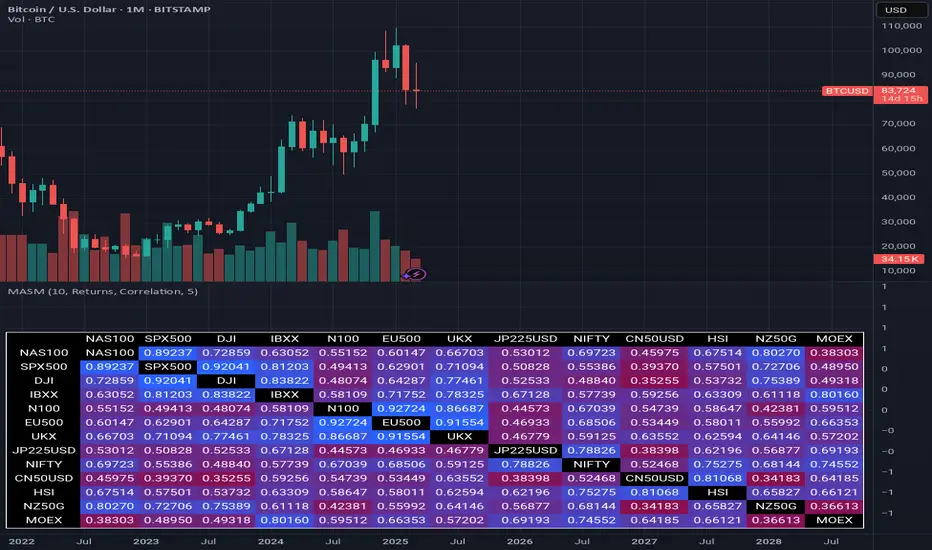
Multi Asset Similarity MatrixProvides a unique and visually stunning way to analyze the similarity between various stock market indices. This script uses a range of mathematical measures to calculate the correlation between different assets, such as indices, forex, crypto, etc..
Key Features:
Similarity Measures: The script offers a range of similarity measures to choose from, including SSD (Sum of Squared Differences), Euclidean Distance, Manhattan Distance, Minkowski Distance, Chebyshev Distance, Correlation Coefficient, Cosine Similarity, Camberra Index, Mean Absolute Error (MAE), Mean Squared Error (MSE), Lorentzian Function, Intersection, and Penrose Shape.
Asset Selection: Users can select the assets they want to analyze by entering a comma-separated list of tickers in the "Asset List" input field.
Color Gradient: The script uses a color gradient to represent the similarity values between each pair of indices, with red indicating low similarity and blue indicating high similarity.
How it Works:
The script calculates the source method (Returns or Volume Modified Returns) for each index using the sec function.
It then creates a matrix to hold the current values of each index over a specified window size (default is 10).
For each pair of indices, it applies the selected similarity measure using the select function and stores the result in a separate matrix.
The script calculates the maximum and minimum values of the similarity matrix to normalize the color gradient.
Finally, it creates a table with the index names as rows and columns, displaying the similarity values for each pair of indices using the calculated colors.
Visual Insights:
The indicator provides an intuitive way to visualize the relationships between different assets. By analyzing the color-coded tables, traders can gain insights into:
Which assets are highly correlated (blue) or uncorrelated (red)
The strength and direction of these correlations
Potential trading opportunities based on similarities and differences between assets
Overall, MASM is a powerful tool for market analysis and visualization, offering a unique perspective on the relationships between various assets.
~llama3
Geo. Geo.
This library provides a comprehensive set of geometric functions based on 2 simple types for point and line manipulation, point array calculations, some vector operations (Borrowed from @ricardosantos ), angle calculations, and basic polygon analysis. It offers tools for creating, transforming, and analyzing geometric shapes and their relationships.
View the source code for detailed documentation on each function and type.
═════════════════════════════════════════════════════════════════════════
█ OVERVIEW
This library enhances TradingView's Pine Script with robust geometric capabilities. It introduces the Point and Line types, along with a suite of functions for various geometric operations. These functionalities empower you to perform advanced calculations, manipulations, and analyses involving points, lines, vectors, angles, and polygons directly within your Pine scripts. The example is at the bottom of the script. ( Commented out )
█ CONCEPTS
This library revolves around two fundamental types:
• Point: Represents a point in 2D space with x and y coordinates, along with optional 'a' (angle) and 'v' (value) fields for versatile use. Crucially, for plotting, utilize the `.to_chart_point()` method to convert Points into plottable chart.point objects.
• Line: Defined by a starting Point and a slope , enabling calculations like getting y for a given x, or finding intersection points.
█ FEATURES
• Point Manipulation: Perform operations like addition, subtraction, scaling, rotation, normalization, calculating distances, dot products, cross products, midpoints, and more with Point objects.
• Line Operations: Create lines, determine their slope, calculate y from x (and vice versa), and find the intersection points of two lines.
• Vector Operations: Perform vector addition, subtraction, multiplication, division, negation, perpendicular vector calculation, floor, fractional part, sine, absolute value, modulus, sign, round, scaling, rescaling, rotation, and ceiling operations.
• Angle Calculations: Compute angles between points in degrees or radians, including signed, unsigned, and 360-degree angles.
• Polygon Analysis: Calculate the area, perimeter, and centroid of polygons. Check if a point is inside a given polygon and determine the convex hull perimeter.
• Chart Plotting: Conveniently convert Point objects to chart.point objects for plotting lines and points on the chart. The library also includes functions for plotting lines between individual and series of points.
• Utility Functions: Includes helper functions such as square root, square, cosine, sine, tangent, arc cosine, arc sine, arc tangent, atan2, absolute distance, golden ratio tolerance check, fractional part, and safe index/check for chart plotting boundaries.
█ HOW TO USE
1 — Include the library in your script using:
import kaigouthro/geo/1
2 — Create Point and Line objects:
p1 = geo.Point(bar_index, close)
p2 = geo.Point(bar_index , open)
myLine = geo.Line(p1, geo.slope(p1, p2))
// maybe use that line to detect a crossing for an alert ... hmmm
3 — Utilize the provided functions:
distance = geo.distance(p1, p2)
intersection = geo.intersection(line1, line2)
4 — For plotting labels, lines, convert Point to chart.point :
label.new(p1.to_chart_point(), " Hi ")
line.new(p1.to_chart_point(),p2.to_chart_point())
█ NOTES
This description provides a concise overview. Consult the library's source code for in-depth documentation, including detailed descriptions, parameter types, and return values for each function and method. The source code is structured with comprehensive comments using the `//@` format for seamless integration with TradingView's auto-documentation features.
█ Possibilities..
Library "geo"
This library provides a comprehensive set of geometric functions and types, including point and line manipulation, vector operations, angle calculations, and polygon analysis. It offers tools for creating, transforming, and analyzing geometric shapes and their relationships.
sqrt(value)
Square root function
Parameters:
value (float) : (float) - The number to take the square root of
Returns: (float) - The square root of the input value
sqr(x)
Square function
Parameters:
x (float) : (float) - The number to square
Returns: (float) - The square of the input value
cos(v)
Cosine function
Parameters:
v (float) : (series float) - The value to find the cosine of
Returns: (series float) - The cosine of the input value
sin(v)
Sine function
Parameters:
v (float) : (series float) - The value to find the sine of
Returns: (series float) - The sine of the input value
tan(v)
Tangent function
Parameters:
v (float) : (series float) - The value to find the tangent of
Returns: (series float) - The tangent of the input value
acos(v)
Arc cosine function
Parameters:
v (float) : (series float) - The value to find the arc cosine of
Returns: (series float) - The arc cosine of the input value
asin(v)
Arc sine function
Parameters:
v (float) : (series float) - The value to find the arc sine of
Returns: (series float) - The arc sine of the input value
atan(v)
Arc tangent function
Parameters:
v (float) : (series float) - The value to find the arc tangent of
Returns: (series float) - The arc tangent of the input value
atan2(dy, dx)
atan2 function
Parameters:
dy (float) : (float) - The y-coordinate
dx (float) : (float) - The x-coordinate
Returns: (float) - The angle in radians
gap(_value1, __value2)
Absolute distance between any two float values
Parameters:
_value1 (float) : First value
__value2 (float)
Returns: Absolute Positive Distance
phi_tol(a, b, tolerance)
Check if the ratio is within the tolerance of the golden ratio
Parameters:
a (float) : (float) The first number
b (float) : (float) The second number
tolerance (float) : (float) The tolerance percennt as 1 = 1 percent
Returns: (bool) True if the ratio is within the tolerance, false otherwise
frac(x)
frad Fractional
Parameters:
x (float) : (float) - The number to convert to fractional
Returns: (float) - The number converted to fractional
safeindex(x, limit)
limiting int to hold the value within the chart range
Parameters:
x (float) : (float) - The number to limit
limit (int)
Returns: (int) - The number limited to the chart range
safecheck(x, limit)
limiting int check if within the chartplottable range
Parameters:
x (float) : (float) - The number to limit
limit (int)
Returns: (int) - The number limited to the chart range
interpolate(a, b, t)
interpolate between two values
Parameters:
a (float) : (float) - The first value
b (float) : (float) - The second value
t (float) : (float) - The interpolation factor (0 to 1)
Returns: (float) - The interpolated value
gcd(_numerator, _denominator)
Greatest common divisor of two integers
Parameters:
_numerator (int)
_denominator (int)
Returns: (int) The greatest common divisor
method set_x(self, value)
Set the x value of the point, and pass point for chaining
Namespace types: Point
Parameters:
self (Point) : (Point) The point to modify
value (float) : (float) The new x-coordinate
method set_y(self, value)
Set the y value of the point, and pass point for chaining
Namespace types: Point
Parameters:
self (Point) : (Point) The point to modify
value (float) : (float) The new y-coordinate
method get_x(self)
Get the x value of the point
Namespace types: Point
Parameters:
self (Point) : (Point) The point to get the x-coordinate from
Returns: (float) The x-coordinate
method get_y(self)
Get the y value of the point
Namespace types: Point
Parameters:
self (Point) : (Point) The point to get the y-coordinate from
Returns: (float) The y-coordinate
method vmin(self)
Lowest element of the point
Namespace types: Point
Parameters:
self (Point) : (Point) The point
Returns: (float) The lowest value between x and y
method vmax(self)
Highest element of the point
Namespace types: Point
Parameters:
self (Point) : (Point) The point
Returns: (float) The highest value between x and y
method add(p1, p2)
Addition
Namespace types: Point
Parameters:
p1 (Point) : (Point) - The first point
p2 (Point) : (Point) - The second point
Returns: (Point) - the add of the two points
method sub(p1, p2)
Subtraction
Namespace types: Point
Parameters:
p1 (Point) : (Point) - The first point
p2 (Point) : (Point) - The second point
Returns: (Point) - the sub of the two points
method mul(p, scalar)
Multiplication by scalar
Namespace types: Point
Parameters:
p (Point) : (Point) - The point
scalar (float) : (float) - The scalar to multiply by
Returns: (Point) - the multiplied point of the point and the scalar
method div(p, scalar)
Division by scalar
Namespace types: Point
Parameters:
p (Point) : (Point) - The point
scalar (float) : (float) - The scalar to divide by
Returns: (Point) - the divided point of the point and the scalar
method rotate(p, angle)
Rotate a point around the origin by an angle (in degrees)
Namespace types: Point
Parameters:
p (Point) : (Point) - The point to rotate
angle (float) : (float) - The angle to rotate by in degrees
Returns: (Point) - the rotated point
method length(p)
Length of the vector from origin to the point
Namespace types: Point
Parameters:
p (Point) : (Point) - The point
Returns: (float) - the length of the point
method length_squared(p)
Length squared of the vector
Namespace types: Point
Parameters:
p (Point) : (Point) The point
Returns: (float) The squared length of the point
method normalize(p)
Normalize the point to a unit vector
Namespace types: Point
Parameters:
p (Point) : (Point) - The point to normalize
Returns: (Point) - the normalized point
method dot(p1, p2)
Dot product
Namespace types: Point
Parameters:
p1 (Point) : (Point) - The first point
p2 (Point) : (Point) - The second point
Returns: (float) - the dot of the two points
method cross(p1, p2)
Cross product result (in 2D, this is a scalar)
Namespace types: Point
Parameters:
p1 (Point) : (Point) - The first point
p2 (Point) : (Point) - The second point
Returns: (float) - the cross of the two points
method distance(p1, p2)
Distance between two points
Namespace types: Point
Parameters:
p1 (Point) : (Point) - The first point
p2 (Point) : (Point) - The second point
Returns: (float) - the distance of the two points
method Point(x, y, a, v)
Point Create Convenience
Namespace types: series float, simple float, input float, const float
Parameters:
x (float)
y (float)
a (float)
v (float)
Returns: (Point) new point
method angle(p1, p2)
Angle between two points in degrees
Namespace types: Point
Parameters:
p1 (Point) : (Point) - The first point
p2 (Point) : (Point) - The second point
Returns: (float) - the angle of the first point and the second point
method angle_between(p, pivot, other)
Angle between two points in degrees from a pivot point
Namespace types: Point
Parameters:
p (Point) : (Point) - The point to calculate the angle from
pivot (Point) : (Point) - The pivot point
other (Point) : (Point) - The other point
Returns: (float) - the angle between the two points
method translate(p, from_origin, to_origin)
Translate a point from one origin to another
Namespace types: Point
Parameters:
p (Point) : (Point) - The point to translate
from_origin (Point) : (Point) - The origin to translate from
to_origin (Point) : (Point) - The origin to translate to
Returns: (Point) - the translated point
method midpoint(p1, p2)
Midpoint of two points
Namespace types: Point
Parameters:
p1 (Point) : (Point) - The first point
p2 (Point) : (Point) - The second point
Returns: (Point) - The midpoint of the two points
method rotate_around(p, angle, pivot)
Rotate a point around a pivot point by an angle (in degrees)
Namespace types: Point
Parameters:
p (Point) : (Point) - The point to rotate
angle (float) : (float) - The angle to rotate by in degrees
pivot (Point) : (Point) - The pivot point to rotate around
Returns: (Point) - the rotated point
method multiply(_a, _b)
Multiply vector _a with _b
Namespace types: Point
Parameters:
_a (Point) : (Point) The first point
_b (Point) : (Point) The second point
Returns: (Point) The result of the multiplication
method divide(_a, _b)
Divide vector _a by _b
Namespace types: Point
Parameters:
_a (Point) : (Point) The first point
_b (Point) : (Point) The second point
Returns: (Point) The result of the division
method negate(_a)
Negative of vector _a
Namespace types: Point
Parameters:
_a (Point) : (Point) The point to negate
Returns: (Point) The negated point
method perp(_a)
Perpendicular Vector of _a
Namespace types: Point
Parameters:
_a (Point) : (Point) The point
Returns: (Point) The perpendicular point
method vfloor(_a)
Compute the floor of argument vector _a
Namespace types: Point
Parameters:
_a (Point) : (Point) The point
Returns: (Point) The floor of the point
method fractional(_a)
Compute the fractional part of the elements from vector _a
Namespace types: Point
Parameters:
_a (Point) : (Point) The point
Returns: (Point) The fractional part of the point
method vsin(_a)
Compute the sine of argument vector _a
Namespace types: Point
Parameters:
_a (Point) : (Point) The point
Returns: (Point) The sine of the point
lcm(a, b)
Least common multiple of two integers
Parameters:
a (int) : (int) The first integer
b (int) : (int) The second integer
Returns: (int) The least common multiple
method vabs(_a)
Compute the absolute of argument vector _a
Namespace types: Point
Parameters:
_a (Point) : (Point) The point
Returns: (Point) The absolute of the point
method vmod(_a, _b)
Compute the mod of argument vector _a
Namespace types: Point
Parameters:
_a (Point) : (Point) The point
_b (float) : (float) The mod
Returns: (Point) The mod of the point
method vsign(_a)
Compute the sign of argument vector _a
Namespace types: Point
Parameters:
_a (Point) : (Point) The point
Returns: (Point) The sign of the point
method vround(_a)
Compute the round of argument vector _a
Namespace types: Point
Parameters:
_a (Point) : (Point) The point
Returns: (Point) The round of the point
method normalize_y(p, height)
normalizes the y value of a point to an input height
Namespace types: Point
Parameters:
p (Point) : (Point) - The point to normalize
height (float) : (float) - The height to normalize to
Returns: (Point) - the normalized point
centroid(points)
Calculate the centroid of multiple points
Parameters:
points (array) : (array) The array of points
Returns: (Point) The centroid point
random_point(_height, _width, _origin, _centered)
Random Point in a given height and width
Parameters:
_height (float) : (float) The height of the area to generate the point in
_width (float) : (float) The width of the area to generate the point in
_origin (Point) : (Point) The origin of the area to generate the point in (default: na, will create a Point(0, 0))
_centered (bool) : (bool) Center the origin point in the area, otherwise, positive h/w (default: false)
Returns: (Point) The random point in the given area
random_point_array(_origin, _height, _width, _centered, _count)
Random Point Array in a given height and width
Parameters:
_origin (Point) : (Point) The origin of the area to generate the array (default: na, will create a Point(0, 0))
_height (float) : (float) The height of the area to generate the array
_width (float) : (float) The width of the area to generate the array
_centered (bool) : (bool) Center the origin point in the area, otherwise, positive h/w (default: false)
_count (int) : (int) The number of points to generate (default: 50)
Returns: (array) The random point array in the given area
method sort_points(points, by_x)
Sorts an array of points by x or y coordinate
Namespace types: array
Parameters:
points (array) : (array) The array of points to sort
by_x (bool) : (bool) Whether to sort by x-coordinate (true) or y-coordinate (false)
Returns: (array) The sorted array of points
method equals(_a, _b)
Compares two points for equality
Namespace types: Point
Parameters:
_a (Point) : (Point) The first point
_b (Point) : (Point) The second point
Returns: (bool) True if the points are equal, false otherwise
method max(origin, _a, _b)
Maximum of two points from origin, using dot product
Namespace types: Point
Parameters:
origin (Point)
_a (Point) : (Point) The first point
_b (Point) : (Point) The second point
Returns: (Point) The maximum point
method min(origin, _a, _b)
Minimum of two points from origin, using dot product
Namespace types: Point
Parameters:
origin (Point)
_a (Point) : (Point) The first point
_b (Point) : (Point) The second point
Returns: (Point) The minimum point
method avg_x(points)
Average x of point array
Namespace types: array
Parameters:
points (array) : (array) The array of points
Returns: (float) The average x-coordinate
method avg_y(points)
Average y of point array
Namespace types: array
Parameters:
points (array) : (array) The array of points
Returns: (float) The average y-coordinate
method range_x(points)
Range of x values in point array
Namespace types: array
Parameters:
points (array) : (array) The array of points
Returns: (float) The range of x-coordinates
method range_y(points)
Range of y values in point array
Namespace types: array
Parameters:
points (array) : (array) The array of points
Returns: (float) The range of y-coordinates
method max_x(points)
max of x values in point array
Namespace types: array
Parameters:
points (array) : (array) The array of points
Returns: (float) The max of x-coordinates
method min_y(points)
min of x values in point array
Namespace types: array
Parameters:
points (array) : (array) The array of points
Returns: (float) The min of x-coordinates
method scale(_a, _scalar)
Scale a point by a scalar
Namespace types: Point
Parameters:
_a (Point) : (Point) The point to scale
_scalar (float) : (float) The scalar value
Returns: (Point) The scaled point
method rescale(_a, _length)
Rescale a point to a new magnitude
Namespace types: Point
Parameters:
_a (Point) : (Point) The point to rescale
_length (float) : (float) The new magnitude
Returns: (Point) The rescaled point
method rotate_rad(_a, _radians)
Rotate a point by an angle in radians
Namespace types: Point
Parameters:
_a (Point) : (Point) The point to rotate
_radians (float) : (float) The angle in radians
Returns: (Point) The rotated point
method rotate_degree(_a, _degree)
Rotate a point by an angle in degrees
Namespace types: Point
Parameters:
_a (Point) : (Point) The point to rotate
_degree (float) : (float) The angle in degrees
Returns: (Point) The rotated point
method vceil(_a, _digits)
Ceil a point to a certain number of digits
Namespace types: Point
Parameters:
_a (Point) : (Point) The point to ceil
_digits (int) : (int) The number of digits to ceil to
Returns: (Point) The ceiled point
method vpow(_a, _exponent)
Raise both point elements to a power
Namespace types: Point
Parameters:
_a (Point) : (Point) The point
_exponent (float) : (float) The exponent
Returns: (Point) The point with elements raised to the power
method perpendicular_distance(_a, _b, _c)
Distance from point _a to line between _b and _c
Namespace types: Point
Parameters:
_a (Point) : (Point) The point
_b (Point) : (Point) The start point of the line
_c (Point) : (Point) The end point of the line
Returns: (float) The perpendicular distance
method project(_a, _axis)
Project a point onto another
Namespace types: Point
Parameters:
_a (Point) : (Point) The point to project
_axis (Point) : (Point) The point to project onto
Returns: (Point) The projected point
method projectN(_a, _axis)
Project a point onto a point of unit length
Namespace types: Point
Parameters:
_a (Point) : (Point) The point to project
_axis (Point) : (Point) The unit length point to project onto
Returns: (Point) The projected point
method reflect(_a, _axis)
Reflect a point on another
Namespace types: Point
Parameters:
_a (Point) : (Point) The point to reflect
_axis (Point) : (Point) The point to reflect on
Returns: (Point) The reflected point
method reflectN(_a, _axis)
Reflect a point to an arbitrary axis
Namespace types: Point
Parameters:
_a (Point) : (Point) The point to reflect
_axis (Point) : (Point) The axis to reflect to
Returns: (Point) The reflected point
method angle_rad(_a)
Angle in radians of a point
Namespace types: Point
Parameters:
_a (Point) : (Point) The point
Returns: (float) The angle in radians
method angle_unsigned(_a, _b)
Unsigned degree angle between 0 and +180 by given two points
Namespace types: Point
Parameters:
_a (Point) : (Point) The first point
_b (Point) : (Point) The second point
Returns: (float) The unsigned angle in degrees
method angle_signed(_a, _b)
Signed degree angle between -180 and +180 by given two points
Namespace types: Point
Parameters:
_a (Point) : (Point) The first point
_b (Point) : (Point) The second point
Returns: (float) The signed angle in degrees
method angle_360(_a, _b)
Degree angle between 0 and 360 by given two points
Namespace types: Point
Parameters:
_a (Point) : (Point) The first point
_b (Point) : (Point) The second point
Returns: (float) The angle in degrees (0-360)
method clamp(_a, _vmin, _vmax)
Restricts a point between a min and max value
Namespace types: Point
Parameters:
_a (Point) : (Point) The point to restrict
_vmin (Point) : (Point) The minimum point
_vmax (Point) : (Point) The maximum point
Returns: (Point) The restricted point
method lerp(_a, _b, _rate_of_move)
Linearly interpolates between points a and b by _rate_of_move
Namespace types: Point
Parameters:
_a (Point) : (Point) The starting point
_b (Point) : (Point) The ending point
_rate_of_move (float) : (float) The rate of movement (0-1)
Returns: (Point) The interpolated point
method slope(p1, p2)
Slope of a line between two points
Namespace types: Point
Parameters:
p1 (Point) : (Point) - The first point
p2 (Point) : (Point) - The second point
Returns: (float) - The slope of the line
method gety(self, x)
Get y-coordinate of a point on the line given its x-coordinate
Namespace types: Line
Parameters:
self (Line) : (Line) - The line
x (float) : (float) - The x-coordinate
Returns: (float) - The y-coordinate
method getx(self, y)
Get x-coordinate of a point on the line given its y-coordinate
Namespace types: Line
Parameters:
self (Line) : (Line) - The line
y (float) : (float) - The y-coordinate
Returns: (float) - The x-coordinate
method intersection(self, other)
Intersection point of two lines
Namespace types: Line
Parameters:
self (Line) : (Line) - The first line
other (Line) : (Line) - The second line
Returns: (Point) - The intersection point
method calculate_arc_point(self, b, p3)
Calculate a point on the arc defined by three points
Namespace types: Point
Parameters:
self (Point) : (Point) The starting point of the arc
b (Point) : (Point) The middle point of the arc
p3 (Point) : (Point) The end point of the arc
Returns: (Point) A point on the arc
approximate_center(point1, point2, point3)
Approximate the center of a spiral using three points
Parameters:
point1 (Point) : (Point) The first point
point2 (Point) : (Point) The second point
point3 (Point) : (Point) The third point
Returns: (Point) The approximate center point
createEdge(center, radius, angle)
Get coordinate from center by radius and angle
Parameters:
center (Point) : (Point) - The center point
radius (float) : (float) - The radius of the circle
angle (float) : (float) - The angle in degrees
Returns: (Point) - The coordinate on the circle
getGrowthFactor(p1, p2, p3)
Get growth factor of spiral point
Parameters:
p1 (Point) : (Point) - The first point
p2 (Point) : (Point) - The second point
p3 (Point) : (Point) - The third point
Returns: (float) - The growth factor
method to_chart_point(point)
Convert Point to chart.point using chart.point.from_index(safeindex(point.x), point.y)
Namespace types: Point
Parameters:
point (Point) : (Point) - The point to convert
Returns: (chart.point) - The chart.point representation of the input point
method plotline(p1, p2, col, width)
Draw a line from p1 to p2
Namespace types: Point
Parameters:
p1 (Point) : (Point) First point
p2 (Point) : (Point) Second point
col (color)
width (int)
Returns: (line) Line object
method drawlines(points, col, ignore_boundary)
Draw lines between points in an array
Namespace types: array
Parameters:
points (array) : (array) The array of points
col (color) : (color) The color of the lines
ignore_boundary (bool) : (bool) The color of the lines
method to_chart_points(points)
Draw an array of points as chart points on the chart with line.new(chartpoint1, chartpoint2, color=linecolor)
Namespace types: array
Parameters:
points (array) : (array) - The points to draw
Returns: (array) The array of chart points
polygon_area(points)
Calculate the area of a polygon defined by an array of points
Parameters:
points (array) : (array) The array of points representing the polygon vertices
Returns: (float) The area of the polygon
polygon_perimeter(points)
Calculate the perimeter of a polygon
Parameters:
points (array) : (array) Array of points defining the polygon
Returns: (float) Perimeter of the polygon
is_point_in_polygon(point, _polygon)
Check if a point is inside a polygon
Parameters:
point (Point) : (Point) The point to check
_polygon (array)
Returns: (bool) True if the point is inside the polygon, false otherwise
method perimeter(points)
Calculates the convex hull perimeter of a set of points
Namespace types: array
Parameters:
points (array) : (array) The array of points
Returns: (array) The array of points forming the convex hull perimeter
Point
A Point, can be used for vector, floating calcs, etc. Use the cp method for plots
Fields:
x (series float) : (float) The x-coordinate
y (series float) : (float) The y-coordinate
a (series float) : (float) An Angle storage spot
v (series float) : (float) A Value
Line
Line
Fields:
point (Point) : (Point) The starting point of the line
slope (series float) : (float) The slope of the line
GOMTRY.

Doubled Numbered Square of Nine Progression | RegressionThe Doubled Number Square of Nine Progression | Regression Indicator enables forecasting of support and resistance levels using the SQ9 progression or regression from a user-selected pivot price. The indicator also plots adjustable pivots on both the chart and the Square of Nine.
How to use to forecast support and resistance levels:
1. Select a Pivot Point: Choose a top or bottom pivot to use as the starting point. Select High or Low in the indicator to set the correct price to the pivot.
2. Set Price Increment or Decrement: Select a price increment to advance the starting price on the Square of Nine (for example 1 or -0.01).
3. Rotate to add or decrease the number of rungs on the Square on Nine: Rotate the Square of Nine and adjust the dimensions. The horizontal levels correlate to the rotation of the Square of Nine.
4. Plot Levels: Select a Square of Nine angle to plot the support and resistance levels based on the selected increments. These levels auto expand and decrease depending on the number of rotations in step 3. The price values from each of the selected diagonal or cardinal cross are applied to the chart with labels on both left and right. Left labels represent the cell the time variable and the right label is price.
5. Review Levels: Conduct a simple review of the plotted support and resistance levels in relation to recent market pivots.
6. Identify Correlations: Identify the Square of Nine cardinal cross or diagonal cross angle that correlates with the most market pivots.
7. The indicator plots user-adjustable pivots on both candles/bars and displays their placement on the Square of Nine in both Progression and Regression. The close price is plotted on the Square of Nine in real-time with a white background. This helps users identify which angles the highs and lows favor from the selected pivot. The pivot levels' colors can be adjusted.
Each market has its tendencies, favoring specific angles from the cardinal or diagonal cross. The basic idea is to choose between the diagonal cross and cardinal cross angles to forecast support and resistance levels.
Settings:
Overview:
Example on Forecasting Support and resistance level using this indicator:
In the image above, I'm progressing from the significant low at a rate of $200 per cell. Based on the plotted pivots, I've selected the 315-degree angle on the diagonal cross as it aligns with a few recent pivots. Now, I've drawn a vertical line to show that as we add rungs to the Square of Nine, we introduce support and resistance levels based on the identified angle that aligns with these early pivots from the low.
In the image below, I've moved forward in time to show how the initial angle selected based on the early pivot forecasted support and resistance levels around the high in BTC. Do not expect the price to turn sharply at the levels the indicator generates, but use it to help identify SQ9 levels that may form market turns. As P. Mikula mentions in his work, "The Square of Nine successfully defines market price swings but it does not make the market form pivots."
This indicator includes enhancements made to the Gann Square of Nine indicator originally created by @ThiagoSchmitz.
This indicator is inspired by the methodologies detailed by Patrick Mikula in his book " The Definitive Guide to Forecasting using W.D Gann's Square of Nine ." I recommend checking it out. He also mentions another use case as a Price and Time chart in his " Gann Scientific Method Unveiled, Volume 2 ." FYI, I am not affiliated with Patrick Mikula in any way.
Known Issues:
Close price plotted on the Square of Nine in Regression "from a high pivot" takes a current candle to close in order to be plotted. Progression works as expected.

Footprint IQ Pro [TradingIQ]Hello Traders!
Introducing "Footprint IQ Pro"!
Footprint IQ Pro is an all-in-one Footprint indicator with several unique features.
Features
Calculated delta at tick level
Calculated delta ratio at tick level
Calculated buy volume at tick level
Calculated sell volume at tick level
Imbalance detection
Stacked imbalance detection
Stacked imbalance alerts
Value area and POC detection
Highest +net delta levels detection
Lowest -net delta levels detection
CVD by tick levels
Customizable values area percentage
The image above thoroughly outlines what each metric in the delta boxes shows!
Metrics In Delta Boxes
"δ:", " δ%:", " ⧎: ", " ◭: ", " ⧩: "
δ Delta (Difference between buy and sell volume)
δ% Delta Ratio (Delta as a percentage of total volume)
⧎ Total Volume At Level (Total volume at the price area)
◭ Total Buy Volume At Level (Total buy volume at the price area)
⧩ Total Sell Volume At Level (total sell volume at the price area)
Each metric comes with a corresponding symbol.
That said, until you become comfortable with the symbol, you can also turn on the descriptive labels setting!
The image above exemplifies the feature.
The image above shows Footprint IQ's full power!
Additionally, traders with an upgraded TradingView plan can make use of the "1-Second" feature Footprint IQ offers!
The image above shows each footprint generated using 1-second volume data. 1-second data is highly granular compared to 1-minute data and, consequently, each footprint is exceptionally more accurate!
Imbalance Detection
Footprint IQ pro is capable of detecting user-defined delta imbalances.
The image above further explains how Footprint IQ detects imbalances!
The imbalance percentage is customizable in the settings, and is set to 70% by default.
Therefore,
When net delta is positive, and the positive net delta constitutes >=70% of the total volume, a buying imbalance will be detected (upwards triangle).
When net delta is negative, and the negative net delta constitutes >=70% of the total volume, a buying imbalance will be detected (downwards triangle).
Stacked Imbalance Detection
In addition to imbalance detection, Footprint IQ Pro can also detect stacked imbalances!
The image above shows Footprint IQ Pro detecting stacked imbalances!
Stacked imbalances occur when consecutive imbalances at sequential price areas occur. Stacked imbalances are generally interpreted as significant price moves that are supported by volume, rather than a significant result with disproportionate effort.
The criteria for stacked imbalance detection (how many imbalances must occur at sequential price areas) is customizable in the settings.
The default value is three. Therefore, when three imbalances occur at sequential price areas, golden triangles will begin to print to show a stacked imbalance.
Additionally, traders can set alerts for when stacked imbalances occur!
Highest +Delta and Highest -Delta Levels
In addition to being a fully-fledged Footprint indicator, Footprint IQ Pro goes one step further by detecting price areas where the greater +Delta and -Delta are!
The image above shows price behavior near highest +Delta price areas detected by Footprint IQ!
These +Delta levels are considered important as there has been strong interest from buyers at these price areas when they are traded at.
It's expected that these levels can function as support points that are supported by volume.
The image above shows a similar function for resistance points!
Blue lines = High +Delta Detected Price Areas
Red lines = High -Delta Detected Price Areas
Value Area Detection
Similar to traditional volume profile, Footprint IQ Pro displays the value area per bar.
Green lines next to each footprint show the value area for the bar. The value area % is customizable in the settings.
CVD Levels
Footprint IQ Pro is capable of storing historical volume delta information to provide CVD measurements at each price area!
The image above exemplifies this feature!
When this feature is enabled, you will see the CVD of each price area, rather than the net delta!
And that's it!
Thank you so much to TradingView for offering the greatest charting platform for everyone to create on!
If you have any feature requests you'd like to see for Footprint IQ, please feel free to share them with us!
Thank you!

Asset Rotation System [InvestorUnknown]Overview
This system creates a comprehensive trend "matrix" by analyzing the performance of six assets against both the US Dollar and each other. The objective is to identify and hold the asset that is currently outperforming all others, thereby focusing on maintaining an investment in the most "optimal" asset at any given time.
- - - Key Features - - -
1. Trend Classification:
The system evaluates the trend for each of the six assets, both individually against USD and in pairs (assetX/assetY), to determine which asset is currently outperforming others.
Utilizes five distinct trend indicators: RSI (50 crossover), CCI, SuperTrend, DMI, and Parabolic SAR.
Users can customize the trend analysis by selecting all indicators or choosing a single one via the "Trend Classification Method" input setting.
2. Backtesting:
Calculates an equity curve for each asset and for the system itself, which assumes holding only the asset deemed optimal at any time.
Customizable start date for backtesting; by default, it begins either 5000 bars ago (the maximum in TradingView) or at the inception of the youngest asset included, whichever is shorter. If the youngest asset's history exceeds 5000 bars, the system uses 5000 bars to prevent errors.
The equity curve is dynamically colored based on the asset held at each point, with this coloring also reflected on the chart via barcolor().
Performance metrics like returns, standard deviation of returns, Sharpe, Sortino, and Omega ratios, along with maximum drawdown, are computed for each asset and the system's equity curve.
3 Alerts:
Supports alerts for when a new, confirmed optimal asset is identified. However, due to TradingView limitations, the specific asset cannot be included in the alert message.
- - - Usage - - -
1. Select Assets/Tickers:
Choose which assets or tickers you want to include in the rotation system. Ensure that all selected tickers are denominated in USD to maintain consistency in analysis.
2. Configure Trend Classification:
Decide on the trend classification method from the available options (RSI, CCI, SuperTrend, DMI, or Parabolic SAR, All) and adjust the settings to your preferences. This customization allows you to tailor the system to different market conditions or your specific trading strategy.
3. Utilize Backtesting for Calibration:
Use the backtesting results, including equity curves and performance metrics, to fine-tune your chosen trend indicators.
Be cautious not to overemphasize performance maximization, as this can lead to overfitting. The goal is to achieve a robust system that performs well across various market conditions, rather than just optimizing for past data.
- - - Parameters - - -
Tickers:
Asset 1: Select the symbol for the first asset.
Asset 2: Select the symbol for the second asset.
Asset 3: Select the symbol for the third asset.
Asset 4: Select the symbol for the fourth asset.
Asset 5: Select the symbol for the fifth asset.
Asset 6: Select the symbol for the sixth asset.
General Settings:
Trend Classification Method: Choose from RSI, CCI, SuperTrend, DMI, PSAR, or "All" to determine how trends are analyzed.
Use Custom Starting Date for Backtest: Toggle to use a custom date for beginning the backtest.
Custom Starting Date: Set the custom start date for backtesting.
Plot Perf. Metrics Table: Option to display performance metrics in a table on the chart.
RSI (Relative Strength Index):
RSI Source: Choose the price data source for RSI calculation.
RSI Length: Set the period for the RSI calculation.
CCI (Commodity Channel Index):
CCI Source: Select the price data source for CCI calculation.
CCI Length: Determine the period for the CCI.
SuperTrend:
SuperTrend Factor: Adjust the sensitivity of the SuperTrend indicator.
SuperTrend Length: Set the period for the SuperTrend calculation.
DMI (Directional Movement Index):
DMI Length: Define the period for DMI calculations.
Parabolic SAR:
PSAR Start: Initial acceleration factor for the Parabolic SAR.
PSAR Increment: Increment value for the acceleration factor.
PSAR Max Value: Maximum value the acceleration factor can reach.
Notes/Recommendations:
While this system is operational, it's important to recognize that it relies on "basic" indicators, which may not be ideal for generating trading signals on their own. I strongly suggest that users delve into the code to grasp the underlying logic of the system. Consider customizing it by integrating more sophisticated and higher-quality trend-following indicators to enhance its performance and reliability.
Disclaimer:
This system's backtest results are historical and do not predict future performance. Use for educational purposes only; not investment advice.

TASC 2025.02 Autocorrelation Indicator█ OVERVIEW
This script implements the Autocorrelation Indicator introduced by John Ehlers in the "Drunkard's Walk: Theory And Measurement By Autocorrelation" article from the February 2025 edition of TASC's Traders' Tips . The indicator calculates the autocorrelation of a price series across several lags to construct a periodogram , which traders can use to identify market cycles, trends, and potential reversal patterns.
█ CONCEPTS
Drunkard's walk
A drunkard's walk , formally known as a random walk , is a type of stochastic process that models the evolution of a system or variable through successive random steps.
In his article, John Ehlers relates this model to market data. He discusses two first- and second-order partial differential equations, modified for discrete (non-continuous) data, that can represent solutions to the discrete random walk problem: the diffusion equation and the wave equation. According to Ehlers, market data takes on a mixture of two "modes" described by these equations. He theorizes that when "diffusion mode" is dominant, trading success is almost a matter of luck, and when "wave mode" is dominant, indicators may have improved performance.
Pink spectrum
John Ehlers explains that many recent academic studies affirm that market data has a pink spectrum , meaning the power spectral density of the data is proportional to the wavelengths it contains, like pink noise . A random walk with a pink spectrum suggests that the states of the random variable are correlated and not independent. In other words, the random variable exhibits long-range dependence with respect to previous states.
Autocorrelation function (ACF)
Autocorrelation measures the correlation of a time series with a delayed copy, or lag , of itself. The autocorrelation function (ACF) is a method that evaluates autocorrelation across a range of lags , which can help to identify patterns, trends, and cycles in stochastic market data. Analysts often use ACF to detect and characterize long-range dependence in a time series.
The Autocorrelation Indicator evaluates the ACF of market prices over a fixed range of lags, expressing the results as a color-coded heatmap representing a dynamic periodogram. Ehlers suggests the information from the periodogram can help traders identify different market behaviors, including:
Cycles : Distinguishable as repeated patterns in the periodogram.
Reversals : Indicated by sharp vertical changes in the periodogram when the indicator uses a short data length .
Trends : Indicated by increasing correlation across lags, starting with the shortest, over time.
█ USAGE
This script calculates the Autocorrelation Indicator on an input "Source" series, smoothed by Ehlers' UltimateSmoother filter, and plots several color-coded lines to represent the periodogram's information. Each line corresponds to an analyzed lag, with the shortest lag's line at the bottom of the pane. Green hues in the line indicate a positive correlation for the lag, red hues indicate a negative correlation (anticorrelation), and orange or yellow hues mean the correlation is near zero.
Because Pine has a limit on the number of plots for a single indicator, this script divides the periodogram display into three distinct ranges that cover different lags. To see the full periodogram, add three instances of this script to the chart and set the "Lag range" input for each to a different value, as demonstrated in the chart above.
With a modest autocorrelation length, such as 20 on a "1D" chart, traders can identify seasonal patterns in the price series, which can help to pinpoint cycles and moderate trends. For instance, on the daily ES1! chart above, the indicator shows repetitive, similar patterns through fall 2023 and winter 2023-2024. The green "triangular" shape rising from the zero lag baseline over different time ranges corresponds to seasonal trends in the data.
To identify turning points in the price series, Ehlers recommends using a short autocorrelation length, such as 2. With this length, users can observe sharp, sudden shifts along the vertical axis, which suggest potential turning points from upward to downward or vice versa.

Session Bar/Candle ColoringChange the color of candles within a user-defined trading session. Borders and wicks can be changed as well, not just the body color.
PREFACE
This script can be used an educational resource for those who are interested in learning Pine Script. Therefore, the script is published open source and is organized in a manner that follows the recommended Style Guide .
While the main premise of the indicator is rather simple, the script showcases various things that can be achieved such as conditional plotting, alignment of indicator settings, user input validation, script optimization, and more. The script also has examples of taking into consideration the chart timeframe and/or different chart types (Heikin Ashi, Renko, etc.) that a user might be running it on. Note: for complete beginners, I strongly suggest going through the Pine Script User Manual (possibly more than once).
FEATURES
Besides being able to select a specific time window, the indicator also provides additional color settings for changing the background color or changing the colors of neutral/indecisive candles, as shown in the image below.
This allows for a higher level of customization beyond the TradingView chart settings or other similar scripts that are currently available.
HOW TO USE
First, define the intraday trading session that will contain the candles to modify. The session can be limited to specific days of the week.
Next, select the parts of the candles that should be modified: Body, Borders, Wick, and/or Background.
For each of the candle parts that were enabled, you can select the colors that will be used depending on whether a candle is bullish (⇧), bearish (⇩), or neutral (⇆).
All other indicator settings will have a detailed tooltip to describe its usage and/or effect.
LIMITATIONS
The indicator is not intended to function on Daily or higher timeframes due to the intraday nature of session time windows.
The indicator cannot always automatically detect the chart type being used, therefore the user is requested to manually input the chart type via the " Chart Style " setting.
Depending on the available historical data and the selected choice for the " Portion of bar in session " setting, the indicator may not be able to update very old candles on the chart.
EXAMPLE USAGE
This section will show examples of different scenarios that the indicator can be used for.
Emphasizing a main trading session.
Defining a "Pre/post market hours background" like is available for some symbols (e.g., NASDAQ:AAPL ).
Highlighting in which bar the midnight candle occurs.
Hiding indecision bars (neutral candles).
Showing only "Regular Trading Hours" for a chart that does not have the option to toggle ETH/RTH. To achieve this, the actual chart data is hidden, and only the indicator is visible; alternatively, a 2nd instance of the indicator could change colors to match the chart background.
Using a combination of Bars and Japanese Candlesticks. Alternatively, this could be done by hiding the main chart data and using 2 instances of the indicator (one with " Chart Style " setting as Bars , and the other set to Candles ).
Using a combination of thin and thick bars on Range charts. Note: requires disabling the "Thin Bars" setting for Bar charts in the TradingView chart settings.
NOTES
If using more than one instance of this indicator on the same chart, you can use the TradingView "Save Indicator Template" feature to avoid having to re-configure the multiple indicators at a later time.
This indicator is intended to work "out-of-the-box" thanks to the behind_chart option introduced to Pine Script in October 2024. But you can always manually bring the indicator to the front just in case the color changes are not being seen (using the "More" option in the indicator status line: More > Visual Order > Bring to front ).
Many thanks to fikira for their help and inspiring me to create open source scripts.
Any feedback including bug reports or suggestions for improving the indicator (or source code itself) are always welcome in the comments section.

Fibonacci Time-Price Zones🟩 Fibonacci Time-Price Zones is a chart visualization tool that combines Fibonacci ratios with time-based and price-based geometry to analyze market behavior. Unlike typical Fibonacci indicators that focus solely on horizontal price levels, this indicator incorporates time into the analysis, providing a more dynamic perspective on price action.
The indicator offers multiple ways to visualize Fibonacci relationships. Drawing segmented circles creates a unique perspective on price action by incorporating time into the analysis. These segmented circles, similar to TradingView's built-in Fibonacci Circles, are derived from Fibonacci time and price levels, allowing traders to identify potential turning points based on the dynamic interaction between price and time.
As another distinct visualization method, the indicator incorporates orthogonal patterns, created by the intersection of horizontal and vertical Fibonacci levels. These intersections form L-shaped connections on the chart, derived from key Fibonacci price and time intervals, highlighting potential areas of support or resistance at specific points in time.
In addition to these geometric approaches, another option is sloped lines, which project Fibonacci levels that account for both time and price along the trendline. These projections derive their angles from the interplay between Fibonacci price levels and Fibonacci time intervals, creating dynamic zones on the chart. The slope of these lines reflects the direction and angle of the trend, providing a visual representation of price alignment with market direction, while maintaining the time-price relationship unique to this indicator
The indicator also includes horizontal Fibonacci levels similar to traditional retracement and extension tools. However, unlike standard tools, traders can display retracement levels, extension levels, or both simultaneously from a single instance of the indicator. These horizontal levels maintain consistency with the chosen visualization method, automatically scaling and adapting whether used with circles, orthogonal patterns, or slope-based analysis.
By combining these distinct methods—circles, orthogonal patterns, sloped projections, and horizontal levels—the indicator provides a comprehensive approach to Fibonacci analysis based on both time and price relationships. Each visualization method offers a unique perspective on market structure while maintaining the core principle of time-price interaction.
⭕ THEORY AND CONCEPT ⭕
While traditional Fibonacci tools excel at identifying potential support and resistance levels through price-based ratios (0.236, 0.382, 0.618), they do not incorporate the dimension of time in market analysis. Extensions and retracements effectively measure price relationships within trends, yet markets move through both price and time dimensions simultaneously.
Fibonacci circles represent an evolution in technical analysis by incorporating time intervals alongside price levels. Based on the mathematical principle that markets often move in circular patterns proportional to Fibonacci ratios, these circles project potential support and resistance zones as partial circles radiating from significant price points. However, traditional circle-based tools can create visual complexity that obscures key market relationships. The integration of time into Fibonacci analysis reveals how price movements often respect both temporal and price-based ratios, suggesting a deeper geometric structure to market behavior.
The Fibonacci Time-Price Zones indicator advances these concepts by providing multiple geometric approaches to visualize time-price relationships. Each shape option—circles, orthogonal patterns, slopes, and horizontal levels—represents a different mathematical perspective on how Fibonacci ratios manifest across both dimensions. This multi-faceted approach allows traders to observe how price responds to Fibonacci-based zones that account for both time and price movements, potentially revealing market structure that purely price-based tools might miss.
Shape Options
The indicator employs four distinct geometric approaches to analyze Fibonacci relationships across time and price dimensions:
Circular : Represents the cyclical nature of market movements through partial circles, where each radius is scaled by Fibonacci ratios incorporating both time and price components. This geometry suggests market movements may follow proportional circular paths from significant pivot points, reflecting the harmonic relationship between time and price.
Orthogonal : Constructs L-shaped patterns that separate the time and price components of Fibonacci relationships. The horizontal component represents price levels, while the vertical component measures time intervals, allowing analysis of how these dimensions interact independently at key market points.
Sloped : Projects Fibonacci levels along the prevailing trend, incorporating both time and price in the angle of projection. This approach suggests that support and resistance levels may maintain their relationship to price while adjusting to the temporal flow of the market.
Horizontal : Provides traditional static Fibonacci levels that serve as a reference point for comparing price-only analysis with the dynamic time-price relationships shown in the other three shapes. This baseline approach allows traders to evaluate how the incorporation of time dimension enhances or modifies traditional Fibonacci analysis.
By combining these geometric approaches, the Fibonacci Time-Price Zones indicator creates a comprehensive analytical framework that bridges traditional and advanced Fibonacci analysis. The horizontal levels serve as familiar reference points, while the dynamic elements—circular, orthogonal, and sloped projections—reveal how price action responds to temporal relationships. This multi-dimensional approach enables traders to study market structure through various geometric lenses, providing deeper insights into time-price symmetry within technical analysis. Whether applied to retracements, extensions, or trend analysis, the indicator offers a structured methodology for understanding how markets move through both price and time dimensions.
🛠️ CONFIGURATION AND SETTINGS 🛠️
The Fibonacci Time-Price Zones indicator offers a range of configurable settings to tailor its functionality and visual representation to your specific analysis needs. These options allow you to customize zone visibility, structures, horizontal lines, and other features.
Important Note: The indicator's calculations are anchored to user-defined start and end points on the chart. When switching between charts with significantly different price scales (e.g., from Bitcoin at $100,000 to Silver at $30), adjustment of these anchor points is required to ensure correct positioning of the Fibonacci elements.
Fibonacci Levels
The indicator allows users to customize Fibonacci levels for both retracement and extension analysis. Each level can be individually configured with the following options:
Visibility : Toggle the visibility of each level to focus on specific areas of interest.
Level Value : Set the Fibonacci ratio for the level, such as 0.618 or 1.000, to align with your analysis needs.
Color : Customize the color of each level for better visual clarity.
Line Thickness : Adjust the line thickness to emphasize critical levels or maintain a cleaner chart.
Setup
Zone Type : Select which Fibonacci zones to display:
- Retracement : Shows potential pull back levels within the trend
- Extension : Projects levels beyond the trend for potential continuation targets
- Both : Displays both retracement and extension zones simultaneously
Shape : Choose from four visualization methods:
- Circular : Time-price based semicircles centered on point B
- Orthogonal : L-shaped patterns combining time and price levels
- Sloped : Trend-aligned projections of Fibonacci levels
- Horizontal : Traditional horizontal Fibonacci levels
Visual Settings
Fill % : Adjusts the fill intensity of zones:
0% : No fill between levels
100% : Maximum fill between levels
Lines :
Trendline : The base A-B trend with customizable color
Extension : B-C projection line
Retracement : B-D pullback line
Labels :
Points : Show/hide A, B, C, D markers
Levels : Show/hide Fibonacci percentages
Time-Price Points
Set the time and price for the points that define the Fibonacci zones and horizontal levels. These points are defined upon loading the chart. These points can be configured directly in the settings or adjusted interactively on the live chart.
A and B Points : These user-defined time and price points determine the basis for calculating the semicircles and Fibonacci levels. While the settings panel displays their exact values for fine-tuning, the easiest way to modify these points is by dragging them directly on the chart for quick adjustments.
Interactive Adjustments : Any changes made to the points on the chart will automatically synchronize with the settings panel, ensuring consistency and precision.
🖼️ CHART EXAMPLES 🖼️
Fibonacci Time-Price Zones using the 'Circular' Shape option. Note the price interaction at the 0.786 level, which acts as a support zone. Additional points of interest include resistance near the 0.618 level and consolidation around the 0.5 level, highlighting the utility of both horizontal and semicircular Fibonacci projections in identifying key price areas.
Fibonacci Time-Price Zones using the 'Sloped' Shape option. The chart displays price retracing along the sloped Fibonacci levels, with blue arrows highlighting potential support zones at 0.618 and 0.786, and a red arrow indicating potential resistance at the 1.0 level. This visual representation aligns with the prevailing downtrend, suggesting potential selling pressure at the 1.0 Fibonacci level.
Fibonacci Time-Price Zones using the 'Orthogonal' Shape option. The chart demonstrates price action interacting with vertical zones created by the orthogonal lines at the 0.618, 0.786, and 1.0 Fibonacci levels. Blue arrows highlight potential support areas, while red arrows indicate potential resistance areas, revealing how the orthogonal lines can identify distinct points of price interaction.
Fibonacci Time-Price Zones using the 'Circular' Shape option. The chart displays price action in relation to segmented circles emanating from the starting point (point A). The circles represent different Fibonacci ratios (0.382, 0.5, 0.618, 0.786) and their intersections with the price axis create potential zones of support and resistance. This approach offers a visually distinct way to analyze potential turning points based on both price and time.
Fibonacci Time-Price Zones using the 'Sloped' Shape option. The sloped Fibonacci levels (0.786, 0.618, 0.5) create zones of potential support and resistance, with price finding clear interaction within these areas. The ellipses highlight this price action, particularly the support between 0.786 and 0.618, which aligns closely with the trend.
Fibonacci Time-Price Zones using the 'Circular' Shape option. The price action appears to be ‘hugging’ the 0.5 Fibonacci level, suggesting potential resistance. This demonstrates how the circular zones can identify potential turning points and areas of consolidation which might not be seen with linear analysis.
Fibonacci Time-Price Zones using the 'Sloped' Shape option with Point D marker enabled. The chart demonstrates clear price action closely following along the sloped Retracement line until the orthogonal intersection at the 0.618 levels where the trend is broken and price dips throughout the 0.618 to 0.786 horizontal zone. Price jumps back to the retracement slope at the start of the 0.786 horizontal zone and continues to the 1.0 horizontal zone. The aqua-colored retracement line is enabled to further emphasize this retracement slope .
Geometric validation using TradingView's built-in Fibonacci Circle tool (overlaid). The alignment at the 0.5 and 1.0 levels demonstrates the indicator's consistent approximation of Fibonacci Circles.
Comparison of Fibonacci Time-Price Zones (Shape: Horizontal) with TradingView's Built-in Retracement and Extension Tools (overlaid): This example demonstrates how the Horizontal structure aligns with TradingView’s retracement and extension levels, allowing users to integrate multiple tools seamlessly. The Fibonacci circle connects retracement and extension zones, highlighting the potential relationship between past retracements and future extensions.
📐 GEOMETRIC FOUNDATIONS 📐
This indicator integrates circular and straight representations of Fibonacci levels, specifically the Circular , Orthogonal , Sloped , and Horizontal shape options. The geometric principles behind these shapes differ significantly, requiring distinct scaling methods for accurate representation. The Circular shape employs logarithmic scaling with radial expansion, where the distance from a central point determines the level's position, creating partial circles that align with TradingView's built-in Fibonacci Circle tool. The other three shapes utilize geometric progression scaling for linear extension from a starting point, resulting in straight lines that align with TradingView's built-in Fibonacci retracement and extension tools. Due to these distinct geometric foundations and scaling methods, perfectly aligning both the partial circles and straight lines simultaneously is mathematically constrained, though any differences are typically visually imperceptible.
The Circular shape's partial circles are calculated and scaled to align with TradingView's built-in Fibonacci Circles. These circles are plotted from the second swing point onward. This approach ensures consistent and accurate visualization across all market types, including those with gaps or closed sessions, which unlike 24/7 markets, do not have a direct one-to-one correspondence between bar indices and time. To maintain accurate geometric proportions across varying chart scales, the indicator calculates an aspect ratio by normalizing the proportional difference between vertical (price) and horizontal (time) distances of the swing points. This normalization factor ensures geometric shapes maintain their mathematical properties regardless of price scale magnitude or time period span, while maintaining the correct proportions of the geometric constructions at any chart zoom level.
The indicator automatically applies the appropriate scaling factor based on the selected shape option, optimizing either circular proportions and proper radius calculations for each Fibonacci level, or straight-line relationships between Fibonacci levels. These distinct scaling approaches maintain mathematical integrity while preserving the essential characteristics of each geometric representation, ensuring optimal visualization accuracy whether using circular or linear shapes.
⚠️ DISCLAIMER ⚠️
The Fibonacci Time-Price Zones indicator is a visual analysis tool designed to illustrate Fibonacci relationships through geometric constructions incorporating both curved and straight lines, providing a structured framework for identifying potential areas of price interaction. It is not intended as a predictive or standalone trading signal indicator.
The indicator calculates levels and projections using user-defined anchor points and Fibonacci ratios. While it aims to align with TradingView’s Fibonacci extension, retracement, and circle tools by employing mathematical and geometric formulas, no guarantee is made that its calculations are identical to TradingView's proprietary methods.
Like all technical and visual indicators, these visual representations may visually align with key price zones in hindsight, reflecting observed price dynamics. However, these visualizations are not standalone signals for trading decisions and should be interpreted as part of a broader analytical approach.
This indicator is intended for educational and analytical purposes, complementing other tools and methods of market analysis. Users are encouraged to integrate it into a comprehensive trading strategy, customizing its settings to suit their specific needs and market conditions.
🧠 BEYOND THE CODE 🧠
The Fibonacci Time-Price Zones indicator is designed to encourage both education and community engagement. By integrating time-sensitive geometry with Fibonacci-based frameworks, it bridges traditional grid-based analysis with dynamic time-price relationships. The inclusion of semicircles, horizontal levels, orthogonal structures, and sloped trends provides users with versatile tools to explore the interaction between price movements and temporal intervals while maintaining clarity and adaptability.
As an open-source tool, the indicator invites exploration, experimentation, and customization. Whether used as a standalone resource or alongside other technical strategies, it serves as a practical and educational framework for understanding market structure and Fibonacci relationships in greater depth.
Your feedback and contributions are essential to refining and enhancing the Fibonacci Time-Price Zones indicator. We look forward to the creative applications, adaptations, and insights this tool inspires within the trading community.

TASC 2025.01 Linear Predictive Filters█ OVERVIEW
This script implements a suite of tools for identifying and utilizing dominant cycles in time series data, as introduced by John Ehlers in the "Linear Predictive Filters And Instantaneous Frequency" article featured in the January 2025 edition of TASC's Traders' Tips . Dominant cycle information can help traders adapt their indicators and strategies to changing market conditions.
█ CONCEPTS
Conventional technical indicators and strategies often rely on static, unchanging parameters, which may fail to account for the dynamic nature of market data. In his article, John Ehlers applies digital signal processing principles to address this issue, introducing linear predictive filters to identify cyclic information for adapting indicators and strategies to evolving market conditions.
This approach treats market data as a complex series in the time domain. Analyzing the series in the frequency domain reveals information about its cyclic components. To reduce the impact of frequencies outside a range of interest and focus on a specific range of cycles, Ehlers applies second-order highpass and lowpass filters to the price data, which attenuate or remove wavelengths outside the desired range. This band-limited analysis isolates specific parts of the frequency spectrum for various trading styles, e.g., longer wavelengths for position trading or shorter wavelengths for swing trading.
After filtering the series to produce band-limited data, Ehlers applies a linear predictive filter to predict future values a few bars ahead. The filter, calculated based on the techniques proposed by Lloyd Griffiths, adaptively minimizes the error between the latest data point and prediction, successively adjusting its coefficients to align with the band-limited series. The filter's coefficients can then be applied to generate an adaptive estimate of the band-limited data's structure in the frequency domain and identify the dominant cycle.
█ USAGE
This script implements the following tools presented in the article:
Griffiths Predictor
This tool calculates a linear predictive filter to forecast future data points in band-limited price data. The crosses between the prediction and signal lines can provide potential trade signals.
Griffiths Spectrum
This tool calculates a partial frequency spectrum of the band-limited price data derived from the linear predictive filter's coefficients, displaying a color-coded representation of the frequency information in the pane. This mode's display represents the data as a periodogram . The bottom of each plotted bar corresponds to a specific analyzed period (inverse of frequency), and the bar's color represents the presence of that periodic cycle in the time series relative to the one with the highest presence (i.e., the dominant cycle). Warmer, brighter colors indicate a higher presence of the cycle in the series, whereas darker colors indicate a lower presence.
Griffiths Dominant Cycle
This tool compares the cyclic components within the partial spectrum and identifies the frequency with the highest power, i.e., the dominant cycle . Traders can use this dominant cycle information to tune other indicators and strategies, which may help promote better alignment with dynamic market conditions.
Notes on parameters
Bandpass boundaries:
In the article, Ehlers recommends an upper bound of 125 bars or higher to capture longer-term cycles for position trading. He recommends an upper bound of 40 bars and a lower bound of 18 bars for swing trading. If traders use smaller lower bounds, Ehlers advises a minimum of eight bars to minimize the potential effects of aliasing.
Data length:
The Griffiths predictor can use a relatively small data length, as autocorrelation diminishes rapidly with lag. However, for optimal spectrum and dominant cycle calculations, the length must match or exceed the upper bound of the bandpass filter. Ehlers recommends avoiding excessively long lengths to maintain responsiveness to shorter-term cycles.

Scatter PlotThe Price Volume Scatter Plot publication aims to provide intrabar detail as a Scatter Plot .
🔶 USAGE
A dot is drawn at every intrabar close price and its corresponding volume , as can seen in the following example:
Price is placed against the white y-axis, where volume is represented on the orange x-axis.
🔹 More detail
A Scatter Plot can be beneficial because it shows more detail compared with a Volume Profile (seen at the right of the Scatter Plot).
The Scatter Plot is accompanied by a "Line of Best Fit" (linear regression line) to help identify the underlying direction, which can be helpful in interpretation/evaluation.
It can be set as a screener by putting multiple layouts together.
🔹 Easier Interpretation
Instead of analysing the 1-minute chart together with volume, this can be visualised in the Scatter Plot, giving a straightforward and easy-to-interpret image of intrabar volume per price level.
One of the scatter plot's advantages is that volumes at the same price level are added to each other.
A dot on the scatter plot represents the cumulated amount of volume at that particular price level, regardless of whether the price closed one or more times at that price level.
Depending on the setting "Direction" , which sets the direction of the Volume-axis, users can hoover to see the corresponding price/volume.
🔹 Highest Intrabar Volume Values
Users can display up to 5 last maximum intrabar volume values, together with the intrabar timeframe (Res)
🔹 Practical Examples
When we divide the recent bar into three parts, the following can be noticed:
Price spends most of its time in the upper part, with relative medium-low volume, since the intrabar close prices are mostly situated in the upper left quadrant.
Price spends a shorter time in the middle part, with relative medium-low volume.
Price moved rarely below 61800 (the lowest part), but it was associated with high volume. None of the intrabar close prices reached the lowest area, and the price bounced back.
In the following example, the latest weekly candle shows a rejection of the 45.8 - 48.5K area, with the highest volume at the 45.8K level.
The next three successive candles show a declining maximum intrabar volume, after which the price broke through the 45.8K area.
🔹 Visual Options
There are many visual options available.
🔹 Change Direction
The Scatter Plot can be set in 4 different directions.
🔶 NOTES
🔹 Notes
The script uses the maximum available resources to draw the price/volume dots, which are 500 boxes and 500 labels. When the population size exceeds 1000, a warning is provided ( Not all data is shown ); otherwise, only the population size is displayed.
The Scatter Plot ideally needs a chart which contains at least 100 bars. When it contains less, a warning will be shown: bars < 100, not all data is shown
🔹 LTF Settings
When 'Auto' is enabled ( Settings , LTF ), the LTF will be the nearest possible x times smaller TF than the current TF. When 'Premium' is disabled, the minimum TF will always be 1 minute to ensure TradingView plans lower than Premium don't get an error.
Examples with current Daily TF (when Premium is enabled):
500 : 3 minute LTF
1500 (default): 1 minute LTF
5000: 30 seconds LTF (1 minute if Premium is disabled)
🔶 SETTINGS
Direction: Direction of Volume-axis; Left, Right, Up or Down
🔹 LTF
LTF: LTF setting
Auto + multiple: Adjusts the initial set LTF
Premium: Enable when your TradingView plan is Premium or higher
🔹 Character
Character: Style of Price/Volume dot
Fade: Increasing this number fades dots at lower price/volume
Color
🔹 Linear Regression
Toggle (enable/disable), color, linestyle
Center Cross: Toggle, color
🔹 Background Color
Fade: Increasing this number fades the background color near lower values
Volume: Background color that intensifies as the volume value on the volume-axis increases
Price: Background color that intensifies as the price value on the price-axis increases
🔹 Labels
Size: Size of price/volume labels
Volume: Color for volume labels/axis
Price: Color for price labels/axis
Display Population Size: Show the population size + warning if it exceeds 1000
🔹 Dashboard
Location: Location of dashboard
Size: Text size
Display LTF: Display the intrabar Lower Timeframe used
Highest IB volume: Display up to 5 previous highest Intrabar Volume values

Market Stats Panel [Daveatt]█ Introduction
I've created a script that brings TradingView's watchlist stats panel functionality directly to your charts. This isn't just another performance indicator - it's a pixel-perfect (kidding) recreation of TradingView's native stats panel.
Important Notes
You might need to adjust manually the scaling the firs time you're using this script to display nicely all the elements.
█ Core Features
Performance Metrics
The panel displays key performance metrics (1W, 1M, 3M, 6M, YTD, 1Y) in real-time, with color-coded boxes (green for positive, red for negative) for instant performance assessment.
Display Modes
Switch seamlessly between absolute prices and percentage returns, making it easy to compare assets across different price scales.
Absolute mode
Percent mode
Historical Comparison
View year-over-year performance with color-coded lines, allowing for quick historical pattern recognition and analysis.
Data Structure Innovation
Let's talk about one of the most interesting challenges I faced. PineScript has this quirky limitation where request.security() can only return 127 tuples at most. £To work around this, I implemented a dual-request system. The first request handles indices 0-63, while the second one takes care of indices 64-127.
This approach lets us maintain extensive historical data without compromising script stability.
And here's the cool part: if you need to handle even more years of historical data, you can simply extend this pattern by adding more request.security() calls.
Each additional call can fetch another batch of monthly open prices and timestamps, following the same structure I've used.
Think of it as building with LEGO blocks - you can keep adding more pieces to extend your historical reach.
Flexible Date Range
Unlike many scripts that box you into specific timeframes, I've designed this one to be completely flexible with your date selection. You can set any start year, any end year, and the script will dynamically scale everything to match. The visual presentation automatically adjusts to whatever range you choose, ensuring your data is always displayed optimally.
█ Customization Options
Visual Settings
The panel's visual elements are highly customizable. You can adjust the panel width to perfectly fit your workspace, fine-tune the line thickness to match your preferences, and enjoy the pre-defined year color scheme that makes tracking historical performance intuitive and visually appealing.
Box Dimensions
Every aspect of the performance boxes can be tailored to your needs. Adjust their height and width, fine-tune the spacing between them, and position the entire panel exactly where you want it on your chart. The goal is to make this tool feel like it's truly yours.
█ Technical Challenges Solved
Polyline Precision
Creating precise polylines was perhaps the most demanding aspect of this project.
The challenge was ensuring accurate positioning across both time and price axes, while handling percentage mode scaling with precision.
The script constantly updates the current year's data in real-time, seamlessly integrating new information as it comes in.
Axis Management
Getting the axes right was like solving a complex puzzle. The Y-axis needed to scale dynamically whether you're viewing absolute prices or percentages.
The X-axis required careful month labeling that stays clean and readable regardless of your selected timeframe.
Everything needed to align perfectly while maintaining proper spacing in all conditions.
█ Final Notes
This tool transforms complex market data into clear, actionable insights. Whether you're day trading or analyzing long-term trends, it provides the information you need to make informed decisions. And remember, while we can't predict the future, we can certainly be better prepared for it with the right tools at hand.
A word of warning though - seeing those red numbers in a beautifully formatted panel doesn't make them any less painful! 😉
---
Happy Trading! May your charts be green and your stops be far away!
Daveatt
HTFCandlesLibLibrary "HTFCandlesLib"
Library to get detailed higher timeframe candle information
method tostring(this, delimeter)
Returns OHLC values, BarIndex of higher and lower timeframe candles in string format
Namespace types: Candle
Parameters:
this (Candle) : Current Candle object
delimeter (string) : delimeter to join the string components of the candle
Returns: String representation of the Candle
method draw(this, bullishColor, bearishColor, printDescription)
Draws the current candle using boxes and lines for body and wicks
Namespace types: Candle
Parameters:
this (Candle) : Current Candle object
bullishColor (color) : color for bullish representation
bearishColor (color) : color for bearish representation
printDescription (bool) : if set to true prints the description
Returns: Current candle object
getCurrentCandle(ltfCandles)
Gets the current candle along with reassigned ltf components. To be used with request.security to capture higher timeframe candle data
Parameters:
ltfCandles (array) : Lower timeframe Candles array
Returns: Candle object with embedded lower timeframe key candles in them
Candle
Candle represents the data related to a candle
Fields:
o (series float) : Open price of the candle
h (series float) : High price of the candle
l (series float) : Low price of the candle
c (series float) : Close price of the candle
lo (Candle) : Lower timeframe candle that records the open price of the current candle.
lh (Candle) : Lower timeframe candle that records the high price of the current candle.
ll (Candle) : Lower timeframe candle that records the low price of the current candle.
lc (Candle) : Lower timeframe candle that records the close price of the current candle.
barindex (series int) : Bar Index of the candle
bartime (series int) : Bar time of the candle
last (Candle) : Link to last candle of the series if any

Ehlers Loops [BigBeluga]The Ehlers Loops indicator is based on the concepts developed by John F. Ehlers, which provide a visual representation of the relationship between price and volume dynamics. This tool helps traders predict future market movements by observing how price and volume data interact within four distinct quadrants of the loop, each representing different combinations of price and volume directions. The unique structure of this indicator provides insights into the strength and direction of market trends, offering a clearer perspective on price behavior relative to volume.
🔵 KEY FEATURES & USAGE
● Four Price-Volume Quadrants:
The Ehlers Loops chart consists of four quadrants:
+Price & +Volume (top-right) – Typically indicates a bullish continuation in the market.
-Price & +Volume (bottom-right) – Generally shows a bearish continuation.
+Price & -Volume (top-left) – Typically indicates an exhaustion of demand with a potential reversal.
-Price & -Volume (bottom-left) – Indicates exhaustion of supply and near trend reversal.
By watching how symbols move through these quadrants over time, traders can assess shifts in momentum and volume flow.
● Price and Volume Scaling in Standard Deviations:
Both price and volume data are individually filtered using HighPass and SuperSmoother filters, which transform them into band-limited signals with zero mean. This scaling allows traders to view data in terms of its deviation from the average, making it easier to spot abnormal movements or trends in both price and volume.
● Loops Trajectories with Tails:
The loops draw a trail of price and volume dynamics over time, allowing traders to observe historical price-volume interactions and predict future movements based on the curvature and direction of the rotation.
● Price & Volume Histograms:
On the right side of the chart, histograms for each symbol provide a summary of the most recent price and volume values. These histograms allow traders to easily compare the strength and direction of multiple assets and evaluate market conditions at a glance.
● Flexible Symbol Display & Customization:
Traders can select up to five different symbols to be displayed within the Ehlers Loops. The settings also allow customization of symbol size, colors, and visibility of the histograms. Additionally, traders can adjust the LPPeriod and HPPeriod to change the smoothness and lag of the loops, with a shorter LPPeriod offering more responsiveness and a longer HPPeriod emphasizing longer-term trends.
🔵 USAGE
🔵 SETTINGS
Low pass Period: default is 10 to
obtain minimum lag with just a little smoothing.
High pass Period: default is 125 (half of the year if Daily timeframe) to capture the longer term moves.
🔵 CONCLUSION
The Ehlers Loops indicator offers a visually rich and highly customizable way to observe price and volume dynamics across multiple assets. By using band-limited signals and scaling data into standard deviations, traders gain a powerful tool for identifying market trends and predicting future movements. Whether you're tracking short-term fluctuations or long-term trends, Ehlers Loops can help you stay ahead of the market by offering key insights into the relationship between price and volume.

Industry Group StrengthThe Industry Group Strength indicator is designed to help traders identify the best-performing stocks within specific industry groups. The movement of individual stocks is often closely tied to the overall performance of their industry. By focusing on industry groups, this indicator allows you to find the top-performing stocks within an industry.
Thanks to a recent Pine Script update, an indicator like this is now possible. Special thanks to @PineCoders for introducing the dynamic requests feature.
How this indicator works:
The indicator contains predefined lists of stocks for each industry group. To be included in these lists, stocks must meet the following basic filters:
Market capitalization over 2B
Price greater than $10
Primary listing status
Once the relevant stocks are filtered, the indicator automatically recognizes the industry group of the current stock displayed on the chart. It then retrieves and displays data for that entire industry group.
Data Points Available:
The user can choose between three different data points to rank and compare stocks:
YTD (Year-To-Date) Return: Measures how much a stock has gained or lost since the start of the year.
RS Rating: A relative strength rating for a user-selected lookback period (explained below).
% Return: The percentage return over a user-selected lookback period.
Stock Ranking:
Stocks are ranked based on their performance within their respective industry groups, allowing users to easily identify which stocks are leading or lagging behind others in the same sector.
Visualization:
The indicator presents stocks in a table format, with performance metrics displayed both as text labels and color-coded lines. The color gradient represents the percentile rank, making it visually clear which stocks are outperforming or underperforming within their industry group.
Relative Strength (RS):
Relative Strength (RS) measures a stock’s performance relative to a benchmark, typically the S&P 500 (the default setting). It is calculated by dividing the closing price of the stock by the closing price of the S&P 500.
If the stock rises while the S&P 500 falls, or if the stock rises more sharply than the S&P 500, the RS value increases. Conversely, if the stock falls while the S&P 500 rises, the RS value decreases. This indicator normalizes the RS value into a range from 1 to 99, allowing for easier comparison across different stocks, regardless of their raw performance. This normalized RS value helps traders quickly assess how a stock is performing relative to others.

Periodic Linear Regressions [LuxAlgo]The Periodic Linear Regressions (PLR) indicator calculates linear regressions periodically (similar to the VWAP indicator) based on a user-set period (anchor).
This allows for estimating underlying trends in the price, as well as providing potential supports/resistances.
🔶 USAGE
The Periodic Linear Regressions indicator calculates a linear regression over a user-selected interval determined from the selected "Anchor Period".
The PLR can be visualized as a regular linear regression (Static), with a fit readjusting for new data points until the end of the selected period, or as a moving average (Rolling), with new values obtained from the last point of a linear regression fitted over the calculation interval. While the static method line is prone to repainting, it has value since it can further emphasize the linearity of an underlying trend, as well as suggest future trend directions by extrapolating the fit.
Extremities are included in the indicator, these are obtained from the root mean squared error (RMSE) between the price and calculated linear regression. The Multiple setting allows the users to control how far each extremity is from the other.
Periodic Linear Regressions can be helpful in finding support/resistance areas or even opportunities when ranging in a channel.
The anchor - where a new period starts - can be shown (in this case in the top right corner).
The shown bands can be visualized by enabling Show Extremities in settings ( Rolling or Static method).
The script includes a background gradient color option for the bands, which only applies when using the Rolling method.
The indicator colors can be suggestive of the detected trend and are determined as follows:
Method Rolling: a gradient color between red and green indicates the trend; more green if the output is rising, suggesting an uptrend, and more red if it is decreasing, suggesting a downtrend.
Method Static: green if the slope of the line is positive, suggesting an uptrend, red if negative, suggesting a downtrend.
🔶 DETAILS
🔹 Anchor Type
When the Anchor Type is set to Periodic , the indicator will be reset when the "Anchor Period" changes, after which calculations will start again.
An anchored rolling line set at First Bar won't reset at a new session; it will continue calculating the linear regression from the first bar to the last; in other words, every bar is included in the calculation. This can be useful to detect potential long-term tops/bottoms.
Note that a linear regression needs at least two values for its calculation, which explains why you won't see a static line at the first bar of the session. The rolling linear regression will only show from the 3rd bar of the session since it also needs a previous value.
🔹 Rolling/Static
When Anchor Type is set at Periodic , a linear regression is calculated between the first bar of the chosen session and the current bar, aiming to find the line that best fits the dataset.
The example above shows the lines drawn during the session. The offered script, though, shows the last calculated point connected to the previous point when the Rolling method is chosen, while the Static method shows the latest line.
Note that linear regression needs at least two values, which explains why you won't see a static line at the first bar of the session. The rolling line will only show from the 3rd bar of the session since it also needs a previous value.
🔶 SETTINGS
Method: Indicator method used, with options: "Static" (straight line) / "Rolling" (rolling linear regression).
Anchor Type: "Periodic / First Bar" (the latter works only when "Method" is set to "Rolling").
Anchor Period: Only applicable when "Anchor Type" is set at "Periodic".
Source: open, high, low, close, ...
Multiple: Alters the width of the bands when "Show Extremities" is enabled.
Show Extremities: Display one upper and one lower extremity.
🔹 Color Settings
Mono Color: color when "Bicolor" is disabled
Bicolor: Toggle on/off + Colors
Gradient: Background color when "Show extremities" is enabled + level of gradient
🔹 Dashboard
Show Dashboard
Location of dashboard
Text size
Custom Pattern DetectionOverview
Chart Patterns is a major tool for many traders. Pattern formation at specific location on the chart is used for investment/trading decisions.
This indicator is designed in a way to allow investors/traders to define patterns of their choice based on certain input parameters and then detect defined pattern on the chart.
Investors/traders can use their own creativity to create and detect patterns.
This indicator works in 2 modes
Create Pattern: One can define a pattern and verify sample pattern formation visually
Detect Pattern: Detect and mark patterns on the chart
Settings
Create Custom Pattern:
Show Custom Pattern – This will mark the pattern lines on the chart so that one can verify how pattern appears based on the input’s parameters provided for lines XA, AB, BC, CD, DE, EF
Offset – Used while pattern creation. Offset is horizonal distance between 2 lines.
XA Points – Used to draw XA line when sample pattern is drawn. XA points can be a negative or position number.
XA line is drawn based on Offset and XA Points. E.g. Offset = 5 and XA Points = -20. In this line would be drawn from last candle high to high – 20 (these are y1 and y2 points of a line). While drawing line distance of 5 candles would be placed between 2 line points (these are x1 and x2 points of a line). In XA line X forms start point and A forms end point of the line.
Line AB – Line AB is drawn from point X. To derive the end point of AB, average Fib% is derived based on From Fib% and To Fib% parameters. Finally end point is derived by applying Fib Retracement on Line XA based on average Fib%.
Line AB to Line EF – These points are derived as explained in Line AB.
The indicator can be used to define/create patterns up to 6 legs/lines. The line would be named as XA -> AB -> BC -> CD -> DE -> EF.
If one wish to create pattern consisting 3 legs then it can be achieved by unchecking/deselecting Line CD, DE and EF or by checking only Line AB and BC.
Based on the parameters above indicator draws a sample pattern after last candle/bar on the chart. Sample pattern helps to visually see how pattern will appear on the chart.
Pattern Identification
Indicator derive the swing high/low points based on the Pivot lookback and use as reference points while detecting patterns.
Use of From Fib% and To Fib% - While detecting pattern, retracement price points are derived for From Fib% and To Fib%. Price points between from Fib% and To Fib% are treated as valid retracement points.
How to configure and use indicator for detecting patterns
Sample Pattern 1
Sample Pattern 2
Sample Pattern 3
Sample Pattern 4

Volume Analysis - Heatmap and Volume ProfileHello All!
I have a new toy for you! Volume Analysis - Heatmap and Volume Profile . Honestly I started to work to develop Volume Heatmap then I decided to improve it and add more features such Volume profile, volume, difference in Buy/Sell volumes etc. I tried to put my abilities into this script and tried to use some new Pine Language™ features ( method, force_overlay, enum etc features ). I hope the usage of these new features would be an example for Pine Programmers.
Lets talk about how it works:
- It gets number of Rows/Columns from the user for each candle to create heatmap
- It calculates the number of the candles to analyze. Number of the candles may change by number of Rows/columns or if any volume / difference in volumes / volume profile is enabled
- It gets Closing/Opening price, Volume and Time info from lower time frame for each candle ( it can be up to 100K for each candle )
- After getting the data it calculates lower time frame to analyze
- Then it calculates how closing price moves, how much volume on each move and create boxes by the volume/move in each box
- The colors for each box calculated by volume info and closing price movements in the lower time frame
- It shows the boxes on Absolute places or Zero Line optionally
- it shows Volume, Cumulative volume, Difference between Buy/Sell volume for each column
- it changes empty box color by Chart background color, also you can change transparency
- At this time it creates Volume Profile with up to 25 rows
- As a new Pine Language™ feature, it can show Volume Profile in the indicator window or in Main chart, shows Value Area, Value Area High (VAH), Value Area Low (VAL), and draw it and POC (Point Of Control) in the indicator window and/or in the main chart
- Honestly the feature I like is that: For the markets that are not open 24/7, it combines the data from the lower time period without any gaps. For example, if you work for a market that is closed on Saturdays and Sundays, it ensures data integrity by omitting weekends and holidays. so for example if the data is like "ABC---DEF-X---YL-Z" then it makes this data like "ABCDEFXYLZ". In this way, there will be no data breaks in the displayed boxes, there will be no empty colons, and it will appear as if data is coming in at any time.
- Finally it shows Info Panel to give info, its background color automatically changes by the Chart background color
- Important! You should set your "Plan" accordingly, your plan is "Premium or Higher" or "Lower tier". so the script can understand the minimum time frame it can get data!!
I tried to share many screenshots below to explain it much better
How it looks?
it shows Highest Buy/Sell volumes brighter, move volume -> brighter
Volume Profile ( up to 25 row s) ( number of contained candles should be more than 1 )
Volume Profile can be shown in the main chart optionally
How the main chart looks:
Closing price shown and you can enable it, change colors & line width
Can include many candles according to Row&Column number you set
Optionally it can show cumulative volume for each candle
Closing prices from lower time frame
Shows Candle Body by changing background colors
It can shows all included candles on Zero line
You can change the colors of many things
You can set Empty box and border transparency
Table, Empty box Colors adjustment done automatically by chart background color
Sometimes we can not get data from some historical candles if time frame is high such 2days, 1 week etc, and it looks like:
It also checks if Chart time frame and Chart type is suitable
Enjoy!
