Expansion Triangle [TradingFinder] MegaPhone Broadening🔵 Introduction
The Expanding Triangle, also known as the Broadening Formation, is one of the key technical analysis patterns that clearly reflects growing market volatility, increasing indecision among participants, and the potential for sharp price explosions.
This pattern is typically defined by a sequence of higher highs and lower lows, forming within two diverging trendlines. Unlike traditional triangles that converge to a breakout point, the expanding triangle pattern becomes wider over time, leaving no precise apex for a breakout to occur.
From a price action perspective, the pattern represents a prolonged tug-of-war between buyers and sellers, where neither side has taken control yet. Each aggressive swing opens the door to new opportunities whether it's a trend reversal, range trading, or a momentum breakout. This dual nature makes the pattern highly versatile across market conditions, from exhausted trend ends to volatile consolidation zones.
The custom-built indicator for this pattern uses a combination of smart algorithms and detailed analysis of swing dynamics to automatically detect expanding triangles and highlight low-risk entry points.
Traders can use this tool to capitalize on high-probability setups from shorting near the upper edge of the structure with confirmation, to trading bearish breakouts during trend continuations, or entering long positions near the lower boundary during bullish reversals. The chart examples included in this article demonstrate these three highly practical trading scenarios in live market conditions.
A major advantage of this indicator lies in its structural filtering engine, which analyzes the behavior of each price leg in the triangle. With four adjustable filter levels from Very Aggressive, which highlights all potential patterns, to Very Defensive, which only triggers when price actually touches the triangle's trendlines the indicator ensures that only structurally sound and verified setups appear on the chart, reducing noise and false signals significantly.
Long Setup :
Short Setup :
🔵 How to Use
The pattern typically forms in conditions of heightened uncertainty and volatility, where price swings generate a series of higher highs and lower lows. The expanding triangle consists of three key legs bounded by diverging trendlines. The indicator intelligently analyzes each leg's direction and angle to determine whether a valid pattern is forming.
At the core of the indicator’s logic is its leg filtering system, which controls the quality of the pattern and filters out weak or noisy setups. Four structural filter modes are available to suit different trading styles and risk preferences. In Very Aggressive mode, filters are disabled, and the indicator detects any pattern purely based on the sequence of swing points.
This mode is ideal for traders who want to see everything and apply their own discretion.
In Aggressive mode, the indicator checks whether each new leg extends no more than twice the length of the previous one. If a leg overshoots excessively, the structure is invalidated.
In Defensive mode, the filter enforces a minimum movement requirement each leg must move at least 2% of the previous one. This prevents the formation of shallow, weak patterns that visually resemble triangles but lack substance.
The strictest setting, Very Defensive, combines all previous filters and additionally requires the price to physically touch the triangle’s trendlines before issuing a signal. This ensures that setups only appear when real market interaction with key structural levels has occurred, not based on assumptions or geometry alone. This mode is ideal for traders seeking maximum precision and minimal risk.
🟣 Bullish Setup
A bullish setup within the Expanding Triangle pattern occurs when price revisits the lower support boundary after a series of broad swings typically near the third leg of the formation. This area often represents a shift in momentum, where sellers begin to lose strength and buyers prepare to take control.
Ideally, the setup is accompanied by a bullish reversal candle (e.g. doji, pin bar, or engulfing) near the lower trendline. If the Very Defensive filter is active, the indicator will only issue a signal if price makes a confirmed touch on the trendline and reacts from that level. This significantly improves signal accuracy and filters out premature entries.
After confirmation, traders may choose to enter a long position on the bullish candle or shortly afterward. A logical stop-loss is placed just below the recent swing low within the pattern. The target can be set at or near the upper trendline, or projected using the full height of the triangle added to the breakout point. On higher timeframes, this reversal often marks the beginning of a strong uptrend.
🟣 Bearish Setup
A bearish setup forms when price climbs toward the upper resistance trendline, usually as the third leg completes. This is where buyers often begin to show exhaustion, and sellers step in with strength providing an ideal low-risk entry point for short positions.
As with the bullish setup, if the Candle Confirmation filter is enabled, the indicator will only show a signal when a bearish reversal candle forms at the point of contact. If Defensive or Very Defensive filters are also active, the setup must meet strict criteria of proportionate leg movement and an actual trendline touch to qualify.
Once confirmed, traders can enter on the reversal candle, placing a stop-loss slightly above the recent high. The target can be set at the lower trendline or calculated based on the triangle's full height, projected downward. This setup is particularly useful at the end of weak bullish trends or in volatile market tops.
🔵 Settings
🟣 Logic Settings
Pivot Period : Defines how many bars are analyzed to identify swing highs and lows. Higher values detect larger, slower structures, while lower values respond to faster patterns. The default value of 13 offers a balanced sensitivity.
Pattern Filter :
Very Aggressive : Detects all patterns based on point sequence with no structural checks.
Aggressive : Ensures each leg is no more than 2x the size of the previous one.
Defensive : Requires each leg to be at least 2% the size of the previous leg.
Very Defensive : The strictest level; only confirms patterns when price touches trendlines.
Candle Confirmation : When enabled, the indicator requires a valid confirmation candle (doji, pin bar, engulfing) at the interaction point with the trendline before issuing a signal. This reduces false entries and improves entry precision.
🟣 Alert Settings
Alert : Enables alerts for SSS.
Message Frequency : Determines the frequency of alerts. Options include 'All' (every function call), 'Once Per Bar' (first call within the bar), and 'Once Per Bar Close' (final script execution of the real-time bar). Default is 'Once per Bar'.
Show Alert Time by Time Zone : Configures the time zone for alert messages. Default is 'UTC'.
🔵 Conclusion
The Expanding Triangle pattern, with its wide structure and volatility-driven nature, represents chaos but also opportunity. For traders who can read its behavior, it provides some of the most powerful setups for reversals, breakouts, and range-based trades. While the pattern may seem messy at first glance, it is built on clear logic and when properly detected, it offers high-probability opportunities.
This indicator doesn’t just draw expanding triangles it intelligently evaluates their structural quality, validates price interaction through candle confirmation, and allows the trader to fine-tune the detection logic through adjustable filter levels. Whether you’re a reversal trader looking for a turning point, or a breakout trader hunting momentum, this tool adapts to your strategy.
In volatile or uncertain markets, where fakeouts and sudden shifts are common, this indicator can become a cornerstone of your trading system helping you turn volatility into structured, high-quality opportunities.
Educational


Zen CSC Bar Strategy v1🧠 Zen Consecutive Bar Strategy — Research Tool (Trend + Reversal)
**Description:**
This strategy is designed as a flexible research tool for studying price behavior following consecutive bull or bear bars. It allows users to explore breakout and reversal scenarios with full control over trade entry and filtering logic.
**🔧 Key Features:**
* **Configurable bar sequence**: Detects customizable streaks of consecutive bull or bear bars.
* **Trend or Reversal mode**: Toggle between breakout-style entries or fade/reversal-style setups.
* **MA-based filter**: Optionally restrict trades to occur above or below the 20-period moving average.
* Longs can be limited to above/below MA
* Shorts can be limited to above/below MA
* **Customizable R-multiple targets**: Choose between 0.5R, 1R, 1.5R, or 2R reward targets.
* **Stop loss logic**: Uses syminfo.mintick to offset stops by 1 tick beyond the pattern high/low.
* **Entry logic**: Buy/Sell either on the close of the setup bar or on breakout beyond high/low.
* **Trade direction**: Enable long-only, short-only, or both.
**📊 Research Use Only:**
This is not a ready-to-trade system. It’s intended to help traders test ideas and collect performance stats under different configurations. Use it to:
* Evaluate the failure rate of open spikes
* Study behavior following strong directional bars
* Compare trend-following vs mean-reversion edge across sessions
**❗Disclaimer:**
This script is for educational purposes only. It does not constitute financial advice. Past performance does not guarantee future results.

Session Highs and Lows Indicator (DST + Editable Times)Session Highs and Lows Indicator (DST + Editable Times)

Nifty Call/Put/Neutral IndicatorThis is based on RSI indicator will tell you if nifty is call put or neutral

XRP Trend & Signal Strategy V2This is a simple yet effective script that plots the closing price of the selected asset directly on the chart. Useful for visualizing raw price action without additional indicators, this script serves as a clean base for further customization and strategy development.

Nifty Call/Put Chart Analysis (Minimal)By Arindam Dey. it is just for learning purpose. do not use it for professional trading. if it is working fine. just let me know on my email ID arindam.day@gmail.com

Max Drawdown (Asset-Based Lookback)Max Drawdown (Long-Term Trading)
🟦 Majors BTC, ETH, BNB, LTC 180 – 365
Captures full correction cycles and recovery patterns (6–12 months).
🟩 Altcoins SOL, ADA, DOT, LINK, AVAX 90 – 180
Alts move faster than majors; 3–6 months catches most large swings.
🟥 Meme coins DOGE, SHIB, PEPE, FLOKI 60 – 120
Volatile with quick trend reversals; 2–4 months captures parabolic runs + drawdowns.
📅 Chart Timeframe:
Use Daily (1D) timeframe for all these.
For extra macro insight, try Weekly (1W) with 52 bars (≈ 1 year).
Compare multiple assets using the same period to assess relative risk.
If you're building a long-term portfolio, combine this with:
200-day SMA or EMA for trend context.
Sharpe Ratio or Sortino Ratio if you're looking for risk-adjusted return metrics.


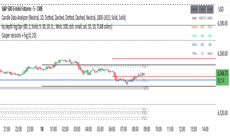
Casper sessions + fvgUpdated version with Asia session lines now drawn correctly.
Timings are correct for futures markets only.
Time adjustment available in settings for other instruments but Asia and London session lines do not print when this option is used.
5 minute opening range should display correctly when on the 1 minute chart
MA Signal IndicatorMA Signal Indicator
The MA Signal Indicator is a customizable designed to identify potential trading opportunities based on price interactions with a Simple Moving Average (SMA). It incorporates risk management features such as stop-loss (SL), take-profit (TP), and breakeven levels, calculated using the Average True Range (ATR). The indicator is visually intuitive, overlaying trade signals, price levels, and colored zones directly on the chart.
Key Features:
1. Moving Average-Based Signals:
• Generates buy (long) signals when the price crosses above a user-defined SMA (default: 55 periods).
• Generates sell (short) signals when the price crosses below the SMA.
• Long and short trades can be independently enabled or disabled via input settings.
2. Risk Management:
• Stop-Loss (SL): Set as a multiple of the ATR (default: 1x ATR) below the entry price for long trades or above for short trades.
• Take-Profit (TP): Set as a multiple of the ATR (default: 5x ATR) above the entry price for long trades or below for short trades.
• Breakeven Level: A trigger level (default: 2x ATR) where traders may choose to move their stop-loss to breakeven, optionally displayed on the chart.
3. Visual Feedback:
• SMA Line: Plotted in orange (default: 55-period SMA) for trend reference.
• Trade Zone: Highlights the area between the stop-loss and take-profit levels with a semi-transparent green (long) or red (short) background.
• Price Lines: Displays entry price (white), stop-loss (red), take-profit (green), and breakeven level (gray, optional) as horizontal lines during active trades.
• Signal Markers: Triangular markers indicate entry points (green triangle up for long, red triangle down for short).
• Exit Markers: Labels show when a trade hits the take-profit (green checkmark) or stop-loss (red cross).
4. Trade Logic:
• Only one trade is active at a time (long or short).
• Trades are exited when either the stop-loss or take-profit is hit, resetting the indicator for the next signal.
• Ensures signals are only triggered when not already in a trade, avoiding duplicate entries.
Inputs:
• MA Period: Length of the SMA (default: 55).
• ATR Period: Period for ATR calculation (default: 5).
• SL Multiplier: ATR multiplier for stop-loss (default: 1.0).
• TP Multiplier: ATR multiplier for take-profit (default: 5.0).
• Move to Breakeven After: ATR multiplier for breakeven trigger (default: 2.0).
• Show Break Even Line: Option to display the breakeven level (default: true).
• Allow Long Trades: Enable/disable long signals (default: true).
• Allow Short Trades: Enable/disable short signals (default: true).
Use Case:
This indicator is ideal for trend-following traders who want a clear, visual system for entering and exiting trades based on SMA crossovers, with predefined risk and reward levels. It suits both manual and automated trading strategies, providing flexibility to adjust parameters for different markets or timeframes.
Notes:
• The indicator is overlaid on the price chart for easy integration with other analysis tools.
• Users should test and adjust parameters (e.g., MA length, ATR multipliers) to suit their trading style and market conditions.
• The breakeven line is a visual guide; manual adjustment of stops is required as the indicator does not automatically modify trade positions.
This indicator provides a robust framework for disciplined trading with clear entry, exit, and risk management visuals.

IU Martingale StrategyDESCRIPTION
This strategy is a Martingale-based trading system that enters a long position based on simple candle patterns and doubles the position size after each loss. It tracks the worst-case drawdown using a live risk matrix table to help traders visualize the downside. With clear profit and loss points, auto position sizing, and a risk visualization table, it’s perfect for backtesting the Martingale concept directly on charts.
WHAT IS MARTINGALE SYSTEM?
The Martingale system is a position-sizing strategy where you double your trade size after every loss, aiming to recover all previous losses with a single profitable trade. It assumes that a winning trade will eventually occur. While it can be high-risk, it’s often used in controlled environments or with high probability setups.
USER INPUTS
📦 Starting Position: Initial position size for the first trade
📈 Profit Points: Target profit in price points
📉 Loss Points: Stop loss in price points
📊 Show Risk Matrix Table: Enable or disable a live table showing current streak and risk stats
LONG CONDITION
A long trade is triggered when the current candle closes higher than it opened, and no open position exists. The condition is simple and used to simulate market entry for testing the Martingale logic.
// Entry Condition:
close > open and no existing position
LONG EXIT
Each trade has a fixed stop-loss and take-profit, based on the user's input:
Stop Loss = Entry Price − Loss Points
Take Profit = Entry Price + Profit Points
The exit is handled using strategy.exit() with these dynamic values.
WHY IT IS UNIQUE
🔁 Implements a dynamic Martingale position sizing system
📊 Includes a visual Risk Matrix Table tracking losing streaks, max size, and risk
📈 Automatically resets position size after a win
🧠 Smart use of array to manage loss history and control logic
🎯 Customizable SL and TP for each entry
🎨 Beautiful chart visuals for entry, stop loss, and target levels
HOW USER CAN BENEFIT FROM IT
🧪 Test the sustainability of a Martingale system with real chart data
👁️ Visualize the risks and impact of consecutive losses
📈 Explore risk vs. reward scenarios before deploying in real markets
🧰 Use it as a base template to build more advanced Martingale or grid-based systems
📚 Great for educational purposes to understand the mathematical drawdowns involved in doubling strategies
Disclaimer :
This Video is not financial advice, it's for educational purposes only highlighting the power of coding( pine script) in TradingView, I am not a SEBI-registered advisor. Trading and investing involve risk, and you should consult with a qualified financial advisor before making any trading decisions. I do not guarantee profits or take responsibility for any losses you may incur.


8 AM & 9 AM NY Candle HighlighterThis indicator helps me to know when the 9am NY candle has closed above or below the previous candle.

Option Auto Anchored VWAPThis indicator automatically shows two Anchored VWAP lines.
The first gets placed on the very first candle of the chart.
The second is set on the last or current day you select in the settings.

T3MA Ribbon Strategy (v6 - Fixed HA) by LKALGOT3MA Ribbon Strategy (v6) by LKALGO
The T3MA Ribbon Strategy helps you catch trends with confidence!
It combines a fast and slow T3 moving average to create a color-filled ribbon that clearly shows bullish (green) and bearish (red) momentum.
✅ Key features:
Smooth trend signals using powerful T3 MAs
Optional Heikin Ashi smoothing for even cleaner trends
Simple, clear BUY and SELL signals on the chart
Alerts included for easy automation
How it works:
Enter long when the ribbon turns green (fast T3 crosses above slow T3)
Exit when it turns red (fast T3 crosses below slow T3)
Works on all timeframes and markets. Perfect for traders who want a simple but effective trend-following system.

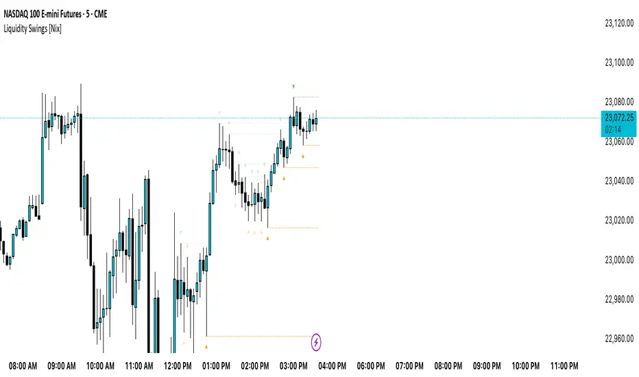
Liquidity Swings [Nix]Liquidity Swings Indicator!
It marks recent swing highs and lows on the chart using lines and labels.
Another great feature is that it tracks whether those swing levels are SWEPT (price crosses them again) and either:
Removes swept levels, or
Fades them to indicate they’ve been taken.
You can customize:
Number of swings shown.
Colors, styles, and visibility of lines/labels.
Whether to show highs, lows, or both.
Useful for liquidity analysis.
Usually when these special swings are swept, you can consider moving stops to BE. This is because there should be enough stop losses at the swing points to liquidate others and give more fuel to your trade direction!
Light MA CrossWhy Use the "GOLDGoalGO" Indicator?
Are you looking for a reliable tool to enhance your gold trading strategy?
Introducing "GOLDGoalGO", a smart and easy-to-use indicator specifically designed to help traders make informed decisions in the gold market.
What Makes "GOLDGoalGO" Stand Out?
* Tailored for Gold (XAUUSD):
Specially optimized to detect crucial trend changes in gold prices, offering you timely signals to buy or sell.
* Precise Entry Points:
Uses smart moving average crossovers to identify the best moments for entry and exit, reducing guessing and improving profitability.
* Real-Time Alerts:
Get instant notifications when buy or sell signals occur—whether you're at your desk or on the go. Never miss a critical trading opportunity again!
* Easy to Use:
Clear visual signals on your chart show exactly when the market is favorable, perfect for both beginners and experienced traders.
* Ideal for Short-Term Trading:
Designed to generate signals on 1-minute charts, helping you capitalize on quick market movements in the fast-paced gold market.
Why Trader's Love It:
* Increase Confidence:
Making trade decisions becomes easier with accurate signals specific to gold trends.
* Save Time:
Automate your analysis—spend less time guessing and more time trading confidently.
* Maximize Profits:
Spot those crucial moments when the price movement is about to turn, giving you a competitive edge.
Start Using "GOLDGoalGO" Today!
Whether you're looking to refine your short-term trading strategy or want a trustworthy tool to guide your trades in gold markets, "GOLDGoalGO" is the perfect addition to your trading arsenal. Try it now and watch your trading confidence and results improve!

GOLDGOGOSIG - 1 Min MA CrossoverWhy Use the "GOLDGoalGO" Indicator?
Are you looking for a reliable tool to enhance your gold trading strategy?
Introducing "GOLDGoalGO", a smart and easy-to-use indicator specifically designed to help traders make informed decisions in the gold market.
What Makes "GOLDGoalGO" Stand Out?
* Tailored for Gold (XAUUSD):
Specially optimized to detect crucial trend changes in gold prices, offering you timely signals to buy or sell.
* Precise Entry Points:
Uses smart moving average crossovers to identify the best moments for entry and exit, reducing guessing and improving profitability.
* Real-Time Alerts:
Get instant notifications when buy or sell signals occur—whether you're at your desk or on the go. Never miss a critical trading opportunity again!
* Easy to Use:
Clear visual signals on your chart show exactly when the market is favorable, perfect for both beginners and experienced traders.
* Ideal for Short-Term Trading:
Designed to generate signals on 1-minute charts, helping you capitalize on quick market movements in the fast-paced gold market.
Why Trader's Love It:
* Increase Confidence:
Making trade decisions becomes easier with accurate signals specific to gold trends.
* Save Time:
Automate your analysis—spend less time guessing and more time trading confidently.
* Maximize Profits:
Spot those crucial moments when the price movement is about to turn, giving you a competitive edge.
Start Using "GOLDGoalGO" Today!
Whether you're looking to refine your short-term trading strategy or want a trustworthy tool to guide your trades in gold markets, "GOLDGoalGO" is the perfect addition to your trading arsenal. Try it now and watch your trading confidence and results improve!


Breaker BlockUpdated version of breaker block indicator with a small change to the Unicorn detection logic

MACD & EMA Cross SignalsMACD and EMA Crossover Signals
-> This tool provides buy and sell signals directly on your chart. It helps you spot action points early.
Symbol Indicators:
"Triangle Up" (Green) shows a positive MACD crossover.
"Triangle Down" (Red) indicates a negative MACD crossover.
"Label Up" (Green) marks a positive EMA crossover.
"Label Down" (Red) signals a negative EMA crossover.
Golden Cross Alerts for MACD and EMAs
-> A "Buy" signal appears when both MACD and EMAs cross positive at the same time.
-> A "Sell" signal shows when both indicators cross negative together.
Option to set custom alerts
-> Golden Buy Signal: Both MACD and EMA cross positive.
-> Golden Sell Signal: Both cross negative.
-> Any Buy Signal: Either MACD or EMA crosses up.
-> Any Sell Signal: Either crosses down.
Note: You can change the values for EMAs, Symbol, and Color in the Settings to fit your needs.

80% Rule BacktestStrategy Overview: 80% Rule Backtest Tool
This strategy tester is designed to validate the classic 80% Rule setup within a defined ETH futures session. Signals are triggered when price reenters the prior day's value area and holds for a qualified duration — targeting the Point of Control (POC) for primary exits, while tracking full value area traversals for research purposes.
- 📅 Session Logic: Anchored to a true 22-hour ETH futures window (5PM–3PM Pacific), with global time zone support
- 🧠 Signal Confirmation: Price must reenter and hold inside value area for ≥ 45 minutes to validate entry
Note: Optimized for 15-minute charts — aligns exactly with traditional rule definition (3-bar hold)
- 🎯 Targets: Primary TP at POC; visual logs for full VAH/VAL reach
- 🔍 Manual Override Mode: Precise SVP-level control when auto logic isn’t preferred
- 🔧 Debug Mode: Single-bar diagnostic labels for development and forward testing
This tool supports both auto-calculated and manually anchored value areas, allowing traders to blend systematic backtesting with discretionary insight.
working on this tool to be used as a strategy tester
