UT Bot Stochastic RSIUT Bot Stochastic RSI is a powerful trading tool designed to help traders identify potential buy and sell signals in the market. This indicator combines the Stochastic and RSI (Relative Strength Index) oscillators, two of the most popular and effective technical analysis tools, to provide a comprehensive view of market conditions.
The Stochastic oscillator is a momentum indicator that compares a security's closing price to its price range over a given time period. The RSI, on the other hand, is a momentum oscillator that measures the speed and change of price movements. By combining these two indicators, the UT Bot Stochastic RSI can help traders identify overbought and oversold conditions, as well as potential trend reversals.
The UT Bot Stochastic RSI also includes an ATR (Average True Range) trailing stop, which can be used to set stop-loss levels and manage risk. This feature is particularly useful in volatile markets, where price movements can be large and unpredictable.
In addition to its powerful technical analysis tools, the UT Bot Stochastic RSI also includes a backtesting feature, allowing traders to test their strategies on historical data. This can help traders identify the most effective settings for the indicator and improve their trading performance.
Overall, the UT Bot Stochastic RSI is a versatile and effective tool for traders of all levels, providing valuable insights into market conditions and helping to improve trading decisions
Educational
Relative Volume (RV)Relative Volume take the volume at a given time of day and compares it to the average volume at that time of day. You can either use the current volume or the cumulative volume in this analysis. You have the option to either see the average and the current volume or a comparative view where you see the percent difference between now and the average.
My implementation of relative volume uses a key-value pair to simplify the process of getting the average volume for the time of day. This reduces the lines of code needed and makes it easier to understand. I have added the normal features you would find in a relative volume indicator with the addition of an average above/below average section for comparing the significance of above/below average moves are. I hope this script is not only useful but educational.
Enjoy

OPEN=HIGH/LOW LabelsIntroduction:
The "OPEN=HIGH/LOW Labels" script is designed to visually indicate instances where the opening price is equal to the high or low price of the candle. It overlays labels on the chart to highlight these conditions, providing traders with additional insights into price action.
Key Features:
Customizable Inputs: Traders can adjust parameters such as the maximum percentage difference between the opening price and the high/low prices, as well as the maximum number of labels to display.
Buy and Sell Conditions: The script defines conditions for both buy and sell scenarios based on whether the low price is equal to or greater than the opening price (indicating potential buying interest) or the high price is equal to or less than the opening price (indicating potential selling interest).
Limited Label Display: To prevent clutter on the chart, the script limits the number of labels displayed by removing older labels when the maximum number is reached.
Usage:
High Price Max % : Adjust this parameter to set the maximum percentage difference allowed between the opening price and the high price of the candle.
Low Price Max %: Set the maximum percentage difference allowed between the opening price and the low price of the candle.
Max Labels: Define the maximum number of labels to be displayed on the chart.
Interpretation:
OL-Buy Label: This label is displayed when the low price of the candle is equal to or greater than the opening price, indicating potential buying interest.
OH-Sell Label: This label is displayed when the high price of the candle is equal to or less than the opening price, suggesting potential selling interest.
Conclusion:
The "OPEN=HIGH/LOW Labels" script is a useful tool for traders to identify instances where the opening price aligns closely with the high or low price of a candle. By customizing parameters and interpreting the labels, traders can gain valuable insights into market sentiment and potential trading opportunities.
Long / Short OI Build Up ntroduction
The "Long / Short OI Build Up" script is designed to identify potential long or short build-up opportunities based on changes in open interest (OI) and price movements. Open interest refers to the total number of outstanding contracts for a financial asset, such as futures or options, that have not been settled. This script provides insights into whether there is a build-up of long positions (bullish sentiment) or short positions (bearish sentiment) in the market.
Script Overview
Indicator Overlay: This script functions as an overlay indicator, meaning it plots its output on the price chart.
Input Customization: Users can customize the symbol for which they want to analyze open interest data. Additionally, they can adjust parameters like the percentage change in open interest and price to define build-up conditions.
Dashboard Display: The script includes a dashboard feature that displays the build-up analysis at a chosen location on the chart.
Build-Up Analysis: Based on the defined criteria, the script identifies whether there is a long build-up (bullish) or short build-up (bearish) scenario. It calculates the change in open interest and price and compares them against user-defined thresholds.
Table Visualization: The results of the analysis are presented in a table format, showing the build-up type, percentage change in open interest, and percentage change in price.
Usage
Override Symbol: Users can choose to override the default symbol for analysis by selecting this option and entering the desired symbol.
Price Change Percentage: Set the percentage change in price that should trigger a build-up signal.
OI Change Percentage: Define the percentage change in open interest necessary to signal a build-up scenario.
Dashboard Location: Choose the location on the chart where the build-up analysis table will be displayed (options include Top Right, Bottom Right, and Bottom Left).
Interpretation
Build Up: Indicates whether there is a long build-up (green) or short build-up (red) based on the defined criteria.
OI Change: Shows the percentage change in open interest relative to the previous value. Positive values are highlighted in green, indicating an increase, while negative values are highlighted in red, indicating a decrease.
Price Change: Displays the percentage change in price relative to the previous close. Positive values are highlighted in green for price increase, while negative values are highlighted in red for price decrease.
Conclusion
The "Long / Short OI Build Up" script provides traders with valuable insights into potential bullish or bearish build-up scenarios based on changes in open interest and price movements. By customizing parameters and visualizing the analysis on a chart dashboard, traders can make more informed decisions regarding their trading strategies.

Index Generator [By MUQWISHI]▋ INTRODUCTION :
The “Index Generator” simplifies the process of building a custom market index, allowing investors to enter a list of preferred holdings from global securities. It aims to serve as an approach for tracking performance, conducting research, and analyzing specific aspects of the global market. The output will include an index value, a table of holdings, and chart plotting, providing a deeper understanding of historical movement.
_______________________
▋ OVERVIEW:
The image can be taken as an example of building a custom index. I created this index and named it “My Oil & Gas Index”. The index comprises several global energy companies. Essentially, the indicator weights each company by collecting the number of shares and then computes the market capitalization before sorting them as seen in the table.
_______________________
▋ OUTPUTS:
The output can be divided into 3 sections:
1. Index Title (Name & Value).
2. Index Holdings.
3. Index Chart.
1. Index Title , displays the index name at the top, and at the bottom, it shows the index value, along with the daily change in points and percentage.
2. Index Holdings , displays list the holding securities inside a table that contains the ticker, price, daily change %, market cap, and weight %. Additionally, a tooltip appears when the user passes the cursor over a ticker's cell, showing brief information about the company, such as the company's name, exchange market, country, sector, and industry.
3. Index Chart , display a plot of the historical movement of the index in the form of a bar, candle, or line chart.
_______________________
▋ INDICATOR SETTINGS:
(1) Naming the index.
(2) Entering a currency. To unite all securities in one currency.
(3) Table location on the chart.
(4) Table’s cells size.
(5) Table’s colors.
(6) Sorting table. By securities’ (Market Cap, Change%, Price, or Ticker Alphabetical) order.
(7) Plotting formation (Candle, Bar, or Line)
(8) To show/hide any indicator’s components.
(9) There are 34 fields where user can fill them with symbols.
Please let me know if you have any questions.
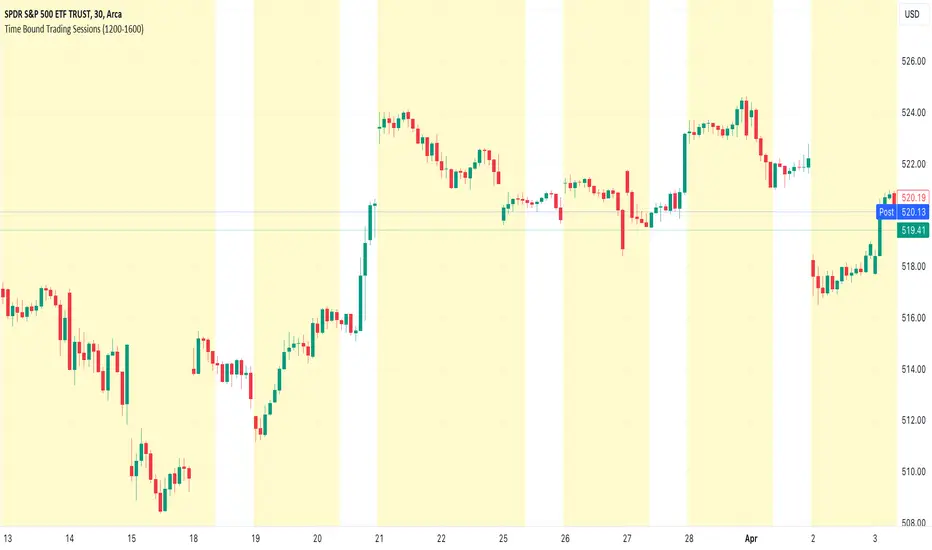
Time Bound Trading SessionsTime Bound Trading Sessions allows to add time bound conditions to your trading sessions given a date range , a time range and/or days of the week .
This indicator can be very handy if you want to control your trading sessions along those three time boundaries, applying them together and/or separately.
Feel free to reuse this code in your own strategy, and leverage the inSession condition as needed.
Features
+ It allows for date range start and/or end to be set.
+ It allows for session time range to be set.
+ It allows for days of the week to be set.
+ It applies chart background color if we are not within the given time bound session parameters.
+ It includes turn on/off functionality.
Settings
Date Range
+ {Start} checkbox: turns on/off start date
+ {Start} date/time
+ {End} checkbox: turns on/off end date
+ {End} date/time
Time Range
+ {Session} checkbox: turns on/off session time range
+ {Session} time range
Days
+ {M} checkbox: turns on/off Mondays
+ {T} checkbox: turns on/off Tuesdays
+ {W} checkbox: turns on/off Wednesdays
+ {T} checkbox: turns on/off Thursdays
+ {F} checkbox: turns on/off Fridays
+ {S} checkbox: turns on/off Saturdays
+ {S} checkbox: turns on/off Sundays
Equity CurveAn equity curve is a graphical representation of the change in the value of a trading account over a time period. The equity curve is a direct reflection of a trading strategy's effectiveness. A consistently upward-trending equity curve indicates a successful strategy, while a flat or declining curve may signal the need for adjustment.
This indicator takes traders daily account values as a comma separated list, and creates an equity curve and simple moving average of the equity curve. This serves as a mirror reflecting the outcome of past actions and decisions, guiding traders in fine-tuning their strategies, managing risk more effectively, and ultimately striving towards a consistently profitable trading journey.
New equity values should be added to the end of the current list. A space or no space after the comma has no effect.
Importance of the Equity Curve
Strategy Evaluation: The equity curve is a direct reflection of a trading strategy's effectiveness over time. A consistently upward-trending equity curve indicates a successful strategy, while a flat or declining curve may signal the need for adjustment.
Risk Management: Monitoring the equity curve helps traders to see the impact of their risk management practices. Sudden drops in equity could highlight instances of excessive risk-taking or inadequate stop-loss settings.
Performance Benchmarks: Comparing the equity curve against benchmarks or desired performance goals allows traders to assess if they are meeting, exceeding, or falling short of their trading objectives.
Psychology: Trading is as much about psychology as it is about strategy. A visual representation of one's equity curve helps maintain discipline, encouraging adherence to a trading plan during downturns and preventing overconfidence during upswings.
Having this data visually allows traders to see which category of trader they fall into.
Unprofitable
Boom or Bust
Profitable
Statistical Data
The indicator not only plots the equity curve and moving average, but includes the option to display the highest value reached by the equity curve, the percentage difference from the peak, and performance over selected periods (All Time, YTD, QTD, MTD, WTD).
Historical Analysis
The Equity Curve Indicator is not just a tool for real-time monitoring of trading performance; it also serves as a powerful instrument for conducting historical analysis. By analyzing the equity curve in conjunction with historical market conditions, traders can identify patterns or triggers that resulted in significant gains or losses.
For example, the chart below shows the equity curve overlaid on periods of net new highs / lows. The equity curve experienced declines while the market was showing net new lows or choppy periods (represented by a red or white background), while most of the equity gains were made while net new highs were present (green background).
This retrospective analysis helps in understanding how different market conditions impact trading strategies and performance.
Trading the Equity Curve
All trading strategies produce an equity curve that has winning and losing periods. In the example above, the trader could introduce a simple rule to lighten up on long positions or move to cash during periods of net new lows.
Another simple rule could be introduced to stop trading if the equity curve falls below the moving average, until favorable market conditions return again.
This indicator is intended to be used on the daily timeframe.

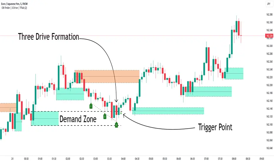
Smart Money Setup 04 [TradingFinder] Three Drive (Harmonic) + OB🔵 Introduction
The "Three Drive" pattern is a well-known formation in technical analysis, recognized for its ability to signal potential trend reversals in price action. Within the realm of trading, particularly in the context of "Reversal Patterns," the Three Drive pattern holds significance as a reliable indicator of shifts in market sentiment.
🟣 Bullish 3 Drive
This pattern typically manifests at a price bottom, where a sequence of lower lows suggests a prevailing negative trend. However, within the structure of the Three Drive pattern, a notable occurrence unfolds.
The second low breaches the range of the first low, followed by the third low surpassing the range of the second low. These penetrations signify a diminishing selling pressure and an emerging buying interest.
Traders often await the confirmation of the third low surpassing the second low as an entry point, with price targets set at the highs formed within the Three Drive pattern.
🟣 Bearish 3 Drive
Conversely, the Bearish Three Drive pattern emerges at a price top, characterized by a sequence of higher highs indicating an upward trend. Yet, amidst this apparent bullish momentum, a shift occurs.
The second high breaks beyond the range of the first high, succeeded by the third high exceeding the range of the second high. These breaches signify a waning buying strength and a resurgence in selling pressure.
Entry into a trade is often executed after the confirmation of the third high surpassing the second high, with targets set at the lows formed within the Three Drive pattern.
Importance :
Understanding the Three Drive pattern's significance extends beyond mere technical analysis. It bears resemblance to other established patterns, such as the Harmonic Pattern and Ending Diagonal within the Elliott Wave Theory.
Recognizing these parallels aids traders in comprehending broader market dynamics and potential price movements.
🔵 Formation of 3 Drive in Order Block Zone
The convergence of the Three Drive pattern with the concept of the Order Block Zone introduces a nuanced layer to traders' analytical approach.
In "Price Action" methodology, Order Blocks represent areas on the price chart where significant market players, such as institutional traders, have executed notable orders.
These zones often act as barriers, with price encountering resistance or support upon reaching them.
When the Three Drive pattern forms within an Order Block Zone, it signifies a confluence of market dynamics.
The completion of the pattern within this zone suggests a potential reversal in the prevailing trend, augmented by the presence of significant institutional orders.
Traders incorporate these Order Blocks into their analysis to identify probable levels where price may change direction, enhancing the reliability of their trading decisions.
🔵 How to Use :
To effectively utilize the Three Drive pattern within the Order Block Zone, traders seek alignment between the completion of the pattern and the presence of significant Order Blocks.
This convergence enhances the reliability of the pattern's signals, increasing the likelihood of successful trade outcomes.
Bullish Three Drive in Demand Zone :
Bearish Three Drive in Supply Zone :
Settings :
You can set your desired "Pivot Period" via settings for the indicator to identify setups based on it.
Evolving RThe "Evolving R" script is a script that allows to calculate a dynamic reward-to-risk ratio at any given point of time during the trade. Its fundamentals are based on Tom Dante's concept of an evolving reward-to-risk. The script requires a user to input their preferred stop loss price and the target price for a specific asset, and calculates the ratio between two differences: (a) the absolute difference between the target price and the current price and (b) the absolute difference between the stop loss price and the current price.
The output of the script displays the ratio discussed as a value called "Evolving R" in the table. In order to use it successfully, the user of the script has to input:
(a) Stop loss price for the asset
(b) Target price for the asset
Theoretically, as long as the evolving R value holds above or equal to 0.25, the trade is worth holding. However, if the evolving R value drops below 0.25, the table turns red and signifies that such a trade possesses more risk than there is a reward remaining: this alerts the user to possibly take profits prematurely without risking their unrealized gains for a minor amount of additional gain.
The graphics of the script are represented by green and red areas: the green area indicates the area between the current price and the target price, while the red area shows the distance between the current price and the stop loss price. This visual representation allows users to understand the relative reward-to-risk ratio graphically in addition to the given evolving R value output.
The script is used for any type of trading: whether trend-trading or in a ranging market, it doesn't suggest a user which market conditions they should use.

NCI Trading Plan Direction - By LightNCI"NCI Trading Plan Direction" is a trading plan for traders who wants to keep track their overview of market direction across multiple timeframes and assets. REMINDER: THIS IS NOT AN AUTOMATION. You need to analyse yourself and then change the buy or sell on the table for your own monitor.
Features:
1. Multi-Timeframe Monitor: Easily monitor the directional bias between higher (HTF) and lower timeframes (LTF).
2. Customisable Asset Tracking: Monitor up to 10 assets simultaneously, with the flexibility to display only those relevant to your trading plan.
3. Dynamic Color Coding: Instantly identify market direction with your on colour-coded direction, distinguishing between bullish (Buy) and bearish (Sell) movements for quick decision-making.
4. User-Friendly Interface: A clean, intuitive design ensures all critical information is at your fingertips, seamlessly integrating into your chart for minimal distraction.

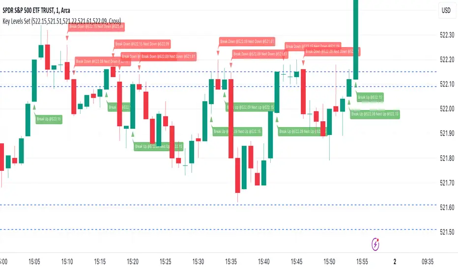
Key Levels SetKey Levels Set allows to set key levels as comma separated values, and to detect breaks to the downside and/or upside, taking into account potential gaps between bars.
This indicator can be very handy if you, like me, rely on some key levels that you identified as potential support/resistance from some technical analysis.
Features
+ It allows for key levels to be set as comma separated values.
+ It draws key levels on chart.
+ On close, it identifies highest key level that has been broken to the upside, if any.
+ On close, it identifies lowest key level that has been broken to the downside, if any.
+ In Cross mode, as bar is printing, it also detects highest/lowest key levels being broken to the upside/downside between bar high and low, if any.
+ It plots and labels breaks with current level and next level information.
+ It includes alerts from breaks on close.
+ It includes turn on/off functionality.
Settings
+ {Prices} checkbox: turns on/off entire functionality
+ {Prices} text field: comma separated values for key levels
+ {Breaks on} checkbox: turns on/off breaks detection functionality
+ {Breaks on} options: selects Close or Cross mode
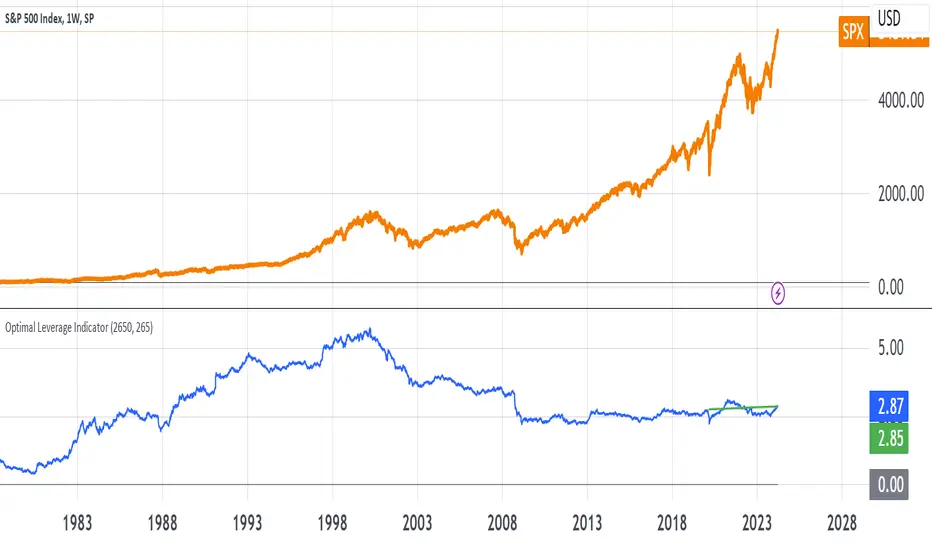
Optimal Leverage IndicatorThe goal of this indicator is to calculate and visualize the optimal leverage and average leverage for a given security based on its historical price data. The optimal leverage is determined by analyzing the relationship between the annualized return and annualized volatility of the security over a specified lookback period.
The methodology can be broken down into the following steps:
Data Input:
The script takes two user inputs: the lookback period and the number of annual trading days.
The lookback period determines the number of historical data points used in the calculations.
The number of annual trading days is used to annualize the return and volatility metrics.
Daily Returns Calculation:
The script retrieves the closing prices of the security on a daily timeframe.
It calculates the daily returns by comparing the current close price with the previous close price.
Mean Return and Volatility Calculation:
The script calculates the mean daily return by taking the simple moving average (SMA) of the daily returns over the specified lookback period.
It also calculates the volatility by taking the standard deviation of the daily returns over the same lookback period.
Annualized Return and Volatility Calculation:
The mean daily return is annualized by compounding it over the number of annual trading days.
The daily volatility is annualized by multiplying it by the square root of the number of annual trading days.
Optimal Leverage Calculation:
The optimal leverage is calculated using the formula: Optimal Leverage = Annualized Return / (Annualized Volatility)^2
This formula assumes that the optimal leverage is proportional to the ratio of the annualized return to the square of the annualized volatility. This is based in this paper: papers.ssrn.com
Average Leverage Calculation:
The script calculates the average leverage by taking the simple moving average (SMA) of the optimal leverage over the specified lookback period.
This provides a smoothed representation of the optimal leverage over time.
The script plots two lines on the chart:
The optimal leverage line (blue) represents the calculated optimal leverage values over time.
The average leverage line (green) represents the average of the optimal leverage values over the specified lookback period.
The main idea behind this methodology is to determine the optimal leverage based on the historical risk-return characteristics of the security. By analyzing the relationship between the annualized return and volatility, the script aims to identify the leverage level that maximizes the return relative to the risk.
The average leverage line provides a smoothed representation of the optimal leverage over time.
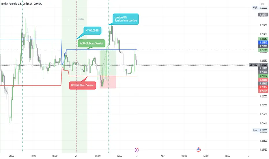
Globbex Session IdTThis indicator allows you to visualize a specific period of time, marking the maximums and minimums they have had.
Additionally, it marks the change of day (NY Time).
The base configuration that the Indicator brings, shows the Globbex session, obtaining the maximum and minimum that it has had.
Marks the London/NY Session Intersection.
Settings
Inputs
Session
Globbex Session Idt
• From HH:MM
• To HH:MM
Globbex Session Check box
o Shows or Hide Session
Display Hour
• Mark - Number of hours after Globbex Session Ends
• We use it to shows the London/NY Session Intersection
Timezone Offset UTC – 4 NY
DIVIDERS
Daily Divider Check box
Style
Background Color checkbox
o Shows or Hide Session
o Can choose the background color
Globbex Low checkbox
o Shows or Hide Low Line
o Can choose the Low Line color
Globbex High checkbox
o Shows or Hide High Line
o Can choose the High Line color
Session LiquidityDescribes if markets are liquid enough for institutions to manipulate. Its often difficult to determine if markets will trend or chop, but by looking at how much volume we have at the open, we can determine of the session will be choppy or trendy, and take trades based on that.
Settings predefined for 1m timeframe on SPY. May work with other tickers, but I have not tested it out yet.
Designed for stocks(as of now, may update later)

Divergence Detector [TradingFinder] RSI + MACD + AO Oscillator 🔵 Introduction
🟣 Understanding Divergence
As mentioned, divergence occurs in technical analysis when a stock's price behaves contrary to indicators on the price chart. Divergence can signify either a reversal of the stock's trend or a continuation of the previous trend correction.
Divergences can act as reversal patterns or continuation patterns. Moreover, divergences can be utilized to identify potential support and resistance levels.
For instance, when an indicator is trending upwards and positive, but the price is declining and trending downwards, divergence occurs. Divergence in a stock indicates trader indecision in buying and selling and warns traders to reconsider their decisions regarding buying or holding the stock.
Divergence aids analysts in identifying critical price points. In indicator divergences, it serves as a potent signal in the realm of technical analysis.
🟣 Types of Divergence
1.Regular Divergence
o Positive Regular Divergence (RD+)
o Negative Regular Divergence (RD-)
2.Hidden Divergence
o Positive Hidden Divergence (HD+)
o Negative Hidden Divergence (HD-)
3.Time Divergence
Key Note : This indicator is specifically designed to identify "Regular Divergence" only. Therefore, the following explanation pertains to this type of divergence.
🔵 Regular Divergence/Convergence
Regular Divergence(Convergence) occurs due to conflicting behavior between the indicator and the price chart, typically at the end of a trend. Recognizing Regular Divergence suggests an anticipation of a trend reversal or a pattern resembling a reversal.
🟣 Positive Regular Divergence (RD+)
In contrast to negative divergence, positive Regular Divergence occurs at the end of a downtrend and between two price lows. It manifests when the price forms a new low on the price chart, but the indicator fails to recognize it.
Positive Regular Divergence indicates strong buying pressure and weak selling pressure. Following the identification of positive divergence on the chart, one can anticipate a price increase for the examined stock.
🟣 Negative Regular Divergence (RD-)
This type of Regular Divergence emerges between two price highs during an uptrend. A new high is formed on the price chart, but the indicator fails to acknowledge it. This scenario indicates negative Regular Divergence.
The likelihood of a subsequent market downturn is high. Negative divergence signifies strong selling pressure and weak buying pressure, suggesting an unfavorable future for the stock.
🔵 How to use
By utilizing the "Fractal Period" input, you can specify your desired periods for identifying divergences.
Additionally, through the "Divergence Detect Method" feature, you can choose which oscillators (MACD, RSI, or AO) to base divergence identification on.
Divergence in MACD Oscillator :
Divergence in the MACD indicator occurs when the price chart and the MACD line form a noticeable opposing pattern, meaning the price moves contrary to the MACD line. In this scenario, one expects a reversal in price direction.
Divergence in RSI Oscillator :
If divergence occurs during a downtrend on the price chart (two consecutive lows, with the second low being lower) and on the corresponding RSI point (two consecutive lows, with the second low being higher), it signifies positive Regular Divergence and implies a buying signal.
Conversely, if divergence occurs during an uptrend on the price chart (two consecutive highs, with the second high being higher) and on the corresponding RSI point (two consecutive highs, with the second high being lower), it indicates negative Regular Divergence, signaling a selling opportunity.
Divergence in AO Oscillator :
The AO indicator calculates histograms similar to the AO base. It calculates the difference between the simple moving averages of 5 and 34 periods based on the median of each bar. Then, it plots the bars based on the difference.
It then compares the histograms to detect peaks and troughs in the AO histograms and compares the identified peaks and troughs to the price. Whenever divergence is detected, it plots lines and arrows.
🔵 Table
The table contains information on the functional features of this oscillator that you can utilize. Four categories of information are presented in the table: "Exist," "Consecutive," "Divergence Quality," and "Change Phase Indicator."
Exist :
If divergence exists, you'll see "+" in this row.
Consecutive :
Divergences may occur consecutively. If same-type divergences form within short intervals, you can observe the count in this row.
Divergence Quality : Based on the number of consecutive divergences, their quality can be evaluated. If one divergence exists, its quality is considered "Normal." If two divergences exist, the quality is "Good," and if three or more divergences exist, the quality is considered "Strong."
Change Phase Indicator : If a phase change occurs between two oscillation peaks formed based on divergence, this change is identified and displayed in this row.

PositionCalculatorPositionCalculator is a simple position calculator that helps to calculate position size or lot size based on custom settings. The calculation result is presented as a table on the chart screen.
Settings description:
MAIN SECTION:
Risk level in percentage
Account size
Entry price
Stop price
Take Profit
FOREX SETTINGS are in addition to the main:
- Exchange rate (default value = 1) - is applied if account currency is to other base currency.
If account currency is the base currency in the pair, the exchange rate should be 1.
- Reverse exchange rate flag - is used for pairs that don't contain account currency.
For example, the account currency is USD, trade pair is GBP/AUD
in this case exchange rate should be defined for AUD/USD in the corresponding field and
"Reverse exchange rate" flag should be set.
- Lot size - is the size of the lot that is used for specific currency (Should be taken from Broker,
the default value is 100 000)
TABLE SECTION
- Dark mode flag - defines the color of the table text according to the user color mode
(black/white)
- Position of table - the result table can be presented in four different places (top_left,
top_right, bottom_left, bottom_right)