TOTrading Divergence HunterDivergence Hunter - Low timeframe scalper
It uses SFP, momentum and moneyflow divergence momentum divergences with ADX filter.
Recommended TP1 is at 0.4% (55% of starting positsion size), TP2 is at 0.9% (25% of starting positsion) and SL is at 0.8%
Script also has all working alerts and is ideal for using bot.
I'm using it with OKX signal bot and it's scalping great.
It's v1 version and still in development, but stats are looking great with good settings.
Try it out for free!
M-oscillator

Tsallis Entropy Market RiskTsallis Entropy Market Risk Indicator
What Is It?
The Tsallis Entropy Market Risk Indicator is a market analysis tool that measures the degree of randomness or disorder in price movements. Unlike traditional technical indicators that focus on price patterns or momentum, this indicator takes a statistical physics approach to market analysis.
Scientific Foundation
The indicator is based on Tsallis entropy, a generalization of traditional Shannon entropy developed by physicist Constantino Tsallis. The Tsallis entropy is particularly effective at analyzing complex systems with long-range correlations and memory effects—precisely the characteristics found in crypto and stock markets.
The indicator also borrows from Log-Periodic Power Law (LPPL).
Core Concepts
1. Entropy Deficit
The primary measurement is the "entropy deficit," which represents how far the market is from a state of maximum randomness:
Low Entropy Deficit (0-0.3): The market exhibits random, uncorrelated price movements typical of efficient markets
Medium Entropy Deficit (0.3-0.5): Some patterns emerging, moderate deviation from randomness
High Entropy Deficit (0.5-0.7): Strong correlation patterns, potentially indicating herding behavior
Extreme Entropy Deficit (0.7-1.0): Highly ordered price movements, often seen before significant market events
2. Multi-Scale Analysis
The indicator calculates entropy across different timeframes:
Short-term Entropy (blue line): Captures recent market behavior (20-day window)
Long-term Entropy (green line): Captures structural market behavior (120-day window)
Main Entropy (purple line): Primary measurement (60-day window)
3. Scale Ratio
This measures the relationship between long-term and short-term entropy. A healthy market typically has a scale ratio above 0.85. When this ratio drops below 0.85, it suggests abnormal relationships between timeframes that often precede market dislocations.
How It Works
Data Collection: The indicator samples price returns over specific lookback periods
Probability Distribution Estimation: It creates a histogram of these returns to estimate their probability distribution
Entropy Calculation: Using the Tsallis q-parameter (typically 1.5), it calculates how far this distribution is from maximum entropy
Normalization: Results are normalized against theoretical maximum entropy to create the entropy deficit measure
Risk Assessment: Multiple factors are combined to generate a composite risk score and classification
Market Interpretation
Low Risk Environments (Risk Score < 25)
Market is functioning efficiently with reasonable randomness
Price discovery is likely effective
Normal trading and investment approaches appropriate
Medium Risk Environments (Risk Score 25-50)
Increasing correlation in price movements
Beginning of trend formation or momentum
Time to monitor positions more closely
High Risk Environments (Risk Score 50-75)
Strong herding behavior present
Market potentially becoming one-sided
Consider reducing position sizes or implementing hedges
Extreme Risk Environments (Risk Score > 75)
Highly ordered market behavior
Significant imbalance between buyers and sellers
Heightened probability of sharp reversals or corrections
Practical Application Examples
Market Tops: Often characterized by gradually increasing entropy deficit as momentum builds, followed by extreme readings near the actual top
Market Bottoms: Can show high entropy deficit during capitulation, followed by normalization
Range-Bound Markets: Typically display low and stable entropy deficit measurements
Trending Markets: Often show moderate entropy deficit that remains relatively consistent
Advantages Over Traditional Indicators
Forward-Looking: Identifies changing market structure before price action confirms it
Statistical Foundation: Based on robust mathematical principles rather than empirical patterns
Adaptability: Functions across different market regimes and asset classes
Noise Filtering: Focuses on meaningful structural changes rather than price fluctuations
Limitations
Not a Timing Tool: Signals market risk conditions, not precise entry/exit points
Parameter Sensitivity: Results can vary based on the chosen parameters
Historical Context: Requires some historical perspective to interpret effectively
Complementary Tool: Works best alongside other analysis methods
Enjoy :)

ADX & Angle Strength📌 Indicator Overview – ADX Angle Strength
This script merges the power of the traditional ADX with a visual interpretation of the angular slope of a moving average, offering a highly effective tool to identify real impulses in price action. The goal of the indicator is not only to highlight market strength, but to reveal direction and slope —helping traders spot the end of impulses, consolidation zones, and potential reversal points.
This script does not aim to replace or compete with ADX, but instead highlights a lesser-used metric: the true angular slope of a moving average as a functional and interpretable force component. Rather than relying exclusively on traditional strength tools, it introduces an immediate, intuitive, and quantifiable way to observe trend steepness — reinforced by a robust metric like ADX.
The author considers both perspectives valuable. While ADX remains an integral part of their technical analysis, greater attention is often given to the angles formed by price-tracking moving averages, as they offer faster insight into trend acceleration. This dual-approach — with one reactive and one confirmatory signal — makes ADX & AngleStrength a practical, clear, and flexible tool for analyzing market momentum from two synchronized yet distinct vantage points.
Key user-configurable options:
- Display of ADX lines (DI+, DI−, zero line, lines 20, 25, 50, and 75)
- ADX length and smoothing
- Moving average type (SMA, EMA, WMA, HMA, ALMA)
- Length, source, color, and style of the angle calculation
- Minimum angle threshold to define color changes (slope comparison)
This indicator is highly sensitive and allows users to visualize:
- Range zones via flat angles (yellow)
- Bullish or bearish impulses through positive or negative slopes (green and red)
- Convergences or divergences relative to traditional ADX strength
📘 Single Real-World Example: Step-by-Step Interpretation
In this section, we’ll walk through a single real-world example on a 1-hour chart, divided into five key moments marked by vertical lines labeled A, B, C, D, and E. Each line identifies a specific point in the movement of price and indicator behavior. We’ll move through the chart step-by-step, explaining what happens between each line and how each indicator responds.
Before Line A: The setup
The chart shows a slight upward movement in the price, though not particularly strong. This section doesn’t have any lines marked yet but sets the foundation for what’s coming next.
The ADX is falling, dropping below the 20-level threshold, which usually signals weakening market momentum. However, the angle indicator, which is more sensitive, starts pointing upward, detecting an increase in slope as the price begins climbing.
This early upward tilt is what we call a rising angle, suggesting the market is gaining slope.
🅰 Line A: First peak
As the upward move completes, a peak forms right at Line A. The angle at that moment reaches +44.70°, showing a relatively strong upward slope.
After Line A:
- Price stalls, entering a sideways range — a classic consolidation.
- The angle indicator begins to fall, because price action no longer has a strong slope.
- The ADX, however, keeps rising, continuing even after the angle begins to decline. It reaches a peak at 35.6, then gradually drops to 15.13, reflecting that the trend’s strength has faded.
🅱 Line B: Sharp drop
Following the sideways range after Line A, the price breaks downward with a strong bearish candle.
This is where the second peak happens — but this time it's a negative angle, as price drops quickly. The angle reaches -48.45°, clearly marking the end of this quick bearish impulse.
At the same moment:
- The ADX, recovering from its earlier drop, reaches 21.83 and continues rising after the angle has peaked.
- This shows that while the angle detects the end of the move, the ADX is still registering the momentum that just occurred — a bit delayed, but confirming.
🅲 Line C: Key turning point
After the drop at Line B, price moves sideways again. During this range:
- The angle gradually declines and enters a yellow zone, indicating low slope or momentum.
But at Line C, everything changes. Unlike the other lines, Line C does not mark a peak, but rather the beginning of a stronger downward move.
From here:
- Price breaks through the range and continues falling — this marks the start of a stronger trend.
- The angle indicator shows a sequence of five descending peaks, tracking the steepening drop in price:
1. 26.47°
2. 40.64°
3. 35.87°
4. 38.71°
5. 66.3° (the steepest)
- The ADX starts rising in parallel, confirming the growing strength of the trend.
🅳 Line D: Bottom and reversal
At Line D, price reaches a bottom — a point of exhaustion marked by high volume, sometimes known as a volume climax or stopping volume.
- The angle reaches its steepest reading so far: 66.3° negative.
- The ADX keeps rising for two more candles after this angle peak, then begins to fall — revealing that the angle catches the momentum shift earlier.
🅴 Line E: Bullish reversal and final peak
After the low at Line D, price begins to rise steadily. The angle responds immediately, tilting upward again.
At Line E, we get the final peak, this time positive, as the bullish move reaches its climax. The angle here is +71.64° — the highest reading in the entire example.
Meanwhile:
- The ADX is still falling at this point, having peaked two candles after Line D and never recovering in time to catch this bullish push.
- Once again, the angle proves more responsive to changes in price behavior, especially at the end of impulses.
⚠️ Compatibility and Intended Use
This indicator is specifically designed to be used on Binance charts, as it is intended for the analysis of cryptocurrency markets, and Binance exclusively operates with crypto assets. It has been optimized for the following timeframes:
- 1 minute
- 5 minutes
- 15 minutes
- 30 minutes
- 1 hour
- 4 hours
- 1 day
These intervals were selected based on the internal architecture used for angle computation. As such, the indicator will not display any data outside of these supported timeframes or on non-Binance assets. Attempting to apply it beyond those conditions will produce a blank chart by design.
👤 Author
This indicator was developed as part of a visual technical analysis project focused on capturing true momentum through combined signals.
📄 User guide available in both Spanish and English for clarity and learning.

SupertrendWill generate Good Signals but be remembered that you can only use when Breakout market is there

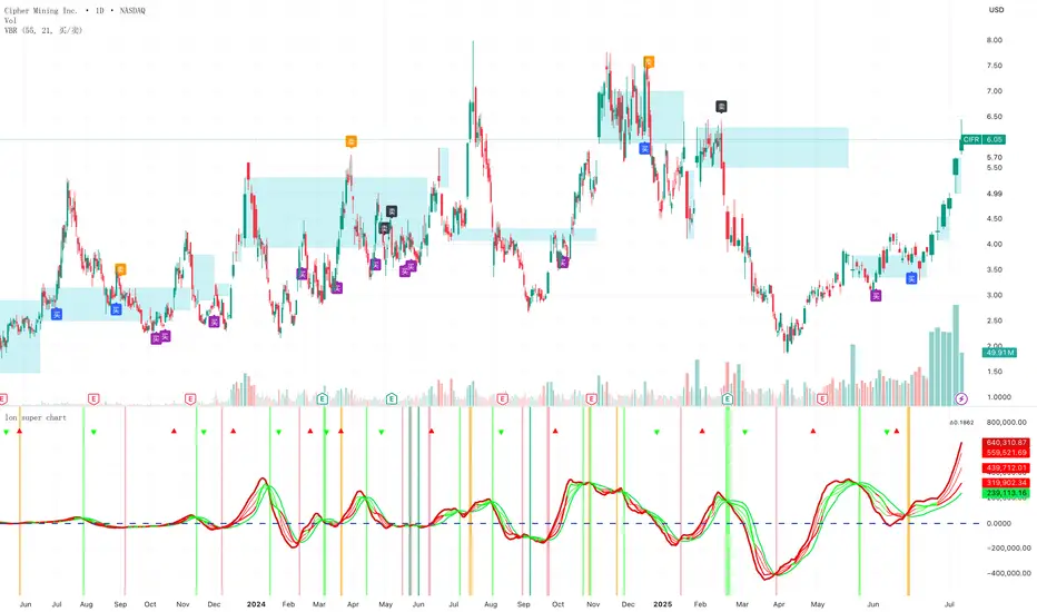
Volume bar range# Volume Bar Range (VBR) Indicator
## Overview
The Volume Bar Range indicator identifies key support and resistance levels based on high-volume price bars. It creates a visual range that represents significant price levels where the market has shown strong interest through volume confirmation.
## Features
### Visual Range Display
- **Blue/Aqua Area**: Shows the price range of the highest volume bar within the lookback period
- **Dynamic Color**: The fill color changes to indicate whether the range is stable (aqua) or newly updated (white)
- **Boundary Lines**: Invisible white lines mark the upper and lower boundaries of the range
### Trading Signals
- **BUY Signal**: Blue upward arrow appears when price breaks above the resistance level with volume confirmation
- **SELL Signal**: Black downward arrow appears when price breaks below the support level with volume confirmation
## How to Use
### Setup
1. Apply the indicator to any chart
2. The indicator automatically identifies the highest volume bar in the last 55 periods
3. The price range of this high-volume bar becomes your support/resistance zone
### Trading Strategy
- **Range Trading**: Trade within the identified support/resistance range
- **Breakout Trading**: Enter positions when price breaks above resistance (BUY) or below support (SELL)
- **Volume Confirmation**: Only take signals when current volume exceeds the 21-period average
### Signal Interpretation
- **BUY Signal**: Price closes above the resistance level with above-average volume
- **SELL Signal**: Price closes below the support level with above-average volume
- **No Signal**: Price remains within the range or volume is insufficient
## Key Parameters
- **Lookback Period**: 55 bars (automatically identifies the highest volume bar)
- **Volume MA**: 21-period simple moving average for volume confirmation
- **Signal Size**: Tiny markers to avoid chart clutter
## Best Practices
- Use on multiple timeframes for confirmation
- Combine with other technical indicators for stronger signals
- Pay attention to the color changes in the range area
- Consider market context and overall trend direction
## Ideal Markets
- Works well on liquid markets with consistent volume patterns
- Effective on stocks, forex, and crypto markets
- Best suited for swing trading and medium-term analysis
This indicator is particularly useful for traders who rely on volume analysis and want to identify key price levels where the market has shown significant interest.
波段过滤器 V4Core Features
Based on an enhanced WaveTrend (WT) oscillator, this tool quantifies the degree of “momentum deviation” from short-term price averages in real time.
Fixed ±threshold levels divide conditions into three tiers: Mild / Moderate / Strong overbought-oversold zones, visually marked with red/green bricks placed outside the threshold lines.
Optional built-in ATR volatility filter to eliminate false extremes in low-volatility areas.
Automatically generates two alert conditions (WT_Box_Over / WT_Box_Under) compatible with TradingView push notifications or Webhooks.
How to Use
Apply to any timeframe from 5-minute to weekly charts.
Fine-tune sensitivity in 3 seconds using four intuitive sliders: n1/n2, threshold, tier step size, and ATR ratio.
When two consecutive bricks appear together with a top/bottom divergence, it signals a high-probability mean reversion zone.
Ideal for: Short-term momentum traders, swing traders, and trend followers who rely on visual “extreme condition alerts.”

Fair Value Z Gauge📊 Fair Value Z Gauge Indicator Description
- This indicator visually represents whether the price is relatively overvalued or undervalued compared to a specific moving average (MA) using a Z-score normalization approach.
- When the Z-score is around 0, it can be interpreted statistically as fair value or "fair price."
✅ Key Concept
- Price-to-MA ratio (p_ratio): Calculated by dividing the price by the MA and then subtracting 1, this shows the relative deviation from the moving average.
- Z-score normalization: p_ratio is divided by its 200-period standard deviation, making it easy to identify statistically significant overbought or oversold zones.
✅ Default & User Inputs
- Default MA period (100, DEMA by default)
- Selectable MA types: EMA, SMA, WMA, VWMA, RMA, DEMA, TEMA, ZLEMA, HMA
- Upper/lower threshold levels (h_level: 3, l_level: -1.5)
- Signal line period (default: 100) and line thickness
✅ Visualization
- Z-score line: Red gradient for overbought, aqua/green gradient for oversold zones
- Signal line: SMA of p_ratio for trend confirmation
- Upper/lower threshold lines: Clearly indicate risk and undervaluation zones
- Fill highlights: Visual emphasis when crossing thresholds
- Bar color: Automatically adjusts based on Z-score status
- Table: Displays real-time p_ratio value
✅ Swing Trading Strategy Interpretation & Usage
- Upper red peak: Overbought zone → Mandatory profit-taking or sell signal
- Lower blue bottom: Undervalued zone → Mandatory buy signal
- Line dropping toward 0: Ideal for gradual, phased entries (scaling in)
- Signal line: Helps confirm overall trend and entry/exit timing
💡 Usage Ideas
- Enables clear, quantified entry/exit strategies based on statistical overextension
- Allows for various MA combinations to define personalized "fair value" levels
- Ideal for scaling in/out and portfolio rebalancing strategies
copyright @invest_hedgeway
===========================================================================
📊 Fair Value Z Gauge 지표 설명
- 이 지표는 가격이 특정 이동평균(MA) 대비 상대적으로 고평가(Overvalued) 혹은 저평가(Undervalued) 되었는지를 Z-score 방식으로 정규화하여 시각적으로 보여줍니다.
- Z-Score가 0이라면 통계적으로 적정평가=공정가치라고 설명할 수 있습니다.
✅ 주요 개념
-가격 대비 이동평균 비율 (p_ratio) : 가격을 MA로 나눈 뒤 -1을 적용해 MA와의 상대적 괴리를 계산합니다.
- Z-score 기반 정규화: p_ratio를 200기간 표준편차로 나누어, 통계적으로 의미 있는 과열 구간과 저평가 구간을 쉽게 파악하도록 설계했습니다.
✅ 기본 입력 및 사용자 입력값
- 기본 MA 기간 (기본: 100, DEMA)
- MA 유형 선택 가능 : EMA, SMA, WMA, VWMA, RMA, DEMA, TEMA, ZLEMA, HMA
- 상단/하단 기준 경계선 (h_level: 3, l_level: -1.5)
- 시그널 라인 기간 (기본: 100) 및 굵기
✅ 시각화 구성
- Z-score 라인: 과열 시 빨간색, 과매도 시 청록색/녹색 그라디언트
- 시그널 라인: p_ratio의 SMA로 추세 보조
- 상단/하단 기준선: 위험 구간과 저점 구간 한눈에 확인
- fill 강조: 기준선 돌파 시 시각적 강조
- 바 색상: Z-score 상태에 따라 자동 채색
- 테이블: 현재 p_ratio 값 실시간 표시
✅ 스윙매매 간 전략적 해석 및 활용
- 상단 빨간 색상 최고·저점: 과열 구간 → 반드시 차익실현 또는 매도 신호
- 하단 파랑 색상 저점: 저평가 구간 → 반드시 매수 신호
- 선이 하락하며 0 인근 도달: 단계적 분할매수 시점
- 시그널 라인은 전체 흐름과 추가 타이밍 보조
💡 활용 아이디어
- 정량화된 과열·과매도 기준으로 단호한 진입·청산 전략 가능
- 다양한 MA 실험으로 자신만의 "공정 가치" 탐색
- 분할매수·매도, 포트폴리오 리밸런싱 전략에 최적
copyright @invest_hedgeway

Stochastics Momentum Index with Buy DotsDetermining overbought points with buy signals at stochastic and ema intersections. We should take into consideration signals coming below -40.

Stochastics Momentum Index with Buy Dotsstokastik ve ema kesişimlerinde buy sinyali ile aşırı alım noktalarını belirleme.


BTC Correlation CoefficientThe BTCUSDT Correlation Coefficient indicator measures the strength and direction of the relationship between the selected asset (e.g., a stock or altcoin) and the price of BTCUSDT over a chosen time period. It uses a custom correlation function to calculate how closely the asset's price movements align with Bitcoin, returning a value between -1 and +1. A coefficient near +1 indicates strong positive correlation, while values near -1 indicate inverse correlation. This helps traders assess whether the asset tends to follow Bitcoin’s price trends or behave independently, enabling more informed decisions on portfolio diversification and market sentiment alignment.

🎯 M7Ai Algo"M7Ai Algo": شرح موجز
مؤشر M7Ai Algo هو أداة متطورة تم تطويرها باستخدام Pine Script v6، مصممة لتزويد المتداولين بنظرة شاملة لديناميكيات السوق وإشارات التداول المحتملة. يدمج هذا المؤشر مكونات تحليلية متعددة لتقديم رؤى قوية:
محرك الاتجاه (Trend Engine): يستخدم متوسطًا متحركًا مدمجًا ("Fusion MA") يتكون من عدة متوسطات متحركة (مثل EMA، SMA، WMA، ALMA، و VWAP) لتحديد اتجاه السوق السائد وقوته بدقة. كما يشتمل على كشف الانعكاسات بناءً على مؤشر RSI.
الدعم والمقاومة (Support & Resistance): يقوم بحساب ورسم مستويات الدعم والمقاومة الديناميكية تلقائيًا، بما في ذلك النقاط المحورية، مما يساعد المتداولين على تحديد مناطق الأسعار الرئيسية.
تحليل هيكل السوق (Market Structure Analysis): يكشف عن عناصر هيكل السوق الحاسمة مثل مناطق الأوامر (Order Blocks)، شموع المطرقة/المطرقة المقلوبة (Hammer/Inverted Hammer candles)، كسور الهيكل (BOS - Breaks of Structure)، تغيرات الطابع (CHOCH - Changes of Character)، ومناطق السيولة (Liquidity Zones). هذه العناصر حيوية لفهم تحركات السعر المحتملة.
توليد إشارات التداول (Trading Signal Generation): بناءً على تقاطع اتجاه السوق، تأكيد الحجم، الزخم، وهيكل السوق المحدد، يولد المؤشر إشارات تداول "شراء" (LONG) أو "بيع" (SHORT). وتأتي كل إشارة مصحوبة بـ درجة ثقة تشير إلى موثوقيتها.
مستويات الدخول، وقف الخسارة، والأهداف (Entry, Stop-Loss, and Targets): لكل إشارة، يحسب المؤشر نقاط دخول تكيفية، ومستويات وقف الخسارة، وأهداف جني الأرباح المتعددة (T1، T2، T3)، وكل ذلك يتم تعديله ديناميكيًا باستخدام متوسط المدى الحقيقي (ATR) ليعكس التقلبات الحالية.
الرسوم البيانية ولوحة المعلومات (Visualizations & Dashboard): يوفر المؤشر عناصر بصرية قابلة للتخصيص، بما في ذلك الشموع الملونة، سحابات الاتجاه، والنطاقات الديناميكية. كما يتضمن لوحة معلومات (Dashboard) على الرسم البياني لتقديم ملخص سريع لحالة السوق الحالية، معلومات الإشارة، ومستويات الدخول.
باختصار، يهدف مؤشر M7Ai Algo إلى تبسيط عملية التحليل الخاصة بك عن طريق تجميع أدوات فنية قوية لمساعدتك على اتخاذ قرارات تداول أكثر استنارة.
M7Ai Algo: A Brief Explanation
English
The M7Ai Algo is a sophisticated Pine Script v6 indicator designed to provide traders with a comprehensive view of market dynamics and potential trading signals. It integrates multiple analytical components to offer robust insights:
Trend Engine: Utilizes a "Fusion MA" (a composite of multiple moving averages like EMA, SMA, WMA, ALMA, and VWAP) to accurately identify the prevailing market trend and its strength. It also incorporates RSI-based reversal detection.
Support & Resistance: Automatically calculates and plots dynamic support and resistance levels, including pivot points, helping traders identify key price areas.
Market Structure Analysis: Detects crucial market structure elements such as Order Blocks, Hammer/Inverted Hammer candles, Breaks of Structure (BOS), Changes of Character (CHOCH), and Liquidity Zones. These elements are vital for understanding institutional footprints and potential price movements.
Trading Signal Generation: Based on a confluence of trend direction, volume confirmation, momentum, and identified market structure, the indicator generates "LONG" or "SHORT" trading signals. Each signal comes with a confidence score, suggesting its reliability.
Entry, Stop-Loss, and Targets: For each signal, the indicator calculates adaptive entry points, stop-loss levels, and multiple take-profit targets (T1, T2, T3), all dynamically adjusted using Average True Range (ATR) to reflect current volatility.
Visualizations & Dashboard: The indicator offers customizable visual elements, including colored candles, trend clouds, and dynamic bands. A dashboard is included on the chart to provide a quick summary of the current market state, signal information, and entry levels.
In essence, the M7Ai Algo aims to streamline your analysis process by bringing together powerful technical tools to help you make more informed trading decisions.

rsi living signal v1 7/1
rsi 지표를 바탕으로 만들어서 상승다이버 하락다이버 등을 눈으로 직접 확인할수 있고
그외 몇가지 지표를 추가 적용하여
과매도 과매수 구간에서 세력이나 고래의 움직임을 포착하여
매수 매도 시그널을 생성시켜주며
단기 차트 5분봉부터 4시간 스윙까지 사용해볼수 있는 보조지표로써
상승의 끝을 알수없는 흐름과 하락의 끝을 알수없는 구간에서
돈많은 세력들의 시그널을 이용해서 천장과 바닥을 예상해볼수 있도록 제작
지지 저항 오더블록 지표등과 함께
엘리어트 파동카운팅과 결합하여 사용한다면
최상의 시너지 효과가 날것으로 예상합니다.
Based on the RSI indicator, you can directly check rising and falling divers with your own eyes, and
by applying several other indicators,
it captures the movements of forces or whales in the overbought and oversold sections,
and generates buy and sell signals.
As an auxiliary indicator that can be used from 5-minute charts to 4-hour swings,
it was created so that you can predict the ceiling and floor using the signals of the forces with a lot of money in the sections where the upward trend has no end and the downward trend has no end.
If used in combination with Elliott Wave Counting, along with support resistance order block indicators, etc., the best synergy effect is expected.


RAHA - Roni's Adjusted Hybrid AverageRoni's Hybrid Moving Average Oscillator
Each value in the series is weighted inversely to its distance from the mean, meaning that outliers have less impact.
The indicator reduces distortions caused by extreme movements.
More suitable for cases such as volatile stocks.
מתנד הממוצע ההיברידי של רוני
כל ערך בסדרה מקבל משקל הפוך למרחקו מהממוצע כלומר חריגים משפיעים פחות.
האינדיקטור מצמצם עיוותים שנגרמים על ידי תנועות קיצוניות.
מתאים יותר למקרים כמו מניות תנודתיות.

Simplified SMC Order Blocks📌 Simplified SMC Order Blocks (Pine Script v6)
This script automatically identifies bullish and bearish order blocks based on simple swing highs and lows — inspired by Smart Money Concepts (SMC) and price action trading.
🔍 Features
Detects swing highs/lows using a lookback period
Waits for confirmation candles to validate the zone
Draws order block zones using box.new() directly on the chart
Includes alerts for both bullish and bearish order blocks
⚙️ Inputs
Lookback: How many candles to look back for swing points
Confirmation Candles: How many bars to wait before confirming the OB
Zone Width: Width of the drawn zone (in bars)
🟩 Bullish Order Block:
Identified after a swing low forms
Plots a green shaded zone below price
🟥 Bearish Order Block:
Identified after a swing high forms
Plots a red shaded zone above price
📈 Use Case
Identify potential reversal or mitigation zones
Align with other SMC tools like break of structure (BoS), liquidity sweep, etc.

Multi-TimeFrame Trend Panel- AK47: SMA, RSI, MACD, ADX Multi-Timeframe Trend Dashboard: SMA, RSI, MACD, ADX
This indicator provides a multi-timeframe dashboard to visually monitor the trend status of four popular technical indicators:
SMA (Simple Moving Average)
RSI (Relative Strength Index)
MACD (Moving Average Convergence Divergence)
ADX (Average Directional Index)
✅ Each row represents a timeframe (from 5m to 1M).
✅ Each column shows the current trend direction:
— 🔵 Bullish, 🔴 Bearish, ⚫ Neutral
✅ The color-coded background helps you quickly assess strength across timeframes and indicators.
🔧 Customizable settings:
Panel position
Trend colors
Moving average & indicator lengths
This tool is ideal for traders who rely on trend alignment across multiple timeframes to make high-confidence entries and exits.

Crypto Futures Master Indicator (CFMI) v3Crypto Futures Master Indicator (CFMI v3) is a confluence-based tool for Binance-style 24/7 markets. It checks six independent filters—EMA trend, RSI bias, Keltner breakout, Supertrend, AlphaTrend and MACD histogram—and prints a green ▲ or red ▼ only when at least the number of filters you set (default four) agree on the same direction. Fewer required filters give more signals; more filters give fewer but stronger ones. The script never repaints because arrows appear after the candle closes. Adjust the ATR and factor inputs to suit each coin’s volatility, pair the arrows with sensible stop-losses (e.g., Supertrend line or ATR multiple) and always back-test before going live.

ParthFintech SMART-MOVE Indicator🔍 ParthFintech SMART-MOVE Indicator.V1.0
The ParthFintech SMART-MOVE Indicator.V1.0 is a precision-engineered tool developed by Parth Fintech to help traders identify high-probability trend-based entries and exits using a clean confluence of institutional-grade indicators. Whether you're a beginner or an experienced trader, this indicator provides clarity in trend direction and momentum shifts, enhancing both confidence and consistency in your trades.
📊How It Works
- The SMART-MOVE Indicator combines:
- 200 EMA: A dynamic trend filter to identify bullish and bearish market bias.
- Parabolic SAR: A powerful momentum indicator to detect price reversals and trailing stop conditions.
- Heikin Ashi or Candlestick Candles: Use either chart type to visualize trend continuation and exhaustion.
🟢 BUY & 🔴 SELL Signal Visualization
🟢 BUY Signal: Displayed as a green rectangle beneath the candle with “BUY” written in white.
Triggered when a bullish Heikin Ashi or candlestick closes above the 200 EMA and the Parabolic SAR dot appears below the candle.
🔴 SELL Signal: Displayed as a red rectangle above the candle with “SELL” written in white.
Triggered when a bearish candle closes below the 200 EMA and the Parabolic SAR dot appears above the candle.
Trade Exit Level
🔺 A red triangle marks the suggested exit for BUY trades.
🔻 A green triangle marks the suggested exit for SELL trades.
This confluence-based approach filters out noise and helps avoid false signals during sideways or volatile market conditions.
---
⚙ Best Use Guidelines
Recommended for: 15m, 1H, and 4H timeframes
- Chart Type: Heikin Ashi or Traditional Candlesticks
- Combine with the ParthFintech SMART Indicator for enhanced levels of; Support and Resistance Zones, Order Blocks (OB), Fair Value Gaps (FVGs)
This multi-indicator confluence strengthens your trade decisions with Smart Money insight.
---
🛡 Why Choose SMART-MOVE
- Built with discipline and precision in mind
- Designed for traders who value quality over quantity
- Easy-to-read signals with built-in trade management prompts
- Developed by professionals with over a decade of trading experience
---
📧 For access or support, contact: support@parth-fintech.com 📢 Telegram: @ParthFintech
Trade Smart. Trade with Us. — Parth Fintech

CVDoogle (CVDoogle Indicator)A line indicator to help finding Open Interest divergences and order flow. It is tuned to most popular timeframes and should be more accurate than indicators that are not defined on every timeframe.
Use as part of the Poor Man's Exo setup.

TRADING GURU LIVE FLASHHi guys,
If you are looking to add some watermark into your charts. You can use this indicator.
You can add add a title and a subtitle, if you want to write in diferents lines, you can use as you can see in the script.
This is just a watermark, which follows my personal style an aesthetic when it comes to Pinescript tools. I like to keep my charts clean to focus on Time and price, and I love to have a reminder to remain disciplined.
Homo Faber Fortunae Suae is a Latin maxim which loosely translates to: Humans Are The Makers Of Their Own Destiny.
So make your own destiny, master yourself and the charts!
All the features are customizable: position, text size, text color, background.
Enjoy it.

TRADING GURU - WatermarkHi guys,
If you are looking to add some watermark into your charts. You can use this indicator.
You can add add a title and a subtitle, if you want to write in diferents lines, you can use as you can see in the script.
All the features are customizable: position, text size, text color, background.
Enjoy it.

PRO Investing - Apex Engine FREE VERSION🧠 The Apex Engine: True Self-Tuning Intelligence
The biggest flaw in most indicators is that they rely on fixed settings. The Apex Engine solves this with two layers of adaptation:
Fully Auto-Adjustable Parameters: The engine first analyzes the volatility of the asset on your chart to derive its own optimal "Fast," "Mid," and "Slow" momentum lengths. You never have to guess settings again—it tunes itself for any instrument and timeframe.
Performance-Based Selection: It then uses statistical correlation to constantly measure which of its auto-tuned parameters is most in-sync with recent price action. It deploys the "winning" engine to generate signals, ensuring you're always using the most relevant analysis.
🎨 An All-in-One, Unified View
We've engineered this script to deliver maximum information with minimum clutter, all within a single indicator.
High-Confluence Buy/Sell Signals (▲/▼): Clear triangles appear directly on your chart. These are not simple crossovers; a signal is only plotted if it aligns with the dominant trend (above/below the 200MA) and the market is not choppy (ADX > 20).
Compact Oscillator Display: A "lite" version of the oscillator is displayed in a compact panel at the bottom of your price chart, showing the active Velocity line and its signal.
Transparent Dashboard: A small table in the corner shows you the engine's "brain" at work, displaying the real-time correlation scores and highlighting the active parameter.
Smart Background Coloring: The entire chart background changes color to give you immediate context:
🟩 Green: Bullish trend, favorable conditions for buys.
🟥 Red: Bearish trend, favorable conditions for sells.
⬛ Gray: Caution zone. Market is choppy or counter-trend.
This tool is designed to be the ultimate all-in-one solution for traders who value automation, clarity, and adaptive analysis.
If you find this indicator powerful, please leave a Boost 👍 and Follow our Profile for more professional-grade tools.
Disclaimer: All indicators are for analytical and educational purposes only. Trading involves significant risk. Always use your own judgment and risk management.
