SMA Backtest Optimizer [Mr_Rakun]The SMA Backtest Optimizer is a powerful Pine Script tool designed to systematically analyze and compare various Simple Moving Average (SMA) periods to identify the most profitable configuration for trading strategies. This indicator tests multiple SMA periods (from 10 to 100) using a crossover strategy where buys occur when price crosses above the SMA and sells when price crosses below it.
Key Features:
Tests 10 different SMA periods to determine optimal settings
Calculates profit/loss based on a defined starting capital
Tracks total profit and number of trades for each period
Visually highlights the best performing SMA on your chart
Displays comprehensive results in an easy-to-read table
Labels the chart with key performance metrics
This code serves as a core framework that traders can customize for their specific needs. You can easily modify the strategy parameters, test different technical indicators, adjust capital settings, or implement more complex entry/exit rules. The optimization methodology can be applied to virtually any trading approach you wish to evaluate.
Feel free to adapt this framework to test your own trading ideas and discover which parameters work best in different market conditions.
Moving Averages

PMA - Pasha Moving Average [AlPashaTrader]🔵 PMA – The Future of Moving Averages
PMA (Pasha Moving Average) is not just another moving average. It’s a next-generation, smart, and adaptive smoothing system engineered to respond dynamically to market conditions. Built on a multi-phase algorithm, it gives traders a crystal-clear view of price direction while filtering out noise and false signals.
⚙️ How PMA Outperforms Traditional MAs
Type Description Weakness
SMA Simple average over a fixed period Too slow, poor response to fast markets
EMA Exponentially weighted to recent prices Overreacts to short-term noise
SMMA Smoothed EMA Too laggy, often misses entries
HMA Weighted hybrid smoothing Fast but erratic in sideways markets
🟦 PMA 3-phase intelligent smoothing (adaptive + predictive + dynamic) High precision with low noise, highly adaptive
🧠 What Makes PMA So Unique?
🔹 Fully Adaptive Behavior
PMA doesn't just rely on fixed periods. It dynamically adapts its responsiveness based on real-time market volatility, ensuring smoother reactions in calm markets and faster adjustment in volatile conditions.
🔹 Built-In Predictive Intelligence (Kalman Layer)
It uses a specialized estimation layer inspired by Kalman filtering, a mathematical model used in GPS and aerospace systems. This allows PMA to anticipate directional shifts with remarkable accuracy.
🔹 Smooth, But Not Slow
Unlike traditional smoothing techniques that introduce heavy lag, PMA intelligently reduces price noise without delaying signals, making it ideal for scalpers, swing traders, and trend followers.
🔹 Pro-Level Architecture
PMA processes price action through three internal stages:
Adaptive smoothing based on volatility
Predictive estimation using advanced modeling
Final intelligent refinement to smooth out any inconsistencies
🎯 How to Use PMA Effectively
Trend Direction
Price above PMA → Bullish bias
Price below PMA → Bearish bias
Signal Confirmation
Use PMA to filter other indicators or entry signals.
Never take trades that contradict the PMA direction.
Entry/Exit Points
Use PMA crossovers or breaks with momentum confirmation as high-confidence entries.
✅ Summary
PMA isn’t just a better moving average — it’s a trading advantage. Designed to adapt, predict, and respond with surgical precision, PMA is your edge in a market full of noise and false signals.

Value Scanner | QuantEdgeB📡 Value Scanner | QuantEdgeB
🔍 What is the Value Scanner?
The Value Scanner by QuantEdgeB is a volatility-adaptive valuation framework that dynamically evaluates where price sits relative to a custom “Fair Value” zone. It combines your choice of moving average engine (SMA, WMA, VIDYA, etc.) with multi-layered standard deviation or ATR-based bands to highlight extreme conditions, reversal zones, and statistical overextensions in real time.
💡 Think of Value Scanner as a radar grid, continuously scanning market terrain and painting a full spectrum from balance to extreme disequilibrium.
⚙️ Core Components
✅ Customizable Moving Average Core
At the heart of the scanner lies a flexible moving average engine:
• Choose from 12+ advanced types: 𝓦𝓜𝓐, 𝓥𝓦𝓜𝓐, 𝓥𝓘𝓓𝓨𝓐, 𝓢𝓜𝓜𝓐, 𝓐𝓛𝓜𝓐, 𝓛𝓢𝓜𝓐, and more.
• Fair Value is derived from this base and acts as the center of the statistical zones.
✅ Volatility-Driven Band Construction
Two volatility methods power the adaptive zones:
• Average True Range (ATR): Ideal for reactive, price-based spreads.
• Standard Deviation (SD): Better for modeling reversion and deviation symmetry.
The scanner builds up to ±5σ zones, dynamically updating in real time.
🎯 Signal and Zone Identification
🧭 Deviation Labels
The system assigns a statistical label at every candle:
• From +0.5σ to +5σ for increasing levels of overextension upward.
• From -0.5σ to -5σ for oversold and undervalued conditions.
🌐 Market Stage Detection
Each deviation zone is translated into an intuitive market phrase such as:
• “𝓔𝔁𝓽𝓻𝓮𝓶𝓮𝓵𝔂 𝓞𝓿𝓮𝓻𝓫𝓸𝓾𝓰𝓱𝓽”
• “𝓜𝓲𝓭 𝓥𝓪𝓵𝓾𝓮 / 𝓑𝓪𝓵𝓪𝓷𝓬𝓮𝓭”
• “𝓜𝓪𝔁𝓲𝓶𝓾𝓶 𝓔𝔁𝓽𝓮𝓷𝓼𝓲𝓸𝓷 𝓓𝓸𝔀𝓷”
These phrases help you intuitively gauge risk, reward, and imbalance without needing to study a chart for long.
🔺 Signal Mechanics
📌 Reversal Signals (Optional)
• Automatic buy signals when price crosses above key lower deviation levels.
• Sell signals when price crosses below upper deviation bands.
• Ideal for mean-reversion setups or high-probability reversal plays.
🖼️ Visual Overlay Engine
• Beautifully shaded volatility bands with decreasing opacity as they move away from fair value.
• Background coloring highlights extreme price zones for fast visual alerts.
• Built-in "table display" summarizing the current base, volatility method, direction, fair value, and deviation stage.
📊 Table Overlay Features
The live diagnostic table (position adjustable) displays:
• 📈 Current Base MA Type
• 🌡️ Volatility Method in use (ATR or SD)
• 🧭 Trend direction (rising/falling/neutral)
• 🧮 Current Deviation Label (+2σ, -3σ, etc.)
• 🚦 Interpretive Stage Phrase ("Strongly Overbought", etc.)
• 📍 Real-Time Fair Value
• 🚨 Upper & Lower Extremes
🧠 Why Use the Value Scanner?
This tool is designed for traders who want to:
• Identify price extremes relative to statistical norms.
• Time entries and exits based on price's relationship to value zones.
• Visualize volatility structure without clutter.
• Combine trend-following or mean-reversion logic with elegant overlays and table analytics.
💼 Ideal Use Cases
• Swing trading: Spot overextensions or returns to mean.
• Options traders: Gauge volatility compression or expansion.
• Reversion systems: Generate contrarian signals at edge zones.
• Trend continuation: Use +1σ or -1σ as breakout validation levels.
🧬 Default Settings
• Base Type: 𝓦𝓜𝓐
• Length: 21
• Volatility Type: 𝓐𝓿𝓰. 𝓣𝓻𝓾𝓮 𝓡𝓪𝓷𝓰𝓮
•. Volatility Lengths: ATR 14 / Stdev 30
🧬 In Summary
Value Scanner | QuantEdgeB is not just a volatility band indicator — it’s a contextual market scanner that combines price equilibrium theory with precision deviation mapping. It adds statistical insight, color-coded extremes, and narrative stage identification — all in real time.
Whether you’re trend-following or fading extremes, this system helps you locate value, measure dislocation, and trade with mathematical confidence.
📌 Trade with Statistical Precision | Powered by QuantEdgeB
🔹 Disclaimer: Past performance is not indicative of future results.
🔹 Strategic Advice: Always backtest, optimize, and align parameters with your trading objectives and risk tolerance before live trading.

MARibbonMARibbon インジケーターについて
この「MARibbon」は、3本の移動平均線(MA1、MA2、MA3)を描画し、特にMA2とMA3の関係性に注目して、背景色でトレンドの強弱や転換のサインを視覚的に分かりやすく表示するインジケーターです。
主な特徴
3種類の移動平均線を表示可能
MA1(白色、期間40、太さ2)
MA2(水色、期間200、太さ4)
MA3(ピンク色、期間800、太さ4)
各MAの期間・種類(SMA、EMA、WMA、RMA)・タイムフレームは自由に設定可能。
MA2とMA3の関係性に応じて、チャート背景に色付きのリボン(帯)を表示。
背景リボンの意味
MA2 > MA3(ゴールデンクロス状況)
→ 背景を薄い緑色にして、上昇トレンドの可能性を示唆。
MA3 > MA2(デッドクロス状況)
→ 背景を薄い赤色にして、下降トレンドの可能性を示唆。
それ以外(等しい場合など)は背景色なし(透明)で表示。
入力可能な設定
各移動平均線の期間
各移動平均線の種類(SMA、EMA、WMA、RMA)
各移動平均線のタイムフレーム(デフォルトはチャートと同じ)
使い方
任意の銘柄・時間足のチャートにインジケーターを適用。
必要に応じて、3本の移動平均の期間・種類・時間足を調整。
MA2とMA3の位置関係によって、チャート背景の色が変わり、トレンドの強弱を直感的に把握可能。
MARibbon is a custom indicator that plots three moving averages (MA1, MA2, MA3) and visually fills the space between MA2 and MA3 with color bands to indicate trend strength and direction.
Each MA supports custom type (SMA / EMA / WMA / RMA), length, and timeframe.
A green band appears when MA2 is above MA3.
A red band appears when MA3 is above MA2.
This clean and minimal design helps traders easily visualize overlapping trends and potential crossovers.
💡 Use Cases:
Visually confirm confluence of long- and short-term trends
Identify ribbon-like zones of trend strength
Support for MA cross strategy analysis

Simple Buy/Sell SignalsThe code works by continuously monitoring the relationship between two moving averages (MAs) on live price data — a fast MA (shorter period) and a slow MA (longer period). These MAs smooth out price action to help identify trends. Here's how it functions step-by-step:
Inputs: The user selects the MA type (SMA or EMA) and the lengths (periods) for the fast and slow MAs.
Calculation: The script calculates the chosen MAs using real-time closing prices.
Signal Logic: It detects a Buy signal when the fast MA crosses above the slow MA (crossover) and a Sell signal when the fast MA crosses below the slow MA (crossunder).
Plotting: When a signal occurs, the script plots a green "BUY" arrow below the candle or a red "SELL" arrow above it.
Alerts: It includes alert conditions so users can receive notifications when a buy or sell condition is met.

wma+ tendance🟢 Wma+ tendance– Trend Ribbon with Weighted Moving Averages and Alerts
Description:
Wma+ tendance is a visual trend indicator that uses two Weighted Moving Averages (WMA) – a fast and a slow one – to clearly highlight market direction. It fills the space between the two WMAs with dynamic colors and includes alerts for trend changes.
🟩 Green: Uptrend – the fast WMA is above the slow WMA, and both are rising.
🟥 Red: Downtrend – the fast WMA is below the slow WMA, and both are falling.
⬜ Gray: No clear trend – indicating potential sideways or consolidating price action.
Features:
Trend ribbon visualized between fast and slow WMAs
Alerts for bullish and bearish trend detection
Customizable inputs for MA lengths and price source
Use cases:
Spot early trend formations
Combine with other indicators for confirmation
Adaptable for intraday and swing trading strategies
This script helps traders stay on the right side of the trend with minimal noise and real-time alerts.

Levels & Flow📌 Overview
Levels & Flow is a visual trading tool that combines daily pivot levels with a dynamic EMA ribbon to help traders identify structure, momentum, and key decision zones in the market.
This script is designed for discretionary traders who rely on clean visual cues for intraday and swing trading strategies.
⚙️ Key Features
Daily Pivot, Support, and Resistance Lines
Automatically plots the daily pivot level based on the previous day’s OHLC data, along with calculated support and resistance levels.
Fibonacci Retracement Levels
Two dashed lines above and below the pivot represent the retracement of the pivot-resistance and pivot-support range, forming the boundaries of the “no-trade zone.”
No-Trade Zone (Shaded Box)
A gray shaded box between the two Fibonacci levels to visually mark a high-chop/low-conviction zone.
Trend-Based Candle Coloring (Current Day Only)
Candles are colored green if the close is above the pivot, red if below (only on the current trading day).
Bullish/Bearish Trend Label
A small table in the bottom-right corner displays “Bullish” or “Bearish” depending on whether price is above or below the pivot.
20-EMA Gradient Ribbon
A stack of 20 EMAs, each smoothed and color-coded from blue to green to reflect short- to long-term trend alignment.
Cumulative EMA with Adaptive Weighting
An intelligent moving average line that adjusts weight distribution among the 20 EMAs based on recent predictive accuracy using a learning rate and lookback period.
🧠 How It Works
📍 Levels
The script calculates daily pivot, resistance, and support levels using standard formulas:
Pivot = (High + Low + Close) / 3
Resistance = (2 × Pivot) – Low
Support = (2 × Pivot) – High
These levels update each day and extend 143 bars to the right.
📏 Fib Lines
Fib Up = Pivot + (Resistance – Pivot) × 0.382
Fib Down = Pivot – (Pivot – Support) × 0.382
These lines form the “no-trade zone” box.
📈 EMA Ribbon
20 EMAs starting from the user-defined Base Length, each incremented by 1
Each EMA is smoothed using the Smoothing Period
Color-coded from blue to green for intuitive visual flow
Filled between EMAs to visualize trend strength and alignment
🧠 Cumulative EMA Learning
Each EMA’s historical error is calculated over a Lookback Period
Lower-error EMAs receive higher weight; weights are normalized to sum to 1
The result is a cumulative EMA that adapts based on historical predictive power
🔧 User Inputs
Input
Base EMA Length: Sets the period for the shortest EMA (default: 20)
Smoothing Period: Smooths all EMAs and the cumulative EMA
Lookback for Learning: Number of bars to evaluate EMA prediction accuracy
Learning Rate: Adjusts how quickly weights shift in favor of more accurate EMAs
✅ How to Use It
Use the pivot level to define directional bias.
Watch for price breakouts above resistance or breakdowns below support to consider entry.
Avoid trading inside the shaded zone, where direction is less reliable.
Use the EMA ribbon gradient to confirm short/long alignment.
The cumulative EMA helps define trend with noise reduction.
🧪 Best For
Intraday traders who want to blend structure with flow
Swing traders needing clean daily levels with dynamic confirmation
Anyone looking to avoid choppy zones and improve visual clarity
⚠️ Disclaimer
This script is for educational and informational purposes only. It does not constitute financial advice or a trading recommendation. Always test scripts in simulation or on demo accounts before live use. Use at your own risk.
MTF Trend + Crossover AlertsMulti-Timeframe Trend Dashboard + Crossover Signals
This indicator provides a clean, real-time visual dashboard of trend directions across multiple timeframes (1m, 5m, 15m, 30m, 1H, 4H, 1D), based on moving average crossovers.
🔹 Trend Detection Logic:
When the fast MA is above the slow MA → Bullish trend 🚀
When the fast MA is below the slow MA → Bearish trend 🐻
When both are equal or ranging → Neutral
📊 Dashboard Features:
Displays trend status for each selected timeframe
Color-coded cells (green = bullish, red = bearish, gray = neutral)
Includes emojis for visual clarity
🔔 Buy/Sell Alerts:
On the active chart timeframe, buy and sell signals are plotted when the fast MA crosses above or below the slow MA. You can also enable TradingView alerts based on these events.
🧩 Customizable Inputs:
Fast MA period
Slow MA period
MA type (EMA or SMA)
🔧 Ideal for traders who want a quick snapshot of market structure across multiple timeframes and receive real-time crossover signals on their current chart.

muraThis indicator is based on moving averages over a certain period using Fibonacci numbers. Pivot points are provided for active trading, which help to trade from the levels.
The indicator takes into account the trend direction, identifies key levels and possible targets.
You can also easily set up notifications for trend changes and receive them in the tradingview app or as an audio signal on your computer. This will help you not to miss anything in the market.
The moving averages with a uniquely recognized trend. 6 moving averages create 3 important trends. The first trend is local from your time frame, the second is global from your time frame and the third trend is predicated for tracking the global trend on an older time frame.
I have identified ways to trade my indicator:
- On a 4-hour time frame you can open trades in one direction with a change in the global trend. That is, if the red trend changes to green, it is time to open longs and vice versa.
- The global trend works best when paired with the local trend. That is, if the global trend is green, we wait until the local trend becomes green and then open longs, as well as in the opposite direction.
- Opening positions when the local trend changes towards the global trend also works well on a 12 hour time frame.
This indicator can be used on any timeframes from 1 minute to 1 year. You can also select levels for trading:
- intraday
- intra-week
- within a month
Note:
- Before you start trading, I strongly recommend you to do your own analysis on your own time frame or pairs
- Recommended for use with additional technical analysis tools

GOYD📊 GOYD (Daily Average Percentage Change) Indicator
Created by: Emre Yavuz - @emreyavuz84
This indicator calculates and displays the average daily percentage change for each day of the week. It helps traders identify which days tend to be more volatile, offering valuable insights for timing strategies and market behavior analysis.
=================================================================================
🔧 How It Works
Daily Percentage Change Calculation:
For each candle, the indicator calculates the percentage change using the formula:
Percentage Change = (High - Low) / Low * 100
=================================================================================
Day-Based Data Collection:
The script stores the daily percentage changes in separate arrays for each day of the week:
Monday → mondayChanges
Tuesday → tuesdayChanges
...
Sunday → sundayChanges
================================================================================
Average Calculation:
For each day, the script calculates the average of all recorded percentage changes. This gives a historical view of how volatile each weekday tends to be.
=================================================================================
Visual Table Display:
A table is displayed in the top-right corner of the chart, showing:
Column 1: Day of the week
Column 2: Average percentage change for that day
=================================================================================
🎯 Use Cases
This indicator is useful for:
Weekly Volatility Analysis: Identify which days are historically more volatile.
Timing Strategies: Optimize entry/exit points based on day-specific behavior.
Data-Driven Decisions: Make informed choices using historical volatility trends.
================================================================================
🎨 Customization
The table color can be customized via the _tc input parameter.
The indicator is set to display directly on the chart (overlay=true).
If you find this indicator helpful, feel free to like, comment, or add it to your favorites. Your feedback is always appreciated! 📈

Moving Average Price Deviation Spread
**Moving Average Price Deviation Spread (MA Dev)**
This indicator visualizes the deviation of price from its exponential moving average (EMA) and scales it within dynamic upper and lower bounds. The core logic measures the smoothed spread between price and EMA, then calculates standard deviation over a rolling window to define statistical thresholds.
* **Spread**: EMA of (Close - EMA), highlighting directional bias.
* **Upper/Lower Bounds**: EMA of ±1.96 \* standard deviation of the spread, framing high/low deviation zones.
* **Use Case**: Spot overextended conditions, mean reversion setups, or volatility-driven breakouts. Ideal for timing entries and exits around price extremes.
Uptrick: Asset Rotation SystemOverview
The Uptrick: Asset Rotation System is a high-level performance-based crypto rotation tool. It evaluates the normalized strength of selected assets and dynamically simulates capital rotation into the strongest asset while optionally sidestepping into cash when performance drops. Built to deliver an intelligent, low-noise view of where capital should move, this system is ideal for traders focused on strength-driven allocation without relying on standard technical indicators.
Purpose
The purpose of this tool is to identify outperforming assets based strictly on relative price behavior and automatically simulate how a portfolio would evolve if it consistently moved into the strongest performer. By doing so, it gives users a realistic and dynamic model for capital optimization, making it especially suitable during trending markets and major crypto cycles. Additionally, it includes an optional safety fallback mechanism into cash to preserve capital during risk-off conditions.
Originality
This system stands out due to its strict use of normalized performance as the only basis for decision-making. No RSI, no MACD, no trend oscillators. It does not rely on any traditional indicator logic. The rotation logic depends purely on how each asset is performing over a user-defined lookback period. There is a single optional moving average filter, but this is used internally for refinement, not for entry or exit logic. The system’s intelligence lies in its minimalism and precision — using normalized asset scores to continuously rotate capital with clarity and consistency.
Inputs
General
Normalization Length: Defines how many bars are used to calculate each asset’s normalized score. This score is used to compare asset performance.
Visuals: Selects between Equity Curve (show strategy growth over time) or Asset Performance (compare asset strength visually).
Detect after bar close: Ensures changes only happen after a candle closes (for safety), or allows bar-by-bar updates for quicker reactions.
Moving Average
Used internally for optional signal filtering.
MA Type: Lets you choose which moving average type to use (EMA, SMA, WMA, RMA, SMMA, TEMA, DEMA, LSMA, EWMA, SWMA).
MA Length: Sets how many bars the moving average should calculate over.
Use MA Filter: Turns the filter on or off. It doesn’t affect the signal directly — just adds a layer of control.
Backtest
Used to simulate equity tracking from a chosen starting point. All calculations begin from the selected start date. Prior data is ignored for equity tracking, allowing users to isolate specific market cycles or testing periods.
Starting Day / Month / Year: The exact day the strategy starts tracking equity.
Initial Capital $: The amount of simulated starting capital used for performance calculation.
Rotation Assets
Each asset has 3 controls:
Enable: Include or exclude this asset from the rotation engine.
Symbol: The ticker for the asset (e.g., BINANCE:BTCUSDT).
Color: The color for visualization (labels, plots, tables).
Assets supported by default:
BTC, ETH, SOL, XRP, BNB, NEAR, PEPE, ADA, BRETT, SUI
Cash Rotation
Normalization Threshold USDC: If all assets fall below this threshold, the system rotates into cash.
Symbol & Color: Sets the cash color for plots and tables.
Customization
Dynamic Label Colors: Makes labels change color to match the current asset.
Enable Asset Label: Plots asset name labels on the chart.
Asset Table Position: Choose where the key asset usage table appears.
Performance Table Position: Choose where the backtest performance table appears.
Enable Realism: Enables slippage and fee simulation for realistic equity tracking. Adjusted profit is shown in the performance table.
Equity Styling
Show Equity Curve (STYLING): Toggles an extra-thick visual equity curve.
Background Color: Adds a soft background color that matches the current asset.
Features
Dual Visualization Modes
The script offers two powerful modes for real-time visual insights:
Equity Curve Mode: Simulates the growth of a portfolio over time using dynamic asset rotation. It visually tracks capital as it moves between outperforming assets, showing compounded returns and the current allocation through both line plots and background color.
Asset Performance Mode: Displays the normalized performance of all selected assets over the chosen lookback period. This mode is ideal for comparing relative strength and seeing how different coins perform in real-time against one another, regardless of price level.
Multi-Asset Rotation Logic
You can choose up to 10 unique assets, each fully customizable by symbol and color. This allows full flexibility for different strategies — whether you're rotating across majors like BTC, ETH, and SOL, or including meme tokens and stablecoins. You decide the rotation universe. If none of the selected assets meet the strength threshold, the system automatically moves to cash as a protective fallback.
Key Asset Selection Table
This on-screen table displays how frequently each enabled asset was selected as the top performer. It updates in real time and can help traders understand which assets the system has historically favored.
Asset Name: Shortened for readability
Color Box: Visual color representing the asset
% Used: How often the asset was selected (as a percentage of strategy runtime)
This table gives clear insight into historical rotation behavior and asset dominance over time.
Performance Comparison Table
This second table shows a full backtest vs. chart comparison, broken down into key performance metrics:
Backtest Start Date
Chart Asset Return (%) – The performance of the asset you’re currently viewing
System Return (%) – The equity growth of the rotation strategy
Outperformed By – Shows how many times the system beat the chart (e.g., 2.1x)
Slippage – Estimated total slippage costs over the strategy
Fees – Estimated trading fees based on rotation activity
Total Switches – Number of times the system changed assets
Adjusted Profit (%) – Final net return after subtracting fees and slippage
Equity Curve Styling
To enhance visual clarity and aesthetics, the equity curve includes styling options:
Custom Thickness Curve: A second stylized line plots a shadow or highlight of the main equity curve for stronger visual feedback
Dynamic Background Coloring: The chart background changes color to match the currently held asset, giving instant visual context
Realism Mode
By enabling Realism, the system calculates estimated:
Trading Fees (default 0.1%)
Slippage (default 0.05%)
These costs are subtracted from the equity curve in real time, and shown in the table to produce an Adjusted Return metric — giving users a more honest and execution-aware picture of system performance.
Adaptive Labeling System
Each time the asset changes, an on-chart label updates to show:
Current Asset
Live Equity Value
These labels dynamically adjust in color and visibility depending on the asset being held and your styling preferences.
Full Customization
From visual position settings to table placements and custom asset color coding, the entire system is fully modular. You can move tables around the screen, toggle background visuals, and control whether labels are colored dynamically or uniformly.
Key Concepts
Normalized values represent how much an asset has changed relative to its past price over a fixed period, allowing performance comparisons across different assets. Outperforming refers to the asset with the highest normalized value at a given time. Cash fallback means the system moves into a stable asset like USDC when no strong performers are available. The equity curve is a running total of simulated capital over time. Slippage is the small price difference between expected and actual trade execution due to market movement.
Use Case Flexibility
You don’t need to use all 10 assets. The system works just as effectively with only 1 asset — such as rotating between CASH and SOL — for a simple, minimal strategy. This is ideal for more focused portfolios or thematic rotation systems.
How to Use the Indicator
To use the Uptrick: Asset Rotation System, start by selecting which assets to include and entering their symbols (e.g., BINANCE:BTCUSDT). Choose between Equity Curve mode to see simulated portfolio growth, or Asset Performance mode to compare asset strength. Set your lookback period, backtest start date, and optionally enable the moving average filter or realism settings for slippage and fees. The system will then automatically rotate into the strongest asset, or into cash if no asset meets the strength threshold. Use alerts to be notified when a rotation occurs.
Asset Switch Alerts
The script includes built-in alert conditions for when the system rotates into a new asset. You can enable these to be notified when the system reallocates to a different coin or to cash. Each alert message is labeled by target asset and can be used for automation or monitoring purposes.
Conclusion
The Uptrick: Asset Rotation System is a next-generation rotation engine designed to cut through noise and overcomplication. It gives users direct insight into capital strength, without relying on generic indicators. Whether used to track a broad basket or focus on just two assets, it is built for accuracy, adaptability, and transparency — all in real-time.
Disclaimer
This script is for research and educational purposes only. It is not intended as financial advice. Past performance is not a guarantee of future results. Always consult with a financial professional and evaluate risks before trading or investing.

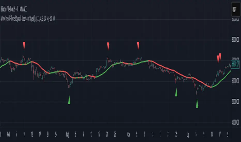
WaveTrend Filtered Signals (LazyBear Style)WaveTrend Filtered Signals (LazyBear Style)
This indicator is based on the popular WaveTrend oscillator (LazyBear) and adds several optional filters to improve signal quality:
✅ Available filters:
WT oversold/overbought zones – enabled by default. Signals are shown only if WT was previously in the specified zone (e.g., < -60 for longs, > 60 for shorts).
SMA trend filter – allows filtering signals in the direction of the moving average trend.
SMA position filter – signals appear only when price is above (for long) or below (for short) the moving average.
Consolidation filter – ignores signals during low-volatility sideways price movement.
💡 All filters are optional and can be enabled or disabled in the settings.
The default setup focuses on a clean approach: WaveTrend + oversold/overbought zones, with other filters left for customization.
Buy/Sell Ei - Premium Edition (Fixed Momentum)**📈 Buy/Sell Ei Indicator - Smart Trading System with Price Pattern Detection 📉**
**🔍 What is it?**
The **Buy/Sell Ei** indicator is a professional tool designed to identify **buy and sell signals** based on a combination of **candlestick patterns** and **moving averages**. With high accuracy, it pinpoints optimal entry and exit points in **both bullish and bearish trends**, making it suitable for forex pairs, stocks, and cryptocurrencies.
---
### **🌟 Key Features:**
✅ **Advanced Candlestick Pattern Detection**
✅ **Momentum Filter (Customizable consecutive candle count)**
✅ **Live Trade Mode (Instant signals for active trading)**
✅ **Dual MA Support (Fast & Slow MA with multiple types: SMA, EMA, WMA, VWMA)**
✅ **Date Filter (Focus on specific trading periods)**
✅ **Win/Loss Tracking (Performance analytics with success rate)**
---
### **🚀 Why Choose Buy/Sell Ei?**
✔ **Precision:** Reduces false signals with strict pattern rules.
✔ **Flexibility:** Works in both live trading and backtesting modes.
✔ **User-Friendly:** Clear labels and alerts for easy decision-making.
✔ **Adaptive:** Compatible with all timeframes (M1 to Monthly).
---
### **🛠 How It Works:**
1. **Trend Confirmation:** Uses MAs to filter trades in the trend’s direction.
2. **Pattern Recognition:** Detects "Ready to Buy/Sell" and confirmed signals.
3. **Momentum Check:** Optional filter for consecutive bullish/bearish candles.
4. **Live Alerts:** Labels appear instantly in Live Trade Mode.
---
### **📊 Ideal For:**
- **Day Traders** (Scalping & Intraday)
- **Swing Traders** (Medium-term setups)
- **Technical Analysts** (Backtesting strategies)
**🔧 Designed by Sahar Chadri | Optimized for TradingView**
**🎯 Trade Smarter, Not Harder!**

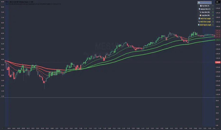
EMA Trend with MACD-Based Bar Coloring (Customized)This indicator blends trend-following EMAs with MACD-based momentum signals to provide a visually intuitive view of market conditions. It's designed for traders who value clean, color-coded charts and want to quickly assess both trend direction and overbought/oversold momentum.
🔍 Key Features:
Multi-EMA Trend Visualization:
Includes four Exponential Moving Averages (EMAs):
Fast (9)
Medium (21)
Slow (50)
Long (89)
Each EMA is dynamically color-coded based on its slope—green for bullish, red for bearish, and gray for neutral—to help identify the trend strength and alignment at a glance.
MACD-Based Bar Coloring:
Candlesticks are colored based on MACD's relationship to its Bollinger Bands:
Green bars signal strong bullish momentum (MACD > Upper Band)
Red bars signal strong bearish momentum (MACD < Lower Band)
Gray bars reflect neutral conditions
Compact Visual Dashboard:
A clean, top-right table displays your current EMA and MACD settings, helping you track parameter configurations without opening the settings menu.
✅ Best Used For:
Identifying trend alignment across short- to medium-term timeframes
Filtering entries based on trend strength and MACD overextension
Enhancing discretion-based or rule-based strategies with visual confirmation
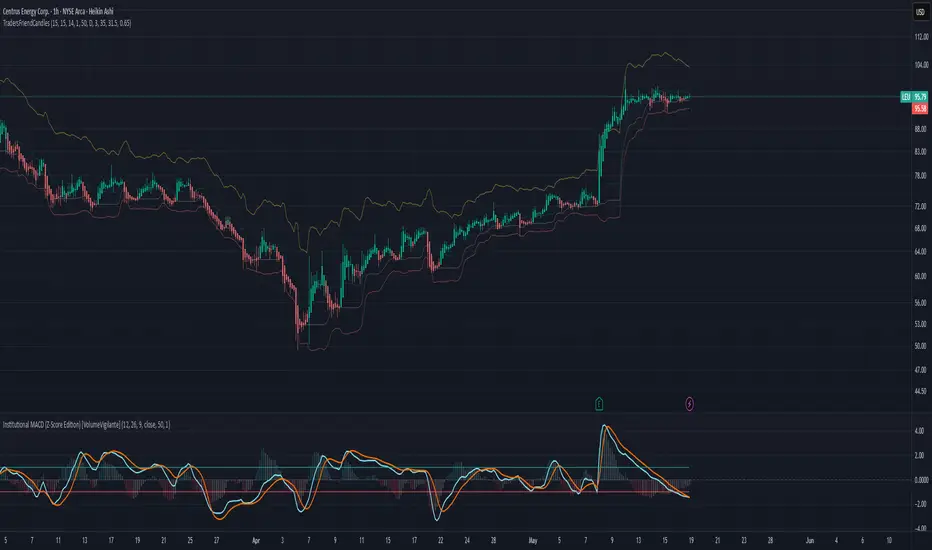
TradersFriendCandles v2
TradersFriendCandles
A fully customizable candle‑color and banding indicator built on percentile + ATR, with optional EMA vs. ALMA trend filtering and higher‑timeframe support.
Key Features
Dynamic Percentile Center Line
Compute any Nth percentile over M bars (default 20th over 15) to serve as a reference “mid‑price” level.
ATR‑Based Bands
Envelope that percentile line with upper/lower bands at X × ATR (default 1×), plus an extended upper band at 3.5× ATR.
Higher‑Timeframe Mode
Plot bands based on a higher timeframe (e.g. daily bands on a 15m chart) so you can gauge macro support/resistance in micro timeframes.
Custom‑Color Candles
5 user‑editable colors for:
Strong bullish
Light bullish
Neutral
Light bearish
Strong bearish
Optional EMA vs. ALMA Trend Filter
When enabled, candles simply turn “bull” or “bear” based on fast EMA crossing above/below slow ALMA.
Border‑Only Coloring
Keep candle bodies transparent and color only the border & wick.
Live Plot Labels & Track Price
All lines carry titles and can display current values directly on the price scale.
Alerts
Strong Bull Breakout (price stays above upper band)
Strong Bear Breakdown (price closes below lower band)
EMA/ALMA crossovers
Inputs & Customization
Percentile level & lookback length
ATR length, multiplier, opacity
Fast EMA length, ALMA parameters (offset, length, sigma)
Toggle bands, lines, custom candles, higher‑timeframe mode
Pick your own colors via color‑picker inputs
Use TradersFriendCandles to visualize momentum shifts, dynamic support/resistance, and trend strength all in one overlay. Perfect for pinpointing breakouts, breakdowns, and filtering noise with adjustable sensitivity.
Candle % High/Low Bar + HL Order + MA by Barty&PitPapcioWhat does the indicator show?
The "Candle % High/Low Bar + HL Order + MA by Barty&PitPapcio" indicator displays the percentage deviation of each candle’s high and low relative to its open price. The zero line represents the candle’s open — bars above zero show upward movement from the open (to high), bars below zero show downward movement (to low).
Additionally, the indicator plots a dot above or below each bar indicating which came first during the candle — the high or the low — based on data from a lower timeframe two steps below the current chart (for example, on a 1-hour chart it uses 15-minute data).
Finally, the indicator calculates and plots a user-selectable moving average (EMA, SMA, or WMA) of these "first high or low" signals, helping identify trends whether the first move is more often upwards or downwards.
Where do the data come from?
Percentage values are calculated directly from the current chart’s candles:
highPerc=(High−Open)/Open×100%,
lowPerc=(Low−Open)/Open×100%
The timing of the first high or low for each candle is retrieved from a lower timeframe, stepping down two levels from the current timeframe (e.g. from 1H to 15 min), providing better precision in detecting the order of highs and lows that may be blurred on higher timeframes.
Additional features:
Full customization of colors for bars, dots, zero line, grid, and thicknesses.
Background grid with adjustable scale and style.
Safety checks for missing lower timeframe data.
A moving average smoothing the sequence of first high/low signals to reveal directional tendencies.
Suggested strategy for technical analysis support
Identify dominant candle direction: If the dot often appears above the bar (first high), it indicates buying pressure; if below (first low), selling pressure dominates.
Use percentage deviations: Large percent bars indicate heightened volatility and potential reversal points.
Moving average on order signals: The EMA of high/low first signals smooths the noise, showing the dominant trend in the sequence of price moves, useful for filtering other signals.
Combine with other tools: This indicator can act as a directional filter on multiple timeframes, synergizing well with momentum indicators, RSI, or support/resistance levels to confirm move strength.
Lots of love, Bartosz

Multi Moving Average with CustomizationCore Functionality
The indicator allows you to display up to 5 different moving averages on your chart simultaneously.
Each moving average can be fully customized with its own settings.
You can choose between
1. Simple Moving Average (SMA),
2. Exponential Moving Average (EMA)
3. Weighted Moving Average (WMA) types
Multi-Timeframe Support
One standout feature is the ability to display higher timeframe moving averages on lower timeframe charts.
For example, you can show a 200 EMA from the daily chart while viewing a 15-minute chart.
Advanced Visualization Features
The indicator includes several visualization enhancements:
1. MA Cloud - Creates a filled area between any two selected moving averages. The cloud automatically changes color based on which MA is on top - typically green when the faster MA is above (bullish) and red when below (bearish).
2. Golden/Death Cross Detection - Automatically detects and marks important MA crossover events:
* Golden Cross: When a shorter-term MA crosses above a longer-term MA (bullish signal)
* Death Cross: When a shorter-term MA crosses below a longer-term MA (bearish signal)
3. Trend Background - Colors the entire chart background based on whether price is above or below a specified MA, giving a clear visual indicator of the overall trend.
Alert System
The indicator can generate alerts when price crosses above or below any selected moving average. This feature is useful for automated trading signals or notifications, and can be configured to trigger once per bar.
Flexible Architecture
The code uses several programming techniques to maximize flexibility:
* Switch statements for selecting MA types and cloud values
* Conditional logic throughout the code
* Function abstraction for calculating MAs and handling multi-timeframe display
* String identifiers to select which MAs to use for cloud visualization
Unique Technical Aspects
1. The multi-timeframe plotting function solves the common problem of higher timeframe MAs looking distorted on lower timeframe charts.
2. The cloud feature uses string identifiers to select which MAs to use, allowing for any combination.
3. The indicator employs smart conditional logic to handle complex decision trees efficiently.
4. Every visual aspect (colors, line widths, display conditions) is customizable through the settings.
This indicator combines multiple technical analysis tools into a single, highly configurable package that can adapt to different trading styles and timeframes.
Its ability to correctly display higher timeframe MAs on lower timeframe charts makes it particularly valuable for traders who analyze multiple timeframes simultaneously.
UT Bot + Hull MA Confirmed Signal DelayOverview
This indicator is designed to detect high-probability reversal entry signals by combining "UT Bot Alerts" (UT Bot Alerts script adapted from QuantNomad - Originally developed by Yo_adriiiiaan and idea of original code for "UT Bot Alerts" from HPotter ) with confirmation from a Hull Moving Average (HMA) Developed by Alan Hull . It focuses on capturing momentum shifts that often precede trend reversals, helping traders identify potential entry points while filtering out false signals.
🔍 How It Works
This strategy operates in two stages:
1. UT Bot Momentum Trigger
The foundation of this script is the "UT Bot Alerts" , which uses an ATR-based trailing stop to detect momentum changes. Specifically:
The script calculates a dynamic stop level based on the Average True Range (ATR) multiplied by a user-defined sensitivity factor (Key Value).
When price closes above this trailing stop and the short-term EMA crosses above the stop, a potential buy setup is triggered.
Conversely, when price closes below the trailing stop and the short-term EMA crosses below, a potential sell setup is triggered.
These UT Bot alerts are designed to identify the initial shift in market direction, acting as the first filter in the signal process.
2. Hull MA Confirmation
To reduce noise and false triggers from the UT Bot alone, this script delays the entry signal until price confirms the move by crossing the Hull Moving Average (or its variants: HMA, THMA, EHMA) in the same direction as the UT Bot trigger:
A Buy Signal is generated only when:
A UT Bot Buy condition is active, and
The price closes above the Hull MA.
Or, if a UT Bot Buy condition was recently triggered but price hadn’t yet crossed above the Hull MA, a delayed buy is signaled when price finally breaks above it.
A Sell Signal is generated only when:
A UT Bot Sell condition is active, and
The price closes below the Hull MA.
Similarly, a delayed sell signal can occur if price breaks below the Hull MA shortly after a UT Bot Sell trigger.
This dual-confirmation process helps traders avoid premature entries and improves the reliability of reversal signals.
📈 Best Use Cases
Reversal Trading: This strategy is particularly well-suited for catching early trend reversals rather than trend continuations. It excels at identifying momentum pivots that occur after pullbacks or exhaustion moves.
Heikin Ashi Charts Recommended: The script offers a Heikin Ashi mode for smoothing out noise and enhancing visual clarity. Using Heikin Ashi candles can further reduce whipsaws and highlight cleaner shifts in trend direction.
MACD Alignment: For best results, trade in the direction of the MACD trend or use it as a filter to avoid counter-trend trades.
⚠️ Important Notes
Entry Signals Only: This indicator only plots entry points (Buy and Sell signals). It does not define exit strategies, so users should manage trades manually using trailing stops, profit targets, or other exit indicators.
No Signal = No Confirmation: You may see a UT Bot trigger without a corresponding Buy/Sell signal. This means the price did not confirm the move by crossing the Hull MA, and therefore the setup was considered too weak or incomplete.
⚙️ Customization
UT Bot Sensitivity: Adjust the “Key Value” and “ATR Period” to make the UT Bot more or less reactive to price action.
Use Heikin Ashi: Toggle between standard candles or Heikin Ashi in the indicator settings for a smoother trading experience.
The HMA length may also be modified in the indicator settings from its standard 55 length to increase or decrease the sensitivity of signal.
This strategy is best used by traders looking for a structured, logic-based way to enter early into reversals with added confirmation to reduce risk. By combining two independent systems—momentum detection (UT Bot) and trend confirmation (Hull MA)—it aims to provide high-confidence entries without overwhelming complexity.
Let the indicator guide your entries—you manage the exits.
Examples of use:
Futures:
Stock:
Crypto:
As shown in the snapshots this strategy, like most, works the best when price action has a sizeable ATR and works the least when price is choppy. Therefore it is always best to use this system when price is coming off known support or resistance levels and when it is seen to respect short term EMA's like the 9 or 15.
My personal preference to use this system is for day trading on a 3 or 5 minute chart. But it is valid for all timeframes and simply marks a high probability for a new trend to form.
Sources:
Quant Nomad - www.tradingview.com
Yo_adriiiiaan - www.tradingview.com
HPotter - www.tradingview.com
Hull Moving Average - alanhull.com

StoRsi# StoRSI Indicator: Combining RSI and Stochastic with multiTF
## Overview
The StoRSI indicator combines Relative Strength Index (RSI) and Stochastic oscillators in a single view to provide powerful momentum and trend analysis. By displaying both indicators together with multi-timeframe analysis, it helps traders identify stronger signals when both indicators align.
## Key Components
### 1. RSI (Relative Strength Index)
### 2. Stochastic Oscillator
### 3. EMA (Exponential Moving Average)
### 4. Multi-Timeframe Analysis
## Visual Features
- **Color-coded zones**: Highlights overbought/oversold areas
- **Signal backgrounds**: Shows when both indicators align
- **Multi-timeframe table**: Displays RSI, Stochastic, and trend across timeframes
- **Customizable colors**: Allows full visual customization
## Signal Generation (some need to uncomment in code)
The indicator generates several types of signals:
1. **RSI crosses**: When RSI crosses above/below overbought/oversold levels
2. **Stochastic crosses**: When Stochastic %K crosses above/below overbought/oversold levels
3. **Combined signals**: When both indicators show the same condition
4. **Trend alignment**: When multiple timeframes show the same trend direction
## Conclusion
The StoRSI indicator provides a comprehensive view of market momentum by combining two powerful oscillators with multi-timeframe analysis. By looking for alignment between RSI and Stochastic across different timeframes, traders can identify stronger signals and filter out potential false moves. The visual design makes it easy to spot opportunities at a glance, while the customizable parameters allow adaptation to different markets and trading styles.
For best results, use this indicator as part of a complete trading system that includes proper risk management, trend analysis, and confirmation from price action patterns.

Smooth Fibonacci BandsSmooth Fibonacci Bands
This indicator overlays adaptive Fibonacci bands on your chart, creating dynamic support and resistance zones based on price volatility. It combines a simple moving average with ATR-based Fibonacci levels to generate multiple bands that expand and contract with market conditions.
## Features
- Creates three pairs of upper and lower Fibonacci bands
- Smoothing option for cleaner, less noisy bands
- Fully customizable colors and line thickness
- Adapts automatically to changing market volatility
## Settings
Adjust the SMA and ATR lengths to match your trading timeframe. For short-term trading, try lower values; for longer-term analysis, use higher values. The Fibonacci factors determine how far each band extends from the center line - standard Fibonacci ratios (1.618, 2.618, and 4.236) are provided as defaults.
## Trading Applications
- Use band crossovers as potential entry and exit signals
- Look for price bouncing off bands as reversal opportunities
- Watch for price breaking through multiple bands as strong trend confirmation
- Identify potential support/resistance zones for placing stop losses or take profits
Fibonacci Bands combines the reliability of moving averages with the adaptability of ATR and the natural market harmony of Fibonacci ratios, offering a robust framework for both trend and range analysis.
Why EMA Isn't What You Think It IsMany new traders adopt the Exponential Moving Average (EMA) believing it's simply a "better Simple Moving Average (SMA)". This common misconception leads to fundamental misunderstandings about how EMA works and when to use it.
EMA and SMA differ at their core. SMA use a window of finite number of data points, giving equal weight to each data point in the calculation period. This makes SMA a Finite Impulse Response (FIR) filter in signal processing terms. Remember that FIR means that "all that we need is the 'period' number of data points" to calculate the filter value. Anything beyond the given period is not relevant to FIR filters – much like how a security camera with 14-day storage automatically overwrites older footage, making last month's activity completely invisible regardless of how important it might have been.
EMA, however, is an Infinite Impulse Response (IIR) filter. It uses ALL historical data, with each past price having a diminishing - but never zero - influence on the calculated value. This creates an EMA response that extends infinitely into the past—not just for the last N periods. IIR filters cannot be precise if we give them only a 'period' number of data to work on - they will be off-target significantly due to lack of context, like trying to understand Game of Thrones by watching only the final season and wondering why everyone's so upset about that dragon lady going full pyromaniac.
If we only consider a number of data points equal to the EMA's period, we are capturing no more than 86.5% of the total weight of the EMA calculation. Relying on he period window alone (the warm-up period) will provide only 1 - (1 / e^2) weights, which is approximately 1−0.1353 = 0.8647 = 86.5%. That's like claiming you've read a book when you've skipped the first few chapters – technically, you got most of it, but you probably miss some crucial early context.
▶️ What is period in EMA used for?
What does a period parameter really mean for EMA? When we select a 15-period EMA, we're not selecting a window of 15 data points as with an SMA. Instead, we are using that number to calculate a decay factor (α) that determines how quickly older data loses influence in EMA result. Every trader knows EMA calculation: α = 1 / (1+period) – or at least every trader claims to know this while secretly checking the formula when they need it.
Thinking in terms of "period" seriously restricts EMA. The α parameter can be - should be! - any value between 0.0 and 1.0, offering infinite tuning possibilities of the indicator. When we limit ourselves to whole-number periods that we use in FIR indicators, we can only access a small subset of possible IIR calculations – it's like having access to the entire RGB color spectrum with 16.7 million possible colors but stubbornly sticking to the 8 basic crayons in a child's first art set because the coloring book only mentioned those by name.
For example:
Period 10 → alpha = 0.1818
Period 11 → alpha = 0.1667
What about wanting an alpha of 0.17, which might yield superior returns in your strategy that uses EMA? No whole-number period can provide this! Direct α parameterization offers more precision, much like how an analog tuner lets you find the perfect radio frequency while digital presets force you to choose only from predetermined stations, potentially missing the clearest signal sitting right between channels.
Sidenote: the choice of α = 1 / (1+period) is just a convention from 1970s, probably started by J. Welles Wilder, who popularized the use of the 14-day EMA. It was designed to create an approximate equivalence between EMA and SMA over the same number of periods, even thought SMA needs a period window (as it is FIR filter) and EMA doesn't. In reality, the decay factor α in EMA should be allowed any valye between 0.0 and 1.0, not just some discrete values derived from an integer-based period! Algorithmic systems should find the best α decay for EMA directly, allowing the system to fine-tune at will and not through conversion of integer period to float α decay – though this might put a few traditionalist traders into early retirement. Well, to prevent that, most traditionalist implementations of EMA only use period and no alpha at all. Heaven forbid we disturb people who print their charts on paper, draw trendlines with rulers, and insist the market "feels different" since computers do algotrading!
▶️ Calculating EMAs Efficiently
The standard textbook formula for EMA is:
EMA = CurrentPrice × alpha + PreviousEMA × (1 - alpha)
But did you know that a more efficient version exists, once you apply a tiny bit of high school algebra:
EMA = alpha × (CurrentPrice - PreviousEMA) + PreviousEMA
The first one requires three operations: 2 multiplications + 1 addition. The second one also requires three ops: 1 multiplication + 1 addition + 1 subtraction.
That's pathetic, you say? Not worth implementing? In most computational models, multiplications cost much more than additions/subtractions – much like how ordering dessert costs more than asking for a water refill at restaurants.
Relative CPU cost of float operations :
Addition/Subtraction: ~1 cycle
Multiplication: ~5 cycles (depending on precision and architecture)
Now you see the difference? 2 * 5 + 1 = 11 against 5 + 1 + 1 = 7. That is ≈ 36.36% efficiency gain just by swapping formulas around! And making your high school math teacher proud enough to finally put your test on the refrigerator.
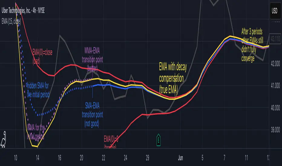
▶️ The Warmup Problem: how to start the EMA sequence right
How do we calculate the first EMA value when there's no previous EMA available? Let's see some possible options used throughout the history:
Start with zero : EMA(0) = 0. This creates stupidly large distortion until enough bars pass for the horrible effect to diminish – like starting a trading account with zero balance but backdating a year of missed trades, then watching your balance struggle to climb out of a phantom debt for months.
Start with first price : EMA(0) = first price. This is better than starting with zero, but still causes initial distortion that will be extra-bad if the first price is an outlier – like forming your entire opinion of a stock based solely on its IPO day price, then wondering why your model is tanking for weeks afterward.
Use SMA for warmup : This is the tradition from the pencil-and-paper era of technical analysis – when calculators were luxury items and "algorithmic trading" meant your broker had neat handwriting. We first calculate an SMA over the initial period, then kickstart the EMA with this average value. It's widely used due to tradition, not merit, creating a mathematical Frankenstein that uses an FIR filter (SMA) during the initial period before abruptly switching to an IIR filter (EMA). This methodology is so aesthetically offensive (abrupt kink on the transition from SMA to EMA) that charting platforms hide these early values entirely, pretending EMA simply doesn't exist until the warmup period passes – the technical analysis equivalent of sweeping dust under the rug.
Use WMA for warmup : This one was never popular because it is harder to calculate with a pencil - compared to using simple SMA for warmup. Weighted Moving Average provides a much better approximation of a starting value as its linear descending profile is much closer to the EMA's decay profile.
These methods all share one problem: they produce inaccurate initial values that traders often hide or discard, much like how hedge funds conveniently report awesome performance "since strategy inception" only after their disastrous first quarter has been surgically removed from the track record.
▶️ A Better Way to start EMA: Decaying compensation
Think of it this way: An ideal EMA uses an infinite history of prices, but we only have data starting from a specific point. This creates a problem - our EMA starts with an incorrect assumption that all previous prices were all zero, all close, or all average – like trying to write someone's biography but only having information about their life since last Tuesday.
But there is a better way. It requires more than high school math comprehension and is more computationally intensive, but is mathematically correct and numerically stable. This approach involves compensating calculated EMA values for the "phantom data" that would have existed before our first price point.
Here's how phantom data compensation works:
We start our normal EMA calculation:
EMA_today = EMA_yesterday + α × (Price_today - EMA_yesterday)
But we add a correction factor that adjusts for the missing history:
Correction = 1 at the start
Correction = Correction × (1-α) after each calculation
We then apply this correction:
True_EMA = Raw_EMA / (1-Correction)
This correction factor starts at 1 (full compensation effect) and gets exponentially smaller with each new price bar. After enough data points, the correction becomes so small (i.e., below 0.0000000001) that we can stop applying it as it is no longer relevant.
Let's see how this works in practice:
For the first price bar:
Raw_EMA = 0
Correction = 1
True_EMA = Price (since 0 ÷ (1-1) is undefined, we use the first price)
For the second price bar:
Raw_EMA = α × (Price_2 - 0) + 0 = α × Price_2
Correction = 1 × (1-α) = (1-α)
True_EMA = α × Price_2 ÷ (1-(1-α)) = Price_2
For the third price bar:
Raw_EMA updates using the standard formula
Correction = (1-α) × (1-α) = (1-α)²
True_EMA = Raw_EMA ÷ (1-(1-α)²)
With each new price, the correction factor shrinks exponentially. After about -log₁₀(1e-10)/log₁₀(1-α) bars, the correction becomes negligible, and our EMA calculation matches what we would get if we had infinite historical data.
This approach provides accurate EMA values from the very first calculation. There's no need to use SMA for warmup or discard early values before output converges - EMA is mathematically correct from first value, ready to party without the awkward warmup phase.
Here is Pine Script 6 implementation of EMA that can take alpha parameter directly (or period if desired), returns valid values from the start, is resilient to dirty input values, uses decaying compensator instead of SMA, and uses the least amount of computational cycles possible.
// Enhanced EMA function with proper initialization and efficient calculation
ema(series float source, simple int period=0, simple float alpha=0)=>
// Input validation - one of alpha or period must be provided
if alpha<=0 and period<=0
runtime.error("Alpha or period must be provided")
// Calculate alpha from period if alpha not directly specified
float a = alpha > 0 ? alpha : 2.0 / math.max(period, 1)
// Initialize variables for EMA calculation
var float ema = na // Stores raw EMA value
var float result = na // Stores final corrected EMA
var float e = 1.0 // Decay compensation factor
var bool warmup = true // Flag for warmup phase
if not na(source)
if na(ema)
// First value case - initialize EMA to zero
// (we'll correct this immediately with the compensation)
ema := 0
result := source
else
// Standard EMA calculation (optimized formula)
ema := a * (source - ema) + ema
if warmup
// During warmup phase, apply decay compensation
e *= (1-a) // Update decay factor
float c = 1.0 / (1.0 - e) // Calculate correction multiplier
result := c * ema // Apply correction
// Stop warmup phase when correction becomes negligible
if e <= 1e-10
warmup := false
else
// After warmup, EMA operates without correction
result := ema
result // Return the properly compensated EMA value
▶️ CONCLUSION
EMA isn't just a "better SMA"—it is a fundamentally different tool, like how a submarine differs from a sailboat – both float, but the similarities end there. EMA responds to inputs differently, weighs historical data differently, and requires different initialization techniques.
By understanding these differences, traders can make more informed decisions about when and how to use EMA in trading strategies. And as EMA is embedded in so many other complex and compound indicators and strategies, if system uses tainted and inferior EMA calculatiomn, it is doing a disservice to all derivative indicators too – like building a skyscraper on a foundation of Jell-O.
The next time you add an EMA to your chart, remember: you're not just looking at a "faster moving average." You're using an INFINITE IMPULSE RESPONSE filter that carries the echo of all previous price actions, properly weighted to help make better trading decisions.
EMA done right might significantly improve the quality of all signals, strategies, and trades that rely on EMA somewhere deep in its algorithmic bowels – proving once again that math skills are indeed useful after high school, no matter what your guidance counselor told you.
Adaptive Strength MACD [UM]Indicator Description
Adaptive Strength MACD is an adaptive variant of the classic MACD that uses a customized Strength Momentum moving average for both its oscillator and signal lines. This makes the indicator more responsive in trending conditions and more stable in sideways markets.
Key Features
1. Adaptive Strength Momentum MA
Leverages the Adaptive Momentum Oscillator to scale smoothing coefficients dynamically.
2. Trend-Validity Filters
Optional ADX filter ensures signals only fire when trend strength (ADX) exceeds a user threshold.
3. Directional Filter (DI+) confirms bullish or bearish momentum.
4. Color-Coded Histogram
5. Bars turn bright when momentum accelerates, faded when slowing.
6. Grayed out when trend filters disqualify signals.
7. Alerts
Bullish crossover (histogram from negative to positive) and bearish crossover (positive to negative) only when filters validate trend.
Comparison with Regular MACD
1. Moving Averages
Classic MACD uses fixed exponential moving averages (EMAs) for its fast and slow lines, so the smoothing factor is constant regardless of how strong or weak price momentum is.
Adaptive Strength MACD replaces those EMAs with a dynamic “Strength Momentum” MA that speeds up when momentum is strong and slows down in quiet or choppy markets.
2. Signal Line Smoothing
In the classic MACD, the signal is simply an EMA of the MACD line, with one user-selected period.
In the Adaptive Strength MACD , the signal line also uses the Strength Momentum MA on the MACD series—so both oscillator and signal adapt together to the underlying momentum strength.
3. Responsiveness to Momentum
A static EMA reacts the same way whether momentum is surging or fading; you either get too-slow entries when momentum spikes or too-fast whipsaws in noise.
The adaptive MA in your indicator automatically gives you quicker crossovers when there’s a trending burst, while damping down during low-momentum chop.
4. Trend Validation Filters
The classic MACD has no built-in mechanism to know whether price is actually trending versus ranging—you’ll see crossovers in both regimes.
Adaptive Strength MACD includes optional ADX filtering (to require a minimum trend strength) and a DI filter (to confirm bullish vs. bearish directional pressure). When those filters aren’t met, the histogram grays out to warn you.
5. Histogram Coloring & Clarity
Typical MACD histograms often use two colors (above/below zero) or a simple ramp but don’t distinguish accelerating vs. decelerating moves.
Your version employs four distinct states—accelerating bulls, decelerating bulls, accelerating bears, decelerating bears—plus a gray “no-signal” state when filters fail. This makes it easy at a glance to see not just direction but the quality of the move.
6. False-Signal Reduction
Because the classic MACD fires on every crossover, it can generate whipsaws in ranging markets.
The adaptive MA smoothing combined with ADX/DI gating in your script helps suppress those false breaks and keeps you focused on higher-quality entries.
7. Ideal Use Cases
Use the classic MACD when you need a reliable, well-understood trend-following oscillator and you’re comfortable manually filtering choppy signals.
Choose Adaptive Strength MACD \ when you want an all-in-one, automated way to speed up in strong trends, filter out noise, and receive clearer visual cues and alerts only when conditions align.
How to Use
1. Setup
- Adjust Fast and Slow Length to tune sensitivity.
- Change Signal Smoothing to smooth the histogram reaction.
- Enable ADX/DI filters and set ADX Threshold to suit your preferred trend strength (default = 20).
2. Interpretation
- Histogram > 0: Short‐term momentum above long‐term → bullish.
- Histogram < 0: Short‐term below long‐term → bearish.
- Faded greyed bars indicate a weakening move; gray bars show filter invalidation.
How to Trade
Buy Setup:
- Histogram crosses from negative to positive.
- ADX ≥ threshold and DI+ > DI–.
- Look for confirmation (bullish candlestick patterns or support zone).
Sell Setup:
- Histogram crosses from positive to negative.
- ADX ≥ threshold and DI– > DI+.
- Confirm with bearish price action (resistance test or bearish pattern).
Stop & Target
- Place stop just below recent swing low (long) or above recent swing high (short).
- Target risk–reward of at least 1:2, or trail with a shorter‐period adaptive MA.
