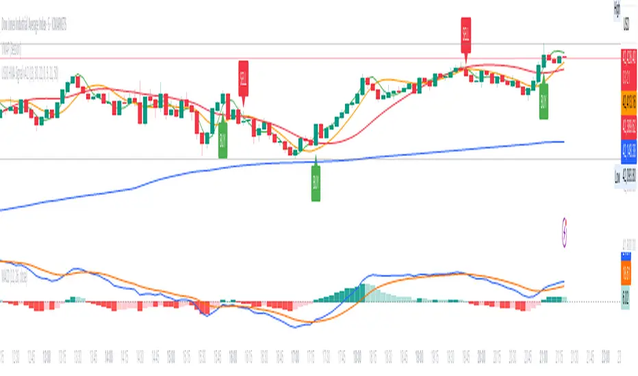
US30 HMA Signal v2.8Indicator Description – US30 HMA Signal v2.8
Overview:
The US30 HMA Signal indicator is designed to generate Buy and Sell signals based on the crossover of three Hull Moving Averages (HMAs). The indicator focuses on identifying momentum shifts and directional bias using the 9, 21, and 50 HMA structures, optimised for the US30 (Dow Jones) index.
⸻
Indicator Components:
1. Hull Moving Averages (HMAs):
• 9 HMA (Green): Fastest HMA, responds quickly to price changes.
• 21 HMA (Amber): Medium-term HMA, acts as a transitional filter.
• 50 HMA (Red): Slowest HMA, defines the broader trend direction.
⸻
Logic and Signal Conditions:
1. Session Filter:
• Signals are only generated during the US session, defined as starting at 13:30 BST.
2. Directional Bias:
• Bullish Bias: Occurs when both the 9 HMA and 21 HMA are above the 50 HMA.
• Bearish Bias: Occurs when both the 9 HMA and 21 HMA are below the 50 HMA.
3. Crossover Logic:
• Buy Signal: Prints when the 9 HMA crosses above the 21 HMA while the directional bias is bullish.
• Sell Signal: Prints when the 9 HMA crosses below the 21 HMA while the directional bias is bearish.
4. Minimum Bar Spacing:
• To avoid signal clustering, a minimum bar spacing of 5 bars is implemented between consecutive signals.
⸻
Plotting:
• Buy Signal: Displays as a green label below the candle with the text “BUY.”
• Sell Signal: Displays as a red label above the candle with the text “SELL.”
⸻
Purpose and Usage:
• The indicator is designed for traders looking to capture momentum shifts in the US30 index using HMA crossovers.
• It is best applied on the 5-minute timeframe to balance signal frequency and reliability.
• The strict session filter ensures signals are only generated during the most volatile period, aligning with US market activity.
Moving Averages
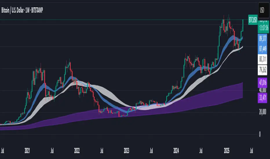
Support BandsSupport Bands – Discount Zones for Bitcoin
⚡Overview:
-The Support Bands indicator identifies one of the most tested and respected support zones for Bitcoin using moving averages from higher timeframes.
-These zones are visualized through colored bands (blue, white, and violet), simplifying the decision making process especially for less experienced traders who seek high-probability areas to accumulate Bitcoin during retracements.
-Band levels are based on manual backtesting and real-world price behavior throughout Bitcoin’s history.
-Each zone reflects a different degree of support strength, from temporary pullback zones to historical bottoms.
⚡️ Key Characteristics:
-Highlights discount zones where Bitcoin has historically shown strong reactions.
-Uses 3 different levels of supports based on EMA/SMA combinations.
-Offers a clean, non-intrusive overlay that reduces chart clutter.
⚡ How to Use:
-Open your chart on the 1W timeframe and select the BTC Bitstamp or BLX symbol, as they provide the most complete historical data, ensuring optimal performance of the indicator.
-Use the bands as reference zones for support and potential pullbacks.
- Level 3 (violet band) historically marks the bottom of Bitcoin bear markets and is ideal for long-term entries during deep corrections.
- Level 2 (white band) often signals macro reaccumulation zones but usually requires 1–3 months of consolidation before a breakout. If the price closes below and then retests this level as resistance for 1–2 weekly candles, it often marks the start of a macro downtrend.
-Level 1 (blue band) acts as short-term support during strong bullish moves, typically after a successful rebound from Level 2.
⚡ What Makes It Unique:
- This script merges moving averages per level into three simplified bands for clearer analysis.
-Reduces chart noise by avoiding multiple overlapping lines, helping you make faster and cleaner decisions.
- Built from manual market study based on recurring Bitcoin behavior, not just random code.
-Historically backtested:
-Level 3 (violet band) until today has always marked the bitcoin bearmarket bottom.
- Level 2 (white band) is the strongest support during bull markets; losing it often signals a macro trend reversal.
- Level 1 is frequently retested during impulsive rallies and can act as short-term support or resistance.
⚡ Disclaimer:
-This script is a visual tool to assist with market analysis.
-It does not generate buy or sell signals, nor does it predict future movements.
-Historical performance is not indicative of future results.
-Always use independent judgment and proper risk management.
⚡ Why Use Support Bands:
-Ideal for traders who want clarity without dozens of lines on their charts.
- Helps identify logical zones for entry or reaccumulation.
- Based on actual market behavior rather than hypothetical setups.
-If the blue band (Level 1) doesn't hold as support, the price often moves to the white band (Level 2), and if that fails too, the violet band (Level 3) is typically the last strong support. By dividing your capital into three planned entries, one at each level,you can manage risk more effectively compared to entering blindly without this structure.
Moving Volume-Weighted Avg Price, % Channel, BBsThis script includes:
- Moving Volume-Weighted Average Price line.
- User-defined % band above and below, very useful for "breakout" signals, and mentally adjusting to the magnitude of price swings when viewing an automatic scale on the price axis.
- Volume-Weighted Bollinger Bands, which are more sensitive to volume.
More detail:
- This is like TV's basic VWAP in concept, except the major flaw in that is that it has reset periods that you can't override, and the volume is cumulative until the next hard reset. The 'reset' is OK for securities trading, that resets every day anyway. But not for crypto - and not if/when securities trading goes 24/7. Also, the denominator accumulating over the entire period is also *not* OK, because then what is shown means something different as the day progresses - which kind of makes it useless. In other words, it starts out very sensitive to volume, and gets progressively more numb to it as they day progresses, and starts flattening out.
- This fixes both problems, by using a user-definable moving window for the average. Essentially combining SMA with volume-weighting.
- You may also find an invaluable trading aid, in the % bands above and below.
- What can optionally be shown is standard deviation bands, aka Bollinger bands. The advantage over regular BB is that it's volume-weighted. Since it is already calculated on a moving average, the period for the standard deviation has been shortened by default, and the magnitude increased, to better approximate regular Bollinger Bands - but it's still more responsive to volume.
Granville's 8 Rules Visualizer 🧠 Granville’s 8 Rules Indicator
I’ve created a Pine Script indicator that visually implements **Granville’s Eight Rules**, one of the foundational theories for price movement relative to a moving average (MA). This tool helps traders better time entries and exits based on momentum shifts and MA behavior.
---
### 📈 What is Granville’s Law?
Joseph Granville’s theory suggests that **price and moving average (typically SMA)** interactions produce **8 recurring signals**:
* **4 Buy signals** (B1–B4)
* **4 Sell signals** (S1–S4)
These rules help identify the beginning or continuation of bullish and bearish trends.
---
### 🔍 Indicator Logic
This indicator uses a simple 20-period SMA (modifiable) and tracks price action in relation to it. Each signal is drawn as a triangle with a label (`B1` to `B4` or `S1` to `S4`), based on the following rules:
#### ✅ Buy Signals:
* **B1**: Price crosses above a rising MA (classic breakout)
* **B2**: Price pulls back below a rising MA, then begins rising again
* **B3**: Price bounces off a falling MA
* **B4**: Price is above a rising MA but temporarily drops
#### ❌ Sell Signals:
* **S1**: Price crosses below a falling MA
* **S2**: Price pulls back above a falling MA, then starts dropping again
* **S3**: Price bounces down off a rising MA
* **S4**: Price is below a falling MA but temporarily rises
---
### 🛠 How to Use It:
1. **Trend Confirmation**: Use the moving average slope (rising or falling) as your trend filter.
2. **Entry Timing**: Look for Buy signals (B1–B4) in uptrends and Sell signals (S1–S4) in downtrends.
3. **Avoid Noise**: Combine with volume or volatility filters (e.g. ATR or squeeze) to eliminate weak setups.
4. **Customize**: Adjust the MA type or length to fit your market (e.g. EMA for crypto, SMA for FX).
---
### 💡 Example Strategies:
* Pair **B1 + rising volume** for early trend entries
* Use **B2/B4** for retracement-based entries
* Exit on **S3/S4** for profit taking or stop logic
Happy trading!

Functionally Weighted Moving AverageOVERVIEW
An anchor-able moving average that weights historical prices with mathematical curves (shaping functions) such as Smoothstep , Ease In / Out , or even a Cubic Bézier . This level of configurability lends itself to more versatile price modeling, over conventional moving averages.
SESSION ANCHORS
Aside from VWAP, conventional moving averages do not allow you to use the first bar of each session as an anchor. This can make averages less useful near the open when price is sufficiently different from yesterdays close. For example, in this screenshot the EMA (blue) lags behind the sessionally anchored FWMA (yellow) at the open, making it slower to indicate a pivot higher.
An incrementing length is what makes a moving average anchor-able. VWAP is designed to do this, indefinitely growing until a new anchor resets the average (which is why it doesn't have a length parameter). But conventional MA's are designed to have a set length (they do not increment). Combining these features, the FWMA treats the length like a maximum rather than a set length, incrementing up to it from the anchor (when enabled).
Quick aside: If you code and want to anchor a conventional MA, the length() function in my UtilityLibrary will help you do this.
Incrementing an averages length introduces near-anchor volatility. For this reason, the FWMA also includes an option to saturate the anchor with the source , making values near the anchor more resistant to change. The following screenshot illustrates how saturation affects the average near the anchor when disabled (aqua) and enabled (fuchsia).
AVERAGING MATH
While there's nothing special about the math, it's worth documenting exactly how the average is affected by the anchor.
Average = Dot Product / Sum of Weights
Dot Product
This is the sum of element-wise multiplication between the Price and Weight arrays.
Dot Product = Price1 × Weight1 + Price2 × Weight2 + Price3 × Weight3 ...
When the Price and Weight arrays are equally sized (aka. the length is no longer incrementing from the anchor), there's a 1-1 mapping between Price and Weight indices. Anchoring, however, purges historical data from the Price array, making it temporarily smaller. When this happens, a dot product is synthesized by linearly interpolating for proportional indices (rather than a 1-1 mapping) to maintain the intended shape of weights.
Synthetic Dot Product = FirstPrice × FirstWeight + ... MidPrice × MidWeight ... + LastPrice × LastWeight
Sum of Weights
Exactly what it sounds like, the sum of weights used by the dot product operation. The sum of used weights may be less than the sum of all weights when the dot product is synthesized.
Sum of Weights = Weight1 + Weight2 + Weight3 ...
CALCULATING WEIGHTS
Shaping functions are mathematical curves used for interpolation. They are what give the Functionally Weighted Moving Average its name, and define how each historical price in the look back period is weighted.
The included shaping functions are:
Linear (conventional WMA)
Smoothstep (S curve)
Ease In Out (adjustable S curve)
Ease In (first half of Ease In Out)
Ease Out (second half of Ease In Out)
Ease Out In (eases out and then back in)
Cubic Bézier (aka. any curve you want)
In the following screenshot, the only difference between the three FWMA's is the shaping function (Ease In, Ease In Out, and Ease Out) illustrating how different curves can influence the responsiveness of an average.
And here is the same example, but with anchor saturation disabled .
ADJUSTING WEIGHTS
Each function outputs a range of values between 0 and 1. While you can't expand or shrink the range, you can nudge it higher or lower using the Scalar . For example, setting the scalar to -0.2 remaps to , and +0.2 remaps to . The following screenshot illustrates how -0.2 (lightest blue) and +0.2 (darkest blue) affect the average.
Easing functions can be further adjusted with the Degree (how much the shaping function curves). There's an interactive example of this here and the following illustrates how a degrees 0, 1, and 20 (dark orange, orange, and light orange) affect the average.
This level of configurability completely changes how a moving average models price for a given length, making the FWMA extremely versatile.
INPUTS
You can configure:
Length (how many historical bars to average)
Source (the bar value to average)
Offset (horizontal offset of the plot)
Weight (the shaping function)
Scalar (how much to adjust each weight)
Degree (how much to ease in / out)
Bézier Points (controls shape of Bézier)
Divisor & Anchor parameters
Style of the plot
BUT ... WHY?
We use moving averages to anticipate trend initialization, continuation, and termination. For a given look back period (length) we want the average to represent the data as accurately and smoothly as possible. The better it does this, the better it is at modeling price.
In this screenshot, both the FWMA (yellow) and EMA (blue) have a length of 9. They are both smooth, but one of them more accurately models price.
You wouldn't necessarily want to trade with these FWMA parameters, but knowing it does a better job of modeling price allows you to confidently expand the model to larger timeframes for bigger moves. Here, both the FWMA (yellow) and EMA (blue) have a length of 195 (aka. 50% of NYSE market hours).
INSPIRATION
I predominantly trade ETF derivatives and hold the position that markets are chaotic, not random . The salient difference being that randomness is entirely unpredictable, and chaotic systems can be modeled. The kind of analysis I value requires a very good pricing model.
The term "model" sounds more intimidating than it is. Math terms do that sometimes. It's just a mathematical estimation . That's it. For example, a regression is an "average regressing" model (aka. mean reversion ), and LOWESS (Locally Weighted Scatterplot Smoothing) is a statistically rigorous local regression .
LOWESS is excellent for modeling data. Also, it's not practical for trading. It's computationally expensive and uses data to the right of the point it's averaging, which is impossible in realtime (everything to the right is in the future). But many techniques used within LOWESS are still valuable.
My goal was to create an efficient real time emulation of LOWESS. Specifically I wanted something that was weighted non-linearly, was efficient, left-side only, and data faithful. Incorporate trading paradigms (like anchoring) and you get a Functionally Weighted Moving Average.
The formulas for determining the weights in LOWESS are typically chosen just because they seem to work well. Meaning ... they can be anything, and there's no justification other than "looks about right". So having a variety of functions (aka. kernels) for the FWMA, and being able to slide the weight range higher or lower, allows you to also make it "look about right".
William Cleveland, prominent figure in statistics known for his contributions to LOWESS, preferred using a tri-cube weighting function. Using Weight = Ease Out In with the Degrees = 3 is comparable to this. Enjoy!

CRT Finder (WanHakimFX)📈 Liquidity Grab Indicator with MTF Confluence & Alerts
🔍 Overview:
The Liquidity Grab Indicator is designed to detect precise moments when price sweeps liquidity — either by wicking below recent lows (bullish LQH) or above recent highs (bearish LQL) — followed by a clear rejection. It combines this logic with multi-timeframe confirmation and trend filters, making it a powerful tool for identifying high-probability reversal setups.
⚙️ How It Works:
✅ Liquidity Sweep Logic (LQH / LQL)
Bullish (LQH):
Current candle wicks below the previous low
Closes above the previous candle body
Confirms potential bullish reversal
Bearish (LQL):
Current candle wicks above the previous high
Closes below the previous candle body
Confirms potential bearish reversal
✅ Additional Conditions:
Must occur during London or New York sessions.
Requires trend confluence:
LQH = Price must be above SMMA 60/100/200
LQL = Price must be below SMMA 60/100/200
🧠 Multi-Timeframe Confluence:
The indicator scans for LQH/LQL sweeps across:
Daily
4H
1H
30M
15M
If a sweep occurs on any of these timeframes, an alert is triggered and a triangle marker appears on the chart for real-time visual confluence.
📊 Visual Features:
Green/Red labels for active timeframe sweeps.
Dotted wick lines to show liquidity zones from the previous candle.
Colored triangle markers for MTF sweep alerts.
🛠 Strategy Usage:
This indicator is best used as a trigger tool in a confluence-based strategy:
Use higher-timeframe MTF LQH/LQL markers for directional bias.
Wait for matching sweep on your entry timeframe (e.g., M1/M5).
Enter on confirmation candle or break of structure.
Target imbalances, FVGs, or previous highs/lows.
Risk-managed entries using sweep candle's high/low as stop.
📢 Alerts:
✅ Bullish Sweep (LQH) on any timeframe
✅ Bearish Sweep (LQL) on any timeframe

Uber Baseline V2 - NNFX Edition [UTS]Uber Baseline V2 – NNFX Edition
Uber Baseline V2 – NNFX Edition is a highly customizable baseline component designed for seamless integration into any trading system. Tailored specifically for the No Nonsense Forex (NNFX) methodology, it serves as a powerful trend filter—helping traders stay aligned with the dominant market direction while avoiding low-probability trades during consolidation.
Choose from 26 high-quality moving averages to find the perfect-fitting baseline for your trading style. Whether you're trend-following or building a complete NNFX stack, this tool adapts to your strategy with precision and clarity.
Usage
🧭 Baseline as Trend Filter
Direction: Trade only in the direction of the baseline. A long entry is only valid if the price closes above the baseline; a short entry only if it closes below.
As VP explains, the baseline “is making sure you are getting into trades that are trending, keeping you out of trades that aren’t trending” and signals exits when trends fail.
📈 Entry Rule (Baseline Cross + ATR)
Baseline Cross: An entry occurs only when price crosses and closes on the opposite side of the baseline.
ATR Zone: The close must lie within a ±1×ATR band around the baseline. In other words, price must close within “the 1 ATR zone of the baseline”.
Confirmations: All primary/secondary confirmation indicators and volume must agree with the move.
“An entry should occur when price crosses the baseline and the price is within the 1 ATR zone of the baseline and all of your indicators agreeing.”
🔁 Beyond-ATR & Pullback Rule
No Immediate Entry: If a baseline signal occurs while price is outside the ±1×ATR band, do not enter immediately. Treat this as a pullback scenario.
Wait for Retrace:
“WATCH for next candle” – enter only when the next bar closes back within the 1×ATR band around the baseline.
If price had closed beyond 1×ATR, only enter when a subsequent candle closes within 1×ATR of the baseline, with all indicators still aligned.
“If Price closes within 1×ATR of Baseline you can enter trade.”
⏳ One-Candle Rule
Filter Lag: If the primary confirmation (C1) fires but the secondary or volume indicators have not yet signaled, you may delay entry by one bar.
Second Chance Entry:
“You can wait one more candle after and enter if your secondary indicator and/or volume indicator have caught up and are giving you a signal.”
This delay is allowed only once per signal and all conditions must be met on the second candle.
Moving Averages
Trend-determining method offers 26 high quality Moving averages to choose.
"SMA", Simple Moving Average, R. H. Hooker, 1901
"EMA", Exponential Moving Average, P. N. Haurlan, early 1960s
"MDMA", McGinley Dynamic MA, John R. McGinley, 1990s
"DSEMA", Double Smoothed EMA, William Blau, year unknown
"DEMA", Double EMA, Patrick G. Mulloy, 1994
"TEMA", Triple EMA, Patrick G. Mulloy, 1994
"WMA", Weighted MA, Author and year unknown
"PWMA", Parabolic Weighted MA, Author and year unknown
"VWMA", Volume Weighted MA, Author and year unknown
"HULL", Hull MA, Alan Hull, 2005, year unknown
"TMA", Triangular MA, Author and year unknown
"B2P", Two Pole Ehlers Butterworth, John F. Ehlers, 2004
"S2P", Two Pole Ehlers Smoother, John F. Ehlers, year unknown
"S3P", Three Pole Ehlers Smoother, John F. Ehlers, year unknown
"SINE", Sine Weighted MA, Author and year unknown
"LINREG", Linear Regression Value (LSMA), Author and year unknown
"ILINREG", Integral of Linear Regression Slope, Author and year unknown
"NLMA", Non Lag MA, Author and year unknown
"ZLMA", Zero Lag MA, Author and year unknown
"SMOOTHER", Smoother, Author and year unknown
"SSM", Super Smoother, John F. Ehlers, year unknown
"ALMA", Arnaud Legoux MA, Arnaud Legoux, year unknown
"KAMA", Kaufman Adaptive MA, Perry J. Kaufman, 1998
"FRAMA", Fractal MA, John F. Ehlers, year unknown
"RMA", Running MA, J. Welles Wilder Jr., 1978
"JMA", Jurik Moving Average, Mark Jurik, year unknown
Signals
The indicator displays buy/sell signals, Beyond-ATR signals, and recommends when a pullback entry is possible.
Long Signal
Short Signal
Beyond-ATR: Long Signal
Beyond-ATR: Short Signal
Pullback Possible: Long Signal
Pullback Possible: Short Signal
Alerts
Each chart signal can trigger an alert with the same name. To avoid multiple alerts being triggered within a single candle, it is recommended to wait for the candle to close and use the 'On Bar Close' setting.
Long Signal
Short Signal
Beyond-ATR: Long Signal
Beyond-ATR: Short Signal
Pullback Possible: Long Signal
Pullback Possible: Short Signal
About
Name: Uber Baseline V2 - NNFX Edition
Created: 2025/05/09
PineScript: v6

Uber Baseline V2 - Lite: NNFX Edition [UTS]Uber Baseline V2 – NNFX Edition
Uber Baseline V2 – NNFX Edition is a highly customizable baseline component designed for seamless integration into any trading system. Tailored specifically for the No Nonsense Forex (NNFX) methodology, it serves as a powerful trend filter—helping traders stay aligned with the dominant market direction while avoiding low-probability trades during consolidation.
Choose from 26 high-quality moving averages to find the perfect-fitting baseline for your trading style. Whether you're trend-following or building a complete NNFX stack, this tool adapts to your strategy with precision and clarity.
Usage
🧭 Baseline as Trend Filter
Direction: Trade only in the direction of the baseline. A long entry is only valid if the price closes above the baseline; a short entry only if it closes below.
As VP explains, the baseline “is making sure you are getting into trades that are trending, keeping you out of trades that aren’t trending” and signals exits when trends fail.
📈 Entry Rule (Baseline Cross + ATR)
Baseline Cross: An entry occurs only when price crosses and closes on the opposite side of the baseline.
ATR Zone: The close must lie within a ±1×ATR band around the baseline. In other words, price must close within “the 1 ATR zone of the baseline”.
Confirmations: All primary/secondary confirmation indicators and volume must agree with the move.
“An entry should occur when price crosses the baseline and the price is within the 1 ATR zone of the baseline and all of your indicators agreeing.”
🔁 Beyond-ATR & Pullback Rule
No Immediate Entry: If a baseline signal occurs while price is outside the ±1×ATR band, do not enter immediately. Treat this as a pullback scenario.
Wait for Retrace:
“WATCH for next candle” – enter only when the next bar closes back within the 1×ATR band around the baseline.
If price had closed beyond 1×ATR, only enter when a subsequent candle closes within 1×ATR of the baseline, with all indicators still aligned.
“If Price closes within 1×ATR of Baseline you can enter trade.”
⏳ One-Candle Rule
Filter Lag: If the primary confirmation (C1) fires but the secondary or volume indicators have not yet signaled, you may delay entry by one bar.
Second Chance Entry:
“You can wait one more candle after and enter if your secondary indicator and/or volume indicator have caught up and are giving you a signal.”
This delay is allowed only once per signal and all conditions must be met on the second candle.
Moving Averages
Trend-determining method offers 26 high quality Moving averages to choose.
"SMA", Simple Moving Average, R. H. Hooker, 1901
"EMA", Exponential Moving Average, P. N. Haurlan, early 1960s
"MDMA", McGinley Dynamic MA, John R. McGinley, 1990s
"DSEMA", Double Smoothed EMA, William Blau, year unknown
"DEMA", Double EMA, Patrick G. Mulloy, 1994
"TEMA", Triple EMA, Patrick G. Mulloy, 1994
"WMA", Weighted MA, Author and year unknown
"PWMA", Parabolic Weighted MA, Author and year unknown
"VWMA", Volume Weighted MA, Author and year unknown
"HULL", Hull MA, Alan Hull, 2005, year unknown
"TMA", Triangular MA, Author and year unknown
"B2P", Two Pole Ehlers Butterworth, John F. Ehlers, 2004
"S2P", Two Pole Ehlers Smoother, John F. Ehlers, year unknown
"S3P", Three Pole Ehlers Smoother, John F. Ehlers, year unknown
"SINE", Sine Weighted MA, Author and year unknown
"LINREG", Linear Regression Value (LSMA), Author and year unknown
"ILINREG", Integral of Linear Regression Slope, Author and year unknown
"NLMA", Non Lag MA, Author and year unknown
"ZLMA", Zero Lag MA, Author and year unknown
"SMOOTHER", Smoother, Author and year unknown
"SSM", Super Smoother, John F. Ehlers, year unknown
"ALMA", Arnaud Legoux MA, Arnaud Legoux, year unknown
"KAMA", Kaufman Adaptive MA, Perry J. Kaufman, 1998
"FRAMA", Fractal MA, John F. Ehlers, year unknown
"RMA", Running MA, J. Welles Wilder Jr., 1978
"JMA", Jurik Moving Average, Mark Jurik, year unknown
Signals
The indicator displays buy/sell signals, Beyond-ATR signals, and recommends when a pullback entry is possible.
Long Signal
Short Signal
Beyond-ATR: Long Signal
Beyond-ATR: Short Signal
Pullback Possible: Long Signal
Pullback Possible: Short Signal
Alerts
Each chart signal can trigger an alert with the same name. To avoid multiple alerts being triggered within a single candle, it is recommended to wait for the candle to close and use the 'On Bar Close' setting.
Long Signal
Short Signal
Beyond-ATR: Long Signal
Beyond-ATR: Short Signal
Pullback Possible: Long Signal
Pullback Possible: Short Signal
Lite Version Constraints
The 'Lite' version keeps things easy, focused on forex and EUR/USD.
About
Name: Uber Baseline V2 – Lite: NNFX Edition
Created: 2025/05/09
PineScript: v6

Range + VWAP + Gann Levels + ZL AMA + Gann Square Num# Multi-Strategy Market Analysis Indicator
## Overview
This comprehensive indicator combines several powerful technical analysis tools to help traders identify potential price movements, market trends, and key support/resistance levels. By integrating price range prediction, volume-weighted averages, adaptive moving averages, and Gann-based mathematical levels, this indicator provides a complete toolkit for market analysis.
## Components & How They Work
### 1. Range Calculator
**What it does:** Calculates the expected price range based on current volatility, useful for predicting potential price movements during a specific time period.
**How it works:**
- Uses the current price level and VIX (Volatility Index) to estimate how far the price might move in a given number of days
- Applies the square root of time principle (volatility grows with the square root of time)
- Displays upper and lower bounds of the expected price range
- Shows the calculation details in a convenient table
**How to use it:**
- Enter the current price level, VIX value, and number of days
- red line indicates potential resistance
- green line indicates potential support
- Useful for options trading, setting stop-loss levels, or preparing for upcoming market events
### 2. Gann Square Numbers
**What it does:** Identifies mathematically significant price levels based on square numbers.
**How it works:**
- Takes the square root of the current price
- Calculates the next 5 square numbers above the current price (upper levels)
- Calculates the 5 square numbers below the current price (lower levels)
- Draws these levels as horizontal lines on the chart
**How to use it:**
- Pink lines (upper levels) show potential resistance levels
- Blue lines (lower levels) show potential support levels
- These mathematical levels often coincide with significant market reactions
- Based on W.D. Gann's theory that price tends to respect mathematical square numbers
### 3. Zero Lag Adaptive Moving Average (AMA)
Bullish Scenario
Bearish Scenario
**What it does:** Provides a dynamic moving average that adapts to changing market conditions, reducing lag during trends while filtering noise during sideways markets.
**How it works:**
- Calculates an "Efficiency Ratio" that measures the directional movement relative to volatility
- Adjusts the smoothing factor based on market efficiency
- Uses a faster smoothing factor during trending markets and slower smoothing during sideways markets
- Background color changes to indicate the trend direction (green for uptrend, red for downtrend)
**How to use it:**
- When price is above the AMA line with green background: Strong uptrend
- When price is below the AMA line with red background: Strong downtrend
- Helpful for trend identification and potential entry/exit points
### 4. Gann Stepline Levels
**What it does:** Creates dynamic support and resistance levels based on multiple SMAs (Simple Moving Averages) of different lengths.
**How it works:**
- Calculates two key dynamic levels:
- Gann 50% Level: Average of 90 and 144-period SMAs
- Gann Level: Average of six different SMAs (90, 144, 180, 216, 240, 288)
- These levels adjust automatically as the market evolves
**How to use it:**
- Blue line (Gann 50% Level) acts as dynamic support in uptrends and resistance in downtrends
- Orange line (Gann Level) serves as a longer-term trend indicator
- Price interaction with these levels often indicates potential reversal or continuation points
### 5. Anchored VWAP (Volume-Weighted Average Price)
**What it does:** Shows the average price weighted by volume starting from a specific anchor point.
**How it works:**
- Calculates the average price weighted by volume from a chosen anchor period (Session, Day, Week, Month)
- Resets calculations at the beginning of each new period
- Shows where the current price is relative to the average trading price
**How to use it:**
- Price above VWAP: Bullish bias, buyers are in control
- Price below VWAP: Bearish bias, sellers are in control
- VWAP often acts as dynamic support/resistance level
- Institutional traders often use VWAP for order execution
## Key Benefits
- **Comprehensive Analysis:** Combines volatility-based, trend-following, volume-weighted, and mathematical approaches
- **Multi-timeframe Perspective:** Different components operate on various timeframes for a complete market view
- **Visual Clarity:** Color-coded lines and background help quickly identify market conditions
- **Customizable Components:** Range Calculator, VWAP, and Gann Square Numbers can be adjusted to fit your trading style
## How to Interpret When Used Together
- **Strong Trend Confirmation:** When AMA shows a trend and price respects the Gann Dynamic levels
- **Reversal Signals:** When price reaches the expected range bounds and encounters a Gann Square Number
- **High-Probability Zones:** Areas where multiple components show support/resistance at similar levels
- **Volatility Assessment:** Compare the expected range from the Range Calculator with the actual price movement
This indicator combines statistical, trend-following, and mathematical approaches to market analysis, providing traders with a well-rounded view of market conditions and potential price movements.

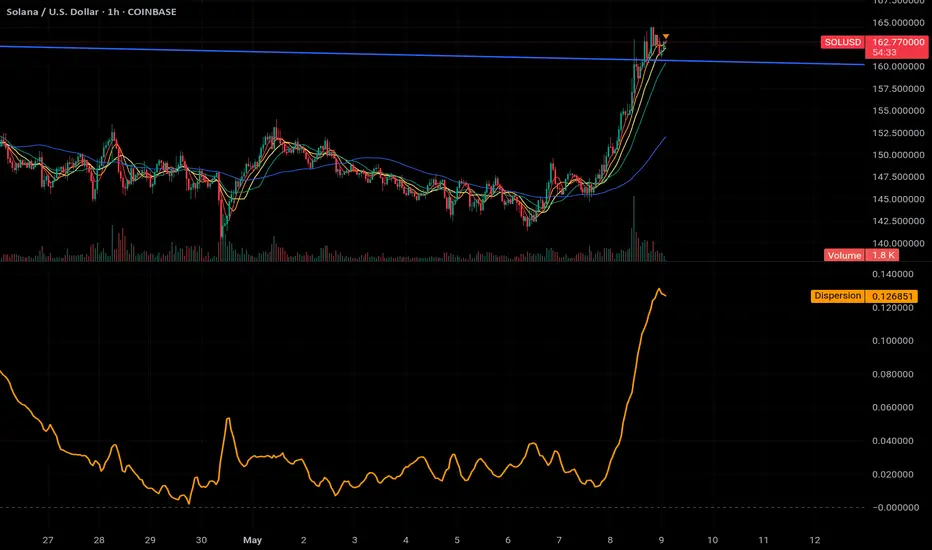
MA Dispersion+MA Dispersion+ — read the “breathing space” between your moving-averages
Get instant feedback on trend strength, volatility expansion and mean-reversion — across any timeframe.
MA Dispersion+ turns the humble moving-average stack into a single, easy-to-read oscillator that tells you at a glance whether price is coiling or fanning out.
🧩 What it does
Plugs into your favourite MA setup
• Pick the classic 5 / 20 / 50 / 200 lengths or disable any combination with one click.
• Choose the MA engine you trust — SMA, EMA, RMA, VWMA or WMA.
• Works on any timeframe thanks to TradingView’s security() engine.
Measures “spread”
For every bar it calculates the absolute distance of each selected MA from their average.
The tighter the stack, the lower the value; the wider the fan, the higher the value.
Adds professional-grade controls
• Weighting — let short-term MAs dominate (Inverse Length), keep everything equal, or dial in your own custom weights.
• Normalisation — convert the raw distance into a percentage of price, ATR multiples, or scale by the MAs’ own mean so you can compare symbols of any price or volatility.
🔍 How traders use it
Trend confirmation – rising dispersion while price breaks out = momentum is genuine.
Volatility squeeze – dispersion parking near zero warns that a big move is loading.
Multi-TF outlook – drop one pane per timeframe (e.g. 5 m, 1 h, 1 D) and see which layer of the market is driving.
Mean-reversion plays – spikes that fade quickly often coincide with exhaustion and snap-backs.
⚙️ Quick-start
Add MA Dispersion+ to your chart.
Set the pane’s timeframe in the first input.
Tick the MA lengths you actually use.
(Optional) Pick a weighting scheme and a normaliser.
Repeat the indicator for as many timeframes as you like — each instance keeps its own settings.
✨ Why you’ll love it
Zero clutter – one orange line tells you what four separate MAs whisper.
Configurable yet bullet-proof – all lengths are hard-coded constants, so Pine never complains.
Context aware – normalisation lets you compare BTC’s $60 000 chaos with EURUSD’s four--decimals calm.
Lightweight – no labels, no drawings, no background processing — perfect for mobile and multi-pane layouts.
Give MA Dispersion+ a try and let your charts breathe — you’ll never look at moving-average ribbons the same way again.
Happy trading!
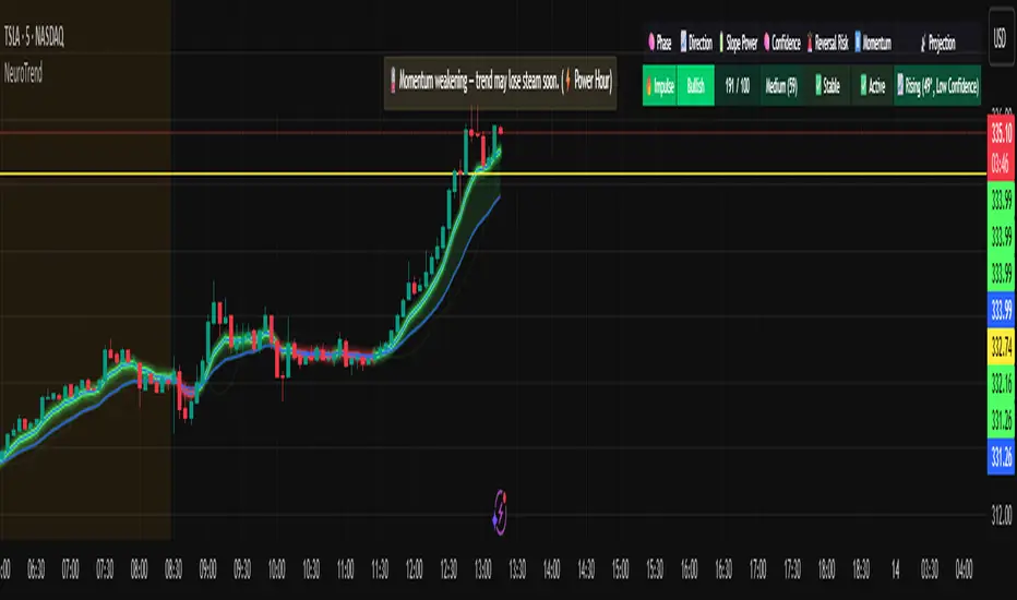
NeuroTrendNeuroTrend is an advanced, self-adjusting trend analysis system that continuously adapts to changing market conditions using volatility-aware smoothing, momentum weighting, and intelligent trend classification. It provides real-time trend detection, confidence scoring, early reversal warnings, and slope projection, all delivered through a coaching dashboard and structured rule-based commentary system.
At its core, NeuroTrend uses two EMAs whose smoothing lengths change automatically based on current volatility, measured by the ATR relative to price, and momentum bias, measured by RSI displacement from the neutral level. These adaptive EMAs create a flexible baseline that adjusts to the pace of the market. From these EMAs, the system calculates angular slope and derives a slope power score, which reflects directional momentum weighted by volatility.
NeuroTrend classifies each bar into one of five market phases: Impulse, Cooling, Reversal Risk, Stall, or Neutral. This classification is based on slope strength, slope variability, and RSI behavior. Each phase offers specific context for whether to enter, continue, or avoid a position.
The indicator uses what is referred to as a neural memory engine, which is inspired by the idea of memory but is not a neural network or machine learning model. Instead, it is a statistical recalibration system that adjusts thresholds using recent ATR conditions and slope standard deviation. This allows the indicator to remain aligned with the current market environment without the need for manual tuning.
Although NeuroTrend is fully adaptive, it includes inputs for the base fast and slow EMAs. These inputs define the central anchor points around which the adaptive logic operates. This gives the trader the ability to control the default behavior of the indicator while still benefiting from real-time responsiveness to volatility and momentum.
To assess the strength of a trend, NeuroTrend computes a confidence score based on four elements: DMI trend strength, directional bias from DI+ and DI–, slope normalization, and volatility efficiency measured by ATR in relation to EMA distance. This score is used to inform alerts, commentary, and dashboard visualization.
The indicator also includes a slope projection engine that estimates near-term direction based on slope change and acceleration. This projection is scaled and clamped using a dynamic volatility factor to prevent unrealistic or unstable values.
Reversal and stall detection are built in. Reversal detection is based on slope collapsing, sign flipping, and RSI weakness. Stall detection is triggered when slope magnitude is low, RSI is flat, and ATR is compressed. These filters help prevent entries in low-quality or high-risk environments.
The system also includes AI-style commentary. This feature is not powered by machine learning or natural language processing. It is rule-based, using prioritized conditions to generate clear statements that reflect the current market state. Messages such as "Strong trend forming" or "Reversal risk rising" are created by predefined logic that adapts to the market.
A visual dashboard is provided on the chart. It displays the current phase, trend direction, slope score, confidence level, reversal status, stall condition, and projected slope angle. This helps traders interpret market behavior at a glance without scanning multiple indicators.
Alerts are triggered only when specific conditions are met: trend strength must be in the impulse phase, confidence must be high, and there must be no active reversal or stall conditions. This ensures alerts are reserved for high-quality setups with strong directional alignment.
Disclaimer:
This script is intended for educational and informational use only. It does not constitute financial advice. The author accepts no responsibility for any trading or investment decisions made using this tool. Always do your own research and consult a licensed financial advisor before making financial decisions.
IBD Style Candles [tradeviZion]IBD Style Candles - Visualize Price Bars Like the Pros
Transform your chart with institutional-grade IBD-style bars and customizable moving averages for both daily and weekly timeframes. This indicator helps you visualize price action the way professionals at Investors Business Daily do.
What This Indicator Offers:
IBD-style bar visualization (clean, professional appearance)
Customizable coloring based on price movement or previous close
Automatic timeframe detection for appropriate moving averages
Four customizable moving averages for daily timeframes (10, 21, 50, 200)
Four customizable moving averages for weekly timeframes (10, 20, 30, 40)
Options to use SMAs or EMAs with adjustable colors and line widths
"The IBD-style bars provide a cleaner view of price action, allowing you to focus on market structure without the visual noise of traditional candles."
How to Apply the IBD-Style Bars:
On your TradingView chart, select "Bars" as the chart type from the main chart type selection menu (next to the time interval options).
Right-click on the chart and select "Settings".
Go to the "Symbol" tab.
Uncheck the "Thin Bars" option to display thicker bars.
Set the "Up Color" and "Down Color" opacity to 0 for a clean IBD-style appearance.
Enable "IBD-style Candles" from the script's settings.
To revert to the original chart style, repeat the above steps and restore the default settings.
Moving Average Configuration:
The indicator automatically detects your timeframe and displays the appropriate moving averages:
Daily Timeframe Moving Averages:
10-day moving average (SMA/EMA)
21-day moving average (SMA/EMA)
50-day moving average (SMA/EMA)
200-day moving average (SMA/EMA)
Weekly Timeframe Moving Averages:
10-week moving average (SMA/EMA)
20-week moving average (SMA/EMA)
30-week moving average (SMA/EMA)
40-week moving average (SMA/EMA)
Usage Tips:
Enable "Color bars based on previous close" to identify momentum shifts based on prior candle closes
Customize colors to match your chart theme or preference
Enable only the moving averages relevant to your trading strategy
For cleaner charts, reduce the number of visible moving averages
For stock trading, the 10/21/50/200 daily and 10/40 weekly MAs are most commonly used by institutions
// Example configuration for different timeframes
if timeframe.isweekly
// Weekly configuration
showSMA1_Weekly = true // 10-week MA
showSMA4_Weekly = true // 40-week MA
else
// Daily configuration
showMA2_Daily = true // 21-day MA
showMA3_Daily = true // 50-day MA
showMA4_Daily = true // 200-day MA
While the IBD style provides clarity, remember that no visualization method guarantees trading success. Always combine with proper analysis and risk management.
If you found this indicator helpful, please consider leaving a comment or suggestion for future improvements. Happy trading!

Zero Lag AMA# Zero Lag AMA Indicator
## Overview
The High Probability AMA Indicator is a sophisticated trend-following tool that adapts to market conditions by dynamically adjusting its smoothing factor based on market efficiency. Unlike standard moving averages with fixed parameters, this indicator becomes more responsive during trending markets and more stable during choppy, sideways markets.
### Adaptive Moving Average (AMA)
The AMA adjusts its sensitivity to price changes based on market conditions:
- In trending markets: The AMA closely follows price movements with minimal lag
- In ranging markets: The AMA filters out noise by smoothing price action
### Efficiency Ratio (ER)
The indicator measures market efficiency using the Efficiency Ratio:
ER = Direction / Volatility
Where:
- **Direction** is the absolute net change in price over a period (how far price has moved)
- **Volatility** is the sum of all absolute price changes over the same period (how much price has fluctuated)
The ER ranges between 0 and 1:
- Values close to 1 indicate a strong trend (efficient market movement)
- Values close to 0 indicate a choppy market (inefficient market movement)
### Variable Smoothing Constant
Based on the Efficiency Ratio, the indicator calculates a smoothing constant between two extremes:
- A fast smoothing constant for trending markets
- A slow smoothing constant for ranging markets
The formula is:
SC = ²
Where:
- FastSC = 2/(fastPeriod + 1)
- SlowSC = 2/(slowPeriod + 1)
## Key Features
### Dynamic Volatility Measurement
The indicator calculates price volatility using standard deviation over a customizable period, which helps contextualize price movements relative to recent market conditions.
### AMA Slope Analysis
The indicator tracks the AMA's slope (rate of change) to determine trend direction and strength, providing valuable context beyond just price position relative to the AMA line.
### Visual Trend Identification
The chart background changes color based on trend conditions:
- Green background indicates bullish conditions (price above AMA and positive slope)
- Red background indicates bearish conditions (price below AMA and negative slope)
## Parameters
### Essential Parameters
- **Fast Period (default: 9)**: Controls the most responsive the AMA can be during strong trends
- **Slow Period (default: 15)**: Controls how smooth the AMA becomes during choppy markets
- **Volatility Period (default: 14)**: Period for calculating price standard deviation
- **Efficiency Ratio Period (default: 20)**: Period for calculating the Efficiency Ratio
### Appearance Settings
- **AMA Line Color**: Customize the color of the Adaptive Moving Average line
## How to Use This Indicator
### Trend Identification
The primary use is identifying the current market trend:
- The AMA line direction indicates the overall trend
- Background colors provide quick visual confirmation of trend state
- Price position relative to the AMA line shows the current market bias
### Market Context
- Monitor the AMA slope to gauge trend strength
- Use volatility readings to assess market conditions
- Pay attention to how closely the AMA follows price - tight following indicates trending markets
### Optimal Trading Conditions
- Most reliable signals occur when price breaks and closes beyond the AMA line while the AMA slope confirms the direction
- The indicator performs best on higher timeframes (1H, 4H, Daily) for strategic positions
- Can also be effective on lower timeframes (5m,15m, 30m) when combined with other confirmation tools
## Best Practices
1. **Multiple Timeframe Analysis**: Confirm signals across different timeframes for higher probability setups
2. **Complementary Indicators**: Combine with:
- Volume indicators to confirm trend strength
- Oscillators for potential reversal points
- Support/resistance levels for entry and exit points
3. **Parameter Optimization**: Adjust parameters based on:
- The specific instrument being traded
- Your trading timeframe
- Current market volatility conditions
## Technical Implementation Details
The indicator uses a sophisticated calculation approach:
1. Calculates the Efficiency Ratio using price direction and volatility
2. Determines the appropriate smoothing constant based on market efficiency
3. Applies the smoothing constant to current and previous AMA values
4. Analyzes AMA slope and price position to determine market conditions
5. Provides visual feedback through line color and background shading
This implementation avoids the lag present in traditional moving averages while still filtering market noise, making it particularly valuable during transitions between trending and ranging market conditions.

ADR & ATR OverlayADR & ATR Overlay
This indicator will display the following as an overlay on your chart:
ADR
% of ADR
ADR % of Price
ATR
% of ATR
ATR % of Price
Description:
ADR : Average Day Range
% of ADR : Percentage that the current price move has covered its average.
ADR % of Price : The percentage move implied by the average range.
ATR : Average True Range
% of ATR : Percentage that the current price move has covered its average.
ATR % of Price : The percentage move implied by the average true range.
Options:
Time Frame
Length
Smoothing
Enable or Disable each value
Text Color
Background Color
How to use this indicator:
The ADR and ATR can be used to provide information about average price moves to help set targets, stop losses, entries and exits based on the potential average moves.
Example: If the "% of ADR" is reading 100%, then 100% of the asset's average price range has been covered, suggesting that an additional move beyond the range has a lower probability.
Example: "ADR % of Price" provides potential price movement in percentage which can be used to asses R/R for asset.
Example: ADR (D) reading is 100% at market close but ATR (D) is at 70% at close. This suggests that there is a potential move of 30% in Pre/Post market as suggested by averages.
Notes:
These indicators are available as oscillators to place under your chart through trading view but this indicator will place them on the chart in numerical only format.
Please feel free to modify this script if you like but please acknowledge me, I am only a hobby coder so this takes some time & effort.

Base Detector Pro [AletheiaTradeLab]This custom Trading View indicator combines William O’Neal “Base” patterns with several complementary tools—David Ryan’s ANT indicator, key pivot‐based price levels, index and earnings lines, relative strength (RS) line, and moving averages—to help you pinpoint base formations and validate whether each one merits a trade.
1. Bases (William O'Neal)
A “base” is simply a period of price consolidation following a significant run-up. During this phase, a stock moves mostly sideways within a defined trading range, forming clear support and resistance lines.
Key Criteria for a Valid Base
- Prior Uptrend
Before a base begins, the stock should already have a healthy advance—typically at least a 30% gain.
- Shapes of Bases
Bases can form in several distinct geometric patterns, each signaling a different kind of consolidation and potential breakout:
Flat Base
Shape : A horizontal rectangle bounded by nearly parallel support (bottom) and resistance (top) trendlines.
Minimum Length : 5 weeks
Maximum Length : 65 weeks
Depth : < 15%
Pivot Point : Left-side high of base
i.ibb.co i.ibb.co
Cup Base
Shape : A smooth, rounded “U” curve.
Minimum Length : 6 weeks
Maximum Length : 65 weeks
Minimum Depth : 8%
Maximum Depth : 50%
Pivot Point : Left-side high of base
i.ibb.co i.ibb.co
Sauce Base
Shape : A very gradual, broad “U” curve, often taking more length than cup bases.
Minimum Length : 6 weeks
Maximum Length : 65 weeks
Minimum Depth : 8%
Maximum Depth : 50%
Pivot Point : Left-side high of base
i.ibb.co i.ibb.co
Cup with Handle Base
Shape : A “U”‐shaped cup followed by a smaller downward-sloping flag or channel (the handle).
Minimum Length : 6 weeks
Maximum Length : 65 weeks
Minimum Depth : 8%
Maximum Depth : 50%
Pivot Point : High of the handle
i.ibb.co i.ibb.co
Saucer with Handle Base
Shape : Similar to cup with handle, but cup looks like the saucer base.
Minimum Length : 6 weeks
Maximum Length : 65 weeks
Minimum Depth : 8%
Maximum Depth : 50%
Pivot Point : High of the handle
i.ibb.co
Ascending Base
Shape : An upward-sloping channel or wedge with 3 pullbacks. Each pullback low should be higher than the previous one. It needs around 20% increase from a base to the other.
Minimum Length : 8 weeks
Maximum Length : 16 weeks
Minimum Depth : 8%
Maximum Depth : 50%
Pivot Point : Left-side high of third base
i.ibb.co i.ibb.co
Consolidation Base
Shape : Similar to flat base, but wider and fails to form any of the above bases.
Minimum Length : 8 weeks
Maximum Length : 16 weeks
Minimum Depth : 8%
Maximum Depth : 50%
Pivot Point : Left-side high of base
i.ibb.co i.ibb.co
- Base Stages
Once a stock has completed its initial 30% run-up and formed its first base, that pattern is labeled Stage 1.
After a breakout from Stage N, the stock must rally at least 20% above the Stage N pivot (the base’s resistance point). If it does, the next valid base becomes Stage N + 1.
When a breakout fails to advance at least 20% a base on base forms. This is considered an extension for the current base stage, and a letter is assigned after the stage number.
When a breakout fails and the price undercuts the low for the previous base, the base stages reset, and a rally of 30% will be needed to form a new stage 1 base.
Note that for IPO stocks, a 30% increase is not required to form the first base. As soon as it meets any of the shape of any of the available bases, it will be drawn.
- Base statistics
To help you determine how healthy is a base, some statistics are available when you hover on the small dot shown above the high-left side of each base.
i.ibb.co
Base : The specific pattern type (Flat, Cup, Sauce, etc.).
Stage : The stage number of the base (1, 2, 3 …) and, in parentheses, how many distinct bases have formed since the very first base (including base-on-base like 1a, 1b, etc.).
Pivot : The resistance level that defines the top of the base. A close above this price often signals a valid breakout and a potential entry point.
Length : The number of bars (days on a daily chart; weeks on a weekly chart) between the start of the base and the bar immediately before breakout. (The initial bar and the breakout bar themselves are not counted.)
Depth : How far, in percentage terms, the low of the base has fallen below its left-side high.
Prior Uptrend : The percent gain from the pivot of the previous base up to the start of the current base.
Blue/Red Count : The number of up days (Blue) and down days (Red) during the base where volume was above the 50-period moving average.
Price % : The percent change from the close at the end of the base to the close at the breakout bar.
Volume % : The percent difference between the volume on the breakout bar and the 50-period average volume at the end of the base.
2. ANT Indicator (David Ryan)
The ANT indicator, developed by David Ryan, is a momentum-based signal used to identify high-potential breakout candidates during a stock’s run-up phase. It complements the base patterns by flagging moments of unusually strong price and volume activity within an uptrend, helping confirm emerging strength before or during a base formation.
i.ibb.co
3. Key Price Levels (Pivots)
Plots recent pivot-based support and resistance levels.
i.ibb.co
4. Index Line Overlay
Overlays a chosen index (e.g. SPX) on the top portion of the chart to compare relative performance.
i.ibb.co
5. Relative Strength (RS) Line
Plots the price ratio of the symbol vs. an index (e.g. SPX) to identify outperformance.
i.ibb.co
6. Moving Averages (SMA & RS-MA)
Allows up to four simple (or exponential) moving averages on price (daily/weekly) and three on the RS line.
7. Earnings Line & EPS Change
Marks earnings events on daily/weekly charts and optionally plots YoY EPS change in a lower portion of the chart. The earnings line also shows a projection to estimated earnings. To maintain alignment with the price chart, the line and YoY EPS data are limited to the most recent 28 quarters on weekly charts and 8 quarters on daily charts. For analyzing older data, you can use the replay feature.
i.ibb.co
8. Bars
Since Trading View displays very thin bars when zoomed out, I added 2-pixel-wide vertical lines over the bars to make them easier to see.
9. Dark Theme
I added this for a quick workaround to adapt colors for dark theme. Enabling this overrides any custom settings. Uncheck to customize colors.
i.ibb.co

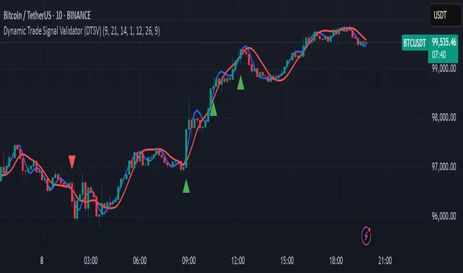
Dynamic Trade Signal Validator (DTSV)The Dynamic Trade Signal Validator (DTSV) is designed to filter false trade signals while generating reliable, frequent trade opportunities. False signals, which lead to unprofitable trades, often occur in choppy or low-momentum markets. The DTSV combines Hull Moving Average (HMA) crossovers, Average True Range (ATR) breakout confirmation, and MACD histogram momentum filtering to ensure signals align with trend, volatility, and momentum, making it ideal for day trading or swing trading across assets like stocks, forex, or cryptocurrencies.
How It Works
The DTSV uses three components to validate trade signals, balancing frequency and reliability:
HMA Crossover for Trend Direction:
Two HMAs (default: 9-period fast, 21-period slow) detect trend changes. A buy signal triggers when the fast HMA crosses above the slow HMA (bullish), and a sell signal when it crosses below (bearish). HMAs reduce lag compared to traditional MAs, enabling more responsive trend detection.
ATR Breakout Confirmation:
The 14-period ATR ensures significant price movement by requiring the bar’s range (high minus low) to exceed the ATR multiplied by 1.0 (adjustable). This confirms volatility, reducing false signals in stagnant markets.
MACD Histogram Momentum Filter:
The MACD (default: 12, 26, 9) histogram confirms momentum. Buy signals require a positive histogram (bullish momentum), and sell signals need a negative histogram (bearish momentum), ensuring directional strength.
Signal Generation
Buy signals (green triangles below bars) occur when a bullish HMA crossover, ATR breakout, and positive MACD histogram align. Sell signals (red triangles above bars) require a bearish crossover, ATR breakout, and negative histogram. This triple confirmation minimizes false trades while maintaining frequent signals.
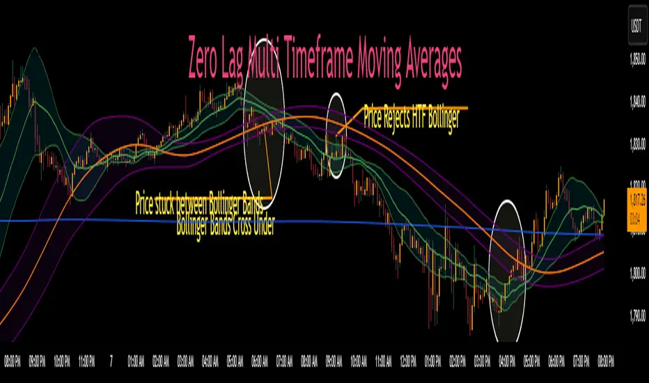
Zero Lag MTF Moving Average by CoffeeshopCryptoBased on Moving Average Types supplied by @TradingView www.tradingview.com
Ideas and code enhanced to show higher timeframe by @CoffeeShopCrypto
It’s time to take the guesswork out of moving averages and multiple timeframes when day trading. Moving averages are a cornerstone of many trading strategies, often viewed as dynamic support and resistance levels. Traders rely on these levels to anticipate price reactions, whether it’s a bounce in a trending market or a reversal in a ranging one. Additionally, the direction and alignment of multi timeframe moving averages—whether they’re moving in the same direction or diverging—provide critical clues about market momentum and potential reversals. However, the traditional higher timeframe moving average indicators force traders to wait for higher timeframe candles to close, creating lag and missed opportunities.
The Old Way
For example: If you are on a 5 minute chart and you want to observe the location and direction of a 30 minute chart Moving Average, you'll need to wait for a total of 6 candles to close, and again every 6 candles after that. This only creates more lag.
The New Way
Now there is no waiting for high timeframe session candles to close. No matter what timeframe Moving Average you want to know about, this indicator will show you its location on your current chart at any time in real time.
For those who prefer Bollinger Bands, this indicator adds a whole new dimension to your strategy. Traders often wait for price action to break outside the lower time frame Bollinger bands before considering a trade, while still seeking key support or resistance levels beyond them. But if you don't know the position of your higher time frame Bollinger, you could be trading into a trap. With Zero Lag Multi Timeframe Moving Average, you can view both your current and higher timeframe Bollinger Bands simultaneously with zero waiting. This lets you instantly see when price action is traveling between the bands of either timeframe or breaking through both—indicating a strong trend in that direction. Additionally, when both sets of Bollinger Bands overlap at the same price levels, it highlights areas of strong consolidation and ranging conditions, giving you a clear picture of market dynamics. This is a key element in price action that tells you there is currently no direction to the market and both the current and higher time frames are flat.
Enter Zero Lag Multi Timeframe Moving Average—the ultimate tool for real-time higher timeframe moving averages and Bollinger Bands. This innovative indicator eliminates the delay, delivering instant, precise values for higher timeframe averages and bands, even on open candles. Seamlessly combining current and higher timeframe data, it allows traders to identify key moments where moving averages or Bollinger Bands align or diverge, signaling market conditions. Whether you’re gauging the strength of a trend, pinpointing potential reversals, or identifying consolidation zones, Zero Lag Multi Timeframe Moving Average gives you the clarity needed to make better trading decisions according to market conditions.
Why is this "Mashup" of moving averages different and important?
Honestly its really about the calculation thats imported through the "import library" function.
Heres what it does:
The ZLMTF-MA is designed to help traders easily see where higher timeframe moving averages and Bollinger Bands are—without needing to switch chart timeframes or wait for those larger candles to close. It works by adjusting common moving average types like SMA, EMA, and VWMA to show what they would look like if they were based on a higher timeframe, right on your current chart. This helps users stay focused on their main timeframe while still having a clear view of the bigger picture, making it easier to spot trend direction, key support and resistance levels, and overall market structure. The goal is to keep things simple, fast, and more visually informative for everyday traders.
Bollinger Bands
When working with Bollinger Bands, a common strategy is to take the trades once price action has escaped through the top or bottom of your current Bollinger Band.
A false breakout occurs when both Bollinger Bands are not moving in the same direction as eachother or when they are overlapping.
Moving Averages as Support and Resistance:
Traders who use Moving Averages as support or resistance, looking for rejections or failures of these areas can now see multiple timeframe price action instantly and simultaneously.
Trading Setup Examples:
Price Action Scenario 1:
Higher Timeframe Ranging-
When price action breaks through a current moving average headed toward a higher timeframe moving average, trades are taken with caution if the moving averages are converging.
Price Action Scenario 2:
Strong Trending Market -
If the moving averages are in the same direction, and your price action is now leading the low timeframe moving average, you have re-entered a strong trend.
Price Action Scenario 3:
High Timeframe Rejections -
If you have a rejection of a higher timeframe moving average, and your both averages are still diverging, this is the end of a pullback as you re-enter a strong trend in the original direction
Price Action Scenario 4:
Trend Reversals -
If you close beyond both the low and high timeframe moving averages, you can consider that price action is strong enough to change direction here and you should prepare for trade setups in the opposite direction of the previous.
HTF MA Label Information:
Even if your high timeframe moving average is turned off, you can still see this label.
It gives you a quick reminder of what high timeframe settings you have used to see MA values.
Ceres Trader Simple Trend & Momentum SignalsCeres Trader – Simple Trend & Momentum Signals
Description:
Cut through chart noise with a lightweight, two-factor signal system that combines a classic trend filter (200 EMA) with momentum confirmation (smoothed RSI as a QQE proxy). This indicator plots clean entry arrows—no background shading, no clutter—so you can trade only in the high-probability regime:
Trend Filter: 200-period exponential moving average
Momentum Filter: RSI(14) smoothed over N bars, offset by 50 to create a zero-line
Long Entry: Price above the 200 EMA and the smoothed RSI crosses up through zero → green up-arrow below bar
Short Entry: Price below the 200 EMA and the smoothed RSI crosses down through zero → red down-arrow above bar
Key Features:
Minimalist display: only the 200 EMA and entry arrows
Customizable inputs: EMA length, RSI length, RSI smoothing period
Ultra-low CPU load: suitable for lower timeframes (e.g. 1 min gold futures)
Yellow label text: for optimal visibility on dark or light chart backgrounds
How to Use:
Add the script to your TradingView chart.
Choose your timeframe and adjust inputs as needed.
Take only the long signals when price is above the EMA, and only the short signals when price is below.
Place stops just beyond the EMA; targets can be measured swings or fixed R-multiples.
Notes:
Designed as a regime-based entry filter—no exits or background fills included.
Feel free to combine with your own stop-loss, take-profit, and money-management rules.
Trade smarter, not harder—let the market tell you only when both trend and momentum align.

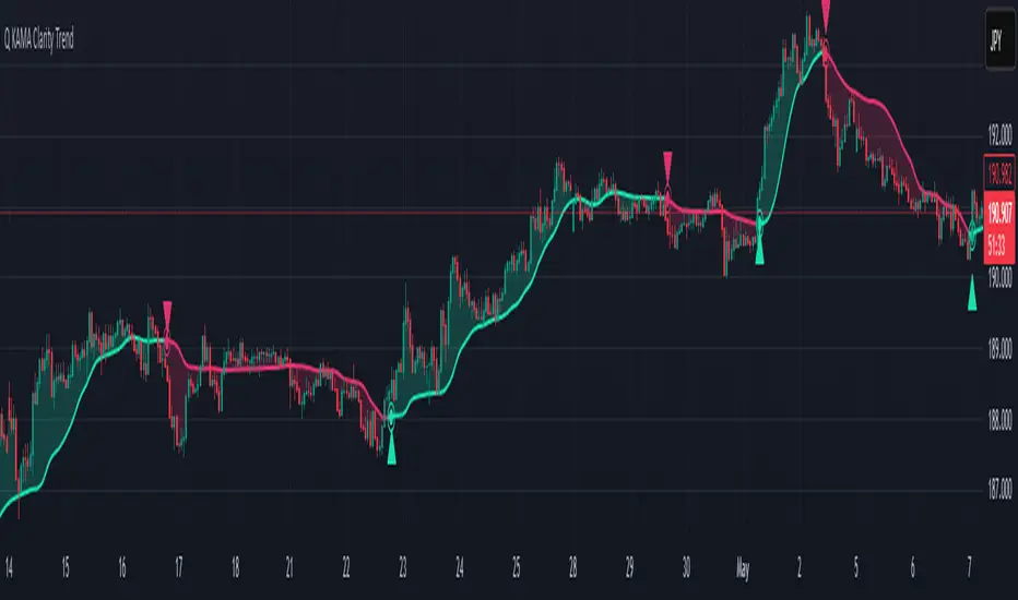
Q KAMA Clarity Trend Q KAMA Clarity Trend
A minimalistic yet versatile trend-following tool that combines **Kaufman’s Adaptive Moving Average (KAMA) with Gaussian smoothing and ATR-based breakout logic. Built for traders who value clarity, responsiveness, and visual simplicity.
🔧 Core Features
1. Adaptive KAMA Trend Line
• Dynamically adjusts to market volatility using Kaufman’s KAMA.
• Gaussian filter pre-smooths price to reduce noise before calculating KAMA.
2. Dual Trend Logic (toggle)
• Default: Trend shifts on price breakouts above/below KAMA ± ATR channel.
• Alternative: Faster signals based on price crossing KAMA directly.
3. Visual Feedback
• Auto-colored KAMA line based on trend direction (up/down/neutral).
• Arrows on trend reversals (up = green, down = red).
• Optional shadow fill below line for regime clarity.
• Optional dot marker ("⦿") on the KAMA line to show trend shifts.
4. Alerts
• Real-time alerts when a new uptrend or downtrend begins.
• Compatible with manual or automated strategies.
⚙️ Configurable Inputs
• Source: Price input (default: close)
• KAMA Length: Adjusts sensitivity (longer = smoother)
• ATR Length & Multiplier: Defines channel width for breakout detection
• Gaussian Filter (Length & Sigma): Controls smoothing strength
• Trend Logic Mode: ATR channel breakout vs. price-KAMA cross
• Style: Custom colors, background fill, marker visibility
📈 How to Use
• Follow trend arrows for directional confirmation
• Use ATR breakout mode for cleaner, filtered signals
• Switch to price-KAMA crossover mode for earlier entries
• Works well with structure, momentum, and volume confirmation
Multi-VWAP System🚀 Multi-VWAP System — Anchored VWAP & Deviation Bands
Overview
The Multi-VWAP System provides traders with a professional-grade approach to anchored VWAP analysis. Inspired by Brian Shannon's pioneering work on Anchored VWAP, this indicator automatically calculates and plots:
Current Session VWAP
Previous Session VWAP (also known as "2-Day VWAP")
High-of-Day (HOD) Anchored VWAP
Each VWAP can also display optional Standard Deviation Bands to highlight statistically significant deviations from the volume-weighted average price.
🔍 Why Anchored VWAP Matters
Volume Weighted Average Price (VWAP) is among the most critical institutional indicators, as it represents the average price paid for a stock adjusted by trading volume. This makes VWAP crucial for identifying fair value and significant areas of institutional activity.
Institutions utilize VWAP extensively to guide their execution algorithms. For instance, if price dips below a 2-day anchored VWAP (anchored to the previous session's open), many institutions interpret this as a discounted entry, potentially triggering large-scale buy programs. Conversely, sustained movement above VWAP signals strong buying pressure and bullish sentiment.
📌 Why Multiple Anchors?
Traders commonly anchor VWAPs at critical reference points:
Current Session VWAP:
Essential for day traders as a reference for intraday sentiment. Price action above this line generally indicates bullish sentiment, while price below signals bearish sentiment.
Previous Session (2-Day) VWAP:
Heavily used by institutions and swing traders, it provides insight into multi-session sentiment. Institutions commonly activate buy or sell programs based on whether price is trading at a premium or discount relative to this VWAP.
High-of-Day (HOD) VWAP:
Frequently used by momentum traders, this anchor captures sentiment after the most recent intraday high. Price above the HOD VWAP suggests sustained bullish momentum, while price below might signal weakening momentum.
🌟 Standard Deviation Bands
Each anchored VWAP in this indicator includes optional Standard Deviation Bands, highlighting statistical extremes. Traders use these bands to:
Identify potentially overextended moves (beyond +2σ or +3σ).
Gauge momentum strength (holding above +1σ).
Spot mean-reversion setups when price returns to VWAP after extreme moves.
🎨 Dynamic Background and Momentum Colorization
To visually highlight strength or weakness in price action relative to VWAP:
Dynamic Background Fill between Current and Previous VWAPs:
Green background appears when the Current VWAP is above the Previous VWAP and the linear regression slope (adjustable length) is positive, indicating bullish sentiment.
Red background appears when the Current VWAP is below the Previous VWAP and the slope is negative, indicating bearish sentiment.
No fill when conditions are mixed or momentum is uncertain.
Gold Fill above HOD VWAP:
When price action is above the High-of-Day VWAP and momentum (linear regression slope) is positive, a subtle gold shading appears, quickly highlighting bullish momentum.
⚙ Fully Customizable Settings
Session Times: Adjust session start and end times to match your specific market hours.
Standard Deviation Bands: Enable or disable each VWAP’s deviation bands individually and select how many bands (1σ, 2σ, or 3σ) you'd like to display.
Momentum Slope Length: Adjustable lookback for linear regression slope calculation—giving you full control of trend sensitivity.
🎯 Who Should Use This Indicator?
This indicator is perfect for:
Day Traders who want quick insights into intraday sentiment shifts.
Swing Traders tracking institutional footprints and seeking optimal entry/exit points.
Momentum Traders who rely on clearly visible momentum signals from HOD anchored VWAPs.
Institutional Traders and Professionals seeking sophisticated, institutionally-inspired VWAP analysis without manual anchoring.
📈 Summary of Features
✅ Automatic VWAP Anchors (Current Session, Previous Session, High-of-Day)
✅ Optional Standard Deviation Bands for each VWAP anchor
✅ Dynamic Background Coloring based on price action and momentum conditions
✅ Gold Momentum Highlight for quick bullish momentum identification above HOD VWAP
✅ Fully Customizable Inputs for precise personalization and flexibility
📢 Conclusion
The Multi-VWAP System isn't just another VWAP indicator. It's an institutional-level, dynamic, multi-dimensional analysis tool inspired by the work of Brian Shannon and leading institutional traders. It takes the guesswork out of anchoring and analysis, leaving you free to focus on identifying and executing high-probability trade setups.
Enjoy trading smarter—not harder. Happy Trading! 🚀📊

CAN INDICATORCAN Moving Averages Indicator - Feature Guide
1. Multiple Moving Averages (20 MAs)
- Supports up to 20 individual moving averages
- Each MA can be independently configured:
- Enable/Disable toggle
- Length (period) setting
- Type selection (SMA, EMA, DEMA, VWMA, RMA, WMA)
- Color customization
- Individual timeframe settings when global timeframe is disabled
Pre-configured MA Settings:
1. MA1-8: SMA type
- Lengths: 20, 50, 100, 200, 365, 489, 600, 1460
2. MA9-20: EMA type
- Lengths: 30, 60, 120, 240, 300, 400, 500, 700, 800, 900, 1000, 2000
2. Global Timeframe Settings
Location: Global Settings group
Features:
- Use Global Timeframe: Toggle to use one timeframe for all MAs
- Global Timeframe: Select the timeframe to apply globally
3. Label Display Options
Location: Main Inputs section
Controls:
- Show MA Type: Display MA type (SMA, EMA, etc.)
- Show MA Length: Display period length
- Show Resolution: Display timeframe
- Label Offset: Adjust label position
4. Cross Alerts System
Location: Cross Alerts group
Features:
1. Price Crosses:
- Alerts when price crosses any selected MA
- Select MA to monitor (1-20)
- Triggers on crossover/crossunder
2. MA Crosses:
- Alerts when one MA crosses another
- Select fast MA (1-20)
- Select slow MA (1-20)
- Triggers on crossover/crossunder
5. Relative Strength (RS) Analysis
Location: Relative Strength group
Features:
- Select any MA to monitor (1-20)
- Compares MA to its own average
- Adjustable RS Length (default 14)
- Visual feedback via background color:
- Green: MA above its average (uptrend)
- Red: MA below its average (downtrend)
- Customizable colors and transparency
6. Moving Average Types Available
1. **SMA** (Simple Moving Average)
- Equal weight to all prices
2. **EMA** (Exponential Moving Average)
- More weight to recent prices
3. **DEMA** (Double Exponential Moving Average)
- Reduced lag compared to EMA
4. **VWMA** (Volume Weighted Moving Average)
- Incorporates volume data
5. **RMA** (Running Moving Average)
- Smoother than EMA
6. **WMA** (Weighted Moving Average)
- Linear weight distribution
Usage Tips
1. **For Trend Following:**
- Enable longer-period MAs (MA4-MA8)
- Use cross alerts between long-term MAs
- Monitor RS for trend strength
2. **For Short-term Trading:**
- Focus on shorter-period MAs (MA1-MA3, MA9-MA11)
- Enable price cross alerts
- Use multiple timeframe analysis
3. **For Multiple Timeframe Analysis:**
- Disable global timeframe
- Set different timeframes for each MA
- Compare MA relationships across timeframes
4. **For Performance:**
- Disable unused MAs
- Limit active alerts to necessary pairs
- Use RS selectively on key MAs

Closest Candle to EMA (CCE)🔍 Closest Candle to EMA (CCE)
The Closest Candle to EMA (CCE) indicator is a visual analytical tool designed to identify the historical price (candle close) that is closest to the current Exponential Moving Average (EMA) over a user-defined period. This allows traders to easily detect how price has interacted with the trend line recently, providing insights into potential mean reversion, support/resistance, and price convergence behavior.
📌 Key Features
✅ Highlights the candle with a closing price closest to the current EMA
✅ Customizable EMA length for various trading styles and timeframes
✅ Helps detect potential zones of trend interaction
✅ Supports analysis of price behavior near dynamic support/resistance
✅ Lightweight and non-intrusive visual overlay (red = closest price, blue = EMA)
🧠 How It Works
The script calculates the EMA using the user-defined length (default: 20).
It then scans the last N candles (equal to the EMA length) and finds the one whose closing price is closest to the current EMA value.
That close is highlighted in red, while the EMA is shown in blue.
This comparison helps traders understand the proximity of past price action to the current trend level.
💡 Use Cases
Mean Reversion Strategies – Spot when price historically reverts to the trend
Dynamic Support/Resistance Identification – Find levels where price respected or returned to the EMA
Consolidation Zone Analysis – Identify areas where price hovered around trend lines
Backtesting Trend Sensitivity – See how price reacted to EMA over time
⚙️ Settings
EMA Length – Set the number of periods used for EMA and comparison window (default: 20)
📊 Example Strategy Setup – EMA Touch with Reversal Candle
This indicator can be incorporated into a price-action strategy that combines candlestick patterns, EMA proximity, and volume confirmation. Here's a practical use case:
🔧 Note: This setup is designed specifically with the EMA length set to 9.
🔁 Bullish Setup – Hammer + EMA (in uptrend)
The market is in an uptrend, confirmed by EMA(9) sloping upward
A Hammer candlestick forms
The EMA (blue) must touch the lower shadow (wick) of the Hammer
It must not touch the candle body
Candle volume is above average
→ ✅ This may signal a bullish continuation opportunity
🔁 Bearish Setup – Shooting Star + EMA (in downtrend)
The market is in a downtrend, confirmed by EMA(9) sloping downward
A Shooting Star candlestick forms
The EMA (blue) must touch the upper shadow (wick) of the candle
It must not touch the candle body
Candle volume is above average
EMA SuiteFor strategies with moving averages, of course. My preference is to use Fibonacci values, but it can be configured with any setup. When working on a single timeframe, it allows adding averages or groups of averages from other timeframes, I’ve used this for scalping. The indicator is designed to be dynamic and adaptable. By editing the script, it’s easy to add or remove averages.
Larger averages might slow down loading, and a color palette selector could be added since manually setting 11 values is tedious.
I’m open to any suggestions