Quantum Moving Average - QMA (TechnoBlooms)The Quantum Moving Average (QMA) is an innovative and advanced Moving Average model designed for traders seeking a more adaptive and precise trend analysis. Unlike traditional moving averages, it integrates a multi-timeframe approach, dynamically selecting and weighting four different timeframes to provide traders with more accurate and reliable trend prediction.
Key Features
Multi-Timeframe averaging
QMA calculates its value based on four different timeframes, offering a broader perspective on market trends.
Dynamic Weighting Mechanism
Unlike fixed weight Moving Averages, QMA assigns adaptive weightage to the selected timeframes, enhancing its responsiveness.
Superior Trend Detection
Provides a smoother and more reliable trend curve reducing noise or false signals.
Enhanced Market Analysis
QMA helps traders identify trend shifts earlier by incorporating multi-timeframe confluence.
Moving Averages

Triple Differential Moving Average BraidThe Triple Differential Moving Average Braid weaves together three distinct layers of moving averages—short-term, medium-term, and long-term—providing a structured view of market trends across multiple time horizons. It is an integrated construct optimized exclusively for the 1D timeframe. For multi-timeframe analysis and/or trading the lower 1h and 15m charts, it pairs well the Granular Daily Moving Average Ribbon ... adjust the visibility settings accordingly.
Unlike traditional moving average indicators that use a single moving average crossover, this braid-style system incorporates both SMAs and EMAs. The dual-layer approach offers stability and responsiveness, allowing traders to detect trend shifts with greater confidence.
Users can, of course, specify their own color scheme. The indicator consists of three layered moving average pairs. These are named per their default colors:
1. Silver Thread – Tracks immediate price momentum.
2. Royal Guard – Captures market structure and developing trends.
3. Golden Section – Defines major market cycles and overall trend direction.
Each layer is color-coded and dynamically shaded based on whether the faster-moving average is above or below its slower counterpart, providing a visual representation of market strength and trend alignment.
🧵 Silver Thread
The Silver Thread is the fastest-moving layer, comprising the 21D SMA and a 21D EMA. The choice of 21 is intentional, as it corresponds to approximately one full month of trading days in a 5-day-per-week market and is also a Fibonacci number, reinforcing its use in technical analysis.
· The 21D SMA smooths out recent price action, offering a baseline for short-term structure.
· The 21D EMA reacts more quickly to price changes, highlighting shifts in momentum.
· When the SMA is above the EMA, price action remains stable.
· When the SMA falls below the EMA, short-term momentum weakens.
The Silver Thread is a leading indicator within the system, often flipping direction before the medium- and long-term layers follow suit. If the Silver Thread shifts bearish while the Royal Guard remains bullish, this can signal a temporary pullback rather than a full trend reversal.
👑 Royal Guard
The Royal Guard provides a broader perspective on market momentum by using a 50D EMA and a 200D EMA. EMAs prioritize recent price data, making this layer faster-reacting than the Golden Section while still offering a level of stability.
· When the 50D EMA is above the 200D EMA, the market is in a confirmed uptrend.
· When the 50D EMA crosses below the 200D EMA, momentum has shifted bearish.
This layer confirms medium-term trend structure and reacts more quickly to price changes than traditional SMAs, making it especially useful for trend-following traders who need faster confirmation than the Golden Section provides.
If the Silver Thread flips bearish while the Royal Guard remains bullish, traders may be seeing a momentary dip in an otherwise intact uptrend. Conversely, if both the Silver Thread and Royal Guard shift bearish, this suggests a deeper pullback or possible trend reversal.
📜 Golden Section
The Golden Section is the slowest and most stable layer of the system, utilizing a 50D SMA and a 200D SMA—a classic combination used by long-term traders and institutions.
· When the 50D SMA is above the 200D SMA the market is in a strong, sustained uptrend.
· When the 50D SMA falls below the 200D SMA the market is structurally bearish.
Because SMAs give equal weight to past price data, this layer moves slowly and deliberately, ensuring that false breakouts or temporary swings do not distort the bigger picture.
Traders can use the Golden Section to confirm major market trends—when all three layers are bullish, the market is strongly trending upward. If the Golden Section remains bullish while the Royal Guard turns bearish, this may indicate a medium-term correction within a larger uptrend rather than a full reversal.
🎯 Swing Trade Setups
Swing traders can benefit from the multi-layered approach of this indicator by aligning their trades with the overall market structure while capturing short-term momentum shifts.
· Bullish: Look for Silver Thread and Royal Guard alignment before entering. If the Silver Thread flips bullish first, anticipate a momentum shift. If the Royal Guard follows, this confirms a strong medium-term move.
· Bearish: If the Silver Thread turns bearish first, it may signal an upcoming reversal. Waiting for the Royal Guard to follow adds confirmation.
· Confirmation: If the Golden Section remains bullish, a pullback may be an opportunity to enter a trend continuation trade rather than exit prematurely.
🚨 Momentum Shifts
· If the Silver Thread flips bearish but the Royal Guard remains bullish, traders may opt to buy the dip rather than exit their positions.
· If both the Silver Thread and Royal Guard turn bearish, traders should exercise caution, as this suggests a more significant correction.
· When all three layers align in the same direction the market is in a strong trending phase, making swing trades higher probability.
⚠️ Risk Management
· A narrowing of the shaded areas suggests trend exhaustion—consider tightening stop losses.
· When the Golden Section remains bullish, but the other two layers weaken, potential support zones to enter or re-enter positions.
· If all three layers flip bearish, this may indicate a larger trend reversal, prompting an exit from long positions and/or consideration of short setups.
The Triple Differential Moving Average Braid is layered, structured tool for trend analysis, offering insights across multiple timeframes without requiring traders to manually compare different moving averages. It provides a powerful and intuitive way to read the market. Swing traders, trend-followers, and position traders alike can use it to align their trades with dominant market trends, time pullbacks, and anticipate momentum shifts.
By understanding how these three moving average layers interact, traders gain a deeper, more holistic perspective of market structure—one that adapts to both momentum-driven opportunities and longer-term trend positioning.

EMAsShow up to 5 EMAs on the chart at the same time.
This only shows the current price of the EMA.
You can use any timeframe you like, but it only works for EMAs on higher timeframe.
NOTE: The script will break if you set an EMA to 0 even if it is disabled.

Dynamic Probability Bands (Historical Bands)Dynamic Probability Bands (Blended/Original Modes)
This indicator displays dynamic probability bands that estimate the likelihood (on a 0–100 scale) for a stock to move within certain price zones relative to a dynamically calculated center. It combines state‐of‐the‐art volatility scaling with customizable center calculation methods, allowing traders to analyze both current and historical price probability levels.
Key Features:
Dual Center Modes:
Original Mode: Uses either an EMA or yesterday’s pivot (average of high, low, and close) as the center.
Blended Mode: Inspired by HPDR Bands, it calculates the center by blending a long-term “visible” range (expanded by custom multipliers) with recent price extremes. This blending makes the center both robust and responsive.
Volatility Scaling with Exponential Factor: The script measures volatility using ATR and expands the forecast range over a user-defined number of bars. An exponent factor lets you adjust the dynamic expansion—from the familiar square-root behavior (with a factor of 0.5) to more aggressive widening.
Probability Levels via Inverse Normal Function: Custom inverse error and inverse-normal functions convert cumulative probability inputs (ranging from near 0% to almost 100%) into z-scores. The resulting band levels are computed as: Band Level = Center + (Scaled Volatility × z-score) Separate series are generated for upward (above the center) and downward (below the center) bands.
Historical Analysis & Visualization: The bands are plotted as continuous series, with fill colors between adjacent bands for clear visual separation. This lets you analyze how the probability zones have evolved over time.
Fully Customizable: Users can adjust key parameters including the choice of center method, lookback periods, multipliers, forecast horizon, and expansion dynamics to suit various markets and strategies.
Use This Indicator To:
Assess potential future price zones based on statistical probability.
Monitor the dynamic evolution of price ranges as market conditions change.
Customize your analysis through blended or traditional center calculations and variable volatility scaling.
Big Boss Order Detector by GSK-VIZAG-AP-INDIABig Boss Order Detector by GSK-VIZAG-AP-INDIA
Overview
The Big Boss Order Detector is designed to help traders identify significant buying and selling activity based on volume and price action. It filters out normal transactions and highlights large institutional orders, helping traders spot potential smart money movements.
This indicator classifies large orders into two categories:
Large Orders – These are detected when the volume exceeds a predefined multiple of the volume SMA, with minimal price movement between open and close.
High Volume Orders – Stricter conditions apply, where volume is even higher, and the price movement remains within a tighter threshold.
By tracking these key market activities, traders can gain insights into potential reversals, breakouts, or the presence of institutional buying and selling.
How It Works
The indicator calculates a Simple Moving Average (SMA) of volume over a user-defined period (default: 50 candles). It then sets two volume-based thresholds:
Large Orders: When the volume is greater than a multiple (default: 2×) of the SMA and price movement between open and close is within a certain percentage threshold (default: 0.05%).
High Volume Orders: When the volume surpasses an even higher threshold (default: 3× the SMA) with stricter price movement (default: 0.02%).
Key Conditions for Order Detection
Large Buy Order: Volume exceeds the threshold, and the closing price is greater than the opening price.
Large Sell Order: Volume exceeds the threshold, and the closing price is lower than the opening price.
High Volume Buy Order: A stricter volume condition is met, and the price closes higher than it opened.
High Volume Sell Order: A stricter volume condition is met, and the price closes lower than it opened.
Indicator Features
🔹 Visual Signals on Chart
Orange Up Arrow (▲) → Large Buy Order
Purple Down Arrow (▼) → Large Sell Order
"Big🐂" (Blue Label Up) → High Volume Buy Order
"Big🐻" (Red Label Down) → High Volume Sell Order
🔹 Alerts for Trading Opportunities
Large Orders Alerts: Notifies when a large buy or sell order is detected.
High Volume Orders Alerts: Identifies potential high volume buy or sell orders.
Traders can set up these alerts in TradingView for real-time notifications.
Use Cases & Trading Insights
Detect High-Impact Trades: Large orders often indicate activity from big market participants who can influence price movements.
Confirm Trend Strength: When large buy orders appear in an uptrend, it may signal trend continuation. Similarly, large sell orders in a downtrend could confirm further weakness.
Spot Potential Reversals: High-volume orders with limited price movement may suggest accumulation (bullish) or distribution (bearish).
🔹 ⚠️ Important Note:
Not every large buy represents fresh buying; some could be short covering. Similarly, large selling could be long liquidation rather than fresh shorting. Always use this indicator with other technical tools and risk management strategies.
Additional Tip: Using This Indicator on Heikin-Ashi Charts
While this indicator is designed for standard candlestick charts, traders who use Heikin-Ashi candles may find it helpful for smoother trend visualization. Since Heikin-Ashi modifies price calculations, volume-based signals may appear slightly different compared to regular candles. Use it as a complementary tool rather than a strict signal generator.
Customization Options
Volume SMA Length (default: 50 candles) – Adjust the sensitivity of volume detection.
Volume Multipliers – Change the thresholds for detecting large and high-volume orders.
Price Difference Thresholds – Modify how strictly price movements are considered for filtering orders.
This flexibility allows traders to fine-tune the indicator to match different trading styles and asset classes.
Importance of Input Settings.
Setting Recommended Values Purpose
Volume SMA Length 20, 30, 50 Defines the baseline average volume for comparison. A shorter SMA (20) reacts faster, while a longer SMA (50) smooths out fluctuations.
Large Order Multiplier 1, 2, 3 Determines how much higher the volume should be compared to the SMA to qualify as a large order. A lower value captures more signals; a higher value filters out noise.
High Volume Order Multiplier 1.5, 2, 2.5 Stricter volume threshold for detecting high-impact trades. Use higher values for highly liquid markets.
Price Difference Threshold (Points) 5, 10, or more Defines the max allowed difference between open and close for large orders. Higher values capture more trades but may include noise.
High Volume Price Threshold (Points) 20 or based on price Stricter price movement condition for high-volume orders. For low-priced stocks, 20 points may be too much—adjust based on asset volatility.
The effectiveness of this indicator depends on its input settings, as they allow traders to fine-tune the detection of high-impact trades based on market conditions. Adjusting parameters like Volume SMA Length, Volume Multipliers, and Price Difference Thresholds can help optimize signals for different assets, timeframes, and volatility levels.
For best results, experiment with these settings and adapt them to suit your trading strategy.
Final Thoughts
The Big Boss Order Detector is a powerful tool for tracking institutional activity and understanding volume dynamics in the market. However, it should be used alongside other indicators and price action analysis to make informed trading decisions.
Give it a try and enhance your market insights! 🚀📈
📢 Share Your Experience!
Your feedback is valuable! If you find this indicator useful, leave a comment with your experience—how it worked for you, any improvements you suggest, or the best settings you discovered.
Let’s build a community of traders refining strategies together! 🚀📊
Disclaimer:
This indicator is for educational and informational purposes only. It does not guarantee profitable trades and should be used with proper risk management. Always conduct your own research before making trading decisions.

Trend Zone Moving Averages📈 Trend Zone Moving Averages
The Trend Zone Moving Averages indicator helps traders quickly identify market trends using the 50SMA, 100SMA, and 200SMA. With dynamic background colors, customizable settings, and real-time alerts, this tool provides a clear view of bullish, bearish, and extreme trend conditions.
🔹 Features:
Trend Zones with Dynamic Background Colors
Green → Bullish Trend (50SMA > 100SMA > 200SMA, price above 50SMA)
Red → Bearish Trend (50SMA < 100SMA < 200SMA, price below 50SMA)
Yellow → Neutral Trend (Mixed signals)
Dark Green → Extreme Bullish (Price above all three SMAs)
Dark Red → Extreme Bearish (Price below all three SMAs)
Customizable Moving Averages
Toggle 50SMA, 100SMA, and 200SMA on/off from the settings.
Perfect for traders who prefer a cleaner chart.
Real-Time Trend Alerts
Get instant notifications when the trend changes:
🟢 Bullish Zone Alert – When price enters a bullish trend.
🔴 Bearish Zone Alert – When price enters a bearish trend.
🟡 Neutral Zone Alert – When trend shifts to neutral.
🌟 Extreme Bullish Alert – When price moves above all SMAs.
⚠️ Extreme Bearish Alert – When price drops below all SMAs.
✅ Perfect for Any Market
Works on stocks, forex, crypto, and commodities.
Adaptable for day traders, swing traders, and investors.
⚙️ How to Use: Trend Zone Moving Averages Strategy
This strategy helps traders identify and trade with the trend using the Trend Zone Moving Averages indicator. It works across stocks, forex, crypto, and commodities.
🟢 Bullish Trend Strategy (Green Background)
Objective: Look for buying opportunities when the market is in an uptrend.
Entry Conditions:
✅ Background is Green (Bullish Zone).
✅ Price is above the 50SMA (confirming strength).
✅ Price pulls back to the 50SMA and bounces OR breaks above a key resistance level.
Stop Loss:
🔹 Place below the most recent swing low or just under the 50SMA.
Take Profit:
🔹 First target at the next resistance level or recent swing high.
🔹 Second target if price continues higher—trail stops to lock in profits.
🔴 Bearish Trend Strategy (Red Background)
Objective: Look for shorting opportunities when the market is in a downtrend.
Entry Conditions:
✅ Background is Red (Bearish Zone).
✅ Price is below the 50SMA (confirming weakness).
✅ Price pulls back to the 50SMA and rejects OR breaks below a key support level.
Stop Loss:
🔹 Place above the most recent swing high or just above the 50SMA.
Take Profit:
🔹 First target at the next support level or recent swing low.
🔹 Second target if price keeps falling—trail stops to secure profits.
🌟 Extreme Trend Strategy (Dark Green / Dark Red Background)
Objective: Trade with momentum when the market is in a strong trend.
Entry Conditions:
✅ Dark Green Background → Extreme Bullish: Price is above all three SMAs (strong uptrend).
✅ Dark Red Background → Extreme Bearish: Price is below all three SMAs (strong downtrend).
Trade Execution:
🔹 For longs (Dark Green): Look for breakout entries above resistance or pullbacks to the 50SMA.
🔹 For shorts (Dark Red): Look for breakdown entries below support or rejections at the 50SMA.
Risk Management:
🔹 Use tighter stop losses and trail profits aggressively to maximize gains.
🟡 Neutral Trend Strategy (Yellow Background)
Objective: Avoid trading or wait for a breakout.
What to Do:
🔹 Avoid trading in this zone—price is indecisive.
🔹 Wait for confirmation (background turns green/red) before taking a trade.
🔹 Use alerts to notify you when the trend resumes.
📌 Final Tips
Use this strategy with price action for extra confirmation.
Combine with support/resistance levels to improve accuracy.
Set alerts for trend changes so you never miss an opportunity.
Enjoy!

Volume Weighted Sign ChangeThe VWSCI measures the relationship between price reversals and volume. Specifically, it calculates the proportion of total volume in a given window that occurs at bars where the price changes direction—i.e., where the price difference switches from positive to negative or vice versa, indicating a local maximum or minimum.
• Low VWSCI values (close to 0) suggest that little volume is associated with price reversals, which typically occurs in strong trending markets where price moves consistently in one direction with high volume, and pullbacks (if any) occur on low volume.
• High VWSCI values (closer to 100) indicate that a significant portion of the volume is tied to price turning points, which is characteristic of a ranging or choppy market with frequent reversals.
This approach combines price action (via sign changes in price differences) and volume, offering a novel twist on traditional momentum or volume-based indicators like RSI, OBV, or the Volume-Price Trend.

Panic Drop Stock Market Bull/Bear Market Panic Drop Bull/Bear
What It Does:
This indicator identifies bull and bear markets for the S&P 500 (or any stock/index) using the 50-period and 150-period Simple Moving Averages (SMAs). A green background signals a confirmed bull market when the 50 SMA is above the 150 SMA and the 150 SMA slope is flat or upward. A red background signals a confirmed bear market when the 50 SMA is below the 150 SMA and the 150 SMA slope is downward. The background color persists until a new confirmed state is detected, ensuring no gaps—perfect for spotting long-term market trends whether you’re a beginner, trend trader, or long-term investor.
Key Features:
Plots 50 SMA (default: blue line) and 150 SMA (default: orange line).
Background highlights: green for bull markets, red for bear markets.
Persistent background color—no gaps during unconfirmed periods.
Alerts for confirmed bull and bear market transitions.
Fully adjustable: MA periods, slope lookback, and more.
How to Use It:
Add to your S&P 500 chart (e.g., SPX or SPY) on a daily or weekly timeframe (daily default recommended for long-term trends).
Watch for background color changes:
Green background: Confirmed bull market—consider long positions or holding.
Red background: Confirmed bear market—consider shorting or exiting longs.
Customize via settings:
Adjust MA periods (default: 50 and 150).
Set slope lookback (default: 5 bars) to control slope sensitivity.
Change MA colors if desired.
Set alerts: Right-click on the chart > "Add Alert" > Select "Bull Market Confirmed" or "Bear Market Confirmed."
Trade smart: Use the background to confirm market regimes—e.g., go long during green (bull) phases above key support levels, or protect capital during red (bear) phases.
Why It’s Great:
Beginners: Simple background colors make market trends easy to spot.
Trend Traders: 50/150 SMA crossover with slope confirmation catches major market shifts.
Long-Term Investors: Persistent background ensures you stay in the trend without noise.
Created by Timothy Assi (Panic Drop), eToro’s elite investor. Test it, tweak it, and trade with confidence!
Multi-MA RibbonMulti-MA Ribbon is a dynamic and highly customizable indicator designed to visually compare and analyze up to 12 moving average bands simultaneously — across two different moving average (MA) types. This allows traders to study how various MAs behave relative to one another in real time, improving market analysis and trade precision.
The script supports EMA, SMA, HMA, RMA, WMA, VWMA, SWMA, and ALMA, with full user control over periods, ribbon thickness, color, and gradient direction.
Key Features:
Dual Moving Average Ribbon System — Compare two independent MA types side by side on the same price chart.
12 User-Defined Period Bands — Visualize short to long-term trend layers, fully adjustable.
Gradient Coloring with Direction Control — Choose whether fast or slow bands are brightest for quick visual focus.
Customizable Thickness and Colors — Adapt the visualization to fit any chart theme or preference.
Supports All Major MAs — Including EMA, SMA, HMA, RMA, WMA, VWMA, SWMA, ALMA.
Overlay-Friendly — Plots directly over price action for seamless market context.
Analytical and Statistical Value:
Visual Sensitivity Comparison: See how fast-reacting MAs (e.g., EMA, HMA) compare to slower, smoother MAs (e.g., SMA, ALMA) over the same periods — critical for understanding market momentum and lag.
Trend Strength and Consensus Detection: When two ribbons align tightly, the trend is strong and consistent; when they diverge, it signals potential reversal or market indecision.
Momentum Shift Identification: Fast MA ribbons breaking while slow MA ribbons hold indicate early momentum shifts or trap moves.
Trade Filtering and Confirmation: Only trade when both ribbons agree in direction, helping avoid false signals and improving entry/exit confidence.
Quantitative MA Efficiency Testing: Visually backtest and analyze which MA types work best for specific assets or strategies.
Use Cases:
Trend Following: Confirm trend strength by aligning both ribbons.
Reversal Anticipation: Spot divergence between ribbons as early reversal signals.
Momentum Trading: Use fast ribbons for early signals and slow ribbons for confirmation.
Breakout & Pullback Strategy: Analyze whether breakouts are sustained across different MA methodologies.
Backtesting and Optimization: Visually test combinations like EMA vs. HMA or VWMA vs. SMA to optimize strategies for specific assets.
Example MA Comparisons You Can Analyze:
Price Action vs. Volume-weighted: EMA vs. VWMA
Fast-reactive vs. Smooth: HMA vs. SMA
Minimal Lag vs. Standard: ALMA vs. EMA
Weighted vs. Wilder's (RMA): WMA vs. RMA
This is NOT:
A recommendation for what you should personally do.
Investment advice.
Intended solely for qualified investors.
Witchcraft or wizardry.
The only certainty is uncertainty

Price / 200 SMA Ratio (Pr)Price / 200 SMA Ratio (Pr) Indicator
The Price / 200 SMA Ratio (Pr) indicator is designed to help traders analyze the relationship between the current price and the 200-period Simple Moving Average (SMA). By calculating the ratio of the close price to the 200 SMA, the indicator provides a visual representation of how the price compares to the long-term trend, giving traders a clear view of potential overbought or oversold conditions.
How It Works:
Ratio Calculation:
The core of this indicator lies in the ratio between the current close price and the 200-period Simple Moving Average (SMA). The formula is straightforward:
Ratio = Close Price / 200 SMA
This ratio indicates whether the current price is above or below the long-term trend (the 200 SMA). A ratio greater than 1 means the price is above the 200 SMA, while a ratio below 1 suggests the price is below the 200 SMA.
Color-Coded Ratio Representation:
The ratio is displayed as a line on the chart with a color that changes dynamically based on the value of the ratio. The color-coding system helps quickly identify key levels:
Black: When the ratio is greater than 5, the price is significantly above the 200 SMA, indicating a highly overbought condition.
Red: When the ratio is greater than 3.5, it signals that the price is significantly above the long-term average but not in extreme territory.
Blue: When the ratio is less than 1, the price is below the 200 SMA, indicating that the market may be in an oversold condition.
Purple: When the ratio is below 0.7, it suggests an extremely oversold market, well below the long-term average.
Green: For values in between, the ratio is considered to be in a more neutral range, showing a balanced market position.
Horizontal Reference Lines:
To make the interpretation of the ratio easier, the indicator includes several reference lines plotted at key ratio levels. These lines help traders visualize specific price zones, giving them clear boundaries for potential trading decisions:
5 Zone (Black line): Marks an extremely high price level, indicating a highly overbought condition.
3.5 Zone (Red line): Represents the upper price zone, where prices are significantly higher than the 200 SMA.
2 Zone (Purple line): This line marks the mid-range of the ratio, providing a visual representation of the transition between overbought and oversold conditions.
1 Zone (Orange line): The 1.0 line is where the price equals the 200 SMA, indicating a balanced market. Prices above 1.0 are considered above average, and prices below 1.0 are below average.
0.7 Zone (Blue line): Represents a very low price level, suggesting an extremely oversold market.
Extra Low Zone (Green line): This line marks an even lower price level, indicating severe oversold conditions.
Background Coloring:
In addition to the ratio line and reference lines, the background color of the chart changes dynamically to provide additional context to the trader:
Red Background: When the ratio is greater than 3.5, the background becomes red, signaling an overbought market condition.
Blue Background: When the ratio is less than 1, the background turns blue, indicating a potential oversold market.
Black Background: If the ratio exceeds 5, the background will be black, signifying an extreme overbought condition.
Green Background: If the ratio drops below 0.7, the background turns green, highlighting an extremely oversold market.
Candle Coloring:
The indicator also changes the color of the individual price bars (candles) based on the ratio value:
Black Candles: When the ratio is greater than 5 or less than 0.7, the price bars are black to emphasize extreme conditions in the market.
White Candles: For all other values, the candles are white, representing a neutral market condition.
What This Indicator Tells You:
Overbought Conditions: When the ratio is significantly above 1 (especially greater than 3.5 or 5), it indicates that the price is far above the 200 SMA, suggesting that the market may be overbought and could experience a correction.
Oversold Conditions: When the ratio is significantly below 1 (especially below 0.7 or 0.5), it suggests that the price is far below the 200 SMA, indicating that the market may be oversold and could be due for a bounce.
Trend and Momentum: The ratio provides insight into the overall trend. If the ratio is consistently above 1, it means the price is generally in an uptrend, and if it’s below 1, it indicates a downtrend.
Why Use This Indicator?
The Price / 200 SMA Ratio indicator is a valuable tool for traders who want to gain insights into the strength or weakness of the price relative to the long-term trend (200 SMA). The color-coding system provides an easy-to-read visual cue, and the reference lines allow traders to identify key price levels where potential reversal or continuation could occur. It helps to spot areas of overbought or oversold conditions, making it ideal for traders looking to enter or exit positions based on extreme price movements.
By combining this indicator with other technical analysis tools, traders can enhance their strategy and make more informed decisions in the market.

EMA Sniper – Precision Trading with EMA 21/50Title: EMA Sniper – Precision Trading with EMA 21/50
Description:
🚀 EMA Sniper is a powerful trading tool designed to identify trend shifts with precision using the EMA 21/50 crossover, while also displaying Stop Loss (SL) and Take Profit (TP) levels directly on the chart.
🔹 Features:
✅ EMA 21/50 Crossover Signals – Buy signals appear when EMA 21 crosses above EMA 50, and sell signals appear when EMA 21 crosses below EMA 50.
✅ Smart Stop Loss & Take Profit – SL is dynamically placed below/above EMA 50 for optimized risk management, while TP follows a 2:1 risk/reward ratio.
✅ Clear Visual Alerts – The indicator plots SL and TP levels as lines on the chart, along with buy and sell markers for quick decision-making.
✅ Multi-Market & Multi-Timeframe – Works across forex, crypto, stocks, and indices on any timeframe.
🚀 Perfect for traders looking for a structured approach to trend-based trading!
Let me know if you’d like any modifications! 🔥

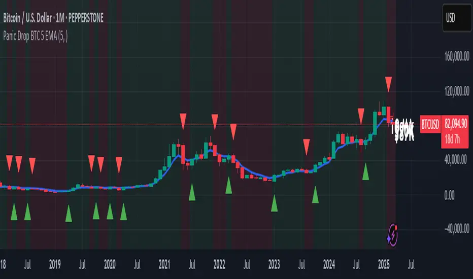
Panic Drop Bitcoin 5 EMA Buy & Sell SignalPanic Drop BTC 5 EMA
What It Does:
This indicator tracks Bitcoin’s price against a 5-period Exponential Moving Average (EMA) to deliver simple buy and sell signals. A green arrow below the candle signals a buy when Bitcoin closes above the 5-EMA, while a red arrow above signals a sell when it closes below. Perfect for spotting Bitcoin’s momentum shifts—whether you’re a newbie, crypto trader, or short on time.
Key Features:
Plots a customizable 5-EMA (default: blue line).
Buy () and Sell () signals on crossovers/crossunders.
Optional background highlight: green (above EMA), red (below).
Alerts for buy/sell triggers.
Fully adjustable: timeframe, colors, signal toggles.
How to Use It:
Add to your BTC/USD chart (works on any timeframe—daily default recommended).
Watch for green arrows (buy) below candles and red arrows (sell) above.
Customize via settings:
Adjust EMA period (default: 5).
Set timeframe (e.g., "D" for daily, "1H" for hourly).
Change colors or toggle signals/background off.
Set alerts: Right-click a signal > "Add Alert" > Select "Buy Signal" or "Sell Signal."
Trade smart: Use signals to catch Bitcoin dips (e.g., buy below $100K) or exits.
Why It’s Great:
Beginners: Clear arrows simplify decisions.
Crypto Traders: 5-EMA catches Bitcoin’s fast moves.
Busy Investors: Signals save time—no deep analysis needed.
Created by Timothy Assi (Panic Drop), eToro’s elite investor. Test it, tweak it, and trade with confidence!
BTC DCA RangeBTC DCA Range indicator is designed to help traders identify potential Dollar-Cost Averaging (DCA) opportunities for Bitcoin (BTC) based on deviations from a reference moving average (MA). It highlights price zones where BTC is trading significantly below a long-term moving average, suggesting potential undervaluation or buying opportunities.
The indicator dynamically adjusts the moving average length based on the selected chart timeframe, ensuring consistency across different timeframes (e.g., daily, weekly, or monthly). It also allows users to set a custom deviation threshold to identify when the price is trading at a significant discount relative to the moving average.
Adjust the Reference MA Length and Deviation Threshold inputs to suit your trading strategy

Price Deviation from EMAThis script creates a chart that tracks a stock's price as a percentage deviation from its EMA. Here's what it does:
Creates a standalone indicator (not overlay) that shows the percentage deviation
Calculates the EMA based on your chosen length (default 200 periods, can be modified)
Plots the percentage deviation from this EMA as a red line
Shows the EMA itself as a horizontal blue line at 0% (the baseline)
Adds horizontal reference lines at +/-5% and +/-10% deviations
Includes labels showing the current deviation percentage and EMA information

AutoFibGauge (TechnoBlooms) AutoFibGauge help users to understand Fibonacci retracement with auto-drawn levels from previous candes, dual moving average crossover for trend confirmation, and a thermometer for quick Fib level identification.
This indicator is designed to streamline your trading decisions. By automatically plotting the Fibonacci levels based on previous candles, it aids in identifying key support and resistance zones. User can choose the number of previous candles for which the Fibonacci is calculated.
Paired with a dual moving average crossover system for robust trend confirmation, this tools helps in aligning with the market's direction.
A dynamic thermometer display that instantly highlights critical Fib levels, making it easier than ever to spot opportunities at a glance.

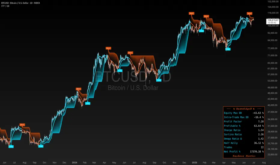
SigmaTrend Prime | QuantEdgeBIntroducing SigmaTrend Prime (STP) by QuantEdgeB
🛠️ Overview
SigmaTrend Prime (STP) is an advanced trend-following indicator that combines double exponential moving averages (DEMA) with a volatility-adjusted SuperTrend framework.
Unlike traditional ATR-based SuperTrends, STP dynamically adjusts trend thresholds using a standard deviation filter derived from price percentiles. This ensures that the trend signals remain highly adaptive, filtering out short-term noise while maintaining robustness across different market conditions.
By leveraging a DEMA core, STP minimizes lag while preserving strong trend identification, making it a powerful tool for traders looking to capture directional moves with enhanced precision.
_____
✨ Key Features
🔹 DEMA-Driven Trend Filtering
SigmaTrend Prime minimizes lag and enhances responsiveness using a double exponential moving average (DEMA) core.
🔹 Volatility-Adaptive SuperTrend
STP applies a percentile-based price smoothing technique, ensuring that the trend filter dynamically adjusts to market conditions.
🔹 Standard Deviation (SD) Filtering for Noise Reduction
By applying a rolling standard deviation derived from smoothed price action, STP eliminates false breakouts and enhances trend clarity.
🔹 Customizable Visual & Signal Settings
Includes multiple color modes, backtest metrics, and signal labels, making it highly adaptable for different trading styles.
📊 How It Works
1️⃣ DEMA-Based Trend Smoothing
SigmaTrend Prime uses DEMA (Double Exponential Moving Average) as its trend foundation, offering a smoother and more responsive trend structure:
🔹 Why DEMA?
✔ Minimizes lag compared to standard EMA.
✔ Maintains trend sensitivity while reducing market noise.
✔ Stronger confirmation of directional moves in volatile environments.
2️⃣ Adaptive Volatility Filtering with Standard Deviation (SD)
Unlike conventional SuperTrend indicators that rely on ATR for trend filtering, SigmaTrend Prime applies an SD-based smoothing mechanism.
📌 How it Works?
✔ Price Percentile Calculation → Uses percentile price ranking for better trend representation.
✔ Rolling Standard Deviation Calculation → Applies a volatility-adjusted filter to prevent false signals.
✔ Dynamic Trend Band Expansion → Factors (Factor1 & Factor2) multipliers to adjust trend sensitivity based on current price behavior.
🔹 Why SD-Based Filtering?
✔ More adaptive to different volatility regimes.
✔ Improves trend accuracy in both trending and ranging markets.
✔ Avoids excessive whipsaws common with ATR-based models.
3️⃣ Signal Generation & Trend Confirmation
SigmaTrend Prime detects trend shifts based on SD-filtered breakouts:
✅ Long Signal → Triggered when price crosses above the SuperTrend upper band.
❌ Short Signal → Triggered when price crosses below the SuperTrend lower band.
📌 Additional Features:
✔ Adaptive Signal Labels → Shows "Long" or "Short" trade signals dynamically.
✔ Trend-Following Mode → Stays in position until a confirmed reversal signal occurs.
✔ Customizable Sensitivity → Traders can adjust Factor1 & Factor2 multipliers and other settings to refine signal responsiveness.
👥 Who Should Use It?
✅ Trend Traders & Momentum Followers → Identify strong directional trends with greater accuracy.
✅ Swing & Position Traders → Gain precise trend confirmation signals for optimized entries/exits.
✅ Volatility-Aware Traders → Benefit from adaptive trend filtering based on real-time market conditions.
✅ Systematic & Quant Traders → Implement STP within automated trading systems for improved trend detection.
⚙️ Customization & Default Settings
🔧 Key Custom Inputs:
• DEMA Source (Default: HLC3) → Defines the price input for DEMA calculations.
• DEMA Length (Default: 30) → Controls the smoothing period for trend calculation.
• Percentile SD Length (Default: 10) → Determines historical percentile ranking for volatility
assessment.
• Volatility SD Length (Default: 30) → Defines rolling SD length for dynamic filtering.
• Trend Sensitivity Factors:
🔹 Factor1 (Default: 25) → Adjusts lower SD band responsiveness.
🔹 Factor2 (Default: 40) → Controls upper SD band expansion.
• Visual Customizations → Multiple color modes, backtest metrics, and trend labels available.
🚀 By default, STP is optimized for adaptive trend-following while remaining flexible for customization.
_____
📌 How to Use SigmaTrend Prime in Trading
1️⃣ Trend-Following Strategy (Momentum Confirmation)
✔ Enter long positions when STP confirms a bullish trend shift above its upper trend band.
✔ Enter short positions when STP confirms a bearish trend shift below its lower trend band.
✔ Stay in trades as long as STP maintains trend direction, filtering out false reversals.
2️⃣ Volatility-Adaptive Strategy (Dynamic Trend Adjustments)
✔ Use Factor1 & Factor2 adjustments to fine-tune STP’s sensitivity to price movements.
✔ Increase Factor1 for slower trend shifts and reduce Factor2 for more aggressive trend detection.
📌 Why?
• In high-volatility conditions, adjust trend bands wider to prevent whipsaws.
• In low-volatility conditions, tighten trend bands for faster signal responsiveness.
_____
📊 Backtest Mode
SigmaTrend Prime includes an optional backtest table, enabling traders to assess its historical effectiveness before applying it in live trading conditions.
🔹 Backtest Metrics Displayed:
• Equity Max Drawdown → Largest historical loss from peak equity.
• Profit Factor → Ratio of total profits to total losses, measuring system efficiency.
• Sharpe Ratio → Assesses risk-adjusted return performance.
• Sortino Ratio → Focuses on downside risk-adjusted returns.
• Omega Ratio → Evaluates return consistency & performance asymmetry.
• Half Kelly → Optimal position sizing based on risk/reward analysis.
• Total Trades & Win Rate → Assess STP’s historical success rate.
📌 Disclaimer:
Backtest results are based on past performance and do not guarantee future success. Always incorporate real-time validation and risk management in live trading.
🚀 Why This Matters?
✅ Strategy Validation → Gain insight into historical trend accuracy.
✅ Customization Insights → See how different STP settings impact performance.
✅ Risk Awareness → Understand potential drawdowns before deploying capital.
_____
📌 Conclusion
SigmaTrend Prime (STP) is an advanced trend-following solution that merges DEMA-based trend smoothing with standard deviation-adaptive filtering. By utilizing percentile-based price smoothing, STP enhances trend accuracy while ensuring that signals remain adaptive to different market environments.
🔹 Key Takeaways:
1️⃣ Lag-Minimized Trend Filtering – DEMA enhances trend responsiveness while reducing noise.
2️⃣ SD-Based Volatility Adaptation – More reliable than ATR-based trend models, reducing false breakouts.
3️⃣ Customizable & Dynamic – Easily fine-tune sensitivity settings for various market conditions.
📌 Master the market with precision and confidence | QuantEdgeB
🔹 Disclaimer: Past performance is not indicative of future results. No trading strategy can guarantee success in financial markets.
🔹 Strategic Advice: Always backtest, optimize, and align parameters with your trading objectives and risk tolerance before live trading.
MVRV Z-Score | Vistula LabsWhat is MVRV?
MVRV (Market Value to Realized Value) is a fundamental on-chain metric used to assess the relative valuation of cryptocurrencies, particularly Bitcoin and Ethereum. This ratio compares the current market value (market capitalization) to the realized value (an approximation of the average price at which all coins were last moved).
Market Value : The total market capitalization of the cryptocurrency (current price × circulating supply)
Realized Value : The sum of the market value of all coins valued at the price they last moved on-chain
When MVRV is high, it suggests the market may be overvalued relative to the price investors paid for their coins, potentially indicating a market top. Conversely, a low MVRV ratio may signal undervaluation and a potential market bottom.
How MVRV is Calculated for BTC & ETH
The MVRV ratio for both Bitcoin and Ethereum is sourced directly from IntoTheBlock's data feed in this indicator:
For Bitcoin: INTOTHEBLOCK:BTC_MVRV
For Ethereum: INTOTHEBLOCK:ETH_MVRV
This indicator transforms the raw MVRV data into a Z-Score, which measures how many standard deviations the current MVRV value is from its historical mean over a specified period. The Z-Score calculation uses a moving average (customizable between SMA, EMA, DEMA, RMA, WMA, or VWMA) and standard deviation over the specified lookback period.
Z-Score formula: (Current MVRV - Moving Average of MVRV) / Standard Deviation of MVRV
How This Indicator Can Be Used
1. Trend Following
The MVRV Z-Score indicator implements a trend-following system with customizable thresholds:
Long signals are generated when the Z-Score crosses above the Long Threshold (default: 0.56)
Short signals are generated when the Z-Score crosses below the Short Threshold (default: -0.28)
These signals are visually represented by:
Green up-triangles for long entries
Red down-triangles for short entries
Color-coded candles and Z-Score plot (teal for long positions, magenta for short positions)
The trend signals help identify potential momentum shifts in the market based on historical MVRV behavior.
2. Overbought/Oversold Conditions
The indicator identifies extreme market conditions using two additional thresholds:
Overbought threshold (default: 3.0): When the Z-Score exceeds this value, the market may be significantly overvalued, suggesting potential selling pressure ahead. These zones are highlighted with a light magenta background.
Oversold threshold (default: -2.0): When the Z-Score falls below this value, the market may be significantly undervalued, suggesting potential buying opportunities. These zones are highlighted with a light teal background.
These extreme readings have historically coincided with major market tops and bottoms, making them valuable for medium to long-term position management.
Customization Options
The indicator offers several customization options:
Cryptocurrency source selection (BTC or ETH)
Moving average type and length for the MVRV calculation
Z-Score lookback period
Adjustable thresholds for long/short signals and overbought/oversold conditions
These parameters allow traders to fine-tune the indicator to their specific trading strategy and risk tolerance.
Alerts
The indicator includes four alert conditions:
MVRV Long Opportunity
MVRV Short Opportunity
MVRV Overbought Condition
MVRV Oversold Condition
These alerts can help traders stay informed of potential trading opportunities without constant chart monitoring.

Moving Average Shift [ChartPrime]Moving Average Shift indicator combines multiple moving average (MA) types with a unique MA Shift Oscillator to help traders visualize trend direction, price deviations, and mean reversion states.
⯁ KEY FEATURES
Customizable Moving Averages: Choose from SMA, EMA, SMMA (RMA), WMA, or VWMA.
Trend-Based Coloring: Candles are dynamically colored based on price position relative to the MA.
MA Shift Oscillator: Identifies price deviations and potential mean reversion zones.
Threshold Filtering: Helps filter mean reversion signals using a user-defined threshold.
Diamond Signals for Mean Reversion: Plots diamonds on the chart when the oscillator crosses back above or below the threshold level.
Oscillator Color Coding: The oscillator has four color states:
Color 1: Above 0 and increasing.
Color 2: Above 0 and decreasing.
Color 3: Below 0 and increasing.
Color 4: Below 0 and decreasing.
⯁ HOW TO USE
Use the indicator to follow the trend based on MA direction and price relation to it.
The MA Shift Oscillator helps identify potential mean reversion points where price may revert toward the MA.
The threshold setting allows traders to filter out weak mean reversion signals and focus on significant shifts.
The four-color oscillator visually indicates trend momentum and potential trend shifts.
⯁ CONCLUSION
The Moving Average Shift indicator is a powerful tool that merges trend-following and mean reversion strategies into one comprehensive system. By allowing traders to select different types of moving averages, it provides flexibility in trend analysis while visually enhancing price action with dynamic candle coloring. The MA Shift Oscillator further strengthens decision-making by detecting deviations and highlighting potential mean reversion points.
MACD Sniper [trade_lexx]📈 MACD Sniper — Improve your trading strategy with accurate signals!
Introducing the MACD Sniper , an advanced trading indicator designed for a comprehensive analysis of market conditions. This indicator combines MACD (Moving Average Convergence Divergence) with various types of moving averages (SMA, EMA, WMA, VWMA, KAMA, HMA, ZLEMA, TEMA, ALMA, DEMA), providing traders with a powerful tool for generating buy and sell signals. It is ideal for traders who need an advantage in detecting changes in trends and market conditions.
🔍 How the signals work
1. Histogram signals:
— A buy signal is generated when the MACD histogram is below zero and begins to grow after the minimum number of falling histogram columns, which are indicated in the indicator menu. This indicates that selling pressure has decreased, the market is oversold and ready for a rebound. The signals are displayed as green triangles labeled "H" under the histogram graph. On the main chart, buy signals are displayed as green triangles labeled "Buy" under candlesticks.
— A sell signal is generated when the MACD histogram is above zero and begins to fall after the minimum number of growing histogram columns, which are indicated in the indicator menu. This indicates that the buying pressure has decreased, the market is overbought and ready for correction. The signals are displayed as red triangles labeled "H" above the histogram graph. On the main chart, the sell signals are displayed as red triangles with the word "Sell" above the candlesticks.
2. Moving Average Crossing Signals (MA):
— A buy signal is generated when the Fast Moving Average (MACD) crosses the Slow Moving Average (Signal Line) from bottom to top. This indicates a possible upward reversal of the market. The signals are displayed as green triangles labeled "MA" under the MACD chart. On the main chart, buy signals are displayed as green triangles labeled "Buy" under candlesticks.
— A sell signal is generated when the Fast Moving Average (MACD) crosses the slow Moving Average (Signal Line) from top to bottom. This indicates a possible downward reversal of the market. The signals are displayed as red triangles labeled "MA" above the MACD chart. On the main chart, the sell signals are displayed as red triangles with the word "Sell" above the candlesticks.
🔧 Signal filtering
— Minimum number of bars between signals
This filter allows the user to set the minimum number of bars that must pass between the generation of two consecutive signals. This helps to avoid frequent false alarms and improves the quality of the generated signals. Setting this parameter allows you to filter out the noise in the market and make the signals more reliable. For example, if the value is set to 5, then a new signal will be generated only after 5 bars have passed since the previous signal.
— "Wait for the opposite signal" mode
In this mode, Buy and Sell signals are generated only after receiving the opposite signal. This means that a buy signal will be generated only after the previous sell signal, and vice versa. This approach adds an additional level of filtering and helps to avoid false positives. This is especially useful in conditions of high market volatility, when false signals often occur.
— RSI filter
The Relative Strength Index (RSI) is used for additional filtering of buy and sell signals. The RSI helps determine whether a market is overbought or oversold. The user can set overbought and oversold levels, and signals will be generated only when the RSI is in the specified ranges. For example, a buy signal will be generated only if the RSI is in the range between 10 and 30 (oversold), and a sell signal if the RSI is in the range between 70 and 90 (overbought). This helps to avoid false signals in extreme market conditions.
🔌 Connector Histogram, MA, Combined 🔌
These parameters allow you to connect the indicator to trading strategies and test the signals throughout the trading history. This makes the indicator an even more powerful tool for traders who want to test the effectiveness of their strategies on historical data.
Connector Histogram provides the ability to connect signals based on the MACD histogram to trading strategies.
Connector MA allows you to connect signals based on the intersection of moving averages (MA) of the MACD, which can also be used for automatic trading or strategy testing.
The combined connector combines signals based on both a histogram and the intersection of moving averages, making the analysis more comprehensive and reliable, which is especially useful for traders seeking to improve the quality of their trading decisions.
🔔 Alerts
The indicator provides the ability to set up notifications for buy and sell signals, which allows traders to keep abreast of important market events without having to constantly monitor the chart. Users can set up notifications that will alert them when buy or sell signals appear, helping them respond to market changes in a timely manner and make informed decisions. These notifications can be configured for various types of signals, such as signals based on the MACD histogram, moving average crossings, or all at once, which makes the indicator a more convenient and functional tool for active traders.
🎨 Customizable Appearance
Customize the appearance of the MACD Sniper according to your preferences to make the analysis more convenient and visually pleasing. In the indicator settings section, you can change the colors of the buy and sell signals so that they stand out on the chart and are easily visible. For example, buy signals can be green, and sell signals can be red. These settings allow traders to adapt the indicator to their individual needs, making it more flexible and user-friendly.
🔧 How it works
The MACD Sniper indicator starts by calculating the MACD values and moving averages for a specific period in order to assess market conditions. For this, fast and slow moving averages are used, as well as a signal line, which are calculated based on the set parameters. The indicator then analyzes the MACD histogram to determine whether the difference between the fast and slow moving averages is rising or falling. Based on this analysis, buy and sell signals are generated. Additionally, the indicator uses the RSI filter to filter out false signals in overbought or oversold market conditions. The user can set the minimum number of bars between the signals and the "Wait for the opposite signal" mode for additional filtering. The indicator dynamically adjusts to changes in the market, providing relevant signals in real time.
📚 Quick guide to using the MACD Sniper
— Add the indicator to your favorites by clicking on the rocket icon. Adjust the parameters such as the length of periods for fast and slow moving averages, the type of moving average (SMA, EMA, WMA, VWMA, KAMA, HMA, ZLEMA, TEMA, ALMA, DEMA) and the length of the signal line, according to your trading style, or leave all settings as default.
— Adjust the signal filters to improve their quality and avoid false alarms
— Turn on notifications so that you don't miss important trading opportunities and don't constantly sit at the chart. This will allow you to keep abreast of all key market events and respond to them in a timely manner, without being distracted from other business.
— Use signals, they will help you determine the optimal entry and exit points of positions.
— Use the Connector for deeper analysis and verification of the effectiveness of signals, connect them to your trading strategies. This will allow you to test signals throughout your trading history and evaluate their accuracy based on historical data.
— Include the indicator in your trading strategy and run testing to see how buy and sell signals have worked in the past.
— Analyze the test results to determine how reliable the signals are and how they can improve your trading strategy. This will help you make more informed decisions and increase your trading efficiency.

CLS Patterns + Price Action Levels📌 Key Features:
✅ CLS Candle Patterns Detection:
CLS Type 1 (Sweeps & Closes Opposite) – Confirms liquidity sweeps with opposite direction close.
CLS Type 2 (Sweeps but No Opposite Close) – Identifies liquidity traps without full reversal.
CLS Type 3 (Engulfing Candles) – Strong momentum shifts with engulfing price action.
CLS Type 4 (Order Block Reversals) – Institutional order flow recognition.
✅ Institutional & Price Action Levels:
250 Pip Institutional Levels – Major S&R zones for Forex & Indices.
Minor Quarter Points (25 Pips) – Intraday precision for refined entries.
✅ Liquidity Imbalance & Order Flow Gaps:
Detects early impulse moves & liquidity voids
Highlights areas of market inefficiency & potential reversals
✅ Higher Timeframe EMA for Trend Confirmation:
Customizable Weekly 3 EMA Overlay
Dynamic color change based on price action
✅ Built-in Alerts for CLS Patterns:
Real-time alerts for CLS buy/sell signals
Configurable notifications for trade execution
🎯 How to Use:
1️⃣ Enable CLS Pattern Signals to spot liquidity sweep candles with directional confirmation.
2️⃣ Use Institutional & QP Levels to identify key areas where price is likely to react.
3️⃣ Monitor Liquidity Imbalances to detect inefficient price moves that may fill.
4️⃣ Confirm Trend with HTF EMA to trade with momentum.
5️⃣ Set Alerts for CLS patterns and key price levels to stay ahead of the market.
This indicator is ideal for Forex, Indices, and Crypto traders looking to refine their entries with precise price action confirmations.
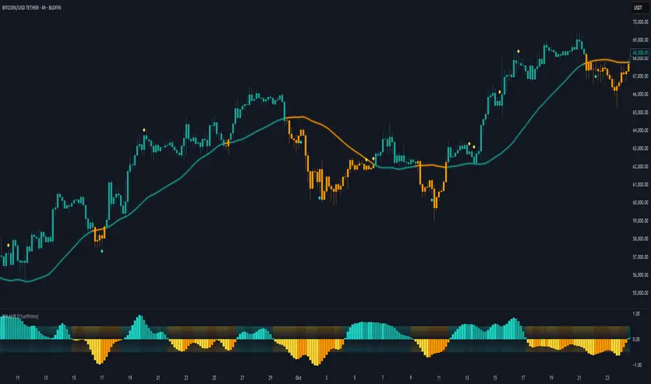
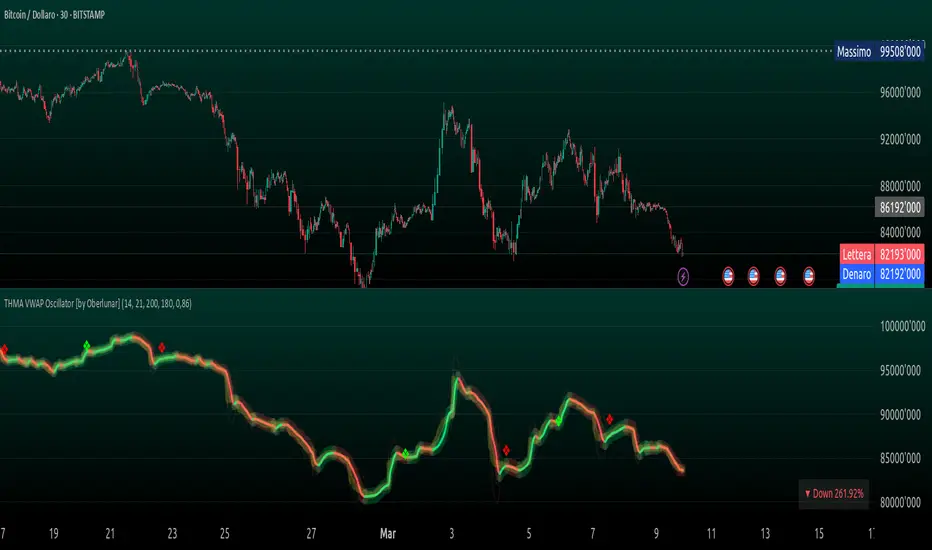
THMA VWAP Oscillator [by Oberlunar]The THMA VWAP Oscillator of Oberlunar is a trend-following and liquidity-sensitive indicator that blends the Triple Hull Moving Average (THMA) with Volume Weighted Average Price (VWAP) deviation bands to highlight high-probability trading setups. It helps traders differentiate between healthy momentum moves and market noise , making it an effective tool for spotting trend continuations, reversals, and mean reversion trades .
At its core, the THMA is an advanced moving average that smooths price action while minimizing lag. Unlike conventional moving averages that react slowly, the THMA dynamically adapts to market conditions by applying a weighted smoothing process. This allows it to react more efficiently to momentum shifts , making it ideal for trend-following and breakout strategies .
The VWAP acts as a volume-weighted price equilibrium, giving traders a framework for understanding institutional positioning. Since VWAP considers both price and volume , it helps determine whether the market is trading at a premium or a discount relative to where most of the volume has transacted. The inclusion of VWAP deviation bands , derived from standard deviations, enhances the ability to detect overbought and oversold conditions , ensuring that signals align with key liquidity levels.
The indicator generates buy and sell signals based on a structured methodology that incorporates trend direction, liquidity positioning, and momentum confirmation . A buy signal is triggered when the THMA on a higher timeframe is positioned below the THMA of the current timeframe, indicating that the broader trend is supportive of an upward move. Additionally, the THMA must be trading below the lower VWAP deviation band , suggesting that price is in a discounted liquidity zone, which is often an area where institutional buyers step in. To ensure that the signal is not just a random fluctuation, the THMA must also show positive slope , meaning it is actively rising, confirming that price is attempting to reverse or continue its upward move with strength.
A sell signal follows the same logic in reverse. The THMA on a higher timeframe must be above the THMA of the current timeframe, confirming alignment with a broader downtrend. The THMA must also be positioned above the upper VWAP deviation band , signaling that price is extended and potentially due for a reversal. To validate that the momentum is actually weakening, the THMA must be in a declining slope , ensuring that price is not simply pausing but actually entering a phase of downward acceleration.
One of the key nuances of the THMA VWAP Oscillator is how it visually represents momentum through the serpentine line , which dynamically shifts color as it develops. When the serpentine line maintains a consistent color—green in an uptrend or red in a downtrend—it signals strong trend conviction . However, when the color fluctuates rapidly between green and red, it indicates a weakening signal , suggesting that price action is becoming choppy and trend strength is deteriorating. This alternation in color serves as an early warning of potential reversals, false breakouts, or trend exhaustion. Traders should be cautious when signals appear in conjunction with an unstable serpentine, as they are less likely to be reliable in such conditions.
To further enhance signal quality, the indicator incorporates a signal alternation mechanism , ensuring that consecutive buy or sell signals do not appear unless the previous trade setup has been invalidated. This helps prevent overtrading in consolidating markets and reduces the chances of chasing false breakouts. Additionally, the placement of buy and sell labels is optimized using ATR-based scaling , positioning them strategically above or below price action to maintain chart clarity without interfering with live price movements.
By integrating trend structure, liquidity positioning, and signal validation , the THMA VWAP Oscillator provides a structured approach to trade execution. It is particularly effective for traders looking to capture breakout moves, pullback entries, and mean reversion opportunities , as it ensures that entries are aligned with market momentum, institutional positioning, and price equilibrium dynamics . The ability to filter out weak signals while identifying strong momentum trends makes it an indispensable tool for trend-followers, breakout traders, and mean reversion specialists alike .
I am very pleased to share that I am publicly releasing one of my private indicators, which I usually provide exclusively to my community. This is a significant moment for me, as this tool has been carefully refined and tested to offer high-quality trading insights.
I also want to take this opportunity to thank my entire community for the incredible support I have received over the past few months. Your feedback, engagement, and enthusiasm continue to inspire me, and I truly appreciate being part of this journey with all of you.
Stay tuned for more updates, and as always, trade smart! 🚀
Multi-Timeframe EMA [TradeWithRon]Multi-Timeframe EMA Indicator
This indicator displays an Exponential Moving Average (EMA) from a higher timeframe on a lower timeframe chart. The EMA is a type of moving average that gives more weight to recent prices, making it more responsive to price changes compared to a Simple Moving Average (SMA). By overlaying a higher timeframe EMA on a lower timeframe chart, you can gain insights into the broader trend while analyzing price action at a more granular level.
🔶 FEATURES
* 5 MTF EMA with price and timeframe labels
* Smoothing: Alter the smoothness of the back-end EMA calculations.
* VWAP
Why Use EMA
Trend Identification: When the price is above the EMA, it suggests an uptrend, while a price below the EMA indicates a downtrend. The steeper the slope of the EMA, the stronger the trend.
Crossovers : A common strategy is to look for crossovers, such as when a short-term EMA crosses above a long-term EMA, signaling a potential buying opportunity (bullish crossover), or when a short-term EMA crosses below a long-term EMA, signaling a potential selling opportunity (bearish crossover).
Support and Resistance : EMAs can act as dynamic support and resistance levels. In an uptrend, the price may bounce off the EMA as support, while in a downtrend, it can act as resistance.
Convergence and Divergence: Traders look for divergences between price and the EMA to spot potential trend reversals. For example, if price makes a new high but the EMA doesn't, it could signal weakening momentum.
Overall, the EMA helps traders follow the market trend, spot potential reversals, and make more informed trading decisions.
After EMA Crosses you may experience A MSS, CISD, SFP. You can use all of these as confluence for a higher probability trade. This is a good way to capitalize on a trade
Another Case
How I Personally Use It:
Shortest EMA ( Example: 10 EMA ) = Entry
Middle EMA ( Example: 50 EMA ) = Short Term Support / Resistance
Longest EMA ( Example: 100 EMA ) = Long Term Support / Resistance
• WARNING
- If your MAIN chart TimeFrame its lower than ( selected TimeFrame ) the Table will not display signals
- Historical Data Unavailable for this resolution is under 2 minute chart, So you will have to use 2 minute and higher
🔶 Disclaimer
Use with Caution: This indicator is provided for educational and informational purposes only and should not be considered as financial advice. Users should exercise caution and perform their own analysis before making trading decisions based on the indicator's signals.
Not Financial Advice: The information provided by this indicator does not constitute financial advice, and the creator (Tradewithron) shall not be held responsible for any trading losses incurred as a result of using this indicator.
Backtesting Recommended: Traders are encouraged to backtest the indicator thoroughly on historical data before using it in live trading to assess its performance and suitability for their trading strategies.
Risk Management: Trading involves inherent risks, and users should implement proper risk management strategies, including but not limited to stop-loss orders and position sizing, to mitigate potential losses.
No Guarantees: The accuracy and reliability of the indicator's signals cannot be guaranteed, as they are based on historical price data and past performance may not be indicative of future results.

BBVOL SwiftEdgeBBVOL SwiftEdge – Precision Scalping with Volume and Trend Filtering
Optimized for scalping and short-term trading on fast-moving markets (e.g., 1-minute charts), BBVOL SwiftEdge combines Bollinger Bands, Heikin Ashi smoothing, volume momentum, and EMA trend alignment to deliver actionable buy/sell signals with visual trend cues. Ideal for forex, crypto, and stocks.
What Makes BBVOL SwiftEdge Unique?
Unlike traditional Bollinger Bands scripts that focus solely on price volatility, BBVOL SwiftEdge enhances signal precision by:
Using Heikin Ashi to filter out noise and confirm trend direction, reducing false signals in choppy markets.
Incorporating volume analysis to ensure signals align with significant buying or selling pressure (customizable thresholds).
Adding an EMA overlay to keep trades in sync with the short-term trend.
Coloring candlesticks (green for bullish, red for bearish, purple for consolidation) to visually highlight market conditions at a glance.
How Does It Work?
Buy Signal: Triggers when price crosses above the lower Bollinger Band, Heikin Ashi shows bullish momentum (close > open), buy volume exceeds your set threshold (default 30%), and price is above the EMA. A green triangle appears below the candle.
Sell Signal: Triggers when price crosses below the upper Bollinger Band, Heikin Ashi turns bearish (close < open), sell volume exceeds the threshold (default 30%), and price is below the EMA. A red triangle appears above the candle.
Trend Visualization: Candles turn green when price is significantly above the Bollinger Bands’ basis (indicating a bullish trend), red when below (bearish trend), or purple when near the basis (consolidation), based on a customizable threshold (default 10% of BB width).
Risk Management: Each signal calculates a stop-loss (10% beyond the opposite band) and take-profit (opposite band), plotted for reference.
How to Use It
Timeframe: Best on 1-minute to 5-minute charts for scalping; test higher timeframes for swing trading.
Markets: Works well in volatile markets like forex pairs (e.g., EUR/USD), crypto (e.g., BTC/USD), or liquid stocks.
Customization: Adjust Bollinger Bands length (default 10), multiplier (default 1.2), volume thresholds (default 30%), EMA length (default 3), and consolidation threshold (default 0.1%) to match your strategy.
Interpretation: Look for green/red triangles as entry signals, confirmed by candle colors. Purple candles suggest caution—wait for a breakout. Use stop-loss/take-profit levels for trade management.
Underlying Concepts
Bollinger Bands: Measures volatility and identifies overbought/oversold zones.
Heikin Ashi: Smooths price action to emphasize trend direction.
Volume Momentum: Calculates cumulative buy/sell volume percentages to confirm market strength (e.g., buyVolPercent = buyVolume / totalVolume * 100).
EMA: A fast-moving average (default length 3) ensures signals align with the immediate trend.
Chart Setup
The chart displays Bollinger Bands (orange), Heikin Ashi close (green circles), EMA (purple), and volume-scaled lines (lime/red). Signals are marked with triangles, and candle colors reflect trend state. Keep the chart clean by focusing on these outputs for clarity.
