2 MA Simplified Sideways Candle ColorsHow to Use the Indicator: A Simple Guide
This custom indicator colors candlesticks to help you quickly identify market conditions based on two moving averages (9-period and 21-period). Here’s how to get started:
Add the Indicator to Your Chart:
Copy the provided Pine Script code.
Open TradingView and navigate to the Pine Editor.
Paste the code into a new script, save it, and then add the indicator to your chart.
Understand the Candlestick Colors:
Green Candles (Bullish):
Indicates a bullish market when the price is above the 9-period SMA and the 9 SMA is above the 21 SMA.
Red Candles (Bearish):
Indicates a bearish market when the price is below the 21-period SMA and the 9 SMA is below the 21 SMA.
Yellow Candles (Sideways):
Indicates a sideways (neutral) market when:
Condition 1: Price is below the 9 SMA but above the 21 SMA, with the 9 SMA above the 21 SMA, or
Condition 2: The 9 SMA is below the 21 SMA, and the price lies between them.
White Candles (No Clear Signal):
Used when none of the above conditions apply.
Interpreting the Signals:
When you see green candles, the market is showing bullish momentum.
When you see red candles, bearish pressure is dominant.
Yellow candles suggest the market is moving sideways without a strong trend.
White candles mean that none of the specific conditions (bullish, bearish, or sideways) are currently met.
Chart Reference:
The script also plots two moving averages on your chart (a blue line for the 9-period SMA and an orange line for the 21-period SMA). These lines help visualize how price interacts with these averages.
Using the Indicator in Practice:
Once added to your chart, monitor the color of the candlesticks:
Green signals may be opportunities to consider long positions.
Red signals may indicate a good time to consider short positions or tighten stops.
Yellow signals suggest caution as the market isn’t trending strongly.
White candles indicate no strong signal, so it might be a period of consolidation or indecision.
This simple visual cue system allows you to quickly assess market sentiment and make more informed trading decisions based on the relationship between price and the two moving averages.
Moving Averages

PGO For Loop | mad_tiger_slayerPGO For Loop Indicator
The PGO For Loop indicator, inspired by Alex Orekhov's "Pretty Good Oscillator," and indicator originally made by Mark Johnson, the PGO designed as a fast and responsive tool to capture quick price movements in financial markets. This oscillator leverages a combination of moving averages and Average True Range (ATR) to measure price deviations, providing a concise yet powerful framework for identifying potential trade entry and exit points. What makes this
"enhanced" PGO indicator special is its ability to identify trending periods more accurately. By using thresholds, this allows the script to enter accurate long and short conditions extremely quickly.
Intended Uses:
Used to capture long-term trends:
Used to identify quick reversals:
Used on higher timeframes above 8hrs for more accurate signals
Used in strategies to enter and exit trades quickly
Can be used for Scalping
NOT Intended Uses:
Not to be used as Mean Reversion
Not to be used as valuation (Overbought or Oversold)
Key Features:
Quick Detection of Market Movements:
The indicator's primary focus is on speed, making it suitable for medium-term traders looking to capitalize on rapid price changes. It is particularly effective in trending or volatile markets.
Customizable Thresholds:
Users can set upper and lower thresholds to define long and short conditions, offering flexibility to adapt the indicator to different trading styles and asset classes.
Noisy but Purposeful:
While the PGO For Loop may generate frequent signals, it is specifically tuned for traders aiming to enter and exit trades quickly, embracing the noise as part of its effectiveness in capturing rapid market dynamics.
Integrated Visuals:
The script plots key levels and provides dynamic visual feedback through colored candles and shapes, enabling intuitive and quick decision-making.
How It Works:
Oscillator Calculation:
The PGO value is derived by comparing the source price's deviation from its moving average to the ATR. This highlights price movements relative to recent volatility.
Signal Identification:
When the oscillator exceeds the upper threshold, it signals potential long opportunities UNTIL the PGO reaches the lower threshold.
When the oscillator drops below the lower threshold, it signals potential short opportunities UNTIL the oscillator reaches above the upper threshold.
No signals occur when the oscillator lies between these thresholds.
Visual Cues:
Color-coded candles indicate market bias (green for long, red for short, gray for neutral).
Upward and downward triangles highlight changes in signal direction.
Note:
This indicator is intentionally "noisy," as it prioritizes capturing fast movements over filtering out minor fluctuations. Users should pair it with other tools or techniques to confirm signals and manage risk effectively.
PENTAD THEORY 30 MINUTE INITIAL BALANCE With Candle HighlightThis indicator is designed to highlight the 30-minute initial balance range, visualize key retracement levels, and provide insights into market behavior based on defined conditions. It also enhances clarity by applying specific color changes to the :06 and :36 minute candle in relative 30-minute intervals.
Key Features:
Initial Balance Box:
Automatically creates a price range (box) representing the first 6 minutes of each 30-minute interval.
The box dynamically updates during this period to capture the high and low prices.
Color-Coded Zones:
Inside the Box: Yellow background indicates price trading within the range.
Above the Box: Green background shows price breaking above the range.
Below the Box: Red background reflects price breaking below the range.
EMA Overlay:
Plots 3 customizable EMAs (default lengths: 9, 21, 55).
Each EMA can be toggled on/off and colored individually for trend analysis.
Retracement Levels:
Automatically calculates and displays key Fibonacci retracement levels (61.8% and 38.2%) based on the box size.
Adds a midline for additional price reference.
Candle Highlighting:
The :06 and :36 minute candle in relative 30-minute intervals is highlighted with a customizable blue color to draw attention to specific market activity.
The break above or below the 6 minute candle or the close of the 6 minute candle outside the box can help determine the direction of the 30-minute interval.
How to Use:
Trend Confirmation:
Use the EMAs to identify overall trend direction. For example, a bullish trend is indicated when shorter EMAs (e.g., 9 EMA) are above longer ones (e.g., 55 EMA).
Breakout and Retracement Analysis:
Watch for price breaking out of the initial balance box.
Observe retracement levels (61.8% and 38.2%) as potential areas for reversal or continuation.
Candle Highlight:
Pay special attention to the :06 or :36 minute candle, which is highlighted to signify its relevance in the relative 30-minute cycle.
Customization:
Adjust colors and EMA settings via the input menu to align with your trading style and chart aesthetics.
Ideal For:
Intraday traders looking to analyze initial balance ranges.
Traders focused on breakout, retracement, and trend-following strategies.
Those who benefit from visual clarity and real-time market insights.
Notes:
Ensure your chart is set to a 3-minute timeframe or lower for optimal performance.
This indicator is most effective when combined with other confluence factors, such as support/resistance zones and volume analysis.

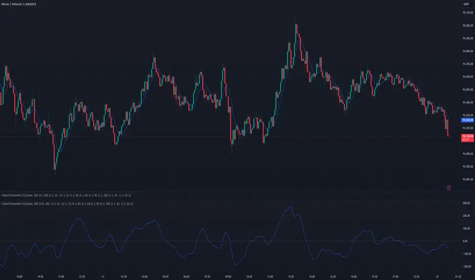
6 Band Parametric EQThis indicator implements a complete parametric equalizer on any data source using high-pass and low-pass filters, high and low shelving filters, and six fully configurable bell filters. Each filter stage features standard audio DSP controls including frequency, Q factor, and gain where applicable. While parametric EQ is typically used for audio processing, this implementation raises questions about the nature of filtering in technical analysis. Why stop at simple moving averages when you can shape your signal's frequency response with surgical precision? The answer may reveal more about our assumptions than our indicators.
Filter Types and Parameters
High-Pass Filter:
A high-pass filter attenuates frequency components below its cutoff frequency while passing higher frequencies. The Q parameter controls resonance at the cutoff point, with higher values creating more pronounced peaks.
Low-Pass Filter:
The low-pass filter does the opposite - it attenuates frequencies above the cutoff while passing lower frequencies. Like the high-pass, its Q parameter affects the resonance at the cutoff frequency.
High/Low Shelf Filters:
Shelf filters boost or cut all frequencies above (high shelf) or below (low shelf) the target frequency. The slope parameter determines the steepness of the transition around the target frequency , with a value of 1.0 creating a gentle slope and lower values making the transition more abrupt. The gain parameter sets the amount of boost or cut in decibels.
Bell Filters:
Bell (or peaking) filters create a boost or cut centered around a specific frequency. A bell filter's frequency parameter determines the center point of the effect, while Q controls the width of the affected frequency range - higher Q values create a narrower bandwidth. The gain parameter defines the amount of boost or cut in decibels.
All filters run in series, processing the signal in this order: high-pass → low shelf → bell filters → high shelf → low-pass. Each stage can be independently enabled or bypassed.
The frequency parameter for all filters represents the period length of the targeted frequency component. Lower values target higher frequencies and vice versa. All gain values are in decibels, where positive values boost and negative values cut.
The 6-Band Parametric EQ combines these filters into a comprehensive frequency shaping tool. Just as audio engineers use parametric EQs to sculpt sound, this indicator lets you shape market data's frequency components with surgical precision. But beyond its technical implementation, this indicator serves as a thought experiment about the nature of filtering in technical analysis. While traditional indicators often rely on simple moving averages or single-frequency filters, the parametric EQ takes this concept to its logical extreme - offering complete control over the frequency domain of price action. Whether this level of filtering precision is useful for analysis is perhaps less important than what it reveals about our assumptions regarding market data and its frequency components.
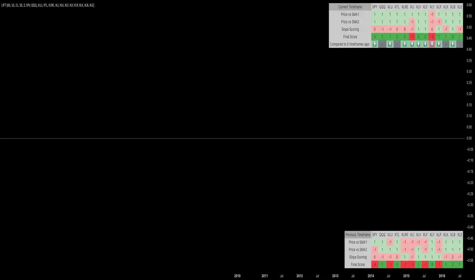
L.I.F.T. - Legaci Index Flow TrackerL.I.F.T. - Legaci Index Flow Tracker
The 'Legaci Index Flow Tracker' is a cutting-edge tool designed for traders and analysts who want to gain unparalleled insight into the strength and momentum of key market indices. This innovative indicator evaluates the relationship between 13 customisable indices and their respective Simple Moving Averages (SMAs), along with the slopes of those SMAs, to deliver a comprehensive market sentiment analysis.
Key Features:
Dynamic Scoring System :
Each index is evaluated across four categories, assigning a score of +1 (bullish) or -1 (bearish) based on price action and momentum.
Intuitive Table Display :
Scores for each index are presented in an easy-to-read table, highlighting:
The index ticker.
Individual scores for the 4 categories (price vs. SMA and slope).
A Final Score summarising the overall strength or weakness of each index.
Customisable Parameters :
Timeframe : Adapt to short-term, mid-term, or long-term trading strategies.
Lookback Period : Fine-tune slope calculations to capture precise market trends.
SMA Lengths : Adjust the moving average lengths to align with your trading methodology.
Index Selection : Choose from the 13 default indices or customise them to track your preferred market segments.
Why use the "L.I.F.T."?
This indicator is perfect for traders seeking a big-picture overview of market flow across multiple indices while maintaining the flexibility to drill down into specific trends. By tracking price action, SMA relationships, and momentum slopes in a unified framework, the Legaci Index Flow Tracker helps you:
Identify market trends at a glance.
Pinpoint the strongest and weakest indices in any timeframe.
Stay ahead of market shifts with actionable insights.
Whether you’re a day trader or a long-term strategist, the indicator is an essential addition to your toolkit, providing you with the clarity and precision needed to navigate today’s complex markets.
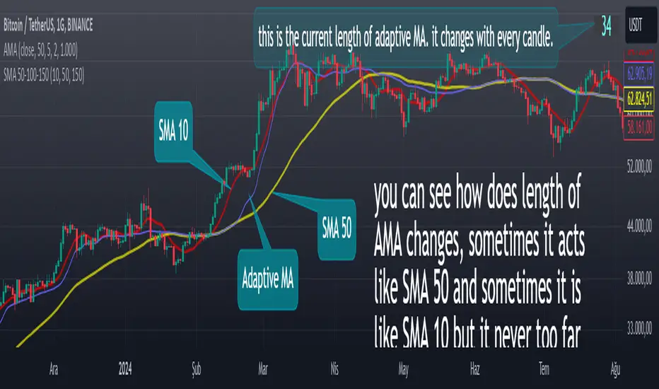
Adaptive Moving Averagewhat is the purpose of the indicator?
When short-length moving averages are used as trailing stops, they cause exiting the trade too early. Keeping the length value too high will result in exiting the transaction too late and losing most of the profits earned. I aimed to prevent this problem with this indicator.
what is "Adaptive Moving Average"?
it is a moving average that can change its length on each candle depending on the selected source.
what it does?
The indicator first finds the average lengths of the existing candles and defines different distances accordingly. When the moving average drawn by the indicator enters the area defined as "far" by the indicator, the indicator reduces the length of the moving average, preventing it from moving too far from the price, and continues to do so at different rates until the moving average gets close enough to the price. If the moving average gets close enough to the price, it starts to increase the length of the average and thus the adaptation continues.
how it does it?
Since the change of each trading pair is different in percentage terms, I chose to base the average height of the candles instead of using constant percentage values to define the concept of "far". While doing this, I used a weighted moving average so that the system could quickly adapt to the latest changes (you can see it on line 17). After calculating what percentage of the moving average this value is, I caused the length of the moving average to change in each bar depending on the multiples of this percentage value that the price moved away from the average (look at line 20, 21 and 22). Finally, I created a new moving average using this new length value I obtained.
how to use it?
Although the indicator chooses its own length, we have some inputs to customize it. First of all, we can choose which source we will use the moving average on. The "source" input allows us to use it with other indicators.
"max length" and "min length" determine the maximum and minimum value that the length of the moving average can take.
Apart from this, there are options for you to add a standard moving average to the chart so that you can compare the adaptive moving average, and bollinger band channels that you can use to create different strategies.
This indicator was developed due to the need for a more sophisticated trailing stop, but once you understand how it works, it is completely up to you to combine it with other indicators and create different strategies.
[Sapphire] JetStream (SWMA + Laguerre Filter)A Dynamic Fusion of Sine Weighted Moving Average and Laguerre Filter
The JetStream Indicator is a versatile tool that combines the Sine Weighted Moving Average (SWMA) and the Laguerre Filter. This can be used to dynamically visualize price movements overtime.
Core Components:
Sine Weighted Moving Average (SWMA):
The SWMA applies sine-weighted coefficients to recent price values, producing a responsive moving average that adapts to market conditions.
The plotted SWMA line changes its color based on directional movement:
Cyan: Upward trend.
Gray: Downward trend.
The sensitivity of the SWMA is controlled via the SWMA Length input, allowing users to fine-tune its responsiveness to price changes.
Laguerre Filter:
The Laguerre Filter uses recursive smoothing techniques to extract meaningful trends while minimizing lag.
The filter line dynamically changes color:
Blue: Upward momentum.
White: Downward momentum.
The Laguerre Alpha parameter adjusts the filter's smoothing intensity, giving users control over its reaction to price fluctuations.
Bar Repainting:
The bar coloring feature adds another layer of visualization by dynamically altering bar colors based on the interaction between the SWMA and Laguerre Filter:
White: Both SWMA and Laguerre Filter are trending upward.
Teal: Both SWMA and Laguerre Filter are trending downward.
Cyan: Divergence between the two (one trending upward, the other downward).

MADĀlgo_Guppy IndicatorThe Guppy Multiple Moving Average (GMMA) is a technical indicator that aims to anticipate a potential breakout in the price of an asset. The term gets its name from Daryl Guppy, an Australian financial columnist and book author who developed the concept in his book, "Trading Tactics."
The GMMA uses the exponential moving average (EMA) to capture the difference between price and value in a stock. A convergence in these factors is associated with a significant trend change. Guppy maintains that the GMMA is not a lagging indicator but a prior warning of a developing change in price and value.
Ref: www.investopedia.com

SOPR | QuantumResearchIntroducing Rocheur’s SOPR Indicator
The Spent Output Profit Ratio (SOPR) indicator by Rocheur is a powerful tool designed for analyzing Bitcoin market dynamics using on-chain data. By leveraging SOPR data and smoothing it through short- and long-term moving averages, this indicator provides traders with valuable insights into market behavior, helping them identify trends, reversals, and potential trading opportunities.
Understanding SOPR and Its Role in Trading
SOPR is a metric derived from on-chain data that measures the profit or loss of spent outputs on the Bitcoin network. It reflects the behavior of market participants based on the price at which Bitcoin was last moved. When SOPR is above 1, it indicates that outputs are being spent at a profit. Conversely, values below 1 suggest that outputs are being spent at a loss.
Rocheur’s SOPR indicator enhances this raw data by incorporating short-term and long-term smoothed trends, allowing traders to observe shifts in market sentiment and momentum.
How It Works
Data Source: The indicator uses SOPR data from Glassnode’s BTC_SOPR metric, updated daily.
Short-Term Trend (STH SOPR):
A Double Exponential Moving Average (DEMA) is applied over a customizable short-term length (default: 150 days).
This reflects recent market participant behavior.
Long-Term Trend (1-Year SOPR):
A Weighted Moving Average (WMA) is applied over a customizable long-term length (default: 365 days).
This captures broader market trends and investor behavior.
Trend Comparison:
Bullish Market: When STH SOPR exceeds the 1-year SOPR, the market is considered bullish.
Bearish Market: When STH SOPR falls below the 1-year SOPR, the market is considered bearish.
Neutral Market: When the two values are equal, the market is neutral.
Visual Representation
The indicator provides a color-coded visual representation for easy trend identification:
Green Bars: Indicate a bullish market where STH SOPR is above the 1-year SOPR.
Red Bars: Represent a bearish market where STH SOPR is below the 1-year SOPR.
Gray Bars: Show a neutral market condition where STH SOPR equals the 1-year SOPR.
The dynamic bar coloring allows traders to quickly assess the prevailing market sentiment and adjust their strategies accordingly.
Customization & Parameters
The SOPR Indicator offers several customizable settings to adapt to different trading styles and preferences:
Short-Term Length: Default set to 150 days, defines the smoothing period for the STH SOPR .
Long-Term Length: Default set to 365 days, defines the smoothing period for the 1-year SOPR.
Color Modes: Choose from seven distinct color schemes to personalize the indicator’s appearance.
Final Note
Rocheur’s SOPR Indicator is a unique tool that combines on-chain data with technical analysis to provide actionable insights for Bitcoin traders. Its ability to blend short- and long-term trends with a visually intuitive interface makes it an invaluable resource for navigating market dynamics. As with all indicators, backtesting and integration into a comprehensive strategy are essential for optimizing performance.

BS | Buy&Sell Signals With EMAKey Features:
EMA Intersections: Generates clear buy and sell signals based on predefined EMA crossings.
5 EMA Lines: Visualize market trends with five distinct EMA lines plotted on the chart.
Support and Resistance Levels: Easily identify crucial support and resistance levels with our integrated marker.
Comprehensive Indicator Panel: At the bottom of the chart, track Stochastic, RSI, Supertrend, and SMA across multiple timeframes (1m, 5m, 15m, 1H, 4H, Daily, Weekly).
Fully Customizable: Almost every indicator within the tool is adjustable to suit your preferences and trading style.
Alarm Feature: Set up alarms to stay informed of important market movements.
Unlock the full potential of your trading strategy with BS | Buy&Sell Signals With EMA. Customize, analyze, and trade with confidence.
created by @bahadirsezer

EMA/RMA clouds by AlpachinoRE-UPLOAD
The indicator is designed for faster trend determination and also provides hints about whether the trend is strong, weaker, or if a range is expected.
It consists of an exponential moving average (EMA) and a slower smoothed moving average (RMA). I chose these because EMA is the fastest and is respected by the market, while I discovered through practice that the market often respects RMA, and in some cases, even more than EMA. Their combination is necessary because I want to take advantage of the best qualities of both averages. Displaying averages based solely on the close values creates a simple line that the market might respect. However, this is often not the case. Market makers know that many traders still believe in the theory that closing above/below an EMA signals a valid new trend. They commonly apply this belief to EMA200. Traders think that if the market closes below EMA, it signals a downtrend. That’s not necessarily true. This misconception often traps inexperienced traders.
For this reason, my indicator does not include a separate line.
I use what are called envelopes. In other words, for both EMA and RMA, the calculation uses the high and low of the selected period, which can be chosen as an input in the indicator.
Why did I choose high and low?
To stabilize price fluctuations as much as possible, especially to allow enough space for the price to react to the moving average. This reaction occurs precisely between the high and low.
Modes:
EMA Cloud – This is the most common envelope in terms of averages. It shows the best reactions with a period of 50.
What should you observe: the alignment of the envelope or its slope.
Usage:
Breakouts through the entire envelope tend to be strong, which signals that the trend may change. However, what interests you most is that the first test of the envelope after a breakout is the most successful entry point for trades in the breakout direction.
In an uptrend, the first support will be the high of the envelope, and the second (let’s call it the "ultimate support") will be the low of the envelope.
If, during an uptrend, the market closes below the low, be cautious, as the trend may reverse.
If the envelope is broken, trade the retest of the envelope.
In general, if the price is above the envelope, focus on long trades; if it’s below the envelope, focus on short trades.
Double Cloud – Since we already know that highs and lows are more relevant for price respect, I utilized this in the double cloud. Here, I use calculations for EMA and RMA highs and EMA and RMA lows.
The core idea is that since the price often reacts more to RMA than EMA, I wanted to eliminate attempts by market makers to lure you into incorrect directions. By creating more space for the price to react to the highs or lows, I made the cloud fill the area between EMA and RMA highs. This serves as the last zone where the price can hold. If the price breaks above this high cloud during a return, this doesn’t happen randomly—you should pay attention, as it’s likely signaling a range or a trend change.
The same applies to the low cloud for EMA and RMA.
The advantage of the double cloud is that you can see two clouds that may move sideways. This can resemble two walls—and they really act as such.
Usage:
Let’s say we have a downtrend. The market seems to be experiencing a downtrend exhaustion. Here's the behavior you might observe:
The price returns to the EMA/RMA low; the first reaction may still have some strength, but each subsequent return will move higher and higher into the cloud with increasingly smaller rejections downward. This indicates the absorption of selling pressure by bullish pressure. Eventually, the price may close above the cloud, significantly disrupting the downtrend and potentially signaling a reversal.
A confirmation of the reversal is usually seen with a retest of the cloud and a bounce upward into an uptrend.
The second scenario, which you’ll often see, involves sharp and significant moves through both envelopes. This kind of move is the strongest signal of a trend change. However, do not jump into trades immediately—wait for the first retest, which is usually successful. Additional tests may not work, as the breakout might not signify a trend change but rather a range.
When the clouds are far apart, it signals a weak trend or that the market is in a range. You will see that this is generally true. When the clouds cross or overlap, their initial point of contact signals the start of a stronger trend. The steeper the slope, the stronger the trend.
Jay Stock Trends
This indicator aids in identifying potential trend starts, continuations and endings by combining moving averages with trend lines.
Its unique trend curves also assist in pinpointing key support and resistance levels for the price.
Multi-timeframe plots provide valuable insights by displaying short-term and long-term trends on the same chart, making it suitable for both intraday and swing trading analysis.
How to read multi-timeframe charts?
The first timeframe, such as daily, is represented by a red EMA8 line (labeled DE) and a corresponding thin trend line (labeled DT). The second timeframe, such as weekly, uses a green EMA8 line (labeled WE) and a medium trend line (labeled WT). The third timeframe, such as monthly, is depicted with a blue EMA8 line (labeled ME) and a thick trend line (labeled MT).
As the timeframe increases, the true range increases and hence trend curve thickness increases.
Trends for lower timeframes are not plotted on daily or higher charts.
How EMA and Trend Line Work Together?
In the BTC daily chart screenshot below, trend initiation is highlighted with a green circle, trend continuation is marked by arrows, and trend completion is indicated with a red circle. A total of six trends are identified on the chart.
When the EMA crosses above the trend line, it signals the start of a trend, while a cross below the trend line marks its end. The period between the trend start and end represents trend continuation.
How Trend Lines Serve as Support or Resistance?
In the BTC daily chart screenshot below, the weekly green trend line serves as support when the price declines toward it, while the red trend line acts as resistance when the price rises from below.
Green circles on the chart highlight instances where the weekly trend provided support, while red circles indicate points where the weekly trend acted as resistance.
How Multi-Timeframe Trends Assist in Stock Analysis?
In the BTC daily chart screenshot below, the monthly trend is rising, and the weekly trend is also moving upward, indicating a favorable outlook for both long-term (monthly) and medium-term (weekly) trends. However, the daily chart suggests a more cautious approach, signaling a period to sit out
Inputs and customization:
This combination of ema and trend plots will be plotted for 4 different time frames all at once. Which 4 timeframes can be chosen in the settings.
How Trend Line and EMA Calculated?
The Trend line is calculated using an arithmetic equation based on the last 8 data points, which are themselves a combination of weighted moving averages of varying lengths. A 14-period true range of the price is calculated and plotted as a buffer zone around the trend lines.
Trend curves appear green when the price is above the trend line and red when it is below. Trend lines are labeled using the timeframe followed by 'T' (e.g., DT, WT, MT).
The EMA represents the weighted moving average of the most recent eight candles and is labeled with the timeframe followed by 'E' (e.g., DE, WE, ME).
Caution: This indicator is for educational or study purposes only, helping traders analyze the movement of both the EMA and trend lines across multiple price swings over an extended period across multi timeframe to gain proficiency at spotting trends.

Trading TimesThis script is based on the 9 and 20 EMA Strategy and combines Fibonacci Levels for added confluence.
When the price retests after breaking the EMAs, we take the trade in the same direction. That is on breakup, we take a long and on a breakdown we take a short.
VWAP can be enabled from settings for more data. institutions use it to average out their trades for both buy and sell orders.

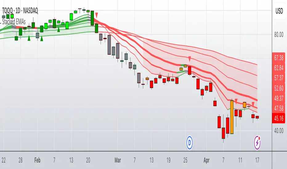
Colored Stacked EMA RibbonThis script is my interpretation of an idea from John Carter in his interview with Richard Moglen.
The idea of moving average ribbons or simply multiple moving averages has been around since moving averages were created. But many of these ideas, such as the Guppy Multiple Moving Averages focus on price closes above a moving average (or multiple moving averages).
In this version, the idea is that the EMAs are compared to each other from shortest to longest. In a completely bullish alignment, the EMAs are referred to as "stacked" in which, for example, the 8 EMA > 13 EMA, the 13 EMA > 21 EMA and so on. When the EMAs are "stacked" in a fully bullish alignment, the EMA cloud is filled green. When the EMAs are "stacked" in a fully bearish alignment, the EMA cloud is filled red.
In addition, I've colored the EMA lines themselves according to if they are rising (green) or falling (red) over a user inputted lookback. The default is "1" period, but it is adjustable. (Generally, I use "1" for the lookback.)
When the EMA lines flip from mixed (rising/falling) to all rising, a green triangle is drawn under the bar/candle. Similarly, when the EMA lines flip from mixed (falling/rising) to all falling, a red triangle is drawn over the bar/candle. This gives the user another potential entry in the context of a stacked EMA cloud. It also can give early signals for entry in a neutral cloud.
Candles/bars are colored according to the EMA cloud & EMA line status. So, for example, a bullish stacked EMA cloud (green) and all EMA lines green, will result in a bright green candle color. IF the cloud is green, but the EMA lines are mixed (red/green), this will result in a dark green candle. Similar logic applies to the bearish conditions which result in red (most bearish) or orange (still bearish) candle colors. IF the EMA cloud is neither bullishly stacked or bearishly stacked, then those candles will appear as gray (neutral).
There are many ways to use this script, but it excels in a trending market. John Carter often sets limit buys in an area near the 21D EMA in names that are trending & he wants to get in. The 13D EMA linewidth is set at 2 and the 21D EMA linewidth is set a 3 to easily identify this area. Now, you can "buy the dip" or "short the rip" within the context of a trending market (which the script identifies with green or red EMA clouds). Or you can wait for some confirmation via the green triangle (or something else like a candle stick pattern or trendline break). Remember to set stops in case price goes against you.
1 final note this is not a "magic bullet", but for a single indicator it does alot of work & personally I've found it to be very useful on multiple time frames. I do recommend combining it with volume (or a volume-based indicator).
Update #1: This updated version allows the user to adjust candle colors, forces the script to wait for bar closes on intraday charts (if conditions are met) before plotting triangles, and removes a link to YT. In addition, non-intraday charts (daily, weekly, etc) will flash a triangle intraday (if conditions are met) before updating completely at the close.
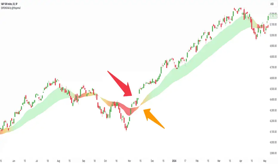
EXPONOVA by @thejamiulEXPONOVA is an advanced EMA-based indicator designed to provide a visually intuitive and actionable representation of market trends. It combines two EMAs (Exponential Moving Averages) with a custom gradient fill to help traders identify trend reversals, strength, and the potential duration of trends.
This indicator uses a gradient color fill between two EMAs—one short-term (20-period) and one longer-term (55-period). The gradient dynamically adjusts based on the proximity and relationship of the closing price to the EMAs, giving traders a unique visual insight into trend momentum and potential exhaustion points.
Key Features:
Dynamic Gradient Fill:
The fill color between the EMAs changes based on the bar's position relative to the longer-term EMA.
A fading gradient visually conveys the strength and duration of the trend. The closer the closing price is to crossing the EMA, the stronger the gradient, making trends easy to spot.
Precision EMA Calculations:
The indicator plots two EMAs (20 and 55) without cluttering the chart, ensuring traders have a clean and informative display.
Ease of Use:
Designed for both novice and advanced traders, this tool is effective in identifying trend reversals and entry/exit points.
Trend Reversal Detection:
Built-in logic identifies bars since the last EMA cross, dynamically adjusting the gradient to signal potential trend changes.
How It Works:
This indicator calculates two EMAs:
EMA 20 (Fast EMA): Tracks short-term price movements, providing early signals of potential trend changes.
EMA 55 (Slow EMA): Captures broader trends and smoothens noise for a clearer directional bias.
The area between the two EMAs is filled with a dynamic color gradient, which evolves based on how far the price has moved above or below EMA 55. The gradient acts as a visual cue to the strength and duration of the current trend:
Bright green shades indicate bullish momentum building over time.
Red tones highlight bearish momentum.
The fading effect in the gradient provides traders with an intuitive representation of trend strength, helping them gauge whether the trend is accelerating, weakening, or reversing.
Gradient-Filled Region: Unique visualization to simplify trend analysis without cluttering the chart.
Dynamic Trend Strength Indication: The gradient dynamically adjusts based on the price's proximity to EMA 55, giving traders insight into momentum changes.
Minimalist Design: The EMAs themselves are not displayed by default to maintain a clean chart while still benefiting from their analysis.
Customizable Lengths: Pre-configured with EMA lengths of 20 and 55, but easily modifiable for different trading styles or instruments.
How to Use This Indicator
Trend Detection: Look at the gradient fill for visual confirmation of trend direction and strength.
Trade Entries:
Enter long positions when the price crosses above EMA 55, with the gradient transitioning to green.
Enter short positions when the price crosses below EMA 55, with the gradient transitioning to red.
Trend Strength Monitoring:
A brighter gradient suggests a sustained and stronger trend.
A fading gradient may indicate weakening momentum and a potential reversal.
Important Notes
This indicator uses a unique method of color visualization to enhance decision-making but does not generate buy or sell signals directly.
Always combine this indicator with other tools or methods for comprehensive analysis.
Past performance is not indicative of future results; please practice risk management while trading.
How to Use:
Trend Following:
Use the gradient fill to identify the trend direction.
A consistently bright gradient indicates a strong trend, while fading colors suggest weakening momentum.
Reversal Signals:
Watch for gradient changes near the EMA crossover points.
These can signal potential trend reversals or consolidation phases.
Confirmation Tool:
Combine EXPONOVA with other indicators or candlestick patterns for enhanced confirmation of trade setups.
RM - FF - DDRM - rKr Indicator
The RM - rKr Indicator is designed to evaluate price momentum by analyzing relative percentage deviations of price components (high, open, low, and close) from their simple moving average. It provides a comprehensive signal of market conditions through color-coded bars, crossovers, and dynamic alerts.
Key Features
• Relative Kr Calculations: Calculates the relative percentage deviation of each price component (high, open, low, close) from their respective moving averages. The results are then averaged to provide a single momentum value.
• Dynamic Bar Coloring: Bars are color-coded based on the sum's value:
Green for positive momentum (sum > 0).
Purple for negative momentum (sum < 0).
• Crossover Signals: Visual markers indicate when the momentum crosses above or below the zero line, signaling potential long (⦿ below bars) or short (⦿ above bars) opportunities.
• Alerts: Built-in alert conditions notify traders of bullish or bearish market conditions when the momentum value crosses zero.
How It Works
Calculates the percentage difference between price components (high, open, low, close) and their simple moving averages.
Averages the results to derive a single momentum value (sum).
Uses zero as the baseline to determine market direction:
Positive values suggest bullish momentum.
Negative values suggest bearish momentum.
Highlights potential trade opportunities with crossover signals when the sum crosses the zero line.
How to Use
• Identify Trends: Use bar colors and the momentum value to gauge market direction.
• Spot Reversals: Monitor for crossover signals near the zero line to identify potential entry or exit points.
• Confirm Conditions: Combine with other indicators for enhanced trend confirmation.
Example Use Cases
Momentum Trading: Use green or purple bars to confirm bullish or bearish momentum.
Reversal Signals: Watch for crossover signals near the zero line for potential trend reversals.
Volatility Assessment: Employ the indicator to measure price momentum deviations over time.
Disclaimer
This indicator provides an analytical view of price momentum and market conditions. It does not guarantee future performance and should be used in conjunction with other tools and proper risk management strategies.

SMA 10/20 Trend Info Table - QullamaggieThe Qullamaggie Index Trend Filter is a momentum-based technical indicator designed to identify strong bullish or bearish trends in the market by analyzing the relationship and movement of two simple moving averages (SMAs): the 10-period SMA and the 20-period SMA. It simplifies trend analysis and provides clear visual cues for traders to align their trades with the prevailing market direction.

UM EMA SMA WMA HMA with Directional Color ChangeUM EMA SMA WMA HMA with Directional Color Change
Description:
This is a Swiss Army knife type of Moving Average tool. Select your favorite Moving Average type, EMA - Exponential Moving Average, SMA - Simple Moving Average, WMA - Weighted Moving Average, or HMA - Hull Moving Average. Then selection your number of periods. The MA line is green when trending higher and red when trending lower. The fill between price and the MA line matches the red/green of the direction.
Defaults and Configuration:
The default setting is 65 period and EMA. Line colors and optional fill colors are user-configurable.
Alerts:
An alert can be set on the MA for directional color changes (red to green, or green to red) Right click the indicator and select Add Alert. Then select Bullish or Bearish color change.
Suggested Uses:
Add this to any timeframe chart with your favorite Moving averages. A strategy I use frequently is to "stretch" the Moving average. For example if you like the 8 day moving average on the daily chart, try the 52 period Moving average on the hourly chart. (6.5 market hours per day * 8) By looking at smaller time frames with longer MAs you get smoother color transitions on the Moving average. Add multiple instances of the MA. I prefer to use a smaller quick MA with a longer MA that represents a longer time frame.
Another use case I also like is the color transition over a Moving Average crossover. While I do like the daily 2/6 and 8/3 moving average crossovers, red-to-green and green-to-red color transitions seem to work with less lag than the crossovers.
Suggested Settings:
Daily charts: 8 EMA
Hourly charts: 55 EMA
30 minute charts: 65 WMA. (I like this one for inverse ETFs)
3 minutes charts: 178 EMA and 233 EMA
I also like to round MA settings up or down to the nearest fibonacci number: 5, 8, 13, 21, 34, 55, 89, 144, 233, 377, etc.

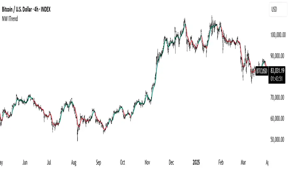
B4100 - NW TrendThis is a trend-following tool based on the Nadaraya-Watson (NW) kernel regression estimator.
Nadaraya-Watson Estimator :
This indicator employs a weighted average of historical prices where the weights are determined by a kernel function. This kernel function gives more weight to recent prices and less weight to older ones. The kernel function's shape (Gaussian, Epanechnikov, or a combination) can be chosen by the user, and its bandwidth controls the sensitivity of the estimator. A smaller value means more sensitivity to short-term changes; a larger value means smoother curves and less sensitivity.
Trend Confirmation:
The indicator also uses a confirmation period (confirm_period) to minimize whipsaws. The trend only changes once the estimator has moved in a particular direction for a configurable number of consecutive bars.
Bandwidth (h):
This is the key parameter controlling the estimator's sensitivity to price changes.
Smaller values (e.g., 10-40) result in a more reactive and wiggly line. This will be more sensitive to short-term price changes.
Larger values (e.g., 100-200) result in a smoother line, focusing on longer-term trends.
Source:
The price data used in the calculations. The default is close but can be changed to other price values such as high, low, or a mathematical combination.
Kernel Type:
Select the type of kernel function to use.
Confirmation Period:
Adjust this setting to specify how many consecutive bars the estimator must be moving in the same direction before the trend is confirmed.
Lower values result in more trend changes.
Higher values result in fewer trend changes and can filter out some noise.
Enjoy, and good luck.
Wave Smoother [WS]The Wave Smoother is a unique FIR filter built from the interaction of two trigonometric waves. A cosine carrier wave is modulated by a sine wave at half the carrier's period, creating smooth transitions and controlled undershoot. The Phase parameter (0° to 119°) adjusts the modulating wave's phase, affecting both response time and undershoot characteristics. At 30° phase the impulse response starts at 0.5 and exhibits gentle undershoot, providing balanced smoothing. Higher phase values reduce ramp-up time and increase undershoot - this undershoot in the impulse response creates overshooting behavior in the filter's output, which helps reduce lag and speed up the response. The default 70° phase setting provides maximum speed while maintaining stability, though practical settings can range from 30° to 70°. The filter's impulse response consists entirely of smooth curves, ensuring consistent behavior across all settings. This design offers traders flexible control over the smoothing-speed trade-off while maintaining reliable signal generation.

Enhanced Renko Channel with Emulation and SMA by Dr DevendraThis indicator combines a dynamic Renko-based channel with emulated Renko bricks and a customizable Simple Moving Average (SMA). It provides traders with a powerful tool for identifying trends, visualizing price movement within a Renko framework, and overlaying critical moving average signals.
Features:
Renko Channel:
A Gaussian-based midline with adjustable poles and sampling periods.
True Range-based dynamic channel boundaries.
Visual trend identification with color-coded channel fills.
Renko Emulation:
Emulated Renko brick levels with adjustable brick sizes.
Dynamic brick plotting based on price action.
Simple Moving Average (SMA):
Configurable length and source (e.g., close, hlc3, etc.).
Dynamic color changes based on SMA slope (uptrend or downtrend).
Customizable Inputs:
Adjustable parameters for the channel, Renko emulation, and SMA settings.
Options for reduced lag and fast response modes in the Renko channel.

HKM - Renko Emulator with EMA TrendThis is a Renko based Emulator to plot on any chart type which prints the box as printed on a Renko charts and is a Non-Repaint version. You can use either Traditional or ATR Method on current chart Timeframe. Option to plot an EMA Line is provided with Trend indication.

Fibonacci Channel Standard Deviation levels based off 200MAThis script dynamically combines Fibonacci levels with the 200-period simple moving average (SMA), offering a powerful tool for identifying high-probability support and resistance zones. By adjusting to the changing 200 SMA, the script remains relevant across different market phases.
Key Features:
Dynamic Fibonacci Levels:
The script automatically calculates Fibonacci retracements and extensions relative to the 200 SMA.
These levels adapt to market trends, offering more relevant zones compared to static Fibonacci tools.
Support and Resistance Zones:
In uptrends, price often respects retracement levels above the 200 SMA (e.g., 38.2%, 50%, 61.8%).
In downtrends, price may interact with retracements and extensions below the 200 SMA (e.g., 23.6%, 1.618).
Customizable Confluence Zones:
Key levels such as the golden pocket (61.8%–65%) are highlighted as high-probability zones for reversals or continuations.
Extensions (e.g., 1.618) can serve as profit targets or bearish continuation points.
Practical Applications:
Identifying Reversal Zones:
Look for confluence between Fibonacci levels and the 200 SMA to identify potential reversal points.
Example: A pullback to the 61.8%–65% golden pocket near the 200 SMA often signals a bullish reversal.
Trend Confirmation:
In uptrends, price respecting Fibonacci retracements above the 200 SMA (e.g., 38.2%, 50%) confirms strength.
Use Fibonacci extensions (e.g., 1.618) as profit targets during strong trends.
Dynamic Risk Management:
Place stop-losses just below key Fibonacci retracement levels near the 200 SMA to minimize risk.
Bearish Scenarios:
Below the 200 SMA, Fibonacci retracements and extensions act as resistance levels and bearish targets.
How to Use:
Volume Confirmation: Watch for volume spikes near Fibonacci levels to confirm support or resistance.
Price Action: Combine with candlestick patterns (e.g., engulfing candles, pin bars) for precise entries.
Trend Indicators: Use in conjunction with shorter moving averages or RSI to confirm market direction.
Example Setup:
Scenario: Price retraces to the 61.8% Fibonacci level while holding above the 200 SMA.
Confirmation: Volume spikes, and a bullish engulfing candle forms.
Action: Enter long with a stop-loss just below the 200 SMA and target extensions like 1.618.
Key Takeaways:
The 200 SMA serves as a reliable long-term trend anchor.
Fibonacci retracements and extensions provide dynamic zones for trade entries, exits, and risk management.
Combining this tool with volume, price action, or other indicators enhances its effectiveness.