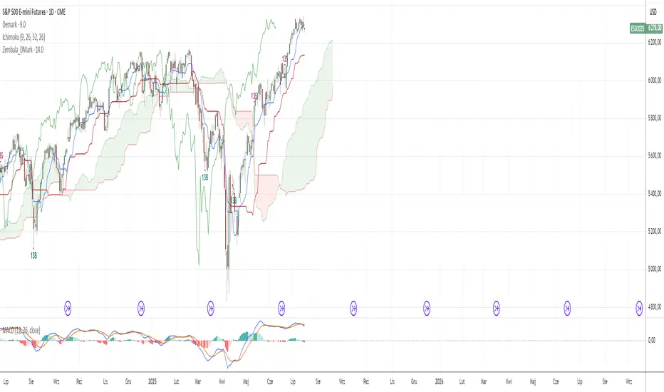
Zembala_DMarkThis indicator uses a specific candle-counting technique to identify potential short-term exhaustion points in price action.
It works by comparing the current candle’s closing price to the closing price 9 candles earlier and maintains two separate counts:
Buy Count (13B): Increases when the current close is lower than the close 9 bars ago.
Sell Count (13S): Increases when the current close is higher than the close 9 bars ago.
When either count reaches 13 consecutive conditions, a signal is displayed:
13B (green triangle up) suggests downside exhaustion and a possible short-term rebound.
13S (red triangle down) suggests upside exhaustion and a potential short-term pullback.
These signals are not traditional buy/sell recommendations but instead highlight areas of potential trend fatigue or price extremes. This logic is loosely inspired by bar-counting methods used in certain sequential strategies, but simplified and adapted for general use without reliance on any proprietary methodology.
Indicators and strategies

Zembala_DMarkThis indicator uses a specific candle-counting technique to identify potential short-term exhaustion points in price action.
It works by comparing the current candle’s closing price to the closing price 9 candles earlier and maintains two separate counts:
Buy Count (13B): Increases when the current close is lower than the close 9 bars ago.
Sell Count (13S): Increases when the current close is higher than the close 9 bars ago.
When either count reaches 13 consecutive conditions, a signal is displayed:
13B (green triangle up) suggests downside exhaustion and a possible short-term rebound.
13S (red triangle down) suggests upside exhaustion and a potential short-term pullback.
These signals are not traditional buy/sell recommendations but instead highlight areas of potential trend fatigue or price extremes. This logic is loosely inspired by bar-counting methods used in certain sequential strategies, but simplified and adapted for general use without reliance on any proprietary methodology.
Breaker BlockUpdated version of breaker block indicator with a small change to the Unicorn detection logic

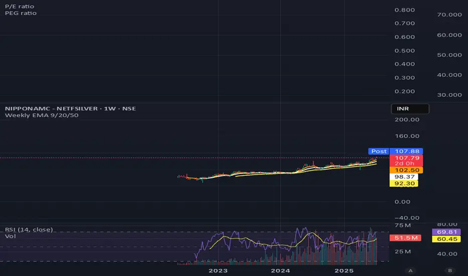
Weekly EMA 9/20/50Weekly EMA for 9, 20 and 50 weeks for any security.
This will show the trends that are otherwise not visible on the daily chart.

TrendZoneTrendZone - Fibonacci Trendline Indicator
TrendZone is a custom Pine Script indicator that automatically draws fibonacci-based trendlines between key pivot points on your chart.
Key Features:
3 Pivot Points: Set start point, major pivot (reversal), and end point
Dual Trendlines: First trendline (Point 1 → 2) and second trendline (Point 2 → 3)
Fibonacci Levels: Automatically draws 25%, 50%, and 100% fibonacci levels for each trendline
Auto Trend Detection: Automatically identifies bullish/bearish trends and adjusts colors accordingly
Customizable: Full control over colors, line styles, and widths for each fibonacci level
How it Works:
The indicator uses your selected pivot points to create two connected trendline systems. Point 2 serves as the major pivot where the first trend ends and the reversal begins. Each trendline system includes fibonacci retracement levels that extend to the right, helping identify potential support/resistance zones.
Use Cases:
Identifying trend reversals at key pivot points
Finding potential support/resistance levels using fibonacci projections
Visualizing market structure changes between different time periods
Planning entries/exits based on fibonacci trendline interactions
Perfect for traders who use fibonacci analysis combined with trend structure to identify high-probability trading zones.

Bollinger Bottom + Middle Lines with Inline TextThis script visualizes key Bollinger Band levels based on two different SMAs (20 & 50 periods), with clear labeling and a smart price table.
🔸 Features:
Draws lower and middle Bollinger Band lines for both SMA(20) and SMA(50)
Inline text at the end of each line instead of default labels (cleaner view)
A dynamic table in the top-right corner, sorted from highest to lowest level
Color-coded rows:
▪️ Orange → BB20 Mid & BB20 Lower
▪️ Green → BB50 Mid & BB50 Lower
Auto-updates each bar without cluttering the chart
✅ Ideal for identifying technical accumulation zones
✅ Suitable for investors using scaling-in strategies or mean-reversion logic

Global Liquidity vs BitcoinGlobal liquidity vs Bitcoin/dollar, per Grok. This combines M2 with US credit data - reverse repos, Fed assets, etc. My aim was to approximate Raoul Pal's Global Liquidty indicator from inside his GMI membership. That membership is probably beyond my skillset, but an indicator like this is useful as it close-to-mirrors Bitcoin price.

Sylvain Zig-Zag [Mark804]> Overview:
The Sylvain Zig-Zag is a premium trend-tracking and structural turning-point indicator designed to identify precise market reversals, swing points, and support/resistance zones using a dynamic ATR-based Zig-Zag logic.
> Key Features:
Dynamic Zig-Zag Algorithm powered by ATR, percentage moves, absolute and tick-based reversal logic.
Support & Resistance Zones auto-drawn from key swing points for real-time structural mapping.
New Trend & Continuation Icons highlight trend shifts and extended moves with visual clarity.
Customizable Colors & Line Widths to match your chart’s style or branding.
Live Bar Coloring based on bullish or bearish trend structure.
Highly Configurable: Adjust ATR period, reversal %, tick distance, absolute threshold, and more.
> Ideal For:
Swing Traders looking for clean structural highs/lows
Smart Money Concept (SMC) practitioners
Price Action traders
Support/Resistance zone mappers
Those who value premium visuals and minimal clutter
> How It Works: This Zig-Zag engine calculates new swing highs or lows using a hybrid logic combining:
ATR-based price movement filter
Reversal percentage confirmation
Optional absolute price or tick-based padding
It plots each pivot, draws connecting lines, and generates real-time support/resistance levels based on recent pivots.
> Visual Enhancements:
Multi-layer polylines for deep contrast and style
Optional trend labels (e.g., "Up Trend", "Down Trend")
Transparent multi-line S/R stacking
Real-time continuation icons for ongoing strength
> Note:
This indicator is Pine Script v5 compatible and follows TradingView's latest visual architecture. Publishing-ready. Fully customizable

9:30 AM Candle High/Low Lineshelps to find intraday bullish and bearish signal...all most 80% + accuracy

Fixed First Candle Levels by TF with UTCFixed First Candle Levels by TF with UTC
This script draws High and Low levels of the first candle of each day based on a custom timeframe selected by the user (15m, 30m, 1h, 2h, 4h) and adjusted for the UTC offset.
Features:
✅ Automatically detects the first candle of the day for the selected timeframe
✅ Plots horizontal lines from the start of the day to the end of the day
✅ Highlights the actual candle’s range using a translucent background box
✅ Works across all chart timeframes
✅ Ideal for identifying potential support/resistance zones based on early market structure
You can customize:
Target timeframe (independent from current chart TF)
UTC offset
Useful for intraday traders, breakout strategies, and pre-market planning.

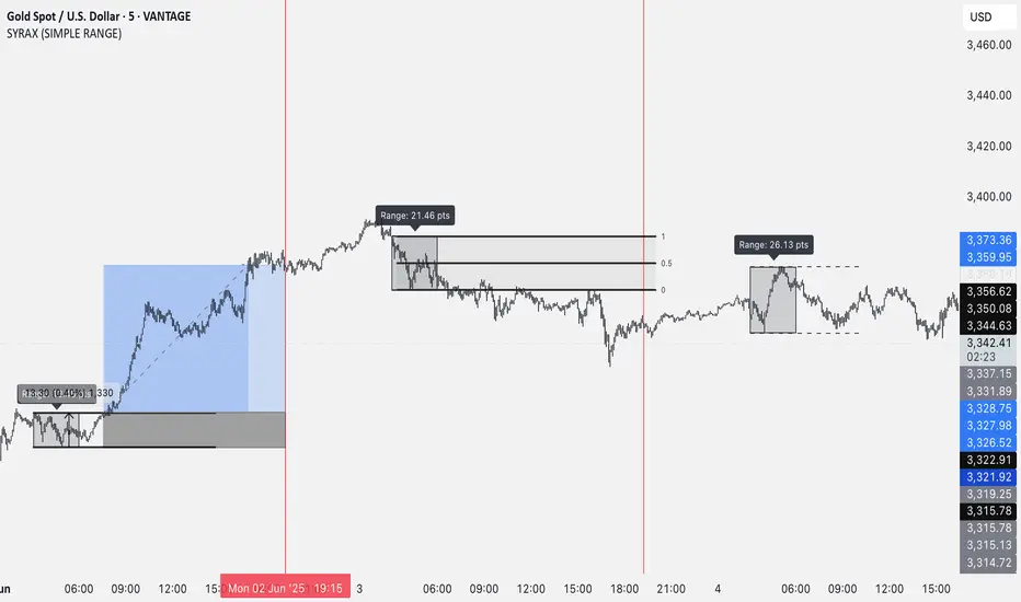
SYRAX (SIMPLE RANGE)SYRAX (SIMPLE RANGE) is a minimalist indicator designed for traders who focus on range breakouts. If you’re someone who just needs one clean and consistent range plotted every day to execute your strategy, this tool is for you.
The indicator defines a customizable time range on your chart and highlights the high and low of that session, helping you visualize potential breakout zones. A vertical line can also be drawn at a specific time each day to assist with your session planning.
Features:
• Automatically draws the daily range box based on your chosen start and end time.
• Timezone setting to align the range with your local or market session.
• Clean visuals with editable box color, border, and text labels.
• Optional extended range lines and vertical session markers.
Whether you’re trading early session breakouts or waiting for liquidity sweeps, SYRAX gives you the structure you need — nothing more, nothing less.
MACD & EMA Cross SignalsMACD and EMA Crossover Signals
-> This tool provides buy and sell signals directly on your chart. It helps you spot action points early.
Symbol Indicators:
"Triangle Up" (Green) shows a positive MACD crossover.
"Triangle Down" (Red) indicates a negative MACD crossover.
"Label Up" (Green) marks a positive EMA crossover.
"Label Down" (Red) signals a negative EMA crossover.
Golden Cross Alerts for MACD and EMAs
-> A "Buy" signal appears when both MACD and EMAs cross positive at the same time.
-> A "Sell" signal shows when both indicators cross negative together.
Option to set custom alerts
-> Golden Buy Signal: Both MACD and EMA cross positive.
-> Golden Sell Signal: Both cross negative.
-> Any Buy Signal: Either MACD or EMA crosses up.
-> Any Sell Signal: Either crosses down.
Note: You can change the values for EMAs, Symbol, and Color in the Settings to fit your needs.

Hacim Patlaması Alarmı (3 Bar Ortalaması)//@version=5
indicator("Hacim Patlaması Alarmı (3 Bar Ortalaması)", overlay=false)
hacim = volume
hacimOrtalama = ta.sma(volume, 3)
limit = hacimOrtalama * 1.5
hacimPatladiMi = hacim > limit
plot(hacim, title="Hacim", color=color.new(color.blue, 0), style=plot.style_columns)
plot(hacimOrtalama, title="3 Bar Ortalaması", color=color.gray, linewidth=1)
bgcolor(hacimPatladiMi ? color.new(color.red, 80) : na)
alertcondition(hacimPatladiMi, title="Hacim Patladı", message="⚠ Hacim patlaması tespit edildi!")

Bitcoin 15m Trend Reversal ConfluenceUnderstanding the Visuals:
Trend Change (First Confluence):
The background of your chart will turn green when the trend is bullish (fast EMA is above the slow EMA).
The background will turn red when the trend is bearish (fast EMA is below the slow EMA).
Break of Structure (Second Confluence):
A green triangle below a candle with the label "BoS" indicates a bullish break of structure.
A red triangle above a candle with the label "BoS" indicates a bearish break of structure.
Retesting Area (Third Confluence):
After a bullish break of structure, a green box will appear. This is the area where you can watch for the price to retest the broken resistance, which may now act as support.
After a bearish break of structure, a red box will appear. This is the area to watch for a retest of the broken support, which may now act as resistance.

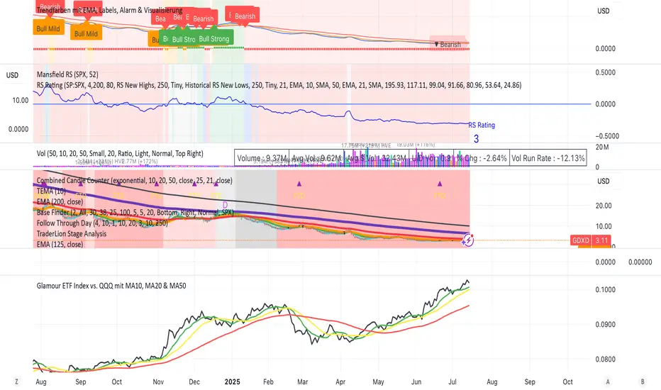
Glamour ETF Index vs. QQQ mit MA10, MA20 & MA50Stan Weinstein uses the term "Glamour Index" as a sentiment indicator to assess how speculative or overheated the stock market is. The Glamour Index measures the relationship between so-called "glamour stocks" (trendy stocks, hyped stocks with high media attention and sometimes extreme price increases) and solid, more conservative stocks. Weinstein uses this index to: 1) Analyze market sentiment – particularly whether the market is in a speculative euphoria phase.
2) Identify warning signs of a potential top formation or an impending downturn.
My basket compares performance against the QQQ (alternatively, SPY or any other benchmark is also possible).
My basket consists of the ETFs in the ARK universe, as well as other growth ETFs such as IPO, FFTY, and QQQJ.
SessionsLondon, US , ASIA open sessions
Use this indicator to highlight Above time zones to analyse trading opportunity during those sessions

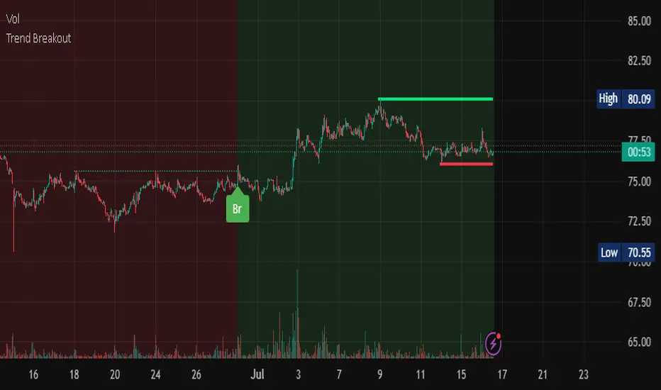
Trend Breakout Description:
This Pine Script indicator identifies pivot high and pivot low points based on user-defined left and right candle legs, detecting breakouts to signal potential trend changes. It plots horizontal lines at pivot highs (lime) and pivot lows (red), marking breakout signals with labels ("Br") when the price crosses above a pivot high or below a pivot low. The indicator also changes the background color to reflect the trend (green for uptrend, red for downtrend) with adjustable transparency. The indicator primarily focuses on recognizing specific pivot patterns to define trends and generate trading signals.
How It Works
• Pivot Detection: Identifies pivot highs and lows using configurable left (Left side Pivot Candle) and right (Right side Pivot Candle) periods.
• Pivot Highs (PH): A pivot high is identified when a candle's high is greater than a specified number of preceding candles (left leg) and succeeding candles (right leg).
• Pivot Lows (PL): Similarly, a pivot low is identified when a candle's low is less than a specified number of preceding and succeeding candles.
The script then tracks the last three pivot highs and pivot lows.
Trend Detection and Breakouts
1. High Line (Resistance): When a middle pivot high (out of the three tracked) is higher than both the previous and the next pivot high, a lime green line is drawn from that pivot high. This line acts as a dynamic resistance level.
2. Low Line (Support): Conversely, when a middle pivot low is lower than both the previous and the next pivot low, a red line is drawn from that pivot low. This line acts as a dynamic support level.
________________________________________
Trading Signals : The indicator generates signals based on price crossing these dynamically drawn lines .
• Long Signal (Uptrend):
o A "Long" signal is triggered when the close price crosses above the current high line (resistance), and the indicator is not already in an uptrend.
o When a long signal occurs, the background turns green, and the high line becomes dotted and thinner. A "Br" (Breakout) label appears below the candle.
• Short Signal (Downtrend):
o A "Short" signal is triggered when the close price crosses below the current low line (support), and the indicator is not already in a downtrend.
o When a short signal occurs, the background turns red, and the low line becomes dotted and thinner. A "Br" (Breakout) label appears above the candle.
________________________________________
Customizable Settings
The indicator provides three user-adjustable inputs:
• Right Side Pivot Candle (fpivotLeg): This setting (default 10) determines the number of candles to the right that must have lower highs/higher lows for a pivot to be confirmed.
• Left Side Pivot Candle (bpivotLeg): This setting (default 15) determines the number of candles to the left that must have lower highs/higher lows for a pivot to be confirmed.
• Adjust Color Visualization (Colortrnp): This setting (default 85) controls the transparency of the background color changes, allowing you to adjust how prominently the green (uptrend) and red (downtrend) backgrounds are displayed.
________________________________________
How to Use It
This indicator can be used by traders to:
• Identify potential reversals: The formation of new pivot highs and lows can signal shifts in market direction.
• Spot breakout opportunities: Crossing above the high line or below the low line can indicate the start of a new trend or the continuation of an existing one.
• Confirm trend strength: The presence and extension of the high and low lines can provide visual cues about the prevailing trend.
• Ideal for swing traders or trend-following strategies.
• Use the breakout labels ("Br") and background color to confirm trend direction.
• Adjust pivot leg inputs to fine-tune sensitivity for different timeframes or assets.
• Customize transparency to suit chart readability.
Example:
On a breakout above a pivot high, a green "Br" label appears, the background turns green, and the pivot line becomes dotted. This signals a potential uptrend, helping traders identify entry points or trend confirmations.
Disclaimer: No indicator guarantees profits. Always use this indicator in conjunction with other analysis methods and proper risk management.
80% Rule BacktestStrategy Overview: 80% Rule Backtest Tool
This strategy tester is designed to validate the classic 80% Rule setup within a defined ETH futures session. Signals are triggered when price reenters the prior day's value area and holds for a qualified duration — targeting the Point of Control (POC) for primary exits, while tracking full value area traversals for research purposes.
- 📅 Session Logic: Anchored to a true 22-hour ETH futures window (5PM–3PM Pacific), with global time zone support
- 🧠 Signal Confirmation: Price must reenter and hold inside value area for ≥ 45 minutes to validate entry
Note: Optimized for 15-minute charts — aligns exactly with traditional rule definition (3-bar hold)
- 🎯 Targets: Primary TP at POC; visual logs for full VAH/VAL reach
- 🔍 Manual Override Mode: Precise SVP-level control when auto logic isn’t preferred
- 🔧 Debug Mode: Single-bar diagnostic labels for development and forward testing
This tool supports both auto-calculated and manually anchored value areas, allowing traders to blend systematic backtesting with discretionary insight.
working on this tool to be used as a strategy tester


TeeLek-HedgingLineIf we are DCA some assets and it happens to be in a downtrend, sitting and waiting is the best way, but it is not easy to do. There are other ways that allow us to buy DCA and keep collecting more. While the market is falling, don't be depressed. The more you buy, the more it drops. Should you continue buying? Plus, if it goes back to an uptrend, you will also get extra profit. Let's go check it out.
ถ้าเรา DCA ทรัพย์สินอะไรซักอย่างนึงอยู่ แล้วมันดันเป็นขาลงพอดี จะนั่งรอเฉยๆ เป็นวิธีที่ดีที่สุด แต่ไม่ได้ทำกันได้ง่ายๆ นะ ยังมีวิธีอื่นอีก ที่ให้เราสามารถ ซื้อ DCA เก็บของเพิ่มได้เรื่อยๆ ระหว่างที่ตลาดร่วง ไม่จิตตก ยิ่งซื้อ ยิ่งลง จะซื้อต่อดีไหม? แถมถ้า กลับมาเป็นขาขึ้น ยังมีกำไรแถมให้ด้วยนะ ไปหาดูกัน

RSI Weekly and MonthlyTHis script plots RSI (Relative Strength Index) values for daily, weekly, and monthly timeframes, with an added 10-period SMA (Simple Moving Average) applied to the weekly RSI. It’s a compact multi-timeframe indicator to analyze price momentum across various horizons.

Multi-Timeframe EMAs & WMAsMulti-Timeframe EMAs & WMAs (MTF EMAWMA)
The Multi-Timeframe EMAs & WMAs (MTF EMAWMA) indicator is a comprehensive tool designed to provide a multi-dimensional view of market trends by plotting various Exponential Moving Averages (EMAs) and Weighted Moving Averages (WMAs) from different timeframes onto your current chart. This allows traders to quickly assess confluent support and resistance levels, identify trend strength, and gain a broader market perspective without switching timeframes.
Key Features:
Multiple EMAs and WMAs:
This indicator includes:
- EMA 200: Plotted from H1 and M15 timeframes.
- EMA 100: Plotted from H1, M30, and M15 timeframes.
- EMA 50: Plotted from H4, H1, M30, and M15 timeframes.
- WMA 720: Plotted from H4, H1, M30, M15, and M1 timeframes.
Multi-Timeframe Analysis: By displaying moving averages from various timeframes, the indicator helps in understanding the interplay of different trends and their potential impact on price action.
Visual Distinction : Each moving average type and its timeframe representation are color-coded and styled (solid vs. dashed lines) for easy identification and clarity on the chart.
EMA 200: Dark Red
EMA 100: Cyan/Teal
EMA 50: SaddleBrown
WMA 720: Orange
Recommended Usage:
This indicator is specifically tailored for XAU/USD (Gold). It is intended to be used as a confluence tool to complement your existing trading strategies and indicators. It is not designed to be used solely as an entry or exit signal. Instead, leverage the information provided by these multi-timeframe moving averages to:
- Identify major trend directions: Observe the alignment and slope of longer-term moving averages.
- Spot potential support and resistance zones: Price often reacts to these key moving average levels from higher timeframes.
- Confirm trade bias: Use the higher timeframe moving averages to confirm the direction of your trades on lower timeframes.
- Enhance risk management: Understand where strong levels might exist to place stop-losses or take-profits.
Always combine this indicator with other forms of analysis, such as price action, chart patterns, volume analysis, or other technical indicators, to make informed trading decisions.
Remark: The script and description were created by AI.
