RSI Zones - Directional Entry StrictRSI Zones - Directional Entry Strict
When RSI returns to the 60–65 zone from above, momentum is weakening and a sell is valid; above 65 suggests the zone may break. The same applies for buys at 35–40: returning from below signals momentum loss, while below 35 indicates likely breakout. Only consider divergence above 65 or below 35 for high-probability reversal setups.
Indicators and strategies

Fair Value Gap & Liquidity Zones [Combined]mixed FVG and buyside and sellside liquidity
xxxxxxxxxxxxxxxxxxxxxxxxxxxxxxxxxxxxxxxxxxxxxxxxxxxxxxxxxxxxxxxxxxxxxxxxxxxxxxxxxx

Smart BB Reversal + Tick Volume Table [NR]This script combines:
Smart Bollinger Band Reversal Detection to identify high-probability reversal zones,
A real-time tick volume table showing Buy vs Sell strength over the last 10 trades (ticks),
Color-coded candles for trend clarity,
Buy/Sell signals based on volume pressure and support/resistance touches.
✅ Ideal for intraday and scalping traders.
✅ Works best on Nifty, BankNifty, and Gold.
✅ No repaint.
✅ Clear entry & exit with visual confirmations.
Use with Bollinger Band and MACD confirmation for best results.

Neuracap Gap AnalysisThe Neuracap Gap Analysis indicator is a comprehensive tool designed to identify and track price gaps, special candlestick patterns, and high-volume breakout signals. It combines multiple trading strategies into one powerful indicator for gap trading, pattern recognition, and momentum analysis.
🎯 What This Indicator Does
1. Gap Detection & Tracking
Automatically identifies price gaps (up and down)
Tracks gap fills with visual boxes that extend until closed
Manages gap history with customizable limits
Color-coded visualization (Green = Gap Up, Red = Gap Down)
2. Upside Tasuki Gap Pattern
Identifies the bullish continuation pattern
Colors candles yellow when pattern is detected
Confirms trend continuation signals
3. Episodic Pivot Detection
High-volume breakout identification
EMA filter ensures signals only in uptrends
Strong momentum confirmation
Fuchsia-colored candles with arrow markers
🔍 How to Use for Trading
📈 Gap Trading Strategy
Gap Up Trading:
Wait for gap up (green box appears)
Check volume - Higher volume = stronger signal
Entry options:
Aggressive: Enter at market open
Conservative: Wait for pullback to gap level
Stop loss: Below the gap fill level
Target: Previous resistance or 2:1 risk/reward
Gap Down Trading:
Identify gap down (red box appears)
Look for bounce opportunities
Entry: When price shows reversal signs
Stop: Below recent lows
Target: Gap fill level
💫 Tasuki Gap Strategy
Yellow candle indicates bullish continuation
Confirms uptrend is likely to continue
Entry: On next candle after pattern
Stop: Below the gap low
Target: Next resistance level
🚀 Episodic Pivot Strategy
Fuchsia candle + arrow = High probability breakout
All conditions met:
Price above EMA 20, 50, 200
High volume (2x+ average)
Strong price move (4%+)
Entry: At close or next open
Stop: Below EMA 20 or recent swing low
Target: Measured move or next resistance
📊 Reading the Visual Signals
Gap Boxes
🟢 Green Box: Gap up - potential bullish continuation
🔴 Red Box: Gap down - potential bounce or bearish continuation
Box extends until gap is filled
Box disappears when gap closes
Candle Colors
🟡 Yellow: Tasuki gap pattern (bullish continuation)
🟪 Fuchsia: Episodic pivot (high-volume breakout)
⬜ Normal: No special pattern detected
Arrows & Markers
⬆️ Triangle Arrow: Episodic pivot confirmation
💡 Trading Tips & Best Practices
✅ Do's
Combine with trend analysis - Trade gaps in direction of trend
Check volume - Higher volume = more reliable signals
Use multiple timeframes - Confirm on higher timeframes
Risk management - Always set stop losses
Wait for confirmation - Don't chase, let signals develop
❌ Don'ts
Don't trade all gaps - Focus on high-quality setups
Avoid low volume - Weak volume = unreliable signals
Don't ignore trend - Counter-trend trading is risky
Don't overtrade - Quality over quantity
Don't ignore context - Consider market conditions
⚠️ Risk Management
Position sizing: Risk 1-2% per trade
Stop losses: Always define before entry
Target levels: Set realistic profit targets
Market conditions: Avoid trading in choppy markets
📈 Performance Optimization
For Conservative Traders:
Increase minimum gap size to 1%
Set volume multiplier to 3.0x
Only trade episodic pivots in strong uptrends
Wait for gap fill confirmation
For Aggressive Traders:
Decrease minimum gap size to 0.3%
Set volume multiplier to 1.5x
Trade both gap types
Enter on pattern confirmation
🚨 Alert Setup
The indicator provides alerts for:
Gap Up Detected
Gap Down Detected
Upside Tasuki Gap
Episodic Pivot
Recommended: Enable all alerts and filter manually based on your strategy.
📝 Summary
This indicator excels at identifying high-probability trading opportunities through gap analysis, pattern recognition, and momentum confirmation. Use it as part of a complete trading system with proper risk management for best results.

Bitcoin 12/26 EMA Crossover with ADX Filter [5min Intraday]A trend-following strategy for Bitcoin on a 5-minute intraday chart, using 12/26 EMA crossovers with ADX and volume filters to reduce false signals in ranging markets.
Key Features:
Entries: Long: 12 EMA crosses above 26 EMA, ADX > 25, volume > 1.5x 20-period average.
Short: 12 EMA crosses below 26 EMA, ADX > 25, volume > 1.5x 20-period average.
Exits: Long: 2% stop loss or 12 EMA crosses below 26 EMA.
Short: 2% stop loss, 3% take profit, or 12 EMA crosses above 26 EMA.
Filters: ADX (14-period) > 25 ensures trending markets; volume filter confirms strong participation.

Multi-TF Candle Pattern Table — last 3 + formingUsing strat pattern, including 4 timeframe, you can directly modify timeframe on code. The up means it is a 2 candle, and separate them between 2U and 2D

PulsePoint SqueezePulsePoint Squeeze™ is a dynamic momentum compression and divergence detection system built to help traders identify high-pressure zones before breakout moves. Combining RSI-based thresholds, price compression zones, and divergence cues, it offers high-clarity insights with minimal noise — ideal for intraday precision and swing positioning.

EMA Slope FilterEMA SLOPE FILTER....50EMA....You’ll see a line oscillating around zero; when it’s within ±0.1, treat the market as “flat.”

10/50 EMA Cloud + 21 EMA + VWAP + FractalsThis indicator is designed for active traders and combines several popular technical analysis tools into a single, easy-to-use overlay. It helps traders identify trend direction, dynamic support and resistance, and potential reversal points, all while providing optional fractal signals for added clarity.
Features and Components
1. EMA Cloud (10/50 EMA)
10-period EMA (Exponential Moving Average): Tracks short-term price momentum.
50-period EMA: Represents a longer-term trend.
Cloud Visualization: The area between the 10 and 50 EMA is filled with color:
Green cloud when the 10 EMA is above the 50 EMA, signaling bullish momentum.
Red cloud when the 10 EMA is below the 50 EMA, signaling bearish momentum.
Purpose: Quickly visualize the prevailing trend and potential trend shifts.
2. 21-period EMA
21 EMA: Plotted as a blue line, this moving average is widely used to gauge intermediate-term trend and dynamic support/resistance.
Purpose: Acts as a reference for trend-following entries and exits.
3. VWAP (Volume Weighted Average Price)
VWAP Line: Plotted in orange, VWAP gives the average price weighted by volume for the session.
Purpose: Useful for identifying fair value, potential bounce/reversal zones, and institutional interest levels.
4. Fractals (Toggleable)
User Option: A setting allows the user to turn fractal signals on or off.
Fractal Logic: Uses a 5-bar pattern:
Up Fractal: Plots a green triangle above the bar if the high of the middle bar (2 bars ago) is higher than the highs of the two bars before and after.
Down Fractal: Plots a red triangle below the bar if the low of the middle bar (2 bars ago) is lower than the lows of the two bars before and after.
Purpose: Highlights potential short-term reversal points or swing highs/lows.
5. Volume Bars
Volume Histogram: Plotted in gray at the bottom of the chart.
Purpose: Provides context for price action, helping to confirm breakouts or identify exhaustion.
How to Use This Indicator
Trend Identification: Use the EMA cloud and 21 EMA to determine the prevailing trend. Trade in the direction of the cloud color and EMA alignment.
VWAP Strategies: Look for price reactions at the VWAP for possible rebounds, breakouts, or reversals.
Fractal Signals: Enable fractals to spot potential reversal zones or to fine-tune entries/exits at swing points.
Volume Confirmation: Use volume bars to validate the strength of moves, especially near key EMAs or VWAP.
Customization
Fractals On/Off: Easily toggle fractal signals in the indicator settings to reduce chart clutter or focus on other signals as needed.

Multiple MAs for Daily and IntradayMultiple DMAs (5, 8, 10, 21, 50, 65, 200) and their equivalent in lower timeframes (3min, 30min, 65min) with the options to select from SMA or EMA.


Price - MA DifferencePlots the difference between the closing price and a moving average (either SMA or EMA) in a separate pane. It includes:
Dropdown to choose between SMA and EMA
Adjustable length (default 21)
Yellow color as default for the plot

8/21 EMA Early Buy/Sell + Golden CrossThis is a a really easy 8/21 EMA Buy/Sell Indicator with a Golden/Death Cross warning plus the ability to adjust and add Early Buy/Sell's
How it works:
Standard BUY/SELL: 8/21 EMA cross as usual.
EARLY SELL: After a strong price up move, EMA8 still above EMA21, and EMA8 turns down.
EARLY BUY: After a strong price down move, EMA8 still below EMA21, and EMA8 turns up.
Golden/Death Cross: From daily 50/200 SMA.
Recommended Colours:
8 EMA Red
21 EMA Blue
50 SMA Purple
200 SMA White

CVD Signal (Above/Below Zero Line)CVD Long or Short Signal when the CVD is above or below zero line.

Support & Resistance by O Dinesh BabuThis Script is Specifically Designed to Work with NIFTY, BANKNIFTY & FINNIFTY Indices Only..
For Optimal Results, Please Wait for the 1st 15-Minute Candle to Complete Before Initiating Any Trades..
Wishing All Traders the Very Best in Their Journey..
Warm Regards,
O. Dinesh Babu
Son of Mr. & Mrs. O. Asha Rama Krishna


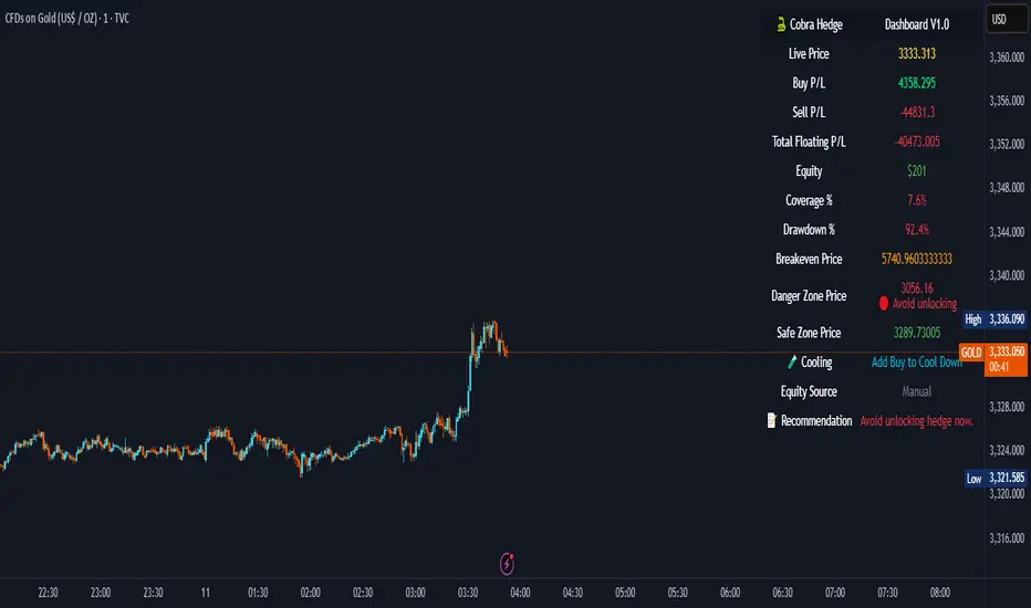
Cobra Hedge Dashboard – V1.0 Final Master🧠 Cobra Hedge Dashboard – V1.0 Final Master
V1.0 | Smart Risk Filter for Open Hedge Positions
📝 (Description):
Cobra Hedge Dashboard is built specifically for traders managing open hedge positions. It provides a real-time view of directional pressure, smart zones, and price behavior to help make informed decisions such as:
When to partially close hedge orders
When to reverse positions based on flow & exhaustion
Which side (Buy or Sell) currently has momentum
Detecting price reaching critical zones (Supply/Demand)
Measuring volume strength to avoid fake exits
🔍 Ideal for traders already in the market — this dashboard is not an entry signal system, but a tool to manage hedge exits and exposure.
Built-in calculations include:
VWAP and EMA cross-pressure
Directional flow meter
Auto Supply & Demand Zones
Volume spikes and breakout strength
Best used on 1m–15m charts.
Open-source for transparency and improvement.
250710 Momentum Buy TriggerWhat It Does (Step by Step)
Sets Up a Moving Average
Calculates a 200-period Simple Moving Average (SMA) of the closing price.
You can change the period by adjusting the maPeriod input.
Calculates Momentum with MACD Histogram
Uses MACD (Moving Average Convergence Divergence) with standard settings:
Fast EMA: 12
Slow EMA: 26
Signal Line: 9
Subtracts the signal line from the MACD line to get the MACD histogram (a momentum indicator).
Defines a Buy Signal
The script checks two conditions:
Price is below the 200-period SMA → suggesting the asset is undervalued.
MACD histogram is rising (i.e., current value is greater than the previous bar) → suggesting bullish momentum is starting.
If both are true on the same bar, a "Buy" signal is generated.

COBRA X Mastermind – Ultimate Smart Panel✅ COBRA X Mastermind – Ultimate Smart Panel
COBRA X Mastermind – Ultimate Panel | Structure, Volume, Signals & Smart Entry
📝 (Description):
COBRA X Mastermind is a precision smart panel for reading market structure, detecting high-quality entries and visualizing critical components in one screen:
Detect Break of Structure (BoS) and CHoCH with context
Auto-mark Order Blocks and Fair Value Gaps (FVGs)
Volume Spike & VWAP alignment for smart trend confirmation
Directional bias from EMA + Dynamic Flow analysis
Hidden divergence detection to anticipate trap moves
Built-in Signal Strength meter with real-time TP/SL suggestion
Each row in the panel reflects a real-time reading of price action, structure, volume, and entry risk.
🔍 How to use it:
Look for a valid signal only when structure + volume + divergence are in agreement. Use the panel strength bar to validate setups.
This script is open-source and optimized for 1m and 5m charts, especially on Gold and FX pairs.
Clean, non-repainting, and built for professional scalpers.

Bull Momentum GaugeBull Momentum Gauge
The Bull Momentum Gauge is a powerful momentum oscillator designed to identify the underlying strength and sustainability of major market trends. Instead of trying to predict tops and bottoms, this indicator helps traders and investors ride long-term bull markets by signaling when momentum is building and when it is starting to fade.
What it Does
At its core, this tool measures how statistically "stretched" or "compressed" an asset's price is relative to its long-term (1-year) trend. It does this by:
Calculating the price's deviation from its 365-day moving average.
Normalizing this deviation into a Z-score to measure its statistical significance.
Comparing the inverted Z-score to its own 200-day moving average to gauge the momentum of the trend itself.
The result is a single, smooth line that oscillates around a zero value.
How to Use It
The signals are simple and based on the indicator's relationship to the zero line:
Green Line (Gauge below 0): This indicates that the price has been compressed relative to its long-term trend and is now showing signs of building upward momentum. A cross into the green zone can be interpreted as a potential entry signal for a new bull run.
Red Line (Gauge above 0): This suggests that the price has become over-extended or "stretched" and the upward momentum is beginning to weaken. A cross into the red zone can be used as a potential exit signal, indicating it may be time to take profits and wait for the next cycle.
This indicator is designed to work across multiple timeframes (Daily, Weekly, Monthly) and provides a clear, data-driven framework for navigating major market cycles.
ds-Volume with Flags & Alerts v1.2ds-Volume with Flags & Alerts: User & Training Guide
1. Summary of Features
This indicator is a powerful, all-in-one tool designed to give you a deep and customizable view of market volume. By analyzing volume in multiple ways, it helps you spot unusual activity, confirm trends, and identify potential reversals.
How It Helps a Trader:
Spotting Institutional Activity: The core purpose of the Volume Flags (using either the Multiplier or Standard Deviation method) is to highlight bars with exceptionally high volume. These spikes often signal the entry or exit of large institutional players. A high-volume up-bar can confirm bullish conviction, while a high-volume down-bar can signal significant selling pressure.
Identifying Climactic Events: The HVE (Highest Volume Ever) and HV1 (Highest Volume - 1 Year) labels automatically pinpoint the most significant volume events on the chart. A "blow-off top" at the end of a long uptrend or a "capitulation" event at a market bottom is almost always accompanied by an HVE or HV1 bar. These are critical moments to watch for potential trend reversals.
Gauging Buying vs. Selling Pressure: The Up/Down Volume Ratio gives you a more nuanced view than volume alone. A ratio consistently above 1.2 suggests that buyers are more aggressive, while a ratio below 0.8 suggests sellers are in control. Watching this ratio can help you confirm the strength of a trend or spot divergences where price is rising but the ratio is falling (a potential warning sign).
Visual Confirmation & Customization: With options to color both the volume bars and the main price bars, you can get instant visual confirmation of these events without having to look away from the price action. The ability to toggle features on and off keeps your chart clean and focused on what matters most to you.
Actionable Alerts: The comprehensive alert system ensures you don't miss a key event. You can be notified of everything from a new all-time high volume bar to a subtle shift in the Up/Down Volume Ratio, allowing you to react to market changes in real-time.
2. User-Changeable Options
This indicator is highly customizable. Here is a breakdown of every setting available in the "Inputs" tab.
General Settings
MA Length: The lookback period for the simple moving average (the gray area plot) of the volume.
Volume Flags
Color Price Bars with Flags: If checked, the main price bars on your chart will be colored when a high or low volume flag condition is met.
Color Volume Bars with Flags: If checked, the volume bars in the indicator pane will be colored for flag conditions.
Flag Calculation Method: This is a crucial setting.
Multiplier (Default): Identifies high volume based on a simple multiple of the average volume (e.g., volume is 1.4x its average). It's simple and intuitive.
Standard Deviation: Identifies high volume based on how statistically unusual it is compared to its recent behavior. This method is more adaptive to changing market volatility.
Daily/Weekly Lookback (Multiplier): Sets the lookback period for calculating the average volume when using the "Multiplier" method.
Daily/Weekly High-Vol Multiplier: Sets the multiplier for a high volume event (e.g., 1.4).
STDEV Length (Daily/Weekly): Sets the lookback period for calculating the average and standard deviation when using the "Standard Deviation" method.
STDEV Threshold (Daily/Weekly): Sets the number of standard deviations above the average required to trigger a high volume flag (e.g., 2.0).
Daily/Weekly Low-Vol Multiplier: Sets the threshold for a low volume event (e.g., 0.5 means volume is less than 50% of its average). This is always based on the multiplier method.
Ratios & Stats
Up/Down Ratio Daily/Weekly Lookback: Sets the lookback period for calculating the sum of up volume and down volume for the ratio.
Ratio Calculation Method:
Close vs. Open: Defines an "up volume" bar as one where the close is higher than the open.
Close vs. Previous Close (Default): Defines an "up volume" bar as one where the close is higher than the previous bar's close. This is a common standard.
Up Ratio Arrow Threshold: If the U/D Ratio exceeds this value, a green "up" arrow will appear.
Show Up Ratio Arrow: Toggles the visibility of the green "up" arrow.
Down Ratio Arrow Threshold: If the U/D Ratio falls below this value, a red "down" arrow will appear.
Show Down Ratio Arrow: Toggles the visibility of the red "down" arrow.

High Selling Point Reversal V6.0Criteria combined for a "High Selling Point" signal: Best used for exiting long positions or entering shorts
Overbought Condition (RSI):
Purpose: Ensures the asset has had a significant run-up and is potentially exhausted.
Criteria: RSI (Relative Strength Index) is above a certain threshold (e.g., 70 or 80).
Bearish Candlestick Reversal Pattern:
Purpose: Identifies specific price action that indicates a shift from buying to selling pressure.
Criteria: We can implement detection for one or more strong bearish patterns. A good starting point would be:
Bearish Engulfing: A bearish candle whose real body completely covers the previous bullish candle's real body. This is a very strong two-candle reversal signal.
Shooting Star: A candle with a small real body at the lower end of the range, a long upper shadow, and little to no lower shadow. It signifies rejection of higher prices.
Evening Star: A three-candle pattern: a large bullish candle, followed by a small-bodied candle (the "star"), and then a large bearish candle. This is a powerful top reversal.
Negative Divergence (Optional but powerful):
Purpose: Indicates weakening momentum despite price continuing to rise, suggesting underlying weakness.
Criteria: Price makes a higher high, but a momentum oscillator (like RSI or MACD) makes a lower high.
Combine with other indicators for confluence

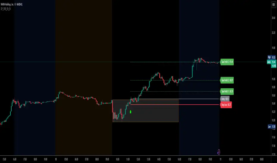
DP_ORB Entry & Exit IndicatorDisclaimer:
This indicator is for educational purposes only. It does not constitute financial advice. Always do your own research and manage your risk. Also, I cannot take full credit for 'ORB' as its a well known strategy amongst many traders, but I do need to give a special shout out to @TheBigDaddyMax for putting me on to this.
DP_ORB Entry & Exit Indicator
Description:
The DP_ORB Entry & Exit Indicator is a powerful tool designed for traders who utilize the Opening Range Breakout (ORB) strategy on the NYSE session. This indicator visually identifies the initial volatility window of the trading day, by marking the 15m High, and 15m Low into a ORB Box, & then tracks breakout opportunities, and provides clear, dynamic trade management levels—all directly on your chart.
Key Features:
Automatic Opening Range (ORB) Box:
Identifies and plots the high and low of the user-defined opening range (default 9:30–9:45 NYSE) for visual reference and strategy foundation.
Breakout Entry Signals:
Automatically detects and marks long or short breakout entries when price closes above or below the ORB range, with additional momentum confirmation.
Dynamic Stop Loss:
Stop loss is intelligently set to the previous bar’s low for long trades (or high for shorts), adapting to market structure at entry.
Take Profit Targets:
Up to three fully adjustable take-profit levels are plotted, calculated as percentages from entry, supporting progressive trade management.
Visual Trade Management:
Entry, stop loss, and take profit levels are displayed as extending dashed lines from entry point to the current bar, with labels always shown just to the right of price for clarity on all timeframes.
Automatic Reset and Cleanup:
Visuals and logic reset daily and upon exit, ensuring a clean, uncluttered chart experience.
How to Use:
Set your preferred opening range time and take profit levels in the settings.
Wait for a breakout and confirmation during the NYSE session.
Use the on-chart lines and labels to manage your trade according to your risk and strategy plan.
Best For:
Day traders and scalpers seeking a disciplined, visual, and fully-automated approach to opening range breakout trading.