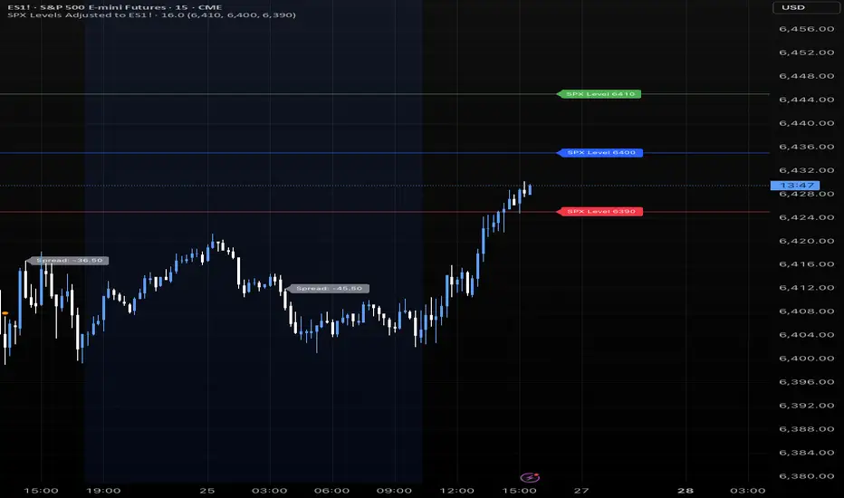
SPX Levels Adjusted to ES1!This indicator allows you to plot custom SPX levels directly on the ES1! (E-mini S&P 500 Futures) chart, automatically adjusting for the spread between SPX and ES1!. This is particularly useful for traders who perform technical analysis on SPX but execute trades on ES1!.
Features:
Input up to three SPX key levels to track (e.g., 5000, 4950, 4900)
The script adjusts these levels in real-time based on the current spread between SPX and ES1!
Displays the spread in the chart header for quick reference
Plots updated horizontal lines that move with the spread
Includes optional labels showing the spread periodically to reduce clutter
Ideal for futures traders who want SPX context while trading ES1!.
Make sure to apply this indicator on the ES1! chart, not SPX.
Indicators and strategies
Daily 16:45 LineDaily start & end indicator at 16:45. Instead of manually doing it on the charts, it will automatically appears, with no manual labor

[DIP] Many Moving AveragesHighly customizable set of moving averages. I noticed there wasn't anything simple, easy to use and customizable in the public domain so I decided to make my own.
Supports:
- Up to 8 Moving Averages ( SMA , EMA , HMA , RMA, VWMA , WMA )
- Each moving average can be configured with its own Period, Type, Source and Timeframe.

EMA Trend ScreenerEMA Trend Screener" instantly shows whether 40+ crypto pairs are bullish (green) or bearish (red) based on their position relative to a customizable EMA. The compact table display saves time by eliminating chart switching, while adjustable settings adapt to any trading style. Perfect for quick market analysis, it helps spot trading opportunities at a glance

RSS-Stochastik [afterworktrading]Hi all,
this is the first script from the series "afterworktrading". The goal is to develop and provide tools for traders with a fulltime job or little time for trading/analyzing charts.
Over time some of the scripts will also be linked to complete trading systems.
Let's start with my favourite one, the "RSS-Stochastik" with alert function.
The RSS-concept (Relative Spread Strength, developed by Ian Copsey) is based on the variance between a "short" and a "long" moving averages (or "slow" and "fast"), here between two EMA.
This variance is calculated and plotted in a RSI-diagram to show "overbought" and "oversold" conditions, helping to identify an ideal entry setup for trend continuation or catching a possible reversal.
Compared to the conventional RSI etc., possible reversal or trend continuation areas are often better represented in terms of quality, as an example see the Amazon-Chart.
The EMA-values, limit value thresholds and background colors can be set in the script. As a special feature, alarms can be set to be notified when a value has reached the extreme range. This reduces the screen time to the minimum.
In my personal trading, this indicator forms the basis for almost all trades, but is not a pure signal indicator on its own.
However, the informative value can be further improved if volume or support/resistance zones etc. are linked to the RSS, see example NASDAQ future with support zone price or 200 EMA.
Example for a possible RSS-Trade-Setup:
- choose an asset with a strong trend
- set alerts for crossing the oversold or overbought condition in direction of the trend
- in case of an alert check possible support/resistance areas on the current chart level (EMA, price zones, volume zones, anchored VWAP etc.)
- trade in the direction of the trend using your preferred entry setup
In my opinion, the system can be used very well, especially in trend phases, in order to obtain optimal entries.
Does it works also on lower timeframes?
Yes, it might work on every timeframe with a strong trend of high quality. Please see attached a 5m-Chart of GPBUSD-pair, notice the signal quality in direction of the trend.
Like every trading system this is not the "holy grail setup" and you will have losing trades. But handling this indicator with care you can have better entries especially in trend direction with less screen time due to the alert function.
Good luck with it! Further indicators will be published in the coming months, some will also be based on the RSS system.
As always: no liability for losing trades, no investment advice etc. Observe the risk limit for every trade!

VWAP Combo: Bands + MACD + Volume + AlertsBands: These are dynamic bands using a 20-period standard deviation and 1.5× width by default. Adjust lookback or bandMultiplier to tighten or widen.
Candle Colors: Green = MACD bullish, Red = bearish.
Volume Spike: Orange triangle when volume > 1.5× average.
Alerts: Fire on breakout, bounce, or combo confirmation.

Current Hourly Open Line with Sweep DetectionThis indicator marks out the high and low of the current hourly open candle.
Stats show, if the current hourly candle takes the high or low of the previous 1H candle there is a chance price returns to the hourly open depending on the time the sweep on the high or low occurred.
There is a high chance >75% price returns to hourly open of current candle if the sweep happens in the first 20 minutes.
There is a medium chance 50% price returns to hourly open of current candle if the sweep happens in the 20-40 minute range of the current candle.
There is a low 25% chance if sweep happens from :40-:59 minutes of the hour.
We use this to spot manipulation on the hourly timeframe, we only want to target hourly open if it happens in the first 20 minutes. We then want to trade in opposite direction of the first move of the hourly, w/ context of course.
The indicator / line will change colors based on the time the first sweep occurred. You can change them to how you want. For default, blue is just the hourly open with no sweep yet.
Green means go, and the sweep happens within the first 20 minutes, Yellow is medium chance, and Red is small chance.

London & NY Session Markers + Pip MovementThis indicator visually marks the London and New York trading sessions on your chart and optionally calculates the pip range (high-low movement) during each session. It's specifically designed for Forex traders, helping you identify volatility windows and analyze market movement within major session times.
🔍 Key Features:
✅ Session Open/Close Markers
Draws vertical dotted lines at:
London Open (08:00 UK time)
London Close (11:00 UK time)
New York Open (14:00 UK time)
New York Close (17:00 UK time)
Each marker is labeled clearly ("London Open", "NY Close", etc.)
Uses color-coding for easy identification:
Aqua for London
Lime for New York
✅ Pip Range Display (Optional)
Measures the high-low price movement during each session.
Converts this movement into pips, using:
0.0001 pip size for most pairs
0.01 pip size for JPY pairs (auto-detected)
Displays a label (e.g., "London: 42.5 pips") above the candle at session close.
This feature can be toggled on/off via the settings panel.
✅ Time-Zone Aware
Session times are aligned to Europe/London time zone.
Adjusts automatically for Daylight Saving Time (DST).
✅ User Controls
Toggle visibility for:
London session markers
New York session markers
Pip range labels
📊 Use Cases:
Identify when liquidity and volatility increase, especially during session overlaps.
Analyze historical session-based volatility (e.g., compare NY vs. London pip ranges).
Combine with price action or indicator signals that work best in high-volume hours.
Optimize entry and exit timing based on session structure.
⚙️ Best Timeframes:
5-min to 1-hour charts for precise session tracking.
Works on Forex and CFD pairs with standard tick sizes.
⚠️ Notes:
This tool does not repaint and uses only completed bar data.
Pip calculation is based on the chart’s current symbol and tick size.
Designed for spot FX, not intended for cryptocurrencies or synthetic indices.
✅ Ideal For:
Forex Day Traders
Session-based Strategy Developers
London Breakout or NY Reversal Traders
Anyone analyzing volatility by session windows

Penguin Trend with RSI on Diff🐧 Penguin Trend with RSI on Diff
Overview
This is a modified version of the original "Penguin Trend" indicator. Instead of displaying the magnitude of volatility with a histogram, this version uses an RSI oscillator to analyze the "momentum of volatility".
The main goal is to help traders see whether volatility is accelerating or decelerating, while still providing color signals on the price bars to indicate the primary trend direction during periods of volatility expansion.
---
How It Works
1. Volatility Difference Calculation
The indicator still calculates the difference value (diff) between the Bollinger Bands and Keltner Channels in the background. This value remains the core component for identifying a Squeeze (consolidation) or a Squeeze Release (volatility expansion).
2. RSI of Volatility Difference
Instead of plotting the diff value as a histogram, this script calculates an RSI based on the diff value. The result is an oscillator line (ranging from 0-100).
This RSI line represents the "momentum" or "rate of change" of the volatility itself.
- A rising RSI indicates that volatility is expanding at an increasing rate.
- A falling RSI indicates that volatility is decelerating or contracting.
3. Bar Coloring
This feature remains identical to the original version. The colors on the price bars are determined by MACD and EMA conditions to reflect the price trend and momentum.
- Lime: Strong bullish trend.
- Red: Strong bearish trend.
- Yellow: Pullback or weakening trend.
Important: The bar colors will only appear during a Squeeze Release (when diff > 0).
---
How to Use
1. Analyze Volatility Momentum with the RSI:
- RSI crossing above 50: Signals that volatility momentum is increasing; the market may be starting to trend.
- RSI above 70: Volatility expansion is in an "overbought" state and might slow down soon.
- RSI below 30: Volatility is very low ("oversold"), which could be a precursor to a new volatility expansion.
2. Confirm with Bar Colors:
After observing that the volatility RSI is rising, look for the bar colors on the main chart to confirm a trade.
- Example: If the RSI line crosses above 50 and, at the same time, the price bars turn "Lime", it could be a strong signal to enter a long position.
Tip: This version is ideal for traders who want a deeper analysis of the strength of a volatility breakout. As always, use it in conjunction with other technical analysis tools for confirmation.

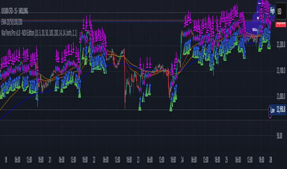
WarTrend Pro v1.0 - NDX EditionWarTrend Pro v1.0 is a high-frequency intraday strategy tailored for the NASDAQ 100 Index (NDX) on the 1H timeframe.
It is engineered for professional traders seeking to combine momentum, structure, and market psychology into a single automated trading system.
Built around a customized SuperTrend logic, the system integrates a set of 11 tactical conditions. A trade is only triggered when 3 or more conditions are simultaneously validated, ensuring high-conviction entries.
Entry Conditions (Long only in v1.0):
✅ SuperTrend turns bullish (price > ATR band)
✅ ADX confirms strong trend (>25)
✅ Price above EMA stack (20, 50, 100, 200)
✅ RSI breakout from neutral zone
✅ Volume anomaly or price reversal candle
✅ Optional: bullish MFI crossover, MACD slope, Keltner confirmation, divergence detection
Exit Conditions:
SL and TP are calculated from volatility-adjusted ranges
Trailing stop can be optionally enabled
Exit also triggered on signal reversal (SuperTrend or ADX flip)
💡 How to Use It
Apply on 1H timeframe (NDX)
Customize risk settings, SL/TP logic, and session filters
Optional: combine with news filters or macro overlays for discretionary enhancement
*License
This strategy is part of the WTRADE Project – Institutional Edition.
Reproduction, republishing, or commercial use without permission is prohibited.
EMA 7/25/99/200 StrategyBuy when EMA 7 crosses above EMA 25
Sell when EMA 7 crosses below EMA 25
Notes:
This strategy does not include stop loss or take profit.
It uses market orders based on EMA 7/25 crossover.
The longer EMAs (99/200) are plotted for context but not yet used in decision logic — you can incorporate them for trend filtering if needed.
For Better Results it would be for larger Timeframes (4H to 1D).

Yellow Dots at 20th, 60th, 120th Last Close//@version=6
indicator("Yellow Dots at 20th, 60th, 120th Last Close", overlay=true)
var label dotLabel20 = na
var label dotLabel60 = na
var label dotLabel120 = na
if barstate.islast
if na(dotLabel20)
dotLabel20 := label.new(bar_index , close , "⬤", color=color.new(color.white, 100), textcolor=color.yellow, size=size.tiny)
else
label.set_x(dotLabel20, bar_index )
label.set_y(dotLabel20, close )
if na(dotLabel60)
dotLabel60 := label.new(bar_index , close , "⬤", color=color.new(color.white, 100), textcolor=color.yellow, size=size.tiny)
else
label.set_x(dotLabel60, bar_index )
label.set_y(dotLabel60, close )
if na(dotLabel120)
dotLabel120 := label.new(bar_index , close , "⬤", color=color.new(color.white, 100), textcolor=color.yellow, size=size.tiny)
else
label.set_x(dotLabel120, bar_index )
label.set_y(dotLabel120, close )

Volume in ₹ (Total Traded Value in Crores)vikram dayal volume chart with total traded value in crores

🧠 Rogue BTC Dominance + BTC Price MonitorLiquidity never lies.
When whales are done pumping, they exit before price tanks, often during sideways chop or fake strength.
So we build a tracker that detects:
Volume drop during uptrend (distribution phase)
Exchange inflows of coins
Rising USDT.D while price holds → stealth exit
Divergence between price & on-chain flows
👁️ Quick Use Case: BTC/USDT with USDT.D Overlay
If you see this pattern:
BTC sideways or slow uptrend
Volume declining
USDT.D rising
BTC.D holding flat
→ Liquidity Exit Detected.
Smart money is exiting quietly, waiting for retail to hold the bag.
Kent Directional Filter🧭 Kent Directional Filter
Author: GabrielAmadeusLau
Type: Filter
📖 What It Is
The Kent Directional Filter is a directionality-sensitive smoothing tool inspired by the Kent distribution, a probability model used to describe directional and elliptical shapes on a sphere. In this context, it's repurposed for analyzing the angular trajectory of price movements and smoothing them for actionable insights.
It’s ideal for:
Detecting directional bias with probabilistic weighting
Enhancing momentum or trend-following systems
Filtering non-linear price action
🔬 How It Works
Price Angle Estimation:
Computes a rough angular shift in price using atan(src - src ) to estimate direction.
Kent Distribution Weighting:
κ (kappa) controls concentration strength (how sharply it prefers a direction).
β (beta) controls ellipticity (bias toward curved vs. linear moves).
These parameters influence how strongly the indicator favors movements at ~45° angles, simulating a directional “lens.”
Smoothing:
A Simple Moving Average (SMA) is applied over the raw directional probabilities to reduce noise and highlight the underlying trend signal.
⚙️ Inputs
Source: Price series used for angle calculation (default: close)
Smoothing Length: Window size for the moving average
Pi Divisor: Pi / 4 would be 45 degrees, you can change the 4 to 3, 2, etc.
Kappa (κ): Controls how focused the directionality is (higher = sharper filter)
Beta (β): Adds curvature sensitivity; higher values accentuate asymmetrical moves
🧠 Tips for Best Results
Use κ = 1–2 for moderate directional filtering, and β = 0.3–0.7 for smooth elliptical bias.
Combine with volume-based indicators to confirm breakout strength.
Works best in higher timeframes (1h–1D) to capture macro directional structure.
I might revisit this.

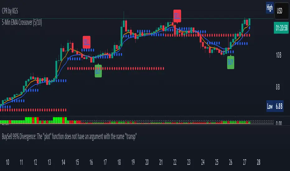
5-Min EMA Crossover (5/10)The 5-Minute EMA Crossover (5/10) strategy is a technical trading approach that uses two Exponential Moving Averages (EMAs) on a 5-minute chart to identify potential buy and sell signals based on trend shifts. Here's a description:
EMAs Used:
Fast EMA: 5-period EMA calculated on 5-minute candles. This EMA reacts quickly to recent price changes since it gives more weight to the latest data.
Slow EMA: 10-period EMA calculated on 5-minute candles. It responds more slowly, smoothing out short-term fluctuations.
How the Crossover Works:
A buy signal (long entry) occurs when the 5-period EMA crosses above the 10-period EMA. This suggests that recent price momentum is gaining strength upward, potentially indicating a bullish trend beginning or resuming.
A sell signal (short entry) happens when the 5-period EMA crosses below the 10-period EMA, signaling weakening recent price momentum and a possible bearish trend.
Purpose:
This crossover method helps traders catch short-term trends on a 5-minute timeframe by signaling moments when momentum shifts.
Because EMAs weight recent prices more heavily, the signals tend to be more responsive to fast market moves compared to simple moving averages.
Typical Usage:
Traders apply this to intraday charts (5-minute candles) looking for quick entries and exits.
It is common to use this crossover in combination with other indicators or price action context to reduce false signals.
Example of Signal Application:
When the 5 EMA crosses above the 10 EMA, consider entering a long position.
When the 5 EMA crosses below the 10 EMA, consider exiting longs or entering shorts.
This method leverages short-term momentum shifts visible on the 5-minute timeframe to help take advantage of intraday trends or reversals.
Intraday Momentum StrategyExplanation of the StrategyIndicators:Fast and Slow EMA: A crossover of the 9-period EMA over the 21-period EMA signals a bullish trend (long entry), while a crossunder signals a bearish trend (short entry).
RSI: Ensures entries are not in overbought (RSI > 70) or oversold (RSI < 30) conditions to avoid reversals.
VWAP: Acts as a dynamic support/resistance. Long entries require the price to be above VWAP, and short entries require it to be below.
Trading Session:The strategy only trades during a user-defined session (e.g., 9:30 AM to 3:45 PM, typical for US markets).
All positions are closed at the session end to avoid overnight risk.
Risk Management:Stop Loss: 1% below/above the entry price for long/short positions.
Take Profit: 2% above/below the entry price for long/short positions.
These can be adjusted via inputs for optimization.
Position Sizing:Fixed lot size of 1 for simplicity. Adjust based on your account size during backtesting.

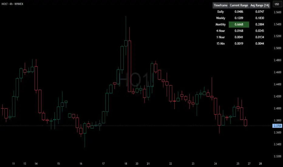
HTF Current/Average RangeThe "HTF(Higher Timeframe) Current/Average Range" indicator calculates and displays the current and average price ranges across multiple timeframes, including daily, weekly, monthly, 4 hour, and user-defined custom timeframes.
Users can customize the lookback period, table size, timeframe, and font color; with the indicator efficiently updating on the final bar to optimize performance.
When the current range surpasses the average range for a given timeframe, the corresponding table cell is highlighted in green, indicating potential maximum price expansion and signaling the possibility of an impending retracement or consolidation.
For day trading strategies, the daily average range can serve as a guide, allowing traders to hold positions until the current daily range approaches or meets the average range, at which point exiting the trade may be considered.
For scalping strategies, the 15min and 5min average range can be utilized to determine optimal holding periods for fast trades.
Other strategies:
Intraday Trading - 1h and 4h Average Range
Swing Trading - Monthly Average Range
Short-term Trading - Weekly Average Range
Also using these statistics in accordance with Power 3 ICT concepts, will assist in holding trades to their statistical average range of the chosen HTF candle.
CODE
The core functionality lies in the data retrieval and table population sections.
The request.security function (e.g., = request.security(syminfo.tickerid, "D", , lookahead = barmerge.lookahead_off)) retrieves high and low prices from specified timeframes without lookahead bias, ensuring accurate historical data.
These values are used to compute current ranges and average ranges (ta.sma(high - low, avgLength)), which are then displayed in a dynamically generated table starting at (if barstate.islast) using table.new, with conditional green highlighting when the current range is greater than average range, providing a clear visual cue for volatility analysis.
Multi-EMA Signal LineHere’s how you can combine multiple EMAs into one smooth line, and change its color based on bullish (long) or bearish (short) signals — all in Pine Script v5.
include:
Multiple EMAs (e.g., 10, 21, 50, 100, 200)
Smooth blended line (averaged or weighted)
Green color when EMAs are trending bullish
Red color when trending bearish

Refined MA + Engulfing (M5 + Confirmed Structure Break)I would like to start by saying that this strategy was put together using ChatGPT, some past trades from myself and some backtested trades, and from my time as a student in Wallstreet Academy under Cue Banks.
I am not profitable yet. I am too jumpy and blow accounts. I'm hoping this strategy (and it's indicator twin) can help me spend less time on the charts, so that I'm not tempted to press buttons as much.
It does fire quite a bit. But, the Strategy Tester tab shows a 30% win rate with our wins being significant to our losses. So, in theory, if you followed the rules of this strategy STRICTLY, you COULD BE profitable.
With that being said, there are times that this strategy has shown to trigger and I ask, "Why?".
I just want to help myself and others, and maybe make some decent\cool stuff along the way. Enjoy
KR
Custom NY Time MarkerThis is a simple time based marker created specifically for 9:00 am open but it can also be modified for different times as well.

Combined Time and Price IndicatorThis is my personal chart. Maps out the only good trading times within the day for consistent gains. Also, candles will be red when it's within the time frame I chose and price is below yesterday's highs (for trend), and the candles will turn green if they are within the time slot I chose, and price is above yesterday's highs.

Momentum 8% 4% 9MMomentum 8% 4% 9M is a simple yet effective visual indicator designed to highlight significant daily price moves and high volume activity on your stock charts.
Features:
Daily Price Move Highlights:
Background turns green when the daily price gain is equal to or greater than 8%, signaling strong bullish momentum.
Background turns red when the daily price drop is equal to or less than -4%, indicating notable bearish moves.
High Volume Marker:
Displays a small yellow upward triangle below the bar on days when the trading volume exceeds 9 million, helping you easily spot volume spikes.
This indicator provides clear visual cues directly on your price chart, making it easier to spot days of unusual market activity without cluttering your chart with excessive labels. It is ideal for traders looking to quickly identify big moves and volume surges for further analysis or trading decisions.
How it works:
The script calculates the daily percentage change from the previous close and compares it with predefined thresholds (8% up, 4% down). Volume is checked against the threshold of 9 million shares. Appropriate background colors and shape markers are then plotted accordingly.
