Candle Counter (Peter)Zählt die Kerzen in jeweiliger Zeiteinheit, Farben und Größe ändern und Position vorgeben.
Indicators and strategies

Enhanced Market Structure StrategyATR-Based Risk Management:
Stop Loss: 2 ATR from entry (configurable)
Take Profit: 3 ATR from entry (configurable)
Dynamic Position Sizing: Based on ATR stop distance and max risk percentage
Advanced Signal Filters:
RSI Filter:
Long trades: RSI < 70 and > 40 (avoiding overbought)
Short trades: RSI > 30 and < 60 (avoiding oversold)
Volume Filter:
Requires volume > 1.2x the 20-period moving average
Ensures institutional participation
MACD Filter (Optional):
Long: MACD line above signal line and rising
Short: MACD line below signal line and falling
EMA Trend Filter:
50-period EMA for trend confirmation
Long trades require price above rising EMA
Short trades require price below falling EMA
Higher Timeframe Filter:
Uses 4H/Daily EMA for multi-timeframe confluence
Enhanced Entry Logic:
Regular Entries: IDM + BOS + ALL filters must pass
Sweep Entries: Failed breakouts with tighter stops (1.6 ATR)
High-Probability Focus: Only trades when multiple confirmations align
Visual Improvements:
Detailed Entry Labels: Show entry, stop, target, and risk percentage
SL/TP Lines: Visual representation of risk/reward
Filter Status: Bar coloring shows when all filters align
Comprehensive Statistics: Real-time performance metrics
Key Strategy Parameters:
pinescript// Recommended Settings for Different Markets:
// Forex (4H-Daily):
// - CHoCH Period: 50-75
// - ATR SL: 2.0, ATR TP: 3.0
// - All filters enabled
// Crypto (1H-4H):
// - CHoCH Period: 30-50
// - ATR SL: 2.5, ATR TP: 4.0
// - Volume filter especially important
// Indices (4H-Daily):
// - CHoCH Period: 50-100
// - ATR SL: 1.8, ATR TP: 2.7
// - EMA and MACD filters crucial
Expected Performance Improvements:
Win Rate: 55-70% (improved filtering)
Profit Factor: 2.0-3.5+ (better risk/reward with ATR)
Reduced Drawdown: Stricter filters reduce false signals
Consistent Risk: ATR-based stops adapt to volatility
This enhanced version provides much more robust signal filtering while maintaining the core market structure edge, resulting in higher-probability trades with consistent risk management.

Cassures Tokyo pendant New York//@version=5
indicator("Cassures Tokyo pendant New York", overlay=true)
// Paramètres de sessions
// Début et fin de Tokyo (00h00 - 08h00 GMT)
tokyo_start = timestamp("GMT+0", year(timenow), month(timenow), dayofmonth(timenow), 0, 0)
tokyo_end = timestamp("GMT+0", year(timenow), month(timenow), dayofmonth(timenow), 8, 0)
// Début et fin de New York (13h30 - 22h00 GMT)
ny_start = timestamp("GMT+0", year(timenow), month(timenow), dayofmonth(timenow), 13, 30)
ny_end = timestamp("GMT+0", year(timenow), month(timenow), dayofmonth(timenow), 22, 0)
// Initialisation des variables persistantes
var float tokyo_high = na
var float tokyo_low = na
var bool ny_started = false
var bool high_broken = false
var bool low_broken = false
// Reset des valeurs à chaque nouvelle journée
if (time >= tokyo_start and time < tokyo_end)
tokyo_high := na
tokyo_low := na
high_broken := false
low_broken := false
ny_started := false
// Détection du high/low Tokyo
if (time >= tokyo_start and time < tokyo_end)
tokyo_high := na(tokyo_high) ? high : math.max(tokyo_high, high)
tokyo_low := na(tokyo_low) ? low : math.min(tokyo_low, low)
// Détection des cassures pendant New York
if (time >= ny_start and time < ny_end)
ny_started := true
if not na(tokyo_high) and high > tokyo_high
high_broken := true
if not na(tokyo_low) and low < tokyo_low
low_broken := true
// Affichage des niveaux Tokyo
plot(tokyo_high, "Tokyo High", color=color.green, linewidth=1, style=plot.style_linebr)
plot(tokyo_low, "Tokyo Low", color=color.red, linewidth=1, style=plot.style_linebr)
// Surlignage visuel en session NY selon cassure
bgcolor(ny_started and high_broken and low_broken ? color.orange : ny_started and high_broken ? color.new(color.green, 80) : ny_started and low_broken ? color.new(color.red, 80) : na)
// Affichage texte sur le graphique
label_id = label.new(x=bar_index, y=high, text="", style=label.style_label_down, textcolor=color.white, size=size.tiny, color=color.gray)
if (ny_started)
label_text = high_broken and low_broken ? "Cassure HIGH & LOW Tokyo" :
high_broken ? "Cassure HIGH Tokyo" :
low_broken ? "Cassure LOW Tokyo" :
"Aucune cassure"
label.set_text(label_id, label_text)
label.set_xy(label_id, bar_index, high + syminfo.mintick * 10)

BTC Breakout Bot (TP/SL + Alerts) 🚀This strategy targets Bitcoin (BTC/USDT) breakout trades by detecting price moves beyond recent highs and lows, with built-in risk management and alerts.
How it works:
📈 Long Entry: When price breaks above the highest high of the last N candles (default 20)
📉 Short Entry: When price breaks below the lowest low of the last N candles
🎯 Take Profit: Automatically set at a percentage from entry price (default 5%)
⚠️ Stop Loss: Automatically set at a percentage from entry price (default 2%)
🔔 Alerts: Triggered on every long and short breakout trade, compatible with Telegram/webhook notifications
Parameters:
⏳ Breakout Lookback: Number of candles used to identify breakout levels (default 20)
💰 Take Profit (%): Profit target as % from entry (default 5%)
🛑 Stop Loss (%): Maximum allowed loss as % from entry (default 2%)

Simple SMA StrategyThis strategy uses two Simple Moving Averages (SMAs) to spot trend changes and generate trade signals on any market or timeframe.
How it works:
➡️ Long Entry: When the fast SMA (default 14) crosses above the slow SMA (default 28), enter a long position.
⬇️ Short Entry: When the fast SMA crosses below the slow SMA, enter a short position.
🔄 Exit: Positions close when the opposite crossover happens, capturing trend reversals.
Features:
⚙️ Adjustable SMA lengths for different markets or styles
💰 Position sizing as % of equity (default 1%) for risk management
📊 Plots fast (blue) and slow (orange) SMAs on the chart
🔔 Alerts on every long & short entry crossover for automation or notifications
Use Cases:
Perfect for trend-following traders in crypto, stocks, forex, and more — simple and effective.
⚠️ Disclaimer
Backtests and alerts are based on historical data and don’t guarantee future results. Always test carefully and manage your risk!

My strategyThis strategy is designed for BTC/USDT breakout trading on short-to-medium timeframes. It enters positions when price breaks out above recent highs or below recent lows, using automated risk management and alerts.
🔍 Core Logic
Long entry: When price breaks above the highest high of the last N candles (default: 20).
Short entry: When price breaks below the lowest low of the last N candles.
This logic helps detect momentum-driven breakout moves based on recent price consolidation.
⚙️ Strategy Settings
Capital: $10,000
Order size: 1% of equity per trade
Commission: 0.1% per trade (simulating exchange fees)
Slippage: 3 ticks (for realism)
Take Profit: 3% from entry
Stop Loss: 1.5% from entry
These settings aim to provide realistic, risk-conscious backtest results, suitable for individual traders.
📊 Visual Features
Green line = Breakout High
Red line = Breakout Low
Entry/exit markers are plotted on the chart
🔔 Alerts
Alerts are integrated for:
Long Entry
Short Entry
You can create TradingView alerts using this script to automate notifications or connect to external bots (e.g., via webhook for Telegram or Discord).
🧠 How This Strategy Is Different
While many breakout bots use standard Donchian channels, this version allows you to:
Tune the breakout sensitivity (via the adjustable lookback period)
Customize TP/SL without external inputs
Integrate alerts for real-time decision making or automation
The simplicity and flexibility make it useful as both a live tool and a framework for further development.
⚠️ Disclaimer
This script is for educational purposes only. Backtests are based on historical data and do not guarantee future results. Always test thoroughly before using in live trading. Risk only what you can afford to lose.

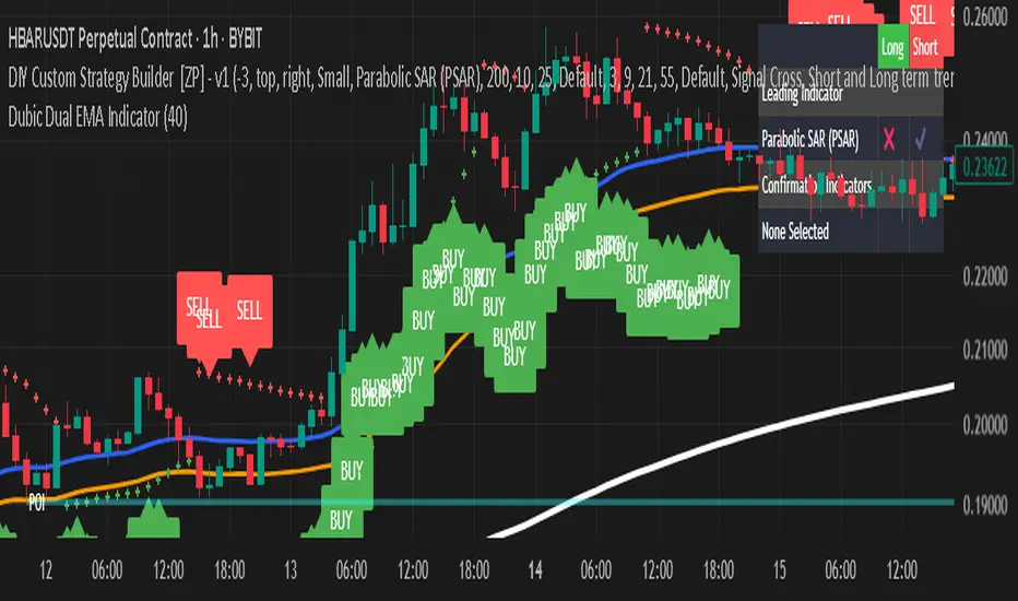
Dubic Dual EMA IndicatorThe Dual EMA Indicator combines two exponential moving averages (EMAs) to identify trend-based buy and sell signals. A buy signal is generated when the price closes above both EMAs suggesting strong bullish momentum. A sell signal appears when the price closes below both EMAs indicating bearish pressure.
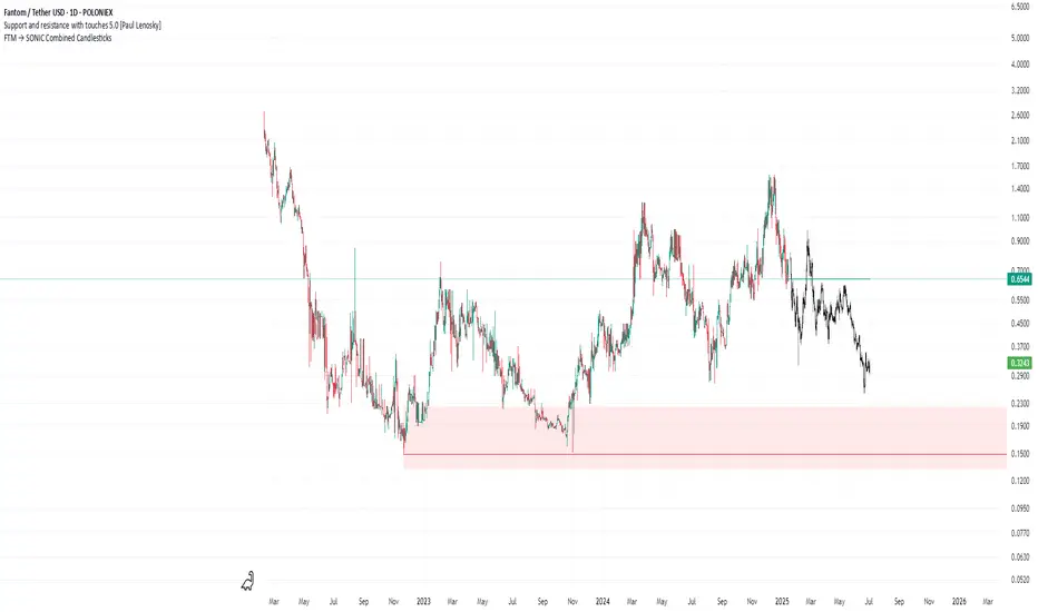
FTM → SONIC Combined Candlesticksthis script combines the chart of FTM and SONIC to get a better overview of the entire price action
Institutional Footprint + RSIPurpose
Detect early signs of institutional activity (accumulation, distribution, shakeouts) using price and volume behavior, combined with RSI for confirmation.
How It Works
Footprint Score (0–100):
Above 70 → Possible accumulation
Below 30 → Possible distribution
Around 50 → Neutral
Shakeout signals: False breakdowns followed by strong recoveries
RSI Line: Plotted for confirmation
Why It Matters
Catches smart money moves before price reacts. Helps identify stealth accumulation or quiet exits not visible in price alone.
Features
Institutional Footprint + RSI
Shakeout markers
Visual zones
Usage Tips
Combine with RSI, VWAP, or support/resistance. For example: if Footprint shows accumulation and RSI is low, this may signal a high-probability buy setup
Best on 1H, 4H, or Daily timeframes
Not a standalone entry/exit signal

ORB Scalp setup by UnenbatDescription
ORB Scalp Setup by Unenbat is a precise breakout scalping tool that identifies short-term price ranges at the transition between hourly sessions.
📌 Core Features:
Draws a dynamic box using the price range from the last 3 minutes of the previous hour and the first 3 minutes of the new hour (total 5m59s range).
Automatically plots:
Box representing the selected range.
Opening Price Line at the start of the hour.
TP Lines (Take Profit) above and below the box at customizable distances.
BE Lines (Break-Even) above and below the box at customizable distances.
Box and line lengths are user-defined (default: 60 minutes).
Works across historical data (up to the last 100 days).
Fully customizable visuals (colors, offsets, visibility toggles).
🎯 How to Use:
Ideal for scalp traders using breakout strategies.
Enter trades when price breaks above or below the box range.
Use TP and BE lines as clear reference levels for exits or trailing stop logic.
⚙️ Custom Settings:
Enable/disable each component (box, open line, TP line, BE line).
Set your own offset in pips for TP/BE lines.
Adjust the box duration to match your trading style.
Modify start and end times of the range as needed.

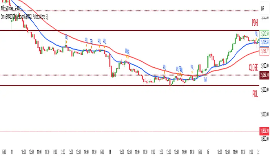
Sesiones + FVG + PDH / PDLMarket Sessions: Define and visualize four market sessions (New York, London, Tokyo, Sydney) with options to display ranges, trend lines, averages, VWAP, and highs/lows.
Dashboard: A panel that displays the status of the sessions (active/inactive) and, in advanced mode, the coefficient of determination (R2) of the trend line and the volume for each session.
Fair Value Gaps (FVG) / Imbalances: Detect and draw Fair Value Gaps (also known as imbalances or inefficiencies) on multiple time frames, with options to extend them, change their color when tested, and adjust their levels if the price touches them.
Previous Day/Week/Month Levels: Displays the highs and lows of the previous day and week (PDH/PDL, PWH/PWL), as well as the opening prices of the current day, week, and month (DO, WO, MO).

Hidden Liquidity Shift DetectorPurpose
The Hidden Liquidity Shift Detector identifies candles that indicate potential hidden accumulation or distribution activity based on volume and price action behavior. These setups often represent institutional absorption of liquidity ahead of larger moves.
How It Works
The script detects candles with the following characteristics:
Small real body relative to the total candle range
A strong wick (upper or lower) indicating rejection
Volume significantly higher than the recent average
It flags:
Hidden Selling (Distribution) when a bearish candle has a long upper wick and high volume
Hidden Buying (Accumulation) when a bullish candle has a long lower wick and high volume
These candles are often missed by traditional indicators but may precede significant reversals or breakouts.
Features
Automatic detection of absorption-style candles
Volume spike filtering based on configurable multiplier
Wick and body ratio thresholds to fine-tune signal quality
Non-intrusive signal markers (colored circles)
Real-time alerts for hidden buying/selling signals
Usage Tips
Use on 15m to 4H charts for intraday detection, or Daily for swing setups
Combine with support/resistance or volume profile zones for higher conviction
Clusters of signals in the same area increase reversal probability
Can be used alongside Wyckoff-style logic or smart money concepts

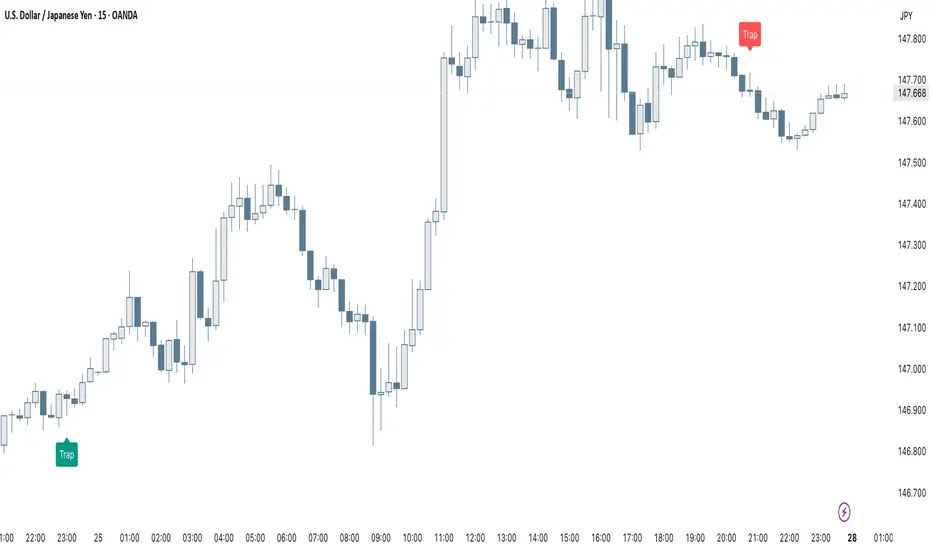
Smart Trap Candle Detector [Pro]Purpose
The Smart Trap Candle Detector is designed to identify common fakeout scenarios in the market, where price breaks a key swing high or low and quickly reverses. These “trap candles” often mislead breakout traders and are commonly used by smart money to induce liquidity before reversing.
How It Works
The script detects potential trap candles using these conditions:
A bearish trap is identified when price breaks above a recent swing high and closes back below it.
A bullish trap is identified when price breaks below a recent swing low and closes back above it.
Optional confirmation from the previous candle’s direction can be enabled.
Swing highs/lows are calculated dynamically using a configurable lookback window.
Once a trap candle is confirmed, a signal is displayed on the chart along with optional labels and alert conditions.
Features
Detects fake breakouts of swing highs and lows
Configurable swing lookback period
Optional confirmation candle filter
Optional label display on trap bars
Built-in alerts for bullish and bearish trap signals
Lightweight, real-time signal detection
Usage Tips
Best used on intraday timeframes such as 15m, 30m, or 1H
Use around key support/resistance zones or liquidity areas
Combine with other confluence signals such as order blocks or RSI divergence
Adjust the swing lookback period depending on the volatility of the asset
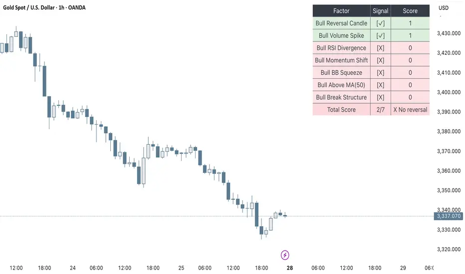
Clarix Smart Reversal ScorecardPurpose
Designed to identify potential trend reversal setups based on a rules-based scoring system. It helps traders quickly assess the strength of reversal signals using objective technical criteria.
How It Works
The script evaluates seven key technical conditions for both bullish and bearish reversals. Each condition met adds 1 point to the total score (max 7). A table displays the results with a final score and an automatic conclusion based on the strength of the setup.
Features
Reversal signal scoring from 0 to 7
Bullish and bearish detection modes
Visual scorecard table with individual factors
Configurable minimum score to show
Alert conditions for strong (5+) and perfect (7) setups
Lightweight and optimized for all timeframes
Usage Tips
Set "Direction" to Bullish, Bearish, or Both depending on your strategy
Use on timeframes between 15m to 4H for optimal signals
A score of 5 or more suggests strong reversal potential
Combine with key support/resistance or trend context for higher accuracy
Avoid using during high-volatility news events for cleaner signals
UngliMulti-Indicator Confluence System
This is a **multi-indicator confluence trading signal system** called "Ungli" that combines RSI, ADX, and MACD to identify high-probability momentum opportunities when used alongside chart pattern and trend line breakouts.
## Core Concept
The script identifies moments when multiple technical indicators align to suggest potential price momentum moves, specifically looking for oversold and overbought conditions with momentum confirmation. Use green and red highlights along with chart patterns and trend line breakouts that signal a breakout for confluence for a likely momentum move.
## Technical Indicators Used
**RSI (Relative Strength Index)**
- Default 14-period RSI
- Oversold threshold: < 40
- Overbought threshold: > 60
**ADX (Average Directional Index)**
- Default 14-period ADX with DI+ and DI-
- Threshold: 21
- Looks for ADX below threshold but ticking upward (momentum building)
**MACD (Moving Average Convergence Divergence)**
- Fast: 12, Slow: 26, Signal: 9
- Uses MACD line direction as trend filter
## Signal Logic
**Green Background (Bullish Momentum Signal):**
- RSI > 60 (overbought)
- ADX < 21 AND rising
- MACD line trending upward
**Red Background (Bearish Momentum Signal):**
- RSI < 40 (oversold)
- ADX < 21 AND rising
- MACD line trending downward
## Key Strategy Elements
1. **Confluence Approach**: Requires all three indicators to align, reducing false signals
2. **Momentum Filter**: ADX must be building (rising) even if low, indicating emerging trend strength
3. **Trend Confirmation**: MACD direction must match the expected move
4. **Visual Simplicity**: Clean background highlighting without chart clutter
5. **Pattern Integration**: Designed to work with chart patterns and breakout strategies
## Use Case
This indicator is designed for swing trading and breakout strategies, identifying moments when oversold/overbought conditions coincide with building momentum in the expected direction. The ADX filter helps avoid choppy, trendless markets. Best used in conjunction with:
- Support/resistance breakouts
- Chart pattern breakouts (triangles, flags, channels)
- Trend line breaks
- Key level violations
The background highlights serve as confluence confirmation when combined with your chart analysis and breakout setups.

EMA-SMA & RSI Strategyusing RSI and EMA strategy, it works on RSI based rules as well as indicator based rules

DI/ADX Trend Strategy | (1-Min Scalping)Strategy Overview
This is an experimental 1-minute trend-following strategy combining DI+/DI-, ADX, RSI, MACD, VWAP, and EMA filters with a time-based exit. It aims to catch strong directional moves while strictly managing risk.
Indicator Components
• DI+/DI- + ADX – Trend direction + strength filter
• RSI (14) – Momentum confirmation (RSI > 55 or < 45)
• MACD Histogram – Detects directional momentum shifts
• Candle Body % Filter – Screens for strong commitment candles
• EMA 600 / 2400 – Long-term trend alignment
• Weekly VWAP – Entry only when price is above/below VWAP
• Trade Limit – Max 2 trades per direction per VWAP cycle
• Time-Based Stop – 0.50% SL, 3.75% TP, 12h (720 bars) time stop
Entry Logic
Long Entry:
• DI+ crosses above DI−
• RSI > 55
• MACD histogram > 0
• Strong bullish candle
• Price > VWAP
• EMA600 > EMA2400
• Within 25 bars of EMA crossover
• Max 2 long trades before VWAP resets
Short Entry:
• DI+ crosses below DI−
• RSI < 45
• MACD histogram < 0
• Strong bearish candle
• Price < VWAP
• EMA2400 > EMA600
• Within 25 bars of EMA crossover
• Max 2 short trades before VWAP resets
Exit Logic
• Stop Loss: 0.50%
• Take Profit: 3.75% (7.5R)
• Time Stop: 720 bars (~12 hours on 1m chart)
• Each trade exits independently
Testing Parameters
• Initial Capital: $10,000
• Commission: 0.10%
• Timeframe: 1-minute
• Tested on: BTCUSDT, ETHUSDT
• Pyramiding: Up to 5 positions allowed
• VWAP resets trade counter to reduce overtrading
Alerts
• Buy / Sell signal
• Trade Opened / Closed
• SL/TP triggered
⚠️ Notes
• Early-stage strategy — entry count varies by trend conditions
• Shared for educational use and community feedback
• Please forward-test before using live
• Open-source — contributions and suggestions welcome!
Disclaimer
This strategy is for educational purposes only and should not be considered financial advice. Past performance does not guarantee future results. Always validate independently before trading live.
