Apex Edge - RSI Trend LinesThe Apex Edge - RSI Trend Lines indicator is a precision tool that automatically draws real-time trendlines on the RSI oscillator using confirmed pivot highs and lows. These dynamic trendlines track RSI structure in motion, helping you anticipate breakout zones, reversals, and hidden divergences.
Every time a new pivot forms, the indicator automatically re-draws the RSI trendline between the two most recent pivots — giving you an always-current view of momentum structure. You’ll instantly see when RSI begins compressing or expanding, long before price reacts.
Key Features: • Dynamic RSI trendlines drawn from the last 2 pivots
• Auto re-draws in real-time as new pivots form
• Optional "Full Extend" or "Pivot Only" modes
• Slope color-coded: green = support, red = resistance
• Built-in dotted RSI levels (30/70 default)
• Alert conditions for RSI trendline breakout signals
• Ideal for spotting divergence, compression, and early SMC confluence
This is not your average RSI — it’s a fully reactive momentum edge overlay designed to give you clarity, structure, and timing from within the oscillator itself. Perfect for traders using Smart Money Concepts, divergence setups, or algorithmic trend tracking.
⚔️ Built for precision. Built for edge. Built for Apex.
Pine utilities

Macros, Sessions, and Quarters - psyploThis script was developed for my personal trading workflow, where I rely heavily on macro time windows and session-based timing to guide my strategy. I designed this tool to help visualize important time-based zones that are crucial in my trading approach, and I believe other traders might find it useful as well.
Features
Macro Time Window Boxes: Visual representation of price range within a configurable time window around the top of every hour.
Session Ribbon Boxes: Clearly marks the Asia, London, and New York trading sessions, labeled distinctly for better visual separation.
Session Quarters: Each session is automatically divided into four quarters, providing more granular time segmentation within sessions.
Time Zone: All session calculations are based on UTC +8 (Asia/Singapore) timezone.
This tool helps traders:
Identify volatility zones around hourly opens.
Track session-specific market dynamics.
Recognize shifts in momentum or liquidity during each session quarter.
I created this for my own strategies, but it can serve any trader who benefits from time-based market segmentation.
Feel free to adjust the colors and time window settings to suit your preferences!

Apex Edge - VantageApex Edge – Vantage
Quarter-Wick Reversal System | Price Action Based | Non-Repainting | Visual Confirmation Tool
Overview:
Apex Edge – Vantage is a precision price action indicator built to assist traders in identifying high-probability reversal entries — not based on indicators, but on how candles behave at their extremes.
This tool implements a clean, repeatable framework that reflects how I personally trade:
Spot a candle that closes with strong directional intent,
Then wait for a controlled pullback into the outer quarter,
And strike — only if price respects that line.
There’s no magic here — just raw, tactical logic visualized clearly on your chart. It's not designed to predict the market — it's built to respond when price offers you Vantage.
Core Logic:
Dot Detection – Final Quarter Close Candles
A green dot prints below a bullish candle if it closes within the top 25% of its wick-to-wick range.
A red dot prints above a bearish candle if it closes within the bottom 25% of its range.
These dots signify candles that made a strong, deliberate move in one direction — where price was pushed to an extreme and held that extreme into the close. These candles often signal institutional intent or momentum imbalance.
Entry Confirmation – Controlled Wick Rebalance
On the very next candle only, price must wick into the prior dot candle's outer quarter — but must not pass beyond it.
For buy entries, the wick must enter the bottom 25% of the previous green dot candle, but not dip below it.
For sell entries, the wick must reach into the top 25% of the red dot candle, but not exceed it.
This wick into the quarter is seen as a controlled rebalancing — a tactical reaction back into the origin zone before potential continuation.
Arrow Printing – Visual Entry Signal
Once the entry criteria are confirmed, an arrow is printed after the candle closes.
This arrow continues to print on each new candle as long as price does not violate the original entry zone — giving visual confirmation that the trade thesis is still valid.
If price breaks above/below the quarter range, the arrow disappears.
This ongoing confirmation is useful for staying in trades, managing risk, or spotting failed setups early.
Automatic Stop Loss Level
A horizontal Stop Loss line is drawn from the extreme wick of the original dot candle.
For buy entries, SL is placed below the green dot candle's low.
For sell entries, SL is placed above the red dot candle's high.
This provides immediate risk context — perfect for traders using limit orders or looking to scale in.
Coding Logic:
This script uses plotshape() and plot() functions for all visual elements.
Dot candles are identified using quarter-range logic via:
pinescript
Copy
Edit
close >= high - (high - low) * 0.25 // for bullish
close <= low + (high - low) * 0.25 // for bearish
Entry validation logic triggers only on the next candle, using:
pinescript
Copy
Edit
low >= quarterLine and low <= high // for buy entries
high <= quarterLine and high >= low // for sell entries
Arrows and SL lines are plotted only on closed candles, ensuring non-repainting behavior.
alertcondition() is used for real-time alerts on valid buy/sell triggers.
How I Personally Use It:
I wait for a dot to print — this shows directional conviction.
On the next candle, I watch for a tap into the outer quarter.
If the wick meets the criteria and the candle closes, I’ll execute manually at the close of that candle.
As long as the arrow remains on the chart, I know the setup hasn’t been invalidated.
I combine this with market structure, session timing, and liquidity context to build confluence around each trade.
Alerts Included:
Buy Entry Alert: When a green arrow prints (entry confirmed)
Sell Entry Alert: When a red arrow prints (entry confirmed)
These fire once per confirmed signal, allowing you to react in real-time or automate if desired.
Who This Is For:
Manual traders who want clean price-based entries
Anyone who uses market structure, SMC, or liquidity concepts
Traders looking to replace indicators with pure candle logic
Discretionary or semi-systematic traders who want visual tools to guide their decisions
Final Word
Apex Edge – Vantage doesn’t predict price — it shows you where price is offering you control.
This is a surgical tool designed to help you act only when the market gives you a measurable edge — and to stay in the trade as long as that edge holds.
If you're ready to stop chasing trades and start striking from a position of Vantage, then this tool belongs on your chart.

MTF Trend Table - Manual InputMTF Trend Table - Manual Input
Description:
This indicator displays a simple and clear multi-timeframe (MTF) trend table in the upper right corner of your chart. You can manually set the current trend direction (Up, Down, or Neutral) for each timeframe: Monthly, Weekly, Daily, 4h, 1h, and 15min. The table shows the status of each timeframe with colored backgrounds—green for Up, red for Down, and gray for Neutral—making it easy to monitor trend alignment across different timeframes at a glance.
Features:
Manual selection of trend direction for each timeframe.
Color-coded status: green (Up), red (Down), gray (Neutral).
Quickly visualize trend alignment across Monthly, Weekly, Daily, 4h, 1h, and 15min.
Table is positioned in the top right corner of the chart for easy reference.
How to use:
Open the indicator settings and select the trend direction for each timeframe based on your own analysis. Use this tool as a visual aid to track and confirm trend bias in your trading system.

My scriptMulti-Currency Converter
Purpose: A TradingView Pine Script indicator that creates a real-time currency conversion table on your chart.
Key Features:
Converts between 6 currencies: USD, EUR, GBP, Bitcoin (BTC), Ethereum (ETH), and Solana (SOL)
Live price feeds from Binance (crypto) and forex markets
Customizable table position and size

HA 21-EMA Crossover • compute Heikin-Ashi values in the background,
• overlay the 21-EMA (orange line) on those HA closes,
• mark bar-close crossovers with green BUY / red SELL arrows, and

Daily Gain/Loss Statistics by Day of WeekDaily Gain/Loss Statistics by Day of Week
Overview
This Pine Script indicator analyzes historical price data to provide comprehensive day-of-week performance statistics, helping traders identify patterns and optimize their trading strategies based on which days historically perform better or worse.
Key Features
📊 Day-of-Week Analysis
7-day breakdown showing Monday through Sunday statistics
Average Gain % - Average percentage gains on winning days for each day of the week
Average Loss % - Average percentage losses on losing days (displayed with minus sign)
Median High % - Typical percentage move from open to daily high
Median Low % - Typical percentage move from open to daily low
🎯 Visual Performance Indicators
🚀 Rocket symbol - Marks the best performing day (highest average gains)
🔻 Red triangle down - Marks the worst performing day (lowest average gains)
Current day highlighting - Today's row highlighted in yellow (#ffdd444b)
⚡ Real-Time Session Tracking
Current Session row - Shows today's performance percentage in real-time
Color-coded gains/losses - Green for positive, red for negative
🎨 Professional Themes
⚙️ Customization Options
Date range selection - Choose specific time periods for analysis
Table positioning - 9 different screen positions
Table sizing - 6 size options from tiny to huge
Timeframe protection - Works only on 1D timeframe with user-friendly warnings
How It Works
Data Collection - Analyzes daily OHLC data within your selected date range
Day Classification - Categorizes each trading day by day of the week
Statistical Calculation - Computes averages and medians for each day type
Performance Ranking - Identifies best and worst performing days
Real-Time Display - Shows current session performance vs historical patterns
Trading Applications
Entry/Exit Timing - Identify optimal days for opening/closing positions
Risk Management - Avoid trading on historically poor-performing days
Strategy Optimization - Align trading strategies with day-of-week patterns
Market Timing - Understand weekly market cycles and seasonality
This indicator transforms raw price data into actionable intelligence, helping traders make more informed decisions based on proven historical day-of-week performance patterns.

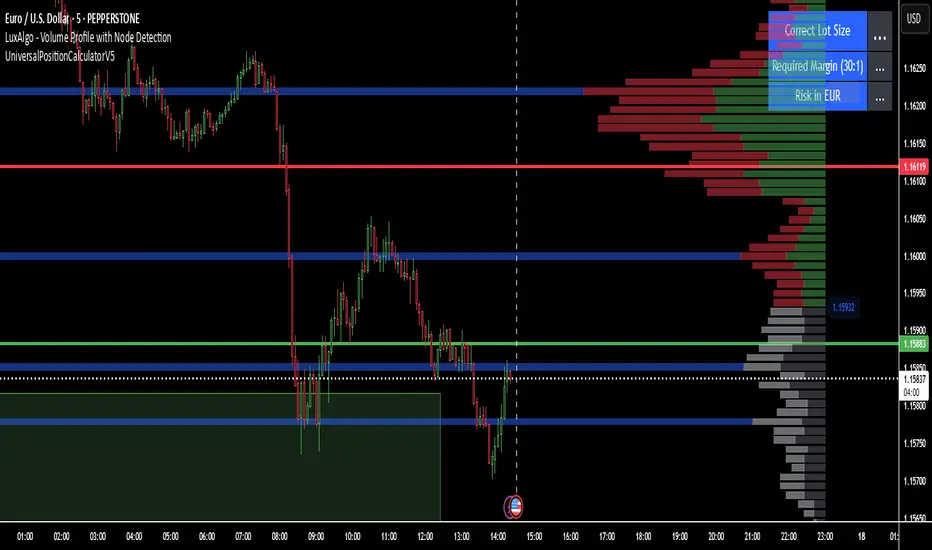
UniversalPositionCalculatorV5🚀 Universal Position Calculator v5 (with Margin-Check) 🚀
Stop using calculators and complicated Excel sheets! 🤯 With the Universal Position Calculator v5, you have the ultimate tool right on your TradingView chart to manage your position size perfectly. Whether it's Forex, Gold, or Indices – this indicator does all the work for you!
✨ What does this indicator do? ✨
This indicator is your personal risk manager. It calculates the exact lot size for your next trade based on your capital, your desired risk, and your leverage. The best part? It immediately checks if your trade is even possible with your margin and warns you if you're about to over-leverage your account! 🚦
🌟 Key Features at a Glance 🌟
Automatic Lot Calculation: Just enter your risk in percent, and the indicator calculates the perfect lot size.
Margin Check: Instantly detects if your desired position size is limited by your margin and adjusts it. No more margin calls due to oversized positions!
For All Asset Classes: Works perfectly for Forex pairs (e.g., EURUSD) and other assets like commodities (XAUUSD) or indices (GER30). 💹
Currency Conversion: Automatically converts between your account currency and the asset's currency. It doesn't matter if you trade in EUR, USD, CHF, or JPY. 💱
Interactive Lines: Simply drag and drop the Entry and Stop Loss lines directly on the chart to plan your trade. 🎯
Clear Info Panel: All important information (lot size, required margin, risk in €/$/...) is displayed cleanly and clearly on your chart.
🛠️ How to Use: It's This Easy! 🛠️
The setup is a piece of cake and done in two simple steps.
Step 1: Configure Your Setup
Go to the indicator settings and fill out the "1. Setup" section:
Asset Type: Choose Forex for currency pairs or Other for everything else (e.g., Gold, Oil, Indices).
Account Currency: Enter the currency of your trading account (e.g., USD).
Account Capital: Enter your current account capital.
Risk in % per Trade: How much of your capital do you want to risk per trade? (e.g., 1.0 for 1%).
Leverage: Enter your account's leverage (e.g., 30 for 30:1).
Contract Size for 'Other': IMPORTANT! Only for the Other type. For Gold (XAUUSD), this is often 100; for the DAX (GER30), it's often 1 or 25. Check your broker's specifications for this!
Step 2: Plan Your Trade
Now for the fun part in the "2. Trade Control" section:
Entry Line (Blue Line): Click on the blue line and drag it to your desired entry level. You can also enter the value manually in the settings.
Stop Loss Line (Red Line): Click on the red line and drag it to your stop-loss level.
Step 3: Read the Results
As soon as you've set your Entry and Stop Loss, the Info Panel in the top-right corner will instantly show you the results:
Correct Lot Size: This is the lot size you need to enter with your broker for this trade.
⚠️ Heads up: If it says "Lot Size (Margin Limited!)" in orange, it means your desired risk was too high for your leverage. The indicator has automatically reduced the lot size to the maximum possible to avoid a margin call.
Required Margin: This is how much capital will be blocked on your account as a security deposit (margin) for this trade.
Risk in : The exact amount of money you will lose if your stop loss is triggered.
With this tool, you can make disciplined and mathematically sound trading decisions. Good luck and Happy Trading! 📈💰

4444Add RSI if above 50 take Buy signal and if it was bellow 50 take Sell signal this is more safe for you it works on all markets but Im using it in stocks market.
Contact me +971588444455 to be a member.
You should pay to be member 1209371$
NEPALI DASHBOARD NEPALI DASHBORAD - All-In-One Sentiment Dashboard
Overview
The NEPALI DASHBORAD is a comprehensive, all-in-one dashboard designed to give day traders a quick yet powerful overview of market sentiment. Instead of cluttering your chart with dozens of individual indicators, this tool consolidates the signals from 11 different technical indicators into a single, easy-to-read table. It calculates an overall bull/bear sentiment score and provides a trading recommendation based on the confluence of these signals, helping you make more informed decisions at a glance.
The dashboard is fully customizable, allowing you to adjust indicator settings, change the table size, and move it to any corner of your chart.
Key Features
Multi-Indicator Analysis: Gathers data from 11 essential indicators covering trend, momentum, volume, and volatility.
Sentiment Score: Calculates a simple "Bull vs. Bear" score to instantly gauge market sentiment.
Actionable Recommendations: Provides a clear trading recommendation (Strong Buy, Buy, Sell, Strong Sell, Hold) based on the strength of the confluence.
Higher Timeframe (HTF) Context: Includes an HTF trend analysis to ensure your trades align with the bigger picture.
Customizable Dashboard: Easily change the size and position of the dashboard to fit your workspace.
How to Use
Check the Market Sentiment: Look at the "Bull vs. Bear" score first. A high score (e.g., 8 vs. 3) indicates strong confluence in one direction.
Verify the HTF Trend: Ensure your intended trade direction aligns with the higher timeframe trend for better probability. For example, be cautious about taking "SELL" signals if the HTF Trend is strongly "BULL."
Use the Recommendation as a Guide: The "Recommendation" and "Confidence" % give you a summary of the indicator signals. A "STRONG BUY" or "STRONG SELL" means that a significant majority of the indicators are in agreement.
Drill Down into Indicators: Use the individual indicator statuses in the table to understand why the market sentiment is bullish or bearish. For example, you might see that momentum indicators (RSI, Stoch) are bullish, but trend indicators (MA, MACD) are still lagging.
Combine with Your Strategy: This dashboard is a powerful confirmation tool. Use its signals to confirm entries and exits for your existing trading strategy. Do not use it as a standalone signal provider.
Disclaimer
In simple terms: This is a tool for analysis, not a signal to trade. Your money is your responsibility.
This script is for educational and informational purposes only. I am not a financial advisor; I am just a learner sharing my work. The information and tools provided are not, and should not be construed as, financial advice, an offer, or a solicitation to buy or sell any securities.
Trading and investing in financial markets involve substantial risk of loss and is not suitable for every investor. I do not guarantee the accuracy, completeness, or profitability of this script. All trading decisions you make are your own, and you are solely responsible for any resulting profits or losses.
Always conduct your own research and seek advice from a qualified financial advisor before making any investment decisions. By using this script, you agree that I am not liable for any and all losses you may incur.

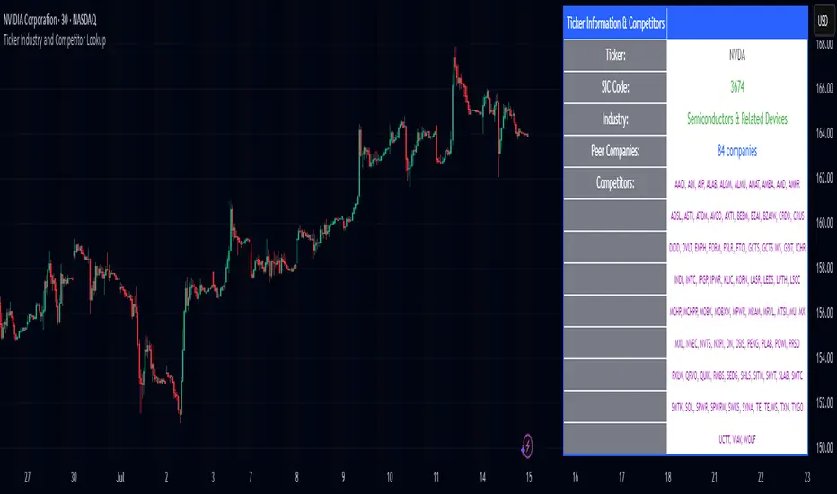
Ticker Industry and Competitor LookupThe Ticker Industry and Competitor Lookup is a comprehensive indicator that provides instant access to industry classification data and competitive intelligence for any ticker symbol. Built using the advanced SIC_TICKER_DATA library, this tool delivers professional-grade sector analysis with enterprise-level performance. It's a simple yet great tool for competitor research, sector studies, portfolio diversification, and investment decision-making.
This indicator is a simple tool built on based on our SIC_TICKER_DATA library to demonstrate the use cases of the library. In this case, you enter a ticker and it displays the sector, SIC or Standard Industrial Classification which is a SEC identifier, and more importantly, the competitors that are listed to be in the exact same SIC by SEC.
There isn't much to say about the indicator itself but we strongly recommend checking out the SIC_TICKER_DATA library we just published to learn more about the types of indicators you can build using it.
HBD.FIBONACCIThis code is an indicator designed to visualize Fibonacci levels in the financial markets and generate alerts based on them. It plots both upward and downward Fibonacci levels at various Fibonacci ratios, starting from a specified reference price (usually the highest closing price). Users can set a tolerance percentage to be notified when the market price approaches or touches these levels, and they can choose to set alerts for all levels or only the prominent orange Fibonacci levels. Furthermore, the areas between these orange lines are highlighted with background boxes for easier visual identification. The era of manually plotting Fibonacci levels is over. Congratulations!

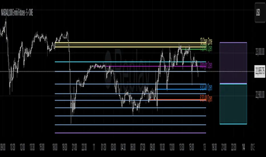
Profitable Loser Model [MMT]Profitable Loser Model
Overview
The Profitable Loser Model is a powerful PineScript v6 indicator designed to enhance your trading by visualizing key price levels, session open zones, Fibonacci retracements, and premium/discount zones. This overlay indicator provides traders with a customizable toolkit to analyze market structure across any timeframe, making it ideal for intraday and swing trading strategies.
Features
Open Zone Visualization
- Plots a box based on the open and close of the first candle in a user-defined timeframe (default: 5-minute).
- Customizable box color, projection offset, and label size (Tiny, Small, Normal, Large).
- Displays a timeframe label (e.g., "5m Open Zone") for quick reference, toggleable on/off.
Session Open Lines
- Optionally draws horizontal lines at key session opens (8:30 AM, 9:30 AM, 1:30 PM, Midnight, New York time).
- Customize line color, style (Solid, Dashed, Dotted), width, and label size for each session.
- Perfect for identifying critical intraday price levels.
Premium and Discount Zones
- Highlights premium (above midpoint) and discount (below midpoint) zones based on session high/low.
- Toggleable with customizable colors and projection offsets.
- Helps traders spot overbought/oversold areas for potential mean-reversion trades.
Fibonacci Retracement Levels
- Plots user-defined Fibonacci levels (default: 0.23, 0.35, 0.5, 0.62, 0.705, 0.79, 0.886, 1, 1.1).
- Customizable line style, width, color, and labels (showing percentage and/or price).
- Dynamically adjusts based on price movement relative to the open zone.
Take Profit (TP) and Stop Loss (SL) Levels
- Highlights TP (default: 0.23) and SL (default: 1.1) Fibonacci levels with distinct colors.
- Fully customizable to align with your risk-reward strategy.
How It Works
- Session Detection : Resets daily (or per user-defined timeframe) to capture the first candle's open, high, low, and close.
- Open Zone : Draws a box between the open and close, extended forward by the projection offset.
- Session Lines : Plots lines at specified session opens with customizable styles and labels.
- Fibonacci Retracement : Adjusts levels dynamically based on session high/low and price action.
- Premium/Discount Zones : Calculated from the session range midpoint, updated in real-time.
Settings
- Open Zone :
- Timeframe (default: 5m), Calculate Timeframe (default: Daily).
- Toggle label, adjust size, box color, and projection offset.
- Session Open Lines :
- Enable/disable lines for 8:30 AM, 9:30 AM, 1:30 PM, Midnight.
- Customize color, style, width, label size, and vertical offset.
- Premium/Discount Zones :
- Toggle visibility, set colors, and adjust projection offset.
- Fibonacci Retracement :
- Toggle visibility, set custom levels, line style, width, color, and label options.
- Adjust projection offset.
- TP/SL :
- Set TP/SL Fibonacci levels and colors.
Use Cases
- Intraday Trading : Use session open lines and open zones to trade key market hours.
- Swing Trading : Leverage Fibonacci levels for potential reversal or continuation zones.
- Risk Management : Set precise TP/SL levels based on Fibonacci retracements.
- Market Structure : Identify overbought/oversold zones with premium/discount areas.
Notes
- Optimized with `dynamic_requests = true` for efficient real-time data handling.
- Visual elements (boxes, lines, labels) are cleaned up at the start of each new session.
- Session lines use New York time (`America/New_York`) for alignment with major markets.
GK Trend Reversal Buy/Sellspots reversals it only 98% hit rate on the 45min any other chart is a no go but 45min is brillent

AshishBediSPLThis tool, called "AshishBediSPL," is a special indicator for traders using TradingView. Its main purpose is to help you track and trade the combined price of a Call and a Put option at the same strike price, a strategy known as a Short Straddle.
What It Does:
Tracks Straddle Prices: You can select a specific Indian index or a stock like Reliance, choose a strike price and expiry date, and the indicator will show you the combined price of that Call and Put option as a single line on your chart.
Calculates Everything for You: You don't need to manually add the prices. The indicator automatically does the math to show you the total premium of the straddle.
Adds Trading Signals: You can turn on various popular trading tools (like VWAP, EMA, Supertrend, etc.). The indicator will then use these tools to automatically show "Buy" and "Sell" signals directly on the chart, helping you decide when to enter or exit a trade.
Customizable: You can choose which trading tools you want to use and adjust their settings to fit your personal trading style.
What is it Used For?
This indicator is specifically for traders who:
Trade a Short Straddle: This is a neutral options strategy where you expect the market to stay in a small range. The indicator helps you monitor the total premium you've collected.
Want to Simplify Analysis: Instead of looking at a Call chart and a Put chart separately, this tool combines them into one easy-to-read chart.
Use Technical Analysis: It helps you apply standard technical indicators directly to the combined premium price, giving you clear signals for your straddle trades.

Normalized Fibonacci Retracement (MTF/LOG)A question: Instead of creating indicators that constantly plot Fibonacci Retracement levels in a visually overwhelming way, why don't we redefine them on a different scale? 🤨
Overview
The Normalized Fibonacci Retracement indicator converts price data to a 0-100 scale based on the selected timeframe's high-low range, displaying normalized candlesticks alongside standard Fibonacci levels (23.6%, 38.2%, 50%, 61.8%, 78.6%). This normalization reveals patterns that may be hidden in absolute price charts and allows consistent analysis across different instruments.
Originality
By normalizing prices to percentages, this indicator enables pattern recognition independent of absolute price levels. The same formation at $10-$20 and $1000-$2000 appears identical on the normalized scale, helping traders identify recurring structures across various assets and timeframes.
Concepts
The indicator uses a simple formula to transform price data into percentages. This creates a bounded scale where patterns become comparable regardless of the underlying asset's price range. The normalized view often reveals symmetries and relationships not visible in traditional price charts.
Mechanics
The system tracks highs and lows within the selected timeframe as anchor points. When a new period begins, fresh boundaries are established and prices recalculated. Trend direction is determined by timing of extremes. Linear scaling uses direct percentage calculation, while logarithmic scaling applies exponential interpolation for assets with large percentage moves.
Functions
Timeframe Selection: Higher timeframe analysis on any chart resolution
Normalized Display: OHLC data converted to 0-100 percentage scale
Fibonacci Levels: Standard retracement levels plotted automatically
Scaling Options: Linear or logarithmic calculation methods
Pattern Recognition: Reveals formations hidden in absolute price charts
Moving Average: Optional 20-period SMA overlay
Notes
Ensure chart data covers the full selected timeframe for accurate calculations. Use logarithmic scaling for volatile assets with large percentage moves. The normalized scale is effective at revealing patterns and structures that remain consistent across different price ranges, making it particularly useful for comparative analysis and pattern-based trading strategies.
I hope it helps everyone. Do not forget to manage your risk. And trade as safely as possible. Best of luck!

SMA+Volume Buy AlertsOverview
This lightweight indicator combines trend and momentum filters to pinpoint high-conviction, oversold entries on ETFs or stocks. It plots your choice of two SMAs (default 100- & 200-day) and a 20-day volume moving average, then only flags a “BUY” when price crosses below an SMA and daily volume exceeds its average.
Use it to capture institutional-strength reversals without alert noise, and receive a single, clear signal exactly when market participants step in.
Key Features
Dual SMA Trend Lines (100/200-day by default)
Volume Filter (20-day avg): only overshoots on above-average volume signal
One-Shot Buy Markers: triangles appear beneath the precise bar that crosses under your SMA on high volume
Alert Conditions: “Buy 100 SMA + High Vol” and “Buy 200 SMA + High Vol” ready for desktop, mobile, or webhooks
Show/Hide Toggle for your SMA lines
100% Pine v6, optimized for speed and compatibility
Inputs
Short SMA Length (default 100)
Long SMA Length (default 200)
Volume MA Length (default 20)
Show SMA Lines toggle
How to Use
Add to Chart: Copy & paste this script into TradingView’s Pine editor, then Save & Add to Chart.
Configure Inputs: Adjust SMA and volume-MA lengths to your trading style.
Create Alerts:
Open “Create Alert,” select the “SMA-VOL-BUY” indicator.
Choose “Buy 100 SMA + High Vol” or “Buy 200 SMA + High Vol.”
Set trigger to “Once Per Bar Close.”
Trade with Confidence: Only the most significant, high-volume overshoots get flagged—no spam, just high-quality setups.
Best Practices
Frame Alignment: Combine daily signals with a weekly SMA trend filter for multi-timeframe confirmation.
Volume Context: Ensure that “high” volume truly represents above-average activity in your chosen security.
Risk Management: Use the signal bar’s low as your stop, and size positions to match your risk tolerance.
Review & Iterate: Tweak SMA or volume lengths to suit fast-moving sectors (e.g. 50/100 SMAs) or slower large-caps.

SMA Undervalue Buy AlertsSMA Undervalue Buy Alerts
Free, open-source Pine v6 indicator for spotting undervalued ETF/stock entries
This simple yet powerful indicator plots two user-configurable Simple Moving Averages (default 100- and 200-day) on your chart and automatically marks any bar where price closes below those SMAs with an on-chart “BUY” triangle. It’s ideal for ETF traders who want a systematic, price-action-based signal whenever a major trend filter is breached to the downside—often a sign of short-term overselling in an otherwise up-trending market.
Key Features
Dual SMA Lines (default 100/200): Smooth out noise and highlight medium- and long-term trend backdrops
Automatic Buy Markers: Triangles appear beneath any candle that closes under your chosen SMA, so you never miss an overshoot
Built-in Alert Conditions: Four alert hooks—“Buy 100 SMA” and “Buy 200 SMA”—let you receive desktop, mobile or webhook notifications the moment a close beneath your SMAs occurs
Show/Hide Toggle: Quickly turn the SMA lines on or off without removing the script
100% Pine v6: Fast, lightweight, and compatible with all TradingView chart types
How to Use
Add to Chart: Copy & paste the Pine v6 code into TradingView’s Pine editor, then Save & Add to Chart.
Configure Inputs: Adjust “Short SMA Length” and “Long SMA Length” to your preferred look-back periods (e.g. 50/200, 20/50, etc.).
Create Alerts: In the Create Alert dialog, choose your indicator, then select “Buy 100 SMA” or “Buy 200 SMA” under Series. Set it to “Once Per Bar Close” for reliable signals.
Trade Management: Use the buy markers as entry triggers or confirm with volume, RSI, or other confluence tools before committing.
Best Practices
Trend Confirmation: Combine with a higher-TF trend filter (e.g. 200 SMA on weekly) to stay aligned with the broader market
Volume Check: Look for above-average volume on overshoot candles to validate institutional interest
Risk Control: Always define your stop (e.g. below the low of the signal bar) and position-size responsibly

Dynamic 5% Below SuperTrend ResistanceThe Central Pivot Range (CPR) is a popular price action-based indicator used by traders to identify key support and resistance levels for a given trading session. It consists of three lines:
Central Pivot (CP): Calculated as the average of the high, low, and close of the previous period.
Top Central Pivot (TC): Calculated as (CP + High of previous period) / 2.
Bottom Central Pivot (BC): Calculated as (CP + Low of previous period) / 2.
How traders use CPR:
If the price is above the CPR, it is considered bullish; if below, bearish.
The width of the CPR can indicate market volatility: a narrow CPR suggests a trending move, while a wide CPR suggests a range-bound market.
CPR levels act as dynamic support and resistance zones for intraday and swing trading.
The SuperTrend is a trend-following indicator based on the Average True Range (ATR). It is plotted as a single line above or below the price on the main chart:
Calculation: The SuperTrend value is derived by adding or subtracting a multiple of the ATR from the closing price.
Trend Indication:
When the price is above the SuperTrend line, the indicator turns green, signaling an uptrend.
When the price is below the line, it turns red, signaling a downtrend.
Signals: A change in the SuperTrend’s position (from above to below the price or vice versa) is considered a potential buy or sell signal.
Support/Resistance: The SuperTrend line acts as a dynamic support or resistance level.
Customization: The indicator’s sensitivity can be adjusted using the ATR period (atrLength) and the multiplier.
Best Use: SuperTrend works best in trending markets and is often combined with other indicators for confirmation.
The SuperTrend indicator is valued for its simplicity, adaptability, and clear visual signals—but, like all indicators, it can generate false signals in sideways or choppy markets and is best used in conjunction with other tools

AlgoTradar MACD (Auto-Optimized)This is the AlgoTradar MACD Optimized indicator, a finely-tuned tool based on the classic MACD crossover strategy.
The script is designed to provide clear, actionable signals for both manual and automated trading systems.
How to Use
Apply to Chart: For the best results, apply this indicator to your chart on the 8-hour (8H) timeframe. Using it on other timeframes may produce less reliable signals as the parameters are tailored for 4H, 8H, 1D, 1W, 1M.
Interpret the Signals:
🚀 BUY Signal: A green "BUY" label appears when the blue MACD line crosses above the orange Signal line. This indicates potential bullish momentum.
📉 SELL Signal: A red "SELL" label appears when the blue MACD line crosses below the orange Signal line. This indicates potential bearish momentum.
Confirmation is Key: This indicator should not be used in isolation. Always use it in conjunction with other analysis methods, such as trend lines, support and resistance levels, or other indicators, to confirm signals before entering a trade.

Renko Alerts📢 Renko Alerts – by Marcelo Ulisses Sobreiro Ribeiro
🧱 Detection of Bricks and Hammers on Renko Charts with Alerts
This indicator was designed for traders who use Renko charts and want to receive automated alerts when bricks and hammer-like patterns are formed, helping with price action reading and quick, objective decision-making.
✅ Indicator Function
Renko Alerts automatically identifies:
Bullish Brick: A clean bullish brick (no wicks), indicating potential trend continuation to the upside.
Bearish Brick: A clean bearish brick (no wicks), indicating potential trend continuation to the downside.
Bullish Hammer: A bullish brick with a lower wick.
Bearish Hammer: A bearish brick with an upper wick.
ℹ️ Important:
Hammer patterns are widely used as entry triggers, both for reversal and trend continuation — it all depends on the market context in which they appear (e.g., support/resistance, pullback zones, indicator confluence).
⚙️ Inputs & Settings
🔹 Box Size (points)
Description: Defines the Renko brick size in points.
Default value: 3.0
Why it matters: This setting is essential for the script to accurately detect brick formations. It calculates the body size and distinguishes between clean bricks and those with wicks (hammers).
Technical Note: A small tolerance is applied automatically to prevent floating-point comparison errors.
🔔 Available Alerts
The indicator provides four ready-to-use alert conditions for use within TradingView:
Alert Name Technical Condition Message
Bullish Brick Bullish brick with body equal to Box Size New Bullish Brick
Bearish Brick Bearish brick with body equal to Box Size New Bearish Brick
Bullish Hammer Bullish brick with a lower wick New Bullish Hammer
Bearish Hammer Bearish brick with an upper wick New Bearish Hammer
These alerts are ideal for automating chart monitoring and receiving real-time notifications about potential trade setups.
📌 Additional Notes
This script is designed to work exclusively with Renko charts using fixed box sizes.
It is not suitable for time-based candlestick charts.
You can use this indicator alongside other tools (moving averages, RSI, stochastics, etc.) to build confluent strategies.

Sector SPDR ETFsThis script automatically identifies the SPDR sector ETF that corresponds to the currently viewed US stock ticker. It maps over 500 US-listed stocks to their respective SPDR sector ETFs — such as XLK (Technology), XLF (Financials), XLY (Consumer Discretionary), and others — based on pre-defined symbol lists.
When applied to a chart, the script displays a label below the last candle showing the SPDR sector symbol (e.g., "XLE" for Energy stocks like XOM). This allows traders and investors to quickly understand the sector classification of any stock they analyze.
Key Features:
Maps tickers to SPDR sector ETFs: XLC, XLY, XLP, XLE, XLF, XLV, XLI, XLB, XLRE, XLK, and XLU.
Displays the corresponding sector label on the chart.
Helpful for sector rotation strategies, macro analysis, or thematic investing.
