BINANCE:BTCUSDT RSI📊 BTC RSI Deviation Visualizer
This indicator visualizes the deviation of BTC RSI from the neutral level (50) to highlight momentum extremes and potential reversal zones in a simplified and color-coded format.
It is specifically designed for traders who prefer to monitor RSI strength centered around neutrality (0 as midpoint) instead of absolute RSI values.
🧠 Concept
This tool subtracts 50 from the RSI of BINANCE:BTCUSDT, creating a deviation value:
java
복사
편집
RSI Deviation = RSI - 50
This approach allows traders to interpret bullish or bearish bias more intuitively:
RSI > 50 → positive deviation → bullish
RSI < 50 → negative deviation → bearish
The result is plotted as a zero-centered histogram, where color and shape dynamically indicate the strength of deviation.
🔍 Visual Components
Color-coded Histogram:
Gradient bar colors reflect the size and direction of deviation.
Strong bullish (+10 to +30): light to dark orange
Strong bearish (-10 to -30): light to dark blue
Extreme values (>|30|): highlighted in yellow
Reversal Zone Circles:
Green circles are plotted when RSI deviation exceeds +30
Red circles appear when deviation is below -30
Circles are rate-limited to avoid visual noise (one signal every 5+ bars)
Reference Lines:
0 line (neutral RSI 50)
±35 threshold lines for identifying abnormal momentum
🔧 Settings
RSI Length: Default 14 (can be adjusted based on your time frame or strategy)
✅ Use Cases
Momentum Strength Monitoring:
Identify when BTC is showing sustained buying/selling pressure above typical ranges.
Reversal Signal Layer:
Use the circle markers to flag possible overbought/oversold peaks in conjunction with other tools.
Trend Filtering:
Use deviation direction (+/-) as an additional filter for trend-based strategies.
🧩 Compatibility
Works on any time frame
Only uses BINANCE:BTCUSDT price
Lightweight and highly responsive
🔐 Originality & Value
Unlike traditional RSI plots, this indicator offers a centered and directional perspective on RSI momentum.
The design emphasizes trend pressure, not just overbought/oversold thresholds, making it highly compatible with scalping, swing, or trend-following strategies.
Rsibar
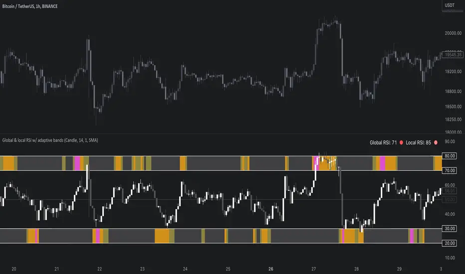
Global & local RSI / quantifytoolsAs the terms global and local imply, global RSI describes broad relative strength, whereas local RSI describes local relative strength within the broad moves. A macro and micro view of relative strength so to speak. Global and local RSI are simply regular RSI and stochastic RSI. Local RSI extremes ( stochastic RSI oversold/overbought) often mark a pivot in RSI which naturally reflects to price. Local RSI extremes are visualized inside the global RSI bands (upper band for overbought, lower band for oversold) in a "heat map" style.
By default:
Stochastic RSI >= 75 = yellow
Stochastic RSI >= 87 = orange
Stochastic RSI >= 100 = pink
Users also have the ability smooth the RSI with their preferred smoothing method ( SMA , EMA , HMA , RMA, WMA ) and length. This leads to different behavior in RSI, rendering the typical RSI extremes (> 70 or < 30) suboptimal or even useless. By enabling adaptive bands, the extremes are readjusted based on typical RSI pivot points (median pivots ), which gives much more relevant reference points for oversold/overbought conditions in both global and local RSI. This feature can be used without smoothing, but it rarely provides a meaningful difference, unless the RSI calculation length is messed with.
Global RSI can be plotted as candles, bars or a line. Candles and bars can be useful for detecting rejections (wicks) in relative strength, the same you would with OHLC data. Sometimes there are "hidden rejections" that are visible in relative strength but not on OHLC data, which naturally gives an advantage. All colors can be adjusted in the input menu. You also have a real-time view of the current RSI states in top right corner. Available alerts are the following: global RSI overbought, global RSI oversold, local RSI overbought and local RSI oversold.