CQ_[TACHIMETER]The Tachimeter Indicator: A Fun Financial Gauge
Visualizing Market Momentum in Real Time
Introduction
The Tachimeter is a playful and innovative indicator designed for those who enjoy observing the financial markets with a touch of excitement. Much like the tachometer in a car measures engine revolutions per minute, the Tachimeter measures the "revolutions" of money in the market — showing just how fast funds are moving in or out, every twenty seconds.
What Does the Tachimeter Show?
At its core, the Tachimeter displays how much money (in U.S. dollars) is shifting direction — either up or down — from the current price within a 20-second window. The indicator operates on a scale that starts at $0 (no significant movement) and extends to $1200, representing the maximum flow observed in each 20-second period.
• Scale: $0 to $1200 every 20 seconds
• Direction: Indicates if money is moving upwards (buying) or downwards (selling)
• Purpose: For entertainment and observation, not for actual trading decisions
Visual Design and Interpretation
The Tachimeter features a gauge reminiscent of a car’s tachometer. The gauge moves to show the current intensity of money flowing into or out of the market right now, providing an immediate sense of how "fast" buyers or sellers are acting.
• Gauge Indicator: The amount of squares shows the speed of ongoing transactions, just like a rev counter in a vehicle.
• Color-Coded Title: The title of the indicator switches colors based on the market’s relationship to the daily opening price:
• Red: When the current price is lower than the daily opening price, indicating downward momentum.
• Green: When the current price is higher than the daily opening price, signaling buying momentum.
How to Use the Tachimeter
This indicator is intended purely for fun — it gives you a rapid, visual sense of market activity, letting you "feel" the excitement of fluctuating prices. If you enjoy watching the markets move, the Tachimeter adds a dynamic, visceral element to your experience.
• Watch the needle twitch higher as heavy buying or selling takes place.
• Notice title color changes as the market sentiment shifts from bullish (green) to bearish (red), or vice versa.
• Use it as a conversation starter or to enhance your enjoyment of fast-paced trading sessions.
Final Thoughts
Like your car’s tachometer helps you sense when to shift gears, the Tachimeter lets you sense when the market is "revving up." It’s not a tool for serious decision-making, but it transforms raw financial data into an engaging, interactive visual — perfect for those who appreciate both finance and a bit of fun.
Enjoy watching the market’s RPMs!
Sentiment

CCI Turbo Pro [CongTrader]📄 Full Description for Publishing — CCI Turbo Pro
⚡️ CCI Turbo Pro — Advanced CCI with Reversal Zones & Alerts
This advanced CCI (Commodity Channel Index) indicator is built for traders who want enhanced reversal signals, customizable extreme zones, and dynamic alerts. It improves the classic CCI with better visual cues and momentum filtering to help you avoid false signals.
🛠️ How to Use:
CCI Length (default = 20): Adjust based on your trading timeframe.
Overbought/Oversold Zones:
Overbought = 200
Oversold = -200
Extreme OB = 300 (red zone)
Extreme OS = -300 (green zone)
When the CCI crosses from below −200 → BUY signal
When the CCI crosses from above +200 → SELL signal
Background turns green/red in extreme zones
Optional labels show entry signals clearly
This indicator is useful for:
Reversal Trading
Momentum Shifts
Scalping, Swing, or Intraday strategies
Overbought/Oversold Confirmation
Works on:
Any asset (Crypto, Forex, Stocks, Indices)
Any timeframe
🔔 Alerts Included:
📈 CCI Buy Alert → CCI crossed up from oversold
📉 CCI Sell Alert → CCI crossed down from overbought
🚨 Extreme OB/OS Alert → CCI enters extreme reversal zone
Alerts help you stay informed even when away from the screen.
🔎 Keywords (for search discovery):
CCI, CCI Reversal, CCI Alert, Turbo CCI, Advanced CCI, CCI Zones, CCI Overbought, CCI Oversold, Momentum Reversal, CCI Scalping, CongTrader, CCI Buy Sell, Technical Indicator
🙏 Thank You
If this indicator adds value to your trading, please give it a 👍, leave a comment, or follow for more free tools from CongTrader. Your support helps independent creators grow the community.
⚠️ Disclaimer
This indicator is for educational purposes only and does not constitute financial advice. Use this tool with your own judgment and risk management. Past performance does not guarantee future results.
✍️ Created by CongTrader — Free, Open-Source Tools for Smarter Traders...

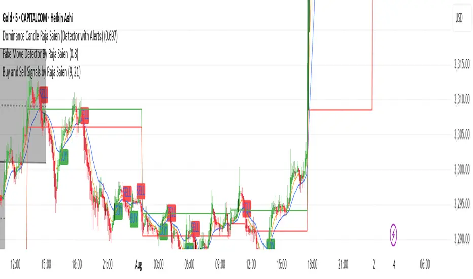
Buy and Sell Signals by Raja Saien📈 Buy and Sell Signals by Raja Saien 💹
"Simple. Clean. Powerful."
🔥 This indicator is built for those who believe in price action and clarity. No confusion, no clutter — just pure EMA crossover logic to catch early trends and filter false moves.
✅ Buy Signal when the 9 EMA crosses above the 21 EMA — indicating momentum shift to the upside.
❌ Sell Signal when the 9 EMA crosses below the 21 EMA — signaling potential downside momentum.
🧠 Designed for traders who trust the trend, respect momentum, and want to stay ahead of the crowd.
🔍 Perfect for scalping, intraday, and swing trading. Combine it with support/resistance or price action zones for even more 🔥 accuracy.
✨ Created by Raja Saien — for serious traders only.
💪 "Indicators don’t make you money, but discipline with clarity does."
HA Background ColorThis indicator colors the entire chart background based on the current Heikin Ashi candle direction:
🟩 Green background = Bullish Heikin Ashi candle
🟥 Red background = Bearish Heikin Ashi candle

RSI OB/OS Alert Indicator[CongTrader]📌 RSI OB/OS Alert Indicator by CongTrader
This is a simple yet powerful Relative Strength Index (RSI) indicator designed to help traders identify potential overbought and oversold market conditions using dynamic alerts and clean visual highlights.
🛠️ How to Use
RSI Length: Adjustable (default = 14).
Overbought Level (default = 75): When RSI crosses above this, price may be overextended.
Oversold Level (default = 25): When RSI drops below this, price may be undervalued.
Background will turn green for oversold zones and red for overbought zones.
Use alerts to get notified when RSI enters these critical zones — no need to watch the chart 24/7.
This tool is suitable for:
Scalping
Swing Trading
Range-bound Markets
Momentum Reversals
Works on any timeframe and any asset (Forex, Crypto, Stocks, Indices, Futures).
🔔 Alerts Included
“RSI Overbought” → Triggered when RSI crosses above the overbought level.
“RSI Oversold” → Triggered when RSI crosses below the oversold level.
Setup your alert by right-clicking on the chart or using the TradingView alert panel.
💬 Keywords (for search visibility)
RSI, RSI Alert, RSI Overbought, RSI Oversold, Momentum Indicator, Reversal Signal, RSI Trading, Crypto RSI, Scalping RSI, RSI Tool, RSI Visual, RSI Zones, Technical Indicator, CongTrader
🙏 Thank You
If you find this indicator useful, feel free to give it a thumbs up 👍 or comment below. Your support helps independent script developers like me continue to share free and open-source tools with the community!
⚠️ Disclaimer
This script is for educational purposes only and does not constitute financial advice. Always perform your own research before making trading decisions. Use this tool at your own risk.
✍️ Developed by CongTrader | Follow for more free indicators & tools.

CRYPTO CME GAPS- Can be used in any crypto symbol of any exchange, (not necessarily the CME exchange)
- Displays the CME gaps with the colors green or red depending on the sentiment of the gap
- Extends the gaps displayed until they are filled.
- In the end of the code there are the boolean values 'filled_bull' and 'filled_bear' that can be used to create a strategy script.
Buy/Sell Demand Pressure SMAThis indicator shows when competing buying and selling pressure has changed.
When bullish buying offsets bearish transaction volume, the indicator turns green. When bearish selling pressure offsets bullish buying volume the indicator is red.
Can be used as a normal SMA or to confirm buy/sell signals of other indicators.
Works best at the start of trades...and not exits but if set properly, it is a good indicator of when a trend has reversed.
~ jb tuttle

Zen HA BackgroundThis script colors the chart background based on Heikin Ashi candle direction.
It filters out noise by waiting for 2 confirmed candles in the same direction with real body size.
Clean, simple, and easy on the eyes.
Great for scalpers and trend traders who want visual confirmation without clutter.

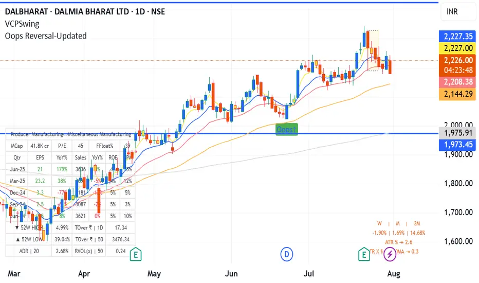
Oops Reversal-Updatedoops reversal - manas arora updated to cover only if it closes above previous day high
Canonical Momenta Indicator [T1][T69]📌 Overview
The Canonical Momenta Indicator models trend pressure using a Lagrangian-based momentum engine combined with reflexivity theory to detect bursts in price movement influenced by herd behavior and volume acceleration.
🧠 Features
Lagrangian-based kinetic model combining velocity and acceleration
Reflexivity burst detection with directional scoring
Adaptive momentum-weighted output (adaptiveCMI)
Buy 🐋 / Sell 🐻 labels when reflexivity confirms direction
Fully parameterized for customization
⚙️ How to Use
This indicator helps traders:
Detect reflexive bursts in market activity driven by sharp price movement + volume spikes
Capture herd-driven directional moves early.
Gauge market pressure using a kinetic-potential energy model.
Suggested signals:
🐋 Reflexive Up: Strong bullish momentum spike confirmed by volume and positive lagrangian pressure
🐻 Reflexive Down: Strong bearish dump confirmed by volume and negative lagrangian burst
🔧 Configuration
MA Lookback Length - Smoothing for baseline price & energy calculation
Reflexivity Momentum Threshold - Price momentum trigger for burst detection
Reflexivity Lookback - Period over which bursts are counted
Reflexivity Window - Minimum burst sum to trigger signal label
Volume Spike Threshold - % above average volume to qualify as burst
📊 Behavior Description
The indicator computes a Lagrangian energy:
Kinetic Energy = (velocity² + 0.5 * acceleration²)
Potential Energy = deviation from moving average (distance²)
Lagrangian = Potential − Kinetic (higher = overextension)
Then, reflexive bursts are triggered when:
Price is rising or falling over short window (burstMvmnt)
Volume is above average by a user-defined multiple
Each bar gets a burst score:
+1 for up-burst
−1 for down-burst
0 otherwise
⚠️ Risk Profile Based on Lookback Settings
Risk Level | Description | Recommended Lookback
🟥 High | Extremely sensitive to bursts, prone to false signals | 7–10
🟨 Moderate | Balanced reflexivity with trend confirmation | 11–20
🟩 Low | Filters out most noise, slower to react | 21+
🧪 Advanced Tips
Combine with moving average slope for trend filtering
Use divergence between adaptiveCMI and price to detect exhaustion
Works well in crypto, commodities, and volatile assets
⚠️ Limitations
Sensitive to high volatility noise if volMult is too low
Designed for higher timeframes (1H, 4H, Daily) for reliability
Doesn’t confirm direction in sideways markets — pair with other filters
📝 Disclaimer
This tool is provided for educational and informational purposes. Always do your own backtesting and use proper risk management.

Simple 5 Moving Averages 5 MAs - Shubhashish DixitEnjoy the 5 Moving Average to Support your analysis deeper

TargetSync | Futures X FOMC IndicatorThis is a TradingView indicator that visualizes macro-aware price zones for futures contracts — specifically aligning with FOMC event timing and instrument bias (Gold or ES). It maps key levels like:
- 🟠 Stretch Target
- 🟢 Safe Target
- 🟣 Fade Zone
- 🧊 Drift Upper / Lower Buffers
- 📌 Contract Label
- 🪧 Sentiment & Macro Bias
🔎 Each level is drawn with precision using line.new() for straight horizontal lines and matching color-coded labels directly embedded at each price level. You’ve added epoch tinting, hit markers, and sentiment overrides for complete visual and contextual clarity.
💡 The indicator's purpose is to narrate macro-influenced targets in real time — clean, audit-friendly, and harmonized with session-aware strategy logic. It empowers futures traders to see key price zones, anticipate drift boundaries, and trade confidently around FOMC volatility.

✅ VMA Avg ATR + Days to Targets 🎯1) The trend filter: LazyBear VMA
You implement the well‑known “LazyBear” Variable Moving Average (VMA) from price directional movement (pdm/mdm).
Internally you:
Smooth positive/negative one‑bar moves (pdmS, mdmS),
Turn them into relative strengths (pdiS, mdiS),
Measure their difference/total (iS), and
Normalize that over a rolling window to get a scaling factor vI.
The VMA itself is then an adaptive EMA:
vma := (1 - k*vI) * vma + (k*vI) * close, where k = 1/vmaLen.
When vI is larger, VMA hugs price more; when smaller, it smooths more.
Coloring:
Green when vma > vma (rising),
Red when vma < vma (falling),
White when flat.
Candles are recolored to match.
Why this matters: The VMA color is your trend regime; everything else in the script keys off changes in this color.
2) What counts as a “valid” new trend?
A new trend is valid only when the previous bar was white and the current bar turns green or red:
validTrendStart := vmaColor != color.white and vmaColor == color.white.
When that happens, you start a trend segment:
Save entry price (startPrice = close) and baseline ATR (startATR = ATR(atrLen)).
Reset “extreme” trackers: extremeHigh = high, extremeLow = low.
Timestamp the start (trendStartTime = time).
Effect: You only study / trade transitions out of a flat VMA into a slope. This helps avoid chop and reduces false starts.
3) While the trend is active
On each new bar without a color change:
If green trend: update extremeHigh = max(extremeHigh, high).
If red trend: update extremeLow = min(extremeLow, low).
This tracks the best excursion from the entry during that single trend leg.
4) When the VMA color changes (trend ends)
When vmaColor flips (green→red or red→green), you close the prior segment only if it was a valid trend (started after white). Then you:
Compute how far price traveled in ATR units from the start:
Uptrend ended: (extremeHigh - startPrice) / startATR
Downtrend ended: (startPrice - extremeLow) / startATR
Add that result to a running sum and count for the direction:
totalUp / countUp, totalDown / countDown.
Target checks for the ended trend (no look‑ahead):
T1 uses the previous average ATR move before the just‑ended trend (prevAvgUp/prevAvgDown).
Up: t1Up = startPrice + prevAvgUp * startATR
Down: t1Down = startPrice - prevAvgDown * startATR
T2 is a fixed 6× ATR move from the start (up or down).
You increment hit counters and also accumulate time‑to‑hit (ms from trendStartTime) for any target that got reached during that ended leg.
If T1 wasn’t reached, it counts as a miss.
Immediately initialize the next potential trend segment with the current bar’s startPrice/startATR/extremes and set validTrendStart according to the “white → color” rule.
Important detail: Using prevAvgUp/Down to evaluate T1 for the just‑completed trend avoids look‑ahead bias. The current trend’s performance isn’t used to set its own T1.
5) Running statistics & targets (for the current live trend)
After closing/adding to totals:
avgUp = totalUp / countUp and avgDown = totalDown / countDown are the historical average ATR move per valid trend for each direction.
Current plotted targets (only visible while a valid trend is active and in that direction):
T1 Up: startPrice + avgUp * startATR
T2 Up: startPrice + 6 * startATR
T1 Down: startPrice - avgDown * startATR
T2 Down: startPrice - 6 * startATR
The entry line is also plotted at startPrice when a valid trend is live.
If there’s no history yet (e.g., first trend), avgUp/avgDown are na, so T1 is na until at least one valid trend has closed. T2 still shows (6× ATR).
6) Win rate & time metrics
Win % (per direction):
winUp = hitUpT1 / (hitUpT1 + missUp) and similarly for down.
(This is strictly based on T1 hits vs misses; T2 hits don’t affect Win% directly.)
Average days to hit T1/T2:
The script stores milliseconds from trend start to each target hit, then reports the average in days separately for Up/Down and for T1/T2.
7) The dashboard table (bottom‑right)
It shows, side‑by‑side for Up/Down:
Avg ATR: historical average ATR move per completed valid trend.
🎯 Target 1 / Target 2: the current trend’s price levels (T1 = avgATR×ATR; T2 = 6×ATR).
✅ Win %: T1 hit rate so far.
⏱ Days to T1/T2: average days (from valid trend start) for the targets that were reached.
8) Alerts
“New Trend Detected” when a valid trend starts (white → green/red).
Target hits for the active trend:
Uptrend: separate alerts for T1 and T2 (high >= target).
Downtrend: separate alerts for T1 and T2 (low <= target).
9) Inputs & defaults
vmaLen = 17: governs how adaptive/smooth the VMA is (larger = smoother, fewer trend flips).
atrLen = 14: ATR baseline for sizing targets and normalizing moves.
10) Practical read of the plots
When you see white → green: that bar is your valid entry (trend start).
An Entry Line appears at the start price.
Target lines appear only for the active direction. T1 scales with your historical average ATR move; T2 is a fixed stretch (6× ATR).
The table updates as more trends complete, refining:
The average ATR reach (which resets your T1 sizing),
The win rate to T1, and
The average days it typically takes to hit T1/T2.
Subtle points / edge cases
No look‑ahead: T1 for a finished trend is checked against the prior average (not including the trend itself).
First trends: Until at least one valid trend completes, T1 is na (no history). T2 still shows.
Only “valid” trends are counted: Segments must start after a white bar; flips that happen color→color without a white in between don’t start a new valid trend.
Time math: Uses bar timestamps in ms, converted to days; results reflect the chart’s timeframe/market session.
TL;DR
The VMA color defines the regime; entries only trigger when a flat (white) VMA turns green/red.
Each trend’s max excursion from entry is recorded in ATR units.
T1 for current trends = (historical average ATR move) × current ATR from entry; T2 = 6× ATR.
The table shows your evolving edge (avg ATR reach, T1 win%, and days to targets), and alerts fire on new trends and target hits.
If you want, I can add optional features like: per‑ticker persistence of stats, excluding very short trends, or making T2 a user input instead of a fixed 6× ATR.

FMX Trend Confirmation - No Reversals🔍 FMX Continuation Signal – No Reversals
Powered by the FMX Model (Fundamentals Meet Execution)
This indicator is designed to capture high-probability continuation trades only, avoiding risky reversals. It confirms buy or sell signals based on:
✅ 15-Minute Structure Shift Confirmation
✅ Liquidity Sweeps (stop hunts beyond recent highs/lows)
✅ Trend Validation using HTF SMA (default: 15min)
✅ Second Candle Close inside the sweep range — FMX-grade precision
📈 Green “Buy” labels appear when:
Liquidity is swept below recent lows
Price closes back inside the range
The higher timeframe trend is bullish
📉 Orange “Sell” labels appear when:
Liquidity is swept above recent highs
Price closes back inside the range
The higher timeframe trend is bearish
🛡️ No reversal signals are plotted. This tool is meant for traders who follow the trend with smart money logic, inspired by FMX principles.
Trading Checklist - DrFXAiTrading Checklist is a customizable indicator designed for traders who want to stay disciplined and stick to their trading rules. Using this indicator, you can easily create and display your own personalized checklist of trading rules directly on your TradingView chart.
The Title and the Body are two different sections, so you can set two different styles.
This indicator allows you to customize:
Text color
Text size
Text alignment
🚀 Join the Pantheon of Profitable Traders
📩 Contact us on Telegram:👉 t.me

Open Interest Screener (Fixed Zones)📌 Purpose
This indicator scans Open Interest (OI) changes across selected exchanges and highlights significant spikes or drops directly on the chart using dynamic shaded zones.
It is designed to help traders detect unusual market positioning changes that may precede volatility events.
🧠 How It Works
1. Data Sources
Supports multiple exchanges: BitMEX USD, BitMEX USDT, Kraken USD (toggle on/off in settings).
Automatically adapts symbol prefix based on the chart’s base asset.
2. Spike / Drop Detection
OI % Change is calculated over a configurable lookback (Bars to look back).
Spike Up: OI increases by more than Threshold %.
Spike Down: OI decreases by more than Threshold %.
3. Dynamic Zones
When a spike occurs, a green zone (increase) or red zone (decrease) is drawn on the chart.
Zone height is dynamic, based on price high/low ± 5%, preventing chart distortion.
Minimum spacing (Zone Spacing) prevents clustering.
📈 How to Use
Green Zones: Large OI increase can signal fresh positioning (possible breakout setups).
Red Zones: Large OI decrease can signal liquidation events or position unwinds.
Combine with price action, funding rates, or volatility measures for higher confidence.
Recommended Timeframes: Works best on 15m, 1h, 4h.
Markets: Crypto derivatives (OI data available).
⚙️ Inputs
Bars to Look Back
OI % Change Threshold
Zone Width
Exchange toggles (BitMEX USD/USDT, Kraken USD)
⚠️ Disclaimer
This script is for educational purposes only and does not constitute financial advice.
Always test thoroughly before live trading.

Clarix Smart Reversal ScorecardPurpose
Designed to identify potential trend reversal setups based on a rules-based scoring system. It helps traders quickly assess the strength of reversal signals using objective technical criteria.
How It Works
The script evaluates seven key technical conditions for both bullish and bearish reversals. Each condition met adds 1 point to the total score (max 7). A table displays the results with a final score and an automatic conclusion based on the strength of the setup.
Features
Reversal signal scoring from 0 to 7
Bullish and bearish detection modes
Visual scorecard table with individual factors
Configurable minimum score to show
Alert conditions for strong (5+) and perfect (7) setups
Lightweight and optimized for all timeframes
Usage Tips
Set "Direction" to Bullish, Bearish, or Both depending on your strategy
Use on timeframes between 15m to 4H for optimal signals
A score of 5 or more suggests strong reversal potential
Combine with key support/resistance or trend context for higher accuracy
Avoid using during high-volatility news events for cleaner signals
🧠 Rogue BTC Dominance + BTC Price MonitorLiquidity never lies.
When whales are done pumping, they exit before price tanks, often during sideways chop or fake strength.
So we build a tracker that detects:
Volume drop during uptrend (distribution phase)
Exchange inflows of coins
Rising USDT.D while price holds → stealth exit
Divergence between price & on-chain flows
👁️ Quick Use Case: BTC/USDT with USDT.D Overlay
If you see this pattern:
BTC sideways or slow uptrend
Volume declining
USDT.D rising
BTC.D holding flat
→ Liquidity Exit Detected.
Smart money is exiting quietly, waiting for retail to hold the bag.
Custom Screener with Alerts @RAMLAKSHMANDASScan the Nifty 50 directly on TradingView!
This script provides a real-time screener for the top 40 Nifty 50 stocks ranked by current index weightage (starting from RELIANCE, HDFCBANK, ICICIBANK, etc.), offering rapid on-chart multi-symbol analysis.
Features
Multi-symbol screener: Monitors the leading 40 Nifty constituents (NSE equities) in one view.
Full indicator table: Get snapshot values for Price, RSI, TSI, ADX, and SuperTrend for every symbol.
Dynamic filtering: Instantly filter results by any indicator value (e.g., highlight all stocks with RSI below 30).
Customizable symbols: Easily edit the symbol list to match updated Nifty composition or your stocks of interest.
Multi-timeframe support: Table values will update for any chosen chart timeframe.
Real-time alerts: Set up alerts for filtered stocks matching your strategy.

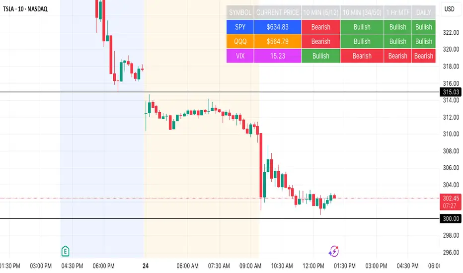
SPY, QQQ, VIX Status TableBased on Ripster EMA and 1 hour MTF Clouds, this custom TradingView indicator displays a visual trend status table for SPY, QQQ, and VIX using multiple timeframes and EMA-based logic to be used on any stock ticker.
🔍 Key Features:
✅ Tracks 3 symbols: SPY, QQQ, and VIX
✅ Multiple trend conditions:
10-min (5/12 EMA) Ripster cloud trend
10-min (34/50 EMA) Ripster cloud trend
1-Hour Multi-Timeframe Ripster EMA trend
Daily open/close trend
✅ Color-coded trend strength:
🟩 Green = Bullish
🟥 Red = Bearish
🟨 Yellow = Sideways
✅ TO save screen space, customizations available:
Show/hide individual rows (SPY, QQQ, VIX)
Show/hide any trend column (10m, 1H MTF, Daily)
Change header/background colors and font color
Bold white top row for readability
✅ Auto-updating table appears on your chart, top-right
This tool is great for active traders looking to quickly scan short-term and longer-term momentum in key market instruments without having to go back and forth market charts.
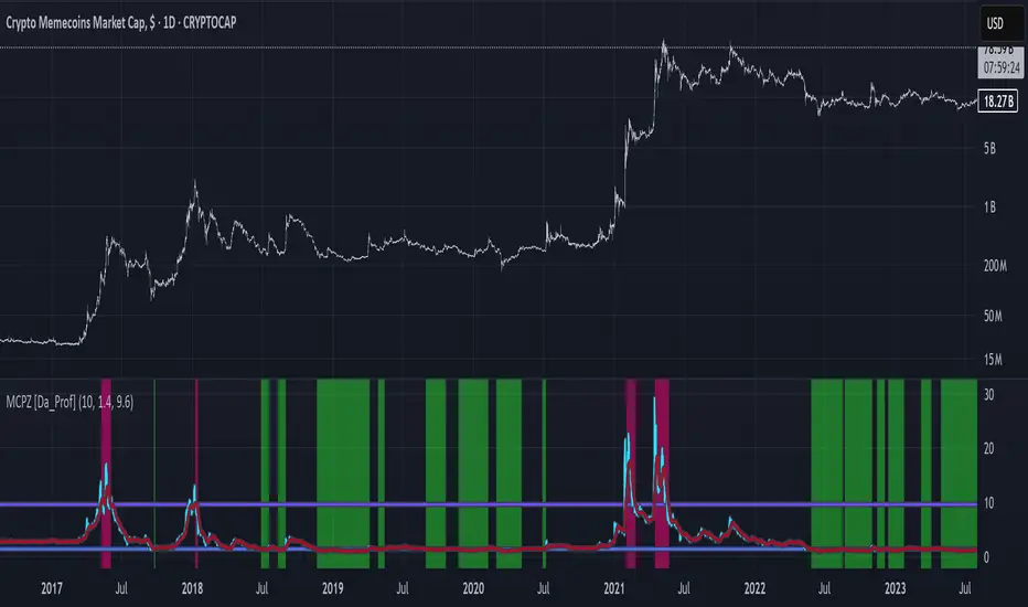
MCPZ - Meme Coin Price Z-Score [Da_Prof]Meme Coin Price Z-score (MCPZ). Investor preference for meme coin trading may signal irrational exuberance in the crypto market. If a large spike in meme coin price is observed, a top may be near. Similarly, if a long price depression is observed, versus historical prices, that generally corresponds to investor apathy, leading to higher prices. The MEME.C symbol allows us to evaluate the sentiment of meme coin traders. Paired with the Meme Coin Volume (MCV) and Meme Coin Gains (MCG) indicators, the MCPZ helps to identify tops and bottoms in the overall meme coin market. The MCPZ indicator helps identify potential mania phases, which may signal nearing of a top and apathy phases, which may signal nearing a bottom. A moving average of the Z-score is used to smooth the data and help visualize changes in trend. In back testing, I found a 10-day sma of the MCPZ works well to signal tops and bottoms when extreme values of this indicator are reached. The MCPZ seems to spend a large amount of time near the low trigger line and short periods fast increase into mania phases.
Meme coins were not traded heavily prior to 2020, but the indicator still picks a couple of tops prior to 2020. Be aware that the meme coin space also increased massively in 2020, so mania phases may not spike quite as high moving forward and the indicator may need adjusting to catch tops. It is recommended to pair this indicator with the MCG and MCV indicators to create an overall picture.
The indicator grabs data from the MEME.C symbol on the daily such that it can be viewed on other symbols.
Use this indicator at your own risk. I make no claims as to its accuracy in forecasting future trend changes of memes or any other asset.
Hope this is helpful to you.
--Da_Prof