Auto-Pivot Levels with Alerts and 4 methods [ChartWhizzperer]🚀 Auto-Pivot Levels – Dynamic Edition
Now with
Live Mode,
4 Pivot Methods
PineConnector-Ready Alerts!
Free, Open Source, Pine Script v6-compliant.
🟢 NEW: Live Mode (Ultra-Dynamic, Repainting) – Switchable in UI!
Instantly switch between Classic (session-based, repaint-free) and Live (rolling window, real-time, repainting) using the simple checkbox in the settings!
Live Mode recalculates all pivots on every tick/bar, using the current high/low/close for the chosen session (daily, weekly, monthly).
Perfect for:
Scalping and high-frequency trading
Real-time bot/automation setups (PineConnector-ready)
Fast-moving or breakout markets
Classic Mode: For traditional, stable levels based on confirmed session data – ideal for backtesting and trading history.
📊 Four Calculation Methods (Choose What Fits YOU):
1️⃣ Classic
Standard pivot calculation.
Based on previous session’s High, Low, Close.
Simple, proven, and suitable for any asset.
2️⃣ Fibonacci
Projects levels using Fibonacci ratios of the prior session’s range.
Great for traders who want to align pivots with fib retracements and extensions.
3️⃣ Camarilla
Uses unique multipliers for support/resistance, focusing on mean reversion and volatility.
Popular among futures and forex day traders.
4️⃣ Woodie
Puts extra weight on previous Close for more responsive pivots.
Often used in trending or choppy conditions.
Switch methods anytime in the UI – the script recalculates instantly and keeps your chart clean!
🔔 Level-Specific Alerts – PineConnector Ready!
Dedicated alert for EVERY level and direction (Up/Down):
Pivot (P), R1, R2, R3, S1, S2, S3
No configuration hassle:
All alerts are pre-defined in the TradingView Alert Panel.
Machine-readable message format:
PIVOT=R1 DIR=UP SYMBOL={{ticker}} PRICE={{close}}
Direct plug-and-play with PineConnector, webhooks, Discord, Telegram, bots, and other automation tools.
Never miss a breakout, reversal, or key support/resistance touch.
🛠 Powerful Customization & Performance
Session selection: Daily, Weekly, Monthly (choose what suits your trading style).
Show/hide any level (Pivot, R1–R3, S1–S3) for minimal chart clutter.
Color selection for each level to match your theme or highlight key pivots.
Auto-cleanup: Old lines and labels are cleared on every recalculation or session change for maximum performance and visual clarity.
Zero runtime errors: Strict Pine Script v6 practices for stability.
💡 How To Use – Quick Start
Add the indicator to your TradingView chart.
Pick your calculation method (Classic, Fibonacci, Camarilla, Woodie).
Set session type (Daily, Weekly, Monthly).
Switch between Classic and Live Mode with a single click in settings.
Customize your levels (on/off, colors).
Open the Alert Panel, select any pre-configured alert (e.g. "R2 Cross Down"), and go live!
Connect with PineConnector or any webhook system instantly using the pre-formatted alert messages.
🤖 Who Is It For?
Active scalpers & bot traders: Live Mode + PineConnector-ready alerts = instant, automated reactions.
Swing and position traders: Use Classic Mode for stable, repaint-free levels.
Strategy developers: Seamless integration into automated and manual trading workflows.
🏷 License & Community
Open Source, Non-Commercial:
Free for personal & educational use under CC BY-NC-SA 4.0.
Feedback, bug reports & ideas:
Drop a comment, or contact me for feature requests.
Trade smart. Trade dynamic. Unlock the true power of pivots – with ChartWhizzperer !
Support and Resistance

RSI Power Zones + Candle ColoringOk , So here is the newly revised PowerZones
With CAndle Coloring Showing you what the PowerZones Show you if it is in a bullish upTrend
or if the trend is currently in a downtrend
Along with my newly created indicator5x EMA/SMA Trend Indicator with the Cloud that coincides with new RSI PowerZones Indictor showing you the candles colored if it is bullish or Bearish Currently

Multi 5x EMA/SMA Colored + EMA Trend Cloud- Ok so these are the settings to the ema's
15
30
50
115
200
Remember these ema's change color depending if the market is bullish or bearish, so choose what colors you want to see bullish and what colors you want to see Bearish
You can also toggle them on or off if you want.
- These are the setting to the trend cloud so you know if the market is bullish or Bearish
50
200
200
Toggle off all plots and only have plots background on

RED E Support & ResistanceThe “RED-E Support & Resistance” indicator is designed to assist traders in visualizing key levels of support and resistance on a chart by employing ATR (Average True Range) to create dynamic horizontal zones. This indicator automatically plots robust support and resistance bands that can help identify potential areas where price may reverse, consolidate, or react. These levels are particularly beneficial for traders who employ concepts like Smart Money analysis, as they illustrate zones where institutional trading activity might occur.
How It Works:
• The indicator uses ATR-based calculations to determine the placement of the support and resistance zones. This approach accounts for market volatility, making the zones adaptive to changing conditions.
• The Zone Thickness parameter allows users to customize the width of the plotted zones, enhancing visibility and fitting them to their specific trading style.
• The support and resistance zones extend horizontally across the chart, providing clear reference points for potential price reactions.
Practical Application:
• Trend Analysis: Identify areas of significant price resistance and support to understand potential turning points or trends in the market.
• Risk Management: Use these zones to better inform stop-loss placements or set profit targets.
• Confirmation Tool: Combine the indicator with other technical analysis tools for confirmation of potential trade entries or exits.
Customization Options:
• Change the colors of the support and resistance zones for better integration with different chart themes.
• Adjust the ATR Length and Multiplier to fine-tune the sensitivity of the zones based on personal preferences and the characteristics of the asset being analyzed.
Disclaimer:
This indicator is for educational and informational purposes only. It is not intended to serve as investment advice or a recommendation to buy or sell any financial instrument. Always perform your own research and consider consulting with a financial professional before making trading decisions. Trading involves significant risk, and past performance does not guarantee future results.
3 hours ago
Release Notes
The “RED-E Support & Resistance” indicator is designed to assist traders in visualizing key levels of support and resistance on a chart by employing ATR (Average True Range) to create dynamic horizontal zones. This indicator automatically plots robust support and resistance bands that can help identify potential areas where price may reverse, consolidate, or react. These levels are particularly beneficial for traders who employ concepts like Smart Money analysis, as they illustrate zones where institutional trading activity might occur.
How It Works:
• The indicator uses ATR-based calculations to determine the placement of the support and resistance zones. This approach accounts for market volatility, making the zones adaptive to changing conditions.
• The Zone Thickness parameter allows users to customize the width of the plotted zones, enhancing visibility and fitting them to their specific trading style.
• The support and resistance zones extend horizontally across the chart, providing clear reference points for potential price reactions.
Practical Application:
• Trend Analysis: Identify areas of significant price resistance and support to understand potential turning points or trends in the market.
• Risk Management: Use these zones to better inform stop-loss placements or set profit targets.
• Confirmation Tool: Combine the indicator with other technical analysis tools for confirmation of potential trade entries or exits.
Customization Options:
• Change the colors of the support and resistance zones for better integration with different chart themes.
• Adjust the ATR Length and Multiplier to fine-tune the sensitivity of the zones based on personal preferences and the characteristics of the asset being analyzed.
Disclaimer:
This indicator is for educational and informational purposes only. It is not intended to serve as investment advice or a recommendation to buy or sell any financial instrument. Always perform your own research and consider consulting with a financial professional before making trading decisions. Trading involves significant risk, and past performance does not guarantee future results.

Dynamic S/R System - Pivot + ChannelDynamic S/R System - Pivot + Channel
A comprehensive Support & Resistance indicator combining dual methodologies for institutional-grade price level analysis
📊 CORE FEATURES
Dual Detection System
• Pivot-Based Levels - Historical turning points with intelligent touch counting
• Dynamic Channel S/R - Trend-aware linear regression boundaries
• Smart Level Management - Auto-merges similar levels, removes weak/outdated ones
Volume Integration
• Multi-timeframe volume analysis using EMA oscillator and spike detection
• Volume confirmation for all breakout signals to filter false moves
• Real-time volume status (Normal/High/Spike) in live information panel
Intelligent Touch Counting
• Automatic level validation through touch frequency analysis
• Strength classification with visual differentiation (colors/thickness)
• Level labels showing exact touch count (S3, R5, etc.)
━━━━━━━━━━━━━━━━━━━━━━━━━━━━━━━━━━━━━━━━━━━━━━━━━━━━━━━━━━━━━━━━━━━━━━━━━━━━━━━
🎨 VISUAL ELEMENTS
Line System
Solid Lines: Pivot-based S/R levels
Dashed Lines: Dynamic channel boundaries
Color Coding:
• 🔵 Blue/🔴 Red: Standard support/resistance
• 🟠 Orange: Strong levels (multiple touches)
• 🟣 Purple: Channel S/R levels
Signal Labels
• "B" - Pivot S/R breakout with volume confirmation
• "CB" - Channel boundary breakout
• "Bull/Bear Wick" - False breakout detection (wick rejections)
Information Panel
Real-time analysis displays:
• Total resistance/support levels detected
• Closest S/R levels to current price
• Volume status and position relative to levels
• Current market position assessment
━━━━━━━━━━━━━━━━━━━━━━━━━━━━━━━━━━━━━━━━━━━━━━━━━━━━━━━━━━━━━━━━━━━━━━━━━━━━━━━
✅ KEY ADVANTAGES
Multi-Method Validation
Combines historical pivot analysis with dynamic trend channels for comprehensive market view
False Breakout Protection
• Volume confirmation requirements
• Wick analysis to identify failed attempts
• Multiple validation criteria before signal generation
Adaptive Level Management
• Automatically updates as new pivots form
• Removes outdated/weak levels
• Maintains clean, relevant level display
Institutional-Grade Analysis
• Touch counting reveals institutional respect levels
• Volume integration shows smart money activity
• Strength classification identifies high-probability zones
━━━━━━━━━━━━━━━━━━━━━━━━━━━━━━━━━━━━━━━━━━━━━━━━━━━━━━━━━━━━━━━━━━━━━━━━━━━━━━━
⏰ OPTIMAL USE CASES
Best Timeframes
• Daily - Primary recommendation for swing trading
• 4-Hour - Intraday analysis and entries
• Weekly - Long-term position planning
Ideal Markets
• Crypto pairs (especially ETH/BTC, BTC/USD)
• Forex majors with good volume data
• Large-cap stocks with institutional participation
Trading Applications
• Entry/exit planning around key S/R levels
• Breakout confirmation with volume validation
• Risk management using nearest S/R for stops
• Trend analysis through channel dynamics
━━━━━━━━━━━━━━━━━━━━━━━━━━━━━━━━━━━━━━━━━━━━━━━━━━━━━━━━━━━━━━━━━━━━━━━━━━━━━━━
⚙️ CONFIGURATION GUIDELINES
Conservative Setup (Higher Confidence)
Min Pivot Strength: 3-4
Volume Threshold: 25-30%
Max Levels: 6-8
Aggressive Setup (More Signals)
Min Pivot Strength: 2
Volume Threshold: 15-20%
Max Levels: 10-12
🔔 ALERT SYSTEM
Breakout Alerts
• Resistance/Support breaks with volume confirmation
• Channel boundary violations
• Approaching strong S/R levels
Advanced Notifications
• Strong level approaches (within 0.5% of price)
• False breakout detection
• Volume spike confirmations
📈 TRADING STRATEGY GUIDE
Entry Strategy
1. Wait for price to approach identified S/R level
2. Confirm with volume analysis (spike/high volume preferred)
3. Watch for wick formations indicating rejection
4. Enter on confirmed breakout with volume or bounce with rejection
Risk Management
• Use nearest S/R level for stop placement
• Scale position size based on level strength (touch count)
• Monitor volume confirmation for exit signals
Market Context
• Combine with higher timeframe trend analysis
• Consider overall market sentiment and volatility
• Use channel direction for bias confirmation
Transform complex S/R analysis into actionable trading intelligence with institutional-level insights for professional trading decisions.

Universal Adaptive Psychological Levels 1.1This simple indicator is somewhat working around an inability to see big accumulations of limit orders in Tradingview.
It just marks the levels of round psychological prices (e.g. 1000, 1100, 1110) and adjusts to the range of prices of the current ticker.
These psychological levels work as resistance and support levels, especially if the price didn't visit it already lately.

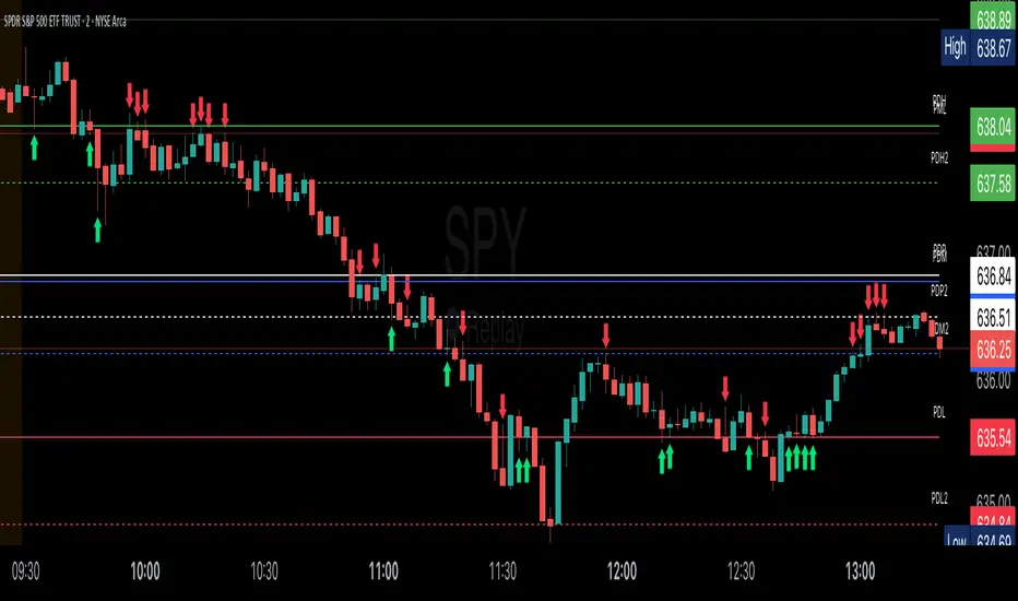
Key Session LevelsKey Session Levels - Indicator Guide
Created by: MecarderoAurum
Why This Indicator Exists: An Overview
The "Key Session Levels" indicator is a comprehensive tool for day traders that automatically plots the most critical price levels from the current premarket and the previous two full trading days. These levels are watched by countless traders and often act as significant areas of support and resistance.
This indicator provides a clear, objective map of these key zones, helping traders anticipate potential turning points, identify areas of confluence, and make more informed trading decisions without having to manually draw and manage these lines every day.
Features & How to Use Them
This indicator plots several types of important historical levels on your chart. Each one is fully customizable.
1. Premarket Levels (PMH / PML)
What they are: The highest (PMH) and lowest (PML) prices reached during the current day's premarket session (04:00 - 09:30 ET).
Why they matter: The premarket high and low are the first significant levels established for the trading day. They often act as initial support or resistance once the market opens.
How to use them: In the settings under "Premarket Levels," you can toggle the visibility of the PMH and PML, and customize their color, line style, and width.
2. Prior Day Levels (PDH / PDL / PDM / PDP)
What they are: The key price points from the previous full trading day.
PDH: Prior Day High
PDL: Prior Day Low
PDM: Prior Day Midpoint (the exact middle of the PDH and PDL)
PDP: Prior Day Pivot (a classic pivot point calculation)
Why they matter: These are often the most important levels for the current trading day. The market frequently tests the previous day's high and low.
How to use them: Under the "Prior Day" settings, you can enable or disable each of these four levels and customize their appearance.
3. 2-Day Prior Levels (PDH2 / PDL2 / etc.)
What they are: The same set of key levels (High, Low, Mid, Pivot) from two trading days ago.
Why they matter: These levels can still be highly relevant, especially if the market is trading within a multi-day range or returning to test a significant prior level.
How to use them: Under the "2-Day Prior" settings, you can customize the visibility and style of these levels. They are styled with more transparency by default to distinguish them from the more recent prior day's levels.
4. General Settings
Days of History: This setting allows you to control how many past days of historical lines are kept on your chart. This is excellent for back-testing strategies and seeing how price has reacted to these levels in the past.
Label Settings: You can customize the color and size of the on-chart labels (e.g., "PDH," "PML") for better visibility.
Sample Strategy: The Key Level Rejection
This strategy focuses on using the indicator's levels to identify potential reversals at key areas of support or resistance.
Identify a Key Level: Watch as the price approaches a significant level plotted by the indicator, such as the Prior Day High (PDH) or the Premarket Low (PML).
Look for Rejection: Do not trade simply because the price touches the level. Wait for a price action signal that confirms the level is holding. This could be a bearish engulfing candle or a shooting star pattern at a resistance level like PDH, or a bullish hammer or morning star pattern at a support level like PML.
Entry: Once you see a clear rejection candle, enter a trade in the direction of the rejection. For a bearish rejection at the PDH, you would enter a short position.
Stop-Loss: A logical place for a stop-loss is just above the high of the rejection candle (for a short trade) or just below the low of the rejection candle (for a long trade). This defines your risk clearly.
Profit Target: Your first profit target could be the next key level plotted by the indicator. For example, if you shorted a rejection at the PDH, your first target might be the Premarket High (PMH) or the day's opening price.
Advanced ICT Theory - A-ICT📊 Advanced ICT Theory (A-ICT): The Institutional Manipulation Detector
Are you tired of being the liquidity? Stop chasing shadows and start tracking the architects of price movement.
This is not another lagging indicator. This is a complete framework for viewing the market through the lens of institutional traders. Advanced ICT Theory (A-ICT) is an all-in-one, military-grade analysis engine designed to decode the complex language of "Smart Money." It automates the core tenets of Inner Circle Trader (ICT) methodology, moving beyond simple patterns to build a dynamic, real-time narrative of market manipulation, liquidity engineering, and institutional order flow.
AIT provides a living blueprint of the market, identifying high-probability zones, tracking structural shifts, and scoring the quality of setups with a sophisticated, multi-factor algorithm. This is your X-ray into the market's true intentions.
🔬 THE CORE ENGINE: DECODING THE THEORY & FORMULAS
A-ICT is built upon a sophisticated, multi-layered logic system that interprets price action as a story of cause and effect. It does not guess; it confirms. Here is the foundational theory that drives the engine:
1. Market Structure: The Blueprint of Trend
The script first establishes a deep understanding of the market's skeleton through multi-level pivot analysis. It uses ta.pivothigh and ta.pivotlow to identify significant swing points.
Internal Structure (iBOS): Minor swings that show the short-term order flow. A break of internal structure is the first whisper of a potential shift.
External Structure (eBOS): Major swing points that define the primary trend. A confirmed break of external structure is a powerful statement of trend continuation. AIT validates this with optional Volume Confirmation (volume > volumeSMA * 1.2) and Candle Confirmation to ensure the break is driven by institutional force, not just a random spike.
Change of Character (CHoCH): This is the earthquake. A CHoCH occurs when a confirmed eBOS happens against the prevailing trend (e.g., a bearish eBOS in a clear uptrend). A-ICT flags this immediately, as it is the strongest signal that the primary trend is under threat of reversal.
2. Liquidity Engineering: The Fuel of the Market
Institutions don't buy into strength; they buy into weakness. They need liquidity. A-ICT maps these liquidity pools with forensic precision:
Buyside & Sellside Liquidity (BSL/SSL): Using ta.highest and ta.lowest, AIT identifies recent highs and lows where clusters of stop-loss orders (liquidity) are resting. These are institutional targets.
Liquidity Sweeps: This is the "manipulation" part of the detector. AIT has a specific formula to detect a sweep: high > bsl and close < bsl . This signifies that institutions pushed price just high enough to trigger buy-stops before aggressively selling—a classic "stop hunt." This event dramatically increases the quality score of subsequent patterns.
3. The Element Lifecycle: From Potential to Power
This is the revolutionary heart of A-ICT. Zones are not static; they have a lifecycle. AIT tracks this with its dynamic classification engine.
Phase 1: PENDING (Yellow): The script identifies a potential zone of interest based on a specific candle formation (a "displacement"). It is marked as "Pending" because its true nature is unknown. It is a question.
Phase 2: CLASSIFICATION: After the zone is created, AIT watches what happens next. The zone's identity is defined by its actions:
ORDER BLOCK (Blue): The highest-grade element. A zone is classified as an Order Block if it directly causes a Break of Structure (BOS) . This is the footprint of institutions entering the market with enough force to validate the new trend direction.
TRAP ZONE (Orange): A zone is classified as a Trap Zone if it is directly involved in a Liquidity Sweep . This indicates the zone was used to engineer liquidity, setting a "trap" for retail traders before a reversal.
REVERSAL / S&R ZONE (Green): If a zone is not powerful enough to cause a BOS or a major sweep, but still serves as a pivot point, it's classified as a general support/resistance or reversal zone.
4. Market Inefficiencies: Gaps in the Matrix
Fair Value Gaps (FVG): AIT detects FVGs—a 3-bar pattern indicating an imbalance—with a strict formula: low > high (for a bullish FVG) and gapSize > atr14 * 0.5. This ensures only significant, volatile gaps are shown. An FVG co-located with an Order Block is a high-confluence setup.
5. Premium & Discount: The Law of Value
Institutions buy at wholesale (Discount) and sell at retail (Premium). AIT uses a pdLookback to define the current dealing range and divides it into three zones: Premium (sell zone), Discount (buy zone), and Equilibrium. An element's quality score is massively boosted if it aligns with this principle (e.g., a bullish Order Block in a Discount zone).
⚙️ THE CONTROL PANEL: A COMPLETE GUIDE TO THE INPUTS MENU
Every setting is a lever, allowing you to tune the AIT engine to your exact specifications. Master these to unlock the script's full potential.
🎯 A-ICT Detection Engine
Min Displacement Candles: Controls the sensitivity of element detection. How it works: It defines the number of subsequent candles that must be "inside" a large parent candle. Best practice: Use 2-3 for a balanced view on most timeframes. A higher number (4-5) will find only major, more significant zones, ideal for swing trading. A lower number (1) is highly sensitive, suitable for scalping.
Mitigation Method: Defines when a zone is considered "used up" or mitigated. How it works: Cross triggers as soon as price touches the zone's boundary. Close requires a candle to fully close beyond it. Best practice: Cross is more responsive for fast-moving markets. Close is more conservative and helps filter out fake-outs caused by wicks, making it safer for confirmations.
Min Element Size (ATR): A crucial noise filter. How it works: It requires a detected zone to be at least this multiple of the Average True Range (ATR). Best practice: Keep this around 0.5. If you see too many tiny, irrelevant zones, increase this value to 0.8 or 1.0. If you feel the script is missing smaller but valid zones, decrease it to 0.3.
Age Threshold & Pending Timeout: These manage visual clutter. How they work: Age Threshold removes old, mitigated elements after a set number of bars. Pending Timeout removes a "Pending" element if it isn't classified within a certain window. Best practice: The default settings are optimized. If your chart feels cluttered, reduce the Age Threshold. If pending zones disappear too quickly, increase the Pending Timeout.
Min Quality Threshold: Your primary visual filter. How it works: It hides all elements (boxes, lines, labels) that do not meet this minimum quality score (0-100). Best practice: Start with the default 30. To see only A- or B-grade setups, increase this to 60 or 70 for an exceptionally clean, high-probability view.
🏗️ Market Structure
Lookbacks (Internal, External, Major): These define the sensitivity of the trend analysis. How they work: They set the number of bars to the left and right for pivot detection. Best practice: Use smaller values for Internal (e.g., 3) to see minor structure and larger values for External (e.g., 10-15) to map the main trend. For a macro, long-term view, increase the Major Swing Lookback.
Require Volume/Candle Confirmation: Toggles for quality control on BOS/CHoCH signals. Best practice: It is highly recommended to keep these enabled. Disabling them will result in more structure signals, but many will be false alarms. They are your filter against market noise.
... (Continue this detailed breakdown for every single input group: Display Configuration, Zones Style, Levels Appearance, Colors, Dashboards, MTF, Liquidity, Premium/Discount, Sessions, and IPDA).
📊 THE INTELLIGENCE DASHBOARDS: YOUR COMMAND CENTER
The dashboards synthesize all the complex analysis into a simple, actionable intelligence briefing.
Main Dashboard (Bottom Right)
ICT Metrics & Breakdown: This is your statistical overview. Total Elements shows how much structure the script is tracking. High Quality instantly tells you if there are any A/B grade setups nearby. Unmitigated vs. Mitigated shows the balance of fresh opportunities versus resolved price action. The breakdown by Order Blocks, Trap Zones, etc., gives you a quick read on the market's recent character.
Structure & Market Context: This is your core bias. Order Flow tells you the current script-determined trend. Last BOS shows you the most recent structural event. CHoCH Active is a critical warning. HTF Bias shows if you are aligned with the higher timeframe—the checkmark (✓) for alignment is one of the most important confluence factors.
Smart Money Flow: A volume-based sentiment gauge. Net Flow shows the raw buying vs. selling pressure, while the Bias provides an interpretation (e.g., "STRONG BULLISH FLOW").
Key Guide (Large Dashboard only): A built-in legend so you never have to guess. It defines every pattern, structure type, and special level visually.
📖 Narrative Dashboard (Bottom Left)
This is the "story" of the market, updated in real-time. It's designed to build your trading thesis.
Recent Elements Table: A live list of the most recent, high-quality setups. It displays the Type , its Narrative Role (e.g., "Bullish OB caused BOS"), its raw Quality percentage, and its final Trade Score grade. This is your at-a-glance opportunity scanner.
Market Narrative Section: This is the soul of A-ICT. It combines all data points into a human-readable story:
📍 Current Phase: Tells you if you are in a high-volatility Killzone or a consolidation phase like the Asian Range.
🎯 Bias & Alignment: Your primary direction, with a clear indicator of HTF alignment or conflict.
🔗 Events: A causal sequence of recent events, like "💧 Sell-side liquidity swept →
📊 Bullish BOS → 🎯 Active Order Block".
🎯 Next Expectation: The script's logical conclusion. It provides a specific, forward-looking hypothesis, such as "📉 Pullback expected to bullish OB at 1.2345 before continuation up."
🎨 READING THE BATTLEFIELD: A VISUAL INTERPRETATION GUIDE
Every color and line is a piece of information. Learn to read them together to see the full picture.
The Core Zones (Boxes):
Blue Box (Order Block): Highest probability zone for trend continuation. Look for entries here.
Orange Box (Trap Zone): A manipulation footprint. Expect a potential reversal after price interacts with this zone.
Green Box (Reversal/S&R): A standard pivot area. A good reference point but requires more confluence.
Purple Box (FVG): A market imbalance. Acts as a magnet for price. An FVG inside an Order Block is an A+ confluence.
The Structural Lines:
Green/Red Line (eBOS): Confirms the trend direction. A break above the green line is bullish; a break below the red line is bearish.
Thick Orange Line (CHoCH): WARNING. The previous trend is now in question. The market character has changed.
Blue/Red Lines (BSL/SSL): Liquidity targets. Expect price to gravitate towards these lines. A dotted line with a checkmark (✓) means the liquidity has been "swept" or "purged."
How to Synthesize: The magic is in the confluence. A perfect setup might look like this: Price sweeps below a red SSL line , enters a green Discount Zone during the NY Killzone , and forms a blue Order Block which then causes a green eBOS . This sequence, visible at a glance, is the story of a high-probability long setup.
🔧 THE ARCHITECT'S VISION: THE DEVELOPMENT JOURNEY
A-ICT was forged from the frustration of using lagging indicators in a market that is forward-looking. Traditional tools are reactive; they tell you what happened. The vision for A-ICT was to create a proactive engine that could anticipate institutional behavior by understanding their objectives: liquidity and efficiency. The development process was centered on creating a "lifecycle" for price patterns—the idea that a zone's true meaning is only revealed by its consequence. This led to the post-breakout classification system and the narrative-building engine. It's designed not just to show you patterns, but to tell you their story.
⚠️ RISK DISCLAIMER & BEST PRACTICES
Advanced ICT Theory (A-ICT) is a professional-grade analytical tool and does not provide financial advice or direct buy/sell signals. Its analysis is based on historical price action and probabilities. All forms of trading involve substantial risk. Past performance is not indicative of future results. Always use this tool as part of a comprehensive trading plan that includes your own analysis and a robust risk management strategy. Do not trade based on this indicator alone.
観の目つよく、見の目よわく
"Kan no me tsuyoku, ken no me yowaku"
— Miyamoto Musashi, The Book of Five Rings
English: "Perceive that which cannot be seen with the eye."
— Dskyz, Trade with insight. Trade with anticipation.

Indexrate Code SMIndexrate Code SM is an indicator and part of the Indexrate Code Set of Algorithm, which additionally includes the Indexrate Code A strategy and Indexrate Code B indicator.
The Indexrate Code Set of Algorithms can be used for any trading instruments and on any existing markets (Stock market, Forex, Cryptocurrency market, etc.).
Getting access to the Indexrate Code A strategy, you gain access to the whole set of Indexrate Code algorithms.
Indexrate Code SM is an indicator, based on the Smart Money concept. Smart money is large market participants with sufficient volumes to influence the price. This is a small group that includes banks and large funds. Their every move is controlled down to the smallest detail. In the modern world, this is done with the help of artificial intelligence and other complex algorithms that move the price to certain values. Unique programs that lower and raise the price are effective because they know the behavior of people, which will invariably be based on fear and greed.
On the other side are the majority of traders, including us - this is uninformed money. This group includes retail traders and small funds. Residents of this group believe that due to their numbers, they move the market. But in fact, the retail sector cannot have any influence on the price. This is due to low volumes: a large group in monetary terms is not as large as it may seem. Large volumes that can do this are in a small group - smart money. Retail traders are too small and make up only a small percentage of the money in circulation on the market (~5%), so the main target for smart capital is always funds.
Smart Money is following large market participants. With the help of this concept and its tools, you can identify and track the actions of smart money. As long as there is liquidity in the market, the concept will be effective in application.
Indexrate Code SM consists of a set of signals displayed on the chart, configured in a unique way to interact with each other and allowing traders to comprehensively analyze the movement of the asset price.
The indicator displays the zones of interest of "bulls" and bears", which are highlighted with lines of the corresponding color. Where gray is the zone of "bears", and blue is the zone of "bulls". When these zones are broken, the indicator displays the corresponding signals to buy or sell.
The indicator also displays the zone of fair price, highlighting it in yellow. This zone acts as a conditional magnet in the event of a price rebound from the zones of interest.
In addition, the indicator displays the zone of the greatest local interest of buyers (storng high) and sellers (weak low). When the zone of fair price is broken, the asset often rushes to these local levels. From which a rebound often occurs, both during a reversal of movement and during a breakout.
The lines of the previous daily high (PDH) and the previous daily low (PDL) give traders an understanding of the intraday range of price movement.
The Indexrate Code SM integrates the Sequential and Trend HMA trend algorithms, known to us from the Indexrate Code A strategy. By default, these algorithms are not displayed on the chart (you can enable the display in the settings), since they are displayed in the strategy, but they continue to work inside the indicator to establish more accurate signals to buy or sell. The settings of these algorithms are identical to the settings displayed in the Indexrate Code A strategy.
The search for optimal signal settings includes the time structure, that is, the period for which the calculation and search for areas of interest are carried out. As well as the number of order blocks.
drive.google.com
The settings of the Sequential and Trend HMA trend algorithms are aimed at eliminating false signals as much as possible.
drive.google.com
The signals on the chart are displayed as green dots for buying and red dots for selling.
Provided that the Indexrate Code A strategy is configured most successfully, the appearance of a confirmation signal can provide the potential probability of the strongest price movement.
It is also worth considering that when working with the Heiken Ashi chart, for which the Indexrate Code Set of Algorithm works, you must install OHLC as shown in the screenshot below. Since this parameter allows you to take into account real exchange prices, without calculating average Heiken Ashi values, which can mislead the trader regarding the current state of the market. And also take into account the percentage of the exchange commission and the On bar close parameter.
telegra.ph
The Indexrate Code Set of Algorithms is suitable for conservative traders who evaluate their success in the long term, and not in short-term excess profits.
IT IS IMPORTANT TO KNOW that no indicator is capable of 100% predicting a successful trade.
The market is a collection of people. It is thanks to human psychology that shapes the forces of supply and demand that financial markets exist (Charles Dow Theory).
Forecasting based on the analysis of mathematical algorithms (indicators) uses data from past trading - the price of the previous period of time and the volume of previous trading. It is these two indicators that are used by modern technical analysis.
The Indexrate Code Set of Algorithm is based on algorithms that evaluate trends, prices and volume indicators. As well as human psychology, which requires an assessment of the exact preceding periods for a specific timeframe, and not an assessment of the entire period from the moment of listing of a trading instrument on a specific exchange. Since market indicators completely change throughout the trading period and the exchange trading volume also changes.
All updates to the Indexrate Code Set of Algorithm will be free.
Trading is trading on probabilities. Investing is trading on opportunity. Nobody knows the future - Always protect your profits!
Russian translation
Indexrate Code SM - это индикатор являющийся частью Комплекта алгоритмов Indexrate Code, включающего в себя дополнительно стратегию Indexrate Code А и индикатор Indexrate Code B.
Комплект алгоритмов Indexrate Code, может быть использован для любых торговых инструментов и на любых существующих рынках (Фондовый рынок, Форекс, Криптовалютный рынок и тд).
Получая доступ к индикатору Indexrate Code SM, вы получаете доступ ко всему комплекту алгоритмов Indexrate Code.
Indexrate Code SM это индикатор, основанный на концепции Smart Money. Умные деньги — это крупные участники рынка, имеющие достаточные объемы, чтобы оказывать влияние на цену. Это небольшая группа, в которую входят банки и крупные фонды. Каждое их движение, до мельчайших деталей контролируется. В современном мире это делается с помощью искусственного интеллекта и других сложных алгоритмов, которые двигают цену на определенные значения. Уникальные программы, которые опускают и поднимают цену, эффективны, потому что они знают поведение людей, которое неизменно будет основываться на страхе и жадности.
По другую сторону находится большинство трейдеров, включая нас – это не информированные деньги. В такую группу входят ритейл трейдеры и небольшие
фонды. Резиденты такой группы считают, что из-за их численности они двигают рынок. Но на самом деле розничный сектор не может оказывать никакого влияния на цену. Обуславливается это низкими объемами: большая группа в денежном эквиваленте не так уж велика, как может показаться. Крупные объемы, способные это делать, находятся в небольшой группе — умных денег. Ритейл трейдеры слишком малы и составляют только небольшой процент обращаемых денег на рынке (~5%), поэтому основной целью для умного капитала всегда выступают фонды.
Smart Money это следование за крупными участниками рынка. С помощью
этой концепции и ее инструментов, вы сможете идентифицировать и отслеживать действия умных денег. Пока на рынке будет ликвидность, до тех пор концепция будет эффективна в применении.
Indexrate Code SM состоит из совокупности отображаемых сигналов на графике, настроенных уникальным образом для взаимодействия между собой и позволяющих трейдерам комплексно анализировать движение цены актива.
Индикатор отображает зоны интереса «быков» и медведей», которые подсвечиваются линиями соответствующего цвета. Где серый это зона «медведей», а голубой это зона «быков». При прорыве этих зон, индикатор отображает соответствующие сигналы на покупку или на продажу.
Также индикатор отображает зону справедливой цены, подсвечивая ее желтым цветом. Данная зона выступает в качестве условного магнита, в случае отскока цены от зон интереса.
Дополнительно на индикаторе отображены зона наибольшего локального интереса покупателей (storng high) и продавцов (weak low). При прорыве зоны справедливой цены, актив чаще устремляется именно к этим локальным уровням. От которых зачастую происходит отскок, как и при развороте движения, так и при пробитии.
Линии предыдущего дневного хая (PDH) и предыдущего дневного лоя (PDL), дают трейдерам понимание внутридневного диапазона движения цены.
В Indexrate Code SM интегрированы трендовые алгоритмы Sequential и Trend HMA, известные нам по стратегии Indexrate Code A. По умолчанию данные алгоритмы не отображаются на графике (можно включит отображение в настройках), так как они отображены в стратегии, но продолжают работать внутри индикатора, для установления более точных сигналов на покупку или продажу. Настройки указанных алгоритмов идентичны, настройкам, отображаемым в стратегии Indexrate Code A.
Поиск оптимальных настроек сигналов, включает в себя структуру времени, то есть период, за который идет расчет и поиск зон интереса. А также количество ордер блоков.
drive.google.com
Настройки трендовых алгоритмов Sequential и Trend HMA, направлены для максимального исключения ложных сигналов.
drive.google.com
Сигналы на графике отображены точками зеленого цвета на покупку и красного цвета на продажу.
При условии наиболее удачной настройки стратегии Indexrate Code A, появление подтверждающего сигнала, может давать потенциальную вероятность наиболее сильного движения цены.
Стоит также учесть, что при работе с графиком Heiken Ashi, для которого работает Комплект алгоритмов Indexrate Code, необходимо устанавливать OHLC как показано ниже на скриншоте. Поскольку этот параметр позволяет учитывать реальные биржевые цены, без расчета усредненных значений Heiken Ashi, которые могут ввести трейдера в заблуждение относительно текущего состояния рынка. А также учитывать процент комиссии биржи и параметр On bar close.
telegra.ph
Комплект алгоритмов Indexrate Code, подходит консервативным трейдерам, оценивающим свой успех в долгосрочном перспективе, а не в краткосрочной сверх прибыли.
ВАЖНО ЗНАТЬ, что ни один индикатор не способен на 100% предсказать успешную сделку.
Рынок - это совокупность людей. Именно благодаря психологии людей, формирующей силы спроса и предложения, существуют финансовые рынки (Теория Чарльза Доу).
Прогнозирование на основе анализа математических алгоритмов (индикаторов), использует данные прошлых торгов - цену предыдущего периода времени и объем предыдущих торгов. Именно эти два показателя и используются современным техническим анализом.
В основе Комплекта алгоритмов Indexrate Code, лежат алгоритмы оценивающие тенденции, цены и показатели объема. А также психология людей, которая требует оценки точных предшествующих периодов для конкретного таймфрейма, а не оценка всего периода с момента листинга торгового инструмента на конкретной бирже. Так как показатели рынка полностью изменяются на всем торговом периоде и также меняется биржевой объем торгов.
Все обновления Комплекта алгоритмов Indexrate Code, будут бесплатны.
Трейдинг - это торговля на вероятностях. Инвестиции - это торговля на возможностях. Никто не знает будущего - Всегда защищайте свою прибыль.

PulseLinesLibPulseLinesLib v1.3.1
PulseLines morphic-level calculator (support & resistance)
Exports:
• getLevels(lookback:int, wickRatioThresh:float, flatCandles:int, tolerancePips:float, atrMult:float) → float

This is a multi-layered swing breakout scanner design🧠 What It Does:
Dynamically plots swing highs and lows using customizable pivot length
Confirms breakout signals with:
✅ Volume spike (above 20-period SMA × multiplier)
✅ RSI trend confirmation (RSI > 50 for longs, < 50 for shorts)
✅ EMA trend filter (price above/below EMA to align with momentum)
🔔 Alerts Included:
"Break Above Swing High" (volume + trend confirmed)
"Break Below Swing Low" (volume + trend confirmed)
📈 Use this tool on any timeframe (5m, 1H, 4H) and asset (stocks, crypto, ETFs).
It is ideal for:
Momentum swing traders
Intraday breakout scalpers
Traders filtering false signals using volume & structure

SMC Scalper Pro - by TradingNexus📈 Scalper Pro SMC is a next-generation Smart Money Concepts ( SMC ) indicator built for active traders and scalpers who want to catch institutional moves with maximum precision.
The script automatically detects BUY/SELL signals using institutional logic:
🚀 Key Features
A+ Smart Money Signals: Instantly detects high-probability BUY/SELL zones based on confluence of BOS, FVG, liquidity grabs, and volume spikes.
Dynamic Trend Visualization: Unique trend cloud background (major/minor) for instant trend context and safer entries.
Automatic TP/SL Levels: Every signal is paired with professional risk management suggestions.
Session Adaptive: Filter signals by major Forex sessions (London, New York, Asia) for optimal timing.
Clean Visuals: Only the most relevant signals – no clutter, no noise. Perfect for scalpers and intraday traders.
One-Glance Dashboard: Real-time panel with all recent signals and pattern counts.
🧠 How it works
Scalper Pro SMC combines four institutional logic filters:
BOS (Break of Structure)
FVG (Fair Value Gap)
Liquidity Grabs
Volume Spikes
Signals are generated only when multiple confirmations align, dramatically increasing win rate and filtering out false moves.
💡 Who is this for?
Professional scalpers & day traders
Smart Money / SMC fans
Anyone seeking disciplined, signal-based trading with clear risk/reward
🏆 Why Scalper Pro SMC?
No guesswork – all signals are institutional logic-based.
No repainting, no lag.
Works on all assets and timeframes.
Full customization for every trader’s style.
Contact & Community - Join us!
🌐 Website: TradingNX.com
💬 Telegram: t.me
𝕏 Twitter/X: x.com

RSI+BOLLINGER (LONG & SHORT)This indicator combines two of the most popular tools in technical analysis, the Relative Strength Index (RSI) and Bollinger Bands (BB), to generate both long (BUY) and short (SELL) trading signals.
Strategy:
Entries (Buy/Short): Entry signals are based on the RSI.
A BUY is suggested when the RSI crosses above an oversold level (default: 29), indicating a possible upward reversal.
A SHORT is suggested when the RSI crosses below an overbought level (default: 71), indicating a possible downward reversal.
Exits (Position Closure): Exit signals are based on Bollinger Bands.
A long position is closed when the price crosses below the upper Bollinger Band.
A short position is closed when the price crosses above the lower Bollinger Band.
Key Features:
Cascade Filter: Includes a smart filter that prevents opening new consecutive trades if the price hasn't moved significantly in favor of a new entry, optimizing signal quality.
Automation Alerts: Generates detailed alerts in JSON format for each event (buy, sell, close), designed for easy integration with trading bots and automated systems via webhooks.
Fully Configurable: All parameters of the RSI, Bollinger Bands, and strategy filters can be adjusted from the indicator’s settings menu.
Custom Opening TimesThis indicator displays custom opening levels on your chart. Define multiple opening times, each with its own customizable style. Display these levels as horizontal lines at the opening price, or as vertical lines to mark the opening time.
Custom Opening Times
4 Independent Groups with 4 custom opening levels each
Set any custom opening time (displayed in New York Local Time)
Choose between Opening Price lines, Vertical time markers, or Both
Cutoff Times: Stop extending lines after specified times
Higher Timeframe Levels
5 Configurable HTF levels supporting any timeframe
Display opening prices from Daily, Weekly, Monthly, Quarterly, and custom timeframes
Show Previous High/Low levels from higher timeframes

Prev Candle Quarters (MTF) – % + PriceThis TradingView indicator visualizes quarter levels (25%, 50%, 75%, 100%) of the previous candle body from a user-selected higher timeframe, helping traders identify key reaction zones within a candle’s structure.
ulti-Timeframe Input: Choose between 15m, 1H, or 2H candles for your measurement basis.
Body-Based Calculation: Measures from open to close of the previous candle (not wick-to-wick), reflecting where price actually closed.
Precise Quarter Levels: Automatically draws horizontal lines at 25%, 50%, 75%, and 100% of the candle body.
Custom Toggles: Enable or disable each individual level via checkboxes.
Price + % Labels: Each level includes a clean label showing the exact price and corresponding percentage.

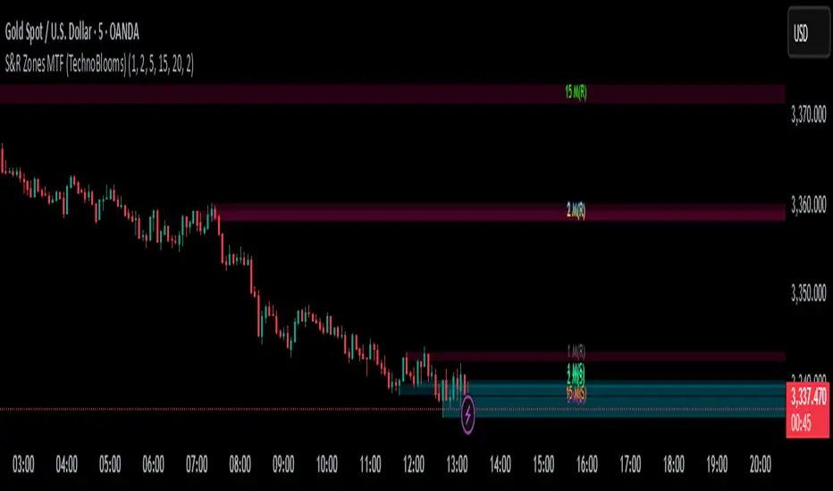
S&R Zones MTF (TechnoBlooms)S&R Zones MTF – Multi-Timeframe Support & Resistance Boxes
🔍 Overview
S&R Zones MTF is a professional-grade yet beginner-friendly indicator that dynamically plots Support & Resistance zones across multiple timeframes, helping traders recognize high-probability reversal areas, entry confirmations, and price reaction points.
This tool visualizes structured zones as colored boxes, allowing both new and experienced traders to analyze multi-timeframe confluence with ease and clarity.
🧠 What Is This Indicator?
S&R Zones MTF automatically detects the most significant support and resistance levels from up to four custom timeframes, using a configurable lookback period. These zones are displayed as colored horizontal boxes directly on the chart, making it easy to:
Spot where price has historically reacted
Identify potential reversal or breakout zones
Confirm entries with institutional-style precision
🛠️ Key Features
✅ Multi-Timeframe Zone Detection (up to 4 timeframes)
📦 Auto Plotted Boxes for Support (Blue) & Resistance (Pink)
🧱 Dynamic Height based on average price range or fixed input
🏷️ Timeframe Labels to instantly identify zone origin
🎛️ Customizable inputs: Lookback length, box color, height style
🔁 Real-time updates as price structure changes
🎓 Educational & Easy to Use
Whether you’re a new trader learning about price structure, or a professional applying institutional concepts, this tool offers an educational layout to understand:
How price respects historic zones
Why multi-timeframe zones offer stronger confluence
How to use zones for entry, exit, or risk placement
📈 How to Use (Multi-Timeframe Strategy)
Select Your Timeframes – Customize up to 4 higher timeframes (e.g., 1m, 5m, 15m, 1h).
Observe Overlapping Zones – When multiple timeframes agree, those zones are more significant.
Entry Confirmation – Wait for price to reach a zone, then look for reversal patterns (engulfing candle, pin bar, etc.)
Combine with Other Tools – Use alongside indicators like RSI, MACD, or Order Blocks for added confidence.
💡 Pro Tips
Zones from higher timeframes (1H, 4H) are often more powerful and reliable.
Confluence matters: If a 15m support zone aligns with a 1H support zone — that's a high-probability reaction area.
Use break-and-retest strategies with zone rejections for sniper entries.
Enable "Auto Height" for a more adaptive, volatility-based zone display.
🌟 Summary
S&R Zones MTF blends precision, clarity, and professional analysis into a visual structure that’s easy to understand. Whether you're learning support & resistance or optimizing your MTF edge — this tool will bring clarity to your charts and confidence to your trades.
High Win Rate Trader by iambuoyant# High Win Rate Trader by iambuoyant - Complete Guide
## Introduction
The "High Win Rate Trader by iambuoyant" is a comprehensive Pine Script indicator designed to identify high-probability trading opportunities across various market conditions. Built with a multi-faceted approach, it integrates several key technical analysis concepts to provide robust buy and sell signals, aiming to maximize potential returns while managing risk. This indicator is particularly useful for traders looking for confirmed entries based on a confluence of factors rather than relying on a single signal.
## Core Philosophy
This indicator operates on the principle that **multiple confirming factors create higher probability trades**. Instead of relying on a single indicator, it combines trend analysis, momentum oscillators, volume confirmation, market structure, and mathematical levels to identify optimal entry points. The more confluence factors that align, the stronger the trading signal.
## Strategies and Confluence Factors
### 1. Trend Analysis
**Purpose**: Establishes the overall market direction to ensure trades align with momentum.
**Components**:
- **Fast EMA (Default: 9)**: Short-term trend detection
- **Slow EMA (Default: 21)**: Medium-term trend confirmation
- **Trend EMA (Default: 50)**: Long-term trend establishment
**How it works**:
- **Bullish Trend**: Fast EMA > Slow EMA > Trend EMA
- **Bearish Trend**: Fast EMA < Slow EMA < Trend EMA
- Signals are filtered to only trigger in the direction of the established trend
**Default Settings**:
- Fast EMA Period: 9
- Slow EMA Period: 21
- Trend EMA Period: 50
### 2. Oscillator Confirmation
**Purpose**: Identifies overbought/oversold conditions and momentum shifts.
#### RSI (Relative Strength Index)
- **Period (Default: 14)**: Standard RSI calculation period
- **Overbought Level (Default: 70)**: RSI level considered overbought
- **Oversold Level (Default: 30)**: RSI level considered oversold
**How it works**:
- **Bullish**: RSI < 40 and turning upward (oversold recovery)
- **Bearish**: RSI > 60 and turning downward (overbought rejection)
#### Stochastic Oscillator
- **K Period (Default: 14)**: Stochastic %K calculation period
- **D Period (Default: 3)**: Stochastic %D smoothing period
- **Overbought Level (Default: 80)**: Stochastic overbought threshold
- **Oversold Level (Default: 20)**: Stochastic oversold threshold
**How it works**:
- **Bullish**: %K < 30 and (%K turning up OR %K > %D)
- **Bearish**: %K > 70 and (%K turning down OR %K < %D)
### 3. MACD (Moving Average Convergence Divergence)
**Purpose**: Confirms momentum shifts and trend changes.
**Components**:
- **Fast Period (Default: 12)**: Fast EMA for MACD calculation
- **Slow Period (Default: 26)**: Slow EMA for MACD calculation
- **Signal Period (Default: 9)**: Signal line smoothing period
**How it works**:
- **Bullish**: MACD line > Signal line OR (MACD rising AND histogram increasing)
- **Bearish**: MACD line < Signal line OR (MACD falling AND histogram decreasing)
### 4. Volume Analysis
**Purpose**: Confirms price moves with volume conviction.
**Components**:
- **Volume MA Period (Default: 20)**: Period for volume moving average
- **Volume Multiplier (Default: 1.5)**: Volume threshold multiplier
**How it works**:
- **Bullish**: Current volume > (Volume MA × 1.5)
- **Bearish**: Current volume > (Volume MA × 1.5)
### 5. Market Structure and Volatility
#### Support and Resistance Levels
- **Pivot Length (Default: 10)**: Period for pivot high/low detection
- **Dynamic Levels**: Automatically identifies recent swing highs and lows
- **Proximity Check**: Ensures trades aren't initiated too close to S/R levels
#### ATR (Average True Range)
- **ATR Period (Default: 14)**: Volatility measurement period
- **ATR Multiplier (Default: 2.0)**: Stop loss distance multiplier
- **Volatility Filter (Default: 50.0%)**: Maximum allowed volatility percentage
**How it works**:
- Calculates market volatility using ATR
- Prevents trades in excessively volatile conditions
- Helps determine dynamic stop loss levels
### 6. Fibonacci Retracements
**Purpose**: Identifies key mathematical support/resistance levels.
**Components**:
- **Lookback Period (Default: 50)**: Period for swing high/low calculation
- **Tolerance (Default: 2.0%)**: Price proximity tolerance to Fib levels
**Key Levels**: 23.6%, 38.2%, 50%, 61.8%, 78.6%
**How it works**:
- **Bullish**: Price near 38.2%, 50%, or 61.8% retracement levels in uptrend
- **Bearish**: Price near 38.2%, 50%, or 61.8% retracement levels in downtrend
### 7. Risk Management
#### Risk:Reward Ratio
- **Minimum RR Ratio (Default: 1.0)**: Minimum acceptable risk:reward ratio
- **Dynamic Calculation**: Based on support/resistance levels and ATR
#### Dynamic Stop Loss
- **ATR-based**: Stop loss = Entry ± (ATR × 1.5)
- **S/R-based**: Uses nearby support/resistance levels when available
### 8. Signal Confirmation
**Confirmation Bars (Default: 0)**:
- **0**: Immediate signals (recommended for testing)
- **1+**: Delayed confirmation for reduced false signals
## How to Use the Indicator
### Step 1: Initial Setup
1. **Add to Chart**: Apply the "High Win Rate Trader by iambuoyant" indicator to your desired chart in TradingView
2. **Verify Display**: Ensure you can see the indicator plots and debug pane below the main chart
### Step 2: Understanding the Signals
#### Visual Elements:
- **Green Triangles (Buy)**: Appear below price bars for long entry signals
- **Red Triangles (Sell)**: Appear above price bars for short entry signals
- **Labels**: Show "BUY" or "SELL" with current RSI value
- **EMA Lines**: Blue (Fast), Orange (Slow), Gray (Trend) - visible when enabled
#### Signal Types:
- **Flash Signals**: Immediate signals when conditions are first met
- **Confirmed Signals**: Signals that have passed confirmation criteria
### Step 3: Debugging and Optimization
#### Access Debug Features:
1. Click the gear icon next to the indicator name
2. Navigate to "Signal Components (Debugging)" section
3. All confluence factors start **disabled** by default
#### Initial Testing Process:
1. **Start Simple**: Keep all "Enable X Condition" toggles **OFF**
2. **Enable Basic**: Turn on "Enable RSI Condition" first
3. **Observe Signals**: Check if buy/sell signals appear
4. **Gradual Addition**: Enable one condition at a time
5. **Monitor Debug Plots**: Watch the colored crosses in the lower pane
#### Debug Plot Interpretation:
- **Green Crosses (Value 1)**: Bullish conditions met
- **Red Crosses (Value 2)**: Bearish conditions met
- **No Cross**: Condition not met
- **"Debug: Final Long/Short Signal"**: Combined signal output
### Step 4: Fine-tuning Parameters
#### If Signals Are Too Rare:
1. **Reduce Thresholds**: Lower RSI overbought/oversold levels
2. **Relax Filters**: Increase volatility filter percentage
3. **Adjust Timeframes**: Modify EMA periods for your trading style
4. **Disable Strict Conditions**: Turn off conditions that are too restrictive
#### If Signals Are Too Frequent:
1. **Increase Thresholds**: Raise RSI levels
2. **Add Filters**: Enable more confluence conditions
3. **Stricter Confirmation**: Increase confirmation bars
4. **Higher RR Ratio**: Increase minimum risk:reward requirement
### Step 5: Display Configuration
#### Display Options:
- **Show Buy/Sell Labels**: Toggle signal labels on/off
- **Show Support/Resistance**: Toggle S/R level lines
- **Show Trend EMAs**: Toggle EMA trend lines
### Step 6: Setting Up Alerts
#### Alert Conditions:
- **"Confirmed Buy Signal"**: Triggers on confirmed long entries
- **"Confirmed Sell Signal"**: Triggers on confirmed short entries
#### Alert Message Format:
- Buy: "BUY - RSI: , Price: "
- Sell: "SELL - RSI: , Price: "
## Recommended Settings by Market Type
### Trending Markets:
- Enable: Trend Alignment, RSI, MACD
- Disable: Volume (optional)
- Confirmation Bars: 1-2
### Ranging Markets:
- Enable: RSI, Stochastic, Support/Resistance
- Disable: Trend Alignment
- Confirmation Bars: 0
### Volatile Markets:
- Enable: Volatility Filter, ATR-based stops
- Reduce: RSI thresholds (60/40 instead of 70/30)
- Increase: Confirmation bars to 2-3
## Troubleshooting
### No Signals Appearing:
1. Check if any "Enable X Condition" is turned ON
2. Verify debug plots show activity
3. Reduce parameter thresholds
4. Check if market conditions match your settings
### Too Many False Signals:
1. Enable more confluence conditions
2. Increase confirmation bars
3. Adjust RSI/Stochastic thresholds
4. Enable volatility filter
### Signals Not Aligning with Price Action:
1. Check trend alignment settings
2. Verify EMA periods match your timeframe
3. Adjust Fibonacci lookback period
4. Review support/resistance proximity settings
## Best Practices
1. **Start Conservative**: Begin with fewer confluence factors and gradually add more
2. **Test Thoroughly**: Use demo accounts to test parameter combinations
3. **Monitor Debug Plots**: Regularly check which conditions are failing
4. **Adapt to Market**: Adjust settings based on current market conditions
5. **Use Multiple Timeframes**: Consider higher timeframe trend direction
6. **Risk Management**: Always use proper position sizing and stop losses
## Default Settings Summary
### Trend Analysis:
- Fast EMA: 9
- Slow EMA: 21
- Trend EMA: 50
### Oscillators:
- RSI Period: 14, Overbought: 70, Oversold: 30
- Stochastic K: 14, D: 3, Overbought: 80, Oversold: 20
### MACD:
- Fast: 12, Slow: 26, Signal: 9
### Volume:
- MA Period: 20, Multiplier: 1.5
### Market Structure:
- ATR Period: 14, Multiplier: 2.0
- Volatility Filter: 50.0%
- Pivot Length: 10
### Fibonacci:
- Lookback: 50, Tolerance: 2.0%
### Signal Quality:
- Confirmation Bars: 0
- Min RR Ratio: 1.0
### Display:
- Show Labels: ON
- Show S/R: ON
- Show Trend: ON
### Debug (All Disabled by Default):
- Enable RSI: OFF
- Enable Stochastic: OFF
- Enable MACD: OFF
- Enable Price Structure: OFF
- Enable Trend Alignment: OFF
- Enable Volume: OFF
- Enable Fibonacci: OFF
- Enable Risk:Reward: OFF
- Enable Volatility: OFF

Order Block + Liquidity Sniper by TradingNexus🧠 Order Block + Liquidity Sniper by TradingNexus
📌 How the Indicator Works – Explanation of Visual Elements
🔺 Triangles – Liquidity Sniper Signals
Green triangle below candle (▲): This is a Bullish Liquidity Sniper Signal. It indicates that price swept liquidity below a Swing Low, triggering stop-losses, and then returned back above a bullish Order Block zone. This suggests potential institutional buying interest and could mark a strong buy opportunity.
Red triangle above candle (▼): This is a Bearish Liquidity Sniper Signal. It shows that price swept above a Swing High to collect liquidity and then returned below a bearish Order Block zone. This implies possible institutional selling after a liquidity hunt and may signal a short entry.
🟢 Circles – Order Block Zones
Green circle (●): Represents a Bullish Order Block area – typically the last bearish candle before a strong bullish move. Price returning to this zone may react due to renewed institutional buying.
Red circle (●): Marks a Bearish Order Block – the last bullish candle before a strong bearish move. These zones may act as resistance when price revisits.
✖️ Crosses – Liquidity Zones
Purple cross (+): Identifies a Swing High liquidity level – a short-term high where many stop-loss orders are likely clustered.
Orange cross (+): Marks a Swing Low liquidity zone – a key area where stop orders from long positions may reside.
This indicator seeks precise institutional-style entries by detecting when price:
Sweeps liquidity at a recent swing high or low;
Then reacts from a valid Order Block zone.
The triangle markers highlight potential Sniper entries, while circles and crosses help visualize the key zones that underpin these moves.
Use this tool to improve timing, context, and confidence in your trades – especially when combining with SMC or price action frameworks.
Built by TradingNexus – designed for price action traders who use Smart Money Concepts (SMC).

Smart MTF S/R Levels[BullByte]
Smart MTF S/R Levels
Introduction & Motivation
Support and Resistance (S/R) levels are the backbone of technical analysis. However, most traders face two major challenges:
Manual S/R Marking: Drawing S/R levels by hand is time-consuming, subjective, and often inconsistent.
Multi-Timeframe Blind Spots: Key S/R levels from higher or lower timeframes are often missed, leading to surprise reversals or missed opportunities.
Smart MTF S/R Levels was created to solve these problems. It is a fully automated, multi-timeframe, multi-method S/R detection and visualization tool, designed to give traders a complete, objective, and actionable view of the market’s most important price zones.
What Makes This Indicator Unique?
Multi-Timeframe Analysis: Simultaneously analyzes up to three user-selected timeframes, ensuring you never miss a critical S/R level from any timeframe.
Multi-Method Confluence: Integrates several respected S/R detection methods—Swings, Pivots, Fibonacci, Order Blocks, and Volume Profile—into a single, unified system.
Zone Clustering: Automatically merges nearby levels into “zones” to reduce clutter and highlight areas of true market consensus.
Confluence Scoring: Each zone is scored by the number of methods and timeframes in agreement, helping you instantly spot the most significant S/R areas.
Reaction Counting: Tracks how many times price has recently interacted with each zone, providing a real-world measure of its importance.
Customizable Dashboard: A real-time, on-chart table summarizes all key S/R zones, their origins, confluence, and proximity to price.
Smart Alerts: Get notified when price approaches high-confluence zones, so you never miss a critical trading opportunity.
Why Should a Trader Use This?
Objectivity: Removes subjectivity from S/R analysis by using algorithmic detection and clustering.
Efficiency: Saves hours of manual charting and reduces analysis fatigue.
Comprehensiveness: Ensures you are always aware of the most relevant S/R zones, regardless of your trading timeframe.
Actionability: The dashboard and alerts make it easy to act on the most important levels, improving trade timing and risk management.
Adaptability: Works for all asset classes (stocks, forex, crypto, futures) and all trading styles (scalping, swing, position).
The Gap This Indicator Fills
Most S/R indicators focus on a single method or timeframe, leading to incomplete analysis. Manual S/R marking is error-prone and inconsistent. This indicator fills the gap by:
Automating S/R detection across multiple timeframes and methods
Objectively scoring and ranking zones by confluence and reaction
Presenting all this information in a clear, actionable dashboard
How Does It Work? (Technical Logic)
1. Level Detection
For each selected timeframe, the script detects S/R levels using:
SW (Swing High/Low): Recent price pivots where reversals occurred.
Pivot: Classic floor trader pivots (P, S1, R1).
Fib (Fibonacci): Key retracement levels (0.236, 0.382, 0.5, 0.618, 0.786) over the last 50 bars.
Bull OB / Bear OB: Institutional price zones based on bullish/bearish engulfing patterns.
VWAP / POC: Volume Weighted Average Price and Point of Control over the last 50 bars.
2. Level Clustering
Levels within a user-defined % distance are merged into a single “zone.”
Each zone records which methods and timeframes contributed to it.
3. Confluence & Reaction Scoring
Confluence: The number of unique methods/timeframes in agreement for a zone.
Reactions: The number of times price has touched or reversed at the zone in the recent past (user-defined lookback).
4. Filtering & Sorting
Only zones within a user-defined % of the current price are shown (to focus on actionable areas).
Zones can be sorted by confluence, reaction count, or proximity to price.
5. Visualization
Zones: Shaded boxes on the chart (green for support, red for resistance, blue for mixed).
Lines: Mark the exact level of each zone.
Labels: Show level, methods by timeframe (e.g., 15m (3 SW), 30m (1 VWAP)), and (if applicable) Fibonacci ratios.
Dashboard Table: Lists all nearby zones with full details.
6. Alerts
Optional alerts trigger when price approaches a zone with confluence above a user-set threshold.
Inputs & Customization (Explained for All Users)
Show Timeframe 1/2/3: Enable/disable analysis for each timeframe (e.g., 15m, 30m, 1h).
Show Swings/Pivots/Fibonacci/Order Blocks/Volume Profile: Select which S/R methods to include.
Show levels within X% of price: Only display zones near the current price (default: 3%).
How many swing highs/lows to show: Number of recent swings to include (default: 3).
Cluster levels within X%: Merge levels close together into a single zone (default: 0.25%).
Show Top N Zones: Limit the number of zones displayed (default: 8).
Bars to check for reactions: How far back to count price reactions (default: 100).
Sort Zones By: Choose how to rank zones in the dashboard (Confluence, Reactions, Distance).
Alert if Confluence >=: Set the minimum confluence score for alerts (default: 3).
Zone Box Width/Line Length/Label Offset: Control the appearance of zones and labels.
Dashboard Size/Location: Customize the dashboard table.
How to Read the Output
Shaded Boxes: Represent S/R zones. The color indicates type (green = support, red = resistance, blue = mixed).
Lines: Mark the precise level of each zone.
Labels: Show the level, methods by timeframe (e.g., 15m (3 SW), 30m (1 VWAP)), and (if applicable) Fibonacci ratios.
Dashboard Table: Columns include:
Level: Price of the zone
Methods (by TF): Which S/R methods and how many, per timeframe (see abbreviation key below)
Type: Support, Resistance, or Mixed
Confl.: Confluence score (higher = more significant)
React.: Number of recent price reactions
Dist %: Distance from current price (in %)
Abbreviations Used
SW = Swing High/Low (recent price pivots where reversals occurred)
Fib = Fibonacci Level (key retracement levels such as 0.236, 0.382, 0.5, 0.618, 0.786)
VWAP = Volume Weighted Average Price (price level weighted by volume)
POC = Point of Control (price level with the highest traded volume)
Bull OB = Bullish Order Block (institutional support zone from bullish price action)
Bear OB = Bearish Order Block (institutional resistance zone from bearish price action)
Pivot = Pivot Point (classic floor trader pivots: P, S1, R1)
These abbreviations appear in the dashboard and chart labels for clarity.
Example: How to Read the Dashboard and Labels (from the chart above)
Suppose you are trading BTCUSDT on a 15-minute chart. The dashboard at the top right shows several S/R zones, each with a breakdown of which timeframes and methods contributed to their detection:
Resistance zone at 119257.11:
The dashboard shows:
5m (1 SW), 15m (2 SW), 1h (3 SW)
This means the level 119257.11 was identified as a resistance zone by one swing high (SW) on the 5-minute timeframe, two swing highs on the 15-minute timeframe, and three swing highs on the 1-hour timeframe. The confluence score is 6 (total number of method/timeframe hits), and there has been 1 recent price reaction at this level. This suggests 119257.11 is a strong resistance zone, confirmed by multiple swing highs across all selected timeframes.
Mixed zone at 118767.97:
The dashboard shows:
5m (2 SW), 15m (2 SW)
This means the level 118767.97 was identified by two swing points on both the 5-minute and 15-minute timeframes. The confluence score is 4, and there have been 19 recent price reactions at this level, indicating it is a highly reactive zone.
Support zone at 117411.35:
The dashboard shows:
5m (2 SW), 1h (2 SW)
This means the level 117411.35 was identified as a support zone by two swing lows on the 5-minute timeframe and two swing lows on the 1-hour timeframe. The confluence score is 4, and there have been 2 recent price reactions at this level.
Mixed zone at 118291.45:
The dashboard shows:
15m (1 SW, 1 VWAP), 5m (1 VWAP), 1h (1 VWAP)
This means the level 118291.45 was identified by a swing and VWAP on the 15-minute timeframe, and by VWAP on both the 5-minute and 1-hour timeframes. The confluence score is 4, and there have been 12 recent price reactions at this level.
Support zone at 117103.10:
The dashboard shows:
15m (1 SW), 1h (1 SW)
This means the level 117103.10 was identified by a single swing low on both the 15-minute and 1-hour timeframes. The confluence score is 2, and there have been no recent price reactions at this level.
Resistance zone at 117899.33:
The dashboard shows:
5m (1 SW)
This means the level 117899.33 was identified by a single swing high on the 5-minute timeframe. The confluence score is 1, and there have been no recent price reactions at this level.
How to use this:
Zones with higher confluence (more methods and timeframes in agreement) and more recent reactions are generally more significant. For example, the resistance at 119257.11 is much stronger than the resistance at 117899.33, and the mixed zone at 118767.97 has shown the most recent price reactions, making it a key area to watch for potential reversals or breakouts.
Tip:
“SW” stands for Swing High/Low, and “VWAP” stands for Volume Weighted Average Price.
The format 15m (2 SW) means two swing points were detected on the 15-minute timeframe.
Best Practices & Recommendations
Use with Other Tools: This indicator is most powerful when combined with your own price action analysis and risk management.
Adjust Settings: Experiment with timeframes, clustering, and methods to suit your trading style and the asset’s volatility.
Watch for High Confluence: Zones with higher confluence and more reactions are generally more significant.
Limitations
No Future Prediction: The indicator does not predict future price movement; it highlights areas where price is statistically more likely to react.
Not a Standalone System: Should be used as part of a broader trading plan.
Historical Data: Reaction counts are based on historical price action and may not always repeat.
Disclaimer
This indicator is a technical analysis tool and does not constitute financial advice or a recommendation to buy or sell any asset. Trading involves risk, and past performance is not indicative of future results. Always use proper risk management and consult a financial advisor if needed.

Persistent 1H S/R Zones with Labels (No Overlap) + 50 EMAit helps find recant support and resistance zones with swing points

Persistent Daily & 4H S/R Zones with Labels + 50 EMAit helps find swing high and lows support and ressistsance

Liquidity Trap Zones [PhenLabs]📊 Liquidity Trap Zones
Version: PineScript™ v6
📌 Description
The goal of the Liquidity Trap Zones indicator is to try and help traders identify areas where market liquidity appears abundant but is actually thin or artificial, helping traders avoid potential fake outs and false breakouts. This advanced indicator analyzes the relationship between price wicks and volume to detect “mirage” zones where large price movements occur on low volume, indicating potential liquidity traps.
By highlighting these deceptive zones on your charts, the indicator helps traders recognize where institutional players might be creating artificial liquidity to trap retail traders. This enables more informed decision-making and better risk management when approaching key price levels.
🚀 Points of Innovation
Mirage Score Algorithm: Proprietary calculation that normalizes wick size relative to volume and average bar size
Dynamic Zone Creation: Automatically generates gradient-filled zones at trap locations with ATR-based sizing
Intelligent Zone Management: Maintains clean charts by limiting displayed zones and auto-updating existing ones
Scale-Invariant Design: Works across all assets and timeframes with intelligent normalization
Real-Time Detection: Identifies trap zones as they form, not after the fact
Volume-Adjusted Analysis: Incorporates tick volume when available for more accurate detection
🔧 Core Components
Mirage Score Calculator: Analyzes the ratio of price wicks to volume, normalized by average bar size
ATR-Based Filter: Ensures only significant price movements are considered for trap zone creation
EMA Smoothing: Reduces noise in the mirage score for clearer signals
Gradient Zone Renderer: Creates visually distinct zones with multiple opacity levels for better visibility
🔥 Key Features
Real-Time Trap Detection: Identifies liquidity mirages as they develop during live trading
Dynamic Zone Sizing: Adjusts zone height based on current market volatility (ATR)
Smart Zone Management: Automatically maintains a clean chart by limiting the number of displayed zones
Customizable Sensitivity: Fine-tune detection parameters for different market conditions
Visual Clarity: Gradient-filled zones with distinct borders for easy identification
Status Line Display: Shows current mirage score and threshold for quick reference
🎨 Visualization
Gradient Trap Zones: Purple gradient boxes with darker centers indicating trap strength
Mirage Score Line: Orange line in status area showing current liquidity quality
Threshold Reference: Gray line showing your configured detection threshold
Extended Zone Display: Zones automatically extend forward as new bars form
📖 Usage Guidelines
Detection Settings
Smoothing Length (EMA) - Default: 10 - Range: 1-50 - Description: Controls responsiveness of mirage score. Lower values make detection more sensitive to recent price action
Mirage Threshold - Default: 5.0 - Range: 0.1-20.0 - Description: Score above this level triggers trap zone creation. Higher values reduce false positives but may miss subtle traps
Filter Settings
ATR Length for Range Filter - Default: 14 - Range: 1-50 - Description: Period for volatility calculation. Standard 14 works well for most timeframes
ATR Multiplier - Default: 1.0 - Range: 0.0-5.0 - Description: Minimum bar range as multiple of ATR. Higher values filter out smaller moves
Display Settings
Zone Height Multiplier - Default: 0.5 - Range: 0.1-2.0 - Description: Controls trap zone height relative to ATR. Adjust for visual preference
Max Trap Zones - Default: 5 - Range: 1-20 - Description: Maximum zones displayed before oldest are removed. Balance clarity vs. history
✅ Best Use Cases
Identifying potential fakeout levels before entering trades
Confirming support/resistance quality by checking for liquidity traps
Avoiding stop-loss placement in trap zones where sweeps are likely
Timing entries after trap zones are cleared
Scalping opportunities when price approaches known trap zones
⚠️ Limitations
Requires volume data - less effective on instruments without reliable volume
May generate false signals during news events or genuine volume spikes
Not a standalone system - combine with price action and other indicators
Zone creation is based on historical data - future price behavior not guaranteed
💡 What Makes This Unique
First indicator to specifically target liquidity mirages using wick-to-volume analysis
Proprietary normalization ensures consistent performance across all markets
Visual gradient design makes trap zones immediately recognizable
Combines multiple volatility and volume metrics for robust detection
🔬 How It Works
1. Wick Analysis: Calculates upper and lower wicks for each bar. Normalizes by average bar size to ensure scale independence
2. Mirage Score Calculation: Divides total wick size by volume to identify thin liquidity. Applies EMA smoothing to reduce noise. Scales result for optimal visibility
3. Zone Creation: Triggers when smoothed score crosses threshold. Creates gradient boxes centered on trap bar. Sizes zones based on current ATR for market-appropriate scaling
💡 Note: Liquidity Trap Zones works best when combined with traditional support/resistance analysis and volume profile indicators. The zones highlight areas of deceptive liquidity but should not be the sole factor in trading decisions. Always use proper risk management and confirm signals with price action.

Twin Tower TP Levels – Hopi Method (from Demystifying ICT 2)📐 Twin Tower TP Levels – Hopi Method (from “Demystifying ICT 2”)
Description:
This indicator visualizes the Twin Tower TP Levels, a concept inspired by the work of the anonymous trader "Hopi", presented in the book "Demystifying ICT 2 (2025 Edition)".
It calculates a set of key take-profit levels based on:
A fixed reference price (typically VWAP at 16:00 EST)
The average daily range (ADR)
A symmetrical unit structure (ADR ÷ 100), projecting levels both above and below the fixed price.
The levels are calculated and labeled at ±7, ±13, ±20, ±30, ±37, ±43, and ±50 units from the Fix Price — providing traders with a balanced range of price action targets and reaction zones.
Key features:
Customizable Fix Price and ADR input
Automatically computes and plots 7 target levels above and below
Color-coded labels for easy reference (green for above, red for below)
Designed for precision take-profit targeting, as conceptualized in the “Twin Tower” method.
Disclaimer:
This script is a fan-made implementation for educational purposes and references concepts discussed in the book "Demystifying ICT 2 (2025 Edition)", attributed to the pseudonymous trader "Hopi".
All rights to the original intellectual property remain with the author.
