Essa - Market Structure & Fibonacci ToolkitEssa – Market Structure & Fibonacci Toolkit” is an all-in-one TradingView Pine Script indicator that detects and labels multi-tier market structure (HH, HL, LH, LL), draws dynamic Fibonacci retracements with customizable levels and a highlighted “Golden Zone,” marks Fair Value Gaps, and overlays enhanced session ranges. It also computes a weighted multi-timeframe trend strength score, displays comprehensive tables for trend analysis and Fibonacci distance/touches, and generates optional alerts for confluence events.
Key Features
Adaptive Pivot Detection: Volatility-scaled lookbacks automatically adjust pivot sensitivity.
Multi-Tier Structure Labelling: Short, intermediate, and long-term swing highs/lows with CHoCH (change-of-character) break lines.
Custom Fibonacci Toolkit: 0–100% retracements plus user-configurable 23.6, 38.2, 50, 61.8, 70.5, 78.6 levels; dynamic Golden Zone shading.
Fair Value Gaps (FVG): Bullish/bearish gap detection, age display, and confluence highlighting when in the Golden Zone.
Session Analysis: Colorized backgrounds, high/low/mid plots and range calculations for London, New York, and Asia sessions.
Multi-Timeframe Confirmation: Auto-selected higher-timeframe pivot alignment and weighted scoring.
Trend Strength Table: Scores HTF alignment, current-TF pattern, momentum, and confluence in a compact dashboard.
Distance & Touch Tracking: Fibonacci price-distance table with pip/point calculations, touch counts, and session annotations.
Alert System: Configurable alerts for CHoCH, Golden Zone entries, FVGs, and level touches.
Who It’s For
Price-Action Traders seeking visual confirmation of market swings and trend shifts.
Fibonacci Enthusiasts who want fully custom retracement levels with confluence zones.
Multi-Timeframe Analysts needing a single overlay to gauge alignment across chart horizons.
Session Strategists trading specific forex or equity sessions with clear range and momentum cues.
Advanced Traders who appreciate consolidated tables, exact touch markers, and automated alerting for high-conviction setups.
Trend Analysis

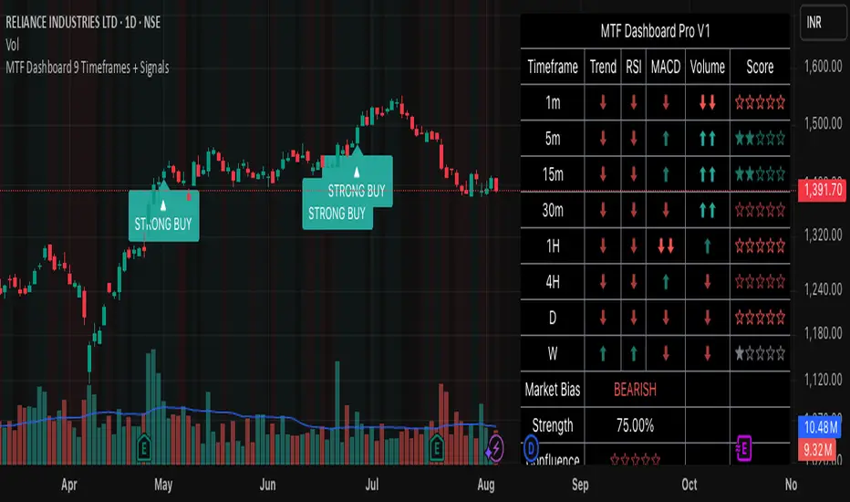
MTF Dashboard 9 Timeframes + Signals# MTF Dashboard Pro - Multi-Timeframe Confluence Analysis System
## WHAT THIS SCRIPT DOES
This script creates a comprehensive dashboard that simultaneously analyzes market conditions across 9 different timeframes (1m, 5m, 15m, 30m, 1H, 4H, Daily, Weekly, Monthly) using a proprietary confluence scoring methodology. Unlike simple multi-timeframe displays that show individual indicators separately, this script combines trend analysis, momentum, volatility signals, and volume analysis into unified confluence scores for each timeframe.
## WHY THIS COMBINATION IS ORIGINAL AND USEFUL
**The Problem Solved:** Most traders manually check multiple timeframes and struggle to quickly assess overall market bias when different timeframes show conflicting signals. Existing MTF scripts typically display individual indicators without synthesizing them into actionable intelligence.
**The Solution:** This script implements a mathematical confluence algorithm that:
- Weights each indicator's signal strength (trend direction, RSI momentum, MACD volatility, volume analysis)
- Calculates normalized scores across all active timeframes
- Determines overall market bias with statistical confidence levels
- Provides instant visual feedback through color-coded symbols and star ratings
**Unique Features:**
1. **Confluence Scoring Algorithm**: Mathematically combines multiple indicator signals into a single confidence rating per timeframe
2. **Market Bias Engine**: Automatically calculates overall directional bias with percentage strength across all selected timeframes
3. **Dynamic Display System**: Real-time updates with customizable layouts, color schemes, and selective timeframe activation
4. **Statistical Analysis**: Provides bullish/bearish vote counts and overall confluence percentages
## HOW THE SCRIPT WORKS TECHNICALLY
### Core Calculation Methodology:
**1. Trend Analysis (EMA-based):**
- Fast EMA (default: 9) vs Slow EMA (default: 21) crossover analysis
- Returns values: +1 (bullish), -1 (bearish), 0 (neutral)
**2. Momentum Analysis (RSI-based):**
- RSI levels: >70 (strong bullish +2), >50 (bullish +1), <30 (strong bearish -2), <50 (bearish -1)
- Provides overbought/oversold context for trend confirmation
**3. Volatility Analysis (MACD-based):**
- MACD line vs Signal line positioning
- Histogram strength comparison with previous bar
- Combined score considering both direction and momentum strength
**4. Volume Analysis:**
- Current volume vs 20-period moving average
- Thresholds: >150% MA (strong +2), >100% MA (bullish +1), <50% MA (weak -2)
**5. Confluence Calculation:**
```
Confluence Score = (Trend + RSI + MACD + Volume) / 4.0
```
**6. Market Bias Determination:**
- Counts bullish vs bearish signals across all active timeframes
- Calculates bias strength percentage: |Bullish Count - Bearish Count| / Total Active TFs * 100
- Determines overall market direction: BULLISH, BEARISH, or NEUTRAL
### Multi-Timeframe Implementation:
Uses `request.security()` calls to fetch data from each timeframe, ensuring all calculations are performed on the respective timeframe's data rather than current chart timeframe, providing accurate multi-timeframe analysis.
## HOW TO USE THIS SCRIPT
### Initial Setup:
1. **Timeframe Selection**: Enable/disable specific timeframes in "Timeframe Selection" group based on your trading style
2. **Indicator Configuration**: Adjust EMA periods (Fast: 9, Slow: 21), RSI length (14), and MACD settings (12/26/9) to match your analysis preferences
3. **Display Options**: Choose table position, text size, and color scheme for optimal visibility
### Reading the Dashboard:
**Symbol Interpretation:**
- ⬆⬆ = Strong bullish signal (score ≥ 2)
- ⬆ = Bullish signal (score > 0)
- ➡ = Neutral signal (score = 0)
- ⬇ = Bearish signal (score < 0)
- ⬇⬇ = Strong bearish signal (score ≤ -2)
**Confluence Stars:**
- ★★★★★ = Very high confidence (score > 0.75)
- ★★★★☆ = High confidence (score > 0.5)
- ★★★☆☆ = Medium confidence (score > 0.25)
- ★★☆☆☆ = Low confidence (score > 0)
- ★☆☆☆☆ = Very low confidence (score > -0.25)
**Market Bias Section:**
- Shows overall market direction across all active timeframes
- Strength percentage indicates conviction level
- Overall confluence score represents average agreement across timeframes
### Trading Applications:
**Entry Signals:**
- Look for high confluence (4-5 stars) across multiple timeframes in same direction
- Higher timeframe alignment provides stronger signal validation
- Use confluence percentage >75% for high-probability setups
**Risk Management:**
- Lower timeframe conflicts may indicate choppy conditions
- Neutral bias suggests ranging market - adjust position sizing
- Strong bias with high confluence supports larger position sizes
**Timeframe Harmony:**
- Short-term trades: Focus on 1m-1H alignment
- Swing trades: Emphasize 1H-Daily alignment
- Position trades: Prioritize Daily-Monthly confluence
## SCRIPT SETTINGS EXPLANATION
### Dashboard Settings:
- **Table Position**: Choose optimal location (Top Right recommended for most layouts)
- **Text Size**: Adjust based on screen resolution and preferences
- **Color Scheme**: Professional (default), Classic, Vibrant, or Dark themes
- **Background Color/Transparency**: Customize table appearance
### Timeframe Selection:
All timeframes optional - activate based on trading timeframe preference:
- **Lower Timeframes (1m-30m)**: Scalping and day trading
- **Medium Timeframes (1H-4H)**: Swing trading
- **Higher Timeframes (D-M)**: Position trading and long-term bias
### Indicator Parameters:
- **Fast EMA (Default: 9)**: Shorter period for trend sensitivity
- **Slow EMA (Default: 21)**: Longer period for trend confirmation
- **RSI Length (Default: 14)**: Standard momentum calculation period
- **MACD Settings (12/26/9)**: Standard MACD configuration for volatility analysis
### Alert Configuration:
- **Strong Signals**: Alerts when confluence >75% with clear directional bias
- **High Confluence**: Alerts when multiple timeframes strongly agree
- All alerts use `alert.freq_once_per_bar` to prevent spam
## VISUAL FEATURES
### Chart Elements:
- **Background Coloring**: Subtle background tint reflects overall market bias
- **Signal Labels**: Strong buy/sell labels appear on chart during high-confluence signals
- **Clean Presentation**: Dashboard overlays chart without interfering with price action
### Color Coding:
- **Green/Bullish**: Various green shades for positive signals
- **Red/Bearish**: Various red shades for negative signals
- **Gray/Neutral**: Neutral color for conflicting or weak signals
- **Transparency**: Configurable transparency maintains chart readability
## IMPORTANT USAGE NOTES
**Realistic Expectations:**
- This tool provides analysis framework, not trading signals
- Always combine with proper risk management
- Past performance does not guarantee future results
- Market conditions can change rapidly - use appropriate position sizing
**Best Practices:**
- Verify signals with additional analysis methods
- Consider fundamental factors affecting the instrument
- Use appropriate timeframes for your trading style
- Regular parameter optimization may be beneficial for different market conditions
**Limitations:**
- Effectiveness may vary across different instruments and market conditions
- Confluence scoring is mathematical model - not predictive guarantee
- Requires understanding of underlying indicators for optimal use
This script serves as a comprehensive analysis tool for traders who need quick, organized access to multi-timeframe market information with statistical confidence levels.
VWAP-RSI Scalper FINAL v1Description
This script implements a robust, battle-tested intraday scalping strategy designed for prop firm challenges, funded trader programs, and serious futures scalpers.
It combines VWAP, RSI, EMA trend, and ATR-based risk management to capture high-probability mean reversion and momentum moves during the most liquid hours of the trading day.
Core Logic
RSI (Relative Strength Index):
Trades are triggered when the RSI is either oversold or overbought using a short lookback (default: 3). This ensures only the strongest intraday reversals or exhaustion moves are considered.
VWAP Filter:
Longs are only taken above VWAP, shorts only below VWAP, aligning trades with the session’s dominant bias.
EMA Filter:
Additional trend quality filter—longs require price above EMA, shorts below EMA.
Session Control:
Only trades between user-defined session hours (default: US cash session), eliminating overnight/illiquid action.
ATR-based Dynamic Stops & Targets:
Every trade uses a stop loss at 1x ATR and a take profit at 2x ATR for a positive risk/reward ratio.
Max Trades Per Day:
Prevents overtrading and controls risk exposure (default: 3).
Performance (Sample Backtest)
Profit Factor: 1.37+ (prop-firm quality)
Drawdown: <1% (very conservative risk)
Win Rate: 37–48% (RR > 1, so high edge)
Consistency: Smooth, steady equity curve over hundreds of trades.
Best For:
ES/NQ/CL/GC intraday traders
Prop firm evaluation challenges (Tradeify, Topstep, Apex, etc.)
Anyone needing robust, no-nonsense systematic edge for futures or indices.
How to Use & Tune
Apply to 3min, 5min, or 15min charts of liquid futures or indices.
Change parameters in the settings panel to suit your asset, volatility, or session hours.
Use “Strategy Tester” to validate P&L, win rate, and drawdown.
How to Optimize
Raise/lower RSI length or bands to make signals more/less frequent.
Adjust stop/target multiples for your preferred risk/reward profile.
Change session hours to match your broker or market.
Disclaimer
This is not financial advice. Use on a demo or sim account first. Results will vary by market, slippage, and execution speed. Past performance does not guarantee future results.
If you find this useful, please give it a like, follow for more strategies, and comment your results or questions!
Good luck and safe trading!

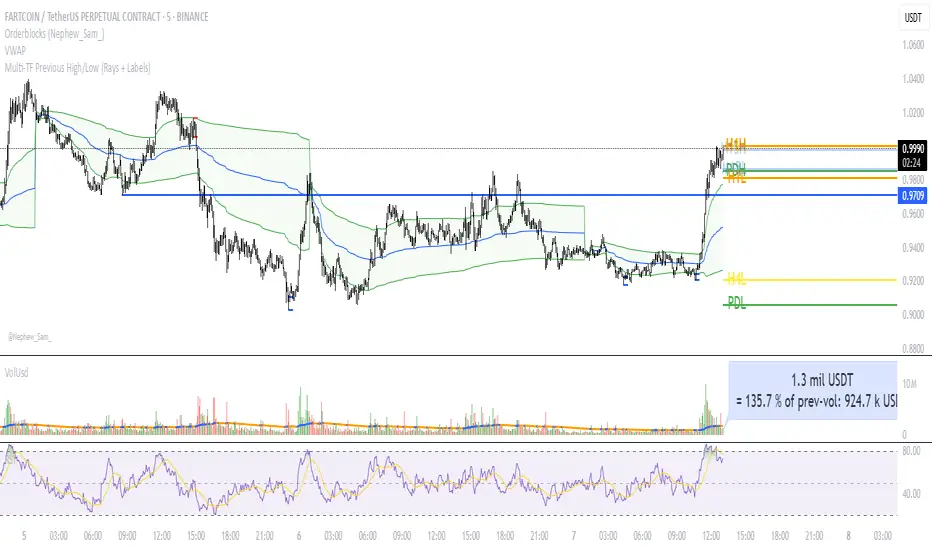
Multi‑TF Previous High/Low (Rays + Labels)Use this indicator if you want to automate Support and Resistance levels.
Previous Day High and Low - Green Lines
Previous 4 Hour High and Low - Yellow Lines
Previous 1 Hour High and Low - Orange Lines
Previous 15 Minute High and Low - Light Blue Lines
Follow me on X-
ADHDTRDR
Trend Zones & ATR Targets[CongTrader]TrendZones ATR is a dynamic trend and support/resistance indicator that combines Hull Moving Average (HMA) smoothing, mid-price analysis, and ATR-based targets to identify precise trading zones and risk levels.
Key Features:
Adaptive Trend Zones — Calculates upper, midline (CoG), and lower borders from smoothed mid-price, adapting to market volatility.
Trend Classification — Detects uptrend, downtrend, or sideways conditions using slope-based logic.
Safe Level & Logical Stop — Automatically sets risk levels according to price zone classification.
Flexible TP Methods — Choose between %-based or ATR-based take-profit targets.
Optional ATR Support Zone — Adds an ATR-based support level for stronger confluence.
Risk & Zone Width Table — Displays real-time risk and channel width data on the chart.
How to Use:
Apply the indicator to any symbol and timeframe.
Identify market zones with color-coded fills.
Align trades with the detected trend direction.
Use Safe Level or Logical Stop for stop-loss placement.
Set TP targets using either % or ATR multiplier.
Combine with your own trade confirmation method for optimal results.
Acknowledgment:
Thanks to the TradingView community for inspiration and feedback. This script is original work by CongTrader.
Disclaimer:
This script is for educational purposes only and does not constitute financial advice. Trading carries risk and may not be suitable for all investors. Do your own research before making any trading decisions. The author is not responsible for any losses resulting from the use of this script.
#trendzones #atr #supportresistance #tradingview #forex #crypto #stocks #daytrading #swingtrading #riskmanagement #chartanalysis .

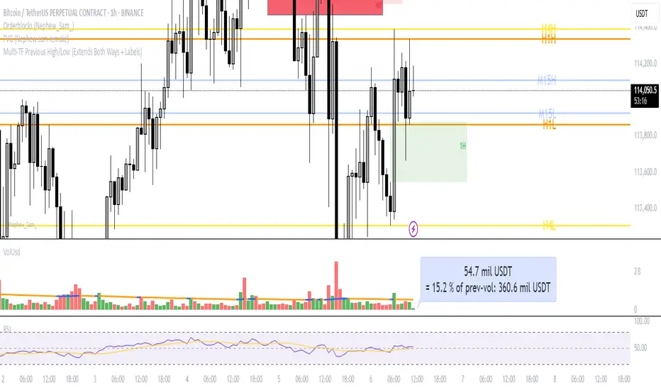
Multi‑TF Previous High/Low (Extends Both Ways + Labels)Use this indicator if you want to automate Support and Resistance levels.
Previous Day High and Low - Green Lines
Previous 4 Hour High and Low - Yellow Lines
Previous 1 Hour High and Low - Orange Lines
Previous 15 Minute High and Low - Light Blue Lines
Follow me on X-
@ADHDTRDR
Cumulative Gain-Loss Ratio This Pine Script indicator is called "Cumulative Gain-Loss Ratio" - a technical analysis tool. Here's what it does for you:
How the Indicator Works:
1. Calculates percentage change for each bar:
It finds how much the closing price changed compared to the previous candle in percentage terms
2. Separates gains and losses:
Positive changes = Gains
Negative changes = Losses (converts to positive values)
3. Takes cumulative totals:
Sums up all gains from the beginning
Sums up all losses from the beginning
4. Calculates the ratio:
Cumulative Gains ÷ Cumulative Losses
What It Tells You:
Ratio > 1: Your total gains exceed losses (good performance)
Ratio < 1: Your total losses exceed gains (poor performance)
Ratio = 1: Gains and losses are equal (break-even)
Practical Usage:
Evaluating long-term performance of a stock or cryptocurrency
Measuring trend strength
Sustained movement above 1.0 line = strong uptrend
Sustained movement below 1.0 line = weak performance
This indicator helps you understand the overall health and momentum strength of an asset by showing the cumulative balance between gains and losses over time.

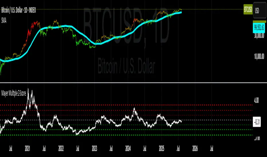
Mayer Multiple Z-ScoreMayer Multiple is a ratio between the current Market Price and its 200 days moving average.
Being a lagging indicator it shows periods of relative value for the asset but does not have much predictive power.
It is worth noting that the indicator relies on a fairly responsive moving average on the scale of a Bitcoin market cycle and as such may be best suited for the swing traders to find zones where price is overbought and oversold within a market cycle.
Added the Z-Score metric for easy classification of the value of Bitcoin according to this indicator. Customizable thresholds from Z-Score calculation as the metric suffers alpha decay / compression.
Created for TRW
HARSI Cross Only by G.I.N.e TradingHARSI + SMA Indicator – Description
Indicator Name: HARSI + SMA
Type: Trend/momentum crossover
Displays: Column bars only when a crossover occurs
🧠 What is HARSI?
HARSI stands for Heikin-Ashi RSI.
It is a smoothed version of the traditional Relative Strength Index (RSI), enhanced by applying Heikin-Ashi-style smoothing to both:
The price (using smoothed open/close values), and
The RSI itself (via additional EMA smoothing).
This helps reduce noise, smooth out choppy movements, and highlight more reliable trend reversals.
⚙️ How the indicator works
This version of the indicator:
Calculates a smoothed HARSI value
Calculates a Simple Moving Average (SMA) of the HARSI (period configurable, typically 3 or 5)
Plots a column only when a crossover occurs:
Green column (+1): HARSI crosses above its SMA → potential long signal
Red column (-1): HARSI crosses below its SMA → potential short signal
Nothing is displayed between signals — making this a clean and non-distracting visual trigger tool.

Custom Ichimoku Cloud with Signals📊 OVERVIEW
This indicator generates trading signals based on Ichimoku Cloud breakouts and breakdowns. It identifies when price decisively moves through the cloud boundaries, filtering out false signals from consolidation periods.
📈 KEY FEATURES
- Transition-based signals only when price breaks through cloud
- Candle body must completely clear cloud (no touching)
- Alternating signal system prevents consecutive duplicate signals
- Built-in alerts for automated notifications
- Standard Ichimoku components included
⚙️ HOW IT WORKS
BUY SIGNAL: Triggered when candle body moves completely above cloud after being inside/below
SELL SIGNAL: Triggered when candle body moves completely below cloud after being inside/above
🎯 USE CASES
- Trend continuation trading
- Breakout trading strategies
- Cloud support/resistance analysis
- Multi-timeframe analysis
📝 PARAMETERS
- Adjustable Ichimoku periods (Conversion, Base, Lagging Span B)
- Customizable lookback period for transition detection
- Visual signal markers with alerts
⚠️ DISCLAIMER
This indicator is for educational purposes. Past performance doesn't guarantee future results. Always use proper risk management and combine with other analysis methods.
⚠️ DISCLAIMER & RISK WARNING
This indicator is provided for informational and educational purposes only and should not be considered as financial advice.
TRADING RISKS:
- Trading involves substantial risk of loss and is not suitable for all investors
- Past performance is not indicative of future results
- You can lose more than your initial investment
- Never trade with money you cannot afford to lose
NO GUARANTEES:
- This indicator does not guarantee profits or predict market movements with certainty
- Signals are based on mathematical calculations and may produce false signals
- Market conditions can change, making any strategy ineffective
- Success depends on multiple factors beyond this indicator
USER RESPONSIBILITY:
- You are solely responsible for your trading decisions
- Always conduct your own research and analysis
- Consider consulting with a qualified financial advisor
- Use proper risk management and position sizing
- Test thoroughly on demo accounts before live trading
TECHNICAL LIMITATIONS:
- Indicator may be subject to repainting in real-time conditions
- Historical results do not represent actual trading
- Signals are for analysis only, not automatic trade execution
- Performance varies across different timeframes and instruments
By using this indicator, you acknowledge that you understand these risks and accept full responsibility for your trading outcomes. The author assumes no liability for any losses incurred.
NOT FINANCIAL ADVICE - FOR EDUCATIONAL PURPOSES ONLY

ShadowBlocks SMC indicator💼 SMC Indicator – Trade Like Smart Money
The SMC Indicator is a precision-engineered tool built around Smart Money Concepts, revealing how institutional players truly move the markets. Forget retail noise — SMC cuts through the fog to show the real structure, liquidity zones, and key manipulation points that big money uses to trap uninformed traders.
Key Features:
🔹 Market Structure Mapping: Real-time detection of Breaks of Structure (BOS) and Change of Character (CHoCH) for trend identification.
🔹 Liquidity Zones: Highlights internal and external liquidity pools where stop hunts are most likely to occur.
🔹 Order Blocks & Imbalances: Automatic marking of bullish/bearish order blocks, Fair Value Gaps (FVGs), and mitigation zones.
🔹 Premium/Discount Zones: Smart price equilibrium tracking using internal range Fibonacci logic.
🔹 Entry & Exit Clarity: Clearly defined high-probability entry zones, TP/SL levels, and confirmation-based signals.
Whether you're a price action purist or a strategic SMC trader, this indicator brings the invisible hand of institutions into full view — so you can follow smart money, not fight it.
⚠️ Disclaimer:
ShadowBlocks SMC Indicator is an educational and informational tool. It does not provide financial advice. Always do your own research and consult a licensed financial advisor before making trading decisions.

Starter Edge StrategyStarter Edge Strategy
A clean and rule-based scalping strategy using ZLEMA, MACD and EMA filters.
Description
The Starter Edge Strategy is a structured technical trading system that combines trend-following and momentum indicators to identify potential entries on both the long and short side.
This script is intended for educational and research purposes only. It provides a clear visual framework for understanding basic momentum setups, with pre-defined risk/reward parameters and a focus on clarity of execution.
It is especially designed for beginner traders or small account investors who want to learn how to apply disciplined entries and exits with clear visual feedback. The strategy uses small position sizing and a low initial capital ($1000), making it more accessible to those just starting out.
All logic is fully transparent, with no repainting or subjective components.
Key Indicators
ZLEMA (Zero-Lag Exponential Moving Average)
MACD (based on ZLEMA)
EMA 100 for trend filtering
RSI for directional strength confirmation
Long Entry Conditions
Price above EMA 100
MACD crosses above the signal line
Histogram is rising
MACD and signal lines are not parallel
RSI > 50
Short Entry Conditions
Price below EMA 100
MACD crosses below the signal line
Histogram is falling
MACD and signal lines are not parallel
RSI < 50
Exit Logic
Take Profit: +2% from entry
Stop Loss: -1% from entry
Visual elements (optional): trade box, TP/SL lines, 2:1 risk/reward label
Strategy Settings
ZLEMA Length: 34
MACD: 12 / 26 / 9
EMA 100 Length: adjustable
RSI Period: 14
TP: 2% (default)
SL: 1% (default)
Position size: 0.1
Initial capital: $1000
Notes
This script is not financial advice.
Designed to help beginner traders study technical setups with clear visuals.
Backtesting and further validation are strongly recommended before live use.

Efficient Candle Range (ECR)Efficient Candle Range (ECR)
A custom-built concept designed to detect zones of efficient price movement, often signaling the start, pause, or end of an implied move.
What is the Efficient Candle Range?
The Efficient Candle Range (ECR) is a unique tool that identifies price zones based on efficient candles—candles with relatively small bodies and balanced wicks. These candles reflect balanced or orderly price action, and when grouped into a range, they can reveal areas of temporary equilibrium in the market.
Rather than focusing on single candles, ECR builds a range that dynamically adjusts as new efficient candles form. This gives traders an objective way to track potential areas of absorption, distribution, or transition.
Why use ECR?
Efficient candles often occur:
At the beginning of a new move, after a liquidity sweep or shift in sentiment
At the end of a strong move, as momentum fades
Within consolidation zones, where price trades in a balanced, indecisive state
While ECRs can appear in any market condition, their interpretation depends on context:
In a range, an ECR might just reflect sideways balance.
But after a sweep or breakout, it could signal a potential shift in direction or continuation.
A close outside the ECR often marks the end of that balance and the start of a new impulse.
How it works
The script detects efficient candles based on body-to-range ratio and wick symmetry.
Consecutive ECs are grouped into a live ECR box.
The box dynamically extends as long as price stays inside the high-low range.
Once a candle closes outside, the ECR is considered invalid (fades visually, but remains visible for reference).
Each active range is labeled "ECR" within the box for easy tracking.
Customizable in settings
Max body percentage of range
Max wick imbalance
Box and label color/transparency
Suggested usage
Let the ECR define your observation zone.
Instead of reacting immediately to an efficient candle, wait for a confirmed breakout from the ECR to validate the next move.
Whether you trade breakouts, reversals, or continuation setups, ECR provides an objective way to visualize price balance and understand when the market is likely to expand.
Designed for individual traders looking to build structure around efficient price movement — no specific methodology required.

ATR Trailing Stop (Strict Ratcheting + Resets Only on Stop)ATR trailing stop after a 250 day breakout. Final version.

Daily EMA Cloud on Smaller TimeframesSee the daily cloud on any time frame... Colors and Exponential Moving Average (EMA) are adjustable settings.
Medico Action Zone self adjust TF version 2to create buy sell signal with adjusted EMA and timeframe

TSD Quantum [Moeinudin Montazerfaraj] 🔹 TSD Quantum is a specialized indicator designed exclusively for day traders who trade EURUSD, XAUUSD (Gold), and DAX40 on the 1H, 15M, and 5M timeframes using a Supply & Demand-based strategy.
This indicator is **not suitable for other symbols** and has been tailored specifically for these three assets to ensure high precision and effectiveness.
---
### 🔍 Key Features:
✅ **Trading Checklist Panel**
A built-in checklist helps you track every rule in your trading plan. If even one condition is left unchecked, the system highlights it in red and marks the trade as "Not Allowed." This feature enhances trading discipline.
✅ **Spread & ATR Control Panel**
Supports both auto-calculated and fixed values for spread and ATR. This is especially helpful when placing stop-losses quickly and accurately.
✅ **Inside & Outside Candle Detection**
A dedicated panel highlights whether the last candle is inside or outside. Hovering your mouse over the chart elements automatically colorizes the candles:
🔵 Blue = Outside candle
🔴 Red = Inside candle
Also displays the high/low of the latest outside bar.
✅ **Weekly Trade Stats Panel**
Custom-built for the mentioned three assets. You can enter your trades using either fixed risk or floating risk models.
✅ **Performance Metrics**
Helps you build and adjust a floating risk model—so you don’t have to enter every trade with the same lot size. Improves risk management across multiple trades.
✅ **Base Candles Display**
Grey and white base candles are marked based on supply and demand zones.
✅ **EOT Candles**
Candles with a green dot underneath indicate valid EOT opportunities for potential move-outs.
✅ **RC (Rejection Candle) Detection**
RC candles are automatically detected to alert you of potential traps or weaknesses during Supply/Demand formations.
---
### ⚠️ Disclaimer
This indicator does **not** issue buy/sell signals and **cannot guarantee profit or prevent loss**. It is a **tool for discretionary trading**, not an automated expert advisor.
All decisions must be made by the trader based on their own strategy and risk tolerance.
This is the **latest tested version** of TSD Quantum. All features have been validated and function as intended. Future updates will be provided if needed.
---
🙏 Thank you for reviewing this script. We hope it becomes a valuable addition to your day trading toolkit!

NEO IMACD Strategy SL y TPNEO IMACD Strategy SL y TP
A structured momentum and trend-following strategy with dynamic SL/TP visual management.
Description
The NEO IMACD Strategy SL y TP is a technical trading system that uses enhanced MACD logic over ZLEMA to detect directional momentum changes, combined with an EMA filter and automated risk management through customizable stop loss and take profit levels.
This script is built with a clear educational purpose: to help traders understand how to apply structured entries and exits using a clean visual layout. It is ideal for both intermediate and beginner traders who want to simulate consistent setups and develop disciplined strategies based on technical confluence.
All code logic is fully transparent and does not repaint. The strategy uses fixed position sizing and percentage-based TP/SL to control risk, making it accessible for traders with small accounts or those learning structured trading systems.
Key Indicators
ZLEMA (Zero-Lag EMA): for responsive price smoothing
MACD (with ZLEMA input): for momentum and trend shift detection
EMA 100: for overall trend direction filtering
RSI (14): used as an optional confirmation for exits
Long Entry Conditions
Price is above EMA 100
MACD crosses above the signal line
Histogram is not flat (MACD lines are not parallel)
Short Entry Conditions
Price is below EMA 100
MACD crosses below the signal line
Histogram is not flat (MACD lines are not parallel)
Exit Logic
Long positions close if:
MACD crosses below the signal line
Histogram declines
RSI drops from overbought (above 70)
Short positions close if:
MACD crosses above the signal line
Histogram declines
RSI rises from oversold (below 30)
Risk Management
Stop Loss: set as a fixed percentage of entry price (default 0.5%)
Take Profit: based on user-defined risk-reward ratio (default 2:1)
Both SL and TP levels are plotted as lines, with optional price labels
Strategy Settings
ZLEMA Length: 34
MACD: 12 / 26 / 9
EMA 100: trend filter
RSI: 14
Stop Loss: 0.5% (adjustable)
Risk-Reward Ratio: 2.0 (default)
Position Size: 1 (fixed)
Notes
This script is for educational and backtesting purposes only.
It is not financial advice or a signal provider.
Always test and adapt before applying any strategy in real market conditions.

TSD Quantum [Moeinudin Montazerfaraj] 🔸 "TSD" stands for **Trend 1-2-3 and Supply & Demand**, which is the foundation of the trading style this indicator is built upon.
🔹 TSD Quantum is a specialized indicator designed exclusively for day traders who trade EURUSD, XAUUSD (Gold), and DAX40 on the 1H, 15M, and 5M timeframes using a Supply & Demand-based strategy.
This indicator is **not suitable for other symbols** and has been tailored specifically for these three assets to ensure high precision and effectiveness.
---
### 🔍 Key Features:
✅ **Trading Checklist Panel**
A built-in checklist helps you track every rule in your trading plan. If even one condition is left unchecked, the system highlights it in red and marks the trade as "Not Allowed." This feature enhances trading discipline.
✅ **Spread & ATR Control Panel**
Supports both auto-calculated and fixed values for spread and ATR. This is especially helpful when placing stop-losses quickly and accurately.
✅ **Inside & Outside Candle Detection**
A dedicated panel highlights whether the last candle is inside or outside. Hovering your mouse over the chart elements automatically colorizes the candles:
🔵 Blue = Outside candle
🔴 Red = Inside candle
Also displays the high/low of the latest outside bar.
✅ **Weekly Trade Stats Panel**
Custom-built for the mentioned three assets. You can enter your trades using either fixed risk or floating risk models.
✅ **Performance Metrics**
Helps you build and adjust a floating risk model—so you don’t have to enter every trade with the same lot size. Improves risk management across multiple trades.
✅ **Base Candles Display**
Grey and white base candles are marked based on supply and demand zones.
✅ **EOT Candles**
Candles with a green dot underneath indicate valid EOT opportunities for potential move-outs.
✅ **RC (Rejection Candle) Detection**
RC candles are automatically detected to alert you of potential traps or weaknesses during Supply/Demand formations.
---
### ⚠️ Disclaimer
This indicator does **not** issue buy/sell signals and **cannot guarantee profit or prevent loss**. It is a **tool for discretionary trading**, not an automated expert advisor.
All decisions must be made by the trader based on their own strategy and risk tolerance.
This is the **latest tested version** of TSD Quantum. All features have been validated and function as intended. Future updates will be provided if needed.
---
🙏 Thank you for reviewing this script. We hope it becomes a valuable addition to your day trading toolkit!

HMA Slope Colorata by G.I.N.e TradingDescription – HMA with Directional Color (Green/Red)
This indicator plots a Hull Moving Average (HMA) on the main chart and dynamically changes its color based on the slope of the line:
🟢 Green: When the HMA is rising (current value is greater than the previous one), indicating bullish momentum
🔴 Red: When the HMA is falling (current value is less than the previous one), indicating bearish momentum
💡 How it works:
The slope is calculated as the difference between the current and previous HMA value:
slope = HMA - HMA
The color change provides instant visual confirmation of the trend direction
It helps traders filter entries by aligning with the prevailing trend
📈 Use case:
Entry filter: Go long only when HMA is green, or short only when HMA is red
Trend confirmation: Combine with momentum or volume indicators for enhanced signal reliability
Works well in trending markets, especially when used with strategies that follow price direction

Ichimoku CloudStandard Ichimoku Cloud Implementation
The official Ichimoku Cloud indicator on TradingView applies an offset value of 1 to several lines, which deviates from Hosoda's original Ichimoku theory. This script rectifies that discrepancy, providing a more accurate representation of the Ichimoku Cloud.

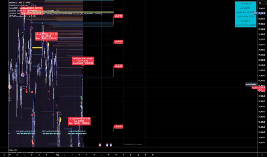
BTC CME Futures Gaps (BTCGapHunt_CME)BTC CME Futures Gaps Indicator
Overview
This indicator visualises price gaps between the daily close and open of Bitcoin CME futures (CME:BTC1!). These gaps are often revisited ("filled") by market price action and may serve as technical targets.
Thanks
... to Maven and the Blockchain Masons (x.com/Masons_DAO) to push me on this topic.
What Is a CME Gap?
CME Bitcoin Futures do not trade 24/7. Gaps form when the market reopens at a different price than where it last closed.
Gaps are often used as support/resistance or liquidity targets.
This indicator tracks, visualises, and alerts on these gaps.
Key Features
Automatic gap detection using daily open/close on CME:BTC1!
Dynamic gap size threshold based on ATR (Average True Range)
Highlight unfilled gaps and track partial fills visually
Alerts for gap formation and fill events
Parameter overlay showing real-time settings
Supported and Overrideable Parameters
ATR Length: Defines the lookback period for ATR calculation (default: 14)
Gap Size Multiplier: Multiplies the ATR to set the dynamic gap threshold (default: 1.0)
Proximity Threshold: Price distance from gap edge to consider it filled (default: 100 USD)
Max Gaps Tracked: Maximum number of concurrent gaps shown (default: 50)
Alerts Enabled: Toggle alerts for gap formation and gap fill events
How the Gap Size Is Calculated
Minimum Gap Size = ATR(14) * Gap Size Multiplier
ATR Length and Gap Size Multiplier are configurable.
Gap threshold adjusts dynamically with market volatility.
Visual Guide
Red Box: Fully unfilled gap
Lemon Yellow Box: Partially filled gap
Right Margin Boxes: Snapshot of unfilled gaps for quick access
Top-Right Panel: Current ATR, Gap Size, Thresholds, etc.
Alerts
Gap Formed: A new gap is detected.
Gap Filled: The gap is either partially or fully filled.
Recommended Timeframes
1H, 4H, 1D (best resolution)
Designed for BTC spot/perpetual charts (e.g., BTCUSD, BTCUSDT)
How To Use
Add the script to your BTC chart.
Monitor red/yellow boxes for unfilled gaps.
Check config panel for current threshold and settings.
Enable alerts via TradingView for real-time updates.
Notes
Up to 50 gaps are tracked (adjustable).
Data source: CME futures via request.security.
All visuals and alerts are time-synced with your chart.
Disclaimer
This script is for educational purposes only. Trade at your own risk.
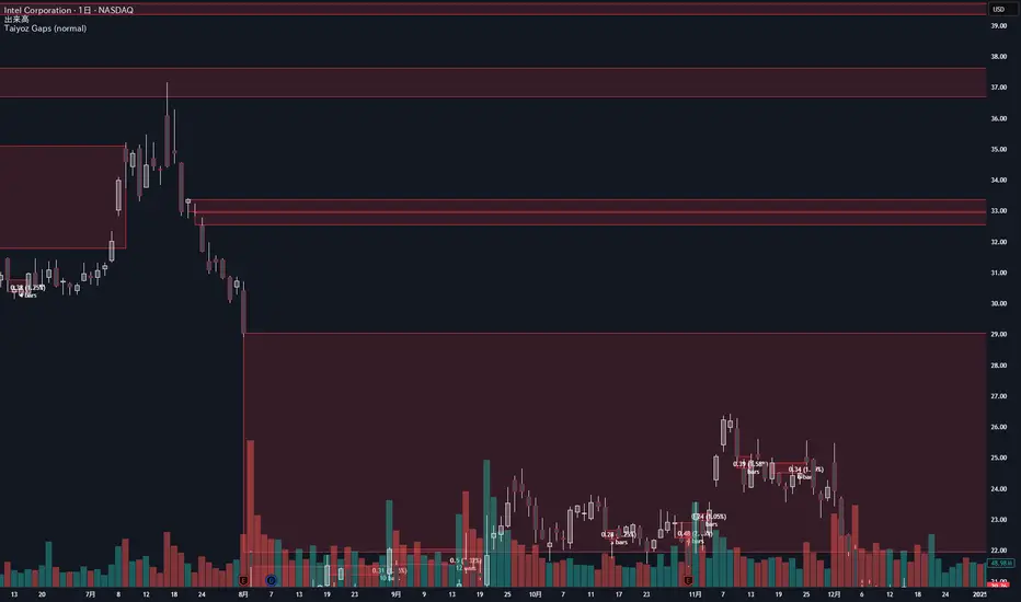
Taiyoz Gaps1. Purpose
Tyoz Gaps highlights “gaps” between yesterday’s close and today’s open directly on your chart. A gap occurs when the opening price is significantly above or below the prior bar’s close. By drawing persistent boxes around each gap, you can instantly see where price left a void and monitor when (or if) that void gets completely filled.
2. Gap Detection Logic
Threshold: A gap is only detected if the open-to-previous-close difference exceeds a user-defined “Minimal Deviation” (percentage of the 14-bar average high-low range).
Direction:
Gap Up: today’s open > yesterday’s close
Gap Down: today’s open < yesterday’s close
3. Box Drawing
For each detected gap, the script draws a rectangular box spanning from yesterday’s close level to today’s open level.
Border & Fill Colors are configurable separately for up-gaps and down-gaps.
Boxes extend to the right as new bars form.
4. Display & Filtering Options
Show Gap Up / Show Gap Down toggles let you hide bullish or bearish gaps independently.
Max Number of Gaps: Limits how many boxes remain on-screen; oldest boxes are removed when the limit is exceeded.
Limit Max Gap Trail Length: Optionally force-close any gap box after a given number of bars, even if unfilled.
5. Closing Logic
Full-Fill Only: A gap box stays visible until price fully “fills” it—i.e., for an up-gap, price must exceed the top edge (yesterday’s close); for a down-gap, price must cross below the bottom edge.
Once filled, the box is removed and a “Gap Closed” alert flag is set.
6. Labels & Alerts
Each active gap can optionally show a label at the gap’s lower edge containing:
Absolute size (in price points) and percentage of the gap
Bar count since the gap formed
Label Text Color and Label Text Size are both user-configurable.
Two built-in alertcondition()s fire when a new gap appears or when a gap closes.