Inside Bar With Alert - RajThis indicator helps you reduce your screen time by giving you consistent alerts on the formation of inside bar candle and it gives you bullish and bearish alerts on breakout of the mother candle. So if you believe in inside strategy this indicator will be helpful for you.
Trend Analysis

Adam Mancini ES Game Plan LevelsThis script plots Support & Resistance levels from Adam Mancini's newsletter.
You can copy and paste levels from Adam's Newsletter to Indicator settings.
You can also add custom text after the support level. For e.g 6550 : Your custom text

RatioETH /US02Y)This indicator shows the normalized performance of ETH multiplied by the inverse of the US 2-Year Treasury Yield (1 / US02Y).
It highlights how ETH reacts to falling or rising short-term yields, normalized as % change from the start of the chart.

Ichimoku Cloud Buy & Custom EMA Exit [With Volume and Filters]1BUY STRATEGY USING ICHIMOKU CLOUD, Ichimoku Cloud Buy with good risk reward ratio

RatioXRP / US02Y)Fetches XRP price and 2-year Treasury yield
Calculates composite: XRP price × (1 / US 2Y yield)
Normalizes that composite to % change from first chart bar
Plots that normalized composite line

RatioBTC/ US02Y)Fetches BTC price and US 2-Year yield (FRED:DGS2)
Computes BTC × (1 / US02Y) to reflect macro impact
Normalizes the composite value to show % change from the first visible value
Plots only the normalized result for clarity
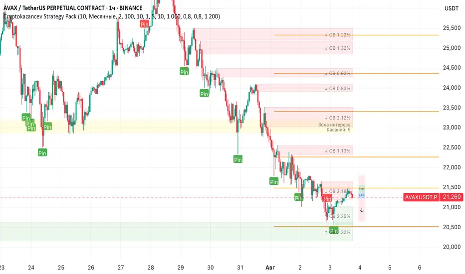
Cryptokazancev Strategy PackCryptokazancev Strategy Pack
Комплексный инструмент для анализа рыночной структуры / Comprehensive Market Structure Analysis Tool
🇷🇺 Описание на русском
Cryptokazancev Strategy Pack by ZeeZeeMon - это мощный набор инструментов для технического анализа, включающий:
• Ордерблоки (Order Blocks) с настройкой количества и цветов
• Пивоты (Pivot Points) различных таймфреймов
• Рыночную структуру с зонами Фибоначчи (0.618, 0.786)
• Разворотные конструкции (пинбары и поглощения)
• Зоны интереса на основе скопления свингов
📊 Основные функции:
1. Ордерблоки
- Автоматическое определение бычьих/медвежьих OB
- Настройка максимального количества блоков (до 30)
- Кастомизация цветов
2. Пивоты
- Поддержка таймфреймов: Дневные/Недельные/Месячные/Квартальные/Годовые
- Уровни Camarilla (P, R1-R4, S1-S4)
3. Рыночная структура
- Четкое определение тренда (UP/DOWN)
- Ключевые уровни Фибо (0.618 и 0.786)
- Настройка глубины анализа (10-1000 баров)
4. Разворотные конструкции
- Обнаружение пинбаров
- Обнаружение поглощений
- Настройка чувствительности
5. Зоны интереса
- Алгоритм кластеризации свингов
- Настройка через ATR-мультипликатор
- Лимит отображаемых зон
🇬🇧 English Description
ZeeZeeMon Pack is a comprehensive market analysis toolkit featuring:
• Order Blocks with customizable count and colors
• Pivot Points for multiple timeframes
• Market Structure with Fibonacci zones
• Reversal patterns (pinbars and engulfings)
• Interest Zones based on swing clustering
📊 Key Features:
1. Order Blocks
- Auto-detection of bullish/bearish OB
- Configurable max blocks (up to 30)
- Custom color schemes
2. Pivot Points
- Supports: Daily/Weekly/Monthly/Quarterly/Yearly
- Camarilla levels (P, R1-R4, S1-S4)
3. Market Structure
- Clear trend detection (UP/DOWN)
- Key Fibonacci levels (0.618 & 0.786)
- Adjustable analysis depth (10-1000 bars)
4. Reversal Patterns
- Smart pinbar detection
- ATR-based engulfing filter
- Sensitivity adjustment
5. Interest Zones
- Swing clustering algorithm
- ATR-multiplier configuration
- Display limit (up to 10 zones)
⚙️ Technical Highlights:
• Built with Pine Script v5
• Performance-optimized
• Well-commented code
• Flexible settings system
⚠️ Важно / Important:
Индикатор в бета-версии. Тестируйте перед использованием в реальной торговле.
This is BETA version. Please test before live trading.
💬 Поддержка / Support:
Комментарии к скрипту / Script comments section
Advanced Forex Currency Strength Meter
# Advanced Forex Currency Strength Meter
🚀 The Ultimate Currency Strength Analysis Tool for Forex Traders
This sophisticated indicator measures and compares the relative strength of major currencies (EUR, GBP, USD, JPY, CHF, CAD, AUD, NZD) to help you identify the strongest and weakest currencies in real-time, providing clear trading signals based on currency strength differentials.
## 📊 What This Indicator Does
The Advanced Forex Currency Strength Meter analyzes currency relationships across 28+ major forex pairs and 8 currency indices to determine which currencies are gaining or losing strength. Instead of relying on individual pair analysis, this tool gives you a bird's-eye view of the entire forex market, helping you:
Identify the strongest and weakest currencies at any given time
Find high-probability trading opportunities by pairing strong vs weak currencies
Avoid ranging markets by detecting when currencies have similar strength
Get clear LONG/SHORT/NEUTRAL signals for your current trading pair
Optimize your trading strategy based on your preferred timeframe and holding period
## ⚙️ How The Indicator Works
### Dual Calculation Method
The indicator uses a sophisticated dual approach for maximum accuracy:
Pairs-Based Analysis: Calculates currency strength from 28+ major forex pairs (EURUSD, GBPUSD, USDJPY, etc.)
Index-Based Analysis: Incorporates official currency indices (DXY, EXY, BXY, JXY, CXY, AXY, SXY, ZXY)
Weighted Combination: Blends both methods using smart weighting for enhanced accuracy
### Smart Auto-Optimization System
The indicator automatically adjusts its parameters based on your chart timeframe and intended holding period:
The system recognizes that scalping requires different sensitivity than swing trading, automatically optimizing lookback periods, analysis timeframes, signal thresholds, and index weights.
### Strength Calculation Process
Fetches price data from multiple timeframes using optimized tuple requests
Calculates percentage change over the specified lookback period
Optionally normalizes by ATR (Average True Range) to account for volatility differences
Combines pair-based and index-based calculations using dynamic weighting
Generates relative strength by comparing base currency vs quote currency
Produces clear trading signals when strength differential exceeds threshold
## 🎯 How To Use The Indicator
### Quick Start
Add the indicator to any forex pair chart
Enable 🧠 Smart Auto-Optimization (recommended for beginners)
Watch for LONG 🚀 signals when the relative strength line is green and above threshold
Watch for SHORT 🐻 signals when the relative strength line is red and below threshold
Avoid trading during NEUTRAL ⚪ periods when currencies have similar strength
Note: This is highly recommended to couple this indicator with fundamental analysis and use it as an extra signal.
### 📋 Parameters Reference
#### 🤖 Smart Settings
🧠 Smart Auto-Optimization: (Default: Enabled) Automatically optimizes all parameters based on chart timeframe and trading style
#### ⚙️ Manual Override
These settings are only active when Smart Auto-Optimization is disabled:
Manual Lookback Period: (Default: 14) Number of periods to analyze for strength calculation
Manual ATR Period: (Default: 14) Period for ATR normalization calculation
Manual Analysis Timeframe: (Default: 240) Higher timeframe for strength analysis
Manual Index Weight: (Default: 0.5) Weight given to currency indices vs pairs (0.0 = pairs only, 1.0 = indices only)
Manual Signal Threshold: (Default: 0.5) Minimum strength differential required for trading signals
#### 📊 Display
Show Signal Markers: (Default: Enabled) Display triangle markers when signals change
Show Info Label: (Default: Enabled) Show comprehensive information label with current analysis
#### 🔍 Analysis
Use ATR Normalization: (Default: Enabled) Normalize strength calculations by volatility for fairer comparison
#### 💰 Currency Indices
💰 Use Currency Indices: (Default: Enabled) Include all 8 currency indices in strength calculation for enhanced accuracy
#### 🎨 Colors
Strong Currency Color: (Default: Green) Color for positive/strong signals
Weak Currency Color: (Default: Red) Color for negative/weak signals
Neutral Color: (Default: Gray) Color for neutral conditions
Strong/Weak Backgrounds: Background colors for clear signal visualization
### 🧠 Smart Optimization Profiles
The indicator automatically selects optimal parameters based on your chart timeframe:
#### ⚡ Scalping Profile (1M-5M Charts)
For positions held for a few minutes:
Lookback: 5 periods (fast/sensitive)
Analysis Timeframe: 15 minutes
Index Weight: 20% (favor pairs for speed)
Signal Threshold: 0.3% (sensitive triggers)
#### 📈 Intraday Profile (10M-1H Charts)
For positions held for a few hours:
Lookback: 12 periods (balanced sensitivity)
Analysis Timeframe: 4 hours
Index Weight: 40% (balanced approach)
Signal Threshold: 0.4% (moderate sensitivity)
#### 📊 Swing Profile (4H-Daily Charts)
For positions held for a few days:
Lookback: 21 periods (stable analysis)
Analysis Timeframe: Daily
Index Weight: 60% (favor indices for stability)
Signal Threshold: 0.5% (conservative triggers)
#### 📆 Position Profile (Weekly+ Charts)
For positions held for a few weeks:
Lookback: 30 periods (long-term view)
Analysis Timeframe: Weekly
Index Weight: 70% (heavily favor indices)
Signal Threshold: 0.6% (very conservative)
### Entry Timing
Wait for clear LONG 🚀 or SHORT 🐻 signals
Avoid trading during NEUTRAL ⚪ periods
Look for signal confirmations on multiple timeframes
### Risk Management
Stronger signals (higher relative strength values) suggest higher probability trades
Use appropriate position sizing based on signal strength
Consider the trading style profile when setting stop losses and take profits
💡 Pro Tip: The indicator works best when combined with your existing technical analysis. Use currency strength to identify which pairs to trade, then use your favorite technical indicators to determine when to enter and exit.
## 🔧 Key Features
28+ Forex Pairs Analysis: Comprehensive coverage of major currency relationships
8 Currency Indices Integration: DXY, EXY, BXY, JXY, CXY, AXY, SXY, ZXY for enhanced accuracy
Smart Auto-Optimization: Automatically adapts to your trading style and timeframe
ATR Normalization: Fair comparison across different currency pairs and volatility levels
Real-Time Signals: Clear LONG/SHORT/NEUTRAL signals with visual markers
Performance Optimized: Efficient tuple-based data requests minimize external calls
User-Friendly Interface: Simplified settings with comprehensive tooltips
Multi-Timeframe Support: Works on any timeframe from 1-minute to monthly charts
Transform your forex trading with the power of currency strength analysis! 🚀

Titan Wick Zone IndicatorThe Titan Wick Zone Indicator visually highlights the upper and lower wick regions of each candlestick on your chart, helping traders instantly identify areas where price was aggressively rejected (top wick) or absorbed (bottom wick). The indicator fills the area above the candle body to the wick high in red (sell zone), and the area below the candle body to the wick low in green (buy zone), both with adjustable opacity for clear visibility.
How to Use:
Spot Rejection and Absorption:
The red-filled upper wick zone marks where upward price moves were sharply rejected by sellers, often indicating supply, resistance, or “stop hunt” zones.
The green-filled lower wick zone marks where downward price moves were absorbed by buyers, pointing to potential demand, support, or accumulation zones.
Enhance Price Action Analysis:
Use these zones to avoid entering trades at price extremes, spot potential reversals, and find areas of confluence with support/resistance, Fibonacci levels, or order blocks.
Risk Management:
The indicator helps visualize where liquidity hunts or false breakouts may occur, so you can better place stop losses outside of volatile wick zones.
Ideal For:
Price action traders, scalpers, and swing traders seeking a visual edge in spotting supply/demand dynamics, liquidity zones, and wick-driven traps.

Ichimoku Trend CycleIchimoku Trend Cycle
A precision dual-trend system combining Ichimoku-based ATR Supertrends — engineered for clarity, reliability, and smart trend detection.
🔷 What is Ichimoku Trend Cycle?
The Ichimoku Trend Cycle harnesses the power of traditional Ichimoku analysis with modern ATR-based supertrend technology:
Alpha Trend: Primary trend detection using Ichimoku conversion & baseline logic
Beta Trend: Secondary confirmation trend with independent ATR calculations
Dual Confirmation Engine : Both trends must align for signal generation
This powerful combination delivers clean, non-repainting Buy/Sell signals while filtering out market noise and false breakouts.
🔍 How It Works
Blue Alpha + Red Beta Trends Align Bullish → BUY Signal
Both Trends Turn Bearish → SELL Signal
You get ONE signal per trend change — no spam, no noise, just crystal-clear direction changes.
⚙️ Core Features
✅ Ichimoku-Enhanced Supertrends
Traditional Ichimoku conversion/baseline logic powering modern ATR bands.
✅ Dual-Trend Confirmation
Alpha and Beta trends must agree — eliminates false signals.
✅ One Alert Per Trend Shift
Clean entries, zero noise, no repeated signals.
✅ Visual Excellence
Color-coded trend lines with high-contrast BUY/SELL labels.
✅ Fully Customizable
Independent settings for both trend systems plus smoothing options.
🎯 Perfect For
Swing Traders wanting confirmed trend changes
Position Traders seeking major trend shifts
Anyone who values clean charts with sharp decision points
🛠 Settings Breakdown
Alpha Trend Settings: Primary trend with conversion/baseline periods + ATR multiplier
Beta Trend Settings: Secondary confirmation trend with independent parameters
Smoothing MA Settings: Optional MA smoothing with Bollinger Bands support
Alert Settings: Customize signal confirmation periods
Candle Color Settings: Fully customizable trend and candle color schemes
✅ Built-in Smart Alerts — Never miss a trend change again
⚡ Zero-lag Performance — Works flawlessly across all timeframes
📈 Strategy-Ready Code — Professional-grade, non-repainting signals
Transform your trading with the precision of Ichimoku and the reliability of dual-trend confirmation.

MACD Indicator [CongTrader]📄 Full Description for Publishing — Advanced MACD Indicator
🔍 Advanced MACD Indicator with Alerts & Visual Zones
This advanced MACD indicator is designed for traders who want enhanced visual clarity, precision, and alert-based trading using the classic MACD formula. It features:
Customizable MACD, Signal, and Histogram lengths
Clean plotting with bullish/bearish crossover highlights
Colored histogram bars based on momentum direction
Alert conditions when MACD crosses above or below Signal
Optional zero-line display and background highlights
🛠️ How to Use:
Use default settings (12, 26, 9) or customize for faster/slower signals
Green histogram = bullish momentum, Red = bearish
Background turns green when MACD crosses above signal (buy cue)
Background turns red when MACD crosses below signal (sell cue)
Histogram bars increase or decrease as momentum strengthens or fades
This tool helps identify:
Momentum shifts
Trend continuation or reversal zones
Entry/exit timing with alerts
Works on:
Any timeframe
All markets (Crypto, Forex, Stocks, Futures)
🔔 Alerts Included:
📈 MACD Bullish Crossover → Triggered when MACD crosses above the Signal line
📉 MACD Bearish Crossover → Triggered when MACD crosses below the Signal line
You can enable these alerts via the TradingView alert system for real-time notifications.
🔎 SEO Keywords (for discovery):
MACD, MACD Histogram, MACD Alert, MACD Signal, MACD Indicator, Momentum Indicator, Advanced MACD, MACD Trading, MACD Visual, MACD Tool, MACD Buy Sell, CongTrader
🙏 Thank You
If you enjoy using this indicator, feel free to leave a thumbs up 👍, comment your thoughts, or follow me for more free trading tools. Your support keeps the community growing!
⚠️ Disclaimer
This script is for educational purposes only and does not constitute financial advice. All trading involves risk. Use this indicator with your own analysis and discretion.
✍️ Created by CongTrader — sharing quality tools for the global trading community..

RSI OB/OS Alert Indicator[CongTrader]📌 RSI OB/OS Alert Indicator by CongTrader
This is a simple yet powerful Relative Strength Index (RSI) indicator designed to help traders identify potential overbought and oversold market conditions using dynamic alerts and clean visual highlights.
🛠️ How to Use
RSI Length: Adjustable (default = 14).
Overbought Level (default = 75): When RSI crosses above this, price may be overextended.
Oversold Level (default = 25): When RSI drops below this, price may be undervalued.
Background will turn green for oversold zones and red for overbought zones.
Use alerts to get notified when RSI enters these critical zones — no need to watch the chart 24/7.
This tool is suitable for:
Scalping
Swing Trading
Range-bound Markets
Momentum Reversals
Works on any timeframe and any asset (Forex, Crypto, Stocks, Indices, Futures).
🔔 Alerts Included
“RSI Overbought” → Triggered when RSI crosses above the overbought level.
“RSI Oversold” → Triggered when RSI crosses below the oversold level.
Setup your alert by right-clicking on the chart or using the TradingView alert panel.
💬 Keywords (for search visibility)
RSI, RSI Alert, RSI Overbought, RSI Oversold, Momentum Indicator, Reversal Signal, RSI Trading, Crypto RSI, Scalping RSI, RSI Tool, RSI Visual, RSI Zones, Technical Indicator, CongTrader
🙏 Thank You
If you find this indicator useful, feel free to give it a thumbs up 👍 or comment below. Your support helps independent script developers like me continue to share free and open-source tools with the community!
⚠️ Disclaimer
This script is for educational purposes only and does not constitute financial advice. Always perform your own research before making trading decisions. Use this tool at your own risk.
✍️ Developed by CongTrader | Follow for more free indicators & tools.

EMA9, EMA200 with Bollinger BandsThe indicator includes the EMA9 line, the EMA200 line and the Bollinger Bands into a single indicator plot.

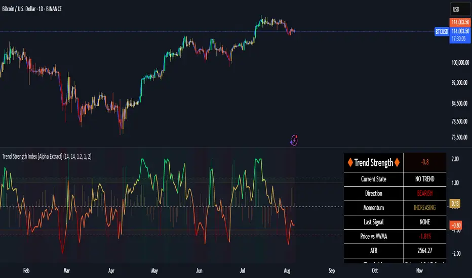
Trend Strength Index [Alpha Extract]The Trend Strength Index leverages Volume Weighted Moving Average (VWMA) and Average True Range (ATR) to quantify trend intensity in cryptocurrency markets, particularly Bitcoin. The combination of VWMA and ATR is particularly powerful because VWMA provides a more accurate representation of the market's true average price by weighting periods of higher trading volume more heavily—capturing genuine momentum driven by increased participation rather than treating all price action equally, which is crucial in volatile assets like Bitcoin where volume spikes often signal institutional interest or market shifts.
Meanwhile, ATR normalizes this measurement for volatility, ensuring that trend strength readings remain comparable across different market conditions; without ATR's adjustment, raw price deviations from the mean could appear artificially inflated during high-volatility periods (like during news events or liquidations) or understated in low-volatility sideways markets, leading to misleading signals. Together, they create a volatility-adjusted, volume-sensitive metric that reliably distinguishes between meaningful trend developments and noise.
This indicator measures the normalized distance between price and its volume-weighted mean, providing a clear visualization of trend strength while accounting for market volatility. It helps traders identify periods of strong directional movement versus consolidation, with color-coded gradients for intuitive interpretation.
🔶 CALCULATION
The indicator processes price data through these analytical stages:
Volume Weighted Moving Average: Computes a smoothed average weighted by trading volume
Volatility Normalization: Uses ATR to account for market volatility
Distance Measurement: Calculates absolute deviation between current price and VWMA
Strength Normalization: Divides price deviation by ATR for a volatility-adjusted metric
Formula:
VWMA = Volume-Weighted Moving Average of Close over specified length
ATR = Average True Range over specified length
Price Distance = |Close - VWMA|
Trend Strength = Price Distance / ATR
🔶 DETAILS Visual Features:
VWMA Line: Blue line overlay on the price chart representing the volume-weighted mean
Trend Strength Area: Histogram-style area plot with dynamic color gradient (red for weak trends, transitioning through orange and yellow to green for strong trends)
Threshold Line: Horizontal red line at the customizable Trend Enter level
Background Highlight: Subtle green background when trend strength exceeds the enter threshold for strong trend visualization
Alert System: Triggers notifications for strong trend detection
Interpretation:
0-Weak (Red): Minimal trend strength, potential consolidation or ranging market
Mid-Range (Orange/Yellow): Building momentum, watch for breakout potential
At/Above Enter Threshold (Green): Strong trend conditions, potential for continued directional moves
Threshold Crossing: Trend strength crossing above the enter level signals increasing conviction in the current direction
Color Transitions: Gradual shifts from warm (red/orange) to cool (green) tones indicate strengthening trends
🔶 EXAMPLES
Strong Trend Entry: When trend strength crosses above the enter threshold (e.g., 1.2), it identifies the onset of a powerful move where price deviates significantly from the mean.
Example: During a rally, trend strength rising from yellow (around 1.0) to green (1.2+) often precedes sustained upward momentum, providing entry opportunities for trend followers.
Consolidation Detection: Low trend strength values in red shades (below 0.5) highlight periods of low volatility and mean reversion potential.
Example: After a sharp sell-off, persistent red values signal a likely sideways phase, allowing traders to avoid whipsaws and wait for orange/yellow transitions as a precursor to recovery.
Volatility-Adjusted Pullbacks: In volatile markets, the ATR component ensures trend strength remains accurate; a dip back to yellow from green during minor corrections can indicate healthy pullbacks within a strong trend.
Example: Trend strength briefly falling to yellow levels (e.g., 0.8-1.1) after hitting green provides profit-taking signals without invalidating the overall bullish bias if the VWMA holds as support.
Threshold Alert Integration: The alert condition combines strength value with the enter threshold for timely notifications.
Example: Receiving a "Strong Trend Detected" alert when the area plot turns green helps confirm Bitcoin's breakout from consolidation, aligning with increased volume for higher-probability trades.
🔶 SETTINGS
Customization Options:
Lengths: VWMA length (default 14), ATR length (default 14)
Thresholds: Trend enter (default 1.2, step 0.1), trend exit (default 1.15, for potential future signal enhancements)
Visuals: Automatic color scaling with red at 0, transitioning to green at/above enter threshold
Alert Conditions: Strong trend detection (when strength > enter)
The Trend Strength Index equips traders with a robust, easy-to-interpret tool for gauging trend intensity in volatile markets like Bitcoin. By normalizing price deviations against volatility, it delivers reliable signals for identifying high-momentum opportunities while the gradient coloring and alerts facilitate quick assessments in both trending and choppy conditions.
Z-Score Mean ReversionThe "Mean Reversion Z-Score" indicator is a statistical tool that helps traders identify potential price reversals by measuring how far the current price has deviated from its mean (average) in terms of standard deviations. Here's what it does:
Calculates the Z-score by comparing the current price to its moving average, then dividing by the standard deviation of prices over a specified period (default 14 periods).
Identifies when the price has moved too far from its mean, suggesting a potential reversion opportunity:
Values above +2 indicate overbought conditions (potential sell)
Values below -2 indicate oversold conditions (potential buy)
Generates clear visual signals:
Green triangle (▲) for buy signals when crossing above -2
Red triangle (▼) for sell signals when crossing below +2
Color-coded background for quick visual reference
Plots reference lines at ±1.5 and ±2.0 standard deviations to help gauge the strength of the current trend.
This indicator is particularly useful for range-bound markets and mean reversion trading strategies, helping traders spot potential entry and exit points based on statistical extremes.

Buy and Sell Signals by Raja Saien📈 Buy and Sell Signals by Raja Saien 💹
"Simple. Clean. Powerful."
🔥 This indicator is built for those who believe in price action and clarity. No confusion, no clutter — just pure EMA crossover logic to catch early trends and filter false moves.
✅ Buy Signal when the 9 EMA crosses above the 21 EMA — indicating momentum shift to the upside.
❌ Sell Signal when the 9 EMA crosses below the 21 EMA — signaling potential downside momentum.
🧠 Designed for traders who trust the trend, respect momentum, and want to stay ahead of the crowd.
🔍 Perfect for scalping, intraday, and swing trading. Combine it with support/resistance or price action zones for even more 🔥 accuracy.
✨ Created by Raja Saien — for serious traders only.
💪 "Indicators don’t make you money, but discipline with clarity does."
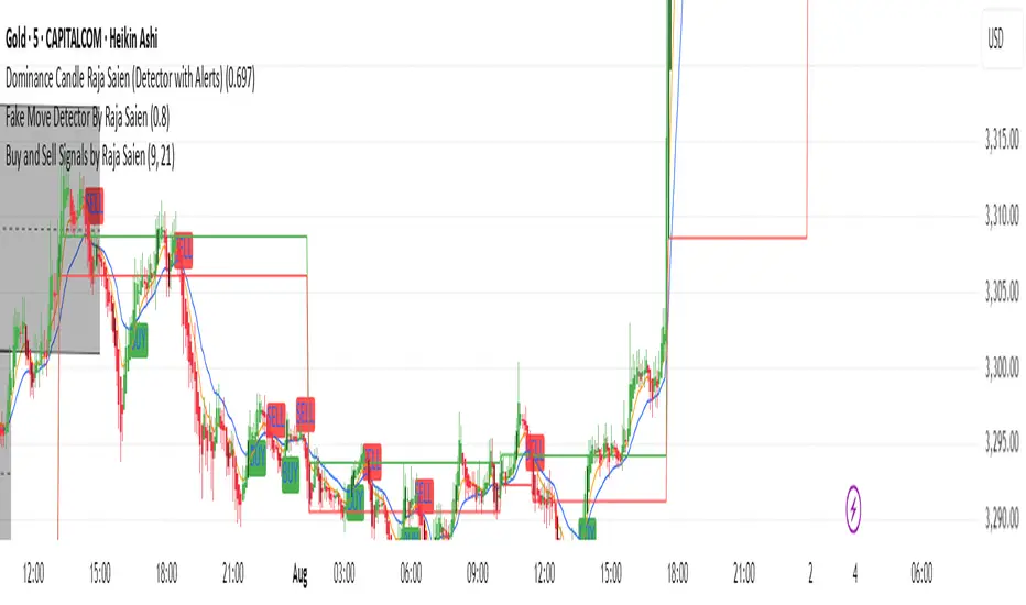
Tradeable Candle Detection By Raja SaienTradeable Candle Detection By Raja Saien
Overview:
This advanced candle detection tool is designed to help traders identify high-quality trade setups and avoid fake moves, based on candle structure, volume, and RSI conditions. Unlike many indicators that are limited to specific sessions, this script works across all market sessions, giving you full flexibility to trade 24/7.
🔍 Key Features:
All Session Support (24/7 Trading)
Detects tradeable setups during any time of the day, including Asian, London, New York, and overlapping hours.
No restriction to any specific session — trade when the opportunity is there!
Fake Move Detection 🚫
Identifies candles with long wicks, small bodies, and low volume — typical signs of manipulation or indecision.
Displays a “No Trade Zone – Fake Move” label to help you avoid poor entries.
Real Move Detection ✅
Highlights candles with strong bodies, short wicks, and high volume — ideal conditions for trade entries.
Helps you focus only on high-probability, momentum-driven moves.
RSI-Based Confirmation
Uses RSI to ensure trade entries align with momentum:
Bullish Entry Allowed: Candle is bullish + RSI between 50–75.
Bearish Entry Allowed: Candle is bearish + RSI between 25–50.
Avoid Trades: RSI is overbought/oversold or showing divergence.
Divergence Detection
Detects bearish divergence in bullish setups and bullish divergence in bearish setups — warns against risky entries.
Visual Zones & Candle Highlights
Plots horizontal lines at candle highs/lows and extended zones based on candle range.
Dominant candles are highlighted in black for quick visual spotting.
⚙️ Custom Inputs:
Minimum Body Size Threshold
Wick-to-Body Ratio for Fake Move
Volume Strength Multiplier
Candle Dominance Precision (% of range)
RSI Period and Source
Optional session filter (can be turned off to enable all-session detection)
🛎️ Alerts Included:
✅ Long Entry Confirmed – Strong bullish candle with supporting RSI
✅ Short Entry Confirmed – Strong bearish candle with supporting RSI
🚫 Fake Move Detected – Weak structure + low volume, no trade
🧠 How to Use:
Wait for a dominant black candle to appear.
Read the label to understand:
✅ Green = Trade Allowed
⚠️ Orange = Avoid (due to RSI or divergence)
🚫 Red = Fake Move (stay out)
Combine with support/resistance, SMC, or price action strategy for confluence.
🟢 "Trade any session, any time – with confidence, precision, and control. Powered by Raja Saien."
Built for traders who value smart entries and reliable signals across all time zones.

Neural Network Buy and Sell SignalsTrend Architect Suite Lite - Neural Network Buy and Sell Signals
Advanced AI-Powered Signal Scoring
This indicator provides neural network market analysis on buy and sell signals designed for scalpers and day traders who use 30s to 5m charts. Signals are generated based on an ATR system and then filtered and scored using an advanced AI-driven system.
Features
Neural Network Signal Engine
5-Layer Deep Learning analysis combining market structure, momentum, and market state detection
AI-based Letter Grade Scoring (A+ through F) for instant signal quality assessment
Normalized Input Processing with Z-score standardization and outlier clipping
Real-time Signal Evaluation using 5 market dimensions
Advanced Candle Types
Standard Candlesticks - Raw price action
Heikin Ashi - Trend smoothing and noise reduction
Linear Regression - Mathematical trend visualization
Independent Signal vs Display - Calculate signals on one type, display another
Key Settings
Signal Configuration
- Signal Trigger Sensitivity (Default: 1.7) - Controls signal frequency vs quality
- Stop Loss ATR Multiplier (Default: 1.5) - Risk management sizing
- Signal Candle Type (Default: Candlesticks) - Data source for signal calculations
- Display Candle Type (Default: Linear Regression) - Visual candle display
Display Options
- Signal Distance (Default: 1.35 ATR) - Label positioning from price
- Label Size (Default: Medium) - Optimal readability
Trading Applications
Scalping
- Fast pace signal detection with quality filtering
- ATR-based stop management prevents signal overlap
- Neural network attempts to reduces false signals in choppy markets
Day Trading
- Multi-timeframe compatible with adaptation settings
- Clear trend visualization with Linear Regression candles
- Support/resistance integration for better entries/exits
Signal Filtering
- Use A+/A grades for highest probability setups
- B grades for confirmation in trending markets
- C-F grades help identify market uncertainty
Why Choose Trend Architect Lite?
No Lag - Real-time neural network processing
No Repainting - Signals appear and stay fixed
Clean Charts - Focus on price action, not indicators
Smart Filtering - AI reduces noise and false signals
Flexible and customizable - Works across all timeframes and instruments
Compatibility
- All Timeframes - 1m to Monthly charts
- All Instruments - Forex, Crypto, Stocks, Futures, Indices
Risk Disclaimer
This indicator is a tool for technical analysis and should not be used as the sole basis for trading decisions. Past performance does not guarantee future results. Always use proper risk management and never risk more than you can afford to lose.

AymaN Entry Signal – With HTF + Pin Bar + Multi TP + BE + V1Ayman Entry Signal – Indicator Description
Overview
Ayman Entry Signal – With HTF + Pin Bar + Multi TP + BE + Stats Panel (V1)
This is a professional-grade Pine Script indicator designed for scalping and intraday trading, with full trade management, multi-confirmation logic, and advanced visualization. The tool is ideal for traders focused on XAUUSD (Gold), Forex, and other volatile instruments who seek both precision entries and structured exits with dynamic risk control.
Main Features
Advanced Entry Logic:
- EMA fast/slow crossovers (configurable)
- Optional conditions: Break of Structure (BoS), Order Block (OB), Fair Value Gap (FVG), Liquidity sweeps, Pin Bars
- HTF confirmation using EMA or BoS
- Real-time entry condition display
Trade Management:
- Dynamic calculation of Entry, SL (with ATR buffer), TP1, TP2
- Supports Partial Close and Break Even logic after TP1
- Visual PnL label (dynamic and color-coded)
Statistics Panel:
- Shows total trades, win/loss/breakeven count, cumulative PnL
- Filter by custom date or session
- Fully customizable panel appearance
Trade Visualization:
- Trade box includes all trade levels (Entry, SL, TP1, TP2)
- Visual display of trade conditions and PnL result
- Option to keep previous trades on chart
Alert System:
- Alerts for Buy and Sell entries
- Compatible with webhook automation systems like MT5/MT4
Customization & Inputs
- Capital & risk per trade
- Value per pip/point
- SL buffer (ATR-based)
- Manual EMA override
- Enable/disable: EMA, BoS, OB, FVG, Liquidity, Pin Bars
- HTF: timeframe + confirmation logic
- Trade box/labels visibility
- Full color customization
- PnL label position: top, center, or bottom
Recommended Use
- Ideal for Gold scalping (XAUUSD), also effective for Forex
- Best on 1m–15m charts; use HTF confirmation from 15m–4H
- Pairs well with semi-automated systems using alerts and webhooks
Disclaimer
Note: This is a non-executing indicator. It does not place trades but provides visual and statistical guidance for professional manual or semi-automated trading.

Zero Lag Moving AverageThis indicator is a trend detection tool that highlights significant momentum shifts with reduced lag. It uses two smoothed moving averages—fast and medium ZLEMAs—optionally enhanced with a Kalman filter to reduce noise. The indicator defines a bullish trend when the price is above both ZLEMAs, and bearish when it is below both. Rather than signaling every crossover, it focuses on trend changes, triggering buy or sell signals only when the trend flips (e.g., from bearish to bullish) and confirms those shifts with two filters: rising volume (above the 20-bar average) and a strong trend based on the ADX indicator. Visual features include optional candle coloring to reflect trend direction and signal markers (triangles) plotted only during a user-defined trading session. This setup helps traders act only on confirmed, high-quality momentum shifts, reducing false positives in low-volume or ranging markets.

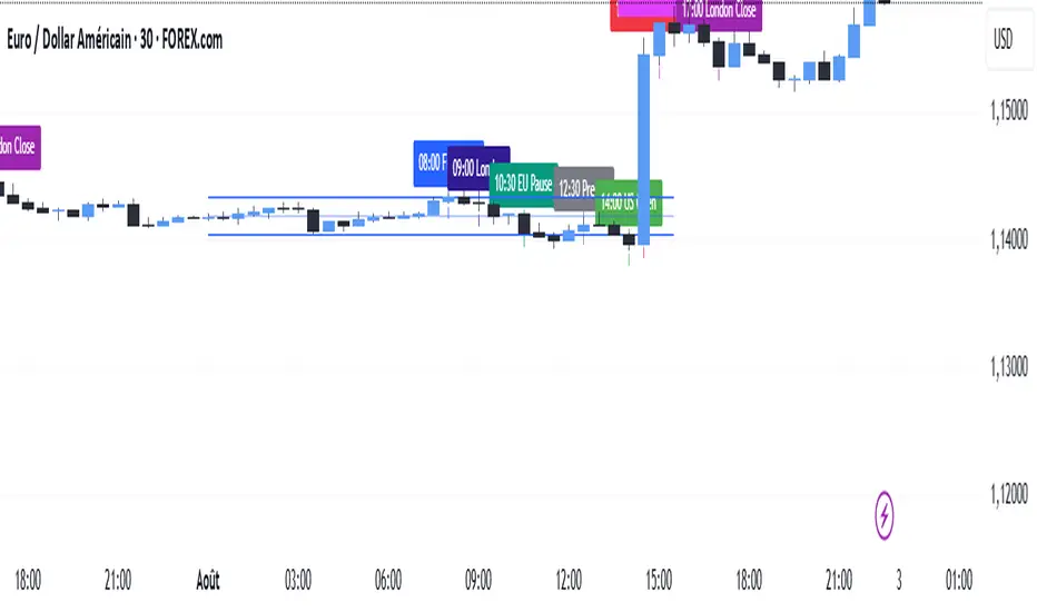
SMC TimingThis indicator (“SMC Timing”) visually marks the exact moments when the market typically experiences large liquidity injections—moments that often trigger strong directional moves. By plotting dashed vertical lines and labels at key session boundaries and news events (Frankfurt open, London open, EU mid-session pause, Pre-US, US open, 14:30 U.S. news releases, 15:00 breakout window, and the London close), it draws your attention to the times when stop-runs and institutional orders tend to pile into the market.
Traders can use these timing zones to:
Anticipate liquidity sweeps where smart-money often liquidates weak positions or hunts stops.
Plan higher-probability entries just before or directly after these injections, reducing slippage and improving execution.
Improve win-rate consistency by aligning your trades with the natural ebb and flow of institutional flow rather than fading it.
With customizable session toggles, a “today-only” filter, and a small vertical offset to keep markers clear of price bars, this tool seamlessly integrates into any chart. Positioning yourself around these highlighted times helps you capture the bulk of intraday moves and avoids getting caught in low-liquidity chop.
BERLIN-MAX 1V.5BERLIN-MAX 1V.5 is a comprehensive trading indicator designed for TradingView that combines multiple advanced strategies and tools. It integrates EMA crossover signals, UT Bot logic with ATR-based trailing stops, customizable stop-loss and target multipliers per timeframe, Hull Moving Averages with color-coded trends, linear regression channels for support and resistance, and a multi-timeframe RSI and volume signal table. This script aims to provide clear entry and exit signals for scalping and swing trading, enhancing decision-making across different market conditions.