TPO[Fixed Range, Anchored, Bars Back]TPO Bars Back, Fixed Range and Anchored
Overview
The TPO Profile (Time Price Opportunity Profile) is a powerful market profile indicator that displays the amount of time price spent at different levels during a specified period. Unlike traditional volume profile indicators that show volume distribution, TPO Profile shows time distribution , providing insights into where price has spent the most time and identifying key support and resistance levels.
Key Advantages Over TradingView's Built-in TPO
Simplified Composite Creation : Automatically creates TPO profiles for any time range without manual split/merge operations
Instant Value Area Calculation : Immediately shows Value Area, POC, VAH, and VAL for your selected period
No Manual Assembly Required : TradingView's native TPO requires you to manually split sessions and merge them to create composites - this indicator does it automatically
Flexible Time Ranges : Create composites for any custom time period (multiple days, weeks, specific events) with a few clicks
Real-time Composite Updates : Anchor mode creates live composites that update as new data arrives
Multiple Composite Analysis : Easily compare different time periods without the tedious manual process
Key Features
Core Functionality
Time-Based Analysis : Shows time spent at each price level rather than volume
Configurable Time Blocks : Use any timeframe for TPO counting (30min, 1H, 4H, etc.)
Multiple Price Levels : Adjustable from 5 to 200 levels for granular analysis
Point of Control (POC) : Automatically identifies the price level with highest time activity
Value Area Calculation : Shows the price range containing 70% (configurable) of time activity
Automatic Composite Generation : Creates multi-session composites without manual intervention
Three Operating Modes
1. Bars Back Mode
Analyzes the last N bars from the current bar
Perfect for recent market activity analysis
Range: 10-500 bars
Use Case : Intraday analysis, recent session review
2. Fixed Range Mode
Analyzes a specific time period between start and end times
Ideal for historical analysis of specific events
Creates perfect composites for multi-day periods
Use Case : Earnings periods, news events, specific trading sessions, weekly/monthly composites
3. Anchor Mode (NEW)
Starts from a specific time and extends to the current bar
Dynamically updates as new bars form
Perfect for building live composites from any starting point
Use Case : Live session monitoring, event-based analysis from a specific point, growing composites
Visual Elements
TPO Bars
Horizontal bars showing time distribution at each price level
Longer bars = more time spent at that level
Color-coded to distinguish Value Area from outlying levels
Point of Control (POC)
Red line marking the price level with highest time activity
Most significant support/resistance level
Configurable line style (Solid/Dashed/Dotted) and width
Value Area High/Low (VAH/VAL)
Green and Orange lines marking the boundaries of the Value Area
Shows the price range containing the specified percentage of time activity
Optional display with customizable line styles
Single Print Detection
Identifies price levels touched by only one time block
Display options: Lines or Boxes
Purple color highlighting these significant levels
Often act as strong support/resistance in future trading
Customization Options
Time Block Configuration
Block Time : Choose timeframe for TPO counting (30min, 1H, 4H, etc.)
Allows analysis at different time granularities
Higher timeframes = broader perspective, Lower timeframes = finer detail
Visual Styling
Line Styles : Solid, Dashed, or Dotted for all line elements
Line Widths : 1-5 pixels for POC, VAH, and VAL lines
Colors : Fully customizable colors for all elements
Transparency : Adjustable transparency for better chart readability
Label Management
Show/Hide Labels : Toggle POC, VAH, VAL labels
Font Sizes : Tiny, Small, Normal, Large, Huge
Label Positioning : 8 different position options relative to lines
Offset Controls : Fine-tune label positioning
Line Extension
Level Offset Right : Controls how far lines extend
Smart extension logic:
Value ≤ 0: Infinite extension (extend.right)
Value ≥ 1: Extends exactly N bars ahead
Trading Applications
Support & Resistance
POC often acts as strong support/resistance
Value Area boundaries provide key levels
Single prints frequently become significant levels
Market Structure Analysis
Identify areas of price acceptance (thick TPO bars)
Spot areas of price rejection (thin TPO bars)
Understand where market participants are comfortable trading
Composite Profile Analysis
Create multi-day, weekly, or monthly composites instantly
Compare different composite periods without manual work
Analyze longer-term price acceptance levels
Build composites around specific events or announcements
Session Analysis
Monitor intraday session development in real-time
Compare different sessions (London, New York, Asia)
Track how profiles change throughout the trading day
Build live composites across multiple sessions
Event Analysis
Use Fixed Range mode for earnings, news events
Use Anchor mode to track price development from specific events
Compare pre/post event price acceptance levels
Create event-based composites automatically
Input Parameters
Mode Selection
Mode : Bars Back | Fixed Range | Anchor
Bars Back : Number of bars to analyze (10-500)
Start Time : Beginning time for Fixed Range and Anchor modes
End Time : Ending time for Fixed Range mode only
Analysis Configuration
Block Time : Timeframe for TPO blocks (e.g., "30" for 30-minute blocks)
TPO Levels : Number of price levels (5-200)
Value Area % : Percentage for Value Area calculation (50-95%)
Display Options
Show POC : Display Point of Control line
Show Value Area : Display Value Area box
Show VAH/VAL Lines : Display Value Area boundary lines
Show Single Prints : Display single print detection
Single Print Style : Lines or Boxes
Styling Controls
Colors : TPO, POC, Value Area, VAH, VAL, Single Print colors
Line Styles : POC, VAH, VAL line styles
Line Widths : POC, VAH, VAL line widths
Labels : Show/hide, font size, position, offset controls
Technical Details
Calculation Method
Divides the price range into equal levels based on TPO Levels setting
For each time block, determines which price levels it crosses
Adds +1 count to each crossed level
Identifies POC as the level with highest count
Calculates Value Area by expanding from POC until target percentage is reached
Performance Considerations
Historical data limited to prevent buffer overflow errors
Smart bounds checking for different timeframes
Optimized cleanup routines to prevent drawing object accumulation
Pine Script Version
Built on Pine Script v6
Uses modern Pine Script best practices
Efficient array handling and drawing object management
Best Practices
Timeframe Selection
Block Time = Chart Timeframe : Traditional TPO approach
Block Time > Chart Timeframe : Smoother, broader perspective
Block Time < Chart Timeframe : More granular, detailed analysis
Level Count Guidelines
Low levels (10-20) : Better for swing trading, major levels
High levels (50-100) : Better for scalping, precise entries
Very high levels (100+) : For very detailed analysis
Mode Selection
Bars Back : Daily analysis, recent activity
Fixed Range : Historical events, specific periods, manual composites
Anchor : Live monitoring, event-based analysis, growing composites
Composite Creation Workflow
Select Fixed Range or Anchor mode
Set your desired start time (and end time for Fixed Range)
Adjust TPO Levels for desired granularity
Enable VAH/VAL lines to see Value Area boundaries
The composite profile generates automatically with all key levels
This indicator eliminates the tedious manual process of creating composite TPO profiles in TradingView. Instead of splitting sessions and manually merging them, you get instant composite analysis with automatic Value Area calculation, POC identification, and single print detection. The combination of time-based analysis, multiple operating modes, and extensive customization options makes it a powerful tool for understanding market structure and price acceptance levels across any time period.
Volume

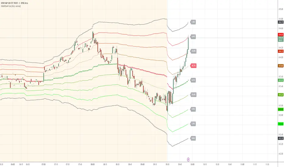
VWAP Deviation Channels with Probability (Lite)VWAP Deviation Channels with Probability (Lite)
Version 1.2
Overview
This indicator is a powerful tool for intraday traders, designed to identify high-probability areas of support and resistance. It plots the Volume-Weighted Average Price (VWAP) as a central "value" line and then draws statistically-based deviation channels around it.
Its unique feature is a dynamic probability engine that analyzes thousands of historical price bars to calculate and display the real-time likelihood of the price touching each of these deviation levels. This provides a quantifiable edge for making trading decisions.
Core Concepts Explained
This indicator is built on three key concepts:
The VWAP (Volume-Weighted Average Price): The dotted midline of the channels is the session VWAP. Unlike a Simple Moving Average (SMA) which only considers price, the VWAP incorporates volume into its calculation. This makes it a much more significant benchmark, as it represents the true average price where the most business has been transacted during the day. It's heavily used by institutional traders, which is why price often reacts strongly to it.
Standard Deviation Channels: The channels above and below the VWAP are based on standard deviations. Standard deviation is a statistical measure of volatility.
- Wide Bands: When the channels are wide, it signifies high volatility.
- Narrow Bands: When the channels are tight and narrow, it signifies low volatility and
consolidation (a "squeeze").
The Conditional Probability Engine: This is the heart of the indicator. For every deviation level, the script displays a percentage. This percentage answers a very specific question:
"Based on thousands of previous bars, when the last candle had a certain momentum (bullish or bearish), what was the historical probability that the price would touch this specific level?"
The probabilities are calculated separately depending on whether the previous candle was green (bullish) or red (bearish). This provides a nuanced, momentum-based edge. The level with the highest probability is highlighted, acting as a "price magnet."
How to Use This Indicator
Recommended Timeframes:
This indicator is designed specifically for intraday trading. It works best on timeframes like the 1-minute, 5-minute, and 15-minute charts. It will not display correctly on daily or higher timeframes.
Recommended Trading Strategy: Mean Reversion
The primary strategy for this indicator is "Mean Reversion." The core idea is that as the price stretches to extreme levels far away from the VWAP (the "mean"), it is statistically more likely to "snap back" toward it.
Here is a step-by-step guide to trading this setup:
1. Identify the Extreme: Wait for the price to push into one of the outer deviation bands (e.g., the -2, -3, or -4 bands for a buy setup, or the +2, +3, or +4 bands for a sell setup).
2. Look for the High-Probability Zone: Pay close attention to the highlighted probability label. This is the level that has historically acted as the strongest magnet for price. A touch of this level represents a high-probability area for a potential reversal.
3. Wait for Confirmation: Do not enter a trade just because the price has touched a band. Wait for a confirmation candle that shows momentum is shifting.
- For a Buy: Look for a strong bullish candle (e.g., a green engulfing candle or a hammer/pin
bar) to form at the lower bands.
- For a Sell: Look for a strong bearish candle (e.g., a red engulfing candle or a shooting star)
to form at the upper bands.
Define Your Exit:
- Take Profit: A logical primary target for a mean reversion trade is the VWAP (midLine).
- Stop Loss: A logical place for a stop-loss is just outside the next deviation band. For
example, if you enter a long trade at the -3 band, your stop loss could be placed just
below the -4 band.
Disclaimer: This indicator is a tool for analysis and should not be considered a standalone trading system. Trading involves significant risk, and past performance is not indicative of future results. Always use this indicator in conjunction with other forms of analysis and sound risk management practices.
Normalized Open InterestNormalized Open Interest (nOI) — Indicator Overview
What it does
Normalized Open Interest (nOI) transforms raw futures open-interest data into a 0-to-100 oscillator, so you can see at a glance whether participation is unusually high or low—similar in spirit to an RSI but applied to open interest. The script positions today’s OI inside a rolling high–low range and paints it with contextual colours.
Core logic
Data source – Loads the built-in “_OI” symbol that TradingView provides for the current market.
Rolling range – Looks back a user-defined number of bars (default 500) to find the highest and lowest OI in that window.
Normalization – Calculates
nOI = (OI – lowest) / (highest – lowest) × 100
so 0 equals the minimum of the window and 100 equals the maximum.
Visual cues – Plots the oscillator plus fixed horizontal levels at 70 % and 30 % (or your own numbers). The line turns teal above the upper level, red below the lower, and neutral grey in between.
User inputs
Window Length (bars) – How many candles the indicator scans for the high–low range; larger numbers smooth the curve, smaller numbers make it more reactive.
Upper Threshold (%) – Default 70. Anything above this marks potentially crowded or overheated interest.
Lower Threshold (%) – Default 30. Anything below this marks low or capitulating interest.
Practical uses
Spot extremes – Values above the upper line can warn that the long side is crowded; values below the lower line suggest disinterest or short-side crowding.
Confirm breakouts – A price breakout backed by a sharp rise in nOI signals genuine engagement.
Look for divergences – If price makes a new high but nOI does not, participation might be fading.
Combine with volume or RSI – Layer nOI with other studies to filter false signals.
Tips
On intraday charts for non-crypto symbols the script automatically fetches daily OI data to avoid gaps.
Adjust the thresholds to 80/20 or 60/40 to fit your market and risk preferences.
Alerts, shading, or additional signal logic can be added easily because the oscillator is already normalised.

Iceberg DetectorThis Pine-script indicator helps you spot potential “iceberg” order activity by highlighting bars where volume spikes well above its average while price movement remains unusually muted. It’s purely a heuristic—no true bid/ask or futures order‐flow data is used—so treat every signal as an invitation to investigate, not as a standalone buy/sell trigger.
How It Works • Volume vs. Volume-SMA: The script compares each bar’s total volume to an N-bar simple moving average. • Price Movement vs. Movement-SMA: It measures the bar’s percent change (|close–open|/open×100) against its own N-bar SMA. • Sensitivity Slider: From 1 (loose filter) to 10 (strict filter), you control how extreme the volume spike (and muted move) must be to fire a signal. • Pivot-Style Extremes Filter: Short signals only appear when price is at or very near a recent local high, and long signals only when price is at or very near a recent local low. This dramatically cuts down “noise” on lower timeframes—script execution halts on intraday charts below 1 H.
How to Use
Apply to an hourly (or higher) chart.
Tweak “Length” parameters for your preferred look-back on volume and movement SMAs.
Adjust “Sensitivity” from 1 (more signals, weaker divergences) up to 10 (very rare, extreme divergences).
Watch for red triangles above bars (Iceberg-Short) and green triangles below (Iceberg-Long).
Important Disclaimers • This is NOT a genuine order-flow or footprint tool—it only approximates delta by bar direction. • Always contextualize Short signals near the lower end of a range or support zone, and Long signals near the upper end of a range or resistance zone. • Use additional confirmation (price patterns, larger-timeframe pivots, traditional volume/price analysis) before risking real capital.
By combining volume spikes with muted price action at range extremes, you gain a fresh lens on where hidden large orders might be lurking—without needing a dedicated order-flow feed. Use it as an idea‐generator, not as gospel

Liquidity Rush:VSMarkettrend Liquidity Rush (LR) Indicator – Market Move Detector
🔍 What is Liquidity Rush?
The Liquidity Rush (LR) indicator detects the flow of big money (institutional or high-volume traders) into a stock over a selected time frame. It visually represents the net liquidity inflow/outflow and compares it with the stock's total market capitalization (MC) to give you a contextual view of its significance.
📊 Indicator Output:
You’ll see a label like:
250.07 Cr / 0.23%MC
250.07 Cr → Liquidity change (buy/sell impact) in the selected timeframe.
0.23%MC → This liquidity is 0.23% of the stock’s market cap.
This helps you judge:
Whether the move is impactful or just noise.
If smart money is likely entering or exiting.
⚠️ Why % of Market Cap?
Volume or liquidity alone doesn't tell the full story. 100 Cr inflow in a 5,000 Cr company is significant (2%), but the same in a 50,000 Cr company is not impactful (0.2%). That’s why this indicator shows LR as a % of MC — to give you contextual importance.
🟢 When is it Powerful?
If LR % > 2% of market cap consistently → Strong entry signals likely from big players.
If LR jumps suddenly after a dull phase → Watch for breakout or reversal.
🎨 Color Coding (Based on Liquidity Amount):
<10 Cr → Low (likely retail-driven)
>10–20 Cr → Moderate (watchful)
>20–100 Cr → Heating up
>100 Cr → High liquidity activity (possible institutional move)
📅 Best Timeframes:
Use it on Daily, Weekly for quick flow detection.
Combine with price action or volume for confirmation.
Use Cases:
Identify breakouts with backing.
Filter fake moves with weak liquidity.
Spot smart money entry before price jumps.
Note : It does not means that stock with low LR are bad and not move, many stock move with low LR also, This indicator need not to be used in isolation.

Previous Day O H L C Calculation By Md//@version=6
indicator("Previous Day O H L C Calculation By Md", overlay=true)
// Check if the previous daily candle is green (bullish) or red (bearish)
previousCandleBullish = close > open
previousCandleBearish = close < open
// Calculate the difference for bullish candles: previous day's high minus previous day's open
bullishCalculation = high - open
// Calculate the difference for bearish candles: previous day's low minus previous day's close
bearishCalculation = low - close
// Show the result at the top of the current daily candle if the previous candle was bullish
if previousCandleBullish
label.new(bar_index, high, "Bullish Calc: " + str.tostring(bullishCalculation), color=color.green, textcolor=color.white, style=label.style_label_left, size=size.small)
// Show the result at the bottom of the current daily candle if the previous candle was bearish
if previousCandleBearish
label.new(bar_index, low, "Bearish Calc: " + str.tostring(bearishCalculation), color=color.red, textcolor=color.white, style=label.style_label_left, size=size.small)

COBRA X Mastermind – Ultimate Smart Panel 🐍 COBRA X Mastermind – Ultimate Smart Panel
The ultimate evolution of smart market analysis.
This indicator combines advanced trend filtering (EMA200 + VWAP), Price Action (BoS, Engulfing), Volume Spikes, Fair Value Gaps (FVG), Hidden Divergences, and breakout risk assessment — all displayed in a clean, professional panel.
✅ Real-time Buy/Sell signal with validity & strength
✅ Live risk metrics: TP%, SL%, and breakout alerts
✅ Full volume analysis: VWAP, POC, Spike Detection
✅ Fair Value Gap + Hidden Divergence Detection
✅ Clean screener panel for scalping or swing trading
🔐 Code is fully protected.
For access or licensing, contact: .

Hope Trend Trader v1🚀 Smart Decisions. Simple Signals. No Repainting.
The Hope Trend Trader v1 is a premium trading tool crafted for precision and consistency — built to serve both scalpers and swing traders who value clarity, confidence, and clean execution.
🔐 Invite-Only Script
Access is limited to protect the integrity of the strategy and support serious traders only.
🔍 Key Highlights:
✅ 100% Non-Repainting Signals – What you see is what you trade
✅ Accurate Buy/Sell labels at real-time turning points
✅ Built-in Multi-Timeframe Dashboard to guide your trend bias
✅ Volatility filter to help avoid choppy/noisy entries
✅ Optimized for Gold, Forex, Indices & Crypto
Unlike generic indicators, Hope Trend Trader v1 adapts to live market dynamics and does not repaint past signals — giving you the confidence to act without second-guessing.
💡 Perfect for traders who need reliable confirmations, clean visual guidance, and a strategy they can trust.
📩 Access By Request Only
DM us for access or reach out via Telegram 👉 @vineethruby
🔗 Join our premium trading circle today.

Liquidity Point LinesLiquidity Point Lines
The "Liquidity Point Lines" indicator helps traders identify potential areas of liquidity in the market by drawing lines at specific price levels where significant "liquidation events" may have occurred. These events are determined by analyzing the MACD Histogram and identifying pivot points that suggest strong movements, which are often associated with the flushing out of short or long positions.
How It Works
This indicator leverages the MACD Histogram to gauge the strength of price momentum. It then identifies pivot highs and lows within the MACD Histogram's values. When a significant pivot is detected, the indicator interprets this as a potential "liquidity point" — a price level where a substantial amount of buy or sell orders (often due to liquidations) may have been executed.
The indicator distinguishes between:
Shorts Liquidation Points (Resistance): These are identified when the MACD Histogram registers a pivot high, suggesting a strong upward movement that could have liquidated short positions. Lines are drawn at the high price of the bar where this pivot occurred.
Longs Liquidation Points (Support): Conversely, these are identified when the MACD Histogram registers a pivot low, indicating a strong downward movement that might have liquidated long positions. Lines are drawn at the low price of the bar where this pivot occurred.
Key Features and Settings
The "Liquidity Point Lines" indicator offers extensive customization to tailor its sensitivity and visual representation:
MACD Settings for Liquidity: Configure the underlying MACD calculation with adjustable Fast Length, Slow Length, Source, Signal Smoothing, and MA Types (SMA/EMA) for both the Oscillator and Signal Line.
Liquidity Points Settings:
Pivot Lookback Left/Right: Define the number of bars to look back on either side to identify a pivot in the MACD Histogram.
Dynamic Strength Thresholds: This powerful feature allows the indicator to dynamically calculate the significance of a liquidation event. When enabled, it uses the average absolute histogram value over a specified Dynamic Threshold Lookback Period and applies Small and Medium Threshold Factors to determine the strength (Small, Medium, or Large) of the liquidity point.
Fixed Strength Thresholds: If dynamic thresholds are disabled, you can set fixed numerical values for Small and Medium Histogram Thresholds to define the strength categories.
Color & Style Customization: Assign distinct colors for Small, Medium, and Large liquidation points, choose the Line Style (Solid, Dashed, Dotted), and set the Label Text Color.
Label X Offset (To Right): Adjust the horizontal position of the liquidity point labels on your chart.
Liquidity Points Management:
Max Active Liquidity Lines: Control the maximum number of liquidity lines displayed simultaneously on your chart. Older lines are automatically removed to maintain clarity, except for lines that have been "touched" (i.e., price has interacted with that liquidity level).
Visual Interpretation
Each liquidity line is colored according to the strength of the detected liquidation event, making it easy to visually assess the potential significance of the price level. Lines extend to the right, serving as ongoing reference points. When the price interacts with a liquidity line (i.e., "touches" it), the line and its corresponding label are removed, indicating that the liquidity at that level may have been absorbed.
This indicator can be a valuable tool for identifying potential support and resistance levels, understanding market reactions to "liquidation cascades," and informing your trading decisions.

EMA+VWAP System4 EMAs u. 3 VWAPs
The preset values of the EMAs can be changed as required.
1) EMA 7
2) EMA 23
3) EMA 50
4) EMA 70
1) VWAP Daily
2) VWAP Weekly
3) VWAP Monthly

Reversão Sobrevenda/Sobrecompra com ExaustãoPrice Touches/Exceeds Lower Bollinger Band: Indicates oversold conditions.
Oversold RSI and/or Divergence: RSI below 30 (strong) or bullish divergence (price makes lower low, RSI makes higher low).
Decreasing Volume: Selling volume decreases as price hits the lower band and RSI becomes oversold, suggesting selling pressure is ending.
Bullish Reversal Candlestick: Formation of a bullish reversal candlestick pattern near the lower band (e.g., Hammer, Bullish Engulfing, Piercing Pattern).
Sell Signal (Bearish Reversal):
Price Touches/Exceeds Upper Bollinger Band: Indicates overbought conditions.
Overbought RSI and/or Divergence: RSI above 70 (strong) or bearish divergence (price makes higher high, RSI makes lower high).
Decreasing Volume: Buying volume decreases as the price reaches the upper band and the RSI becomes overbought, suggesting that buying pressure is ending.
Bearish Reversal Candlestick: Formation of a bearish reversal candlestick pattern near the upper band (Ex: Shooting Star, Bearish Engulfing, Dark Cloud).

Fibo_Ma with Toggleable 200 EMA Filter Fibo_MA with Toggleable 200 EMA Filter
Description:
This multi-functional indicator blends Fibonacci-based moving averages with customizable filters and visual enhancements to support various trading strategies. It offers traders the flexibility to analyze trend dynamics and potential reversal zones using multiple tools in one script.
Key Features:
🔹 Fibonacci MA Framework
Leverage a range of Fibonacci numbers (from 1 to 233) to visualize trend-based EMA lines with optional smoothing. Users can choose the moving average method (SMA, EMA, RMA, WMA, VWMA, etc.) and adjust the smoothing length for fine-tuned analysis.
🔹 VWAP and Dynamic EMA Tools
Includes VWAP and a color-coded 200 EMA that updates based on trend slope. These help visualize key dynamic support and resistance levels.
🔹 Multi-Timeframe Support
Option to switch the data source to a higher timeframe for broader trend confirmation.
🔹 Signal Highlights
Bullish and bearish signal markers based on crossovers with optional filters.
Background highlights show whether the current price is above or below a smoothed EMA line.
🔹 Customizable Filters
Enable or disable filters like:
200 EMA Position Filter (only signal when price is above or below the 200 EMA)
ATR Filter (filter out low-volatility candles)
Volume Filter (signal only on sufficient volume)
🔹 Cross Alerts & Labels
Built-in alert conditions for crossovers and customizable signal display options—labels, shapes, and background highlights.
🔹 Advanced Options
Toggle forecast line visibility and offset
Fine-tune alerts using price action relative to the smooth trend line
Optional tail and cross label display for deeper chart customization
How to Use:
This tool can support trend-following, breakout, and pullback strategies. Customize the MA types, filters, and timeframe settings to match your trading style. The script is designed for visual clarity while offering rich configurability for discretionary and system-based traders.

MCDX with MAsMCDX with MAs – Market Participant Flow Analyzer
📌 Overview
The MCDX with MAs indicator provides insight into market behavior by visualizing the money flow of three key participant types—Bankers (Smart Money), Hot Money, and Retail Traders—through custom RSI logic and moving averages. It helps traders assess which group is driving price action and how this aligns with broader market trends.
🔍 What Makes This Indicator Unique?
Unlike generic mashups, this tool builds on the MCDX concept by:
Using custom RSI logic per participant group
Applying independent MAs to each RSI stream
Supporting multi-timeframe analysis
Offering clear color-coded trends and strengths
Enabling signal generation based on group behavior and crossover dynamics
⚙️ How It Works
RSI Logic (Per Group)
Each group’s RSI uses:
A base threshold (neutral zone)
A sensitivity multiplier (to control reactivity)
Visual capping (default max: 20) for easier histogram comparison
Moving Averages
Each RSI stream has its own moving average:
Selectable types: EMA, SMA, WMA, RMA, SMMA
Bankers include three MAs: short, mid, and long-term
MAs are used to identify trends and filter noise
📊 Visual Output & Color Logic
Each group is represented by a histogram with conditional coloring:
Bankers:
RSI > MA → Strong Green
RSI < MA → Light Green (or user-defined)
Hot Money:
RSI > MA → Bright Yellow
RSI < MA → Light Yellow
Retail:
RSI > MA → Bright Red
RSI < MA → Light Red
This makes it easy to visually assess which market participant is in control.
🟢 Bullish Conditions
Banker RSI rising and above at least one MA
Retailer RSI falling (retail exiting as smart money enters)
Hot Money RSI rising and above its MA
Stronger signal if Bankers or Hot Money RSI is recovering from extreme low values
🔴 Bearish Conditions
Banker RSI falling and below all MAs
Retail RSI rising (retail buying into weakness)
Hot Money RSI declining
Stronger signal if Bankers or Hot Money RSI are near extreme high levels
🛠️ Customization Features
Timeframe Input: Analyze flow from any timeframe
Static Reference Levels: Level 1, 2, 3 for support/resistance
Extreme Thresholds: Define extreme_high and extreme_low zones
MA Options: Choose MA type and length per RSI stream
🧠 Strategy Ideas
Combine with price action and volume for higher confluence
Use Banker RSI on a higher timeframe to filter trades on lower TFs
Monitor divergences between Retail and Banker flows
Use crossovers and slope direction for entries/exits
🔔 Alert Logic (Optional, Customizable in Pine Script)
Banker RSI crosses MA
RSI enters or exits extreme zones
RSI group divergence or alignment
Trend shift confirmation from all groups
✅ Best Suited For
Swing traders spotting accumulation/distribution zones
Traders seeking confirmation from institutional vs retail behavior
Users looking to combine money flow logic with MA-based trend confirmation
⚠️ Important Notes
This indicator is not financial advice. Use at your own discretion and with proper risk management.
Backtest thoroughly before applying in live markets.
Best used on a clean chart with no overlapping indicators for clarity.
Alert logic is not built-in but can be added using Pine Script.
Market behavior can vary greatly; always combine with other tools (e.g., support/resistance, candlestick patterns).
🧾 Summary
The MCDX with MAs indicator is a complete tool for visualizing and interpreting the behavior of market participants across different timeframes. By combining enhanced RSI logic, moving averages, and color-coded money flow dynamics, traders gain a structured way to identify trend strength, turning points, and entry/exit signals.

EMA Color Candle Volume + Dashboard with TP/SLBuy/Sell Signals from EMA Crossover
This indicator uses a short-term EMA, a long-term EMA, and an average EMA to detect points where the short-term EMA crosses above or below both the long-term and average EMAs. These crossover points act as buy or sell signals.
Candle Colors Based on Volume Pressure
The indicator changes the candlestick colors based on buying and selling pressure calculated from trading volume. There are four main colors that indicate the strength of buying or selling pressure for each candle:
Blue: High buying volume – Green candle with volume above average
Green: Normal buying volume – Green candle with volume at or below average
Red: Normal selling volume – Red candle with volume at or below average
Orange: High selling volume – Red candle with volume above average
Volume Pressure Calculation
The calculation uses the total volume of each candle without separating by price level (e.g., delta volume). Candle color determines the weighting of pressure:
If the candle is green (Close > Open), it is considered buy pressure, weighted 0.7 to buying and 0.3 to selling
If the candle is red (Close < Open), it is considered sell pressure, weighted 0.7 to selling and 0.3 to buying
A 20-period SMA is then calculated to compare against the current buy/sell pressure.
BUY/SELL Labels with Volume
When enabled, a “BUY” or “SELL” label appears on the candle along with the trading volume.
Label size can be selected (small, medium, large) for better visibility.
Repaint System (Toggle On/Off)
You can choose whether EMA calculations update in real-time (which may repaint) or use the previous candle’s data for more stable signals.
Trend Zone Highlight
The chart background changes to light green or light red based on the EMA trend direction to help visualize market trends more clearly.
Automatic Alerts
Alerts trigger immediately when a buy or sell signal occurs.
Heatmap, TP, SL, and How to Use
1. Heatmap (Status Dashboard)
A table summarizing current market conditions divided into four main parts:
Signal: EMA signal – BUY / SELL / NEUTRAL
Trend: Trend status – UPTREND / DOWNTREND / SIDEWAYS
Volume: Volume strength – shown as four colors matching candle colors (Green, Blue, Red, Orange)
TP/SL: Take Profit and Stop Loss prices with background colors to provide a clear overview
2. TP (Take Profit)
The price level where profits are expected, based on a predefined percentage (default 1.5%)
Example: If current Close is 100, TP = 100 + 1.5% = 101.5
Note: TP is a guideline and not guaranteed to be reached.
3. SL (Stop Loss)
The price level to cut losses if price moves against the trade direction.
Calculated from Close minus a predefined percentage (default 0.7%)
Helps reduce risk and keep losses within acceptable limits.
4. How to Use
Add this indicator to your price chart
Look for entry points using EMA signals, candle colors, and BUY/SELL labels
Check the Heatmap at the top-right corner for signals, trend status, volume strength, and TP/SL
Use TP/SL prices from the Heatmap as a guide to place orders on your trading platform
Adjust TP/SL percentages in settings according to your trading style
Enable alerts to avoid missing important trade opportunities

Carnival Absorption [by Oberlunar]Carnival Absorption of Oberlunar is a refined algorithmic lens, designed to expose the invisible forces that operate behind price movement. Much like a Carnival, where a mask conceals a deeper identity, this tool seeks out areas where the market disguises its true intent—volume absorption cloaked in stillness, pressure coiling beneath the surface, waiting to unmask.
At the core of the indicator are two phenomena: absorption and compression .
Absorption is defined as a localised spike in normalised volume relative to the candle’s range. This is measured using a dynamic z-score (sigma buy/sell), which quantifies the significance of the volume within its historical context. Only when this score exceeds a configurable threshold is the candle considered a potential site of meaningful activity—what one might call a “masked intention.”
But one candle is not enough. Divergence must occur.
Here, the heart of the detection logic lies in comparing price action to the Cumulative Volume Delta (CVD). If price makes a new high but CVD does not—or vice versa—it suggests a disconnect between what the market displays and what it internally processes. It is in this tension between form and substance that the signal is born.
When both high absorption and a valid divergence align, the area becomes a pending zone—a sort of unspoken potential. These zones are stored dynamically in memory arrays and clustered intelligently to avoid overlap and redundancy. Suppose price returns to that area within a specified time and range tolerance, confirming the original hypothesis. In that case, the mask drops: a box is drawn on the chart, accompanied by a confidence label that quantifies how closely the current price behavior matches the pending structure. The closer the price aligns with the heart of the original zone, the higher the confidence percentage is shown.
But the Carnival continues.
When a bullish absorption zone is followed by a bearish one (or vice versa), the indicator detects a compression. This is not a reversal signal, but a phase of coiled tension—a compression of opposing forces, visualized as a colored box stretching between the two zones. These compressions are not arbitrary: they emerge only when the distance between the two zones is statistically significant. Once confirmed, they are labeled with the transition type (“B→S” or “S→B”) and an associated confidence metric.
The visual behavior is fully customizable. Users can choose whether to display confirmed boxes, pending circles, labels, and adjust transparency and placement. Pending signals are marked with colored circles whose size and intensity reflect their statistical confidence—ranging from tiny to huge.
The entire visual system acts as a living map of pressure and potential.
— Oberlunar 👁️★

Tradability Score (0-1)What THI measures
Turnover – Daily USD volume ÷ market-cap
Tells you how much of the circulating supply actually changed hands.
Liquidity Pulse – Current volume ÷ 20-day average volume
Shows whether today’s flow is above or below “normal,” hinting at how easy fills will be.
Relative Volatility – ATR(14) ÷ closing price
Captures price range: you need some swing to make day-trades worthwhile.
Each raw value is min-max normalised over a user-set look-back (default 120 bars), scaled to 0-1, then blended with default weights 40 % / 30 % / 30 %.
The final THI score is therefore always between 0 (avoid) and 1 (ideal).
How to read it
THI zone Interpretation Typical action
≥ 0.80 “Hot”—ample volume and movement Size up, consider multiple setups
0.60 – 0.79 Tradable but not perfect Trade, yet tighten risk
0.40 – 0.59 Borderline Only take A-grade signals
< 0.40 Cold / illiquid Skip or scalp tiny size
Dashed guide-lines at 0.80 / 0.60 / 0.40 and color-coded histogram bars make the hot/cold zones obvious at a glance.

ETH Pro Strategy Alerts (Buy & Sell)This indicator combines four powerful tools into a single confluence-based strategy:
✅ Chandelier Exit: Identifies trend direction and trailing stop levels.
✅ Triple RSI (6/12/24): Confirms momentum alignment across short, mid, and long term.
✅ Stochastic RSI: Pinpoints early entry/exit zones using overbought/oversold signals.
✅ OBV (On-Balance Volume): Validates price action with real volume strength.
Buy/Sell alerts trigger only when all conditions align, helping you avoid false signals and trade with confidence.

LTF Volume markerLTF Volume Marker
Overview:
The LTF Volume Marker highlights candles that contain volume spikes on a lower timeframe (LTF), even while you are viewing a higher timeframe chart. It is designed to help identify hidden volume activity that may not be visible when aggregating candles.
This indicator is conceptually similar to a volume profile — but instead of showing distribution across price levels, it visualizes volume clusters within the structure of a sloped trend or time-based aggregation.
Key Features:
✅ Automatically detects high-volume candles on a user-defined lower timeframe
✅ Marks the price level of volume spikes using weighted average price (VWAP) within higher timeframe bars
✅ Supports both manual threshold and auto mode (which highlights top X% of volume candles in a selected range)
✅ Fully adjustable timeframe and date range
✅ Displays either a point or an area at the spike location or together
How It Works:
You define a Lower Timeframe (e.g. 1-minute) and optionally a threshold or use the auto mode to dynamically calculate it from past data.
On higher timeframes (e.g. 5-min, 15-min), the indicator looks inside each bar, finds all volume spikes, and plots the volume-weighted average price of those spikes.
If you are on the same timeframe as the LTF, it simply highlights candles with volume exceeding the threshold.
Use Cases:
Spotting hidden volume clusters inside trending moves
Validating support/resistance levels with underlying volume
Filtering false breakouts using intra-bar volume
Enhancing scalping and intraday setups by visualizing internal structure
Notes:
The indicator ignores future-looking data (lookahead=off) and only processes completed bars.
If the chart’s timeframe is lower than the selected LTF, the indicator will automatically disable itself.
Works best with aggregated symbols, such as futures or cryptocurrencies with high resolution data.

HSI Market sessions and Volume profileHSI Market Sessions and Volume Profile
Unlock deeper market insight with this advanced volume profile indicator tailored for Hang Seng Index (HSI) and other futures instruments. This tool combines session-based volume analysis, customizable profiles, and intraday tracking for superior market structure awareness.
🔍 Key Features:
Dynamic Volume Profile: View aggregated buy/sell volume or open interest delta across customizable price zones.
POC, VAH, VAL Lines: Instantly spot the Point of Control, Value Area High, and Value Area Low for each session.
Flexible Session Options: Analyze market behavior by Tokyo, London, New York, or standard timeframes like Daily, Weekly, Monthly, Quarterly, or Yearly.
Live Zone Tracking: Stay ahead with real-time profiling of the current session.
Forex Box Option: Visualize forex trading zones even without volume profiles.
Highly Configurable: Choose from three display modes, resolution settings, and color schemes to fit your style and precision needs.
🧠 Smart Mechanics:
Adaptive to both Volume and Open Interest data.
Built-in smoothing algorithm for cleaner profiles in high-volatility assets.
Auto-reset and draw logic based on session type and bar resolution.
Intrabar data handling for more granular profiling (requires lower timeframe input).
✅ Ideal For:
HSI Futures Traders looking for market session clarity and volume zones.
Volume Profile Analysts needing flexible, session-specific profile rendering.
Day Traders and Swing Traders who value precision in trade planning.

Z-Score Volume with CVD ConfirmationZ-Score Volume with CVD Confirmation is a volume-based confluence tool that enhances traditional volume analysis by combining Z-Score volume anomalies with Cumulative Volume Delta (CVD) confirmation. This indicator helps traders identify unusual volume activity that aligns with directional order flow, offering a cleaner signal for potential breakout or reversal scenarios.
🔍 Key Features:
Z-Score Calculation: Measures how extreme current volume is relative to its recent average, highlighting statistically significant surges or drops.
CVD Confirmation: Uses Cumulative Volume Delta candles (open/high/low/close) to assess buying vs. selling pressure in lower timeframes.
Bar Color Logic:
Green: High Z-Score volume confirmed by CVD bullish candle
Red: High Z-Score volume confirmed by CVD bearish candle
Other color bands show progressively strong or weak volume outliers
Real Volume Bar Heights: Volume bars retain true scale while color reflects underlying order flow strength and direction.
💡 Use Cases:
Breakout validation: Confirm price range breaks when volume surge is supported by CVD direction
Fade setups: Detect unsustainable high-volume moves lacking CVD support
Trend continuation: Spot momentum when both Z-Score and CVD align in the direction of the trend
⚙️ How to Use:
Adjust the Z-Score length to define how far back to measure average and deviation.
Select your anchor timeframe (typically 1D) and a lower timeframe for CVD calculations (e.g., 1-minute).
Use color-coded volume bars to assess volume significance and directional flow at a glance.
Add the standard volume indicator to the chart so one can compare the difference between the standard volume indicator and the Z-Score Volume with CVD Confirmation script. Useful at specific price levels and exiting ranges or not.

Manual VAH/VAL LevelsManual VAH/VAL Levels is a utility indicator that lets traders manually display the Value Area High (VAH) and Value Area Low (VAL) from the prior trading day, based on a Fixed Range Volume Profile tool.
This script is designed to:
Draw horizontal lines at the manually input VAH and VAL levels
Label each line with the corresponding price, aligned clearly to the right of the chart
Display levels only during the regular trading session for focused market context
Maintain a clean chart appearance with transparent label backgrounds
💡 How to Use:
Apply TradingView's Fixed Range Volume Profile tool to the prior day's session
Manually enter the VAH and VAL values into the script settings
The script will draw and label these levels dynamically during the NY market session
This tool is ideal for:
Traders using volume-based key levels for intraday decision-making
Contextualizing price action near areas of prior day value
Confluence analysis when paired with opening range, CVD, or breakout systems

Alpha X Quant EngineAlpha X Quant Engine
A high-integrity execution framework combining volatility triggers, momentum dynamics, and structural bias.
🔷 Purpose
Alpha X Quant Engine is built to detect asymmetric trade opportunities with precision. It filters high-conviction entries using data-driven momentum and volatility logic, combined with price structure awareness.
🔷 Core Principles
1. Volatility Surge Detection
Leverages Z-score analysis of volume to identify market “spikes” that often precede structural breaks or reversals.
2. Momentum Alignment
Tracks short-term and high/low MA slope dynamics via Z-score normalization and ROC (rate-of-change) momentum to confirm directional bias.
3. Structural Confluence
Utilizes fair value gap (FVG) bias and wick-trap rejection logic to determine whether price is breaking with conviction or faking out.
🔷 Trade Types Supported
Breakout Continuations
Reversal Traps
Expansion Triggers
Fair Value Gap Validations
🔷 Why It Works
Alpha X is not reactive—it’s anticipatory. By requiring multi-signal alignment, it filters noise and reduces false entries, delivering high-integrity trade setups adaptable to trend and chop.

OG TTM Histogram Elite © 2025🔥 Created by OG WEALTH, this elite-level TTM Squeeze Histogram is built for precision sniper entries and exits.
Master squeeze cycles like never before:
🟢 Green Dots = Squeeze Released (Entry Setup Forming)
⚫ Black Dots = Squeeze Building (High Potential Coiling)
🟥 / 🟠 Histogram = Momentum Losing Strength
🔺 / 🔻 Entry Arrows = Confirmed Reversal or Trend Initiation
🚀 Features:
✅ Advanced MTF Confirmation from higher timeframes
🔔 Built-in Alerts: Squeeze ON, Release, Bull/Bear Entry
🎯 Auto-labeled Squeeze Status Tag (Top-Right Corner)
🧠 Refined Momentum Color Logic to avoid false signals
🎛️ Clean UI for scalpers, intraday traders, and swing specialists
