LVN/HVN Auto Detection [PhenLabs]📊 PhenLabs - LVN/HVN Auto Detection
Version: PineScript™ v6
📌 Description
The PhenLabs LVN/HVN Auto Detection indicator is an advanced volume profile analysis tool that automatically identifies Low Volume Nodes (LVN) and High Volume Nodes (HVN) across multiple trading sessions. This sophisticated indicator analyzes volume distribution patterns to pinpoint critical support and resistance levels where price is likely to react, providing traders with high-probability zones for entries, exits, and risk management.
Unlike traditional volume indicators that only show current activity, this tool builds comprehensive volume profiles from historical sessions and intelligently filters the most significant levels. It combines real-time volume analysis with dynamic level detection, offering both visual bubbles for immediate volume activity and persistent horizontal lines that act as ongoing support/resistance references.
🚀 Points of Innovation
Multi-Session Volume Profile Analysis - Automatically calculates and analyzes volume profiles across the last 5 trading sessions
Intelligent Level Separation Logic - Prevents overlapping signals by maintaining minimum separation between LVN and HVN levels
Dynamic Timeframe Adaptation - Automatically adjusts session lengths based on chart timeframe for optimal level detection
Real-Time Activity Bubbles - Shows volume activity strength through different bubble sizes at key levels
Persistent Line Management - Creates horizontal lines that extend until price crosses them, providing ongoing reference points
Dual Threshold System - Independent percentage-based thresholds for both LVN and HVN identification
🔧 Core Components
Volume Profile Engine : Builds 20-row volume profiles for each analyzed session, distributing volume across price levels
Level Identification Algorithm : Uses percentage-based thresholds to classify volume distribution patterns
Separation Logic : Ensures minimum distance between conflicting levels, prioritizing HVN when overlap occurs
Line Management System : Tracks active support/resistance lines and removes them when price crosses through
Volume Activity Monitor : Compares current volume to 13-period moving average for activity classification
🔥 Key Features
Customizable Thresholds : LVN threshold (5-35%, default 20%) and HVN threshold (65-95%, default 80%) for precise level filtering
Volume Activity Multiplier : Adjustable volume threshold (0.5+, default 1.5) for bubble and line creation sensitivity
Flexible Display Modes : Choose between Lines only, Bubbles only, or Both for optimal chart clarity
Smart Level Separation : Minimum separation percentage (0.1-2%, default 0.5%) prevents conflicting signals
Color Customization : Independent color controls for LVN (red) and HVN (blue) elements
Performance Optimization : Processes every 15 bars with maximum 500 active lines for smooth operation
🎨 Visualization
Colored Bubbles : Three sizes (large, medium, small) indicate volume activity strength at key levels
Horizontal Lines : Persistent support/resistance lines with width corresponding to volume activity
Dual Color System : Semi-transparent red for LVN areas, semi-transparent blue for HVN zones
Information Tooltip : Optional table showing usage guidelines and optimization tips
📖 Usage Guidelines
Volume Thresholds
LVN Threshold
○ Default: 20.0%
○ Range: 5.0-35.0%
○ Description: Price levels with volume below this percentage are marked as LVNs. Lower values create fewer, more significant levels. Typical range 15-25% works for most instruments.
HVN Threshold
○ Default: 80.0%
○ Range: 65.0-95.0%
○ Description: Price levels with volume above this percentage are marked as HVNs. Higher values create fewer, stronger levels. Range 75-85% is optimal for most trading.
Display Controls
Volume Threshold
○ Default: 1.5
○ Range: 0.5+
○ Description: Multiplier for volume significance (High=2+threshold, Medium=1+threshold, Low=0+threshold). Higher values require more volume for signals.
✅ Best Use Cases
Swing Trading : Identify key levels for position entries and exits over multiple days
Scalping : Use bubbles for immediate volume activity confirmation at critical levels
Risk Management : Place stops beyond LVN levels where price moves quickly
Breakout Trading : Monitor HVN levels for potential breakout or rejection scenarios
Multi-Timeframe Analysis : Combine with higher timeframe levels for confluence
⚠️ Limitations
Timeframe Sensitivity : Lower timeframes may produce too many levels; higher timeframes recommended for cleaner signals
Volume Data Dependency : Accuracy depends on reliable volume data from your data provider
Historical Analysis : Uses past volume data which may not predict future price behavior
Performance Impact : High number of active lines may affect chart performance on slower devices
💡 What Makes This Unique
Automated Session Analysis : No manual drawing required - automatically analyzes multiple sessions
Intelligent Filtering : Advanced separation logic prevents overlapping and conflicting signals
Adaptive Processing : Adjusts to different timeframes automatically for optimal level detection
Dual Visualization System : Combines persistent lines with real-time activity indicators
🔬 How It Works
1. Volume Profile Construction :
Analyzes the last 5 trading sessions with dynamic session length based on timeframe
Divides each session’s price range into 20 equal levels for volume distribution analysis
2. Level Classification :
Calculates volume percentage at each price level relative to session maximum
Identifies LVN levels below threshold and HVN levels above threshold
3. Signal Generation :
Creates bubbles when volume activity exceeds thresholds at identified levels
Draws horizontal lines that persist until price crosses through them
💡 Note : For optimal results, increase your chart timeframe if you see too many levels. The indicator performs best on 15-minute and higher timeframes where volume patterns are more meaningful and less noisy.
Volume

The Dow Theory - Linear Regression Channel - Minor TrendI've seen many indicators using the linear regression channel. However, their main drawback is that they average price over a fixed number of candles. The channel lines themselves are based on smoothed prices and a smoothed calculation of the width.
I didn’t want to follow the same approach — I wanted something that doesn’t rely on price averages. Something that can read the market segment by segment.
So I switched to a different approach, and that’s when I discovered Dow Theory.
I began by analyzing the smallest wave that can be meaningfully studied — and this is it: the minor trend of Dow Theory.
All market phases are present, even within a minor trend.
Accumulation and distribution phases are represented by black lines, while wave up or down movements are marked with orange or blue (you can customize these colors).
Main Features:
Continuous linear regressions with no gaps. No repainting. No price smoothing used.
Customizable colors for uptrend, downtrend, and sideways phases.
Can be used to identify structure alignment across minor, intermediate, and primary trends.
Enjoy.

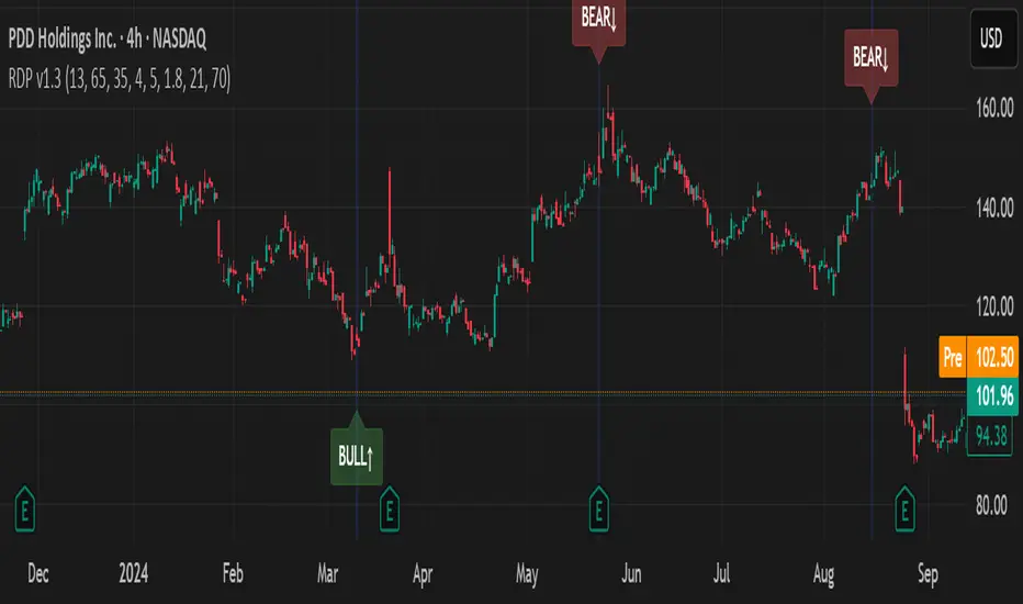
RSI Divergence Pro+ VolumeRSI Divergence Pro+ Volume
What It Does:
RSI Divergence Pro+ Volume is a non-repainting indicator that helps traders spot potential bullish and bearish reversal zones using a classic technical analysis concept—RSI divergence—combined with advanced volume confirmation. The script highlights moments when price and RSI disagree, filtering for signals only when there is a significant volume spike, which helps reduce false positives in quiet or illiquid markets.
How It Works:
Bullish Divergence: Triggered when price makes a lower low but RSI forms a higher low, suggesting possible exhaustion in selling pressure.
Bearish Divergence: Triggered when price makes a higher high but RSI forms a lower high, signaling potential buying exhaustion.
Volume Confirmation: Signals only appear when trading volume exceeds a dynamic threshold (based on a user-defined moving average and multiplier), making alerts more reliable.
Visual Features: Customizable labels and optional gradient highlights mark the exact bars where divergence with volume confirmation occurs, making signals easy to see.
Alert System: Built-in alerts for both bullish and bearish divergences so traders can receive instant notifications.
How to Use:
Apply the script to any timeframe or liquid asset (15m–4H recommended for best results).
Watch for green “BULL↑” labels below bars (bullish divergence) and red “BEAR↓” labels above bars (bearish divergence).
Blue/violet background highlights confirm volume-verified signals.
Combine with your own risk management and confirmation tools for trade entries/exits.
Adjust lookback and volume settings to match your asset and style.
Originality & Usefulness:
This indicator stands out by combining traditional RSI divergence with advanced volume filtering, giving more credible and actionable reversal alerts. All logic is non-repainting and calculated on closed bars only. Settings are fully grouped and customizable, with professional visuals for clarity.
Limitations & Disclaimers:
Not every divergence results in a major reversal—use with other analysis.
More effective in trending or volatile markets; may produce more false signals in choppy/range conditions.
Signals are generated on bar close and do not repaint.
No indicator is a substitute for proper trading discipline and risk management.
FVG Candle TYHE42This indicator highlights potential Fair Value Gaps by applying a color change to the body of the candle that aligns with an imbalance in price movement.
When such a gap is detected in the price structure, the corresponding candle is visually marked using a customizable color, allowing for easy identification without cluttering the chart.
Users can adjust the highlight color from the settings to better match their chart style or personal preference.

Previous Daily High/LowUnderstanding Previous Daily High and Low in Trading
The previous day’s high and low are critical price levels that traders use to identify potential support, resistance, and intraday trading opportunities. These levels represent the highest and lowest prices reached during the prior trading session and often act as reference points for future price action.
Why Are Previous Daily High/Low Important?
Support & Resistance Zones
The previous day’s low often acts as support (buyers defend this level).
The previous day’s high often acts as resistance (sellers defend this level).
Breakout Trading
A move above the previous high suggests bullish momentum.
A move below the previous low suggests bearish momentum.
Mean Reversion Trading
Traders fade moves toward these levels, expecting reversals.
Example: Buying near the previous low in an uptrend.
Institutional Order Flow
Market makers and algos often reference these levels for liquidity.
How to Use Previous Daily High/Low in Trading
1. Breakout Strategy
Long Entry: Price breaks & closes above previous high → bullish continuation.
Short Entry: Price breaks & closes below previous low → bearish continuation.
2. Reversal Strategy
Long at Previous Low: If price pulls back to the prior day’s low in an uptrend.
Short at Previous High: If price rallies to the prior day’s high in a downtrend.
3. Range-Bound Markets
Buy near previous low, sell near previous high if price oscillates between them.

Smart Money Gap [Algo Seeker]Introduction – Originality and usefulness
It is important for traders to diversify their strategies, and having a few approaches for different situations is key to increasing their odds of success.
These days, substantial information and important events happen so fast and so often that all the noise created afterward makes people forget the events that were actually worth remembering.
The same can be said about trading and investing. Every day, there seems to be something new happening and new price action unfolding, which can make it difficult for traders to filter out the noise and stay focused on relevant events. But for every problem, a solution can be born.
🟠 Unique Features & Trading Benefits
The SMG aims to be a system that helps traders filter out what it deems to be irrelevant noise and stay focused on what matters most. In addition, SMG provides multiple plans and ways to act on that information.
The reason it’s called “Smart Money Gap” is because this algorithm is designed to identify the most relevant price action—whether it's earnings, an economic calendar event, a stock-specific development, major news, or institutional activity. It determines which of these situations is the most current and relevant, and it keeps the focus on that. This means that day in and day out, traders and investors can rely on a consistent plan and framework that is automatically drawn up for them, helping them trade with confidence that they’re acting on meaningful price levels. When the algorithm identifies a new event as more important, it will switch focus and build a new system around that.
SMG also goes a step further—it understands that different types of traders, such as scalpers, swing traders, or investors, have different time horizons and risk tolerance regarding how long they plan to hold a position and how much space and time they are willing to give a move. With that in mind, SMG provides different trading modes for these personas, selecting events that match the criteria needed for that specific trader.
For instance, a scalper may benefit from a smaller, more recent event that provides quick entry and exit opportunities—whereas an investor might focus on something more significant and long-term. SMG takes this into consideration and builds its entire framework accordingly.
🟠 Description of the Unique SMG (Continued) – How It Works Together as One System
The true power of SMG begins once a relevant event is identified, and the entire system is automatically displayed on the user’s chart. From that single event, SMG generates a structured framework that produces three distinct strategies. Each of these strategies takes inspiration from fundamentals within trading but gives it our own unique twist inside the SMG system. These strategies can be used individually or in combination, depending on the trader’s style and market context.
🟢 1. Filling the Smart Money Gap
One of the key opportunities is to trade the SMG itself—the “gap” created by the specific event. Gap fills are a strategy that traders and investors like to use. SMG continuously tracks how much of this unique gap has been filled, so users are never confused about how much remains. They can reference the shaded region or the percentage-left box for clarity.
🟢 2. Targeting SMG-Based Extensions and Retracements
When the SMG zone is created, the algorithm simultaneously generates extension and retracement levels tied to that event. These levels remain anchored to the original structure, providing consistent, event-driven targets. Unlike the constantly redrawn lines many traders adjust throughout the day, these levels stay fixed and reflect meaningful price action—not noise.
🟢 3. Executing Trades Based on SMG Volume
Because SMGs are tied to meaningful events, they often remain valid for an extended time. This is where Anchored VWAP becomes critical. From the moment the event occurs, SMG begins calculating volume-based data. The longer the event goes unchanged, the more powerful and influential the Anchored VWAP and its deviation bands become—due to the increasing accumulation of volume over time. These volume layers not only help refine entries and exits—they also serve as additional points of confluence where traders can place stops, take profits, or re-enter trades with greater context and confidence.
In conclusion:
SMG is designed to help traders diversify their portfolio of strategies even further. It creates an entire system that filters out noise and builds a strategy around a key event—and it will stay focused on that event until another becomes more relevant. SMG gives traders the ability to react calmly, with a plan that is automatically laid out for them. This is a special algorithm that we’ve incorporated into our approach for over three years, and we hope users will find it to be a valuable aid in their trading journey.
🟠 How to Use
Initial Setup
🟢 1. Select Trading Mode:
Choose from six built-in personas—Scalp 1, Scalp 2, Swing 1, Swing 2, Invest 1, and Invest 2—based on your trading style. Each persona adjusts the SMG logic to fit the risk profile and time horizon of that specific persona.
1. Scalp: For intraday movements (minutes to hours)
• Best used on faster charts (1-minute to 30-minute)
2. Swing: For medium-term positions (days to weeks)
• Best used on 1-hour to daily charts
3. Investor: For longer-term positions (weeks to months)
• Best used on 1-hour to daily charts
🟢 2. Choose SMG Update Behavior: Bar Close vs Live Update:
By default, SMG waits until all conditions are met and the bar closes before updating. This ensures confirmed structure and helps avoid noise or repainting.
If “Update Before Bar Closes?” is selected, the algorithm updates as soon as all conditions are met — even if the bar hasn’t closed yet. This allows earlier updates but may result in elements that repaint if the conditions don’t hold through the close.
Keep this setting unchecked if you prefer confirmed, non-repainting elements.
🟢 3. Visual Customization:
Customize the appearance of SMG zones, extension labels, and volume-derived levels via the “SMG Zone” and “Anchored VWAP” settings groups. This includes:
1. Zone colors and opacity
2. Label positions
3. Retracement display toggle
4. Anchored VWAP and ±1, ±2, ±3 deviation bands
Extra Notes on User Customization:
• Bull Box Color – the color used when SMG retracement is active
• Final Bull Box Color – the color used when SMG retracement is finished
• Same logic applies to Bear Box Color and Final Bear Box Color
• Retracement % Label – If the label is hard to see, it may be overlapping with the Fib labels depending on your chart zoom. To adjust, bring the Retracement % Label Indent closer to 1 to shift it left. Then increase the Fib Label Indent value to move those labels further right.
🟠 Strategic Execution
Strategy Usage Example
🟢 1. Entry & Exit Tactics Within the SMG
Use the shaded Smart Money Gap as a decision-making framework. Traders may choose to:
1. Fade a retracement (shorting or exiting as price retraces into the SMG)
2. Enter on signs of continuation (rejoining the move after a partial retrace)
3. Wait for the gap to fill completely and reverse
Volume-weighted Anchored VWAP levels add an additional layer—helping assess whether price is entering or rejecting volume consensus zones.
🟢 2. Extension Targeting:
When price resumes in the original direction, SMG plots potential extension levels. These can be used to:
1 Set take-profit or stop-loss targets
2. Spot exhaustion areas
3 Evaluate whether to scale in, take partial profits, or re-enter a position
🟢 3. Volume-Based Execution via Anchored VWAP:
For traders looking to incorporate volume into execution—especially when an SMG has remained active for an extended period—Anchored VWAP and its deviation bands can be used to:
1. Confirm direction or momentum via VWAP slope and interaction
2. Enter or fade positions at volume-backed levels
3. Set dynamic entries or exits as volume builds or thins across deviations
⚠️Optional Update Behavior: Bar Close vs Live Update
By default, SMG waits until all conditions are met and the bar closes before updating. This ensures confirmed structure and helps avoid noise or repainting.
If “Update Before Bar Closes?” is selected, the algorithm updates as soon as all conditions are met — even if the bar hasn’t closed yet. This allows earlier updates but may result in elements that repaint if the conditions don’t hold through the close.
Keep this setting unchecked if you prefer confirmed, non-repainting elements.
⚠️ Interpreting Anchored VWAP Behavior
Anchored VWAP and its deviation bands become more relevant with time as they widen and separate. While tight and accumulating near price, it may be worth holding off on using VWAP for entries or exits until expansion begins.
🟠 Additional Description – SMG Table Overview
The SMG table presents four key pieces of information to help traders quickly understand the current setup at a glance:
1) If the Algo is set for dynamic or bar close
2) Which trading mode they currently have selected
3) What type of SMG gap is displayed
4) how much of the Retracement is done
🟠 Additional Benefits:
🟢 1. Risk Profile Options
Trading personas allow users to instantly switch between different risk profiles—Scalp, Swing, or Investor—at the click of a button. This helps traders quickly align the system to their preferred holding period and risk tolerance without reconfiguring inputs.
🟢 2. Time Efficiency
SMG saves traders time by creating a complete system around each Smart Money Gap. From gap logic to retracement tracking, extension targets, and volume levels—everything needed to trade the SMG is generated at once, eliminating the need for manual setup or separate tools.
The Smart Money Gap represents years of development and refinement aimed at creating a unified, event-driven trading system. It was designed to help traders manage through the constant noise of the market, and we hope that traders benefit from having an additional tool to support and diversify their trading strategy.

80% Rule Indicator (ETH Session + SVP Prior Session)I created this script to show the 80% opportunity on chart if setting lines up.
"80% rule: Open outside the vah or Val. Spend 30 mins outside there then break back inside spend 15 mins below or above depending which way u broke. Then come back and retest the vah/val and take it to the poc as a first target with the final target being the other Val/vah "
📌 Script Summary
The "80% Rule Indicator (ETH Session + SVP Prior Session)" overlays your chart with prior session value area levels (VAH, VAL, and POC) calculated from extended-hours 30-minute data. It tracks when the price reenters the value area and confirms 80% Rule setups during your chosen trading session. You can optionally trigger alerts, show/hide market sessions, and fine-tune line appearance for a clean, modular workflow.
⚙️ Options & Settings Breakdown
- Use 24-Hour Session (All Markets)
When checked, the indicator ignores time zones and tracks signals during a full 24-hour period (0000-0000), helpful if you're outside U.S. trading hours or want consistent behavior globally.
- Market Session
Dropdown to select one of three key market zones:
- New York (09:30–16:00 ET)
- London (08:00–16:30 local)
- Tokyo (09:00–15:00 local)
Used to gate entry signals during relevant hours unless you choose the 24-hour option.
- Show PD VAH/VAL/POC Lines
Toggle to show or hide prior day’s levels (based on the 30-min extended session). Turning this off removes both the lines and their white text labels.
- Extend Lines Right
When enabled, the VAH/VAL/POC lines extend into the current day’s session. If disabled, they appear only at their anchor point.
- Highlight Selected Session
Adds a soft blue background to help visualize the active session you selected.
- Enable Alert Conditions
Allows TradingView alerts to be created for long/short 80% Rule entries.
- Enable Audible Alerts
Plays an in-chart sound with a popup message (“80% Rule LONG” or “SHORT”) when signals trigger. Requires the chart to be active and sounds enabled in TradingView.

Volume Zones IndicatorVolume Zones Indicator — VWAP with Dynamic Monthly Volume Zones
This indicator is an enhanced version of the classic VWAP (Volume Weighted Average Price), designed to create clear monthly zones around VWAP based on average price range (ATR) and volume activity.
The core idea is to highlight key zones where price is more likely to reverse or consolidate, based on where significant trading volume occurs.
How does it work?
VWAP is calculated over the last N days (set by the lookbackPeriod input).
Four zones are plotted above and below VWAP, spaced using a multiple of ATR.
Each zone has its own color for clarity:
Blue — closest to VWAP
Red — second band
Green — third band
Orange — outer band (potential breakout or exhaustion zone)
If the current volume exceeds the moving average of volume, it is highlighted directly on the chart. This helps detect accumulation or distribution moments more easily.
What does the trader see?
You see horizontal colored bands on the chart that update at the start of each new month. These zones:
Remain fixed throughout the month
Automatically adjust based on recent volume and volatility
Act as dynamic support/resistance levels
Best used for:
Mean reversion strategies — identifying pullbacks toward value areas
Support and resistance mapping — automatic SR zones based on price/volume behavior
Breakout filtering — when price reaches zone 3 or 4, trend continuation or reversal is likely
Adding volume context to price action — works well with candlestick and pattern analysis
Settings
Lookback Period (Days): VWAP and volume smoothing length
Volume Area Threshold %: Reserved for future functionality
Works on any timeframe; best suited for 4H timeframe.
Zones are calculated and fixed monthly for clean visual context
Combines price structure with actual volume flow for more reliable decision-making
Breakout Confirmation🔍 Indicator Name: Breakout Confirmation (Body + Volume)
📌 Purpose:
This indicator is designed to detect high-probability breakout setups based on price structure and volume strength. It identifies moments when the market breaks through a key support or resistance level, confirmed by two consecutive strong candles with large real bodies and high volume.
⚙️ How It Works
1. Support and Resistance Detection
The indicator uses pivot points to identify potential horizontal support and resistance levels.
A pivot high or pivot low is considered valid if it stands out over a configurable number of candles (default: 50).
Only the most recent valid support and resistance levels are tracked and displayed as horizontal lines on the chart.
2. Breakout Setup
The breakout condition is defined as:
First Candle (Breakout Candle):
Large body (compared to the recent body average)
High volume (compared to the recent volume average)
Must close beyond a resistance or support level:
Close above resistance (bullish breakout)
Close below support (bearish breakout)
Second Candle (Confirmation Candle):
Also must have a large body and high volume
Must continue in the direction of the breakout (i.e., higher close in bullish breakouts, lower close in bearish ones)
3. Signal Plotting
If both candles meet the criteria, the indicator plots:
A green triangle below the candle for bullish breakouts
A red triangle above the candle for bearish breakouts
📈 How to Interpret the Signals
✅ Green triangle below a candle:
Indicates a confirmed bullish breakout.
The price has closed above a recent resistance level with strength.
The trend may continue higher — possible entry for long positions.
🔻 Red triangle above a candle:
Indicates a confirmed bearish breakout.
The price has closed below a recent support level with strength.
Potential signal to enter short or exit long positions.
⚠️ The plotted horizontal lines show the last key support and resistance levels. These are the zones being monitored for breakouts.
📊 How to Use It
Timeframe: Works best on higher timeframes (1H, 4H, Daily), but can be tested on any chart.
Entry: Consider entries after the second candle confirms the breakout.
Stop Loss:
For longs: Below the breakout candle or the broken resistance
For shorts: Above the breakout candle or broken support
Take Profit:
Based on previous structure, risk:reward ratios, or using trailing stops.
Filter with Trend or Other Indicators (optional):
You can combine this with moving averages, RSI, or market structure for confluence.
🛠️ Customization Parameters
lengthSR: How many candles to look back for identifying support/resistance pivots.
volLength: Length of the moving average for volume and body size comparison.
bodyMultiplier: Multiplier threshold to define a “large” body.
volMultiplier: Multiplier threshold to define “high” volume.
✅ Ideal For:
Price action traders
Breakout traders
Traders who use volume analysis
Anyone looking to automate the detection of breakout + confirmation setups
Wavelet-Trend ML Integration [Alpha Extract]Alpha-Extract Volatility Quality Indicator
The Alpha-Extract Volatility Quality (AVQ) Indicator provides traders with deep insights into market volatility by measuring the directional strength of price movements. This sophisticated momentum-based tool helps identify overbought and oversold conditions, offering actionable buy and sell signals based on volatility trends and standard deviation bands.
🔶 CALCULATION
The indicator processes volatility quality data through a series of analytical steps:
Bar Range Calculation: Measures true range (TR) to capture price volatility.
Directional Weighting: Applies directional bias (positive for bullish candles, negative for bearish) to the true range.
VQI Computation: Uses an exponential moving average (EMA) of weighted volatility to derive the Volatility Quality Index (VQI).
Smoothing: Applies an additional EMA to smooth the VQI for clearer signals.
Normalization: Optionally normalizes VQI to a -100/+100 scale based on historical highs and lows.
Standard Deviation Bands: Calculates three upper and lower bands using standard deviation multipliers for volatility thresholds.
Signal Generation: Produces overbought/oversold signals when VQI reaches extreme levels (±200 in normalized mode).
Formula:
Bar Range = True Range (TR)
Weighted Volatility = Bar Range × (Close > Open ? 1 : Close < Open ? -1 : 0)
VQI Raw = EMA(Weighted Volatility, VQI Length)
VQI Smoothed = EMA(VQI Raw, Smoothing Length)
VQI Normalized = ((VQI Smoothed - Lowest VQI) / (Highest VQI - Lowest VQI) - 0.5) × 200
Upper Band N = VQI Smoothed + (StdDev(VQI Smoothed, VQI Length) × Multiplier N)
Lower Band N = VQI Smoothed - (StdDev(VQI Smoothed, VQI Length) × Multiplier N)
🔶 DETAILS
Visual Features:
VQI Plot: Displays VQI as a line or histogram (lime for positive, red for negative).
Standard Deviation Bands: Plots three upper and lower bands (teal for upper, grayscale for lower) to indicate volatility thresholds.
Reference Levels: Horizontal lines at 0 (neutral), +100, and -100 (in normalized mode) for context.
Zone Highlighting: Overbought (⋎ above bars) and oversold (⋏ below bars) signals for extreme VQI levels (±200 in normalized mode).
Candle Coloring: Optional candle overlay colored by VQI direction (lime for positive, red for negative).
Interpretation:
VQI ≥ 200 (Normalized): Overbought condition, strong sell signal.
VQI 100–200: High volatility, potential selling opportunity.
VQI 0–100: Neutral bullish momentum.
VQI 0 to -100: Neutral bearish momentum.
VQI -100 to -200: High volatility, strong bearish momentum.
VQI ≤ -200 (Normalized): Oversold condition, strong buy signal.
🔶 EXAMPLES
Overbought Signal Detection: When VQI exceeds 200 (normalized), the indicator flags potential market tops with a red ⋎ symbol.
Example: During strong uptrends, VQI reaching 200 has historically preceded corrections, allowing traders to secure profits.
Oversold Signal Detection: When VQI falls below -200 (normalized), a lime ⋏ symbol highlights potential buying opportunities.
Example: In bearish markets, VQI dropping below -200 has marked reversal points for profitable long entries.
Volatility Trend Tracking: The VQI plot and bands help traders visualize shifts in market momentum.
Example: A rising VQI crossing above zero with widening bands indicates strengthening bullish momentum, guiding traders to hold or enter long positions.
Dynamic Support/Resistance: Standard deviation bands act as dynamic volatility thresholds during price movements.
Example: Price reversals often occur near the third standard deviation bands, providing reliable entry/exit points during volatile periods.
🔶 SETTINGS
Customization Options:
VQI Length: Adjust the EMA period for VQI calculation (default: 14, range: 1–50).
Smoothing Length: Set the EMA period for smoothing (default: 5, range: 1–50).
Standard Deviation Multipliers: Customize multipliers for bands (defaults: 1.0, 2.0, 3.0).
Normalization: Toggle normalization to -100/+100 scale and adjust lookback period (default: 200, min: 50).
Display Style: Switch between line or histogram plot for VQI.
Candle Overlay: Enable/disable VQI-colored candles (lime for positive, red for negative).
The Alpha-Extract Volatility Quality Indicator empowers traders with a robust tool to navigate market volatility. By combining directional price range analysis with smoothed volatility metrics, it identifies overbought and oversold conditions, offering clear buy and sell signals. The customizable standard deviation bands and optional normalization provide precise context for market conditions, enabling traders to make informed decisions across various market cycles.

Prev Week POC Buy/Sell Signals
Hi, I’m Edward. I created a straightforward strategy for swing traders (4hr or 8hr timeframe users). This strategy is for traders that are not interested to look at charts all day long, 2 times a day max, but still be profitable.
The indicator:
Print a buy signal when the price closes above the previous week's Point of Control (POC).
Stay in the trade until the price closes below the previous week's POC, then print a sell signal.
The indicator calculates the weekly POC using a basic volume profile method, then tracks the previous week's POC for signals.
Previous week POC is valid from Monday to Thursday. By close of business on Thursday, the current week trend and POC should be well established and should be used make buy or sell decisions. Enjoy!

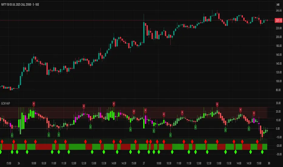
GCM Heikin Ashi with PivotsTitle: GCM Heikin Ashi with Pivots
Description:
Overview
This indicator provides a powerful combination of trend visualization, precise reversal signals, and volume confirmation in a clean, customizable sub-chart. It is designed to help traders identify trend momentum using Heikin Ashi candles, pinpoint confirmed swing highs and lows (pivots), and spot surges in buying pressure with our unique Volume Rate-of-Change (VROC) highlighter.
The key feature of this script is its non-repainting pivot signals. A pivot high or low is only confirmed and plotted after a specific number of subsequent bars have closed, ensuring the signals are reliable and do not change after they appear.
Key Features
Heikin Ashi Sub-Chart: Displays smoothed Heikin Ashi candles in a separate pane to clearly visualize trend strength and direction without cluttering the main price chart.
Non-Repainting Pivot Signals: Uses ta.pivothigh and ta.pivotlow to identify confirmed swing points. The signals will not repaint or move once they are printed on the chart.
Smart Volume Spike Analysis (VROC): A Heikin Ashi candle will be highlighted in a distinct bright green (#2dff00) when the volume increases significantly on a bullish price candle. This "volume-confirmed" candle can signal strong conviction behind a move.
Complete Label Customization: Take full control over the look and feel of your signals:
Label Mode: Choose between "High & Low" (H/L) or "Buy & Sell" (B/S) to match your trading terminology.
Custom Colors: Set unique colors for both the high and low pivot labels.
Label Style: Select from various shapes like boxes, circles, diamonds, or squares.
Label Size: Adjust the size of the labels from Tiny to Huge for perfect visibility.
Adjustable Pivot Sensitivity: Fine-tune the pivot detection algorithm by setting the number of bars required to the left (strength) and right (confirmation) of a pivot point.
How to Use & Interpret the Signals
Assess the Trend with Heikin Ashi:
A series of green HA candles with little to no lower wicks indicates strong bullish momentum.
A series of red HA candles with little to no upper wicks indicates strong bearish momentum.
Look for Volume Confirmation:
A bright green highlighted candle signals a surge in buying pressure (VROC spike). This adds significant weight to bullish moves and can act as a leading indicator for a new leg up.
Identify Entry/Exit Points with Pivot Labels:
An "L" or "B" label marks a confirmed swing low. This is a potential buying opportunity, especially if it is followed by green Heikin Ashi candles and, ideally, a bright green VROC spike candle.
An "H" or "S" label marks a confirmed swing high. This is a potential selling/shorting opportunity, especially as HA candles turn red.
Example Strategy (High-Confluence)
A powerful way to use this indicator is to look for a sequence of events:
Wait for a "Buy" (B) or "Low" (L) signal to appear, confirming a bottom has likely formed.
Wait for the first bright green VROC spike candle to appear after the signal. This confirms that buyers are stepping in with conviction.
Consider an entry based on this high-confluence setup, using the swing low as a potential stop-loss area.
Settings Explained
Pivot Detection:
Left Bars (Strength): Number of bars to the left of a pivot. A higher number finds more significant pivots.
Right Bars (Confirmation): Number of bars to the right required to confirm a pivot. This creates a lag for reliability.
Volume Spike Detection (VROC):
Enable Volume Spike Highlighting: Turn the bright green candle highlight on or off.
VROC Length: The lookback period for calculating the volume's rate of change.
VROC Threshold %: The percentage volume must increase to trigger a highlight.
Label Customization:
Label Text Mode: Choose between "High & Low" or "Buy & Sell".
Label Color, Style, and Size: Full cosmetic control for the pivot labels.
Final Note
This indicator is a tool to aid in technical analysis and should not be used as a standalone trading system. Always use it in conjunction with other analysis methods, proper risk management, and a sound trading plan.
Enjoy!
Cross-Exchange Any Volume[nakano]# Cross-Exchange Any Volume
This indicator aggregates the real-time trading volume of a specific crypto asset across multiple exchanges and displays it as a single, stacked column chart. It allows you to grasp the total volume and its composition across the market at a glance.
このインジケーターは、複数の取引所における特定の暗号資産の出来高をリアルタイムで合算し、一つの積み上げ棒グラフに表示します。市場全体の総出来高とその内訳を、一目で把握することができます。
## Features / 主な機能
* **Aggregate up to 20 Exchanges:** Simultaneously calculates and displays the volume from up to 20 user-defined exchanges.
* 最大20の取引所の出来高を同時に集計・表示します。
* **Customizable Exchanges:** Freely customize the exchange prefix for each slot in the settings (e.g., `BINANCE`, `COINBASE`, `BYBIT`).
* 設定画面から各取引所の取引所プリフィックスを自由に変更可能です(例:`BINANCE`、`COINBASE`、`BYBIT`)。
* **Flexible Quote Currencies:** Specify the quote currencies you want to aggregate for each exchange in a comma-separated list (e.g., `USDT,USDC`).
* 取引所ごとに集計したいクォート通貨をカンマ区切りで指定可能です(例:`USDT,USDC`)。
* **Individual Configuration:** Individually configure the color and visibility (On/Off) for each exchange slot.
* 各取引所の色や表示/非表示を個別に設定できます。
* **On-Chart Details:** Display a detailed volume breakdown on the chart as either a Table or a Label. Text size is also adjustable.
* チャート上に出来高の内訳をテーブル形式またはラベル形式で表示できます。文字サイズの調整も可能です。
* **Debug Report:** Includes a date-range-specific cumulative volume report for debugging and analysis purposes.
* デバッグや分析目的で、指定した期間の累計出来高レポートを表示する機能を搭載しています。
## How to Use / 設定方法
1. **Set Base Asset:** In the settings, enter the crypto asset symbol you want to analyze into the `Base Asset` field (e.g., `BTC`, `ETH`, `SOL`).
* 設定画面の`Base Asset`に、分析したい暗号資産のシンボル(例:`BTC`, `ETH`, `SOL`)を入力します。
2. **Configure Exchanges:** For each row (1-20), enable the checkbox for the exchange you want to use. Then, enter the correct exchange prefix (e.g., `BINANCE`) and the desired quote currencies (e.g., `USDT,USDC`). You can also customize the display color.
* 各行(1〜20)で、使用したい取引所のチェックボックスをONにします。次に、正しい取引所プリフィックス(例:`BINANCE`)と、集計したいクォート通貨(例:`USDT,USDC`)を入力します。表示色も自由にカスタマイズできます。
3. **Disable Unused Slots:** For any slots you are not using, simply leave the checkbox disabled. The script will ignore them.
* 不要なスロットは、チェックボックスをOFFのままにしてください。スクリプトはそれらを無視します。
## Notes / 注意事項
* **`request.security` Call Limit:** Pine Script has a limit on `request.security` calls (around 40 per script). If the total number of quote currencies across all enabled exchanges exceeds this limit, the script will stop with an error. For example, `USDT,USDC` counts as two pairs. Please be mindful of the total number of pairs in use.
* **`request.security`の呼び出し回数上限**: Pine Scriptには、スクリプトあたりの`request.security`呼び出し回数に上限(約40回)があります。有効にした全取引所のクォート通貨の合計数がこの上限を超えると、スクリプトはエラーで停止します。例えば、`USDT,USDC`は2ペアとしてカウントされます。有効にするペアの合計数にご注意ください。
* **Debug Report Timeout:** The Debug Report feature aggregates data over every single bar within the specified date range. Using this feature with a long date range on short timeframes (like the 1-minute chart) may cause the script to exceed TradingView's calculation limits and time out. It is recommended to use a shorter time range when enabling this feature on low timeframes.
* **デバッグレポートのタイムアウト**: デバッグレポート機能は、指定された期間のすべてのバーのデータを集計するため、特に1分足などの短い時間足で長期間を指定すると、TradingViewの計算リソースの限界を超え、チャートの読み込みがタイムアウトする可能性があります。この機能を使用する際は、短い期間に絞ってお試しいただくことをお勧めします。

VWVI - Volume Weighted Volatility Index# 📊 Complete VWVI Indicator User Guide (Current Version)
## 🔍 **I. Core Principles**
### **VWVI's Unique Value**
VWVI isn't a simple volatility indicator, but a **volume-confirmed volatility strength indicator**:
- **Problems with traditional volatility indicators**: ATR, Bollinger Bands, etc. only look at price movements while ignoring volume
- **VWVI advantage**: Only fluctuations accompanied by high volume are considered "true volatility"
- **Core logic**: Fluctuations driven by large capital are more important than retail noise
---
## 🎨 **II. Detailed Explanation of Current Version Visual Elements**
### **1. Main Line Color System (Most Important Signal)**
```
🟢 Green main line (VWVI > 60):
├─ Meaning: High volatility + high volume = true trend
├─ Market state: One-way market, breakout market, trend acceleration
├─ Trading opportunity: Trend following, momentum trading
└─ Duration: Typically lasts several cycles
🟠 Orange main line (40 ≤ VWVI ≤ 60):
├─ Meaning: Medium volatility or mismatched volume
├─ Market state: Transition phase, direction pending
├─ Trading strategy: Wait-and-see, await clear signals
└─ Note: High probability of false breakouts
🔴 Red main line (VWVI < 40):
├─ Meaning: Low volatility + low volume = consolidation
├─ Market state: Sideways, range-bound, shrinking volume
├─ Trading opportunity: Range trading, mean reversion
└─ Feature: Price oscillates between support/resistance
```
### **2. Reference Line System (Auxiliary Judgment)**
```
🟢 Trend threshold line (default 60):
├─ Function: Watershed for trend confirmation
├─ Breakout upward: Trend begins confirmation
├─ Break downward: Trend weakening or ending
└─ Adjustment suggestion: Can adjust based on market characteristics (50-70)
🔴 Range threshold line (default 40):
├─ Function: Confirmation line for range-bound markets
├─ Break downward: Range-bound market confirmed
├─ Breakout upward: Range may be ending
└─ Adjustment suggestion: Can adjust based on volatility (30-50)
⚫ Center line (50):
├─ Function: Market neutral reference
├─ Above: Trend characteristics
├─ Below: Range characteristics
└─ Meaning: Long-term equilibrium position
```
### **3. Background Coloring System (State Identification)**
```
🟢 Light green background:
├─ Trigger: VWVI > trend threshold
├─ Meaning: Trend confirmation period
├─ Trading suggestion: Trend following strategy
└─ Risk: Possible reversal at trend end
🔴 Light red background:
├─ Trigger: VWVI < range threshold
├─ Meaning: Range-bound confirmation period
├─ Trading suggestion: Range trading strategy
└─ Opportunity: Look for support/resistance levels
🟩 Green background flashing:
├─ Trigger: VWVI breaks through trend threshold
├─ Meaning: Trend signal generated
├─ Action: Consider establishing trend positions
└─ Confirmation: Needs other indicators
🟥 Red background flashing:
├─ Trigger: VWVI breaks below range threshold
├─ Meaning: Range signal generated
├─ Action: Consider range trading strategy
└─ Confirmation: Observe persistence
```
### **4. Information Panel (Upper Right Corner)**
```
📊 Real-time data display:
├─ VWVI value: Current indicator reading
├─ Current state: Trend/Range/Neutral
├─ Volume status: Above/Below 20-day average
├─ Volatility strength: High/Low volatility
├─ Trend threshold: Current setting
└─ Range threshold: Current setting
```
---
## 📈 **III. Specific Usage Methods**
### **A. Trend Following Strategy**
```
🎯 Entry timing:
✅ VWVI breaks above 60 from below (green background flashing)
✅ Main line turns green and continues rising
✅ Volume status shows "above average"
✅ Volatility strength shows "high volatility"
📍 Position management:
- Continue holding: VWVI remains above 60
- Reduce position warning: VWVI starts declining but still >50
- Stop loss exit: VWVI breaks below 50 or turns orange
⚠️ Risk control:
- False breakout: VWVI quickly falls back after breaking 60
- Trend end: VWVI oscillates at high levels
```
### **B. Range Trading Strategy**
```
🎯 Confirm range:
✅ VWVI breaks below 40 (red background flashing)
✅ Main line turns red and lingers at low levels
✅ Volume status shows "below average"
✅ Volatility strength shows "low volatility"
📍 Trading strategy:
- Upper range: Look for resistance to short
- Lower range: Look for support to long
- Stop loss: Breakout beyond range boundaries
- Profit target: Near range midpoint
⚠️ Notes:
- False breakouts may occur at range end
- Abnormal volume spikes may signal trend change
```
### **C. State Transition Strategy**
```
🔄 Range→Trend transition:
- Observe: VWVI rises from <40 to 40-60 range
- Prepare: Orange main line phase preparation
- Confirm: Consider entry when breaking 60
- Verify: Whether volume expands simultaneously
🔄 Trend→Range transition:
- Warning: VWVI declines from >60 to 40-60 range
- Reduce position: Gradually reduce in orange phase
- Confirm: Switch to range strategy when breaking 40
- Observe: Whether it's a trend pullback
```
---
## ⚠️ **IV. Common Mistakes and Precautions**
### **❌ Common Mistakes**
1. **Mistake 1: Using VWVI alone**
- ❌ Wrong: Making trading decisions based solely on VWVI
- ✅ Correct: Combine with price action, support/resistance, other indicators
2. **Mistake 2: Ignoring volume confirmation**
- ❌ Wrong: Only looking at VWVI values, ignoring volume status
- ✅ Correct: VWVI signal + volume confirmation = more reliable signal
3. **Mistake 3: Overtrading**
- ❌ Wrong: Trading every color change
- ✅ Correct: Wait for clear state transition signals
4. **Mistake 4: Fixed thresholds**
- ❌ Wrong: Using 60/40 thresholds for all markets
- ✅ Correct: Adjust parameters for different products
5. **Mistake 5: Ignoring background information**
- ❌ Wrong: Not considering market environment and fundamentals
- ✅ Correct: Combine with market cycles and important events
### **⚡ Special Situation Handling**
```
🚨 Abnormal signal identification:
- VWVI spikes sharply >80: May indicate sudden events
- VWVI remains <20 long-term: Extreme market contraction
- Frequent oscillation near thresholds: Market indecision
- Volume-VWVI divergence: Requires caution
🎯 Optimal usage environment:
✅ Suitable: Actively traded mainstream products
✅ Suitable: Markets with sufficient historical data
✅ Suitable: Exchanges with accurate volume data
❌ Not suitable: Extremely low liquidity products
❌ Not suitable: Heavily manipulated small coins
❌ Not suitable: Newly listed products (insufficient data)
```
### **🔧 Parameter Optimization Suggestions**
```
📊 Parameter suggestions for different markets:
- BTC/ETH major coins: Keep default 14/60/40
- Altcoins: Can adjust to 10/65/35 (more sensitive)
- Stock market: Can adjust to 20/55/45 (more stable)
- Forex market: Can adjust to 21/58/42 (follow tradition)
⏱️ Different timeframes:
- 1-minute: Not recommended (too noisy)
- 5-15 minutes: Short-term trading, can adjust sensitivity
- 1-4 hours: Medium-term trading, keep defaults
- Daily: Long-term analysis, can be more conservative
```
**Summary: VWVI is a powerful market state identification tool, but requires correct understanding of its meaning, combination with other analysis methods, and avoidance of overtrading to maximize effectiveness.**
# 📊 VWVI指标完全使用指南(当前版本)
## 🔍 **一、指标核心原理**
### **VWVI的独特价值**
VWVI不是简单的波动率指标,而是**成交量确认的波动强度指标**:
- **传统波动率指标问题**:ATR、布林带等只看价格波动,忽略了成交量
- **VWVI的优势**:只有伴随大成交量的波动才被认为是"真实波动"
- **核心逻辑**:大资金推动的波动比散户噪音更重要
---
## 🎨 **二、当前版本视觉元素详解**
### **1. 主线颜色系统(最重要的信号)**
```
🟢 绿色主线 (VWVI > 60):
├─ 含义:高波动 + 高成交量 = 真实趋势
├─ 市场状态:单边行情、突破行情、趋势加速
├─ 交易机会:趋势跟随、动量交易
└─ 持续时间:通常持续数个周期
🟠 橙色主线 (40 ≤ VWVI ≤ 60):
├─ 含义:中等波动或成交量不匹配
├─ 市场状态:过渡阶段、方向待定
├─ 交易策略:观望、等待明确信号
└─ 注意:假突破高发区域
🔴 红色主线 (VWVI < 40):
├─ 含义:低波动 + 低成交量 = 震荡整理
├─ 市场状态:横盘、区间震荡、成交萎缩
├─ 交易机会:区间交易、均值回归
└─ 特征:价格在支撑阻力间反复
```
### **2. 参考线系统(辅助判断)**
```
🟢 趋势阈值线 (默认60):
├─ 作用:趋势确认的分水岭
├─ 突破向上:趋势行情开始确认
├─ 跌破向下:趋势减弱或结束
└─ 调整建议:可根据市场特性调整(50-70)
🔴 震荡阈值线 (默认40):
├─ 作用:震荡行情的确认线
├─ 跌破向下:震荡行情确认
├─ 突破向上:震荡可能结束
└─ 调整建议:可根据波动性调整(30-50)
⚫ 中线 (50):
├─ 作用:市场中性参考
├─ 上方:偏向趋势特征
├─ 下方:偏向震荡特征
└─ 意义:长期均衡位置
```
### **3. 背景着色系统(状态识别)**
```
🟢 淡绿色背景:
├─ 触发:VWVI > 趋势阈值
├─ 含义:趋势行情确认期
├─ 交易建议:趋势跟随策略
└─ 风险:趋势末期可能反转
🔴 淡红色背景:
├─ 触发:VWVI < 震荡阈值
├─ 含义:震荡行情确认期
├─ 交易建议:区间交易策略
└─ 机会:寻找支撑阻力位
🟩 绿色背景闪烁:
├─ 触发:VWVI突破趋势阈值瞬间
├─ 含义:趋势信号产生
├─ 行动:考虑建立趋势仓位
└─ 确认:需结合其他指标
🟥 红色背景闪烁:
├─ 触发:VWVI跌破震荡阈值瞬间
├─ 含义:震荡信号产生
├─ 行动:考虑区间交易策略
└─ 确认:观察是否持续
```
### **4. 信息面板(右上角)**
```
📊 实时数据显示:
├─ VWVI数值:当前指标读数
├─ 当前状态:趋势/震荡/中性
├─ 成交量状态:高于/低于20日均值
├─ 波动强度:高波动/低波动
├─ 趋势阈值:当前设置值
└─ 震荡阈值:当前设置值
```
---
## 📈 **三、具体使用方法**
### **A. 趋势跟随策略**
```
🎯 入场时机:
✅ VWVI从下方突破60(绿色背景闪烁)
✅ 主线变为绿色且持续上升
✅ 成交量状态显示"高于均值"
✅ 波动强度显示"高波动"
📍 持仓管理:
- 继续持有:VWVI保持在60以上
- 减仓警告:VWVI开始下降但仍>50
- 止损离场:VWVI跌破50或变为橙色
⚠️ 风险控制:
- 假突破:VWVI突破60后快速回落
- 趋势末期:VWVI在高位震荡
```
### **B. 震荡交易策略**
```
🎯 确认震荡:
✅ VWVI跌破40(红色背景闪烁)
✅ 主线变为红色且在低位徘徊
✅ 成交量状态显示"低于均值"
✅ 波动强度显示"低波动"
📍 操作策略:
- 区间上沿:寻找阻力位做空
- 区间下沿:寻找支撑位做多
- 止损设置:突破区间边界
- 利润目标:区间中轴附近
⚠️ 注意事项:
- 震荡末期可能出现假突破
- 成交量异常放大需警惕变盘
```
### **C. 状态转换策略**
```
🔄 震荡→趋势转换:
- 观察:VWVI从<40上升至40-60区间
- 准备:橙色主线阶段做好准备
- 确认:突破60时考虑入场
- 验证:成交量是否同步放大
🔄 趋势→震荡转换:
- 警告:VWVI从>60下降至40-60区间
- 减仓:橙色主线阶段逐步减仓
- 确认:跌破40时转为震荡策略
- 观察:是否为趋势中的回调
```
---
## ⚠️ **四、使用误区与注意事项**
### **❌ 常见误区**
1. **误区一:单独使用VWVI**
- ❌ 错误:仅凭VWVI做交易决策
- ✅ 正确:结合价格行为、支撑阻力、其他指标
2. **误区二:忽略成交量确认**
- ❌ 错误:只看VWVI数值,不看成交量状态
- ✅ 正确:VWVI信号+成交量确认=更可靠信号
3. **误区三:频繁交易**
- ❌ 错误:每次颜色变化都交易
- ✅ 正确:等待明确的状态转换信号
4. **误区四:固定阈值**
- ❌ 错误:所有市场都用60/40阈值
- ✅ 正确:根据不同品种调整参数
5. **误区五:忽略背景信息**
- ❌ 错误:不看市场环境和基本面
- ✅ 正确:结合市场周期和重要事件
### **⚡ 特殊情况处理**
```
🚨 异常信号识别:
- VWVI急剧飙升>80:可能是突发事件
- VWVI长期<20:市场极度萎缩
- 频繁在阈值附近震荡:市场犹豫不决
- 成交量与VWVI背离:需谨慎对待
🎯 最佳使用环境:
✅ 适用:活跃交易的主流品种
✅ 适用:有足够历史数据的市场
✅ 适用:成交量数据准确的交易所
❌ 不适用:极低流动性品种
❌ 不适用:操纵严重的小币种
❌ 不适用:新上市品种(数据不足)
```
### **🔧 参数调优建议**
```
📊 不同市场的参数建议:
- BTC/ETH主流币:保持默认14/60/40
- 山寨币:可调整为10/65/35(更敏感)
- 股票市场:可调整为20/55/45(更稳定)
- 外汇市场:可调整为21/58/42(跟随传统)
⏱️ 不同时间周期:
- 1分钟:不建议使用(噪音太大)
- 5-15分钟:短线交易,参数可调敏感
- 1-4小时:中线交易,保持默认
- 日线:长线分析,可调保守
```
**总结:VWVI是一个强大的市场状态识别工具,但需要正确理解其含义,结合其他分析方法,避免过度交易,才能发挥最大效用。**

SHA Multi Pivot Points -v1.0.0🔎Using Pivot Points in Trading
Traders use PPs to help determine predefined support and resistance levels to guide their trading strategies. In addition, traders identify potential price reversals, trend direction, and breakout opportunities:
Trend identification: PPs act as a reference level to gauge market sentiment. If the price opens above the PP and remains above it, traders interpret this as an uptrend. Conversely, if the price opens below the pivot point and stays below, it suggests a downtrend.
Support and resistance determination: Pivot levels are natural barriers where price reactions frequently occur. Traders may enter long positions near support levels, expecting a price bounce, or if the price approaches resistance levels, traders may consider shorting the asset.
Breakout trading: When the price breaks above resistance or support, it may indicate strong momentum for further movement.
Reversal identification: Traders also look for failed breakouts or price rejections at pivot levels to anticipate reversals.
Trading strategy combinations: Traders can improve accuracy by combining PPs with other technical analysis indicators.
1. Camarilla Pivot Points
📌 Overview:
Developed by Nick Scott in 1989, Camarilla Pivot Points are designed for short-term, intraday trading. Unlike traditional pivots, Camarilla levels are tighter and more responsive, making them useful in volatile markets.
📐 Key Levels:
It generates eight levels:
- Resistance: Initial Level (R1), Mid-range Level (R2), Sell Reversal Level (R3), Breakout Level (R4)
- Support: Initial Level (S1), Mid-range Level (S2), Buy Reversal Level (S3), Breakout Level (S4)
✅ How to Use:
- S1/R1 + RSI or volume divergence to confirm weak momentum and early reversals.
- S2/R2 with price action patterns to enter early on major moves before L3/H3 get tested.
- S3/R3: Mean-reversion zones → price often reverses.
- Break of S4/R4: Strong breakout → trend-following signal.
- Combine with volume or candlestick confirmation for entries.
🔹 2. Floor (Standard) Pivot Points
📌 Overview:
This is the most traditional pivot method, widely used by floor traders. It’s symmetrical and provides a clear central pivot point with equally spaced support and resistance levels.
📐 Key Levels:
- Povit Points : Average price (PPs)
- Resistance : First price ceiling (R1), Stronger ceiling (R2), Extreme resistance (R3)
- Support : First price floor (S1), Stronger floor (S2), Extreme support (S3)
✅ How to Use:
- Above PPs = bullish bias; Below PPs = bearish bias.
- S1/R1 are most used for intraday targets.
- S2–S3/R2–R3 indicate potential extreme moves.
- Often used in combination with momentum indicators.
🔹 3. Woodie Pivot Points
📌 Overview:
Woodie’s pivot formula gives double weight to the closing price, emphasizing the most recent session's sentiment.
📐 Key Levels:
- Povit Points : Weighted average (PPs)
- Resistance : First price ceiling (R1), Stronger resistance (R2)
- Support : First price floor (S1), Stronger support (S2)
✅ How to Use:
- Works best in fast-moving markets.
- PPs acts as a momentum-based balance level.
- Good for scalpers and momentum traders.
🔹 4. Fusion Pivot Points
📌 Overview:
This method differs significantly — it calculates only one support and one resistance level, adjusting based on the relationship between the open and close.
📐 Key Levels:
- Povit Points : Single directional (PPs)
- Resistance : Potential ceiling (R)
- Support : Potential floor (S)
✅ How to Use:
- Not symmetrical → more responsive to price behavior.
- Best for breakout or reversal strategies.
- Use when you're expecting directional momentum.
🔹 5. Classic Pivot Points (Traditional)
📌 Overview:
Also known as Standard or Traditional Pivot Points, this is the default method used by most charting platforms. It offers a balanced and simple framework.
📐 Key Levels:
- Povit Points : Central price level (PPs)
- Resistance : First ceiling (R1), Stronger resistance (R2), Extreme resistance (R3)
- Support : First floor (S1), Stronger floor (S2), Extreme support (S3)
✅ How to Use:
- PPs is the market’s equilibrium point.
- Helps define market structure, bias, and trade zones.
- Combine with order blocks, RSI, or MACD for confirmation.
📊 Summary Comparison :
1. Camarilla Pivot Points
- Focus : Mean Reversion & Breakouts
- Best Use : Scalping, Day Trading
2. Floor Pivot Points
- Focus : General Support/Resistance
- Best Use : Intraday, Swing
3. Woodie Pivot Points
- Focus : Recent Close Emphasis
- Best Use : Momentum Trading
4. Fusion Pivot Points
- Focus : Trend/Breakout
- Best Use : Directional Breakouts
5. Classic Povit Points
- Focus : Market Structure
- Best Use : General Use
⚠️ Disclaimer
The information and tools provided in this script are for educational and informational purposes only. They do not constitute financial advice, investment recommendations, or a solicitation to buy or sell any financial instrument.
Trading in the financial markets involves risk of loss and is not suitable for every investor. You are solely responsible for your trading decisions. Always do your own research, use proper risk management, and consult a licensed financial advisor before making any financial decisions.

VDR-PROVDR-PRO - Volume Weighted Average Price Dynamic Range
Advanced multi-timeframe VWAP indicator with intelligent range levels for precise trading decisions.
🎯 Key Features:
3 Independent Systems with configurable Average Daily/Weekly/Monthly Range calculations
VWAP Dismount Detection across multiple timeframes (Daily, Weekly, Monthly, Quarterly, Yearly)
Smart Level Synchronization - range levels automatically align with VWAP dismount points
Progressive Color System - automatic color coding for easy level identification
Intelligent Price Formatting - automatically adjusts decimal places based on symbol tick size
Dynamic Reference Points - use current price, manual price, or any VWAP dismount as central reference
📊 Perfect For:
Swing Trading - identify key support/resistance levels
Day Trading - precise entry/exit points based on volume-weighted levels
Range Trading - understand price distribution around volume-weighted averages
Multi-timeframe Analysis - combine different range calculations for comprehensive market view
⚙️ Customizable Settings:
Configure range periods (5-200 bars)
Adjust division factors (2-20x)
Set number of levels per system (2-15)
Choose from 12 different VWAP dismount references
Toggle progressive colors or use manual color schemes
🎨 Visual Excellence:
Clean, professional interface
Ghost-style labels with transparent backgrounds
Comprehensive range statistics table
Forex-friendly pip calculations
Transform your trading with precision VWAP-based range analysis. VDR-PRO combines volume analysis with dynamic range calculation for superior market insights.

Volume Weighted Regression ChannelThis indicator constructs a volume-weighted linear regression channel over a custom time range.
It’s conceptually similar to a Volume Profile, but instead of projecting horizontal value zones, it builds a tilted trend channel that reflects both price direction and volume concentration.
🧠 Core Features:
Volume-weighted points: Each candle contributes to the regression line proportionally to its volume — heavier candles shift the channel toward high-activity price zones.
Linear regression line: Shows the trend direction within the selected time interval.
±σ boundaries: Outer bands represent the standard deviation of price (also volume-weighted), highlighting statistical dispersion.
Fully customizable: Adjustable line styles, widths, and channel width (sigma multiplier).
Time window control: Select any start and end time to define the regression interval.
📊 Why use this instead of Volume Profile?
While Volume Profile shows horizontal distributions of traded volume, this indicator is ideal when:
You want to understand how volume clusters affect trend direction, not just price levels.
You're analyzing time-dependent flow rather than static price zones.
You're looking for a dynamic volume-adjusted channel that moves with the market's structure.
It’s especially useful in identifying volume-supported trends, hidden pullback zones, and statistical extremes.
⚙️ Notes:
Works on any timeframe and instrument.
Does not repaint.
Does not require volume profile data feeds — uses standard volume and hl2.
True Market Structure [Advanced Liquidity Hunter] v1True Market Structure v1
📌 Table of Contents
1. Introduction
2. Core Concepts
3. Indicator Components
4. Configuration
5. Signal Interpretation
6. Trading Strategies
7. Risk Management
8. FAQ
________________________________________
🎯 Introduction
What is True Market Structure?
True Market Structure is an advanced technical analysis indicator that reveals hidden market mechanisms. Based on Smart Money Concepts (SMC) and ICT (Inner Circle Trader) methodology, it identifies where large financial institutions hunt retail traders' stop losses.
Who is this indicator for?
• ✅ Beginners - Intuitive visualizations and clear signals
• ✅ Intermediate - Deeper market structure analysis
• ✅ Advanced - Full parameter control and advanced strategies
Key Benefits
• 🔍 Sees the invisible - Hidden liquidity levels
• 🎯 Precise signals - Based on real data
• ⚡ Real-time - Instant analysis
• 🛡️ Capital protection - Warns against traps
💡 Pro Tip: Start with 15M timeframe! That's where most action happens - stop hunts every few candles, retail traps, liquidity battles. It's the best "microscope" to understand how the market really works.
________________________________________
📚 Core Concepts
Smart Money vs Retail Money
Smart Money:
• Banks, hedge funds, large institutions
• Create market moves, don't follow them
• Exploit retail predictability
Retail Money:
• Individual traders
• Often act emotionally
• Place stop losses at predictable levels
Liquidity
Liquidity refers to areas where many orders are waiting:
• Stop losses above highs (shorts)
• Stop losses below lows (longs)
• Orders at round numbers
Key principle: Smart Money needs liquidity to enter/exit large positions. That's why they "hunt" stop losses first, then make the real move.
________________________________________
🔧 Indicator Components
1. 💧 Liquidity Pools
What is it?
• Price levels tested multiple times
• Stop loss accumulation areas
• Displayed as blue horizontal lines
How to read?
• LIQ HIGH x15 = Level tested 15 times from above
• LIQ LOW x8 = Level tested 8 times from below
• Higher number = stronger zone
Significance:
• Price magnet
• High probability of reaction
• Smart Money target
2. 🎣 Stop Hunts
What is it?
• Candles with long wicks
• Brief penetrations of important levels
• Marked with purple labels
Types:
• STOP HUNT ⬆ - Upward hunt (shorts' stop losses)
• STOP HUNT ⬇ - Downward hunt (longs' stop losses)
Characteristics:
• Long wick (minimum 2x larger than body)
• Wick must also be larger than 0.5 ATR (default)
• Breaks recent high/low from lookback period
• Quick price return
3. 🪤 Trapped Traders
What is it?
• Areas where retail got trapped
• Failed breakouts that didn't hold
• Colored rectangles on chart
Trap types:
• 🔴 TRAPPED LONGS - Buyers caught at top
• 🟢 TRAPPED SHORTS - Sellers caught at bottom
Mechanism:
1. Important level break
2. Retail enters breakout direction
3. Price returns leaving them at loss
4. Stop losses get activated
4. 🎪 Inducement Levels
What is it?
• "Too obvious" support/resistance
• Levels respected minimum 3 times
• Orange dashed lines
Why is it a trap?
• Look like perfect trading spots
• Attract retail traders' attention
• Smart Money uses them to collect liquidity
Example:
• 100,000 level on BTC - round number
• 3 bounces = "strong support"
• Retail buys, Smart Money sells to them
5. ⏰ Kill Zones
What is it?
• Highest Smart Money activity periods
• Red background on chart
• Maximum manipulation time
Default Kill Zones:
• 🌆 London Open (08:00-09:00 UTC)
• 🏙️ NY Open (13:00-14:00 UTC)
• 🌃 Midnight (00:00-01:00 UTC)
Trading Sessions (chart background):
• 🌏 Asian (00:00-08:00 UTC) - Gray background
• 🇬🇧 London (08:00-16:00 UTC) - Blue background
• 🇺🇸 New York (13:00-21:00 UTC) - Orange background
Note: London and New York sessions overlap (13:00-16:00 UTC) - this is the highest liquidity period!
6. 🎯 Smart Money Signals
What is it?
• Potential institutional entry points
• Large labels with 🎯 emoji
• Appear after stop hunts
Conditions:
1. Stop hunt in one direction
2. High volume (2x average)
3. In Kill Zone
4. Direction reversal
7. 📊 Market Analysis Table
The table displays 9 rows with key information:
1. Session - Current trading session (ASIA/LONDON/NEW YORK/CLOSED)
2. Kill Zone - Zone status (🔴 ACTIVE / ✅ SAFE)
3. Liquidity Pools - Number of liquidity zones found
4. Inducement Levels - Number of bait levels
5. Traps (50 bars) - Number of traps in last 50 bars
6. Market Bias - Market direction:
o BULLISH 📈 (close > SMA50 and EMA21)
o BEARISH 📉 (close < SMA50 and EMA21)
o NEUTRAL ➡️ (other cases)
7. Volume - Volume status:
o 🔥 EXTREME (>2x average)
o ⬆️ HIGH (>1.5x average)
o NORMAL (>average)
o ⬇️ LOW (3 traps)
o ⚠️ CHOPPY (>5 traps)
o 👀 WATCH LIQUIDITY (>3 liquidity zones)
o ✓ NORMAL (other)
________________________________________
⚙️ Configuration
Step 1: Basic Configuration
Where to find settings:
• Method 1: Click the ⚙️ (gear) icon next to indicator name on chart
• Method 2: Double-click any indicator line/label
• Method 3: Right-click → "Settings" on indicator name
🌍 Timezone Setting
UTC Offset: Your timezone
Examples:
- London: 0 (winter) or +1 (summer)
- New York: -5 (winter) or -4 (summer)
- Tokyo: +9
🎚️ Sensitivity Adjustment
For beginners - Default settings:
• Lookback Period: 30
• Detection Sensitivity: 0.3
• Min. Touches: 2
For different timeframes:
• 15M: Sensitivity 0.2-0.3, Lookback 20-30
• 1H: Sensitivity 0.3-0.4, Lookback 30-40
• 4H: Sensitivity 0.4-0.5, Lookback 40-50
For different instruments:
• Forex Majors (EUR/USD): Sensitivity 0.1-0.2
• Indices (S&P500;): Sensitivity 0.2-0.4
• Crypto (BTC): Sensitivity 0.4-0.8
• Stocks: Sensitivity 0.3-0.5
Step 2: Advanced Configuration
🔧 Liquidity Zones Parameters
• Min. Touches (1-5): Less = more signals
• Lookback (20-200): More = further levels
• Max Zones (1-10): Display quantity control
🎣 Stop Hunt Parameters
• Wick/Body Ratio (1-5): Lower = more signals
• Min. Wick Size (0.1-2 ATR): Filters small wicks
🎯 Smart Money Analysis
• Require Kill Zone: Enable for fewer signals
• Volume Multiplier: Higher = only big moves
________________________________________
📖 Signal Interpretation
Note: Most examples are shown on 15M timeframe, because that's where you can best see all market manipulations in action!
Signal Importance Hierarchy
1. 🎯 Smart Money Signal - Strongest signal
2. 🪤 Trapped Traders - High reliability
3. 🎣 Stop Hunt - Medium reliability
4. 💧 Liquidity Touch - Needs confirmation
Interpretation Examples
Scenario 1: "Liquidity Grab"
You see: LIQ HIGH x20 at 100,000
+ Stop Hunt ⬆
+ Volume spike
= Likely decline
Scenario 2: "Trap and Reverse"
You see: TRAPPED LONGS
+ Kill Zone Active
+ SM SHORT 🎯
= Strong short signal
Scenario 3: "Inducement Break"
You see: Inducement Level break
+ No volume
+ Status: NORMAL
= Likely trap, wait
Colors and Their Meaning
• 🔵 Blue - Liquidity (neutral)
• 🟠 Orange - Caution, possible trap
• 🔴 Red - Negative signal / long trap
• 🟢 Green - Positive signal / short trap
• 🟣 Purple - Stop hunt (neutral, wait for reaction)
________________________________________
💡 Trading Strategies
Strategy 1: "Liquidity Sweep" (For Beginners)
Assumptions:
• Trade only with trend
• Wait for liquidity collection
• Enter on return
Best timeframe for learning: 15M - you'll see all manipulation stages in real-time!
Steps:
1. Identify trend (Market Bias in table)
2. Find nearest liquidity zone aligned with trend
3. Wait for price to touch and bounce
4. Enter after confirming candle
5. Stop loss beyond liquidity zone
6. Take profit at next zone
Example:
• Trend: BULLISH
• Liquidity at 100,000 (support)
• Price drops to 99,950 (stop hunt)
• Returns above 100,000
• LONG with SL 99,900, TP 101,000
Strategy 2: "Kill Zone Hunter" (Intermediate)
Assumptions:
• Trade only in Kill Zones
• Exploit stop hunts
• Aggressive entries
Ideal timeframe: 15M - in Kill Zones on 15M you'll see exactly every Smart Money move!
Steps:
1. Wait for Kill Zone (red background)
2. Watch first 15-30 minutes
3. Look for stop hunt
4. Enter immediately after stop hunt
5. Tight stop loss (0.5 ATR)
6. Scale position with profit
Tips:
• London Open - often stop hunt down, then rise
• NY Open - often tests Asian High/Low
• Midnight - position resets, false moves
Strategy 3: "Smart Money Follow" (Advanced)
Assumptions:
• Ignore minor signals
• Wait only for SM signals
• Larger positions, fewer trades
Steps:
1. Status must show HIGH RISK or WATCH LIQUIDITY
2. Wait for stop hunt series (minimum 2)
3. Watch Trapped Traders
4. Enter only on SM signal 🎯
5. Stop loss beyond last extreme
6. Hold position until opposite SM signal
Position Management:
• 1/3 position at signal
• 1/3 after direction confirmation
• 1/3 after breaking last high/low
________________________________________
🛡️ Risk Management
Basic Rules
1. Never place stop loss at obvious level
o Add 5-10 pips buffer
o Avoid round numbers
o Check where Liquidity Pools are
2. Reduce position in Kill Zones
o 50% of normal size
o Or wait until they end
3. Avoid trading at HIGH RISK status
o Unless experienced
o Then reverse logic - look for traps
Stop Loss - Where to Place?
❌ Bad places:
• Exactly below/above candle
• At Inducement Levels
• At round numbers
• Where Liquidity Pools visible
✅ Good places:
• Beyond last stop hunt
• Behind Trapped Traders zone
• Minimum 1.5 ATR from entry
• Where SM would lose significantly
Position Sizing
Safe position formula:
Risk per trade = 1-2% of capital
Position size = Risk / (Stop Loss in pips × Pip value)
Modifiers:
• Kill Zone active: × 0.5
• After SM signal: × 1.5
• HIGH RISK status: × 0.3
• With trend: × 1.2
________________________________________
❓ FAQ
General Questions
Q: Indicator shows nothing, what to do? A: Check in settings:
1. Reduce "Min. Touches" to 1
2. Increase "Detection Sensitivity"
3. Enable "Debug Mode" to see statistics
4. Ensure proper timeframe (15M+)
5. On 15M sometimes wait a few candles for first signal
Tip for 15M: If you don't see signals on 15M, enable Debug Mode. If it shows Liq=0, reduce "Min. Touches" to 1 and increase "Liquidity Lookback" to 100.
Q: Too many signals, I'm lost A:
1. Increase requirements (min. touches, respects)
2. Disable some components
3. Trade only strongest signals (SM 🎯)
Q: Which timeframe is best? A:
• 15M - PERFECT FOR LEARNING! Many signals, shows all manipulations, great for beginners
• 30M - Good balance, less noise than 15M
• 1H - Medium-term trading, clear setups
• 4H - Fewer signals but bigger moves, for patient traders
• 1D - Only major levels, position trading
💡 For beginners: Start with 15M! That's where you'll see how the market really works - stop hunts, traps, false breakouts. Only after understanding the mechanics, move to higher timeframes.
Technical Questions
Q: What does "x15" mean at LIQ? A: Number of level touches. Higher = stronger level.
Q: Why are Kill Zones red? A: High risk periods - most manipulation.
Q: What does Debug Mode show? A: When "Show Debug Info" is enabled, a label appears above the last candle with:
• Liq=X - number of Liquidity Pools found
• Ind=X - number of Inducement Levels found
• HighLvl=X - number of highs stored in memory
• LowLvl=X - number of lows stored in memory
This helps understand why sometimes no signals appear (e.g., when Liq=0).
Trading Questions
Q: Can I use only this indicator? A: Yes, but better combined with:
• Trend analysis
• Support/resistance
• Volume
Q: Does it work on all markets? A: Best on liquid ones:
• ✅ Major Forex pairs
• ✅ Main indices
• ✅ BTC, ETH
• ⚠️ Less liquid altcoins
• ❌ Exotic pairs, small caps
Q: How to remove indicator from chart? A:
• Method 1: Click X next to indicator name
• Method 2: Right-click on name → "Remove"
• Method 3: In indicators panel (left side) find and click trash icon
Q: Can I use multiple copies of the indicator? A: Yes! You can add the indicator multiple times with different settings (e.g., one for liquidity, another for stop hunts only).
Q: How much can I earn? A: Indicator doesn't guarantee profit. It's an analysis tool, not a trading system. Your results depend on:
• Discipline
• Risk management
• Experience
• Market conditions
________________________________________
🎯 Quick Start - Checklist
Pro Tip: After adding the indicator, click the star ⭐ to add to favorites - you'll have quick access in the future!
For Beginners:
• After adding indicator, set your UTC offset in settings
• Start on 15M timeframe (where you'll see the most action!)
• Observe for a week without trading
• Learn to recognize each signal type
• Practice on 15M, then try 1H
• Start with "Liquidity Sweep" strategy
• Max 1% risk per trade
• Keep trading journal
First Steps:
1. Days 1-3: Observe and learn signals
2. Days 4-7: Mark potential entries (no trading)
3. Week 2: Demo trading with small positions
4. Week 3+: Real trading with strict risk management
________________________________________
💬 Support
• Questions & Suggestions: Comments section under the indicator
• Bug Reports: Describe issue in comments with timeframe and instrument
• Updates: Click "Follow" to receive notifications
• Examples: Regular trading idea publications with usage examples
💡 Community: Share your setups in comments - let's help each other!
________________________________________
⚖️ Disclaimer
This indicator is an educational and analytical tool. It does not constitute investment advice. Trading involves risk of capital loss. Always conduct your own analysis and apply appropriate risk management. Historical results do not guarantee future profits.

Quantum Market Intelligence (QMI)Quantum Market Intelligence (QMI) Indicator
The Quantum Market Intelligence (QMI) is a sophisticated multi-factor technical indicator that combines four key market analysis components into a single composite score. This indicator provides traders with a comprehensive market assessment tool that adapts to changing market conditions. The QMI score oscillates between -100 and +100, offering clear visual signals through color-coded plotting and an informative dashboard display.
The indicator analyzes markets through four distinct lenses: Trend Analysis (using EMAs and volatility-adjusted momentum), Momentum Analysis (combining RSI, Stochastic, and Williams %R), Volume Analysis (incorporating volume ratios and Accumulation/Distribution), and Volatility Analysis (utilizing ATR and Bollinger Bands). These components are intelligently weighted based on detected market regimes - whether trending, volatile, or range-bound. The adaptive mode feature continuously evaluates the indicator's recent performance and adjusts sensitivity accordingly, making it responsive to evolving market dynamics.
Traders can utilize the QMI's signal system which generates four types of alerts: Strong Buy (above 70 and rising), Buy (crossing above 30), Strong Sell (below -70 and falling), and Sell (crossing below -30). The visual presentation includes triangular markers for strong signals, circular markers for regular signals, and background shading that indicates the current market regime. The information table displays real-time metrics including the QMI score, individual component scores, detected market regime, and performance ratio, providing traders with a complete analytical dashboard for informed decision-making.
Important Notice:
The use of this technical indicator does not guarantee profitable results. This indicator should not be used as a standalone analysis tool. It is essential to combine it with other forms of analysis, such as fundamental analysis, risk management strategies, and awareness of current market conditions. Always conduct thorough research.
Note: The effectiveness of any technical indicator can vary based on market conditions and individual trading styles. It's crucial to test indicators thoroughly using historical data before applying them in live trading scenarios.
Disclaimer:
Trading financial instruments involves substantial risk and may not be suitable for all investors. Past performance is not indicative of future results. This indicator is provided for informational and educational purposes only and should not be considered investment advice. Always conduct your own research before making any trading decisions.

Bitcoin Macro Oscillator | [DeV]The Bitcoin Macro Oscillator (BMO) is a sophisticated fundamental indicator designed to provide a comprehensive view of Bitcoin’s market conditions by combining four key on-chain metrics: the Market Value to Realized Value (MVRV) Ratio, Volume-Weighted Average Price (VWAP) Ratio, Cumulative Value-Days Destroyed (CVDD) Ratio, and Sharpe Ratio. These metrics are individually z-scored and weighted according to user-defined preferences, then averaged to produce a single oscillating value, the BMO Z-score. This helps users identify whether Bitcoin is in a bullish (above zero) or bearish (below zero) phase, offering insights into potential market tops, bottoms, and overall trend strength. Inspired and reverse engineered from the BMO of Woonomics, this indicator is enhanced with a customizable moving average.
Market Value to Realized Value (MVRV) Ratio
The MVRV Ratio compares Bitcoin’s current market capitalization (price multiplied by circulating supply) to its realized capitalization (the value of all coins at the price they were last moved on the blockchain). Calculated as MVRV = Market Cap / Realized Cap, it is then z-scored over a user-defined lookback period (default 120 days). This metric tracks whether Bitcoin is overvalued (high MVRV, suggesting a market top) or undervalued (low MVRV, indicating a potential bottom), providing a gauge of investor profitability and market sentiment.
Volume-Weighted Average Price (VWAP) Ratio
The VWAP Ratio measures Bitcoin’s current price against its volume-weighted average price, which is computed by summing the product of price and volume over a lookback period (default 120 days) and dividing by total volume, with a fallback to the current price if volume is zero. The ratio is z-scored to standardize it. This tracks the relationship between price and the average price paid with volume consideration, helping identify overbought or oversold conditions—high values may signal tops, while low values suggest bottoms.
Cumulative Value-Days Destroyed (CVDD) Ratio
The CVDD Ratio is based on the CVDD metric, which estimates the total value of Bitcoin that has been “destroyed” (spent at a loss) over time, approximated here using a longer-term simple moving average (SMA) of the price over twice the lookback period. The ratio is calculated as the current price divided by this CVDD price, then z-scored. It tracks the accumulation of value destruction, with low values indicating bearish exhaustion and high values suggesting bullish momentum.
Sharpe Ratio
The Sharpe Ratio assesses Bitcoin’s risk-adjusted return by comparing the average return (calculated as the natural log of the price change) to its volatility (standard deviation of returns) over a user-defined Sharpe lookback period (default 180 days). If volatility is zero, it defaults to zero to avoid errors. This z-scored value tracks whether Bitcoin’s price movements offer a favorable return for the risk taken—positive values indicate good risk-adjusted performance, while negative values suggest caution.
Together, the MVRV, VWAP, CVDD, and Sharpe Ratio metrics provide a multi-faceted view of Bitcoin’s market health, with each contributing unique insights into valuation, volume, value destruction, and risk-adjusted performance. Their weighted combination into the BMO Z-score balances these inputs to offer a unified signal, enhanced by a customizable moving average (default 90-period EMA) that smooths the Z-score for trend confirmation—rising when bullish, falling when bearish. Credit to Woonomics for inspiring this robust framework, which adapts their BMO concept into a flexible, user-tailored tool.

BB + Volume + RSI StrategyHere's an English explanation of your Pine Script code, designed for clarity and ease of understanding for someone familiar with trading concepts.
Pine Script Indicator: Enhanced Buy/Sell Signals (BB + Volume + RSI Combination)
This Pine Script indicator, designed for TradingView, overlays buy and sell signals directly onto your price chart. It combines three popular technical analysis tools: Bollinger Bands (BB), Volume, and the Relative Strength Index (RSI) to generate more robust trading signals.
How It Works:
This indicator calculates and displays the following:
Bollinger Bands (BB): It uses a 20-period Simple Moving Average (SMA) as the middle band, with upper and lower bands set at 2 standard deviations from the SMA. These bands help identify periods of high and low volatility, and potential overbought/oversold price levels.
RSI (Relative Strength Index): A 14-period RSI is calculated to measure the speed and change of price movements. It's primarily used here for generating sell signals when the asset is considered overbought.
Volume: A 20-period Simple Moving Average of volume is calculated to provide a baseline for typical trading activity.
Signal Generation Logic:
The indicator generates two types of buy signals and one type of sell signal:
1. Buy Signals (Green Upward Triangles)
Normal Buy Signal ("Buy" - Small Green Triangle): This signal appears when the closing price crosses above the Upper Bollinger Band. This suggests that the price is becoming overextended to the upside, often preceding a potential pullback or a strong upward trend.
Strong Buy Signal ("Strong Buy" - Large Green Triangle): This is an enhanced buy signal that appears when the closing price crosses above the Upper Bollinger Band AND the current trading volume is significantly higher than its average (specifically, 1.5 times the 20-period average volume, by default). The accompanying high volume indicates stronger conviction behind the breakout, increasing the reliability of the signal.
2. Sell Signal (Red Downward Triangle)
RSI-Based Sell Signal ("Sell" - Red Triangle): This signal appears when the RSI value crosses below 70. An RSI above 70 typically indicates an overbought condition, so a move back below 70 suggests that buying momentum is fading, potentially signaling a reversal or pullback.
Visual Representation:
Bollinger Bands: Plotted as orange lines for the upper and lower bands, and a blue line for the middle (basis) band.
Buy Signals:
"Buy" (Normal): Small green upward-pointing triangle with green text, placed below the bar.
"Strong Buy" (Volume Confirmed): Larger green upward-pointing triangle with green text, placed below the bar.
Sell Signals:
"Sell": Red downward-pointing triangle with red text, placed above the bar.
Customization:
You can easily adjust the parameters of this indicator by accessing its settings on your TradingView chart. Look for the gear icon next to the indicator name on your chart to modify:
BB Length: (Default: 20)
BB StdDev: (Default: 2.0)
RSI Length: (Default: 14)
RSI Overbought Level: (Default: 70)
Volume Average Length: (Default: 20)
Volume Confirmation Multiplier: (Default: 1.5)
This script provides a clear visual representation of potential entry and exit points based on established technical analysis principles, helping you identify opportunities within changing market conditions.

Mark4ex vWapMark4ex VWAP is a precision session-anchored Volume Weighted Average Price (VWAP) indicator crafted for intraday traders who want clean, reliable VWAP levels that reset daily to match a specific market session.
Unlike the built-in continuous VWAP, this version anchors each day to your chosen session start and end time, most commonly aligned with the New York Stock Exchange Open (9:30 AM EST) through the market close (4:00 PM EST). This ensures your VWAP reflects only intraday price action within your active trading window — filtering out irrelevant overnight moves and providing clearer mean-reversion signals.
Key Features:
Fully configurable session start & end times — adapt it for NY session or any other market.
Anchored VWAP resets daily for true session-based levels.
Built for the New York Open Range Breakout strategy: see how price interacts with VWAP during the volatile first 30–60 minutes of the US market.
Plots a clean, dynamic line that updates tick-by-tick during the session and disappears outside trading hours.
Designed to help you spot real-time support/resistance, intraday fair value zones, and liquidity magnets used by institutional traders.
How to Use — NY Open Range Breakout:
During the first hour of the New York session, institutional traders often define an “Opening Range” — the high and low formed shortly after the bell. The VWAP in this zone acts as a dynamic pivot point:
When price is above the session VWAP, bulls are in control — the level acts as a support floor for pullbacks.
When price is below the session VWAP, bears dominate — the level acts as resistance against bounces.
Breakouts from the opening range often test the VWAP for confirmation or rejection.
Traders use this to time entries for breakouts, retests, or mean-reversion scalps with greater confidence.
⚙️ Recommended Settings:
Default: 9:30 AM to 4:00 PM New York time — standard US equities session.
Adjust hours/minutes to match your target market’s open and close.
👤 Who is it for?
Scalpers, day traders, prop traders, and anyone trading the NY Open, indices like the S&P 500, or highly liquid stocks during US cash hours.
🚀 Why use Mark4ex VWAP?
Because a properly anchored VWAP is a trader’s real-time institutional fair value, giving you better context than static moving averages. It adapts live to volume shifts and helps you follow smart money footprints.
This indicator will reconfigure every day, anchored to the New York Open, it will also leave historical NY Open VWAP for study purpose.
Volume Weighted Average Price Dynamic Slope [sgbpulse]VWAP Dynamic Slope: A Comprehensive Indicator for Trend Identification and Smart Trading
Introducing VWAP Dynamic Slope, an innovative TradingView indicator that harnesses the power of Volume Weighted Average Price (VWAP) and enhances it with immediate visual feedback. The indicator colors the VWAP line based on its slope, allowing you to quickly and easily identify the direction and strength of the current trend for the asset, providing advanced tools for in-depth analysis.
What is VWAP and Why is it so Important?
VWAP (Volume Weighted Average Price) is an indicator that represents the average price at which an asset has traded, weighted by the volume traded at each price level. Unlike a simple moving average, VWAP gives greater weight to trades executed with high volume, making it a reliable measure of the asset's "true" or "fair" price within a given period. Many institutional traders use VWAP as a central reference point for evaluating the effectiveness of entries and exits. An asset trading above its VWAP is considered to have bullish momentum, and below it – bearish momentum.
How it Works: Dynamic VWAP Slope Analysis
VWAP Dynamic Slope analyzes the inclination of the VWAP line and displays it using an intuitive color scheme:
Positive Slope (Uptrend): When the VWAP points upwards, signaling positive momentum, the default color will be green.
Negative Slope (Downtrend): When the VWAP points downwards, signaling negative momentum, the default color will be orange.
Trend Change (CHG): When a change in the VWAP's trend direction occurs, a "CHG" label will be displayed. The label's color will be green if the change is to an uptrend, and orange if the change is to a downtrend.
Identifying Steep Slopes for Increased Momentum:
The indicator's uniqueness lies in its ability to identify "steep" slopes – rapid and particularly strong changes in the VWAP's direction. This indicates exceptionally strong momentum:
Steep Positive Slope: The VWAP color will change to dark green, indicating significant buying pressure.
Steep Negative Slope: The VWAP color will change to dark red, indicating significant selling pressure.
Dynamic Momentum Strength Label: In situations of steep slope (positive or negative), a dynamic label will be displayed with the change value of the VWAP at that point. This label allows you to monitor momentum strength, intensification, or weakening in real-time.
Advanced Analytical Tools for Complete Control
VWAP Dynamic Slope provides you with unprecedented flexibility through a variety of customizable tools:
Multiple VWAP Anchors and Visual Marking:
Common Time Anchors: Choose whether the VWAP resets at the beginning of each Session (daily), Week, Month, Quarter, Year, Decade, or Century.
Advanced Intraday Anchors: Within the Session, you can choose to calculate VWAP specifically for Pre-Market, Regular Hours, and Post-Market hours. This option is particularly crucial for intraday traders.
Important Event Anchors: The indicator allows for VWAP resets at significant milestones such as Earnings, Dividends, and Splits, for analyzing the market's immediate reaction.
Visual Anchor Marking: To enhance clarity and orientation, a Label ⚓ can be displayed at each selected anchor point, helping to immediately identify the start point of the VWAP calculation in the chosen context.
Customizable Bands (Up to Three on Each Side):
Add up to three Bands above and below the VWAP to identify areas of deviation and excursion from the average price. You have two calculation options:
Standard Deviation: Based on volatility and statistical distance from the VWAP.
Percentage: Defines fixed percentage-based bands from the VWAP.
Key Pre-Market Levels (Pre-Market High/Low):
Display the Pre-Market High and Low levels as separate lines on the chart. These lines often serve as important psychological support and resistance zones, allowing you to see how the VWAP behaves near them.
Full Customization and Precise Control:
VWAP Source Selection: Determine which price data type will be used for the VWAP calculation. The default is HLC3 (average of High, Low, and Close), but any other relevant data source available in TradingView can be selected.
Offset: Set an offset for the VWAP line, allowing you to shift it left or right on the time axis by a chosen number of bars.
Customizable Colors: Choose your preferred colors for each slope state, Pre-Market High/Low lines, and Bands.
Setting the "Steepness" Threshold (Per-mille Price Change Per Minute ‱/min with Auto-Adjustment): Determine the sensitivity for identifying a steep slope by setting the required change threshold in VWAP in terms of per-mille price change per minute (‱/min). The indicator performs smart adjustment for any timeframe you select on the chart (e.g., 30 seconds, 1 minute, 5 minutes, 10 minutes, etc.), ensuring that the "steepness" setting maintains consistency and relevance.
Examples for Setting the Steepness Threshold:
Suppose you set the steepness threshold to 0.3‱/min (per-mille price change per minute).
On a 30-second chart: The indicator will check if the VWAP changed by 0.15 ‱/min (half of the per-minute threshold) within a single bar. If so, the slope will be considered steep. Explanation: Since 30 seconds is half a minute, the indicator looks for a change that is half of the threshold set for a full minute.
On a 1-minute chart: The indicator will check if the VWAP changed by 0.3 ‱/min (the full per-minute threshold) within a single bar. If so, the slope will be considered steep. Explanation: Here, the bar represents a full minute, so we check the full threshold.
On a 5-minute chart: The indicator will check if the VWAP changed by 1.5 ‱/min (5 times the per-minute threshold) within a single bar. If so, the slope will be considered steep. Explanation: A 5-minute bar contains 5 minutes, so the cumulative change in VWAP needs to be 5 times greater to be considered "steep" on the same scale.
In summary, this setting allows you to precisely and uniformly control the sensitivity of steep slope detection across all timeframes, providing immense flexibility in analyzing the asset's momentum.
Advantages of Using Per-mille Price Change Per Minute (‱/min)
Using per-mille price change per minute (‱/min) offers several key advantages for your indicator:
Normalized and Objective Measurement: It provides a uniform scale for the VWAP's rate of change, regardless of the asset's price or nominal value. A 0.1 per-mille change per minute always carries the same relative significance.
Comparison Across Different Asset Prices: Using per-mille allows for direct comparison of VWAP movement strength between assets trading at very different prices (e.g., a $100 asset versus a $1 asset), enabling an understanding of true momentum without bias from the nominal price.
Smart Timeframe Agnostic Adjustment: This is a critical capability. The indicator automatically adjusts the per-mille per minute threshold you set to any chart timeframe (30 seconds, 1 minute, 5 minutes, etc.), maintaining consistency in "steepness" detection without manual recalibration.
Precise Momentum Identification: This measurement precisely identifies when the VWAP's rate of change becomes significant, and when momentum strengthens or weakens, contributing to more informed trading decisions.
In short, per-mille change per minute (‱/min) provides accuracy, consistency, and flexibility in identifying VWAP momentum changes, with smart adaptation across all timeframes.
Who is this Indicator For?
VWAP Dynamic Slope is a powerful tool for:
Intraday Traders: For quick identification of intraday trend directions and momentum across any timeframe, with specific consideration for Pre-Market, Regular Hours, or Post-Market VWAP, and incorporating key pre-market levels.
Swing Traders and Long-Term Investors: For analyzing longer-term trends based on periodic and event-driven VWAP anchors.
Beginner Traders: As an excellent visual aid for understanding the relationship between price, volume, and trend direction, and how different anchor points, pre-market levels, and data sources influence price behavior.
Experienced Traders: For integration with existing strategies, gaining additional confirmation for trend strength identification, and highly precise and flexible parameter calibration.
VWAP Dynamic Slope provides a rich, multi-dimensional layer of information about the VWAP, helping you make more informed trading decisions in real-time, within the context of your chosen asset.
