Cumulative Volume Delta📊 Indicator Name:
Cumulative Volume Delta (CVD) + Candle Divergence (Color DIfference)
📌 Purpose:
This indicator visualizes volume delta over a user-defined time anchor and highlights divergence between volume-based momentum and price movement. It's especially useful for identifying potential reversals, fakeouts, or hidden buying/selling pressure.
🔍 How It Works:
1. Volume Delta Calculation (CVD Candles):
The script uses ta.requestVolumeDelta() to approximate volume delta data over a chosen anchor period (e.g., 1D).
Volume delta = Buy Volume – Sell Volume
Each candle on the CVD chart represents changes in cumulative volume delta, with OHLC-style values:
openVolume: cumulative delta at the start of the bar
lastVolume: cumulative delta at the end of the bar
maxVolume, minVolume: intra-bar high and low
2. Visual Representation (CVD Candles):
Green/Teal candle: Delta is increasing (buying pressure dominates)
Red candle: Delta is decreasing (selling pressure dominates)
3. Divergence Detection:
The script compares the direction of the price candle with the direction of the CVD candle:
Price Up + CVD Down → Possible hidden selling (bearish divergence)
Price Down + CVD Up → Possible hidden buying (bullish divergence)
4. Color Highlighting:
Orange candle on the CVD chart signals divergence between price and volume delta.
This color override helps you quickly spot potential discrepancies between price movement and underlying volume pressure.
5. Alerting:
An alertcondition is added so you can receive a notification whenever a divergence occurs.
⚙️ User Inputs:
Anchor period (e.g., 1D): Timeframe over which the CVD is anchored.
Use custom timeframe: Allows you to override and define the internal lower timeframe used for volume estimation (e.g., 1-min).
📈 How to Use It:
✅ Bullish Divergence (Price down, CVD up)
This may indicate:
Buyers absorbing selling pressure.
A potential reversal to the upside.
Hidden accumulation.
🚫 Bearish Divergence (Price up, CVD down)
This may indicate:
Sellers stepping in despite upward price.
A potential reversal to the downside.
Hidden distribution.
🧠 Trading Insights:
CVD is often used by order flow traders or those analyzing market depth and volume imbalances.
This version lets you visually align price action with underlying volume, improving decision-making.
The divergence signal can be combined with other technical tools like support/resistance, candlestick patterns, or trendlines for confirmation.
Volume

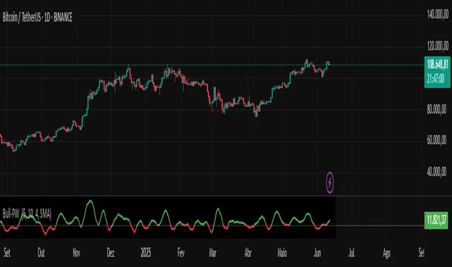
Chaikin Bull-Power OscillatorThis indicator is given with much love and care to the community to help you in your trading operations.
How to use the "Chaikin-Bull-PW" Indicator
The Chaikin-Bull-PW is an oscillator based on the Accumulation/Distribution (AD) line smoothed by different methods, called here the "Hull Chaikin Oscillator." It compares two smoothed averages of the AD line — a short period and a long period — to indicate the strength and direction of buying and selling pressure in the market.
Adjustable Parameters:
Short Period: Number of bars used to calculate the short smoothed average of the AD line. Shorter periods make the indicator more sensitive.
Long Period: Number of bars used to calculate the long smoothed average of the AD line. Longer periods smooth the indicator more.
Background Offset: Controls the offset of the chart’s background color.
Smoothing Type: Choose the smoothing method for the AD line among HMA, SMA, SMMA, EMA, WMA, and JMA. This affects how the averages are calculated and how the oscillator responds to price.
Indicator Interpretation:
The oscillator is the difference between the short and long smoothed averages of the AD line.
When the oscillator is above zero (green), it indicates increasing buying pressure, suggesting an uptrend.
When the oscillator is below zero (red), it indicates increasing selling pressure, suggesting a downtrend.
The zero line acts as a reference for trend changes.
Usage Suggestions:
Use the oscillator crossing the zero line to identify potential entry or exit points.
Combine with other indicators or chart analysis to confirm signals.
Adjust the periods and smoothing type to fit your asset and timeframe.
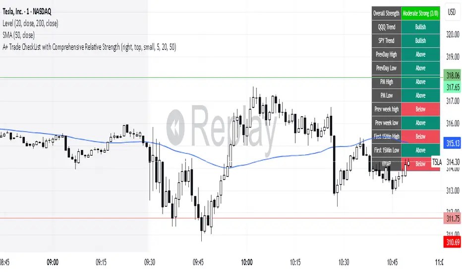
A+ Trade CheckList with Comprehensive Relative StrengthThe indicator designed for traders who need real-time market assessment across multiple timeframes and benchmarks. This comprehensive tool combines traditional technical analysis with sophisticated relative strength measurements to provide a complete market picture in one convenient table display.
The indicator tracks essential trading levels including:
QQQ and SPY trend analysis using exponential moving averages
Previous day and week high/low levels for key support and resistance
Market open levels from the first 5 and 15 minutes of trading (9:30 AM ET)
VWAP positioning for institutional price reference
Short-term EMA positioning for momentum assessment
Advanced Relative Strength Analysis
The standout feature of this indicator is its comprehensive 8-metric relative strength scoring system that compares your current ticker against both QQQ (Nasdaq-100) and SPY (S&P 500) benchmarks.
The 4-Metric Relative Strength System Explained
Metric 1: Relative Strength Ratio (RSR)
Purpose: Measures whether your ticker is outperforming or underperforming relative to its historical relationship with the benchmarks.
How it works:
Calculates the ratio of your ticker's price to QQQ/SPY prices
Compares current ratio to a 20-period moving average of the ratio
Scores +1 if ratio is above average (relative strength), -1 if below (relative weakness)
Trading significance: Identifies when a stock is breaking out of its normal correlation pattern with major indices.
Metric 2: Percentage-Based Relative Performance
Purpose: Compares short-term percentage changes to identify immediate relative momentum.
How it works:
Calculates 5-day percentage change for your ticker and benchmarks
Subtracts benchmark performance from ticker performance
Scores +1 if outperforming by >1%, -1 if underperforming by >1%, 0 for neutral
Trading significance: Captures recent momentum shifts and identifies stocks moving independently of market direction.
Metric 3: Beta-Adjusted Relative Strength (Alpha)
Purpose: Measures risk-adjusted performance by accounting for the ticker's natural volatility relationship with benchmarks.
How it works:
Calculates rolling beta (correlation and variance relationship)
Determines expected returns based on benchmark moves and beta
Measures alpha (excess returns above/below expectations)
Scores based on whether alpha is consistently positive or negative
Trading significance: Identifies stocks generating returns beyond what their risk profile would suggest, indicating fundamental strength or weakness.
Metric 4: Volume-Weighted Relative Strength
Purpose: Incorporates volume analysis to validate price-based relative strength signals.
How it works:
Compares VWAP-based percentage changes between ticker and benchmarks
Applies volume weighting factor based on relative volume strength
Enhances score when high relative volume confirms price movements
Trading significance: Distinguishes between genuine institutional-driven moves and low-volume price action that may not sustain.
Combined Scoring System
The indicator generates 8 individual scores (4 metrics × 2 benchmarks) that combine into a single strength assessment:
Score Interpretation
Strong (4-8 points): Ticker significantly outperforming both benchmarks across multiple methodologies
Moderate Strong (1-3 points): Ticker showing good relative strength with some mixed signals
Neutral (0 points): Balanced performance relative to benchmarks
Moderate Weak (-1 to -3 points): Ticker showing relative weakness with some mixed signals
Weak (-4 to -8 points): Ticker significantly underperforming both benchmarks
Display Format
The indicator shows results as: "Strong (6/8)" indicating the ticker scored 6 out of 8 possible points.
SignalWatcherThis script provides real-time monitoring of multiple technical indicators and generates visual alerts and configurable alarms:
Inputs & Mini-GUI
MACD Settings: Activation, fast, slow and signal line lengths.
RSI Settings: Activation, period length, overbought and oversold thresholds.
ADX Settings: Activation, period length, smoothing and trend strength thresholds.
Volume Settings: Activation, length of the volume MA, factor for detecting volume peaks.
Global Alert: A single composite alert for all signals.
Plot Settings: Activation and deactivation of the plot displays for RSI, MACD (lines) and ADX. Color and width selection for each line.
Display Table: Activation of the status table.
Calculations
MACD: Generates macdLine and signalLine, detects crossovers (bullish) and crossunders (bearish).
RSI: Calculates rsi_val, compares with rsi_ob and rsi_os to determine overbought/oversold.
ADX: Uses ta.dmi() to determine adx_val and checks against adx_thresh for trend strength.
Volume Spike: Exceptional trading activity detected by moving average (vol_ma) and factor (vol_factor).
Alert conditions
Six individual alertcondition() calls: MACD ↑/↓, RSI Overbought/Oversold, ADX Strong Trend, Volume Spike.
Optional composite alert (enable_global): A single notification when one of the indicator signals strikes.
Visual overlays
Alarm overlay (bottom right): Red table with text lines for currently triggered signals.
Status Table (bottom left): Overview of all indicators with current status (On/Off, Values, Thresholds).
Plots in the chart
RSI, MACD Line & Signal Line, ADX: Are displayed as lines if activated in the GUI; configurable colors & line thicknesses.
Normalized Volume & True RangeThis indicator solves a fundamental challenge that traders face when trying to analyze volume and volatility together on their charts. Traditionally, volume and price volatility exist on completely different scales, making direct comparison nearly impossible. Volume might range from thousands to millions of shares, while volatility percentages typically stay within single digits. This indicator brings both measurements onto a unified scale from 0 to 100 percent, allowing you to see their relationship clearly for the first time.
The core innovation lies in the normalization process, which automatically calculates appropriate scaling factors for both volume and volatility based on their historical statistical properties. Rather than using arbitrary fixed scales that might work for one stock but fail for another, this system adapts to each instrument's unique characteristics. The indicator establishes baseline averages for both measurements and then uses statistical analysis to determine reasonable maximum values, ensuring that extreme outliers don't distort the overall picture.
You can choose from three different volatility calculation methods depending on your analytical preferences. The "Body" option measures the distance between opening and closing prices, focusing on the actual trading range that matters most for price action. The "High/Low" method captures the full daily range including wicks and shadows, giving you a complete picture of intraday volatility. The "Close/Close" approach compares consecutive closing prices, which can be particularly useful for identifying gaps and overnight price movements.
The indicator displays volume as colored columns that match your candlestick colors, making it intuitive to see whether high volume occurred during up moves or down moves. Volatility appears as a gray histogram, providing a clean background reference that doesn't interfere with volume interpretation. Both measurements are clipped at 100 percent, which represents their calculated maximum normal values, so any readings near this level indicate unusually high activity in either volume or volatility.
The baseline reference line shows you what "normal" volume looks like for the current instrument, helping you quickly identify when trading activity is above or below average. Optional moving averages for both volume and volatility are available if you prefer smoothed trend analysis over raw daily values. The entire system updates in real-time as new data arrives, continuously refining its statistical calculations to maintain accuracy as market conditions evolve.
This two-in-one indicator provides a straightforward way to examine how price movements relate to trading volume by presenting both measurements on the same normalized scale, making it easier to spot patterns and relationships that might otherwise remain hidden when analyzing these metrics separately.

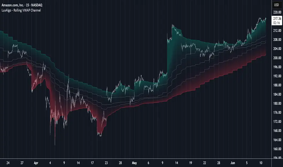
Rolling VWAP Channel [LuxAlgo]The Rolling VWAP Channel indicator creates a channel by analyzing a large number of Volume Weighted Average Prices (VWAPs) and determining a Channel based on percentile linear interpolation throughout the VWAPs.
🔶 USAGE
In this indicator, we have formed a Channel by first calculating multiple VWAPs, each with their respective anchor, then locating prices using "Percentile Linear Interpolation".
Note: Percentile Linear Interpolation locates the price point at which a specified percentage of VWAPs fall below it.
For example, a percentile of 50% would mean that 50% of the VWAP values fall below this price.
This method of analysis is important since the VWAPs are not often evenly distributed; therefore, we are able to draw importance to different levels by analyzing in percentiles.
When visualized, there is typically clustering of the VWAP values, which occurs at any given time, as seen below.
The channel can be tailored to each individual, with full control of each percentile represented in the channel. That being said, a general concept is that these clustered areas are clear results of sideways price action, which would lead us to believe that after interactions at these levels, we should expect to see a directional decision made by the market closely after.
🔶 DETAILS
The Rolling VWAP calculation calculates a user-specified number of VWAPs (up to 500), each anchored to a unique starting point in the chart based on the start of a new timeframe.
Each new timeframe that occurs causes a new VWAP to initialize. When the total number of desired VWAPs is reached, the oldest VWAP is removed and re-initialized, anchored to the current bar. Hence, the name " Rolling " VWAPs
This method allows us to automatically generate and manage large amounts of VWAPs without the need for user interaction.
After we have generated these VWAPs, we are able to run analyses on their returned values, such as the "Percentile Linear Interpolation" mentioned in the section above.
🔶 SETTINGS
Anchor Period: Choose which time period to use as the anchor point to initialize new VWAPs from.
VWAP Source: Choose the source for your VWAPs to calculate.
VWAP Amount: Sets the number of VWAPs to use. After this amount is on the chart, the oldest will be rolled.
🔹 Channel Lines
Toggle: Enable the associated VWAP Channel percentile line.
Percentile: Adjust each line's percentile independently for your needs.
Width: Adjust the width of the associated percentile line.
🔹 Calculation
Calculated Bars: Tells the indicator how many bars to calculate on, for faster calculations with less history, use a lower value. Setting this to 0 will remove the bar constraint.
Overlay Candles with MultiplierCompare Price Movements Between Two Symbols Visually
This indicator overlays the price action of a secondary symbol on your current chart, allowing you to directly compare the relative movement of two instruments — for example, Gold (XAUUSD) and Silver (XAGUSD).
By applying a customizable multiplier to the overlayed symbol's price data, the indicator scales the second symbol to fit your chart, making it easier to visually identify correlations, divergences, or relative strength between the two assets.
You can choose between candle or line display styles for the overlay, and easily switch between two distinct color schemes for better clarity and personal preference.
Use Cases:
Compare precious metals like Gold and Silver side-by-side.
Visualize correlations between related forex pairs or indices.
Monitor relative price movement for pairs trading or spread strategies.

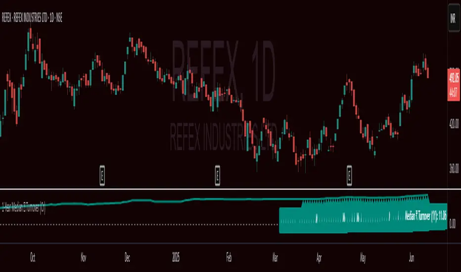
1-Year Median ₹ Turnover (Cr)# 1-Year Median ₹ Turnover (Cr) - Pine Script Description
## Overview
This Pine Script indicator calculates and displays the median turnover value in Indian Rupees (₹) over a customizable lookback period, expressed in crores for better readability. The indicator helps traders analyze the typical trading activity levels by showing the middle value of turnover distribution rather than simple averages, providing a more robust measure that's less affected by extreme values.
## Key Features
- **Median Calculation**: Uses median instead of mean to provide a more stable representation of typical turnover levels
- **Customizable Lookback Period**: Default 252 bars (approximately 1 trading year) with minimum 20 bars
- **Indian Rupee Format**: Displays values in crores (₹ Cr) for easier interpretation in Indian markets
- **Visual Label**: Optional on-chart label showing current median value
- **Clean Visualization**: Plots in a separate pane with clear formatting
## How It Works
1. **Turnover Calculation**: Multiplies volume by closing price to get turnover in rupees
2. **Data Collection**: Gathers turnover data for the specified lookback period
3. **Median Computation**: Sorts the data array and calculates the true median value
4. **Format Conversion**: Converts the result to crores (÷ 10^7) for readability
5. **Display**: Plots the median turnover as a teal line with optional labeling
## Input Parameters
- **Lookback Period**: Number of bars to include in median calculation (default: 252)
- **Show Label**: Toggle to display/hide the current value label on chart
## Technical Notes
- Uses Pine Script v5 for optimal performance
- Displays in separate pane (overlay=false) for clear visualization
- Handles edge cases for even/odd array lengths in median calculation
- Efficient array operations for real-time calculation
*This indicator is designed specifically for Indian equity markets where turnover analysis in rupees provides meaningful insights for traders and analysts.*
Market Strength Buy Sell Indicator [TradeDots]A specialized tool designed to assist traders in evaluating market conditions through a multifaceted analysis of relative performance, beta-adjusted returns, momentum, and volume—allowing you to identify optimal points for long or short trades. By integrating multiple benchmarks (default S&P 500) and percentile-based thresholds, the script provides clear, actionable insights suitable for both day trading and higher-level timeframe assessments.
📝 HOW IT WORKS
1. Multi-Factor Composite Score
Relative Performance (RS Ratio): Compares your asset’s performance to a chosen benchmark (default: SPY). Values above 1.0 indicate outperformance, while below 1.0 suggest underperformance.
Beta-Adjusted Returns: Checks the ticker’s excess movement relative to expected market-related moves. This helps distinguish pure “alpha” from broad market effects.
Volume & Correlation: Volume spikes often confirm the momentum behind a move, while correlation measures how closely the asset tracks or diverges from its benchmark.
These components merge into a 0–100 composite score. Scores above 50 frequently imply bullish strength; drops below 50 often point to underperformance—potentially flagging short opportunities.
2. Intraday & Day Trading Focus
Monitoring Below 50: During the trading day, the script calculates live data against the benchmark, offering an intraday-sensitive composite score. A dip under 50 may indicate a short bias for that session, especially when accompanied by high volume or momentum shifts.
3. Higher Timeframe Monitoring
Daily Strategies: On daily or weekly charts, the script reveals overall relative strength or weakness compared to the S&P 500. This higher-level perspective helps form broader trading biases—crucial for swing or position trades spanning multiple days.
Long/Short Thresholds: Persistent readings above 50 on a daily chart typically reinforce a long bias, while consistent dips below 50 can sustain a short or cautious outlook.
4. Pair Trading Applications
Custom Benchmark Selection: By setting a specific ticker pair as your benchmark instead of the default S&P 500, you can identify spread trading opportunities between two correlated assets. This allows you to go long the outperforming asset while shorting the underperforming one when the spread reaches extreme levels.
4. Color-Coded Signals & Alerts
Visual Zones (25–75): Color-coded bands highlight strong outperformance (above 75) or pronounced underperformance (below 25).
Alerts on Strong Shifts: Automatic alerts can notify you of sudden entries or exits from bullish or bearish zones, so you can potentially act on new market information without delay.
⚙️ HOW TO USE
1. Select Your Timeframe: For scalping or day trading, lower intervals (e.g., 5-minute) offer immediate data resets at the session’s start. For multi-day insight, daily or weekly charts reveal broader performance trends.
2. Watch Key Levels Around 50: Intraday dips under 50 may be a cue to consider short trades, while bounces above 50 can confirm renewed strength.
3. Assess Benchmark Relationships: Compare your asset’s score and signals to the broader market. A stock falling below its pair’s relative strength line might lag overall market momentum.
4. Combine Tools & Validate: This script excels when integrated with other technical analysis methods (e.g., support/resistance, chart patterns) and fundamental factors for a holistic market view.
❗ LIMITATIONS
No Direction Guarantee: The indicator identifies relative strength but does not guarantee directional price moves.
Delayed Updates: Since calculations update after each bar close, sudden intrabar changes may not immediately reflect.
Market-Specific Behaviors: Some assets or unusual market conditions may deviate from typical benchmarks, weakening signal reliability.
Past ≠ Future: High or low relative strength in the past may not predict continued performance.
RISK DISCLAIMER
All forms of trading and investing involve risk, including the possible loss of principal. This indicator analyzes relative performance but cannot assure profits or eliminate losses. Past performance of any strategy does not guarantee future results. Always combine analysis with proper risk management and your broader trading plan. Consult a licensed financial advisor if you are unsure of your individual risk tolerance or investment objectives.

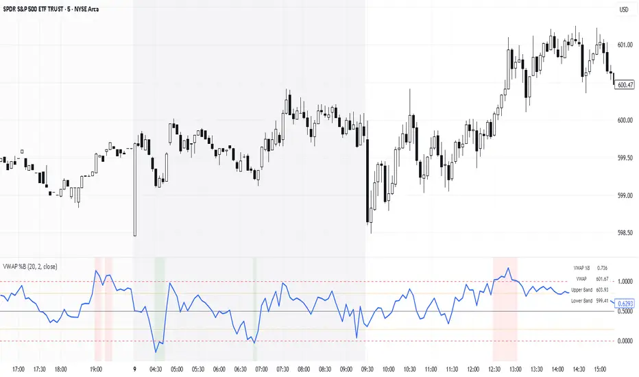
VWAP %BVWAP %B - Volume Weighted Average Price Percent B
The VWAP %B indicator combines the reliability of VWAP (Volume Weighted Average Price) with the analytical power of %B oscillators, similar to Bollinger Bands %B but using volume-weighted statistics.
## How It Works
This indicator calculates where the current price sits relative to VWAP-based standard deviation bands, expressed as a percentage from 0 to 1:
• **VWAP Calculation**: Uses volume-weighted average price as the center line
• **Standard Deviation Bands**: Creates upper and lower bands using standard deviation around VWAP
• **%B Formula**: %B = (Price - Lower Band) / (Upper Band - Lower Band)
## Key Levels & Interpretation
• **Above 1.0**: Price is trading above the upper VWAP band (strong bullish momentum)
• **0.8 - 1.0**: Overbought territory, potential resistance
• **0.5**: Price exactly at VWAP (equilibrium)
• **0.2 - 0.0**: Oversold territory, potential support
• **Below 0.0**: Price is trading below the lower VWAP band (strong bearish momentum)
## Trading Applications
**Trend Following**: During strong trends, breaks above 1.0 or below 0.0 often signal continuation rather than reversal.
**Mean Reversion**: In ranging markets, extreme readings (>0.8 or <0.2) may indicate potential reversal points.
**Volume Context**: Unlike traditional %B, this incorporates volume weighting, making it more reliable during high-volume periods.
## Parameters
• **Length (20)**: Period for standard deviation calculation
• **Standard Deviation Multiplier (2.0)**: Controls band width
• **Source (close)**: Price input for calculations
## Visual Features
• Reference lines at key levels (0, 0.2, 0.5, 0.8, 1.0)
• Background highlighting for extreme breaks
• Real-time values table
• Clean oscillator format below price chart
Perfect for intraday traders and swing traders who want to combine volume analysis with momentum oscillators.
4-EMA Signals + MTF Analysis4-EMA Signals + MTF Analysis Indicator: User Guide
This indicator is designed for active traders; from scalpers / intra-day traders to swing-traders who simply want an easy to understand, simple, but yet comprehensive and easy-to-understand indicator with a quick overview of initial market momentum and overall market direction to assist the trader in their initial trading.
The main feature of this indicator is that It overlays four exponential moving averages (EMAs), and provides a dashboard of real-time trend signals for both buy and sell (long/short) scenarios.
Settings Overview
MA Period Setup
Custom: Set your own EMA periods.
Conservative, Aggressive, Fibonacci: Quickly apply preset EMA period combinations for different trading styles.
EMA Periods (Custom Setup)
Fast EMA: Shortest EMA, reacts quickly to price (default 7).
Medium-Short EMA: Intermediate speed (default 25).
Medium-Long EMA: Slower, filters out more noise (default 70).
Slow EMA: Longest-term trend (default 200).
(These settings can be adjusted to suit your individual needs)
Main Indicator Features
Four EMAs : Plotted in distinct colors (green, yellow, orange, red) for quick trend recognition - this can be altered in colour to your personal preferences.
Buy/Sell Signals : Triangles appear below/above bars when EMA crossovers occur, optionally filtered by volume - the volume filter when applied greatly reduces the influx of signals, only giving high-quality signals!
Trading Sessions + Backgrounds : A trading session feature has been added: (London, New York, Asia, Sydney) with the choice of a background to indicate each global trading session.
Volume Overlay : Volume bars and a blue volume moving average line for context.
Dashboard Table (Top Right):
Market Direction: Shows the overall EMA alignment (bullish, bearish, weak, consolidating).
The initial trend on the 5m, 15m, 1H, and 4H time-frame to give a quick snapshot of overall trend direction.
How to Use
Trend Identification :
-- Use the EMA alignment and dashboard table to quickly see if the market is bullish, bearish, or consolidating.
EMA Set-up
-- Adjust the EMA settings to your specific requirements, the signals will alter depending on the volatility of the instrument your trading.
Signal Confirmation :
-- ''Buy'' signals simply appear when the faster EMAs cross above slower EMAs in and ''Sell'' signals simply appear when they cross below.
Volume Context :
--Use the volume moving average and the optional volume filter to avoid signals during low-activity periods.
No Repainting :
-- All signals and dashboard readings are calculated using only confirmed, closed bars. What you see in real time is exactly what will appear in your back-test — no repainting or look-ahead bias.
Alerts / Notifications
Now for the fun part:
1. Enable Buy/Sell Signal Alerts: Get notifications when buy or sell signals occur.
2. For Alerts to function correctly, set the ''condition'' to the indicator itself.
3. Select ''EMA Bearish Cross'' or ''EMA Bullish Cross'' depending whether you want alerts for either buy/sell signals - Or one can simply set alerts for both scenarios.
4. For ''Interval'' set to ''Same as chart'' - So, the time-frame which you'd like to trade on.
5. For ''Trigger'' set to ''Once Per Bar Close''.
6. Save.
7. Wait for a signal to occur!
NOTE: Before placing a trade, it's often best to also assess the market conditions at that time also - and not rely solely on the signals, the signals are to assist, and it's often occurred a signal has shown, but a pull-back occurs, and a FVG in discount holds -- it's this FVG holding, accompanied by volume, that's the real entry, possibly.
Tip: For the cleanest results, use the indicator during the most active sessions and always check multi-time-frame trend alignment before entering trades. Good Luck! :)

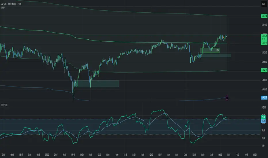
TradeQUO Herrick Payoff RSIHerrick Payoff Index RSI (HPI-RSI) with Signal Line
An advanced oscillator that measures market strength not just by price, but by "smart money flow."
This indicator is not a typical RSI. Instead of applying the Relative Strength Index to price alone, it calculates it on the cumulative Herrick Payoff Index (HPI) . This creates a unique oscillator that reflects the underlying sentiment and capital flow in the market.
What is the Herrick Payoff Index (HPI)?
The HPI is a classic sentiment indicator that combines three crucial elements to determine if money is flowing into or out of an asset:
Price Change: The direction and momentum of the market.
Trading Volume: The conviction behind the price movement.
Open Interest (OI): The total number of open contracts (mainly in futures), which indicates if new capital is entering the market.
By combining these factors, the HPI provides a more comprehensive picture of market strength than indicators based solely on price.
How This Indicator Works
The script follows a logical, multi-step process:
It calculates the raw Herrick Payoff Index for each bar.
It creates a cumulative sum of this index to generate a continuous money flow value.
This cumulative value is smoothed with a short-period EMA to reduce noise.
The RSI is then applied to this smoothed HPI value.
An additional, configurable signal line (moving average) is added to facilitate trading signals.
Interpretation and Application
You can use this indicator much like a standard RSI, but with the added context of money flow:
Overbought/Oversold: Values above 70 suggest an overbought condition, while values below 30 signal an oversold condition.
Signal Line Crossovers: A cross of the HPI-RSI line above the signal line can be seen as a bullish signal. A cross below can be seen as a bearish signal.
Divergences: Look for divergences between the indicator and the price. A bullish divergence (price makes a lower low, indicator makes a higher low) can indicate an upcoming move to the upside. A bearish divergence (price makes a higher high, indicator makes a lower high) can signal a potential move to the downside.
Settings
The indicator has been deliberately kept simple:
HPI Smoothing Length: Smoothing length (1-5) for the cumulative HPI.
RSI Length: The lookback period for the RSI calculation.
Signal Line Settings: Here you can enable/disable the signal line and customize its type and length.
Display Settings: Adjust the colors of the RSI and signal lines to your preference.
This indicator is a tool for analysis and should always be used in combination with other methods and a solid risk management strategy. Happy trading!
Engulfing Candles (ATR-Based) with Volume SpikeOverview:
This script is designed to detect high-probability bullish and bearish engulfing patterns — but with a twist: it filters them through ATR-based volatility and confirms strength with volume spikes, all while offering optional trend filtering. It's built for traders who want more than just surface-level candle patterns — it's for those who want contextual confirmation before entering a trade.
What Makes It Different:
Most engulfing candle indicators simply match two candle shapes. This script goes deeper by:
Measuring candle body size relative to recent volatility (via ATR).
Checking for volume confirmation using a dynamic spike threshold.
Filtering based on trend context using SMA-based structure detection.
This tri-layered logic aims to avoid false positives and give traders cleaner, more actionable entries that align with momentum.
Core Concepts:
1. Trend Detection (Optional)
You can choose between two structural filters:
SMA50 only: Looks for price above or below the 50-period SMA to define trend direction.
SMA50 + SMA200 alignment: A stricter rule requiring both fast and slow SMAs to confirm a trend.
Or turn off trend filtering entirely (No detection).
This helps ensure engulfing setups appear in line with the broader trend, increasing the likelihood of continuation.
2. ATR-Filtered Candle Bodies
To eliminate noise:
A candle is only considered a valid engulfing candle if it has a body larger than 1.5× ATR(14).
The previous candle must be a small-bodied candle (less than 0.5× ATR), creating a clear visual engulfing structure.
This method dynamically adjusts for market volatility, so setups are meaningful even during periods of compression or expansion.
3. Volume Spike Confirmation
Not all engulfing candles lead to follow-through. That’s why this script includes a volume confirmation filter:
A 20-period moving average of volume is calculated.
A spike is flagged if the current bar’s volume exceeds 1.5× this average (adjustable).
Patterns with this confirmation are marked with a “*” label (e.g., BU* or BE*) to distinguish volume-backed setups from weaker ones.
Visuals & Alerts:
BU = Bullish engulfing without volume spike
BU* = Bullish engulfing with volume spike
BE = Bearish engulfing without volume spike
BE* = Bearish engulfing with volume spike
A white background highlight is shown behind candles with volume-confirmed engulfing patterns.
Alerts are available for BU* and BE* so you can automate your edge.
How to Use:
Add the indicator to any chart.
Choose your trend filter from the settings panel.
Watch for BU* and BE* labels — these are your highest-conviction signals.
Optional: Combine with support/resistance, Fibonacci zones, or MTF confirmation to refine entries.
Use the included alerts to receive real-time push/email notifications when patterns emerge.
Performance Note:
I’ve found this script to be fairly good when applied to the 1-hour charts of the companies in the US100. The combination of ATR-based filtering and volume confirmation appears to provide clear, high-quality setups with good follow-through potential.
By blending candle patterns, volatility filtering, volume confirmation, and trend context, this script aims to filter out weak signals and highlight the most statistically significant engulfing opportunities.

Trendline Breakouts With Volume Strength [TradeDots]Trendline Breakouts With Volume Strength is an innovative indicator designed to identify potential market turning points using pivot-based trendline detection and volume confirmation. By merging dynamic trendline analysis with multi-tiered volume filters, this tool helps traders quickly spot breakouts or breakdowns that may signal significant shifts in price action.
📝 HOW IT WORKS
1. Pivot-Based Trendline Detection
The script automatically scans for recent pivot highs and lows over a user-defined lookback period.
When it finds higher pivot lows, it plots green uptrend lines; when it finds lower pivot highs, it plots red downtrend lines.
These dynamic lines update as new pivots form, providing continuously refreshed trend guidance.
2. Volume Ratio Analysis
A moving average of volume is compared against the current bar’s volume to calculate a ratio (e.g., 1.5×, 2×).
Higher ratios suggest above-average volume, often interpreted as stronger participation.
The script applies color-coded cues to highlight the intensity of volume surges.
3. Breakout & Breakdown Detection
Each trendline is monitored for a defined “break threshold,” which helps avoid minor penetrations that can trigger premature signals.
When price closes beyond a threshold below an uptrend line, the indicator labels it a “BREAKDOWN.” If it closes above a threshold on a downtrend line, it labels it a “BREAKOUT.”
Volume surges accompanying these breaks are highlighted with contextual emojis and distinct color gradients for quick visual reference.
4. Trend Direction Table
A small on-chart table provides a snapshot of the current market trend—Uptrend, Downtrend, or Sideways—based on a simple moving average slope and the number of active uptrend or downtrend lines.
This table also displays quick stats on how many lines are actively tracked, helping traders assess the broader market posture at a glance.
🛠️ HOW TO USE
1. Choose a Timeframe
This script works on multiple timeframes. Intraday traders can monitor minute or hourly charts for frequent pivot updates, while swing and position traders may prefer daily or weekly intervals to reduce noise.
2. Observe Trendlines & Labels
Watch for newly drawn green/red lines connecting pivots.
When you see a “BREAKOUT” or “BREAKDOWN” label, confirm whether volume was abnormally high based on the ratio or color-coded bars.
3. Consult the Trend Table
Use the table in the bottom-right corner to quickly check if the market is trending or range-bound.
Look at the count of active uptrend vs. downtrend lines to gauge broader sentiment.
4. Employ Additional Analysis
Combine these signals with other tools (e.g., candlestick patterns, oscillators, or fundamental analysis).
Validate potential breakouts using standard techniques like retests or support/resistance checks.
❗️LIMITATIONS
Delayed Pivots: Trendlines only adjust once new pivot highs or lows form, which can introduce a slight lag in highly volatile environments.
Choppy Markets: Rapid, back-and-forth price moves may produce conflicting trendline signals and frequent breakouts/breakdowns.
Volume Data Reliability: Gaps in volume data or unusual market conditions (holidays, low-liquidity sessions) can skew ratio readings.
RISK DISCLAIMER
Trading any financial instrument involves substantial risk, and this indicator does not guarantee profits or prevent losses. All signals and visual cues are for educational and informational purposes only; past performance does not assure future outcomes. You retain full responsibility for your trading decisions, including proper risk management, position sizing, and the use of additional confirmation methods. Always consider the possibility of losing some or all of your original investment.

Liquidation Heatmap ║ BullVision 🧠Overview
The Liquidation Heatmap ║ BullVision 💥 is a high-precision visualization tool engineered to highlight probable liquidation levels in crypto markets. It leverages multi-exchange Open Interest data, real-time volume dynamics, and structure-aware volatility signals to reveal where leveraged traders are most at risk of forced position closures.
📖 What Are Liquidations?
In leveraged derivatives markets, a liquidation occurs when a trader’s margin becomes insufficient to maintain their position, triggering an automatic force-close by the exchange. These events are typically clustered around price levels where large volumes of overleveraged positions accumulate. When breached, they often result in sharp, aggressive price movements — also known as liquidation cascades.
This indicator is designed to detect and project such high-risk zones before they trigger, giving traders an edge in visualizing hidden pressure points in the market.
🧠 How It Works
The core engine aggregates real-time ∆OI (Open Interest delta) data from multiple major exchanges and applies a layered filtering system that considers:
Relative Open Interest shifts, normalized against an adaptive moving average baseline
Volume acceleration patterns, compared to a rolling historical benchmark
Market structure context, identifying meaningful directional breaks and failed retests
Leverage-tier modeling, using probabilistic distance rules to simulate where liquidations from 5x to 100x positions would be triggered
Each qualifying liquidation level is rendered using dynamic gradient lines and optional glow-enhanced zone visuals. The display adapts in real time to structural confirmation, volatility regime, and liquidity depth.
Exemple of Liquidation cascades
Exemple of Liquidation rejection
🔍 Key Features
🔗 Multi-Exchange OI Aggregation: Binance, OKX, BitMEX, Kraken (toggleable)
📊 Leverage-Tier Mapping: 5x, 10x, 25x, 50x, 100x projections
🎨 Gradient Zones: Custom color ramps reflect level significance
🧱 Structure-Sensitive Filtering: Noise reduction via multi-condition confirmation logic
🧠 Contextual Directional Bias: Zones filtered based on recent bullish/bearish transitions
⚙️ Fully Customizable: User-defined intensity thresholds, color palette, and range filtering
🧩 Why It’s Worth Paying For
This is not a mashup of public indicators. The script introduces an original, multi-layered architecture combining real-time Open Interest dynamics, structural analysis, and custom liquidation modeling.
Unlike speculative support/resistance plots or volume-only heatmaps, this tool is built to:
Detect liquidation zones before they cascade
React dynamically to market shifts
Filter noise through structural confirmation
Retain historical zones for visual learning and backtesting
✅ Compliance & Originality
This script was developed entirely in-house with original detection logic. No reused open-source components are included. Data requests are made through TradingView’s native .P_OI feeds, and all calculations, signal conditions, and visual logic were coded from scratch for this script.
⚠️ Risk Disclaimer & Access Policy
This script is a visual risk-awareness tool, not a signal generator or financial advice mechanism. No guarantee is made regarding future price action, liquidation triggers, or trading performance.
Use at your own discretion, with proper position sizing, risk management, and awareness of the market's inherent uncertainty.
🔒 Why This Script Is Invite-Only and Closed-Source
To protect its proprietary detection engine, this script is both closed-source and invite-only. The algorithm uses original methods to:
Aggregate real-time Open Interest delta across exchanges
Simulate leverage-based liquidation zones
Dynamically filter zones using structure and volatility layers
Opening the source would expose core detection logic to copycats or misuse. Likewise, access is limited to ensure the tool is used responsibly by serious traders and not distributed or repackaged unethically.
This model preserves the script’s quality, originality, and intended value.

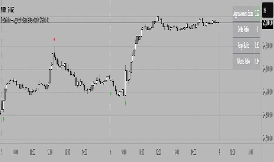
DeltaStrike — Aggressive Candle Detector by Chaitu50cDeltaStrike — Aggressive Candle Detector
by Chaitu50c
DeltaStrike is a simple and effective tool designed to help traders identify the most aggressive candles on the chart in real time. It works purely on price action and internal candle dynamics, with no reliance on lagging indicators.
The indicator combines delta (directional strength), candle range, and volume to compute an overall aggressiveness score for each candle. When this score exceeds a dynamic threshold based on recent market behavior, the candle is marked as an aggressive move.
Aggressive bullish candles are plotted as green diamonds below the candle, while aggressive bearish candles are plotted as red diamonds above the candle. The goal is to help traders visually spot moments of strong directional pressure, where potential trends or reversals may emerge.
The detection logic adapts automatically to changing market volatility and volume, making it suitable for all instruments and timeframes, including index futures, equities, and forex.
An integrated dashboard on the chart displays live readings of the key components contributing to each candle’s aggressiveness score: delta ratio, range ratio, and volume ratio. This helps traders understand the internal structure of each aggressive move.
Features:
Dynamic aggressiveness detection based on delta, range, and volume
Adaptive threshold for consistent behavior across timeframes and instruments
Clean chart output with clear diamond markers only on selected candles
Live dashboard with internal metrics for advanced analysis
Simple, lightweight, and optimized for intraday and swing trading
Works with any instrument: index, equity, forex, commodity
DeltaStrike is intended as an objective visual aid to help traders focus on genuine moments of strong market intent, filtering out ordinary or passive price movement. It can be used standalone or in combination with your existing trading strategy.
Whale Activity Classic[nakano]## Whale Activity Classic
### Uncover the Hidden Intent of Volume
The **Whale Activity Classic ** indicator provides an unparalleled view into the nuanced volume dynamics within each candlestick. By analyzing sub-timeframe volume, it visually separates significant **large investor** activity from typical "Noise" volume, helping you understand the true forces driving price action.
This tool is designed to reveal the otherwise invisible movements of **large investors** and gauge overall market participation, giving you a deeper understanding than standard volume bars alone.
---
### Key Features:
* **Multi-Layered Volume Bars:**
* **Large Investor Volume (Densely Colored Bars):** Represents the aggregated volume from sub-timeframe candles where individual volume exceeded your defined threshold. Green indicates buying pressure (positive), and red indicates selling pressure (negative).
* **Normal Volume (Lightly Colored Bars):** Shows the total volume from sub-timeframe trades that fell *below* the threshold. This provides context about general market participation.
* **Comprehensive Customization:**
* **Symbol Selection:** Analyze the current chart's symbol or specify any custom symbol (e.g., crypto, stocks, forex) for in-depth analysis.
* **Lower Timeframe Analysis:** Choose your desired granularity from 1-second, 5-second, 10-second, 30-second, 1-minute, 5-minute, or 15-minute sub-timeframes.
* **Volume Thresholding:** Opt for a `Manual` fixed threshold or an `Automatic` calculation that adapts to current market conditions.
* **Noise Volume Visibility:** Toggle the display of "Normal Volume" bars to focus on **large investor** activity or view the complete picture.
* **Extensive Color Settings:** Customize the colors and transparency for all four volume types (**large investor** Positive/Negative, Normal Positive/Negative) to match your visual preferences.
---
### How to Use & Interpretation Tips:
* **Understanding Auto-Calculated Thresholds:** When `Automatic` calculation is selected, hover your cursor over any bar. The exact "Current Threshold" applied to that bar will be displayed in the status line at the top-left of the indicator panel.
* **Spotting Large Investor Intent:**
* If **Large Investor Volume (green/red bars)** is prominent while **Normal Volume (lightly colored bars)** is small, it suggests a sudden, significant move by a **large investor**, potentially against the prevailing retail sentiment.
* Conversely, if both **Large Investor Volume** and Normal Volume are large, it indicates strong trend momentum, drawing in both large institutions and retail participants.
* **Measuring Trend Strength:** Combined large **Large Investor Volume** and Normal Volume bars signify a robust trend with broad market participation.
* **Default Settings:** The automatic threshold's default settings (Period: 100, Multiplier: 25) are balanced for broad market application. However, we recommend adjusting these values to optimize performance for your specific asset and trading style.
---
### Important Notes:
* Analyzing longer chart timeframes (e.g., 1-hour, daily) with very low sub-timeframes may process a large amount of data, potentially affecting performance or causing errors. Using this indicator on **minute timeframes** is recommended.
* Always ensure your `Analysis Timeframe (Lower)` is **shorter** than your main chart's timeframe.
* Access to second-based timeframes (1S, 5S, etc.) requires a paid TradingView plan.
---
---
### 出来高の隠れた意図を解き明かす
**Whale Activity Classic ** インジケーターは、各ローソク足内で展開される微細な出来高の力関係を、かつてないほど詳細に可視化します。より短い時間足の出来高を分析することで、重要な**大口投資家**の活動と、一般的な「通常出来高(ノイズ)」を視覚的に分離し、値動きを動かす真の力を理解する手助けをします。
このツールは、通常の出来高バーでは見えない**大口投資家**の動きと、市場全体の参加状況を同時に把握するために設計されており、標準的な出来高表示だけでは得られない深い洞察を提供します。
---
### 主な機能:
* **多層的な出来高バー:**
* **大口投資家出来高(濃い色のバー):** 指定した閾値を超えた、より短い時間足の個々の出来高を合計したものです。緑色は買い圧力(プラス方向)、赤色は売り圧力(マイナス方向)を示します。
* **通常出来高(薄い色のバー):** 閾値に満たなかった取引の合計出来高を示します。これにより、一般的な市場参加の状況を把握できます。
* **包括的なカスタマイズ性:**
* **銘柄選択:** 現在のチャートの銘柄を分析することも、暗号資産、株式、FXなど、任意のカスタム銘柄を指定して詳細な分析を行うこともできます。
* **分析する時間足 (下位):** 1秒、5秒、10秒、30秒、1分、5分、15分から、分析の粒度を選択できます。
* **出来高の閾値:** 固定値を設定する「手動」モードと、現在の市場状況に適応する「自動」計算モードを選択できます。
* **通常出来高の表示:** チェックボックスで「通常出来高」バーの表示/非表示を切り替え、**大口投資家**の活動に焦点を当てるか、全体像を見るかを選択できます。
* **詳細なカラー設定:** 4種類の出来高タイプ(**大口投資家**プラス/マイナス、通常プラス/マイナス)すべての色と透明度を自由にカスタマイズできます。
---
### 使い方と分析のヒント:
* **自動計算された閾値の確認方法:** 「自動」計算を選択した場合、任意のバーにカーソルを合わせると、インジケーターパネルの左上にあるステータスラインに、そのバーに適用された正確な「現在の計算閾値」が表示されます。
* **大口投資家の意図を読み解く:**
* **大口投資家出来高(緑/赤のバー)が際立っている一方で、通常出来高(薄い色のバー)が小さい場合**、それは一般的な小売りのセンチメントとは異なる、**大口投資家**による突然の重要な動きを示唆している可能性があります。
* 逆に、**大口投資家出来高**と通常出来高の両方が大きい場合、それは大規模な機関投資家と個人投資家の両方を巻き込んだ、強いトレンドが発生していることを示します。
* **トレンドの勢いを測る:** **大口投資家出来高**と通常出来高のバーの両方が大きい場合、それは活発な市場参加を伴う、堅調なトレンドを示します。
* **デフォルト設定について:** 自動閾値のデフォルト設定(期間:100、倍率:25)は、幅広い市場に適用できるようバランスが取れています。ただし、ご自身の分析対象となる資産や取引スタイルに合わせて、これらの値を調整することをお勧めします。
---
### 重要な注意事項:
* メインチャートの時間足を長く(例:1時間足、日足)しすぎると、非常に細かい下位の時間足で大量のデータを処理することになり、パフォーマンスが低下したり、エラーが発生する可能性があります。このインジケーターは**分足での使用を推奨**します。
* 「分析する時間足 (下位)」は、必ずメインチャートの時間足より**短いもの**を選択してください。
* 秒足(1S、5Sなど)での分析には、TradingViewの有料プランへの加入が必要です。
---
Volume Profile - EdzVolume Profile – Edz is a lightweight indicator that identifies the top high-volume price levels over a recent range of candles, using customizable price binning (priceStep) and lookback length. It highlights the top N volume clusters with horizontal lines, labels, and strength-based star ratings (★–★★★), and displays a compact summary table showing price, volume, and relative strength. Optimized for intraday and short-term trading, this tool updates only on the latest bar for maximum performance and is ideal for spotting volume-based support, resistance, and high-confluence trading zones.
Volume-Time Imbalance (VTI)Volume-Time Imbalance (VTI) – Indicator Description
This indicator measures the imbalance between traded volume and the time elapsed between bars to identify unusual spikes in volume per second (volume per unit of time). Its purpose is to highlight volume movements that may indicate moments of strong interest, acceleration, or reversal in the market.
How it works:
It calculates the traded volume divided by the time (in seconds) elapsed since the previous bar — thus obtaining the volume per second.
An EMA (exponential moving average) of this volume per second is calculated to smooth the data.
The VTI value is the ratio between the current volume per second and this moving average, showing if the current volume is above what is expected for that pace.
The higher the VTI, the greater the imbalance between volume and time, indicating possible bursts of activity.
Settings:
VTI Moving Average Length: The period of the moving average used to smooth the volume per second (default is 20).
Alert Thresholds: Alert levels to identify moderate and high imbalances (defaults are 1.5 and 2.0).
Show VTI Histogram: Displays the VTI histogram in the indicator window.
Color Background: Colors the indicator background based on the strength of the imbalance (orange for moderate, red for high).
Show Alert Arrows: Shows arrows below the chart when a strong volume spike occurs (high alert).
Interpretation:
VTI values above the moderate level (1.5) indicate an unusual increase in volume relative to time.
Values above the high level (2.0) signal strong spikes that may anticipate significant moves or trend changes.
Use the colors and arrows as visual confirmations to quickly identify these moments.
8EMA/VWAP14 Oscillator w/ Trend Exhaustion Bands8EMA/VWAP14 Oscillator w/ Trend Exhaustion Bands + Performance Screener
Introducing the 8EMA/VWAP14 Oscillator with Trend Exhaustion Bands + Screener Suite - a comprehensive trading system that combines trend identification, momentum analysis, and real-time performance tracking all in one indicator. This system features a four-tier signal approach: early momentum warning dots before anything happens, confirmed entry/exit triangles when it's time to act, a dynamic trend ribbon on your price chart, and adaptive exhaustion bands that adjust to each asset's unique characteristics. The built-in performance tracker shows exactly how well your signals are working - success rates, average time to hit targets, and more - providing clear insight for confident trading decisions. Optimized for daily and weekly timeframes, this suite is suitable for both manual traders and automated strategies.
Aim of the Indicator
The 8EMA/VWAP14 Oscillator with Trend Exhaustion Bands is an advanced momentum oscillator system that combines trend identification, momentum analysis, and forward-looking performance validation. This comprehensive tool measures the percentage difference between an 8-period Exponential Moving Average and a 14-period Volume Weighted Average Price while providing multiple layers of signal confirmation through visual trend ribbons, momentum shift alerts, and adaptive exhaustion detection.
How to Interpret the Indicator
Visual Trend System: The indicator displays a dynamic ribbon between the 8EMA and 14VWAP lines on the price chart, automatically colored green when EMA8 is above VWAP14 (bullish trend) and red when below (bearish trend), providing instant trend context.
Four-Tier Signal System:
Tiny Green Dots (Below Bars): Early bullish momentum shifts when the oscillator crosses above its adaptive baseline
Green Triangles (Below Bars): Confirmed buy signals when EMA8 crosses above VWAP14
Tiny Red Dots (Above Bars): Early bearish momentum shifts when the oscillator crosses below its adaptive baseline
Red Triangles (Above Bars): Confirmed sell signals when EMA8 crosses below VWAP14
Oscillator Analysis: The separate pane displays the momentum oscillator with a dynamic zero line (thin blue) representing the recent average EMA8/VWAP14 relationship. Trend exhaustion is detected through adaptive bands - orange for potential upside exhaustion and purple for potential downside exhaustion, calculated dynamically based on the oscillator's historical range relative to its adaptive baseline.
Key Settings and Flexibility
Signal Source Customization: Choose from Open, High, Low, Close, OHLC Average, or HL Average to optimize signal sensitivity for different market conditions and trading styles.
Multi-Timeframe Capability: Enable higher timeframe analysis to use signals from longer periods while trading on shorter timeframes, significantly reducing noise and improving signal quality for more reliable entries.
Dynamic Baseline Controls: Adjust the adaptive zero line calculation period (5-100 bars) - shorter periods provide more responsive momentum detection, while longer periods offer smoother trend context and reduced false signals.
Entry Timing Options: "Bar Opening Only" mode ensures signals trigger only at confirmed bar close using realistic entry prices, eliminating mid-bar noise and providing accurate backtesting results for automated trading systems.
Adaptive Exhaustion Detection: Customize lookback periods and threshold multipliers to fine-tune exhaustion sensitivity for different volatility environments and asset classes.
Comprehensive Performance Tracking: Set custom profit targets (1-50%) and maximum holding periods to analyze forward-looking signal effectiveness with real-time success rate monitoring.
Advanced Features and Benefits
Forward-Looking Performance Analytics: Unlike traditional backtesting, this system tracks how often buy signals reach specified profit targets and measures average time to target, providing immediate validation of signal quality across different assets and timeframes.
Adaptive Baseline Technology: The dynamic zero line automatically adjusts to each asset's unique EMA8/VWAP14 relationship patterns, making momentum signals contextually relevant rather than using static thresholds that may not suit all market conditions.
Professional Entry/Exit Tracking: When "Bar Opening Only" is enabled, all performance calculations use actual tradeable prices (next bar's open) rather than theoretical mid-bar prices, ensuring realistic performance expectations.
Visual Performance Dashboard: Real-time table displaying success rate, average bars to target, fastest/slowest target achievement, and active position tracking with complete transparency about timeframe, signal source, and methodology being used.
Integrated Alert System: Comprehensive alerts for both early momentum shifts and confirmed crossover signals, enabling automated trading integration and timely manual intervention.
Best Practices for Timing Entries and Exits
Entry Timing Strategy:
Watch for Early Warning: Monitor tiny green dots as momentum builds - this is your preparation phase
Confirm with Ribbon: Ensure the ribbon color aligns with your intended direction (green for long positions)
Enter on Triangle Signal: Execute entries when confirmed buy triangles appear, using realistic bar opening prices
Avoid Exhaustion Zones: Be cautious entering when the oscillator is near orange (upper) exhaustion bands
Exit Timing Strategy:
Monitor Momentum Shifts: Red dots above bars provide early warning of potential reversals before actual sell signals
Use Exhaustion Bands: Consider partial profit-taking when oscillator reaches exhaustion zones (orange/purple bands)
Confirm with Sell Signals: Exit positions when red triangles appear, especially if preceded by bearish momentum dots
Time-Based Exits: Utilize the "Max Bars to Target" setting to avoid holding losing positions indefinitely
Risk Management Integration:
Position Sizing: Use success rate metrics to adjust position sizes - higher success rates may warrant larger positions
Multi-Timeframe Confluence: Combine daily signals with weekly context for highest probability setups
Avoid False Signals: Wait for momentum dots before triangles for stronger signal confirmation, reducing whipsaw trades
Optimal Market Conditions:
Trending Markets: Ribbon provides clear directional bias - trade in direction of ribbon color
Range-Bound Markets: Focus on exhaustion bands for reversal opportunities near dynamic support/resistance levels
Volatile Conditions: Use higher timeframe settings to filter noise and focus on more significant moves
Optimal Timeframe Usage
This indicator achieves exceptional performance on Daily timeframes and delivers superior results on Weekly timeframes. Weekly analysis is particularly powerful for position trading and swing strategies, as the adaptive exhaustion bands and momentum shifts have greater statistical significance over extended periods. The ribbon visualization becomes especially valuable on longer timeframes, clearly delineating major trend phases while filtering out intraday noise that can plague shorter-term analysis.
Alternative Applications
Multi-Timeframe Confluence System: Use weekly signals for trend direction while executing entries on daily timeframes, combining the indicator's momentum dots and triangles across different time horizons for high-probability setups.
Automated Trading Integration: The indicator's comprehensive alert system and realistic entry tracking make it ideal for automated trading platforms, with clear signal hierarchy and performance validation built into the system.
Risk-Adjusted Position Sizing: Utilize real-time success rate data and average holding period metrics to dynamically adjust position sizes based on current market effectiveness of the strategy.
Market Regime Detection: The ribbon color changes and exhaustion band interactions help identify when markets transition between trending and ranging conditions, allowing strategy adaptation accordingly.
Performance Validation Tool: Test signal effectiveness across different assets, timeframes, and market conditions before committing capital, using the forward-looking analytics to validate strategy assumptions.
Conclusion
The 8EMA/VWAP14 Oscillator with Trend Exhaustion Bands represents a comprehensive trading system that bridges the gap between manual analysis and automated execution. Its multi-layered approach provides both leading momentum indicators and lagging confirmation signals, while the adaptive baseline technology ensures relevance across different market conditions and asset classes. The integration of visual trend ribbons, performance analytics, and flexible timing controls makes it suitable for both discretionary traders seeking enhanced market insight and systematic traders requiring robust signal validation for automated strategies.

Candle Body Strength CounterThis indicator measures the total bullish and bearish candle body strength over a user-defined lookback period. For each bar, it sums the absolute body sizes of bullish candles (where close > open) and bearish candles (where close < open) within the lookback window. The result is two lines: one for bullish body strength and one for bearish body strength, making it easy to spot shifts in market momentum and bias.
Adjustable lookback period (default: 20 bars)
Green line: cumulative bullish body strength
Red line: cumulative bearish body strength
Use this tool to quickly assess which side (bulls or bears) has been stronger over your chosen timeframe.

Langlands-Operadic Möbius Vortex (LOMV)Langlands-Operadic Möbius Vortex (LOMV)
Where Pure Mathematics Meets Market Reality
A Revolutionary Synthesis of Number Theory, Category Theory, and Market Dynamics
🎓 THEORETICAL FOUNDATION
The Langlands-Operadic Möbius Vortex represents a groundbreaking fusion of three profound mathematical frameworks that have never before been combined for market analysis:
The Langlands Program: Harmonic Analysis in Markets
Developed by Robert Langlands (Fields Medal recipient), the Langlands Program creates bridges between number theory, algebraic geometry, and harmonic analysis. In our indicator:
L-Function Implementation:
- Utilizes the Möbius function μ(n) for weighted price analysis
- Applies Riemann zeta function convergence principles
- Calculates quantum harmonic resonance between -2 and +2
- Measures deep mathematical patterns invisible to traditional analysis
The L-Function core calculation employs:
L_sum = Σ(return_val × μ(n) × n^(-s))
Where s is the critical strip parameter (0.5-2.5), controlling mathematical precision and signal smoothness.
Operadic Composition Theory: Multi-Strategy Democracy
Category theory and operads provide the mathematical framework for composing multiple trading strategies into a unified signal. This isn't simple averaging - it's mathematical composition using:
Strategy Composition Arity (2-5 strategies):
- Momentum analysis via RSI transformation
- Mean reversion through Bollinger Band mathematics
- Order Flow Polarity Index (revolutionary T3-smoothed volume analysis)
- Trend detection using Directional Movement
- Higher timeframe momentum confirmation
Agreement Threshold System: Democratic voting where strategies must reach consensus before signal generation. This prevents false signals during market uncertainty.
Möbius Function: Number Theory in Action
The Möbius function μ(n) forms the mathematical backbone:
- μ(n) = 1 if n is a square-free positive integer with even number of prime factors
- μ(n) = -1 if n is a square-free positive integer with odd number of prime factors
- μ(n) = 0 if n has a squared prime factor
This creates oscillating weights that reveal hidden market periodicities and harmonic structures.
🔧 COMPREHENSIVE INPUT SYSTEM
Langlands Program Parameters
Modular Level N (5-50, default 30):
Primary lookback for quantum harmonic analysis. Optimized by timeframe:
- Scalping (1-5min): 15-25
- Day Trading (15min-1H): 25-35
- Swing Trading (4H-1D): 35-50
- Asset-specific: Crypto 15-25, Stocks 30-40, Forex 35-45
L-Function Critical Strip (0.5-2.5, default 1.5):
Controls Riemann zeta convergence precision:
- Higher values: More stable, smoother signals
- Lower values: More reactive, catches quick moves
- High frequency: 0.8-1.2, Medium: 1.3-1.7, Low: 1.8-2.3
Frobenius Trace Period (5-50, default 21):
Galois representation lookback for price-volume correlation:
- Measures harmonic relationships in market flows
- Scalping: 8-15, Day Trading: 18-25, Swing: 25-40
HTF Multi-Scale Analysis:
Higher timeframe context prevents trading against major trends:
- Provides market bias and filters signals
- Improves win rates by 15-25% through trend alignment
Operadic Composition Parameters
Strategy Composition Arity (2-5, default 4):
Number of algorithms composed for final signal:
- Conservative: 4-5 strategies (higher confidence)
- Moderate: 3-4 strategies (balanced approach)
- Aggressive: 2-3 strategies (more frequent signals)
Category Agreement Threshold (2-5, default 3):
Democratic voting minimum for signal generation:
- Higher agreement: Fewer but higher quality signals
- Lower agreement: More signals, potential false positives
Swiss-Cheese Mixing (0.1-0.5, default 0.382):
Golden ratio φ⁻¹ based blending of trend factors:
- 0.382 is φ⁻¹, optimal for natural market fractals
- Higher values: Stronger trend following
- Lower values: More contrarian signals
OFPI Configuration:
- OFPI Length (5-30, default 14): Order Flow calculation period
- T3 Smoothing (3-10, default 5): Advanced exponential smoothing
- T3 Volume Factor (0.5-1.0, default 0.7): Smoothing aggressiveness control
Unified Scoring System
Component Weights (sum ≈ 1.0):
- L-Function Weight (0.1-0.5, default 0.3): Mathematical harmony emphasis
- Galois Rank Weight (0.1-0.5, default 0.2): Market structure complexity
- Operadic Weight (0.1-0.5, default 0.3): Multi-strategy consensus
- Correspondence Weight (0.1-0.5, default 0.2): Theory-practice alignment
Signal Threshold (0.5-10.0, default 5.0):
Quality filter producing:
- 8.0+: EXCEPTIONAL signals only
- 6.0-7.9: STRONG signals
- 4.0-5.9: MODERATE signals
- 2.0-3.9: WEAK signals
🎨 ADVANCED VISUAL SYSTEM
Multi-Dimensional Quantum Aura Bands
Five-layer resonance field showing market energy:
- Colors: Theme-matched gradients (Quantum purple, Holographic cyan, etc.)
- Expansion: Dynamic based on score intensity and volatility
- Function: Multi-timeframe support/resistance zones
Morphism Flow Portals
Category theory visualization showing market topology:
- Green/Cyan Portals: Bullish mathematical flow
- Red/Orange Portals: Bearish mathematical flow
- Size/Intensity: Proportional to signal strength
- Recursion Depth (1-8): Nested patterns for flow evolution
Fractal Grid System
Dynamic support/resistance with projected L-Scores:
- Multiple Timeframes: 10, 20, 30, 40, 50-period highs/lows
- Smart Spacing: Prevents level overlap using ATR-based minimum distance
- Projections: Estimated signal scores when price reaches levels
- Usage: Precise entry/exit timing with mathematical confirmation
Wick Pressure Analysis
Rejection level prediction using candle mathematics:
- Upper Wicks: Selling pressure zones (purple/red lines)
- Lower Wicks: Buying pressure zones (purple/green lines)
- Glow Intensity (1-8): Visual emphasis and line reach
- Application: Confluence with fractal grid creates high-probability zones
Regime Intensity Heatmap
Background coloring showing market energy:
- Black/Dark: Low activity, range-bound markets
- Purple Glow: Building momentum and trend development
- Bright Purple: High activity, strong directional moves
- Calculation: Combines trend, momentum, volatility, and score intensity
Six Professional Themes
- Quantum: Purple/violet for general trading and mathematical focus
- Holographic: Cyan/magenta optimized for cryptocurrency markets
- Crystalline: Blue/turquoise for conservative, stability-focused trading
- Plasma: Gold/magenta for high-energy volatility trading
- Cosmic Neon: Bright neon colors for maximum visibility and aggressive trading
📊 INSTITUTIONAL-GRADE DASHBOARD
Unified AI Score Section
- Total Score (-10 to +10): Primary decision metric
- >5: Strong bullish signals
- <-5: Strong bearish signals
- Quality ratings: EXCEPTIONAL > STRONG > MODERATE > WEAK
- Component Analysis: Individual L-Function, Galois, Operadic, and Correspondence contributions
Order Flow Analysis
Revolutionary OFPI integration:
- OFPI Value (-100% to +100%): Real buying vs selling pressure
- Visual Gauge: Horizontal bar chart showing flow intensity
- Momentum Status: SHIFTING, ACCELERATING, STRONG, MODERATE, or WEAK
- Trading Application: Flow shifts often precede major moves
Signal Performance Tracking
- Win Rate Monitoring: Real-time success percentage with emoji indicators
- Signal Count: Total signals generated for frequency analysis
- Current Position: LONG, SHORT, or NONE with P&L tracking
- Volatility Regime: HIGH, MEDIUM, or LOW classification
Market Structure Analysis
- Möbius Field Strength: Mathematical field oscillation intensity
- CHAOTIC: High complexity, use wider stops
- STRONG: Active field, normal position sizing
- MODERATE: Balanced conditions
- WEAK: Low activity, consider smaller positions
- HTF Trend: Higher timeframe bias (BULL/BEAR/NEUTRAL)
- Strategy Agreement: Multi-algorithm consensus level
Position Management
When in trades, displays:
- Entry Price: Original signal price
- Current P&L: Real-time percentage with risk level assessment
- Duration: Bars in trade for timing analysis
- Risk Level: HIGH/MEDIUM/LOW based on current exposure
🚀 SIGNAL GENERATION LOGIC
Balanced Long/Short Architecture
The indicator generates signals through multiple convergent pathways:
Long Entry Conditions:
- Score threshold breach with algorithmic agreement
- Strong bullish order flow (OFPI > 0.15) with positive composite signal
- Bullish pattern recognition with mathematical confirmation
- HTF trend alignment with momentum shifting
- Extreme bullish OFPI (>0.3) with any positive score
Short Entry Conditions:
- Score threshold breach with bearish agreement
- Strong bearish order flow (OFPI < -0.15) with negative composite signal
- Bearish pattern recognition with mathematical confirmation
- HTF trend alignment with momentum shifting
- Extreme bearish OFPI (<-0.3) with any negative score
Exit Logic:
- Score deterioration below continuation threshold
- Signal quality degradation
- Opposing order flow acceleration
- 10-bar minimum between signals prevents overtrading
⚙️ OPTIMIZATION GUIDELINES
Asset-Specific Settings
Cryptocurrency Trading:
- Modular Level: 15-25 (capture volatility)
- L-Function Precision: 0.8-1.3 (reactive to price swings)
- OFPI Length: 10-20 (fast correlation shifts)
- Cascade Levels: 5-7, Theme: Holographic
Stock Index Trading:
- Modular Level: 25-35 (balanced trending)
- L-Function Precision: 1.5-1.8 (stable patterns)
- OFPI Length: 14-20 (standard correlation)
- Cascade Levels: 4-5, Theme: Quantum
Forex Trading:
- Modular Level: 35-45 (smooth trends)
- L-Function Precision: 1.6-2.1 (high smoothing)
- OFPI Length: 18-25 (disable volume amplification)
- Cascade Levels: 3-4, Theme: Crystalline
Timeframe Optimization
Scalping (1-5 minute charts):
- Reduce all lookback parameters by 30-40%
- Increase L-Function precision for noise reduction
- Enable all visual elements for maximum information
- Use Small dashboard to save screen space
Day Trading (15 minute - 1 hour):
- Use default parameters as starting point
- Adjust based on market volatility
- Normal dashboard provides optimal information density
- Focus on OFPI momentum shifts for entries
Swing Trading (4 hour - Daily):
- Increase lookback parameters by 30-50%
- Higher L-Function precision for stability
- Large dashboard for comprehensive analysis
- Emphasize HTF trend alignment
🏆 ADVANCED TRADING STRATEGIES
The Mathematical Confluence Method
1. Wait for Fractal Grid level approach
2. Confirm with projected L-Score > threshold
3. Verify OFPI alignment with direction
4. Enter on portal signal with quality ≥ STRONG
5. Exit on score deterioration or opposing flow
The Regime Trading System
1. Monitor Aether Flow background intensity
2. Trade aggressively during bright purple periods
3. Reduce position size during dark periods
4. Use Möbius Field strength for stop placement
5. Align with HTF trend for maximum probability
The OFPI Momentum Strategy
1. Watch for momentum shifting detection
2. Confirm with accelerating flow in direction
3. Enter on immediate portal signal
4. Scale out at Fibonacci levels
5. Exit on flow deceleration or reversal
⚠️ RISK MANAGEMENT INTEGRATION
Mathematical Position Sizing
- Use Galois Rank for volatility-adjusted sizing
- Möbius Field strength determines stop width
- Fractal Dimension guides maximum exposure
- OFPI momentum affects entry timing
Signal Quality Filtering
- Trade only STRONG or EXCEPTIONAL quality signals
- Increase position size with higher agreement levels
- Reduce risk during CHAOTIC Möbius field periods
- Respect HTF trend alignment for directional bias
🔬 DEVELOPMENT JOURNEY
Creating the LOMV was an extraordinary mathematical undertaking that pushed the boundaries of what's possible in technical analysis. This indicator almost didn't happen. The theoretical complexity nearly proved insurmountable.
The Mathematical Challenge
Implementing the Langlands Program required deep research into:
- Number theory and the Möbius function
- Riemann zeta function convergence properties
- L-function analytical continuation
- Galois representations in finite fields
The mathematical literature spans decades of pure mathematics research, requiring translation from abstract theory to practical market application.
The Computational Complexity
Operadic composition theory demanded:
- Category theory implementation in Pine Script
- Multi-dimensional array management for strategy composition
- Real-time democratic voting algorithms
- Performance optimization for complex calculations
The Integration Breakthrough
Bringing together three disparate mathematical frameworks required:
- Novel approaches to signal weighting and combination
- Revolutionary Order Flow Polarity Index development
- Advanced T3 smoothing implementation
- Balanced signal generation preventing directional bias
Months of intensive research culminated in breakthrough moments when the mathematics finally aligned with market reality. The result is an indicator that reveals market structure invisible to conventional analysis while maintaining practical trading utility.
🎯 PRACTICAL IMPLEMENTATION
Getting Started
1. Apply indicator with default settings
2. Select appropriate theme for your markets
3. Observe dashboard metrics during different market conditions
4. Practice signal identification without trading
5. Gradually adjust parameters based on observations
Signal Confirmation Process
- Never trade on score alone - verify quality rating
- Confirm OFPI alignment with intended direction
- Check fractal grid level proximity for timing
- Ensure Möbius field strength supports position size
- Validate against HTF trend for bias confirmation
Performance Monitoring
- Track win rate in dashboard for strategy assessment
- Monitor component contributions for optimization
- Adjust threshold based on desired signal frequency
- Document performance across different market regimes
🌟 UNIQUE INNOVATIONS
1. First Integration of Langlands Program mathematics with practical trading
2. Revolutionary OFPI with T3 smoothing and momentum detection
3. Operadic Composition using category theory for signal democracy
4. Dynamic Fractal Grid with projected L-Score calculations
5. Multi-Dimensional Visualization through morphism flow portals
6. Regime-Adaptive Background showing market energy intensity
7. Balanced Signal Generation preventing directional bias
8. Professional Dashboard with institutional-grade metrics
📚 EDUCATIONAL VALUE
The LOMV serves as both a practical trading tool and an educational gateway to advanced mathematics. Traders gain exposure to:
- Pure mathematics applications in markets
- Category theory and operadic composition
- Number theory through Möbius function implementation
- Harmonic analysis via L-function calculations
- Advanced signal processing through T3 smoothing
⚖️ RESPONSIBLE USAGE
This indicator represents advanced mathematical research applied to market analysis. While the underlying mathematics are rigorously implemented, markets remain inherently unpredictable.
Key Principles:
- Use as part of comprehensive trading strategy
- Implement proper risk management at all times
- Backtest thoroughly before live implementation
- Understand that past performance does not guarantee future results
- Never risk more than you can afford to lose
The mathematics reveal deep market structure, but successful trading requires discipline, patience, and sound risk management beyond any indicator.
🔮 CONCLUSION
The Langlands-Operadic Möbius Vortex represents a quantum leap forward in technical analysis, bringing PhD-level pure mathematics to practical trading while maintaining visual elegance and usability.
From the harmonic analysis of the Langlands Program to the democratic composition of operadic theory, from the number-theoretic precision of the Möbius function to the revolutionary Order Flow Polarity Index, every component works in mathematical harmony to reveal the hidden order within market chaos.
This is more than an indicator - it's a mathematical lens that transforms how you see and understand market structure.
Trade with mathematical precision. Trade with the LOMV.
*"Mathematics is the language with which God has written the universe." - Galileo Galilei*
*In markets, as in nature, profound mathematical beauty underlies apparent chaos. The LOMV reveals this hidden order.*
— Dskyz, Trade with insight. Trade with anticipation.

Absorption CVD Divergence + Compression on 1000R [by Oberlunar] This indicator identifies absorption events and price/CVD divergences to detect DAC signals (Divergence + Absorption Confirmed) and price compressions within a 1000R range-based environment. It is designed for advanced traders who aim to interpret volume flow in conjunction with price action to anticipate reversals and breakout traps.
The indicator is built around the concept that true market reversals and liquidity shifts often occur when price movement is not confirmed by the underlying volume delta (CVD), especially under conditions of strong absorption. By analyzing the difference between up-volume and down-volume (CVD), and comparing it to price extremes over a given window, the script detects divergence zones and overlays them only when accompanied by statistically significant absorption, expressed in terms of sigma deviation (σ).
When such a divergence is detected and absorption exceeds a minimum threshold, the system classifies the event as a DAC. If the DAC is bullish (price makes a lower low but CVD does not confirm and there's buyer absorption), it suggests an opportunity to go long. Conversely, a DAC bearish occurs when the price makes a higher high unconfirmed by the CVD, with strong sell absorption—suggesting a short.
Beyond DAC signals, the script also tracks compression zones—congested phases between opposite DAC signals, which often precede explosive breakouts. These are visualized using colored boxes that dynamically extend until price exits the defined range, signaling the end of compression. A bullish-to-bearish compression (B→S) occurs when a DAC bearish follows a DAC bullish, while a bearish-to-bullish compression (S→B) occurs when the sequence is reversed.
The tool is especially effective in range-based charting (e.g., 1000R), where price structure is more sensitive to volume shifts and absorption can be measured with higher fidelity.
Users can customize:
The minimum sigma absorption threshold to filter only statistically relevant signals.
The lookback window for divergence detection.
Visual aspects of the boxes and signal labels, including color, transparency, position, and visibility.
Ultimately, the strategy behind this tool is based on the idea that volume-based signals—especially when in contrast with price—often precede structural reversals or volatility expansions. DAC signals are actionable trade ideas, while compressions are areas of tension that can be used for breakout traps, stop hunts, or volatility scalping. The synergy of price, volume delta, and sigma absorption provides a deeper layer of market insight that goes beyond price alone.
Oberlunar 👁️🌟
