Super bull???I'm shaking my head in disbelief day after day. This bull market continues to defy gravity. Today, the NYA broke ATHs and
this critical financial sector that I have shouted about time and time again is closer than ever to exceeding the 2007 ATHs. Crossing this high may completely change the game, igniting a super bull breakout condition in the process. The rational part of me still cannot believe this possibility with deteriorating economic conditions, growing geopolitical tensions, extreme bearish divergence and abysmal volume, yet here it looking me straight in the eye. I think we shall see in a day or two what the reality may be. Will the market continue to climb the seemingly impossible obstacles and blow straight up, or will it collide head first into an iron clad wall and completely knock itself out? K.O. Of course, there are in-between scenarios as my other dotted line scenarios depict, but I have a feeling the finale will be extremely dramatic, either up or down.
Good luck, friends!
XLF trade ideas

XLF Strong compared to other sectorsTicker: $XLF
Huge gap up open and bulls ran with it. The only reason why SPY was so strong is because of the financial sector.
XLF closed above the All time high (30.33)! We need more bull volume to confirm it is a clear break or else I would still consider it a double top with 30.33 if we reject.
If we consolidate pre market and bulls open with fire, that would be ideal for bulls.
If we consolidate hard, expect a 4 hour high low to form because retesting the All time high of 30.46.

Poised for critical failureMirror mirror on the wall?
Who is the fairest of them all?
NOT THIS CHART.
Sudden two day breakdown from perfect channel resistance with incredible RSI strength and spiking volume.
Did not make it to previous ATHs.
What will the rest of the mirror image look like I wonder?
My guess is it will be very red, but we shall see...

Is there a serious turning point?S&P 500 was down 27.11 points with a 0.86% drop in yesterday's trading session. In the past few weeks SPY straightened up almost every day since the beginning of October, and during this period SPY smoothly waved inside of the expected move which indicated by options chain. However, yesterday SPY edged downside of this range and people started questioning if it was a turning point for the market.
So today, I am going to detail some things that you may need to be aware of if the market actually is going down seriously. As we start to look at the SPY, yesterday's session caught some sell-side activities, but it's was not took place in SPY first, it's started with the QQQ and then affected on various parts of the broader market. Yet, some capitals are still finding its best rotation in the products like MO.
For further details, what you really need to consider is the financials, and XLF was down 0.63% yesterday. Why should detail XLF? Because XLF as the market's fundamentals, that led the market to the rally in the past two months with an 11.13% gain while SPY had up 7.31%, on a YTD basis, it has increased roughly 25%. So if you want to see a major sell-off activity to take place in the market that has to be led by the financials, currently it just remained solid in the market place.
With some sell-side activity still on holds, what do traders do, they simply just flip over to the bond markets. Since we are seeing that TLT is still in the downtrend with lower highs and lower lows, XLF would not necessarily lead the market to the downside. People always mention about the technology, but for now you should forget about the tech sector, the tech sector may be could step into some sell-side activities but it ain't gonna get things done. If the market is going to get hammered it has to be done by financials. Besides if you try to take look at BAC, BAC is still up in the last trading session. With the big bets detected from yesterday's options chain, BAC got over 1 million valued long calls scheduled in December which also could signal people seems to be quite bullish on these banks for moving forward.

Extremely important junctionThanksgiving 2019: Next week's financial index movement shall perhaps be the single most important of the entire US market. Although we are in a short term state of bullish exhilaration, bearishness has been a prevalent theme of the entire bull run since 2008 with crash theories surrounding every juncture. XLF is perhaps the only remaining index that clearly still shows why, because it still has not exceeded the 2007 highs. However, we are ticks away from exceeding that high now.
My theory is that if XLF fails to exceed that high of 30.87, then the most bearish theories that exist suggesting near complete destruction of the financial system as we know it and eventual market crash back toward the 2008 lows are still valid. However, if we shoot past this value, then I doubt that any such crash will come to pass in the decades ahead and the central banks will at least have succeeded in protecting America's financial system and the market lows of 666.
I do not know what will pass, but I think we are at a very important juncture.

XLF wants to correctThis technical analysis was conducted using the Swing•Genie Cycles swing trading indicator on a 2-day chart. It typically takes between 1 and 10 days from the time the Swing•Genie Cycles indicator prints a dot on the chart for the trend to demonstrably change. A green dot is a bullish signal, a red dot is a bearish signal. Swing trades using this system typically last 2 to 6 weeks.
LEARN HOW TO USE SWING•GENIE
discord.gg
Join our Discord group of Swing•Genie users and learn a system that will improve your trading and increase your profits. Make friends, share information, get ideas, and learn from other growth oriented people. Let's get rich together!
WATCH OUR DAILY YOUTUBE VIDEOS
www.youtube.com
Our daily 2 minute video reveals the direction every major index is heading and the gains made since the last Swing•Genie Cycles indicator printed. Like, share, and subscribe!
SUPPORT US ON PATREON
www.patreon.com
Your tips help us make informative content.
GET SWING•GENIE
stockdotgenie.com
Swing•Genie provides novice traders the same abilities as experienced and professional traders - the first time they use it! These professional trading skills often take years for traders to develop. Swing•Genie quickly and accurately analyze stock charts even providing signals that anticipate where that stock will go next, with a very high level of confidence. I have no financial interest in Swing•Genie. I just think it's the best indicator on the planet.

COMPRA PUT EN 0.45$ A 29$ CON ACCION EN PRECIO 29.81$ VENCIMIECOMPRA PUT EN 0.45$ A 29$
CON ACCION EN PRECIO 29.81$
VENCIMIENTO 2 MESES
ENERO 17 2020
...

XLF island reversal Unless there is a big enough gap up tomorrow looks like an island reversal. Relative weakness today considering XLF barely caught a rally and did not fill the gap.


Bearish ButterflyFinancials are on a solid run after trade dispute worries fade and interest rates are coming back up. I think it's a little overdone with this exhaustive looking move today, Thursday. I find this harmonic pattern to be an interesting trade and will start to ease into small put spread positions looking for a reversal point.

XLF Forms Bullish Ascending Triangle In Daily ChartWhen you see the SPY forming a bullish ascending triangle that is great! But when you also see the XLF forming an ascending triangle, you know that the likelihood of the market going higher is good.

SPY struggling why ?Banks XLF, KBE,and IWM they are lagging
but we can go 302 easy by manipulation but lets watch
we break 302 I will go long until then I am staying short


Financials; Dead MoneyThis has got to be the tightest range on a monthly chart for any sector. The direction it goes is crucial for the market.

$XLF ... (BEARISH!)Liquidity keeps drying up and the feds have decided they'll get back in the market (officially) soon, maybe they will solve everything.
If someone knows how banks can survive this environment of negative rate that we're heading toward, please...
***Let's talk about it...***


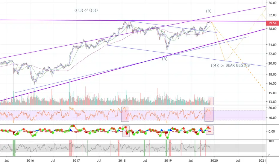
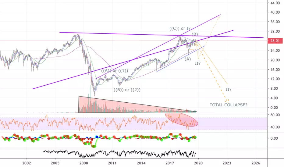
A subtle but potentially EXTREME danger in the financial sectorOf all the sectors in the American stock market, I believe the financial sectors exhibits the most dangerous chart pattern at this point, because it is the *only* sector that has not managed to achieve ATHs since the Great Recession. This could mean a multitude of things. The most positive scenario is that it is just lagging and will soon burst to ATHs with significant strength, along with the rest of the market.
However... pay close attention to the relentless declining volume and extreme RSI divergence in recent years. If I was a statistician, would those signals give me confidence that this most positive scenario will take place?
Now let is consider the most negative scenario. That is... the 2008 low was only the beginning or the middle of the decline and a total and utter destructive final phase will eventually follow this 10 year *corrective* rally.
What era are we approaching? Revival of traditional currencies? Or rise of cryptos?
Take care, friends. We live in times that spell caution. That is all I can conclude, for nobody knows the future.

Exhaustion gap Short term short tradeen.wikipedia.org(chart_pattern)
There are four types of gaps, excluding the gap that occurs as a result of a stock going ex-dividend. Each type has its own distinctive implication so it is important to be able to distinguish between them.
Breakaway gap – occurs when prices break away from an area of congestion. When the price is breaking away from a triangle (Ascending or Descending) with a gap then it can be implied that change in sentiment is strong and coming move will be powerful. One must keep an eye on the volume. If it is heavy after the gap is formed then there is a good chance that market does not return to fill the gap. When the price is breaking away on a low volume, there is a possibility that the gap will be filled before prices resume their trend.
Common gap – also known as an area gap, pattern gap, or temporary gap, tend to occur when trading is bound between support and resistance level on a short span of time and market price is moving sideways ("where the price trend...has been experiencing neither an uptrend nor a downtrend. Instead, the price activity has been oscillating between a relatively narrow range without forming any distinct trends"). One can also see them in price congestion area. Usually, the price moves back or goes up in order to fill the gaps in the coming days. If the gap is filled, they offer little forecasting significance.
Exhaustion gap – signals the end of a move. These gaps are associated with a rapid, straight-line advance or decline. A reversal day can easily help to differentiate between the Measuring gap and the Exhaustion gap. When it is formed at the top with heavy volume, there is significant chance that the market is exhausted and prevailing trend is at halt which is ordinarily followed by some other area pattern development. An Exhaustion gap should not be read as a major reversal.
Measuring Gap – also known as a runaway gap, formed usually in the half way of a price move. It is not associated with the congestion area, it is more likely to occur approximately in the middle of rapid advance or decline. It can be used to measure roughly how much further ahead a move will go. Runaway gaps are not normally filled for a considerable period of time.


The beginning of the growth of relative strength in the financiaAn interesting situation unfolds in stocks of the US financial sector
a very rare reversal signal has arrived - only the 3rd (!) such signal since 2009 in the financial sector S&P 500,
this was in 2009, 2016 and now here again this week.
Relative Strength - the relative strength of the XLF financial sector ETF has broken the trend line of the weakening cycle since 2018, and just the last 1.5 years, banks have been weaker than the market and have been underestimated for a long time, and now, as we see last week, a certain rotation has gone from grwoth sectors to the most undervalued securities, including banks in the US market.
As can be seen from the graph, this happened since 2016 when the RS sector came out of decline and sharply went higher. That is, the outperfom of the sector went against the S&P 500 - a cycle of strengthening the sector against the market as a whole.
And six months after this moment, ETFs in the financial sector added + 38%, while the S&P 500 only + 11%, almost 3 times ahead of the entire market.
