XLE - true breakout or fakeout?Oil has been ripping lately and trying to establish a new consolidation range. Keep in mind this rally in energy has occurred as the DXY has had 9 weeks of consecutive upside.
The energy sector has been a bullish piece of the market and is at a critical support level.
If this breakout in XLE is to hold we could see some significant upside.
A weekly & daily breakout has been confirmed but when you zoom out to the monthly chart this could be signalling a failed Double top reversal.
Seeing how XLE closes the monthly candle will be telling for the market as oil has been the main increase in the CPI and inflation expectations.
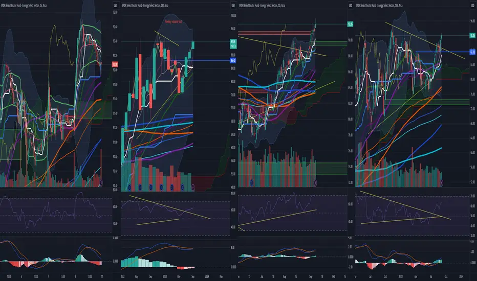
XLE trade ideas

XLE at buy zoneXLE came to Weekly buy zone and at POC now.
It makes sense to do bull thinking.
Especially regarding weak energy stocks

XLE breakoutXLE breakout to the upside
Daily bull flag playing out
Be careful of the bearish divergence on the daily
TP: Top of monthly BB
Noise: Expecting moves Monday + Friday and stagnant during the week
XLE calls during dips
XLE Looking LongHi mates, Sharing weekly chart of XLE it is looking good by breaking a horizontal and falling resistance of triangle so i am considering that it is a breakout and planning to go long in it, targets identified by the two ways one is price based and one is pattern (triangle) based measured by Height of triangle from where it took resistance (last swing high) to swing low it made after that are the potential target can arrived in coming sessions.
This is not and trade or investment advice. This idea is meant for learning only.

RSI DivergencePrice does not slope in the same direction as RSI which equals a Divergence. Price slopes up and RSI slopes down which equals a bearish divergence. Bearish divergences are measured at the peaks and bullish divergence is measured at the valleys.
Prior inverse head and shoulders marked with blue stars.
Shooting star which turned in to a Doji since i have been typing is at the top of this leg up which is also a gravestone doji. Followed by a spinning top which represents indecision. Candles need confirmation which has not yet occurred.
A spinning top has a small candle body and a doji has a very small body or only a line as it's body.
No recommendation
No recommendation


Chart Request_Harmonic Elliott Wave and Hurst's Cyclic AnalysisAnalysis of the Structure:
Looking into the weekly chart, I see XLE in wave IV of (a) of III, developing as a triangle.
Analysis of the Cycles:
I have the March 2020 low as an 18-year cycle trough. Right now, we are in the third 80W cycle of the current 54M cycle. Considering the nominal 54M cycle length, we should get the 54M cycle trough in August 2024 (wave (b) of III).
The 40W cycle trough in the current 18M cycle is expected on the December 2023.

$XLE Ascending Triangle PatternAMEX:XLE Ascending Triangle Pattern, waiting for a breakout.
Key Elements:
Rising Support Line: This trendline connects the higher lows. It indicates that buyers are stepping in at higher prices, suggesting increasing demand and potential accumulation.
Slightly Sloping Resistance Line: This trendline connects the roughly equal highs, forming the upper boundary of the triangle. It represents a level where sellers are currently entering the market.
Interpretation:
The bullish triangle pattern suggests that despite the temporary resistance encountered at the horizontal trendline, buyers are gradually becoming more dominant. As the price gets squeezed into the apex of the triangle, there's a diminishing range between the highs and lows. This compression often signifies a potential breakout to the upside.
Potential Breakout:
Traders closely watch the pattern for a breakout. A breakout occurs when the price moves decisively above the horizontal resistance line. This is often accompanied by an increase in trading volume, indicating a surge in buying interest. The expected price target after a bullish triangle breakout can be estimated by measuring the height of the triangle at its widest point and adding it to the breakout price.
Confirmation:
To confirm the validity of the bullish triangle pattern, traders often look for an increase in volume during the breakout, price movement above the resistance line, and ideally, a retest of the upper trendline as new support.

XLE - Falling Trend Channel🔹Breakout Falling Trend Ceiling in medium long term.
🔹Once breakout resistance 87.4 be POSITIVE signal.
🔹Short-term momentum is POSITIVE with RSI above 70.
Chart Pattern;
🔹DT - Double Top | BEARISH | 🔴
🔹DB - Double Bottom | BULLISH | 🟢
🔹HNS - Head & Shoulder | BEARISH | 🔴
🔹REC - Rectangle | 🔵
🔹iHNS - inverse head & Shoulder | BULLISH | 🟢
Verify it first and believe later.
WavePoint ❤️

Oil/Gold Short Setup: Inverted Cup & Handle (XLE/GLD)After a steep decline in $XLE/ AMEX:GLD , the chart has now formed the highlighted cup & handle.
Combine this with the observation that CPI YoY & Core PCE YoY ( ECONOMICS:USCCPI ) are in strong declining trends , which historically correlates negatively with oil (and oil-related equities) and positively with gold.
Executing on this idea: use a lower-vega strategy:
Low (2x max) leverage
Short XLE: directly short sell the shares, or buy inverse ETF ( AMEX:DUG , AMEX:ERY ).
Long GLD: Just buy AMEX:GLD , or go 2x with $UGL. Make sure that it balances your XLE short after accounting for leverage.

Natural Gas & oil UpdateOil looking strong and testing a bearish range breakout.
Natural Gas back testing a key support zone.

Feeling energetic? Gold/oil signaling the bottom for energyThis chart compares the price of AMEX:XLE + AMEX:XOP to Gold/Oil. The gold/oil ratio is a simple measure that divides the price of gold (per ounce) by the price of oil (per barrel). This ratio represents the number of barrels of oil that can be bought with one ounce of gold. The relative value of these two commodities and can provide insights into market dynamics and can signal tops and bottoms in the energy sector.
When the gold/oil ratio is high, it means that gold is expensive relative to oil, or conversely, that oil is cheap relative to gold. In recent decades the ratio above 30 has often been an indication that oil prices are near a bottom. This is because a high ratio suggests that oil is undervalued or that gold is overvalued, and markets may adjust to correct this imbalance. However, it's important to note that while the gold/oil ratio can be a useful indicator, it is not infallible. Other factors, such as changes in supply and demand, geopolitical events, and broader economic trends, can also significantly impact oil prices. Therefore, the gold/oil ratio should be used in conjunction with other market indicators and analysis tools.

XLE basing into a cup/handle & bull FlagI've been reviewing multiple energy stocks and energy related etfs. One common theme i'm noticing is the multiple cup and handle patterns that are forming. Upon review of the AMEX:XLE monthly chart, I notice a solid base.
1) Inside this base you can see the previous bullish ABCD pattern.
2) C leg of this pattern, was the short/resistances level
3) Previous resistances level ( C leg) is currently acting as support
4) If you look from B leg to C leg thats a bullish cypher pattern
5) There is good support at $76
6) The Bull flag is building, and is acting as the handle to the larger cup/handle breakout pattern set up
7) I have breakout level above $83.50, which is an old resistances level

$XLE Bear Flag AMEX:XLE Bear Flag on the weekly chart, Close on a weekly basis first target is the horizontal line.


XLE - Cracked longterm uptrend supportBig-cap oil has been lagging behind the broader energy market, particularly the correlation between AMEX:XLE and $WTI.
The break of this trendline is significant and could result in big move down for large-cap O&G.

XLEEnergy wants to go higher.
Still some ways to go before the neckline line at 87.39 but the inverted H&S is showing

Will history repeat? XLE outperformed XLK in 2000In the year 2000, the energy sector represented by XLE outperformed the technology sector represented by XLK. The trend seems to be repeating itself as we witness the commodities boom occurring just as the tech boom slows down.
This begs the question, will history repeat itself?!
During the tech boom in the late 1990s and early 2000s, the technology sector was the most sought-after by investors. However, in 2000, the market saw a major shift as the energy sector, represented by XLE, outperformed the technology sector, represented by XLK. This shift occurred as the tech bubble burst and the commodities boom took over.
Fast forward to today, and we see a similar trend. As the technology sector has slowed down in recent months, the energy sector has seen significant gains. The rise in commodities such as oil and gas has driven the energy sector's recent outperformance.
While there are always unique factors at play in the market, the similarities between the current situation and that of 2000 cannot be ignored. It is possible that history will repeat itself, and we could see the energy sector once again outperforming the technology sector.

Ascending Triangle On The Daily Chart Ascending triangle on the daily chart w/ a strong setup for more upside contingent on a daily close above the ascending triangle resistance at $87.20.

XLE Energy Select Sector Price TargetAfter the Organization of the Petroleum Exporting Countries supply cut and considering the Elliott Wave Chart Pattern, i would say the next price target for XLE Energy Select Sector SPDR Fund is $92.60.
Looking forward to read your opinion about it.

Long XLE and XOP, wedge breakout Breakout based on OPEC's recent oil-cut by +1,6Mbpd
Good timing with the wedge tightening as well, great Risk here.

XLE closed below the critical lineDaily had a retest and got rejected. It could have more fluctuation around this area but likely more downside is ahead with in the next month.

$XLE - Weakness in the Energy Sector Could Bring Stage 4 DeclineThe Energy sector is notoriously one of the last to roll over in a recessionary environment and the $XLE chart appears to be topping out right on queue.
After a euphoric run beginning in the middle of 2020, the Energy sector has stalled out creating a triple top near the $90 level.
With the break of the 200-day moving average, along with an accompanying bearish momentum regime in the RSI, we expect the Energy sector to begin its descent into a Stage 4 decline.
Many individual stocks within the Energy sector look prime for capitulation events and accompanying sector weakness would further aggravate already anemic charts.
PT near 60.
