For The Win Playing around with some newly discovered indicators & have been learning ways to strategize from these indications.
I am also using indicators I have plenty of experience with.
Let me break down each indicator & then I will discuss my personal strategy for this stock.
Indicators:
I. RSI which is showing price to be underbought
II. Divergence+ shows a green shadow below the candles indicating bullish divergence
III. Knoxville divergence trend line is a divergence indicator that is quicker to spot when the next breakout will be
IV. Visible Range shows that the prime price that the highest trading volume occurs is at 70.97
Prediction:
Friday July 9th price will continue to fall based on bullish divergence not quite being strong enough. Then a new low will be tested and fall deeper into the low trading price range. As price falls below the desirable ( highly traded ) price range, bulls will have control of the price the next trading session and we could enter a bull run lasting up to 2 weeks into the desirable range.
Strategy:
Since the most common traded price is roughly $70 and we are due for a bull run for the week of the 12th, I am going to pick a price between $66 and $70. ( Most likely going to be $68 ) I am going to purchase a $68 Call that expires 7/23 and sell it during the upward price wave during the previous week to take a 20-50% profit.
Feedback:
I would love to hear your feedback/thoughts on my predictions & strategy.
Follow to see this come into play ( or fail ) and like if you are a WDC bull.
WDC trade ideas

WDC: Range breakout.The range resistance level is broken upwards with the minimum target level around 87.

WDC may beform good in julyA speculative entry in WDC, since I await good news from micron, which may push WDC up again.
Target could be new highs, since expected EPS on 29.7 is very high, so the stock should rise now.


WDC - Long on breakout outside the channel, 5% riskWDC has formed very nice cup and handle pattern and started to move higher, breaking resistance zone which is 73.00 on heavy volume. The trading strategy for now is to buy and hold (stop loss 68.00), possibly it will retest the broken resistance. In case of retest I will provide an update.
The TA is exellent for this stock and fundamentals as well, because CHIA mining requires Hard Drives.


Daily ascending triangle on #WDCTo be watched until it triggers an entry .
Daily ascending triangle on #WDC


$WDC Western Digital Bullish Earnings Setup
Bullish channel break potentially on earnings.
Alert set $73.50 for entry
PT's $76.59 & $79.74
The stock has failed to rally on previous beats so caution needed on size of trade.
$WDC short$WDC looks toppy and weak here, need beg account to short the shares tho, options are ugly.

WDC shines with multi-chart oversold signalsI have changed up how to best display projected movement. In the case of WDC, 5 of my algorithms signaled a BUY on March 23, 2021. Equities nearly always obey the signal and move up, but sometimes it may continue to move down first.
I have placed two red boxes and two green boxes on the chart. The larger red box depicts all of the historical movement, from a percentage standpoint, that this stock has moved on the Hourly chart after a BUY signal occurred. Therefore, this box represents 100% of previous movement downward before the stock finally moved upward. The smaller red box represents 50% of all historical movement downward, before the stock moved upward. The smaller box is more of a precise target for the potential bottom in this instance.
The green boxes represent the same thing. In this instance, the smaller green box would be my projected target for the final top.
The black dotted arrow represents median historical movement. Medians are a good metric, but they are just one of many I use when forecasting future movement.
As always, the stock could rise the very next bar after the signal without looking back (therefore the red boxes would not come into play) or the stock may never rise (and the green boxes may never come into play).
All statistics and the full analysis are available for free as always at the site below.

the b[AI]te's weekly insights -- WDC 2021-03-22center stage attention
stock
our system found that WDC received most attention over the course of last week.
comment image
we see a moderate positive correlation with our image indicator. We therefore assume that prices are driven partial emotionally as there is probably some other catalyst with regard to the company resulting in an uncertain pricing.
new free tool
we launched our new free analysis tool. Check our website and test it out!
new free and powerful data API
you can now access our data via our free API . Check our website and test it out!
FAQ
ATTENTION
our algorithms define ATTENTION as the overall number of stories and opinions that appear for a given security each day.
IMAGE
our algorithms define IMAGE as the averaged sentiment value extracted from all opinions received for a given security per day.


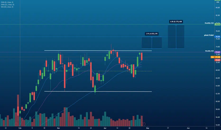
Long | WDCNASDAQ:WDC
Possible Scenario: LONG
Evidence: Price Action
This is my idea and could be wrong 100%,
TP1 ~ 74, TP2~77
CALLS for 1 April Strike 78$


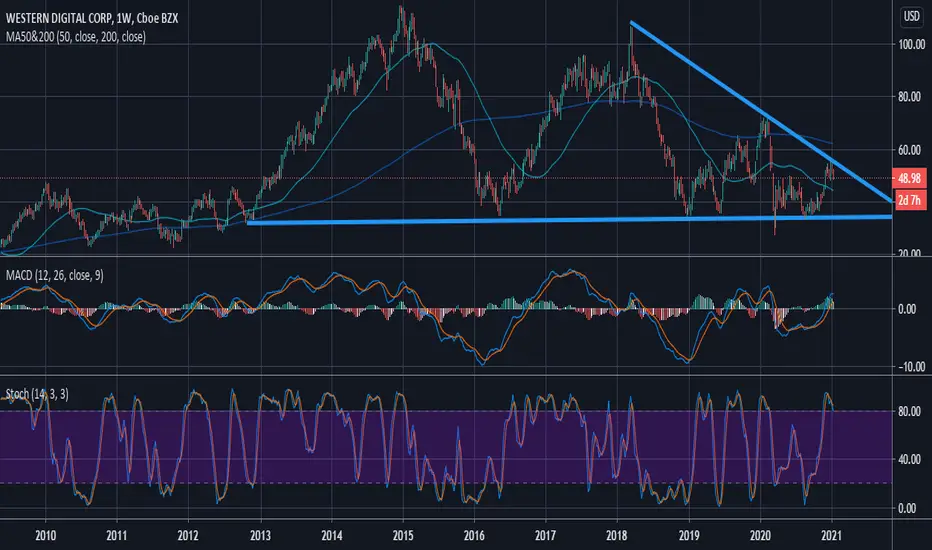
$WDC Western Digital Bullish Trendline Breakout Imminent
WDC is a major laggard among the SMH and may offer a nice catchup trade opportunity.
Alert set on major downtrend from the 2014 high.
Major drop in volume resistance .

Massive Multi-year breakout just happenedWDC resolving out of the wedge to the upside. Stop is pretty clear in the low to mid-50s if it broke back under the triangle.

A good DIAMOND pattern in #WDC As you see on the chart a good breakout happen of the DIAMOND pattern, with a good volume
Good luck