BofA High Yield SpreadsI check this chart all the time. If the blue line starts trending higher the market will struggle.
BAMLH0A0HYM2 trade ideas

Jaws closingThe high yield (junk bond) spread against Treasuries, having earlier moved above the important 4% threshold, continues to advance higher. It has now eclipsed 5%. Accompanying this indicator is the $SPY decline which has caused these "jaws" to move closer to closure. Maintain risk management and stay aware for signs of reversal.

Credit Spreads - About to Blow?While credit spreads, which reached near-historic lows in 2024, remain tight, they have widened notably since the beginning of 2025. If this trend accelerates, it could put substantial pressure on the bond market, resulting in tighter financial conditions and corresponding headwinds for the domestic economy. The last 2-3 weeks have seen risk assets come under pressure, but the below chart suggests that the risk-off sentiment shift may still be early-stage... Whether viewed through a traditional technical lens or supply/demand, current levels could be considered supportive - risk is to the upside.
A few impacted ETFs: NASDAQ:IEF , NASDAQ:TLT , AMEX:HYG , AMEX:JNK
Jon
JHartCharts

The 3-way of Economic Nightmares.I recently had a discussion on X, with regard to the Forecasting ability of High Yield Spreads. I was making the claim they do possess Leading Indicator qualities, while a gentleman took the other side of this debate.
To illustrate my views, I've put together a chart of FedFunds Rate, Unemployment Rate, and said High Yield Spreads.
This chart shows the last ~28yr of the above mentioned series, and how they "play" with one another.
A) Shows the period leading into the "DotCom" Bubble. We see High Yield Spreads rise first - Leading the other two data series. In a Coincident fashion, FedFunds then rolls over, while Unemployment shoots higher. A successful "Forecast" by High Yield Spreads of the impending Downturn/Recession. A successful Leading Indicator.
B) Shows the period leading into the "GFC". We once again see High Yield Spreads rise, this time SHARPLY, albeit with much less "lead time" than the previous example. As with example A), FedFunds and Unemployment then begin their inverse (to each other) dance. Once again showing High Yields Spread giving us that Advanced/Leading warning that things were getting fragile in the economy. A successful Leading Indicator - with admittedly less warning time.
C) Shows us an outlier in this analysis, and for good reason. We see our 'significant' rise in High Yield Spreads, but what we do NOT see, is FedFunds and Unemployment doing their typical dance. Unemployment continues to head lower, while FedFunds begin to rise - the OPPOSITE of what they did in the prior 2 examples.
D) Shows the period surrounding Covid. Once again High Yield Spreads shoot up in a dramatic fashion, warning bells should be going off in markets. Much like 2 of the previous 3 examples, FedFunds had also been in a "hiking" cycle. And right on cue, Unemployment skyrockets; completing our 3-way from Hell.
We now find ourself in E). In the Oval we see our significant rise in High Yield Spreads, but this is accompanied by rising FedFunds, so we do not have our "danger" signal. Unemployment also remains low. We now however see High Yield Spreads beginning to turn up, with talks of Rate Cuts to FedFunds, as well as Unemployment rising.
History may not repeat, but it does often rhyme. Are we starting to see warning signs flashing? Only time will tell, but as stated in previous posts... It's definitely not a time to be leveraged, or riding on large gains you haven't secured.
TLDR; High Yield Spreads followed by Fallings FedFunds and Rising Unemployment = Market/Economic Stroke.
As always, good luck, have fun, practice solid risk management. And thank you for your time.

Market Stress and Bitcoin Price Reversals2008 Financial Crisis: Marked by a severe spike in the high yield spread, significant S&P 500 decline, and aggressive Fed rate cuts to stabilize the economy.
COVID-19 Market Crash (2020): Triggered sharp increases in market volatility and credit spreads. The Fed's rapid rate cuts aimed to support the economy. Bitcoin also experienced notable price movements.
Interest Rate Cuts: Implemented during periods of economic slowdown or financial stress, leading to narrowing credit spreads and market stabilization.
SPX All-Time Highs: Peaks in the S&P 500 indicating market optimism, often followed by corrections during economic weakening.
Credit Spreads Narrowing: Indicates improving economic conditions and reduced credit risk, often coinciding with market recoveries.
Significant BTC Price Movements: Reflect broader market reactions and investor behavior during major financial events.

HY Junk Bond Spreads and SPX CorrelationAs you can see clearly on this chart, there is a high correlation between the BofA Option Adjusted Junk Bond Spread Index and the S&P500. While tough to use as a timing tool, when spreads widen to 4.5% or so, many times this is a good time to nibble in the S&P during a correction. When they reach 6%+, generally it is a good time to gorge. When they drop as low as 3%, it is usually a great time to reduce exposure.

BULLISH SETUP ON HY-IG SPREAD EMERGING. (BEARISH EQUITIES)Back in November of 2022 I wrote about using the HY-IG spread as a potential indicator of 'risk on' vs. 'risk off' sentiment and I will insert that below for readers trying to understand how this spread differential can be utilized. Subsequently I will explain what I currently see emerging on the above chart with the addition of both the RSI and correlation indicators to provide a more robust and predictive analysis than using the HY-IG options adjusted spread alone.
Written November 2022 - 'When the spread between High-Yield (HY) debt and Investment Grade (IG) debt contracts or expands, this can be perceived as the market demanding more or less compensation for the risk it perceives to be present in owning the HY debt against the IG corporate debt. (HY-IG) = Risk On/Risk Off market sentiment.
Generally speaking HY debt a.k.a. Junk Debt, is considered more risky than IG debt. Because of this increased risk, the market demands a higher yield for taking on HY debt, also known as a ‘risk premium’ or ‘premium’ over the alternative investment opportunities the market provides.
This yield premium on HY/JunkBonds can be viewed as ‘extra incentive’ for bids to take on the ‘riskier debt’. When this spread (white) contracts, we can see that the market (yellow) has a tendency to go up (risk on) and when the spread (white) expands we can see the market (white) has a tendency to go down (risk off). This is only one of many indicators I use to gauge ‘market risk sentiment’ and I thought I would share it.' (I have included the link to this piece for reference at the bottom of the page and please excuse the extra charting as I was new to the platform at the time and included the second chart and indicators, but the words remain the same.)
Now that the fundamental use case of the HY-IG spread is explained we can dive in to the current situation. As we can see the HY-IG spread called the late October2023 bottom in the AMEX:SPY (orange), as the spread peaked, the broader equity markets found their bottom. This is not always as direct and their is often a bit of a latency where equities will begin to trend upward before the spread peaks due to the forward looking nature of equity markets, however in October of 2023 the spread nailed the bottom.
As of today, February 27th, 2024, the HY-IG spread has made a 'lower low' down to 2.27 which gives us a bullish price to RSI divergence on the HY-IG options adjusted spread. The HY-IG spread has made a 'lower low' while the RSI is still printing 'higher lows'. In this particular instance, a bullish divergence on the HY-IG spread could signal a bearish sentiment for broader equity markets ( AMEX:SPY ) at some point over the next 4 to 6 weeks which is the normal time latency between a peak or trough in the options adjusted spread and the time it takes to show up in the price action of equity markets. This divergence theory would be invalidated with an RSI reading below 25 by the HY-IG spread. A reading below 25 would make a lower low on the RSI and would invalidate any divergence.
Finally we can look at the correlation (bottom indicator) and see that HY-IG is inversely correlated to the broader equity markets as represented by AMEX:SPY at (-0.92) over the last twenty trading days and has maintained a relatively consistent and significant inverse correlation to AMEX:SPY over the majority of the last year. While I did not include the tech laden NASDAQ:QQQ on the chart, the inverse correlation is still very significant at (-0.87) at the time I am writing this article. This assumes 'corollary significance' is achieved at a greater than or equal to (0.62) level.
Given the further contraction in the options adjusted spread down to the 2.27 level, its possible we have a bit more upside room to run in equities, however, assuming the RSI divergence holds with 'higher lows', it's unlikely that we don't see a move to the upside in the HY-IG spread over the next 4 to 6 weeks, which is generally a bearish signal for equities markets. I hope you enjoyed this piece and I welcome any feedback or suggestions you might have so that I might improve further articles. Thank you for reading and happy trading!

US High yield spreads and interest rateComparison of US High yield spreads and interest rate. Spreads predict interest rate changes.

High Yield Spread V SPXWhen the high yield spread comes down, stocks should rally. If the MACD crosses below the black line it should be bullish for stocks. Lets see how it turns out.

HY-IG OAS Spread Significant Negative CorrelationHY= high yield option adjusted spread
IG= investment grade option adjusted spread
HY-IG Option Adjusted Spread showing significant inverse/negative correlation to the S&P500.
When the HY-IG spread (white) rises we see the S&P500 (yellow) fall. The inverse is also true. Spread is currently trending down and SPX is rising which could be indicative of a short term shift towards a ‘risk on’ sentiment.
Were the HY-IG spread’s trend to shift directions from down to up, we could infer that SPX would shortly after begin to trend in the opposite direction based on recent behavior. (not financial advice)

Gauging Market Sentiment on Risk Using the IG/HY SpreadWhen the spread between High-Yield (HY) debt and Investment Grade (IG) debt contracts or expands, this can be perceived as the market demanding more or less compensation for the risk it perceives to be present in owning the HY debt against the IG corporate debt. (HY-IG) = Risk On/Risk Off market sentiment.
Generally speaking HY debt a.k.a. Junk Debt, is considered more risky than IG debt. Because of this increased risk, the market demands a higher yield for taking on HY debt, also known as a ‘risk premium’ or ‘premium’ over the alternative investment opportunities the market provides.
This yield premium on HY/JunkBonds can be viewed as ‘extra incentive’ for bids to take on the ‘riskier debt’. When this spread (white) contracts, we can see that the market (yellow) has a tendency to go up (risk on) and when the spread (white) expands we can see the market (white) has a tendency to go down (risk off). This is only one of many indicators I use to gauge ‘market risk sentiment’ and I thought I would share it. (Not financial advice.)

Corporate Credit Conditions: Part 3As discussed in part two (prior installments linked below), the duration mismatch between LQD and HYG renders the ratio useless as a tool to assess credit distress or changes in investor preference. Credit ETFs, must be compared to a duration matched ETF, Treasury security or index to be useful.
There is also the difficulty in comparing spreads across investment cycles. For instance, credit quality across both investment grade (C0A0) and high yield (H0A0) indexes have changed significantly over the last three years. During the pandemic recession over 200 billion of investment grade (IG) debt was downgraded to high yield (HY). This improved the quality of IG, making it less susceptible to a downgrade cycle. Additionally, the debt refinancing wave of the last three years left record cash on IG balance sheets, sharply reducing their need to issue new debt into the higher rate environment. In fact, IG interest coverage is at a record high of 12.8 times. The combination should result in significantly less IG spread widening than in past recessions/downgrade cycles.
A way to monitor risk preferences is to utilize the arithmetic difference between HY and IG OAS. The idea is that as investor preferences swing between risk on and risk off, that the spread between the risk premiums will reflect this. If credit conditions are deteriorating, the spread will widen as investors demand a greater risk premium. When the Fed began tightening the spread was 226 basis points (bps). The initial surge peaked in June at +529 bps and has now narrowed to 339 bps, only 113 bps higher than the start of the year. Viewed in this manner, it is again hard to see why the Fed would be overly concerned.
To place this spread difference into historical context I again plot 1 and 2 standard deviation bands around the regression line. Its not surprising that with both IG and HY OAS at their historical mean (see parts one and two) that the spread would also be at its historical mean. Again there is little in the data that would suggest that the Fed should be alarmed with credit or suggesting that there is compelling investment value.
In the final part of this series we will examine the extremely high all-in-yields of IG bonds and use traditional technical methods to reach an opinion on BBB (the lowest rung of IG) credit.
And finally, many of the topics and techniques discussed in this post are part of the CMT Associations Chartered Market Technician’s curriculum.
Good Trading:
Stewart Taylor, CMT
Chartered Market Technician
Taylor Financial Communications
Shared content and posted charts are intended to be used for informational and educational purposes only. The CMT Association does not offer, and this information shall not be understood or construed as, financial advice or investment recommendations. The information provided is not a substitute for advice from an investment professional. The CMT Association does not accept liability for any financial loss or damage our audience may incur.

Credit Conditions and the Fed: Part 2In part 2 I take a quick look at high yield corporates and describe a common mistake made in using ETF ratios to monitor changes in credit risk. Part one and an earlier piece that described how to use the TradingView platform to monitor secondary market credit spreads are linked below.
If there is any one thing that will produce a Fed policy a pivot, it is credit distress. Credit is far more vital to economic functionality than equity. If companies are unable to secure funding, they may face liquidity issues, and if liquidity problems become widespread, they have the potential to become systemic. In 2008 and again in 2020 credit markets were frozen. Particularly in 2008, many companies ran into barriers that inhibited their conducting their ongoing daily business lines. There were plenty of offers but, as I so painfully remember, in many cases zero bids…. None…at any price. It was this credit distress that convinced the Fed to move.
In part 1 we looked at the weekly chart of the option adjusted spread (OAS) of the broad ICE BofA Corporate Index and concluded that the there is no evidence of the kind of credit distress that would galvanize the Fed, and that, at least on this basis, that there was no compelling value (rich/cheap) argument to be made.
What of high yield? Does high yield OAS suggest a meaningful deterioration in credit markets? Again, I plot a regression mean and one and two standard deviation bands above and below. Just as in the IG market, high yield OAS has widened, but only to its long term mean, and this following a lengthy period of being nearly a standard deviation rich. In short, while spreads have widened somewhat, there is no compelling rich/cheap argument and certainly nothing that would suggest to the Fed that credit conditions are meaningfully impaired.
I frequently see commentaries that use price changes in the high yield ETF (HYG) and the investment grade ETF (LQD) as a measure of investor risk preference. Since the January high, LQD is down 26.15% versus 19.65% for high yield. At first glance it appears as if investors prefer the lower quality HYG. But the price changes do not account for the differences in fund duration. Put simply, LQD at 8.36 years duration has roughly twice the interest sensitivity of HYG at 4.06 years. In other words, a 100 bps change in rate, will change LQD 8.36% and HYG 4.06%.
LQD in Ratio with HYG and Ten Year Futures in Ratio to Five Year Futures: I also see analysis that uses the ratio between LQD and HYG to ascertain risk preference. But the direction of the ratio is almost completely due to the difference in duration. You can see this by compare LQD/HYG to the ratio between ten year and five year note futures. LQD/HYG ratio is almost entirely correlated with changes between five and ten year treasuries. When rates are volatile and directional the total return of many rate products generally a reflection of rates than it is investor quality preference.
And finally, many of the topics and techniques discussed in this post are part of the CMT Associations Chartered Market Technician’s curriculum.
Good Trading:
Stewart Taylor, CMT
Chartered Market Technician
Taylor Financial Communications
Shared content and posted charts are intended to be used for informational and educational purposes only. The CMT Association does not offer, and this information shall not be understood or construed as, financial advice or investment recommendations. The information provided is not a substitute for advice from an investment professional. The CMT Association does not accept liability for any financial loss or damage our audience may incur.

Junk Bonds as Indicator of Overall Market RiskThe decline in junk bonds is generally an indication of high market risk. In this type of enviornment, investors of junk bonds demand higher yields to compensate for additional risks.
As bond yields and prices are inversely correlated, higher yields cause junk bond prices to fall; a repeating pattern over the last two decades.
When markets face a significant crisis, junk bonds fell along with other risk assets.

Will this failed signal lead to a market bottom?Last week, I published a chart that suggested that the market (SPY) was about to enter capitulation mode. The signal was that the rate of change of high yield spreads (bottom panel) had crossed above a level that in 2008, 2011 and 2020 signaled capitulation. However, the indicator has now dropped back below the signal line rather than following through. In other words, it was a failed signal. That happens in technical analysis, but a failed signal can often be an important signal of its own...
There has been one other failed signal over this period, in 2018. Then, like now, the rate of change very briefly crossed the signal line before dropping back below. Also then, like now, the level of high yield spreads remained above 4.50 (see middle panel). This failed signal coincided with a market bottom. Will the past repeat itself? I can't say for sure, and we will need to watch how the situation unfolds. But this is certainly a signal of caution for the bears. There are other factors that suggest a possible rally, in the short-term at least. These will be subjects of additional posts.
If you found this analysis helpful, please give me a thumbs up and a follow! Thank you!

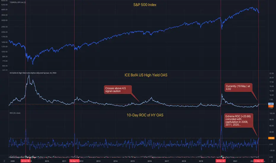
High Yield Spreads Signal S&P500 Capitulation!The ICE BofA US High Yield Options-Adjusted Spread is a measure of the risk premium demanded for high yield (junk) bonds. It is published at the end of each day by the St. Louis Fed.
When it is elevated to high levels (above about 4.5%) it can act as an early warning for equity prices. See the horizontal orange line in the middle panel. Last week, on May 11, the HY OAS crossed above 4.5 for the first time since 24 Feb 2020. That was the first early warning signal.
The bottom panel on the chart shows the 10-day rate of change of the HY OAS. Why? Because it's not just the level that is important. When it is ramping up quickly, that provides an more ominous signal. The indicator has crossed up above the horizontal orange line (20.66) three times since 2008. In 2008 and 2011 that coincided with general capitulation starting in the S&P500. It was arguably early in 2020, catching institutional capitulation. General capitulation followed a few days later.
The ROC indicator signaled on May 12 briefly but dropped back below the signal line the next day. That was the second early warning signal. Today, the indicator has again crossed above the signal line. I interpret this as a particularly strong signal as it has now been tested.
In short, I expect general capitulation in equity markets to start today. Certainly the price action so far supports that thesis! The next few trading days should have extending breadth to the downside. Don't buy the dip just yet! This is a falling knife!
Please follow me for more market insights!
Ol' OAS Stirring
Keeping an eye on the US high yield OAS (option adjusted spread), which is testing the upper limit of a Linear Regression Channel and has the potential to break out above resistance. This credit spread may have reached a year-long, risk-off bottom. Conditions that are deteriorating are a bearish leading indicator.
Credit spread widening is bearish, as is price distribution under the indices over the last year.
FRED:BAMLH0A0HYM2
