T10Y2Y 3M chart: Plotted US recessions since 1980US recessions since 1980 plotted on the T10Y2Y 3M chart.
Orange circles indicate value on the curve and the Stoch RSI value at the start of the first month and year of recession.
Red vertical bars are length of recessions.
Orange vertical lines on the Stoch RSI are the first month and year of the
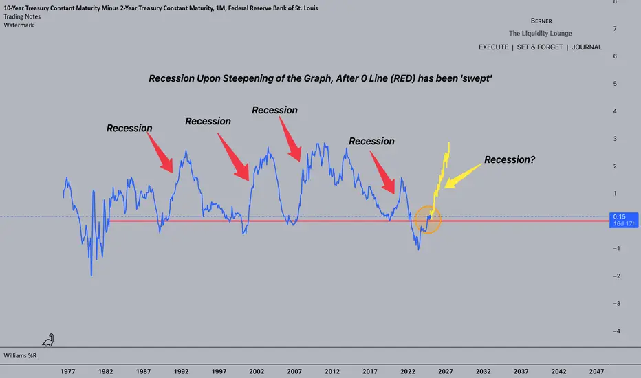
10-Year Treasury Constant Maturity Minus 2-Year Treasury Constant Maturity
No trades
About 10-Year Treasury Constant Maturity Minus 2-Year Treasury Constant Maturity
Related indicators

Descending channel on the yield curveI spotted a descending channel on the yield curve which it never formed before in it's entire history.. So if this one plays out then we will break out to the upside..

Yield Curve Inversion Watch Chart - Fed Has To Cut!If you’re worried about a recession, you should be watching the Yield Curve Inverting.
Historically, an inversion signals a recession, but with a lag.
We can see this on the chart whenever the yield curve hits 0%
This shows the 2Y yield higher than the 10Y which is a signal that the market expect

Global Recession A recession is already coded in the algo, time will prove this correct.
I'm not a 'bearmaxi' or 'doomposter' i'm a realist. If you struggle to believe my theories, come back to the chart in 1-2 years and ponder how you missed it.
Stay Safe.
- Berner
The Inverted Yield Curve - A History LessonThe yield curve has just recently reverted back to normal after the longest inversion in history. The yield curve has been perhaps the most reliable and only indicator needed to predict recessions. This time is no different. We are entering the final stages now, we are seeing the type of extreme gre

Yield Curve with SPX performanceYield Curve with SPX performance
Unemployment rate goes along with T10Y-T02Y

Sorry for being so bearish This is not going to end well unfortunately. Stay with cash and wait for the discounts. Be patient

Yield Curve Reversion Trade 2024The yield curve reversion is when the US10Y Treasury Yield becomes greater than the US2Y Treasury Yield and has a track record for signalling recession. I've been tracking the reversion for the past two years for any hint of sense of whether the US FED would cut FEDFUNDS rates or if bond traders wou

10y/2y Treasury Yield Curve cant make up its mind10y/2y Treasury Yield Curve
⏳ Just cant make up its mind......
I wonder what Friday's stamp will be

US10Y2Y Spread vs SPX500History is repeating itself.
When US Treasury 10Y minus 2Y yield turns positive and inching higher, investors should be precautious.

See all ideas