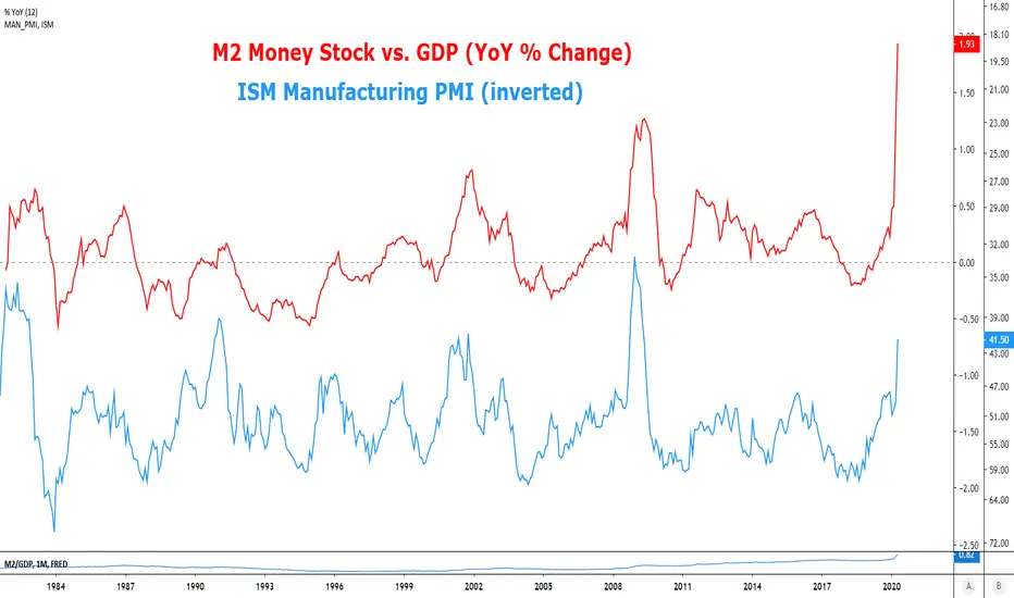
M2/GDP RatioThis ratio is indicating more pain to come from macro indicators such as the ISM Manufacturing PMI..
WM2NS trade ideas
Money Velocity is in Complete FreeFallM2V most recent data is from December 2019. It is likely near zero at the present moment.
Some voices are saying that the Fed liquidity and balance sheet expansion is inflationary, but the charts tell a different story.
The velocity of M2 is in complete freefall. We have reached the point where interest suppression is no longer an effective tool for monetary policy. It doesn't matter how low rates go or how much the Fed is willing to lend, people don't want to spend or borrow, and insolvent businesses are going to self-liquidate. People are hoarding cash, and rightfully so.
You can't print your way out of a global demand shock and supply shock.
If you study M2V closely, it tells a story. What you'll see is that the Fed has been in a liquidity trap for the last 20 years. To avoid a big deflation they've pushed rates lower and lower to stimulate growth now and push the problems down the road, but now we're at the end of the road and facing a bigger deflation than we could have ever imagined. There's no more growth to stimulate.

Impressive PrintingDo prices currently reflect this growth and when will consumers see this reflected in store prices? That is the question I am asking myself. Since the dollar is based on trust how much more inflated can it get without seeing a reduction of trust? How long will it take for people in America to see they are not immune to inflation as if math only applies to other countries?
Amazing that in 2008 the growth of the last 4 months would have been a 25%+ increase in money supply.


Will M2 go above GDPLook at all the new money. With many people expecting GDP to decline will GDP be less then M2. We may see the velocity of money go below 1 for the first time. If then GDP picks up again people will be happy about jobs and GDP. What about the effects of all the money starting to move again causing inflation.

A Deep Dive Into Inflation & Fed Policy, Plus Consequences!This chart that I've put together has the basic economic figures that factor into calculating prices that consumers encounter in the economy. The equation to calculate economic prices is as follows:
Price = (Money Supply X Money Velocity) / Real DGP
or
P=(MV)/Y
Here is the breakdown of each graph on the chart:
Blue Graph = Money Supply (M)
Yellow Graph = Money Velocity (V)
Grey Graph = Real GDP (Y)
Red Graph = US Consumer Debt
Black Graph = Consumer Price Index (US Inflation)
With this chart, we can visualize why (until February 2020) the US Federal Reserve had problems reaching it's 2% core inflation target, even after adding nearly $5 Trillion to the money supply during QE1, QE2, and QE3. The reason is that money velocity has been falling, but real GDP has been rising. So, when we think of the equation P=(MV)/Y, you can see that as M has gone up, V has fallen, and Y has risen in a way that has kept the equation relatively stable.
Plugging the numbers into the equation:
P = (16298 X 1.43) / 21729
P = 1.07
With a price figure of 1.07, we can see why prices are currently relatively stable, with consumer prices at about 107% (roughly 7% YOY) despite the Trillions that have been printed by the Fed.
So, why aren't we seeing more significant price inflation? And will we ever see an inflationary response from the Federal Reserve's seemingly LIMITLESS printing? Well, one way that could happen, is if we had a substantial decline in real GDP, and we're actually seeing that right now on a global level. Countries all around the world are experiencing massive declines in real GDP, due to the global economic gridlock resulting from the coronavirus. The question is, how much will GDP fall? If GDP falls substantially, it could result in an increase in consumer prices. However, you can see how the blue graph is spiking, as the Fed prints Trillions in an attempt to stimulate the economy. The printing may offset inflation pressures generated the drop in real GDP, if it's proportionate.
With that said, printing to offset inflation due to collapsing GDP is a rabbit hole or sorts, because there is no identifiable breaking point between acceptable inflation and hyperinflation — especially when central bank printing is this aggressive. It's not like with 9.99% inflation, it's just "inflation," and then at 10% you trigger a runaway effect.
It seems as though the Fed could soon find itself in a very bad situation. If we continue printing this aggressively, we could find ourselves at a point where the Fed needs to decide between stimulating the economy (which currently seems like a never-ending objective) or combating inflation.
The other thing worth considering is the Fed's other primary weapon of economic defense — adjusting the Federal Funds Rate. Currently, the Federal Funds rate is basically at zero percent. So, they can't cut rates without going negative. That could be part of the reason why they've printed $4.7 Trillion already this year. I wouldn't be surprised if we see negative rates though, especially if the economy continue to collapse.
Finally, the orange graph is the total public debt in the US, minus several multi-trillion dollar liabilities, such as mortgages, social security, and medicare. The personal debt of US citizens, excluding the aforementioned figures, is about $77 Trillion. When you include mortgages, social security, and medicare liabilities, you get the total "unfunded liabilities" debt of the US, which is a staggering $137.3 Trillion. That's ONLY the US. If you include other countries, the figures may reach as high as a Quadrillion dollars in liabilities. Extreme debt acquisition is a systemic problem in the global economy, and it is at an increasingly high level of risk, as the debts continue to rise and the global economy experiences significant problems.
So, while the Fed can print money to stimulate the economy, there is a delicate balance that they must maintain to control inflation, especially as we experience a collapse in GDP during this recession. I've seen estimates that GDP could fall as much as 25% this year, which is unprecedented. Eventually, inflation WILL present itself. As the money velocity (yellow graph) continues it's steady decline, and the economy slides deeper into recession, falling GDP could force the Fed to expand the money supply by tens of Trillions more, in order to maintain price stability in the economy.
However, I don't fear the Fed's actions as much as I fear the orange graph on this chart. We are in a debt based economy, which clearly can't function without the constantly rising acquisition of new debt. If the Fed simply loses control of interest rates (as we've already seen briefly in the overnight repo market) debt liability and defaults could surge to a point that is like nothing witnessed in modern day finance. Jerome Powell has said that the Fed would expand the money supply to support the markets "indefinitely." I'm failing to understand how that will have a happy ending.
I'm The Master of The Charts, The Professor, The Legend, The King, and I go by the name of Magic! Au revoir.
***This information is not a recommendation to buy or sell. It is to be used for educational purposes only.***
-JD-


M2 Inverse HnS; Inflation rate increase - QuantRsi 1M From investopedia:
"Generally speaking, inflation occurs if M2 money supply expands faster than the rate of productive growth in the overall economy"
What I'm looking at here is a classical charting pattern painted by the QuantRsi:
With the QuantRsi applied to the Monthly M2 chart, a pattern is painted which can be used for technical analysis and classical charting.
Looking at the indicator as well as fibs drawn (log scale chart, correct fib tool used to prevent this issue:
getsatisfaction.com )
the M2 money stock looks like it is ready for a large increase sometime around 2020-2021.
This, coupled with slowed economic growth from rising interest rates, will result in increasing dollar inflation.
Because HnS patterns often have continuation when the neckline is broken, a QRsi value of +7 for M2 on the Monthly chart would confirm this idea.
Based solely on technicals, I believe that the inflation velocity will increase well in to 2025-2030. This coincides with fundamental analysis and other economic forecasts.

M2: Final Words RequiredMillions of people screaming at each other. I wish you could see the world through my eyes. Waves inside waves inside waves inside waves, composite and probabilistic in nature.
Nature, what is human nature. People sure put a lot on the line in their perceived life. Since life, as we know it, is finite, what happens after life?. You think you have the answer, Christian, Muslim, 'insert doctrine here'. What if you're wrong?. Do you remember before you were born or is your experience learned. What if life has no meaning?. What if you're wrong. You don't know, I don't know. I am not worried about what I think I know in this life, I am worried about what I don't know after life. Why worry at all? I don't know what happens after life, neither do you, one thing I do know is, if it was a test, I'm FOCK3D. Eternity is a long time to have been wrong when I had no focking idea.
I get furious at the system, I want to break it, smash it to pieces, because the alternative is so beautiful that if it were organic human nature it could only mean one thing. Simulation, of finding an electron on a wave |PSI|2 wave function , probabilistic in nature. Not 100%...... randomness amongst order in a normalised time scale. Waves.. which make up all, give me hope that, mutual destruction is not also inevitable, however improbable.
Can the cycle be broken? There has to be a way.
I am scared. Not for me, my fait is sealed.
For all of us.

Bitcoin's Real SupportHello Everyone!
I am Donald David Dongalore!
This idea is less of a trade and more of a thesis about BTC!
As you can see here, there seems to be a heavy interest in continually increasing the M2 money supply, and by extension...all other money supplies!
The best part about BTC, is that it is finite! Meaning, that the more money that the Federal Reserve and U.S. Treasury make, the more valuable your BTC will be! Hooray for hard money!
This is not financial advice, but it probably could be. But its not.
Yahooooooooo!

M1 vs M2 m1>m2 this is contango --- short(VXX) or long(svxy)
m1<m2 this is backwardation -----long(vxx) or short(svxy)

Look at the beautiful and powerful bubble index I made.Look at the beautiful and powerful bubble index I made.

M2 Inverse HnS - Inflation Rate set to increase - 1M QuantRsiFrom investopedia:
"Generally speaking, inflation occurs if M2 money supply expands faster than the rate of productive growth in the overall economy"
what I'm looking at here is a classical charting pattern painted by the QuantRsi:
Applied to the Monthly M2 chart.
Looking at the indicator as well as the fibs (log scale chart, correct fib tool used to prevent this issue:
getsatisfaction.com )
the M2 money stock looks like it is ready for a large increase sometime around 2020-2021.
This, coupled with slowed economic growth from rising interest rates, will result in increasing dollar inflation.
Because HnS patterns often have continuation when the neckline is broken, a QRsi value of +7 for M2 on the Monthly chart would confirm this idea.
Based solely on technicals, I believe that the inflation velocity will increase well in to 2025-2030. This coincides with fundamental analysis and other economic forecasts.

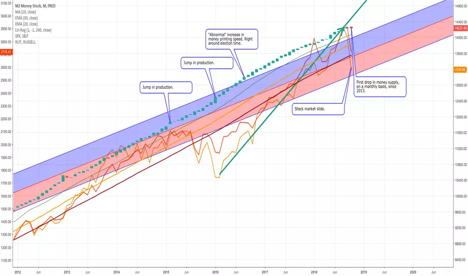
Printing Money, Interest Rates, and Equity MarketsI'm neither economist nor investment advisor, but the rise of cryptocurrency got me thinking about physical currency in America.
Most of us know the U.S. Treasury prints money. Here's a chart, roughly, of how much they've been printing:
There are several measures of money supply, but FRED:M2 is a fair picture of how much cash is out there. As you can see, it's a fairly consistent uptrend.
Most of the charts in this article will have three moving average lines, inspired by Dave Landry. As Dave writes, they aren't magic; they just give us some help visualizing trend. But if we add regression channels over the last 20 years...
...we see that the trend is almost straight-line. The channels are a best-fit straight line with lines drawn 2 standard deviations on either side, which, for normally distributed events should contain 95% of population. Look how narrow the channels are when compared to something a little less predictable, S&P 500 :
Just for kicks, let's tighten the channels to 1 standard deviation on each side, which should contain 68% of the bars:
The only time the money supply growth dips below the channels is May 2006 through Nov 2008 and Sep 2009 through July 2011. Just to jog our memories, I'll overlay the SP500 and the Russel 2000 .
Notice how, even though the money supply is always rising, when the pace of that supply drops a little bit, it precedes significant market drops, which "recover" when the pace of printing money returns to "normal."
Of course, this isn't they only way to look at market events in those periods. There were real fiscal crises that happened. There may be other causes. I'm only asking a question of myself,
"Is it possible that the extended bull markets we've seen are funded by the treasury's printing presses?"
And remember, we're not just talking about how fast those printing presses run; we're talking about how fast the Treasury adds printing presses, especially when we see the velocity of money production increase along with the recent bull market:
In 2014 the markets started to flatten out a bit. Feb 2014 saw a spike in money printing speed (notice the gapped bar.) A long bar show another spike in production Jan 2016, and a continued increase in speed through Sep 2018 when the stocks started sliding.
This month, October 2018, we see the first decrease in money supply since Jan 2013 (if you compare end-of-month to end-of-month).
Notice also the green, and drawn line marking the 2016 bull run.
I believe people can predict the markets. Anybody who tells you for sure the market will do a certain thing by a certain date is, IMHO, viewing you as a market. I sure can't time the markets; I just like thinking about charts and asking questions.
These charts leave me asking:
To what extent is market recovery and growth funded by the manufacture of currency?
Can that manufacture continue indefinitely?
Who decides to slow down that production, and why?
What does a drop in money supply mean? I assume it's the Federal Reserve "paying off" the Treasury Bonds it used to create the money, simultaneously lowering its debt and increasing the value of money.
Should this affect my market bias?
Should that affect my investing?


M2/crbThis is how deflated commodities and real economy are atm.
Qe has lead to assetinflation not to demandside inflation.
QT will lead to demand side inflation and cause assetinflation to roll over.

M2 = BTC priceM2 says indirectly to us ,
"BTC will continuously go upwards as long as the government prints out their money."

$XAUUSD, $M2 Money supply in ounces of goldA less negative correlated phase needed to change/enforce LT trend
