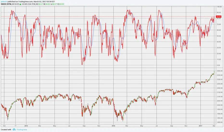
Percentage of stocks above 20MAIt's getting near that time again folks! 82% of AMEX:SPY stocks above 20MA which suggests a sharp pullback is imminent.
S5TW trade ideas

Market View going into 5/12/25Here's a short video looking at where the S&P 500 stands in terms of it's 200, 50, 20, and 5 day moving averages. I am still looking for a pull back to start swing trading long. Currently as of Friday I have small positions using inverse leveraged ETF's on SPY, QQQ, and Bitcoin. Cheers!

S&P 500 | Short-Term Breadth Signal | (April 2025)S&P 500 | Short-Term Breadth Signal | (April 27, 2025)
1️⃣ Insight Summary:
The S&P 500 percentage of stocks above the 20-day moving average is dropping sharply. This indicator is a great tool to catch local extremes — and right now, it’s flashing an important signal.
2️⃣ Market Setup:
🔻 Sell / Open Short Zones:
When this indicator pushes above 85–90% (marked in red), the market tends to be overheated. Historically, after these levels, corrections often follow.
🟢 Buy / Open Long Zones:
When the indicator falls below 20–25% (marked in green), the market becomes oversold. Pressure builds up, and probability for a bounce increases.
❌ Always be careful: in strong bear trends, oversold readings can stay extended longer than expected — so confirm structure before entering heavily.
4️⃣ Follow-up:
I will be closely watching for confirmation signs like a reversal in breadth and price stabilization before committing more to long setups.
Please LIKE 👍, FOLLOW ✅, SHARE 🙌 and COMMENT ✍ if you enjoy this idea! Also share your ideas and charts in the comments section below! This is best way to keep it relevant, support us, keep the content here free and allow the idea to reach as many people as possible.
Disclaimer: This is not financial advice. Always conduct your own research. This content may include enhancements made using AI.

Smart investor strategyS&P 500: Percentage of Stocks Above the 20-Day Moving Average
This indicator shows the percentage of S&P 500 stocks trading above their 20-day moving average. It visually reflects short-term market strength or weakness and helps identify potential reversal points.
🔻 Sell / Open Shorts Zones:
Levels above 85–90% (marked in red) indicate an overheated market — when most stocks are trading above their short-term averages, a correction often follows.
🟢 Buy / Open Longs Zones:
Levels below 20–25% (marked in green) signal an oversold market — pressure is high, and the probability of a rebound increases.
Historically:
Each strong rally towards the 4500–4600 levels in the S&P 500 index was accompanied by overheated indicator values (85–90%).
Declines towards the 3500–3900 levels were marked by deep drops in the percentage of stocks above the 20 MA (below 20%).
Conclusion:
This indicator performs well within a sideways range and can serve as a leading signal for spotting local extremes. Currently, the reading has dropped below 15% — historically, this is a strong zone to look for long opportunities. I also showed the price of bitcoin at the moment in yellow.
Best regards EXCAVO
_____________________
Disclosure: I am part of Trade Nation's Influencer program and receive a monthly fee for using their TradingView charts in my analysis.

Market Reversal? S5TW Buy/Sell Zones + Samuel Benner Cycle!🚀 Market Timing with S5TW & Benner Cycle
🚀 Are We Near a Market Turning Point?
This chart combines S5TW buy/sell zones with the legendary Samuel Benner market cycle—a historical pattern used to forecast major bull and bear trends. If history repeats, we might be at a critical decision point!
🔹 📊 S5TW Buy/Sell Zones → Key support & resistance levels mapped.
🔹 📅 Benner’s Cycle in Action → A historical blueprint for future moves.
🔹 🚀 Next Market Move? → Is a breakout or correction coming?
⚡ Why This Matters:
Smart traders look at history + real-time data to anticipate moves.
This analysis helps align short-term strategies with macro trends, improving accuracy on entry/exit points.
📉 Bearish or Bullish? Drop your thoughts in the comments!👇
Do you agree with this outlook?
Let’s make sense of the market together. 🔥

SPY, PCC & Percentage of S&P 500 Stocks Trading Above 20 SMASPY is in pink, PCC is in yellow and candles show S5TW (Percentage of S&P 500 stocks trading above their 20 SMA) on this weekly chart. You will notice after a significant drop of over 5% on S&P 500, once S5TW start getting below 20%, a reversal isn't that far away. Relief rally rips can be dramatic, so it really isn't the time to get bearish. Need to put that bull hat on! For now I am leaning after this retrace pump to 590 area, conclusion of B wave, but we still will put in a C wave which will likely head lower than where we finished A, but after that it will be one more impulsive wave to finish this bull run which should take us to SPY 650 by mid next year. Won't want to miss that one!!!
Overbought zoneWhen the SPX500 daily chart shows divergence, and the market breadth index is in an overbought or oversold condition, these are key trading opportunities.
Currently, we see that the market breadth index has entered the overbought zone.
Once the SPX500 daily RSI shows a divergence signal, it will be time to short.
There may be a period of consolidation, so we need to wait.

Ketchup Market elken(B)readthHey Traders,
Got a little behind in posting some weekly look-backs and wanted to catch-up to this current week. I consolidated the "Weekly RSI Divergence" and the "elken(B)readth" charts into one.
We will be looking back at the week closes using my "blocker" rectangle; the obvious black-out on the right side of the chart. I will post from the start of the year to now (which is ~three weeks from quarter end).
Flour:
Blue is 20 Daily Moving Average
Red is 50 DMA
Yellow 100 DMA
Teal 200 DMA
Crust:
The $SPX is shown in white. We will be focusing on the RSI divergences compared to the white line. The EMA's are there for reference.
Yeast:
Look for RSI divergence on the fast moving (B)readth BLUE line. This can indicate an upcoming change in market direction (and in this market it just might mean FLAT).
Please bear with me as I will try and post the rest of the weeks in update format to this idea to get us all caught up.

Semi-monthly PublicationLittle update before friday close. I may try and do this weekly but I do not want to flood my charts with a single segment. More to follow, slowly but surely!


Percent of S&P stocks above 20 smaHere is look at the percentage of S&P stocks above the 20 sma. Getting to an extreme reading so bounce potential increasing.

Using Daily moving-averages on $SPX (and children)Hello all,
Not a financial advisor, i just trade full-time. I can share some stuff that I look at.
TL;DR
Look at crosses, touches and space
--------------------------------------------------------------------------------------------------------------------
Please also pull up my other idea on $SPX timeframe'd weekly, linked (scroll down to bottom for links | also, to open the link in a NEW TAB, hold the control ( CTRL ) key down and then click the link).
- The traffic light time-axis markers are borrowed from the weekly time-frame.
If you need to manage your position with $SPX or your children, then this is for you.
References:
MA = moving average.
DMA = daily moving average
The calculations in this study are from TradingView, I am unsure how they are calculated. Who cares! We just like to draw on charts, right?
Orientation:
We are on a $SPX weekly BASELINE chart (values are from the week of 03/16/2020 for baseline)
We have the S&P 500 (or 505, if you know) drawn up 4 times
----Each one of these lines represent the percent of stocks ABOVE their relative moving average
-----There are 4 daily moving averages: 20, 50, 100, 200.
-------For example, the BLUE line represents the percentage of stocks inside of the $SPX that are trading above their 20 DMA (daily moving average).
snowy, elkenpolar-branded traffic light time-axis markers from $SPX weekly
Two highlighted boxes mapping the $SPX weekly corrections to 25 EMA.
EDIT: I didn't use it, but the RSI is based on the 20 DMA. I just noticed a couple neat things there, look for yourself.
Our baseline is the bottom of the market in March, 2020. This is a great time to start looking because this was a huge shift in...well, just about everything.
The boxes highlight some periods of volatility in the $SPX. The first box (yellow) is the first (double) correction to the $SPX 25 weekly MA. The red box highlights a very volatile correction to the 25 weekly MA.
Yellow Box
This is EXCITING! We can see some indecision and faltering to the 25 weekly here. Notice how the 20/50 percent line form a cross in the first red rectangle. They also bounce off the 100 DMA line. The second box is a SNAPPY correction and notice how this one falls off a cliff to the 200 DMA line.
Red Box
Here we highlight the correction in purple. You can see a cross in the couple of week before hand. A leading indicator to what was possible in the next couple of week. We then got a RSI divergence on the weekly $SPX price chart and a correction. Notice the difference between the two 'major' highlighted boxes though - i.e. we did NOT touch the 100 or 200 DMA percentage lines. What could this mean?
To Note
Notice when our 'short' or 'small' moving average (% of above 20 DMA) crosses over our 'long' or 'tall' MA (50 DMA) it may lead one to turn off the playstation and open up a chart, with crayons.
Also note other convergences, divergences and, you know, funny shapes.
Observations
Later on we can see some similar stuff lining up this month.
We had a bearish cross (blue crossing below red), a bullish cross (blue crossing ABOVE red) and now we are kinda in this place of "Ruh Roh". Do I have a crystal ball? No, but my system tells me to sell/heavy hedge right now, so that is what I am doing. This doesn't just apply to my positions in this asset class either.
Look at crosses, touches and space
What does it mean, Mason?
Well, that is going to have to be decided for you. I can tell you what I did, I bought naked long puts. For Monday. What will I do this week? Probably more crayons. We are in turbulence and the best way to ride a turbulent airplane is with nothing in your tray and it *securely* stowed into the seat in front of you. Unless you got one of those fancy flying-beds.
If you make this chart and use it, be sure to correlate this chart with a price action chart from $SPX.
Please leave me any questions or if you would like something explained further below.
And what do you think? Link me your charts.
Thanks
Black Elk Speaks, Crazy Horse:
"imagine using smoke signals in 1998" *chuckles*


SPX500, ES show me whats is nextTake a look last time S&P 500 number of stocks over the 20 ma went so low and then in 3 weeks or less went up to almost 100% the market moved up for a long time. For this to happen again I think the tracker has to move back up over the middle blue line and hold. Will be watching to see how that 20 ma supports or rejects the spx500 stocks.

77 % of S&P 500 stocks are trading above their 20-day MAThe number of stocks above their 20-Day moving average has hit 77% which is also a major resistance area. Do we get some selling pressure from here or break out?