SPX500 Under Pressure Amid Renewed Israel-Iran TensionsSPX500 Overview
Israel-Iran Truce Hopes Collapse
Investor hopes for a swift de-escalation between Israel and Iran were quickly shattered as both sides resumed hostilities. The situation intensified further after U.S. President Donald Trump urged Iranian civilians to evacuate Tehran and abruptly ended his participation at the G7 summit, reportedly convening the U.S. National Security Council.
These developments have fueled broad risk-off sentiment across markets.
Technical Outlook:
SPX500 remains under bearish pressure as long as the price trades below 6010. A continued drop toward the key support at 5966 is likely, with a break below this level potentially opening the path to 5938 and 5902.
However, if the price stabilizes above 5966 without breaking it, we may see a rebound attempt toward 6010 and 6041.
Any signs of negotiation or de-escalation in the conflict could trigger a strong bullish reversal.
Support: 5966, 5938, 5902
Resistance: 6041, 6098, 6143
SPX500 trade ideas

How Financial Markets Are Reacting to Middle East EscalationHow Financial Markets Are Reacting to the Escalation in the Middle East
The exchange of strikes between Iran and Israel continues. However, judging by the behaviour of various assets, market participants do not appear to expect further escalation:
→ Oil prices are falling. Monday’s candlestick on the XBR/USD chart closed significantly below the opening level.
→ Safe-haven assets are also retreating: the Swiss franc weakened during Monday’s U.S. session, while a bearish candle formed on the daily XAU/USD chart.
Equity markets, too, have largely held their ground.
The S&P 500 index (US SPX 500 mini on FXOpen) climbed on Monday (A→B) following reports of potential talks between Iran and the U.S. However, it pulled back (B→C) after the U.S. President urged citizens to evacuate Tehran.
Technical Analysis of the S&P 500 Chart
News of Israeli strikes on targets inside Iran led to a bearish breakout from the rising channel (marked with a red arrow), though the downward move failed to gain traction.
At present, the S&P 500 chart (US SPX 500 mini on FXOpen) shows the formation of an ascending triangle — a signal of temporary balance between supply and demand.
Still, given the elevated geopolitical uncertainty, this balance remains fragile. It could be disrupted by:
→ Further developments in the Iran–Israel conflict (notably, Donald Trump left the G7 summit early due to the situation in the Middle East);
→ U.S. retail sales data , due today at 15:30 GMT+3.
It is possible that the S&P 500 may soon attempt to break out of the triangle , potentially triggering a new directional trend.
This article represents the opinion of the Companies operating under the FXOpen brand only. It is not to be construed as an offer, solicitation, or recommendation with respect to products and services provided by the Companies operating under the FXOpen brand, nor is it to be considered financial advice.

Meta & Microsoft: How Two Tech Titans Outran a Sinking Mag 7Forget about the Magnificent Seven and say hello to M&M — the only two winners of the year so far.
If you blinked during the first half of 2025, you might’ve missed it: the mighty Magnificent Seven are starting to look more like a Scraggly Five. While Tesla NASDAQ:TSLA fumbled its autonomy narrative and Apple NASDAQ:AAPL spent more time designing slides for the WWDC than in keynotes, two names quietly did the thing — created shareholder value.
Meta NASDAQ:META and Microsoft NASDAQ:MSFT
Both are up more than 13% year-to-date each, sitting comfortably at the top of the gains leaderboard. For comparison: Nvidia managed just 3% (and that’s with all the AI hype), and everyone else? Down. Flat. Or just ghosted by Wall Street. The iPhone maker? How’s 20% to the downside?
Let’s break down how Meta and Microsoft dodged the selloff.
📞 Meta: Not About That Meta
Meta NASDAQ:META came into 2025 like it had something to prove. Zuck had long gone full avatar with the metaverse. But now? Now he wants to win AI — and he’s putting his money where his data is. Meta’s latest foray into AI is a $14.3 billion investment into Scale AI.
A 49% non-voting stake in the AI darling isn’t for fun — but for function. It’s a full-court press to close the Llama-size gap between Meta’s in-house models and the heavyweights like OpenAI and Anthropic.
Scale AI, already one of Meta’s biggest vendors, processes and labels the data that fuels Meta’s large language models. It was only a matter of time before Zuck decided, “Hey, let’s just own a piece of the pipeline.”
And in true tech soap opera fashion, Scale CEO Alexandr Wang last week confirmed in an internal memo he’s leaving to join Meta full-time. For those keeping score: Wang, born in 1997, became the youngest billionaire in 2021. Now, he’s headed into the belly of the Menlo Park beast.
Wall Street seems to dig that. The stock shot up when the news leaked , as investors rewarded Meta for looking less like a social media giant and more like a serious AI player — even if it still serves your aunt’s minion memes.
👾 Microsoft: The OS of Enterprise Still Runs Smooth
Meanwhile in Redmond, Satya Nadella was out here quietly running the table.
Microsoft NASDAQ:MSFT hit an all-time high of $480 on June 12, pushing its market cap to a record-breaking $3.5 trillion. For about a day or two before that, Nvidia NASDAQ:NVDA was on top — and then Microsoft did what Microsoft always does: calmly pressed Ctrl+Alt+Delete on its competition and reclaimed its spot as Earth’s most valuable company .
How did that happen? Certainly not overnight.
Azure continues to gobble cloud market share, Microsoft 365 is still the gold standard for digital productivity, and Teams — love it or hate it — is now basically corporate law.
But don’t sleep on its AI game. Microsoft isn’t just throwing money at OpenAI, it’s embedding AI into everything it touches. Outlook, Excel, Word — all getting their Copilot upgrades. Want to finish that quarterly report faster? Let AI do it. Want it rewritten in pirate-speak? AI’s got you.
Microsoft isn’t just building tools. It’s establishing an infrastructure for the new AI economy. And traders see that. They understand that while Nvidia sells the shovels, Microsoft owns the mine.
👩🏻💻 Why the Rest of the Mag 7 Didn’t Make the Cut
Quick vibe check:
Apple NASDAQ:AAPL Still chasing the AI breakthrough. No one talks about the Vision Pro headset anymore, and the annual WWDC event wasn’t anything special. The stock is down 20% on the year.
Tesla NASDAQ:TSLA Robotaxis are coming ( maybe even this week ). But earnings pressure and margin squeeze made investors wish for more than tweets and timelines. The shares are underwater by 14% YTD.
Amazon NASDAQ:AMZN E-commerce growth hit cruise control, and its AI presence still feels more like an R&D lab than a monetized machine. The stock is staring at a 3.7% loss, largely thanks to Amazon getting slapped in the face from Trump’s tariffs .
Alphabet NASDAQ:GOOGL Search is still dominant, but Gemini’s bumpy launch and questionable performance has traders waiting for Google to actually ship something great, and not just strip the results from the iconic blue links . The stock is down 8%.
Nvidia NASDAQ:NVDA Yes, still the king of chips. And yes, it’s still delivering. But with valuation stretched like Lululemons in a CrossFit class and export bans weighing heavy , it’s getting harder to maintain the pace.
🍻 Trading Lesson: Leadership Rotates
If you’re a trader who’s been glued to Nvidia’s every tick or still buying dips on Apple because it “has to come back,” let this be your mid-year reminder: the market doesn’t care what used to lead.
Leadership rotates. Fundamentals shift. And sometimes, the best trade is the one hiding behind less hype and more function.
Case in point: While Apple’s been trying to find a catalyst, Meta just found a whole new business partner. While Nvidia’s been spinning plates on export rules, Microsoft’s just printing money off the back of Office subscriptions and Azure servers.
👀 What Happens Next?
With the second half of the year approaching, all eyes are on:
Meta’s AI ambitions — can the Scale deal accelerate model performance fast enough to close the gap with rivals?
Microsoft’s cloud dominance — can Azure continue its double-digit growth without hitting the regulatory radar?
Earnings, earnings, earnings — it’s almost the season again! Earnings reports kick off in about a month and things will get cracking.
Whatever happens, don’t bet the farm on what used to work. Watch the rotation. Track the strategy shifts. And for the love of charts — keep one eye on the Earnings Calendar .
💬 Final Thought
If Meta and Microsoft can shine while their peers flounder, what does that say about the real winners in this new AI economy? Maybe it’s not about who builds the flashiest model — but who actually knows how to monetize it. What’s your thought?

S&P 500 H1 | Falling toward a swing-low supportThe S&P 500 (SPX500) is falling towards a swing-low support and could potentially bounce off this level to climb higher.
Buy entry is at 5,974.27 which is a swing-low support that aligns closely with the 78.6% Fibonacci retracement.
Stop loss is at 5,935.00 which is a level that lies underneath a swing-low support.
Take profit is at 6,056.80 which is a swing-high resistance.
High Risk Investment Warning
Trading Forex/CFDs on margin carries a high level of risk and may not be suitable for all investors. Leverage can work against you.
Stratos Markets Limited (tradu.com ):
CFDs are complex instruments and come with a high risk of losing money rapidly due to leverage. 63% of retail investor accounts lose money when trading CFDs with this provider. You should consider whether you understand how CFDs work and whether you can afford to take the high risk of losing your money.
Stratos Europe Ltd (tradu.com ):
CFDs are complex instruments and come with a high risk of losing money rapidly due to leverage. 63% of retail investor accounts lose money when trading CFDs with this provider. You should consider whether you understand how CFDs work and whether you can afford to take the high risk of losing your money.
Stratos Global LLC (tradu.com ):
Losses can exceed deposits.
Please be advised that the information presented on TradingView is provided to Tradu (‘Company’, ‘we’) by a third-party provider (‘TFA Global Pte Ltd’). Please be reminded that you are solely responsible for the trading decisions on your account. There is a very high degree of risk involved in trading. Any information and/or content is intended entirely for research, educational and informational purposes only and does not constitute investment or consultation advice or investment strategy. The information is not tailored to the investment needs of any specific person and therefore does not involve a consideration of any of the investment objectives, financial situation or needs of any viewer that may receive it. Kindly also note that past performance is not a reliable indicator of future results. Actual results may differ materially from those anticipated in forward-looking or past performance statements. We assume no liability as to the accuracy or completeness of any of the information and/or content provided herein and the Company cannot be held responsible for any omission, mistake nor for any loss or damage including without limitation to any loss of profit which may arise from reliance on any information supplied by TFA Global Pte Ltd.
The speaker(s) is neither an employee, agent nor representative of Tradu and is therefore acting independently. The opinions given are their own, constitute general market commentary, and do not constitute the opinion or advice of Tradu or any form of personal or investment advice. Tradu neither endorses nor guarantees offerings of third-party speakers, nor is Tradu responsible for the content, veracity or opinions of third-party speakers, presenters or participants.

post market ideasSPX rallied into resistance today, so far it's being held back there. Gold looks like a bounce is coming but I don't think it lasts. NG is looking more and more bullish. USOIL found support under 70 and should test the highs from Friday. BTC looks like it could come down a bit here.

SPX/USDI've been calling for a crash for a while.
The closer to the top you are, the more hatred that you'll get for calling one.
It's a difficult position being contrary to the crowd. I think that's why Peter denied Jesus.
In any case, positive sentiment must end and as overdue as it is, I'm expecting a bang, after a final wave of FOMO.

Monday Preview SPX rallied overnight, making the the larger C wave down less of a possibility. Gold may fall now that it's tested it's highs. Natural Gas is over resistance and looks like it will go higher. Oil also looking for a bounce today. BTC is above resistance at the moment.

Markets Watch: Caution Ahead? U.S. stock index futures rose Monday, buoyed by easing oil prices, even as geopolitical tensions between Israel and Iran simmer in the background. All eyes are now on the upcoming Federal Reserve meeting. 👀💼
But here’s the catch on the S&P 500 👇
🔹 Price is stalling at a resistance line, tracing back to March highs
🔹 Daily RSI shows major divergence, signalling a loss of momentum
🔹 Rally is slowing just as it approaches the Feb all-time high at 6147
📉 If the index fails to hold and breaks below:
🔻 The 200-day MA at 5808
🔻 Key pivot levels at 5773 (Jan low) and 5787 (March peak)
…then we could see real downside pressure emerge.
🛑 For now, the market is showing red flags at a critical level. Stay alert — this could get interesting.
Disclaimer:
The information posted on Trading View is for informative purposes and is not intended to constitute advice in any form, including but not limited to investment, accounting, tax, legal or regulatory advice. The information therefore has no regard to the specific investment objectives, financial situation or particular needs of any specific recipient. Opinions expressed are our current opinions as of the date appearing on Trading View only. All illustrations, forecasts or hypothetical data are for illustrative purposes only. The Society of Technical Analysts Ltd does not make representation that the information provided is appropriate for use in all jurisdictions or by all Investors or other potential Investors. Parties are therefore responsible for compliance with applicable local laws and regulations. The Society of Technical Analysts will not be held liable for any loss or damage resulting directly or indirectly from the use of any information on this site.

S&P500 INTRADAY support retest The Israel-Iran conflict has now entered its fourth day, with no signs of de-escalation. Iran launched more missile attacks, while Israel struck back, targeting a major gas field and a key military figure. Notably, Israeli strikes damaged Iran’s uranium facility in Isfahan, and an Iranian missile caused minor damage near the U.S. consulate in Tel Aviv.
While these developments added geopolitical stress, markets showed some resilience:
Oil prices pulled back after initial gains but remain volatile as the risk of supply disruption in the Middle East — a region supplying ~1/3 of global crude — persists.
S&P 500 futures edged higher, indicating investors are not fully in risk-off mode, but remain cautious.
On the political front, Donald Trump reportedly blocked an Israeli plan to assassinate Iran’s Supreme Leader. He mentioned the possibility of a future agreement between the two sides but said more conflict may come first. Trump is attending the G7 summit in Canada today, where leaders will discuss how to manage the Middle East crisis and navigate diplomacy with Trump.
For S&P 500 traders:
Monitor oil prices — a sharp spike on new escalation could weigh on risk sentiment.
Headlines from the G7 and any sign of U.S. involvement or de-escalation efforts could shift markets.
Geopolitical risk remains elevated, but the market is currently pricing in a contained conflict.
Key Support and Resistance Levels
Resistance Level 1: 6,058
Resistance Level 2: 6,138
Resistance Level 3: 6,200
Support Level 1: 5,953
Support Level 2: 5,913
Support Level 3: 5,845
This communication is for informational purposes only and should not be viewed as any form of recommendation as to a particular course of action or as investment advice. It is not intended as an offer or solicitation for the purchase or sale of any financial instrument or as an official confirmation of any transaction. Opinions, estimates and assumptions expressed herein are made as of the date of this communication and are subject to change without notice. This communication has been prepared based upon information, including market prices, data and other information, believed to be reliable; however, Trade Nation does not warrant its completeness or accuracy. All market prices and market data contained in or attached to this communication are indicative and subject to change without notice.

SPX500 – Cautious Optimism as Market Eyes Fed DecisionSPX500 – Cautious Optimism as Market Eyes Fed Decision
Futures tied to the S&P 500 are slightly higher as traders appear to be shrugging off Middle East tensions, viewing the situation as contained for now. However, geopolitical uncertainty remains a risk, and attention is shifting toward upcoming Fed commentary and policy direction.
Technical Outlook:
The index may pull back toward 5989 and 5966. A break below 5966 opens the path toward 5938, with an extended target at 5902.
However, a 1H close above 6010 would signal renewed bullish momentum toward 6041.
Key Levels:
• Resistance: 6041, 6098, 6143
• Support: 5966, 5938, 5902

Opportunities abound if you are open mindedRead latest article here
I have covered my regrets for missing this stock here and here
From this article , you can see that resellers are investing/buying up these limited edition plush toys and selling online at a profits. See, you need not be dabbling in the stock market to make money. These resellers neither manufacture nor market these toys but were sharp and fast enough to catch the trend.
Risks - if they bought too many and the trend dies down or the profits start to come down, they stand to lose as well since they need to first cough out capital to purchase these toys.
I am of the opinion that the stock market is created equally for both the rich and poor to have a stake in the game. That is why if you are an employee earning a fixed salary, learning to trade/invest is no longer a luxury unless you have a huge inheritance, strike lottery or simply not interested in making money.
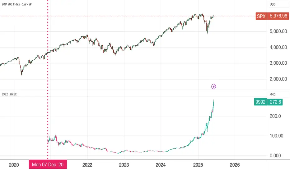
Since Dec 2020, Pop Mart has gained 286% returns for the shareholders who ride through the lows of less than 10 dollars in its darkest moments during 2023/2024. In comparison, the same amount of money invested in the SPX will gives you less than 70% returns. Pop Mart gains is 4x more than passive investing in SPX.
Congrats to those who had longed it and are laughing to the bank. For those like me who missed it, no point crying over spilled milk. There are abundant opportunities, just keep an open mind, if the fundamentals are ok, nibble a bit and see how it goes. All you need is 1-2 multibagger in your portfolio
S&P 500 Index.4H CHART PATTERN.the S&P 500 Index (4H timeframe), it appears you're using a combination of Ichimoku Cloud, trend channels, and support/resistance zones to project downside targets. Here's the breakdown of your marked targets:
📉 Bearish Targets:
1. Target 1: Around 5,500
2. Target 2: Around 5,200
3. Target 3: Around 4,950–4,900
---
🔍 Technical Observations:
Price has broken below the upward trend channel.
It's entering the Ichimoku Cloud, signaling potential consolidation or bearish pressure.
The large blue downward arrow indicates a bearish expectation, possibly tied to macro/fundamental concerns or technical reversal patterns.
The grey resistance block near 5,960–6,000 suggests failed breakout/retest.
---
📌 Summary:
If current bearish momentum continues:
✅ Immediate Target: 5,500 (first major support)
⚠ Medium Target: 5,200
🔻 Final Target Zone: 4,900–4,950 (strong previous support and fib zone)
Let me know if you want stop-loss ideas, confluence indicators, or entry strategy breakdowns!

SPX500 VEP Trader Strategy | Trend + Liquidity + Precise We’ve confirmed a strong bullish trend in SPX500 supported by solid momentum on the daily timeframe using the Squeeze Momentum indicator. The market shows potential to continue upward but may first revisit key liquidity zones.
🔍 Identified Liquidity Zones
We’ve marked high-liquidity zones on the following daily candles:
📅 Thursday, June 5
📅 Thursday, June 12
📅 Tuesday, June 3
These are areas where the market may pull back to sweep open orders before resuming the bullish trend.
🎯 Key Area: Fair Value Gap (15min)
We are expecting price to reach a 15-minute FVG identified on Monday, June 2 at 10:15 AM.
✅ Target level: $5,892
If the price taps into this zone, we’ll be watching for a bullish reaction.
🛠️ Entry Confirmation (5min or 2min)
Once the reaction occurs:
Look for a new FVG on 5M or 2M.
Confirm that Squeeze Momentum continues to show bullish strength.
If aligned, we enter CALLs with high confidence.
📉 Risk Management
Stop Loss: $5,860
Take Profit 1: Nearest recent High
Take Profit 2 and beyond: Continue marking each new High as a profit-taking step
📌 Final Thoughts
This is a clean setup combining liquidity analysis, FVG structure, and VEP Trader confirmation for high-probability trading.
It’s a plan that respects patience, structure, and precision.
📸 (See attached chart for full visualization of structure, levels, and gaps)
#SPX500 #VEPTrader #SmartMoneyConcepts #PriceAction #LiquiditySweep #FVGTrading #DayTrading #TradingViewIdeas #PBInvesting

Bearish outlook on us500Looking at how price took out liquidity inside the previous eardhbob l I would be watching for bearishness to the downside

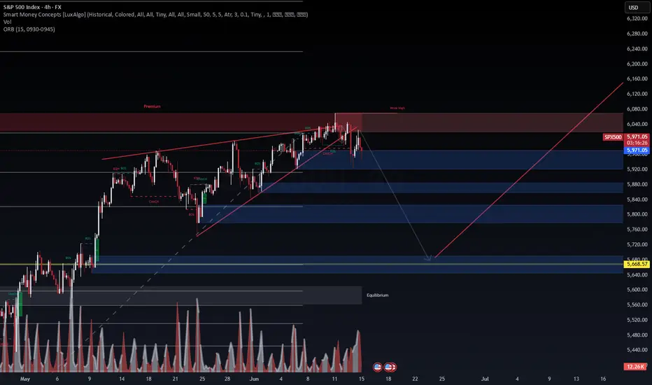
SPX500 | SMC Breakdown in Progress – Watch the Liquidity SweepThe rising wedge broke structure near the weak high in premium territory. We are now seeing bearish CHoCHs and BOS with volume confirmation, suggesting a move down toward the next key demand zone between 5840–5720.
📊 Volume Analysis
Spikes in sell volume during BOS align with structural shifts, confirming the loss of bullish intent.
📌 Key Zones
Premium Zone: 6000–6080 was swept and rejected
Target Zones: 5840, 5760, and final liquidation zone near 5668
Equilibrium sits below 5700, matching confluence with prior FVG and OB
🔀 Scenarios
Price could react mid-range and retrace to test the weak high again.
A full sweep of the lower liquidity zone near 5668 could create a bullish springboard for a longer-term continuation.
🎯 Bias: Bearish unless price reclaims 6020 on strong volume.
Watch for how price behaves near the mid-blue zone — patience will provide the cleanest entry.
— WaverVanir International LLC
SPX500 BUYGreeting there traders this is my analysis on
📊 S&P 500 – Potential Elliott Wave 3 Formation | Long Setup
The current 4H chart of the S&P 500 suggests a potential bullish continuation based on Elliott Wave Theory. Here's the structured breakdown:
🔹 Wave 1: Initiated after a failed breakout and sharp reversal from a previous resistance zone. This impulsive move marked a key shift in trend structure.
🔹 Wave 2: A corrective phase followed, consolidating near the support area (~5,915), respecting previous demand.
🔹 Current Price Action: Price has broken above the minor resistance at 6,000, indicating the potential beginning of Wave 3, which is typically the strongest and most extended wave in the sequence.
📈 Trade Setup:
Entry: Above 6,000 (confirmation of breakout and wave continuation)
Stop Loss: Below 5,915 (invalidates bullish structure if broken)
Target Zone: 6,167 – 6,170 (aligned with prior resistance and wave projection)
🔍 Additional Notes:
The breakout is supported by a clean structure and rejection from key support.
Ideal scenario would involve increasing volume and continuation with higher highs and higher lows.
📌 Bias: Bullish – targeting Wave 3 extension.
⚠️ Always manage risk accordingly and watch for signs of exhaustion or divergence.
Dear Traders like,comment let me know what do you think?

Rising wedge + Bearish divergence + GAP at 5700 + new war !!!Rising wedge + bearish divergence + GAP down at 5700.
And yes, a new war in the Middle East. Higher oil prices are coming — Iran controls the Hormuz Strait, where 20–30% of the world’s oil is transported. Yes, Iran is on the sanctions list, but other countries aren’t — they trade with Iran and resell the oil to the rest of the world. Triangle trade.
But that supply of 20–30% is about to disappear due to the war. Higher oil prices mean higher expenses. A lot of the world still relies on oil as an energy source.
We’re also out of the previous trend we had before the tariffs.
DYOR (Do Your Own Research).

S&P500 awaits new drivers for growthThe S&P 500 index has been moving in a perfectly sideways direction without any clear directional bias. This week had increased volatility a little bit, but not too much: the price was consolidating in a narrowing triangle, having expanded it to some extent.
It’s possible to observe a continuation of a sideways action, at least until the interest rate decision from the FED next week and the press-conference of Jerome Powell, which might give (or might not give) any clarity about the possible direction of the market.
Overall activity remains muted as summer’s slow price action dominates the action.
Don't forget - this is just the idea, always do your own research and never forget to manage your risk!

US500 Will Fall! Short!
Here is our detailed technical review for US500.
Time Frame: 10h
Current Trend: Bearish
Sentiment: Overbought (based on 7-period RSI)
Forecast: Bearish
The market is approaching a significant resistance area 5,979.56.
Due to the fact that we see a positive bearish reaction from the underlined area, I strongly believe that sellers will manage to push the price all the way down to 5,838.14 level.
P.S
Overbought describes a period of time where there has been a significant and consistent upward move in price over a period of time without much pullback.
Disclosure: I am part of Trade Nation's Influencer program and receive a monthly fee for using their TradingView charts in my analysis.
Like and subscribe and comment my ideas if you enjoy them!

SPX: geopolitics shaping sentiment Although the previous week on US equity markets started with a positive sentiment, still the newly emerged tensions in the Middle East turned the sentiment to the negative side. The S&P 500 was looking for higher grounds, after recently reaching the 6K level again, however, turning 1,13% to the negative territory on Friday, after the news regarding the Middle East tensions. The index is back below the 6K, closing the week at 5.976. While investors were digesting the risks from the Middle East tensions, tech companies were the ones that were mostly driving the index to the down side. NVDA dropped by 2,09%, AAPL was down by 1,38%. On the opposite side was TSLA, with a Fridays gain of 1,94%.
On the other hand, the macro fundamentals were relatively positive for the US economy. The inflation is clearly calming down, with the US inflation in May at 0,1%, which was better from market estimate. Also the University of Michigan Consumer sentiment preliminary for June showed decreased inflation expectation by US consumers, at 5,1% for this year, from 6,6% posted previously.
The most important event during the week ahead would be the FOMC meeting, scheduled for Wednesday, June 18th. The Fed will also discuss the economic projections. This would be a day to watch on financial markets as it can bring some higher volatility.

Down for SPX500USDHi traders,
SPX500USD went exactly to the target of my previous outlook.
After price came into the Daily FVG it rejected from there and started the correction down.
So next week we could see more downside for this pair to finish a bigger correction down.
Let's see what the market does and react.
Trade idea: Wait for a small correction up on a lower timeframe to trade short term shorts to the previous Weekly low.
If you want to learn more about trading FVG's & liquidity sweeps with Wave analysis, then please make sure to follow me.
This shared post is only my point of view on what could be the next move in this pair based on my technical analysis.
Don't be emotional, just trade your plan!
Eduwave

Is SPX at a crucial point here.... inflection point?Until yesterday, it seemed that bulls were fully in control chugging along to make new ATH or go closer to previous ATH. Seemed like SPX was breaking from ascending triangle. Looked bulllish going into this Opex close, certainly propped by good data and good tariff comments.
Now with the recent war news, and the dip we had yesterday, seems like new pattern emerging (rising wedge) which is bearish. Also keep in mind the JPM hedge that expires end of month. The open interest shows that JPM hedge is still alive (they havent closed) and based on my calculations currently JPM has a loss of around $622M.
To stem losses market at minimum needs to be below 5900 by end of month (at 5900 JPM loses $59M but its chump change for them) and for them to be neutral or make money then SPX needs to be 5300 and below by end of month.
Currently around 5975, would mean a drop of 500-600 points in next 2 weeks... certainly can happen....
Appreciate your comments!

S&P 500 Daily Chart Analysis For Week of June 13, 2025Technical Analysis and Outlook:
The S&P 500 Index has displayed both upward and downward movements throughout this week's trading session, narrowly missing the targeted Outer Index Rally level of 6073. Currently, the index is characterized by a bearish trend, warranting attention towards the Mean Support level of 5940, with additional critical support identified at 5888.
Conversely, there exists a significant potential that, upon reaching the Mean Support of 5940, the index may recover and rise to the Mean Resistance level of 6046. This upward movement could facilitate an interim rally, culminating in the completion of the Outer Index Rally at 6073 and enabling the index to address the Key Resistance level positioned at 6150.
