US10Y Technical Analysis & Mortgage Rate Outlook Weekly. Aug. 4US10Y Technical Analysis & Mortgage Rate Outlook
(Based on Weekly Chart & Current Economic Context)
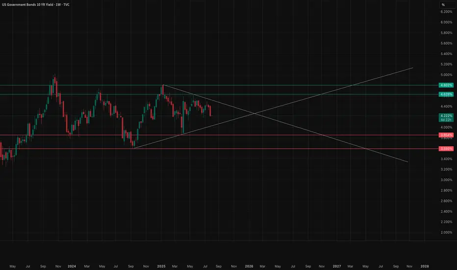
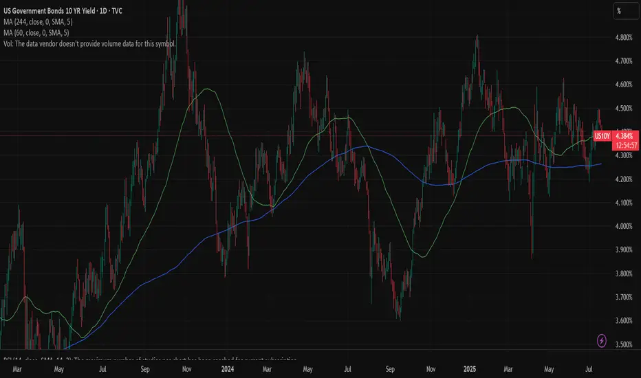
Technical View (Weekly Timeframe)
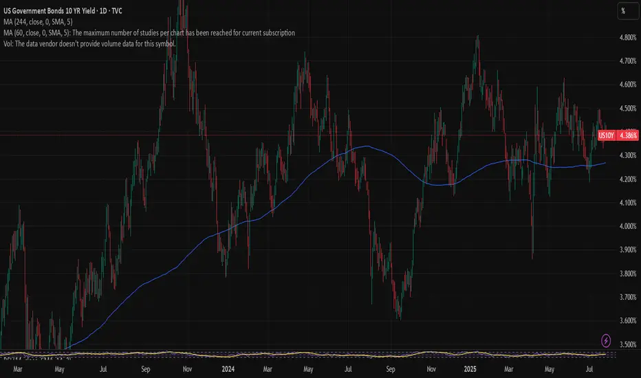
The US10Y yield is sitting around 4.21%, in the middle of a wide consolidation range that’s been developing since late 2023. This range is bounded by strong resistance near 4.62%–4.80% (purple supply zone) and support near 3.86%–4.00%.
* Trend Structure:
* We are still in a macro uptrend from the 2020 lows, but recent action has been sideways-to-lower since late 2023.
* Yields remain above the long-term uptrend line but have failed to sustain breakouts above 4.80% multiple times — showing sellers are defending that zone heavily.
* Support Levels:
* 4.00%–4.10% → First key demand zone.
* 3.86% → Major floor; losing this could trigger a larger downside move toward 3.50%–3.60%.
* Resistance Levels:
* 4.50% → First overhead supply.
* 4.62%–4.80% → Strong long-term resistance. A breakout here could signal a push toward 5.0%+ yields.
Economic & Labor Market Context
The latest labor market report showed slowing job growth but still relatively low unemployment. Wage pressures have eased slightly, hinting that labor-driven inflation is cooling. However:
* Inflation remains above the Fed’s 2% target, making the central bank reluctant to cut rates aggressively.
* The bond market is pricing in fewer rate cuts in 2025 than previously expected, keeping yields elevated.
* The Fed’s tone remains “higher for longer” until inflation shows more decisive softening.
Mortgage Rate Implications
Mortgage rates tend to follow the 10-year Treasury yield plus a spread of roughly 1.8%–2.0%.
* If 10Y Stays Near 4.20% → 30-year fixed mortgage rates likely hover around 6.0%–6.2%.
* If 10Y Tests 4.80% Resistance → Mortgage rates could climb toward 6.8%–7.0%.
* If 10Y Breaks Below 4.0% → Mortgage rates could fall into the 5.8%–5.9% range.
Given the Fed’s cautious stance and sticky inflation, a sustained drop below 6% mortgage rates in the near term looks unlikely unless we get a meaningful deterioration in economic growth.
My Thoughts
* Short-term (1–2 months): Likely range-bound between 4.0% and 4.62% until a major macro catalyst (CPI, Fed policy shift) forces a breakout.
* Medium-term (3–6 months): If economic data continues to soften, yields could drift toward 4.0% and help mortgage rates ease modestly. If data surprises to the upside, a retest of 4.80% is likely.
* Mortgage Rate Forecast: Expect 30-year fixed rates to stay between 6.0% and 6.6% for the rest of summer, with downside limited unless the Fed signals an earlier pivot.
US10Y trade ideas
US 10Y TREASURY: NFP sank yields Although the previous week was full of important US macroeconomic data, including the FOMC meeting, still the weaker than expected NFP data impacted significantly the US Treasuries market. The 10Y US benchmark yields were holding around the 4,3% level during the week, however, weak NFP data pushed yields strongly to the downside, closing the week at the level of 4,22%. The support line at 4,2% was also tested at Friday's trading session. As per current sentiment, investors are now anticipating two rate cuts till the end of this year, one in September and another one in December by 25bps. Odds for September rate cut stand at 85% since Friday.
The week ahead will be a reflective one on financial markets, as there are no important data to be released. In this sense, markets will digest both this week's posted economic data as well as macro projections from the latest FOMC meeting. Some upward corrections are possible, at least till the level of 4,3%.

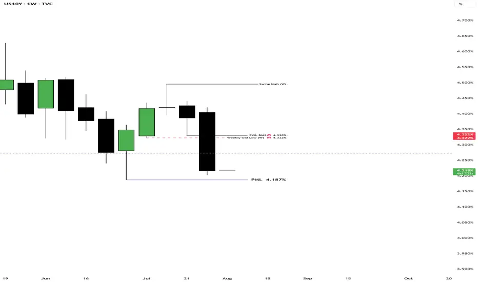
US 10-year yield threatening to breach key supportAfter Friday’s US jobs report, US Treasury yields fell across the curve. This caused the benchmark 10-year yield to retest the area below the 6M resistance level at 4.417% and settle at the 3M support from 4.211%. The mentioned support level has acted as a familiar floor since May this year. Therefore, a rejection of this base could refocus attention on 4.417% as an upside target, while a breakout might open the possibility for price to decline towards a 1Y support at 4.038%.
Written by the FP Markets Research Team

US10YTHE non farm employment data report has given us a reason to sell of US10Y.the lower than forecast of 73K was a big shock ,the slower job growth reflects caution amongst employers amid uncertainties related to tariff, trade and immigration policies. Wages grew with average hourly earnings increasing about 0.3% month over month. overall, the labor market shows signs of cooling but remains fundamentally resilient with payroll gains still keeping pace with working age population growth.
the US10Y COULD SLIP DOWN MORE ON ECENONOMIC OUTLOOK,IF THEY DONT DEFEND THE DEMAND FLOOR .
#US10Y #BONDS #YIELD

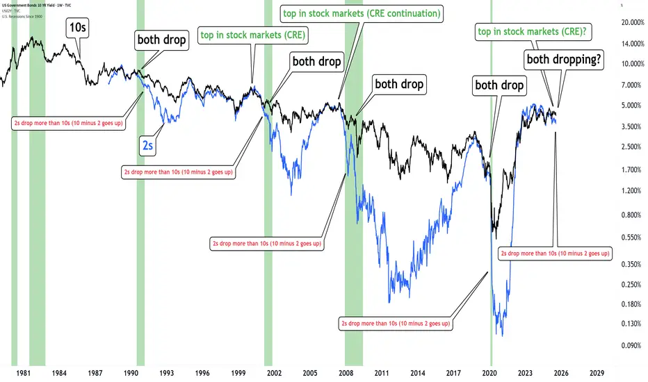
The bond market is warning us.When both 2s & 10s drop together and the yield curve steepens (10–2 rises)... It’s historically followed by important market turmoil
Happened in 2000, 2008 and 2020.
It's possibly happening again.
The bond market is warning us.
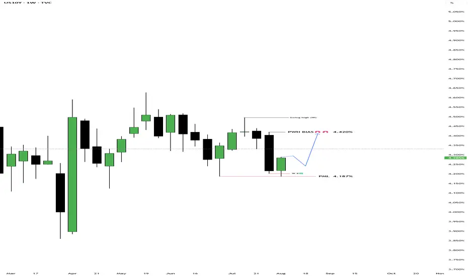
T-Bond Futures & US10Y Yields Weekly BiasUS10Y: 4.288% - 4.240%
T-Bonds: 115.11 - 115.24
Bullish t-bond, bearish US10Y

US10Y1. Labor Market Data
Average Hourly Earnings m/m:
Actual: 0.3%
Forecast: 0.3%
Previous: 0.2%
Interpretation: In-line with forecast and slightly above the prior period, indicating stable wage growth. This suggests inflationary pressures from labor costs remain steady, not accelerating unexpectedly.
Non-Farm Employment Change:
Actual: 73,000
Forecast: 106,000
Previous: 14,000
Interpretation: A clear downside surprise; job gains are well below expectations, and while up from a low previous period, this points to softening labor demand—an early sign of slack in the job market.
Unemployment Rate:
Actual: 4.2%
Forecast: 4.2%
Previous: 4.1%
Interpretation: Matches the forecast but marks a slight uptick, reinforcing mild labor market weakness.
Fed View: The Fed will interpret softer than expected job growth and a higher unemployment rate as evidence of easing labor market pressures—a dovish signal that could support future policy easing if the trend continues.
2. Manufacturing and Industry
Final Manufacturing PMI (S&P Global):
Actual: 49.8
Forecast: 49.7
Previous: 49.5
Interpretation: Slightly above forecast but still below the 50 threshold, indicating contraction persists but is less severe.
ISM Manufacturing PMI:
Actual: 48.0
Forecast: 49.5
Previous: 49.0
Interpretation: Below both forecast and prior; contraction in the manufacturing sector is deepening.
ISM Manufacturing Prices:
Actual: 64.8
Forecast: 69.9
Previous: 69.7
Interpretation: Lower than both forecast and previous, signaling input price pressures are easing—positive for the Fed’s inflation outlook.
Fed View: Ongoing contraction in manufacturing and lower input prices support the argument that inflation risks are cooling from the supply side, allowing for a more dovish stance.
3. Consumer and Construction
Revised UoM Consumer Sentiment:
Actual: 61.7
Forecast: 62.0
Previous: 61.8
Interpretation: Slightly below forecast, little change—consumer confidence remains relatively subdued.
Construction Spending m/m:
Actual: -0.4%
Forecast: 0.0%
Previous: -0.4%
Interpretation: Same as previous, misses forecast—ongoing weakness in construction and real estate investment.
Fed View: Weak consumer sentiment and persistent soft construction data reinforce slower demand-side dynamics, an argument in favor of pausing or even cutting rates.
4. Inflation Expectations
Revised UoM Inflation Expectations:
Actual: 4.5%
Forecast: Not directly listed (prior 4.4%)
Interpretation: Ticks up slightly, indicating that consumers expect inflation to remain higher. This could temper the Fed’s willingness to cut rates too soon—if expectations become unanchored, the Fed may have to stay hawkish.
Overall Fed Interpretation
Labor market: Softer than forecast, unemployment up—dovish for rates.
Manufacturing/industry: Slight improvement in PMI, but ISM shows contraction; input prices are easing—dovish.
Consumer/construction: Little improvement, still weak—dovish.
Inflation expectations: Up slightly—potential hawkish caution.
Net result: The data is mostly dovish—except for the higher inflation expectation which remains a concern. The Fed will likely see this data as supporting a “watchful pause” and adopt a more flexible stance: no immediate rate cut, but the case for easing is growing unless inflation expectations keep drifting higher. Sustained weak jobs or further easing in prices would increase the chances of a rate cut in coming months. Elevated inflation expectations will keep the Fed cautious about acting too quickly.
#DOLLAR #US10Y #STOCKS #BONDS #YIELD
Crude Oil Spikes - Russia / Ukraine / USA sanction? Concerns about the possibility of tighter global oil supplies are supporting crude prices after President Trump warned of "secondary sanctions" if Russia fails to reach a ceasefire in Ukraine within 10 to 12 days.
These sanctions have absolutely burned the shorts in oil and can cause a 3 bar surge on the daily chart if crude breaks this channel.
Keep you eye on the daily 200 MA...if it holds above we should push higher on crude.
FOMC RATE DECISION TOMORROW - Tune into our live stream.

US Treasury 10Y Technical Outlook for the week July 28-Aug 1 US Treasury 10Y Technical Outlook for the week July 28-Aug 1 (updated daily)
Overnight
Overnight, U.S. Treasury yields reversed their upward trend and traded lower as investors awaited key developments from the Federal Reserve’s upcoming policy meeting and ongoing U.S.-China trade talks. The benchmark 10-year Treasury note yield fell to 4.35%, a decrease of 2 basis points, while the 30-year bond yield dropped to 4.92%, down 3 basis points. This shift followed a period of elevated yields driven by concerns over potential inflationary pressures from proposed U.S. tariffs. Market participants were particularly focused on the Federal Reserve’s stance on interest rates, with futures markets indicating a likely rate cut in September. Additionally, trade negotiations in London between U.S. and Chinese officials added uncertainty, as economists anticipated that tariff-related disruptions could push the Consumer Price Index higher, potentially impacting future Fed decisions. The market’s cautious mood was reflected in a light economic data calendar, leaving room for yields to react to trade and Fed-related headlines.
Economic Release for the Week www.myfxbook.com
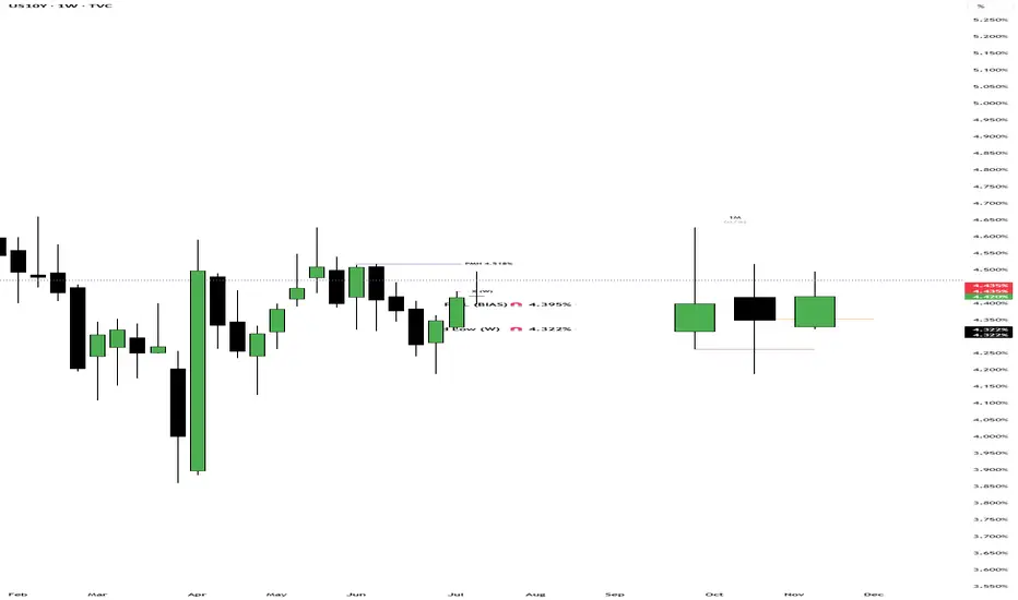
Weekly Bias
As expected last Monday we were anticipated that 4.395% will be mitigated. Basing on how the market moved last week and the week closing through below previous week low I am anticipating a continuation to target 4.33% to 4.322%. Bear in mind though that this week’s FOMC meeting could generate a significant volatility and become a catalyst to our projection.
Daily Bias UST 10y July 29
Overnight
The yield on the 10-year US Treasury note remained steady at approximately 4.39% for the third consecutive session as investors awaited a critical week of monetary policy and economic data. The Federal Reserve is expected to maintain current interest rates at its Wednesday meeting, with markets keenly observing for indications of a potential rate cut in September. Investors are also focused on the upcoming Personal Consumption Expenditures report, the Fed’s preferred inflation measure, which may reveal the impact of tariffs on price dynamics. Additionally, a series of labor market data releases, culminating in Friday’s closely watched monthly jobs report, will draw significant attention. On the trade front, a recent US-EU agreement has reduced tariffs on most EU exports to 15%, down from a previously threatened 30%, alleviating some trade-related uncertainty.
Economic Release July 29 www.myfxbook.com
Daily Bias
Basing on price action I am anticipating market to test the previous day high of 4.42%. Market is also waiting for the start of the FED meeting which could contribute to low volatility for the meantime. Although market is expecting no move but any deviation from policy expectation could create high volatility.
Daily Bias UST 10y July 30
Overnight
Overnight, U.S. stock markets experienced a downturn, with major indices like the S&P 500, Dow Jones Industrial Average, and Nasdaq Composite declining ahead of anticipated Federal Reserve announcements. The drop was primarily driven by uncertainty surrounding potential interest rate decisions and ongoing trade tensions, particularly following President Trump’s recent tariff policies. Concurrently, U.S. Treasury yields, including the 10-year note, fell to 4.28% from 4.35% the previous day, reflecting investor caution and a shift toward safer assets amid economic concerns. This market reaction underscores heightened sensitivity to Federal Reserve actions and the broader implications of trade disruptions on global economic growth.
Economic release July 30 www.myfxbook.com
Daily Bias
Cautious positioning kicks in and all our anticipated targets were all missed instead market moved to our weekly bias of 4.33% and old week low of 4.322%. This is expected on an FOMC week due on Thursday morning. With how the market moved yesterday I am anticipating a further test on the low side of previous day range but don’t discount any volatility with GDP due to be released later tonight . www.tradingview.com
Daily Bias UST 10y July 31
Overnight
The yield on the 10-year US Treasury note rose to 4.35% on Wednesday, rebounding from a near-one-month low of 4.32%, as markets evaluated the Federal Reserve’s decision to maintain interest rates and its neutral stance on future policy moves. Strong US GDP growth of 3% in Q2, exceeding market expectations, was tempered by distortions from net foreign demand due to import front-loading. Volatile trade data reflected new tariffs imposed by President Trump on India and Brazil. The Treasury announced stable issuance volumes for notes and bonds but plans to double long-end nominal buybacks and increase TIPS buybacks, aligning with efforts to manage long-end yields, as outlined by Secretary Bessent.
Economic Release July 31 www.myfxbook.com
Daily Bias
Prior to FOMC decision the yield moved higher (price lower) and retraced to the 50% range of the prior day’s range (Tuesday). Today I would like to wait if the market would continue the bullish move of Tuesday. We are on an inside candle pattern so I would like more confirmation for the next move.
**Disclaimer:**
The technical analyses provided herein are based solely on my personal analysis and are intended for my own study and reference. They do not constitute a recommendation or solicitation to buy or sell any financial instruments. Any decision made by individuals based on this analysis is their own responsibility, and I assume no liability for any losses or damages incurred as a result of using this information. It is advisable to conduct thorough research and consult with a qualified financial advisor before making any investment decisions.
U.S. homebuilders tumble as rate cut bets decrease after Powell'** Shares of U.S. homebuilders slide on Weds after Fed chair Powell says no decision yet on rate cuts
** Markets now pointing to odds dropping below 50% that the Fed will cut rates at its next meeting in Sept, as benchmark U.S. 10-year yield
US10Y
extends rise
** Rising yields can potentially lead to higher mortgage rates, which could negatively impact homebuilders by making homes less affordable for consumers
** PHLX Housing Index
HGX
dropping >2% on the session
** Among biggest HGX fallers are: LGI Homes
LGIH
5%, DR Horton
DHI
>2%, Lennar
LEN
nearly 3%, Pultegroup
PHM
>3%
** In S&P 500
SPX
, building products maker Builders FirstSource
BLDR
down 5%, and home improvement retailers Home Depot
HD
and Lowe's
LOW
both off nearly 2%
** With moves on Weds, HGX down ~2% YTD vs 8% advance in SPX

US 10Y TREASURY: a bit of correction Two weeks ago U.S. Treasury yields were under a strong impact of weaker-than-expected non-farm payrolls data. The market reacted with a strong move toward the level of 4,2%. However, during the previous week some corrections in the level of yields occurred, as expected. The market digested the data and moved yields toward the 4,3%. The 10Y yields are ending the week at 4,28%.
The week ahead is also going to be an interesting one from the perspective of data. The inflation rate for July and the producers price index for July are scheduled for a release. The market will wage this data in a sense of its potential impact on the Fed's decision to cut or postpone rate cuts in September. Inflation data are especially relevant for market participants as it will provide an overview of the spillover effect of implemented tariffs on both inflation and the U.S. real economy.

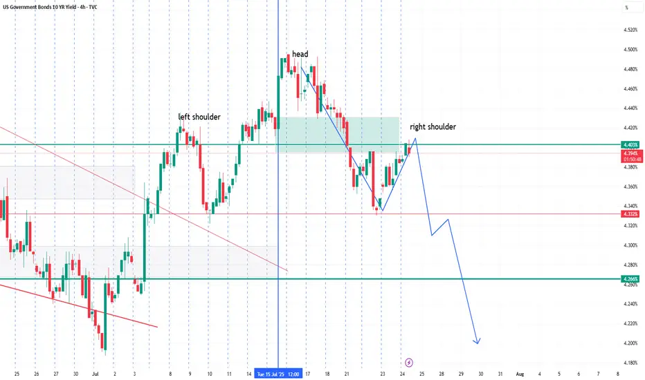
UST 10Y Technical Outlook for the week Aug 11-15 (updated daily)UST 10Y Technical Outlook for the week Aug 11-15 (updated daily)
Overnight
The yield on the US 10-year Treasury note climbed to 4.27% on Friday, marking a fourth consecutive session of increases from a three-month low earlier in the week. This uptick follows market reactions to proposed tariffs on gold bars, President Trump’s nomination of Stephen Miran to the Federal Reserve’s Board of Governors, and concerns over potential politicization of the Fed. Weak economic indicators, including a lackluster jobs report, a subdued ISM Services PMI, and rising jobless claims, have heightened expectations for an interest rate cut next month. Additionally, recent Treasury auctions for 10-year and 30-year notes suggest declining demand for US debt. Investors are now focused on the upcoming CPI report and other economic data for further clarity on the US economy’s trajectory.
Economic Release for the week www.myfxbook.com
Weekly Bias
Based on last week's market activity, the market tested the prior week's low and the previous month's low before rallying strongly to close within the prior week's range. For the upcoming week, I anticipate the market may target last week's high of 4.42%. Key economic data, including CPI and inflation figures, are scheduled for release on Tuesday. These figures are likely to introduce significant volatility, so close monitoring is advised.
**Disclaimer:**
The technical analyses provided herein are based solely on my personal analysis and are intended for my own study and reference. They do not constitute a recommendation or solicitation to buy or sell any financial instruments. Any decision made by individuals based on this analysis is their own responsibility, and I assume no liability for any losses or damages incurred as a result of using this information. It is advisable to conduct thorough research and consult with a qualified financial advisor before making any investment decisions.
US10Y & T-Bond Future - Weekly AnalysisBias For The Week:
US10Y - Bullish Up to 4.341%
T-Bond - Bearish Down To 113.25

UST 10Y Technical Outlook for the week Aug 4-8 updated dailyUS Treasury 10Y Technical Outlook for the week Aug 4-8 (updated daily)
Overnight
The yield on the US 10-year Treasury note dropped sharply by nearly 20 basis points to 4.25% on Friday, hitting a three-month low, driven by revised labor market data indicating significant weakness. Nonfarm payrolls for July increased by only 73,000, far below the expected 110,000, with prior data revised downward by 258,000 jobs for the previous two months. These figures highlighted the adverse effects of tariff threats and economic policy uncertainty, challenging earlier perceptions of a strong US labor market. As a result, market expectations shifted, reducing the likelihood of a Federal Reserve rate cut in September and limiting anticipated cuts to two for the year. Additionally, President Trump’s imposition of 39% tariffs on Switzerland, effective next week, and new tariffs on the EU, Japan, and Korea, effective immediately, further pressured yields. The Treasury’s announcement of increased buybacks for notes, bonds, and TIPS also contributed to the decline in yields.
Economic Release Aug 4 to 8 www.myfxbook.com
Weekly Outlook
Last week’s market has been very volatile. Yield has closed below prior week’s low and may continue to reach the previous month’s low of 4.187% . There are lots of noise in Trump’s administration from firing of the National statistician to fed governor Adriana Kuger resignation and Nuclear talks. These might affect the market in the coming days.
**Disclaimer:**
The technical analyses provided herein are based solely on my personal analysis and are intended for my own study and reference. They do not constitute a recommendation or solicitation to buy or sell any financial instruments. Any decision made by individuals based on this analysis is their own responsibility, and I assume no liability for any losses or damages incurred as a result of using this information. It is advisable to conduct thorough research and consult with a qualified financial advisor before making any investment decisions.
US 10Y TREASURY: FOMC week During the previous week investors were digesting the latest macro data aiming to set expectations for the forthcoming FOMC meeting, which is scheduled for Wednesday, July 30th. The 10Y Treasury yields were moving between 4,32% and 4,44%, closing the week at 4,38%. The drop in yields during the second half of the week was impacted with a trade deal between the US and Japan. Negotiations with the EU are taking place during the weekend in Scotland, whose outcome will be known at the start of the week ahead.
Regardless of trade negotiations, the week ahead will bring a lot of currently important US macro data, as well as the FOMC meeting. Current expectations with 95% odds is that the Fed will keep interest rates unchanged in July. Also, it is expected that Fed Chair Powell will inform the public about the latest Feds members view on the US economic developments. In case of any information that the market still has not priced, the higher volatility will take place. For the week ahead, there is both probability for a further modest relaxation in yields, at least till the level of 4,35%, and also potential for testing of 4,4% for one more time.
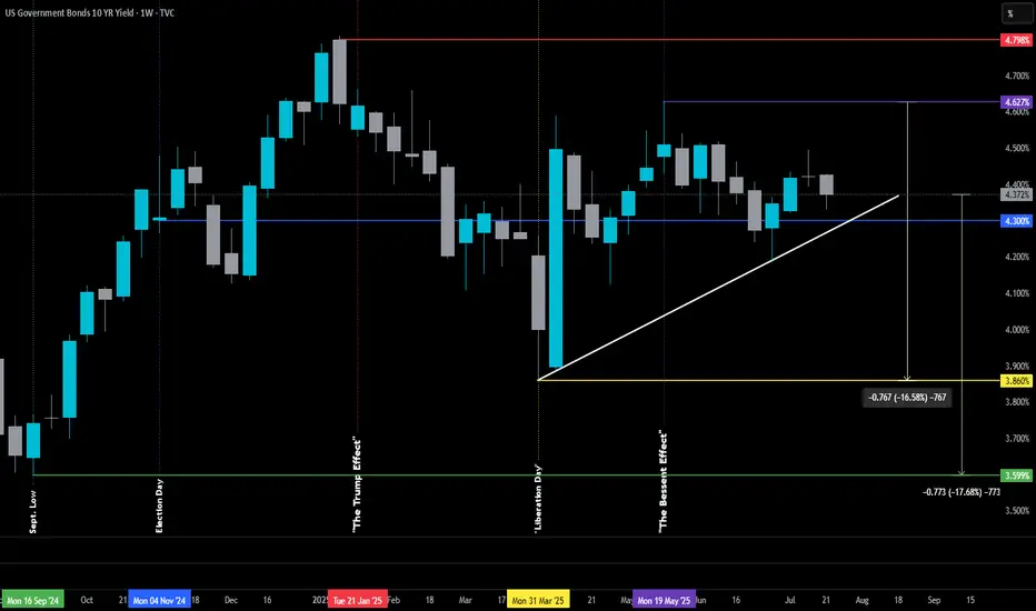
The Bessent Effect: Part I-Challenge the FedThe Bessent Effect: Part I-Challenge the Fed
Originally posted on June 30th, 2025, but it was removed by a moderator — I misinterpreted the posting guidelines (I tend to read a little too deep between the lines sometimes).
For context, the original version didn’t include the White or Green lines.
June 30th post:
The 10-year Treasury yield is the heartbeat of commercial lending — it’s what sets the tone for everything from real estate financing to economic sentiment. And interestingly, it’s now hovering right around the same level it was on Election Day 2024 (Blue Line), which feels like a lifetime ago in policy terms.
So what’s happened since then? Quite a bit.
Yields peaked the week before Inauguration Day (Red Line), then began a steady decline — until we were hit with what can only be described as "Liberation Day Tariff Whiplash."
The tariffs, announced in early April (Yellow Line), spooked the markets — particularly the ever-watchful Real Money Investors (think central banks, pension funds, and the ruthless whales). Their reaction? A spike in the 10-year, as they scrambled to reassess risk and reposition.
Plot twist: Trump’s unleashing of Scott Bessent.
Since stepping into the role of Treasury Secretary, Bessent has taken the reins of U.S. economic diplomacy. By late May (Purple Line), he was already deep in talks at the G7 meeting in Banff, hashing out trade dynamics and currency cooperation with global finance leaders. And — perhaps not so coincidentally — since then, the 10-year has been on the decline again, even as the Fed remains firm in its refusal to cut rates.
Here’s the big takeaway: there's a strong chance we could see rates — the ones that actually move the real estate market and reflect how the “real players” feel — drift back down to their pre-tariff levels. That is, before Tariff Derangement Syndrome set in. And probably before they shoot back up to the peaks we saw just as Trump returned to the White House.
In short: the 10-year might be hinting that the worst isn't over — but we could be in for a stretch of green pastures before we hit the next storm.
US 10Y TREASURY: June data cools rate cut hopesThe US inflation and jobs data shaped investors sentiment during the previous week, where 10Y US Treasury yields eased as of the end of the week. The US inflation remains relatively steady and in line with expectations, with 0,3% increase in June or 2,7% y/y. The producers price Index was holding at 0% in June, while the University of Michigan inflation expectations also eased to 4,4% for the year and 3,6% for a five years inflation expectations. June Retail Sales surprised the market with a 0,6% increase for the month.
At the start of the week, 10Y yields reached their highest weekly level at 4,49%, and took a downturn during the second part of the week. The lowest weekly level reached was 4,41% on Friday. As US macro data remains relatively robust, the current market expectations for a rate cut in July are almost diminished. Traders now expect any rate cuts to be delayed to September or later. As per CME FedWatch Tool, odds for September rate cut slipped from 70% down to current 50%. As the week ahead does not bring any currently significant macro data, it could be expected that also 10Y Treasury yields could have a relatively calmer week. It will be used for digesting current macro data and to gear up for the last week of July, when the next FOMC meeting is scheduled.
UST 10Y Technical Outlook for the week July 21-25 (updated dailyUS Treasury 10Y Technical Outlook for the week July 21-25 (updated daily)
Overnight
On Friday, the yield on the US 10-year Treasury note slightly declined to 4.44%, driven by investor reactions to the latest University of Michigan Consumer Sentiment data and remarks from Federal Reserve Governor Christopher Waller. The consumer sentiment index rose in July, accompanied by lower inflation expectations for both short- and long-term horizons. Waller expressed support for a potential rate cut in July, indicating he might dissent if the Federal Open Market Committee chooses to maintain current rates. However, market expectations remain focused on no rate changes this month, with two quarter-point cuts anticipated in September and December. Earlier data highlighted robust consumer spending through strong retail sales, alongside softer-than-expected core CPI and PPI figures.
Economic Release for the Week www.myfxbook.com
Weekly Bias
For the week I am expecting last weeks low of 4.395% to be mitigated to previous old low of 4.322%. I am basing this assumption based on the price action last week and how the weekly candle closed weekly (pin bar). Will start the analysis on daily bias on Tuesday.
**Disclaimer:**
The technical analyses provided herein are based solely on my personal analysis and are intended for my own study and reference. They do not constitute a recommendation or solicitation to buy or sell any financial instruments. Any decision made by individuals based on this analysis is their own responsibility, and I assume no liability for any losses or damages incurred as a result of using this information. It is advisable to conduct thorough research and consult with a qualified financial advisor before making any investment decisions.
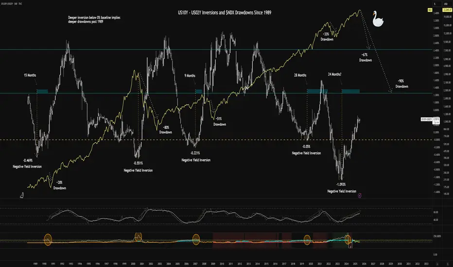
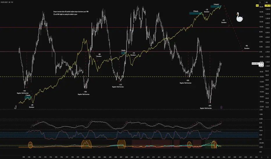
$US10Y - $US02Y Inversion and $NDX Drawdowns Since 1989I cleaned the chart a bit for readability.
The chart shows historical inversions in the TVC:US10Y and TVC:US02Y and the drawdowns in the NASDAQ:NDX that followed. The implication is that we should expect to see a >50% drawdown within 4 months. I'm not calling the "why" but only drawing parallels to historical price action following bond market environments.
My current interpretation is that we're headed for stagflation - interest rates will be stickier than consensus takes driven by market uncertainty and increasing energy prices. The Trump administration seems to be pushing for policies that would alleviate pain from stagflation. The next revolution in technology promises massive productivity gains with respect to efficiencies in money transfers and back-end business operations in general. Unemployment will continue to rise as automation begins to increase.
The market will take time to find its bearings (upskilling and learning curves for employees and employers).
The Ai boom requires energy - more than we currently have capacity for. Companies will have to finance this build-out with vast sums of money. The reward will take time to harvest. Pain in the real economy will dampen consumption for a while.
Price action in Ai and technology companies has outpaced realized gains - we are at the front-end of this curve, much like the dotcom bubble.
Speculative bubbles like BITSTAMP:BTCUSD represent a direct threat to control over monetary policy for the reserve currency and hegemony. I am still very long USA (Dollar Milkshake). CRYPTOCAP:BTC has real value for struggling economies eclipsed by the majors, but for holders of this asset in the western world, large gains in CRYPTOCAP:BTC would necessarily depend on the collapse of civilization as we know it, implying a logical paradox for people that expect outsized returns. CRYPTOCAP:BTC.D demonstrates the loss of share of market cap well.
I invite comments with legitimate rational criticism as I'm always looking to improve my thinking about this topic.
Long ideas (comment additional tickers):
Utility-driven tokens enabling this new paradigm - BITSTAMP:XRPUSD COINBASE:XLMUSD COINBASE:ICPUSD COINBASE:LINKUSD BITFINEX:XDCUSD COINBASE:HBARUSD etc.
Inelastic staples - NYSE:LLY NYSE:BUD NYSE:PM
Energy and Ai infra - NASDAQ:ABAT AMEX:WWR NASDAQ:ENVX NASDAQ:PLUG NYSE:LAC AMEX:LEU NYSE:SMR NYSE:CHPT NYSE:KMI NYSE:QS NASDAQ:ITRI NASDAQ:ENPH NASDAQ:FSLR NASDAQ:CLSK NASDAQ:TSLA KRAKEN:EWTUSD
Disruption Beneficiaries - NYSE:WU AMEX:UPW NASDAQ:OPEN BOATS:PYPL NYSE:FIS NYSE:XYZ NASDAQ:FIVN NASDAQ:BGM
Short ideas:
NASDAQ:MSTR NASDAQ:PLTR NASDAQ:META NYSE:ED NYSE:EIX NYSE:PCG BOATS:XOM NYSE:CVX
I am employing long-expiry, OTM verticals to improve costs of trades or synthetic longs on moonshot names if not holding shares outright.
Share your comments. Good luck to all!
US10Y & T-BONDS Weekly AnalysisWeekly Targets:
- US10Y: 4.412%, 4.395%, 4.375%
- T-BONDS: 113.10, 113.16, 113.23

$NDX Black Swan Correlation of Variance from 0% of $US10Y $US02YIt appears that since 1989, deeper inversions of the yield curve have led to deeper drawdowns in the $NDX. Relative strength always appears to be in a steeper move upward coupled with fuzzy signals in volatility before the drawdown. Based on the previous market crashes, anything from a 60% to 90% drawdown appears to be plausible.
Currently buying long-expiry OTM put verticals across tech meme names (think NASDAQ:PLTR ) and potentially on some stalwart Mag7 tickers (maybe NASDAQ:META ) for pennies for potentially massive risk/reward paydays. Nothing more than a few grand, but I'm also long exposure to battery materials, hydrogen, and other energy plays. NASDAQ:ABAT NASDAQ:PLUG AMEX:WWR NYSE:LAC NASDAQ:ENVX NYSE:CHPT AMEX:LEU NYSE:SMR
Best of luck.
US10Y UNITED STATES GOVERNMENT 10 YEAR BOND YIELD .US 10-Year Treasury Yield Reaction to July 15, 2025 Economic Data
Key Economic Data (July 15, 2025)
Indicator Actual Forecast Previous
Core CPI m/m 0.2% 0.3% 0.1%
CPI m/m 0.3% 0.3% 0.1%
CPI y/y 2.7% 2.6% 2.4%
Empire State Mfg Index 5.5 — -8.3
Market Reaction: US 10-Year Treasury Yield
Yield Movement:
The US 10-year Treasury yield rose sharply to 4.495% on July 15, 2025, up from 4.43% the previous market day—a gain of 7 basis points.
Immediate Cause:
This jump occurred as the inflation data, while showing softer core CPI than forecast, delivered a higher-than-expected annual CPI (2.7% y/y vs. 2.6% forecast) and robust CPI m/m. Additionally, the Empire State Manufacturing Index rebounded strongly, further supporting concerns over persistent price pressures and economic momentum.
Market Interpretation:
Investors increasingly scaled back expectations for near-term Federal Reserve rate cuts, causing a sell-off in Treasuries and pushing yields higher.
Persistent inflation—especially with annual CPI running above consensus—suggests the Fed may need to keep rates higher for longer, amplifying bond market volatility.
The improved manufacturing sentiment also fueled the belief that the US economy remains resilient, reinforcing the hawkish read on interest rates.
Summary Table: US 10-Year Yield
Date Yield Daily Change
July 15, 2025 4.495% +0.07%
July 14, 2025 4.43% —
Key Takeaways
US10Y jumped by 7 bps to its highest level in five weeks after the mixed inflation report and strong manufacturing data.
Investor sentiment shifted toward fewer and later Fed rate cuts as inflation proved more stubborn than forecast.
The yield reaction underscores ongoing sensitivity to inflation surprises and economic resilience in 2025.
The bond market’s move highlights that even minor upsets to the inflation outlook can quickly ripple through rates, especially when compounded by positive growth signals.
#US10Y
