Knock Knock Who is there? it is me, US10Y 4.2%Knock knock.
Who's there?
I. O.
I. O. who?
Me.
When are you paying Treasury holders back?
Never!
Bullish Breakout ...to be continued...
The information and publications are not meant to be, and do not constitute, financial, investment, trading, or other types of advice or recommendations.
US10Y trade ideas

SPX: MAKE A MONTHLY TREND TOPHi everyone, im a portfolio manager. Today, i send you a warning to create a peak of the S&P500 index.
Careful.

US 10Y TREASURY: staying elevated The resilience of the US economy is evident in the latest posted economic figures. Both business and consumer sentiment is improving, while inflation, expressed through PCE continues to slow down. Still, the pending issue is what the FOMC will do at their meetings till the end of this year. As per Fed`s Chair Powell comments, two more rate increases should be expected. Whether that will actually occur, is to be seen till the end of this year, still, possibility of “soft landing” holds.
The 10Y Treasury ended Friday`s trading by reaching a level of 3.89%. It seems that the market is anticipating further rate hikes which might stay for a longer period of time at higher levels. With this move, a new chapter on charts was opened, in which terms, a road toward the 4% is now open. This level might be tested in the coming period. As for the week ahead, 10Y yields will open at level of 3.90%. It could not be noted at this moment whether yields will go higher from this level. In case of a short reversal, 3.8% will be tested, with lower probability that yields might return to the 3.6% level.

US10Y for shits and gigglesLet's see if it's accurate in the future since right now it looks like the mad market continues.

Ten year yield testing this channelThe US treasury bond ten year yield has been in a down trend channel for the last 9 months in the context of an uptrend that started in 2020. This could be a bull flag. The price now is at the top resistance line of that channel. A breakout could indicate higher inflation and interest rate expectations.

us 10yr looks like it breaking out from the cup and handle patteTVC:US10Y looks like it breaking out from the cup and handle pattern and could be on its way back to 4.1%

US 10Y yield looks to be failing at its downtrendDisclaimer:
The information posted on Trading View is for informative purposes and is not intended to constitute advice in any form, including but not limited to investment, accounting, tax, legal or regulatory advice. The information therefore has no regard to the specific investment objectives, financial situation or particular needs of any specific recipient. Opinions expressed are our current opinions as of the date appearing on Trading View only. All illustrations, forecasts or hypothetical data are for illustrative purposes only. The Society of Technical Analysts Ltd does not make representation that the information provided is appropriate for use in all jurisdictions or by all Investors or other potential Investors. Parties are therefore responsible for compliance with applicable local laws and regulations. The Society of Technical Analysts will not be held liable for any loss or damage resulting directly or indirectly from the use of any information on this site.

US 10Y TREASURY: pending 3.6% levelFed Chair Powell was speaking in front of the US Senate during the previous week, and confirmed what was previously said, that the Fed would most probably hit the rates for two more times till the end of this year. Market expectations are that the rates would be increased by additional 50 bps, which means two times 25 bps hikes. The 10Y US benchmark yields were moving around 3.8% at the beginning of the week, but ended the week around 3.68%. Still, Friday's trading close was at a level of 3.73%. The market continues to perceive an inverted yield curve, meaning that the rates would certainly have to go down. Charts are also perceiving some further relaxation in 10Y yields.
Charts continue to point to the level of 3.6% as the next target of 10Y yields. This level might be tested in the coming week or two. On the opposite side, at this moment there is no indication that the yields might go higher from 3.8% and there is a low probability that this level might be tested for one more time in the coming week.

10y and 2y yield curves inverted--market crash when?The blue line is the inverted yield curve 10y-2y. Two other times where it got to low levels preceded the 2001 and 2008 crashes. But the orange circles mark where the crashes actually began and the markets fell, several months later after the inverted yields bottomed. The bottoms last five to eight months each before the inverted yields started to resolve and move up again. But it was 6-8 months later when the crashes began. If this holds true for today, our bottoming process is just getting started so we could be six months from the inverted yield curve moving up. Then it could take six more months before a crash begins.

Bonds down on the short term? Dear Ziilllaatraders,
We should expect a short term sell.
Greetings,
Ziilllaatrades

Why did I know that bond yields were going to fall?To obtain this information, we need to look at four things:
-Fed Rates: The Federal Reserve's interest rates decisions can have a significant impact on financial markets and the overall economy.
-US5Y (US 5-year Treasury bonds): Yields on US 5-year Treasury bonds are an important measure to assess market expectations for short-term interest rates and investor sentiment regarding the economy.
-US10Y (US 10-year Treasury bonds): Yields on US 10-year Treasury bonds are also a key benchmark to evaluate investor expectations for medium-term interest rates and market risk perception.
-US30Y (US 30-year Treasury bonds): Yields on US 30-year Treasury bonds provide insight into investors' long-term expectations for interest rates and confidence in long-term economic stability.
Monitoring these indicators can provide valuable information about the direction of interest rates, market sentiment, and the overall health of the economy.
If we observe these three together, we can see that the maximum point marked with a red rectangle, the US5Y, is the only one that violated that high. This suggests that the movement in the US5Y was a manipulation (liquidity pool), as none of the other bonds violated the high. Also, the DXY (US Dollar Index) did not violate it and has already created a lower low. This indicates that we can expect the completion of this move in the DXY and a more aggressive decline in bonds.

The downward channel in gold remains intact.The market's current reluctance to accept a 3.65% rate and the potential for further dollar support can act as resistance for gold, confirming the bearish scenario.
A break of the 1954 dollar pivot could serve as a suitable confirmation for the continuation of the downward trend.

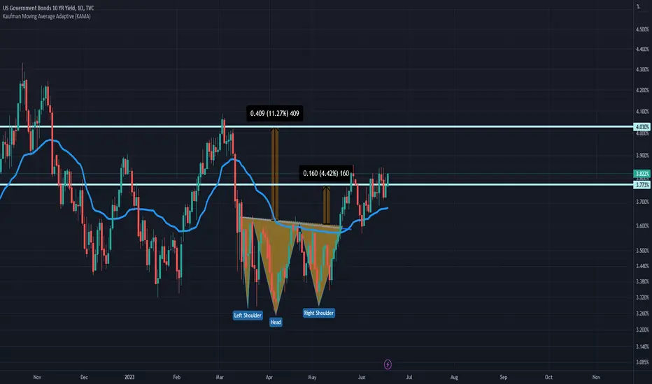
US10Y // REVERSE SHOULDER HEAD SHOULDER FORMATIONAlthough there is an inverted shoulder head shoulder formation on the chart, the targets are drawn according to Fibonacci.
US 10Y TREASURY: supporting 3.6%The Federal Reserve decided to halt its rate increase in June, acting exactly as the market was anticipating. However, this is not the long-awaiting Fed`s pivoting point. As per Fed Chair Powell, there would most certainly be two more rate hikes until the end of this year. This would eventually mean that the benchmark rate might go as high as 5.6% by the end of this year. So, the market was left as of the end of the previous week to digest Fed's comments and decisions during the weekend. On a positive side is that the inflation in the US is slowing down, reaching 4% in May on a yearly basis.
As of the end of the previous week, the 10Y Treasuries reverted by 7 points on Friday, ending the week at level of 3.7%, after reaching 3.8% during the week. Current charts are pointing to a potential for further weakening of the 10Y yields, in which sense, the level of 3.6% might be tested for one more time in the week ahead. Still, risks to the upside in the coming period should not be overlooked.

Yields are Yelling: Recession is comingIt looks like we are turning over.
Coupled with gigantic short positioning of speculators on bonds (highest in history bsed on the COT Data), the chart indicates that yields will fall again.
Why would they fall?
Because of a flight to saftey and/or a recession.
I am keeping it very simple, I just buy Bonds via ETF. I am long TLT, IEF and SHY.
With that trade, I am also long USD, since my native currency is EUR.
If we have a weekly close above 3,5% on the US10Y, I will exit my positions.
It might also be lucrative to go short stocks now, but I wont do that too much.
This might be a great trade, but I am viewing it as a set up for an even better one.
We might get a great opportunity to buy stocks soon.

Yield curve un-inversion = recession People focus on the yield curve when it inverts but the recession occurs when it un-inverts. Fractal gives us idea of possible momentum.

Hawkish Fed Falls On Deaf EarsIn what was perceived as a hawkish pause by the FOMC, fell on deaf ears shortly after the statement by the Federal Reserve was released Wednesday afternoon. Initially, after investors recognized the hawkish projections, interest rates quickly raced higher and stocks sold-off quite substantially. But that sentiment didn't last long, as US 10-year futures immediately recovered, spending the rest of the session grinding higher. As a result, key trendline support that originates off the March lows remains intact and if held in the immediate future could hint of a period of stability for interest rate futures. In terms of yields, the correlating trendline is even more apparent. The falling trendline (10-year yields) extends further back, connecting the highs from last October. Both trendlines will be keenly watched the rest of the week ahead of two key central bank meetings, namely the ECB and the BOJ.

US10Y - INMINENT SELL OFF US10Y - 10 YEAR BOND WEEKLY TENDENCY ANALYSIS
THE 10 Year Bond Started Buying from Weekly Demand (green)
Then reached Monthly Supply that generated a new/fresh weekly Supply to start reversing the price
Destiny: Weekly demand (green)
Stages/Weekly tendency - Stan Weistein
- STAGE I: Price consolidate Between SMA 30 @ Weekly TF
- STAGE II: Price break consolidation and make highs above SMA 30 @ Weekly TF
- STAGE III: Price consolidate Between SMA 30 @ Weekly TF
- STAGE IV: Price break consolidation and make lows below SMA 30 @ Weekly TF

US10Y : It is better we keep this in focusSoon it would be FOMC and a new set of dot plot.
Till then, everyone is nervous. FX would likely be trading sideways. While all eyes are looking at the various FX pairs, it is this chart that can provide some clue as to what the MARKET is actually thinking.
See that is found a footing first at the 100MA. For the last 3 days, it seems to move UP and found a footing at the 200MA.
This week would be decisive. For further signs of what the MARKET is thinking, we look further to the COTR due this FRIDAY. And also what happens to OIL.
For EURUSD, if you have a keen eye, you would have noticed why previously I mentioned 1.0655 was the LOW. Of course, it went slightly below that. The point was, it did NOT go to the POC just slightly below @ 1.0612 or 1.0525. Understanding this is crucial for what can HAPPEN next and how to trade this.
Good luck.
P/S : As always, do not just believe what I say. Use your common sense.

Is the Worst OVER? This is the differential of 10yr vs 1yr US bond which represents long term against short term yield on sovereign debt, and those you don't know, short term bonds are used by central banks to control interest rates(amazing uh? the FED does not actually print money) therefore they do use bonds as a tool to control interest rates which then controls the S&D of capital.
As you can see, we are back at a differential which is extremely low, back to energy crisis levels. However, we seem to be already at very low levels, does that mean THE WORST HAS COME? What is going to happen to the stock market?
A very quick and personal thought to sum everything up as I do not consider myself an expert macroeconomist: the market is efficient, meaning that the current price on every single security is traded at all the current public information that is available and if something keeps going up, it means that expectation are in favor of it moving higher.
Hope that explains what I wanted to say,
Feel free to ask question, be safe!

US 10Y yield chart - key levels to watch ahead of dataWe have a big week of data
US inflation figures are released tomorrow and are likely to show a continued disinflationary trend, with the headline rate falling to 4.1%. This will help the Fed remain on pause for the Wednesday rate decision.
The major level to watch to our mind is the tentative downtrend drawn from the October 2022 high. This comes in at 3.88. The market has been sidelined for months but is building a potential bullish consolidation pattern and that idea will be reinforced should a close above the 3.88 downtrend be seen.

US 10Y TREASURY: waiting FOMC meeting As the FOMC meeting is approaching and more data on inflation pressures and the economy are released, the Treasury bond market is increasing its volatility. Current question which is in the spotlight is whether the Fed will hike rates by 25 bps or it will skip June and leave rate increase for July`s meeting. Current market consensus is that rates will remain at the same level during June. Although 10Y Treasuries started the week around 3.6%, the yield was soon increased to the level of 3.8%. It was sort of testing this level for one more time, if it can hold. Still, yields are ending the week around 3.7%.
The week ahead might bring some volatility back to the markets, in case the Fed still increases rates, contrary market expectations. Certainly, inflation figures will be posted a day before the FOMC meeting, and any surprises on this side might also bring some volatility back. As per current charts, since 3.8% was tested, the market could easily slip back to the level of 3.6%, which might occur during the week ahead. At this moment, there is no indication that 3.8% might be breached to the upside. However, it should be noted, that a potential breach of 3.8% level to the upside, would certainly lead the market to the level of 4% yield for 10Y Treasuries.

