Stocks Are Crushing It at Record Highs. What’s Behind the Rally?Happy record highs, everyone — confetti, champagne, and yet another all-time high. The Nasdaq NASDAQ:IXIC and the S&P 500 SP:SPX just did it again — notched fresh closing records that have traders flexing their P&Ls like it’s 1999.
If you’ve been on the sidelines, you’re probably staring at the chart asking: How did we add trillions to market cap while my grocery bill still looks like a high-yield bond payment?
Good question. Because these days, stocks are behaving like they live on a separate planet from the actual economy (looking at you, Nvidia NASDAQ:NVDA ).
Let’s pop the hood and see what’s revving this record-breaking machine — and what potholes might lurk ahead.
🤫 Nasdaq: The Comeback Kid of 2025
Take the Nasdaq Composite NASDAQ:IXIC — your favorite tech playground — up a mind-boggling 32% since the April lows . One-third of its total value was minted in three months — as much as $7 trillion added in.
What happened? Well, start with the obvious: the Magnificent Seven are doing the heavy lifting again. Nvidia NASDAQ:NVDA , Microsoft NASDAQ:MSFT , Apple NASDAQ:AAPL , Amazon NASDAQ:AMZN , Alphabet NASDAQ:GOOGL , Meta NASDAQ:META , Tesla NASDAQ:TSLA — they’re the gym rats of this rally.
But here’s the kicker: while the headlines are all “index record highs,” the Mag 7 as a whole are actually down slightly for the year. The hero’s cape belongs mostly to a few standouts: Meta, up 21% this year. Microsoft, up 17%. And Nvidia? Not bad: up a whopping 65% since the April swoon.
When the generals lead, the army follows — at least until they don’t?
🤖 S&P 500: Powered by 7, Dragged by 493
The broad-based S&P 500 also clocked a new record close at 6,173.07 . Everyone loves to toast a new all-time high, but here’s your buzzkill: the “500” in S&P 500 is a bit of a myth these days.
The Magnificent Seven alone account for more than 30% of the index’s total weight. Last year, this elite club rose 57% while the other 493 stocks crawled up just 13%. Strip out the hyper-scalers, and you’ll find most stocks are still limping along, wrestling with tepid growth and stubborn inflation.
So yes — the S&P 500 is soaring. But the S&P 493? Not partying at the same rooftop bar.
💼 Conflicting Data: This Economy Ain’t It (Yet)
Here’s where it gets spicy: GDP actually shrank last quarter — down 0.5% year over year. Inflation is still running hot with May’s PCE figure at 2.7% (the Fed’s target is 2%).
Fed boss Jay Powell and the central bank squad are trying to thread the world’s tiniest policy needle: cut rates enough to juice the economy, but not so much that they stoke a fresh inflation flare-up.
Meanwhile, job numbers are a mixed bag , and corporate revenue hasn’t been setting new records to match those ceiling-high stock valuations.
In short, the disconnect between equity prices and economic reality is growing wider than the spread on your favorite meme coin during an illiquid Sunday afternoon.
👨🏻💻 Tariffs, Tweets, and the Trump Factor
And who could forget the wildcard factor? Trump’s new tariffs. The “reciprocal tariffs,” as he likes to pitch them. One day he’s threatening to slap 50% duties on everything from French wine to German cars. The next, he’s cozying up for “productive” chats with Brussels.
This policy whiplash makes supply chains sweat, but so far, equity traders are shrugging it off — and even cheering. Why? Because in Trump’s world, chaos means central banks might cut rates to cushion the blow. And nothing says “rocket fuel” for risk assets like lower borrowing costs.
Add to that the weird paradox that tariffs — while inflationary in the short run — can also weaken the dollar if the Fed turns dovish. A weaker greenback means US tech giants look cheaper to global investors. So… up we go.
🏛️ The Great Fed Cut Watch
Speaking of cuts: the Fed’s next meeting is in late July, and Wall Street is holding its breath. Rate cuts mean cheaper money — which often means traders load up on risk.
The market is currently pricing in a 90% chance of a cut in September (and an 80% chance of a hold in July). Meanwhile, gold OANDA:XAUUSD — the non-yielding safe haven — is selling off while traders are flocking toward the risk-end of the boat, leaving the safe-haven corner gathering dust.
👀 What’s Next? The Inevitable Hand-Wringing
So — should you pop champagne? Depends.
If you’re a trend follower, record highs are record highs. Momentum is your friend. But if you’re a value purist, these multiples probably make your eye twitch.
Big question: when does this all get too frothy? Will the next earnings season justify these valuations? Markets are forward-looking anyway — even if big tech’s revenue flops, that doesn’t mean money will flow out of the market cap.
After all, we’re halfway through the year and that means it’s time to pop open the Earnings calendar for those spring reports.
Any dip right now may very well be seen as an opportunity to swoop in at a lower price, not as something that indicates there’s something fundamentally wrong with the business.
🫶🏻 The Takeaway: Celebrate, but Stay Focused
The rally is real. The headlines are dazzling. But the same lessons apply: trends don’t last forever, risk doesn’t disappear just because the chart is green, and the Magnificent Seven won’t carry the world on their backs indefinitely.
So have your stop losses placed right, your position sizes sensible , and your eyes on the macro backdrop. Because record highs are fun, but holding the bag isn’t.
Off to you : Are you riding this rocket or waiting for the next dip? Drop your take below — are we so back, or about to crack?
US500.F trade ideas

S&P500 Potential UpsidesHey Traders, in today's trading session we are monitoring US500 for a buying opportunity around 6,075 zone, S&P500 is trading in an uptrend and currently is in a correction phase in which it is approaching the trend at 6,075 support and resistance area.
Trade safe, Joe.

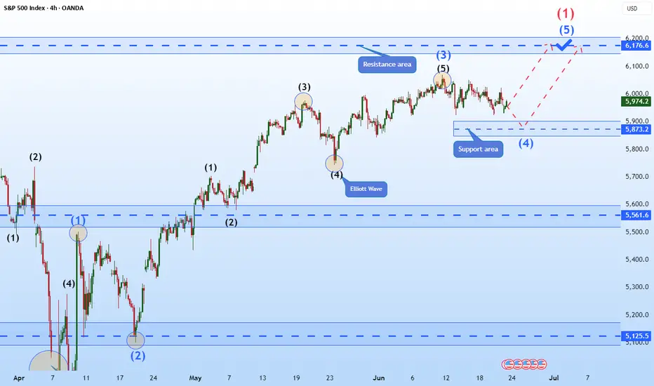
Hellena | SPX500 (4H): LONG resistance area of 6176 (Wave 1).Colleagues, the previous forecast remains essentially unchanged, and the target is still 6176, but I think the forecast can be updated because the price has been flat for quite some time.
I still expect the upward movement to continue in the large wave “1” and in the medium-order wave “5”.
A small correction to the support area of 5873 is possible.
Manage your capital correctly and competently! Only enter trades based on reliable patterns!
The market bias stays up, MJ stocks may be a buy here. The market continues to be biased up, and the target is likely the weekly B. MJ stocks are showing technical signs that a reversal may come. There may be other sectors similar as I think the summer bottom gamblers will start appearing now that everything else is at the highs. Gold looks like it will eventually go lower. Nat gas lost support and is likely to go lower. USOIL is bear flagging.

Nasdaq All-Time Highs, S&P Close, Blast Off or Breakdown?What an incredible melt-up since April 7 lows in the US markets.
Trump vs Musk - ignored
Iran vs Israel - ignored
High Valuations - ignored
FED Pausing - ignored
The US economy is resilient and it's a good thing because the world is performing really well (EX-US). Europe/China/India/Emerging Markets are outperforming the US by 15-16% YTD
The USD is having one its worst years ever in 2025
Gold, Silver, Bitcoin are great diversifiers in my opinion for 2025
Oil prices are incredibly volatile and energy stocks and commodities in turn are showing
volatility and big swings
As we near end of month and end of Q2, I have to believe the market is due for a small pause or pullback sooner rather than later - but we'll see
Thanks for watching!!!

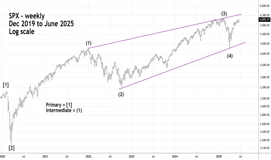
Long - Term S&P 500 - Elliott Imulse WaveThe S&P 500 - (SPX) could soon complete a five - year Elliott Impulse wave that began in March 2020.
Fibonacci resistance is in the SPX 6,200 area which could be reached on 06/26/25 or 06/27/25.
S&P500 1D Golden Cross, middle of 3y Channel, much upside to go!The S&P500 index (SPX) has been trading within a Channel Up since the final sell-off of the 2022 Inflation Crisis. The only time this pattern broke was for 4 days during the bottom formation (April 2025) of the recent Trade War.
Ahead of the first 1D Golden Cross since January 26 2023, the market looks more bullish than ever as it is trading within the 0.5 - 0.618 Fibonacci range of this Channel Up, suggesting that there is considerable upside before it tops.
The last Bullish Leg that started on the Channel Up bottom and peaked before a 1D MA50 (blue trend-line) test grew by +28.30%. Expecting a repeat of that, we may see the price targeting the 0.786 Fibonacci level at 6550 before the next 1D MA50 pull-back.
-------------------------------------------------------------------------------
** Please LIKE 👍, FOLLOW ✅, SHARE 🙌 and COMMENT ✍ if you enjoy this idea! Also share your ideas and charts in the comments section below! This is best way to keep it relevant, support us, keep the content here free and allow the idea to reach as many people as possible. **
-------------------------------------------------------------------------------
Disclosure: I am part of Trade Nation's Influencer program and receive a monthly fee for using their TradingView charts in my analysis.
💸💸💸💸💸💸
👇 👇 👇 👇 👇 👇

S&P500 and Nasdaq Short: Wave 5 <= Wave 3Based on the Elliott Wave rule that wave 3 is not the shortest wave, I gave a projection on where the peak of both S&P500 and Nasdaq could be. Based on these peaks, the stop is set above and the take profit target is where wave 4 was.

S&P500 Bullish Leg not over yet.The S&P500 index (SPX) has been trading within a Channel Up since the May 07 Low and is currently unfolding the latest Bullish Leg.
As you can see, it is far from having topped, not just by a plain trend-line (Higher Highs) perspective but also based on the Fibonacci and % rise terms relative to the previous Bullish Leg.
That peaked after a +7.10% rise, a little above the 3.0 Fibonacci extension. As a result, a 6330 Target on the short-term is more than fitting.
-------------------------------------------------------------------------------
** Please LIKE 👍, FOLLOW ✅, SHARE 🙌 and COMMENT ✍ if you enjoy this idea! Also share your ideas and charts in the comments section below! This is best way to keep it relevant, support us, keep the content here free and allow the idea to reach as many people as possible. **
-------------------------------------------------------------------------------
Disclosure: I am part of Trade Nation's Influencer program and receive a monthly fee for using their TradingView charts in my analysis.
💸💸💸💸💸💸
👇 👇 👇 👇 👇 👇

S&P 500 - Fibonacci Resistance Intermediate wave (5) up from the 04/07/25 bottom could be nearing completion.
Minor wave 5 of (5) is close to a Fibonacci relationship with Minor wave 1.
Using leeway around the 6,208 target gives a broad zone of 6,175 to 6,220. The SPX could reach this zone on 06/27/25.

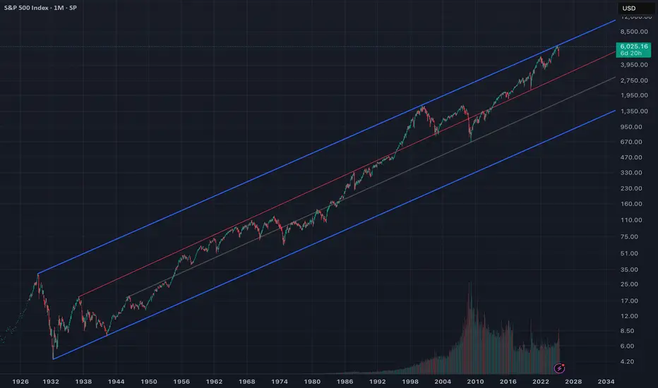
🇺🇸 America at the Crossroads: Golden Age or Great Reset? As the S&P 500 crosses 6,000 , investors celebrate yet another all-time high. But beneath the surface of this rally lies an uncomfortable truth: we are standing at a national and market inflection point.
This isn’t just another leg up. This is the top of a century-long trend channel, a moment where all prior historical peaks have led to sharp reversion . Will this time be different?
📉 Or are we heading into the final blow-off top of a fiat-fueled bull market ?
📈 Or is this the birth of a new nominal supercycle — a “Golden Age” driven by AI, deglobalization, and fiscal firehoses?
📊 The Chart That Frames the Future
This chart stretches back to 1926. Price now presses against the upper blue boundary , just like in:
1929 → Great Depression
2000 → Dot-com Crash
2021 → Post-COVID Inflation Panic
Every previous touch has ended in multi-year mean reversion . Will we now break out — or break down?
🕰️ The Fiat Currency Clock Is Ticking
“The average lifespan of a fiat currency is 80–100 years.”
The U.S. defaulted on gold bonds in 199 and the U.S. dollar was untethered from gold in 1971. We're many years into a fiat system. Every fiat regime in history has collapsed under debt, inflation, and loss of confidence .
📉 K-Shaped Economy and the Strained Consumer
Since 2008, monetary policy has disproportionately enriched capital holders. Asset owners got rich. Wage earners stagnated.
Now we see:
-Record-high credit card interest
-Rising consumer delinquencies
-Real wages trailing inflation
This is not a healthy economy — it’s a two-speed system with widening fractures.
📈 The Most Expensive Market in History?
CAPE Ratio : ~33x — rivaling 1929 and 2000
ZIRP is gone , yet valuations remain elevated
Investors are pushed out the risk curve by low real bond yields
This is the result of TINA (There Is No Alternative) — but that narrative is fragile.
🏦 Cracks in the Core: Treasuries and Liquidity
The U.S. Treasury market is flashing red:
Weakening auction demand
Foreign buyers (like China, Japan) stepping back
Bank of Japan may be forced to liquidate U.S. debt
Liquidity is thinning — just like in 2007
🤖 AI and the Accelerating Wealth Gap
AI is a double-edged sword:
It boosts productivity
But it eliminates mid-skill jobs
It consolidates wealth into a few mega-cap tech monopolies
And it strains an already outdated energy grid
AI could fuel inequality and fragility .
🌍 End of Globalization and Rise of BRICS
The BRICS alliance is actively challenging dollar hegemony
Trade is shifting to commodity-backed and bilateral settlement
U.S. foreign policy is being stress-tested on multiple fronts (Ukraine, Taiwan, Middle East)
The post-WWII order is unraveling. And America must adapt — or lose ground.
⚠️ Blow-Off Top Before the Storm?
This market feels like a blow-off top :
Narrow breadth
Retail mania
AI euphoria
Massive fiscal deficits
All-time high valuations
Next step? A potential deflationary bust , followed by a stimulus-fueled inflationary wave — especially in energy and commodities.
⚡ Power Grid Risk in an Electrified World
AI and EVs demand **enormous energy inputs**. But:
U.S. grid is **underdeveloped**
Transmission infrastructure is outdated
Blackouts are increasing
China, meanwhile, has been quietly building resilient grid systems for over a decade taking advantage of Nuclear, while The U.S. risks falling behind.
🌀 The Fourth Turning: Crisis as Catalyst
“History doesn't repeat itself, but it often rhymes.” – Mark Twain
According to Fourth Turning theory, we are nearing the climax of a ~100-year generational cycle — a period marked by institutional breakdown, global conflict, and radical transformation. Each cycle contains four “turnings,” and we are now deep into the fourth: the Crisis phase.
The current Fourth Turning began in 2008 with the Global Financial Crisis. It is expected to resolve sometime between 2025 and the early 2030s — a period of upheaval that mirrors previous turning points such as:
The Great Depression & World War II (1929–1946)
The American Civil War (1861–1865)
The Revolutionary War (1775–1794)
As Neil Howe writes in The Fourth Turning Is Here (2023):
“Each Fourth Turning is a time of radical disruption — a time when an old order is replaced by a new one, often through war, collapse, or revolution. ”
Today, we face:
Political polarization at generational extremes
Sovereign debt levels previously only seen during world wars
Eroding trust in media, financial institutions, and government
Technological upheaval via AI and automation
Geopolitical flashpoints from Ukraine to Taiwan
The market, the dollar, and our political system are not outside this cycle — they are central to it.
The question is no longer whether we are in a transformation, but:
What kind of world will emerge on the other side?
🚧 The Fork in the Road: Two Futures
We stand at a fork in the road — not just for markets, but for **America’s future**:
🟢 Path 1: The Breakout – Golden Age
AI revolution supercharges GDP
Commodities rise but wages lag
Treasury/Fed normalize debt via inflation
S&P and assets soar in **nominal terms**, even if real value lags
🔴 Path 2: The Reversion – Great Reset
Credit cycle breaks
Liquidity vanishes
Markets mean revert 40–60%
Global capital flees to safety
🧠 Final Thought: Don’t Chase the Top
“At the top of a long-term channel, humility is a better strategy than hubris.”
Now is not the time to blindly chase momentum. Whether we break out or break down, the risks are rising — and history offers few second chances after peaks like this.
We stand not only at a technical inflection, but at a civilizational one.
The Fourth Turning is reaching its apex, and markets are reflecting that tension — between collapse and rebirth, between order and entropy.
📌 Hedge.
📌 Diversify.
📌 Prepare.
Because one way or another, America is crossing a threshold — and there’s no going back.
US500 will fly!US500 (H4 time frame) is in up trend and recently broke the highest CTS and touches POI, if it keeps higher and breaks 6,168.13 then go long
This result depends on my own analysis (Am not professional or advisor)

S&P 500 approaches 52 week high!1). SELL @ 6148.71 with a tight stop! 2). Wave 5 is likely over! 3). 3). Sentiment is "BEARISH"! 4). Volume has petered out! 5). Banks bought positions up to 6150, and now they're selling!!

Market crash looming - Fractal Echo of 2007 - 2025 S&P 500 In what other case could the "market" be here if it wasn't centrally rigged?
Geopolitics aside. The 2025 vs. 2007 numerological equivalence ("9" year) shows the power of 9 taking over: the end of a rigged bull market.
Chart overlays the S&P 500 price action from 2023–2025 (white line) with that of the 2006–2008 pre-GFC period (red line), highlighting an uncanny fractal similarity in structure, tempo, and momentum. The visual suggests that 2025 (numerologically marked as a “9” year, like 2007) may be echoing the same setup seen before the 2008 financial crisis: just massively worse.

SPX500 Holds Above 6,098 | Bullish Bias Toward ATH at 6,143OANDA:SPX500USD OVERVIEW
S&P 500 Futures Subdued After Near-Record Close | Market Eyes Powell’s Comments
U.S. stock futures were muted on Wednesday after the S&P 500 closed near an all-time high, following signals from Israel and Iran that their air conflict has ended.
Investors now await further comments from Fed Chair Jerome Powell for clues on the monetary policy outlook.
TECHNICAL OUTLOOK – SPX500
The price remains in a bullish trend as long as it trades above 6,098, with upside potential toward the ATH at 6,143.
However, a 1H or 4H candle close below 6,098 would likely trigger a bearish correction toward 6,056 and 6,041.
Pivot Level: 6,098
Resistance Levels: 6,143 → 6,175 → 6,210
Support Levels: 6,066 → 6,041

SPX500 Short There are multiple patterns on M15 and H1
All timeframes up to H4 are overbought
There are multiple double tops with divergence
This is at the all-time high, suggesting there will be a lot of resistance
Markets look like they are due for a drop after such a sharp move up\
Stop loss above 6130

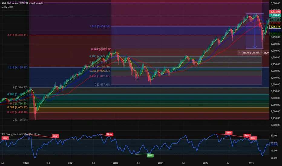
S&P 500 Outlook. Best Quarter Since 2023… But What Next?The S&P 500 just logged its best quarterly performance since Q4 2023 , surging on optimism around global trade negotiations and growing expectations that the Fed may begin cutting rates as early as September. US futures are green this morning, thanks to developments like Canada backing off digital taxes, ongoing dialogues with China ahead of the July 9 deadline, and risk-on sentiment is pushing yields and the dollar lower.
But as traders, we need to ask:
Are we witnessing a genuine economic inflection point? Or is this just a liquidity-driven rally that’s pricing in a best-case scenario?
Technical View
Support Zone: 6,150 was just broken through. And 6000, the round number level, coinciding with the 20-day EMA and previous swing level.
Resistance Levels: 6,235 is the next critical ceiling, a clean breakout could see price reach the extension level of 6,415.
Momentum Indicators: RSI remains elevated and is creeping toward the overbought. While momentum is strong, watch out for the possible development of a divergence.
Possible Scenarios
The 'Soft Landing’ Is Now the Base Case
Markets are trading as if the Fed has successfully engineered a soft landing. But that’s now fully priced in, and historically, the most dangerous trades are the ones everyone agrees on. If trade talks stall, inflation re-accelerates, or earnings disappoint, the reversal could be brutal and fast.
Risk-on Sentiment Without Volume Is a Yellow Flag
Despite the price strength, volume has been tapering off. The S&P’s recent leg up occurred on lighter-than-average participation, suggesting institutions may be watching, not chasing. That’s often the case in low-volatility summers, but it also implies that any negative catalyst could cause outsized downside moves.
Macro-Fundamentals May Not Justify Valuation Expansion
Yes, inflation is slowing, and the Fed might cut. But if they do, it’s likely because growth is weakening, not because the economy is roaring. So the very condition that triggers rate cuts could also cap earnings growth!
Projection
Bullish Scenario: A confirmed breakout above 6,280 could carry us toward 6,400–6,500 by mid-Q3, especially if the trade deals progress, July inflation comes in soft, and the Fed signals accommodation.
Bearish Risk: If price fails to hold above 6,120, especially if trade optimism fades, or inflation growth spikes or Fed rhetoric shifts hawkish again, this could then open a quick pullback toward 6,000 or lower, which also aligns with the 50-day SMA.
Key Events to Watch
July 9 Trade Talks Deadline: Any sign of stalling could bring volatility back fast.
June CPI Print (July 10): Crucial for confirming the Fed's next move.
Earnings Season Kickoff (mid-July): Tech-heavy expectations may not be easy to beat after such a strong run.
Conclusion
A record-setting quarter is impressive but not necessarily predictive. This quarter’s rally has been built more on relief and expectations than hard data. When expectations (not earnings) are doing the heavy lifting, any misstep from central banks or geopolitics could unravel gains rapidly.
A rate cut might be delayed, or inflation re-accelerates, or trade talks stall; any of these could leave equities hanging. Remember: the higher the climb without real earnings growth, the harder the fall when sentiment shifts. It's not just about the chart. It is about the narrative behind the price.
What’s your bias for Q3?
Are you buying this breakout or fading the optimism? Drop your thoughts below.

$SPX Path of least resistance is higher. Next Stop : 6500 This week we officially recovered all the losses from the liberation day low. We had a 20% bear market crash and since then there has been a V shaped rally in the major averages. NASDAQ:QQQ and SP:SPX have fully recovered the losses and then some. It is 0% form its ATH. We have been closely following the chart of SP:SPX for the last few weeks and have marked various Fib Retracement levels and Fib Extenstion. IN my opinion the Covid lows were one of the majot drawdown moments.
If we plot the Fib Extension on the COVID highs and lows, we can clearly see the Support and Resistance zones. As per the Fib Levels the next consequential level in SP:SPX will be 6550, which is the 3.618 Fib level. That I would suggest as the path to least resistance. First, we go higher before we can see any major correction. In case of a Major correction, we get support @ 5300.
Verdict : SP:SPX goes higher first before correction. 6550 is the next stop.
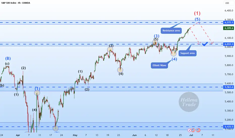
Hellena | SPX500 (4H): SHORT to support area of 6033.Colleagues, I assume that wave “1” completes the upward movement and somewhere around here a major correction ‘2’ should begin, which will consist of waves “ABC” and may continue to the level of 5700. But for now, I think we need to focus on the nearest targets.
I see the support area of 6033 as the first target.
Manage your capital correctly and competently! Only enter trades based on reliable patterns!
S&P 500 Futures Rise on Ceasefire Relief, Eyes on Fed PowellSPX500 OVERVIEW
U.S. Futures Rise as Ceasefire Eases Tensions, Focus Turns to Powell
U.S. stock futures climbed on Tuesday, with S&P 500 futures up 0.8%, extending gains from the previous session as Middle East tensions eased following a ceasefire announcement.
President Trump confirmed a ceasefire agreement between Israel and Iran, which appears to be holding for now—though early signs of potential violations have already emerged.
Market attention is now firmly on Federal Reserve Chair Jerome Powell’s testimony before Congress today, where traders hope to gain more clarity on the Fed’s economic outlook and rate path.
TECHNICAL OUTLOOK – SPX500
The price touched resistance at 6,098 and is currently hovering near that level.
Failure to break above 6,098 may trigger a short-term correction toward 6,041, before another push higher.
A confirmed breakout above 6,098 would open the path toward the All-Time High (ATH) at 6,143, followed by extended targets.
Support Levels: 6041 → 6010 → 5966
Resistance Levels: 6143 → 6175 → 6225
Stability above 6,098 confirms bullish continuation, while failure to hold may suggest a temporary pullback before resuming the uptrend.

Watch out for SPX500USDHi traders,
Last week SPX500USD made a gap lower but after the fill it went further up and broke the previous swing high (ATH). This could be the last wave 5 (orange) of wave 3 (red).
So next week we could see this pair go lower for a (big) correction down.
Let's see what the market does and react if it reaches the Daily bullish FVG's.
Trade idea: Wait for price come into the Daily bullish FVG's to trade longs again. At the moment price is too high to trade.
If you want to learn more about trading FVG's & liquidity sweeps with Wave analysis, then please make sure to follow me.
This shared post is only my point of view on what could be the next move in this pair based on my technical analysis.
Don't be emotional, just trade your plan!
Eduwave

SPX500: Bearish Momentum Below 5966, Bullish Recovery Above 6010SPX500 – Technical Overview
SPX500 is currently exhibiting bearish momentum, largely driven by escalating tensions in the Middle East, which are contributing to heightened market volatility.
At present, the price is approaching the pivot level at 5966. A confirmed 1-hour candle close below this level would likely reinforce the bearish bias, targeting 5938, and potentially extending the decline toward 5902 and 5858.
However, if the price stabilizes above 5990, we may see a retest of the 6010 resistance. A breakout above this level would shift the momentum toward the upside, with further targets at 6041 and 6098.
Key Levels
• Pivot: 5966
• Support: 5938, 5902, 5858
• Resistance: 6010, 6041, 6098

S&P 500 Sets New All-Time High, Surges Above 6200S&P 500 Sets New All-Time High, Surges Above 6200
The S&P 500 index (US SPX 500 mini on FXOpen) started the week by reaching a fresh all-time high. As shown on the chart, the index hit 6,210 points earlier this morning.
In addition to a reduced risk of US involvement in a large-scale war in the Middle East, market optimism has been fuelled by:
→ Tariff-related news. Last week, the US President announced the signing of a trade deal with China, while Treasury Secretary Scott Bessent expressed hope that the US would conclude trade negotiations with over a dozen countries by early September.
→ Strong corporate performance. On Friday, Nike (NKE) shares led the stock market, rising by more than 15% following an earnings report that exceeded analysts’ expectations. This could be boosting investor sentiment ahead of the upcoming earnings season.
Technical Analysis of the S&P 500 Chart
Evaluating the 4-hour chart of the S&P 500 index (US SPX 500 mini on FXOpen) in the context of June’s price movements reveals key reference points (marked on the chart) that outline an ascending channel. A consolidation zone, marked with an arrow, highlights a temporary equilibrium between supply and demand—after which buyers gained the upper hand, pushing the price upward.
It is possible that the ongoing bullish momentum could carry the price toward the upper boundary of the channel. However, attention should be paid to the RSI indicator, which suggests the market is heavily overbought; in fact, Friday’s reading marked the highest level of the year. In such conditions, a price correction cannot be ruled out—potentially back toward the local ascending trendline (shown in orange).
This article represents the opinion of the Companies operating under the FXOpen brand only. It is not to be construed as an offer, solicitation, or recommendation with respect to products and services provided by the Companies operating under the FXOpen brand, nor is it to be considered financial advice.
