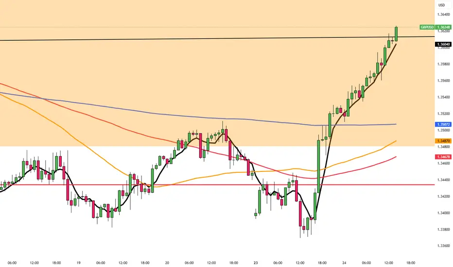
Technical + Fundamental Alignment: GBPUSD Short in PlayGBPUSD ( FX:GBPUSD ) is moving near the Resistance zone($1.354-$1,350) and has managed to break the Support line .
In terms of Elliott Wave theory , it seems that GBPUSD has completed the Zigzag Correction(ABC/5-3-5) , we can expect the next five bearish waves .
--------------------------------------------------------
Fundamental Analysis
1-Weak UK Economic Data:
Recent reports including Retail Sales, Industrial Output, and PMIs have come in below expectations.
Labour market is softening, and wage growth is decelerating.
2-Dovish Expectations for BoE:
With inflation cooling down, the Bank of England is expected to hold or even cut rates soon, reducing support for the pound.
3-Stronger USD Outlook
Despite some weaker U.S. data, the Fed maintains a hawkish stance. U.S. retail sales and inflation still support the dollar overall.
4-UK Political Risk
Upcoming UK elections on July 4 are adding uncertainty and downside risk to GBP.
--------------------------------------------------------
I expect GBPUSD to attack at least the Support lines based on the above explanation.
Targets: 1.3
1)1.3353 USD =>Risk-To-Reward: 1.51
2)1.3315 USD =>Risk-To-Reward: 2.00
Note: Stop Loss(SL): 1.3549 USD
Please respect each other's ideas and express them politely if you agree or disagree.
British Pound / U.S Dollar Analyze (GBPUSD), 1-hour time frame.
Be sure to follow the updated ideas.
Do not forget to put a Stop loss for your positions (For every position you want to open).
Please follow your strategy and updates; this is just my Idea, and I will gladly see your ideas in this post.
Please do not forget the ✅' like '✅ button 🙏😊 & Share it with your friends; thanks, and Trade safe.
USDGBP trade ideas

GBPUSD UPDATEGBPUSD pushed clean and fast, but skipped my entry with no real pause. Structure’s still rising, candles stayed tight, but volume started to fade mid-push.
Feels like early buyers got paid — now it’s baiting the late ones 🧠
Waiting on a pullback that makes sense. Letting it come to me.
⚡
Still tracking GBPUSD from last week’s post.

GBPUSD– Rejection at Resistance: Technical and Macro PullbackGBPUSD has climbed back into a strong multi-week resistance zone just beneath 1.3670. While the recent rally was sharp, it now confronts both structural resistance and weakening UK fundamentals. The British economy is losing steam—GDP contracted more than expected, manufacturing output is weak, and the latest CBI survey paints a grim industrial outlook. Meanwhile, Fed officials continue to push back on early rate cut expectations, lending resilience to the USD. Technically, this aligns with a potential top forming near 1.3630–1.3670, offering a compelling risk-reward for sellers.
🔻 Bias: Bearish
• Favoring short setups from resistance, backed by weak UK data and a sticky Fed narrative.
🔑 Key Fundamentals
🇬🇧 UK:
May GDP: –0.3% m/m (worse than forecast)
CBI Industrial Trends: Output volumes and orders well below long-run average
Inflation slowing, but BoE hesitant amid stagnant growth – classic stagflation
🇺🇸 US:
Fed officials (Barkin, Collins, Cook) emphasize caution
Core services inflation still elevated
Fed rate cuts now expected in September, not July
⚠️ Risks to the Bearish View
Hawkish surprise from the BoE (if they hike or signal tightening)
U.S. Core PCE comes in soft, pressuring the USD
Sustained global risk-on rally pulling GBP higher via equities
📅 Important Events to Watch
June 25–26: Fed Chair Powell testimony to Congress
June 28: U.S. Core PCE inflation report
UK CPI revisions, retail sales, and BoE commentary
U.S. jobs and consumer confidence (early July)
📉 Technical Setup – Short from Key Supply Zone
Chart Structure:
Major confluence resistance at 1.3625–1.3665 (blue zone)
Multiple rejection wicks + ascending wedge structure
Bearish divergence building on momentum (not shown)
🎯 Trade Setup:
Entry Zone:
🔹 Sell between 1.3625 and 1.3665, ideally after a bearish engulfing/pin bar or 4H rejection
Take Profits:
TP1: 1.3535 – local support
TP2: 1.3465 – fib and horizontal confluence
TP3: 1.3390 – wedge breakdown target
Stop Loss / Invalidation:
🔸 SL above 1.3685**
A 4H/1D candle close above invalidates the setup and opens the door to new highs.
Risk-Reward:
RR to TP1: ~1.8
RR to TP3: 3.5+
🧭 Summary:
GBPUSD is technically stretched and facing key resistance. With UK macro data deteriorating and Fed members holding the line, this rally looks increasingly vulnerable. As long as 1.3685 holds, sellers may dominate with clear downside targets over the next 1–2 weeks.

GBP/USD ShortStrong momentum to the downside left FVG on 4h timeframe yesterday.
I will be looking for price to retrace up to 1.353 zone before entering shorts.
And if price loooks to struggle on upside.
Price may go up and take out stoplosses above latest high aswell.
For TP look for support at 1.325
Keep in mind FOMC which will move the price
later today on 18th of June.
SL above 1.3650
Entry 1.3533
TP 1.32500

GBPUSD Sell - June, 24📍Context:
Reaction from Weekly & Daily OBs
Price tapped into a 4H OB
Asia low to fill
15m & 5m POIs showing clear rejection
Presence of wicks signaling slowdown + bearish engulfing confirming seller control
📍Entry:
Based on 15m imbalance left behind
SL placed above recent highs – structure still valid
🎯 TP:
Minimum 1:3 RR
Final target: Asia lows

British Pound Slips to One-Month LowGBP/USD briefly climbed to 1.3560 in early European trading, supported by dollar softness and anticipation of upcoming speeches from BoE Governor Bailey and Fed Chair Powell. However, the pair remains under pressure, as market doubts linger around the ceasefire’s durability, especially after new missile activity by Israel’s IDF.
Fed rate cut expectations continue to build: odds for July are now at 23%, and 78% for September, fueled by dovish remarks from Governor Bowman.
Resistance is seen at 1.3600, while support holds at 1.3500.
GBPUSD Breakdown The Ascending Channel selling strong 📉 GBPUSD Breakdown Alert
– 4H Timeframe
Cable has broken down from the ascending channel with a strong bearish candle, confirming seller strength. We're now eyeing short setups from 1.34400.
🎯 Technical Targets
🔻 1st Target: 1.33500 – Demand Zone
🔻 2nd Target: 1.32700 – Demand Zone
🔻 3rd Target: 1.31800 – Major Support
🛑 Stop Loss: 1.36000 – Bearish Order Block (OB)
🔥 Bias: Bearish
🕓 Timeframe: 4H
💡 Strategy: Sell the pullback, ride the momentum.
—
💬 Like, comment, and follow for more updates!
🚀 Join our trading squad and level up your analysis!
#GBPUSD #ForexSignals #PriceAction #LiviaTrades 😜

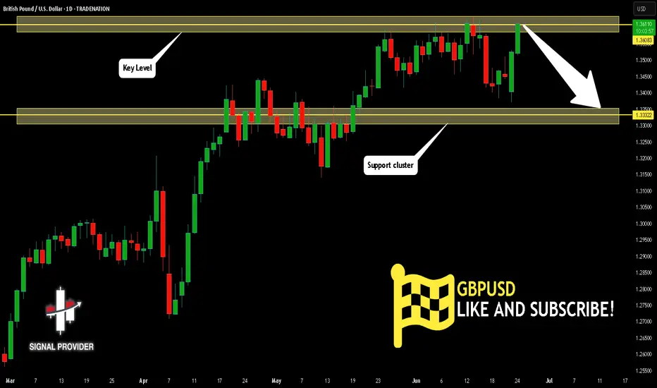
GBPUSD Will Move Lower! Sell!
Please, check our technical outlook for GBPUSD.
Time Frame: 1D
Current Trend: Bearish
Sentiment: Overbought (based on 7-period RSI)
Forecast: Bearish
The market is approaching a key horizontal level 1.360.
Considering the today's price action, probabilities will be high to see a movement to 1.333.
P.S
Please, note that an oversold/overbought condition can last for a long time, and therefore being oversold/overbought doesn't mean a price rally will come soon, or at all.
Disclosure: I am part of Trade Nation's Influencer program and receive a monthly fee for using their TradingView charts in my analysis.
Like and subscribe and comment my ideas if you enjoy them!
Fundamental Market Analysis for June 24, 2025 GBPUSDThe GBP/USD pair is strengthening to 1.3560 in the early European session on Tuesday, helped by a weaker US Dollar (USD).
Federal Reserve (Fed) Governor Michelle Bowman said on Monday that she would favor an interest rate cut at the next meeting in July if inflationary pressures remain muted. Bowman's comments echoed those of Fed chief Christopher Waller, who said on Friday that he believes the U.S. central bank may consider a rate cut in July.
Traders now put the probability of a rate change at the July meeting at nearly 23%, and the probability that the Fed will cut rates in September at about 78%.
On the other hand, uncertainty surrounding the ceasefire between Israel and Iran and renewed tensions in the Middle East could increase safe-haven flows, supporting the Pound Sterling (GBP). The Israel Defense Forces said early Tuesday it had detected rockets launched from Iran towards southern Israel, despite US President Donald Trump saying a “full and final” ceasefire between Israel and Iran would take effect.
Trading recommendation: SELL 1.3545, SL 1.3645, TP 1.3345


GBPUSD, Possible Short trade Analysis based on CRT and Bearish order block.
CRT rejection on bearish order block should push us downside possibly targeting fvg or support level

GBPUSD GBP/USD: 10-Year Bond Yields, Interest Rates, and Upcoming Monetary Policy News (June 2025)
1. 10-Year Bond Yields
UK 10-Year Gilt Yield:
As of June 24, 2025, the UK 10-year government bond yield is 4.51%, having recently climbed as high as 4.73%—the highest since April—driven by hotter-than-expected inflation data.
Markets have scaled back expectations for Bank of England (BoE) rate cuts due to persistent inflation, particularly in core and services sectors.
US 10-Year Treasury Yield:
The US 10-year Treasury yield ended June 20, 2025 at 4.38%.
2. Central Bank Interest Rates
Bank of England (BoE) Rate:
The BoE held its policy rate steady at 4.25% at its June 19 meeting, with a 6–3 vote to maintain rates. Three members favored a 0.25% cut to 4.00%.
Inflation in the UK slowed to 3.4% in May (from 3.5% in April), but core and services inflation remain elevated, making policymakers cautious about cutting rates too soon.
US Federal Reserve Rate:
The Federal Reserve kept its key rate in a range of 4.25%–4.50% at its June 2025 meeting and signaled the possibility of two rate cuts later this year, but with ongoing uncertainty about the timing.
3. Upcoming Monetary Policy News (Late June–July 2025)
Bank of England:
The BoE is expected to remain cautious, with markets now pricing in only 34 basis points of cuts for 2025 (down from earlier expectations of two cuts this year).
Economists expect a possible rate cut in August if inflation and wage growth show clearer signs of easing.
Federal Reserve:
The Fed continues to signal a data-dependent approach, with two cuts still possible in 2025 if inflation moderates and growth slows as projected.
Key Data to Watch:
UK: Flash PMIs (Thursday) for signs of economic momentum or weakness.
US: PCE inflation and labor market data for Fed policy clues.
Summary Table
Metric/News UK (GBP) US (USD)
10-Year Bond Yield 4.51% (recent high: 4.73%) 4.38%
Policy Interest Rate 4.25% 4.25%–4.50%
Next Central Bank Decision Possible cut in August Two cuts possible in 2025
Key Drivers Sticky core/services inflation Inflation, growth, Fed outlook
Key Takeaways
The UK 10-year gilt yield remains above the US 10-year yield, supporting GBP/USD in the near term.
The BoE is holding rates steady but may cut in August if inflation data softens further.
The Fed is also on hold, with possible cuts later in 2025, making upcoming inflation and labor data crucial for both currencies.
Both central banks are in a wait-and-see mode, with markets closely watching economic data and policy signals for direction.
#GBPUSD

GBPUSD Sellprice mitigated an Order Block during London open and should head downward to take out Asia liquidity to complete daily cycle.

Cable looking for a new high with Ending DiagonalCable found some support in the last 24 hours and it looks like we may still see a retest of the high, so apparently this 5th wave is still in progress but unfolding with an ending diagonal with subwave five on the way up to 1.37–1.38, which could be the key resistance for this reversal pattern. So despite some recovery that is happening right now, we still think that the impulse from January is in late stages, which is also confirmed by divergence on the RSI and overlapping price action that clearly suggests that bulls are losing strength up here.
GH

GU-Tue-24/06/25 TDA-Strong bullish push from GU, don't FOMOing!Analysis done directly on the chart
Follow for more, possible live trades update!
It's really easy to FOMOing when price is going
unilateral and I don't blame you. It's part of human
psychology to instinctively react like this.
But ask yourself: if you FOMOed this time and got
lucky, do you think long term it's a repeatable approach?
Sustainable long term?
When price pushes a lot and you are not in the trade,
usually good thing to do is wait for some sort of pullback
or some sort of support so you can put good sl placement.
So you know already your sl and tp before you enter a trade.
One good or bad trading day won't define you as a trader.
The consistent results will!
Active in London session!
Not financial advice, DYOR.
Market Flow Strategy
Mister Y

GBPUSD SHORT FORECAST Q2 W26 D24 Y25GBPUSD SHORT FORECAST Q2 W26 D24 Y25
Professional Risk Managers👋
Welcome back to another FRGNT chart update📈
Diving into some Forex setups using predominantly higher time frame order blocks alongside confirmation breaks of structure.
Let’s see what price action is telling us today!
💡Here are some trade confluences📝
✅Daily order block
✅1H Order block
✅Intraday breaks of structure
✅4H Order block
🔑 Remember, to participate in trading comes always with a degree of risk, therefore as professional risk managers it remains vital that we stick to our risk management plan as well as our trading strategies.
📈The rest, we leave to the balance of probabilities.
💡Fail to plan. Plan to fail.
🏆It has always been that simple.
❤️Good luck with your trading journey, I shall see you at the very top.
🎯Trade consistent, FRGNT X

GBPUSD I Montly CLS I KL WOB I Model 1Hey, Market Warriors, here is another outlook on this instrument
If you’ve been following me, you already know every setup you see is built around a CLS Footprint, a Key Level, Liquidity and a specific execution model.
If you haven't followed me yet, start now.
My trading system is completely mechanical — designed to remove emotions, opinions, and impulsive decisions. No messy diagonal lines. No random drawings. Just clarity, structure, and execution.
🧩 What is CLS?
CLS is real smart money — the combined power of major investment banks and central banks moving over 6.5 trillion dollars a day. Understanding their operations is key to markets.
✅ Understanding the behavior of CLS allows you to position yourself with the giants during the market manipulations — leading to buying lows and selling highs - cleaner entries, clearer exits, and consistent profits.
📍 Model 1
is right after the manipulation of the CLS candle when CIOD occurs, and we are targeting 50% of the CLS range. H4 CLS ranges supported by HTF go straight to the opposing range.
"Adapt what is useful, reject what is useless, and add what is specifically your own."
— David Perk aka Dave FX Hunter ⚔️
👍 Hit like if you find this analysis helpful, and don't hesitate to comment with your opinions, charts or any questions.

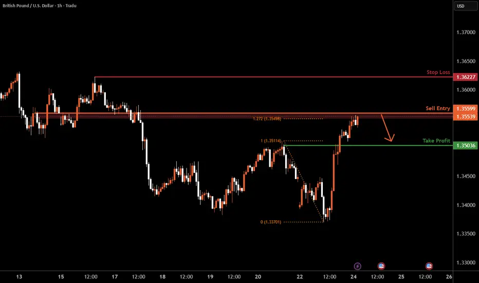
GBPUSD H1 I Bearish Reversal Based on the H4 chart, the price is trading near our sell entry level at 1.3559, a pullback resistance that aligns with the127.2Fib extension.
Our take profit is set at 1.3503, a pullback support.
The stop loss is set at 1.3622, a swing high resistance.
High Risk Investment Warning
Trading Forex/CFDs on margin carries a high level of risk and may not be suitable for all investors. Leverage can work against you.
Stratos Markets Limited (tradu.com ):
CFDs are complex instruments and come with a high risk of losing money rapidly due to leverage. 63% of retail investor accounts lose money when trading CFDs with this provider. You should consider whether you understand how CFDs work and whether you can afford to take the high risk of losing your money.
Stratos Europe Ltd (tradu.com ):
CFDs are complex instruments and come with a high risk of losing money rapidly due to leverage. 63% of retail investor accounts lose money when trading CFDs with this provider. You should consider whether you understand how CFDs work and whether you can afford to take the high risk of losing your money.
Stratos Global LLC (tradu.com ):
Losses can exceed deposits.
Please be advised that the information presented on TradingView is provided to Tradu (‘Company’, ‘we’) by a third-party provider (‘TFA Global Pte Ltd’). Please be reminded that you are solely responsible for the trading decisions on your account. There is a very high degree of risk involved in trading. Any information and/or content is intended entirely for research, educational and informational purposes only and does not constitute investment or consultation advice or investment strategy. The information is not tailored to the investment needs of any specific person and therefore does not involve a consideration of any of the investment objectives, financial situation or needs of any viewer that may receive it. Kindly also note that past performance is not a reliable indicator of future results. Actual results may differ materially from those anticipated in forward-looking or past performance statements. We assume no liability as to the accuracy or completeness of any of the information and/or content provided herein and the Company cannot be held responsible for any omission, mistake nor for any loss or damage including without limitation to any loss of profit which may arise from reliance on any information supplied by TFA Global Pte Ltd.
The speaker(s) is neither an employee, agent nor representative of Tradu and is therefore acting independently. The opinions given are their own, constitute general market commentary, and do not constitute the opinion or advice of Tradu or any form of personal or investment advice. Tradu neither endorses nor guarantees offerings of third-party speakers, nor is Tradu responsible for the content, veracity or opinions of third-party speakers, presenters or participants.
GBP/USD 4H – Bearish Supply Zone Reaction SetupTrade Breakdown:
Price broke structure to the downside after rejecting the 4H supply zone around 1.35800, creating bearish momentum. We’ve now pulled back aggressively into that same supply zone, aligning with a clean imbalance just above 1.35577. This area is now prime for a reversal.
I’m looking for a bearish engulfing confirmation or strong rejection wick inside the zone to enter short. Once confirmed, this could be a clean swing back to the imbalance fill and potential target zone at 1.33352.
Imbalance:
Clear imbalance left just below 1.35577, sitting right inside the supply zone. Expecting price to mitigate this inefficiency before resuming bearish pressure.
Entry Criteria:
Only entering if a bearish engulfing forms within the supply zone. No confirmation = no trade. ✅
SL: 1.35868
TP: 1.33352
RR: 7.65:1
Bias: Bearish 🔻
Session: London / NY overlap preferred for execution
⸻
🖊️ Trade Simple. Live Lavish.™ – Jaquil Taylor

BUY GBPUSDFOMC moved the greenback positively yesterday by alot of pips, we anticipate a decent bullish move since price action touched an area of strong resistance basing on historical data.

GBPUSDPresident Trump claims the war is over we will observe if this will make volatility stabilize, GU is aiming a Key level which might potentially create a new LL, lets see how it goes!

Bullish rise off pullback support?The Cable (GBP/USD) is falling towards the pivot which is a pullback support and could bounce to the 1st resistance.
Pivot: 1.3503
1st Support: 1.3455
1st Resistance: 1.3616
Risk Warning:
Trading Forex and CFDs carries a high level of risk to your capital and you should only trade with money you can afford to lose. Trading Forex and CFDs may not be suitable for all investors, so please ensure that you fully understand the risks involved and seek independent advice if necessary.
Disclaimer:
The above opinions given constitute general market commentary, and do not constitute the opinion or advice of IC Markets or any form of personal or investment advice.
Any opinions, news, research, analyses, prices, other information, or links to third-party sites contained on this website are provided on an "as-is" basis, are intended only to be informative, is not an advice nor a recommendation, nor research, or a record of our trading prices, or an offer of, or solicitation for a transaction in any financial instrument and thus should not be treated as such. The information provided does not involve any specific investment objectives, financial situation and needs of any specific person who may receive it. Please be aware, that past performance is not a reliable indicator of future performance and/or results. Past Performance or Forward-looking scenarios based upon the reasonable beliefs of the third-party provider are not a guarantee of future performance. Actual results may differ materially from those anticipated in forward-looking or past performance statements. IC Markets makes no representation or warranty and assumes no liability as to the accuracy or completeness of the information provided, nor any loss arising from any investment based on a recommendation, forecast or any information supplied by any third-party.
