Multiple Setups in XAU / XAG - Flags, Support and Resistance- The setups shown in this video are all in Hindsight. I did not take all the setups detailed in the video.
- Learn to train yourself to see these examples by going through Price Action from the past and you will be able to see these form in real time and react accordingly.
Common names people give to thses setups: Supply and Demand, Support and Resistance, Pivot
*All those refer to the same thing. They are all areas where Price is MOST LIKELY TO REACT from since it has react from the area PREVIOUSLY.
Since Price previously has react from an area before, That area will become our area of interest where we look to do business. Upon a retest, we expect Price to react in a similar fashion as the last time.
XAUXAG trade ideas

MEDIUM TERM(XAUXAG): WAVE COUNT|BULLISH TARGETS+STRUCTURAL [TA]Commodity and Fixed Income Series : Part 1 Commodities ( Ratios+the most popular and widely traded Commodities )
The Essential note s from this chart are the following( Indicator analysis included in the comments ): {4.5 minute read}
To begin with the easiest part of the chart. The supports were identified on the quarterly chart which will be linked in the comments. There are 3 main support levels :1. ~80(RED LINE) 2. ~70-66(BLUE LINE) 3. ~58-60(GREEN LINE)
Somewhat more difficult part of the chart are the bullish targets . There are 2 main targets and 1 psychologica l. The 2 main targets were derived based on fibonacci extensions from the quarterly chart #1 ~94, #2 ~110 ; and the obvious psychological target is circa: 100 .
Q: What is the method used to label the Wave count?
-Following the ABC correction(2008-2011), gold has clearly outperformed silver. This is partially because of the new production methods that were introduced after 2012( more cost-effective extraction of silver as a byproduct while mining for other metals). In effect, this boosted the supply of silver relatively to gold; positively affecting the gold-to-silver ratio . Hence, the W-X-Y-X-Z Wave count fits the best into the current chart structure.
Q: Bullish on silver? - Not yet . As it can be observed from the chart, prior to the ABC correction(2008-2011) ; there was a boom in the demand for gold as the primary metal of value used as a protection against inflation . This pattern should occur during the next recession, yielding a potential target for the ratio of around ~110.
Other worthy notes: 2020 Election will have an impact on practically every market; Commodities are no exception . Nevertheless, in the medium term , I am relatively more bullish on silver in comparison to gold . This is supported by continuously downtrending volume as we progress through the bullish channel(pitchfork) . The ABC orange labelled correction is obviously a far fetched idea, since we do not know the timing nor the absolute top for the ratio yet. It's included just for the sake of general market principles.
P.S. I do realize the chart is quite hard to be understood, mostly because it is labelled to the smallest and extreme detail. If there are any poor understandings of the labels, I'd be able to answer any additional questions in the comment s.
>>I do not share my ideas for the likes or the views. This channel is only dedicated to well informed research and other noteworthy and interesting market stories.>>
However, if you'd like to support me and get informed in the greatest of details, every thumbs up or follow is greatly appreciated !
Step_Ahead_oftheMarket- {Make sure to check out my previous series on US(SPX) Sector including 11 episodes of the major US sectors}
This chart is a continuation to one of my most popular charts from last week:
Full Disclosure : This is just an opinion, you decide what to do with your own money. For any further references or use of my content for private or corporate purposes- contact me through any of my social media channels.


silver about to make another runawe yea. not bullish nor bearish. just showing relative out performance in silver over gold is likely now that the rate cut shenanigans are back on

Gold to silver 2 standard deviation moveGold cot remains bullish however silver cot indicated a massive short covering is on the way.traditionally gold to silver stays around 40-50 oz silver per 1 oz of gold. Being in the ratio was at a generational (27 year high) the reversion to the mean makes silver likely to outperform gold. That being said silver will move faster than gold to the upside and slower than gold to the downside. Not necessarily bullish or bearish just showing a game plan and likely outperformance of silver vs gold. Macro factors going forth favor a weaker dollar not because the FOMC wants to but has to weaken the dollar, in order to maintain control of the dollar. Ie ioer vs fed funds

silver getting love, but COT yet to confirmstill bullish gold. but neutral to bullish silver. are we at a turning point?
the importance of COT open interestmost are confused by gold:silver ratio. this really only matters if youre doing physical swaps. yea this would be an ideal spot if you were planning on doing a swap gold for silver. but buying silver outright, not necessarily. the ratio may reverse but doesnt necessarily mean youre an instant winner long silver. now if youre doing credit spreads this ratio is extremely useful. aside from that faily psychological. if youre a physical dealer, now is an opportune time to swap physical gold for physical silver. for traders i say pay attention to open interest changes on COT reporting. you'll notice silver is fairly balanced on managed money side. however gold has a growing imbalance on the long side. if the trend is your friend. gold is in favor vs silver, ride that wave. also question why people are long gold and the implications of how aggressive powell will have to be to compensate for lack of fire power. based on the past the fomc has had 5bps of cutting power during a downturn. with 2.25. we dont even have half.. so... QE is likely to be used again if this cycle is really beginning to turn against us.
Gold/Silver RATIO: some thoughtsHi Guys,
"The most common method of trading the ratio is that of hedging a long position in one metal with a short position in the other. For example, if the ratio is at historically high levels and investors anticipate a decline in the ratio that would reflect a decline in the price of gold relative to the price of silver, investors should simultaneously buy silver while selling short an equivalent amount of gold, looking to realize a net profit from a relatively better price performance of silver compared to that of gold."
(source: Investopedia www.investopedia.com)
Below Gold/silver ratio marking 29th Sept 2008 as the most recent peak at 88% same as today. I've added the same date both in #gold and #silver to show that 29th of Sept 2008 is the dip before skyrocketing. IMHO today's cause for such high ratio is not the same as in 2008. IMHO 2007-2008 Financial Crisis created a distortion that need to be taken into consideration.
Since 2011 Gold lost 45% whilst Silver 70%. More ounces of Silver are required to buy Gold but why? Today Gold is up 94% and Silver 73% from last time their ratio hit such an high level.
GOLD/SILVER RATIO www.investopedia.com
TRADING THE GOLD-SILVER RATIO www.investopedia.com
Hope the above clarifies but please do not hesitate to contact me for any queries, comments or feedbacks.
Thank you for your support and for sharing your ideas.
Don't forget to put a like if you appreciate the post and to follow me if you want to receive notifications on new and updated ideas.
Disclaimer:
Please note that I am not a professional trader and these are my personal ideas only. The information contained in this presentation is solely for educational purposes and does not constitute investment advice. The risk of trading in securities markets can be substantial. You should carefully consider if engaging in such activity is suitable to your own financial situation. Cozzamara is not responsible for any liabilities arising from the result of your market involvement or individual trade activities.


Gold to Silver Ratio and Elliott WavesThis analysis that I have made is to retain insight into what can happen, to look back at what happened afterwards and to look back when I discover a similar case. I do not give advice as to what someone from this analysis should do or imply. It is an important reminder for myself about what happened.

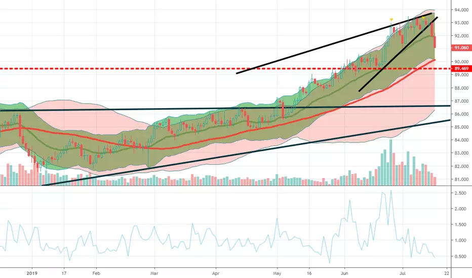
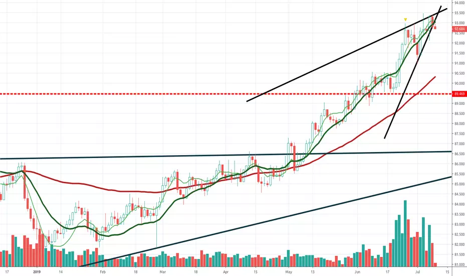
Looks like we got confirmation on Gold/SilverGot a nice bounce on the Daily, on an uptrend from the Daily to the 15m. It could be ready to soar. AT 86.5 we'll take half the position and let the rest swing with the stop in profit. Let's see what happens.


GOLD SILVER Ratio At Extreme Levels silver is extremely undervalued compared to gold.
awaiting reversal soon.
silver will outperform gold on the next upcoming bull market.
Target : 64
good luck.

xauxag short daily signal 1 :Rond number 84
signal 2: The ceiling of the previous price and the resistance zone
signal 3: Stochastic has broken its fast line down
signal 4:Divergence in the macd and rsi
signal 5:weekly r2 pivot


XAUXAG - Short term strength in Silver relative to GoldWith XAUXAG looking to fall lower, it is an indication that silver will be relatively stronger than gold in the short term.
If you are looking to buy into the precious metals, silver may be a better metal to focus on.
If you are looking to sell into the dip on precious metals, gold may be a better choice.
*Disclaimer - This analysis alone DOES NOT warrant a buy or sell trade immediately. Before you enter any trade in the financial market, it is very important that you have a proper trading plan and risk management approach.
The sharing of this idea is neither necessarily indicative of nor a guarantee of future performance or success.

Gold/Silver not far away from its highest level (oct 08)I see XAUUSD and XAGUSD rising, XAG with much more potential.

Part 6 - Risk-off August - XAU/XAG DailyXAU/XAG – Monthly Resistance & Support:
Resistance: 86.00
Support: 74.00
XAU/XAG – Summary:
Expected to start a Bullish Swing from the current 79.00 Levels and complete the Ending Diagonal pattern at or around 86.00 Levels
Bearish Impulse expected at or around 86.00 Levels


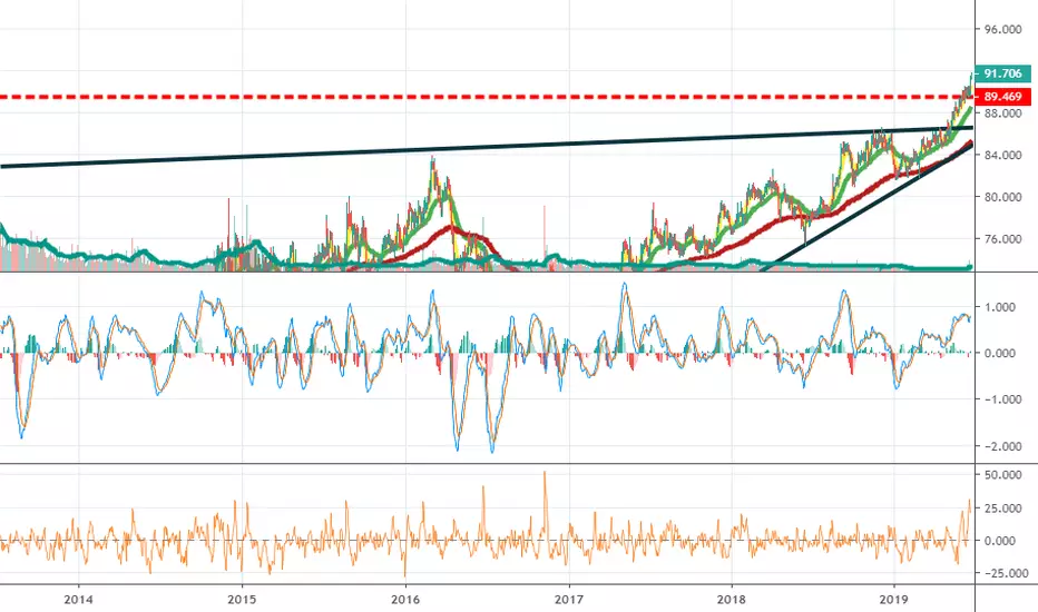
Gold/Silver ratio is peakingThere is a resistance line since 2009 and gold/silver is right below it.
Same below, a support line.
Where is it gonna break ? Up or down ?

