prime_trade97
The graph is labeled "gold 15M" in black text.It displays a red and green line chart, indicating price fluctuations over time The x-axis represents time, while the y-axis represents price.A box within the graph is labeled "sell zone," suggesting a specific area of interest for traders.The table is situated to the right of the graph and contains three The top row...
Chart: The chart displays the price of gold over time, with a red line showing a decline Annotations BUY ZONE" is written in a box below the chart.Target: 48.949 (1.49%) 4,894.9, Amount" is displayed above the green bar.Open P/L: -0.198, Qty: 11 Risk/Reward Ratio: 2.16" is shown above the red bar.Stop: 22.691 (0.69%) 2,269.1, Amount" is written below the red bar....
Market may be goint to buy side. A line graph with price movements indicated by red and blue lines. A "BUY ZONE" highlighted on the chart, suggesting a potential buying opportunity based on the price level. A green box on the right side of the chart with an upward arrow, indicating a predicted price increase
The image shows a trading chart for the USD/JPY (U.S. Dollar/Japanese Yen) currency pair on a 30-minute time frame from CMC Markets. - The chart shows price movements with a marked "sell zone" indicated by a rectangle containing a red top section and a green bottom section. - An upward arrow points to the red section, and a downward arrow points to the green...
The chart has a black background with a line graph showing the price movement of EUR/USD over time. The graph features blue and pink lines indicating price fluctuations. A green and pink rectangle is overlaid on the right side of the chart, possibly highlighting a specific trading zone or strategy.
The chart displays the exchange rate of the British Pound (GBP) against the United States Dollar (USD) with a 30-minute time frame, as indicated by "30 - FXCM" at the top. The chart itself is a candlestick chart showing price movements over time, with pink and blue lines representing price fluctuations. A rectangle overlay on the chart is divided into two...
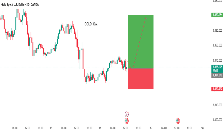
The chart features a candlestick pattern in pink and blue, indicating price movements over time. A green and pink rectangle is overlaid on the chart, suggesting a potential trading strategy or analysis. The current price of Gold is approximately $3,387.366 against the US Dollar. The chart is labeled "GOLD 30M" and includes various price points and indicators...
The chart is a candlestick chart, showing the price movement of XAUUSD over time. The chart has a downward trend, with a series of lower highs and lower lows. The chart is annotated with various symbols and labels, including "B" and "S," which likely indicate buy and sell signals. Buy Zone: The buy zone is highlighted in pink and is located at the bottom of the...
gold buy singnal analysis keep holding market may be long side and good analysis
It features a series of vertical bars in red and green, representing price movements over time. - The chart is labeled "btc 30m" at the bottom, indicating that it displays Bitcoin (BTC) price data over a 30-minute interval. - A white horizontal bar spans the chart, marked with the text "SELL SIGNAL ZONE" in black letters. - To the right of the candlestick...
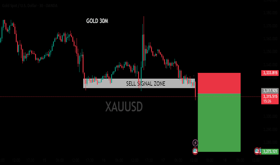
The chart appears to be a candlestick chart, which is commonly used in financial markets to display price movements over time. The chart is labeled "GOLD 30M" at the top, indicating that it is showing the price of gold over a 30-minute time frame. The chart has a downward trend, with the price of gold decreasing over time. A white box in the center of the chart...
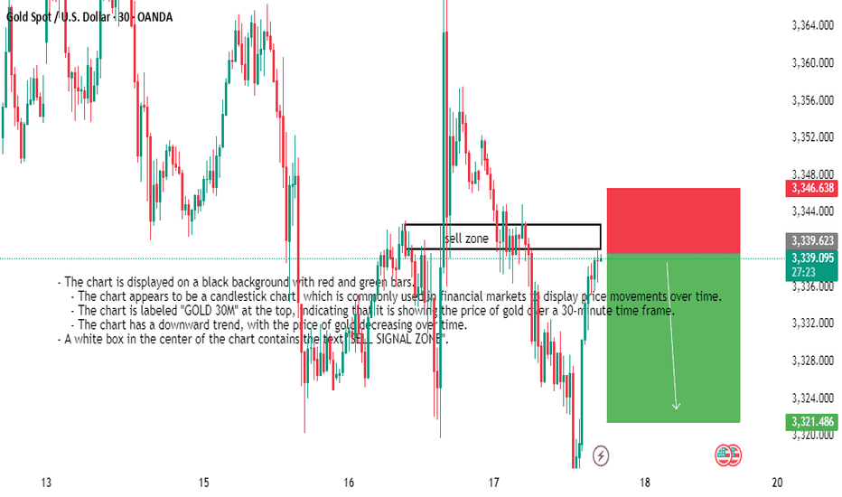
- The chart is displayed on a black background with red and green bars. - The chart appears to be a candlestick chart, which is commonly used in financial markets to display price movements over time. - The chart is labeled "GOLD 30M" at the top, indicating that it is showing the price of gold over a 30-minute time frame. - The chart has a downward...
The image suggests that the trader is using technical analysis to identify potential trading opportunities in the Bitcoin market. The use of specific patterns and indicators, such as the descending triangle and target price level, indicates a systematic approach to trading. However, it's important to note that trading carries inherent risks, and past performance...
The image depicts a computer screen displaying a trading platform, specifically the Euro/U.S. Dollar currency pair on a 4-hour chart from FXCM. The chart features a black background with a blue trend line and a blue shaded area, indicating an upward trend. The price action is represented by red and green bars, with the current price at 1.17283.
The image shows a screenshot of a computer screen displaying a graph on a trading platform. The graph is titled "U.S. Dollar Index" and has a dark blue background with red and green bars indicating price movements over time.
The chart appears to be part of a larger analysis or trading strategy, as indicated by the presence of multiple tabs open in the browser, including one labeled "BTC 2HOURS BULLISH ANALYSIS"
The image shows a computer screen displaying a trading platform with a chart for Gold Spot / U.S. Dollar (XAUUSD) on a 2-hour time frame from OANDA. The chart features a candlestick pattern with red and blue bars, indicating price movements over time
The image shows a laptop screen displaying a trading chart for the Euro/U.S. Dollar currency pair on the FXCM platform. The chart is set to a 2-hour time frame and features a black background with red and blue bars indicating price movements.


