Altcoins vs Stablecoins (with signals)This indicator visualizes the ratio of altcoin market dominance (excluding the top 10) to the combined dominance of the two largest stablecoins (USDT + USDC).
📊 Formula:
OTHERS.D / (USDT.D + USDC.D)
🔍 Purpose:
Rising values indicate increasing capital flow into altcoins — a potential altseason signal
Falling values suggest capital rotation into stablecoins — risk-off behavior
🟢 Bullish Signal:
When the ratio crosses above 1.3, a green arrow appears — signaling possible altcoin momentum
🔴 Bearish Signal:
When the ratio crosses below 0.9, a red arrow appears — signaling capital flight into stablecoins
✅ Useful for:
Timing market phases
Spotting early altseason entries
Portfolio rotation and risk monitoring
Breadth Indicators

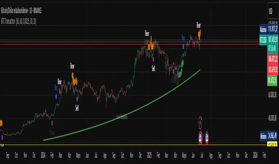
BTC Transaction Indicator Name: "Bitcoin On-Chain Volume & Dynamic Parabolic Curve Signals"
Purpose:
This indicator is designed for Bitcoin traders and long-term holders. It combines the analysis of Bitcoin's on-chain transaction volume with price action to generate "Whale" and "Bear" signals. Additionally, it features a unique dynamic parabolic curve that acts as a visual support line, adapting its visibility based on price interaction with a key Exponential Moving Average (EMA).
Key Components:
On-Chain Volume Analysis:
Utilizes Estimated Transaction Volume (ETRAV) data from the Bitcoin blockchain.
Calculates fast and slow Simple Moving Averages (SMAs) of this volume.
Identifies volume trends (up/down) and significant volume increases/decreases.
Employs fixed thresholds (2,500,000 for low volume and 25,000,000 for high volume) to define key activity levels, similar to how historical on-chain analysis defined accumulation and distribution zones.
Price Action Analysis:
Calculates fast and slow SMAs of the price.
Detects price trends (up/down), recoveries, and declines based on these price SMAs.
"Whale" and "Bear" Signals:
Whale Signals (Buy-side): Generated when there's an upward volume trend, significant volume increase, and a downward price trend followed by price recovery. These indicate potential accumulation phases.
Bear Signals (Sell-side): Generated when there's a downward volume trend, significant volume decrease, and an upward price trend followed by price decline. These indicate potential distribution phases.
Visuals: Both types of signals are plotted as small, colored circles directly on the price chart, with corresponding text labels ("Whale," "Buy," "Bear," "Sell," "Price Recovering," "Price Declining").
Dynamic Parabolic Curve:
Concept: A green parabolic (exponential) curve that serves as a dynamic visual support line.
Activation: The curve starts drawing automatically only when the price crosses over the EMA 500 (Exponential Moving Average of 500 periods). The curve's starting point is set at a user-defined percentage below the EMA 500 value at that exact crossover point.
Visibility: The curve remains visible and continues its trajectory only as long as the price stays above the EMA 500.
Deactivation: The curve disappears instantly if the price falls below or equals the EMA 500. It will only reappear if the price crosses above the EMA 500 again.
Customization: The curve's steepness (Tasa Crecimiento Curva) and its initial distance from the EMA 500 (Inicio Curva % por debajo de EMA500) are adjustable.
Dynamic Label: A "Parabólico" text label is plotted near the center of the active curve segment, with an adjustable vertical offset to ensure it stays visually appealing below the curve.
What is PLOTTED on the chart:
The small, colored circle signals for Whale/Buy and Bear/Sell activity.
The green dynamic parabolic curve.
What is NOT PLOTTED:
EMA 200, EMA 500 lines (though they are calculated internally for logic).
Raw volume data or volume Moving Averages (these are only used for signal calculation, not plotted).
Ideal for:
Bitcoin traders and investors focused on long-term trends and cycle analysis, who want visual cues for accumulation/distribution phases based on on-chain activity, complemented by a unique, dynamically appearing parabolic support curve.
Important Notes:
Relies on the availability of external on-chain data (QUANDL:BCHAIN) within TradingView.
Functions best on a daily timeframe for optimal on-chain data relevance.
Super PerformanceThe "Super Performance" script is a custom indicator written in Pine Script (version 6) for use on the TradingView platform. Its main purpose is to visually compare the performance of a selected stock or index against a benchmark index (default: NIFTYMIDSML400) over various timeframes, and to display sector-wise performance rankings in a clear, tabular format.
Key Features:
Customizable Display:
Users can toggle between dark and light color themes, enable or disable extended data columns, and choose between a compact "Mini Mode" or a full-featured table view. Table positions and sizes are also configurable for both stock and sector tables.
Performance Calculation:
The script calculates percentage price changes for the selected stock and the benchmark index over multiple periods: 1, 5, 10, 20, 50, and 200 days. It then checks if the stock is outperforming the index for each period.
Conviction Score:
For each period where the stock outperforms the index, a "conviction score" is incremented. This score is mapped to qualitative labels such as "Super solid," "Solid," "Good," etc., and is color-coded for quick visual interpretation.
Sector Performance Table:
The script tracks 19 sector indices (e.g., REALTY, IT, PHARMA, AUTO, ENERGY) and calculates their performance over 1, 5, 10, 20, and 60-day periods. It then ranks the top 5 performing sectors for each timeframe and displays them in a sector performance table.
Visual Output:
Two tables are constructed:
Stock Performance Table: Shows the stock's returns, index returns, outperformance markers (✔/✖), and the difference for each period, along with the overall conviction score.
Sector Performance Table: Ranks and displays the top 5 sectors for each timeframe, with color-coded performance values for easy comparison.

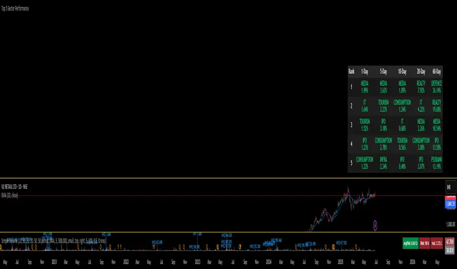
Top 5 Sector Performancehe indicator creates a table showing:
Top 5 performing sectors for 3 timeframes: 1-day, 10-day, and 20-day periods
Performance data including sector name and percentage change
Color-coded results: Green (positive), Red (negative), Gray ("N/A" for missing data)
Key Features
Table Structure:
Columns: Rank | 1-Day | 10-Day | 20-Day
Rows: Top 5 sectors for each timeframe
Header: Dark gray background with white text
Rows: Alternating dark gray shades for readability
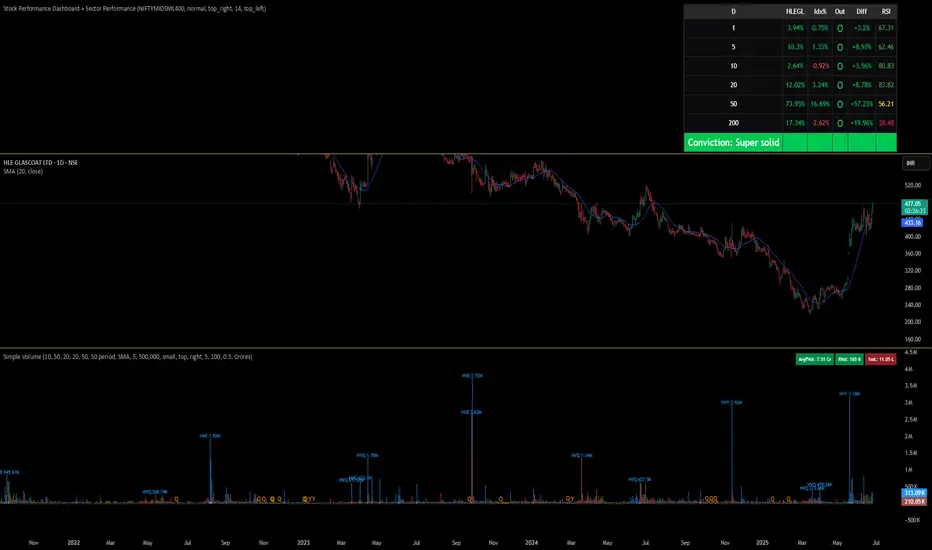
Stock Performance Dashboard + Sector PerformanceThis indicator, Stock Performance Dashboard + Sector Performance, provides a comprehensive visual analysis of both individual stock performance and sectoral trends directly on your TradingView chart.
Key Features:
Performance Dashboard Table:
Displays the stock’s returns over multiple timeframes (1, 5, 10, 20, 50, 200 days) and compares them to a selected benchmark index (default: NIFTYMIDSML400).
Highlights whether the stock is outperforming the index for each period, shows the difference in performance, and includes an RSI (Relative Strength Index) column for additional momentum insight.
Calculates and displays a “conviction” score and level based on how often the stock outperforms the index across periods.
Sector Performance Table:
Ranks and displays the top-performing sectors from a predefined list of major NSE sector indices over four key periods (1D, 5D, 30D, 50D).
For each period, the top 5 sectors are shown, with color-coded performance for quick visual assessment.
Customization:
Includes options for dark/light mode, table size, position, and which columns to display.
Supports a compact “mini mode” for simplified visualization.
Usage:
This tool is ideal for traders and investors who want a quick, at-a-glance comparison of a stock’s short- and long-term momentum versus its benchmark, as well as a live snapshot of sector rotation and leadership in the Indian market. All data is presented in clear, color-coded tables for actionable decision-making.
Stock Performance DashboardStock Performance Dashboard
This indicator provides a compact, color-coded table comparing the performance of the current stock to a benchmark index across multiple timeframes: 1, 5, 10, 20, 50, and 200 days.
Columns: Period, Stock %, Index %, Outperforming (✔/✖), and Difference.
Conviction Score: The last row summarizes overall outperformance as a “conviction” level (e.g., Super solid, Solid, Good, Ok, Needs improv., Poor).
Mini Mode: For a quick view, Mini Mode shows only the period and outperformance status.
Customizable: Supports dark/light mode, table size, position, and optional difference column.
Space Efficient: Short headers and a minimized layout make it easy to add more info or columns in future versions.
How to use:
Add the indicator to any chart. Adjust settings in the indicator panel to change the benchmark index, enable mini mode, or reposition the table.
Ideal for:
Traders who want a fast, at-a-glance summary of how a stock is performing against its benchmark across key timeframes, directly on the chart.

Liquidity Zones (JTS)Title: Liquidity Zones (JTS)
Description:
This script marks out key liquidity zones using pivot highs and lows. It includes:
Buy-Side Liquidity (Highs): Shown in red lines
Sell-Side Liquidity (Lows): Shown in green lines
Sweep Protection: Zones will only be removed after a defined number of bars AND a true sweep beyond the level
Toggle Controls: Enable/disable highs or lows individually
Adjustable Settings: Pivot length, sweep delay, max lines, and colors
Perfect for traders looking to track untapped or recently swept liquidity.
Created by JTS
For educational and strategic use

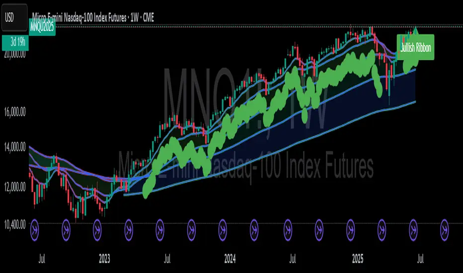
Mongoose EMA Ribbon — Pro EditionMongoose EMA Ribbon — Pro Edition
The Mongoose EMA Ribbon is a precision tool designed to support directional bias, trend integrity, and momentum alignment through a structured multi-EMA system. It is built for traders seeking clarity across high-timeframe trend conditions without sacrificing speed or simplicity.
Key Features:
Five customizable EMAs optimized for layered ribbon analysis
Configurable color logic for clean visual separation
Built-in ribbon compression and expansion visibility
Support for ribbon-based trend continuation zones
Optional label and visual tag for real-time trend state
Applications:
Identify trend strength and reversals with ribbon alignment
Detect compression zones that precede directional moves
Support discretionary or system-based trading strategies
Integrates well with price structure and macro overlays
This script is part of the Mongoose Capital toolkit and was developed to meet internal standards for clarity, execution readiness, and cross-asset compatibility.
Version: Pro Edition
Timeframes: Optimized for 1H, 4H, Daily, Weekly
Niveaux Dealers + Previous M W D📊 TradingView Script – Dealers Levels & Previous D/W/M
🔹 General Purpose:
This advanced script provides a clear view of key market levels used by professional traders for scalping, day trading, and technical analysis. It combines manual levels (Dealer) set by the user with automated levels based on the previous day, week, and month’s highs and lows.
⸻
🧩 1. Dealers Levels Module (Manual)
✅ Features:
• Displays 28 customizable levels, grouped into 4 categories:
• Maxima: Buyer Control, Max Day, Max Event, Max Extreme
• Minima: Seller Control, Min Day, Min Event, Min Extreme
• Call Resistance: 10 user-defined levels
• Pull Support: 10 user-defined levels
🎨 Customization:
• Each level’s value is manually entered
• Line color, style, and thickness can be customized
• Display includes transparent labels with a clean design
🔧 Options:
• Line extension configurable:
• To the left: from 1 to 499 bars
• To the right: from 1 to 100 bars
• Label display can be toggled on/off
⸻
🧩 2. Previous Daily / Weekly / Monthly Levels Module (Automatic)
✅ Features:
• Automatically detects and plots:
• Previous Daily High / Low
• Previous Weekly High / Low
• Previous Monthly High / Low
🎯 Technical Details:
• Accurate calculation based on closed periods
• Dynamically extended lines (past and future projection)
• Labels aligned with the right-hand extension of each line
🎨 Customization:
• Each level has configurable color, line style, and thickness
• Labels use rectangle style with transparent background
⸻
⚙ Global Script Settings:
• Toggle display of labels (✔/❌)
• Configurable left extension (1–499) and right extension (1–100)
• Settings panel organized into groups for clarity and ease of use
⸻
💡 Usefulness:
This script provides traders with a precise map of price reaction zones, combining fixed institutional zones (Dealer levels) with dynamic historical levels (D/W/M). It’s ideal for intraday strategies on indices (e.g., Nasdaq), crypto, or forex markets.

AZRO Systems XRP Top/Bottom Indicator — Invite-OnlyAZRO Systems – XRP Top/Bottom Indicator — Invite-Only
VERSION v1.0.4 — Early tops & bottoms flagged; label auto-flips to MAJOR at weekly close
──────────────────────────────────────────────────────
WHAT IT DOES
• EARLY TOP / EARLY BOTTOM prints intra-bar the moment any multi-factor recipe triggers.
• When the weekly bar closes, the label flips to MAJOR TOP / MAJOR BOTTOM and the confirmed alert fires.
• (If Soft-Confirm is ON, a TOP must first pull back ≈ 30 % of ATR-90 before confirmation.)
• Adds large green/red labels and a light bar-tint once major status is confirmed.
• Historical tests indicate materially lower drawdowns versus passive holding while still capturing each macro upswing.
HOW IT WORKS (concept level — exact thresholds are locked)
• Macro-Rotation Gauge – BTC dominance
Weekly BTC.D enters a historic extreme, then reverses for ≥ 2 weekly closes to flag potential rotation; never fires solo.
• Asset-Share Pivot – XRP market-cap share filters out false RSI spikes.
• Momentum-Stress Check – Weekly RSI + ATR pull-back captures exhaustion without waiting for close.
A label prints only when a recipe combining these lenses is met, greatly reducing false signals versus single-factor scripts.
HOW TO USE
Chart : XRP-USD · 1-WEEK (lower timeframes unsupported)
Watch : EARLY label → flips to MAJOR at weekly confirmation (bar tint appears)
Alerts : • EARLY Bottom / EARLY Top → ONCE PER BAR
• MAJOR Bottom / MAJOR Top → ONCE PER BAR CLOSE
USER-VISIBLE INPUTS
• Label distance (% ATR-90) – vertical offset for labels (Default 50)
• Light-mode palette – swap colors for bright themes (Default OFF)
• Soft-Confirm filter – ON waits for ≈ 30 % ATR pull-back on tops; OFF prints faster tops (Default ON)
• Warning checkbox – visual reminder only; no impact on signals (Default OFF)
ROADMAP
An intraday scalp mode for this XRP script is under development.
LIMITATIONS & DISCLAIMER
• Designed exclusively for the weekly timeframe; extreme market events can override any model—always manage risk.
• Educational tool — not financial advice. Past performance ≠ future returns.

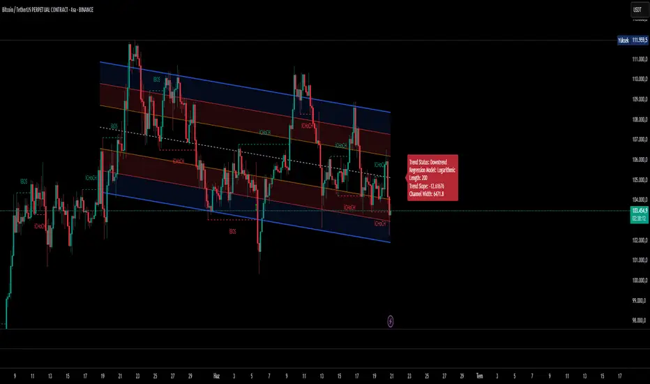
Ultimate Regression Channel v5.0 [WhiteStone_Ibrahim]Ultimate Regression Channel v5.0: Comprehensive User Guide
This indicator is designed to visualize the current trend, potential support/resistance levels, and market volatility through a statistical analysis of price action. At its core, it plots a regression line (a trend line) based on prices over a specific period and adds channels based on standard deviation around this line.
1. Core Features and Settings
Length Mode:
Numerical (Manual): You define the number of bars to be used for the regression channel calculation. You can use lower values (e.g., 50-100) for short-term analysis and higher values (e.g., 200-300) to identify long-term trends.
Automatic (Based on Market Structure): This mode automatically draws the channel starting from the highest high or lowest low that has formed within the Auto Scan Period. This allows the indicator to adapt itself to significant market turning points (swing points), which is highly useful.
Regression Model:
Linear: Calculates the trend as a straight line. It generally works well in stable, short-to-medium-term trends.
Logarithmic: Calculates the trend as a curved line. It more accurately reflects price action, especially on long-term charts or for assets that experience exponential growth/decline (like cryptocurrencies or growth stocks).
Channel Widths:
These settings determine how far from the central trend line (in terms of standard deviations) the channels will be drawn.
The 0 (Inner), 1 (Middle), and 2 (Outer) channels represent the "normal" range of price movement and the "extreme" zones. Statistically, about 95% of all price action occurs within the outer channels (2nd standard deviation).
2. Visual Extras and Their Interpretation
Breakout Style:
This feature alerts you when the price closes above the uppermost channel (Channel 2) with a green arrow/background or below the lowermost channel with a red arrow/background.
This is a very important signal. A breakout can signify that the current trend is strengthening and likely to continue (a breakout/trend-following strategy) or that the market has become overextended and may be due for a reversal (an exhaustion/top-bottom signal). It is critical to confirm this signal with other indicators (e.g., RSI, Volume).
Info Label:
This provides an at-a-glance summary of the channel on the right side of the chart:
Trend Status: Identifies the trend as "Uptrend," "Downtrend," or "Sideways" based on the slope of the centerline. The Horizontal Threshold setting allows you to filter out noise by treating very small slopes as "Sideways."
Regression Model and Length: Shows your current settings.
Trend Slope: A numerical value representing how steep or weak the trend is.
Channel Width: Shows the price difference between the outermost channels. This is a measure of current volatility. A widening channel indicates increasing volatility, while a narrowing one indicates decreasing volatility.
3. What Users Should Pay Attention To & Best Practices
Define Your Strategy: Mean Reversion or Breakout?
Mean Reversion: If the market is in a ranging or gently trending phase, the price will tend to revert to the centerline after hitting the outer channels (overbought/oversold zones). In this case, the outer channels can be considered opportunities to sell (upper channel) or buy (lower channel).
Breakout: If a strong trend is in place, a price close beyond an outer channel can be a sign that the trend is accelerating. In this scenario, one might consider taking a position in the direction of the breakout. Correctly analyzing the current market state (ranging vs. trending) is key to deciding which strategy to employ.
Don't Use It in Isolation: No indicator is a holy grail. Use the Regression Channel in conjunction with other tools. Confirm signals with RSI divergences for overbought/oversold conditions, Moving Averages for the overall trend direction, or Volume indicators to confirm the strength of a breakout.
Choose the Right Model: On shorter-term charts (e.g., 1-hour, 4-hour), the Linear model is often sufficient. However, on long-term charts like the daily, weekly, or monthly, the Logarithmic model will provide much more accurate results, especially for assets with parabolic movements.
The Power of Automatic Mode: The Automatic length mode is often the most practical choice because it finds the most logical starting point for you. It saves you the trouble of adjusting settings, especially when analyzing different assets or timeframes.
Use the Alerts: If you don't want to miss the moment the price touches a key channel line, set up an alert from the Alert Settings section for your desired line (e.g., only the "Outer Channels"). This helps you catch opportunities even when you are not in front of the screen.
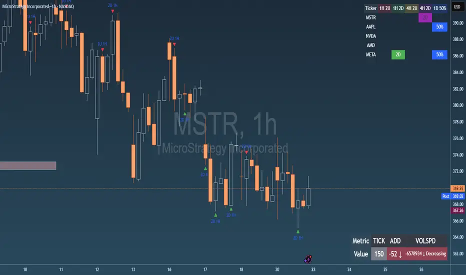
Failed 2U/2D + 50% Retrace Scanner📈 Multi-Ticker Failed 2U/2D Scanner with Daily Retrace & Market Breadth Table
This TradingView indicator is a multi-symbol price action scanner designed to catch high-probability reversal signals using The Strat’s failed 2U/2D patterns and daily 50% retrace logic, while also displaying market breadth metrics ( USI:TICK and USI:ADD ) for context.
Monitored Symbols:
SPY, SPX, QQQ, IWM, NVDA, AMD, AAPL, META, MSTR
🔍 Detection Logic
1. Failed 2U / Failed 2D Setups
Failed 2U: Price breaks above the previous candle’s high but closes back below the open → Bearish reversal
Failed 2D: Price breaks below the previous candle’s low but closes back above the open → Bullish reversal
Timeframes Monitored:
🕐 1-Hour (1H)
⏰ 4-Hour (4H)
2. Daily 50% Candle Retrace
Checks if price has retraced 50% or more of the previous day’s candle body
Highlights potential trend exhaustion or reversal confluence
3. Market Breadth Metrics (Display Only)
USI:TICK : Measures real-time NYSE up vs. down ticks
USI:ADD : Advance-Decline Line (net advancing stocks)
Not used in signal logic — just displayed in the table for overall market context
🖼️ Visual Elements
✅ Chart Markers
🔺 Red/Green Arrows for 1H Failed 2U/2D
🟨 Yellow Squares for 4H Failed 2U/2D
Visual markers are plotted directly on the relevant candles
📊 Signal Table
Lists all 9 tickers in rows
Columns for:
1H Signal
4H Signal
Daily 50% Retrace
USI:TICK Value
USI:ADD Value
Color-Coded Cells:
🔴 Red = Failed 2U
🟢 Green = Failed 2D
⚠️ Highlight if 50% Daily Retrace condition is true
🟦 Neutral-colored cells for TICK/ADD numeric display
🔔 Alerts
Hardcoded alerts fire when:
A 1H or 4H Failed 2U/2D is detected
The Daily 50% retrace condition is met
Each alert is labeled clearly by symbol and timeframe:
"META 4H Failed 2D"
"AAPL Daily 50% Retrace"
🎯 Use Case
Built for:
Reversal traders using The Strat
Swing or intraday traders watching hourly setups
Traders wanting quick visual context on market breadth without relying on it for confirmation
Monitoring multiple tickers in one clean view
This is scan 2
Add scan 1 for spx, spy, iwm, qqq, aapl
This indicator is not financial advice. Use the alerts to check out chart and when tickers trigger.
Auto-Fibonacci Levels [ChartWhizzperer]Auto-Fibonacci Levels
Discover one of the most elegant and flexible Fibonacci indicators for TradingView – fully automatic, tastefully understated, and built entirely in Pine Script V6.
Key Features:
- Automatically detects the most recent swing high and swing low.
- Plots Fibonacci retracement levels and extensions (including 161.8%, 261.8%) perfectly aligned
to the prevailing trend.
- Distinctive, dashed lines with crystal-clear price labels right at the price scale
for maximum clarity.
- Line length and label offset are fully customisable for your charting preference.
- Absolutely no repainting: Only confirmed swings are used for reliable signals.
- Parameter: "Swing Detection Length"
The “Swing Detection Length” parameter determines how many bars must appear to the left and right of a potential high or low for it to be recognised as a significant swing point.
- Higher values make the script less sensitive (only major turning points are detected).
- Lower values make it more responsive to minor fluctuations (more fibs, more signals).
For best results, adjust this setting according to your preferred timeframe and trading style.
Pro Tip:
Fibonacci levels refresh automatically whenever a new swing is confirmed.
Ideal for price action enthusiasts and Fibonacci purists alike.
Licence:
// Licence: CC BY-NC-SA 4.0 – Non-commercial use only, attribution required.
// © ChartWhizzperer

Real Cumulative Delta VolumeReal Cumulative Delta Volume (CDV) - Enhanced Volume Flow Analysis
What This Indicator Does
This indicator calculates cumulative delta volume using an enhanced approximation methodology that analyzes buying and selling pressure within each candlestick. It provides traders with insights into volume flow dynamics by tracking the cumulative difference between estimated buy and sell volumes over time.
Technical Methodology & Calculation Details
Volume Distribution Algorithm: The indicator uses a price-weighted distribution method to estimate buy and sell volumes within each bar:
Delta multiplier = (close - low) / (high - low)
Buy volume = total volume × delta multiplier
Sell volume = total volume × (1 - delta multiplier)
Net delta = buy volume - sell volume
Cumulative Delta Tracking: Unlike basic volume indicators, this approach maintains a running cumulative total of net delta values:
CDV Open = Previous CDV Close
CDV Close = Previous CDV Close + Net Delta
CDV High/Low = Previous CDV Close + estimated intrabar extremes
Enhanced Features Beyond Standard CDV:
Divergence Detection: Automatically identifies when price direction conflicts with volume flow direction
Body Size Analysis: Compares current vs previous CDV candle body sizes to detect momentum changes
Conditional Color Coding: Special visual alerts when specific price/volume relationships occur
Signal Generation: Buy/sell signals based on divergence resolution patterns
How This Differs from Basic Cumulative Delta
Standard Limitations Addressed:
Most cumulative delta indicators on TradingView use simple uptick/downtick classification. This indicator enhances the approach by:
Price-Weighted Distribution: Instead of assuming 50/50 volume splits, uses the bar's price action (close relative to high/low) to estimate volume distribution
OHLC Representation: Displays CDV as candlesticks rather than just a line, showing intrabar volume dynamics
Integrated Divergence Detection: Built-in algorithms identify price/volume conflicts automatically
Advanced Signal Logic: Multi-condition signal generation beyond simple crossovers
Visual Enhancement Features:
Dual display modes (candlestick or line)
Special color coding for divergence conditions
Moving average overlays for trend confirmation
Optional buy/sell signal markers
Signal Generation Logic
Buy Signals Generated When:
Previous bar showed bearish divergence (price down, CDV up)
Current CDV candle shows specific color condition
Current CDV body is contained within previous divergence body
Price closes above previous high
Sell Signals Generated When:
Previous bar showed bullish divergence (price up, CDV down)
Current CDV candle shows specific color condition
Current CDV body is contained within previous divergence body
Price closes below previous low
Trading Applications
Volume Flow Analysis:
Identify periods of hidden accumulation or distribution
Spot when large players are buying/selling against the price trend
Confirm trend strength through volume alignment
Divergence Trading:
Early warning system for potential reversals
Identify when price movements lack volume support
Time entries based on divergence resolution
Trend Confirmation:
Use CDV direction to confirm price trend validity
Moving averages on CDV provide additional trend context
Volume momentum changes often precede price momentum shifts
Display Options & Settings
Visual Modes:
Candlestick: Full OHLC representation of cumulative delta
Line: Simplified cumulative line display
Moving Averages:
Optional SMA overlays (default: 50, 200 periods)
Optional EMA overlays (default: 50, 200 periods)
Customizable periods and colors
Signal Controls:
Toggle buy/sell signals on/off independently
Customizable colors for all visual elements
Adjustable transparency and styling options
Usage Guidelines & Limitations
Best Practices:
Most effective on timeframes 15m and higher due to volume data quality
Works best in liquid markets with consistent volume
Should be used alongside price action analysis and support/resistance levels
Signals are more reliable during trending market conditions
Technical Limitations:
Uses approximation methods due to lack of tick-by-tick data in Pine Script
Volume distribution estimates may be less accurate during gaps or low-volume periods
Effectiveness depends on quality of volume data from your broker/exchange
Market Context Considerations:
Less reliable during market holidays or extremely low volume sessions
News events and earnings can cause volume anomalies that affect calculations
Consider market microstructure when interpreting signals on very short timeframes
Important Disclaimers
Educational Purpose: This indicator is designed for educational and analysis purposes. It does not constitute financial or investment advice.
Risk Warning: All trading involves risk of loss. Past performance of any indicator signals does not guarantee future results.
Testing Required: Users should thoroughly backtest and forward test this indicator before using it in live trading. Paper trading is recommended to understand signal behavior.
No Guarantees: The developer makes no claims about profitability or accuracy. Market conditions change and historical effectiveness may not continue.
Proper Usage: This is a technical analysis tool, not a complete trading system. Always use appropriate risk management, position sizing, and combine with other forms of analysis.
Developer: Delta Merge Professional Trading Applications
Access Instructions: Send a private message through TradingView explaining your trading experience and how you plan to use this indicator. Access is provided to traders who demonstrate understanding of volume analysis concepts and proper risk management practices.

Gap Open DetectorIndicator Note: Gap Open Detector
What This Indicator Does
This indicator helps you spot significant price gaps at the start of new candles compared to the previous candle’s close. A gap means the current candle’s opening price is noticeably higher or lower than the previous candle’s closing price.
Gap Up: The new candle opens above the previous candle’s close.
Gap Down: The new candle opens below the previous candle’s close.
The indicator highlights these gaps with colored candles:
Green Candle: Gap Up detected.
Red Candle: Gap Down detected.
How to Use the Indicator:
This indicator gives Best Results on Hourly Candles:
This indicator works best on hourly charts (1-hour time frame). It is especially useful for spotting gaps at the start of the next day or after a significant break in trading.
Wait for Confirmation:
After a gap is detected at the open, wait for the candle to form. Ideally, wait for one hour (until the hourly candle is complete) to confirm the candle’s direction and strength before taking any action.
Customize Gap Size:
You can set the minimum gap size using either points or percentage:
Points: Enter the minimum number of points for a gap to be considered significant.
Percentage: Enter the minimum percentage change for a gap to be considered significant.
This flexibility allows you to adjust the indicator to suit different markets and volatility levels.
Trading Logic
If there is a Gap Up and the one hour candle is green:
Buy Option: Consider initiating a buy (long) position.
If there is a Gap Up but the one hour candle is red:
Sell Option: Consider initiating a sell (short) position.
If there is a Gap Down and the one hour closing candle is red:
Sell Option: Consider initiating a sell (short) position.
If there is a Gap Down but the one hour candle is green:
Buy Option: Consider initiating a buy (long) position.
Important Tips
1. Patience Pays: Always wait for the hourly candle to close before making any trading decisions based on the gap.
2. Next Day Open: This strategy is especially effective for catching gaps at the start of a new trading day or after a market break.
3. Visual Cues: The indicator gives you a simple visual cue to spot potential trading opportunities.
4. Flexible Settings: Set your preferred gap size in points or percentage to match your trading style.

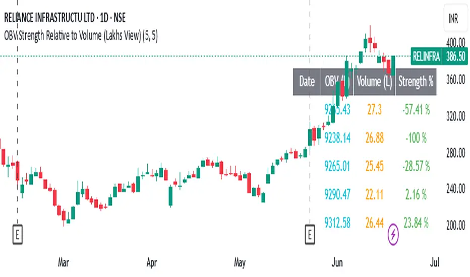
OBV Strength Relative to Volume (Lakhs View)OBV Strength Relative to Volume (Lakhs View)
Description:
to provide a compact yet powerful insight into volume momentum and price conviction. It's tailored for traders and analysts in markets like India, where high-volume stocks are often better interpreted in lakhs.
💡 Key Features:
OBV Calculation: Cumulative OBV is computed based on price movement direction and volume contribution.
OBV Strength (%): Measures the percentage strength of OBV relative to total volume over a user-defined period. It reflects how strongly volume is contributing to price movements.
Lakhs View: Both OBV and Volume are scaled to lakhs for cleaner readability and practical analysis in high-volume securities.
Historical Table Display:
Displays date-wise OBV, Volume, and OBV Strength for the last N candles (customizable).
Automatically updates every 5 bars or on each bar for real-time analysis.
Color-coded cells for quick visual recognition.
⚙️ Inputs:
OBV Strength Period: Number of bars used to calculate OBV strength (default = 5).
Number of Days in Table: Number of recent bars shown in the on-chart table (default = 5).
📈 Plots:
OBV (Lakhs) – Aqua line.
Volume (Lakhs) – Orange columns.
OBV Strength (%) – Green line indicating momentum strength based on volume.
📍 Ideal Use:
Use this indicator to:
Spot divergences between OBV and price.
Assess the strength of volume behind a trend.
Track consistency and spikes in volume-backed price moves.
Quickly scan recent trends with a clear numerical and visual table.
CoffeeShopCrypto Supertrend Liquidity EngineMost SuperTrend indicators use fixed ATR multipliers that ignore context—forcing traders to constantly tweak settings that rarely adapt well across timeframes or assets.
This Supertrend is a nodd to and a more completion of the work
done by Olivier Seban ( @olivierseban )
This version replaces guesswork with an adaptive factor based on prior session volatility, dynamically adjusting stops to match current conditions. It also introduces liquidity-aware zones, real-time strength histograms, and a visual control panel—making your stoploss smarter, more responsive, and aligned with how the market actually moves.
📏 The Multiplier Problem & Adaptive Factor Solution
Traditional SuperTrend indicators rely on fixed ATR multipliers—often arbitrary numbers like 1.5, 2, or 3. The issue? No logical basis ties these values to actual market conditions. What works on a 5-minute Nasdaq chart fails on a daily EUR/USD chart. Traders spend hours tweaking multipliers per asset, timeframe, or volatility phase—and still end up with stoplosses that are either too tight or too loose. Worse, the market doesn’t care about your setting—it behaves according to underlying volatility, not your parameter.
This version fixes that by automating the multiplier selection entirely. It uses a 4-zone model based on the current ATR relative to the previous session’s ATR, dynamically adjusting the SuperTrend factor to match current volatility. It eliminates guesswork, adapts to the asset and timeframe, and ensures you’re always using a context-aware stoploss—one that evolves with the market instead of fighting it.
ATR EXAMPLE
Let’s say prior session ATR = 2.00
Now suppose current ATR = 0.32
This places us in Zone 1 (Very Low Volatility)
It doesn’t imply "overbought" or "oversold" — it tells you the market is moving very little, which often means:
Lower risk | Smaller stops | Smaller opportunities (and losses)
🔁 Liquidity Zones vs. Arbitrary Pullbacks
The standard SuperTrend stop loss line often looks like price “barely misses it” before continuing its trend. Traders call this "stop hunting," but what’s really happening is liquidity collection—price pulls back into a zone rich in orders before continuing. The problem? The old SuperTrend doesn’t show this zone. It only draws the outer limit, leaving no visual cue for where entries or continuation moves might realistically originate.
This script introduces 2 levels in the Liquidity Zone. One for Support and one for Stophunts, which draw dynamically between the current price and the SuperTrend line. These levels reflect where the market is most likely to revisit before resuming the trend. By visualizing the area just above the Supertrend stop loss, you can anticipate pullbacks, spot ideal re-entries, and avoid premature exits. This bridges the gap between mechanical stoploss logic and real-world liquidity behavior.
⏳ Prior Session ATR vs. Live ATR
Using real-time ATR to determine movement potential is like driving by looking in your rearview mirror. It’s reactive, not predictive. Traders often base decisions on live ATR, unaware that today’s range is still unfolding —creating volatility mismatches between what’s calculated and what actually matters. Since ATR reflects range, calculating it mid-session gives an incomplete and misleading picture of true volatility.
Instead, this system uses the ATR from the previous session , anchoring your volatility assumptions in a fully-formed price structure . It tells you how far price moved in the last full market phase—be it London, New York, or Tokyo—giving you a more reliable gauge of expected range today. This is a smarter way to estimate how far price could move rather than how far it has moved.
The Smoothing function will take the ATR, Support, Resistance, Stophunt Levels, and the Moving Avearage and smooth them by the calculation you choose.
It will also plot a moving average on your chart against closing prices by the smoothing function you choose.
🧭 Scalping vs. Trending Modes
The market moves in at least 4 phases. Trending, Ranging, Consolidation, Distribution.
Every trader has a different style —some scalp low-volatility moves during off-hours, while others ride macro trends across days. The problem with classic SuperTrend? It treats every market condition the same. A fixed system can’t possibly provide proper stoploss spacing for both a fast scalp and a long-term swing. Traders are forced to rebuild their system every time the market changes character or the session shifts.
This version solves that with a simple toggle:
Scalping or Trend Mode . With one switch, it inverts the logic of the adaptive factor to either tighten or loosen your trailing stops. During low-liquidity hours or consolidation phases, Scalping Mode offers snug stoplosses. During expansion or clear directional bias.
Trend Mode lets the trade breathe. This is flexibility built directly into the logic—not something you have to recalibrate manually.
📉 Histogram Oscillator for Move Strength
In legacy indicators, there’s no built-in way to gauge when the move is losing power . Traders rely on price action or momentum indicators to guess if a trend is fading. But this adds clutter, lag, and often contradiction. The classic SuperTrend doesn’t offer insight into how strong or weak the current trend leg is—only whether price has crossed a line.
This version includes a Trending Liquidity Histogram —a histogram that shows whether the liquidity in the SuperTrend zone is expanding or compressing. When the bars weaken or cross toward zero, it signals liquidity exhaustion . This early warning gives you time to prep for reversals or anticipate pullbacks. It even adapts visually depending on your trading mode, showing color-coded signals for scalping vs. trending behavior. It's both a strength gauge and a trade timing tool—built into your stoploss logic.
Histogram in Scalping Mode
Histogram in Trending Mode
📊 Visual Table for Real-Time Clarity
A major issue with custom indicators is opacity —you don’t always know what settings or values are currently being used. Even worse, if your dynamic logic changes mid-trade, you may not notice unless you go digging into the code or logs. This can create confusion, especially for discretionary traders.
This SuperTrend solves it with a clean visual summary table right on your chart. It shows your current ATR value, adaptive multiplier, trailing stop level, and whether a new zone size is active. That means no surprises and no second-guessing—everything important is visible and updated in real-time.
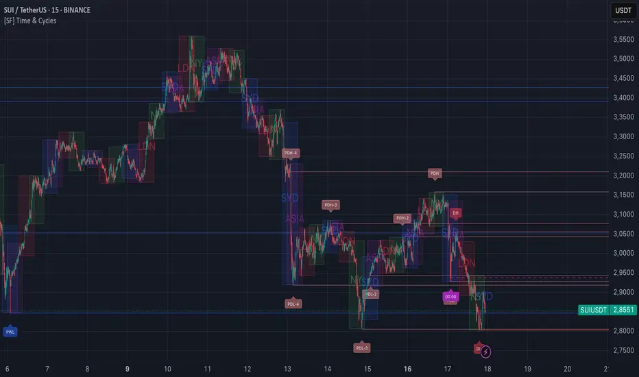
[FS] Time & Cycles Time & Cycles
A comprehensive trading session indicator that helps traders identify and track key market sessions and their price levels. This tool is particularly useful for forex and futures traders who need to monitor multiple trading sessions.
Key Features:
• Multiple Session Support:
- London Session
- New York Session
- Sydney Session
- Asia Session
- Customizable TBD Session
• Session Visualization:
- Clear session boxes with customizable colors
- Session labels with adjustable visibility
- Support for sessions crossing midnight
- Timezone-aware calculations
• Price Level Tracking:
- Daily High/Low levels
- Weekly High/Low levels
- Previous session High/Low levels
- Customizable history depth for each level type
• Customization Options:
- Adjustable colors for each session
- Customizable border styles
- Label visibility controls
- Timezone selection
- History level depth settings
• Technical Features:
- High-performance calculation engine
- Support for multiple timeframes
- Efficient memory usage
- Clean and intuitive visual display
Perfect for:
• Forex traders monitoring multiple sessions
• Futures traders tracking market hours
• Swing traders identifying key session levels
• Day traders planning their trading hours
• Market analysts studying session patterns
The indicator helps traders:
- Identify active trading sessions
- Track session-specific price levels
- Monitor market activity across different time zones
- Plan trades based on session boundaries
- Analyze price action within specific sessions
Note: This indicator is designed to work across all timeframes and is optimized for performance with minimal impact on chart loading times.
Stephis Supply & Demand Zones v3
📉 Support
Definition: Support is a price level where a downtrend can be expected to pause or reverse due to a concentration of buying interest.
Why it matters: When the price of an asset falls to a support level, traders expect buyers to step in, preventing the price from falling further.
Visual clue: On a chart, support often appears as a horizontal line where the price has bounced up multiple times.
📈 Demand
Definition: Demand refers to the willingness and ability of buyers to purchase an asset at a given price.
In trading context: High demand typically pushes prices up, while low demand can lead to price drops.
Relation to support: A support level exists because of demand—buyers are willing to buy at that price, creating a floor.
🧠 How They Work Together
When price approaches a support level, traders watch to see if demand increases—if it does, the price may bounce.
If the support level is broken, it may signal that demand has weakened, and the price could fall further.
🔁 Opposite Concept: Resistance & Supply
Resistance is the opposite of support—it's a level where selling pressure (supply) may stop a price from rising.
Just like demand creates support, supply creates resistance.

High/LowPrevious Day High/Low & Weekly Open Indicator
A clean and simple indicator that displays key reference levels for intraday trading.
Features:
Previous day's high and low levels
Current week's opening price
Auto-hides levels once broken (prevents clutter)
Resets automatically at the start of each trading day
No repainting - uses proper security function calls
How it works:
The indicator plots yesterday's high/low as horizontal lines on your chart. When price breaks above the previous day's high, that level disappears. Same for the low. This keeps your chart clean and shows only unbroken levels.
Perfect for:
Day traders using previous day's range as reference
Breakout trading strategies
Support/resistance analysis
Clean chart setup without manual level drawing
The cyan lines show previous day's high/low, while the orange line displays the weekly open. All levels use non-repainting data for reliable backtesting.
Yelober - Intraday ETF Dashboard# How to Read the Yelober Intraday ETF Dashboard
The Intraday ETF Dashboard provides a powerful at-a-glance view of sector performance and trading opportunities. Here's how to interpret and use the information:
## Basic Dashboard Reading
### Color-Coding System
- **Green values**: Positive performance or bullish signals
- **Red values**: Negative performance or bearish signals
- **Symbol colors**: Green = buy signal, Red = sell signal, Gray = neutral
### Example 1: Identifying Strong Sectors
If you see XLF (Financials) with:
- Day % showing +2.65% (green background)
- Symbol in green color
- RSI of 58 (not overbought)
**Interpretation**: Financial sector is showing strength and momentum without being overextended. Consider long positions in top financial stocks like JPM or BAC.
### Example 2: Spotting Weakness
If you see XLK (Technology) with:
- Day % showing -1.20% (red background)
- Week % showing -3.50% (red background)
- Symbol in red color
- RSI of 35 (approaching oversold)
**Interpretation**: Technology sector is showing weakness across multiple timeframes. Consider avoiding tech stocks or taking short positions in names like MSFT or AAPL, but be cautious as the low RSI suggests a bounce may be coming.
## Advanced Interpretations
### Example 3: Sector Rotation Detection
If you observe:
- XLE (Energy) showing +2.10% while XLK (Technology) showing -1.50%
- Both sectors' Week % values showing the opposite trend
**Interpretation**: This suggests money is rotating out of technology into energy stocks. This rotation pattern is actionable - consider reducing tech exposure and increasing energy positions (look at XOM, CVX in the Top Stocks column).
### Example 4: RSI Divergences
If you see XLU (Utilities) with:
- Day % showing +0.50% (small positive)
- RSI showing 72 (overbought, red background)
**Interpretation**: Despite positive performance, the high RSI suggests the sector is overextended. This divergence between price and indicator suggests caution - the rally in utilities may be running out of steam.
### Example 5: Relative Strength in Weak Markets
If SPY shows -1.20% but XLP (Consumer Staples) shows +0.30%:
**Interpretation**: Consumer staples are showing defensive strength during market weakness. This is typical risk-off behavior. Consider defensive positions in stocks like PG, KO, or PEP for protection.
## Practical Application Scenarios
### Day Trading Setup
1. **Morning Market Assessment**:
- Check which sectors are green pre-market
- Focus on sectors with Day % > 1% and RSI between 40-70
- Identify 2-3 stocks from the Top Stocks column of the strongest sector
2. **Midday Reversal Hunting**:
- Look for sectors with symbol color changing from red to green
- Confirm with RSI moving away from extremes
- Trade stocks from that sector showing similar pattern changes
### Swing Trading Application
1. **Trend Following**:
- Identify sectors with positive Day % and Week %
- Look for RSI values in uptrend but not overbought (45-65)
- Enter positions in top stocks from these sectors, using daily charts for confirmation
2. **Contrarian Setups**:
- Find sectors with deeply negative Day % but RSI < 30
- Look for divergence (price making new lows but RSI rising)
- Consider counter-trend positions in the stronger stocks within these oversold sectors
## Reading Special Conditions
### Example 6: Risk-Off Environment
If you observe:
- XLP (Consumer Staples) and XLU (Utilities) both green
- XLK (Technology) and XLY (Consumer Disc) both red
- SPY slightly negative
**Interpretation**: Classic risk-off rotation. Investors are moving to safety. Consider defensive positioning and reducing exposure to growth sectors.
### Example 7: Market Breadth Analysis
Count the number of sectors in green vs. red:
- If 7+ sectors are green: Strong bullish breadth, consider aggressive long positioning
- If 7+ sectors are red: Weak market breadth, consider defensive positioning or shorts
- If evenly split: Market is indecisive, focus on specific sector strength instead of broad market exposure
Remember that this dashboard is most effective when combined with broader market analysis and appropriate risk management strategies.

Adaptive Quadratic Kernel EnvelopeThis study draws a fair-value curve from a quadratic-weighted (Nadaraya-Watson) regression. Alpha sets how sharply weights decay inside the look-back window, so you trade lag against smoothness with one slider. Band half-width is ATRslow times a bounded fast/slow ATR ratio, giving an instant response to regime shifts without overshooting on spikes. Work in log space when an instrument grows exponentially, equal percentage moves then map to equal vertical steps. NearBase and FarBase define a progression of adaptive thresholds, useful for sizing exits or calibrating mean-reversion logic. Non-repaint mode keeps one-bar delay for clean back-tests, predictive mode shows the zero-lag curve for live decisions.
Key points
- Quadratic weights cut phase error versus Gaussian or SMA-based envelopes.
- Dual-ATR scaling updates width on the next bar, no residual lag.
- Log option preserves envelope symmetry across multi-decade data.
- Alpha provides direct control of curvature versus noise.
- Built-in alerts trigger on the first adaptive threshold, ready for automation.
Typical uses
Trend bias from the slope of the curve.
Entry timing when price pierces an inner threshold and momentum stalls.
Breakout confirmation when closes hold beyond outer thresholds while volatility expands.
Stops and targets anchored to chosen thresholds, automatically matching current noise.

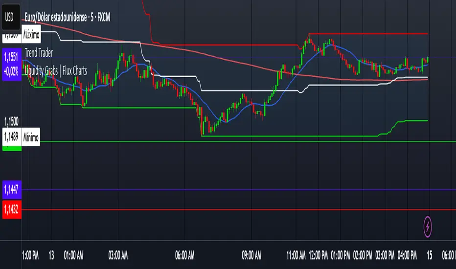
Trend TraderDescription and Usage of the "Trend Trader" Indicator
The "Trend Trader" indicator, created by Gerardo Mercado as a legacy project, is a versatile trading tool designed to identify potential buy and sell signals across various instruments. While it provides predefined settings for popular instruments like US30, NDX100, GER40, and GOLD, it can be seamlessly adapted to any market, including forex pairs like EUR/USD. The indicator combines moving averages, time-based filters, and MACD confirmation to enhance decision-making for traders.
How It Works
Custom Moving Averages (MAs):
The indicator uses two moving averages:
Short MA: A faster-moving average (default: 10 periods).
Long MA: A slower-moving average (default: 100 periods).
Buy signals are generated when the Short MA crosses above the Long MA.
Sell signals are triggered when the Short MA crosses below the Long MA.
Time-Based Signals:
The user can define specific trading session times (start and end in UTC) to focus on high-activity periods for their chosen market.
Signals and background coloring are only active during the allowed session times.
MACD Confirmation:
A MACD (Moving Average Convergence Divergence) calculation on a 15-minute timeframe ensures stronger confirmation for signals.
Buy signals require the MACD line to be above the signal line.
Sell signals require the MACD line to be at or below the signal line.
Target Levels:
Predefined profit targets are dynamically set based on the selected trading instrument.
While it includes settings for US30, NDX100, GER40, and GOLD, the target levels can be adjusted to fit the volatility and structure of any asset, including forex pairs like EUR/USD.
Target 1 and Target 2 levels display when these thresholds are met after an entry signal.
Adaptability to Any Market:
Although predefined options are included for specific instruments, the indicator's moving averages, time settings, and MACD logic are applicable to any tradable asset, making it suitable for forex, commodities, indices, and more.
Visual Alerts:
Labels appear on the chart to highlight "BUY" and "SELL" signals at crossover points.
Additional labels indicate when price movements reach the predefined target levels.
Bar and background coloring visually represent active signals and MACD alignment.
Purpose
The indicator aims to simplify trend-following and momentum-based trading strategies. By integrating moving averages, MACD, customizable time sessions, and dynamic targets, it offers clear entry and exit points while being adaptable to the needs of individual traders across diverse markets.
How to Use
Setup:
Add the indicator to your TradingView chart.
Configure the moving average periods, trading session times, and target levels according to your preferences.
Select the instrument for predefined target settings or customize them to fit the asset you’re trading (e.g., EUR/USD or other forex pairs).
Interpreting Signals:
Buy Signal: The Short MA crosses above the Long MA, MACD confirms the upward trend, and the session is active.
Sell Signal: The Short MA crosses below the Long MA, MACD confirms the downward trend, and the session is active.
Adapt for Any Instrument:
Adjust the predefined target levels to match the volatility and trading style for your chosen asset.
For forex pairs like EUR/USD, consider typical pip movements to set appropriate profit targets.
Targets:
Use the provided target labels (e.g., 50 or 100 points) or customize them to reflect realistic profit goals based on the asset’s volatility.
Visual Aids:
Pay attention to the background color:
Greenish: Indicates a bullish trend during the allowed session.
Redish: Indicates a bearish trend during the allowed session.
Use the "BUY" and "SELL" labels for actionable insights.
This indicator is a flexible and powerful tool, suitable for traders across all markets. Its adaptability ensures that it can enhance your strategy, whether you’re trading forex, commodities, indices, or other assets. By offering actionable alerts and customizable settings, the "Trend Trader" serves as a valuable addition to any trader’s toolkit. FX:EURUSD