EdgeXplorer - Profit Bottoms EdgeXplorer – Profit Bottoms
⸻
🔍 What This Indicator Does
Profit Bottoms is a custom momentum oscillator designed to reveal price strength inflections through correlation logic. It identifies potential market exhaustion zones, highlights overbought/oversold conditions, and visually marks swing tops and bottoms — helping traders pinpoint profit-taking opportunities or early reversals across any asset or timeframe.
It features a flexible histogram view, color-coded background trends, and precision labels for clearer insight into market sentiment momentum shifts.
⸻
⚙️ How It Works
At the core of this indicator is a correlation function:
• It measures how strongly the price (close) correlates with bar index progression over a lookback window — essentially evaluating how directional recent price action has been.
• This results in a “strength index” ranging between +1 (strong uptrend) and -1 (strong downtrend).
• It tracks the slope of this index to infer trend direction and visually represent shifts.
From there, the indicator layers on:
• Dynamic overbought/oversold zones (±0.9)
• Swing high/low detection based on local peaks and troughs
• Trend background shading based on momentum slope
• Optional histogram and fill display styles
⸻
📈 Visual Components Explained
Element Meaning
🔮 Pulse Strength Line (purple line) Primary oscillator showing strength of directional movement
🌈 Colored Fill Fills above/below baseline to represent bullish/bearish intensity
🟢 Green Background Slope of strength index is rising (trend gaining)
🔴 Red Background Slope of strength index is falling (trend weakening)
🔼 ↑ Label Price is entering extreme overbought territory
🔽 ↓ Label Price is entering extreme oversold territory
🟠 Circle Markers Swing Top (Teal) or Swing Bottom (Orange)
📊 Histogram / Line Style Alternate visualizations of the oscillator based on user preference
⸻
📊 Input Settings Explained
Setting Description
Window Size Lookback period for correlation calculation
Bull Fill / Bear Fill Gradient colors for up/down momentum
Mark Tops/Bottoms Enables visual detection of swing highs/lows
Highlight Overbought/Oversold Displays zone entry markers (↑/↓) near extremes
Show Pulse Histogram Adds either histogram or line view
Histogram Style Choose between histogram bars, a thin line, or hide the visual entirely
⸻
🧠 How to Interpret in Different Market Conditions
Condition Interpretation
Strength Index near +1 Strong upward correlation — trend likely maturing or overbought
Strength Index near -1 Strong downward correlation — trend possibly exhausted or oversold
Cross below 0 Momentum shift from bullish to bearish
Cross above 0 Momentum shift from bearish to bullish
Swing Top Detected Potential short-term exhaustion — profit zone for longs
Swing Bottom Detected Early reversal zone or buying opportunity
The colored background makes it easy to visually segment the chart by trend environment, while the swing markers and zone labels add precision entry/exit timing cues.
⸻
🧪 Use Cases & Strategy Tips
• Scalpers & intraday traders: Use swing tops/bottoms with zone labels for tight entries.
• Swing traders: Watch for strength fading as a warning sign to exit positions.
• Divergence Spotting: Compare price action to the oscillator for hidden signals.
• Momentum Riders: Use histogram mode with background coloring to stay in trend longer.
For example:
If you see a swing bottom occur just below the -0.9 zone, paired with a background color flip from red to green — that’s a high-probability setup for reversion or breakout.
⸻
🧷 Alerts Included
This indicator provides built-in alerts for key conditions:
• EPS+ Top Detected → Swing Top
• EPS+ Bottom Detected → Swing Bottom
• EPS+ Overbought Zone → Strength Index > 1
• EPS+ Oversold Zone → Strength Index < -1
These can be used in alert-based automation or simply for manual signal confirmation.
Centered Oscillators

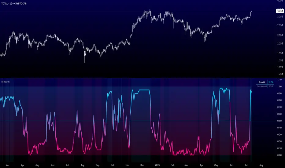
Crypto Breadth | AlphaNatt\ Crypto Breadth | AlphaNatt\
A dynamic, visually modern market breadth indicator designed to track the strength of the top 40 cryptocurrencies by measuring how many are trading above their respective 50-day moving averages. Built with precision, branding consistency, and UI enhancements for fast interpretation.
\ 📊 What This Script Does\
* Aggregates the performance of \ 40 major cryptocurrencies\ on Binance
* Calculates a \ breadth score (0.00–1.00)\ based on how many tokens are above their moving averages
* Smooths the breadth with optional averaging
* Displays the result as a \ dynamic, color-coded line\ with aesthetic glow and gradient fill
* Provides automatic \ background zones\ for extreme bullish/bearish conditions
* Includes \ alerts\ for key threshold crossovers
* Highlights current values in an \ information panel\
\ 🧠 How It Works\
* Pulls real-time `close` prices for 40 coins (e.g., XRP, BNB, SOL, DOGE, PEPE, RENDER, etc.)
* Compares each coin's price to its 50-day SMA (adjustable)
* Assigns a binary score:
• 1 if the coin is above its MA
• 0 if it’s below
* Aggregates all results and divides by 40 to produce a normalized \ breadth percentage\
\ 🎨 Visual Design Features\
* Smooth blue-to-pink \ color gradient\ matching the AlphaNatt brand
* Soft \ glow effects\ on the main line for enhanced legibility
* Beautiful \ multi-stop fill gradient\ with 16 transition zones
* Optional \ background shading\ when extreme sentiment is detected:
• Bullish zone if breadth > 80%
• Bearish zone if breadth < 20%
\ ⚙️ User Inputs\
* \ Moving Average Length\ – Number of periods to calculate each coin’s SMA
* \ Smoothing Length\ – Smooths the final breadth value
* \ Show Background Zones\ – Toggle extreme sentiment overlays
* \ Show Gradient Fill\ – Toggle the modern multicolor area fill
\ 🛠️ Utility Table (Top Right)\
* Displays live breadth percentage
* Shows how many coins (e.g., 27/40) are currently above their MA
\ 🔔 Alerts Included\
* \ Breadth crosses above 50%\ → Bullish signal
* \ Breadth crosses below 50%\ → Bearish signal
* \ Breadth > 80%\ → Strong bullish trend
* \ Breadth < 20%\ → Strong bearish trend
\ 📈 Best Used For\
* Gauging overall market strength or weakness
* Timing trend transitions in the crypto market
* Confirming trend-based strategies with broad market support
* Visual dashboard in macro dashboards or strategy overlays
\ ✅ Designed For\
* Swing traders
* Quantitative investors
* Market structure analysts
* Anyone seeking a macro view of crypto performance
Note: Not financial advise
Dual MACD + TSI [CryptoSmart] by IgnotusA sophisticated dual momentum indicator combining a custom MACD Histogram with Divergence Detection and a TSI (True Strength Index) oscillator, designed for advanced technical analysis in crypto and other fast-moving markets.
---
🔍 Key Features:
- Custom MACD Histogram (MACD 1):
- Configurable fast/slow lengths and signal smoothing method (EMA/SMA).
- Advanced divergence detection (Regular & Hidden Bullish/Bearish patterns).
- Visual alerts and labels directly on the chart.
- Built-in divergence alerts for easy integration with TradingView alerts.
- TSI Oscillator (MACD 2):
- True Strength Index with customizable fast/slow periods and signal line smoothing.
- Overbought/oversold levels and optional background shading for quick visual cues.
- Fully optional elements (TSI Line, Signal Line, OB/OS levels) – disabled by default for clean charting.
- User-Friendly Design:
- Optional components can be toggled on/off via the settings panel.
- Works great as a standalone momentum filter or as part of a multi-indicator dashboard.
---
📈 How to Use:
- Use the MACD Histogram divergences to spot potential reversals.
- Combine with the TSI oscillator to confirm trend strength or detect overextended moves.
- Enable/disable components to avoid clutter and focus on what matters most.
---
Crafted for traders who want precision, flexibility, and visual clarity in their charts. Whether you're scalping or swing trading, this indicator helps you stay ahead of the curve.
---
Feel free to tweak the values and customize it to your strategy. Happy trading!

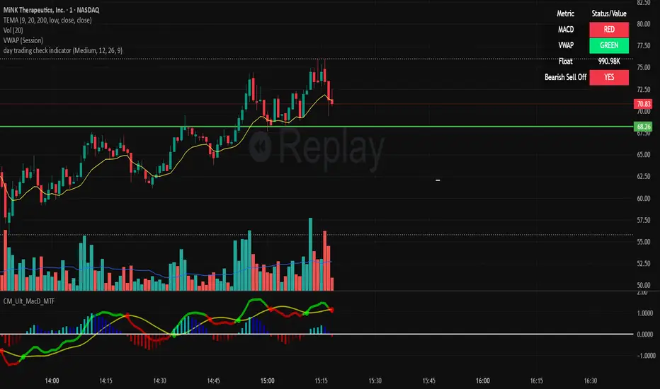
day trading check indicatorDay Trading Check Indicator
By Trades per Minute · Creator: Trader Malik
Overview
The Day Trading Check Indicator is an on‐chart status panel that gives you a quick “go/no-go” snapshot of four key metrics—MACD, VWAP, Float, and Bearish Sell-Off—directly in TradingView’s top-right corner. It’s designed for fast decision-making during high-velocity intraday sessions, letting you instantly see whether each metric is “bullish” (green) or “bearish” (red), plus live float data.
What It Shows
Column Description
Metric The name of each metric: MACD, VWAP, Float, Bearish Sell-Off
Status/Value A color-coded status (“GREEN”/“RED” or “YES”/“NO”) or the float value formatted in K/M/B
Metrics & Calculations
MACD (1-Minute)
Calculation: Standard MACD using EMA (12) – EMA (26) with a 9-period signal line, all fetched from the 1-minute timeframe via request.security().
Status:
GREEN if MACD ≥ Signal
RED if MACD < Signal
VWAP (Session-Anchored)
Calculation: Built-in session VWAP (ta.vwap(close)) resets each new trading session.
Status:
GREEN if current price ≥ VWAP
RED if current price < VWAP
Float
Calculation: Retrieves syminfo.shares_outstanding_float (total float), then scales it into thousands (K), millions (M), or billions (B), e.g. “12.3 M.”
Display: Always shown as the absolute float value, white on semi-transparent black.
Bearish Sell-Off
Calculation: Checks the last five 1-minute bars for any “high-volume down” candle (volume above its 20-bar SMA and close < open).
Status:
YES if at least one such bar occurred in the past 5 minutes
NO otherwise
Key Features
Dynamic Table: Automatically shows only the metrics you enable via the Display Options group.
Size Selector: Choose Small, Medium, or Large text for easy visibility.
Clean Styling: Distinct header row with custom background, consistent row shading, centered status text, and a subtle gray border.
Lightweight Overlay: No cluttering plots—just a concise status panel in the corner.
Published by Trader Malik / Trades per Minute
Version: Pine Script v5
EdgeXplorer - Battle of the BullsEdgeXplorer – Battle of the Bulls
Momentum isn’t a mystery. It’s a battle. And this tool shows you who’s winning.
Battle of the Bulls is a momentum visualizer built for traders who want to track the tug-of-war between bullish and bearish pressure — in real time. It blends raw market energy with simple visuals to help you interpret power shifts, confirm trends, or anticipate reversals.
⸻
🔍 What It Tracks:
At its core, this tool calculates two things on every candle:
• Bull Power = High − EMA
• Bear Power = Low − EMA
These two values are added together to create a net momentum reading — giving you a unique view of pressure on both ends of the candle. The more aggressively price moves above or below the EMA, the stronger the histogram prints in that direction.
This approach allows you to see not just price movement, but the intensity behind it.
⸻
📊 Visual Breakdown:
• Momentum Histogram:
Colored bars show bullish vs. bearish pressure:
• Green bars = bullish net pressure (momentum > 0)
• Red bars = bearish net pressure (momentum < 0)
• Zero Line:
This baseline acts as a key decision zone. Crosses above zero often signal increasing bullish pressure, while crosses below zero can flag incoming bearish strength.
• Raw Momentum Line (optional):
Toggle this ON if you prefer to see a smoother visual of momentum shifts layered over the histogram. It’s helpful for those who like cleaner entries based on slope or curve behavior.
• Background Tinting:
To keep the screen minimal yet informative, a light red or green background tint reflects the prevailing momentum bias without being visually overwhelming.
⸻
🧠 How to Use It:
1. Confirming Trend Strength:
Use the histogram to validate whether a move is driven by real strength or just noise. A strong uptrend with fading green bars? Momentum might be weakening. Choppy range but rising bars? Breakout may be brewing.
2. Spotting Momentum Shifts Early:
The zero line crossover can be used as an early signal for trend reversals or new legs forming. Pair with your existing structure or pattern analysis for high-conviction entries.
3. Filtering False Breakouts:
Sometimes price breaks a level but momentum doesn’t support it — Battle of the Bulls can help you avoid those traps. If the histogram is neutral or fading while price breaks out, caution may be warranted.
4. Scalping Short-Term Swings:
Scalpers can track short bursts of power, riding histogram pulses in one direction. Set the EMA lookback lower (e.g. 5–8) for ultra-sensitive setups, or go higher (20+) for smoother confirmation.
⸻
⚙️ Customizable Inputs:
• Lookback Length – Controls the EMA length used in calculating momentum.
• Lower = more sensitive.
• Higher = more stable.
• Color Inputs – Change bullish and bearish histogram colors to fit your theme.
• Raw Line Option – Toggle for smoother, minimal overlay of momentum data.
⸻
🔔 Built-In Alerts:
We’ve added alert conditions for both:
• Bullish Cross (Momentum > 0)
• Bearish Cross (Momentum < 0)
So whether you want to automate notifications for scalping, swing confirmations, or divergence watching, this script has you covered.
⸻
🔚 Final Notes:
This script is minimal by design — no clutter, no distractions — just the heartbeat of market pressure visualized in a way you can actually trade. Whether you’re using it for confluence, confirmation, or clean pulse reads, Battle of the Bulls gives you insight without overcomplication.

Market Entropy Strategy V2.5This strategy is an updated version of a market entropy-based trading system. It removes EMA dependencies and introduces two indicators:
1. **Volatility Momentum Index (VMI)**: Measures volatility acceleration for timing entries (from calm to active phases) and exits (at peak chaos).
2. **Volume-Weighted Price Center (VWPC)**: A volume-weighted trend filter using typical price to determine overall market direction.
The strategy enters trades on transitions from low volatility ("calm") to increasing activity, filtered by trend direction. Exits occur when volatility reaches a high "chaos" threshold. It supports long, short, or both directions, with configurable parameters for optimization.
Backtest results depend on market conditions; use with caution and combine with your own analysis. No guarantees of performance.

MACD con Divergencias y Temperatura v3.0MACD con temperatura de mercado en diferentes temporalidades de forma simultanea.

SR360 OSCILLATOR 2025Unlock deeper insights into momentum and trend strength with the SR360 Oscillator 2025, a high-precision dual-indicator system designed for traders focusing on NSE stocks.
🚀 Key Features:
🔹 GVR Oscillator (RSI on VWAP)
Identify powerful shifts in price momentum using a smart blend of RSI and VWAP — ideal for catching trend reversals and breakouts.
Dynamic coloring: 🔴 Overbought, 🟢 Oversold, 🔵 Neutral zones
🔹 Multi-Symbol Trend Table (Supertrend or EMA)
Stay ahead with a real-time trend dashboard for RELIANCE, SBIN, INFY, HDFCBANK, TCS, and more.
Choose your trend logic: Supertrend or EMA crossover
Custom watchlist + include current chart symbol
💼 Who’s It For?
Intraday & swing traders in the Indian equity markets
Analysts seeking clean, trend-verified setups
Anyone needing a reliable trend/momentum combo tool

Dettling Sexy Shirt LevelsThis indicator allows you to quickly enter levels you want to trade for quick scalps. You can enter your buy or sell point (Bull or Bear Line), and up to 5 profit levels. Pearsons Pivots and Camarillo Pivots are automatically updated each day, and can be selected on or off. It works well if you buy a call or put a few days until expiration, a few dollars out of the money.
After entering your buy points and Target levels, there is a drop down menu at the top of the settings page. You must select the ticker you are looking at on the chart, Tradingview will not automatically update the level if you are looking at a ticker but it is not selected in the menu.


GMMA-MACDThe indicator itsels is a hybrid of the MACD and GMMA indicators, it has 2 modes, normal and Consensus mode.
The normal mode plots 2 modified MACD, one using the currently highest of the GMMA fast group to calculate the MACD line, and the other one uses the currently lowest of the slow group to do the same.
In Consensus mode all the GMMA moving averages being calculated separately, which means it uses 12 MACD indicators instead of 2, the logic is the same as in the normal MACD, turns bullish if MACD above it's signal line, in this mode also has a Donchian channel to help visualize potential divergences.
This mode can show trend direction and strength more effectively, and potential reversal points, coloring of the indicator is green if all MACD are in consensus of a bullish trend, turns light green if 7-11 of them shows slight/weakening bullish trend, orange for neutral (6-6), light red for 7-11 shows slight/weakening bearish trend, red if all shows bearish trend.
For easier adjustment instead of adjusting every single EMA period, the logic uses a multiplier to adjust the periods as a whole unit.
Tested in a few strategies against the normal MACD, as a trend filter, this one gave at least the same results, usually better, and because it's logic is dynamic it's more future proof than the normal MACD.

52SIGNAL RECIPE CCI Linreg Bands═══ 52SIGNAL RECIPE CCI Linreg Bands ═══
◆ Overview
52SIGNAL RECIPE CCI Linreg Bands is an advanced technical indicator that combines the CCI (Commodity Channel Index) with Linear Regression Bands. This indicator visualizes the volatility of the CCI using linear regression bands, helping to clearly identify overbought/oversold areas and more accurately capture potential trend reversal points.
─────────────────────────────────────
◆ Key Features
• CCI-Based Overbought/Oversold Analysis: Uses the traditional CCI indicator to identify overbought/oversold conditions in the market
• Integrated Linear Regression Bands: Applies linear regression analysis to the CCI to visually represent the direction and strength of trends
• Dual Overbought/Oversold Levels: Sets overbought/oversold levels for both CCI and Linear Regression Bands to increase the accuracy of signals
• Advanced Visualization: Intuitive chart analysis is possible with color changes according to trend direction and clear band display
• Multiple Alert Settings: Alert functions for various conditions ensure you don't miss important trading moments
─────────────────────────────────────
◆ Technical Foundation
■ CCI (Commodity Channel Index)
• Basic Settings: 20-period CCI with Weighted Moving Average (WMA) applied
• Calculation Method: Measures the deviation from the average price normalized to a specific range
• Overbought/Oversold Levels: Default values set to +150 (overbought) and -150 (oversold)
■ Linear Regression Bands
• Period: Default value of 100 days
• Deviation: Default value of 4.5 standard deviations
• Center Line: The center line of the linear regression analysis for the CCI values
• Band Width: Displays the range of volatility around the center line based on the calculated standard deviation
• Overbought/Oversold Levels: Default values set to +250 (overbought) and -250 (oversold)
─────────────────────────────────────
◆ Practical Applications
■ Identifying Trading Signals
• Buy Signal:
▶ When the CCI falls below the oversold level (-150)
▶ When the lower band of the Linear Regression Bands falls below the oversold level (-250)
▶ When both conditions are met simultaneously (extreme oversold state) - a strong buy signal
• Sell Signal:
▶ When the CCI rises above the overbought level (+150)
▶ When the upper band of the Linear Regression Bands rises above the overbought level (+250)
▶ When both conditions are met simultaneously (extreme overbought state) - a strong sell signal
■ Trend Analysis
• Uptrend: When the linear regression center line is rising and the CCI is moving above the zero line
• Downtrend: When the linear regression center line is falling and the CCI is moving below the zero line
• Trend Strength: The wider the gap between the bands, the greater the volatility; the narrower, the more stable the trend
■ Divergence Confirmation
• Bearish Divergence: Price forms a new high, but the CCI is lower than the previous high (potential bearish signal)
• Bullish Divergence: Price forms a new low, but the CCI is higher than the previous low (potential bullish signal)
─────────────────────────────────────
◆ Advanced Setting Options
■ CCI Setting Adjustments
• CCI Source: Selectable options include Close (default), Open, High, Low, HL2, HLC3, OHLC4, etc.
• CCI Length: Adjust to lower values for short-term volatility, higher values for long-term trends
■ Linear Regression Setting Adjustments
• Period: Use lower values (20-50) for short-term analysis, higher values (100-200) for long-term analysis
• Deviation: Higher values create wider bands (more signals), lower values create narrower bands (more accurate signals)
■ Overbought/Oversold Level Adjustments
• CCI Levels: Adjust to more extreme values (±200) in highly volatile markets
• Linear Regression Band Levels: Adjustable to ±300 or ±200 depending on market conditions
─────────────────────────────────────
◆ Synergy with Other Indicators
• Bollinger Bands: Use alongside Bollinger Bands on the price chart to compare price volatility with CCI volatility
• MACD: Use with MACD for momentum and trend confirmation
• Fibonacci Retracement: Check CCI Linreg Bands signals with key support/resistance levels
• Moving Averages: Combine moving average crossovers with CCI Linreg Bands signals to improve reliability
─────────────────────────────────────
◆ Conclusion
52SIGNAL RECIPE CCI Linreg Bands provides a powerful and accurate technical analysis tool by combining traditional CCI with linear regression analysis. The dual overbought/oversold system increases the accuracy of trading signals and clearly visualizes trend direction and strength to help traders make decisions. You can achieve optimal results by adjusting various settings to match your trading style and market conditions.
─────────────────────────────────────
※ Disclaimer: Past performance does not guarantee future results. Always use appropriate risk management strategies.
═══ 52SIGNAL RECIPE CCI 선형회귀 밴드 ═══
◆ 개요
52SIGNAL RECIPE CCI 선형회귀 밴드는 CCI(Commodity Channel Index)와 선형회귀 밴드를 결합한 고급 기술적 지표입니다. 이 지표는 선형회귀 밴드를 사용하여 CCI의 변동성을 시각화하여 과매수/과매도 영역을 명확하게 식별하고 잠재적인 추세 반전 지점을 더 정확하게 포착하는 데 도움을 줍니다.
─────────────────────────────────────
◆ 주요 특징
• CCI 기반 과매수/과매도 분석: 전통적인 CCI 지표를 사용하여 시장의 과매수/과매도 상태를 식별
• 통합된 선형회귀 밴드: CCI에 선형회귀 분석을 적용하여 추세의 방향과 강도를 시각적으로 표현
• 이중 과매수/과매도 레벨: CCI와 선형회귀 밴드 모두에 과매수/과매도 레벨을 설정하여 신호의 정확도 향상
• 고급 시각화: 추세 방향에 따른 색상 변화와 명확한 밴드 표시로 직관적인 차트 분석 가능
• 다중 알림 설정: 다양한 조건에 대한 알림 기능으로 중요한 트레이딩 시점을 놓치지 않도록 보장
─────────────────────────────────────
◆ 기술적 기반
■ CCI (Commodity Channel Index)
• 기본 설정: 20기간 CCI에 가중이동평균(WMA) 적용
• 계산 방법: 평균 가격에 대한 편차를 측정하여 정규화한 값으로 표현
• 과매수/과매도 레벨: 기본값으로 +150(과매수)과 -150(과매도) 설정
■ 선형회귀 밴드
• 기간: 기본값 100일
• 편차: 기본값 4.5 표준편차
• 중심선: CCI 값에 대한 선형회귀 분석의 중심선
• 밴드 폭: 계산된 표준편차에 기반하여 중심선 주변의 변동성 범위 표시
• 과매수/과매도 레벨: 기본값으로 +250(과매수)와 -250(과매도) 설정
─────────────────────────────────────
◆ 실용적 응용
■ 트레이딩 신호 식별
• 매수 신호:
▶ CCI가 과매도 레벨(-150) 아래로 떨어질 때
▶ 선형회귀 밴드의 하단이 과매도 레벨(-250) 아래로 떨어질 때
▶ 두 조건이 동시에 충족될 때(극단적 과매도 상태) - 강한 매수 신호
• 매도 신호:
▶ CCI가 과매수 레벨(+150) 위로 상승할 때
▶ 선형회귀 밴드의 상단이 과매수 레벨(+250) 위로 상승할 때
▶ 두 조건이 동시에 충족될 때(극단적 과매수 상태) - 강한 매도 신호
■ 추세 분석
• 상승 추세: 선형회귀 중심선이 상승하고 CCI가 0선 위로 움직일 때
• 하락 추세: 선형회귀 중심선이 하락하고 CCI가 0선 아래로 움직일 때
• 추세 강도: 밴드 사이의 간격이 넓을수록 변동성이 크고, 좁을수록 추세가 안정적
■ 다이버전스 확인
• 약세 다이버전스: 가격이 신고점을 형성하지만 CCI가 이전 고점보다 낮을 때(잠재적 약세 신호)
• 강세 다이버전스: 가격이 신저점을 형성하지만 CCI가 이전 저점보다 높을 때(잠재적 강세 신호)
─────────────────────────────────────
◆ 고급 설정 옵션
■ CCI 설정 조정
• CCI 소스: 선택 가능한 옵션에는 종가(기본값), 시가, 고가, 저가, HL2, HLC3, OHLC4 등이 포함
• CCI 길이: 단기 변동성을 위해 낮은 값으로, 장기 추세를 위해 높은 값으로 조정
■ 선형회귀 설정 조정
• 기간: 단기 분석을 위해 낮은 값(20-50), 장기 분석을 위해 높은 값(100-200) 사용
• 편차: 높은 값은 더 넓은 밴드(더 많은 신호), 낮은 값은 더 좁은 밴드(더 정확한 신호) 생성
■ 과매수/과매도 레벨 조정
• CCI 레벨: 변동성이 큰 시장에서는 더 극단적인 값(±200)으로 조정
• 선형회귀 밴드 레벨: 시장 상황에 따라 ±300 또는 ±200으로 조정 가능
─────────────────────────────────────
◆ 다른 지표와의 시너지
• 볼린저 밴드: 가격 차트의 볼린저 밴드와 함께 사용하여 가격 변동성과 CCI 변동성 비교
• MACD: 모멘텀과 추세 확인을 위해 MACD와 함께 사용
• 피보나치 되돌림: CCI 선형회귀 밴드 신호를 주요 지지/저항 레벨과 함께 확인
• 이동평균선: 이동평균 교차와 CCI 선형회귀 밴드 신호를 결합하여 신뢰성 향상
─────────────────────────────────────
◆ 결론
52SIGNAL RECIPE CCI 선형회귀 밴드는 전통적인 CCI와 선형회귀 분석을 결합하여 강력하고 정확한 기술적 분석 도구를 제공합니다. 이중 과매수/과매도 시스템은 트레이딩 신호의 정확도를 높이고 추세 방향과 강도를 명확하게 시각화하여 트레이더의 의사 결정을 돕습니다. 다양한 설정을 트레이딩 스타일과 시장 상황에 맞게 조정하여 최적의 결과를 얻을 수 있습니다.
─────────────────────────────────────
※ 면책 조항: 과거 성과가 미래 결과를 보장하지 않습니다. 항상 적절한 리스크 관리 전략을 사용하세요.

Rifle UnifiedThis script is designed for use on 30-second charts of Dow Jones-related symbols (YM, MYM, US30). It provides automated buy and sell signals using a combination of price action, RSI (Relative Strength Index), and volume analysis. The script is intended for both live trading signals and backtesting, with configurable risk management and debugging features.
Core Functionality
1. Signal Generation Logic
Trigger: The algorithm looks for a sharp price move (drop or rise) of a user-defined threshold (default: 80 points) within a specified lookback window (default: 20 minutes).
Levels: It monitors for price drops below specific numerical levels ending in 23, 43, or 73 (e.g., 42223, 42273).
RSI Condition: When price falls below one of these levels and the RSI is below 30, the setup is considered active.
Buy Signal: A buy is triggered if, after setup:
Price rises back above the level,
The RSI rate of change (ROC) indicates exhaustion of the drop,
The current bar shows positive momentum.
2. Trade Management
Stop Loss & Take Profit: Configurable fixed or trailing stop loss and take profit levels are plotted and managed automatically.
Exit Signals: The script signals exit based on price action relative to these risk management levels.
3. Filters & Enhancements
Parabolic Move Filter: Prevents entries during extreme price moves.
Dead Cat Bounce Filter: Avoids false signals after sharp reversals.
Volume Filter: Optionally requires volume conditions for trade entries (especially for shorts).
Multiple Confirmation Layers : Includes checks for 5-minute RSI, momentum, and price retracement.
User Inputs & Customization
Trade Direction: Toggle between LONG and SHORT signal generation.
Trigger Settings: Adjust thresholds for price moves, lookback windows, RSI ROC, and volume requirements.
Trade Settings: Set take profit, stop loss, and trailing stop behavior.
Debug & Visualization: Enable or disable various plots, labels, and debug tables for in-depth analysis.
Backtesting: Integrated backtester with summary and detailed statistics tables.
Technical Features
Uses External Libraries: Relies on RifleShooterLib for core logic and BackTestLib for backtesting and statistics.
Multi-timeframe Analysis: Incorporates both 30-second and 5-minute RSI calculations.
Chart Annotations: Plots entry/exit points, risk levels, and debug information directly on the chart.
Alert Conditions: Built-in alert triggers for key events (initial move, stall, entry).
Intended Use
Markets: Dow Jones symbols (YM, MYM, US30, or US30 CFD).
Timeframe: 30-second chart.
Purpose: Automated signal generation for discretionary or algorithmic trading, with robust risk management and backtesting support.
Notable Customization & Extension Points
Momentum Calculation: Plans to replace the current momentum measure with "sqz momentum".
Displacement Logic: Future update to use "FVG concept" for displacement.
High-Contrast RSI: Optional visual enhancements for RSI extremes.
Time-based Stop: Consideration for adding a time-based stop mechanism.
This script is highly modular, with extensive user controls, and is suitable for both live trading and historical analysis of Dow Jones index movements
PUNPORTFX MARKET STRUCTURE CHECK LiteIt is used for viewing trends with MACD and trend, showing it in a simple graphic.

Elliott Wave Helper//@version=5
indicator("Elliott Wave Helper", overlay=true)
// Settings
pivotLength = input.int(5, "Pivot Length")
showLabels = input.bool(true, "Show Wave Labels")
zigzagColor = input.color(color.orange, "Zigzag Line Color")
// Find Pivot Highs and Lows
pivotHigh = ta.pivothigh(high, pivotLength, pivotLength)
pivotLow = ta.pivotlow(low, pivotLength, pivotLength)
// Store pivots
var float pivotPrices = array.new_float()
var int pivotBars = array.new_int()
if not na(pivotHigh)
array.push(pivotPrices, pivotHigh)
array.push(pivotBars, bar_index - pivotLength)
if not na(pivotLow)
array.push(pivotPrices, pivotLow)
array.push(pivotBars, bar_index - pivotLength)
// Draw zigzag line between pivots
for i = 1 to array.size(pivotBars) - 1
x1 = array.get(pivotBars, i - 1)
y1 = array.get(pivotPrices, i - 1)
x2 = array.get(pivotBars, i)
y2 = array.get(pivotPrices, i)
line.new(x1, y1, x2, y2, width=2, color=zigzagColor)
// Label waves as 1-5 or A-C (manual cycling)
if showLabels
waveLabels = array.from("1", "2", "3", "4", "5", "A", "B", "C")
labelText = array.get(waveLabels, (i - 1) % array.size(waveLabels))
label.new(x2, y2, text=labelText, style=label.style_label_up, textcolor=color.white, size=size.small, color=color.blue)

Uber TTM Squeeze [UTS]📈 TTM Squeeze – Volatility-Adapted Breakout & Momentum Indicator
A precision volatility and momentum indicator inspired by John Carter’s original TTM Squeeze – now enhanced for modern, rules-based traders seeking breakout opportunities.
🔵 What Is “The Squeeze”?
The “squeeze” occurs when both the upper and lower Bollinger Bands contract and sit entirely within the Keltner Channel. This signals a period of low volatility—price action becomes range-bound and moves sideways, with no clear momentum in either direction.
During these low-volatility periods, it’s best to avoid trading, as entering positions in a choppy market can lead to getting eaten up by whipsaws and false signals. The TTM Squeeze helps you identify these quiet, uncertain phases so you can steer clear of unnecessary risk and wait for stronger opportunities.
When the squeeze ends (as indicated by a color change in the bars and a momentum flip in the histogram), volatility returns and the market is primed for a potential breakout—this is when you want to pay attention.
✅ What Makes This Version Unique?
• Integrates Bollinger Bands and Keltner Channel, adapting to current volatility using ATR and standard deviation
• Squeeze condition (“energy building”) is detected when Bollinger Bands contract inside the Keltner Channel
• Separately settable Moving Averages for both, the Bollinger Bands and the Keltner Channel
• Extreme fine tuning potential due to various settings
🔁 Trend-Split, Directional Histogram
• Green bars for rising momentum
• Bars only appear colored at true momentum change – no repainting or extra noise
• Green and gray bars highlight squeeze on/off status in real-time
🎛️ Customizable Moving Averages
• Choose from 26 MAs (SMA, EMA, SMMA, LWMA ... ) for the Keltner Channel and Bollinger Bands
• All key lengths and multipliers are adjustable for advanced tuning
• Volatility width adapts to ATR period and your chosen smoothing
The 26 high quality Moving averages to choose:
• "SMA", Simple Moving Average, R. H. Hooker, 1901
• "EMA", Exponential Moving Average, P. N. Haurlan, early 1960s
• "MDMA", McGinley Dynamic MA, John R. McGinley, 1990s
• "DSEMA", Double Smoothed EMA, William Blau, year unknown
• "DEMA", Double EMA, Patrick G. Mulloy, 1994
• "TEMA", Triple EMA, Patrick G. Mulloy, 1994
• "WMA", Weighted MA, Author and year unknown
• "PWMA", Parabolic Weighted MA, Author and year unknown
• "VWMA", Volume Weighted MA, Author and year unknown
• "HULL", Hull MA, Alan Hull, 2005, year unknown
• "TMA", Triangular MA, Author and year unknown
• "B2P", Two Pole Ehlers Butterworth, John F. Ehlers, 2004
• "S2P", Two Pole Ehlers Smoother, John F. Ehlers, year unknown
• "S3P", Three Pole Ehlers Smoother, John F. Ehlers, year unknown
• "SINE", Sine Weighted MA, Author and year unknown
• "LINREG", Linear Regression Value (LSMA), Author and year unknown
• "ILINREG", Integral of Linear Regression Slope, Author and year unknown
• "NLMA", Non Lag MA, Author and year unknown
• "ZLMA", Zero Lag MA, Author and year unknown
• "KIJUN", Kijun-Sen Ichimoku, Goichi Hosoda, late 1930s
• "SSM", Super Smoother, John F. Ehlers, year unknown
• "ALMA", Arnaud Legoux MA, Arnaud Legoux, year unknown
• "KAMA", Kaufman Adaptive MA, Perry J. Kaufman, 1998
• "FRAMA", Fractal MA, John F. Ehlers, year unknown
• "RMA", Running MA, J. Welles Wilder Jr., 1978
• "JMA", Jurik Moving Average, Mark Jurik, year unknown
🎯 Clean Signals, Fast Readability
• Only one trend arrow appears per momentum flip, removing ambiguity
• Semi-transparent fills reinforce directional moves for easy chart reading
• Suits both manual and algorithmic traders who want rapid volatility detection
🕰️ History & Context
Originally developed by John Carter, the TTM Squeeze is known for timing volatility breakouts. This version maintains the original squeeze logic but modernizes it for dynamic, rules-based trading—helping you catch the big moves as volatility transitions from quiet to explosive.
🔔 Alerts
Create alerts via the “Add Alert” dialog and select the appropriate signal.
• “Trade Signal” on crossover of the Bands above the Channel
• “No-Trade Signal” on Bollinger Band squeeze
• Supports “Once Per Bar Close” to avoid repainting
📝 About
• Pine Script®: v6
• Created: 2025-07-09
⚠️ Disclaimer
For educational purposes only. Not financial advice. Trading involves risk; apply sound risk management and backtest thoroughly before live trading.

All in one [AlgoPoint]all indicators in one - easy to you use, there you can use differents indicators by your choise at settings. FIrst of all you can use few signals when you need to open the order. Also you can see there levels when you need to maybe close order. fwp, kill zone, ema
Pivot level- by DoItToday(BonVoyage)

Hurst Exponent DFAThis script computes the Hurst exponent using Detrended Fluctuation Analysis (DFA) in TradingView. It works as follows:
- It takes a user-defined lookback window of closing prices and centers them by subtracting their mean.
- It builds a cumulative profile of these centered values.
- For each sample size input by the user, it divides the profile into non-overlapping segments, fits a local linear trend in each segment, and measures the root-mean-square fluctuation around that trend.
- It then performs a log–log regression of the average fluctuation versus segment size to estimate the Hurst exponent H.
- An optional exponential moving average smooths the Hurst series to reduce noise.
- A horizontal line at H = 0.5 helps distinguish trending regimes (H > 0.5) from mean-reverting regimes (H < 0.5).

Flush with MOMOThe Flush indicator highlights the possible turn of the market cyclical distribution , when a flush takes places within a pinzone there is a higher probability of the arrival of an informed trader. It can lead to a turn in price and if the flush fails it is also a high probability trade to buy/sell for continuation of the market cycle extending.
It is best to use this indicator with the spectrometer to fully understand the concept and to verify the flush as the flush has multiple nuances which can not be coded due to situational differences.
The momentum paddles of the indicator are based on 2 candle pullback which has failed to turn the gaussian cycle so it is unlikely that the price will keep turning so the continuation of the previous move is more probable.
You can change the timeframe of the indicator to track different time frame signals if desired.

Bimmeresty's ROCBimmeresty's ROC indicator is a custom technical analysis tool designed for day traders, particularly those employing scalping strategies on low timeframes such as the 1-minute chart. Built by @highlyrisky, this indicator combines the Rate of Change (ROC) oscillator with a Simple Moving Average (SMA) of the ROC, enhanced with customizable horizontal lines and color-coded fill zones to assist in identifying potential entry, exit, and profit-taking opportunities. The indicator visually represents momentum, trend direction, and key levels for decision-making. ROC is a momentum-based oscillator that measures the percentage change in price over a specified period. It quantifies how fast the price is moving relative to a previous price point, providing insight into the strength and speed of price movements.
The customizable horizontal lines and their fill zones serve as critical reference points for scalpers
Long Positions: When trading a long (buy) position, the Upper Inner Zone (0.5 to 1.0) is a key area for considering profit-taking. If the ROC enters this zone, it suggests that bullish momentum is becoming overextended, potentially signaling a reversal or slowdown.
Short Positions: For short (sell) positions, the Lower Inner Zone (-0.5 to -1.0) is the target for profit-taking. A ROC in this zone indicates strong bearish momentum that may be nearing exhaustion.
This indicator is also useful for exiting positions in unfavorable direction or preventing a premature close of a position (such a consolidation zone).
Follow me @highlyrisky for more trading content

[Top] 🦙 LHAMA-MACD🦙 LHAMA-MACD — Low-High Adaptive MACD Oscillator
This indicator is a custom MACD-style oscillator that uses LHAMA (Low-High Adaptive Moving Average) smoothing instead of conventional EMAs. LHAMA dynamically adapts its responsiveness based on recent high/low price activity, aiming to reduce lag and improve sensitivity to trend shifts compared to standard MACD.
How It Works
LHAMA Calculation:
For both fast and slow components, the indicator evaluates whether the highest high or lowest low over the lookback length is changing. When new extremes are detected, an adaptive tracking coefficient increases, making the moving average respond faster. This results in a moving average that adapts more quickly during volatility and smooths out during consolidation.
MACD Line:
The difference between the fast LHAMA and slow LHAMA.
Signal Line:
An EMA of the MACD line over a user-defined period.
Histogram:
The difference between the MACD Line and the Signal Line.
Crossover Labels:
Green star ✳️ appears below price when the MACD crosses above the Signal Line (potential bullish momentum).
Orange star ✴️ appears above price when the MACD crosses below the Signal Line (potential bearish momentum).
Inputs
Price Source: The price data to analyze (default: close).
Fast LHAMA Length: Period for the faster adaptive average.
Slow LHAMA Length: Period for the slower adaptive average.
Signal EMA Length: Smoothing period for the Signal Line.
Show Histogram: Toggle histogram display.
Show Oscillator Lines: Toggle MACD and Signal Lines display.
How to Use
Trend Confirmation: Use histogram and line crossovers to gauge trend strength and potential reversals.
Momentum Shifts: Bullish crossovers may indicate increasing upside momentum, while bearish crossovers can signal weakening price action.
Subpane Visualization: The oscillator plots in a separate pane below your chart.
Price Markers: Labels appear directly on the price chart for clearer visual signals.
This tool can complement price action strategies by providing early warnings of trend changes and momentum shifts, thanks to its adaptive smoothing approach.

Open Drive 7M DetectorAn Opening Drive play or Open Drive play is a strategy for just right when the market is open. This strategy lets you take advantage of the momentum that happens just when the market opens. At the beginning of my trading career i made a lot of money using this strategy.
This indicator attempts to use my personal logic to decide wether one of the 7 Magnificents is a candidate for this strategy. So what the script does is to look for premarket behavior of the price around the VWAP with particular focus on interactions between 8 AM and 9:30 AM. If the price is found to cross VWAP or EMA 200 is a possible candidate. If the price retest either VWAP or EMA 200 then it's a candidate.
To play an Open Drive make sure your price is as close to the VWAP or EMA 200 as possible and then risk just a little below of them on an uprend and conversely up of them if on a downtrend.
Contact me if you have questions.

