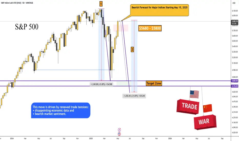
SP500: Bearish Forecast for Major Indices Starting May 15, 2025Bearish Forecast for Major Indices Starting May 15, 2025
The S&P 500, Dow Jones, Nikkei 225, and other major indices are poised to begin a significant decline, potentially as early as today, May 15, 2025, targeting a retest of the price lows from April 7, 2025, and possibly lower (S&P 500: ~4,802.20, Dow Jones: ~36,611.78, Nikkei: ~30,340.50).
This movement is driven by renewed trade tensions, disappointing economic data, and pervasive bearish market sentiment.
1. Fundamental Factors Driving Potential Decline
1.1. Renewed Uncertainty in Trade Policy
· The rally in indices on May 12–13, 2025, was fueled by optimism surrounding a temporary U.S.-China tariff reduction agreement (a 90-day truce) announced after talks in Switzerland on May 11, 2025. However, as of May 15, 2025, investor confidence may be waning due to a lack of tangible progress in ongoing U.S.-China trade negotiations.
Trigger for May 15: Recent reports highlight conflicting statements from the Trump administration, with earlier promises of new trade deals (e.g., a U.K. deal on May 8) followed by uncertainty. A Reuters report from May 14, 2025, notes that U.S. Trade Representative Jamieson Greer and Treasury Secretary Scott Bessent are meeting with Chinese officials, but no new agreements have been confirmed. If today’s talks yield no positive outcomes or if President Trump escalates rhetoric (e.g., reinstating higher tariffs), markets could plummet, as seen in early April when tariffs triggered a 15% drop in the S&P 500.
· Trade war fears disproportionately impact export-heavy indices like the Nikkei, which is sensitive to yen appreciation and U.S.-China tensions, and the Dow Jones, with its significant exposure to multinational corporations. A breakdown in negotiations could drive indices toward the April 7 lows as investors price in higher costs and slower global growth.
1.2. Disappointments in Economic Data
· CPI Reaction: The April 2025 Consumer Price Index (CPI), released on May 14, 2025, reported inflation at 2.3% annually, below the expected 2.4%. While initially viewed as positive, markets may have anticipated an even lower figure to justify Federal Reserve rate cuts. The modest S&P 500 gain (+0.7%) and Dow’s decline (-0.6%) on May 14 suggest investor skepticism about further inflation cooling.
· Producer Price Index (PPI) Release on May 15: The PPI for April 2025, scheduled for release at 8:30 AM ET (2:30 PM CEST) on May 15, 2025, is a pivotal event. If the PPI indicates persistent wholesale inflation—potentially driven by tariff-related cost pressures—it could signal rising consumer prices ahead, diminishing hopes for Fed policy easing and triggering a sell-off. A higher-than-expected PPI could echo the market’s reaction to mixed economic data in early April, when GDP contraction fears pushed indices lower.
· Consumer Sentiment: The University of Michigan Consumer Sentiment Index for May 2025, released on May 14, 2025, likely showed continued weakness (April’s reading was 52.2, a multi-year low). If the May figure, reported yesterday, declined further, it could amplify concerns about reduced consumer spending, negatively impacting corporate earnings and pushing indices downward.
1.3. Concerns Over Federal Reserve Policy
· On May 7, 2025, Fed Chair Jerome Powell highlighted heightened economic risks, citing “elevated uncertainty” due to trade policies. Markets are pricing in 75 basis points of rate cuts for 2025, with the first cut expected in July.
· Trigger for May 15: If today’s PPI data or other economic indicators (e.g., Initial Jobless Claims, also due at 8:30 AM ET) point to persistent inflation or economic weakness, expectations for rate cuts could fade, increasing borrowing costs for companies and pressuring equity valuations. This scenario would mirror April 7, when recession fears and tariff impacts drove the S&P 500 below 5,000.
2. Technical Analysis
· The initial impulse move saw a decline of approximately -21.87%, with a second impulse of similar magnitude (marked on the chart). Currently, markets are aligned for a simultaneous decline across asset classes: oil, cryptocurrencies, and major indices like the S&P 500, Dow Jones, Nikkei, and others.
· Previous analysis concluded that this is a correction preceding a broader decline in indices, driven by trade wars, geopolitical conflicts, and U.S. economic indicators. I believe a recession is already underway.
Price Targets for S&P 500 Decline:
➖ Retest of the April 7, 2025, low: $4,803.00
➖ Secondary target: $4,716.00
3. Market Sentiment and Behavioral Factors
3.1. Fragile Optimism Post-Rally
· The S&P 500’s 22% rally from April lows and the Dow’s 15% recovery were driven by trade truce optimism and strength in technology stocks (e.g., Nvidia, Palantir). However, Bloomberg reported on May 14, 2025, that Wall Street’s rebound is “showing signs of exhaustion” due to trade war risks and fears of an economic slowdown. This fragility could lead to profit-taking today if negative news emerges.
· The Dow’s weakness on May 14 (down 0.6% compared to the S&P 500’s 0.7% gain) highlights vulnerabilities in specific sectors (e.g., healthcare following UnitedHealth’s 18% drop), which could spread to broader markets.
3.2. Global Market Correlation
· Asian markets, including the Nikkei, exhibited mixed performance on May 14, with China’s CSI 300 up slightly (+0.15%) and India’s Nifty 50 down 1.27%. If Asian markets open lower on May 15 due to overnight U.S. declines or trade-related news, it could create a feedback loop, intensifying global selling pressure.
4. Mini Evidence-Based Framework for the Forecast
4.1. Catalysts for Today’s Decline (May 15, 2025)
PPI Data (8:30 AM ET): A higher-than-expected PPI could signal persistent inflation, reducing the likelihood of Fed rate cuts and triggering a sell-off. Consensus anticipates a 0.2% monthly increase; a reading above 0.3% could be bearish.
Trade Talk Updates: Negative commentary from U.S. or Chinese officials (e.g., no deal reached in Geneva) could reignite trade war fears, mirroring the April 7 sell-off.
Initial Jobless Claims (8:30 AM ET): An unexpected rise in claims (e.g., above 220,000 compared to the prior fmadd211,000) could signal labor market weakness, amplifying recession fears.
4.2. Global Scenario for S&P 500
· I anticipate a wave-like decline with intermittent corrections. I wouldn’t be surprised if the S&P 500 falls below 4,700, potentially reaching 4,200. Extreme caution is warranted this year.
· There’s even a theory that, starting in 2025, the U.S. dollar could lose 50% of its purchasing power.
Idea:
4.3. Oil and Geopolitical Outlook
I expect oil (Brent) to decline to the $50+/- range, from which an upward trend may begin, potentially tied to future military conflicts:
· Europe vs. Russia
· India vs. Pakistan
· Iran vs. Israel
SPX trade ideas
Weekly SPX Has A Bottom W Pattern Prompting More Upside!Hey Traders and Followers! SPX is going up!
Sounds crazy despite the tariff news floating around but charts never lie.
Here's what we got on the weekly SPX/USD; We have a bottoming W pattern. What's that mean? We going higher people.
5690.7 is the beakline area, price above invites bulls to a party.
Target for this long is at 6198.9 area. Support sits at 5579.4 for this one.
I'm letting you know about this party so up to you if you want to have a good time. See you all there with bells on and cash for all $ for those who show up.
Best of luck in all your trades $
Cheers!


3pm update SPX and GoldSPX has been in balance all day, I expect a breakout and failure around 5925-5930(where stops are). Pullback should start overnight and tomorrow if this happens. Gold has broken balance and has not recovered, but be wary of an attempt at bulls to try and regain it.

S&P500: VIX confirmed new Bull Cycle, eyes 9,800.S&P500 is on excellent bullish levels on its 1D technical outlook (RSI = 66.480, MACD = 76.110, ADX = 38.627) and has technically fulfilled all conditions to extend this recovery and transition into a new Bull Cycle. VIX shows with its massive spike and then aggressive retreat that the correction's bottom is in and is in fact similar to March 2020 (COVID) and March 2009 (subprime crisis). The Bull Cycles after those were similar, the smallest was +105.62%. In accordance to that, we have a long term TP = 9,800.
## If you like our free content follow our profile to get more daily ideas. ##
## Comments and likes are greatly appreciated. ##

SPX Short Trade idea. Short SPX target 2 days. buy a debit put spread 5880/5890. SPX is losing momentum and need to come down.

S&P500 vs BitcoinNormally, when the S&P500 goes into a bear market, Bitcoin follows.
This cycle, however, for the first time, the S&P500 went into a bear market, while BTC remained above its prior all time highs.
This cycle, Bitcoin either proves a new level of resilience among broader economic uncertainty, or a similar pattern is still yet to play out.
Bulls and Bears zone for 05-14-2025ETH session markets trending higher, could traders continue this week's rally or need to be cautious.
Levels to watch: 5912---5914
S&P 500 Index May Lose Upward MomentumS&P 500 Index May Lose Upward Momentum
Yesterday’s inflation data release held no major surprises, as the actual Consumer Price Index (CPI) figures came in close to analysts’ forecasts.
According to Forex Factory:
→ Annual CPI: actual = 2.3%, forecast = 2.4%, previous = 2.4%;
→ Monthly Core CPI: actual = 0.2%, forecast = 0.3%, previous = 0.1%.
Overall, stock indices rose yesterday, but according to media reports, this momentum may begin to slow in the near future:
→ UBS analysts downgraded their rating on US equities from “attractive” to “neutral” following the recovery from early April lows;
→ Goldman Sachs analysts believe that the US stock market rally could stall at current levels. In their view, the S&P 500 (US SPX 500 mini on FXOpen) is likely to reach 5900 over the next three months.
Technical Analysis of the E-Mini S&P 500 Chart
The chart provides more reasons to suggest that the current pace of growth may begin to slow.
Firstly, the index has entered a broad range between 5800 and 6120, where it spent a prolonged period during late 2024 and early 2025. This is a zone (highlighted in purple) where supply and demand previously reached a stable equilibrium — and similar balance could potentially emerge again.
Secondly:
→ the slope of the current upward channel (marked in black) appears excessively steep;
→ the RSI indicator points to a divergence;
→ the psychological level of 6000 may act as resistance.
Given the above, special attention should be paid to the scenario in which the S&P 500 (US SPX 500 mini on FXOpen) forms a short-term correction before the end of the month.
This article represents the opinion of the Companies operating under the FXOpen brand only. It is not to be construed as an offer, solicitation, or recommendation with respect to products and services provided by the Companies operating under the FXOpen brand, nor is it to be considered financial advice.

Upper Band Holds Post-Breakout - Classic Trend Signal in PlayDéjà vu? Not quite - but today’s session feels a lot like yesterday’s.
We’ve got a fresh mechanical bear trigger from a late-day Tag ‘n Turn setup. But much like the previous session, price action is telling us a different story.
Let’s walk through what I’m looking for.
---
SPX Market Briefing
Yesterday’s session started with a bearish bias. But by the end of the day, the market voided the setup via the hedge trigger - and since I wasn’t positioned bearish, it was a clear signal to flip bullish.
Same playbook again today.
I entered yesterday bullish and didn’t babysit the charts. Today, I’m starting with a bearish mechanical trigger, but futures are holding up. There’s also a post-breakout continuation in play that’s clinging to the upper Bollinger Band - a strong sign of bullish trending momentum.
Bollinger himself suggested this as one of the most reliable signs of strength.
So what’s the move?
Bearish trigger? Yes.
Bear entry? Not yet.
I’ll defer bearish entries unless price breaks below the 5880 area, with a v-shaped entry.
If price stays above 5910, I’ll resume bullish activity as needed.
This is shaping up to be another go/no-go decision day - no need to guess, no need to jump early.
Let price make the choice. I’ll respond when it does.
GEX Analysis Update
5900 is looking like the key GEX level again.
---
Expert Insights:
Mistake: Taking every mechanical setup without confirming price action
Fix: Use price structure (like Bollinger Band holds) to confirm trend integrity
Mistake: Jumping in without clear invalidation levels
Fix: Predefine bull/bear flip zones - today: 5880 and 5910
Mistake: Over-monitoring slow sessions
Fix: No need to stare at charts - mechanical setups do the heavy lifting
---
Rumour Has It…
Bollinger Band Declared Emotional Support Tool
Sources say traders have begun using the upper Bollinger Band like a weighted blanket. “As long as we’re above it,” one trader whispered from beneath a desk, “I feel safe.”
Psychologists confirm it's become a market-wide security blanket, replacing support/resistance zones in all therapy sessions.
This is entirely made-up satire. Probably!
Breaking scoops courtesy of the Financial Nuts Newswire-because who needs sanity?
---
Fun Fact
John Bollinger designed his bands in the early 1980s - not just to spot reversals, but also to identify sustained breakouts.
When price hugs the upper band after a breakout, it’s often signalling continuation, not exhaustion. It’s a feature of trend momentum, not a warning of collapse.
Today’s chart is textbook.
The system gives us the setup. But the context? That’s where discretion adds juice to the edge.

S&P500 Short: Update to Wave StructureAs mentioned, this is the 4th attempt to catch the peak for S&P500 (and Nasdaq). Over here, I break down the details of the wave structure to the subminuette level at the final wave. I believe this to be the final peak given that I do not see any more extension possible without changing the entire up-move wave labelling.
As usual, manage your risk and use a stop loss above the end of Wave Y.
Good luck!

SPX 500 Downtrend MovementGreetings Traders this is my analysis on SPX500 and it is Short
📊 Overview:
Current price: 5,901 (in the opening zone of the short position).
The analysis points to a short strategy — the author predicts a price decline with the opening of a position between 6.009 and 6.023, aiming for 5.394–5.392.
🟩 Zone of resistance (Resistance level):
Major resistance level: 6,153.39
Price has reacted at that level in the past and has previously been rejected, making it a strong psychological and technical barrier.
🟨 Entry and Expectation Zone:
Open Position zone: 6.009–6.023 (brown zone)
Expected reaction: short signal, if the price is likely to bounce off the resistance and head lower
"First Top" and "Breakout" formations are observed, which is often a sign of a subsequent decline
🔻 Anticipated correction:
Target zone: 5.394–5.392
It is the previous levels of consolidation and the possible target of a short position
An arrow is shown predicting a price drop from the current level
🔴 Support Zone (Support Level):
Main support: 5,091.52
If the price breaks through the target level, it can even go down to this support
🧠 Technical elements:
Elliott Wave marks the completion of the impulse and corrective phase, suggesting the end of the upward wave
Impulsive movement and a drop in price indicate the possibility that the current correction will end and the price will move downwards again
A possible support area has already been tested, but it may be active again
🧩 Conclusion:
Strategy: short entry at ~6,010–6,020
Stop loss should be above 6,153 (above strong resistance)
Target: 5,394 (possible continuation of downward trend)
The plan is based on price action analysis, waves and recognition of key zones
Dear Traders like,comment let me know what do you think?

SP500 Time to be bearish againWatch out bulls, don't play hero. Bears are around the corner.
Probably gap up again tomorrow and push to 5937 and that's it because bears time is coming into play to take price down to 5760 and by the end of next week it should be around 5675 (if not sooner). Buckle up ladies and gentlemen we are going into a wild...wild ride.

S&P 500 Index Most Bullish Signal In 15 YearsThis is why it is very clear, certain, that the stock market, the S&P 500 Index (SPX) is set to grow in the coming months. Last week produced the highest volume session, on the bullish side, since April/May 2010, that's 15 years. Back then, when this signal showed up, this index went to grow for years non-stop.
The SPX also produced the strongest weekly session in several decades, maybe the strongest week ever, and a bounce happened (support found) exactly at the 0.618 retracement Fib.
This is all we need to know. When the bulls enter the market and do so with force, it is because the market is set to grow. The correction produced decline of 21%. This is pretty standard. The fact that the correction happened really fast, it means that it will also have a fast end.
The low is in. The correction is over. The S&P 500 Index is set to grow.
You can be certain. If you have any doubts, just ask the chart.
Namaste.

The S&P 500 Is About to Drop — The Real Rally Comes in July!S&P 500 Market Outlook: Navigating the Path to a Bullish Breakout by June 2025
At Vital Direction, we are committed to delivering precise and forward-looking market analysis rooted in deep technical expertise. Our current evaluation of the S&P 500 indicates that the recent upward movement is not the beginning of a true bull market. Rather, it reflects a counter-trend rally that is approaching exhaustion. We firmly believe that the market is preparing for a significant decline in the short term, followed by a prolonged sideways consolidation, before initiating a genuine, powerful bull market in late June 2025.
Elliott Wave Analysis: A Classic Counter-Trend Structure
Our Elliott Wave analysis suggests that the S&P 500’s recent rally has been corrective in nature, comprised of only three waves — a classic hallmark of a counter-trend move. This pattern lacks the five-wave impulsive structure typically associated with sustainable bull markets. From our vantage point, this confirms that we remain in a larger corrective phase.
We anticipate that a sharp retracement is imminent, one that may unfold over the coming days and weeks, ultimately transitioning into a period of sideways price action until mid-to-late June 2025. Only thereafter do we foresee the conditions forming for a new all-time high and the emergence of a powerful bull leg.
Gann Theory Timing: Imminent Market Top
Our Gann timing model aligns precisely with this forecast. We have identified this week as a critical timing window for a potential top in the S&P 500. Once this pivot is confirmed, we expect the index to enter a steep downward phase. From a Gann perspective, this is a natural part of the market’s cyclical structure — a necessary clearing phase before the next long-term advance.
US Bond Yields: A Telling Risk-Off Signal
One of the most overlooked — yet crucial — factors supporting our bearish near-term view is the behaviour of US bond yields. Charts clearly show that bond yields are breaking out to new highs, a significant development that suggests institutional and “smart money” investors are positioning defensively. This is not a characteristic of a “risk-on” environment.
When yields rise, particularly amidst equity euphoria, it typically indicates that investors are seeking safety and yield rather than embracing equity risk. This divergence is a red flag that supports our conviction: the equity rally is unsustainable, and a meaningful correction is near.
Seasonality Supports the Retracement View
Historical seasonality trends for the S&P 500 further validate our analysis. Data indicates the following typical market behaviour:
Mid-May to Late May: Downtrend
Late May to Mid-June: Temporary uptrend
Mid-June to Late June: Another corrective phase
From Late June Onward: Start of the next major bullish cycle
This seasonal rhythm perfectly mirrors what we see technically: the market is preparing to reset before beginning a strong ascent in July 2025, building into a full-fledged bull market by late June.
The Broader Picture: Beyond US-China
While some market optimism has emerged on the back of renewed US-China tariff discussions, we caution against over-reliance on this narrative. The market appears to be ignoring the broader geopolitical context, including the absence of any clear tariff agreements between the US and Japan — another major global economic player.
The complexity of global trade negotiations introduces substantial uncertainty, which may continue to weigh on investor confidence. Until such macroeconomic factors are stabilised and digested by the market, we do not anticipate a truly risk-on environment.
The Road Ahead: A Strategic Pause Before Ascent
In conclusion, Vital Direction maintains its firm stance: the current market structure does not yet support the onset of a sustained bull market. A meaningful retracement is necessary and, indeed, healthy for the long-term health of the market. We expect this corrective period to unfold over the coming weeks and months, culminating in a sideways consolidation until late June 2025 — the point at which we foresee the S&P 500 transitioning into a highly bullish environment, with the potential to reach new all-time highs.
We will continue to monitor the technicals, macroeconomic developments, and global capital flows to provide our clients with the most accurate and actionable insights. The bull is coming — just not yet.

Bullish S&P500The S&P 500 is showing strong behavior again today, which suggests investors remain optimistic about the market's overall direction.
That said, the price is starting to look overextended from the 10 EMA and is now touching the Bollinger Bands. This usually signals that a pullback is likely, even if it's just a minor one to the 10 EMA. Of course, we can never predict exactly how the market will move—but when that pullback happens, it often brings better entry opportunities on individual stocks, helping us position ourselves more effectively.
As always, remember that trading carries risk. Be mindful with your entries and apply solid risk and money management to protect your capital and avoid being wiped out by unexpected market moves.

U.S. Bulls Take Charge: S&P 500 Set to Break OutHello,
📊 S&P 500 Market Outlook – Pro-Bullish Perspective
🔥 Market Recap: The S&P 500 recently saw a significant dip, marking a 1-year low at 4805.92, largely attributed to the shockwaves caused by President Trump’s sweeping tariff announcement on April 2. This move sent markets into a tailspin, creating heightened volatility levels not seen since the early pandemic days.
However, savvy traders recognized opportunity amidst the panic and entered strategic buy zones around those lows. Since then, the index has managed to stabilize above key technical levels, signaling potential bullish momentum building from the ground up.
🧭 Current Key Technical Levels to Watch:
1W Pivot Point (PP): ✅ Holding above 5224.13
1D Pivot Point (PP): ⚠️ Testing resistance at 5297.05
1M Strong Support/Resistance: ⛔ Acting as resistance at 5329.31
🚀 Bullish Confirmation Pathway:
To fully confirm a bottom-up bullish reversal, we’re looking for:
✅ Sustained close above the 1D PP @ 5297.05
✅ Break and hold above the 1M Resistance @ 5329.31
✅ Momentum toward the 1Y PP @ 5550.97
If these levels are conquered with conviction, it opens the door for an extended upside move toward 5878.58, aligning with a broader bullish sentiment.
🛑 Cautionary Downside Scenario:
Although currently less likely, a failure to maintain support above the 1W PP @ 5224.13 could reopen downside risk in the short term. We remain watchful of that level as a bull-bear pivot.
🌐 Macro Overview – Tariff Shock & Earnings Spotlight:
Trump’s abrupt tariff move has reshuffled the global economic deck, and investors are still processing its implications.
The S&P 500 is currently down ~14% from its February highs, but showing resilience.
Earnings season is now center stage, with major players like Tesla, Alphabet, IBM, and Boeing under the microscope.
⚠️ Volatility Index (VIX) is down from post-tariff highs (~60) to ~30, still elevated from the long-term median of 17.6, signaling cautious optimism.
💬 CEO Sentiment Matters:
As JJ Kinahan from IG North America noted:
“The view of CEOs going forward has never been more important.”
With traditional guidance uncertain, investors are leaning on transparent, scenario-based outlooks like United Airlines’ “dual roadmap” approach.
🔋 Magnificent Seven on Watch:
Alphabet: -20% YTD
Tesla: -40% YTD
These leaders are key sentiment barometers. If they bounce, the broader market is likely to follow.
🏛️ Fed & Trump Tensions:
Trump recently stated that Fed Chair Jerome Powell’s termination “cannot come fast enough,” pushing for rate cuts.
Powell, however, remains cautious, citing the need for more economic data before acting.
✍️ Final Note – A Cooling Tariff War?
💬 According to Trump’s latest statement, the tone around tariffs is beginning to cool, hinting at possible de-escalation.
This development adds further bullish tailwinds to the broader market outlook.
✅ Summary:
We are leaning bullish here with the base-building process in motion. Key levels are aligning, volatility is easing, and clarity from corporate earnings could be the catalyst to propel markets upward.
Watch for a clean breakout above 5329 — that’s where the real confirmation begins. Eyes on the prize: 5878.58 👀📈
The Support and Resistance outlined in green and red are the respective support/resistance for this pair currently for 1M-1Y timeframes!
No Nonsense. Just Really Good Market Insights. Leave a Boost
TradeWithTheTrend3344

S & P Index - Volatality Magic StudyThis is for the study purpose based on the index volatility and the level are based on no of points it can move within the short span of time.
Quick preview 5-13The Market is still 50+ points from the Bollinger Band, now that it's moved up. However, we're in a channel and a breakdown of the channel may be significant. Trend is still up and the bias is as well. If we are to break below the 200 ma and the 18 weekly, bears would have to step in very soon. Otherwise we will continue to push up.

US500 - Let the Bulls Strive!Hello TradingView Family / Fellow Traders. This is Richard, also known as theSignalyst.
📈US500 has been overall bullish trading within the rising channel marked in red.
Moreover, the blue zone is a strong support and structure!
🏹 Thus, the highlighted blue circle is a strong area to look for buy setups as it is the intersection of support and lower red trendline acting as a non-horizontal support.
📚 As per my trading style:
As #US500 approaches the blue circle zone, I will be looking for bullish reversal setups (like a double bottom pattern, trendline break , and so on...)
📚 Always follow your trading plan regarding entry, risk management, and trade management.
Good luck!
All Strategies Are Good; If Managed Properly!
~Rich
Disclosure: I am part of Trade Nation's Influencer program and receive a monthly fee for using their TradingView charts in my analysis.

S&P500 Alert! Entering a medium-term SELL ZONE!The S&P500 index (SPX) has recovered the 0.786 Fibonacci retracement level, limiting the Trade War losses considerably. Trading this week above its 1W MA50 (blue trend-line), the index has confirmed that it resumed its long-term bullish trend.
On he medium-term though attention is needed as we're headed towards a range, which in the past 10 years has historically been an interim Sell Zone. That's the 0.786 - 0.9 Fibonacci range, which since the 2016 correction, it has always rejected the uptrend of a 1W MA200 (orange trend-line) led recovery.
On 3 out of 3 occasions so far (April 2016, June 2020, July 2023), every time the price tested the 0.9 Fib, it got rejected back to its 1W MA50 (blue trend-line). In 2023 the pull-back bottomed in 3 months but in 2020 and 2016 it took considerably less.
As a result, we call for caution near the 0.9 Fib for a potential medium-term pull-back but on the long-term the bullish trend is intact and historically it targets a minimum +27.74% from the All Time High (ATH), which is translated into a 7800 Target.
-------------------------------------------------------------------------------
** Please LIKE 👍, FOLLOW ✅, SHARE 🙌 and COMMENT ✍ if you enjoy this idea! Also share your ideas and charts in the comments section below! This is best way to keep it relevant, support us, keep the content here free and allow the idea to reach as many people as possible. **
-------------------------------------------------------------------------------
💸💸💸💸💸💸
👇 👇 👇 👇 👇 👇

Market has shifted to a lower rising channel. Correction dueI believe the market has discounted the tariff effect and now shifted to a lower channel.
If that is the case, then a normal correction of 5% is imminent, as it encounters multiple resistance trendlines. The inflation (CPI) numbers on 13 May could be a catalyst

S&P500 Short: Update on wave counts, Completion of WXYThis is my 3rd attempt to call the correction peak for S&P500 or Nasdaq (I use them interchangeably). From the previous short idea using Nasdaq, I mentioned that the reason for the invalidation of the previous idea is due to the last wave 5 of C of Y to extend into a 5-wave structure.
Over here, the short position will be stopped out if a new high above wave Y is hit. I offered 2 conservative targets in this short idea and suggests that one can reduce position and shift stop loss when the first conservative target is reached. I also mention that if this WXY wave structure is the correct call, then the big picture is really that S&P500 will crash below 4800.
Good luck!
