Three Percent Trades: Educational PostThis is an example of how we calculate range movements on a breakout. It comes down to simple math to calculate a measured move.
We simply take the high and subtract it from the low of the range. Then you add the high plus the difference to get your measured move.
If the trade moves in your favor you will want to add to your winners as it trends higher. You should add to your position on future breakouts of consolidation, and on any sign of weakness we sell half our shares to lock in profits and play with house money.
Following this will help protect your hard earned capital and allow you to let your winners run.
Oil

EW Analysis: OIL + EURUSD + BTCUSD In Positive Correlation?!Hello traders!
Today we will talk about correlations in different markets!
Correlations are very important to recognize the direction. There are positive and negative correlations, but what we currently see in the FX market (EURUSD), Commodity market (Crude oil) and Cryptocurrency market (BTCUSD) is that they are in tight positive correlation! So, if we respect what market is doing and considering Elliott Wave bullish setups, then we can expect a bullish continuation for the next few weeks soon!
As you can see, Crude oil has clear five waves up and three waves of correction back to very important 50%-61,8% Fibonacci retracement, which means that it's already formed a bullish setup and it may easily continue higher in the upcoming sessions!
EURUSD is still forming the final wave (c) of a correction that can retest 50%-61,8% Fibonacci retracement and 1.1000 support level at the beginning of the next week, from where we can expect to follow Crude oil within an uptrend!
And looking at BTCUSD, just like EURUSD, it can be ready for a decline into wave (c) to a complete a three-wave corrective setback, where 50%-61,% Fibonacci retracement and 10000 level can be tested before an uptrend resumes together with Crude oil and EURUSD.
That being said, there are no tick by tick correlations, but from our experience, they always somehow get caught in the end.
However, there's nothing confirmed yet, but if Crude oil stays above wave (c), and if in the meantime EURUSD and BTCUSD bounced from projected support levels in an impulsive manner, then we can easily confirm a bullish continuation!
Be humble and trade smart!!
Disclosure: Please be informed that information we provide is NOT a trading recommendation or investment advice. All of our work is for educational purposes only.


SUPPORT AND RESISTANCE A major mistake traders make is to assume that in order to be profitable you need to use so many tools and it's in fact the opposite.
Let's start off with basic support resistance. We know the market moves up, down and side ways. But it never moves straight up or down. As it moves up or down it will meet levels of support and resistance. It's important you understand where these levels are on which ever pairs you trade.
SUPPORT - you will meet points of support mainly in a downtrend. As pointed out above, you can see there are more points of support than resistance. So remember support will appear below price, below the candlesticks. see it as the floor of the chart.
RESISTANCE - You will meet points of resistance mainly in an uptrend, support is the 'roof' it will appear above price. Price meets head on with resistance levels.
Previous support/resistance turning into future resistance/support - Previous support can turn into future resistance, this is where price will break through this support in a downtrend and the come back and retest this level ( as shown in the chart above) . This previous support is now resistance. This also applies the other way around.
Support and resistance levels are points within the market where price will pivot. There are also levels in the market where price will gain momentum before continuing a move.
You always want to plot these levels on the higher time frames as the levels on the higher time frames will hold more significance. i.e. support on the daily time frame will hold a lot significance than support on the 1hr time frame.
Hit that follow button for more stuff to come..

A Renko Strategy for Trading - Part 8This is intended more as educational material on a strategy for using renko charts. To begin with, I'll be using USOil in the examples but will include other markets as I continue through the series. The material is not intended to prescribe or recommend actual trades as the decision to place trades is the responsibility of each individual who trades as they assume all risks for their own positions and accounts.
www.investopedia.com
Chart setup :
(Part 1)
Double Exponential Moving Average (DEMA) 12 black line
Double Exponential Moving Average (DEMA) 20 red line
Parabolic SAR (PSAR) 0.09/0.09/.23 blue circles
Simple Moving Average (SA) 20 blue line
(Part 2)
Stochastics 5, 3, 3 with boundaries 80/20 dark blue/light blue
Stochastics 50, 3, 3 with boundaries 55/45 red
Overlay these two on one indicator. Refer to 'Part 2' as to how to do this
(Part 3)
True Strength Indicator (TSI) 14/4/4 dark blue/ red
Directional Movement Indicator DMI 14/14 ADX-dark green, +DI-dark blue, -DI-red
Renko Chart Settings
Crude Oil (TVC:USOil): renko/traditional/blksize .05/.10/.25
Natural Gas (ngas): renko/traditional/blksize .005/.010/.025
Soybeans/Wheat/Corn (soybnusd/wheatusd/cornusd): can use the ngas setup
S&P 500 (spx500usd): renko/traditional/blksize 2.5/5.0/12.5
Euros (EURUSD): renko/traditional/blksize .0005/.0010/.0025


CRUDE OIL OBSERVATION OVERVIEWPlease be aware mostly visual demonstration, any verbal descriptions comes at the end when drawing harmonics.

A Renko Strategy for Trading - Part 7 Refactor/RefinementThis is intended more as educational material on a strategy for using renko charts. To begin with, I'll be using USOil in the examples but will include other markets as I continue through the series. The material is not intended to prescribe or recommend actual trades as the decision to place trades is the responsibility of each individual who trades as they assume all risks for their own positions and accounts.
(Part 1)
Double Exponential Moving Average (DEMA) 12 black line
Double Exponential Moving Average (DEMA) 20 red line
Parabolic SAR (PSAR) 0.09/0.09/.23 blue circles
Simple Moving Average (SA) 20 blue line
(Part 2)
Stochastics 5, 3, 3 with boundaries 80/20 dark blue/light blue
Stochastics 50, 3, 3 with boundaries 55/45 red
Overlay these two on one indicator. Refer to 'Part 2' as to how to do this
(Part 3)
True Strength Indicator (TSI) 14/4/4 dark blue/ red
Directional Movement Indicator DMI 14/14 ADX-dark green, +DI-dark blue, -DI-red

A Renko Strategy for Trading - Part 5This is intended more as educational material on a strategy for using renko charts. To begin with, I'll be using USOil in the examples but will include other markets as I continue through the series. The material is not intended to prescribe or recommend actual trades as the decision to place trades is the responsibility of each individual who trades as they assume all risks for their own positions and accounts.
Chart setup:
(Part 1)
Double Exponential Moving Average (DEMA) 12 black line
Double Exponential Moving Average (DEMA) 20 red line
Parabolic SAR (PSAR) 0.09/0.09/.23 blue circles
Simple Moving Average (SA) 20 blue line
(Part 2)
Stochastics 5, 3, 3 with boundaries 80/20 dark blue/light blue
Stochastics 50, 3, 3 with boundaries 55/45 red
Overlay these two on one indicator. Refer to 'Part 2' as to how to do this
(Part 3)
True Strength Indicator (TSI) 14/4/4 dark blue/ red
Directional Movement Indicator DMI 14/14 ADX-dark green, +DI-dark blue, -DI-red

A Renko Strategy for Trading - Part 1This is intended more as educational material on a strategy for using renko charts. To begin with, I'll be using USOil in the examples but will include other markets as I continue through the series. The material is not intended to prescribe or recommend actual trades as the decision to place trades is the responsibility of each individual who trades as they assume all risks for their own positions and accounts.

Master the Simple Inside Bar Pattern
hey guys,
on WTI we have a perfect example of Inside Bar candlestick pattern on a daily chart.
An inside bar is a series of bars or sometimes just one bar that is contained within the range of the preceding bar (mother bar).
The first rule that we should take into account is that inside bars must have a higher low and lower high than the mother bar.
The second rule is that we trade this pattern only after bearish or bullish breakout of a mother bar trading range.
The logic behind inside bar is simple. It indicates a time of indecision and market consolidation. Inside bars typically occur as a market consolidates after making a large directional move (bearish on WTI), you also can see this pattern at key decision points like major support or resistance levels.
For WTI our plan is to wait until a violation of a trading range.
Remember that the candle MUST close below or above the range before we take any action!

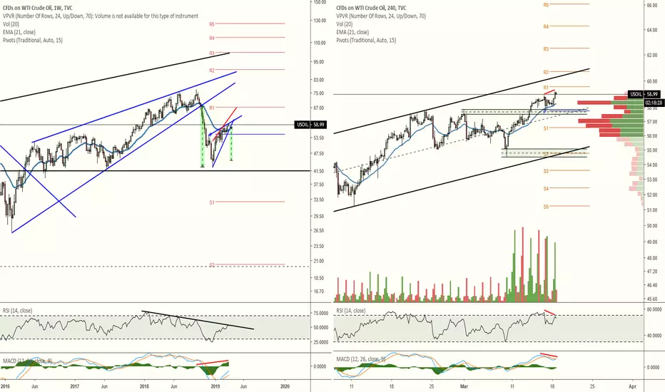
US Oil: A big challengeUS Oil presents some serious challenges for those looking to short this market.
This analysis is time frame dependent. Which way you might want to go depends entirely on trends in respective time frames.
DAILY PICTURE
1. On the daily time frame this is very much a bull market. We can see that in the ATR (amber trendline) and the green Guppy investor zone.
2. On the daily price has made a temporary retreat to near ATR support, in a parabolic limb of the curve.
3. If anything this is usually a place to go long (on this time frame).
4H - FOUR HOURLY PICTURE
1. There is an early trend switch for the south.
2. This is seen on the ATR and SQM (Squeeze momentum).
3. But it isn't as yet a Grade A or Grade B switch.
DECISION-MAKING (Speculative issues)
1. Finding appropriate entry point on a chosen time frame.
2. For a limited hit going long (north) on the 4H, taking a reasonable stop loss and taking only about a 26 or 38.2 Fib retracement of the most recent daily candle.
3. For a limited hit going short (south) on the 4H, a larger stop-loss is required.
4. Possibly going long on the daily and hold out.
As usual before starting any trade on any time frame common things need to be decided:
1. Time frame one will stick to (1D, 4H or something else).
2. Entry position.
3. Stop-loss.
4. Exit position.
Stop-losses on 4H and less need to cater for short spikes in price. So simply saying 2.5 times ATR may not be enough.
Based on experience only of US Oil, I can expect a recoil up on the 4H but of course, I can't predict how much. As mentioned above I can expect at least a 26% Fib on the length of the last daily candle. Expectation is not prediction.
Declaration : This post is for educational purposes only. Nothing here is intended as advice. Your losses are your own should you still construe this as advice, act on it, and lose money.

MY LEADING INDICATORS IN USE!Made this for someone in the chatbox, but thought newbies or so may find it helpful to try out themselves too, so bon apetite all.
P.S. if i ignore any questions after today then it is because today is my last day off work. After this, it is back to being a slave to the system lol.

OIL TRADING CHANNEL This is the channel oil is obviously following, trade within and watch out for a future break in trend.
Warning; trading comes with risks, trade safely and within reason. All charts to be used for guideline purposes only.

OIL TARGET REGIONS MAPPED OUTOil on the 1day view and possible targets outlined, trade within and/or watch out for a future break in trend.
If oil does stay within channel then expect a drop from around 60.90 - 61.30
If market breaks up then next big target region 67.60 - 68.00
Warning; trading comes with risks, trade safely and within reason. All charts to be used for guideline purposes only.

USOIL headed downWeekly chart shows price nearing the apex of the ascending wedge with a target of $45. RSI is hitting resistance and MACD's histogram is possibly printing hidden bearish divergence.
H4 chart shows RSI, and possibly MACD, printing bearish divergence. The nearby demand has already been tapped once making it much easier for the next drop into it to potentially fall further. I would watch for the demand below that at around $55 to provide some support. It also aligns with the ascending channel's support. If that support cannot hold then, based on the height of the ascending channel, we should be looking at $49.70/$50 for the next likely support. That target is a mere $5 away from the weekly breakdown target.
take a look at how a pin bar can indicate a possible downtrendIn the chart above,
we have a bullish pin bar that formed on the USDJPY weekly chart.
.This pin bar formed at a previous resistance level,
which is now acting as support.
This price action signal tells us that the market is likely to see higher ground in the weeks ahead.
"BUT" instead of trading the weekly time frame,
we can move to the daily chart and watch for bullish price action.
If you want to learn a consistent traidng method, let me tell you that you are lucky because you come to the right
place.i helped thousands of beginner traders become profitable.i have one of the most powerful
trading method in history, it is simple, easy, and very profitable.if you are interested contact.

Correlation Trading EUR/USD/ DAX/ OIL/ GOLDHey guys,
after a time of inactivity I"m back.
Today I show you how you can trade EUR/USD with the help of correlations.
You can see in the chart positive correlations and negative correlations.
Be careful the arrows on the chart are no trend direction.
If for example Oil change its direction the trend direction is turned.
But be careful with long term-trends and short- therm trend.
Always be aware of your timeframe.
(4h is short therm trading)
Hope I could be informative for you guys

Pattern Analysis; incorporating timeframes (USOIL)Understanding trends within a pattern gives analysts the ability to better understand sentiment and directional pressure.
In this example, pattern extremities were highlighted. Then, on a lower timeframe, trends within said pattern drawn.
Overlaying timeframes is a necessary part of a complete analysis, and a complete commodity analysis can help piece together economic factors affecting commodity-sensitive currencies such as CAD and AUD.

Correlation Coefficient + CCIPictured above is a graph of Royal Dutch Shell vs brent crude, the correlation coefficient between them, and the commodity channel index tracking the volume weighted moving average of Shell.
I tested this indicator on a few energy stocks: RDS, MRO, BP and XOM. Negative correlation between brent crude and an energy stock coupled with an overbought CCI seems to give an indication of price reversal. Here we see two overbought CCI readings coupled with negative correlation, both followed by massive drops in the price of BCO and RDS. Likewise we see negative correlation coupled with upward CCI readings pointing to massive price rises in RDS. Seems to work on daily time frame as well but indicator length will need to be tweaked accordingly.
Correlation coefficient going negative is an indication of pricing inefficiency and momentum potential, but does not give us an indication of price direction. The commodity channel index can give us a sense of where price momentum is pointed. Both put together give us a powerful indicator capable of foreshadowing both momentum and direction.

Ben Wright's 3 Essential Trading Routines!! MUST SEE!!SELF DEVELOPMENT/METHODOLOGY/PSYCHOLOGY
Below are 3 essential trading routines that i follow on a daily basis. This has been a critical component to my success.
Morning Routine
1. Meditation (10 Mins)
2. Gratitude
3. Trading Affirmations (2 Mins)
• I am a successful trader
• I have a very strict risk management plan
• I use a trading journal
• I am unemotional about profits or losses
• I am patient and let high probability trades present themselves to me
• I am happy to take a profit and will not be greedy
• I have an edge and I trade it effectively and decisively
• Losses are a part of my trading
• I am relaxed and confident about my trading at all times
• I do whatever is necessary to win at trading
• Discipline means I follow my trading rules and manage my risk
• I am highly focused
• I am in total control at all times with my trading
• I am a master trader
• I am not stressed about relying on trading money to provide for the family
4. Visualization (Goals & Perfect Trading Day) (10 Mins)
5. Priming – (30 – 60 Sec cold shower)
Shocks your body system and activates endorphins
6. Motivation & Stretching (10 Mins)
Pre-Trading Routine
1. 3 Deep breaths
2. Gratitude
Night Routine
1. Read (30 Mins)
2. Affirmations (2 Mins)
3. Gratitude
4. Visualization (Goals & Perfect Trading Day) (10 Mins)
Happy trading :)
Follow your Trading plan, remained disciplined and keep learning !!

OIL - The Key Indicator to an Imminent Global RecessionEverything is linked to the price of oil. Our food, our phones, our computers, our clean water, our electricity, everything we use each day is dependant on oil.
If oil prices were to pump due to a new peak (which is inevitable), the price of everything will climb. As a result, it will reach a point where we can't afford to consume the same amount of things, slowing down our industrial activity.
2008 was a crisis, meaning our governments managed to fix the issue on the short term. However, during that period, food industries were struggling, and famines happened in several countries. To solve this problem, they had no other choice than shutting down the price of oil to restart the machine.
In 2014, thanks to our advanced technique of extraction, global production exceeded demand, and the price fell by itself.
However cheap oil is becoming rarer and demand is not decreasing. We will see price climbing slowly at first, and like an exponential curve, will be able to very quickly climb up to new highs, and who knows what will happen then? How long are we going to be able to answer the demand that seems to be in a no-limit growth?

#EURNOK and #UKBRENT #UKOIL CorrelationWhen we look at correlations in charting, we sometimes see certain #FX pairs are correlated to a #commodity or #index, in this instance I am giving you an example of #EURNOK vs #UKOIL #BRENT. These charts can help you make distinctions in the trend of the commodity, so when we see a #bullish EURNOK, you want to be looking a trades that are bearish Brent/UKOil, again this is not tick for tick, so, you will use confirmation like trendlines, underlying fundamentals etc. But you can clearly see the correlations. I suggest you try this with other markets, like #USDNOK #WTI #USDJPY #NIKKEI #SPX #10YR
