Smart Money Concepts (SMC)Introductions:
Before explaining the functions of this indicator to you, we need to talk about what theoretical knowledge we need to have. Many different price approaches have been developed over the decades with different analysis methods and are still evolving. Some theories used in classical trend analysis methods are interpreted or blended with different perspectives over time and we try to make more successful analyses by having a consistent market reading strategy. While analyzing the classical market structure with the price action method, some issues that are missing and do not fit into place are brought to light with a higher level analysis method known as the smart money concept.
As a result of the research and developments we have done on this subject from many different sources for a long time, I personally think that the most efficient and logical concept is the smart money concept. Of course, no matter which method we use, acting within a risk management and remaining strictly loyal to our conditions should be our first priority so that we can talk about sustainable success in the market. In light of all this, we decided to make an indicator of this concept, which we believe is consistent.
In order to analyze the market structure correctly, we must first draw fractal structures and interpret them correctly. Because the market consists of fractal structures. Regardless of the technique, if we cannot draw fractals correctly or if we make an incorrect interpretation while determining them, our market structure analysis may also be incorrect.
Instead of manually identifying fractal structures, script writers often choose the following method for ease of use; They leave the number of candles to the user's choice, detect the highest and lowest points among x number of candles, and draw fractal structures accordingly, but in fact this is not an accurate detection method. In the visual I have prepared below, you can see how the correct fractal structures should be drawn. Fractal structures should be made based on the previous and next candle levels, not from a certain group of candles.
To identify market structures, we make an interpretation based on these fractal movements.
While classic market structure analysis with traditional price action follows a relatively simpler path as shown in the example below, this situation is a bit more detailed in the smart money concepts.
To explain the situation in the smart money concept in an easily understandable way, it is as follows; imagine an uptrend that progresses by creating levels HH and HL, when the price creates a new HL, we call this point as inducement and we move this level up as each new HL is formed. When drawing structures in this way, when the price falls below the inducement level, the peak is confirmed. To explain it with a different approach, the price must first get liquidity from these last rising bottoms in order to make a break of structure (BOS). The break of structure occurs when the price passes the approved peak. When BOS occurs, the lowest point between this point and the previous peak is defined as the Swing Low and this is the level that needs to be protected in uptrend. When BOS occurs, the last HL point that made this BOS is also defined as inducement and it continues to move as new HL is formed until the new peak is confirmed. If the price somehow "closes" below the Swing Low point that needs to be protected, CHOCH (change of character) has occurred and the trend direction has changed. After CHOCH, we start applying the same logic for the downtrend, the last LH peak formed after is defined as inducement and as the fractal structure continues downward, this level is also carried as the inducement level until the Swing Low level is determined. An important note is; In order for BOS and CHOCH to be valid, "a closing must definitely occur". If it remains in the form of a wick, we call it a liquidity sweep and the end point of this wick is updated as the point where we need to look for a closing in order to be able to say that the BOS or CHOCH level is determined. By the way, We call these liquidity sweep points as "x" in the indicator.
It may be easier to explain this topic with a few sample images that I have shared below.
The thing to consider in the smart money concept is that if you are going to take a long trade in an uptrend, you should wait for the price to fall below the inducement level or if you are going to take a short trade in a downtrend, you should wait for the price to rise above the inducement level and only then look for suitable structures, order flows, order blocks, price gaps and other structures before this are considered traps in this concept. I have some strategies that I personally apply, but since these are my personal preferences, I do not find it right to share them here in order not to affect your opinions, but I am basically careful to act as I stated above.
While preparing this script, we paid attention to the fact that it can be interpreted with a real human eye, provides ease at the speed of machine language and can work extremely flawlessly.
From the first moment we started preparing the script, we went through a long and seriously laborious preparation process that lasted months until now, which we happily share.
We brought this code to life by putting on the table almost everything the user may want in terms of both flawlessly fulfilling the conditions specified by the concept and convenience.
If we touch on the function of the code in order, our code finds the following;
It perfectly identifies the fractals that form the basis of the market structure, within the framework of the rules that I mentioned above, we taught to the script.
According to smart money concepts, as I explained in detail above, it provides great convenience in this regard by skillfully identifying the direction of the market in the time period you are in, rather than traditional methods.
In addition to identifying the direction of the market, it also detects the direction changes taking place in the internal structure. Indicator tries to detect even the slightest direction changes by making a stricter interpretation while determining the trend and bottom-top points in the internal structure. Theoretically, it determines the top point in a downward fractal breakout, and marks the bottom point in an upward fractal breakout.
In this context, it also uniquely identifies the candle flow direction and we can observe it on the table. I explained this issue in the first image about fractal determination, you can read that part again.
When you identify swing structures correctly, you will also determine the area you need to focus on, and we have also included this in the script.
Another one of our favorite features on the chart is that it can show active swing areas live by following the BOS, CHOCH and Inducement lines. So, I believe that this gives it a more professional appearance.
In the light of all these functions, it provides great ease of use while presenting data on the direction of the market in a table not only in the current time frame but also in 6 different time frames that the user can choose according to his/her preference, including seconds timeframes (1 sec., 5 sec., 15 sec., 30 sec. etc.)
In order to speed up the user, it instantly informs the selected parity and all structural changes (Bos, Choch, Inducement, Liquidity Sweeps etc.) that occur on the market structure of this timeframe by setting a single alarm.
In the settings window, you will find the following settings that we have personalized for you:
Main Options;
Fractal Lines box: You can check this box to see whether the fractals that form the basic interpretation structure of the indicator are visible or not.
Swing Lines box: You can use this box to turn on or off the Bos, Choch, Inducement and Liquidity Sweeps lines, which are the main elements of the market structure.
Internal Structures box: You can check this box to observe the H and L points in the internal structure of the graph and therefore the direction in the internal structure.
Live Bos / Choch / Inducement Lines box: You can turn on / off the visibility of the lines belonging to the current and active Bos, Choch and Inducement levels on the chart.
Range Lines box: You can use it to turn on / off the visibility of range lines drawn between the active Swing high and Swing low points on the chart.
Multitimeframe Tables box: It allows you to open and close the table where you can observe the main trend direction of the current parity on the screen, its internal structure and the candle flow direction in 6 different time frames.
Fractal Settings;
In this section, you can choose the colors, style and thickness of the fractal lines as you wish.
Swing Settings;
In this section you can choose the colors of the Swing High and Swing Low points, their shape and size.
Likewise, you can choose the colors, line style, thickness and text size of Bos and Choch lines for bullish and bearish situations.
There are also settings where you can choose the colors, style, line thickness and text size of the Liquidity Sweep and Inducement lines.
Internal Swing Settings;
In this section, you can determine the colors of the High and Low points detected in the internal structure and select the label size, style and thickness of the direction change lines.
Live BOS / CHOCH / IDM Lines;
In this section, you can select the colors, label sizes, line style and thickness of the bos, choch and inducement lines that show the important levels followed in the current status of the chart.
Range Settings;
As mentioned above, you can choose the color, style, thickness of the range lines drawn between the active swing high and swing low points and the size of the price tags of these levels.
Multitimeframe Table Settings;
In this section, there are settings boxes for 6 selectable timeframes, 9 different position alternatives where you can change the position of the table, and a section where you can find 2 different options to express the directions in the table. In addition to these, you will also be able to choose the background color of the table and the color of the text used to express the directions in the table.
We hope that this script will reach a wide audience by becoming a tool that will be used with pleasure and indispensable, while providing convenience to all users, as we have dreamed of and expected from the first moment we started writing it.
DISCLAIMER: No sharing, copying, reselling, modifying, or any other forms of use are authorized for the documents, script / strategy, and the information published with them. This informational planning script / strategy is strictly for individual use and educational purposes only. This is not financial or investment advice. Investments are always made at your own risk and are based on your personal judgement. We are not responsible for any losses you may incur. Please invest wisely.
Best regards and enjoy it.
Concept

Bearish vs Bullish ArgumentsThe Bearish vs Bullish Arguments Indicator is a tool designed to help traders visually assess and compare the number of bullish and bearish arguments based on their custom inputs. This script enables users to input up to five bullish and five bearish arguments, dynamically displaying the bias on a clean and customizable table on the chart. This provides traders with a clear, visual representation of the market sentiment they have identified.
Key Features:
Customizable Inputs: Users can input up to five bullish and five bearish arguments, which are displayed in a table on the chart.
Bias Calculation: The script calculates the bias (Bullish, Bearish, or Neutral) based on the number of bullish and bearish arguments provided.
Color Customization: Users can customize the colors for the table background, text, and headers, ensuring the table fits seamlessly into their charting environment.
Reset Functionality: A reset switch allows users to clear all input arguments with a single click, making it easy to start fresh.
How It Works:
Input Fields: The script provides input fields for up to five bullish and five bearish arguments. Each input is a simple text field where users can describe their arguments.
Bias Calculation: The script counts the number of non-empty bullish and bearish arguments and determines the overall bias. The bias is displayed in the table with a dynamically changing color to indicate whether the market sentiment is bullish, bearish, or neutral.
Customizable Table: The table is positioned on the chart according to the user's preference (top-left, top-right, bottom-left, bottom-right) and can be customized in terms of background color and text color.
How to Use:
Add the Indicator: Add the Bearish vs Bullish Arguments Indicator to your chart.
Input Arguments: Enter up to five bullish and five bearish arguments in the provided input fields in the script settings.
Customize Appearance: Adjust the table's background color, text color, and position on the chart to fit your preferences.
Example Use Case:
A trader might use this indicator to visually balance their arguments for and against a particular trade setup. By entering their reasons for a bullish outlook in the bullish argument fields and their reasons for a bearish outlook in the bearish argument fields, they can quickly see which side has more supporting points and make a more informed trading decision.
This script was inspired by Arjoio's concepts

Tic Tac Toe Game [TradeDots]Feeling bored with trading?
Time to inject some fun into your decision-making process with our Tic Tac Toe Indicator!
The Tic Tac Toe game transforms your chart into a competitive playground where trading pairs face off in a classic game of Tic Tac Toe.
HOW TO PLAY
Our Tic Tac Toe game invites you to pit one trading pair against another directly on your chart. Choose the competitors and watch as they battle it out in a traditional grid setup.
Navigate to settings and select your competitor pair.
Choose who kicks off the game.
After the close of each new bar, the algorithm will utilize the closing prices of both symbols. These numbers feed into a random number generator which alternates the turns for placing marks on the grid.
The game progresses until one pair aligns three consecutive symbols and wins, or the board fills up. After that, the game resets every three bars, offering continual engagement during active market hours.
MANUAL PLAYING MODE
Currently, due to PineScript's limitations, a fully interactive manual mode is not supported, as all previous data will be lost with each new user input, preventing the replication of existing game states.
However, users can input a sequence at the start, guiding the placement of symbols throughout the game.
Stay tuned for future updates!

Swing Harmony IndicatorThis indicator is called "Swing Harmony Indicator" and it calculates the average of the highest high and lowest low prices over a certain period, along with a simple moving average of the closing prices. It then plots these values on the chart, with the color of the average line dynamically changing based on whether the second average is less than or greater than the first average.

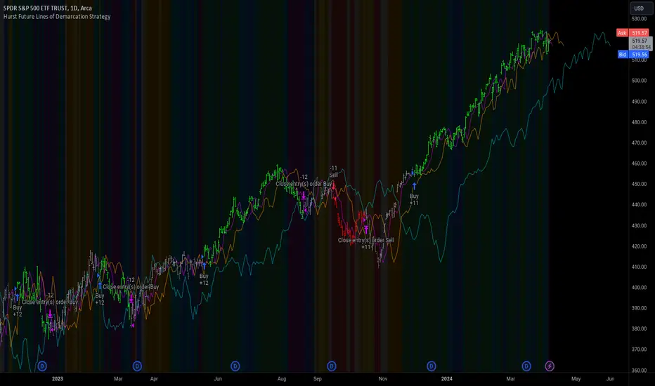
Hurst Future Lines of Demarcation StrategyJ. M. Hurst introduced a concept in technical analysis known as the Future Line of Demarcation (FLD), which serves as a forward-looking tool by incorporating a simple yet profound line into future projections on a financial chart. Specifically, the FLD is constructed by offsetting the price half a cycle ahead into the future on the time axis, relative to the Hurst Cycle of interest. For instance, in the context of a 40 Day Cycle, the FLD would be represented by shifting the current price data 20 days forward on the chart, offering an idea of future price movement anticipations.
The utility of FLDs extends into three critical areas of insight, which form the backbone of the FLD Trading Strategy:
A price crossing the FLD signifies the confirmation of either a peak or trough formation, indicating pivotal moments in price action.
Such crossings also help determine precise price targets for the upcoming peak or trough, aligned with the cycle of examination.
Additionally, the occurrence of a peak in the FLD itself signals a probable zone where the price might experience a trough, helping to anticipate of future price movements.
These insights by Hurst in his "Cycles Trading Course" during the 1970s, are instrumental for traders aiming to determine entry and exit points, and to forecast potential price movements within the market.
To use the FLD Trading Strategy, for example when focusing on the 40 Day Cycle, a trader should primarily concentrate on the interplay between three Hurst Cycles:
The 20 Day FLD (Signal) - Half the length of the Trade Cycle
The 40 Day FLD (Trade) - The Cycle you want to trade
The 80 Day FLD (Trend) - Twice the length of the Trade Cycle
Traders can gauge trend or consolidation by watching for two critical patterns:
Cascading patterns, characterized by several FLDs running parallel with a consistent separation, typically emerge during pronounced market trends, indicating strong directional momentum.
Consolidation patterns, on the other hand, occur when multiple FLDs intersect and navigate within the same price bandwidth, often reversing direction to traverse this range multiple times. This tangled scenario results in the formation of Pause Zones, areas where price momentum is likely to temporarily stall or where the emergence of a significant trend might be delayed.
This simple FLD indicator provides 3 FLDs with optional source input and smoothing, A-through-H FLD interaction background, adjustable “Close the Trade” triggers, and a simple strategy for backtesting it all.
The A-through-H FLD interactions are a framework designed to classify the different types of price movements as they intersect with or diverge from the Future Line of Demarcation (FLD). Each interaction (designated A through H by color) represents a specific phase or characteristic within the cycle, and understanding these can help traders anticipate future price movements and make informed decisions.
The adjustable “Close the Trade” triggers are for setting the crossover/under that determines the trade exits. The options include: Price, Signal FLD, Trade FLD, or Trend FLD. For example, a trader may want to exit trades only when price finally crosses the Trade FLD line.
Shoutouts & Credits for all the raw code, helpful information, ideas & collaboration, conversations together, introductions, indicator feedback, and genuine/selfless help:
🏆 @TerryPascoe
🏅 @Hpotter
👏 @parisboy
itradesize /\ Time Cycles x Zeussy supplementaryThis is a supplementary script to my previous itradesize /\ Time Cycles x Zeussy script. It should be displayed in a new pane.
This script will display the 30 and 90 AMD Time Cycles, along with the Asia, London, and New York AM & PM sessions in a new pane, based on the times taught by Zeussy.
You have the option to customize which cycles you would like to display, as well as the arrangement of the cycles based on the location of the pane (above or below the current chart).
The script can also be used for backtesting; just uncheck the 'Draw Today's Only' option.
Session timings are as follows:
Asia: 20:00 - 00:00
London: 02:30 - 07:00
NY AM: 07:00 - 11:30
NY PM: 11:30 - 16:00
London Cycles:
- 02:30 - 04:00
- 04:00 - 05:30
- 05:30 - 07:00
AM Cycles:
- 07:00 - 08:30
- 08:30 - 10:00
- 10:00 - 11:30
PM Cycles:
- 11:30 - 13:00
- 13:00 - 14:30
- 14:30 - 16:00
itradesize /\ Time Cycles x ZeussyI created this script based on Zeussy's & TOTK time cycle tweets.
The base 90-minute cycle starts at 2:30 AM NY time. For the best outcome, trade only during the New York AM & PM cycles. If you are a London trader, use mainly the Asian high and low instead of those 90-minute cycles as the algorithm mostly refers to them instead of the 90M cycles high or low.
In the current time cycle, we use the high and low of the previous cycle(s) to determine order flow.
During the current time cycle, IPDA refers to the previous cycle(s) as high or low. How the price reacts to these price levels is crucial for measuring order flow.
Every turning point in the market is timed and predetermined beforehand. The importance of timing can be seen by glancing at the history of the charts.
To measure order flow, we look for the following signs of reversal or continuation:
- If the price was bullish but does not find support at the previous cycle's high after breaking above it, it is the first warning sign that the order flow is potentially changing.
- If the price was bearish but does not find resistance at the previous cycle's low after breaking below it, it is the first warning sign that the order flow is potentially changing.
- If the price is bullish, then it should find support at the previous cycle's high after breaking above it.
- If the price is bearish, then it should find support at the previous cycle's low after breaking below it.
Each cycle has its Accumulation , Manipulation , and Distribution (AMD) characteristics within the larger sessions.
Even smaller cycles have these characteristics too. You can divide them further or add them up to get a more complex picture.
The indicator primarily shows the 90-minute cycles, but you can also view the multiples of 90-minute cycles to get a higher 270-minute picture. You can even divide them further into 30-minute cycles. (These 30-minute cycles can also be divided into 10-minute cycles.)
The AM sessions are from:
- 07:00 - 8:30
- 8:30 - 10:00
- 10:00 - 11:30
The PM sessions are from:
- 11:30 - 13:00
- 13:00 - 14:30
- 14:30 - 16:00
Regarding the features of the indicator, you can show the cycles as dividers or use boxes to highlight them.
The indicator also comes with a pivot high & low for the 90-minute cycles, which means the script automatically lengthens the high or low of the former 90-minute cycle until it's taken. If it has not been taken until the 90-minute cycle ends, it stops drawing.

BTC Purchasing Power 2009-20XX! Hello, today I'm going to show you something that shifts our perspective on Bitcoin's value, not just in nominal terms, but adjusted for the real buying power over the years. This Pine Script TAS developed for TradingView does exactly that by taking into account inflation rates from 2009 to the present.
As you know, inflation erodes the purchasing power of money. That $100 in 2009 does not buy you the same amount in goods or services today. The same concept applies to Bitcoin. While we often look at its price in terms of dollars, pounds, or euros, it's crucial to understand what that price really means in terms of purchasing power.
What this script does is adjust the price of Bitcoin for cumulative inflation since 2009, allowing us to see not just how the nominal price has changed, but how its value as a means of purchasing goods and services has evolved.
For example, if we see Bitcoin's price at $60,000 today, that number might seem high compared to its early years. However, when we adjust this price for inflation, we might find that in terms of 2009's purchasing power, the effective price might be somewhat lower. This adjusted price gives us a more accurate reflection of Bitcoin's true value over time.
This script plots two lines on the chart:
The Original BTC Price: This is the unadjusted price of Bitcoin as we typically see it.
BTC Purchasing Power: This line shows Bitcoin's price adjusted for inflation, reflecting how many goods or services Bitcoin could buy at that point in time compared to 2009.
By comparing these lines, we can observe periods where Bitcoin's purchasing power significantly increased, even if the nominal price was not at its peak. This can help us identify moments when Bitcoin was undervalued or overvalued in real terms.
This analysis is crucial for long-term investors and traders who want to understand Bitcoin's value beyond the surface-level price movements. It helps us appreciate Bitcoin's potential as a store of value, especially in contexts where traditional currencies are losing purchasing power due to inflation.
Remember, investing is not just about riding price waves; it's about understanding the underlying value. And that's precisely what this script helps us to uncover

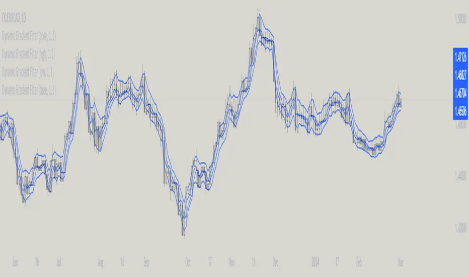
Dynamic Gradient Filter
Sigmoid Functions:
History and Mathematical Basis:
Sigmoid functions have a rich history in mathematics and are widely used in various fields, including statistics, machine learning, and signal processing.
The term "sigmoid" originates from the Greek words "sigma" (meaning "S-shaped") and "eidos" (meaning "form" or "type").
The sigmoid curve is characterized by its smooth S-shaped appearance, which allows it to map any real-valued input to a bounded output range, typically between 0 and 1.
The most common form of the sigmoid function is the logistic function:
Logistic Function (σ):
Defined as σ(x) = 1 / (1 + e^(-x)), where:
'x' is the input value,
'e' is Euler's number (approximately 2.71828).
This function was first introduced by Belgian mathematician Pierre François Verhulst in the 1830s to model population growth with limiting factors.
It gained popularity in the early 20th century when statisticians like Ronald Fisher began using it in regression analysis.
Specific Sigmoid Functions Used in the Indicator:
sig(val):
The 'sig' function in this indicator is a modified version of the logistic function, clamping a value between 0 and 1 on the sigmoid curve.
siga(val):
The 'siga' function adjusts values between -1 and 1 on the sigmoid curve, offering a centered variation of the sigmoid effect.
sigmoid(val):
The 'sigmoid' function provides a standard implementation of the logistic function, calculating the sigmoid value of the input data.
Adaptive Smoothing Factor:
The ' adaptiveSmoothingFactor(gradient, k)' function computes a dynamic smoothing factor for the filter based on the gradient of the price data and the user-defined sensitivity parameter 'k' .
Gradient:
The gradient represents the rate of change in price, calculated as the absolute difference between the current and previous close prices.
Sensitivity (k):
The 'k' parameter adjusts how quickly the filter reacts to changes in the gradient. Higher values of 'k' lead to a more responsive filter, while lower values result in smoother outputs.
Usage in the Indicator:
The "close" value refers to the closing price of each period in the chart's time frame
The indicator calculates the gradient by measuring the absolute difference between the current "close" price and the previous "close" price.
This gradient represents the strength or magnitude of the price movement within the chosen time frame.
The "close" value plays a pivotal role in determining the dynamic behavior of the "Dynamic Gradient Filter," as it directly influences the smoothing factor.
What Makes This Special:
The "Dynamic Gradient Filter" indicator stands out due to its adaptive nature and responsiveness to changing market conditions.
Dynamic Smoothing Factor:
The indicator's dynamic smoothing factor adjusts in real-time based on the rate of change in price (gradient) and the user-defined sensitivity '(k)' parameter.
This adaptability allows the filter to respond promptly to both minor fluctuations and significant price movements.
Smoothed Price Action:
The final output of the filter is a smoothed representation of the price action, aiding traders in identifying trends and potential reversals.
Customizable Sensitivity:
Traders can adjust the 'Sensitivity' parameter '(k)' to suit their preferred trading style, making the indicator versatile for various strategies.
Visual Clarity:
The plotted "Dynamic Gradient Filter" line on the chart provides a clear visual guide, enhancing the understanding of market dynamics.
Usage:
Traders and analysts can utilize the "Dynamic Gradient Filter" to:
Identify trends and reversals in price movements.
Filter out noise and highlight significant price changes.
Fine-tune trading strategies by adjusting the sensitivity parameter.
Enhance visual analysis with a dynamically adjusting filter line on the chart.
Literature:
en.wikipedia.org
medium.com
en.wikipedia.org
Cryptocurrency Altcoin Screener
This indicator works as a screener for bullish/bearish moves. There are two versions showing two different sets of Altcoins, just choose version 1 or 2. Load up any chart and it will show all selected pairs and their current state regardless of asset or timeframe. Assets can be shown/unshown and longs/shorts can be shown/unshown.
It shows (asset) +1 if it considers it bullish
(asset) -1 if it considers it bearish
(asset) 0 if considers the asset to be neutral/choppy
You can see how effective the indicator is by loading up the asset you're looking at, this will show the true history of the markers for that asset.
This script utilises MACD and RSI on the daily timeframe on both USDT and BTC pairs in order to identify a trend.
The main purpose of the script is to easily identify strong trends that allow you to do TA with rather than manually looking at every asset

itradesize /\ IPDA Look Back - for any timeframeThe script automatically calculates the 20-40-60 look-back periods and their premium and discount ranges.
The base concept is from ICT’s IPDA which should be applied to the daily timeframe but now you can use that same concept on the lower timeframes .
The higher the timeframes you use the more reliable it will be ( when we are talking about lower timeframes than Daily ).
- With the use of the indicator you can apply it on any timeframe with ease.
- You can customize the coloring of premium & discount, frame lines, and even the look of it.
- Hide or show the EQ levels
Below the IPDA texts the indicator shows the actual percentage of the selected range based on the current price fluctuations.
The script handles the 20-40-60 days look-back as fractals so it can be applied on lower timeframes.
The basics:
- The Interbank Price Delivery Algorithm (IPDA): The algorithm creates a shift on the daily chart every 20, 40, and 60 trading days.
- These are the IPDA look-back periods. Every 20 trading days or so there is a new liquidity pool forming on both sides of the market based on ICT concepts.
- Determine the IPDA Data Range of the land 20 trading days.
- Note the highest high & lowest low in the past 20 trading days. Identify the institutional order flow and mark the relevant PD arrays in the selected IPDA look-back period we deemed useful for our trading style.
- This is your current dealing range.
- If the price consolidates for 20 days, consider switching to a 40-day look back.
Inside this dealing range, we look for the next draw on liquidity. Is it reaching for a liquidity pool or is it looking to rebalance at a particular PD Array. This is going to the Bias.
Which IPDA data range should you use?
IPDA20 can be our Short Term range - fit for intraday traders at most
IPDA40 can be our Swing Trade range - have a clear indication of the market profile
IPDA60 can be our range for position trading - have a clear indication of the market profile

itradesize /\ Silver Bullet x Macro x KillzoneThis indicator shows the best way to annotate ICT Killzones, Silver Bullet and Macro times on the chart. With the help of a new pane, it will not distract your chart and will not cause any distractions to your eye, or brain but you can see when will they happen.
The indicator also draws everything beforehand when a proper new day starts.
You can customize them how you want to show up.
Collapsed or full view?
You can hide any of them and keep only the ones you would like to.
All the colors can be customized, texts & sizes or just use shortened texts and you are also able to hide those drawings which are older than the actual day.
You should minimize the pane where the script has been automatically drawn to therefore you will have the best experience and not show any distractions.
The script automatically shows the time-based boxes, based on the New York timezone.
Killzone Time windows ( for indices ):
London KZ 02:00 - 05:00
New York AM KZ 07:00 - 10:00
New York PM KZ 13:30 - 16:00
Silver Bullet times:
03:00 - 04:00
10:00 - 11:00
14:00 - 15:00
Macro times:
02:33 - 03:00
04:03 - 04:30
08:50 - 0910
09:50 - 10:10
10:50 - 11:10
11:50 - 12:50

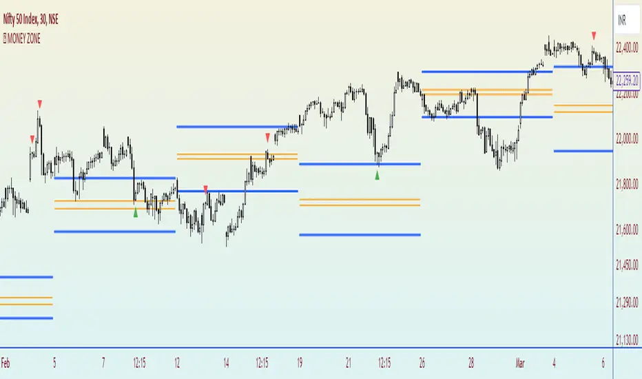
MONEY ZONEA volume profile is an advanced charting tool that displays the traded volume at different price levels over a specific period. It helps you visualize where the majority of trading activity has occurred.
This indicator is a Market Profiling tool used to analyse the Point of Control (POC) and Value Area (VAH/VAL) on the daily, weekly and monthly timeframes. It also optionally displays historical Value Areas to help find confluence with past data.
The Point of Control describes the price level where the most volume was traded. A Naked Point of Control (also called a Virgin Point of Control) is a previous POC that has not been traded.
The Value Area is a range of prices where the majority of trading volume took place on the prior trading day. In specific, this area is the range where 70% of the prior day’s volume happened. The value area is approximately one standard deviation above and below the average highest volume price. With this knowledge, there are specific probabilities of market behavior we can understand to digest the value area. The value area gives us an idea of where the smart money is playing ball and where the institutions are guiding the market. From this data, we can derive intra-day strategies that capitalize on market behavior.
🔹 Point of Control (PoC)
Point of Control (POC) – The price level for the time period with the highest traded volume
🔹 Value Area (VA)
Value Area (VA) – The range of price levels in which the specified percentage of all volume was traded during the time period.
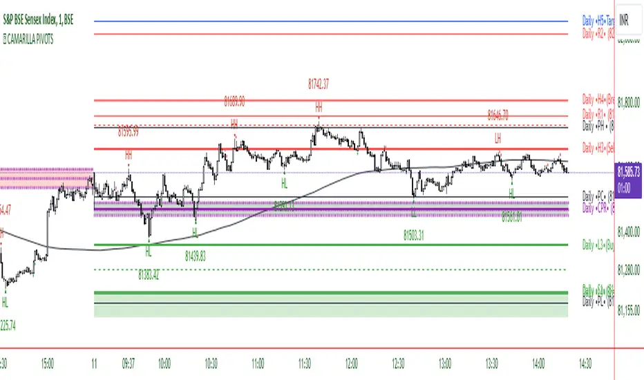
CAMARILLA PIVOTSThis indicator is based on the Pivot study. Traders will be able to plot CPR, Standard floor pivots as well as Camarilla Pivots on multiple timeframes.
Why pivots from multiple timeframes are relevant and included in this one indicator?
We can analyse pivots on multiple timeframes for different trading setups. As in, Daily floor pivots are best suited for analysing the market trend for Day trading. Similarly, Weekly and Monthly floor pivots can be analysed for Swing and positional trading entries. Whereas yearly pivot is best suited for trend analysis for investment purpose.
What is the relevance of plotting tomorrow's pivot level in advance?
Pivot are calculated based on the price happened on a previous day. And hence trader can plot tomorrow pivots in advance to shortlist stocks for tomorrow's trading session.
TimeFrames Available to traders are –
- Auto (1H)
1. Daily
2. Weekly
3. Monthly
4. Quarterly
5. Yearly
A) Daily Pivots
Present Day –
1. Trader can plot Daily CPR
2. Trader can plot Daily R1, R2, R3 and R4 pivot resistance levels
3. Trader can plot Daily S1, S2, S3 and S4 pivot support levels
4. Trader can plot Daily Camarilla levels
Future Day –
1. Trader can plot Tomorrow CPR
2. Trader can plot Tomorrow R1, R2, R3 and R4 pivot resistance levels
3. Trader can plot Tomorrow S1, S2, S3 and S4 pivot support levels
4. Trader can plot Tomorrow Camarilla levels
5. Previous Day High and Low
B) Weekly Pivots
Present Week –
1. Trader can plot Present week CPR
2. Trader can plot Present week R1, R2, R3 and R4 pivot resistance levels
3. Trader can plot Present week S1, S2, S3 and S4 pivot support levels
4. Trader can plot Present week Camarilla levels
Next Week –
1. Trader can plot Next week CPR
2. Trader can plot Next week R1, R2, R3 and R4 pivot resistance levels
3. Trader can plot Next week S1, S2, S3 and S4 pivot support levels
4. Trader can plot Next week Camarilla levels
5. Previous Week High and Low
C) Monthly Pivots
Present Month –
1. Trader can plot Present Month CPR
2. Trader can plot Present Month R1, R2, R3 and R4 pivot resistance levels
3. Trader can plot Present Month S1, S2, S3 and S4 pivot support levels
4. Trader can plot Present Month Camarilla levels
Next Month –
1. Trader can plot Next Month CPR
2. Trader can plot Next Month R1, R2, R3 and R4 pivot resistance levels
3. Trader can plot Next Month S1, S2, S3 and S4 pivot support levels
4. Trader can plot Next Month Camarilla levels
5. Previous Month High and Low
EXTREME REVERSAL SETUP:
This is by far my favorite setup in the lot. Classic Mean Reversion setup.
The logic, as explained in the book, goes like this,
1. The first bar of the pattern is about two times larger than the average size of the candles in the lookback period.
2. The body of the first bar of the pattern should encompass more than 50 percent of the bar’s total range, but usually not more than 85 percent.
3. The second bar of the pattern opposes the first.
The setup works extremely well in high beta stocks like Vedanta VEDL.
Feel free to play with the settings in order to better align this pattern with your favorite stock.
OUTSIDE REVERSAL SETUP:
My second favorite setup, it is quite good at catching intraday trends.
Here’s the logic,
1. The engulfing bar of a bullish outside reversal setup has a low that is below the prior bar’s low and a close that is above the prior bar’s high. Reverse the conditions for bearish outside reversal.
2. The engulfing bar is usually 5 to 25 percent larger than the size of the average bar in the lookback period.
Settings for this pattern simply reflect these conditions. Feel free to modify them as you wish.
DOJI REVERSAL SETUP:
Doji candles signify market indecision and this pattern tries to profit off these market conditions.
Logic:
1. The open and close price of the doji should fall within 10 percent of each other, as measured by the total range of the candlestick.
2. For a bullish doji, the high of the doji candlestick should be below the ten-period simple moving average. Vice-versa for bearish.
3. For a bullish doji setup, one of the two bars following the doji must close above the high of the doji. Vice-versa for bearish.
Feel free to modify the settings and optimize according to the stock you are trading.
Don't optimize too much :)
This pattern works brilliantly well on larger intraday timeframes, like 15m/30m/60m.
This pattern also has a higher propensity to give false indications than the two described above.
Doji reversal typically helps to catch larger trend reversals.
WICK REVERSAL SETUP:
This pattern tries to capture candlesticks with large wick sizes, as they often indicate trend reversal when coupled with significant support and resistance levels.
Logic:
1. The body is used to determine the size of the reversal wick. A wick that is between 2.5 to 3.5 times larger than the size of the body is ideal.
2. For a bullish reversal wick to exist, the close of the bar should fall within the top 35 percent of the overall range of the candle.
3. For a bearish reversal wick to exist, the close of the bar should fall within the bottom 35 percent of the overall range of the candle.
This pattern must always be coupled with important support resistance levels, else there will be a lot of false signals.
This indicator helps you identify market structure by plotting swing highs and lows (HH, LH, HL, LL).
Indicator Settings Overview
SWING LENGTH
The number of leftbars and rightbars when searching for swing points. The lower the value, the more swing points are shown and the higher the value, the less swing points are shown. I suggest adjusting it to fit your style and when switching between different timeframes.
Oops!Oops! is based on an overemotional response, then a quick reversal of the concomitant overreaction of price. The overreaction we are looking for to give us a buy signal is an opening that is below the previous day's low. The entry comes when, following the lower open, price then rallies back to the previous day's low (selling pressures have been abated and a market rally should follow). A sell signal is just the opposite. We will be looking for an open greater than the prior day's high. Our entry then comes from price falling back to the prior high, giving us a strong short-term suggestion of lower prices to come.

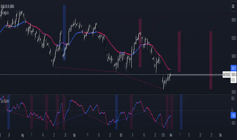
Cycle OscillatorThe Cycle Oscillator is a tool developed to help traders analyze market cycles thanks to a simplified version of the Hurst theory and the easy visualization provided by the detrended cycle.
This indicator has two functions:
- The first one is the plotting of a line that oscillates above and below the zero line, which can be used to find the cycle direction and momentum
- The second feature is the next-cycle bottom forecaster, useful for estimating the timing of the future pivot low based on the pivot low of the oscillator.
This last feature shows graphically the period in which the next low will probably happen, using as a calculation method the timing of the previous indicator's lows.
Additionally, the user can choose to modify the cycle length to analyze bigger or smaller price movements.
This indicator can be greatly used in combination with other Cycle Indicators to gain more confluence in the plotted time areas.
Cycle IndicatorThe Cycle Indicator is a tool developed to help traders analyze market cycles thanks to a simplified version of the Hurst theory.
This indicator has two functions:
- The first one is the plotting of a line that can be used to find the cycle direction and momentum
- The second feature is the next-cycle bottom forecaster, useful for estimating the timing of the future pivot low.
This last feature shows graphically the period in which the next low will probably happen, using as a calculation method the timing of the previous lows.
Additionally, the user can choose to extend this time zone or to limit them to the range between the last pivot high and low.

itradesize /\ Previous HTF x OHLC Box
FYI: It is an invite-only script, if you are interested in, please scroll down to see the Author's instructions.
Introducing an indicator which inspired by ICT concepts that use a model, based on what TTrades teaches in some of his DOL videos about how to get a proper bias.
Having a daily bias can be frustrating and this script could make it easy for you besides creating a ton of opportunities for scalpers as well as not only helpful for a daily bias, it can also help you to determine the actual H4 or H1 bias or even lower.
Always keep in mind: the higher the timeframe you use, the more accurate it can be.
You can use OHLC to determine the current or higher time frame bias as it can be used on any of them and properly gain a sentiment of a drawn of liquidity.
This model integrates the previous candle's open, high, low, and close values (or open, low, high close) in addition to their equilibrium to make it easier to identify where the price should go moreover they can be used as reference points for potential trading opportunities.
The 50% also known as equilibrium creates premium and discount zones within the previous candles. Using the former higher timeframe candle’s OHLC you can simply have an external range of liquidity and where the current price should it drawn to.
With this tool, you can achieve a proper trading framework as you can easily recognize the external & internal range of liquidity, so whether you are a scalper or a day trader you are able to rely on the indicator.
A bit of a candlestick analysis:
When the price wicks below means a potential bullish reversal is incoming.
When the price wicks above, then it means a potential bearish reversal is happening.
Closing below means lower prices. (Bearish trend)
Closing above means higher prices. (Bullish trend)
This indicator is an absolute monster for the OHLC guys.
How to use it?
- Analyse the trend on the higher timeframe, bullish trend is when the price continuously takes the previous candle’s high over and over again. Bearish trend is the total opposite.
- Wait for external liquidity to be taken.
- When it's happening there should be a displacement back to the range with an actual structure shift.
- Looking for an imbalance in the displacement.
- Aiming for an imbalance that is above 50% of the former move.
- Aggressive stop: below or above the candle which has an imbalance
- Conservative stop: below or above the former swing
Classic sell setup:
Classic buy setup:
The indicator has a ton of customizable features, the power of the tool is really in there, as you can find or refine your own model with it. Once you're familiar with your setup you will be really feeling the power of the tool, I promise.
Indicator Features:
• M5/M15/H1/H4/D Time frames
• OHLC bar with an offset (you can have a look at the current HTF bar developing or you can use it as a locked previous bar)
• Current time frame OHLC / OLHC box with extended lines to the current time
• Showing the previous time frame OHLC / OLHC box with extended lines and the ability to add labels. The color of the OHLC or OLHC box is based on the candle closing. If it's a bear candle, if it's a bull candle.
• Previous high time frame open / close lines with labels, customisable colours, label sizes
• It has a lot of customisable features, the power of the tool is really in there as you can find or refine your own model with it.
• Every box and bar automatically switches its colors based on the close of the candle whether it's a bear or a bull candle.
• The color of the labels is switching automatically based on the coloring of your chart.
• You can customize each and every box color - OHLC/OLHC based on your taste, and the open and closing lines of the previous HTF.
Additional Information:
You can combine it with my own model. If you are not familiar with it, you can find here .
Or you can combine it with other frameworks for extra confluences like combining it with Daye’s QT in some simple equation:
Open → Q1 , High → Q2, Low → Q3, Close → Q4
Open → Q1, Low → Q2, High → Q3, Close → Q4
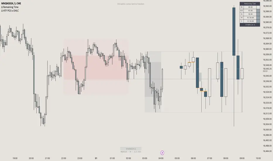
itradesize /\ Model x RTH Gap
I’m happy to announce my model and sharing it with you as an indicator.
About the model
The model is based on a range from 18:00 until 1:30. If you are keen you probably know that it's something that based on a bit of Daye's Theory. As Daily Q4 is from 18:00 until 0:00 and I've added a 90's Q1 to it as well that's why it ended up at 1:30.
It's an accumulation range and where we are looking for some opportunities above or below it when the algo is trying to fake the traders as the high and the low of the range are both important zones for liquidity pools. This model works on almost every pair but I've been mostly focusing on indices, especially on ES, NQ, and EUR/USD.
Do not trade before 1:30 AM and do not trade this model after 6:00 AM. So any tradable setup must be valid until 6:00 AM.
*All the mentioned times are based on America/NewYork timezone.
A simple sell setup
∆ If it takes the high of the model, then look for short opportunities.
∆ The best reliable scenario is when a high is taken while retracing back to an HTF PD Array so it will end up in a failure swing, Judas swing, you name it.
∆ When a high is taken you should wait for a market structure shift then it should give a nice displacement where it should retrace.
∆ The imbalance after the shift can be on every timeframe, based on your trade idea.
∆ If there are more imbalances, your decision on which to go with (as if there is a BPR, Breaker, OB, etc.. - can change the view of an FVG).
The same story goes for a buy setup.
∆ The first target is always the EQ of the model's range.
∆ The second target could be liquidity inside the EQ and the other side of the model (optional).
∆ The third target is the other side of the model.
∆ You can always leave a runner there if you eyeing some levels outside the model.
Additional information
∆ You can use silver bullet range as an extra confirmation when you looking for the actual displacement.
∆ An RTH range is also added to the indicator (starts drawing at 9:30 when the futures market opens) as it can be used to trade in the NY session and it is a must-have thing when trading indices.
∆ The colors of every label are switched automatically based on your chart's coloring.

NormInvTargetSeekerNormInvTargetSeeker
The NormInvTargetSeeker is a trading tool designed to aid traders in identifying and capitalizing on Distribution and Accumulation zones, highlighting specific price levels that could serve as targets for future price movements. Although the indicator itself is not multi-timeframe, an effective trading strategy might involve signal validation across multiple timeframes.
🔶 USAGE
The indicator identifies Distribution and Accumulation zones, providing potential targets for future price moves.
Traders are encouraged to use these zones as profit targets or potential reversal points.
Confluence Zones
These zones are identified as regions where various factors or levels converge, signaling an increased probability of price reaction.
They can be used to reinforce signals or identify levels where price might encounter significant resistance or support.
🔹 Trading Strategy
First, identify a signal on your primary trading timeframe.
Manually check higher timeframes to ensure the signal aligns with them.
Use the identified zones, whether Distribution or Accumulation, as target zones for your trades.
🔶 Order Blocks
The NormInvTargetSeeker identifies "Order Blocks" by examining a specified number of consecutive candles with a specific condition: the current candle must completely engulf the previous candle. This means that both the high and low of the current candle are higher and lower, respectively, than the high and low of the previous candle, signifying a dominant move in the direction of the current candle.
🔹 Trading Strategy
Target Confirmation: Order Blocks can serve to confirm target points, providing additional validation for identified levels.
Market Insight: They offer crucial insights into whether "big hands" or institutional players are positioned as buyers or sellers in the market.
Traders can use Order Blocks as a means to validate targets or key price levels, observing if the price reacts significantly upon reaching these blocks.
They can also provide insights into the general market direction or underlying market strength by identifying where the major market players are placing their orders.
🔶 SETTINGS
The indicator allows users to adjust various parameters to customize the display and logic of the tool to fit their needs.
🔹 Display Settings
Users can customize the colors and displays of various zones and labels to match their preferences.
🔶 LICENSE AND CREDITS
This work is licensed under Attribution-NonCommercial-ShareAlike 4.0 International (CC BY-NC-SA 4.0). More information here: creativecommons.org
This indicator utilizes a TypeScript implementation of the Normal Inverse function as a reference, which can be found here : github.com
Special thanks to the authors of the referenced code for providing a foundation upon which this indicator was built.
🔶 UPDATES
Current Version: 1.0.0
For future updates, please check the comment section.
🔶 CONTACT
For any questions or suggestions, please feel free to contact @RickSimpson on TradingView.

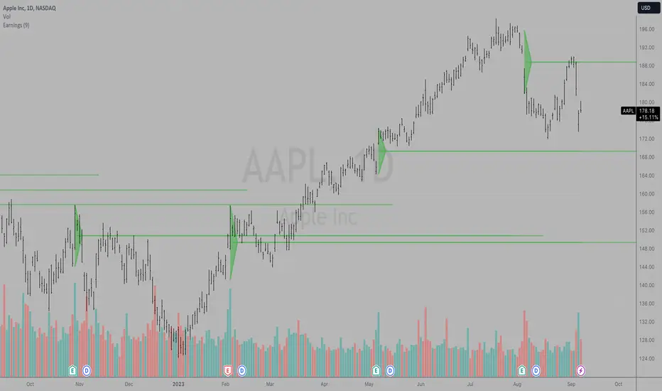
Earnings LevelsI am proud to announce that the formerly secret "Key Earnings Levels" graphing tool will be freely available to TradingView users whereas before it was only available by monthly or annual subscription since its invention here at TradingView many years ago by Tim West. TradingView code writers wrote the original code for using this powerful tool and then Johannes Falkenburg re-wrote the code several years ago.
The most important FOUR days a year in a stock chart are the days that the company gives its quarterly update. Since the GRAND majority of companies have earnings, the indicator is called the "Key Earnings Level", or KEL for short. The unique part of the release of the quarterly update is that it can be "before the open" or "after the close" and the price action leading up to the earnings and immediately after the earnings are useful for future reference, as you'll see shortly.
The Key Earnings indicator plots a triangle for the range around the day before and the day after earnings and draws a mid-point line to capture the over/under level for that report. That mid-point line is then extended into the future for a minimum of one quarter until the next earnings report and as long as a year with the current code.
This triangle plot allows you to see how a stock is trading RELATIVE TO where it was trading when earnings were announced and when a glimpse into the current quarter along with projections for the upcoming year.
Simply put: Key Earnings Levels are the easiest way to see how a stock is doing relative to the most important four days a year.
You can devise your own trading strategies around these levels, but I want you to have this information so you can see it and know it too. I've kept this little secret of Key Hidden Levels to myself and my followers in the Key Hidden Levels Chat Room here at TradingView for far too long. I have occasionally published charts with the Key Earnings Levels but have not made the code freely available to TradingView subscribers.
If anyone has paid me for access to these indicators and wants a refund, I will be glad to do that. This is too important to keep from everyone any longer. I think it is essential to make this available to everyone to make sure we all have the most advantage we can get when investing and trading in the markets.
I hope you can all find the powerful benefit from using Key Earnings Levels and please thank Johannes Falkenburg aka @Vollchaot here at TradingView for writing the latest version of this code.
The idea itself came from using TradingView and the powerful graphing and layout features here to track our observations and to do research. Thank you TradingView for such a great product.
I look forward to answering any questions.
Sincerely,
Tim West
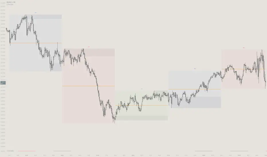
3M_RANGE/ErkOzi/Hello Dear Investors,
Today, I'd like to introduce you to an indicator called "3M Range" and explain how this indicator is calculated, as well as the kind of strategy it can offer.
What is the 3M Range Indicator?
"3M Range" is an analytical tool designed to identify and visualize market movements within three-month periods. This indicator employs specific levels and Fibonacci levels to assist investors in understanding market trends.
How is it Calculated?
The indicator utilizes the opening, highest, and lowest prices of three-month periods starting on Mondays. By using these prices, the indicator tracks weekly opening prices and marks the opening prices every Monday.
How Does the Indicator's Strategy Work?
Using this indicator, you can refine your long-term investment strategies:
Identify Three-Month Periods: The indicator follows the opening, highest, and lowest prices in three-month periods. This allows for a clearer understanding of long-term trends.
Utilize Fibonacci Levels: The indicator calculates Fibonacci levels to show support and resistance levels. These levels can help predict potential reversals or ongoing movements.
Observe Monday Opening Prices: The indicator distinctly marks Monday opening prices. This helps you capture potential movements at the beginning of the week.
Evaluate Trends and Opportunities: By using the indicator, you can observe long-term trends and potential market opportunities more clearly.
In Conclusion,
The "3M Range" indicator provides long-term investors with a better analytical tool by showcasing market movements within three-month periods. The indicator marks Monday opening prices and allows for analysis supported by Fibonacci levels. By using this indicator, you can shape your long-term investment strategies more consciously.
Always remember that, as with anything, making careful and informed decisions is crucial when investing. I hope this indicator helps you better navigate your long-term investments.
Note: Understanding market risks and utilizing analytical tools carefully is always important. Best of luck!
Baha'i Reversal Points [CC]The Baha'i Reversal Points is a custom creation that combines some of my favorite passions, creating stock indicator scripts and my faith. The Baha'i Faith believes in the oneness of God and all religions, and sees the number 9 as significant because that is the number of major world religions as well as the Baha'i symbol is a nine-pointed star. The number 19 is also seen as significant because in the Baha'i calendar, there are 19 months, and each month is made up of 19 days. Anyway, with all that being explained, I created these reversal points to find the points where the last 19 highs or lows are higher or lower, respectively than the previous high or low nine days ago. As with many indicators, this does have some hits and misses but does a pretty good job of finding reversal points based on these criteria.
There are a few different ways to analyze this data to determine when to buy or sell. I have set the default behavior for when we encounter the first time that the amount of highs or lows is greater than or equal to the length amount using a crossover or crossunder alert. You could also ignore the crossover or crossunder alerts and buy when the count is greater than or equal to the length, which can happen for extended periods depending on the underlying trend. Overall, buy when the buy label appears and sell when the sell label appears.
Let me know if there are any other custom indicators or scripts you would like to see me publish!
