Fibo_Ma with Toggleable 200 EMA Filter Fibo_MA with Toggleable 200 EMA Filter
Description:
This multi-functional indicator blends Fibonacci-based moving averages with customizable filters and visual enhancements to support various trading strategies. It offers traders the flexibility to analyze trend dynamics and potential reversal zones using multiple tools in one script.
Key Features:
🔹 Fibonacci MA Framework
Leverage a range of Fibonacci numbers (from 1 to 233) to visualize trend-based EMA lines with optional smoothing. Users can choose the moving average method (SMA, EMA, RMA, WMA, VWMA, etc.) and adjust the smoothing length for fine-tuned analysis.
🔹 VWAP and Dynamic EMA Tools
Includes VWAP and a color-coded 200 EMA that updates based on trend slope. These help visualize key dynamic support and resistance levels.
🔹 Multi-Timeframe Support
Option to switch the data source to a higher timeframe for broader trend confirmation.
🔹 Signal Highlights
Bullish and bearish signal markers based on crossovers with optional filters.
Background highlights show whether the current price is above or below a smoothed EMA line.
🔹 Customizable Filters
Enable or disable filters like:
200 EMA Position Filter (only signal when price is above or below the 200 EMA)
ATR Filter (filter out low-volatility candles)
Volume Filter (signal only on sufficient volume)
🔹 Cross Alerts & Labels
Built-in alert conditions for crossovers and customizable signal display options—labels, shapes, and background highlights.
🔹 Advanced Options
Toggle forecast line visibility and offset
Fine-tune alerts using price action relative to the smooth trend line
Optional tail and cross label display for deeper chart customization
How to Use:
This tool can support trend-following, breakout, and pullback strategies. Customize the MA types, filters, and timeframe settings to match your trading style. The script is designed for visual clarity while offering rich configurability for discretionary and system-based traders.
Volume

MCDX with MAsMCDX with MAs – Market Participant Flow Analyzer
📌 Overview
The MCDX with MAs indicator provides insight into market behavior by visualizing the money flow of three key participant types—Bankers (Smart Money), Hot Money, and Retail Traders—through custom RSI logic and moving averages. It helps traders assess which group is driving price action and how this aligns with broader market trends.
🔍 What Makes This Indicator Unique?
Unlike generic mashups, this tool builds on the MCDX concept by:
Using custom RSI logic per participant group
Applying independent MAs to each RSI stream
Supporting multi-timeframe analysis
Offering clear color-coded trends and strengths
Enabling signal generation based on group behavior and crossover dynamics
⚙️ How It Works
RSI Logic (Per Group)
Each group’s RSI uses:
A base threshold (neutral zone)
A sensitivity multiplier (to control reactivity)
Visual capping (default max: 20) for easier histogram comparison
Moving Averages
Each RSI stream has its own moving average:
Selectable types: EMA, SMA, WMA, RMA, SMMA
Bankers include three MAs: short, mid, and long-term
MAs are used to identify trends and filter noise
📊 Visual Output & Color Logic
Each group is represented by a histogram with conditional coloring:
Bankers:
RSI > MA → Strong Green
RSI < MA → Light Green (or user-defined)
Hot Money:
RSI > MA → Bright Yellow
RSI < MA → Light Yellow
Retail:
RSI > MA → Bright Red
RSI < MA → Light Red
This makes it easy to visually assess which market participant is in control.
🟢 Bullish Conditions
Banker RSI rising and above at least one MA
Retailer RSI falling (retail exiting as smart money enters)
Hot Money RSI rising and above its MA
Stronger signal if Bankers or Hot Money RSI is recovering from extreme low values
🔴 Bearish Conditions
Banker RSI falling and below all MAs
Retail RSI rising (retail buying into weakness)
Hot Money RSI declining
Stronger signal if Bankers or Hot Money RSI are near extreme high levels
🛠️ Customization Features
Timeframe Input: Analyze flow from any timeframe
Static Reference Levels: Level 1, 2, 3 for support/resistance
Extreme Thresholds: Define extreme_high and extreme_low zones
MA Options: Choose MA type and length per RSI stream
🧠 Strategy Ideas
Combine with price action and volume for higher confluence
Use Banker RSI on a higher timeframe to filter trades on lower TFs
Monitor divergences between Retail and Banker flows
Use crossovers and slope direction for entries/exits
🔔 Alert Logic (Optional, Customizable in Pine Script)
Banker RSI crosses MA
RSI enters or exits extreme zones
RSI group divergence or alignment
Trend shift confirmation from all groups
✅ Best Suited For
Swing traders spotting accumulation/distribution zones
Traders seeking confirmation from institutional vs retail behavior
Users looking to combine money flow logic with MA-based trend confirmation
⚠️ Important Notes
This indicator is not financial advice. Use at your own discretion and with proper risk management.
Backtest thoroughly before applying in live markets.
Best used on a clean chart with no overlapping indicators for clarity.
Alert logic is not built-in but can be added using Pine Script.
Market behavior can vary greatly; always combine with other tools (e.g., support/resistance, candlestick patterns).
🧾 Summary
The MCDX with MAs indicator is a complete tool for visualizing and interpreting the behavior of market participants across different timeframes. By combining enhanced RSI logic, moving averages, and color-coded money flow dynamics, traders gain a structured way to identify trend strength, turning points, and entry/exit signals.

EMA Color Candle Volume + Dashboard with TP/SLBuy/Sell Signals from EMA Crossover
This indicator uses a short-term EMA, a long-term EMA, and an average EMA to detect points where the short-term EMA crosses above or below both the long-term and average EMAs. These crossover points act as buy or sell signals.
Candle Colors Based on Volume Pressure
The indicator changes the candlestick colors based on buying and selling pressure calculated from trading volume. There are four main colors that indicate the strength of buying or selling pressure for each candle:
Blue: High buying volume – Green candle with volume above average
Green: Normal buying volume – Green candle with volume at or below average
Red: Normal selling volume – Red candle with volume at or below average
Orange: High selling volume – Red candle with volume above average
Volume Pressure Calculation
The calculation uses the total volume of each candle without separating by price level (e.g., delta volume). Candle color determines the weighting of pressure:
If the candle is green (Close > Open), it is considered buy pressure, weighted 0.7 to buying and 0.3 to selling
If the candle is red (Close < Open), it is considered sell pressure, weighted 0.7 to selling and 0.3 to buying
A 20-period SMA is then calculated to compare against the current buy/sell pressure.
BUY/SELL Labels with Volume
When enabled, a “BUY” or “SELL” label appears on the candle along with the trading volume.
Label size can be selected (small, medium, large) for better visibility.
Repaint System (Toggle On/Off)
You can choose whether EMA calculations update in real-time (which may repaint) or use the previous candle’s data for more stable signals.
Trend Zone Highlight
The chart background changes to light green or light red based on the EMA trend direction to help visualize market trends more clearly.
Automatic Alerts
Alerts trigger immediately when a buy or sell signal occurs.
Heatmap, TP, SL, and How to Use
1. Heatmap (Status Dashboard)
A table summarizing current market conditions divided into four main parts:
Signal: EMA signal – BUY / SELL / NEUTRAL
Trend: Trend status – UPTREND / DOWNTREND / SIDEWAYS
Volume: Volume strength – shown as four colors matching candle colors (Green, Blue, Red, Orange)
TP/SL: Take Profit and Stop Loss prices with background colors to provide a clear overview
2. TP (Take Profit)
The price level where profits are expected, based on a predefined percentage (default 1.5%)
Example: If current Close is 100, TP = 100 + 1.5% = 101.5
Note: TP is a guideline and not guaranteed to be reached.
3. SL (Stop Loss)
The price level to cut losses if price moves against the trade direction.
Calculated from Close minus a predefined percentage (default 0.7%)
Helps reduce risk and keep losses within acceptable limits.
4. How to Use
Add this indicator to your price chart
Look for entry points using EMA signals, candle colors, and BUY/SELL labels
Check the Heatmap at the top-right corner for signals, trend status, volume strength, and TP/SL
Use TP/SL prices from the Heatmap as a guide to place orders on your trading platform
Adjust TP/SL percentages in settings according to your trading style
Enable alerts to avoid missing important trade opportunities

Carnival Absorption [by Oberlunar]Carnival Absorption of Oberlunar is a refined algorithmic lens, designed to expose the invisible forces that operate behind price movement. Much like a Carnival, where a mask conceals a deeper identity, this tool seeks out areas where the market disguises its true intent—volume absorption cloaked in stillness, pressure coiling beneath the surface, waiting to unmask.
At the core of the indicator are two phenomena: absorption and compression .
Absorption is defined as a localised spike in normalised volume relative to the candle’s range. This is measured using a dynamic z-score (sigma buy/sell), which quantifies the significance of the volume within its historical context. Only when this score exceeds a configurable threshold is the candle considered a potential site of meaningful activity—what one might call a “masked intention.”
But one candle is not enough. Divergence must occur.
Here, the heart of the detection logic lies in comparing price action to the Cumulative Volume Delta (CVD). If price makes a new high but CVD does not—or vice versa—it suggests a disconnect between what the market displays and what it internally processes. It is in this tension between form and substance that the signal is born.
When both high absorption and a valid divergence align, the area becomes a pending zone—a sort of unspoken potential. These zones are stored dynamically in memory arrays and clustered intelligently to avoid overlap and redundancy. Suppose price returns to that area within a specified time and range tolerance, confirming the original hypothesis. In that case, the mask drops: a box is drawn on the chart, accompanied by a confidence label that quantifies how closely the current price behavior matches the pending structure. The closer the price aligns with the heart of the original zone, the higher the confidence percentage is shown.
But the Carnival continues.
When a bullish absorption zone is followed by a bearish one (or vice versa), the indicator detects a compression. This is not a reversal signal, but a phase of coiled tension—a compression of opposing forces, visualized as a colored box stretching between the two zones. These compressions are not arbitrary: they emerge only when the distance between the two zones is statistically significant. Once confirmed, they are labeled with the transition type (“B→S” or “S→B”) and an associated confidence metric.
The visual behavior is fully customizable. Users can choose whether to display confirmed boxes, pending circles, labels, and adjust transparency and placement. Pending signals are marked with colored circles whose size and intensity reflect their statistical confidence—ranging from tiny to huge.
The entire visual system acts as a living map of pressure and potential.
— Oberlunar 👁️★

Tradability Score (0-1)What THI measures
Turnover – Daily USD volume ÷ market-cap
Tells you how much of the circulating supply actually changed hands.
Liquidity Pulse – Current volume ÷ 20-day average volume
Shows whether today’s flow is above or below “normal,” hinting at how easy fills will be.
Relative Volatility – ATR(14) ÷ closing price
Captures price range: you need some swing to make day-trades worthwhile.
Each raw value is min-max normalised over a user-set look-back (default 120 bars), scaled to 0-1, then blended with default weights 40 % / 30 % / 30 %.
The final THI score is therefore always between 0 (avoid) and 1 (ideal).
How to read it
THI zone Interpretation Typical action
≥ 0.80 “Hot”—ample volume and movement Size up, consider multiple setups
0.60 – 0.79 Tradable but not perfect Trade, yet tighten risk
0.40 – 0.59 Borderline Only take A-grade signals
< 0.40 Cold / illiquid Skip or scalp tiny size
Dashed guide-lines at 0.80 / 0.60 / 0.40 and color-coded histogram bars make the hot/cold zones obvious at a glance.

ETH Pro Strategy Alerts (Buy & Sell)This indicator combines four powerful tools into a single confluence-based strategy:
✅ Chandelier Exit: Identifies trend direction and trailing stop levels.
✅ Triple RSI (6/12/24): Confirms momentum alignment across short, mid, and long term.
✅ Stochastic RSI: Pinpoints early entry/exit zones using overbought/oversold signals.
✅ OBV (On-Balance Volume): Validates price action with real volume strength.
Buy/Sell alerts trigger only when all conditions align, helping you avoid false signals and trade with confidence.

LTF Volume markerLTF Volume Marker
Overview:
The LTF Volume Marker highlights candles that contain volume spikes on a lower timeframe (LTF), even while you are viewing a higher timeframe chart. It is designed to help identify hidden volume activity that may not be visible when aggregating candles.
This indicator is conceptually similar to a volume profile — but instead of showing distribution across price levels, it visualizes volume clusters within the structure of a sloped trend or time-based aggregation.
Key Features:
✅ Automatically detects high-volume candles on a user-defined lower timeframe
✅ Marks the price level of volume spikes using weighted average price (VWAP) within higher timeframe bars
✅ Supports both manual threshold and auto mode (which highlights top X% of volume candles in a selected range)
✅ Fully adjustable timeframe and date range
✅ Displays either a point or an area at the spike location or together
How It Works:
You define a Lower Timeframe (e.g. 1-minute) and optionally a threshold or use the auto mode to dynamically calculate it from past data.
On higher timeframes (e.g. 5-min, 15-min), the indicator looks inside each bar, finds all volume spikes, and plots the volume-weighted average price of those spikes.
If you are on the same timeframe as the LTF, it simply highlights candles with volume exceeding the threshold.
Use Cases:
Spotting hidden volume clusters inside trending moves
Validating support/resistance levels with underlying volume
Filtering false breakouts using intra-bar volume
Enhancing scalping and intraday setups by visualizing internal structure
Notes:
The indicator ignores future-looking data (lookahead=off) and only processes completed bars.
If the chart’s timeframe is lower than the selected LTF, the indicator will automatically disable itself.
Works best with aggregated symbols, such as futures or cryptocurrencies with high resolution data.

HSI Market sessions and Volume profileHSI Market Sessions and Volume Profile
Unlock deeper market insight with this advanced volume profile indicator tailored for Hang Seng Index (HSI) and other futures instruments. This tool combines session-based volume analysis, customizable profiles, and intraday tracking for superior market structure awareness.
🔍 Key Features:
Dynamic Volume Profile: View aggregated buy/sell volume or open interest delta across customizable price zones.
POC, VAH, VAL Lines: Instantly spot the Point of Control, Value Area High, and Value Area Low for each session.
Flexible Session Options: Analyze market behavior by Tokyo, London, New York, or standard timeframes like Daily, Weekly, Monthly, Quarterly, or Yearly.
Live Zone Tracking: Stay ahead with real-time profiling of the current session.
Forex Box Option: Visualize forex trading zones even without volume profiles.
Highly Configurable: Choose from three display modes, resolution settings, and color schemes to fit your style and precision needs.
🧠 Smart Mechanics:
Adaptive to both Volume and Open Interest data.
Built-in smoothing algorithm for cleaner profiles in high-volatility assets.
Auto-reset and draw logic based on session type and bar resolution.
Intrabar data handling for more granular profiling (requires lower timeframe input).
✅ Ideal For:
HSI Futures Traders looking for market session clarity and volume zones.
Volume Profile Analysts needing flexible, session-specific profile rendering.
Day Traders and Swing Traders who value precision in trade planning.

Z-Score Volume with CVD ConfirmationZ-Score Volume with CVD Confirmation is a volume-based confluence tool that enhances traditional volume analysis by combining Z-Score volume anomalies with Cumulative Volume Delta (CVD) confirmation. This indicator helps traders identify unusual volume activity that aligns with directional order flow, offering a cleaner signal for potential breakout or reversal scenarios.
🔍 Key Features:
Z-Score Calculation: Measures how extreme current volume is relative to its recent average, highlighting statistically significant surges or drops.
CVD Confirmation: Uses Cumulative Volume Delta candles (open/high/low/close) to assess buying vs. selling pressure in lower timeframes.
Bar Color Logic:
Green: High Z-Score volume confirmed by CVD bullish candle
Red: High Z-Score volume confirmed by CVD bearish candle
Other color bands show progressively strong or weak volume outliers
Real Volume Bar Heights: Volume bars retain true scale while color reflects underlying order flow strength and direction.
💡 Use Cases:
Breakout validation: Confirm price range breaks when volume surge is supported by CVD direction
Fade setups: Detect unsustainable high-volume moves lacking CVD support
Trend continuation: Spot momentum when both Z-Score and CVD align in the direction of the trend
⚙️ How to Use:
Adjust the Z-Score length to define how far back to measure average and deviation.
Select your anchor timeframe (typically 1D) and a lower timeframe for CVD calculations (e.g., 1-minute).
Use color-coded volume bars to assess volume significance and directional flow at a glance.
Add the standard volume indicator to the chart so one can compare the difference between the standard volume indicator and the Z-Score Volume with CVD Confirmation script. Useful at specific price levels and exiting ranges or not.

Manual VAH/VAL LevelsManual VAH/VAL Levels is a utility indicator that lets traders manually display the Value Area High (VAH) and Value Area Low (VAL) from the prior trading day, based on a Fixed Range Volume Profile tool.
This script is designed to:
Draw horizontal lines at the manually input VAH and VAL levels
Label each line with the corresponding price, aligned clearly to the right of the chart
Display levels only during the regular trading session for focused market context
Maintain a clean chart appearance with transparent label backgrounds
💡 How to Use:
Apply TradingView's Fixed Range Volume Profile tool to the prior day's session
Manually enter the VAH and VAL values into the script settings
The script will draw and label these levels dynamically during the NY market session
This tool is ideal for:
Traders using volume-based key levels for intraday decision-making
Contextualizing price action near areas of prior day value
Confluence analysis when paired with opening range, CVD, or breakout systems

Alpha X Quant EngineAlpha X Quant Engine
A high-integrity execution framework combining volatility triggers, momentum dynamics, and structural bias.
🔷 Purpose
Alpha X Quant Engine is built to detect asymmetric trade opportunities with precision. It filters high-conviction entries using data-driven momentum and volatility logic, combined with price structure awareness.
🔷 Core Principles
1. Volatility Surge Detection
Leverages Z-score analysis of volume to identify market “spikes” that often precede structural breaks or reversals.
2. Momentum Alignment
Tracks short-term and high/low MA slope dynamics via Z-score normalization and ROC (rate-of-change) momentum to confirm directional bias.
3. Structural Confluence
Utilizes fair value gap (FVG) bias and wick-trap rejection logic to determine whether price is breaking with conviction or faking out.
🔷 Trade Types Supported
Breakout Continuations
Reversal Traps
Expansion Triggers
Fair Value Gap Validations
🔷 Why It Works
Alpha X is not reactive—it’s anticipatory. By requiring multi-signal alignment, it filters noise and reduces false entries, delivering high-integrity trade setups adaptable to trend and chop.

OG TTM Histogram Elite © 2025🔥 Created by OG WEALTH, this elite-level TTM Squeeze Histogram is built for precision sniper entries and exits.
Master squeeze cycles like never before:
🟢 Green Dots = Squeeze Released (Entry Setup Forming)
⚫ Black Dots = Squeeze Building (High Potential Coiling)
🟥 / 🟠 Histogram = Momentum Losing Strength
🔺 / 🔻 Entry Arrows = Confirmed Reversal or Trend Initiation
🚀 Features:
✅ Advanced MTF Confirmation from higher timeframes
🔔 Built-in Alerts: Squeeze ON, Release, Bull/Bear Entry
🎯 Auto-labeled Squeeze Status Tag (Top-Right Corner)
🧠 Refined Momentum Color Logic to avoid false signals
🎛️ Clean UI for scalpers, intraday traders, and swing specialists


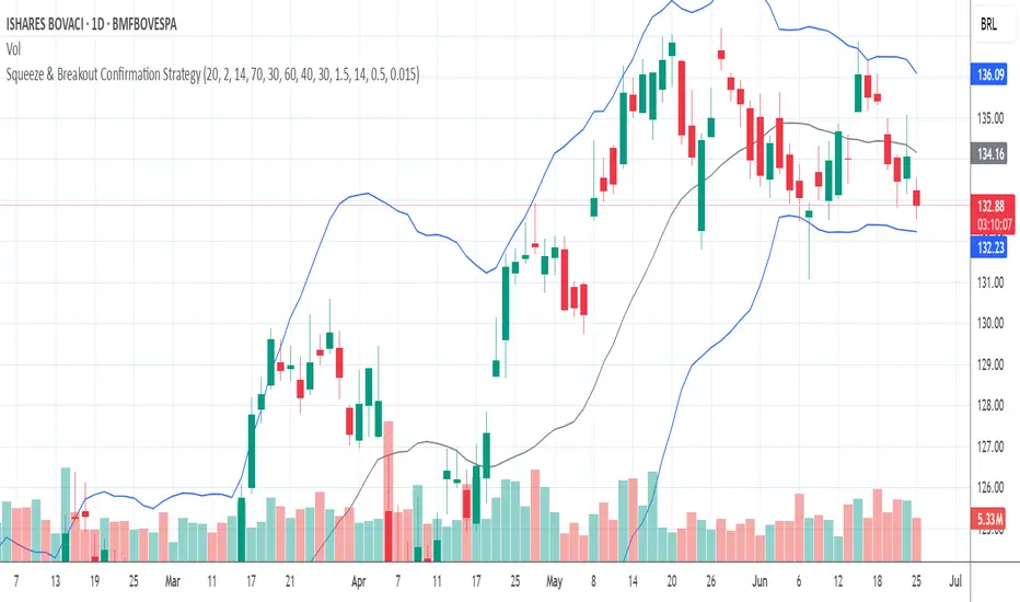
Squeeze & Breakout Confirmation StrategyThis strategy focuses on identifying periods of low volatility (Bollinger Band Squeeze) and then confirming the direction of the subsequent breakout with momentum, volume, and candle strength.
Concepts Applied: Bollinger Bands (Squeeze), RSI (Momentum), Market Volume (Conviction), Candle Size (Strength)
Buy Signal:
Bollinger Band Squeeze: Look for a period where the Bollinger Bands contract significantly, indicating low volatility and consolidation. The bands should be very close to the price action.
RSI Breakout: After the squeeze, wait for the price to break decisively above the upper Bollinger Band. Simultaneously, the RSI should break above 60 (or even 70), indicating strong bullish momentum.
Volume Surge: The breakout candle should be accompanied by a significant increase in trading volume, ideally above its recent average, confirming strong buying interest.
Strong Bullish Candle: The breakout candle itself should be a large, bullish candle (e.g., a strong green candle with a small upper wick or a bullish engulfing pattern), demonstrating buyer conviction.
Sell Signal (Short):
Bollinger Band Squeeze: Look for a period where the Bollinger Bands contract significantly.
RSI Breakdown: After the squeeze, wait for the price to break decisively below the lower Bollinger Band. Simultaneously, the RSI should break below 40 (or even 30), indicating strong bearish momentum.
Volume Surge: The breakdown candle should be accompanied by a significant increase in trading volume, ideally above its recent average, confirming strong selling interest.
Strong Bearish Candle: The breakdown candle itself should be a large, bearish candle (e.g., a strong red candle with a small lower wick or a bearish engulfing pattern), demonstrating seller conviction.
OG MACD-Histogram 6/13/5 © 2025🧠 OG MACD Histogram
📈 Developed by: OG WEALTH
📜 Description for TradingView:
This custom MACD Histogram was developed by OG WEALTH to provide elite-level momentum clarity and intraday reversal precision. Unlike traditional MACD tools, the OG MACD Histogram includes:
🔍 Smoother signal line filters for reduced noise
🟢 Dynamic histogram coloring for trend shifts
🛠 Designed for scalping, swing trades, and trend continuation setups
✅ Color Logic:
Dark green: Momentum building (bullish)
Light green: Momentum fading (still bullish, weakening)
Dark red: Bearish pressure increasing
Light red: Bearish exhaustion
🎯 Best For:
Confirming continuation moves
Detecting early reversals during low volume pullbacks
Pairing with EMA stacks (8/21 or 9/20)
📘 How to Use:
Use with trend overlays, such as EMAs or VWAP.
Look for dark green bars rising = possible call setup.
Look for dark red bars rising = possible put setup.
Wait for the histogram color to flip to confirm a momentum shift.
⚠️ Pro Tip: Combine with OG Flow Signal or ATR Trail for sniper-grade entries.


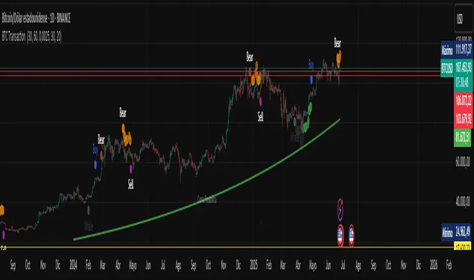
BTC Transaction Indicator Name: "Bitcoin On-Chain Volume & Dynamic Parabolic Curve Signals"
Purpose:
This indicator is designed for Bitcoin traders and long-term holders. It combines the analysis of Bitcoin's on-chain transaction volume with price action to generate "Whale" and "Bear" signals. Additionally, it features a unique dynamic parabolic curve that acts as a visual support line, adapting its visibility based on price interaction with a key Exponential Moving Average (EMA).
Key Components:
On-Chain Volume Analysis:
Utilizes Estimated Transaction Volume (ETRAV) data from the Bitcoin blockchain.
Calculates fast and slow Simple Moving Averages (SMAs) of this volume.
Identifies volume trends (up/down) and significant volume increases/decreases.
Employs fixed thresholds (2,500,000 for low volume and 25,000,000 for high volume) to define key activity levels, similar to how historical on-chain analysis defined accumulation and distribution zones.
Price Action Analysis:
Calculates fast and slow SMAs of the price.
Detects price trends (up/down), recoveries, and declines based on these price SMAs.
"Whale" and "Bear" Signals:
Whale Signals (Buy-side): Generated when there's an upward volume trend, significant volume increase, and a downward price trend followed by price recovery. These indicate potential accumulation phases.
Bear Signals (Sell-side): Generated when there's a downward volume trend, significant volume decrease, and an upward price trend followed by price decline. These indicate potential distribution phases.
Visuals: Both types of signals are plotted as small, colored circles directly on the price chart, with corresponding text labels ("Whale," "Buy," "Bear," "Sell," "Price Recovering," "Price Declining").
Dynamic Parabolic Curve:
Concept: A green parabolic (exponential) curve that serves as a dynamic visual support line.
Activation: The curve starts drawing automatically only when the price crosses over the EMA 500 (Exponential Moving Average of 500 periods). The curve's starting point is set at a user-defined percentage below the EMA 500 value at that exact crossover point.
Visibility: The curve remains visible and continues its trajectory only as long as the price stays above the EMA 500.
Deactivation: The curve disappears instantly if the price falls below or equals the EMA 500. It will only reappear if the price crosses above the EMA 500 again.
Customization: The curve's steepness (Tasa Crecimiento Curva) and its initial distance from the EMA 500 (Inicio Curva % por debajo de EMA500) are adjustable.
Dynamic Label: A "Parabólico" text label is plotted near the center of the active curve segment, with an adjustable vertical offset to ensure it stays visually appealing below the curve.
What is PLOTTED on the chart:
The small, colored circle signals for Whale/Buy and Bear/Sell activity.
The green dynamic parabolic curve.
What is NOT PLOTTED:
EMA 200, EMA 500 lines (though they are calculated internally for logic).
Raw volume data or volume Moving Averages (these are only used for signal calculation, not plotted).
Ideal for:
Bitcoin traders and investors focused on long-term trends and cycle analysis, who want visual cues for accumulation/distribution phases based on on-chain activity, complemented by a unique, dynamically appearing parabolic support curve.
Important Notes:
Relies on the availability of external on-chain data (QUANDL:BCHAIN) within TradingView.
Functions best on a daily timeframe for optimal on-chain data relevance.
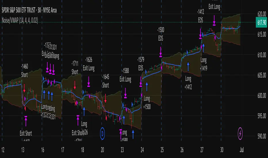
Out of the Noise Intraday Strategy with VWAP [YuL]This is my (naive) implementation of "Beat the Market An Effective Intraday Momentum Strategy for S&P500 ETF (SPY)" paper by Carlo Zarattini, Andrew Aziz, Andrea Barbon, so the credit goes to them.
It is supposed to run on SPY on 30-minute timeframe, there may be issues on other timeframes.
I've used settings that were used by the authors in the original paper to keep it close to the publication, but I understand that they are very aggressive and probably shouldn't be used like that.
Results are good, but not as good as they are stated in the paper (unsurprisingly?): returns are smaller and Sharpe is very low (which is actually weird given the returns and drawdown ratio), there are also margin calls if you enable margin check (and you should).
I have my own ideas of improvements which I will probably implement separately to keep this clean.

NASDAQ Reaper📈 NASDAQ Reaper – The Ultimate Wall Street Killer
The NASDAQ Reaper is a highly advanced Smart Money Concepts (SMC) + Price Action based indicator, engineered for traders who demand accuracy, precision, and real-time edge in the NASDAQ (NQ) market.
This tool was crafted for serious traders looking to dominate the charts with institutional-grade logic, featuring:
✅ Smart Buy/Sell Zones
✅ Opening Range Breakout (ORB) Detection
✅ Volume Confirmation for Strong Entries
✅ Real-Time Entry & Exit Signals
✅ Trend & Momentum Alignment (Multi-Timeframe Logic)
✅ Trailing TP & SL with Visual Feedback
✅ Backtest Module for Strategy Validation
💡 Designed to filter noise and highlight only high-probability setups, NASDAQ Reaper helps you stay one step ahead of retail traders and ride the moves the smart money makes.
🔔 Works best on:
• 5M, 15M, and 30M charts
• London and New York sessions
• Scalping or intraday swing strategy
Whether you're aiming for 50+ tick scalps or sniper entries aligned with trend reversals, this is your secret weapon to level up your trading game.

CM Volume Projection Indicator with ATRCM Volume Projection Indicator
Description:
Elevate your trading analysis with the CM Volume Projection Indicator, a pioneering tool crafted for Trading View charts. This closed-source indicator redefines volume analysis by delivering dynamic, real-time volume forecasts, offering traders a nuanced understanding of market momentum across diverse timeframes and assets.
Key Features:
Dynamic Volume Projection: Utilizes a proprietary algorithm to generate both original and adjusted volume projections, blending current bar elapsed time with historical averages. This creates a tailored forecast that adapts to market conditions, surpassing the limitations of static volume bars.
Percentage-Based Time Adjustment: Incorporates a customizable time factor based on the percentage of remaining candle duration (default 16.67%), enabling precise scaling across timeframes. This innovative approach minimizes overestimation by adjusting projections dynamically as the candle nears completion.
Volume Change Percentage: Introduces a unique metric by comparing current volume to the proportional volume at the same elapsed time in the previous candle, capturing intrabar momentum shifts that traditional indicators, reliant on full candle data, overlook.
Adaptive Spike Factor: Enhances responsiveness by adjusting projections based on volume spikes relative to a moving average, while stabilizing low-volume periods, ensuring reliability in volatile markets.
Fully Customizable Settings: Offers user-controlled adjustments via the strategy bar—including historical averaging period, minimum adjustment factor, spike threshold, moving average type (SMA or EMA), cap threshold percentage, and scaling factor—allowing tailored application without script access.
Visual Customization: Provides color-coded bars and labels for clear interpretation, with optional debug and elapsed time displays for advanced analysis.
How It Works and Adds Value:
The CM Volume Projection Indicator combines a linear scaling of previous candle volume (proportional to elapsed time) with a dynamic cap based on the remaining time percentage, refined by a squared time factor and volatility adjustments. This synergy creates an original intrabar forecasting model that:
Forecasts in Real-Time: Provides forward-looking projections, aiding anticipation of volume trends within the current candle, adaptable to any timeframe.
Delivers Intrabar Precision: Tracks momentum shifts by comparing elapsed-time volumes, offering a granularity static indicators like OBV or volume bars cannot match.
Adapts Across Timeframes: Uses percentage-based caps to ensure consistency, reducing misleading spikes during volatile periods, a step beyond traditional moving average-based tools.
Empowers Strategy: Integrates current volume, moving averages, and adaptive adjustments into a versatile metric, giving traders a strategic edge in diverse market conditions.
Ideal For:
Day traders and scalpers seeking real-time volume insights across short timeframes.
Swing traders analyzing momentum shifts within candles on various durations.
Technical analysts customizing indicators for diverse assets and market environments.
This indicator enhances market analysis as a valuable additional tool, success depends on your strategy and risk management. Explore its potential by adjusting settings via the strategy bar to suit your trading style and leverage its innovative projections in today’s dynamic markets.
Today's Turnover (VWAP × Vol) in CrVWAP (ta.vwap) gives the volume-weighted average price for the current day.
Daily volume is fetched via request.security(..., "D", volume), even if you’re on an intraday chart.
Dividing by 1e7 turns the raw share count into crores.
Multiplying VWAP by that crores-volume gives today’s turnover in “crore-rupees.”
A single label is drawn above the last bar at high + (ticksOffset * mintick).

CVD - Cumulative Volume Delta CandlesCumulative Volume Delta with CVD level Alerts for finding Absorption - statistically the strongest CVD divergence.
Select your CVD levels in Settings > Inputs ("Upper Y Scale Alert Level" / "Lower Y Scale Alert Level") then right click on the green/red levels to create an alert for when CVD crosses.
If CVD hits a new high/low without price doing the same, there is Absorption
Reach out on X @cvolumeprofile to find out on which charts this works best
CVD by @cvolumeprofile also shows candle by candle divergences - highlighted with a green background. This is when a market goes down on more buyers or when a market goes up on more sellers - often signalling market inflection points
