Liquidation Heatmap ║ BullVision 🧠Overview
The Liquidation Heatmap ║ BullVision 💥 is a high-precision visualization tool engineered to highlight probable liquidation levels in crypto markets. It leverages multi-exchange Open Interest data, real-time volume dynamics, and structure-aware volatility signals to reveal where leveraged traders are most at risk of forced position closures.
📖 What Are Liquidations?
In leveraged derivatives markets, a liquidation occurs when a trader’s margin becomes insufficient to maintain their position, triggering an automatic force-close by the exchange. These events are typically clustered around price levels where large volumes of overleveraged positions accumulate. When breached, they often result in sharp, aggressive price movements — also known as liquidation cascades.
This indicator is designed to detect and project such high-risk zones before they trigger, giving traders an edge in visualizing hidden pressure points in the market.
🧠 How It Works
The core engine aggregates real-time ∆OI (Open Interest delta) data from multiple major exchanges and applies a layered filtering system that considers:
Relative Open Interest shifts, normalized against an adaptive moving average baseline
Volume acceleration patterns, compared to a rolling historical benchmark
Market structure context, identifying meaningful directional breaks and failed retests
Leverage-tier modeling, using probabilistic distance rules to simulate where liquidations from 5x to 100x positions would be triggered
Each qualifying liquidation level is rendered using dynamic gradient lines and optional glow-enhanced zone visuals. The display adapts in real time to structural confirmation, volatility regime, and liquidity depth.
Exemple of Liquidation cascades
Exemple of Liquidation rejection
🔍 Key Features
🔗 Multi-Exchange OI Aggregation: Binance, OKX, BitMEX, Kraken (toggleable)
📊 Leverage-Tier Mapping: 5x, 10x, 25x, 50x, 100x projections
🎨 Gradient Zones: Custom color ramps reflect level significance
🧱 Structure-Sensitive Filtering: Noise reduction via multi-condition confirmation logic
🧠 Contextual Directional Bias: Zones filtered based on recent bullish/bearish transitions
⚙️ Fully Customizable: User-defined intensity thresholds, color palette, and range filtering
🧩 Why It’s Worth Paying For
This is not a mashup of public indicators. The script introduces an original, multi-layered architecture combining real-time Open Interest dynamics, structural analysis, and custom liquidation modeling.
Unlike speculative support/resistance plots or volume-only heatmaps, this tool is built to:
Detect liquidation zones before they cascade
React dynamically to market shifts
Filter noise through structural confirmation
Retain historical zones for visual learning and backtesting
✅ Compliance & Originality
This script was developed entirely in-house with original detection logic. No reused open-source components are included. Data requests are made through TradingView’s native .P_OI feeds, and all calculations, signal conditions, and visual logic were coded from scratch for this script.
⚠️ Risk Disclaimer & Access Policy
This script is a visual risk-awareness tool, not a signal generator or financial advice mechanism. No guarantee is made regarding future price action, liquidation triggers, or trading performance.
Use at your own discretion, with proper position sizing, risk management, and awareness of the market's inherent uncertainty.
🔒 Why This Script Is Invite-Only and Closed-Source
To protect its proprietary detection engine, this script is both closed-source and invite-only. The algorithm uses original methods to:
Aggregate real-time Open Interest delta across exchanges
Simulate leverage-based liquidation zones
Dynamically filter zones using structure and volatility layers
Opening the source would expose core detection logic to copycats or misuse. Likewise, access is limited to ensure the tool is used responsibly by serious traders and not distributed or repackaged unethically.
This model preserves the script’s quality, originality, and intended value.
Forecasting

Stop Hunt Indicator ║ BullVision 🧠 Overview
The Stop Hunt Indicator (SmartTrap Radar) is an original tool designed to identify potential liquidity traps caused by institutional stop hunts. It visually maps out historically significant levels where price has repeatedly reversed or rejected — and dynamically detects real-time sweep patterns based on volume, structure, and candle rejection behavior.
This script does not repurpose existing public indicators, nor does it use default TradingView built-ins such as RSI, MACD, or MAs. Its core logic is fully proprietary and was developed from scratch to support discretionary and data-driven traders in visualizing volatility risks and manipulation zones.
🔍 What the Indicator Does
This indicator identifies and visualizes potential stop hunt zones using:
Historical structure analysis: Swing highs/lows are identified via a configurable lookback period.
Liquidity level tracking: Once detected, levels are monitored for touches, age, and volume strength.
Proprietary scoring model: Each level receives a real-time significance score based on:
Age (how long the level has held)
Number of rejections (touches)
Relative volume strength
Proximity to current price
The glow intensity of plotted levels is dynamically mapped based on this score. Bright glow = higher institutional interest probability.
⚙️ Stop Hunt Detection Logic
A stop hunt is flagged when all of the following are met:
Price sweeps through a high/low beyond a user-defined penetration threshold
Wick rejection occurs (i.e., candle closes back inside the level)
Volume spikes above the average in a recent window
The script automatically:
Detects bullish stop hunts (below support) and bearish ones (above resistance)
Marks detected sweeps on-chart with optional 🔰/🚨 signals
Adjusts glow visuals based on score even after the sweep occurs
These sweeps often precede local reversals or high-volatility zones — this is not predictive, but rather a reactive mapping of market manipulation behavior.
📌 Why This Is Not Just Another Liquidity Tool
Unlike typical liquidity heatmaps or S/R indicators, this script includes:
A proprietary significance score instead of fixed rules
Multi-layer glow rendering to reflect level importance visually
Real-time scoring updates as new volume and touches occur
Combined volume × rejection × structure logic to validate stop hunts
Fully customizable detection logic (lookback, wick %, volume filters, max bars, etc.)
This indicator provides a specialized view focused solely on visualizing trap setups — not generic trend signals.
🧪 Usage Recommendations
To get started:
Add the indicator to your chart (volume-enabled instruments only)
Customize detection:
Lookback Period for structure
Penetration % for how far price must sweep
Volume Spike Multiplier
Wick rejection strength
Enable/disable features:
Glow effects
Hunt markers
Score labels
Volume highlights
Watch for:
🔰 Bullish Sweeps (below support)
🚨 Bearish Sweeps (above resistance)
Bright glowing zones = high-liquidity targets
This tool can be used for both confluence and risk assessment, especially around high-impact sessions, liquidation events, or range extremes.
📊 Volume Dependency Notice
⚠️ This indicator requires real volume data to function correctly. On instruments without volume (e.g., synthetic pairs), certain features like spike detection and scoring will be disabled or inaccurate.
🔐 Closed-Source Disclosure
This script is published as invite-only to protect its proprietary scoring, glow mapping, and detection logic. While the full implementation remains confidential, this description outlines all key mechanics and configurable logic for user transparency.

Mavericks ORBMavericks ORB – Opening Range Breakout Zones
Overview:
Mavericks ORB is a fully customizable Opening Range Breakout (ORB) indicator designed for serious intraday traders. It dynamically plots the ORB range for your chosen session and timeframe (5 min, 15 min, or any custom range), projects powerful price zones above and below the range, and automatically includes key midpoints—giving you actionable levels for breakouts, reversals, and dynamic support/resistance.
How It Works:
Configurable Session & Duration:
Choose any session start time and range length (e.g., 5 or 15 minutes) to define your personal ORB window.
Automatic Range Detection:
The indicator marks the high, low, and midpoint of the ORB range as soon as your defined period completes.
Dynamic Zones & Midpoints:
Three replicated price zones are projected both above and below the initial ORB, each calculated using the original ORB’s range and evenly spaced. Each zone includes its own midpoint for nuanced trade management and target planning.
Pre-Market Levels:
Tracks pre-market high and low (with fully customizable colors), giving you crucial context as the regular session opens.
Session Range Visualization:
Highlights the defined trading session with an adjustable background color for easy visual tracking.
Real-Time Info Table:
Displays a summary of all key levels—ORB range, highs, lows, and pre-market levels—right on your chart.
Full Customization:
Adjust all colors, enable/disable session range shading, show/hide labels, and tweak all session settings to fit your trading style.
Key Features:
Select any ORB start time and duration (fully customizable)
Plots ORB High, Low, and Midpoint in real time
Automatically projects 3 zones above and 3 zones below, each with its own midpoint
Pre-market high/low detection and labeling
Configurable session shading for visual clarity
At-a-glance info table with all major levels
Multiple color customizations for all zones and lines
Ready-to-use alert conditions for session and pre-market events
How to Use:
Set your preferred ORB start time and duration (e.g., 9:30 AM, 5 min for US equities).
Watch as the ORB forms and updates in real time.
Once complete, the high, low, and midpoint are plotted.
Monitor the projected zones above and below.
Use these for breakouts, targets, or support/resistance.
Reference the info table for all levels and pre-market context.
Customize as you go: Adjust colors, shading, and session settings to your needs.
Who is this for?
Intraday traders who trade the opening range breakout strategy (stocks, futures, forex, crypto)
Price action traders who want clean, actionable levels
Anyone looking for a reliable, highly visual ORB framework on TradingView
Short Description (for TradingView):
Mavericks ORB is a customizable Opening Range Breakout indicator that plots your session’s high, low, midpoint, and projects three dynamic zones above and below the range including midpoints for powerful trade planning. Includes pre-market levels, session highlights, and a real-time info table. Perfect for intraday price action traders.
What Makes Mavericks ORB Unique?
Flexible: Works with any timeframe or session.
Visual: Clean, uncluttered, and fully customizable.
Strategic: Automatic zone and midpoint projection, not just lines.
Practical: At-a-glance info table and real pre-market context.
Alert-ready: Triggers for session and pre-market events.
If you want to include any tips or a personal note (some script publishers do), you could add:
Tip: Use the midpoints for partial profit-taking or to gauge momentum strength. Adjust your ORB window for different asset classes or volatility environments.

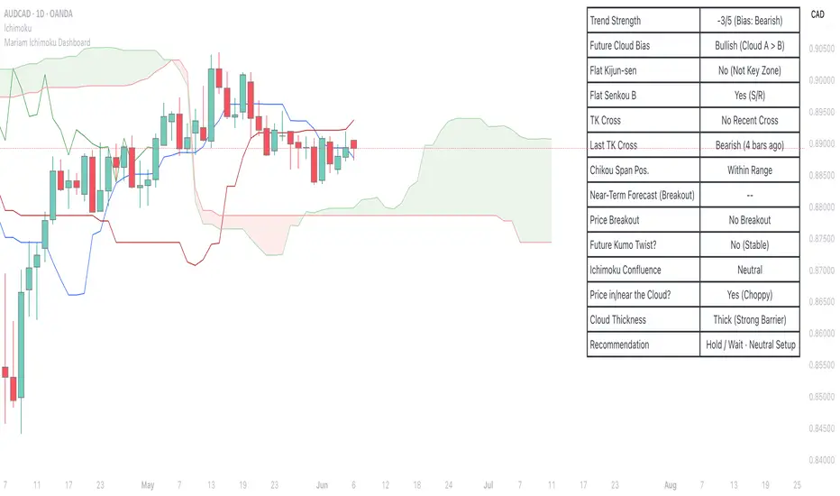
Mariam Ichimoku DashboardPurpose
The Mariam Ichimoku Dashboard is designed to simplify the Ichimoku trading system for both beginners and experienced traders. It provides a complete view of trend direction, strength, momentum, and key signals all in one compact dashboard on your chart. This tool helps traders make faster and more confident decisions without having to interpret every Ichimoku element manually.
How It Works
1. Trend Strength Score
Calculates a score from -5 to +5 based on Ichimoku components.
A high positive score means strong bullish momentum.
A low negative score shows strong bearish conditions.
A near-zero score indicates a sideways or unclear market.
2. Future Cloud Bias
Looks 26 candles ahead to determine if the future cloud is bullish or bearish.
This helps identify the longer-term directional bias of the market.
3. Flat Kijun / Flat Senkou B
Detects flat zones in the Kijun or Senkou B lines.
These flat areas act as strong support or resistance and can attract price.
4. TK Cross
Identifies Tenkan-Kijun crosses:
Bullish Cross means Tenkan crosses above Kijun
Bearish Cross means Tenkan crosses below Kijun
5. Last TK Cross Info
Shows whether the last TK cross was bullish or bearish and how many candles ago it happened.
Helps track trend development and timing.
6. Chikou Span Position
Checks if the Chikou Span is above, below, or inside past price.
Above means bullish momentum
Below means bearish momentum
Inside means mixed or indecisive
7. Near-Term Forecast (Breakout)
Warns when price is near the edge of the cloud, preparing for a potential breakout.
Useful for anticipating price moves.
8. Price Breakout
Shows if price has recently broken above or below the cloud.
This can confirm the start of a new trend.
9. Future Kumo Twist
Detects upcoming twists in the cloud, which often signal potential trend reversals.
10. Ichimoku Confluence
Measures how many key Ichimoku signals are in agreement.
The more signals align, the stronger the trend confirmation.
11. Price in or Near the Cloud
Displays if the price is inside the cloud, which often indicates low clarity or a choppy market.
12. Cloud Thickness
Shows whether the cloud is thin or thick.
Thick clouds provide stronger support or resistance.
Thin clouds may allow easier breakouts.
13. Recommendation
Gives a simple trading suggestion based on all major signals.
Strong Buy, Strong Sell, or Hold.
Helps simplify decision-making at a glance.
Features
All major Ichimoku signals summarized in one panel
Real-time trend strength scoring
Detects flat zones, crosses, cloud twists, and breakouts
Visual alerts for trend alignment and signal confluence
Compact, clean design
Built with simplicity in mind for beginner traders
Tips
Best used on 15-minute to 1-hour charts for short-term trading
Avoid entering trades when price is inside the cloud because the market is often indecisive
Wait for alignment between trend score, TK cross, cloud bias, and confluence
Use the dashboard to support your trading strategy, not replace it
Enable alerts for major confluence or upcoming Kumo twists
Futures vs CFD Price Display
🎯 Trading the same asset in CFDs and Futures but tired of switching charts to compare prices? This is your indicator!
Stop the constant chart hopping! This live price comparison shows you instantly where the better conditions are.
✨ What you get:
Bidirectional: Works in both Futures AND CFD charts
Live prices: Real-time comparison of both markets
Spread calculation: Automatic difference in points and percentage
Fully customizable: Colors, position, size to your liking
Professional design: Clean display with symbol header
🎯 Perfect for:
Gold traders (Futures vs CFD)
Arbitrage strategies
Spread monitoring
Multi-broker comparisons
⚙️ Customization:
3 sizes (Small/Normal/Large) for all screens
4 positions available
Individual color schemes
Toggle features on/off
💡 Simply enter the symbol and keep both markets in sight!
Notice: "Co-developed with Claude AI (Anthropic) - because even AI needs to pay the server bills! 😄"
Fair Value Trend Model [SiDec]ABSTRACT
This pine script introduces the Fair Value Trend Model, an on-chart indicator for TradingView that constructs a continuously updating "fair-value" estimate of an asset's price via a logarithmic regression on historical data. Specifically, this model has been applied to Bitcoin (BTC) to fully grasp its fair value in the cryptocurrency market. Symmetric channel bands, defined by fixed percentage offsets around this central fair-value curve, provide a visual band within which normal price fluctuations may occur. Additionally, a short-term projection extends both the fair-value trend and its channel bands forward by a user-specified number of bars.
INTRODUCTION
Technical analysts frequently seek to identify an underlying equilibrium or "fair value" about which prices oscillate. Traditional approaches-moving averages, linear regressions in price-time space, or midlines-capture linear trends but often misrepresent the exponential or power-law growth patterns observable in many financial markets. The Fair Value Trend Model addresses this by performing an ordinary least squares (OLS) regression in log-space, fitting ln(Price) against ln(Days since inception). In practice, the primary application has been to Bitcoin, aiming to fully capture Bitcoin's underlying value dynamics.
The result is a curved trend line in regular (price-time) coordinates, reflecting Bitcoin's long-term compounding characteristics. Surrounding this fair-value curve, symmetric bands at user-specified percentage deviations serve as dynamic support and resistance levels. A simple linear projection extends both the central fair-value and its bands into the immediate future, providing traders with a heuristic for short-term trend continuation.
This exposition details:
Data transformation: converting bar timestamps into days since first bar, then applying natural logarithms to both time and price.
Regression mechanics: incremental (or rolling-window) accumulation of sums to compute the log-space fit parameters.
Fair-value reconstruction: exponentiation of the regression output to yield a price-space estimate.
Channel-band definition: establishing ±X% offsets around the fair-value curve and rendering them visually.
Forecasting methodology: projecting both the fair-value trend and channel bands by extrapolating the most recent incremental change in price-space.
Interpretation: how traders can leverage this model for trend identification, mean-reversion setups, and breakout analysis, particularly in Bitcoin trading.
Analysing the macro cycle on Bitcoin's monthly timeframe illustrates how the fair-value curve aligns with multi-year structural turning points.
DATA TRANSFORMATION AND NOTATION
1. Timestamp Baseline (t0)
Let t0 = timestamp of the very first bar on the chart (in milliseconds). Each subsequent bar has a timestamp ti, where ti ≥ t0.
2. Days Since Inception (d(t))
Define the “days since first bar” as
d(t) = max(1, (t − t0) / 86400000.0)
Here, 86400000.0 represents the number of milliseconds in one day (1,000 ms × 60 seconds × 60 minutes × 24 hours). The lower bound of 1 ensures that we never compute ln(0).
3. Logarithmic Coordinates:
Given the bar’s closing price P(t), define:
xi = ln( d(ti) )
yi = ln( P(ti) )
Thus, each data point is transformed to (xi, yi) in log‐space.
REGRESSION FORMULATION
We assume a log‐linear relationship:
yi = a + b·xi + εi
where εi is the residual error at bar i. Ordinary least squares (OLS) fitting minimizes the sum of squared residuals over N data points. Define the following accumulated sums:
Sx = Σ for i = 1 to N
Sy = Σ for i = 1 to N
Sxy = Σ for i = 1 to N
Sx2 = Σ for i = 1 to N
N = number of data points
The OLS estimates for b (slope) and a (intercept) are:
b = ( N·Sxy − Sx·Sy ) / ( N·Sx2 − (Sx)^2 )
a = ( Sy − b·Sx ) / N
All‐Time Versus Rolling‐Window Mode:
All-Time Mode:
Each new bar increments N by 1.
Update Sx ← Sx + xN, Sy ← Sy + yN, Sxy ← Sxy + xN·yN, Sx2 ← Sx2 + xN^2.
Recompute a and b using the formulas above on the entire dataset.
Rolling-Window Mode:
Fix a window length W. Maintain two arrays holding the most recent W values of {xi} and {yi}.
On each new bar N:
Append (xN, yN) to the arrays; add xN, yN, xN·yN, xN^2 to the sums Sx, Sy, Sxy, Sx2.
If the arrays’ length exceeds W, remove the oldest point (xN−W, yN−W) and subtract its contributions from the sums.
Update N_roll = min(N, W).
Compute b and a using N_roll, Sx, Sy, Sxy, Sx2 as above.
This incremental approach requires only O(1) operations per bar instead of recomputing sums from scratch, making it computationally efficient for long time series.
FAIR‐VALUE RECONSTRUCTION
Once coefficients (a, b) are obtained, the regressed log‐price at time t is:
ŷ(t) = a + b·ln( d(t) )
Mapping back to price space yields the “fair‐value”:
F(t) = exp( ŷ(t) )
= exp( a + b·ln( d(t) ) )
= exp(a) · ^b
In other words, F(t) is a power‐law function of “days since inception,” with exponent b and scale factor C = exp(a). Special cases:
If b = 1, F(t) = C · d(t), which is an exponential function in original time.
If b > 1, the fair‐value grows super‐linearly (accelerating compounding).
If 0 < b < 1, it grows sub‐linearly.
If b < 0, the fair‐value declines over time.
CHANNEL‐BAND DEFINITION
To visualise a “normal” range around the fair‐value curve F(t), we define two channel bands at fixed percentage offsets:
1. Upper Channel Band
U(t) = F(t) · (1 + α_upper)
where α_upper = (Channel Band Upper %) / 100.
2. Lower Channel Band
L(t) = F(t) · (1 − α_lower)
where α_lower = (Channel Band Lower %) / 100.
For example, default values of 50% imply α_upper = α_lower = 0.50, so:
U(t) = 1.50 · F(t)
L(t) = 0.50 · F(t)
When “Show FV Channel Bands” is enabled, both U(t) and L(t) are plotted in a neutral grey, and a semi‐transparent fill is drawn between them to emphasise the channel region.
SHORT‐TERM FORECAST PROJECTION
To extend both the fair‐value and its channel bands M bars into the future, the model uses a simple constant‐increment extrapolation in price space. The procedure is:
1. Compute Recent Increments
Let
F_prev = F( t_{N−1} )
F_curr = F( t_N )
Then define the per‐bar change in fair‐value:
ΔF = F_curr − F_prev
Similarly, for channel bands:
U_prev = U( t_{N−1} ), U_curr = U( t_N ), ΔU = U_curr − U_prev
L_prev = L( t_{N−1} ), L_curr = L( t_N ), ΔL = L_curr − L_prev
2. Forecasted Values After M Bars
Assuming the same per‐bar increments continue:
F_future = F_curr + M · ΔF
U_future = U_curr + M · ΔU
L_future = L_curr + M · ΔL
These forecasted values produce dashed lines on the chart:
A dashed segment from (bar_N, F_curr) to (bar_{N+M}, F_future).
Dashed segments from (bar_N, U_curr) to (bar_{N+M}, U_future), and from (bar_N, L_curr) to (bar_{N+M}, L_future).
Forecasted channel bands are rendered in a subdued grey to distinguish them from the current solid bands. Because this method does not re‐estimate regression coefficients for future t > t_N, it serves as a quick visual heuristic of trend continuation rather than a precise statistical forecast.
MATHEMATICAL SUMMARY
Summarising all key formulas:
1. Days Since Inception
d(t_i) = max( 1, ( t_i − t0 ) / 86400000.0 )
x_i = ln( d(t_i) )
y_i = ln( P(t_i) )
2. Regression Summations (for i = 1..N)
Sx = Σ
Sy = Σ
Sxy = Σ
Sx2 = Σ
N = number of data points (or N_roll if using rolling‐window)
3. OLS Estimator
b = ( N · Sxy − Sx · Sy ) / ( N · Sx2 − (Sx)^2 )
a = ( Sy − b · Sx ) / N
4. Fair‐Value Computation
ŷ(t) = a + b · ln( d(t) )
F(t) = exp( ŷ(t) ) = exp(a) · ^b
5. Channel Bands
U(t) = F(t) · (1 + α_upper)
L(t) = F(t) · (1 − α_lower)
with α_upper = (Channel Band Upper %) / 100, α_lower = (Channel Band Lower %) / 100.
6. Forecast Projection
ΔF = F_curr − F_prev
F_future = F_curr + M · ΔF
ΔU = U_curr − U_prev
U_future = U_curr + M · ΔU
ΔL = L_curr − L_prev
L_future = L_curr + M · ΔL
IMPLEMENTATION CONSIDERATIONS
1. Time Precision
Timestamps are recorded in milliseconds. Dividing by 86400000.0 yields days with fractional precision.
For the very first bar, d(t) = 1 ensures x = ln(1) = 0, avoiding an undefined logarithm.
2. Incremental Versus Sliding Summation
All‐Time Mode: Uses persistent scalar variables (Sx, Sy, Sxy, Sx2, N). On each new bar, add the latest x and y contributions to the sums.
Rolling‐Window Mode: Employs fixed‐length arrays for {x_i} and {y_i}. On each bar, append (x_N, y_N) and update sums; if array length exceeds W, remove the oldest element and subtract its contribution from the sums. This maintains exact sums over the most recent W data points without recomputing from scratch.
3. Numerical Robustness
If the denominator N·Sx2 − (Sx)^2 equals zero (e.g., all x_i identical, as when only one day has passed), then set b = 0 and a = Sy / N. This produces a constant fair‐value F(t) = exp(a).
Enforcing d(t) ≥ 1 avoids attempts to compute ln(0).
4. Plotting Strategy
The fair‐value line F(t) is plotted on each new bar. Its color depends on whether the current price P(t) is above or below F(t): a “bullish” color (e.g., green) when P(t) ≥ F(t), and a “bearish” color (e.g., red) when P(t) < F(t).
The channel bands U(t) and L(t) are plotted in a neutral grey when enabled; otherwise they are set to “not available” (no plot).
A semi‐transparent fill is drawn between U(t) and L(t). Because the fill function is executed at global scope, it is automatically suppressed if either U(t) or L(t) is not plotted (na).
5. Forecast Line Management
Each projection line (for F, U, and L) is created via a persistent line object. On successive bars, the code updates the endpoints of the same line rather than creating a new one each time, preserving chart clarity.
If forecasting is disabled, any existing projection lines are deleted to avoid cluttering the chart.
INTERPRETATION AND APPLICATIONS
1. Trend Identification
The fair‐value curve F(t) represents the best‐fit long‐term trend under the assumption that ln(Price) scales linearly with ln(Days since inception). By capturing power‐law or exponential patterns, it can more accurately reflect underlying compounding behavior than simple linear regressions.
When actual price P(t) lies above U(t), it may be considered “overextended” relative to its long‐term trend; when price falls below L(t), it may be deemed “oversold.” These conditions can signal potential mean‐reversion or breakout opportunities.
2. Mean‐Reversion and Breakout Signals
If price re‐enters the channel after touching or slightly breaching L(t), some traders interpret this as a mean‐reversion bounce and consider initiating a long position.
Conversely, a sustained move above U(t) can indicate strong upward momentum and a possible bullish breakout. Traders often seek confirmation (e.g., price remaining above U(t) for multiple bars, rising volume, or corroborating momentum indicators) before acting.
3. Rolling Versus All‐Time Usage
All‐Time Mode: Captures the entire dataset since inception, focusing on structural, long‐term trends. It is less sensitive to short‐term noise or volatility spikes.
Rolling‐Window Mode: Restricts the regression to the most recent W bars, making the fair‐value curve more responsive to changing market regimes, sudden volatility expansions, or fundamental shifts. Traders who wish to align the model with local behaviour often choose W so that it approximates a market cycle length (e.g., 100–200 bars on a daily chart).
4. Channel Percentage Selection
A wider band (e.g., ±50 %) accommodates larger price swings, reducing the frequency of breaches but potentially delaying actionable signals.
A narrower band (e.g., ±10 %) yields more frequent “overbought/oversold” alerts but may produce more false signals during normal volatility. It is advisable to calibrate the channel width to the asset’s historical volatility regime.
5. Forecast Cautions
The short‐term projection assumes that the last single‐bar increment ΔF remains constant for M bars. In reality, trend acceleration or deceleration can occur, rendering the linear forecast inaccurate.
As such, the forecast serves as a visual guide rather than a statistically rigorous prediction. It is best used in conjunction with other momentum, volume, or volatility indicators to confirm trend continuation or reversal.
LIMITATIONS AND CONSIDERATIONS
1. Power‐Law Assumption
By fitting ln(P) against ln(d), the model posits that P(t) ≈ C · ^b. Real markets may deviate from a pure power‐law, especially around significant news events or structural regime changes. Temporary misalignment can occur.
2. Fixed Channel Width
Markets exhibit heteroskedasticity: volatility can expand or contract unpredictably. A static ±X % band does not adapt to changing volatility. During high‐volatility periods, a fixed ±50 % may prove too narrow and be breached frequently; in unusually calm periods, it may be excessively broad, masking meaningful variations.
3. Endpoint Sensitivity
Regression‐based indicators often display greater curvature near the most recent data, especially under rolling‐window mode. This can create sudden “jumps” in F(t) when new bars arrive, potentially confusing users who expect smoother behaviour.
4. Forecast Simplification
The projection does not re‐estimate regression slope b for future times. It only extends the most recent single‐bar change. Consequently, it should be regarded as an indicative extension rather than a precise forecast.
PRACTICAL IMPLEMENTATION ON TRADINGVIEW
1 Adding the Indicator
In TradingView’s “Indicators” dialog, search for Fair Value Trend Model or visit my profile, under "scripts" add it to your chart.
Add it to any chart (e.g., BTCUSD, AAPL, EURUSD) to see real‐time computation.
2. Configuring Inputs
Show Forecast Line: Toggle on or off the dashed projection of the fair‐value.
Forecast Bars: Choose M, the number of bars to extend into the future (default is often 30).
Forecast Line Colour: Select a high‐contrast colour (e.g., yellow).
Bullish FV Colour / Bearish FV Colour: Define the colour of the fair‐value line when price is above (e.g., green) or below it (e.g., red).
Show FV Channel Bands: Enable to display the grey channel bands around the fair‐value.
Channel Band Upper % / Channel Band Lower %: Set α_upper and α_lower as desired (defaults of 50 % create a ±50 % envelope).
Use Rolling Window?: Choose whether to restrict the regression to recent data.
Window Bars: If rolling mode is enabled, designate W, the number of bars to include.
3. Visual Output
The central curve F(t) appears on the price chart, coloured green when P(t) ≥ F(t) and red when P(t) < F(t).
If channel bands are enabled, the chart shows two grey lines U(t) and L(t) and a subtle shading between them.
If forecasting is active, dashed extensions of F(t), U(t), and L(t) appear, projecting forward by M bars in neutral hues.
CONCLUSION
The Fair Value Trend Model furnishes traders with a mathematically principled estimate of an asset’s equilibrium price curve by fitting a log‐linear regression to historical data. Its channel bands delineate a normal corridor of fluctuation based on fixed percentage offsets, while an optional short‐term projection offers a visual approximation of trend continuation.
By operating in log‐space, the model effectively captures exponential or power‐law growth patterns that linear methods overlook. Rolling‐window capability enables responsiveness to regime shifts, whereas all‐time mode highlights broader structural trends. Nonetheless, users should remain mindful of the model’s assumptions—particularly the power‐law form and fixed band percentages—and employ the forecast projection as a supplemental guide rather than a standalone predictor.
When combined with complementary indicators (e.g., volatility measures, momentum oscillators, volume analysis) and robust risk management, the Fair Value Trend Model can enhance market timing, mean‐reversion identification, and breakout detection across diverse trading environments.
REFERENCES
Draper, N. R., & Smith, H. (1998). Applied Regression Analysis (3rd ed.). Wiley.
Tsay, R. S. (2014). Introductory Time Series with R (2nd ed.). Springer.
Hull, J. C. (2017). Options, Futures, and Other Derivatives (10th ed.). Pearson.
These references provide background on regression, time-series analysis, and financial modeling.

DCA Investment Tracker Pro [tradeviZion]DCA Investment Tracker Pro: Educational DCA Analysis Tool
An educational indicator that helps analyze Dollar-Cost Averaging strategies by comparing actual performance with historical data calculations.
---
💡 Why I Created This Indicator
As someone who practices Dollar-Cost Averaging, I was frustrated with constantly switching between spreadsheets, calculators, and charts just to understand how my investments were really performing. I wanted to see everything in one place - my actual performance, what I should expect based on historical data, and most importantly, visualize where my strategy could take me over the long term .
What really motivated me was watching friends and family underestimate the incredible power of consistent investing. When Napoleon Bonaparte first learned about compound interest, he reportedly exclaimed "I wonder it has not swallowed the world" - and he was right! Yet most people can't visualize how their $500 monthly contributions today could become substantial wealth decades later.
Traditional DCA tracking tools exist, but they share similar limitations:
Require manual data entry and complex spreadsheets
Use fixed assumptions that don't reflect real market behavior
Can't show future projections overlaid on actual price charts
Lose the visual context of what's happening in the market
Make compound growth feel abstract rather than tangible
I wanted to create something different - a tool that automatically analyzes real market history, detects volatility periods, and shows you both current performance AND educational projections based on historical patterns right on your TradingView charts. As Warren Buffett said: "Someone's sitting in the shade today because someone planted a tree a long time ago." This tool helps you visualize your financial tree growing over time.
This isn't just another calculator - it's a visualization tool that makes the magic of compound growth impossible to ignore.
---
🎯 What This Indicator Does
This educational indicator provides DCA analysis tools. Users can input investment scenarios to study:
Theoretical Performance: Educational calculations based on historical return data
Comparative Analysis: Study differences between actual and theoretical scenarios
Historical Projections: Theoretical projections for educational analysis (not predictions)
Performance Metrics: CAGR, ROI, and other analytical metrics for study
Historical Analysis: Calculates historical return data for reference purposes
---
🚀 Key Features
Volatility-Adjusted Historical Return Calculation
Analyzes 3-20 years of actual price data for any symbol
Automatically detects high-volatility stocks (meme stocks, growth stocks)
Uses median returns for volatile stocks, standard CAGR for stable stocks
Provides conservative estimates when extreme outlier years are detected
Smart fallback to manual percentages when data insufficient
Customizable Performance Dashboard
Educational DCA performance analysis with compound growth calculations
Customizable table sizing (Tiny to Huge text options)
9 positioning options (Top/Middle/Bottom + Left/Center/Right)
Theme-adaptive colors (automatically adjusts to dark/light mode)
Multiple display layout options
Future Projection System
Visual future growth projections
Timeframe-aware calculations (Daily/Weekly/Monthly charts)
1-30 year projection options
Shows projected portfolio value and total investment amounts
Investment Insights
Performance vs benchmark comparison
ROI from initial investment tracking
Monthly average return analysis
Investment milestone alerts (25%, 50%, 100% gains)
Contribution tracking and next milestone indicators
---
📊 Step-by-Step Setup Guide
1. Investment Settings 💰
Initial Investment: Enter your starting lump sum (e.g., $60,000)
Monthly Contribution: Set your regular DCA amount (e.g., $500/month)
Return Calculation: Choose "Auto (Stock History)" for real data or "Manual" for fixed %
Historical Period: Select 3-20 years for auto calculations (default: 10 years)
Start Year: When you began investing (e.g., 2020)
Current Portfolio Value: Your actual portfolio worth today (e.g., $150,000)
2. Display Settings 📊
Table Sizes: Choose from Tiny, Small, Normal, Large, or Huge
Table Positions: 9 options - Top/Middle/Bottom + Left/Center/Right
Visibility Toggles: Show/hide Main Table and Stats Table independently
3. Future Projection 🔮
Enable Projections: Toggle on to see future growth visualization
Projection Years: Set 1-30 years ahead for analysis
Live Example - NASDAQ:META Analysis:
Settings shown: $60K initial + $500/month + Auto calculation + 10-year history + 2020 start + $150K current value
---
🔬 Pine Script Code Examples
Core DCA Calculations:
// Calculate total invested over time
months_elapsed = (year - start_year) * 12 + month - 1
total_invested = initial_investment + (monthly_contribution * months_elapsed)
// Compound growth formula for initial investment
theoretical_initial_growth = initial_investment * math.pow(1 + annual_return, years_elapsed)
// Future Value of Annuity for monthly contributions
monthly_rate = annual_return / 12
fv_contributions = monthly_contribution * ((math.pow(1 + monthly_rate, months_elapsed) - 1) / monthly_rate)
// Total expected value
theoretical_total = theoretical_initial_growth + fv_contributions
Volatility Detection Logic:
// Detect extreme years for volatility adjustment
extreme_years = 0
for i = 1 to historical_years
yearly_return = ((price_current / price_i_years_ago) - 1) * 100
if yearly_return > 100 or yearly_return < -50
extreme_years += 1
// Use median approach for high volatility stocks
high_volatility = (extreme_years / historical_years) > 0.2
calculated_return = high_volatility ? median_of_returns : standard_cagr
Performance Metrics:
// Calculate key performance indicators
absolute_gain = actual_value - total_invested
total_return_pct = (absolute_gain / total_invested) * 100
roi_initial = ((actual_value - initial_investment) / initial_investment) * 100
cagr = (math.pow(actual_value / initial_investment, 1 / years_elapsed) - 1) * 100
---
📊 Real-World Examples
See the indicator in action across different investment types:
Stable Index Investments:
AMEX:SPY (SPDR S&P 500) - Shows steady compound growth with standard CAGR calculations
Classic DCA success story: $60K initial + $500/month starting 2020. The indicator shows SPY's historical 10%+ returns, demonstrating how consistent broad market investing builds wealth over time. Notice the smooth theoretical growth line vs actual performance tracking.
MIL:VUAA (Vanguard S&P 500 UCITS) - Shows both data limitation and solution approaches
Data limitation example: VUAA shows "Manual (Auto Failed)" and "No Data" when default 10-year historical setting exceeds available data. The indicator gracefully falls back to manual percentage input while maintaining all DCA calculations and projections.
MIL:VUAA (Vanguard S&P 500 UCITS) - European ETF with successful 5-year auto calculation
Solution demonstration: By adjusting historical period to 5 years (matching available data), VUAA auto calculation works perfectly. Shows how users can optimize settings for newer assets. European market exposure with EUR denomination, demonstrating DCA effectiveness across different markets and currencies.
NYSE:BRK.B (Berkshire Hathaway) - Quality value investment with Warren Buffett's proven track record
Value investing approach: Berkshire Hathaway's legendary performance through DCA lens. The indicator demonstrates how quality companies compound wealth over decades. Lower volatility than tech stocks = standard CAGR calculations used.
High-Volatility Growth Stocks:
NASDAQ:NVDA (NVIDIA Corporation) - Demonstrates volatility-adjusted calculations for extreme price swings
High-volatility example: NVIDIA's explosive AI boom creates extreme years that trigger volatility detection. The indicator automatically switches to "Median (High Vol): 50%" calculations for conservative projections, protecting against unrealistic future estimates based on outlier performance periods.
NASDAQ:TSLA (Tesla) - Shows how 10-year analysis can stabilize volatile tech stocks
Stable long-term growth: Despite Tesla's reputation for volatility, the 10-year historical analysis (34.8% CAGR) shows consistent enough performance that volatility detection doesn't trigger. Demonstrates how longer timeframes can smooth out extreme periods for more reliable projections.
NASDAQ:META (Meta Platforms) - Shows stable tech stock analysis using standard CAGR calculations
Tech stock with stable growth: Despite being a tech stock and experiencing the 2022 crash, META's 10-year history shows consistent enough performance (23.98% CAGR) that volatility detection doesn't trigger. The indicator uses standard CAGR calculations, demonstrating how not all tech stocks require conservative median adjustments.
Notice how the indicator automatically detects high-volatility periods and switches to median-based calculations for more conservative projections, while stable investments use standard CAGR methods.
---
📈 Performance Metrics Explained
Current Portfolio Value: Your actual investment worth today
Expected Value: What you should have based on historical returns (Auto) or your target return (Manual)
Total Invested: Your actual money invested (initial + all monthly contributions)
Total Gains/Loss: Absolute dollar difference between current value and total invested
Total Return %: Percentage gain/loss on your total invested amount
ROI from Initial Investment: How your starting lump sum has performed
CAGR: Compound Annual Growth Rate of your initial investment (Note: This shows initial investment performance, not full DCA strategy)
vs Benchmark: How you're performing compared to the expected returns
---
⚠️ Important Notes & Limitations
Data Requirements: Auto mode requires sufficient historical data (minimum 3 years recommended)
CAGR Limitation: CAGR calculation is based on initial investment growth only, not the complete DCA strategy
Projection Accuracy: Future projections are theoretical and based on historical returns - actual results may vary
Timeframe Support: Works ONLY on Daily (1D), Weekly (1W), and Monthly (1M) charts - no other timeframes supported
Update Frequency: Update "Current Portfolio Value" regularly for accurate tracking
---
📚 Educational Use & Disclaimer
This analysis tool can be applied to various stock and ETF charts for educational study of DCA mathematical concepts and historical performance patterns.
Study Examples: Can be used with symbols like AMEX:SPY , NASDAQ:QQQ , AMEX:VTI , NASDAQ:AAPL , NASDAQ:MSFT , NASDAQ:GOOGL , NASDAQ:AMZN , NASDAQ:TSLA , NASDAQ:NVDA for learning purposes.
EDUCATIONAL DISCLAIMER: This indicator is a study tool for analyzing Dollar-Cost Averaging strategies. It does not provide investment advice, trading signals, or guarantees. All calculations are theoretical examples for educational purposes only. Past performance does not predict future results. Users should conduct their own research and consult qualified financial professionals before making any investment decisions.
---
© 2025 TradeVizion. All rights reserved.

Previous Two Days HL + Asia H/L + 4H Vertical Lines📊 Indicator Overview
This custom TradingView indicator visually marks key market structure levels and session data on your chart using lines, labels, boxes, and vertical guides. It is designed for traders who analyze intraday and multi-session behavior — especially around the New York and Asia sessions — with a focus on 4-hour price ranges.
🔍 What the Indicator Tracks
1. Previous Two Days' Ranges (6PM–5PM NY Time)
PDH/PDL (Day 1 & Day 2): Draws horizontal lines marking the previous two trading days’ highs and lows.
Midlines: Calculates and displays the midpoint between each day’s high and low.
Color-Coded: Uses strong colors for Day 1 and more transparent versions for Day 2, to help differentiate them.
2. Asia Session High/Low (6 PM – 2 AM NY Time)
Automatically tracks the high and low during the Asia session.
Extends these levels until the following day’s NY close (4 PM).
Shows a midline of the Asia session (optional dotted line).
Highlights the Asia session background in gray.
Labels Asia High and Low on the chart for easy reference.
3. Last Closed 4-Hour Candle Range
At the start of every new 4H candle, it:
Draws a box from the last closed 4H candle.
Box spans horizontally across a set number of bars (adjustable).
Top and bottom lines indicate the high and low of that 4H candle.
Midline, 25% (Q1) and 75% (Q3) levels are also drawn inside the box using dotted lines.
Helps traders identify premium/discount zones within the previous 4H range.
4. Vertical 4H Time Markers
Draws vertical dashed lines to mark the start and end of the last 4H candle range.
Based on the standard 4H bar timing in NY (e.g. 5:00, 9:00, 13:00, 17:00).
⚙️ Inputs & Options
Line thickness, color customization for all levels.
Option to place labels on the right or left side of the chart.
Toggle for enabling/disabling the 4H box.
Adjustable box extension length (how far to extend the range visually).
✅ Ideal Use Cases
Identifying reaction zones from prior highs/lows.
Spotting reversals during Asia or NY session opens.
Trading intraday setups based on 4H structure.
Anchoring scalping or swing entries off major session levels.

Enhanced Seasonality Trade BacktestEnhanced Seasonality Trade Backtest
Overview
A comprehensive Pine Script indicator that backtests seasonal trading strategies by analyzing historical price performance during specific date ranges. The tool provides detailed statistics, visual markers, and election cycle filtering to identify profitable seasonal patterns.
Key Features
📊 Backtesting Engine
Tests up to 50 years of historical data
Configurable entry/exit dates (day/month)
Automatic holiday/weekend date adjustment
Separate analysis for long and short positions
🗳️ Election Cycle Filter
All Years: Test every year in the lookback period
Election Years: US presidential election years only (2024, 2020, 2016...)
Pre-Election Years: Years before elections (2023, 2019, 2015...)
Post-Election Years: Years after elections (2021, 2017, 2013...)
📈 Comprehensive Statistics
Win rate percentage
Total and average returns
Best/worst performing years
Detailed trade-by-trade breakdown
Years tested vs. years filtered
🎯 Visual Indicators
Entry/exit lines for all historical trades
Future trade date projections
Background highlighting during trade periods
Color-coded performance labels
⚙️ Customization Options
Toggle between long/short analysis
Show/hide price and date details
Adjustable table position
Future trade date visualization
Use Cases
Seasonal Trading: Identify recurring profitable periods (e.g., "Sell in May")
Election Cycle Analysis: Test how political cycles affect market performance
Strategy Validation: Backtest specific date-range strategies
Risk Assessment: Analyze worst-case scenarios and drawdowns
Perfect For
Swing traders looking for seasonal edges
Portfolio managers timing market entries/exits
Researchers studying market cyclicality
Anyone wanting to quantify seasonal market behavior
ONLY WORKS IN 1D TIME FRAME

Session Status Table📌 Session Status Table
Session Status Table is an indicator that displays the real-time status of the four major trading sessions:
* 🇯🇵 Asia (Tokyo)
* 🇬🇧 London
* 🇺🇸 New York AM
* 🇺🇸 New York PM
It shows which sessions are currently open, how much time remains until they open or close, and optionally sends alerts in advance.
🧩 Features:
* Real-time session table — shows the status of each session on the chart.
* Color-coded statuses:
* 🟢 Green – Session is open
* 🔴 Red – Session is closed
* ⚪ Gray – Weekend
* Countdown timers until session open or close.
* User alerts — receive a notification a custom number of minutes before a session starts.
⚙️ Customization:
* Table position — fully configurable.
* Session colors — customizable for open, closed, and weekend states.
* Session labels — customizable with icons.
* Notifications:
* Enabled through TradingView's Alerts panel.
* User-defined lead time before session opens.
🕒 Time Zones:
All times are calculated in UTC to ensure consistency across different markets and regions, avoiding discrepancies from time zones and daylight saving time.
🚨 How to enable alerts:
1. Open the "Alerts" panel in TradingView.
2. Click "Create Alert".
3. In the condition dropdown, choose "Session Status Table".
4. Set to any alert() trigger.
5. Save — you'll be notified a set number of minutes before each session begins.
ℹ️ Technical Notes:
* Built with Pine Script version 6.
* Logically divided into clear sections: inputs, session calculations, table rendering, and alerts.
* Optimized for performance and reliability on all timeframes.
Ideal for traders who use session activity in their strategies — especially in Forex, crypto, and futures markets.
QG-Particle OscillatorThis is an advanced oscillator based on auxiliary particle filter. It separates signal from noise and uses smoothing algorithm similar to JMA.
The main oscillator line is a smoothed and detrended version of the price series similar to detrended oscillator line. The purple/aqua lines are a prediction based on an additional adaptive smoothing technique and current volatility.
The prediction is smoothed twice and is supposed to represent the true signal without any noise, thus the prediction should always be less than the raw detrend line. However, certain volatile conditions will cause the prediction to cross above/below the detrend line. When this happens the likelihood of a reversal or pullback is extremely high.
There are 3 dots on the zero line- Red, Green and Yellow. The yellow dots warn of an eminent pullback 2 bars before it actually occurs. This is a non-repainting indicator.
One can also use this indicator to trade CCI signals, similar to zero line rejection in existing trend.
The indicator has 2 settings- Period and Phase. The phase represents cycle phase and Period represents oscillator period.
Credits: This indicator has been originally published for Ninjatrader and this is conversion into pinescript.

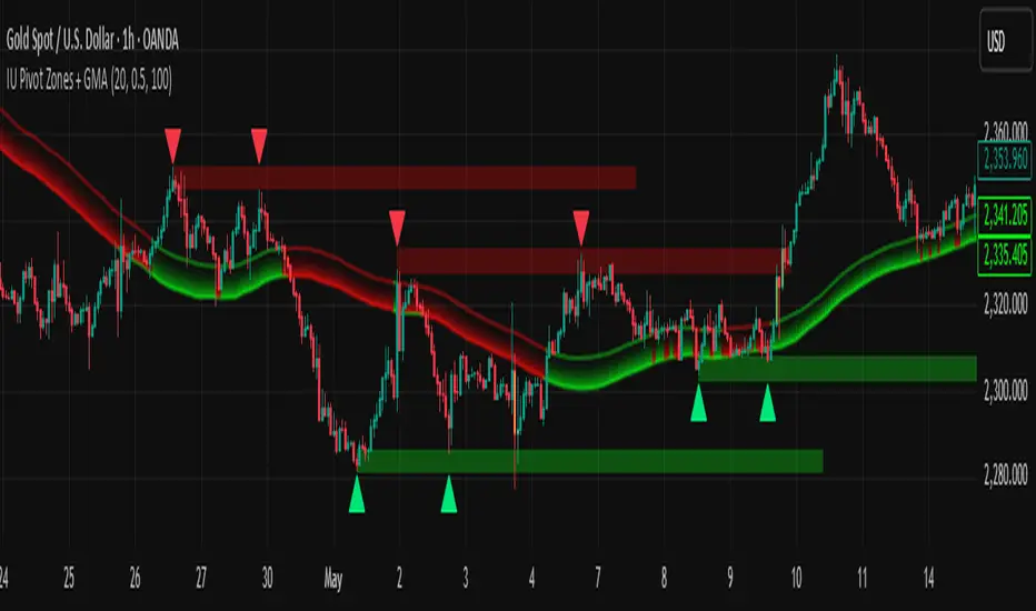
IU Pivot Zones + GMADESCRIPTION:
IU Pivot Zones + GMA is a smart price-action-based indicator that detects meaningful support and resistance zones formed through pivot highs/lows while combining them with dynamic zone generation and Geometric Moving Averages (GMA). This tool is built to help traders visualize institutional breakout/rejection zones with clear, logical mapping and live box management — helping you stay ahead of the move.
The indicator is designed for intraday, swing, and positional traders who want to enhance their trading decisions with visual confluence zones and market structure logic.
USER INPUTS
* Pivot point Lengths: Number of bars used to detect pivot highs/lows
* Zone length: Controls the thickness of the support/resistance zone; higher values create wider zones
* GMA Length: Period for calculating the geometric moving averages based on highs and lows
* Allow Bar/candle Color: Enables or disables special candle coloring when price interacts with the zones
LOGIC OF THE INDICATOR:
* Detects pivot highs and pivot lows using the user-defined length
* Compares consecutive pivot levels to determine if they fall within a valid ATR-based price band to form a zone
* If confirmed, the indicator dynamically plots a resistance or support box between those pivot points, colored respectively (red for resistance, green for support)
* The boxes update in real-time based on price action. If price respects the zone, the box extends forward. If price breaks the zone, the box disappears
* Geometric Moving Averages (GMA) based on logarithmic mean of highs and lows are plotted to offer a trend bias
* Candles that touch the top of the support zone are colored yellow, and those touching the bottom of the resistance zone are orange, enhancing zone reaction visibility
WHY IT IS UNIQUE:
* Uses logarithmic-based GMAs, which are smoother and less reactive than traditional moving averages
* ATR-based zone logic makes it adaptive to volatility instead of using fixed-width zones
* Combines structural levels (pivots), volatility filters (ATR), and trend overlays (GMA) in one unified tool
* Real-time zone extension and disappearance logic based on price interaction
HOW USER CAN BENEFIT FROM IT:
* Spot high-probability breakout or reversal zones that price respects consistently
* Use the GMA cloud for trend confirmation — for example, bullish bias when price is above both GMAs
* Build price action strategies around zone touches, breakouts, or rejections
* Use color-coded candles as real-time alerts for potential entry/exit signals near S/R levels
* Save time by avoiding manual marking of zones on charts across timeframes
DISCLAIMER:
This indicator is created for educational and informational purposes only. It does not constitute financial advice or a recommendation to buy or sell any asset. All trading involves risk, and users should conduct their own analysis or consult with a qualified financial advisor before making any trading decisions. The creator is not responsible for any losses incurred through the use of this tool. Use at your own discretion.
Last Week's APM & Daily % Move(Corrected)Last Week's Average Price Movement + Daily Percentage Move (based on NY time)
This indicator accurately displays last week's Average Pip Movement (APM) consistently across all timeframes and tracks the true daily percentage move relative to that APM in a clear table in the top-right corner.
Key Features:
-Consistent Last Week's APM: Calculates the average pip movement from Monday to Friday of the previous trading week (based on daily wick-to-wick ranges, divided by 5). This APM value is now stable and the same across all chart timeframes.
-Accurate Live Daily % Move: Tracks the maximum percentage the price has moved (either up or down) since the 5 PM New York time daily open, compared to last week's APM. The percentage holds the maximum value reached during the day and resets at the next 5 PM NY open.
-NY Time Alignment: All time-based calculations are aligned with the New York time zone
Pip Adjustment: Automatically adjusts for JPY pairs.
⚠️ Important: For the intended display and relevance of the daily percentage move, this indicator is best used on timeframes 4-hour and under. On Daily and Weekly timeframes, the APM display will show a message indicating this.
We hope this indicator enhances your trading analysis.

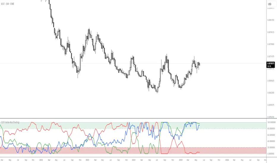
COT-Index-NocTradingCOT Index Indicator
The COT Index Indicator is a powerful tool designed to visualize the Commitment of Traders (COT) data and offer insights into market sentiment. The COT Index is a measurement of the relative positioning of commercial traders versus non-commercial and retail traders in the futures market. It is widely used to identify potential market reversals by observing the extremes in trader positioning.
Customizable Timeframe: The indicator allows you to choose a custom time interval (in months) to visualize the COT data, making it flexible to fit different trading styles and strategies.
How to Use:
Visualize Market Sentiment: A COT Index near extremes (close to 0 or 100) can indicate potential turning points in the market, as it reflects extreme positioning of different market participant groups.
Adjust the Time Interval: The ability to adjust the time interval (in months) gives traders the flexibility to analyze the market over different periods, which can be useful in detecting longer-term trends or short-term shifts in sentiment.
Combine with Other Indicators: To enhance your analysis, combine the COT Index with your technical analysis.
This tool can serve as an invaluable addition to your trading strategy, providing a deeper understanding of the market dynamics and the positioning of major market participants.
Doganayy2 Buy/Sell & liquidityTrap🔧 User-Changeable Settings and Their Meanings
1. ✅ Is Wick Filter Active?
What does it do?: Controls the length of the candle wick.
Effect: If active, a long wick is considered a trap (a sign of manipulation).
2. 📊 Is Volume Filter Active?
What does it do?: Controls abnormally high volume according to the volume average.
Effect: If active, high volume candles are considered for a liquidity trap signal.
3. 📈 Is RSI Filter Active?
What does it do?: Controls overbought/oversold according to the RSI level.
Effect: If active;
If RSI > ?, a long trap is searched.
If RSI < ?, a short trap is searched.
4. 🔴🟢 Is Candle Color (Direction) Filter Active?
What does it do?: Controls whether the candle is green or red.
Effect: If active;
A red candle (selling pressure) is required for a long trap.
A green candle (buying pressure) is required for a short trap.
5. 🧮 Is Fibonacci Level Filter Active?
What does it do?: Checks whether the price has reached important Fibonacci levels.
Effect: If active;
For a long trap, the price must rise above the Fibo level.
For a short trap, the price must fall below the Fibo level.
6. 📏 Is ATR Filter Active?
What does it do?: Checks whether there is sufficient deviation in the price according to the ATR.
Effect: If active;
A trap signal is given according to whether the price has moved too far from the ATR.
📌 As a result:
As these filters are activated, the system's long/short trap detection becomes tighter and produces fewer but more reliable signals. If you close the filters, you will receive more signals, but reliability may decrease.
Purpose of the indicator: To present buy/sell opportunities by detecting liquidity traps.
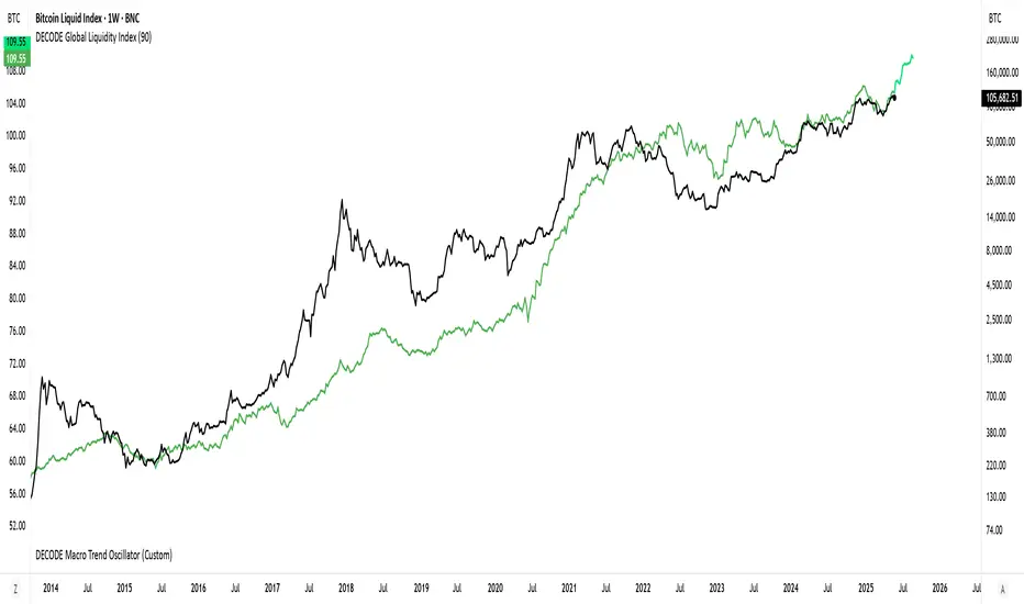
DECODE Global Liquidity IndexDECODE Global Liquidity Index 🌊
The DECODE Global Liquidity Index is a powerful tool designed to track and aggregate global liquidity by combining data from the world's 13 largest economies. It offers a comprehensive view of financial liquidity, providing crucial insights into the underlying currents that can influence asset prices and market trends.
The economies covered are: United States, China, European Union, Japan, India, United Kingdom, Brazil, Canada, Russia, South Korea, Australia, Mexico, and Indonesia. The European Union accounts for major individual economies within the EU like Germany, France, Italy, Spain, Netherlands, Poland, etc.
Key Features:
1. Customizable Liquidity Sources
Include Global M2: You can opt to include the M2 money supply from the 13 listed economies. M2 is a broad measure of money supply that includes cash, checking deposits, savings deposits, money market securities, mutual funds, and other time deposits. (Note: Australia uses M3 as its primary measure, which is included when M2 is selected for Australia).
Include Central Bank Balance Sheets (CBBS): Alternatively, or in addition, you can include the total assets held by the central banks of these economies. Central bank balance sheets expand or contract based on monetary policy operations like quantitative easing (QE) or tightening (QT).
Combined View: If you select both M2 and CBBS, and data is available for both, the indicator will display an average of the two aggregated values. If only one source type is selected, or if data for one type is unavailable despite both being selected, the indicator will display the single available and selected component. This provides flexibility in how you define and analyze global liquidity.
2. Lead/Lag Analysis (Forward Projection):
Lead Offset (Days): This feature allows you to project the liquidity index forward by a specified number of days.
Why it's useful: Global liquidity changes can often be a leading indicator for various asset classes, particularly those sensitive to risk appetite, like Bitcoin or growth stocks. These assets might lag shifts in liquidity. By applying a lead (e.g., 90 days), you can shift the liquidity data forward on your chart to more easily visualize potential correlations and identify if current asset price movements might be responding to past changes in liquidity.
3. Rate of Change (RoC) Oscillator:
Year-over-Year % View: Instead of viewing aggregate liquidity, you can switch to a Year-over-Year (YoY%) Rate of Change (ROC) oscillator.
Why it's useful:
Momentum Identification: The ROC highlights the speed and direction of liquidity changes. Positive values indicate liquidity is increasing compared to a year ago, while negative values show it's decreasing.
Turning Points: Oscillators make it easier to spot potential accelerations, decelerations, or reversals in liquidity trends. A cross above the zero line can signal strengthening liquidity momentum, while a cross below can signal weakening momentum.
Cycle Analysis: It helps in assessing the cyclical nature of liquidity provision and its potential impact on market cycles.
This indicator aims to provide a clear, customizable, and insightful measure of global liquidity to aid traders and investors in their market analysis.
Momentum Fusion v1Momentum Fusion v1
Overview
Momentum Fusion v1 (MFusion) is a multi-oscillator indicator that combines several components to analyze market momentum and trend strength. It incorporates modified versions of classic indicators such as PVI (Positive Volume Index), NVI (Negative Volume Index), MFI (Money Flow Index), RSI, Stochastic, and Bollinger Bands Oscillator. The indicator displays a histogram that changes color based on momentum strength and includes "FUSION🔥" signal labels when extreme values are reached.
Indicator Settings
Parameters:
EMA Length – Smoothing period for the moving average (default: 255).
Smoothing Period – Internal calculation smoothing parameter (default: 15).
BB Multiplier – Standard deviation multiplier for Bollinger Bands (default: 2.0).
Show verde / marron / media lines – Toggles the display of auxiliary lines.
Show FUSION🔥 label – Enables/disables signal labels.
Indicator Components
1. PVI (Positive Volume Index)
Formula:
pvi := volume > volume ? nz(pvi ) + (close - close ) / close * sval : nz(pvi )
Description:
PVI increases when volume rises compared to the previous bar and accounts for price percentage change. The stronger the price movement with increasing volume, the higher the PVI value.
2. NVI (Negative Volume Index)
Formula:
nvi := volume < volume ? nz(nvi ) + (close - close ) / close * sval : nz(nvi )
Description:
NVI tracks price movements during declining volume. If the price rises on low volume, it may indicate a "stealth" trend.
3. Money Flow Index (MFI)
Formula:
100 - 100 / (1 + up / dn)
Description:
An oscillator measuring money flow strength. Values above 80 suggest overbought conditions, while values below 20 indicate oversold conditions.
4. Stochastic Oscillator
Formula:
k = 100 * (close - lowest(low, length)) / (highest(high, length) - lowest(low, length))
Description:
A classic stochastic oscillator showing price position relative to the selected period's range.
5. Bollinger Bands Oscillator
Formula:
(tprice - BB midline) / (upper BB - lower BB) * 100
Description:
Indicates the price position relative to Bollinger Bands in percentage terms.
Key Lines & Histogram
1. Verde (Green Line)
Calculation:
verde = marron + oscp (normalized PVI)
Interpretation:
Higher values indicate stronger bullish momentum. A FUSION🔥 signal appears when the value reaches 750+.
2. Marron (Brown Line)
Calculation:
marron = (RSI + MFI + Bollinger Osc + Stochastic / 3) / 2
Interpretation:
A composite oscillator combining multiple indicators. Higher values suggest overbought conditions.
3. Media (Red Line)
Calculation:
media = EMA of marron with smoothing period
Interpretation:
Acts as a signal line for trend confirmation.
4. Histogram
Calculation:
histo = verde - marron
Colors:
Bright green (>100) – Strong bullish momentum.
Light green (>0) – Moderate bullish momentum.
Orange (<0) – Bearish momentum.
Red (<-100) – Strong bearish momentum.
Signals & Alerts
1. FUSION🔥 (Strong Momentum)
Condition:
verde >= 750
Visualization:
A "FUSION🔥" label appears below the chart.
Alert:
Can be set to trigger notifications when the condition is met.
2. Background Aura
Condition:
verde > 850
Visualization:
The chart background turns teal, indicating extreme momentum.
Usage Recommendations
FUSION🔥 Signal – Can be used as a long entry point when confirmed by other indicators.
Histogram:
1. Green bars – Potential long entry.
2. Red/orange bars – Potential short entry.
3. Media & Marron Crossover – Can serve as an additional trend filter.
4. Suitable for a 5-15 minute time frame
Conclusion
Momentum Fusion v1 is a powerful tool for momentum analysis, combining multiple indicators into a unified system. It is suitable for:
Trend traders (catching strong movements).
Scalpers (identifying short-term impulses).
Swing traders (filtering entry points).
The indicator features customizable settings and visual signals, making it adaptable to various trading styles.

Price Statistical Strategy-Z Score V 1.01
Price Statistical Strategy – Z Score V 1.01
Overview
A technical breakdown of the logic and components of the “Price Statistical Strategy – Z Score V 1.01”.
This script implements a smoothed Z-Score crossover mechanism applied to the closing price to detect potential statistical deviations from local price mean. The strategy operates solely on price data (close) and includes signal spacing control and momentum-based candle filters. No volume-based or trend-detection components are included.
Core Methodology
The strategy is built on the statistical concept of Z-Score, which quantifies how far a value (closing price) is from its recent average, normalized by standard deviation. Two moving averages of the raw Z-Score are calculated: a short-term and a long-term smoothed version. The crossover between them generates long entries and exits.
Signal Conditions
Entry Condition:
A long position is opened when the short-term smoothed Z-Score crosses above the long-term smoothed Z-Score, and additional entry conditions are met.
Exit Condition:
The position is closed when the short-term Z-Score crosses below the long-term Z-Score, provided the exit conditions allow.
Signal Gapping:
A minimum number of bars (Bars gap between identical signals) must pass between repeated entry or exit signals to reduce noise.
Momentum Filter:
Entries are prevented during sequences of three or more consecutively bullish candles, and exits are prevented during three or more consecutively bearish candles.
Z-Score Function
The Z-Score is calculated as:
Z = (Close - SMA(Close, N)) / STDEV(Close, N)
Where N is the base period selected by the user.
Input Parameters
Enable Smoothed Z-Score Strategy
Enables or disables the Z-Score strategy logic. When disabled, no trades are executed.
Z-Score Base Period
Defines the number of bars used to calculate the simple moving average and standard deviation for the Z-Score. This value affects how responsive the raw Z-Score is to price changes.
Short-Term Smoothing
Sets the smoothing window for the short-term Z-Score. Higher values produce smoother short-term signals, reducing sensitivity to short-term volatility.
Long-Term Smoothing
Sets the smoothing window for the long-term Z-Score, which acts as the reference line in the crossover logic.
Bars gap between identical signals
Minimum number of bars that must pass before another signal of the same type (entry or exit) is allowed. This helps reduce redundant or overly frequent signals.
Trade Visualization Table
A table positioned at the bottom-right displays live PnL for open trades:
Entry Price
Unrealized PnL %
Text colors adapt based on whether unrealized profit is positive, negative, or neutral.
Technical Notes
This strategy uses only close prices — no trend indicators or volume components are applied.
All calculations are based on simple moving averages and standard deviation over user-defined windows.
Designed as a minimal, isolated Z-Score engine without confirmation filters or multi-factor triggers.
TrendLine + AlertsThe TrendLine + Alerts indicator is an advanced technical analysis tool designed to quickly identify trend direction using various moving averages and RMSD deviation. It dynamically generates buy and sell signals and visually marks entry points with price labels on the chart. Additionally, an optional transaction table can be toggled on or off, displaying buy and sell prices along with the percentage returns of individual trades and an aggregated summary row, facilitating the evaluation of trading strategy performance.
🔧 Key Features:
- Supports multiple moving average types: SMA, EMA, HMA, DEMA, TEMA, RMA, FRAMA
- Dynamic trend analysis based on RMSD deviation, adaptable to current market conditions
- Color-coded trend indication: green for uptrends, red for downtrends
- Alert generation: real-time buy and sell signals (TrendLine BUY / SELL)
- Price labels on the chart for better visualization of entry/exit points
- Interactive settings panel allowing selection of data source (open, close, high, low etc.), adjustable moving average length, and RMSD deviation multiplier
- Optionally displays a dynamic transaction table (toggleable via chart settings) that shows:
- Buy: entry prices
- Sell: exit prices
- Percent: percentage return of each trade, displayed as a number
- A summary row that aggregates the percentage returns, offering a quick evaluation of trading performance
⚙️ Settings:
- Ability to select the data source: open, close, high, low, oc2, hl2, occ3, hlc3, ohlc4, hlcc4
- Adjustable moving average length
- Customizable RMSD deviation multiplier
- Toggle switch to enable or disable the transaction table
🚀 Application:
Ideal for traders seeking an effective method to identify trends and turning points in the market. It is suitable for both short-term day trading and long-term trend analysis, with adjustable settings to suit individual trading strategies.
CPR by DSKThis CPR (Central Pivot Range) indicator is designed to provide multi-timeframe insights and simplify trend analysis for traders of all levels. Key features include:
1. Dynamic CPR Levels
Automatically adapts and displays CPR levels based on the current chart timeframe (Daily, Weekly, or Monthly).
Useful for identifying intraday or swing trading opportunities.
2. Market Sentiment Summary Table
A compact summary table indicates the market bias (Bullish/Bearish) using the relative position of the price to the Daily, Weekly, and Monthly CPR Pivots.
Helps you instantly assess the prevailing trend across key timeframes.
3. Target Achievement Status
The summary also highlights if any CPR-based targets or key levels have been hit, offering valuable confirmation for trade setups and exits.
This indicator is ideal for traders seeking a quick, visual overview of market structure and trend strength using the well-known CPR method.

MTF - Quantum Fibonacci ATR/ADR Levels & Targets V_2.0# Quantum Fibonacci Wave Mechanics v2.0 Release Notes
## 🚀 New Features
- Added multi-timeframe alert system for buy/sell signals
- Implemented dynamic label management with price values
- New mid-level trigger option for additional signals
- New EMA trigger option for confirmation signals
- Signal bar highlighting option
- Customizable line widths for all levels
## 🎨 Visual Improvements
- Completely redesigned label system (left-aligned with offsets)
- More intuitive input organization
- Better color customization options
## ⚙️ Technical Upgrades
- Upgraded to Pine Script v6
- Reduced repainting with stricter confirmation checks
- Optimized performance with proper variable initialization
## ⚠️ Note for Existing Users
- Some color parameters have been renamed
- Label positioning has changed (now with configurable offset)
- Review new mid-level trigger option in strategy settings
## 🐛 Bug Fixes
- Fixed potential repainting issues in signal generation
- Improved label cleanup between periods
- More robust security function implementation
## ⚠️ Caution for Mid-Level & EMA Signals
- Mid-Level Reversals may trigger premature entries in ranging markets.
- EMA crossovers can lag; confirm with price action.

CAFX Liquidity Pro V1CAFX Liquidity Pro Indicator
Precision Engineered for Smart Profit-Taking
The CAFX Liquidity Pro Indicator is a powerful trading tool designed to help traders pinpoint high-probability liquidity zones, making it ideal for setting accurate and strategic take profit levels. By identifying where institutional interest is likely to reside, this indicator highlights the areas where price is most likely to react, reverse, or pause—giving you the edge in locking in profits before the market shifts.
Whether you're scalping, day trading, or swing trading, the CAFX Liquidity Pro provides clear visual cues that simplify your decision-making process and enhance your trade management. With a focus on precision and reliability, it helps you avoid emotional exits and instead base your take profits on real market behavior and liquidity dynamics.
Use CAFX Liquidity Pro to stay one step ahead—because knowing where to exit is just as important as knowing when to enter.

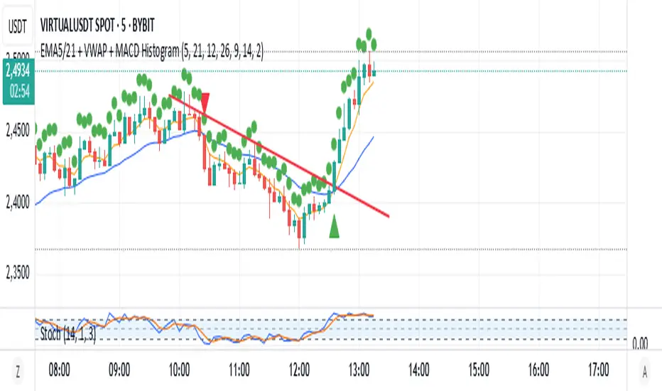
EMA5/21 + VWAP + MACD HistogramScript Summary: EMA + VWAP + MACD + RSI Strategy
Objective: Combine multiple technical indicators to identify market entry and exit opportunities, aiming to increase signal accuracy.
Indicators Used:
EMAs (Exponential Moving Averages): Periods of 5 (short-term) and 21 (long-term) to identify trend crossovers.
VWAP (Volume Weighted Average Price): Serves as a reference to determine if the price is in a fair value zone.
MACD (Moving Average Convergence Divergence): Standard settings of 12, 26, and 9 to detect momentum changes.
RSI (Relative Strength Index): Period of 14 to identify overbought or oversold conditions.
Entry Rules:
Buy (Long): 5-period EMA crosses above the 21-period EMA, price is above VWAP, MACD crosses above the signal line, and RSI is above 40.
Sell (Short): 5-period EMA crosses below the 21-period EMA, price is below VWAP, MACD crosses below the signal line, and RSI is below 60.
Exit Rules:
For long positions: When the 5-period EMA crosses below the 21-period EMA or MACD crosses below the signal line.
For short positions: When the 5-period EMA crosses above the 21-period EMA or MACD crosses above the signal line.
Visual Alerts:
Buy and sell signals are highlighted on the chart with green (buy) and red (sell) arrows below or above the corresponding candles.
Indicator Plotting:
The 5 and 21-period EMAs, as well as the VWAP, are plotted on the chart to facilitate the visualization of market conditions.
This script is a versatile tool for traders seeking to combine multiple technical indicators into a single strategy. It can be used across various timeframes and assets, allowing adjustments according to the trader's profile and market characteristics.
Juliano Einhardt Ulguim, Brazil, 05/27/2025.