Improve your trading skills with PTAHey Traders!
In this video we talk about Post Trade Analysis which we believe it probably the best way to develop your trading skills, trading system and general instinct of trading.
Today we traded the DAX for 2 hours with complete focus, focus is a vital requirement for trading success as it allows you to be present and disciplined to follow your trading rules and system.
The video explains some things we did good and some things we did bad, of-course the good should be repeated in the next trading session, the bad either improved or removed!
Do you do post trade analysis? - Let us know in the comment section below!
Have a fab day!
Trading Tools

Setting Pending Orders and Breakeven TradesHi Purpose Traders. In this video, I will be showing you how to set a sell limit and how to move a trade to breakeven. Both of these are vital to being a profitable trader because there may be times you cannot set manual orders due to time or distractions. There will come a time when you in good profit and you don't want to risk giving it back.
I pray you find value in this video and if you do like the video.

Learn What is U.S. Dollar Index (DXY) 💵💲
Hey traders,
I share my analysis, signals and forecasts on Dollar Index occasionally. Quite often I receive questions from you asking me to explain what exactly that index means and why it is so important.
Dollar Index (DXY) is a measure of the value of the United States Dollar against a weighted basket of major currencies.
This basket consists of 6 following currencies:
🇪🇺Euro (EUR) - 57.6% share
🇯🇵Japanese yen (JPY) - 13.6% share
🇬🇧Pound sterling (GBP) - 11.9% share
🇨🇦Canadian dollar (CAD) - 9.1% share
🇸🇪Swedish krona (SEK) - 4.2% share
🇨🇭Swiss franc (CHF) - 3.6% share
The selection of the following basket of currencies and their weight is determined by the significance of a trading partnership between the countries.
The index value is calculated with the formula:
USDX = 50.14348112 × EURUSD ^ -0.576 × USDJPY ^ 0.136 × GBPUSD ^ -0.119 × USDCAD ^ 0.091 × USDSEK ^ 0.042 × USDCHF ^ 0.036
The index was launched in 1973 and had an initial value of 100.
When the U.S.D is gaining strength against the above-mentioned currencies, the index is growing, while its weakness against them leads to a decline of the index value.
To conclude, the Dollar Index reflects a fair value of the Dollar and its dominance in global markets. Its analysis may help to make more accurate predictions of the future direction of the dollar related instruments.
Do you analyze DXY?
❤️If you have any questions, please, ask me in the comment section.
Please, support my work with like, thank you!❤️

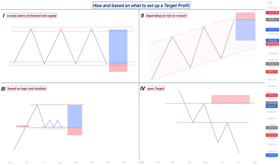
Different strategies of setting a Target ProfitSetting a Target Profit is an inalienable part of every individual's trading strategy, and each trader has his own plan and tactic of integrating a Target Profit into his or her trading style. While there are different ways and types of setting up a Target Profit, we are gonna go through four common and most well-known ones.
1. Key zones
Setting a TP at a crucial zone of support or resistance is a strategy used mainly by swing traders. If the market is ranging, buying a security at the lower barrier of the rectangular box and aiming for the upper barrier of it and vice versa is commonly implemented in the market by middle or long-term speculators.
2. Risk-to-reward
This technique is mostly utilised by day traders and it implies setting a fixed risk-to-reward ratio for every trade and use the "set and forget" logic. On the illustration on the top right graph, it can be inferred that even thought the price has more potential to drop to the downside, a fixed RR of 1:3 has been set.
3. Logic and intuition
The more you trade, the more experience you gain. After some time on the markets, you will easily spot some patterns and price movements in advance, without being in need to have more confluences than usual. On the 3rd chart, we can observe that the price is forming a "Triple Bottom" pattern on the 50% Fibonacci retracement level. Our intuition tells us that after some consolidations, an impulsive move should take place, and there is a high possibility for the price to keep rising and reach the zone of the Higher High illustrated on the graph.
4. Open Target
Lastly, there is a group of traders that prefers having an open Target Profit and letting their trades run for weeks or even months. This tactic is commonly used by position traders, where they set a Stop Loss, but leave their Target Profit open, making it possible for them to hold a transaction open for long periods of time.
Post Trade Analysis (intro video)This is just a quick inditial video of a much more detail video which we will release tomorrow to show why and just how powerful Post Trade Analysis is.
I personally believe it is the express lane to trader development and I highly recommend you guys use it too for every single trade you take!
More on this tomorrow!

Defining TrendlinesLet's make it an objective explanation to what a trendline is. It's an average of price points. An average that is constructed in a vertical design (up or down) to visually aid the direction that price is moving.
Technical analysis needs to be Technical. That means being objective, quantitatively and mathematic, not having objective concepts results in endless (and silly) debates among lots of people, for having lots of different opinions of where the "correct" trendline is.
When the truth is that people simple are using different average points, like different moving averages. There's not exactly a "right" or "wrong" trendline, but there are those who are better fitted to a certain price action development.
The same way that some moving averages are better suited to work some types of price action, some trendlines are better for each market moment.
The best way to become good at drawing trendlines is to practice viewing the average of the price points and connecting them to see if the market recognizes them later as important levels.
Along with support and resistance (horizontal levels) trendlines (vertical levels) construct the market structure and with that knowledge coupled with chart patterns we can create wonderful trades.
Practice daily and frequently, because knowing how to draw trendlines well is next to support and resistances as one of the most important abilities of a Technical analyst and profitable Trader.

What are the parts of a trading strategy?What are the parts of a trading strategy?
I was doing a backtest on a new concept yesterday, and I realized the different parts of my testing strategy. At that moment, I became aware that the way I see any trading strategy is like an algorithm with several filters or steps. When those filters become "TRUE," we can check the following filter until we have a valid setup. Another way of understanding a trading strategy is like a funnel with different filters. At the end of the funnel, we have two possible outcomes.
Outcome 1. You are allowed to set pending orders.
Outcome 2. Do not place orders because one or more filters are not "TRUE."
Why am I writing about this? Because it was clear to me that even if you are doing it consciously or not, every strategy is like an algorithm; it doesn't matter if you trade manually. In the end, your brain is taking the price and making it go through a funnel of filters. So my intention today is that by putting together those different filters/stages/steps I realized yesterday, you can try to see them in your strategy and make improvements to your system or maybe become aware of something you have been doing.
It's important to say that this is a template, maybe you are using 2 filters, or perhaps you are using 5. The key point is understanding the step-by-step process that systematic strategies follow every time a setup is developed.
--------------------------------------------------------
FILTER 1: GENERAL CONTEXT
The most probable thing is that your first filter is about general context. What we are trying to answer here is, "Are we in a valid place for the strategy or not?" Some examples can be:
- The price must be in contact with a support/resistance zone.
- The price must be above/below (a certain technical level)
- The price must be on a drawdown of (time)
(TRUE / FALSE)?. IF true, proceed with the following filter; IF false, you are not allowed to trade.
--------------------------------------------------------
FILTER 2: SPECIFIC CONTEXT.
Now that your first filter is TRUE, the most probable thing is that you are using the 2nd filter regarding context; this is pretty similar to the previous filter but happens after the first one is true. Example:
- Moving averages should be in the following order...
- The price must be above/below (a certain secondary technical level)
- On a lower timeframe, the price must be (technical condition)
(TRUE / FALSE)?. IF true, proceed with the following filter; IF false, you are not allowed to trade.
--------------------------------------------------------
FILTER 3: FINAL CONTEXT BEFORE THE TRIGGER.
Here you will be paying attention to the final filter before the trigger; this is the last thing that, if TRUE, you will be able to wait for your trigger. Example:
- A technical indicator must be overbought/oversold.
- Volume at a certain level should be...
- I need to see a divergence.
(TRUE / FALSE)?. IF true, proceed with the following filter; IF false, you are not allowed to trade.
--------------------------------------------------------
FILTER 4: THE TRIGGER
All the filters are TRUE, and we are allowed to wait for the last thing before executing a setup, "The Trigger." Your trigger is a set of parameters that will enable you to place pending orders. Let's take a look at some of them:
- Candlestick Patterns
- Technical Structures (like Zig-Zag, Triangles, Irregulars, Flat, etc.)
(TRUE / FALSE)?. IF true + Risk to Reward ratio is aligned with the minimum requirements. Then set, Entry level / Stop level / Break-Even level / Take Profit level.
--------------------------------------------------------
My conclusion:
If I understand the different filters I'm using on my strategy, from general to specific ones, it becomes straightforward to make improvements or detect elements that require fixing. Instead of saying "My strategy is not working" or "My strategy requires improvements," we can say: My trigger is excellent. However, my filters regarding general context are not on point so I will work on that.
Understanding the parts of your trading strategy, like parts of an engine, will bring you insights into what you are doing. Try to see your system as a series of gears working together.
Thanks for reading!

Pending Orders Changed The Way I TradeIf you feel like you're missing trades due to a busy work schedule or because you're afraid to hit the button when a great trading opportunity comes along, pending orders may be the thing you need.
In this video, I will teach you the difference between market orders vs. pending orders.
Thank you for watching the video and comment below your thoughts. I'd love to read them ( please be kind and happy trading).

How To Backtest Further In The Past On Low TimeframesQuick video to show this little trick using the Replay mode that allows us to load more historical bars than real time, and thus get a better picture at how a strategy can perform over time.
The Strategy Tester re-calculate the results everytime we load new bars, as the indicator strategy is correctly applied to these new bars.
I got the confirmation from the awesome TradingView Support Team that the extra data that you get this way is real and relevant, and can be used to test your strategies.
That means we are no more limited to 15/30 days backtest data in the 5min timeframe for example.

LET'S GET REAL: Fear of Losing! Hey Traders,
Most traders battle it. I myself had to progress past this in order to achieve consistent returns trading the markets. It is seen as one of the hardest challenges to pass in terms of emotional discipline. Understanding yourself better so you can make decisions in a calm, composed and consistent manner is crucial to success.
Today I wanted to touch on that. I wanted to talk about the fear of losing what spurred from my fear of losing, how I progressed through it (it still creeps in from time to time). Hopefully you can take from my story and how it improved your trading or how it can help you progress past that fear of losing.
If anyone has any questions or maybe some other stories in the way they progressed through a fear of losing or a fear of being a failure, please feel free to share in the comments and I'll get back to you as soon as possible.
Have a fantastic trading week!

Learning to Utilize bots in uncertainty and capitulationOften times when the moments passed, we have lingering hopes of still finding the values of our initial opportunities…however I’ve realized it’s better to win & walk away…come back fresh and plan and execute fresh again! It seems the perspective we have gets colored as we trade. So all my family here and my haters to I simply ask when not certain what to do? Those times utilize trade bots and you’ll certainly woohoo! Matters of capitulation, and when community signals galore! Those who diversify all of their practices will certainly see this through. Imagine setting your parameters based on the channels we draw? Then don’t worry just adjust as it rises and falls ^_^ #BotsFTW

Interest rates, Inflation and how to trade it.Hey Traders,
Massive week this week fundamentally for the Forex market. 3 big interest rate decisions being released so I thought there was no better time than now to have a chat about what it is, what it indicates and finally, how traders profit from it. Fed and BOE almost guaranteed to hike rates, RBA is sitting unsure.
Have a watch of the video and I am more than happy to have a discussion in the comment section!
As always, have a fantastic trading week and I wish you all many profits.

How to distinguish a fake guru from a real professional💯How to distinguish an online conman from a real professional
In 2016-17 there was a boom in the info business, and this field grew so fast and unregulated that it opened the door for many scammers. And, unfortunately, many newcomers are caught by them and lose money.
After all, scammers are not limited to the truth and can draw the sweetest pictures in the head of their potential victims.
And what industry attracts these online conmen the most? Of course, our favorite crypto. It is so attractive because it has the following properties:
• No punishment for fraud
• The ability to promise endless profits
• The unawareness of the masses about its nature
Last year, crypto enthusiasts lost more than $14 billion to fraudulent schemes. This is more than the annual budget of Serbia 🇷🇸, Nigeria 🇳🇬, and 3 times more than Georgia 🇬🇪.
So that you don't lose your hard-earned money, I have prepared for you a simple list of how to distinguish a pseudo-expert from a real pro:
The presence of real statistics. And not for one month, but at least six months. When giga traders sell you a VIP pass to a super-mega-secret group and show you how they made fifty X's by longing doge, ask for real statistics with all trades, or let them return under the rock from which they crawled out.
Talks not only about the victories, but also about his defeats, analyzing mistakes and showing opportunities for growth. Don’t confuse it with a heartbreaking story to get attention.
Never saying something will happen with 100% probability. No one is Nostradamus, and if your favorite expert is yelling about having a crystal ball and going to Mount Sinai at night to ask God if the bitcoin will grow, then I have bad news for you.
Not showing off. For a successful pro, earning thousands of dollars in trading is the norm, he's used to it. He does not need to prove to everyone that he is worth something, showing his park with Lamborghini, he knows himself that he is cool.
Having a huge number of real reviews. He doesn't hide the bad ones and communicate with his dissatisfied audience, because he knows that the truth is on his side and he is responsible for his actions.
Do you think this post would be helpful to a newcomer? If so, click the like so more newbies will see it trending and I can boast to my mom)
Anything to add? Have you ever faced scammers? Tell us about your situation in the comments

The basics of back-testing (HOW TO)Hey Traders,
Today I wanted to follow on from the fantastic amount of comments that we are receiving from the previous video, "stop strategy jumping." It seems that so many of you took a whole heap of value from that video and for that I am very thankful and to everyone who reached out and told their story or let me know that it really touched them.
As highly requested, I wanted to run through a basic way to start getting the grips with strategy back-testing. How can we go about back-testing our strategies to ensure that they are profitable for us in the long run? Take a look, have a listen and tune in. Set up an excel sheet the way I do and get back testing. There's only one way to do this, and it is to do the hard work.
Let me know what you guys find. I can go more in depth in the future, but for now. It seems like most people wanted to get to grips with the absolute basics, which is what I'm going to show you today.
If you have any questions at all, please the comment section is the place to be. As always, have a fantastic trading week and a fantastic weekend traders. I'll see you very soon.

How to use relative strength/weakness in Forex — GBPUSD exampleIchimoku makes identifying trends very easy, but it can be difficult to know when to enter a trend. This factor is often overlooked by newer traders, and it makes a significant difference to risk-adjusted returns.
One of my favourite ways to identify when to enter a trend is to use the concept of relative strength or weakness. Put simply, relative strength or weakness is when you compare a security to an "index" and try to understand whether:
The index is moving up, and your chosen security is moving up even faster = Relative Strength
The index is moving down or ranging, and your chosen security is holding ground or moving slightly higher = Relative Strength
The index is moving down, and your chosen security is moving down even faster = Relative Weakness
The index is moving up or ranging, and your chosen security is holding ground or moving slightly lower = Relative Weakness
This concept is incredibly important to understand. It can turn a B+ setup into an A+ setup.
The question is then, how do you find relative strength? The really easy, beginner-friendly, way is to plot the "Rate of Change" (ROC). This is an included indicator in TradingView and simply tells you how quickly something is moving up or down. What you can do with ROC is to plot it against the symbol you're trading, and then plot it again against an index. An example of an index could be $DXY for the USD. This index would work for pairs like USDJPY, USDEUR, USDGBP, etc. Any pair where USD is the base.
I found a perfect example of relative weakness on GBPUSD. I plotted the ROC for GBPUSD (green) and the ROC for all GBP pairs (red). Ichimoku already told me that GBPUSD was bearish and I was looking for an opportunity to go short. Notice, that when GBPUSD becomes weaker than all GBP pairs, there is almost no bullish pressure.
If you short when there is relative weakness, your trade would have almost zero drawdown, and you would be in profit almost instantly. Yes, you could short anywhere on this chart and make money if you didn't have a stoploss, but this is not how to trade like a professional. If you tried to short this morning when there was no relative weakness, you would have to suffer through +37 pips of drawdown before it started moving down again. Could you take that? Could your risk manager take that if you were trading someone else's money?
I encourage all traders to explore Relative Strength/Weakness. It is one of the most powerful concepts in trading, and as long as you have your "index" right, you can use this anywhere. Stocks, Forex, Crypto, Commoddities, etc.

GBPUSD +7.5R - SMT Divergence, SMC, Element of TimeAs promised, here is the breakdown of my trade on GBPUSD :)
Check the links to related ideas for more context.
Make sure you watch the Element of Time tutorial to better understand this breakdown.

GBPUSD Using the Element of TimeThe element of time is a technical analysis tool that I've previously elaborated on -> Check links to related ideas.
The illustration is pretty self-explanatory.
First attempt failed, however price presented a better opportunity a couple hours later which ultimately yielded all our profits for the week.
I will provide my thought process, execution and exits for this trade in a subsequent recording :)
Stay tuned !

Trading SetupHi traders
in this post would like to share a trade setup i use for a while.
first - supertrand indicator
second - 20-50-200 sma indicator
for supertrand - click on indicators and search for supertrend - choose the 3rd 1 from the list u see.
change settings to - atr period - 5
source - hlcc4 - and atr multiplier - 1
now u have a system which will print out buy / sell signals.
combined with 20-50-200 sma - i take a position when price cross the 20 sma.
look @ the examples - sell signal + cross the 20ma
test it @ home :)
##this is not investing advise##
hope you find it usufull ...
good luck

How to Read a Candlestick | Beginners Guide 🕯
Hey traders,
If you follow me for quite a while you probably noticed that I apply a candlestick chart for the market analysis.
In this post, we will discuss how to read an individual candlestick and we will outline its important elements.
🔰The candlestick reflects the price movement for a selected period of time.
An hourly candle will show you a price action within an hour and a daily candle within a day.
🔰The candlestick pattern has a very specific shape:
it is composed of a body and a wick.
The wick of the candle indicates the range of the price action within the candle. Its upper wick will show you the highest price during that time period and its lower wick will show the lowest price, while the body of the candle indicates its opening and closing price.
🔰From the color of the body of the candle, we identify its direction.
Green signifies a bullish candle while red signifies a bearish one.
🔰The lower boundary of a body of a bullish candle will show its opening price and its upper boundary its closing price.
🔰The upper boundary of a body of a bearish candle indicates its opening price and its lower boundary its closing price level.
With so many elements within a single candlestick, one can derive a lot of valuable information.
Some candlesticks have a very specific form and are called candlestick patterns. They are applied for predicted the future market behavior.
A proper reading of a candlestick chart may unveil a lot of insights about the market so it is very important for you to learn to work with that.
❤️Please, support this idea with like and comment!❤️

The Element of Time - The Most Underrate Technical Analysis ToolMarket timing is an essential tool whether you're a day-trader, portfolio manager and/or long-term investor. I present to you the most underrated technical analysis tool in the space of retail trading. The purpose of this short educational webinar is to open your eyes to something you don't hear about abundantly because it is the most disregarded aspect of trading in my opinion.
As an intraday trader, my main focus is on the speculation of "the next daily candle". However, I first analyze and project on "the next weekly candle". Each weekly candle is broken into 5 individual daily candles, and each daily candle is broken down into 3 main market sessions - namely, Asia, London & New York Session.
You'll find that my main focus in this lesson is on the day in which you find a lower / upper wick being created on the weekly candle. More often than not, "Tuesday" typically forms the low of a bullish weekly candle, and the high of a bearish weekly candle.
Watch the lesson entirely, take notes, but most importantly, let it open up the opportunity for you to exponentially elevate your trading skillset.

The Power of the P0 - P3/P4 Fork for finding P5 ReversalsThe power of the Fork is NOT in just anchoring 3 pivots. The power comes from how the USER applies & interprets the "Story" the FORK is showing you. Today I am showing you a unique method of isolating important pivots in the market that give the trader an increased probability or edge in capturing a strong move. it is NOT the unicorn you've been searching for however unicorns leave clues for those who can see them!
Thanks
RB

multitype dynamic multi registry with categories 3d matrix
using matrixes, and overloads.. a complete parallel multiregistry, multitype,multikey datastore.
it can use get, set, delete, with as many registries and individual matrixes as the system can handle.
system >
registry
category names
key names for each item
value (( to x/y in value matrix)
value matrix
item in x/y coords
so putting item 'float XXX' with a value of XXX (ohlc..) for category 'ohlc values' into value matrix floats, floats1 for hist... etc.. historical value for the past X num of bars for all 4 values in historical matrixes..
here's an example..
almost done testing..
very powerful tool
anyone with extensive skills who can take a look at it, i'm open for help prepping and finding any optimizations available
as is, it is very very fast..
i believe i can improve though from here.
_ohlcreg = initkeyregistry(2,2)
_regfloats = ini_float(2,2)
_hist1_floats = ini_float(2,2)
_colorreg = ini_color(2,2)
set(_regfloats , _ohlcreg, 'Normal', 'open ' , open )
set(_regfloats , _ohlcreg, 'Normal', 'high ' , high )
set(_regfloats , _ohlcreg, 'Normal', 'low ' , low )
set(_regfloats , _ohlcreg, 'Normal', 'close ' , close )
set(_regfloats , _ohlcreg, 'MTF' , 'open ' , request.security('MSFT', 'D', open ))
set(_regfloats , _ohlcreg, 'MTF' , 'high ' , request.security('MSFT', 'D', high ))
set(_regfloats , _ohlcreg, 'MTF' , 'low ' , request.security('MSFT', 'D', low ))
set(_regfloats , _ohlcreg, 'MTF' , 'close ' , request.security('MSFT', 'D', close ))
set(_hist1_floats, _ohlcreg, 'Normal', 'open ' , open )
set(_hist1_floats, _ohlcreg, 'Normal', 'high ' , high )
set(_hist1_floats, _ohlcreg, 'Normal', 'low ' , low )
set(_hist1_floats, _ohlcreg, 'Normal', 'close ' , close )
set(_hist1_floats, _ohlcreg, 'MTF' , 'open ' , request.security('MSFT', 'D', open ))
set(_hist1_floats, _ohlcreg, 'MTF' , 'high ' , request.security('MSFT', 'D', high ))
set(_hist1_floats, _ohlcreg, 'MTF' , 'low ' , request.security('MSFT', 'D', low ))
set(_hist1_floats, _ohlcreg, 'MTF' , 'close ' , request.security('MSFT', 'D', close ))
// add colors for these specific ones.. if a value is attempted to retrieve
// but the spot on the value matrix is empty, it will siimple pull a typecast na.
// so these colors show when specidfied.. will have to make a global or a '*' for any'
set(_colorreg , _ohlcreg, 'Normal', 'open ' , color.red )
set(_colorreg , _ohlcreg, 'Normal', 'high ' , color.green )
set(_colorreg , _ohlcreg, 'Normal', 'low ' , color.blue )
set(_colorreg , _ohlcreg, 'Normal', 'close ' , color.orange)
// ... etc..
// the retrieval now can select along any axis...
// which matrix to use
valmatrix = switch input(0)
0 => _regfloats
1 => _hist1_floats
/// which group to pull from
_barchoice = input.string('MTF', options = )
/// which value from that group-.
valuechoice = switch input(1)
1 => 'open '
2 => 'high '
3 => 'low '
4 => 'close '
plot(get(valmatrix, _ohlcreg, _barchoice, valuechoice ))
plot(get(_regfloats , _ohlcreg, 'Normal', 'open '), 'Normal open ' ,
get(_colorreg , _ohlcreg, 'Normal', 'open '))
plot(get(_regfloats , _ohlcreg, 'Normal', 'high '), 'Normal high ' ,
get(_colorreg , _ohlcreg, 'Normal', 'high '))
plot(get(_regfloats , _ohlcreg, 'Normal', 'low '), 'Normal low ' ,
get(_colorreg , _ohlcreg, 'Normal', 'low '))
plot(get(_regfloats , _ohlcreg, 'Normal', 'close '), 'Normal close ' ,
get(_colorreg , _ohlcreg, 'Normal', 'close '))

The Most Underrated Technical Analysis Tool - Element of Time !Market timing is an essential tool whether you're a day-trader, portfolio manager and/or long-term investor. I present to you the most underrated technical analysis tool in the space of retail trading. The purpose of this short educational webinar is to open your eyes to something you don't hear about abundantly because it is the most disregarded aspect of trading in my opinion.
As an intraday trader, my main focus is on the speculation of "the next daily candle". However, I first analyze and project on "the next weekly candle". Each weekly candle is broken into 5 individual daily candles, and each daily candle is broken down into 3 main market sessions - namely, Asia, London & New York Session.
You'll find that my main focus in this lesson is on the day in which you find a lower / upper wick being created on the weekly candle. More often than not, "Tuesday" typically forms the low of a bullish weekly candle, and the high of a bearish weekly candle.
I encourage you to mark out the Open of your week, and highlight the swing point on the Tuesday of each week. I promise, you'll start implementing the "Element of Time" in your trading toolbox.
Of course this is not a standalone tool, however is helps greatly with the determination of your weekly directional bias. It will also assist with your trade and risk management.
It is to up to you to put the work in and infer whatever information you can from this little teaser of an illustration.
Let this open up the opportunity for you to exponentially elevate your trading skillset.
