Time of Day Background with Bar Count & TableDescription:
This indicator provides a comprehensive overview of market activity by dynamically displaying the time-of-day background and tracking bullish and bearish bar counts across different sessions. It also features a table summarizing the market performance for the last 7 days, segmented into four time-based sessions: Morning, Afternoon, Evening, and Night.
Key Features:
Time of Day Background:
The chart's background color changes based on the time of day:
Evening (12 AM - 6 AM) is shaded blue.
Morning (6 AM - 12 PM) is shaded aqua.
Afternoon (12 PM - 6 PM) is shaded yellow.
Night (6 PM - 12 AM) is shaded silver.
Bullish and Bearish Bar Counting:
It tracks the number of bullish (closing higher than opening) and bearish (closing lower than opening) candles.
The sum of the price differences (bullish minus bearish) for each session is displayed as a dynamic label, indicating overall market direction for each session.
Session Breakdown:
The chart is divided into four sessions, each lasting 6 hours (Morning, Afternoon, Evening, Night).
A new label is generated at the start of each session, indicating the bullish/bearish performance and the net difference in price movements for that session.
Historical Session Performance:
The indicator tracks and stores the performance for each session over the past 7 days.
A table is generated in the top-right corner of the chart, summarizing the performance for each session (Morning, Afternoon, Evening, Night) and the price changes for each of the past 7 days.
The values are color-coded to indicate positive (green) or negative (red) results.
Dynamic Table:
The table presents performance data for each time session over the past week with color-coded cells:
Green cells indicate positive performance.
Red cells indicate negative performance.
Empty cells represent no data for that session.
Use Case:
This indicator is useful for traders who want to track market activity and performance across different times of day and monitor how each session contributes to the overall market trend. It provides both visual insights (through background color) and numerical data (via the table) for better decision-making.
Settings:
The background color and session labels update automatically based on the time of day.
The table updates every day, tracking the performance of each session over the past week.
Statistics

Vortex Candle MarkerVortex Candle Marker
The Vortex Candle Marker is a specialized TradingView indicator designed to identify and highlight **Vortex Candles**—candles that momentarily form without wicks on either the high or low. This unique price behavior can signal potential price retracements or reversals, aligning with the **Power of Three (PO3)** concept in price action theory.
Indicator Logic:
A candle is classified as a **Vortex Candle** if either of these conditions is met during its formation:
1. **Vortex Top:** The **high** equals either the **open** or **close**, indicating no upper wick.
2. **Vortex Bottom:** The **low** equals either the **open** or **close**, indicating no lower wick.
When a Vortex Candle is detected, the indicator changes the **candle border color** to **aqua**, making it easy to identify these significant price moments.
Market Insight & PO3 Interpretation:
In typical price behavior, most candles exhibit both upper and lower wicks, representing price exploration before settling at a closing value. A candle forming without a wick suggests **strong directional intent** at that moment. However, by the **Power of Three (PO3)** concept—Accumulation, Manipulation, and Distribution—such wickless formations often imply:
- **Price Reversion Likelihood:** When a candle temporarily forms without a wick, it suggests the market may **revisit the opening price** to establish a wick before the candle closes.
- **Liquidity Manipulation:** The absence of a wick may indicate a **stop-hunt** or liquidity grab, where the price manipulates one side before reversing.
- **Entry Triggers:** Identifying these moments can help traders anticipate potential **retracements** or **continuations** within the PO3 framework.
Practical Application
- **Early Reversal Detection:** Spot potential price reversals by observing wickless candles forming at key levels.
- **Breakout Validation:** Use Vortex Candles to confirm **true breakouts** or **false moves** before the price returns.
- **Liquidity Zones:** Identify areas where the market is likely to revisit to create a wick, signaling entry/exit points.
This indicator is a powerful tool for traders applying **Po3** methodologies and seeking to capture price manipulation patterns.

CAPM Alpha & BetaThe CAPM Alpha & Beta indicator is a crucial tool in finance and investment analysis derived from the Capital Asset Pricing Model (CAPM) . It provides insights into an asset's risk-adjusted performance (Alpha) and its relationship to broader market movements (Beta). Here’s a breakdown:
1. How Does It Work?
Alpha:
Definition: Alpha measures the portion of an investment's return that is not explained by market movements, i.e., the excess return over and above what the market is expected to deliver.
Purpose: It represents the value a fund manager or strategy adds (or subtracts) from an investment’s performance, adjusting for market risk.
Calculation:
Alpha is derived from comparing actual returns to expected returns predicted by CAPM:
Alpha = Actual Return − (Risk-Free Rate + β × (Market Return − Risk-Free Rate))
Alpha = Actual Return − (Risk-Free Rate + β × (Market Return − Risk-Free Rate))
Interpretation:
Positive Alpha: The investment outperformed its CAPM prediction (good performance for additional value/risk).
Negative Alpha: The investment underperformed its CAPM prediction.
Beta:
Definition: Beta measures the sensitivity of an asset's returns relative to the overall market's returns. It quantifies systematic risk.
Purpose: Indicates how volatile or correlated an investment is relative to the market benchmark (e.g., S&P 500).
Calculation:
Beta is computed as the ratio of the covariance of the asset and market returns to the variance of the market returns:
β = Covariance (Asset Return, Market Return) / Variance (Market Return)
β = Variance (Market Return) Covariance (Asset Return, Market Return)
Interpretation:
Beta = 1: The asset’s price moves in line with the market.
Beta > 1: The asset is more volatile than the market (higher risk/higher potential reward).
Beta < 1: The asset is less volatile than the market (lower risk/lower reward).
Beta < 0: The asset moves inversely to the market.
2. How to Use It?
Using Alpha:
Portfolio Evaluation: Investors use Alpha to gauge whether a portfolio manager or a strategy has successfully outperformed the market on a risk-adjusted basis.
If Alpha is consistently positive, the portfolio may deliver higher-than-expected returns for the given level of risk.
Stock/Asset Selection: Compare Alpha across multiple securities. Positive Alpha signals that the asset may be a good addition to your portfolio for excess returns.
Adjusting Investment Strategy: If Alpha is negative, reassess the asset's role in the portfolio and refine strategies.
Using Beta:
Risk Management:
A high Beta (e.g., 1.5) indicates higher sensitivity to market movements. Use such assets if you want to take on more risk during bullish market phases or expect higher returns.
A low Beta (e.g., 0.7) indicates stability and is useful in diversifying risk in volatile or bearish markets.
Portfolio Diversification: Combine assets with varying Betas to achieve the desired level of market responsiveness and smooth out portfolio volatility.
Monitoring Systematic Risk: Beta helps identify whether an investment aligns with your risk tolerance. For example, high-Beta stocks may not be suitable for conservative investors.
Practical Application:
Use both Alpha and Beta together:
Assess performance with Alpha (excess returns).
Assess risk exposure with Beta (market sensitivity).
Example: A stock with a Beta of 1.2 and a highly positive Alpha might suggest a solid performer that is slightly more volatile than the market, making it a suitable pick for risk-tolerant, return-maximizing investors.
In conclusion, the CAPM Alpha & Beta indicator gives a comprehensive view of an asset's performance and risk. Alpha enables performance evaluation on a risk-adjusted basis, while Beta reveals the level of market risk. Together, they help investors make informed decisions, build optimal portfolios, and align investments with their risk-return preferences.

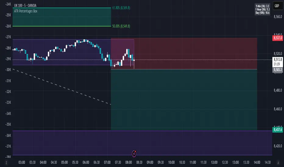
ATR Percentages BoxThis custom indicator provides a quick visual reference for volatility-based price ranges, directly on your TradingView charts. It calculates and displays three ranges derived from the Daily Average True Range (ATR) with a standard 14-period setting:
5 Min (3% ATR): Ideal for very short-term scalping and quick intraday moves.
1 Hour (5% ATR): Useful for hourly setups, short-term trades, and intraday volatility assessment.
Day (10% ATR): Perfect for daily volatility context, swing trades, or placing stops and targets.
The ranges are clearly shown in a compact box at the top-right corner, providing traders immediate insights into realistic price movements, helping to optimise entries, stops, and profit targets efficiently.
Massive Market Order Detector by GSK-VIZAG-AP-INDIA
Massive Market Order Detector by GSK-VIZAG-AP-INDIA
Purpose of the Indicator:
This indicator is designed to detect massive market orders (high-volume trades) in real-time, helping traders identify potential accumulation or distribution zones. It highlights sudden spikes in volume that exceed a calculated threshold, signaling strong buying or selling pressure.
Core Logic & Unique Aspects:
Volume Spike Detection: Compares the current volume to the average volume over a user-defined lookback period. If the volume exceeds the threshold (calculated using a multiplier), it is classified as a Massive Order.
Buy vs. Sell Order Identification: Determines whether the detected massive order is a buy (green marker) or a sell (red marker) based on candlestick price action.
Time Zone Adjustment: Allows traders to adjust the timestamp according to their local timezone, ensuring accurate interpretation of order timings.
Table Display of Recent Orders: A table is created within the chart to list the last 15 detected massive orders, showing key details such as time, volume, type (buy/sell), price, and volume percentage change.
How It Works:
The indicator calculates the average volume over a lookback period (default: 20 bars).
If the current volume exceeds the threshold (average volume × multiplier), it is marked as a Massive Order.
The order is classified as:
Massive Buy Order (MB) → If the closing price is higher than the opening price.
Massive Sell Order (MS) → If the closing price is lower than the opening price.
The detected orders are visually represented as green (MB) and red (MS) labels on the chart.
The most recent 15 massive orders are logged in a table for easy reference.
Intended Use Cases:
🔹 Scalping & Intraday Trading – Spot unusual market activity to enter or exit trades quickly.
🔹 Swing Trading – Identify strong buying or selling pressure at key support/resistance levels.
🔹 Breakout Confirmation – Validate if price breakouts are backed by significant volume.
🔹 Market Manipulation Detection – Recognize potential institutional buying/selling activity.
Input settings:
Lookback Period: Adjust the number of bars to calculate average volume.
Volume Multiplier: Set the threshold as 1/2/3 for defining a massive order.
Time Zone Offset: Modify timestamps to match your local market time.
Max Signals in Table: Control how many signals are displayed in the table.
Why Use This Indicator?
✅ Identifies smart money activity
✅ Works across multiple timeframes (5m, 15m, 1H, Daily, etc.)
✅ No repainting – Reliable real-time signals
✅ Easy-to-read visual cues & table logs
Disclaimer:
"This indicator is for educational and informational purposes only and should not be considered financial advice. Always do your own research (DYOR) and consult with a qualified financial professional before making investment decisions. Trading involves significant risk, and past performance does not guarantee future results. I am not a licensed financial advisor and hold no liability for any losses incurred. This indicator may not work in all market conditions, and results are based on backtesting or hypothetical scenarios. Use at your own discretion and ensure compliance with local regulations."

Extreme Areas with MTF Screener by QTX Algo SystemsStatistically Extreme Areas with MTF Screener by QTX Algo Systems
Overview
This indicator is designed to automatically highlight zones where prices become statistically overextended, signaling potential reversal opportunities. Enhanced with a Multi Time Frame (MTF) Screener, it verifies these extremes across several timeframes for a comprehensive, multi-dimensional view of market conditions.
How It Works
Baseline Statistical Analysis:
The indicator establishes a baseline price range using historical data through a statistical percentile approach. This baseline reflects typical price extremes over time.
Volatility and Momentum Filters:
It incorporates a Bollinger Band Width Percentile (BBWP) to measure real-time volatility and combines this with a double‐smoothed SMI and a Price – Moving Average Ratio (PMARP) to assess short-term momentum. This dual-filter system ensures that signals are generated only when both volatility and momentum conditions are satisfied.
Directional Oscillator (BBO) Analysis:
A Bollinger Band Oscillator (BBO) is used to evaluate the slopes of the upper and lower bands, adding an extra layer of confirmation for identifying true market extremes.
MTF Screener Integration:
The added MTF Screener scans multiple timeframes, confirming that the statistically extreme conditions are not isolated events. This cross-verification provides a more robust signal, ensuring that the identified reversal zones are consistent across the market.
Customizable Visual Alerts:
The indicator allows for customizable color coding for various conditions (e.g., extreme low warnings, extreme high warnings, and potential reversals), offering clear, visual guidance for traders.
Why It’s Different and Valuable
This tool is more than just a simple merger of common indicators—it’s a carefully integrated system that validates price extremes across several dimensions. By combining statistical analysis with real-time volatility, momentum verification, and multi-timeframe confirmation, it provides a dynamic framework that helps traders identify high-probability reversal zones while minimizing false signals. The added MTF Screener ensures that these signals are consistent and reliable across different market views, enhancing the overall decision-making process.
How to Use
Monitor Visual Cues: Look for the color-coded signals that indicate statistically extreme price levels.
Confirm Across Timeframes: Use the MTF Screener component to ensure that the extreme conditions appear consistently across various timeframes.
Integrate with Your Strategy: Use this indicator alongside other technical tools to refine entry, exit, and stop-loss decisions.
Disclaimer
This indicator is for educational purposes only and is intended to support your trading analysis. It does not guarantee performance, and past results are not indicative of future outcomes. Always use proper risk management and conduct your own analysis before trading.

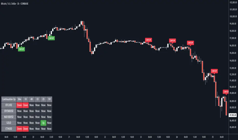
Continuation Opportunity with MTF Screener by QTX Algo SystemsContinuation Opportunity Indicator with MTF Screener by QTX Algo Systems
Overview
This enhanced indicator is designed to pinpoint key moments when an established trend is likely to continue. By combining traditional momentum analysis with dual volatility measures—and now integrating a powerful Multi Time Frame (MTF) Screener—it offers a multi-dimensional view of trend behavior. This tool not only detects when a pullback is simply a temporary consolidation (characterized by reduced volatility) but also confirms that the overall trend is poised to resume, validated across several timeframes.
How It Works
Core Methodology:
The base indicator uses a double‐smoothed Stochastic Momentum Index (SMI) combined with a Price – Moving Average Ratio (PMARP) to detect momentum crossovers that signal trend continuation. It also uses volatility filters to ensure that the signals occur only when market activity is strong.
Dual Volatility Analysis:
A Bollinger Band Width Percentile (BBWP) measure and historical volatility metrics work together to ensure that only meaningful pullbacks trigger signals—distinguishing between noise and genuine consolidation.
MTF Screener Integration:
The new MTF Screener feature extends the analysis beyond a single timeframe. It scans multiple assets and timeframes concurrently, confirming that a detected pullback or resumption signal appears consistently across the broader market view. This cross-verification minimizes false signals and provides traders with confidence that the trend continuation is robust.
Enhanced Visual Cues:
Color-coded backgrounds and well-defined signal triggers help traders quickly interpret when a pullback is likely just a consolidation phase and when increased volatility signals the trend’s resumption.
Why It’s Different and Valuable
Unlike a simple combination of separate indicators, this tool integrates each element in a systematic, layered approach. The MTF Screener adds an extra dimension by validating signals across different timeframes—ensuring that traders are not basing decisions on isolated, potentially misleading data. This cohesive design enhances overall accuracy and provides actionable insights that are more robust than what individual indicators would offer on their own.
How to Use
Monitor Visual Signals: Look for color-coded cues and momentum crossovers that appear after a pullback.
Validate Across Timeframes: Use the MTF Screener’s output to confirm that the continuation signal is consistent across various timeframes.
Integrate with Other Tools: Combine these signals with your existing technical analysis methods to refine your entry and exit points.
Disclaimer
This indicator is provided for educational purposes only and is intended to support your trading analysis. It does not guarantee performance, and past results are not indicative of future outcomes. Always use proper risk management and perform your own analysis before trading.
Simple APF Strategy Backtesting [The Quant Science]Simple backtesting strategy for the quantitative indicator Autocorrelation Price Forecasting. This is a Buy & Sell strategy that operates exclusively with long orders. It opens long positions and generates profit based on the future price forecast provided by the indicator. It's particularly suitable for trend-following trading strategies or directional markets with an established trend.
Main functions
1. Cycle Detection: Utilize autocorrelation to identify repetitive market behaviors and cycles.
2. Forecasting for Backtesting: Simulate trades and assess the profitability of various strategies based on future price predictions.
Logic
The strategy works as follow:
Entry Condition: Go long if the hypothetical gain exceeds the threshold gain (configurable by user interface).
Position Management: Sets a take-profit level based on the future price.
Position Sizing: Automatically calculates the order size as a percentage of the equity.
No Stop-Loss: this strategy doesn't includes any stop loss.
Example Use Case
A trader analyzes a dayli period using 7 historical bars for autocorrelation.
Sets a threshold gain of 20 points using a 5% of the equity for each trade.
Evaluates the effectiveness of a long-only strategy in this period to assess its profitability and risk-adjusted performance.
User Interface
Length: Set the length of the data used in the autocorrelation price forecasting model.
Thresold Gain: Minimum value to be considered for opening trades based on future price forecast.
Order Size: percentage size of the equity used for each single trade.
Strategy Limit
This strategy does not use a stop loss. If the price continues to drop and the future price forecast is incorrect, the trader may incur a loss or have their capital locked in the losing trade.
Disclaimer!
This is a simple template. Use the code as a starting point rather than a finished solution. The script does not include important parameters, so use it solely for educational purposes or as a boilerplate.

Multi-MA RibbonMulti-MA Ribbon is a dynamic and highly customizable indicator designed to visually compare and analyze up to 12 moving average bands simultaneously — across two different moving average (MA) types. This allows traders to study how various MAs behave relative to one another in real time, improving market analysis and trade precision.
The script supports EMA, SMA, HMA, RMA, WMA, VWMA, SWMA, and ALMA, with full user control over periods, ribbon thickness, color, and gradient direction.
Key Features:
Dual Moving Average Ribbon System — Compare two independent MA types side by side on the same price chart.
12 User-Defined Period Bands — Visualize short to long-term trend layers, fully adjustable.
Gradient Coloring with Direction Control — Choose whether fast or slow bands are brightest for quick visual focus.
Customizable Thickness and Colors — Adapt the visualization to fit any chart theme or preference.
Supports All Major MAs — Including EMA, SMA, HMA, RMA, WMA, VWMA, SWMA, ALMA.
Overlay-Friendly — Plots directly over price action for seamless market context.
Analytical and Statistical Value:
Visual Sensitivity Comparison: See how fast-reacting MAs (e.g., EMA, HMA) compare to slower, smoother MAs (e.g., SMA, ALMA) over the same periods — critical for understanding market momentum and lag.
Trend Strength and Consensus Detection: When two ribbons align tightly, the trend is strong and consistent; when they diverge, it signals potential reversal or market indecision.
Momentum Shift Identification: Fast MA ribbons breaking while slow MA ribbons hold indicate early momentum shifts or trap moves.
Trade Filtering and Confirmation: Only trade when both ribbons agree in direction, helping avoid false signals and improving entry/exit confidence.
Quantitative MA Efficiency Testing: Visually backtest and analyze which MA types work best for specific assets or strategies.
Use Cases:
Trend Following: Confirm trend strength by aligning both ribbons.
Reversal Anticipation: Spot divergence between ribbons as early reversal signals.
Momentum Trading: Use fast ribbons for early signals and slow ribbons for confirmation.
Breakout & Pullback Strategy: Analyze whether breakouts are sustained across different MA methodologies.
Backtesting and Optimization: Visually test combinations like EMA vs. HMA or VWMA vs. SMA to optimize strategies for specific assets.
Example MA Comparisons You Can Analyze:
Price Action vs. Volume-weighted: EMA vs. VWMA
Fast-reactive vs. Smooth: HMA vs. SMA
Minimal Lag vs. Standard: ALMA vs. EMA
Weighted vs. Wilder's (RMA): WMA vs. RMA
This is NOT:
A recommendation for what you should personally do.
Investment advice.
Intended solely for qualified investors.
Witchcraft or wizardry.
The only certainty is uncertainty

*Auto Backtest & Optimize EngineFull-featured Engine for Automatic Backtesting and parameter optimization. Allows you to test millions of different combinations of stop-loss and take profit parameters, including on any connected indicators.
⭕️ Key Futures
Quickly identify the optimal parameters for your strategy.
Automatically generate and test thousands of parameter combinations.
A simple Genetic Algorithm for result selection.
Saves time on manual testing of multiple parameters.
Detailed analysis, sorting, filtering and statistics of results.
Detailed control panel with many tooltips.
Display of key metrics: Profit, Win Rate, etc..
Comprehensive Strategy Score calculation.
In-depth analysis of the performance of different types of stop-losses.
Possibility to use to calculate the best Stop-Take parameters for your position.
Ability to test your own functions and signals.
Customizable visualization of results.
Flexible Stop-Loss Settings:
• Auto ━ Allows you to test all types of Stop Losses at once(listed below).
• S.VOLATY ━ Static stop based on volatility (Fixed, ATR, STDEV).
• Trailing ━ Classic trailing stop following the price.
• Fast Trail ━ Accelerated trailing stop that reacts faster to price movements.
• Volatility ━ Dynamic stop based on volatility indicators.
• Chandelier ━ Stop based on price extremes.
• Activator ━ Dynamic stop based on SAR.
• MA ━ Stop based on moving averages (9 different types).
• SAR ━ Parabolic SAR (Stop and Reverse).
Advanced Take-Profit Options:
• R:R: Risk/Reward ━ sets TP based on SL size.
• T.VOLATY ━ Calculation based on volatility indicators (Fixed, ATR, STDEV).
Testing Modes:
• Stops ━ Cyclical stop-loss testing
• Pivot Point Example ━ Example of using pivot points
• External Example ━ Built-in example how test functions with different parameters
• External Signal ━ Using external signals
⭕️ Usage
━ First Steps:
When opening, select any point on the chart. It will not affect anything until you turn on Manual Start mode (more on this below).
The chart will immediately show the best results of the default Auto mode. You can switch Part's to try to find even better results in the table.
Now you can display any result from the table on the chart by entering its ID in the settings.
Repeat steps 3-4 until you determine which type of Stop Loss you like best. Then set it in the settings instead of Auto mode.
* Example: I flipped through 14 parts before I liked the first result and entered its ID so I could visually evaluate it on the chart.
Then select the stop loss type, choose it in place of Auto mode and repeat steps 3-4 or immediately follow the recommendations of the algorithm.
Now the Genetic Algorithm at the bottom right will prompt you to enter the Parameters you need to search for and select even better results.
Parameters must be entered All at once before they are updated. Enter recommendations strictly in fields with the same names.
Repeat steps 5-6 until there are approximately 10 Part's left or as you like. And after that, easily pour through the remaining Parts and select the best parameters.
━ Example of the finished result.
━ Example of use with Takes
You can also test at the same time along with Take Profit. In this example, I simply enabled Risk/Reward mode and immediately specified in the TP field Maximum RR, Minimum RR and Step. So in this example I can test (3-1) / 0.1 = 20 Takes of different sizes. There are additional tips in the settings.
━
* Soon you will start to understand how the system works and things will become much easier.
* If something doesn't work, just reset the engine settings and start over again.
* Use the tips I have left in the settings and on the Panel.
━ Details:
Sort ━ Sorting results by Score, Profit, Trades, etc..
Filter ━ Filtring results by Score, Profit, Trades, etc..
Trade Type ━ Ability to disable Long\Short but only from statistics.
BackWin ━ Backtest Window Number of Candle the script can test.
Manual Start ━ Enabling it will allow you to call a Stop from a selected point. which you selected when you started the engine.
* If you have a real open position then this mode can help to save good Stop\Take for it.
1 - 9 Сheckboxs ━ Allow you to disable any stop from Auto mode.
Ex Source - Allow you to test Stops/Takes from connected indicators.
Connection guide:
//@version=6
indicator("My script")
rsi = ta.rsi(close, 14)
buy = not na(rsi) and ta.crossover (rsi, 40) // OS = 40
sell = not na(rsi) and ta.crossunder(rsi, 60) // OB = 60
Signal = buy ? +1 : sell ? -1 : 0
plot(Signal, "🔌Connector🔌", display = display.none)
* Format the signal for your indicator in a similar style and then select it in Ex Source.
⭕️ How it Works
Hypothesis of Uniform Distribution of Rare Elements After Mixing.
'This hypothesis states that if an array of N elements contains K valid elements, then after mixing, these valid elements will be approximately uniformly distributed.'
'This means that in a random sample of k elements, the proportion of valid elements should closely match their proportion in the original array, with some random variation.'
'According to the central limit theorem, repeated sampling will result in an average count of valid elements following a normal distribution.'
'This supports the assumption that the valid elements are evenly spread across the array.'
'To test this hypothesis, we can conduct an experiment:'
'Create an array of 1,000,000 elements.'
'Select 1,000 random elements (1%) for validation.'
'Shuffle the array and divide it into groups of 1,000 elements.'
'If the hypothesis holds, each group should contain, on average, 1~ valid element, with minor variations.'
* I'd like to attach more details to My hypothesis but it won't be very relevant here. Since this is a whole separate topic, I will leave the minimum part for understanding the engine.
Practical Application
To apply this hypothesis, I needed a way to generate and thoroughly mix numerous possible combinations. Within Pine, generating over 100,000 combinations presents significant challenges, and storing millions of combinations requires excessive resources.
I developed an efficient mechanism that generates combinations in random order to address these limitations. While conventional methods often produce duplicates or require generating a complete list first, my approach guarantees that the first 10% of possible combinations are both unique and well-distributed. Based on my hypothesis, this sampling is sufficient to determine optimal testing parameters.
Most generators and randomizers fail to accommodate both my hypothesis and Pine's constraints. My solution utilizes a simple Linear Congruential Generator (LCG) for pseudo-randomization, enhanced with prime numbers to increase entropy during generation. I pre-generate the entire parameter range and then apply systematic mixing. This approach, combined with a hybrid combinatorial array-filling technique with linear distribution, delivers excellent generation quality.
My engine can efficiently generate and verify 300 unique combinations per batch. Based on the above, to determine optimal values, only 10-20 Parts need to be manually scrolled through to find the appropriate value or range, eliminating the need for exhaustive testing of millions of parameter combinations.
For the Score statistic I applied all the same, generated a range of Weights, distributed them randomly for each type of statistic to avoid manual distribution.
Score ━ based on Trade, Profit, WinRate, Profit Factor, Drawdown, Sharpe & Sortino & Omega & Calmar Ratio.
⭕️ Notes
For attentive users, a little tricks :)
To save time, switch parts every 3 seconds without waiting for it to load. After 10-20 parts, stop and wait for loading. If the pause is correct, you can switch between the rest of the parts without loading, as they will be cached. This used to work without having to wait for a pause, but now it does slower. This will save a lot of time if you are going to do a deeper backtest.
Sometimes you'll get the error “The scripts take too long to execute.”
For a quick fix you just need to switch the TF or Ticker back and forth and most likely everything will load.
The error appears because of problems on the side of the site because the engine is very heavy. It can also appear if you set too long a period for testing in BackWin or use a heavy indicator for testing.
Manual Start - Allow you to Start you Result from any point. Which in turn can help you choose a good stop-stick for your real position.
* It took me half a year from idea to current realization. This seems to be one of the few ways to build something automatic in backtest format and in this particular Pine environment. There are already better projects in other languages, and they are created much easier and faster because there are no limitations except for personal PC. If you see solutions to improve this system I would be glad if you share the code. At the moment I am tired and will continue him not soon.
Also You can use my previosly big Backtest project with more manual settings(updated soon)

Clustering Volatility (ATR-ADR-ChaikinVol) [Sam SDF-Solutions]The Clustering Volatility indicator is designed to evaluate market volatility by combining three widely used measures: Average True Range (ATR), Average Daily Range (ADR), and the Chaikin Oscillator.
Each indicator is normalized using one of the available methods (MinMax, Rank, or Z-score) to create a unified metric called the Score. This Score is further smoothed with an Exponential Moving Average (EMA) to reduce noise and provide a clearer view of market conditions.
Key Features:
Multi-Indicator Integration: Combines ATR, ADR, and the Chaikin Oscillator into a single Score that reflects overall market volatility.
Flexible Normalization: (Supports three normalization methods)
MinMax: Scales values between the observed minimum and maximum.
Rank: Normalizes based on the relative rank within a moving window.
Z-score: Standardizes values using mean and standard deviation.
Dynamic Window Selection: Offers an automatic window selection option based on a specified lookback period, or a fixed window size can be used.
Customizable Weights: Allows the user to assign individual weights to ATR, ADR, and the Chaikin Oscillator. Optionally, weights can be normalized to sum to 1.
Score Smoothing: Applies an EMA to the computed Score to smooth out short-term fluctuations and reduce market noise.
Cluster Visualization: Divides the smoothed Score into a number of clusters, each represented by a distinct color. These colors can be applied to the price bars (if enabled) for an immediate visual indication of the current volatility regime.
How It Works:
Input & Window Setup: Users set parameters for indicator periods, normalization methods, weights, and window size. The indicator can automatically determine the analysis window based on the number of lookback days.
Calculation of Metrics: The indicator computes the ATR, ADR (as the average of bar ranges), and the Chaikin Oscillator (based on the difference between short and long EMAs of the Accumulation/Distribution line).
Normalization & Scoring: Each indicator’s value is normalized and then weighted to form a raw Score. This raw Score is scaled to a range using statistics from the chosen window.
Smoothing & Clustering: The raw Score is smoothed using an EMA. The resulting smoothed Score is then multiplied by the number of clusters to assign a cluster index, which is used to choose a color for visual signals.
Visualization: The smoothed Score is plotted on the chart with a color that changes based on its value (e.g., lime for low, red for high, yellow for intermediate values). Optionally, the price bars are colored according to the assigned cluster.
_____________
This indicator is ideal for traders seeking a quick and clear assessment of market volatility. By integrating multiple volatility measures into one comprehensive Score, it simplifies analysis and aids in making more informed trading decisions.
For more detailed instructions, please refer to the guide here:

Statistically Extreme Areas by QTX Algo SystemsStatistically Extreme Areas by QTX Algo Systems
Overview
This indicator helps traders pinpoint potential reversal zones by detecting when prices become statistically overextended. By combining advanced statistical analysis with volatility and momentum metrics—including BBWP, SMI, PMARP, and Bollinger Band Oscillator (BBO) slope analysis—it provides clear visual cues for identifying market extremes and managing risk.
How It Works
Baseline Statistical Calculation:
The indicator starts by establishing a baseline price range using historical data through a statistical percentile approach. This captures the typical extremes over a significant period and forms the foundation for further analysis.
Volatility Adjustment:
A Bollinger Band Width Percentile (BBWP) measure is used to assess recent price variability. This dynamic volatility factor adjusts the baseline, ensuring that signals are only generated when overall market volatility exceeds a minimum threshold.
Momentum and Trend Verification:
A double‐smoothed Stochastic Momentum Index (SMI) captures short-term momentum, while a Price – Moving Average Ratio (PMARP) confirms the prevailing trend's strength. Additionally, a Bollinger Band Oscillator (BBO) calculates the slopes of the upper and lower bands to further refine the detection of extreme conditions without relying solely on a simple mashup of standard indicators.
Why It's Different
Rather than merely merging common indicators, this tool integrates distinct layers of analysis to produce a cohesive and dynamic framework. The synthesis of statistical extremes, real-time volatility adjustments, and momentum/trend verification helps filter out noise and false signals, offering traders a robust method to identify reversal zones and set precise stop-loss levels. This multi-dimensional approach delivers actionable insights that go beyond what traditional support/resistance or momentum indicators can offer on their own.
How to Use
Interpret the Visual Cues:
Watch for the color-coded background changes that signal statistically extreme conditions.
Integrate with Your Analysis:
Use these visual alerts alongside other technical tools to refine your entry and exit decisions and to enhance your overall risk management.
Disclaimer
This indicator is for educational purposes only and is intended to support your trading analysis. It does not guarantee performance, and past results are not indicative of future outcomes. Always use proper risk management and perform your own analysis before trading.

Statistical Price Bands with Trend Filtering by QTX Algo SystemsStatistical Price Bands with Trend Filtering by QTX Algo Systems
Overview
This indicator generates adaptive support and resistance bands by fusing statistical analysis with real-time volatility and trend measurements. It highlights areas where prices appear overextended, providing traders with clear visual cues for potential reversals or risk management adjustments.
How It Works
Baseline Statistical Calculation:
The indicator begins by deriving a baseline price range from historical data using a statistical percentile approach. This percentile reflects the typical extremes observed over a significant period, forming the foundation for the bands.
Volatility Adjustment:
A dynamic volatility factor is then calculated by comparing the moving standard deviation of price to its moving average. This factor adjusts the baseline, ensuring that the bands reflect current market variability. The use of both a long-term dispersion measure and a short-term percentile-based volatility metric helps confirm that overall market volatility remains above a minimum threshold.
Trend Filtering:
In parallel, the indicator assesses trend direction by comparing the current price to a volume-weighted moving average (VWMA). This trend component shifts the bands in the direction of the prevailing market bias—moving the bands upward during uptrends and downward during downtrends.
Why It’s Different
Unlike traditional static support/resistance tools, this indicator integrates multiple layers of analysis—statistical extremes, real-time volatility, and trend direction—to create bands that continuously adapt to market conditions. This synthesis produces a dynamic framework that not only identifies potential overextended price areas but also provides practical stop loss levels, setting it apart from other basic band or moving average models.
How to Use
Customize the baseline statistical setting to match your trading style. Use the dynamically adjusted bands as visual cues for potential reversal zones or as guides for setting stop losses. Combine these insights with other technical tools to refine your entry and exit decisions.
Disclaimer
This indicator is for educational purposes only and is intended to support your trading strategy. It does not guarantee performance, and past results are not indicative of future outcomes. Always use proper risk management and perform your own analysis before trading.

Volatility Based SMI with Dynamic Bands by QTX Algo SystemsVolatility Based SMI with Dynamic Bands by QTX Algo Systems
Overview
This advanced oscillator redefines the classic Stochastic Momentum Index (SMI) by incorporating adaptive volatility scaling and dynamically tilting its overbought and oversold levels based on market trends. The result is a context-sensitive momentum tool that adjusts its thresholds in real time, helping traders identify potential reversals or trend continuations more effectively.
How It Works
Enhanced SMI Calculation:
The indicator starts by computing a double‐smoothed SMI. Two layers of exponential moving averages—controlled by the “Smoothing K” and “Smoothing D” inputs—are applied to both the relative price range and the overall range (difference between the highest high and lowest low) over a fixed period. This process reduces short-term noise and isolates the underlying momentum.
Adaptive Volatility Scaling:
A normalized volatility measure is derived using a fixed Bollinger Band Width Percentile (BBWP) approach. This volatility metric is used to create an adaptive adjustment factor that scales the SMI, ensuring that the oscillator’s sensitivity reflects current market conditions without being distorted by temporary extremes.
Dynamic Threshold Adjustment:
The indicator then calculates trend strength using a lookback period (set by the “Trend Lookback Period” input) that compares the current price to a volume-weighted moving average (VWMA). This trend strength is used to adjust the base overbought and oversold levels (fixed at 50 and –50) through two mechanisms:
Band Tilt Strengths:
The “Upper Band Tilt Strength” and “Lower Band Tilt Strength” inputs determine how aggressively the respective thresholds are shifted in response to the prevailing trend. In an uptrend, for example, the oversold level is raised more noticeably, while in a downtrend, the overbought level is lowered.
Opposite Band Compression:
The “Opposite Band Compression Strength” input further refines this adjustment by accelerating the contraction of the opposite band during trend reversals, enhancing the indicator’s responsiveness.
How to Use and Input Adjustments
Smoothing K & Smoothing D:
Adjust these to control the degree of smoothing in the SMI calculation. Lower values provide quicker, albeit noisier, responses, while higher values yield smoother signals.
SMI EMA Length:
This sets the sensitivity of the moving average applied to the SMI, affecting how promptly crossover signals are generated.
Trend Lookback Period:
Defines the historical window for assessing trend strength. A longer period gives a more stable trend, while a shorter period increases responsiveness.
Upper/Lower Band Tilt Strength:
These parameters determine how much the overbought and oversold levels shift in response to the market’s trend. Increasing these values results in more pronounced threshold adjustments.
Opposite Band Compression Strength:
This setting influences how quickly the opposite band compresses during trend reversals, thereby fine-tuning the dynamic nature of the oscillator’s thresholds.
What Makes It Proprietary
Traditional SMI indicators typically rely on fixed thresholds for overbought and oversold conditions. Our approach is proprietary because it seamlessly integrates adaptive volatility scaling with dynamic, trend-based threshold adjustments. This fusion produces an oscillator that is acutely sensitive to current market conditions, offering a more nuanced and context-aware view of momentum that stands apart from conventional methods.
How to Use
Monitor the oscillator for crossovers between the SMI and its EMA, which serve as potential signals for reversals or confirmations of trend continuation. Fine-tune the input parameters to match your market conditions and trading style, and use the dynamically adjusted thresholds in conjunction with other technical analysis tools to refine your entry and exit decisions.
Disclaimer
This indicator is for educational purposes only and is intended to support your trading strategy. It does not guarantee performance, and past results are not indicative of future outcomes. Always use proper risk management and perform your own analysis before trading.

CAM| Bar volatility and statsCAPRICORN ASSETS MANAGEMENT
⸻
CAM | Bar Volatility and Stats Indicator
The CAM | Bar Volatility and Stats indicator is designed to track historical price movements, analyzing bar volatility and key statistical trends in financial instruments. By evaluating past bars, it provides insights into market dynamics, helping traders assess volatility, trend strength, and momentum patterns.
Key Features & Functionality:
✅ Volatility Analysis – Measures historical volatility by calculating the average price range per bar and displaying it in pips.
✅ Bull & Bear Bar Statistics – Tracks the number of bullish and bearish bars within a given lookback period, including their respective percentages.
✅ Consecutive Bar Sequences – Identifies and records the longest streaks of consecutive bullish or bearish bars, providing insights into market trends.
✅ Average Volatility by Trend – Computes separate volatility values for bullish and bearish bars, helping traders understand trend-based price behavior.
✅ Real-Time Labeling – Displays a live statistics summary directly on the chart, updating dynamically with each new bar.
Benefits for Traders:
📊 Enhanced Market Insight – Quickly assess market conditions, determining whether volatility is increasing or decreasing.
📈 Trend Strength Identification – Identify strong bullish or bearish sequences to improve trade timing and strategy development.
⏳ Better Risk Management – Use historical volatility metrics to fine-tune stop-loss and take-profit levels.
🛠 Customizable Analysis – Adjustable lookback period and display options allow traders to focus on the data that matters most.
This indicator is an essential tool for traders looking to refine their decision-making process by leveraging volatility-based statistics. Whether trading Forex, stocks, or commodities, it provides valuable insights into price action trends and market conditions.
⸻

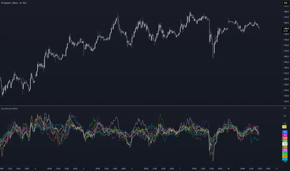
Broad Market MOEX### **Broad Market for Russia**
The **Broad Market for Russia** indicator provides a comparative analysis of the price deviation of major Russian stocks relative to their average closing price over a customizable lookback period. This tool helps traders identify market trends and detect relative strength or weakness among different assets.
### **How It Works:**
- The indicator calculates the **percentage deviation** of each stock’s current price from its **simple moving average (SMA)** over the defined **lookback period (in hours).**
- The **default lookback period is 24 hours**, but it can be adjusted based on the trader’s needs.
- It tracks major Russian assets, including **Gazprom, Sberbank, Lukoil, Rosneft, Norilsk Nickel, Yandex, and others**, alongside the currently selected instrument.
- Each stock’s deviation is plotted on a separate panel, allowing for quick visual comparison.
- **Positive deviation** indicates that the price is trading above its average, signaling potential **bullish momentum**.
- **Negative deviation** suggests the price is below its average, possibly indicating **bearish conditions**.
This indicator is particularly useful for traders in the Russian stock market who want to gauge broader market strength and detect divergence patterns across multiple assets.
---
### **Broad Market for Russia**
Индикатор **Broad Market for Russia** предоставляет сравнительный анализ отклонения цены крупнейших российских акций относительно их среднего значения за настраиваемый период. Этот инструмент помогает трейдерам выявлять рыночные тренды и определять относительную силу или слабость активов.
### **Как это работает:**
- Индикатор рассчитывает **процентное отклонение** текущей цены каждой акции от её **простого скользящего среднего (SMA)** за заданный **период анализа (в часах).**
- **Период анализа по умолчанию — 24 часа**, но его можно изменять в зависимости от предпочтений трейдера.
- В индикаторе отслеживаются **крупнейшие российские активы**, такие как **Газпром, Сбербанк, Лукойл, Роснефть, Норникель, Яндекс и другие**, а также текущий выбранный инструмент.
- Отклонение каждой акции отображается на отдельной панели, что позволяет быстро проводить визуальное сравнение.
- **Положительное отклонение** означает, что цена торгуется выше своего среднего значения, что может сигнализировать о **бычьем тренде**.
- **Отрицательное отклонение** указывает, что цена ниже своего среднего значения, что может свидетельствовать о **медвежьей тенденции**.
Этот индикатор особенно полезен для трейдеров российского фондового рынка, которые хотят оценить силу всего рынка и выявлять расхождения между различными активами.
Broad Market for Crypto**Broad Market for Crypto** indicator provides a comparative analysis of the price deviation of multiple major cryptocurrencies relative to their average closing price over a customizable lookback period. This tool helps traders identify market trends and spot relative strength or weakness among different assets.
### **How It Works:**
- The indicator calculates the percentage deviation of each cryptocurrency’s current price from its simple moving average (SMA) over the defined **lookback period (in hours).**
- The **default lookback period is 24 hours**, but it can be adjusted according to the trader's preference.
- It tracks major crypto assets, including **BTC, ETH, BNB, SOL, XRP, ADA, AVAX, LINK, DOGE, and TRX**, alongside the currently selected instrument.
- Each cryptocurrency’s deviation is plotted on a separate panel, allowing for quick visual comparison.
- Positive deviation indicates that the price is trading above its average, signaling potential bullish momentum.
- Negative deviation suggests the price is below its average, possibly indicating bearish conditions.
This indicator is particularly useful for crypto traders who want to gauge the broader market’s strength and detect divergence patterns across multiple assets.
---------------------------------------------------------------------------------
**Broad Market for Crypto - Описание индикатора**
Индикатор **Broad Market for Crypto** предоставляет сравнительный анализ отклонения цены различных крупных криптовалют относительно их среднего значения за настраиваемый период. Этот инструмент помогает трейдерам выявлять рыночные тренды и определять относительную силу или слабость активов.
### **Как это работает:**
- Индикатор рассчитывает **процентное отклонение** текущей цены каждой криптовалюты от её **простого скользящего среднего (SMA)** за заданный **период анализа (в часах)**.
- **Период анализа по умолчанию — 24 часа**, но его можно изменять в зависимости от предпочтений трейдера.
- В индикаторе отслеживаются основные криптоактивы: **BTC, ETH, BNB, SOL, XRP, ADA, AVAX, LINK, DOGE и TRX**, а также текущий выбранный инструмент.
- Отклонение каждой криптовалюты отображается на отдельной панели, что позволяет быстро проводить визуальное сравнение.
- **Положительное отклонение** означает, что цена торгуется выше своего среднего значения, что может сигнализировать о **бычьем тренде**.
- **Отрицательное отклонение** указывает, что цена ниже своего среднего значения, что может свидетельствовать о **медвежьей тенденции**.
Этот индикатор особенно полезен для криптотрейдеров, желающих оценить силу всего рынка и выявлять расхождения между различными активами.

Fibonacci-Only Strategy V2Fibonacci-Only Strategy V2
This strategy combines Fibonacci retracement levels with pattern recognition and statistical confirmation to identify high-probability trading opportunities across multiple timeframes.
Core Strategy Components:
Fibonacci Levels: Uses key Fibonacci retracement levels (19% and 82.56%) to identify potential reversal zones
Pattern Recognition: Analyzes recent price patterns to find similar historical formations
Statistical Confirmation: Incorporates statistical analysis to validate entry signals
Risk Management: Includes customizable stop loss (fixed or ATR-based) and trailing stop features
Entry Signals:
Long entries occur when price touches or breaks the 19% Fibonacci level with bullish confirmation
Short entries require Fibonacci level interaction, bearish confirmation, and statistical validation
All signals are visually displayed with color-coded markers and dashboard
Trading Method:
When a triangle signal appears, open a position on the next candle
Alternatively, after seeing a signal on a higher timeframe, you can switch to a lower timeframe to find a more precise entry point
Entry signals are clearly marked with visual indicators for easy identification
Risk Management Features:
Adjustable stop loss (percentage-based or ATR-based)
Optional trailing stops for protecting profits
Multiple take-profit levels for strategic position exit
Customization Options:
Timeframe selection (1m to Daily)
Pattern length and similarity threshold adjustment
Statistical period and weight configuration
Risk parameters including stop loss and trailing stop settings
This strategy is particularly well-suited for cryptocurrency markets due to their tendency to respect Fibonacci levels and technical patterns. Crypto's volatility is effectively managed through the customizable stop-loss and trailing-stop mechanisms, making it an ideal tool for traders in digital asset markets.
For optimal performance, this strategy works best on higher timeframes (30m, 1h and above) and is not recommended for low timeframe scalping. The Fibonacci pattern recognition requires sufficient price movement to generate reliable signals, which is more consistently available in medium to higher timeframes.
Users should avoid trading during sideways market conditions, as the strategy performs best during trending markets with clear directional movement. The statistical confirmation component helps filter out some sideways market signals, but it's recommended to manually avoid ranging markets for best results.

Round NumbersTries to only show major round numbers regardless of whether you're looking at something priced in the thousands or under a dollar.
Relative Strength RatioWhen comparing a stock’s strength against NIFTY 50, the Relative Strength (RS) is calculated to measure how the stock is performing relative to the index. This is different from the RSI but is often used alongside it.
How It Works:
Relative Strength (RS) Calculation:
𝑅
𝑆
=
Stock Price
NIFTY 50 Price
RS=
NIFTY 50 Price
Stock Price
This shows how a stock is performing relative to the NIFTY 50 index.
Relative Strength Ratio Over Time:
If the RS value is increasing, the stock is outperforming NIFTY 50.
If the RS value is decreasing, the stock is underperforming NIFTY 50.

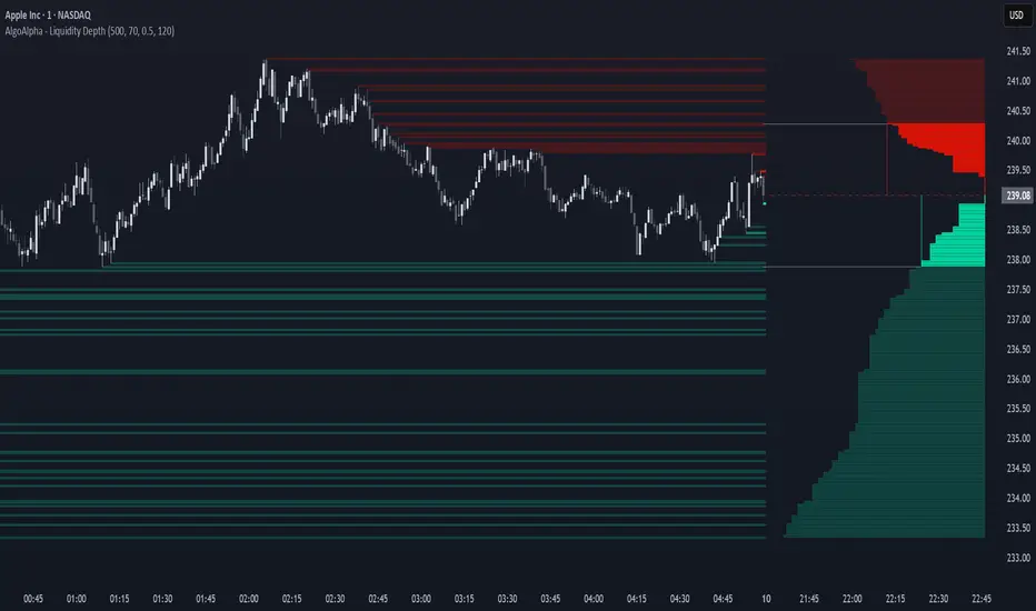
Liquidity Depth [AlgoAlpha]OVERVIEW
This script visualizes market liquidity by identifying key price levels where significant volume has transacted. It highlights zones of high buying and selling interest, helping traders understand where liquidity is accumulating and how price may respond to these areas. By dynamically tracking volume at highs and lows, the script builds a real-time liquidity profile, making it a powerful tool for identifying potential support and resistance levels.
CONCEPTS
Liquidity depth analysis helps traders determine how price interacts with supply and demand at different levels. The script processes historical volume data to distinguish between high-liquidity and low-liquidity zones. It assigns transparency levels to plotted lines , ensuring that more relevant liquidity areas stand out visually. The script adds a profile to show the depth of liquidity (derived from historical volume data) for levels above and below the current price
FEATURES
Liquidity Levels: Tracks liquidity levels based on volume concentration at price high and lows.
Volume-Based Transparency: More significant liquidity levels are displayed with higher visibility, showing their significance.
Interpolation: interpolates the bullish and bearish liquidity depth at a user defined range away from the price, helping in comparing the liquidity amounts between bullish and bearish.
Depth Profile: Allows traders to visualize depth of liquidity in a more quantitative and clearer way than the liquidity levels/list]
USAGE
This indicator is best used to track liquidity levels and potential price reaction areas. Traders can adjust the Liquidity Lookback setting to analyze past liquidity levels over different historical periods. The Profile Resolution setting controls the granularity of liquidity depth visualization, with higher values providing more detail. The script can be applied across different timeframes, from intraday scalping to swing trading analysis. The plotted liquidity zones provide traders with insights into where price may encounter strong support, resistance, or potential liquidity-driven reversals.
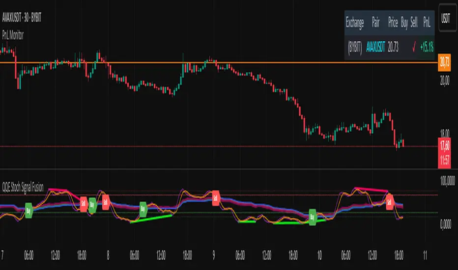
PnL MonitorThe PnL Monitor is a customizable tool designed to help traders track the Profit and Loss (PnL) of up to 20 currency pairs or assets in real-time. This script provides a clear and organized table that displays the entry price, and PnL percentage for each pair, making it an essential tool for monitoring open positions or tracking potential trades.
Key Features:
Multi-Asset Tracking:
Monitor up to 20 currency pairs or assets simultaneously. Simply input the pair symbol and your entry price, and the script will calculate the PnL in real-time.
Dynamic Table Positioning:
Choose where the table appears on your chart with the Table Position input. Options include:
Top Left
Top Right
Bottom Left
Bottom Right
Real-Time PnL Calculation:
The script fetches the current price of each pair and calculates the PnL percentage based on your entry price. Positive PnL is highlighted in green, while negative PnL is highlighted in red.
Exchange and Pair Separation:
The script automatically separates the exchange name (if provided) from the pair symbol, making it easier to identify the source of the data.
Customizable Inputs:
Add or remove pairs as needed.
Leave the price field blank for pairs you don’t want to track.
How to Use:
Input Your Pairs:
In the script settings, input the symbol of the pair (e.g., NASDAQ:AAPL or BTCUSD) and your entry price. Leave the price field blank for pairs you don’t want to track.
Choose Table Position:
Select where you want the table to appear on your chart.
Monitor PnL:
The table will automatically update with the current price and PnL percentage for each pair.
Why Use This Script?
Efficiency: Track multiple pairs in one place without switching charts.
Clarity: Easily identify profitable and losing positions at a glance.
Flexibility: Customize the table to fit your trading style and preferences.
Ideal For:
Forex, crypto, and stock traders managing multiple positions.
Uptrick: Portfolio Allocation DiversificationIntro
The Uptrick: Portfolio Allocation Diversification script is designed to help traders and investors manage multiple assets simultaneously. It generates signals based on various trading systems, allocates capital using different diversification methods, and displays real-time metrics and performance tables on the chart. The indicator compares active trading strategies with a separate long-term holding (HODL) simulation, allowing you to see how a systematic trading approach stacks up against a simple buy-and-hold strategy.
------------------------------------------------------------------------
Trading System Selection
1. No signals (none)
In this mode, the script does not produce bullish or bearish indicators; every asset stays in a neutral stance. This setup is useful if you prefer to observe how capital might be distributed based solely on the chosen diversification method, with no influence from directional signals.
2. rsi – neutral
This mode uses an index-based measure of whether an asset appears overbought or oversold. It generates a bearish signal if market conditions point to overbought territory, and a bullish signal if they indicate oversold territory. If neither extreme surfaces, it remains neutral. Some traders apply this in sideways or range-bound conditions, where overbought and oversold levels often hint at possible turning points. It does not specifically account for divergence patterns.
3. rsi – long only
In this setting, the system watches for instances where momentum readings strengthen even if the asset’s price is still under pressure or setting new lows. It also considers oversold levels as potential signals for a bullish setup. When such conditions emerge, the script flags a possible move to the upside, ignoring indications that might otherwise suggest a bearish trend. This approach is generally favored by those who want to concentrate exclusively on identifying price recoveries.
4. rsi – short only
Here, the script focuses on spotting signs of deteriorating momentum while an asset’s price remains relatively high or attempts further gains. It also checks whether the market is drifting into overbought territory, suggesting a potential decline. Under such conditions, it issues a bearish signal. It provides no bullish alerts, making it particularly suitable for traders who look to take advantage of overvalued scenarios or protect themselves against sudden downward moves.
5. Deviation from fair value
Under this system, the script judges how far the current price may have strayed from what is considered typical, taking into account normal fluctuations. If the asset appears to be trading at an unusually low level compared to that reference, it is flagged as bullish. If it seems abnormally high, a bearish signal is issued. This can be applied in various market environments to seek opportunities that arise from perceived mispricing.
6. Percentile channel valuation
In this mode, the script determines where an asset's price stands within a historical distribution, highlighting whether it has reached unusually high or low territory compared to its recent past. When the price reaches what is deemed an extreme reading, it may indicate that a reversal is more likely. This approach is often used by traders who watch for statistical outliers and potential reversion to a more typical trading range.
7. ATH valuation
This technique involves comparing an asset's current price with its previously recorded peak values. The script then interprets whether the price is positioned so far below the all-time high that it looks discounted, or so close to that high that it could be overextended. Such perspective is favored by market participants who want to see if an asset still has ample room to climb before matching historic extremes, or if it is nearing a possible ceiling.
8. Z-score system
Here, the script measures how far above or below a standard reference average an asset's price may be, translated into standardized units. Substantial negative readings can suggest a price that might be unusually weak, prompting a bullish indication, while large positive readings could signal overextension and lead to a bearish call. This method is useful for traders watching for abrupt deviations from a norm that often invite a reversion to more balanced levels.
RSI Divergence Period
This input is particularly relevant for the RSI - Long Only and RSI - Short Only modes. The period determines how many bars in the past you compare RSI values to detect any divergences.
------------------------------------------------------------------------
Diversification Method
Once the script has determined a bullish, bearish, or neutral stance for each asset, it then calculates how to distribute capital among all included assets. The diversification method sets the weighting logic.
1. None
Gives each asset an equal weight. For example, if you have five included assets, each might get 20 percent. This is a simple baseline.
2. Risk-Adjusted Expected Return Using Volatility Clustering
Emphasizes each asset’s average returns relative to its observed risk or volatility tendencies. Assets that exhibit good risk-adjusted returns combined with moderate or lower volatility may receive higher weights than more volatile or less appealing assets. This helps steer capital toward assets that have historically provided a better ratio of return to risk.
3. Relative Strength
Allocates more capital to assets that show stronger price strength compared to a reference (for example, price above a long-term moving average plus a higher RSI). Assets in clear uptrends may be given higher allocations.
4. Trend-Following Indicators
Examines trend-based signals, like positive momentum measurements or upward-trending strength indicators, to assign more weight to assets demonstrating strong directional moves. This suits those who prefer to latch onto trending markets.
5. Volatility-Adjusted Momentum
Looks for assets that have strong price momentum but relatively subdued volatility. The script tends to reward assets that are trending well yet are not too volatile, aiming for stable upward performance rather than massive swings.
6. Correlation-Based Risk Parity
Attempts to weight assets in such a way that the overall portfolio risk is more balanced. Although it is not an advanced correlation matrix approach in a strict sense, it conceptually scales each asset’s weight so no single outlier heavily dominates.
7. Omega Ratio Maximization
Gives preference to assets with higher omega ratios. This ratio can be interpreted as the probability-weighted gains versus losses. Assets with a favorable skew are given more capital.
8. Liquidity-Weighted Valuation
Considers each asset’s average trading liquidity, such as the combination of volume and price. More liquid assets typically receive a higher allocation because they can be entered or exited with lower slippage. If the trading system signals bullishness, that can further boost the allocation, and if it signals bearishness, the allocation might be set to zero or reduced drastically.
9. Drawdown-Controlled Allocation (DCA)
Examines each asset’s maximum drawdown over a recent window. Assets experiencing lighter drawdowns (thus indicating somewhat less downside volatility) receive higher allocations, aiming for a smoother overall equity curve.
------------------------------------------------------------------------
Portfolio and Allocation Settings
Portfolio Value
Defines how much total capital is available for the strategy-based investment portion. For example, if set to 10,000, then each asset’s monetary allocation is determined by the percentage weighting times 10,000.
Use Fixed Allocation
When enabled, the script calculates the initial allocation percentages after 50 bars of data have passed. It then locks those percentages for the remainder of the backtest or real-time session. This feature allows traders to test a static weighting scenario to see how it differs from recalculating weights at each bar.
------------------------------------------------------------------------
HODL Simulator
The script has a separate simulation that accumulates positions in an asset whenever it appears to be recovering from an undervalued state. This parallel tracking is intended to contrast a simple buy-and-hold approach with the more adaptive allocation methods used elsewhere in the script.
HODL Buy Quantity
Each time an asset transitions from an undervalued state to a recovery phase, the simulator executes a purchase of a predefined quantity. For example, if set to 0.5 units, the system will accumulate this amount whenever conditions indicate a shift away from undervaluation.
HODL Buy Threshold
This parameter determines the level at which the simulation identifies an asset as transitioning out of an undervalued state. When the asset moves above this threshold after previously being classified as undervalued, a buy order is triggered. Over time, the performance of these accumulated positions is tracked, allowing for a comparison between this passive accumulation method and the more dynamic allocation strategy.
------------------------------------------------------------------------
Asset Table and Display Settings
The script displays data in multiple tables directly on your chart. You can toggle these tables on or off and position them in various corners of your TradingView screen.
Asset Info Table Position
This table provides key details for each included asset, displaying:
Symbol – Identifies the trading pair being monitored. This helps users keep track of which assets are included in the portfolio allocation process.
Current Trading Signal – Indicates whether the asset is in a bullish, bearish, or neutral state based on the selected trading system. This assists in quickly identifying which assets are showing potential trade opportunities.
Volatility Approximation – Represents the asset’s historical price fluctuations. Higher volatility suggests greater price swings, which can impact risk management and position sizing.
Liquidity Estimate – Reflects the asset’s market liquidity, often based on trading volume and price activity. More liquid assets tend to have lower transaction costs and reduced slippage, making them more favorable for active strategies.
Risk-Adjusted Return Value – Measures the asset’s returns relative to its risk level. This helps in determining whether an asset is generating efficient returns for the level of volatility it experiences, which is useful when making allocation decisions.
2. Strategy Allocation Table Position
Displays how your selected diversification method converts each asset into an allocation percentage. It also shows how much capital is being invested per asset, the cumulative return, standard performance metrics (for example, Sharpe ratio), and the separate HODL return percentage.
Symbol – Displays the asset being analyzed, ensuring clarity in allocation distribution.
Allocation Percentage – Represents the proportion of total capital assigned to each asset. This value is determined by the selected diversification method and helps traders understand how funds are distributed within the portfolio.
Investment Amount – Converts the allocation percentage into a dollar value based on the total portfolio size. This shows the exact amount being invested in each asset.
Cumulative Return – Tracks the total return of each asset over time, reflecting how well it has performed since the strategy began.
Sharpe Ratio – Evaluates the asset’s return in relation to its risk by comparing excess returns to volatility. A higher Sharpe ratio suggests a more favorable risk-adjusted performance.
Sortino Ratio – Similar to the Sharpe ratio, but focuses only on downside risk, making it more relevant for traders who prioritize minimizing losses.
Omega Ratio – Compares the probability of achieving gains versus losses, helping to assess whether an asset provides an attractive risk-reward balance.
Maximum Drawdown – Measures the largest percentage decline from an asset’s peak value to its lowest point. This metric helps traders understand the worst-case loss scenario.
HODL Return Percentage – Displays the hypothetical return if the asset had been bought and held instead of traded actively, offering a direct comparison between passive accumulation and the active strategy.
3. Profit Table
If the Profit Table is activated, it provides a summary of the actual dollar-based gains or losses for each asset and calculates the overall profit of the system. This table includes separate columns for profit excluding HODL and the combined total when HODL gains are included. As seen in the image below, this allows users to compare the performance of the active strategy against a passive buy-and-hold approach. The HODL profit percentage is derived from the Portfolio Value input, ensuring a clear comparison of accumulated returns.
4. Best Performing Asset Table
Focuses on the single highest-returning or highest-profit asset at that moment. It highlights the symbol, the asset’s cumulative returns, risk metrics, and other relevant stats. This helps identify which asset is currently outperforming the rest.
5. Most Profitable Asset
A simpler table that underscores the asset producing the highest absolute dollar profit across the portfolio.
------------------------------------------------------------------------
Multi Asset Selection
You can include up to ten different assets (such as BTCUSDT, ETHUSDT, ADAUSDT, and so on) in this script. Each asset has two inputs: one to enable or disable its inclusion, and another to select its trading pair symbol. Once you enable an asset, the script requests the relevant market data from TradingView.
------------------------------------------------------------------------
Uniqness and Features
1. Multiple Data Fetches
Each asset is pulled from the chart’s timeframe, along with various metrics such as RSI, volatility approximations, and trend indicators.
2. Various Risk and Performance Metrics
The script internally keeps track of different measures, like Sharpe ratio (a measure of average return adjusted for risk), Sortino ratio (which focuses on downside volatility), Omega ratio, and maximum drawdown. These metrics feed into the strategy allocation table, helping you quickly assess the risk-and-return profile of each asset.
3. Real-Time Tables
Instead of having to set up complex spreadsheets or external dashboards, the script updates all tables on every new bar. The color schemes in these tables are designed to draw attention to bullish or bearish signals, positive or negative returns, and so forth.
4. HODL Comparison
You can visually compare the active strategy’s results to a separate continuous buy-on-dips accumulation strategy. This allows for insight into whether your dynamic approach truly beats a simpler, more patient method.
5. Locking Allocations
The Use Fixed Allocation input is convenient for those who want to see how holding a fixed distribution of capital performs over time. It helps in distinguishing between constant rebalancing vs a fixed, set-and-forget style.
------------------------------------------------------------------------
How to use
1. Add the Script to Your Chart
Once added, open the settings panel to configure your asset list, choose a trading system, and select the diversification approach.
2. Select Assets
Pick up to ten symbols to monitor. Disable any you do not want included. Each included asset is then handled for signals, diversification, and performance metrics.
3. Choose Trading System
Decide if you prefer RSI-based signals, a fair-value approach, or a percentile-based method, among others. The script will then flag assets as bullish, bearish, or neutral according to that selection.
4. Pick a Diversification Method
For example, you might choose Trend-Following Indicators if you believe momentum stocks or cryptocurrencies will continue their trends. Or you could use the Omega Ratio approach if you want to reward assets that have had a favorable upside probability.
5. Set Portfolio Value and HODL Parameters
Enter how much capital you want to allocate in total (for the dynamic strategy) and adjust HODL buy quantities and thresholds as desired. (HODL Profit % is calculated from the Portfolio Value)
6. Inspect the Tables
On the chart, the script can display multiple tables showing your allocations, returns, risk metrics, and which assets are leading or lagging. Monitor these to make decisions about capital distribution or see how the strategy evolves.
------------------------------------------------------------------------
Additional Remarks
This script aims to simplify multi-asset portfolio management in a single tool. It emphasizes user-friendliness by color-coding the data in tables, so you do not need extra spreadsheets. The script is also flexible in letting you lock allocations or compare dynamic updates.
Always remember that no script can guarantee profitable outcomes. Real markets involve unpredictability, and real trading includes fees, slippage, and liquidity constraints not fully accounted for here. The script uses real-time and historical data for demonstration and educational purposes, providing a testing environment for various systematic strategies.
Performance Considerations
Due to the complexity of this script, users may experience longer loading times, especially when handling multiple assets or using advanced allocation methods. In some cases, calculations may time out if too many settings are adjusted simultaneously. If this occurs, removing and reapplying the indicator to the chart can help reset the process. Additionally, it is recommended to configure inputs gradually instead of adjusting all parameters at once, as excessive changes can extend the script’s loading duration beyond TradingView’s processing limits.
------------------------------------------------------------------------
Originality
This script stands out by integrating multiple asset management techniques within a single indicator, eliminating the need for multiple scripts or external portfolio tools. Unlike traditional single-asset strategies, it simultaneously evaluates multiple assets, applies systematic allocation logic, and tracks risk-adjusted performance in real time. The script is designed to function within TradingView’s script limitations while still allowing for complex portfolio simulations, making it an efficient tool for traders managing diverse holdings. Additionally, its combination of systematic trading signals with allocation-based diversification provides a structured approach to balancing exposure across different market conditions. The dynamic interplay between adaptive trading strategies and passive accumulation further differentiates it from conventional strategy indicators that focus solely on directional signals without considering capital allocation.
Conclusion
Uptrick: Portfolio Allocation Diversification pulls multiple assets into one efficient workflow, where each asset’s signal, volatility, and performance is measured, then assigned a share of capital according to your selected diversification method. The script accommodates both dynamic rebalancing and a locked allocation style, plus an ongoing HODL simulation for passive accumulation comparison. It neatly visualizes the entire process through on-chart tables that are updated every bar.
Traders and investors looking for ways to manage multiple assets under one unified framework can explore the different modules within this script to find what suits their style. Users can quickly switch among trading systems, vary the allocation approach, or review side-by-side performance metrics to see which method aligns best with their risk tolerance and market perspective.
