ALGORITHM D_C (Scalping & Trend Detection Tool)This invite-only script is designed for manual traders seeking an advanced analytical assistant to validate market entries through a comprehensive technical framework. It identifies potential entry zones by combining price action, EMA alignment, market structure analysis, and dynamic detection of breakouts and reversals, adapting to both trending and consolidating environments.
⚙️ Core Functionality
The internal logic integrates:
Directional bias detection across multiple timeframes (EMA20/50 alignment)
Structural breakout scanning based on swing and price flow
Detection of reversal patterns (engulfing, pin bars, inside bars)
Visual confirmation of signal zones with contextual directional strength
The tool displays clear visual signals (Buy/Sell labels) on the chart to help traders identify high-probability entry zones. All signals are based on confirmed candle closes, with no repainting logic. It also marks key zones (support and resistance) to assist traders in filtering signals with greater discretion.
🔍 Why invite-only and closed-source?
The strategy powering this script is the result of extensive real-time testing and ongoing optimization. The source code is protected to preserve its originality and avoid misuse or copying, while delivering full technical utility.
🛠️ How to use it?
This tool is intended for manual execution. Users must apply their own judgment using the signals and technical analysis provided as a guide within their trading strategy.
⚠️ Disclaimer
This script does not guarantee profitable results. It is a technical analysis tool meant to assist decision-making and requires trader interpretation. It does not constitute financial advice of any kind.
Statistics

Astro Event Reaction Analyzer█ Astro Event Reaction Analyzer
Overview
The "Astro Event Reaction Analyzer" is a Pine Script™ v6 indicator for TradingView that visualizes and analyzes price reactions around astrological planetary events, such as retrograde or direct motion starts. It aligns historical data around event anchors to map % changes, similar to a financial event study, with customizable plots and stats.
Disclaimer: For educational purposes only. Does not provide trading signals or advice. Astrology's market influence is unproven; past patterns do not guarantee future results. Conduct your own research.
Relies on unmodified libraries (Mozilla Public License 2.0):
@TradingView ValueAtTime (v1): For timestamp-based price queries.
@BarefootJoey Astrolib : For planetary data.
Purpose
Explore price patterns tied to planetary cycles on your Tradingview chart. Normalize changes relative to anchors to spot trends (e.g., pre-event buildup, post-event volatility), supporting astro-trading hypothesis testing.
Details
Events: Currently detecting Planetary retrogrades and direct.
Planets: Mercury to Pluto.
Alignment: % changes from -lookback to +lookahead days; skips >10,000-bar events.
Plots:
Separate: Polylines for recent events (maxEvents limit).
Average: Aggregated line across all events.
Custom: Curved/closed, fills, styles; optional anchors, highlights, labels.
Table: Top-right summary with tooltips and color-coding (green/positive, red/negative).
How to Use
Add to your Tradingview Chart (recommended Daily timeframe or higher).
Inputs: Planet/event type, lookback/lookahead, mode (Separate/Average), visuals.
Interpret: Plots show aligned % changes; table metrics guide insights (e.g., high expectancy = potential bias).
Tips: Stats description provided as hover-over tooltips.
Stats Provided
Aggregates from all events; color-coded for evaluation:
Post-Event (Lookahead): Prob Gain/Loss, Mean/Median Return, Std Dev, Max/Min, Avg Gain/Loss, Expectancy, Sharpe, t-Stat.
Full Window: Avg Pre/Post Return, Max Drawdown/Run-Up, Pre/Post Vol, Prob New High/Low, Trend Slope.
Context: Total signals, date range.
Unique Aspects
Integrates astro data with quantitative stats for "event studies" on TradingView—dual modes, extensive metrics (e.g., expectancy, volatility shifts), and optimizations set it apart from basic astro indicators.
What is Retrograde?
Retrograde motion occurs when a planet appears to reverse direction from Earth’s perspective. This optical illusion, caused by relative planetary orbits, has long been studied for its potential timing relevance in financial and psychological cycles. Retrogrades are often associated with review, reversal, or disruption phases.
Example on TVC:DJI
Future Improvements
Will add planetary ingress (sign entries) and aspects (angular relationships) as event types for broader cycle analysis.

Universal Premium Monitor(X: 0x664_)You can use this indicator to compare price differences—between exchanges, trading pairs, stable-coins, or even spot vs. futures markets—making it handy for arbitrage and for gauging buying and selling pressure across venues.
1. What the indicator does
It displays the real-time premium (spread) between two trading pairs. The indicator subtracts Pair 2’s price from Pair 1’s price. If the two pairs are quoted in different stable-coins, it first converts Pair 2’s price using the live exchange rate between the two stable-coins, so the premium remains as accurate and useful as possible.
2. How to use it
① Use the built-in pair selector
The script includes seven exchanges, three base coins, and four stable-coins. Mix and match to suit your needs.
Example: You want to see the premium between OKX BTC/USDT (spot) and Binance BTC/USDC (perpetual futures).
Pair 1 settings
- Exchange: OKX
- Base coin: BTC
- Stable-coin: USDT
Pair 2 settings
- Exchange: BINANCE
- Base coin: BTC
- Stable-coin: USDC
- Tick “Futures contract”
The indicator automatically converts Pair 2 into USDT at the current USDT/USDC rate, then compares it with Pair 1 to output the live premium.
② Enable “Custom Pair Mode” for anything else
Tick “Enable custom pair mode” and type full TradingView symbols (e.g., BINANCE:BTCUSDT.P, where “.P” denotes a futures contract; omit it for spot).
Example: Compare Binance XRP/USDT (spot) with Coinbase XRP/USD (spot).
Tick “Enable custom pair mode.”
Pair 1 full symbol: BINANCE:XRPUSDT | Stable-coin: USDT
Pair 2 full symbol: COINBASE:XRPUSD | Stable-coin: USD
The indicator converts Pair 2 via the USDT/USD rate, then outputs the real-time premium versus Pair 1.
Notes
Liquidity for stable-coins other than USDT, USDC, USD, and DAI is extremely poor (DAI isn’t great either). Even if you enter a pair quoted in another stable-coin, the script cannot fetch reliable data or perform conversions for it.
When entering symbols manually, be sure the “Stable-coin” field matches the quote currency of your symbol; otherwise the conversion will fail.
你可以用它查看不同交易所、不同交易对、不同稳定币或者是期货和现货的差价。方便套利以及观察各交易所期现买卖强度。
1. 指标作用:
可根据用户需求查看两个交易对的实时溢价,使用交易对1减去交易对2得出价差,如果两个交易对使用不同的稳定币记价,则会将交易对2的价格按照两个稳定币当前的汇率自动转换,尽可能保证溢价的真实性和实用性。
2. 使用方法:
①使用指标内嵌的交易对,本指标内嵌了7个交易所,3个主币种,4个稳定币,可根据自己的需求自行选择。
- 例:我想查看OKX的BTCUSDT现货和BINANCE的BTCUSDC合约之间的溢价。
在交易对1设置里选择
交易所:OKX
主币种:BTC
稳定币:USDT
在交易对2设置里选择
交易所:BINANCE
主币种:BTC
稳定币:USDC
勾选上"是否合约"
指标会自动将交易对2的价格与USDTUSDC汇率对进行换汇,再将换汇后的价格与交易对1进行对比,得出实时溢价。
②如果有其它想看的交易所/币种/稳定币组合,也可勾选上"启用自定义交易对模式"后,在"完整交易对付号"中自行输入想查看的两个交易对全称,(格式例=BINANCE:BTCUSDT.P,".p" 为合约格式,非合约无需输入)。
- 例:我想查看BINANCE的XRPUSDT现货和COINBASE的XRPUSD之间的溢价。
首先勾选"启用自定义交易对模式",在交易对1设置中的"完整交易对符号"里输入:BINANCE:XRPUSDT,并将稳定币选为USDT。
在交易对2设置中的"完整交易对符号"里输入:COINBASE:XRPUSD,并将稳定币选为USD。
指标会自动将交易对2的价格与USDTUSD汇率对进行换汇,再将换汇后的价格与交易对1进行对比,得出实时溢价。
注1:由于除USDT/USDC/USD/DAI以外,其它稳定币交易深度都非常糟糕(其实DAI也不咋样),所以即使手动输入的是其它稳定币的交易对,也无法检测并执行其它稳定币的换汇行为。
注2:当手动输入时,请一定将"稳定币"栏对应上你输入的交易对的稳定币,否则无法正常换汇。

MA Crossover Strategy with TP/SL📊 MA Crossover Strategy with TP/SL
This strategy uses two simple moving averages (SMAs) to catch trend changes and trade breakouts with clear risk management.
🔥 How it works:
Enters a Long position when the fast SMA (short period) crosses above the slow SMA (long period), signaling an upward trend.
Enters a Short position when the fast SMA crosses below the slow SMA, signaling a downward trend.
🎯 Features:
Take Profit (TP): Automatically closes the trade at a defined percentage profit.
Stop Loss (SL): Limits potential losses with a predefined stop level.
Customizable parameters: Adjust the lengths of the moving averages, TP%, and SL% to fit your style.
Alerts: Receive notifications on every trade entry for timely action.
⚡️ Designed for traders looking for a simple, effective trend-following system with built-in risk control.

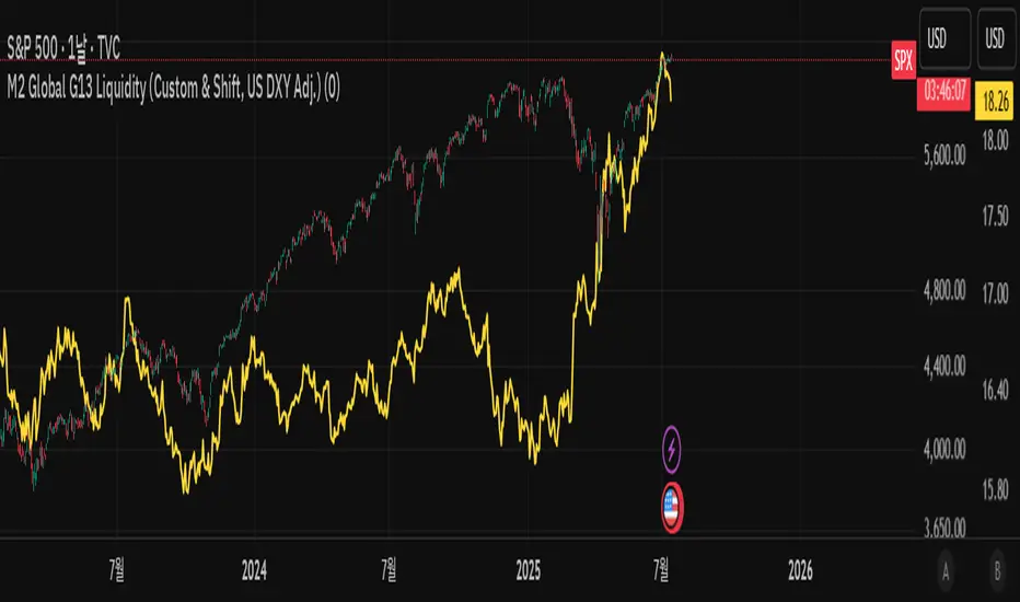
M2 Global G13 Liquidity (Custom & Shift, US DXY Adj.)🌎 M2 Global G13 Liquidity index (Custom & Shift, US DXY Adj.)
💡 Indicator Overview
The M2 Global G13 Liquidity indicator combines the M2 liquidity of 13 major countries, allowing users to selectively include or exclude each country to visualize global capital flows and potential investment liquidity at a glance.
Each country's M2 data is converted to USD using real-time exchange rates, and the US M2 is further adjusted using the Dollar Index (DXY) to reflect the impact of dollar strength or weakness on US liquidity.
✅ What is M2?
M2 is a broad measure of money supply that includes cash, demand deposits, savings deposits, and certain financial products.
It represents a country's overall liquidity and capital supply and is often interpreted as "dry powder" ready to be deployed into various assets such as equities, real estate, and bonds.
Therefore, M2 serves as a crucial benchmark for assessing a country's potential investment capacity that can flow into markets at any time.
💰 Exchange Rate & Dollar Index Adjustment
- All country M2 data is converted from local currencies to USD.
- The US M2 is further adjusted using the Dollar Index (DXY) to better reflect its real global power:
- DXY > 100 → Liquidity contraction (strong dollar effect)
- DXY < 100 → Liquidity expansion (weak dollar effect)
🗺️ Country Selection Options
- Default selection: United States
- Major selections: China, Eurozone, Japan, United Kingdom (core G5 economies)
- Additional selections: Switzerland, Canada, India, Russia, Brazil, South Korea, Mexico, South Africa
- Users can freely add or remove countries to customize the indicator to match their analytical needs.
📈 Example Use Cases
- Monitor global capital flows: Track worldwide liquidity trends and detect potential market risk signals.
- Analyze exchange rate and monetary policy trends: Compare dollar strength with major central bank policies.
- Benchmark against equity indices: Evaluate correlations with MSCI World, KOSPI, NASDAQ, etc.
- Valuation analysis: Compare overall liquidity levels to equity index prices or market capitalization to assess relative valuation and identify potential overvaluation or undervaluation.
- Crisis response strategy: Identify liquidity contraction during global credit crises or deleveraging phases.
==================================================
🌎 M2 글로벌 G13 유동성 지수 (Custom & Shift, US DXY Adj.)
💡 지표 소개
M2 Global G13 Liquidity 지표는 세계 13개 주요국의 M2 유동성을 선택적으로 결합하여, 글로벌 자금 흐름과 잠재 투자 자금을 한눈에 시각화할 수 있도록 설계된 종합 유동성 지표입니다.
국가별 M2 데이터를 환율과 결합해 달러 기준으로 표준화하며, 특히 미국 M2는 달러지수(DXY)로 보정하여 달러 강약에 따른 파급력을 반영합니다.
✅ M2란?
M2는 광의 통화지표로, 현금 + 요구불 예금 + 저축성 예금 + 일부 금융상품을 포함합니다.
이는 한 국가의 유동성 수준과 자금 공급 상태를 나타내는 핵심 거시경제 지표이며, **주식·부동산·채권 등 다양한 자산에 투자될 준비가 된 '대기자금'**으로도 해석됩니다.
따라서 M2는 투자시장으로 언제든지 흘러들어갈 수 있는 잠재적 투자 역량을 평가할 때 중요한 기준입니다.
💰 환율 및 달러지수 보정
- 모든 국가 M2는 자국 통화에서 **달러(USD)**로 환산됩니다.
- 특히 미국 M2는 달러 가치의 글로벌 실질 파워를 평가하기 위해 DXY 보정을 적용합니다.
- DXY > 100 → 유동성 축소 (강달러 효과)
- DXY < 100 → 유동성 확대 (약달러 효과)
🗺️ 국가별 선택 옵션
- 기본 선택: 미국
- 주요 선택: 중국, 유로존, 일본, 영국 (주요 G5)
- 추가 선택: 스위스, 캐나다, 인도, 러시아, 브라질, 한국, 멕시코, 남아공
- 사용자는 각 국가를 자유롭게 더하거나 빼면서 커스터마이즈할 수 있습니다.
📈 활용 예시
- 글로벌 자금 흐름 모니터링: 전세계 유동성 추세 및 시장 리스크 신호 분석
- 환율/금리 정책 분석: 달러 강약과 주요국 정책 변화 비교
- 주가지수 벤치마크 비교: MSCI World, 코스피, 나스닥 등과 상관관계 확인
- 밸류에이션 분석: 전체 유동성 수준을 주가지수나 시가총액과 비교하여, 시장의 상대적 고평가·저평가 여부를 평가
- 위기 대응 전략: 글로벌 신용위기·자금 긴축 국면 대비
NQ Hourly Standard Deviation ZonesNQ Hourly Standard Deviation ZonesDescriptionThe NQ Hourly Standard Deviation Zones indicator is designed for traders analyzing the NASDAQ 100 futures (NQ) on an hourly timeframe. It plots dynamic support and resistance zones based on historical standard deviation (SD) levels calculated from the hourly open price. These zones represent the expected price range for each hour of the trading day, offering insights into potential price targets, reversals, or breakout levels. The indicator is highly customizable, allowing users to adjust the data period, display settings, and visual preferences to suit their trading style.The indicator calculates and displays:
• 0.5 SD Zones: Representing the price levels one-half standard deviation above and below the hourly open.
• 1.0 SD Zones: Representing the price levels one standard deviation above and below the hourly open.
• Hourly Open Line: A reference line marking the hourly open price.
These zones are derived from pre-calculated standard deviation data for the high and low price movements relative to the hourly open, segmented by each hour of the day (0–23). Users can select from multiple historical data periods (3 months to 17+ years) to align the zones with their preferred lookback period, accommodating both short-term and long-term trading strategies.Key Features
• Customizable Data Periods: Choose from 3 months, 6 months, 9 months, 1 year, 2 years, 3 years, 4 years, 5 years, 10 years, 15 years, or 17+ years of historical data to calculate standard deviation zones.
• RTH Filter: Option to display zones only during Regular Trading Hours (RTH, 9:00–15:59, America/New_York timezone) for traders focusing on the main trading session.
• Visual Customization:
• Toggle visibility of 0.5 SD and 1.0 SD labels.
• Customize line styles (Solid, Dotted, Dashed) and colors for 0.5 SD and 1.0 SD lines.
• Enable or disable shaded fills between the 0.5 SD and 1.0 SD zones, with customizable fill color.
• Timezone Support: Aligns with user-specified timezone (default: America/New_York) for accurate hourly calculations.
• Dynamic Updates: Zones are redrawn at the start of each new hourly bar, ensuring real-time relevance.
How It WorksThe indicator uses pre-computed standard deviation values for price movements (high and low) from the hourly open, based on the selected data period. For each hour of the day:
• High Zones: The +0.5 SD and +1.0 SD levels are plotted above the hourly open price.
• Low Zones: The -0.5 SD and -1.0 SD levels are plotted below the hourly open price.
• Hourly Open: A dotted line marks the open price for reference.
• Fills: Optional shaded areas between the 0.5 SD and 1.0 SD zones highlight the expected price range.
• Labels: Optional labels display "+0.5 σ," "-0.5 σ," "+1.0 σ," "-1.0 σ," and "h.o" (hourly open) at the end of each hourly bar for clarity.
The zones are plotted as horizontal lines spanning the duration of the hour, with fills and labels updated dynamically as new hourly bars form. The indicator clears previous lines and labels at the start of each new hour to maintain a clean chart.Usage
• Intraday Trading: Use the 0.5 SD and 1.0 SD zones as dynamic support and resistance levels for identifying potential entry/exit points, reversals, or breakout opportunities.
• Range Trading: The zones help visualize the expected price range for each hour, aiding in range-bound strategies.
• Risk Management: The 1.0 SD zones represent statistically significant levels, useful for setting stop-loss or take-profit levels.
• Session Filtering: Enable the "Show RTH Only" option to focus on high-liquidity hours, ideal for day traders.
• Historical Analysis: Select different data periods to analyze how price behavior varies over short-term (e.g., 3 months) versus long-term (e.g., 17+ years) market conditions.
Settings
• Settings:
• Show RTH Only (9:00–15:59): Toggle to display zones only during Regular Trading Hours (default: true).
• Timezone: Select the timezone for accurate hourly alignment (default: America/New_York).
• Select Data Period: Choose the historical data period for standard deviation calculations (options: 3 Months, 6 Months, 9 Months, 1 Year, 2 Years, 3 Years, 4 Years, 5 Years, 10 Years, 15 Years, 17+ Years; default: 17+ Years).
• Visuals:
• Show Fill: Toggle shaded areas between 0.5 SD and 1.0 SD zones (default: true).
• Fill Color: Customize the color and transparency of the fill (default: light gray, 90% transparency).
• 0.5 SD Line: Set the color (default: gray, 50% transparency) and style (Solid, Dotted, Dashed; default: Dashed) for 0.5 SD lines.
• 1.0 SD Line: Set the color (default: gray, 0% transparency) and style (Solid, Dotted, Dashed; default: Solid) for 1.0 SD lines.
• Show 0.5 SD Labels: Toggle visibility of 0.5 SD labels (default: true) and set their text color (default: gray).
• Show 1.0 SD Labels: Toggle visibility of 1.0 SD labels (default: true) and set their text color (default: gray).
Notes
• The indicator is optimized for the NASDAQ 100 futures (NQ) on an hourly timeframe. Ensure the chart is set to a compatible timeframe (e.g., 1-hour) for accurate results.
• Standard deviation values are pre-calculated and stored for each hour of the day, based on historical data. They are not dynamically recalculated from live data, ensuring consistent performance.
• The indicator uses up to 500 lines and labels to comply with TradingView’s rendering limits, ensuring smooth operation even on extended charts.
• For best results, use on liquid instruments like NQ futures, and consider combining with other technical indicators for confirmation.
Example Use CaseA trader focusing on NQ day trading can enable "Show RTH Only" and select a 3-month data period to plot zones for the 9:00–15:59 session. During the 10:00 AM hour, if the price approaches the +1.0 SD zone, the trader might anticipate resistance and consider a short position, using the -1.0 SD zone as a potential target. Conversely, a break above the +1.0 SD zone could signal a breakout, prompting a long position.Limitations
• The indicator relies on pre-computed standard deviation values, which may not reflect real-time market volatility.
• It is designed specifically for hourly charts and may not function correctly on other timeframes.
• The RTH filter assumes a standard trading session (9:00–15:59); custom session times are not supported.
AuthorThis indicator is designed for traders seeking a statistical approach to intraday price analysis, leveraging historical volatility patterns to inform trading decisions.

DCA Tracker: Avg Price, Investment, ProfitShow the average buy price for each day's investments, with total amount and potential profit.
NOTE: Works best on h1. To see calculations on h4 or daily, select the hour that corresponds to the close/opening of the h4/daily candlestick.

NMT P&L; %EMA112; DVB; Inside Bar & Fakey GPTA. Lines
1. You choose the number of candles (n) needed to determine the largest and smallest values among the candles you choose
2. Determine the OHLC4 candle with the smallest value
3. Determine the OHLC4 candle with the largest value
=> I draw 2 dashed lines and calculate the % difference
B. Determine the Inside Bar and Fakey candles
C. Determine the difference between the buy price and the last closing price
Happy to serve you!!

Korea M2 Liquidity Index💡 Korea M2 Liquidity Index
- This indicator visualizes Korea's M2 liquidity trends, designed to help both domestic and global investors easily understand the overall money supply situation in the Korean economy.
- In particular, by comparing it with the KOSPI index, investors can assess the equity market level relative to liquidity, allowing for a more precise valuation analysis to determine whether the Korean stock market is overvalued or undervalued.
✅ What is M2?
- M2 is a broad measure of money supply, which includes cash, demand deposits, savings deposits, and certain financial products.
- It serves as a crucial macroeconomic indicator that reflects the overall liquidity and capital supply in the Korean economy.
💰 KRW and USD display options
- KRW basis: Displays the total M2 amount in Korean won (in trillion units).
- USD basis: Converts the total M2 amount into US dollars using the KRW/USD exchange rate(KRW/USD) making it useful for global investors or those analyzing in USD terms.
📊 Display style and interpretation
- Users can freely choose to display Korea’s M2 and liquidity index and turn them on or off as needed.
- The index is simplified and displayed in trillion won units, allowing for an intuitive view of long-term trends and structural changes.
- The Offset (days) feature enables temporal adjustments, making it easier to compare this indicator with other economic or financial data series.
🌏 Example use cases
- Domestic policy analysis: Analyze the correlation between Bank of Korea's monetary policy changes (base rates, liquidity injections, etc.) and M2 growth.
- FX and global capital flow analysis: Understand the relationship between KRW/USD exchange rate fluctuations and changes in domestic liquidity.
- Leading indicator for asset markets: Use it as a forward-looking signal for stock, real estate, and bond markets.
- Comparison with KOSPI index: Identify gaps between liquidity and market levels to support strategic investment decisions and evaluate market capitalization levels more precisely.
copyright @invest_hedgeway
============================================================
💡 Korea M2 Liquidity Index
- 이 지표는 대한민국의 M2 유동성 흐름을 시각화하여, 국내 및 글로벌 투자자들이 한국 경제의 자금 공급 상태를 한눈에 파악할 수 있도록 설계되었습니다.
- 특히 코스피 지수와 비교 분석함으로써 유동성 대비 주가지수 수준을 평가하고, 한국 증시의 상대적 고평가·저평가 여부를 판단해 보다 정교한 밸류에이션 분석에 활용할 수 있습니다.
✅ M2란?
- M2는 광의통화 지표로, 현금 + 요구불 예금 + 저축성 예금 + 금융상품(일부) 등을 포함하는 총 유동성을 의미합니다. 이는 한국 경제의 자금 공급 상태를 나타내는 중요한 거시경제 지표로 활용됩니다.
💰 KRW 및 USD 표시 선택
- KRW(원화) 기준: 한국 원화 기준으로 M2 총액(조 단위)을 나타냅니다.
- USD 기준: M2 총액을 환율(KRW/USD) 기준으로 달러화 환산 후 표시하여, 글로벌 투자자나 달러화 기준 평가 시 활용 가능합니다.
📊 표시 방식과 해석
- 사용자는 한국의 M2와 유동성지수를 자유롭게 선택해 원하는 방식으로 켜거나 끌 수 있습니다.
- 지표는 조원(Trillion won) 단위로 단순화해 표시되며, 장기 흐름과 추세 변화를 시각적으로 확인할 수 있습니다.
- Offset (days) 기능을 통해 시리즈를 시차 조정할 수 있어, 다른 경제 지표와의 비교 분석에 유용합니다.
🌏 활용 예시
- 국내 정책 분석: 한국은행의 통화정책 변화(기준금리, 유동성 공급 등)와 M2 증가율 간 상관성 분석.
- 환율 및 글로벌 자금 흐름 분석: 원/달러 환율 변동과 유동성 간 상관관계 파악.
- 주식, 부동산, 채권 등 자산시장 선행 지표로서 활용.
- 코스피 지수와의 비교 분석: 시장 유동성과 지수의 괴리를 파악하여 전략적 투자 판단과 시가총액 수준에 대한 평가에 활용.
copyright @invest_hedgeway

Live 30-Point Horizontal Lines with Price LabelsLive 30-Point Horizontal Lines with Price Labels for upper and below current price

Correlation Coefficient with MA & BB中文版介紹
相關係數、移動平均線與布林帶指標 (Correlation Coefficient with MA & BB)
這個 Pine Script 指標是一款強大的工具,旨在幫助交易者和投資者深入分析兩個市場標的之間的關係強度與方向,並結合移動平均線 (MA) 和布林帶 (BB) 來進一步洞察這種關係的趨勢和波動性。
無論您是想尋找配對交易機會、管理投資組合風險,還是僅僅想更好地理解市場動態,這個指標都能提供有價值的見解。
指標特色與功能:
動態相關係數計算:
您可以選擇任何您想比較的股票、商品或加密貨幣代號(例如,預設為 GOOG)。
指標會自動計算當前圖表(主數據源,預設為收盤價)與您指定標的之間的相關係數。
相關係數值介於 -1 (完美負相關) 至 1 (完美正相關) 之間,0 表示無線性關係。
視覺化呈現相關係數線,並標示 1、0、-1 參考水平線,同時填充完美相關區間,讓您一目了然。
特別之處:程式碼中包含了 ticker.modify,確保比較標的數據考慮了股息調整或延長交易時段,使相關性分析更加精準。
相關係數的移動平均線 (MA):
為了平滑相關係數的短期波動,指標提供了多種移動平均線類型供您選擇,包括:SMA、EMA、WMA、SMMA。
您可以設定計算 MA 的週期長度(預設 20 週期)。
這條 MA 線有助於識別相關係數的長期趨勢,判斷兩者關係是趨於增強還是減弱。
相關係數的布林帶 (BB):
將布林帶應用於相關係數,以衡量其波動性和相對高低水平。
中軌與您選擇的移動平均線保持一致。
上軌和下軌則根據相關係數的標準差和您設定的 Z 值(預設 2.0 倍標準差)動態調整。
布林帶可以幫助您識別相關係數何時處於極端水平,可能預示著未來會回歸均值。
如何運用這個指標?
配對交易策略:當兩個通常高度相關的資產,其相關係數短期內顯著偏離平均水平(例如,一個資產價格上漲而另一個原地踏步),您可能可以考慮利用此「失衡」進行配對交易。
投資組合多元化:了解不同資產之間的相關性,有助於構建更穩健的投資組合,避免過度集中於同向變動的資產,有效分散風險。
市場趨勢洞察:透過觀察相關係數的趨勢和波動,您可以更好地理解不同市場板塊或資產類別之間的聯動性,為您的宏觀經濟分析提供數據支持。
請注意,相關性不等於因果性。使用此指標時,請結合您的整體交易策略、宏觀經濟分析以及其他技術指標進行綜合判斷。
English Version Introduction
Correlation Coefficient with Moving Average & Bollinger Bands Indicator (Correlation Coefficient with MA & BB)
This Pine Script indicator is a powerful tool designed to help traders and investors deeply analyze the strength and direction of the relationship between two market instruments. It integrates Moving Averages (MA) and Bollinger Bands (BB) to further insight into the trend and volatility of this relationship.
Whether you're looking for pair trading opportunities, managing portfolio risk, or simply aiming to better understand market dynamics, this indicator can provide valuable insights.
Indicator Features & Functionality:
Dynamic Correlation Coefficient Calculation:
You can select any symbol you wish to compare (e.g., default is GOOG), be it stocks, commodities, or cryptocurrencies.
The indicator automatically calculates the correlation coefficient between the current chart (main data source, default is close price) and your specified symbol.
Correlation values range from -1 (perfect negative correlation) to 1 (perfect positive correlation), with 0 indicating no linear relationship.
It visually plots the correlation line, marks 1, 0, -1 reference levels, and fills the perfect correlation zone for clear visualization.
Special Feature: The code includes ticker.modify, ensuring that the comparative symbol's data accounts for dividend adjustments or extended trading hours, leading to more precise correlation analysis.
Moving Average (MA) for Correlation:
To smooth out short-term fluctuations in the correlation coefficient, the indicator offers multiple MA types for you to choose from: SMA, EMA, WMA, SMMA.
You can set the length of the MA period (default 20 periods).
This MA line helps identify the long-term trend of the correlation coefficient, indicating whether the relationship between the two instruments is strengthening or weakening.
Bollinger Bands (BB) for Correlation:
Bollinger Bands are applied to the correlation coefficient itself to gauge its volatility and relative high/low levels.
The middle band aligns with your chosen Moving Average.
The upper and lower bands dynamically adjust based on the correlation coefficient's standard deviation and your set Z-score (default 2.0 standard deviations).
Bollinger Bands can help you identify when the correlation coefficient is at extreme levels, potentially signaling a future reversion to the mean.
How to Utilize This Indicator:
Pair Trading Strategies: When two typically highly correlated assets show a significant short-term deviation from their average correlation (e.g., one asset's price rises while the other stagnates), you might consider exploiting this "imbalance" for pair trading.
Portfolio Diversification: Understanding the correlation between different assets helps build a more robust investment portfolio, preventing over-concentration in co-moving assets and effectively diversifying risk.
Market Trend Insight: By observing the trend and volatility of the correlation coefficient, you can better understand the联动 (interconnectedness) between different market sectors or asset classes, providing data support for your macroeconomic analysis.
Please note that correlation does not imply causation. When using this indicator, combine it with your overall trading strategy, macroeconomic analysis, and other technical indicators for comprehensive decision-making.

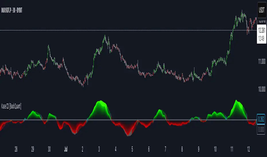
Kase Convergence Divergence [BackQuant]Kase Convergence Divergence
The Kase Convergence Divergence is a sophisticated oscillator designed to measure directional market strength through the lens of volatility-adjusted log return structures. Inspired by Cynthia Kase’s work on statistical momentum and price projection ranges, this unique indicator offers a hybrid framework that merges signal processing, multi-length sweep logic, and adaptive smoothing techniques.
Unlike traditional momentum oscillators like MACD or RSI, which rely on static moving average differences, KCD introduces a dual-process system combining:
Kase-style statistical range projection (via log returns and volatility),
A sweeping loop of lookback lengths for robustness,
First and second derivative modes to capture both velocity and acceleration of price movement.
Core Logic & Computation
The KCD calculation is centered on two volatility-normalized transforms:
KSDI Up: Measures how far the current high has moved relative to a past low, normalized by return volatility.
KSDI Down: Measures how far the current low has moved relative to a past high, also normalized.
For every length in a user-defined sweep range (e.g., 25–35), both KSDI_up and KSDI_dn are computed, and their maximum values across the loop are retained. The difference between these two max values produces the raw signal:
KPO (Kase Projection Oscillator): Measures directional skew.
KCD (Kase Convergence Divergence): Defined as KPO – MA(KPO) — similar in spirit to MACD but structurally different.
Users can choose to visualize either the first derivative (KPO) , or the second derivative (KCD) , depending on market conditions or strategy style.
Key Features
✅ Multi-Length Sweep Logic: Improves signal reliability by aggregating statistical range projections across a set of lookbacks.
✅ Advanced Smoothing Modes: Supports DEMA, HMA, TEMA, LINREG, WMA and more for dynamic adaptation.
✅ Dual Derivative Modes: Choose between speed (first derivative) or smoothness (second derivative) to fit your trading regime.
✅ Color-Encoded Signal Bands: Heatmap-style oscillator coloring enhances visual feedback on trend strength.
✅ Candlestick Painting: Optional bar coloring makes it easy to spot trend shifts on the main chart.
✅ Adaptive Fill Zones: Green and red fills between the oscillator and zero line help distinguish bullish and bearish regimes at a glance.
Practical Applications
📈 Trend Confirmation: Use KCD as a secondary confirmation layer after breakout or pullback entries.
📉 Momentum Shifts: Crossover and crossunder of the zero line highlight potential regime changes.
📊 Strategy Filters: Incorporate into algos to avoid trendless or mean-reverting environments.
🧪 Derivative Switching: Flip between KPO and KCD modes depending on whether you want to measure acceleration or deceleration of price flow.
Alerts & Signals
Two built-in alerts help you catch regime shifts in real time:
Long Signal: Triggered when the selected oscillator crosses above zero.
Short Signal: Triggered when it crosses below zero.
These events can be used to generate entries, exits, or trend validation cues in multi-layer systems.
Conclusion
The Kase Convergence Divergence goes beyond traditional oscillators by offering a volatility-normalized, derivative-aware signal engine with enhanced visual dynamics. Its sweeping architecture and dynamic fill logic make it especially powerful for identifying trending environments, filtering chop, and adding statistical rigor to your trading toolkit.
Whether you’re a discretionary trader seeking precision, or a quant looking to model more robust return structures, KCD offers a creative yet analytically grounded solution.
Capitalife IndexCapitalife Index
Jahres Rendite seit 2008 basierend auf Backtesting & Live Ergebnisse

RISK ROTATION MATRIX ║ BullVision [3.0]🔍 Overview
The Risk Rotation Matrix is a comprehensive market regime detection system that analyzes global market conditions across four critical domains: Liquidity, Macroeconomic, Crypto/Commodities, and Risk/Volatility. Through proprietary algorithms and advanced statistical analysis, it transforms 20+ diverse market metrics into a unified framework for identifying regime transitions and risk rotations.
This institutional-grade system aims to solve a fundamental challenge: how to synthesize complex, multi-domain market data into clear, actionable trading intelligence. By combining proprietary liquidity calculations with sophisticated cross-asset analysis.
The Four-Domain Architecture
1. 💧 LIQUIDITY DOMAIN
Our liquidity analysis combines standard metrics with proprietary calculations:
Proprietary Components:
Custom Global Liquidity Index (GLI): Unique formula aggregating central bank assets, credit spreads, and FX dynamics through our weighted algorithm
Federal Reserve Balance Proxy: Advanced calculation incorporating reverse repos, TGA fluctuations, and QE/QT impacts
China Liquidity Proxy: First-of-its-kind metric combining PBOC operations with FX-adjusted aggregates
Global M2 Composite: Custom multi-currency M2 aggregation with proprietary FX normalization
2. 📈 MACRO DOMAIN
Sophisticated integration of global economic indicators:
S&P 500: Momentum and trend analysis with custom z-score normalization
China Blue Chips: Asian market sentiment with correlation filtering
MBA Purchase Index: Real estate market health indicator
Emerging Markets (EEMS): Risk appetite measurement
Global ETF (URTH): Worldwide equity exposure tracking
Each metric undergoes proprietary transformation to ensure comparability and regime-specific sensitivity.
3. 🪙 CRYPTO/COMMODITIES DOMAIN
Unique cross-asset analysis combining:
Total Crypto Market Cap: Liquidity flow indicator with custom smoothing
Bitcoin SOPR: On-chain profitability analysis with adaptive periods
MVRV Z-Score: Advanced implementation with multiple MA options
BTC/Silver Ratio: Novel commodity-crypto relationship metric
Our algorithms detect when crypto markets lead or lag traditional assets, providing crucial timing signals.
4. ⚡ RISK/VOLATILITY DOMAIN
Advanced volatility regime detection through:
MOVE Index: Bond volatility with inverse correlation analysis
VVIX/VIX Ratio: Volatility-of-volatility for regime extremes
SKEW Index: Tail risk measurement with custom normalization
Credit Stress Composite: Proprietary combination of credit spreads
USDT Dominance: Crypto flight-to-safety indicator
All risk metrics are inverted and normalized to align with the unified scoring system.
🧠 Advanced Integration Methodology
Multi-Stage Processing Pipeline
Data Collection: Real-time aggregation from 20+ sources
Normalization: Custom z-score variants accounting for regime-specific volatility
Domain Scoring: Proprietary weighting within each domain
Cross-Domain Synthesis: Advanced correlation matrix between domains
Regime Detection: State-transition model identifying four market phases
Signal Generation: Composite score with adaptive smoothing
🔁 Composite Smoothing & Signal Generation
The user can apply smoothing (ALMA, EMA, etc.) to highlight trends and reduce noise. Smoothing length, type, and parameters are fully customizable for different trading styles.
🎯 Color Feedback & Market Regimes
Visual dynamics (color gradients, labels, trails, and quadrant placement) offer an at-a-glance interpretation of the market’s evolving risk environment—without forecasting or forward-looking assumptions.
🎯 The Quadrant Visualization System
Our innovative visual framework transforms complex calculations into intuitive intelligence:
Dynamic Ehlers Loop: Shows current position and momentum
Trailing History: Visual path of regime transitions
Real-Time Animation: Immediate feedback on condition changes
Multi-Layer Information: Depth through color, size, and positioning
🚀 Practical Applications
Primary Use Cases
Multi-Asset Portfolio Management: Optimize allocation across asset classes based on regime
Risk Budgeting: Adjust exposure dynamically with regime changes
Tactical Trading: Time entries/exits using regime transitions
Hedging Strategies: Implement protection before risk-off phases
Specific Trading Scenarios
Domain Divergence: When liquidity improves but risk metrics deteriorate
Early Rotation Detection: Crypto/commodity signals often lead broader markets
Volatility Regime Trades: Position for mean reversion or trend following
Cross-Asset Arbitrage: Exploit temporary dislocations between domains
⚙️ How It Works
The Composite Score Engine
The system's intelligence emerges from how it combines domains:
Each domain produces a normalized score (-2 to +2 range)
Proprietary algorithms weight domains based on market conditions
Composite score indicates overall market regime
Smoothing options (ALMA, EMA, etc.) optimize for different timeframes
Regime Classification
🟢 Risk-On (Green): Positive composite + positive momentum
🟠 Weakening (Orange): Positive composite + negative momentum
🔵 Recovery (Blue): Negative composite + positive momentum
🔴 Risk-Off (Red): Negative composite + negative momentum
Signal Interpretation Framework
The indicator provides three levels of analysis:
Composite Score: Overall market regime (-2 to +2)
Domain Scores: Identify which factors drive regime
Individual Metrics: Granular analysis of specific components
🎨 Features & Functionality
Core Components
Risk Rotation Quadrant: Primary visual interface with Ehlers loop
Data Matrix Dashboard: Real-time display of all 20+ metrics
Domain Aggregation: Separate scores for each domain
Composite Calculation: Unified score with multiple smoothing options
Customization Options
Selective Metrics: Enable/disable individual components
Period Adjustment: Optimize lookback for each metric
Smoothing Selection: 10 different MA types including ALMA
Visual Configuration: Quadrant scale, colors, trails, effects
Advanced Settings
Pre-smoothing: Reduce noise before final calculation
Adaptive Periods: Automatic adjustment during volatility
Correlation Filters: Remove redundant signals
Regime Memory: Hysteresis to prevent whipsaws
📋 Implementation Guide
Setup Process
Add to chart (optimized for daily, works on all timeframes)
Review default settings for your market focus
Adjust domain weights based on trading style
Configure visual preferences
Optimization by Trading Style
Position Trading: Longer periods (60-150), heavy smoothing
Swing Trading: Medium periods (20-60), balanced smoothing
Active Trading: Shorter periods (10-40), minimal smoothing
Best Practices
Monitor domain divergences for early signals
Use extreme readings (-1.5/+1.5) for high-conviction trades
Combine with price action for confirmation
Adjust parameters during major events (FOMC, earnings)
💎 What Makes This Unique
Beyond Traditional Indicators
Multi-Domain Integration: Only system combining liquidity, macro, crypto, and volatility
Proprietary Calculations: Custom formulas for GLI, Fed, China, and M2 proxies
Adaptive Architecture: Dynamically adjusts to market regimes
Institutional Depth: 20+ integrated metrics vs typical 3-5
Technical Innovation
Statistical Normalization: Custom z-score variants for cross-asset comparison
Correlation Management: Prevents double-counting related signals
Regime Persistence: Algorithms to identify sustainable vs temporary shifts
Visual Intelligence: Information-dense display without overwhelming
🔢 Performance Characteristics
Strengths
Early regime detection (typically 1-3 weeks ahead)
Robust across different market environments
Clear visual feedback reduces interpretation errors
Comprehensive coverage prevents blind spots
Optimal Conditions
Most effective with 100+ bars of history
Best on daily timeframe (4H minimum recommended)
Requires liquid markets for accurate signals
Performance improves with more enabled components
⚠️ Risk Considerations & Limitations
Important Disclaimers
Probabilistic system, not predictive
Requires understanding of macro relationships
Signals should complement other analysis
Past regime behavior doesn't guarantee future patterns
Known Limitations
Black swan events may cause temporary distortions
Central bank interventions can override signals
Requires active management during regime transitions
Not suitable for pure technical traders
💎 Conclusion
The Risk Rotation Matrix represents a new paradigm in market regime analysis. By combining proprietary liquidity calculations with comprehensive multi-domain monitoring, it provides institutional-grade intelligence previously available only to large funds. The system's strength lies not just in its individual components, but in how it synthesizes diverse market information into clear, actionable trading signals.
⚠️ Access & Intellectual Property Notice
This invite-only indicator contains proprietary algorithms, custom calculations, and years of quantitative research. The mathematical formulations for our liquidity proxies, cross-domain correlation matrices, and regime detection algorithms represent significant intellectual property. Access is restricted to protect these innovations and maintain their effectiveness for serious traders who understand the value of comprehensive market regime analysis.

Kaufman Efficiency Ratio (Directional)simple kaufman efficiency with positive and negative, use at 0.3 and -0.3 as threshold

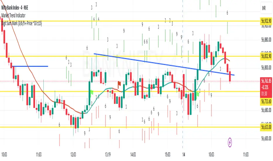
Digit Sum Mark (3/6/9 + Price ~33 ±15)This indicator highlights the price bars where the digit sum of high or low equals 3, 6, or 9, and the closing price is within a specific range (around ₹33 ±15, i.e., mod 100 ∈ ).
✨ Key Features:
Calculates digit sum of high and low values.
Adds +1 if the decimal portion > 0.50 (smart rounding logic).
Only activates when close price mod 100 is between 18 to 48, a zone inspired by the resonance around 33.
Marks the chart with green downward arrows (for high) and red upward arrows (for low) when digit sum = 3, 6, or 9.
📌 Inspired by Gann numerology and price vibration logic – especially the powerful influence of 3, 6, and 9 as noted by Nikola Tesla.
🚨 Best used on intraday or positional charts where price oscillates frequently around round figures.
🧠 Try pairing this with support/resistance tools for better accuracy!
ICT - Quit Job in 90 daysThis indicator is designed to help traders identify potential intraday reversals during the New York session, using key liquidity zones and structural shifts. It’s especially suited for 1-minute and 5-minute timeframes.
🔍 Core Concept
The tool focuses on liquidity grabs followed by structure breaks, a concept often used in smart money or institutional trading strategies. It plots liquidity levels during the London session (customizable, default: 2AM–7AM), identifying the high and low of that range. These levels act as key zones where price may reverse once liquidity is taken.
When price sweeps one of these liquidity levels during the New York session, the script looks for a change of structure (ChoCH) to confirm a potential reversal in the opposite direction.
📈 Change of Structure Logic
The CoS logic is based on price action:
For a short setup, the script waits for a series of bullish (up-close) candles into a liquidity level, followed by a bearish candle closing below the last up-close candle's body.
For a long setup, the opposite applies (a series of down-close candles, followed by a bullish close above).
This method helps confirm that the market has reacted to liquidity and is shifting direction.
⚙️ Customization
Liquidity window: You can adjust the time range for plotting liquidity levels to fit your session of interest.
Levels: In addition to intraday liquidity, the script also includes yesterday's high and low, which many traders use as reversal zones.
📌 Usage Notes
Recommended on 1-minute timeframe for optimal precision, though it can also work on 5-minute charts.
Designed to be used standalone—no additional indicators required.
The chart should be kept clean to best visualize the plotted zones and structure shifts.
🔒 Closed-Source
While the script is closed-source, the logic is transparently explained above. The core idea is original and not based on combining existing indicators but on a specific, rule-based approach to intraday structure shifts around liquidity.
I also want to say, that just base on a CoS Alert, you are not supposed to take a trade directly. Altough it may work, but on strong continuation days the code will create false signals.

Advanced Profit/Loss and Risk Calculator for Trading [Alex Ko]
📊 Advanced Profit/Loss and Risk Calculator for Trading (R:R Tool)
This indicator helps traders calculate all key trade parameters:
Entry price, Take-Profit (TP), Stop-Loss (SL)
Liquidation price (based on leverage)
Profit in $ or custom target exit price
Automatic deposit size calculation (if both profit $ and exit price are given)
All data displayed in an on-chart table
Fully supports both Long and Short trades.
Perfect for visual planning and trade preparation.

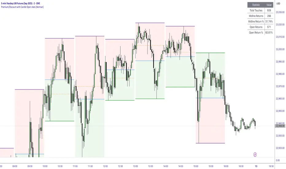
Premium/Discount with Candle Open stats [Herman]Premium/Discount with Stats
This indicator is designed to help traders identify and analyze premium/discount zones on any timeframe while automatically tracking statistics on price behavior relative to these zones. It is especially valuable for traders looking to structure entries, manage targets, and quantify market reactions to prior session ranges.
What it draws on the chart
✅ Range High and Low Lines
For each selected timeframe period (15min, 30min 1H, 4H, Daily), the indicator plots the high and low of the completed previous period.
These lines are color-coded dynamically based on sweep detection:
If the high was swept (price broke the previous high), the high line is marked as Premium.
If the low was swept, the low line is marked as Discount.
If both were swept or neither, it uses the default color settings.
✅ Midline
An optional midline at the 50% level of the previous period’s high-low range.
Helpful for mean-reversion traders or anyone watching for retests of equilibrium.
✅ Quartile Lines (25%–75%)
Optional additional lines at 25% and 75% of the previous range, helping traders visualize inner range subdivisions.
✅ Open Price Line
Marks the open price of the previous period as a horizontal reference.
✅ Background Fills
The region between low and midline is shaded with the Discount color.
The region between high and midline is shaded with the Premium color.
These optional fills help highlight the premium and discount zones visually.
✅ Current Incomplete Period Lines (optional)
You can choose to display provisional high, low, midline, quartiles, and open for the current forming period.
These update in real-time until the period closes.
Sweep Detection Logic
The indicator automatically tracks if the current period price sweeps above the previous period’s high or below the low.
A "sweep" is simply defined as price exceeding the previous high/low while tracking is active.
The sweep status affects the colors of the premium/discount lines, helping traders see potential liquidity grabs or stop hunts.
What it counts and tracks (Statistics)
The script automatically compiles statistics over time:
✅ Total Touches
Counts how many times the price in a new period touches either the previous period’s high or low.
A “touch” is registered once per side per period.
✅ Midline Returns
Counts how often, after touching the previous high/low, price returns to the previous period’s midline.
Gives you a measure of mean-reversion success.
✅ Open Returns
Similarly, tracks how often price returns to the previous period’s open after touching the previous high/low.
✅ Return Percentages
Displays the percentage of touches that result in a return to midline or open.
These percentages are calculated live on your chart and updated after each period closes.
✅ Stats Table
A customizable on-chart table summarizing all of these stats in real-time.
Helps traders evaluate the effectiveness of range-based trading setups over time.
How it Works (Technical details)
On each new bar, the script checks if a new period (as defined by your timeframe selection) has begun.
When a new period starts, the previous period’s high, low, open, midline, quartiles are recorded and drawn on the chart.
The script then “watches” the current period:
Updates provisional high and low.
Detects sweeps of previous highs/lows.
Tracks if price returns to the previous period’s midline or open after those sweeps.
Increments statistical counters if conditions are met.
Background fills and lines update dynamically based on real-time data.
Intended Use Cases
This indicator is ideal for:
✅ Identifying premium/discount zones for swing or intraday trades.
✅ Spotting liquidity sweeps and possible manipulation zones.
✅ Structuring trades with logical, data-driven target zones (midline, open).
✅ Quantifying the probability of mean-reversion moves after liquidity events.
✅ Developing and backtesting range-based trading models with live stats.
Highly Customizable
Choose any timeframe for defining the premium/discount range.
Toggle visibility of midline, quartiles, open line, current period preview.
Full control over colors, line styles, line widths, and background shading.
Optional real-time statistical table with total counts and return percentages.
Turnover & Liquidity Dashboard With Nifty 50 RS Jitendrasummary of the indicator and its core logic
Turnover & Liquidity Dashboard With Nifty 50 RS Jitendra
📊 Purpose
This Pine Script dashboard provides a quick, tabular view of key liquidity and valuation metrics for any stock, highlighting how turnover and market cap metrics behave relative to their averages and comparing the stock’s performance with NIFTY50.
Setting Image
drive.google.com
⚙️ Core Components & Logic
1. 🧮 Market Cap Calculation
Formula:
marketCap = (Total Shares Outstanding × Close Price) / 1 Crore
2. 🔁 Turnover Calculation
turnover = Volume × Close / 1 Crore
It also computes:
Average Turnover over a user-defined SMA length (e.g., 20 days)
Turnover % Change from previous day
HTQ (Highest Turnover in Quarter)
TOMCAP = Turnover as % of Market Cap
1-Min Liquidity (optional): total traded value at 1-min resolution
3. 🟩 Conditional Color Coding
Turnover > Avg Turnover → Green background
Turnover % Change > 0 → Green background
Else → Red background
Used to quickly identify strength/weakness in liquidity.
4. 🧾 Table Display
Data shown in either vertical or horizontal layout
Table fields include:
Market Cap
Turnover
Avg Turnover
Turnover % Change
TOMCAP (Turnover Vs MarketCap)
1-Min Liquidity (if enabled)
5. 📈 Performance vs NIFTY50
Compares current stock’s return over a lookback period with NIFTY50’s return:
stockReturn = (close - close ) / close
niftyReturn = (niftyClose - niftyClose ) / niftyClose
perfVsNifty = stockReturn - niftyReturn
Shows "Outperform" if perfVsNifty > 0
"Underperform" if < 0, with appropriate background color.
Lookback Bar No : Denotes
Stock Vs Nifty Performance
1= 1 Day Stock Vs Nifty Performance
5 = 5 Day Stock Vs Nifty Performance
20= 1 Months Stock Vs Nifty Performance
✅ Use Cases
Evaluate liquidity trends quickly.
Identify stocks with unusual volume or turnover spikes.
Compare a stock’s momentum to NIFTY50 to spot relative strength/weakness.
Ideal for institutional-style screening dashboards or sector overviews.

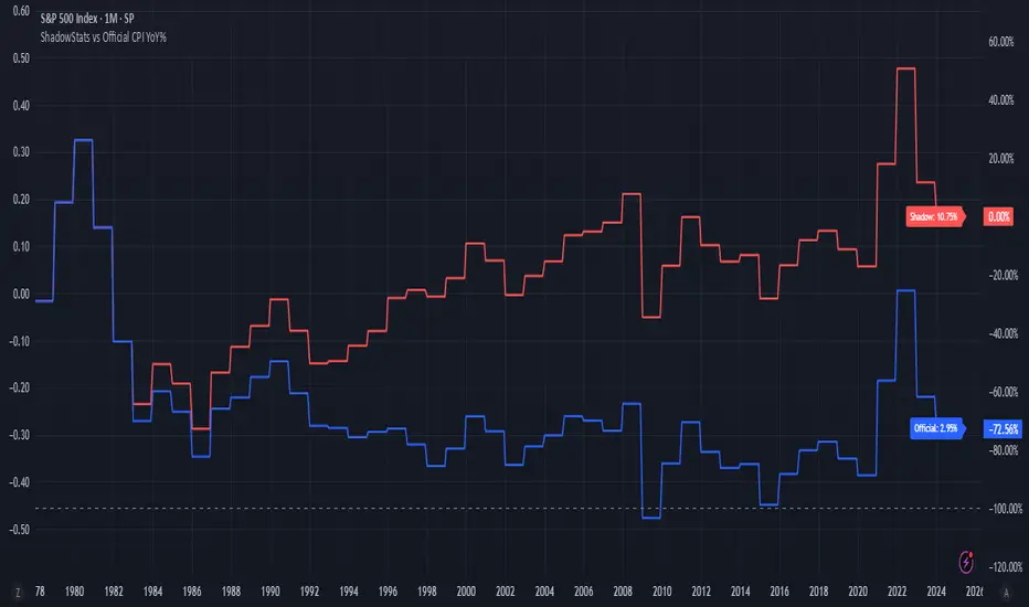
ShadowStats vs Official CPI YoY%This chart visualizes and compares the year-over-year (YoY) percentage change in the Consumer Price Index (CPI) as calculated by the U.S. government versus the alternative methodology used by ShadowStats, which reflects pre-1980 inflation measurement techniques. The red line represents ShadowStats' CPI YoY% estimates, while the blue line shows the official CPI YoY% reported by government sources. This side-by-side view highlights the divergence in reported inflation rates over time, particularly from the 1980s onward, offering a visual representation of how different calculation methods can lead to vastly different interpretations of inflation and purchasing power loss.