Machine Learning Key Levels [AlgoAlpha]🟠 OVERVIEW
This script plots Machine Learning Key Levels on your chart by detecting historical pivot points and grouping them using agglomerative clustering to highlight price levels with the most past reactions. It combines a pivot detection, hierarchical clustering logic, and an optional silhouette method to automatically select the optimal number of key levels, giving you an adaptive way to visualize price zones where activity concentrated over time.
🟠 CONCEPTS
Agglomerative clustering is a bottom-up method that starts by treating each pivot as its own cluster, then repeatedly merges the two closest clusters based on the average distance between their members until only the desired number of clusters remain. This process creates a hierarchy of groupings that can flexibly describe patterns in how price reacts around certain levels. This offers an advantage over K-means clustering, since the number of clusters does not need to be predefined. In this script, it uses an average linkage approach, where distance between clusters is computed as the average pairwise distance of all contained points.
The script finds pivot highs and lows over a set lookback period and saves them in a buffer controlled by the Pivot Memory setting. When there are at least two pivots, it groups them using agglomerative clustering: it starts with each pivot as its own group and keeps merging the closest pairs based on their average distance until the desired number of clusters is left. This number can be fixed or chosen automatically with the silhouette method, which checks how well each point fits in its cluster compared to others (higher scores mean cleaner separation). Once clustering finishes, the script takes the average price of each cluster to create key levels, sorts them, and draws horizontal lines with labels and colors showing their strength. A metrics table can also display details about the clusters to help you understand how the levels were calculated.
🟠 FEATURES
Agglomerative clustering engine with average linkage to merge pivots into level groups.
Dynamic lines showing each cluster’s price level for clarity.
Labels indicating level strength either as percent of all pivots or raw counts.
A metrics table displaying pivot count, cluster count, silhouette score, and cluster size data.
Optional silhouette-based auto-selection of cluster count to adaptively find the best fit.
🟠 USAGE
Add the indicator to any chart. Choose how far back to detect pivots using Pivot Length and set Pivot Memory to control how many are kept for clustering (more pivots give smoother levels but can slow performance). If you want the script to pick the number of levels automatically, enable Auto No. Levels ; otherwise, set Number of Levels . The colored horizontal lines represent the calculated key levels, and circles show where pivots occurred colored by which cluster they belong to. The labels beside each level indicate its strength, so you can see which levels are supported by more pivots. If Show Metrics Table is enabled, you will see statistics about the clustering in the corner you selected. Use this tool to spot areas where price often reacts and to plan entries or exits around levels that have been significant over time. Adjust settings to better match volatility and history depth of your instrument.
Statistics
[TCV] - Position Tool Position Tool by TheCryptoVizier is a trade-planning widget that lets you drop Entry, Take-Profit and Stop-Loss levels directly on the chart, instantly calculates risk-to-reward and position size, and shows only the numbers you actually need. It’s designed for traders who plan visually and don’t want to juggle spreadsheets or external calculators.
WHAT PROBLEM DOES IT SOLVE?
When you drag price levels on TradingView you still have to:
work out how many contracts / coins you can buy for a fixed $ risk,
check that your R:R is acceptable,
copy the final values somewhere else.
The Position Tool automates all of that inside the chart and keeps the screen clean.
HOW TO USE
Add the indicator to any chart.
Drag the blue (Entry), green (TP) and red (SL) lines to your desired levels.
Set your Risk in USDT and toggle the check-boxes to show / hide extra fields.
Read off the position size, risk and R:R in the corner table or copy the exact numbers from the Data Window.
Place your order with confidence – the maths is already done.
Whether you scalp lower-timeframes or swing trade higher ones, the Position Tool removes friction from trade preparation and lets you focus on execution.
KEY FEATURES
Drag-and-drop Entry / TP / SL lines – plan the trade visually.
Fixed-risk position sizing – enter how much you’re willing to lose in USDT (or account currency) and the script tells you the exact position value and quantity.
Live R-to-R ratio – instantly see whether the reward compensates the risk as you move levels.
Smart info panel – overlay table shows Entry, TP, SL, R:R and – optionally via check-boxes – position in USDT, position in $TICKER and risk in USDT. Hide what you don’t need.
Copy-ready Data Window values – the same numbers appear in TradingView’s Data Window, so you can click any cell to copy it straight to the clipboard.
----------
Disclaimer: This indicator is provided for educational purposes only. Trading involves substantial risk, and nothing here should be construed as financial advice or a recommendation to trade. Always do your own research and consult a qualified professional.

ReversoReverso – Moving Average Touch Statistics Tracker
Reverso indicator is a technical analysis tool that tracks and visualizes how price interacts with a selected Exponential Moving Average (EMA). It provides detailed statistics about price behavior before, during, and after each EMA touch event.
This script is suitable for both trend-following and mean-reversion traders who want to study EMA reactions, understand market tendencies, and refine entry/exit strategies based on price-memory dynamics.
Features and Functionality
Supported MAs: EMA 9, 20, or 50
Timeframe Support: Uses the chart’s timeframe
Touch Detection: Triggered when the price range (high to low) crosses or touches the EMA
Automatic Data Tracking
Tables for Quick Visual Summary
Visual Overlay: Optional EMA line plotted on chart
Timeframe Support: Uses the chart’s timeframe
Capped history: Most recent 50 touches
Automatic Data Tracking:
Number of EMA touches
Time intervals between touches
Price distance from last touch
Maximum price deviation (above/below EMA) between touches
Time spent above/below EMA
Tables for Quick Visual Summary:
Info Table: Live details about last and first touches, distance from touch, bars above/below, peak movements since last touch
Stats Table: Averages and extreme values for price behavior patterns across recent history
Core Metrics Tracked
Last Touch Price: The last price level where price touched the EMA
Distance from Last Touch: Current % change from the last touch price
Time Between Touches: Average and maximum intervals (in bars or time) between touch events
Max Distance Above/Below: Peak movement above/below EMA between touches
Bars Above/Below: How long price stayed above/below the EMA since last touch
Peak This Cycle: Max deviation above/below in current cycle since last touch
How It Works
Reverso monitors each bar to check if price intersects the selected EMA.
When a new touch occurs, it records the touch price and time, and resets the tracking cycle.
From that point forward, it tracks how far and how long price drifts above or below the EMA.
This process repeats with each new touch, building a detailed profile of how price behaves around the moving average.
The result is a visual and statistical framework for understanding price memory, market rhythm, and mean-reversion opportunities.
Customization Options
EMA Length: Choose from EMA 9, 20, or 50
Show MA Line: Toggle the EMA plot on the chart
Show Info Table: Enable/disable the current-touch summary
Show Statistics Table: Show aggregate data over the history
Table Positioning: Customizable placement for both tables
MA Color: Select custom color for EMA plot
Intended Use Cases
Identify reversal or continuation setups near EMAs
Validate strategies relying on mean reversion
Backtest the consistency of price respect to EMAs
Detect periods of volatility clustering around EMAs
Notes and Disclaimers
This script does not repaint: calculations are made on confirmed bars.
This indicator is educational in nature and should be used alongside other forms of analysis.
Time durations in the tables are approximated using bar timing and may vary across markets/timeframes.

SD Levels"SD Levels", is a powerful tool for technical analysis that automatically calculates and plots key price levels based on the price action within a user-defined time range. It functions by identifying a specific trading session, calculating the midpoint and half the range of that session's price action, and then using these values as a baseline and a standard deviation equivalent to project a series of customizable Fibonacci-style levels into the future.
These projected levels can act as potential support and resistance zones, helping traders identify significant price areas where the market might react. The indicator is highly customizable, allowing users to tailor its functionality and appearance to their specific trading strategies.
Key Features
• User-Defined Time Range: You can specify a particular time window (e.g., the first three hours of the New York session) and a corresponding timezone. The indicator will base all its calculations on the high, low, and closing prices within this defined period each day.
• Standard Deviation-Based Levels: The core of the indicator is its use of a "standard deviation" value, which is calculated as half the range (High - Low) of the specified session. The baseline, or "0" level, is the midpoint of this range.
• Customizable Fibonacci Levels: The script allows for the plotting of up to 11 distinct levels, each defined by a multiplier of the calculated standard deviation. Users have complete control over:
o The level's multiplier value.
o Whether the level is displayed.
o The color, style (solid, dashed, dotted), and thickness of the level line.
o The option to display a text label for each level.
• Mirrored Levels: An option is available to automatically "mirror" each level on the opposite side of the baseline. For example, if you have a level at 1.5 standard deviations above the baseline, enabling the mirror function will also plot a corresponding level at -1.5 standard deviations below it.
• Visual Customization: Beyond individual line styles, you can adjust the overall appearance of the levels, including:
o Adding a transparent background fill between the levels to enhance visibility.
o Adjusting the padding (extension) of the level lines to the right of the chart.
o Controlling the size of the labels and choosing to display the level value, the price value, or both.
• Historical Analysis: The indicator can display these calculated levels for a user-specified number of previous days, allowing for back-testing and analysis of how price has historically interacted with these zones.
How It Works
1. Session Identification: The indicator first identifies the bars on the chart that fall within the user-defined Range Time and Timezone.
2. Range Calculation: During this identified session, it records the highest high and the lowest low.
3. Baseline and Deviation Calculation: At the end of the session, it calculates two critical values:
o Baseline: The midpoint of the session's range, calculated as (range_high + range_low) / 2. This serves as the 0 level.
o Standard Deviation Value: Half of the session's total range, calculated as (range_high - range_low) / 2.
4. Level Plotting: Using the baseline and the standard deviation value, the indicator calculates and plots the various user-defined Fibonacci levels. For instance, a level with a multiplier of 2.0 would be plotted at baseline + (2 * stdev_val).
5. Drawing and Extension: The calculated levels are drawn starting from the beginning of the session and are extended forward in time, updating with each new bar. This allows traders to see how the current price is interacting with the levels derived from the earlier session.
In essence, the "SD Levels" indicator provides a structured and automated way to identify and visualize significant, data-driven price levels based on the volatility and price action of a specific, important trading period.

Liquidity Break Probability [PhenLabs]📊 Liquidity Break Probability
Version: PineScript™ v6
The Liquidity Break Probability indicator revolutionizes how traders approach liquidity levels by providing real-time probability calculations for level breaks. This advanced indicator combines sophisticated market analysis with machine learning inspired probability models to predict the likelihood of high/low breaks before they happen.
Unlike traditional liquidity indicators that simply draw lines, LBP analyzes market structure, volume profiles, momentum, volatility, and sentiment to generate dynamic break probabilities ranging from 5% to 95%. This gives traders unprecedented insight into which levels are most likely to hold or break, enabling more confident trading decisions.
🚀 Points of Innovation
Advanced 6-factor probability model weighing market structure, volatility, volume, momentum, patterns, and sentiment
Real-time probability updates that adjust as market conditions change
Intelligent trading style presets (Scalping, Day Trading, Swing Trading) with optimized parameters
Dynamic color-coded probability labels showing break likelihood percentages
Professional tiered input system - from quick setup to expert-level customization
Smart volume filtering that only highlights levels with significant institutional interest
🔧 Core Components
Market Structure Analysis: Evaluates trend alignment, level strength, and momentum buildup using EMA crossovers and price action
Volatility Engine: Incorporates ATR expansion, Bollinger Band positioning, and price distance calculations
Volume Profile System: Analyzes current volume strength, smart money proxies, and level creation volume ratios
Momentum Calculator: Combines RSI positioning, MACD strength, and momentum divergence detection
Pattern Recognition: Identifies reversal patterns (doji, hammer, engulfing) near key levels
Sentiment Analysis: Processes fear/greed indicators and market breadth measurements
🔥 Key Features
Dynamic Probability Labels: Real-time percentage displays showing break probability with color coding (red >70%, orange >50%, white <50%)
Trading Style Optimization: One-click presets automatically configure sensitivity and parameters for your trading timeframe
Professional Dashboard: Live market state monitoring with nearest level tracking and active level counts
Smart Alert System: Customizable proximity alerts and high-probability break notifications
Advanced Level Management: Intelligent line cleanup and historical analysis options
Volume-Validated Levels: Only displays levels backed by significant volume for institutional-grade analysis
🎨 Visualization
Recent Low Lines: Red lines marking validated support levels with probability percentages
Recent High Lines: Blue lines showing resistance zones with break likelihood indicators
Probability Labels: Color-coded percentage labels that update in real-time
Professional Dashboard: Customizable panel showing market state, active levels, and current price
Clean Display Modes: Toggle between active-only view for clean charts or historical view for analysis
📖 Usage Guidelines
Quick Setup
Trading Style Preset
Default: Day Trading
Options: Scalping, Day Trading, Swing Trading, Custom
Description: Automatically optimizes all parameters for your preferred trading timeframe and style
Show Break Probability %
Default: True
Description: Displays percentage labels next to each level showing break probability
Line Display
Default: Active Only
Options: Active Only, All Levels
Description: Choose between clean active-only view or comprehensive historical analysis
Level Detection Settings
Level Sensitivity
Default: 5
Range: 1-20
Description: Lower values show more levels (sensitive), higher values show fewer levels (selective)
Volume Filter Strength
Default: 2.0
Range: 0.5-5.0
Description: Controls minimum volume threshold for level validation
Advanced Probability Model
Market Trend Influence
Default: 25%
Range: 0-50%
Description: Weight given to overall market trend in probability calculations
Volume Influence
Default: 20%
Range: 0-50%
Description: Impact of volume analysis on break probability
✅ Best Use Cases
Identifying high-probability breakout setups before they occur
Determining optimal entry and exit points near key levels
Risk management through probability-based position sizing
Confluence trading when multiple high-probability levels align
Scalping opportunities at levels with low break probability
Swing trading setups using high-probability level breaks
⚠️ Limitations
Probability calculations are estimations based on historical patterns and current market conditions
High-probability setups do not guarantee successful trades - risk management is essential
Performance may vary significantly across different market conditions and asset classes
Requires understanding of support/resistance concepts and probability-based trading
Best used in conjunction with other analysis methods and proper risk management
💡 What Makes This Unique
Probability-Based Approach: First indicator to provide quantitative break probabilities rather than simple S/R lines
Multi-Factor Analysis: Combines 6 different market factors into a comprehensive probability model
Adaptive Intelligence: Probabilities update in real-time as market conditions change
Professional Interface: Tiered input system from beginner-friendly to expert-level customization
Institutional-Grade Filtering: Volume validation ensures only significant levels are displayed
🔬 How It Works
1. Level Detection:
Identifies pivot highs and lows using configurable sensitivity settings
Validates levels with volume analysis to ensure institutional significance
2. Probability Calculation:
Analyzes 6 key market factors: structure, volatility, volume, momentum, patterns, sentiment
Applies weighted scoring system based on user-defined factor importance
Generates probability score from 5% to 95% for each level
3. Real-Time Updates:
Continuously monitors price action and market conditions
Updates probability calculations as new data becomes available
Adjusts for level touches and changing market dynamics
💡 Note: This indicator works best on timeframes from 1-minute to 4-hour charts. For optimal results, combine with proper risk management and consider multiple timeframe analysis. The probability calculations are most accurate in trending markets with normal to high volatility conditions.

Logarithmic Moving Average (LMA) [QuantAlgo]🟢 Overview
The Logarithmic Moving Average (LMA) uses advanced logarithmic weighting to create a dynamic trend-following indicator that prioritizes recent price action while maintaining statistical significance. Unlike traditional moving averages that use linear or exponential weights, this indicator employs logarithmic decay functions to create a more sophisticated price averaging system that adapts to market volatility and momentum conditions.
The indicator displays a smoothed signal line that oscillates around zero, with positive values indicating bullish momentum and negative values indicating bearish momentum. The signal incorporates trend quality assessment, momentum confirmation, and multiple filtering mechanisms to help traders and investors identify trend continuation and reversal opportunities across different timeframes and asset classes.
🟢 How It Works
The indicator's core innovation lies in its logarithmic weighting system, where weights are calculated using the formula: w = 1.0 / math.pow(math.log(i + steepness), 2) The steepness parameter controls how aggressively recent data is prioritized over historical data, creating a dynamic weight decay that can be fine-tuned for different trading styles. This logarithmic approach provides more nuanced weight distribution compared to exponential moving averages, offering better responsiveness while maintaining stability.
The LMA calculation combines multiple sophisticated components. First, it calculates the logarithmic weighted average of closing prices. Then it measures the slope of this average over a 10-period lookback: lmaSlope = (lma - lma ) / lma * 100 The system also incorporates trend quality assessment using R-squared correlation analysis of log-transformed prices, measuring how well the price data fits a linear trend model over the specified period.
The final signal generation uses the formula: signal = lmaSlope * (0.5 + rSquared * 0.5) which combines the LMA slope with trend quality weighting. When momentum confirmation is enabled, the indicator calculates annualized log-return momentum and applies a multiplier when the momentum direction aligns with the signal direction, strengthening confirmed signals while filtering out weak or counter-trend movements.
🟢 How to Use
1. Signal Interpretation and Threshold Zones
Positive Values (Above Zero): LMA slope indicating bullish momentum with upward price trajectory relative to logarithmic baseline
Negative Values (Below Zero): LMA slope indicating bearish momentum with downward price trajectory relative to logarithmic baseline
Zero Line Crosses: Signal transitions between bullish and bearish regimes, indicating potential trend changes
Long Entry Threshold Zone: Area above positive threshold (default 0.5) indicating confirmed bullish signals suitable for long positions
Short Entry Threshold Zone: Area below negative threshold (default -0.5) indicating confirmed bearish signals suitable for short positions
Extreme Values: Signals exceeding ±1.0 represent strong momentum conditions with higher probability of continuation
2. Momentum Confirmation and Visual Analysis
Signal Color Intensity: Gradient coloring shows signal strength, with brighter colors indicating stronger momentum
Bar Coloring: Optional price bar coloring matches signal direction for quick visual trend identification
Position Labels: Real-time position classification (Bullish/Bearish/Neutral) displayed on the latest bar
Momentum Weight Factor: When short-term log-return momentum aligns with LMA signal direction, the signal receives additional weight confirmation
Trend Quality Component: R-squared values weight the signal strength, with higher correlation indicating more reliable trend conditions
3. Examples: Preconfigured Settings
Default: Universally applicable configuration balanced for medium-term investing and general trading across multiple timeframes and asset classes.
Scalping: Highly responsive setup with shorter period and higher steepness for ultra-short-term trades on 1-15 minute charts, optimized for quick momentum shifts.
Swing Trading: Extended period with moderate steepness and increased smoothing for multi-day positions, designed to filter noise while capturing larger price swings on 1-4 hour and daily charts.
Trend Following: Maximum smoothing with lower steepness for established trend identification, generating fewer but more reliable signals optimal for daily and weekly timeframes.
Mean Reversion: Shorter period with high steepness for counter-trend strategies, more sensitive to extreme moves and reversal opportunities in ranging market conditions.
Avg daily rangeThe Average Daily Range (ADR) is a technical indicator that measures the average price movement of a financial instrument over a specific period.

Price Reaction Analysis by Day of WeekOverview
The "Price Reaction Analysis by Day of Week" indicator is a tool that enables traders to analyze historical price reaction patterns to technical indicator signals on a selected day of the week. It examines price behavior on a chosen candle (from 1 to 30) in the next day or subsequent days after a signal, depending on the timeframe, and provides success rate statistics to support data-driven trading decisions. The indicator is optimized for timeframes up to 1 day (e.g., 1D, 12H, 8H, 6H, 4H, 1H, 15M), as the analysis relies on day-of-week comparisons. Lower timeframes generate more signals due to the higher number of candles per day.
Key Features
1. Flexible Technical Indicator Selection
Users can choose one of four technical indicators: RSI, SMI, MA, or Bollinger Bands. Each indicator has configurable parameters, such as:
RSI length, oversold/overbought levels.
SMI length, %K and %D smoothing, signal levels.
MA length.
Bollinger Bands length and multiplier.
2. Day-of-Week Analysis
The indicator allows users to select a day of the week (Monday, Tuesday, Wednesday, Thursday, Friday) for generating signals. It analyzes price reactions on a selected candle (from 1 to 30) in the next day or subsequent days after the signal. Examples:
On a daily timeframe, a signal on Monday can be analyzed for the first, fourth, or later candle (up to 30) in subsequent days (e.g., Tuesday, Wednesday).
On timeframes lower than 1 day (e.g., 12H, 8H, 6H, 4H, 1H, 15M), the analysis targets the selected candle in the next day or subsequent days. For example, on a 4H timeframe, you can analyze the second Tuesday candle following a Monday signal. The maximum timeframe is 1 day to ensure consistent day-of-week analysis.
3. Visual Signals
Signals for the analysis period are marked with background highlights in real-time when the indicator’s conditions are met. The last highlighted candle of the selected day is always analyzed. Arrows are displayed on the chart at the candle specified by the “Candles to Compare” setting (e.g., the first candle if set to 1):
Green upward triangles (below the candle) for successful buy signals (the closing price of the selected candle is higher than the signal candle’s close).
Red downward triangles (above the candle) for successful sell signals (the closing price of the selected candle is lower than the signal candle’s close).
Gray “x” marks for unsuccessful signals (no price reversal in the expected direction). Arrow positions are intuitive: buy signals below the candle, sell signals above. Highlights and arrows do not require waiting for future signals but are essential for calculating statistics.
Note: The first candle of the next day may appear shifted on the chart due to timezone differences, which can affect the timing of signal appearance.
4. Signal Conditions (Highlights) for Each Indicator
RSI: The oscillator is in oversold (buy) or overbought (sell) zones.
SMI: SMI returns from oversold (buy) or overbought (sell) zones.
MA: Price crosses the MA (upward for buy, downward for sell).
Bollinger Bands: Price returns inside the bands (from below for buy, from above for sell).
5. Success Rate Statistics
A table in the top-right corner of the chart displays:
The number of buy and sell signals for the selected day of the week.
The percentage of cases where the price of the selected candle in the next day or subsequent days reversed as expected (e.g., rising after a buy signal). Statistics are based on comparing the closing price of the signal candle with the closing price of the selected candle (e.g., first, fourth) in the next day or subsequent days.
Important: Statistics do not account for price movements within the candle or after its close. The price on the selected candle (e.g., fourth) may be lower than earlier candles but still higher than the signal candle, counting as a positive buy signal, though it does not guarantee profit.
6. Date Range
Users can specify the analysis date range, enabling strategy testing on historical data from a chosen period. Ensure the start and end dates are set correctly.
Applications
The indicator is designed for traders who want to leverage historical patterns for position planning. Examples:
On a 4-hour timeframe: If a sell signal highlight appears on Monday and statistics show an 80% chance that the fourth Tuesday candle is bearish, traders may consider playing a correction at the open of that candle.
On a daily timeframe: If a highlight indicates market overheating, traders may consider entering a position at the open of the first candle after the signal (e.g., Tuesday), provided statistics suggest an edge. Users can analyze the signal on the first candle and check later candles to validate results, increasing confidence in consistent patterns.
Key Settings
Indicator Type: Choose between RSI, SMI, MA, or Bollinger Bands.
Selected Day: Monday, Tuesday, Wednesday, Thursday, or Friday.
Candles to Compare: The number of the candle in the next day or subsequent days (from 1 to 30).
Indicator Parameters: Lengths, levels (e.g., oversold/overbought for RSI).
Background Colors: Configurable highlights for buy and sell signals.
Notes
Timeframes: The indicator is optimized for timeframes up to 1 day (e.g., 1D, 12H, 8H, 6H, 4H, 1H, 15M), as the analysis relies on day-of-week patterns. Timeframes lower than 1 day generate more signals due to the higher number of candles per day.
Candle Shift: The first candle of the next day may appear shifted on the chart due to timezone differences, affecting the timing of signals across markets or platforms.
Statistical Limitations: Results are based on the closing prices of the selected candle, ignoring fluctuations in earlier candles, within the candle, or subsequent price movements. Traders must assess whether entering at the open or after the close of the selected candle is profitable.
Testing: Effectiveness depends on historical data and parameter settings. Testing different configurations across markets and timeframes is recommended.
Who Is It For?
Swing and position traders who base decisions on technical analysis and historical patterns.
Market analysts seeking patterns in price behavior by day of the week.
TradingView users of all experience levels, thanks to an intuitive interface and flexible settings.

NQ Hourly Stats - Detailed Prob (24h)Hourly Sweep Statistics - Probability Engine (Credits to nqstats.com)
Overview
This indicator is a powerful statistical tool designed for intraday traders, particularly those focused on session-based patterns and mean reversion strategies. It automatically tracks the previous hour's high, low, and open, and when a sweep of the high or low occurs, it instantly displays the historical probability of the price returning to the hourly open within that same hour.
The core of this indicator is a comprehensive probability model built on historical price data, providing traders with an objective, data-driven edge.
Key Concepts
The indicator operates on a simple but effective premise: after the high or low of the previous hour is taken, what is the statistical likelihood that price will revert back to the opening price of the current hour?
• Previous Hour High (PHH) & Previous Hour Low (PHL): These levels often act as key liquidity zones. A sweep of these levels can signify either a stop run before a reversal or the start of a strong continuation.
• Return to Open: This is a classic mean-reversion concept. The indicator quantifies the probability of this event happening based on the exact time the sweep occurs.
• Time-Based Probability: The probability of returning to the open is not static; it changes depending on when the sweep happens. A sweep in the first 5 minutes of the hour has a different statistical outcome than a sweep in the last 5 minutes. This indicator accounts for that variance by breaking down the hour into 12 distinct 5-minute buckets.
How It Works
1. Automatic Level Plotting: At the start of each new hour, the indicator automatically draws three lines on your chart:
o The Previous Hour's High (Teal, solid line)
o The Previous Hour's Low (Maroon, solid line)
o The Current Hour's Open (Gray, dotted line)
2. Sweep Detection & Labeling: The script constantly monitors price action. The moment the current price action sweeps (touches or breaks) the PHH or PHL, a label appears.
o High Sweep: A label will appear above the PHH line.
o Low Sweep: A label will appear below the PHL line.
3. Information-Rich Labels: Each label provides crucial, real-time information:
o Direction: "Took PHH" or "Took PHL".
o Time: The exact time (@ HH:MM) the sweep occurred.
o Probability: The historical probability ("Prob to Open: XX.XX%") of price returning to the hourly open after that specific sweep.
4. Dynamic Color-Coding: The labels are color-coded for at-a-glance interpretation:
o Green: High probability (>70%) - Strong statistical likelihood of returning to the open.
o Orange: Medium probability (40%-70%) - Neutral/moderate likelihood.
o Red: Low probability (<40%) - Weak statistical likelihood of returning to the open; may suggest trend continuation.
How to Use in Your Trading
This indicator is not a standalone signal generator but a powerful confluence tool to enhance your decision-making.
• Mean Reversion Setups: When a sweep occurs and a high-probability (green) label appears, it can serve as strong confirmation for a mean-reversion trade. You can look for entries on a lower timeframe, targeting the hourly open.
• Trend Continuation Setups: If a sweep generates a low-probability (red) label, it suggests that the move has strength and is less likely to reverse. This can be used to validate a breakout or trend-following strategy, or to avoid taking a counter-trend trade.
• Filtering Trades: Use the probabilities to filter your existing setups. You might choose to only take reversion trades when the probability is above a certain threshold (e.g., 70%) or avoid them entirely when the probability is low.
Features & Customization
• Full 24-Hour Data: The statistical model includes data for all 24 hours of the day, making it useful for trading any session (Asia, London, New York).
• Timezone Setting: Ensure you set the Chart Timezone input to match your chart's timezone (e.g., 'America/New_York') for the probabilities to be accurate.
• Custom Colors: All line colors are fully customizable to match your chart's theme.
Disclaimer: This indicator is based on historical statistics and does not guarantee future results. It should be used as part of a comprehensive trading plan that includes proper risk management. Always do your own research and backtesting.

Icy-Hot Visual Indicator [SciQua]🧊 Icy-Hot Visual Indicator
This indicator colors your price bars and/or chart background based on a normalized & smoothed transform of any price-based input (default: close). It gives you a quick “temperature map” of market momentum or volatility—cool blues for low readings, hot reds for high readings—without cluttering your chart.
🔍 Key Features
1. Dual Visual Layers
Candle Gradient: Applies a smooth, multi-color gradient to candle bodies and wicks based on normalized, smoothed input data
Background Gradient: Adds a semi-transparent gradient behind the candles to highlight broader trend zones or volatility regimes
2. Advanced Customization
Normalization Types: bounded, unbounded, z-score, MAD, percentile, sigmoid, tanh, rank, robust, and more
Smoothing Methods: EMA, SMA, WMA, RMA, HMA, TEMA, VWMA, Gaussian, LinReg, ExpReg, and others (12+ options)
3. Gradient Control: Choose 2–7 color stops, reverse direction, adjust display length
Flexible Source Inputs
Use any built-in price series (close, hl2, volume, etc.)
Feed outputs from external indicators (RSI, custom oscillators, moving averages) into either layer
❓How It Works
Inputs are normalized (z-score, bounded, etc.) then smoothed (EMA, LinReg, etc.) in the order you choose. The result is clamped to 0–1 and passed through a multi-stop gradient engine for precise color mapping.
✨ What Makes It Original
While many indicators apply colors or smoothing, this script combines multi-stage normalization, adaptive smoothing, and a modular gradient rendering engine in a highly customizable dual-layer system. It’s built using proprietary functions from the SciQua suite that are not available in public libraries and allow for advanced visual encoding without relying on alerts, signals, or extra panes.
This makes it original in both design and execution—offering a visual-first approach with unique depth, clarity, and flexibility.
🔐 Why This Script Is Closed-Source
While the underlying functions are published in the open-source SciQua library, this indicator’s specific implementation, configuration architecture, and visual behavior are proprietary. It combines multiple library utilities into a dual-layer adaptive system that handles advanced gradient rendering, multi-stage normalization, and smoothing pipelines in a unique way.
The source is closed to protect the design logic, interface abstraction, and fine-tuned behaviors that make this indicator commercially valuable. The building blocks are open to the Pine community, but this assembled product is not meant for replication or redistribution.
How to Use It
1. Highlight Trend Strength
Source: RSI percentile
Setup: 200-bar look-back, mild smoothing
Result: Warm tones when momentum is peaking; cool when it’s fading. Use as a quick filter for entries in the direction of the trend.
2. Visualize Volatility Regimes
Source: ATR or True Range
Setup: Bounded normalization with tighter smoothing bar color off, bg color on.
Result: Background bands that shade when volatility spikes. Helps you avoid low-volatility breakouts or throttle position sizing in choppy markets.
3. Combine with Other Indicators
Source: Output of your custom indicator (e.g., a Keltner Band width)
Setup: Match normalization period to your strategy’s timeframe
Result: Bars colored by your own logic—no extra panes, just enhanced candles.
4. Background Only Heatmap
Turn off bar coloring and dial in semi-transparent background shades—keeps candles crisp while still giving you a context heat-map behind price.
long short ratioSummary
Transform your analysis with a clear view of the market's true engine: capital.
The Long/Short Ratio HUD is a visual analysis tool designed to offer an instant perspective on the battle between buyers and sellers. Unlike traditional volume indicators that only measure the quantity of assets traded, this HUD measures the actual monetary value (e.g., USD, USDT) flowing into the market, giving you a much more accurate reading of true sentiment and conviction.
This indicator is presented as a clean, non-intrusive Heads-Up Display (HUD) in a corner of your chart, allowing you to keep your workspace clear while receiving high-value information.
Key Features
Intuitive Sentiment Bar: Instantly visualize the percentage of dominance between buyers (green) and sellers (red) in the current timeframe.
True Monetary Volume: Calculations are not based on simple volume (number of shares or coins) but on quote volume (Volume x Price). Discover how much real capital is backing the bulls and bears.
Data Smoothing: It uses an Exponential Moving Average (EMA) to smooth the volume data, showing the trend in sentiment rather than the noise of a single candle.
Non-Intrusive HUD: Docks to your chosen corner, displaying essential information without cluttering your price action and analysis.
Smart Number Formatting: Large monetary volumes are automatically abbreviated (e.g., 2.1M for millions, 850K for thousands) for a quick and easy read.
Fully Customizable: Easily adjust the HUD's position and the EMA's length (sensitivity) to fit your trading style.
How It Works & How to Interpret It
The indicator analyzes each candle's structure (body and wicks) along with its monetary volume to determine the buying and selling pressure.
Sentiment Calculation:
A green candle with a large body and a high close indicates strong buying pressure.
A red candle with a large body and a low close indicates strong selling pressure.
Long wicks signify a battle; the indicator intelligently distributes the volume to reflect who won that intra-bar fight.
Practical Interpretation:
Clear Dominance (e.g., > 70% Green): Suggests strong control by buyers. Look for confirmation of a trend continuation.
Balance (~50%/50%) with High Monetary Volume: Indicates a major battle or an absorption phase. Although significant capital is being traded, there is no clear winner. This is a key signal to be alert for a potential reversal or consolidation.
Divergences: One of the most powerful signals. If the price is rising but the buying sentiment on the HUD is decreasing, it could indicate that the uptrend is losing capital momentum and is vulnerable to a correction.
Disclaimer
This indicator is provided for educational and analytical purposes only. It does not constitute financial advice or a recommendation to buy or sell any asset. All investment and trading decisions are the sole responsibility of the user. Past performance is not indicative of future results.

Max Value Gap [MOT]📊 Max Value Gap — Intraday Fill Zones + Stats Dashboard
Max Value Gap is a real-time gap fill detection system that visualizes institutional-style intraday price inefficiencies on major indices like SPX and NDX. Built for scalpers and short-term traders, it helps identify prime reversal areas where price is likely to return — often within the same session.
This script tracks U.S. regular market hour gaps only (9:30 AM to 4:00 PM ET) and is designed for high-precision execution on the 1-minute chart.
🧠 What Is an SPX Intraday Gap?
An SPX intraday gap occurs when the market creates a void between candles due to rapid price movement — often following volatility spikes, liquidation breaks, or aggressive buyer/seller imbalances. These unfilled zones act like magnetic targets, drawing price back into them as liquidity rebalances.
Unlike overnight gaps, these are formed and resolved within the same session, making them ideal for intraday strategies.
🔍 Key Features
✅ 1. Automatic Gap Detection
Scans only during official U.S. equity market hours (9:30 AM – 4:00 PM EST)
Gap Up: A green candle opens above the previous high
Gap Down: A red candle opens below the previous low
Each valid gap is outlined using colored boxes:
🟩 Green Box = Gap Up
🟥 Red Box = Gap Down
📸 Image : Chart with both green and red boxes marking gaps on SPX.
✅ 2. Dynamic Gap Zone Tracking
Once a gap is identified, the box extends forward until price fills the zone
A gap is considered filled when:
Price trades back into the gap zone
For gap ups: price crosses below the bottom of the gap
For gap downs: price crosses above the top of the gap
Users have the option to auto-delete filled boxes for clarity
📸 Image: Chart with price re-entering and completing a gap fill with box extending only until that point.
✅ 3. Real-Time Statistics Table
Located in the bottom-right of your chart, the built-in dashboard shows:
Total gaps formed
Gaps filled intraday
Gaps filled same day
Percentages of successful fills
📸 Image: Picture of statistics table
This live table helps assess whether the current day’s gaps are behaving in line with historical probabilities — no guesswork required.
🔄 Futures Execution Strategy
While the gaps are plotted on the SPX (or index) chart, the actual trades are taken on MNQ, NQ, or ES, using the gap levels as entry targets.
Sample Trading Flow:
A gap down forms on SPX at 1:45 PM (EST)
Price starts showing reversal signs back toward the gap
Enter long MNQ or NQ targeting a move into the gap zone
Take profit once price fully fills the zone
Repeat throughout the session — trend or chop, gaps are a magnet
This method mirrors institutional mean reversion techniques, capitalizing on market inefficiencies without chasing momentum.
📸 SPX Gap Being Filled with Corresponding MNQ Move Overlay
✅ Best Practices
Works best during morning session volatility (9:30–11:30 AM ET)
Combine with reversal candles or momentum tools for high-quality entries
Avoid during low-volume lunch chop unless tracking larger gap zones
Use on SPX while executing trades on MNQ/NQ/ES
⚠️ Disclaimer
This script is provided for educational and informational purposes only. It does not offer investment advice or trade signals. Past performance does not guarantee future results. Use appropriate risk management. Redistribution or resale is strictly prohibited.

Boomerang Trading Indicator# Boomerang News Trading Indicator
## Overview
The Boomerang Trading Indicator is designed to identify potential reversal opportunities following major economic news releases. This indicator analyzes the initial market reaction to news events and provides visual cues for potential counter-trend trading opportunities based on Fibonacci retracement levels.
## How It Works
### News Event Detection
- Automatically detects major news release times (NFP, CPI, FOMC, etc.)
- Analyzes the first significant price movement following news releases
- Requires minimum candle size threshold to filter out weak reactions
### First Move Analysis
The indicator employs multiple analytical methods to determine the initial market direction:
**Simple Analysis (High Confidence):**
- When the news candle has ≥70% body-to-total ratio, uses straightforward bullish/bearish classification
**Advanced Analysis (Complex Cases):**
- Volume-weighted direction analysis
- Momentum and wick pattern analysis
- Market structure and gap analysis
- Weighted voting system combining all methods
### Entry Signal Generation
Based on the "boomerang" concept where markets often reverse after initial news reactions:
**For Bullish First Moves (Price Up Initially):**
- Generates SHORT entry signals when price retraces to 1.25-1.5 Fibonacci levels
- Visual: Red triangles above price bars
**For Bearish First Moves (Price Down Initially):**
- Generates LONG entry signals when price retraces to -0.25 to -0.5 Fibonacci levels
- Visual: Green triangles below price bars
## Key Features
### Visual Elements
- **Fibonacci Levels**: Displays key retracement levels based on the initial reaction range
- **Entry Zones**: Clear visual marking of optimal entry areas
- **Direction Arrows**: Shows the initial market reaction direction
- **Target Levels**: Displays profit target zones at 50% and 100% retracement levels
### Information Panel
Real-time display showing:
- Current setup status
- First move direction and body percentage
- Recommended trade direction
- Key price levels (reaction high/low)
- Profit targets with historical success rates
### Alert System
- Pre-news warnings (customizable timing)
- News event notifications
- Setup activation alerts
- Entry signal notifications
### Success Tracking
- Visual "BOOM!" animations when targets are hit
- Target 1 (50% level): ~95% historical success rate
- Target 2 (Main target): ~80% historical success rate
## Configuration Options
### Time Settings
- News release hour and minute (customizable for different events)
- Pre-news alert timing
- Setup duration (default 60 bars after news)
### Fibonacci Levels
- Adjustable retracement percentages
- Customizable target levels
- Mid-level importance weighting
### Risk Management
- Minimum reaction candle size filter
- Maximum risk point setting
- Visual risk/reward display
### Display Options
- Toggle Fibonacci level visibility
- Toggle target level display
- Toggle animation effects
- Customizable alert preferences
## Applicable News Events
This indicator is designed for high-impact economic releases:
- Non-Farm Payrolls (NFP) - First Friday, 8:30 AM ET
- Consumer Price Index (CPI) - Monthly, 8:30 AM ET
- Producer Price Index (PPI) - Monthly, 8:30 AM ET
- Gross Domestic Product (GDP) - Quarterly, 8:30 AM ET
- FOMC Interest Rate Decisions - 8 times yearly, 2:00 PM ET
## Trading Strategy Framework
### Core Principle
Markets often overreact to news initially, then reverse toward more rational price levels. This "boomerang effect" creates short-term trading opportunities.
### Entry Strategy
1. Wait for significant initial reaction (>10 points minimum)
2. Identify the initial direction using multi-factor analysis
3. Trade opposite to the initial reaction when price reaches sweet spot zones
4. Use Fibonacci retracement levels as entry triggers
### Risk Management
- Always use appropriate position sizing
- Set stop losses beyond recent swing levels
- Consider market volatility and news importance
- Monitor for setup invalidation signals
## Important Notes
### Educational Purpose
This indicator is for educational and analytical purposes. Users should:
- Thoroughly test strategies in demo environments
- Understand the risks involved in news trading
- Consider market conditions and volatility
- Use proper risk management techniques
### Market Considerations
- High volatility during news events increases both opportunity and risk
- Spreads may widen significantly during news releases
- Different brokers may have varying execution conditions
- Economic calendar timing may vary between sources
### Limitations
- Past performance does not guarantee future results
- Market conditions can change, affecting strategy effectiveness
- News events may have unexpected outcomes affecting normal patterns
- Technical analysis should be combined with fundamental analysis
## Version Information
- Compatible with TradingView Pine Script v5
- Designed for 1-minute timeframe optimal performance
- Works on major forex pairs, indices, and commodities
- Regular updates based on market condition changes
---
**Disclaimer:** This indicator is provided for educational purposes only. Trading involves substantial risk and is not suitable for all investors. Past performance is not indicative of future results. Users should conduct their own research and consider their financial situation before making trading decisions.

NQ Hourly Edge (By Scalpr)📊 Hourly Edge (Lorden) - Statistical Trading Edge Indicator
Transform your NQ1! trading with data-driven hourly analysis and high-probability setups based on extensive backtesting.
🎯 What This Indicator Does
The Hourly Edge indicator identifies high-probability "return to open" scenarios during the New York trading session (8am-4pm ET) specifically for NQ1! (Nasdaq futures). When the current hour opens inside the previous hour's range and then sweeps the previous high or low, statistical data shows strong probabilities of price returning to the hourly open.
📈 Key Features
Statistical Edge Detection
Real-time sweep detection with tick-by-tick accuracy
Probability percentages based on extensive NQ1! backtesting data
Color-coded probability levels: Green (75%+), Yellow (51-74%), Red (<50%)
Status tracking: Waiting → Swept → Returned
Visual Trading Tools
Hourly/Custom interval lines with full customization
High/Low tracking with optional current hour hiding
Opening price reference lines
Configurable line styles, colors, and widths
Smart Session Management
NY timezone awareness (8am-4pm ET focus)
"Waiting for 8am" display outside trading hours
20-minute segment analysis for refined probability calculations
🔧 Customization Options
Timeframe Flexibility
Multiple preset intervals: 4H, 1H, 30m, 15m, 10m, 5m
Custom timeframe input (hours + minutes)
Works on any chart timeframe
Display Controls
Show/hide any line type independently
Moveable info box (4 corner positions)
Adjustable text sizes
Historical line limit (1-500 bars)
Line Styling
Individual color settings for each line type
Style options: Solid, Dashed, Dotted
Width control: 1, 2, or 3 pixels
📊 How to Use
Add to NQ1! charts during NY session hours
Watch for sweep notifications in the info box
Check probability percentages for trade confidence
Monitor return status for entry/exit timing
Use alerts for high-probability setups (75%+ edge)
⚡ Best Practices
Optimal timeframes: 1m-15m for entries, 1H for context
Focus on 75%+ probability setups for highest edge
Wait for "moved away from open" confirmation before expecting returns
Combine with your existing NQ1! strategy for enhanced timing
🎯 Perfect For
NQ1! scalpers seeking high-probability entries
Nasdaq day traders wanting statistical edge confirmation
Futures strategy developers incorporating hourly analysis
Risk managers looking for data-driven NQ1! setups
Fractal Manipulation Projections [keypoems]Fractal Manipulation Projections 0-30 minutes
This study draws statistical hourly rails that help visualize how far price normally travels during the first half‑hour of each hour.
How it works
On the first bar of every clock hour (New York time) the script records the hourly open.
It then looks up the historical mean (μ) and standard deviations (σ) of (open - low for bearish| high - open for bullish candles) of the first 5 / 10 / 15 / 20 / 25 / 30‑minute candle that followed that open.
Lines are plotted at ±0.5 σ, ±1 σ and ±1.5 σ above and below the open; optional polylines or smooth curves can connect equal‑σ levels.
A small on‑chart table shows the current ±1.5 σ ranges for quick reference.
Data set
Pre‑computed distributions were built from 1‑minute CME Nasdaq‑100 futures (NQ1!) data:
2020‑present for all other hours (default).
2010‑present for the 02:00 hour (optional toggle).
No external data or HTTP requests are used; the script is fully self‑contained.
Inputs
Select which time‑slices (5 m … 30 m) and which σ levels to draw.
Choose straight or Catmull‑Rom curves, colors, line styles, and how many past hours (1‑6) remain visible.
Intended use
These projections do not predict direction or supply trade signals; they simply show where price would lie if it moved a typical ±σ distance from the hourly open. Use them as a contextual volatility gauge alongside your own strategy.
For educational purposes only. Nothing in this script constitutes financial advice. Past performance‑based statistics do not guarantee future results.

Micro Futures Contract Calculator Micro Futures Contract Calculator
Synopsis: The Micro Futures Contract Calculator is a sleek, minimalist indicator that calculates the number of Micro E-mini Nasdaq-100 (MNQ) or S&P 500 (MES) contracts you can trade based on a fixed dollar risk and stop-loss (in ticks). Displayed in a compact, professional table in the top-right corner, it shows your risk, stop-loss, contract type, and calculated contracts, helping traders maintain consistent risk management.
How to Use:
Add the indicator to your chart (search “Micro Futures Contract Calculator”).
In settings, input:
Maximum Risk ($): Your total risk per trade (e.g., $100).
Stop-Loss (Ticks): Stop-loss size in ticks (e.g., 20 ticks = 5 points).
Contract Type: Select MNQ or MES.
Check the top-right table for:
Risk, stop-loss, contract type, and number of contracts (e.g., “10” for MNQ, “4” for MES).
Use the contract number to size trades, ensuring risk stays fixed.
Why Standardized Risk is Important:
Consistency: Fixed risk per trade (e.g., $100) prevents oversized losses, stabilizing long-term performance.
Discipline: Removes emotional guesswork, enforcing a systematic approach across MNQ/MES trades.
Capital Protection: Limits exposure, preserving your account during losing streaks and volatile markets.
Scalability: Aligns position sizing with your risk tolerance, enabling confident scaling as your account grows.
This indicator simplifies risk management, making it essential for disciplined futures trading.

Smart LevelsSmart Levels - Professional Support & Resistance Indicator
🔥 ADVANCED TRUE OPENS & HIGH/LOW DETECTION SYSTEM
Smart Levels is a comprehensive technical analysis tool designed for professional traders who demand precision in identifying key market levels across multiple timeframes. This indicator automatically detects and displays critical support and resistance levels based on institutional trading concepts.
🎯 KEY FEATURES
TRUE OPENS DETECTION
Annual True Open: April 1st market opening (Q2 institutional cycle start)
Monthly Q1 & Q2 True Opens: First and second Monday of each month (customizable hours: 18:00 NY or 00:00 NY)
Weekly True Open: Every Monday at 18:00 NY (institutional week start)
Daily True Open: Midnight NY time (00:00 NY)
HIGH/LOW LEVELS IDENTIFICATION
Daily Highs & Lows: Previous day's extreme levels
Weekly Highs & Lows: Previous week's extreme levels
Monthly Highs & Lows: Previous month's extreme levels
Quarterly Highs & Lows: Previous quarter's extreme levels
Annual Highs & Lows: Previous year's extreme levels
ADVANCED CUSTOMIZATION
Master Controls: Enable/disable entire groups with one click
⚙️ Auto Scale Adjustment: Keep chart focused on price action (lines don't compress the view)
Individual Control: Each level can be configured independently
Line Styles: Solid, dashed, or dotted lines
Extension Types: Fixed displacement or last candle alignment
Color Coding: Fully customizable colors for each timeframe
PROFESSIONAL DISPLAY
Information Table: Live quarterly cycle status with color coding
Smart Labels: Price levels clearly marked with descriptive text
Multiple Positioning: Table can be positioned anywhere on chart
Clean Interface: Professional appearance with customizable text sizes
📊 INSTITUTIONAL CONCEPTS
This indicator is built on institutional trading principles:
Q1 (Accumulation): Smart money accumulation phase
Q2 (Manipulation): Price manipulation and liquidity hunting
Q3 (Distribution): Smart money distribution phase
Q4 (Continuation/Reversal): Trend continuation or major reversal
⚡ MASTER CONTROLS
🔥 DISPLAY ALL TRUE OPENS
Toggle all True Open levels on/off with a single click
📊 DISPLAY ALL HIGHS & LOWS
Toggle all High/Low levels on/off with a single click
⚙️ AUTO SCALE ADJUSTMENT (NEW FEATURE)
ON: Lines extend but don't affect chart scaling (maintains focus on price action)
OFF: Traditional behavior (lines may compress chart view)
Default: ENABLED for optimal trading experience
🛠 CONFIGURATION OPTIONS
True Open Settings (Per Timeframe)
Enable/Disable individual True Opens
Hour selection for monthly levels (18:00 NY or 00:00 NY)
Extension type: Fixed displacement or last candle alignment
Line appearance: Color, style, and width
Maximum number of lines displayed
High/Low Settings (Per Timeframe)
Enable/Disable individual High/Low pairs
Extension configuration
Separate colors for highs and lows
Line styling options
Information Table
Show/Hide information panel
Detailed view toggle
Position selection (6 options)
Text and background color customization
Text size adjustment
🎨 VISUAL FEATURES
Color-Coded Quarters: Each quarterly phase has distinct colors
Smart Positioning: Lines extend 20 candles beyond current price for clarity
Professional Labels: Clean price level identification
Memory Efficient: Automatic cleanup of old levels
Multi-Timeframe: Works on all timeframes from 1-minute to monthly
💡 TRADING APPLICATIONS
Support & Resistance
Previous High/Low levels act as natural S&R zones
True Opens often become significant pivot points
Institutional Analysis
Track quarterly cycles for macro trend analysis
Identify accumulation and distribution phases
Entry & Exit Points
Use level breaks for entry signals
Set targets at next timeframe levels
Risk Management
Place stops beyond key institutional levels
Size positions based on level confluence
🔧 TECHNICAL SPECIFICATIONS
Pine Script Version: v6
Overlay: Yes (displays directly on price chart)
Max Objects: 500 lines, 500 labels, 500 boxes
Timezone: America/New_York (institutional standard)
Performance: Optimized for all chart timeframes
Compatibility: Works with all TradingView accounts
📈 RECOMMENDED USAGE
Enable Master Controls for full functionality
Keep Auto Scale ON for optimal chart viewing
Customize colors to match your trading style
Use Information Table to track current quarterly phase
Combine with price action for high-probability setups
Smart Levels transforms complex institutional concepts into clear, actionable visual information. Whether you're scalping intraday moves or analyzing long-term trends, this indicator provides the precision levels professional traders depend on.
📊 Trade with institutional precision. Trade with Smart Levels.Tentar novamenteO Claude pode cometer erros. Confira sempre as respostas.Pesquisa Sonnet 4

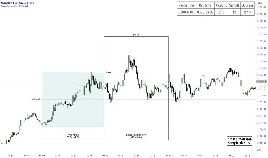
Price Range Retrace statisticks [HERMAN]📈 Price Range Retrace Stats
This indicator is designed to help traders quantify how often price retraces to a selected equilibrium level (e.g., 50%) after sweeping the high/low of a defined time-based range.
It is especially useful for modeling sessions such as the London Opening Range (e.g., 02:00–03:00 NY time), checking if price sweeps that range in a subsequent window (e.g., 03:00–04:00), and returns to its 50% level.
✅ What does it do?
Lets you define multiple time ranges (e.g. London, NY Open, custom ranges).
Draws the range box for the selected session time.
Calculates and plots the retracement level (default 50%).
Checks if price sweeps the high/low of the range before retracing.
Tracks success rate, average distance, sample size and displays these stats in a table.
⚙️ Key Features:
Fully customizable time windows (range box time and retracement check time).
-Configurable retracement % (default 50% equilibrium).
-Optional sweep condition (only count retracements if price sweeps the high/low first).
-Clean, theme-adaptive stats table with success rates and averages.
-Supports two independent levels (e.g. London and NY sessions).
📊 Why use it?
This tool turns session-based setups into statistical models:
Backtest session strategies over many days.
Quantify edge with % success over time.
Validate trading ideas with data.
Use probabilities instead of gut feeling.
Example insight you can track:
“Between 3–4 AM NY time, price swept the high/low of the 2–3 AM London Opening Range and returned to its 50% equilibrium level in 64% of 234 sessions.”
📌 Ideal for:
ICT concepts (Opening Range, Sweep, Equilibrium Return).
Algo developers wanting probabilities.
Anyone who wants data-driven confirmation for session range mean-reversion.
Instructions:
1️⃣ Enable the desired Price Range (1 or 2).
2️⃣ Set your Range Time (e.g. 02:00–03:00).
3️⃣ Set your Retracement Check Time (e.g. 03:00–04:00).
4️⃣ Choose retracement % (e.g. 50%).
5️⃣ Watch the box and retrace line plot on chart.
6️⃣ Review the success statistics in the table.
OI Bahavior MapThis indicator visualizes Open Interest (OI) changes for Binance Futures and highlights the behavior of market participants — whether takers or makers are opening or closing positions.
📊 Supported display modes:
• Taker or Maker
• Longs or Shorts
• Cumulative or Per-Bar
• Displayed in USD or Coins
💡 Each candle color reflects the dominant trade direction (delta):
🟢 Green = Aggressive buying (Delta Buy)
🔴 Red = Aggressive selling (Delta Sell)
OI direction (↑/↓) determines whether positions are being opened or closed.
🛠️ Optional metrics:
• Moving average of OI (SMA, EMA, WMA, VWMA, LSMA)
• Volatility channels (Bollinger Bands or Extremums)
⚙️ How it works:
• Fetches OI data from the SYMBOL_OI ticker (e.g., BTCUSDT_OI)
• Compares current OI with the previous bar
• Uses signed volume delta (close - open) to infer intent
• Classifies bar as open/close, long/short, taker/maker
• Displays the net effect as a colored candle on a secondary chart
🤔 How to interpret Taker and Maker?
• Taker: The aggressive participant who removes liquidity (initiates the trade)
• Maker: The passive participant who provides liquidity (places resting orders)
You can choose to display the same event from either the Taker or Maker perspective — the chart will look the same, but the interpretation changes.
🧠 Core Logic Mapping
```
🟢 Green: Taker Longs (Buy, OI↑) | Maker Shorts (Buy, OI↓)
🔴 Red: Taker Shorts (Sell, OI↑) | Maker Longs (Sell, OI↓)
```
⚠️ Limitations:
• Works only for Binance Futures
• Requires existence of SYMBOL_OI ticker on TradingView
• Represents approximate intent based on OI + volume behavior
💬 Open Source
The script is open for the community. Suggestions and feedback are welcome in the comments!
__________________________________________________________________________________
Этот индикатор визуализирует изменения открытого интереса (OI) для Binance Futures и показывает поведение участников рынка — открывают или закрывают позиции тейкеры или мейкеры.
📊 Доступные режимы отображения:
• Taker или Maker
• Longs или Shorts
• Кумулятивный или по бару
• В USD или в монетах
💡 Каждый цвет свечи отражает преобладающее направление сделок (дельта):
🟢 Зеленый = Агрессивные покупки (Delta Buy)
🔴 Красный = Агрессивные продажи (Delta Sell)
Направление OI (↑/↓) показывает, открываются или закрываются позиции.
🛠️ Дополнительные метрики:
• Скользящая средняя OI (SMA, EMA, WMA, VWMA, LSMA)
• Волатильностные каналы (Bollinger Bands или экстремумы)
⚙️ Как работает:
• Получает данные OI из тикера SYMBOL_OI (например, BTCUSDT_OI)
• Сравнивает текущий OI с предыдущим баром
• Использует направленную дельту объема (close - open) для определения намерения
• Классифицирует бар как открытие/закрытие, лонг/шорт, тейкер/мейкер
• Отображает итог в виде цветной свечи на дополнительном графике
🤔 Как интерпретировать Taker и Maker?
• Taker: Агрессивный участник, который изымает ликвидность (инициирует сделку)
• Maker: Пассивный участник, который создает ликвидность (выставляет лимитные заявки)
Вы можете выбрать отображение события с позиции тейкера или мейкера — график будет одинаковым, но смысл меняется.
🧠 Схема логики
```
🟢 Зеленый: Taker Longs (Покупка, OI↑) | Maker Shorts (Покупка, OI↓)
🔴 Красный: Taker Shorts (Продажа, OI↑) | Maker Longs (Продажа, OI↓)
```
⚠️ Ограничения:
• Работает только для Binance Futures
• Требуется наличие тикера SYMBOL_OI на TradingView
• Показывает приблизительное намерение на основе OI и дельты объема
💬 Open Source
Скрипт открыт для сообщества. Предложения и обратная связь приветствуются в комментариях!

BTC/Fiat Divergence & Spread Monitor📄 BTC/Fiat Divergence & Spread Monitor
This indicator visualizes Bitcoin’s relative performance across multiple fiat currencies and highlights periods of unusual divergence. It helps traders assess which fiat pairs BTC has outperformed or underperformed over a configurable lookback period and monitor the dynamic spread between the strongest and weakest pairs.
Features:
Relative Performance Matrix:
Ranks BTC returns in 6 fiat pairs, displaying a color-coded table of percentage changes and ranks.
Divergence Spread Oscillator:
Calculates the spread between the top and bottom performing pairs and normalizes this using a Z-Score. The oscillator helps identify when fiat pricing divergence is unusually high or compressed.
Dynamic Smoothing:
Optional Hull Moving Average smoothing to reduce noise in the spread signal.
Customizable Inputs:
Lookback period for percent change.
Z-Score normalization window.
Smoothing length.
Symbol selection for each fiat pair.
Visual Mode Toggle:
Switch between relative performance lines and spread oscillator view.
Potential Use Cases:
Fiat Rotation:
Identify which fiat is relatively weak or strong to optimize your exit currency when taking BTC profits.
Volatility Detection:
Use the spread Z-Score to detect periods of high divergence across fiat pairs, signaling macro FX volatility or dislocations.
Regime Analysis:
Track when fiat spreads are converging or expanding, potentially signaling market regime shifts.
Risk Management:
When divergence is extreme (Z-Score > +1), consider reducing position sizing or waiting for reversion.
Disclaimer:
This indicator is provided for educational and informational purposes only. It does not constitute financial advice or a recommendation to buy or sell any security or asset. Always do your own research and consult a qualified financial professional before making trading decisions. Use at your own risk.
Tip:
Experiment with different lookback periods and smoothing settings to adapt the indicator to your timeframe and trading style.

Uptrick: Universal Z-Score ValuationOverview
The Uptrick: Universal Z-Score Valuation is a tool designed to help traders spot when the market might be overreacting—whether that’s on the upside or the downside. It does this by combining the Z-scores of multiple key indicators into a single average, letting you see how far the current market conditions have stretched away from “normal.” This average is shown as a smooth line, supported by color-coded visuals, signal markers, optional background highlights, and a live breakdown table that shows the contribution of each indicator in real time. The focus here is on spotting potential reversals, not following trends. The indicator works well across all timeframes and asset classes, from fast intraday charts like the 1-minute and 5-minute, to higher timeframes such as the 4-hour, daily, or even weekly. Its universal design makes it suitable for any market — whether you're trading crypto, stocks, forex, or commodities.
Introduction
To understand what this indicator does, let’s start with the idea of a Z-score. In simple terms, a Z-score tells you how far a number is from the average of its recent history, measured in standard deviations. If the price of an asset is two standard deviations above its mean, that means it’s statistically “rare” or extended. That doesn’t guarantee a reversal—but it suggests the move is unusual enough to pay attention.
This concept isn’t new, but what this indicator does differently is apply the Z-score to a wide set of market signals—not just price. It looks at momentum, volatility, volume, risk-adjusted performance, and even institutional price baselines. Each of those indicators is normalized using Z-scores, and then they’re combined into one average. This gives you a single, easy-to-read line that summarizes whether the entire market is behaving abnormally. Instead of reacting to one indicator, you’re reacting to a statistically balanced blend.
Purpose
The goal of this script is to catch turning points—places where the market may be topping out or bottoming after becoming overstretched. It’s built for traders who want to fade sharp moves rather than follow trends. Think of moments when price explodes upward and starts pulling away from every moving average, volume spikes, volatility rises, and RSI shoots up. This tool is meant to spot those situations—not just when price is stretched, but when multiple different indicators agree that something is overdone.
Originality and Uniqueness
Most indicators that use Z-scores only apply them to one thing—price, RSI, or maybe Bollinger Bands. This one is different because it treats each indicator as a contributor to the full picture. You decide which ones to include, and the script averages them out. This makes the tool flexible but also deeply informative.
It doesn’t rely on complex or hidden math. It uses basic Z-score formulas, applies them to well-known indicators, and shows you the result. What makes it unique is the way it brings those signals together—statistically, visually, and interactively—so you can see what’s happening in the moment with full transparency. It’s not trying to be flashy or predictive. It’s just showing you when things have gone too far, too fast.
Inputs and Parameters
This indicator includes a wide range of configurable inputs, allowing users to customize which components are included in the Z-score average, how each indicator is calculated, and how results are displayed visually. Below is a detailed explanation of each input:
General Settings
Z-Score Lookback (default: 100): Number of bars used to calculate the mean and standard deviation for Z-score normalization. Larger values smooth the Z-scores; smaller values make them more reactive.
Bar Color Mode (default: None): Determines how bars are visually colored. Options include: None: No candle coloring applied. - Heat: Smooth gradient based on the Z-score value. - Latest Signal: Applies a solid color based on the most recent buy or sell signal
Boolean - General
Plot Universal Valuation Line (default: true): If enabled, plots the average Z-score (zAvg) line in the separate pane.
Show Signals (default: true): Displays labels ("𝓤𝓹" for buy, "𝓓𝓸𝔀𝓷" for sell) when zAvg crosses above or below user-defined thresholds.
Show Z-Score Table (default: true): Displays a live table listing each enabled indicator's Z-score and the current average.
Select Indicators
These toggles enable or disable each indicator from contributing to the Z-score average:
Use VWAP Z-Score (default: true)
Use Sortino Z-Score (default: true)
Use ROC Z-Score (default: true)
Use Price Z-Score (default: true)
Use MACD Histogram Z-Score (default: false)
Use Bollinger %B Z-Score (default: false)
Use Stochastic K Z-Score (default: false)
Use Volume Z-Score (default: false)
Use ATR Z-Score (default: false)
Use RSI Z-Score (default: false)
Use Omega Z-Score (default: true)
Use Sharpe Z-Score (default: true)
Only enabled indicators are included in the average. This modular design allows traders to tailor the signal mix to their preferences.
Indicator Lengths
These inputs control how each individual indicator is calculated:
MACD Fast Length (default: 12)
MACD Slow Length (default: 26)
MACD Signal Length (default: 9)
Bollinger Basis Length (default: 20): Used to compute the Bollinger %B.
Bollinger Deviation Multiplier (default: 2.0): Standard deviation multiplier for the Bollinger Band calculation.
Stochastic Length (default: 14)
ATR Length (default: 14)
RSI Length (default: 14)
ROC Length (default: 10)
Zones
These thresholds define key signal levels for the Z-score average:
Neutral Line Level (default: 0): Baseline for the average Z-score.
Bullish Zone Level (default: -1): Optional intermediate zone suggesting early bullish conditions.
Bearish Zone Level (default: 1): Optional intermediate zone suggesting early bearish conditions.
Z = +2 Line Level (default: 2): Primary threshold for bearish signals.
Z = +3 Line Level (default: 3): Extreme bearish warning level.
Z = -2 Line Level (default: -2): Primary threshold for bullish signals.
Z = -3 Line Level (default: -3): Extreme bullish warning level.
These zone levels are used to generate signals, fill background shading, and draw horizontal lines for visual reference.
Why These Indicators Were Merged
Each indicator in this script was chosen for a specific reason. They all measure something different but complementary.
The VWAP Z-score helps you see when price has moved far from the volume-weighted average, often used by institutions.
Sortino Ratio Z-score focuses only on downside risk, which is often more relevant to traders than overall volatility.
ROC Z-score shows how fast price is changing—strong momentum may burn out quickly.
Price Z-score is the raw measure of how far current price has moved from its mean.
RSI Z-score shows whether momentum itself is stretched.
MACD Histogram Z-score captures shifts in trend strength and acceleration.
%B (Bollinger) Z-score indicates how close price is to the upper or lower volatility envelope.
Stochastic K Z-score gives a sense of how high or low price is relative to its recent range.
Volume Z-score shows when trading activity is unusually high or low.
ATR Z-score gives a read on volatility, showing if price movement is expanding or contracting.
Sharpe Z-score measures reward-to-risk performance, useful for evaluating trend quality.
Omega Z-score looks at the ratio of good returns to bad ones, offering a more nuanced view of efficiency.
By normalizing each of these using Z-scores and averaging only the ones you turn on, the script creates a flexible, balanced view of the market’s statistical stretch.
Calculations
The core formula is the standard Z-score:
Z = (current value - average) / standard deviation
Every indicator uses this formula after it’s calculated using your chosen settings. For example, RSI is first calculated as usual, then its Z-score is calculated over your selected lookback period. The script does this for every indicator you enable. Then it averages those Z-scores together to create a single value: zAvg. That value is plotted and used to generate visual cues, signals, table values, background color changes, and candle coloring.
Sequence
Each selected indicator is calculated using your custom input lengths.
The Z-score of each indicator is computed using the shared lookback period.
All active Z-scores are added up and averaged.
The resulting zAvg value is plotted as a line.
Signal conditions check if zAvg crosses user-defined thresholds (default: ±2).
If enabled, the script plots buy/sell signal labels at those crossover points.
The candle color is updated using your selected mode (heatmap or signal-based).
If extreme Z-scores are reached, background highlighting is applied.
A live table updates with each individual Z-score so you know what’s driving the signal.
Features
This script isn’t just about stats—it’s about making them usable in real time. Every feature has a clear reason to exist, and they’re all there to give you a better read on market conditions.
1. Universal Z-Score Line
This is your primary reference. It reflects the average Z-score across all selected indicators. The line updates live and is color-coded to show how far it is from neutral. The further it gets from 0, the brighter the color becomes—cyan for deeply oversold conditions, magenta for overbought. This gives you instant feedback on how statistically “hot” or “cold” the market is, without needing to read any numbers.
2. Signal Labels (“𝓤𝓹” and “𝓓𝓸𝔀𝓷”)
When the average Z-score drops below your lower bound, you’ll see a "𝓤𝓹" label below the bar, suggesting potential bullish reversal conditions. When it rises above the upper bound, a "𝓓𝓸𝔀𝓷" label is shown above the bar—indicating possible bearish exhaustion. These labels are visually clear and minimal so they don’t clutter your chart. They're based on clear crossover logic and do not repaint.
3. Real-Time Z-Score Table
The table shows each indicator's individual Z-score and the final average. It updates every bar, giving you a transparent breakdown of what’s happening under the hood. If the market is showing an extreme average score, this table helps you pinpoint which indicators are contributing the most—so you’re not just guessing where the pressure is coming from.
4. Bar Coloring Modes
You can choose from three modes:
None: Keeps your candles clean and untouched.
Heat: Applies a smooth gradient color based on Z-score intensity. As conditions become more extreme, candle color transitions from neutral to either cyan (bullish pressure) or magenta (bearish pressure).
Latest Signal: Applies hard coloring based on the most recent signal—greenish for a buy, purple for a sell. This mode is great for tracking market state at a glance without relying on a gradient.
Every part of the candle is colored—body, wick, and border—for full visibility.
5. Background Highlighting
When zAvg enters an extreme zone (typically above +2 or below -2), the background shifts color to reflect the market’s intensity. These changes aren’t overwhelming—they’re light fills that act as ambient warnings, helping you stay aware of when price might be reaching a tipping point.
6. Customizable Zone Lines and Fills
You can define what counts as neutral, overbought, and oversold using manual inputs. Horizontal lines show your thresholds, and shaded regions highlight the most extreme zones (+2 to +3 and -2 to -3). These lines give you visual structure to understand where price currently stands in relation to your personal reversal model.
7. Modular Indicator Control
You don’t have to use all the indicators. You can enable or disable any of the 12 with a simple checkbox. This means you can build your own “blend” of market context—maybe you only care about RSI, price, and volume. Or maybe you want everything on. The script adapts accordingly, only averaging what you select.
8. Fully Customizable Sensitivity and Lengths
You can adjust the Z-score lookback length globally (default 100), and tweak individual indicator lengths separately. This lets you tune the indicator’s responsiveness to suit your trading style—slower for longer swings, faster for scalping.
9. Clean Integration with Any Chart Layout
All visual elements are designed to be informative without taking over your chart. The coloring is soft but clear, the labels are readable without being huge, and you can turn off any feature you don’t need. The indicator can work as a full dashboard or as a simple line with a couple of alerts—it’s up to you.
10. Precise, Real-Time Signal Logic
The crossover logic for signals is exact and only fires when the Z-score moves across your defined boundary. No estimation, no delay. Everything is calculated based on current and previous bar data, and nothing repaints or back-adjusts.
Conclusion
The Universal Z-Score Valuation indicator is a tool for traders who want a clear, unbiased way to detect overextension. Instead of relying on a single signal, you get a composite of several market perspectives—momentum, volatility, volume, and more—all standardized into a single view. The script gives you the freedom to control the logic, the visuals, and the components. Whether you use it as a confirmation tool or a primary signal source, it’s designed to give you clarity when markets become chaotic.
Disclaimer
This indicator is for research and educational use only. It does not constitute financial advice or guarantees of performance. All trading involves risk, and users should test any strategy thoroughly before applying it to live markets. Use this tool at your own discretion.

Pristine Fundamental AnalysisThe Pristine Fundamental Analysis indicator enables users to perform comprehensive fundamental stock analysis in a fraction of the time! 🏆
For swing/position traders, fundamental analysis is essential—it informs stock selection and strengthens conviction, enabling traders to stay in positions long enough to capture larger moves. Since every ticker represents both a business and a tradable asset, fundamental analysis perfectly complements technical analysis.
💠 Fundamental Analysis Insights - Weekly Timeframe
EPS & sales trends, margins & ratios, and valuation metrics are displayed on the weekly timeframe for in-depth analysis outside market hours.
💠 Fundamental Analysis Insights - Daily Timeframe
A slimmed down version of the fundamental analysis table is displayed on the daily timeframe to provide users quick insights into the fundamentals, while allowing them to focus on technical analysis during market hours.
💠 Fundamental Analysis Metrics to Deepen Understanding of Companies!
EARNINGS & SALES TRENDS
Why does it matter? Company stock prices tend to track the growth trajectory of earnings and sales over time. By analyzing fundamentals, users can gain an edge that pure technical traders do not have. This edge is most pronounced during big market dislocations when investors are forced to liquidate their top holdings.
▪ EPS - Measures year-over-year growth, quarter-over-quarter growth, and the surprise between actuals & analyst estimates
▪ Sales Analysis - Measures year-over-year growth, quarter-over-quarter growth, and the surprise between actuals & analyst estimates
MARGIN ANALYSIS
Why does it matter? Revenue is the lifeblood of a company. Margins measure company profits and expenditures as a percentage of revenue
▪ G% - Gross margin measures the percentage of revenue a company retained after subtracting the direct costs of producing the goods or services it sells, known as the cost of goods sold (COGS)
▪ CFO% - Measures the percentage of a company's revenue that was converted to Cash flow from operations (CFO). CFO, also known as operating cash flow (OCF), is the amount of cash a company generated from its core business activities over a specific period. It reflects the actual cash inflows and outflows resulting from the company’s main operations, such as selling products or providing services, and excludes cash flows from investing and financing activities.
▪ Net% - Net margin measures the percentage of revenue that was converted to net profit
▪ ROE% - Return on Equity measures how much net income a company produced for each dollar of equity invested by shareholders
▪ R&D% - R&D margin measures how much the company invested in research & development as a percentage of revenue
▪ D/E - The Debt to Equity ratio measures how much of a company’s financing comes from creditors (debt) versus owners (equity), providing insight into the company’s financial leverage and risk profile. The indicator tracks changes in the ratio over time
VALUATION METRICS
Why does it matter? Valuation metrics provide users an understanding of the potential risk if the fundamental trajectory of the company, or the broad market, changes! The more highly valued a company is, the more downside risk is present if conditions worsen, and vice versa.
▪ PE - The Price-to-Earnings ratio measures a company’s current share price relative to its trailing twelve-month(TTM) earnings per share (EPS). It helps investors assess how much they are paying for each dollar of a company’s earnings and is often used to gauge whether a stock is overvalued, undervalued, or fairly valued compared to its peers or historical averages.
▪ PS - The Price-to-Sales ratio measures a company’s current share price relative to its trailing twelve-month(TTM) sales per share. It helps investors assess how much they are paying for each dollar of a company’s sales and is often used to gauge whether a stock is overvalued, undervalued, or fairly valued compared to its peers or historical averages.
▪ BB% - Buyback yield measures the annual percentage of stock repurchased by the company. Share buybacks reduce total share count, which directly increases earnings per share!
💠 What Makes This Indicator Unique
There are many fundamental dashboards, however, what makes this indicator unique is customized metrics that were used to achieve back-to-back top finishes in the US Investing Championship. The main purpose of the indicator is to highlight companies with a history of EPS and sales acceleration , rather than focusing on the values in isolation, or even the growth of the values. Our goal is further evolution of the metrics and color signals based on continued backtesting and analysis of real-time market data.
▪ Custom Margin Metrics : Several of the margin metrics are unique and offer significant value beyond EPS and sales data alone.
For example, there are plenty of companies that have negative EPS due to non-cash expenses and/or investments they are making into their business, but that does not by itself mean that the companies are not worthy of an investment. Roblox (RBLX) is a great example. The company has consistently negative EPS, but the CFO% margin is positive! That means the core business throws off significant amounts of cash, and a large amount of it is being allocated to aggressive R&D spend, which is captured by the R&D% metric. This could propel the fundamentals of the business well into the future.
▪ Color Signals Based on Thresholds : The background colors of metrics are based on historical analysis and apply relevant thresholds to help users identify companies with strong fundamentals
▪ Comprehensive Inline Documentation : All headers cells offer detailed information about the relevant calculations/metrics as well as in-depth information on color coding and how to interpret each value. This small, yet important detail, allows users to quickly identify accelerating fundamental trends
💠 Practical Use Case Examples
Analyzing fundamentals to trade a Power Earnings Gap setup 👇
In August 2023, APP reported a +467% YoY increase in EPS, 181% higher than Wall Street estimates! This sparked a generational trading opportunity.👇
After the first earnings report with stellar earnings growth, APP rallied > 1000% in 2 years, following the trajectory of sales and EPS.👇
💠 Settings and Preferences
💠 Tips and Tricks
Fundamentals drive price action during periods of fundamental transition
▪ Pre-revenue companies that are anticipated to start earning revenue
▪ Revenue-generating companies that are anticipated to flip from negative to positive EPS
▪ Revenue-generating companies that are anticipated to flip from negative cash flow to positive cash flow
▪ Major accelerations or decelerations in sales or EPS

Pristine Market Analysis DashboardThe Pristine Market Analysis indicator enables users to perform comprehensive top-down analysis of global risk assets in a fraction of the time! 🏆
Top-down analysis is important because the overall market environment has a significant impact on the success of individual trading setups.
💠 Market Analysis Insights
▪ Identify if money is flowing into equities, or equity alternatives like bonds,gold,and bitcoin
▪ Perform relative strength analysis of US vs International equities
▪ Identify rotation into risk-on or risk-off assets to determine overall market health
▪ Detect leading sectors to enable targeted stock screening, or to trade the ETFs themselves
💠 Market Analysis Metrics to Improve Your Situational Awareness!
▪ %Δ - 1-day percent change
▪ ATR Δ - 1-day percent change/ ATR %
▪ DCR - Daily closing range
▪ 52WR - Measures where a security is trading in relation to it’s 52wk high and 52wk low
▪ MAx - Measures how extended price is from a key moving average of your choosing in ATR% multiple terms
▪ ST ↑↓ (Short- Term Stage) - Measures the short-term trend using key moving averages of your choosing
▪ LT ↑↓ (Long-Term Stage) - Measures the long-term trend using key moving averages of your choosing
The indicator automatically sorts from greatest to least based on the %Δ column 👇
What is ATR?
The average true range (ATR) is a technical analysis indicator introduced by market technician J. Welles Wilder Jr. in his book New Concepts in Technical Trading Systems that measures security volatility by decomposing the entire range of an asset price for a time period.
Why do we use it?
Because converting price moves into ATR terms better contextualizes them relative to the asset's historical volatility!
Example: If the ATR is $2.50, it means the average price range each day is roughly $2.50.
We use an ATR length of 20 days in our calculation, and convert the 20D ATR into a 20D ATR %. The formula for ATR % is as follows:
ATR % = (ATR/Current Price) * 100
Why does MAx matter?
MAx measures the number of ATR % multiples a security is trading away from a key moving average.The default moving average length is 50 days.
MAx can be used to identify mean reversion trades . When a security trends strongly in one direction and moves significantly above or below its moving average, the price often tends to revert back toward the average.
Example, if the ATR % of the security is 5%, and the stock is trading 50% higher than the 50D SMA, the MAx would be 50%/5% = 10. A user might opt to take a countertrend trade when the MAx exceeds a predetermined level.
The MAx can also be useful when trading breakouts above or below the key moving average of your choosing. The lower the MAx, the tighter stop loss one can take if trading against that level.
Identifying an extreme price extension using MAx 👇
Price mean reverted immediately following the high MAx 👇
Why does 52WR matter?
Historical analysis conducted by market legends like William O’Neill and Mark Minervini indicates that stocks trading at or near 52wk highs tend to outperform over time, and vice versa for stocks trading close to 52wk lows. Avoiding stocks trading with a low 52WR metric can help traders avoid buying stocks in downtrends. Likewise, focusing on stocks trading with a high 52WR provides a technical edge.
💠 Stage Analysis Guide
Short-term and long-term stage analysis data is provided in the two rightmost columns of each table. The columns are labeled ST ⇅ and LT ⇅.
Why is Stage Analysis important? Popularized by Stan Weinstein, stage analysis is a trend following system that classifies assets into four stages based on price-trend analysis.
The problem? The interpretation of stage analysis is highly subjective. Based on the methodology provided in Stan Weinstein’s books, five different traders could look at the same chart, and come to different conclusions as to which stage the security is in!
We solved for this by creating our own methodology for classifying stocks into stages using moving averages. This indicator automates that analysis, and produces short-term and long-term trend signals based on user-defined key moving averages. You won’t find this in any textbook or course, because it’s completely unique to the Pristine trading methodology.
Our indicator calculates a short-term trend signal using two moving averages; a fast moving average, and a slow moving average. We default to the 10D EMA as the fast moving average & the 20D SMA as the slow moving average. A trend signal is generated based on where price is currently trading with respect to the fast moving average and the slow moving average. We use the signal to guide shorter-term swing trades.
In general, we want to take long trades in stocks with strengthening trends, and short trades in stocks with weakening trends. The user is free to change the moving averages based on their own short-term timeframe. Every trader is unique!
The same process is applied to calculate the long-term trend signal. We default to the 50D SMA as our fast moving average, and the 200D SMA as the slow moving average for the LT ⇅ signal calculation, but users can change these to fit their own unique trading style.
What is Stage 1?
Stage 1 identifies stocks that transitioned from downtrends, into bottoming bases.
Stage 1A - Bottom Signal: Marks the first day a security shows initial signs of recovery after a downtrend, with early indications of strength emerging.👇
Stage 1B - Bottoming Process: Identifies the ongoing phase where the security continues to stabilize and strengthen, confirming the base-building process after the initial signal.👇
Stage 1R - Failed Uptrend: Detects when a security that had entered an early uptrend loses momentum and slips back into a bottoming phase, signaling a failed breakout.👇
What is Stage 2?
Stage 2 identifies stocks that transitioned from bottoming bases to uptrends.
Stage 2A - Breakout: Marks the first day a security decisively breaks out, signaling the start of a new uptrend.👇
Stage 2B - Uptrend: Identifies when the security continues to trade in an established uptrend following the initial breakout, with momentum building but not yet showing full strength.👇
Stage 2C - Strong Uptrend: Detects when the uptrend strengthens further, with the security displaying clear signs of accelerating strength and buying pressure.👇
Stage 2R - Failed Breakdown: Detects when a security that had recently entered a corrective phase reverses course and reclaims its upward trajectory, moving back into an uptrend.👇
What is Stage 3?
Stage 3 identifies stocks that transitioned from uptrends to topping bases.
Stage 3A - Top Signal: Marks the first day a security shows initial signs of weakness after an uptrend, indicating the start of a potential topping phase.👇
Stage 3B - Topping Process: Identifies the period following the initial signal when the security continues to show signs of distribution and potential trend exhaustion.👇
Stage 3R - Failed Breakdown: Detects when a security that had entered a deeper corrective phase reverses upward, recovering enough strength to re-enter the topping phase.👇
What is Stage 4?
Stage 4 identifies stocks that transitioned from topping bases to downtrends.
Stage 4A - Breakdown: Marks the first day a security decisively breaks below key support levels, signaling the start of a new downward trend.👇
Stage 4B - Downtrend: Identifies when the security continues to trend lower following the initial breakdown, with sustained bearish momentum, though not yet fully entrenched.👇
Stage 4C - Strong Downtrend: Detects when the downtrend intensifies, with the security displaying clear signs of accelerating weakness and selling pressure.👇
Stage 4R - Failed Bottom: Detects when a security that had begun to show early signs of bottoming reverses course and resumes its decline, falling back into a downtrend.👇
Stage N/A - Recent IPO: Applies to stocks that recently IPO’ed and don’t have enough data to calculate all necessary moving averages.
💠 Historical Analysis
Users can leverage the Replay feature in TradingView to perform historical analysis and see how the overall configuration of global risk assets looked at key turning points in the market!
To perform historical analysis:
1) Show the chart if previously hidden (see Tips and Tricks).
2) Click the Replay button on the toolbar at the top of the chart.
3) Use the slider on the chart to select the bar to begin the analysis.
💠 Comprehensive Tooltips
Hover over header labels to get detailed information about the data and relevant calculations.
For stage analysis (Short Term and Long Term), the tooltips provide a complete key of all the relevant stages.
💠 Settings and Preferences
▪ Customize this script by setting preferred colors and thresholds.
▪ There are two tables that can be customized, one on each side of the chart. For each table you can configure the location and show/hide each table. You can also specify colors for header and row data, including your preferred text size.
▪ You can customize the moving averages that are used in stage analysis. Specify your preferred fast and slow moving averages for both short-term and long-term analysis.
▪ For the ATR extension, the default moving average is 50D SMA. You can choose the length and type (SMA or EMA) to align with your trading preferences.
💠 Tips and Tricks
▪ Hide/Show Chart:
To provide a clean backdrop for the tables, it can be helpful to hide the chart. Hover your mouse over the symbol information in the upper right. Select the "..." option and choose "Hide" option. Choose the option "Show" to see the chart details if hidden.
▪ Futures Outside Regular Trading Hours (RTH):
In order for the data in the “%Δ” column of the the “Equity Alternatives” table to populate correctly when outside of regular trading hours, you must have your chart displaying a futures contract. Examples: ES, NQ, RTY, GC.
