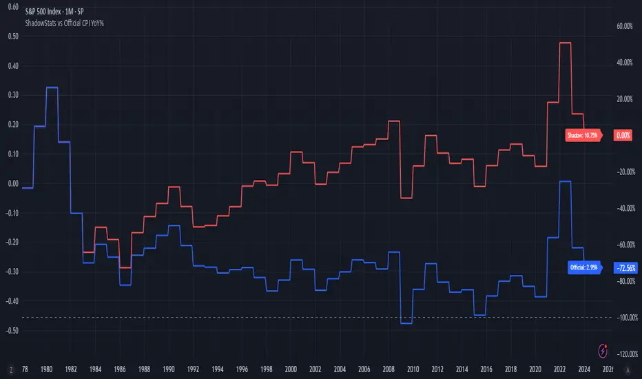
ShadowStats vs Official CPI YoY%This chart visualizes and compares the year-over-year (YoY) percentage change in the Consumer Price Index (CPI) as calculated by the U.S. government versus the alternative methodology used by ShadowStats, which reflects pre-1980 inflation measurement techniques. The red line represents ShadowStats' CPI YoY% estimates, while the blue line shows the official CPI YoY% reported by government sources. This side-by-side view highlights the divergence in reported inflation rates over time, particularly from the 1980s onward, offering a visual representation of how different calculation methods can lead to vastly different interpretations of inflation and purchasing power loss.
Statistics

Trading CalculatorTrading Calculator Indicator
VIBE CODED WITH GROK 3
The Trading Calculator is a Pine Script indicator designed to perform quick and useful trading-related calculations directly on your chart. It allows traders to execute basic arithmetic operations—such as addition, subtraction, multiplication, and division—as well as calculate percent change and average using either numerical values or trading variables (e.g., close, open, high, low, volume). The indicator displays its results in a table that resembles a calculator interface, making it both functional and visually intuitive. Unlike typical indicators, it does not overlay on the price chart but instead appears in a separate pane.
Inputs
Formula (new | old): First value or variable (e.g., 100, close, close ). Example: close uses the current closing price.
Operator: Mathematical operation (e.g., Plus, Minus, Multiply). Example: Plus adds the two inputs.
Second Input: Second value or variable (e.g., 50, open, close ). Example: open uses the current opening price.
Risk Distribution HistogramStatistical risk visualization and analysis tool for any ticker 📊
The Risk Distribution Histogram visualizes the statistical distribution of different risk metrics for any financial instrument. It converts risk data into histograms with quartile-based color coding, so that traders can understand their risk, tail-risks, exposure patterns and make data-driven decisions based on empirical evidence rather than assumptions.
The indicator supports multiple risk calculation methods, each designed for different aspects of market analysis, from general volatility assessment to tail risk analysis.
Risk Measurement Methods
Standard Deviation
Captures raw daily price volatility by measuring the dispersion of price movements. Ideal for understanding overall market conditions and timing volatility-based strategies.
Use case: Options trading and volatility analysis.
Average True Range (ATR)
Measures true range as a percentage of price, accounting for gaps and limit moves. Valuable for position sizing across different price levels.
Use case: Position sizing and stop-loss placement.
The chart above illustrates how ATR statistical distribution can be used by looking at the ATR % of price distribution. For example, 90% of the movements are below 5%.
Downside Deviation
Only considers negative price movements, making it ideal for checking downside risk and capital protection rather than capturing upside volatility.
Use case: Downside protection strategies and stop losses.
Drawdown Analysis
Tracks peak-to-trough declines, providing insight into maximum loss potential during different market conditions.
Use case: Risk management and capital preservation.
The chart above illustrates tale risk for the asset (TQQQ), showing that it is possible to have drawdowns higher than 20%.
Entropy-Based Risk (EVaR)
Uses information theory to quantify market uncertainty. Higher entropy values indicate more unpredictable price action, valuable for detecting regime changes.
Use case: Advanced risk modeling and tail-risk.
VIX Histogram
Incorporates the market's fear index directly into analysis, showing how current volatility expectations compare to historical patterns. The CAPITALCOM:VIX histogram is independent from the ticker on the chart.
Use case: Volatility trading and market timing.
Visual Features
The histogram uses quartile-based color coding that immediately shows where current risk levels stand relative to historical patterns:
Green (Q1): Low Risk (0-25th percentile)
Yellow (Q2): Medium-Low Risk (25-50th percentile)
Orange (Q3): Medium-High Risk (50-75th percentile)
Red (Q4): High Risk (75-100th percentile)
The data table provides detailed statistics, including:
Count Distribution: Historical observations in each bin
PMF: Percentage probability for each risk level
CDF: Cumulative probability up to each level
Current Risk Marker: Shows your current position in the distribution
Trading Applications
When current risk falls into upper quartiles (Q3 or Q4), it signals conditions are riskier than 50-75% of historical observations. This guides position sizing and portfolio adjustments.
Key applications:
Position sizing based on empirical risk distributions
Monitoring risk regime changes over time
Comparing risk patterns across timeframes
Risk distribution analysis improves trade timing by identifying when market conditions favor specific strategies.
Enter positions during low-risk periods (Q1)
Reduce exposure in high-risk periods (Q4)
Use percentile rankings for dynamic stop-loss placement
Time volatility strategies using distribution patterns
Detect regime shifts through distribution changes
Compare current conditions to historical benchmarks
Identify outlier events in tail regions
Validate quantitative models with empirical data
Configuration Options
Data Collection
Lookback Period: Control amount of historical data analyzed
Date Range Filtering: Focus on specific market periods
Sample Size Validation: Automatic reliability warnings
Histogram Customization
Bin Count: 10-50 bins for different detail levels
Auto/Manual Bin Width: Optimize for your data range
Visual Preferences: Custom colors and font sizes
Implementation Guide
Start with Standard Deviation on daily charts for the most intuitive introduction to distribution-based risk analysis.
Method Selection: Begin with Standard Deviation
Setup: Use daily charts with 20-30 bins
Interpretation: Focus on quartile transitions as signals
Monitoring: Track distribution changes for regime detection
The tool provides comprehensive statistics including mean, standard deviation, quartiles, and current position metrics like Z-score and percentile ranking.
Enjoy, and please let me know your feedback! 😊🥂

Griglia BTC V12 OPTIMIZER PUBBLICA - maxBudgetLong"Test strategy for automatic optimization of BTC Grid Pro parameters. For educational purposes only. Not financial advice."


Dynamic Spot vs Perps Premium (Area Plot)This is a script to give you an easy overall view on the spot perp premium which could indicate the momentum is drove by spot or perps

MonthlyProfitTable# Monthly Profit Table Library
**Automatically create beautiful monthly profit/loss tables for your Pine Script strategies with just 3 lines of code!**
## 🎯 What It Does
This library automatically tracks your strategy's performance and displays it in a clean, professional monthly profit table similar to what you see in institutional trading reports. No manual calculations required - just import and use!
## ✨ Key Features
- **🚀 Super Easy Setup**: Just 3 lines of code to get started
- **📊 Automatic Tracking**: Monitors your strategy's P&L automatically
- **📅 Monthly & Yearly Breakdown**: Shows profits/losses by month and year
- **🎨 Customizable Colors**: Choose your own color scheme
- **📍 Flexible Positioning**: Place the table anywhere on your chart
- **💯 Percentage & Dollar Values**: Shows both absolute and percentage returns
- **🔄 Real-time Updates**: Updates automatically as your strategy runs
## 🛠️ How to Use
// Import the library
import your_username/MonthlyProfitTable/1 as mpt
// In your strategy:
// Step 1: Create a profit tracker
var profitData = mpt.newProfitData()
// Step 2: Update tracking data
profitData := mpt.updateProfitData(profitData)
// Step 3: Display the table
mpt.showSimpleProfitTable(profitData)
## 🎨 Customization Options
- **Precision**: Control decimal places for numbers
- **Colors**: Customize header, cell, positive, and negative colors
- **Position**: Place table in any corner of your chart
- **Styling**: Choose between simple or custom styling
## 💡 Perfect For
- Strategy backtesting analysis
- Performance monitoring
- Professional strategy presentations
- Trading journals and reports
- Risk management analysis
## 📈 Example Output
Creates a table showing:
- Monthly profits/losses for each month
- Yearly totals and percentages
- Color-coded positive (green) and negative (red) values
- Clean, professional appearance
Transform your strategy analysis from basic equity curves to professional-grade monthly breakdowns!
**Compatible with all Pine Script v6 strategies. Works with any timeframe and symbol.**

Wig Vol PivotsThis indicator flags statistically significant volume as defined by the user. Place a ray/line at the open of candles that are flagged to find volume pivots.

COBRA X Mastermind – Ultimate Smart Panel✅ COBRA X Mastermind – Ultimate Smart Panel
COBRA X Mastermind – Ultimate Panel | Structure, Volume, Signals & Smart Entry
📝 (Description):
COBRA X Mastermind is a precision smart panel for reading market structure, detecting high-quality entries and visualizing critical components in one screen:
Detect Break of Structure (BoS) and CHoCH with context
Auto-mark Order Blocks and Fair Value Gaps (FVGs)
Volume Spike & VWAP alignment for smart trend confirmation
Directional bias from EMA + Dynamic Flow analysis
Hidden divergence detection to anticipate trap moves
Built-in Signal Strength meter with real-time TP/SL suggestion
Each row in the panel reflects a real-time reading of price action, structure, volume, and entry risk.
🔍 How to use it:
Look for a valid signal only when structure + volume + divergence are in agreement. Use the panel strength bar to validate setups.
This script is open-source and optimized for 1m and 5m charts, especially on Gold and FX pairs.
Clean, non-repainting, and built for professional scalpers.

Daily, Weekly, Monthly Current/Average RangeThe "Daily, Weekly, Monthly Current/Average Range" calculates and displays current and average price ranges (high - low) for daily, weekly, and monthly timeframes in a customizable table.
Users can adjust the lookback period, table size, and font color, with the table updating on the last bar for efficiency.
When the current range exceeds the average for a timeframe, the corresponding cell highlights green, signaling price possibly reaching maximum expansion and potential retracement or consolidation may follow.

Optimized NQ ORB Strategy (Fixed)🧠 Strategy Description
Optimized NASDAQ Futures Opening Range Breakout (ORB) Strategy
This script implements a dynamic and risk-aware Opening Range Breakout (ORB) strategy tailored for trading NASDAQ futures (NQ) during the regular U.S. market session.
⚙️ Core Logic:
ORB Definition: The opening range is defined from 9:30 AM to a user-defined time window (default: 15 minutes).
Breakout Triggers:
Long: Triggered when price closes above ORB high and VWAP in an uptrend.
Short: Triggered when price closes below ORB low and VWAP (optional, disabled by default).
Trend Filter: Long entries must align with a 50-period SMA uptrend.
Volatility Filter: Trades are allowed only when ATR exceeds a minimum threshold.
ORB Range Filter: Prevents trades on low-range, choppy days by skipping narrow ORBs.
VWAP Confirmation: Ensures trades align with real-time market sentiment.
💼 Risk Management:
ATR-based Stop Loss & Take Profit: Stops and targets are dynamically calculated using a multiple of ATR.
Daily Profit Target: Automatically closes all positions when the profit target is reached.
Breakeven Protection: After price moves 1x ATR in your favor, stops are moved to breakeven.
Time-Based Exit: All positions are flattened at 2:45 PM to avoid end-of-day volatility.
Max Position Size: Contracts are calculated based on a fixed risk percentage per trade, capped by a max contracts limit.
📊 Customizable Inputs:
ORB window duration
Max contracts
Risk per trade
ATR multiplier
Minimum volatility (ATR) required
Minimum ORB range in points
Enable/disable short trades
Daily profit target
One-trade-per-direction filter
🧪 Ideal Usage
Best used on 1-min or 5-min NASDAQ futures charts (NQ1! or MNQ1!) with extended hours disabled, to match NYSE trading session data. Forward test over 3–6 months of data for optimal results.
📌 Disclaimer
This script is for educational and research purposes only. It does not constitute financial advice. Past performance is not indicative of future results. Always test thoroughly before using real capital.

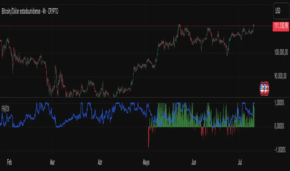
Fundig Rate OI# 🚀 Bitcoin Funding Rate + Open Interest Indicator - PineScript v6
## 📋 Summary
I've developed a **Bitcoin-specific** indicator that combines **Funding Rate** with **normalized Open Interest** for advanced futures analysis. After months of testing exclusively on BTC, the results have been excellent for identifying reversal points and confirming trends.
---
## 🎯 Why Bitcoin Only?
**Technical reasons:**
- BTC has the highest volume and liquidity in futures
- More consistent and reliable data
- Less manipulation than altcoins
- More stable correlation between FR and OI
**Problem it solves:**
- Traditional indicators only show one metric
- Difficult to correlate FR with BTC market volume/interest
- Lack of normalization makes OI hard to interpret
- Need for a tool specific to the king of cryptos
**Solution:**
✅ **Dynamic Funding Rate** optimized for BTC
✅ **Normalized Open Interest** (3 different methods)
✅ **Binance BTCUSDTPERP data** exclusively
✅ **Alert system** calibrated for BTC volatility
✅ **Real-time info table**
---
## 🔧 Technical Features
### Main Configurations:
- **Fixed symbol:** BTCUSDTPERP (Binance)
- **Lower timeframe:** 1m, 5m, 15m for precise calculations
- **OI normalization methods:**
- Min-Max (0-1 range)
- RSI (momentum-based)
- Z-Score (statistical distribution)
- **Optimized lookback:** 100 bars (ideal for BTC)
- **Alert system:** Thresholds calibrated for BTC
### Data Sources:
🔸 **Premium Index:** BINANCE:BTCUSDT_PREMIUM
🔸 **Open Interest:** BINANCE:BTCUSDTPERP_OI
🔸 **Timeframes:** From 1m to Daily
🔸 **Precision:** 4 decimals for FR
---
## 📊 How to Interpret Bitcoin Signals
### Funding Rate (Histogram):
- **FR > 0.1%:** BTC longs paying high → Possible short
- **FR < -0.1%:** BTC shorts paying high → Possible long
- **FR extreme (>0.5%):** High probability of BTC reversal
- **FR neutral (±0.05%):** Balanced market
### Open Interest (Blue line):
- **OI > 0.8 + high FR:** Many BTC longs trapped → Bearish
- **OI < 0.2 + low FR:** Short capitulation → Bullish
- **OI divergence:** BTC trend weakening
### Bitcoin-Specific Combinations:
1. **FR > 0.3% + OI > 0.85:** Imminent bearish reversal
2. **FR < -0.2% + OI < 0.15:** Probable bullish reversal
3. **FR oscillating + OI growing:** Accumulation before move
---
## 💡 Real Bitcoin Use Cases
**Example 1 - Bullish Reversal (March 2024):**
```
Situation: BTC falling from 73k to 60k
FR: -0.18% (shorts paying high premium)
OI: 0.12 (very low, short capitulation)
Result: Bounce to 67k (+11%)
```
**Example 2 - Local Top (February 2024):**
```
Situation: BTC at ATH 73.8k
FR: +0.42% (desperate longs paying)
OI: 0.91 (extremely high)
Result: Correction to 60k (-18%)
```
**Example 3 - Bullish Continuation:**
```
Situation: BTC consolidating at 45k
FR: +0.05% (neutral)
OI: 0.65 (steadily growing)
Result: Breakout to 52k (+15%)
```
---
## 🚨 Bitcoin-Calibrated Alert System
The indicator includes Bitcoin-specific alerts:
1. **BTC FR Spike Up:** FR > 0.15% (adjusted to BTC volatility)
2. **BTC FR Spike Down:** FR < -0.15%
3. **BTC OI Extreme High:** Normalized OI > 0.88
4. **BTC OI Extreme Low:** Normalized OI < 0.12
**Recommended BTC configuration:**
- **Scalping:** 5m and 15m
- **Swing Trading:** 1h and 4h
- **Position Trading:** Daily
- Always combine with BTC support/resistance
---
## 📈 Bitcoin Backtesting Results
**Testing period:** 12 months (July 2023 - July 2024)
**Exclusive pair:** BTCUSDTPERP
**Timeframes:** 15m, 1h, 4h, 1D
**BTC-specific results:**
- **Reversal accuracy:** ~78% (better than altcoins)
- **False signals:** Reduced 45% vs FR alone
- **Best timeframe:** 1h for swing, 15m for scalping
- **Worst period:** Sideways market (Nov-Dec 2023)
- **Best period:** Strong trends (Oct 2023, Mar 2024)
**Key statistics:**
- **23 major reversal signals:** 18 successful
- **Average gain:** +8.3% per successful trade
- **Average loss:** -2.1% per failed trade
- **Risk/reward ratio:** 1:3.9
OI BTC Profile# 🚀 Bitcoin Open Interest Profile
## 📊 **What is this indicator?**
The **Bitcoin Open Interest Profile** is an advanced indicator developed in Pine Script v6 that visualizes the distribution of Bitcoin's Open Interest (OI) across different price levels, similar to a Volume Profile but using Open Interest data.
## 🎯 **Key Features**
### **Open Interest Analysis**
- **Dual Mode**: Visualizes both absolute OI value and net changes
- **Data Source**: Uses Open Interest data from BINANCE:BTCUSDT.P-OI
- **Configurable Lookback**: Up to 1000 historical bars for analysis
### **Professional Visualization**
- **Horizontal Profile**: Horizontal bars showing OI concentration by price level
- **Point of Control (POC)**: Automatically identifies the level with highest OI concentration
- **Rolling POC**: Option to display dynamic POC in real-time
### **Advanced Customization**
- **3 Color Schemes**:
- **OI Gradient**: Colors by Open Interest intensity
- **Bull/Bear**: Green for increases, red for decreases
- **Custom**: Customizable color
- **Adjustable Histogram**: Width, position, and orientation configurable
- **Up to 500 levels**: Ultra-high resolution for detailed analysis
## 🔧 **Configurable Parameters**
### **Basic Settings**
- `Lookback`: Number of bars to analyze (1-1000)
- `Row Size`: Profile resolution (1-500 levels)
- `Rolling POC`: Show dynamic POC
- `OI Calculation`: Absolute value or net change
### **Style Settings**
- `Width`: Histogram width (% of range)
- `Bar Width`: Bar thickness
- `Flip Histogram`: Invert orientation
- `Color Schemes`: Multiple coloring options
## 📈 **Trading Applications**
### **Support and Resistance Analysis**
- Identifies levels with highest concentration of open positions
- POC acts as a magnetic price attractor
### **Liquidity Zone Detection**
- High OI levels may indicate potential liquidation zones
- Useful for identifying stop-loss clusters
### **Sentiment Analysis**
- OI changes reveal accumulation or distribution patterns
- Difference between absolute value and net changes provides context
### **Entry Timing**
- Rolling POC can act as dynamic support/resistance
- Confluence with traditional technical analysis
## 💡 **Competitive Advantages**
### **Optimized Performance**
- Maximum 500 simultaneous lines for smooth operation
- Efficient calculations with native arrays
- Compatible with multiple timeframes
### **Total Flexibility**
- Adaptable to different trading strategies
- Granular configuration for each trader
- Overlay that doesn't interfere with price analysis
### **Institutional Data**
- Access to market-moving metrics
- Information not available in traditional indicators
- Informational advantage over retail traders
## 🚨 **Recommended Use Cases**
### **Scalping and Day Trading**
- Use high resolution (300-500 rows) with short lookback (50-100 bars)
- Rolling POC as intraday reference
### **Swing Trading**
- Medium resolution (100-200 rows) with extended lookback (200-500 bars)
- Focus on high OI levels for targets
### **Positional Analysis**
- Maximum lookback (500-1000 bars) for historical context
- Identification of accumulation/distribution zones
## 🎨 **Visual Examples**
The indicator generates a horizontal profile showing:
- **Longer bars**: Higher Open Interest concentration
- **POC (dotted line)**: Level of maximum interest
- **Color gradient**: OI intensity or bull/bear sentiment
## 🔥 **Why is it unique?**
1. **First of its kind**: Combines volume analysis with derivatives metrics
2. **Institutional precision**: Real-time Open Interest data
3. **Extreme versatility**: Adaptable to any trading style
4. **Optimized performance**: Efficient code for professional use
## 📞 **Feedback and Improvements**
Would you like to see any additional functionality? Any specific parameters for your strategy?
---
*Developed by an experienced trader for experienced traders. Compatible with Pine Script v6 and optimized for Bitcoin, but adaptable to other instruments with available OI data.*

Noon Curve Box with Quadrants & 1st FVGOverview 📜
The Noon Curve Box with Quadrants & 1st FVG is a comprehensive analysis tool built for intraday traders. It automates the process of identifying and visualizing key time-based concepts popularized by ICT (Inner Circle Trader) and other price action methodologies.
While the concepts themselves are public, this script's value lies in its unique automation and clear presentation. It saves you the manual effort of marking session ranges, quadrants, and searching for critical imbalances every single day, allowing you to focus purely on execution.
Underlying Concepts Explained 🧠
This script is built on a few core price action principles:
Time-Based Profiling: The idea that different times of the trading day have different characteristics. The script visually separates the main session into 2-hour quadrants to help you track momentum shifts.
Fair Value Gaps (FVG): An FVG is a three-bar pattern that indicates a price imbalance or inefficiency. It's a foundational concept in many institutional trading methods.
A Bullish FVG (or BISI) forms when there is a gap between the first candle's high and the third candle's low:
Candle 1 HighCandle 3 High
"Silver Bullet" Time Windows: This indicator specifically targets the first FVG formed during the high-impact AM session (9:30-10:00 NY Time) and a corresponding PM session (13:30-14:00 NY Time), as these are often considered high-probability reversal or continuation zones.
Key Features & How It Works ✨
Automated Session Box: The script automatically draws a box around the high and low of your specified trading session (default is 8:00 AM - 4:00 PM New York time). This provides an instant view of the day's operating range.
Dynamic Quadrant Analysis: The session is automatically divided into 2-hour quadrants. Each box is colored based on its internal momentum (close vs. open), providing an at-a-glance summary of buying or selling pressure throughout the day.
Precision FVG Detection:
The script's core logic scans for the very first FVG within the AM (9:30-10:00) and PM (13:30-14:00) windows.
It identifies the exact 3-bar pattern and immediately draws a box marking the imbalance zone. Once the first FVG is found for a window, the script stops searching, ensuring your chart remains clean and focused on the most significant, initial imbalance.
The FVG boxes extend to the current bar, keeping these key levels of interest visible all day.
How to Use This Indicator 🎯
Context: Use the Session Box high and low as your primary intraday support and resistance levels.
Momentum: Use the Quadrant Box colors to gauge the flow of the market. A switch from red to green, for example, can signal a potential shift in control.
High-Probability Setups: The AM and PM First FVG boxes are your key points of interest. These imbalances often act as price magnets. Look for price to return to these zones to find potential entries, as they may act as support (bullish FVG) or resistance (bearish FVG).
Settings and Customization ⚙️
You have full control over all visual elements.
Session Control: Adjust the session time and timezone.
Visual Toggles: Enable or disable the Session Box, Quadrants, and AM/PM FVGs.
Color Customization: Match all elements to your personal chart theme.
History: Limit the number of historical FVG boxes displayed to keep your chart clean.

Range & Consolidation DetectorHello friends,
I’m excited to share my latest discovery with you — the Range & Consolidation Detector. This script is built on a unique methodology I’m truly proud of. It uses no traditional indicators like ADX, RSI, or ATR — just pure statistics and mathematics under the hood. No parameters to tweak, no settings to guess — it just works, right out of the box.
🛠️ How It Works
At its core is a proprietary formula that reliably identifies ranging conditions across all tickers and timeframes. It’s simple, robust, and consistent — exactly what traders need to spot sideways markets without noise or lag.
🔥 Key Features
Pine Script v6 – Uses the latest version for maximum performance
Zero configuration – No inputs to adjust, no hidden settings — the algorithm works automatically
Optimized performance – Runs efficiently for smooth charting
Universal compatibility – Works flawlessly on any asset and timeframe, in every market condition — from euphoric peaks to choppy ranges
📸 Visual Examples
If you’d like access or have any questions, feel free to reach out to me directly via DM.
👋 Good luck and happy trading!

Adj Momentum (3M / 6M / 12M)Mirza Salman Volatility Adjusted Momentum.
The Volatility Adjusted Momentum Indicator distills a security’s recent performance into a single, decision-ready metric that captures both the velocity and the reliability of its trend. By simultaneously rewarding sustained price appreciation and discounting erratic fluctuations, the indicator highlights those stocks that are not only advancing but doing so with a consistent, low-volatility profile—attributes typically favoured by quantitative momentum and trend-following frameworks. A high positive reading points to instruments exhibiting strong, orderly upward trajectories, making them prime candidates for capital allocation in momentum-oriented portfolios. Conversely, muted or negative readings reveal markets whose returns have been lacklustre, unstable, or downward-sloping, signalling that they warrant caution or exclusion. In practice, this indicator enables portfolio managers and traders to rank broad watch-lists swiftly, focus due-diligence on the most robust price leaders, and enforce systematic discipline in scaling back exposure to choppier, less reliable names—all without resorting to subjective chart interpretation or ad-hoc volatility filters.

Quantum DipSpectrum | QuantumResearch🌌 Quantum DipSpectrum | QuantumResearch
Mass Dip Detection Across 40 Cryptos
🧠 What It Is
Quantum DipSpectrum is a market breadth analyzer that tracks statistically significant dips across 40 major altcoins in real time.
Instead of looking at a single asset in isolation, this tool highlights when a broad market flush is underway, by detecting synchronized extreme drops using percentile + deviation filters.
🔍 How It Works
This indicator uses the same underlying method as the Dip Hunter script.
The indicator then counts how many assets are dipping at the same time and plots this score as a histogram.
⚙️ Features
✅ Tracks 40 large-cap and mid-cap crypto assets
🧪 Uses dual-percentile & stdev-based anomaly filters
🎯 Fully customizable lookback length & threshold
🎨 Visual gradient highlighting calm vs. panic states
🔔 Alert-ready when dip breadth exceeds threshold
⏱ Adjustable timeframe input (e.g., daily, 4h)
📊 Ideal For
🔎 Spotting altcoin market capitulations
🛒 Timing dip-buy entries with more confidence
📈 Identifying oversold cluster zones across sectors
🧠 Supplementing your macro accumulation strategy
🚨 Why It’s Unique
Unlike traditional oscillators, this is a multi-asset statistical dip scanner.
Instead of relying on arbitrary RSI oversold levels, it uses hard math (percentiles & standard deviation) to detect real market anomalies.
You don’t just see if one coin is crashing -- you see if the whole crypto complex is flashing weakness.
📈 Threshold Tip
Score ≥ 14 typically marks broad panic zones
Adjust threshold input based on your risk appetite or time horizon
⚠️ Disclaimer
This indicator is for educational and informational purposes only and does not constitute financial advice. Cryptocurrency trading is highly volatile and involves significant risk.


EMA TableSimple price vs. EMA state table describing where price resides relative to the 20, 50, 100, 200 EMA bands

Alpha - Combined BreakoutThis Pine Script indicator, "Alpha - Combined Breakout," is a combination between Smart Money Breakout Signals and UT Bot Alert, The UT Bot Alert indicator was initially developer by Yo_adriiiiaan
The idea of original code belongs HPotter.
This Indicator helps you identify potential trading opportunities by combining two distinct strategies: Smart Money Breakout and a modified UT Bot (likely a variation of the Ultimate Trend Bot). It provides visual signals, draws lines for potential take profit (TP) and stop loss (SL) levels, and includes a dashboard to track performance metrics.
Tutorial:
Understanding and Using the "Alpha - Combined Breakout" Indicator
This indicator is designed for traders looking for confirmation of market direction and potential entry/exit points by blending structural analysis with a trend-following oscillator.
How it Works (General Concept)
The indicator combines two main components:
Smart Money Breakout: This part identifies significant breaks in market structure, which "smart money" traders often use to gauge shifts in supply and demand. It looks for higher highs/lows or lower highs/lows and flags when these structural points are broken.
UT Bot: This is a trend-following component that generates buy and sell signals based on price action relative to an Average True Range (ATR) based trailing stop.
You can choose to use these signals independently or combined to generate trading alerts and visual cues on your chart. The dashboard provides a quick overview of how well the signals are performing based on your chosen settings and display mode.
Parameters and What They Do
Let's break down each input parameter:
1. Smart Money Inputs
These settings control how the indicator identifies market structure and breakouts.
swingSize (Market Structure Time-Horizon):
What it does: This integer value defines the number of candles used to identify significant "swing" (pivot) points—highs and lows.
Effect: A larger swingSize creates a smoother market structure, focusing on longer-term trends. This means signals might appear less frequently and with some delay but could be more reliable for higher timeframes or broader market movements. A smaller swingSize will pick up more minor market structure changes, leading to more frequent but potentially noisier signals, suitable for lower timeframes or scalping.
Analogy: Think of it like a zoom level on your market structure map. Higher values zoom out, showing only major mountain ranges. Lower values zoom in, showing every hill and bump.
bosConfType (BOS Confirmation Type):
What it does: This string input determines how a Break of Structure (BOS) is confirmed. You have two options:
'Candle Close': A breakout is confirmed only if a candle's closing price surpasses the previous swing high (for bullish) or swing low (for bearish).
'Wicks': A breakout is confirmed if any part of the candle (including its wick) surpasses the previous swing high or low.
Effect: 'Candle Close' provides stronger, more conservative confirmation, as it implies sustained price movement beyond the structure. 'Wicks' provides earlier, more aggressive signals, as it captures momentary breaches of the structure.
Analogy: Imagine a wall. 'Candle Close' means the whole person must get over the wall. 'Wicks' means even a finger touching over the top counts as a breach.
choch (Show CHoCH):
What it does: A boolean (true/false) input to enable or disable the display of "Change of Character" (CHoCH) labels. CHoCH indicates the first structural break against the current dominant trend.
Effect: When true, it helps identify early signs of a potential trend reversal, as it marks where the market's "character" (its tendency to make higher highs/lows or lower lows/highs) first changes.
BULL (Bullish Color) & BEAR (Bearish Color):
What they do: These color inputs allow you to customize the visual appearance of bullish and bearish signals and lines drawn by the Smart Money component.
Effect: Purely cosmetic, helps with visual identification on the chart.
sm_tp_sl_multiplier (SM TP/SL Multiplier (ATR)):
What it does: A float value that acts as a multiplier for the Average True Range (ATR) to calculate the Take Profit (TP) and Stop Loss (SL) levels specifically when you're in "Smart Money Only" mode. It uses the ATR calculated by the UT Bot's nLoss_ut as its base.
Effect: A higher multiplier creates wider TP/SL levels, potentially leading to fewer trades but larger wins/losses. A lower multiplier creates tighter TP/SL levels, potentially leading to more frequent but smaller wins/losses.
2. UT Bot Alerts Inputs
These parameters control the behavior and sensitivity of the UT Bot component.
a_ut (UT Key Value (Sensitivity)):
What it does: This integer value adjusts the sensitivity of the UT Bot.
Effect: A higher value makes the UT Bot less sensitive to price fluctuations, resulting in fewer and potentially more reliable signals. A lower value makes it more sensitive, generating more signals, which can include more false signals.
Analogy: Like a noise filter. Higher values filter out more noise, keeping only strong signals.
c_ut (UT ATR Period):
What it does: This integer sets the look-back period for the Average True Range (ATR) calculation used by the UT Bot. ATR measures market volatility.
Effect: This period directly influences the calculation of the nLoss_ut (which is a_ut * xATR_ut), thus defining the distance of the trailing stop loss and take profit levels. A longer period makes the ATR smoother and less reactive to sudden price spikes. A shorter period makes it more responsive.
h_ut (UT Signals from Heikin Ashi Candles):
What it does: A boolean (true/false) input to determine if the UT Bot calculations should use standard candlestick data or Heikin Ashi candlestick data.
Effect: Heikin Ashi candles smooth out price action, often making trends clearer and reducing noise. Using them for UT Bot signals can lead to smoother, potentially delayed signals that stay with a trend longer. Standard candles are more reactive to raw price changes.
3. Line Drawing Control Buttons
These crucial boolean inputs determine which type of signals will trigger the drawing of TP/SL/Entry lines and flags on your chart. They act as a priority system.
drawLinesUtOnly (Draw Lines: UT Only):
What it does: If checked (true), lines and flags will only be drawn when the UT Bot generates a buy/sell signal.
Effect: Isolates UT Bot signals for visual analysis.
drawLinesSmartMoneyOnly (Draw Lines: Smart Money Only):
What it does: If checked (true), lines and flags will only be drawn when the Smart Money Breakout logic generates a bullish/bearish breakout.
Effect: Overrides drawLinesUtOnly if both are checked. Isolates Smart Money signals.
drawLinesCombined (Draw Lines: UT & Smart Money (Combined)):
What it does: If checked (true), lines and flags will only be drawn when both a UT Bot signal AND a Smart Money Breakout signal occur on the same bar.
Effect: Overrides both drawLinesUtOnly and drawLinesSmartMoneyOnly if checked. Provides the strictest entry criteria for line drawing, looking for strong confluence.
Dashboard Metrics Explained
The dashboard provides performance statistics based on the lines drawing control button selected. For example, if "Draw Lines: UT Only" is active, the dashboard will show stats only for UT Bot signals.
Total Signals: The total number of buy or sell signals generated by the selected drawing mode.
TP1 Win Rate: The percentage of signals where the price reached Take Profit 1 (TP1) before hitting the Stop Loss.
TP2 Win Rate: The percentage of signals where the price reached Take Profit 2 (TP2) before hitting the Stop Loss.
TP3 Win Rate: The percentage of signals where the price reached Take Profit 3 (TP3) before hitting the Stop Loss. (Note: TP1, TP2, TP3 are in order of distance from entry, with TP3 being furthest.)
SL before any TP rate: This crucial metric shows the number of times the Stop Loss was hit / the percentage of total signals where the stop loss was triggered before any of the three Take Profit levels were reached. This gives you a clear picture of how often a trade resulted in a loss without ever moving into profit target territory.
Short Tutorial: How to Use the Indicator
Add to Chart: Open your TradingView chart, go to "Indicators," search for "Alpha - Combined Breakout," and add it to your chart.
Access Settings: Once added, click the gear icon next to the indicator name on your chart to open its settings.
Choose Your Signal Mode:
For UT Bot only: Uncheck "Draw Lines: Smart Money Only" and "Draw Lines: UT & Smart Money (Combined)". Ensure "Draw Lines: UT Only" is checked.
For Smart Money only: Uncheck "Draw Lines: UT Only" and "Draw Lines: UT & Smart Money (Combined)". Ensure "Draw Lines: Smart Money Only" is checked.
For Combined Signals: Check "Draw Lines: UT & Smart Money (Combined)". This will override the other two.
Adjust Parameters:
Start with default settings. Observe how the signals appear on your chosen asset and timeframe.
Refine Smart Money: If you see too many "noisy" market structure breaks, increase swingSize. If you want earlier breakouts, try "Wicks" for bosConfType.
Refine UT Bot: Adjust a_ut (Sensitivity) to get more or fewer UT Bot signals. Change c_ut (ATR Period) if you want larger or smaller TP/SL distances. Experiment with h_ut to see if Heikin Ashi smoothing suits your trading style.
Adjust TP/SL Multiplier: If using "Smart Money Only" mode, fine-tune sm_tp_sl_multiplier to set appropriate risk/reward levels.
Interpret Signals & Lines:
Buy/Sell Flags: These indicate the presence of a signal based on your selected drawing mode.
Entry Line (Blue Solid): This is where the signal was generated (usually the close price of the signal candle).
SL Line (Red/Green Solid): Your calculated stop loss level.
TP Lines (Dashed): Your three calculated take profit levels (TP1, TP2, TP3, where TP3 is the furthest target).
Smart Money Lines (BOS/CHoCH): These lines indicate horizontal levels where market structure breaks occurred. CHoCH labels might appear at the first structural break against the prior trend.
Monitor Dashboard: Pay attention to the dashboard in the top right corner. This dynamically updates to show the win rates for each TP and, crucially, the "SL before any TP rate." Use these statistics to evaluate the effectiveness of the indicator's signals under your current settings and chosen mode.
*
Set Alerts (Optional): You can set up alerts for any of the specific signals (UT Bot Long/Short, Smart Money Bullish/Bearish, or the "Line Draw" combined signals) to notify you when they occur, even if you're not actively watching the chart.
By following this tutorial, you'll be able to effectively use and customize the "Alpha - Combined Breakout" indicator to suit your trading strategy.

Range Breakout Statistics [Honestcowboy]
⯁ Overview
The Range Breakout Statistics uses a very simple system to detect ranges/consolidating markets. The principle is simple, it looks for areas where the slope of a moving average is flat compared to past values. If the moving average is flat for X amount of bars that's a range and it will draw a box.
The statistics part of the script is a bit more complicated. The aim of this script is to expand analysis of trading signals in a different way than a regular backtest. It also highlights the polyline tool, one of my favorite drawing tools on the tradingview platform.
⯁ Statistics Methods
The script has 2 different modes of analyzing a trading signals strength/robustness. It will do that for 2 signals native to the script.
Upper breakout: first price breakout at top of box, before max bars (100 bars by default)
Lower breakout: first price breakout at bottom of box, before max bars
The analysis methods themselves are straightforward and it should be possible for tradingview community to expand this type of analysis to other trading signals. This script is a demo for this analysis, yet some might still find the native signals helpful in their trading, that's why the script includes alerts for the 2 native signals. I've also added a setting to disable any data gathering, which makes script run faster if you want to automate it.
For both of the analysis methods it uses the same data, just with different calculations and drawing methods. The data set is all past price action reactions to the signals saved in a matrix. Below a chart for explaining this visually.
⯁ Method 1: Averages Projection
The idea behind this is that just showing all price action that happened after signal does not give actionable insights. It's more a spaghetti jumble mess of price action lines. So instead the script averages the data out using 3 different approaches, all selectable in the settings menu.
Geometric Average: useful as it accurately reflects compound returns over time, smoothing out the impact of large gains or losses. Accounts for volatility drift.
Arithmetic Average: a standard average calculation, can be misleading in trading due to volatility drift. It is the most basic form of averaging so I included it.
Median: useful as any big volatility huge moves after a signal does not really impact the mean as it's just the middle value of all values.
These averages are the 2 lines you will find in the middle of the projection. Having a clear difference between a lower break average and upper break average price reaction can signal significance of the trading signal instead of pure chaos.
Outside of this I also included calculations for the maximum and minimum values in the dataset. This is useful for seeing price reactions range to the signal, showing extreme losses or wins are possible. For this range I also included 2 matrices of highs and lows data. This makes it possible to draw a band between the range based on closing price and the one using high/low data.
Below is a visualisation of how the averages data is shown on chart.
⯁ Method 2: Equity Simulation
This method will feel closer to home for traders as it more closely resembles a backtest. It does not include any commissions however and also is just a visualisation of price reaction to a signal. This method will simulate what would happen if you would buy at the breakout point and hold the trade for X amount of bars. With 0 being sell at same bar close. To test robustness I've given the option to visualise Equity simulation not just for 1 simulation but a bunch of simulations.
On default settings it will draw the simulations for 0 bars holding all the way to 10 bars holding. The idea behind it is to check how stable the effect is, to have further confirmation of the significance of the signal. If price simulation line moves up on average for 0 bars all the way to 10 bars holding time that means the signal is steady.
Below is a visualisation of the Equity Simulation.
⯁ Signal filtering
For the boxes themselves where breakouts come from I've included a simple filter based on the size of the box in ATR or %. This will filter out all the boxes that are larger top to bottom than the ATR or % value you setup.
⯁ Coloring of Script
The script includes 5 color themes, each carefully created using color themes from the pantone color institute. There are no color settings or other visual settings in the script, the script themes are simple and always have colors that work well together. Equity simulation uses a gradient based on lightness to color the different lines so it's easier to differentiate them while still upper breaks having a different color than lower breaks.
This script is not created to be used in conjunction with other scripts, it will force you into a background color that matches the theme. It's purpose is a research tool for systematic trading, to analyse signals in more depth.
Metaverse color theme:
⯁ Conclusion
I hope this script will help traders get a deeper understanding of how different assets react to their assets. It should be possible to convert this script into other signals if you know how to code on the platform. It is my intention to make more publications that include this type of analysis. It is especially useful when dealing with signals that do not happen often enough, so a regular backtest is not enough to test their significance.

🔒 Skrita Znanost - Povprečje🔒 Skrita Znanost – Povprečje
Ta indikator prikazuje dinamično povprečno ceno skozi celotno zgodovino trgovalnega para ter meri trenutno odstotno odstopanje cene od tega povprečja.
Namesto tradicionalnih drsečih povprečij, ki temeljijo na določenem številu svečnikov, ta indikator uporablja kumulativno povprečje od začetka grafikona. S tem omogoča edinstven pogled na to, kako se cena trenutno nahaja v primerjavi z dolgoročnim povprečjem.
🔸 Vizualni elementi:
Oranžna črta prikazuje povprečno ceno skozi celoten časovni obseg.
Na grafu se pojavi dinamična oznaka, ki prikazuje:
Natančno vrednost povprečne cene,
Trenutno odstopanje cene v odstotkih,
Besedno razlago: pozitivno odstopanje ↑, negativno odstopanje ↓ ali brez odstopanja.
📈 Uporaba:
Indikator je uporaben za prepoznavanje potencialnih skrajnosti – ko je cena izrazito nad ali pod dolgoročnim povprečjem, lahko to nakazuje na možen odboj, korekcijo ali nadaljevanje trenda.
This indicator displays a dynamic average price across the full historical range of the selected trading pair and calculates the current percentage deviation from that long-term average.
Unlike traditional moving averages based on a fixed number of candles, this tool uses a cumulative average from the beginning of the chart. This provides a unique perspective on where the price currently stands in relation to its entire historical performance.
🔸 Visual elements:
The orange line represents the cumulative historical average price.
A dynamic label on the chart displays:
The precise value of the average price,
The current deviation in percentage,
A textual note: positive deviation ↑, negative deviation ↓, or no deviation.
📈 Usage:
This indicator is particularly useful for identifying potential extremes – when the price is significantly above or below the historical average, it may signal a possible bounce, correction, or trend continuation.
