Volatility

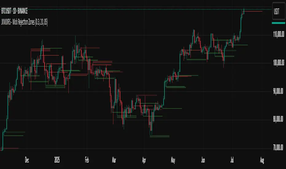
JXMJXRS - Wick Rejection ZonesWick Rejection Zones indicator is designed to identify key price levels where strong rejections occur, typically marked by long wicks and small candle bodies. These zones often signal areas of supply and demand where price was forcefully rejected, making them useful for anticipating potential support or resistance.
The script detects bullish rejection zones when a candle shows a long lower wick, a small body near the top of the candle, and a close above the open. Conversely, bearish rejection zones are identified by long upper wicks, small bodies near the candle low, and a close below the open. This stricter version only highlights the most decisive rejections by enforcing wick dominance and body positioning filters.
When these conditions are met, the indicator draws a colored zone above or below the candle wick to visually represent the rejection area. These zones persist on the chart for a fixed number of bars, allowing traders to reference them for potential reaction levels.
Settings:
Zone Duration (Bars) allows you to control how long each rejection zone remains visible on the chart. A higher number keeps zones active for more bars, while a lower number removes them sooner.
Zone Transparency adjusts the visual opacity of the rejection zones. A lower value makes the zone more visible, while a higher value makes it more transparent.
Bullish Zone Color and Bearish Zone Color let you customize the colors used for bullish and bearish rejection zones, respectively.
This tool is particularly effective in volatile crypto markets where wicks often mark sharp reversals or failed breakout attempts. It can be used as a reference for entries, exits, or stop-loss placement depending on market context.
Alpha VIX - with Stop loss built inUnleash VIX volatility spikes with razor-sharp, entry & exit signals and built-in risk control. Jump in precisely when trend, momentum & price breakouts align—and exit at the first sign of rolling momentum or a protective 2% stop loss.
🔍 Trend Filter: SMA confirms the prevailing move
⚡ Momentum Trigger: Williams %R crosses its EMA after an oversold setup
📈 Clean Entry: Green ▲ arrow + exact fill price label
📉 Exit Logic: ROC downturn or %R rebound within 2 bars
🛡️ Dynamic Stop-Loss: 2% below your entry price, enforced after bar close
🎯 Clear Visuals: Red ▼ arrow + on-chart exit price & P&L percentage
Capture volatility moves with discipline and clarity—no guesswork, no clutter, just pure alpha.
DM me your TradingView handle to request invite-only access!
Sources
Ask ChatGPT

ROC JefeA multi-layer ROC (Rate of Change) momentum oscillator with built-in Bollinger Bands and optional SMA/EMA overlays—designed to highlight expansions, contractions, and mean-reversion opportunities in price momentum.
🔍 High-Level Overview
Raw ROC (blue) shows percentage change over your chosen look-back
Bollinger Bands on ROC (red/green) gauge volatility of momentum swings
Optional SMA & EMA (orange/purple) filter noise and signal trend shifts
Zero Line Reference for quick bullish/bearish bias
BB Fill Area visually highlights extreme ROC readings
This gives you a clear, at-a-glance read on when momentum is over-extended or poised to reverse.
Combined with WR2 Jefe indicator for best entry & exit signals along with Alpha VIX for clear entry / exit on chart!

WR2 JefeWR2 Jefe is a multi-smoothed Williams %R momentum oscillator that helps you spot overbought/oversold extremes and trend shifts.
Raw W%R (blue) over your chosen look-back
Smoothed W%R via a simple moving average (red)
EMA W%R via an exponential moving average (green)
Slow SMA W%R via a longer simple moving average (purple)
Reference lines at –20 (overbought), –50 (mid), and –80 (oversold)
Use the combination of raw and differently smoothed curves to filter false signals, confirm momentum turns, and trade with greater precision. Code is MPL 2.0 licensed.

Alpha VIX - with Stop loss built inAn invite-only, private market signal indicator that delivers clean, long-entry/exit signals on UVIX (15 min), with built-in dynamic stop-loss and price & % profit labels. Historically, it has generated alpha and exits are typically within 1-2 hours.
By design the signals won't trigger when there's a rally. Unlike 99% of stocks and ETFs, the strategy acts as profit market shield when the S&P pulls back after a rally, increased volatility, or when entering macro bear market.
Click Request Access above, tell me your TradingView username, and I’ll approve you ASAP.

Oscilación + Volatilidad + Volumen GráficoComposite oscillator combining volume, volatility, and range analysis, normalized through a configurable ratio threshold to signal optimal entry conditions.

DRAGONFLY 2.0 Study🐉 DRAGONFLY 2.0 — Study Guide
DRAGONFLY 2.0 is a precision-built trading system designed for adaptive trend-based entries, dynamic scaling, and calculated exits. It introduces a unique multi-ladder logic and a reactive take-profit engine, ideal for intraday or swing trading.
🧭 Strategy Concept
Proprietary trigger engine that detects trend shifts using directional logic
Ladder entry system that adds size during structured pullbacks
Take profit targets are assigned to each ladder with dynamic average entry updates
A fallback global take profit is used when no ladders are active
Stop loss is managed at a structural level
This system is built for traders who prefer rules over emotions
⚙️ Input Sections
🪜 Ladder Entry Settings
Set percentage distance between ladder steps
Define the first entry size
Assign additional size for each ladder step
Allows flexible scaling into positions with controlled risk
🎯 Take Profit Settings
Set global take profit for longs and shorts before any ladders are filled
Define individual take profit levels for each ladder
Only one take profit is active at a time depending on ladder status
🛡️ Stop Loss Settings
Set percentage stop loss below or above average entry for long and short trades
Designed to exit when market structure is broken
Optional and fully customizable
📐 Trend Engine Settings
Adjust upper and lower trend filters to control signal sensitivity
Change signal length to smooth the trend detection
Choose source input for trend logic like close or hl2
Fine-tune to reduce false signals or increase confirmation strength
🔁 Strategy Flow
📍 Entry and Ladder Progression
Trade begins when the trend breakout is confirmed
Initial base position is entered
As price moves deeper, ladder entries are triggered
Each ladder entry recalculates the average price
Old take profit is disabled and new one is assigned
This creates a fluid and responsive position builder
💰 Take Profit Logic
A global take profit is used if no ladders are filled
When ladder one is triggered, global take profit is disabled
New take profit is tied to the updated average price
Each ladder step updates the take profit accordingly
Visual markers and alerts are shown when targets are hit
🛑 Stop Loss Logic
Stop loss is calculated relative to the average entry
Only triggered if structural breakdown occurs
Can be turned off or adjusted based on risk preference
📊 Visual Chart Aids
🟢 Green circles show active ladder take profits for long trades
🟠 Orange circles show active ladder take profits for short trades
🔵 Blue circles show global take profit level
🔺 Trend bands act as entry zone and direction filters
💡 Strategy Tips
Use wider ladder spacing in volatile markets like BTC or ETH
Smaller take profits are better for scalping
Increase trend filter range if you’re getting too many false signals
Enable or disable long and short entries based on market conditions
📢 ALERT SYSTEM — DMT Autobot Dragonfly Edition
This strategy works seamlessly with TradingView alerts and automation systems
Every entry, ladder, take profit, and stop can trigger real-time alerts for bots or webhooks
🔔 Types of Alerts
lentry and SEntry trigger long and short entries
ADD1 to ADD4 are sent as ladder steps are activated
TP alerts are triggered when targets are reached
close_all signals full exit from the position
🧠 How It Works
Alerts are generated based on logic inside the strategy
You can create alerts in TradingView and connect them to bots or external platforms
⚙️ Recommended Alert Settings
Entry alerts should be set to once per bar close
Ladder adds should be set to once per bar
Take profits should be set to once per bar for better timing
Stop loss or exit alerts should be once per bar close
Once per bar is more responsive and helps avoid missing take profit hits
📈 Entry and Exit Logic
Each ladder or take profit follows strict logic
Alerts are only sent when exact trade conditions are met
Helps automate clean and reliable execution
🔄 Ladder System and Alerts
Every ladder step has a dedicated alert
Take profit is recalculated each time a ladder fills
The system supports full automation with dynamic trade logic
Bots can follow each step as price evolves
⚠️ Leveraged Trading Considerations
If using leverage, check that your ladder spacing and size is appropriate
Make sure your account can handle full position build
Strategy can recover positions using precision, but leverage increases risk
🧭 Final Note
DRAGONFLY 2.0 supports full automation and is compatible with most trading bots
For access, contact me directly on TradingView chat
Stay focused and trade smart with DRAGONFLY 2.0

DRAGONFLY 2.0 Strategy🐉 DRAGONFLY 2.0 — Strategy Guide
DRAGONFLY 2.0 is a precision-built trading system designed for adaptive trend-based entries, dynamic scaling, and calculated exits. It introduces a unique multi-ladder logic and a reactive take-profit engine, ideal for intraday or swing trading.
🧭 Strategy Concept
Proprietary trigger engine that detects trend shifts using directional logic
Ladder entry system that adds size during structured pullbacks
Take profit targets are assigned to each ladder with dynamic average entry updates
A fallback global take profit is used when no ladders are active
Stop loss is managed at a structural level
This system is built for traders who prefer rules over emotions
⚙️ Input Sections
🪜 Ladder Entry Settings
Set percentage distance between ladder steps
Define the first entry size
Assign additional size for each ladder step
Allows flexible scaling into positions with controlled risk
🎯 Take Profit Settings
Set global take profit for longs and shorts before any ladders are filled
Define individual take profit levels for each ladder
Only one take profit is active at a time depending on ladder status
🛡️ Stop Loss Settings
Set percentage stop loss below or above average entry for long and short trades
Designed to exit when market structure is broken
Optional and fully customizable
📐 Trend Engine Settings
Adjust upper and lower trend filters to control signal sensitivity
Change signal length to smooth the trend detection
Choose source input for trend logic like close or hl2
Fine-tune to reduce false signals or increase confirmation strength
🔁 Strategy Flow
📍 Entry and Ladder Progression
Trade begins when the trend breakout is confirmed
Initial base position is entered
As price moves deeper, ladder entries are triggered
Each ladder entry recalculates the average price
Old take profit is disabled and new one is assigned
This creates a fluid and responsive position builder
💰 Take Profit Logic
A global take profit is used if no ladders are filled
When ladder one is triggered, global take profit is disabled
New take profit is tied to the updated average price
Each ladder step updates the take profit accordingly
Visual markers and alerts are shown when targets are hit
🛑 Stop Loss Logic
Stop loss is calculated relative to the average entry
Only triggered if structural breakdown occurs
Can be turned off or adjusted based on risk preference
📊 Visual Chart Aids
🟢 Green circles show active ladder take profits for long trades
🟠 Orange circles show active ladder take profits for short trades
🔵 Blue circles show global take profit level
🔺 Trend bands act as entry zone and direction filters
💡 Strategy Tips
Use wider ladder spacing in volatile markets like BTC or ETH
Smaller take profits are better for scalping
Increase trend filter range if you’re getting too many false signals
Enable or disable long and short entries based on market conditions
📢 ALERT SYSTEM — DMT Autobot Dragonfly Edition
This strategy works seamlessly with TradingView alerts and automation systems
Every entry, ladder, take profit, and stop can trigger real-time alerts for bots or webhooks
🔔 Types of Alerts
lentry and SEntry trigger long and short entries
ADD1 to ADD4 are sent as ladder steps are activated
TP alerts are triggered when targets are reached
close_all signals full exit from the position
🧠 How It Works
Alerts are generated based on logic inside the strategy
You can create alerts in TradingView and connect them to bots or external platforms
⚙️ Recommended Alert Settings
Entry alerts should be set to once per bar close
Ladder adds should be set to once per bar
Take profits should be set to once per bar for better timing
Stop loss or exit alerts should be once per bar close
Once per bar is more responsive and helps avoid missing take profit hits
📈 Entry and Exit Logic
Each ladder or take profit follows strict logic
Alerts are only sent when exact trade conditions are met
Helps automate clean and reliable execution
🔄 Ladder System and Alerts
Every ladder step has a dedicated alert
Take profit is recalculated each time a ladder fills
The system supports full automation with dynamic trade logic
Bots can follow each step as price evolves
⚠️ Leveraged Trading Considerations
If using leverage, check that your ladder spacing and size is appropriate
Make sure your account can handle full position build
Strategy can recover positions using precision, but leverage increases risk
🧭 Final Note
DRAGONFLY 2.0 supports full automation and is compatible with most trading bots
For access, contact me directly on TradingView chat
Stay focused and trade smart with DRAGONFLY 2.0


Trend CatcherTrend Catcher with Trade Statistics is a clean, high-precision trend-following tool designed to help traders stay confidently aligned with the market's dominant direction.
It avoids premature reversals by using an ATR-based confirmation model that waits for multiple bar validations before flipping trend direction — filtering out noise and false signals during consolidations.
Along with visually intuitive signals, the indicator also tracks and summarizes trade performance, giving traders real-time insights into their strategy's effectiveness.
💡 Key Features
🔹 Trend Detection
Uses ATR-based logic with confirmation bars (Flip Sensitivity) to determine real trend shifts.
Single-line trend display:
🔵 Blue = Uptrend
⚫ Black = Downtrend
Flips only when the market confirms, not just when price temporarily crosses the line.
🔹 Visual Feedback
🔼 / 🔽 labels on the chart with exact price of trend flips.
Smart spacing keeps the chart clean and legible.
🔹 Real-Time Alerts
Alerts when a new trend is confirmed (Uptrend or Downtrend).
Useful for automation, scalping alerts, or swing trade monitoring.
🔹 Built-in Performance Tracker
A summary table (top-right corner) displays performance over the last trades:
✅ Count of winning long trades
❌ Count of losing long trades
✅ Count of winning short trades
❌ Count of losing short trades
📊 Total PnL (point difference between entries and exits)
⚙️ Inputs
Setting Description
ATR Period Period used to calculate ATR
ATR Multiplier How far away the trend line sits from price
Flip Sensitivity Bars needed to confirm a new trend
🧑💻 Author
vineeth059

Volatility MeterThe Volatility Meter highlights transitions between choppy zones and high-volatility environments, helping traders filter false signals, time trend entries, and manage exits more effectively.
✅ Green Zone: High volatility (ideal for breakout and trend setups)
❌ Red Zone: Low volatility/chop (avoid trading or reduce position size)
🔁 Transitions (Red→Green or Green→Red): Often precede trend ignition or exhaustion

TRIVI(Trend Risk Institutional Volume Indicator)
TRIVI – Trend Risk Institutional Volume Indicator
This custom indicator combines price momentum, volume spikes, and trend strength into one powerful tool — ideal for traders who want to visually assess the health of a stock at a glance.
✅ What's Included
1. 📈 Swing Momentum
Momentum-based strength (similar to RSI)
Plotted with color-coded bars:
🟩 Green = bullish momentum
🟥 Red = bearish momentum
Helps identify trend shifts and potential entry/exit points
2. 🔥 Institutional Volume Spikes (IV Zones)
Highlights candles with exceptionally high volume and strong close
Auto-plots support/resistance zones based on past institutional buying/selling
Useful for breakout and liquidity-based traders
3. 📊 TPR Score (Trend + Power + Risk)
Combines trend structure, relative strength vs benchmark (e.g., SPX), and volatility
Color bands on the chart indicate:
🟢 Strong Trend
🟠 Neutral Zone
🔴 Weak or Risky Trend
Perfect for aligning trades with market strength
Smart Metrics Table (Top Right)
Shows live values like:
TPR Score – Combines trend strength, price power, and risk to assess overall technical quality.
RS Rank – Ranks the stock’s relative strength vs. benchmark (e.g., NIFTY) from 0 to 100.
IV Range vs ADR – Compares institutional volume zone range to average daily range for volatility insight.
Relative Volume (%) – Shows current volume strength vs. average volume.
EMA Gap – Distance between price and key EMAs, helping assess momentum extension.
MA Trend Confirm – Confirms if short/long-term moving averages are aligned for trend confirmation.
Chart Back Ground - Captures short- and long-term momentum shifts; green for strength, red for weakness.
TPR Ribbon – Color-coded (green/orange/red) to quickly visualize overall technical rating based on trend, power, and risk.
📈 Volume Conditions -Ribbon
Color-coded volume bars highlight key activity:
Green for above-average volume,
Orange for weak volume,
Black for sudden spikes (1.5x previous),
Blue for strong institutional spikes (3x 50-SMA),
helping traders spot accumulation or exhaustion.
🚀 How This Helps You
Quickly assess whether a stock is under accumulation, trending, or weakening
Visual confirmation of volume-based entry points
Stay on the right side of trend using the TPR score logic
Suitable for swing traders, breakout traders, and momentum investors
DM on X Handle @AarveeHere

FoundryFutures Volatility Deviations
🔍 What This Tool Does
This indicator is designed to help traders visualize volatility-based expected move zones around the daily close and VWAP (Volume Weighted Average Price).
It applies a simple but widely used approach:
Uses volatility (from the VIX):
Calculates standard deviation/Sigma Levels(σ) around key reference prices (prior close and prior VWAP) to show reversion or extension from mean trade scenarios
✅ Key features:
Multi-day VWAP calculations
Customizable colors, line styles, and widths
Optional deviation labels for quick reading
Visual fills between zones for clear context
📈 How It Works (Methodology)
Implied Volatility Input:
The script pulls the previous day’s VIX close as a baseline implied volatility estimate.
This value is normalized and scaled for the number of trading days in a year (user can choose 252 or 365).
Deviation / Sigma Levels:
Expected daily price movement is calculated using the classic square root of time method.
Bands are plotted above and below the prior day’s closing price and VWAP.
Users can adjust line appearance and labels to fit their style.
VWAP Context:
Includes daily VWAP and a rolling multi-day VWAP.
VWAP help frame intraday mean reversion or trend continuation scenarios.
⚙️ How To Use It📚 Educational Use Only!
This is not a buy/sell signal generator. It is an analytical framework to support your own research.
✅ Add it to your favorites/chart:
Click Add to Chart in the TradingView Indicator Library (once published).
Customize inputs:
Choose deviation settings and trading days
Adjust colors, line width, and styles
Toggle labels on/off
Observe how price interacts with deviation zones during your intraday analysis.
💡 Best Practices
Treat deviation bands as contextual zones, not hard levels.
Combine with your other frameworks (VWAP, order flow, market profile) to develop hypotheses for trade setups.
Use the fills between VWAP and Close deviations to spot compression or expansion phases.
⚠️ Important Risk Disclosures
📉 No Guaranteed Outcomes: Markets are uncertain and volatile.
These deviation levels do not predict future price moves with certainty.
🧩 Use With Other Tools: This indicator works best when combined with a robust trade plan, risk management, and other forms of market context.
❗ Not Financial Advice: This is an educational tool only. It does not recommend specific trades or guarantee profits.
📝 Full Release of Liability
Disclaimer:
This indicator is provided as is for educational purposes only.
The creator, contributors, and TradingView do not accept any liability for losses, damages, or risks incurred by using this tool.
By adding this indicator to your charts, you agree that you are solely responsible for your own trading decisions and outcomes.
Always consult with a qualified financial advisor before making trading or investment decisions.
Happy charting, stay disciplined, and use it wisely!
📊 — FoundryFutures

Buy Sell RSI, MACD, OBV, inverted VIX MACD, and ADX"Multi-Indicator Signal" that combines five technical indicators (RSI, MACD, OBV, inverted VIX MACD, and ADX) to calculate a score for buy/sell signals. It displays real-time values and statuses in a customizable table (horizontal for desktop, stacked for mobile), with options for timeframes, thresholds, colors (blue for buy, red for sell by default), and text size. Signals appear as arrows on the chart, and the score persists until an opposite signal triggers.

JXMJXRS - Retest Entry ZonesThis indicator identifies directional breakout retest zones based on structural price levels. It is built for traders who look for secondary entry opportunities after breakouts—often referred to as "retest entries." It is particularly suited to crypto markets and other volatile assets where breakout-retest behavior is frequent and tradable.
The indicator monitors recent price structure and identifies breakouts above or below key levels using a configurable lookback window. When a breakout occurs, it automatically plots a colored zone in the direction of the move:
Green zones are plotted after bullish breakouts (potential long retest areas).
Red zones are plotted after bearish breakouts (potential short retest areas).
Each zone persists on the chart for a defined number of bars before being removed to maintain visual clarity.
Settings
Range Lookback:
Defines how many bars are used to determine recent highs and lows. This controls the structural levels the script uses to detect a breakout. Higher values filter out minor breakouts and only react to more significant price moves.
Zone Height (%):
Sets the vertical size of the retest zone as a percentage of the breakout candle's close. A larger value produces wider zones and increases the chance of price re-entering the zone.
Zone Duration (bars):
Determines how long each zone remains visible after the breakout. After the specified number of bars, the zone is automatically removed. This helps prevent clutter and keeps focus on recent, actionable retest opportunities.
The indicator works across all timeframes and does not repaint. It is best used in trending environments or during volatile market phases where breakouts are likely to lead to continuation.

Innotrade ATR & RSI MTFGet an instant, multi-timeframe overview of market volatility (ATR) and momentum (RSI) in a single, clean, and fully customizable dashboard on your chart. Stop switching between timeframes and indicators—see the full picture at a glance!
Key Features:
Unified Dashboard: Combines two of the most powerful indicators, ATR and RSI, into one compact table.
Multi-Timeframe (MTF) Analysis: Monitor up to 6 user-defined timeframes simultaneously, from 1 minute to the daily chart.
Advanced ATR Volatility Analysis:
ATR: The baseline average true range.
Current Range: The real-time range of the current bar.
Range %: The most crucial metric! Instantly see if the current volatility (Range) is exceeding its recent average (ATR). Red indicates expanding volatility, while green shows it's within the norm.
Actionable RSI Momentum Status: This isn't your standard RSI. Instead of just "overbought/oversold," it provides five clear states:
Bull Trend: RSI is above 50 and its SMA (strong upward momentum).
Bear Trend: RSI is below 50 and its SMA (strong downward momentum).
Bullish Cross: RSI has just crossed up through its SMA below 50 (potential reversal signal).
Bearish Cross: RSI has just crossed down through its SMA above 50 (potential reversal signal).
Neutral: The RSI is not in a decisive state.
Fully Customizable:
Choose any 6 timeframes you want to monitor.
Manually change the colors for every RSI status to match your chart theme.
Position the dashboard in any corner of your chart.
Integrated Alerts: Get notified of key market events without staring at the screen. Create alerts for:
Volatility Breakouts: When a timeframe's range exceeds its ATR.
RSI Status Changes: When a timeframe's momentum state shifts (e.g., from "Bear Trend" to "Bullish Cross").
How to Use This Dashboard
This tool is designed to provide high-level context and improve your decision-making. Here are a few ways to use it:
Confluence & High-Probability Setups:
Look for alignment across multiple timeframes. A "Bullish Cross" on the 15M, 30M, and 1H charts is a much more powerful signal than one appearing in isolation.
Volatility Confirmation for Breakouts:
Did you just get a "Bullish Cross" signal? Check the ATR section. If the Range % is also turning red and pushing above 100%, it confirms that volatility is expanding in the direction of your signal, adding conviction to the trade.
Trend-Following & Exit Timing:
If you are in a long trade, you can hold it with more confidence as long as the higher timeframes remain in a "Bull Trend" status. If you start seeing "Bearish Cross" signals appear on your entry timeframe and then on higher ones, it could be an early warning to tighten your stop-loss or take partial profits.
Risk Management:
If you see that the Range % is extremely high (e.g., >200%) across most timeframes, it indicates a period of extreme, unpredictable volatility. This might be a good time to reduce your position size or wait for the market to calm down.
Settings Explained
Display Options: Show/hide the table and choose its location.
Dashboard Settings: Tweak the calculation lengths for both ATR and RSI.
RSI Color Settings: Your personal color palette! Click any color to customize the look of the RSI status cells.
Timeframes: Define the 6 timeframes that are most important to your trading strategy.
Alert Settings: Enable or disable alerts for ATR and RSI, and select which timeframes should trigger them.
Disclaimer: This is an analysis tool, not a financial signal generator. Always use proper risk management and do not trade based solely on the output of one indicator.

Institutional Sweep Zone (Range-Based)Institutional Sweep Zone (Range-Based)
This indicator models potential stop sweep zones based on institutional capital ranges, helping traders visualize where high-probability liquidity grabs are likely to occur.
Unlike traditional volatility bands, this tool estimates price movement by calculating how far a specific amount of capital—entered into the market—can push price. By defining a lower and upper capital range (in millions of USD), the indicator dynamically draws bands representing the distance institutions could realistically move price in either direction.
It supports directional control, allowing you to focus on long sweeps, short sweeps, or both simultaneously. The pip cost is auto-calibrated based on the selected currency pair, making it highly adaptive to major FX pairs.
Key Features:
-Capital input range (in millions of USD)
-Directional sweep targeting: Long, Short, or Both
-Auto-detection of pip value based on FX pair
-Visual sweep zone mapped above and below current price
-Designed to highlight areas of institutional stop hunts
Why use it?
-Helps avoid setting stops inside common sweep zones
-Improves trade survivability when paired with higher timeframe strategies
-Offers a unique way to view price through an institutional lens
Created by: The_Forex_Steward
Explore more advanced tools and concepts on my TradingView profile.

TrendZonesTrendZones
This is an indicator which I use, have tested, tweaked and added features to for use in my trend following investing system. I got the idea for it when for some reason I was looking for a dynamic reference to measure the height of a channel or something. In search of this I made MA’s of the high and low borders of a Donchian channel which turned out to be two near parallel and stunningly smooth curves. This visual was so appealing that I immediately tried to turn it into a replacement for the KeltCOG which I previously used in my system. First I created a curve in the middle of the upper and lower curves, which I called COG (Center Of Gravity). Then I decided to enter only one lookback and let the script create a Donchian channel with half the lookback and use this to create the curves with an MA of whole lookback. For this reason the minimum lookback is set to 14, enough room for the Donchian Channel of 7 periods. This Donchian ChanneI has a special way of calculating the borders, involving a 5 period Median value. Thanks to this these borders are really a resistance and support level, which won’t change at a whim, e.g. when a ‘dead cat bounce’ occurs. I prevented the Donchian channel to show itself between the curves and only pop out from behind these. These pop outs now function as “strong trend zones”. I gave it colors (blue:-strong up, green: moderate up, orange: moderate down, red: strong down, near COG: gray, curves horizontal: gray) and it looked very appealing. I tested it in different time frames. In some weekend, when I was bored, I observed for a few hours the minute chart of bitcoin. It turned out that you can reliably tell that an uptrend ends when the candles go under the COG beginning a downtrend. Uptrend starts again once the candles go above COG. As Trends on minute charts only last around half an hour, this entertainment made the potential of this indicator very clear to me in just one afternoon.
Risk Management, Safe Level and Logical Stops.
In the inputs are settings for “Risk Tolerance”, and to activate “Show Logical Stop Level” (activated in example chart) and “Show Safe Level”. As a rule of thump a trade should not expose the invested capital to a risk of losing more than 2 percent. I divided my investment capital in ten equal parts which are allocated to ten different stocks or other instruments or kept liquid. This means that when a position is closed by triggering a Stop with a loss of 20 percent, the invested capital suffers only 2 percent (20% x 10% = 2%). This is why the value for “Risk Tolerance” has a default of 20. Because I put my Stops on the lower curve, a “Safe Level” can be calculated such that when you buy for a price below or at this level, the stop will protect the position sufficiently. Because I only buy when the instrument is in uptrend, the buying price should be between COG and Safe Level. Although I never do that, putting the stop at other curves is feasible and when you want to widen the stop (I never lower my stops btw) in a downtrend situation, even 1 ATR below the “Low Border”. I call these “Logical Stop Levels”, marked with dark green circles on the lower curve when safe buying by placing the Stoploss on this curve is possible, gray circles on the other curves, on the Upper Curve navy when price enters very profitable level. In a downtrend situation maroon circles appear.
Target lines
When I open a position I always set a Stoploss and a Target, for this purpose two types of Target values can be set and corresponding Target lines activated. These lines are drawn above the “High Border” at the set distance. If one expects some price to be used, differences will occur.
Other Features
Support Zone, this is 1 ATR below the “Low Border”, the maroon circles of the “Logal Stops” are placed on this “Support level”.
Stop distance and Channel Width. (activated in example chart) These are reported in a two cell table in the right lower corner of the main panel. I created this because I want to be able to check the volatility, whether the channel shows a situation in which safe buying in most levels of the channel is possible or what risk you take when you buy now and set the Stop at the nearest logical level (which is not always the “Lower curve”). This feature comes in handy for creating a setup I propose in the “Day Trading Fantasy” below.
Some General and User Settings. I never activate this, perhaps you will.
Use Of TrendZones In My System.
Create a list of stocks in uptrend. I define ‘stock in uptrend’ as in uptrend zone in all three monthly, weekly and daily charts, all three should at the same time be in uptrend. The advantage of TrendZones is that you can immediately see in which zone the candle moves.
Opening a position in a stock from the above list. I do this only when in both the daily and weekly the green dot on the lower curve indicates a buying opportunity. This is usually not the case in most of the items of the list, this feature thus provides a good timing for opening a position. Sometimes you need to wait a few weeks for this to happen.
Setting a target over a position. For this I use the Target percent line of the weekly chart with the default value of 10.
Updating the Stoploss and Target values. Every week or two weeks I set these to the new values of the “Lower Curve” and the Target line of the weekly. Attention: never shift down Stops, only up or let them stay the same when the curve moves down. I never use Stop levels on other curves.
I Check the charts whenever I like to do this. Close the position when the uptrend obviously shifts down. Otherwise I let the profits run until the Target triggers which closes the position with some profit.
For selecting stocks an checking charts for volume events, I also use a subpanel indicator called “TZanalyser”, which borrows the visual of my “Fibonacci Zone Oscillator”, is based on TrendZones and includes code from my REVE indicators. I intend to publish that as well.
Day Trading Fantasy.
Day trading is an attempt to earn a dime by opening a position in the morning and close it during the day again with a profit (or a loss). Before the market closes, you close all day trading positions.
In my fantasy the “Logical Stop Level” is repurposed for use as entry point and the ATR-based Target line is used to provide a target setting in an intraday chart, like e.g. 15 minute. To do this the “Safe Level” should be limited to between Channel width and COG. This can be done by showing “Safe Level” and “Channel Width” and then set “Risk Tolerance” to around the shown Channel Width. In this setting you can then wait for the green circle to show up for entering your trade and protect it with the stop.
I don’t know if this works fine or if it’s better than other day trade systems, because I don’t do day trading.
Take care and have fun.

Innotrade Market Cycle Orderflow + Volatiliy BandThis indicator provides a comprehensive and visually intuitive view of market momentum and volatility. It moves beyond standard oscillators by combining a powerful composite momentum engine—visualized as "Orderflow Candles"—with a dynamic Volatility Band (VB) Channel.
Instead of just telling you if the market is overbought or oversold, this tool helps you understand the energy behind market moves. Is momentum strong and sustained? Is the market coiling up for a breakout? Is a trend reaching its exhaustion point? This indicator is designed to answer those questions.
Core Components
Market Cycle (MC) Orderflow Candles: These are not price candles. Each candle is a visual representation of aggregate momentum, calculated from a weighted blend of three powerful oscillators: the Detrended Crystal Oscillator (DCO), the Relative Strength Index (RSI), and the Stochastic RSI.
Green Candles: Indicate rising buying momentum.
Red Candles: Indicate rising selling momentum.
Wicks: Show the highest and lowest momentum levels reached during the bar.
The VB (Volatility Band) Channel: This is the key addition that provides dynamic context. Based on the classic Traders Dynamic Index (TDI) logic, these blue bands are calculated using the RSI's standard deviation.
Bands Expand: Volatility is high; momentum is strong.
Bands Contract (Squeeze): Volatility is low; the market is consolidating and building energy for its next move.
Moving Average (Yellow Line): A simple moving average of the MC Orderflow's "close." It acts as a baseline, helping to spot short-term shifts in momentum. A crossover of the MA is often the first sign of a change in direction.
Trading Strategies & Interpretations
The real power of this indicator comes from observing the interaction between the MC Orderflow Candles and the VB Channel.
Strategy 1: The Squeeze and Breakout
This classic volatility strategy helps you pinpoint moments of market consolidation and enter just as a new, powerful trend begins.
The Setup: Look for the blue VB Channel bands to become very narrow and tighten around the MC Orderflow candles. This is the "squeeze," representing a period of low volatility and market indecision.
The Signal:
Bullish Breakout: A strong green MC candle breaks out of the squeeze, pushing the upper VB band open and crossing above the yellow MA. This signals that buying pressure is unleashing.
Bearish Breakout: A strong red MC candle breaks down from the squeeze, pushing the lower VB band open and crossing below the yellow MA. This signals that selling pressure is taking control.
Strategy 2: Riding the Trend ("Walking the Band")
This technique helps you stay in winning trades longer by confirming the strength and sustainability of a trend.
The Setup: You are in an established trend (e.g., a long position after a bullish breakout).
The Signal to Stay In: As long as the MC Orderflow candles are consistently "riding" along the outer edge of the VB Channel (the upper band in an uptrend, lower band in a downtrend), it confirms that momentum is strong and sustained. Don't exit prematurely.
The Signal of Weakness: If the candles begin to fall away from the outer band and move back towards the 50 midline or cross the yellow MA, it signals that momentum is fading and it may be time to take profits or tighten your stop.
Strategy 3: Exhaustion and Reversal Signals
This is a more aggressive, counter-trend strategy designed to identify points where a trend has become over-extended and is likely to reverse.
The Setup: The market has made a fast, parabolic move, and the VB Channel bands are very wide.
The Signal: Look for an MC Orderflow candle that pokes outside of the VB Channel. This signals a climactic, often emotional, and unsustainable move.
Sell Signal: The high of an MC candle pierces above the upper VB band, and the next candle's close is back inside the channel. This suggests the uptrend is exhausted.
Buy Signal: The low of an MC candle pierces below the lower VB band, and the next candle's close is back inside the channel. This suggests a capitulation bottom.
A Practical Example: Tying It All Together
The Squeeze: You spot the blue VB Channel bands tightening, signaling low volatility.
The Entry: A green MC candle breaks out of the top of the squeeze, expanding the upper band. You enter a long position.
The Trend: The green MC candles continue to form, "walking the band" higher. You hold your position.
The Exit: After a strong run, an MC candle's high briefly pokes outside the upper band. The next candle is red and closes back inside the channel. This is your exhaustion signal to exit the trade and lock in profits.
Disclaimer: This indicator is a tool for market analysis and should not be considered financial advice. All trading involves substantial risk. Always use proper risk management and trade responsibly.

Bollingr+supertrend
📘 Bollinger Bands + Supertrend (Buy/Sell Area Notes)
1. Bollinger Bands consist of a moving average (Basis) and upper/lower bands based on standard deviation.
2. Price near lower band may indicate a potential buy area (oversold).
3. Price near upper band may indicate a potential sell area (overbought).
4. Band squeeze shows low volatility — often followed by a breakout (good for entries).
5. Supertrend uses ATR and price to determine trend direction with green (up) and red (down) lines.
6. Supertrend flips from red to green → indicates a possible Buy signal.
7. Supertrend flips from green to red → indicates a possible Sell signal.
8. Best Buy Area: When Supertrend turns green and price is near or below the lower Bollinger Band.
9. Best Sell Area: When Supertrend turns red and price is near or above the upper Bollinger Band.
10. Use both indicators together to confirm trend direction and time entries more reliably.
Would you like a chart example or image to visualize these Buy/Sell zones?

ITRADEPRO DAILY VOLUME PROFILEvisit www.itradepro.academy to get full free membership in the biggest free educational academy in the world
