New London Breakout StructureThe London Breakout Structure Pro is a fully mechanical trading indicator designed to capture high-probability breakout moves during the London session. It automatically identifies valid trade setups based on time-defined zones, price structure, and breakout confirmation. With a built-in risk-reward ratio of 1:2 and session filters, it helps traders maintain consistency and discipline. Ideal for intraday traders looking to systematize their strategy during the most volatile hours of the Forex market.
Volatility

Volatility & Market Regimes [AlgoXcalibur]Analyze Market Conditions Like a Pro.
Volatility & Market Regimes is a specialized, institution-inspired indicator designed to help traders instantly identify the current conditions of the market with clarity and confidence.
By combining a real-time Volatility Histogram and Strength Line with a compact Regime Table, this tool reveals four essential market dimensions—Volatility, Strength, Participation, and Noise—in a clean and intuitive format. Whether you’re confirming trade setups or managing risk, knowing the current regimes enhances awareness across all assets and timeframes.
🧠 Algorithm Logic
This sophisticated tool continuously monitors four independent regimes, each reflecting a distinct dimension of market behavior:
• Volatility – Gauges how active or dormant the market is by comparing current price action movement to historical averages. A dynamic, color-gradient Volatility Histogram transitions from Low (ice blue/white) to Medium (green/yellow) to High (orange/red), giving you an immediate assessment of volatility and risk.
• Strength – Measures directional intensity by assessing trend momentum, pressure, and persistence. A color-gradient Strength Line ranges from weak (red) to strong (green), helping traders determine if directional strength is trending, weakening, or consolidating.
• Participation – Analyzes relative volume to assess the level of trader engagement. Higher volume indicates stronger participation and conviction, while low volume may signal uncertainty, fading momentum, or even liquidity traps.
• Noise – Evaluates structural stability by measuring how orderly or chaotic the price action is. High noise suggests choppy, unstable conditions, while low noise reflects clean, stable moves.
Each regime includes a High / Medium / Low classification and a color-coded directional arrow to indicate whether condition parameters are increasing or decreasing. Together, these components deliver real-time market context—helping you stay grounded in logic, not emotion.
⚙️ User-Selectable Features
Each component of the indicator—the Volatility Histogram, Strength Line, and Regime Table—can be independently made visible or hidden to match your preference. This flexibility allows you to display only the Regime Table and move it directly to your main chart, where it auto-positions to the center-right and integrates seamlessly with other AlgoXcalibur indicators that also use data tables for a cohesive and refined experience.
📊 Clarity, Not Guesswork
Volatility & Market Regimes is a unique, institution-inspired algorithm rarely seen in retail trading. Not only does it clearly display volatility—it translates complex market behavior into a clear context to reveal what’s happening behind the candles. By decoding core regimes in real-time, this tool transforms uncertainty into structured insight—empowering traders to act with clarity, not guesswork.
🔐 To get access or learn more, visit the Author’s Instructions section.

Mean Amplitude (300 candles)Displays the average candle amplitude (volatility) as % over a selected period. Useful for gauging market activity compression or expansion.

Intra-bar Close/Open Gap [YuL]Just checking one idea: look at gaps between close and open bars on lower timeframe to try to estimate how much slippage exists there that may be a result of buying or selling pressure.
Perhaps it only useful in real time to see if situation of the current bar is changing.
Open to ideas and suggestions.

Volume & Distance IndicatorA comprehensive multi-metric indicator that combines volume analysis, volatility measurement, and momentum positioning to provide crucial trading insights in a clean, customizable table format.
📊 Key Metrics:
52WH (52-Week High Distance) - Shows percentage distance from 52-week high, helping identify momentum and potential reversal zones.
Vol Val (Volume Value) - Calculates current close × SMA of volume, providing dollar-weighted volume analysis for institutional activity insights.
ADR (Average Daily Range) - Measures average volatility using SMA of High/Low ratios, essential for position sizing and risk management.
⚙️ Features: • Customizable periods (20 or 50 days) for Volume and ADR calculations • Enable/disable individual metrics • Fully customizable colors for labels and values • Adjustable text size (Tiny/Small/Normal/Large) • 9 table position options • Smart alert system with color-coded warnings
🚨 Alert System: • Red background when ADR < 3% (low volatility warning) • Red background when 52WH < -25% (oversold condition) • Customizable thresholds for personalized risk management
💡 Use Cases:
Identify low-volatility breakout setups
Monitor institutional volume participation
Track momentum relative to recent highs
Set position sizing based on volatility metrics
Settings are fully customizable - choose your preferred periods, colors, and alert levels. Perfect for swing traders, day traders, and investors who rely on volume and volatility analysis.
Works on all timeframes and asset classes.
This description highlights the indicator's professional features while explaining its practical trading applications for TradingView users.

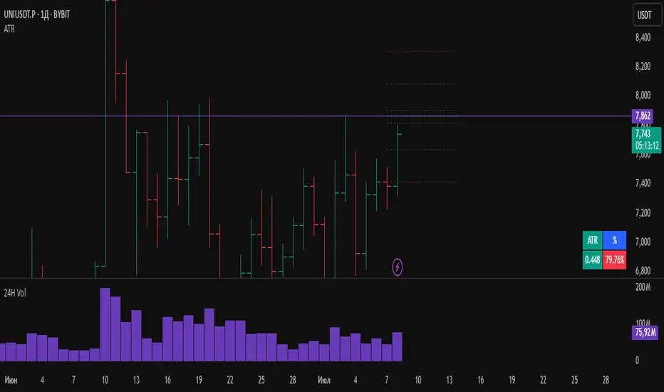
ATRWhat the Indicator Shows:
A compact table with four cells is displayed in the bottom-left corner of the chart:
| ATR | % | Level | Lvl+ATR |
Explanation of the Columns:
ATR — The averaged daily range (volatility) calculated with filtering of abnormal bars (extremely large or small daily candles are ignored).
% — The percentage of the daily ATR that the price has already covered today (the difference between the daily Open and Close relative to ATR).
Level — A custom user-defined level set through the indicator settings.
Lvl+ATR — The sum of the daily ATR and the user-defined level. This can be used, for example, as a target or stop-loss reference.
Color Highlighting of the "%" Cell:
The background color of the "%" ATR cell changes depending on the value:
✅ If the value is less than 10% — the cell is green (market is calm, small movement).
➖ If the value is between 10% and 50% — no highlighting (average movement, no signal).
🟡 If the value is between 50% and 70% — the cell is yellow (movement is increasing, be alert).
🔴 If the value is above 70% — the cell is red (the market is actively moving, high volatility).
Key Features:
✔ All ATR calculations and percentage progress are performed strictly based on daily data, regardless of the chart's current timeframe.
✔ The indicator is ideal for intraday traders who want to monitor daily volatility levels.
✔ The table always displays up-to-date information for quick decision-making.
✔ Filtering of abnormal bars makes ATR more stable and objective.
What is Adaptive ATR in this Indicator:
Instead of the classic ATR, which simply averages the true range, this indicator uses a custom algorithm:
✅ It analyzes daily bars over the past 100 days.
✅ Calculates the range High - Low for each bar.
✅ If the bar's range deviates too much from the average (more than 1.8 times higher or lower), the bar is considered abnormal and ignored.
✅ Only "normal" bars are included in the calculation.
✅ The average range of these normal bars is the adaptive ATR.
Detailed Algorithm of the getAdaptiveATR() Function:
The function takes the number of bars to include in the calculation (for example, 5):
The average of the last 5 normal bars is calculated.
pinescript
Копировать
Редактировать
adaptiveATR = getAdaptiveATR(5)
Step-by-Step Process:
An empty array ranges is created to store the ranges.
Daily bars with indices from 1 to 100 are iterated over.
For each bar:
🔹 The daily High and Low with the required offset are loaded via request.security().
🔹 The range High - Low is calculated.
🔹 The temporary average range of the current array is calculated.
🔹 The bar is checked for abnormality (too large or too small).
🔹 If the bar is normal or it's the first bar — its range is added to the array.
Once the array accumulates the required number of bars (count), their average is calculated — this is the adaptive ATR.
If it's not possible to accumulate the required number of bars — na is returned.
Что показывает индикатор:
На графике внизу слева отображается компактная таблица из четырех ячеек:
ATR % Уровень Ур+ATR
Пояснения к столбцам:
ATR — усреднённый дневной диапазон (волатильность), рассчитанный с фильтрацией аномальных баров (слишком большие или маленькие дневные свечи игнорируются).
% — процент дневного ATR, который уже "прошла" цена на текущий день (разница между открытием и закрытием относительно ATR).
Уровень — пользовательский уровень, который задаётся вручную через настройки индикатора.
Ур+ATR — сумма уровня и дневного ATR. Может использоваться, например, как ориентир для целей или стопов.
Цветовая подсветка ячейки "%":
Цвет фона ячейки с процентом ATR меняется в зависимости от значения:
✅ Если значение меньше 10% — ячейка зелёная (рынок пока спокоен, маленькое движение).
➖ Если значение от 10% до 50% — фон не подсвечивается (среднее движение, нет сигнала).
🟡 Если значение от 50% до 70% — ячейка жёлтая (движение усиливается, повышенное внимание).
🔴 Если значение выше 70% — ячейка красная (рынок активно движется, высокая волатильность).
Особенности работы:
✔ Все расчёты ATR и процентного прохождения производятся исключительно по дневным данным, независимо от текущего таймфрейма графика.
✔ Индикатор подходит для трейдеров, которые торгуют внутри дня, но хотят ориентироваться на дневные уровни волатильности.
✔ В таблице всегда отображается актуальная информация для принятия быстрых торговых решений.
✔ Фильтрация аномальных баров делает ATR более устойчивым и объективным.
Что такое адаптивный ATR в этом индикаторе
Вместо классического ATR, который просто усредняет истинный диапазон, здесь используется собственный алгоритм:
✅ Он берет дневные бары за последние 100 дней.
✅ Для каждого из них рассчитывает диапазон High - Low.
✅ Если диапазон бара слишком сильно отличается от среднего (более чем в 1.8 раза больше или меньше), бар считается аномальным и игнорируется.
✅ Только нормальные бары попадают в расчёт.
✅ В итоге считается среднее из диапазонов этих нормальных баров — это и есть адаптивный ATR.
Подробный алгоритм функции getAdaptiveATR()
Функция принимает количество баров для расчёта (например, 5):
Считается 5 последних нормальных баров
pinescript
Копировать
Редактировать
adaptiveATR = getAdaptiveATR(5)
Пошагово:
Создаётся пустой массив ranges для хранения диапазонов.
Перебираются дневные бары с индексами от 1 до 100.
Для каждого бара:
🔹 Через request.security() подгружаются дневные High и Low с нужным смещением.
🔹 Считается диапазон High - Low.
🔹 Считается временное среднее диапазона по текущему массиву.
🔹 Проверяется, не является ли бар аномальным (слишком большой или маленький).
🔹 Если бар нормальный или это самый первый бар — его диапазон добавляется в массив.
Как только массив набирает заданное количество баров (count), берётся их среднее значение — это и есть адаптивный ATR.
Если не удалось набрать нужное количество баров — возвращается na.
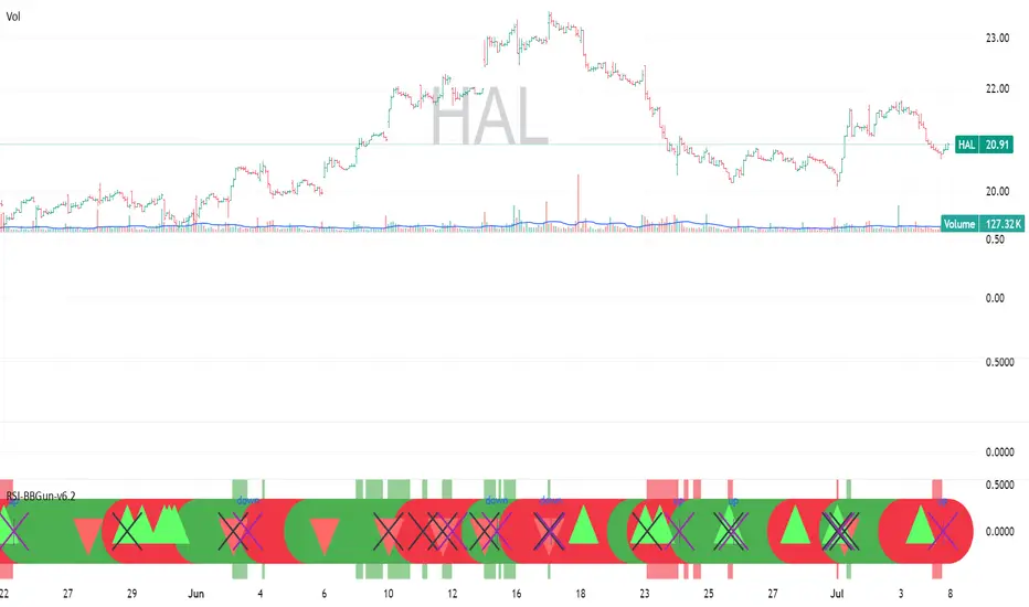
RSI-BBGun-v6.1RSI BB Gun – Operator's Guide
“Eyes on target. Wait for the right moment. Then strike.”
________________________________________
🎯 Mission Objective
RSI BB Gun identifies extreme market conditions using RSI and Bollinger Bands, then overlays trend and volatility intelligence so you know when the setup is real.
The ❌ is your target acquisition signal—price just moved from an extreme zone back into play. Now you’ve got a clean radar lock.
________________________________________
📡 How to Operate
🟣 Step 1: Watch for the ❌'s (Black X = RSI & Bollinger Band Extremes Encountered)
• The Purple X means price and RSI are both stretched—and just snapped back into range.
• The target is now in the cross hairs and potentially ready for engagement.
🟥 Step 2: Confirm the Trend
• The thick ribbon tells you if the trend is with you:
o 🟢 Green = Uptrend. Focus on long setups.
o 🔴 Red = Downtrend. Focus on puts or short plays.
• Align with trend. Only engage when the field favors your position.
🔺 Step 3: Evaluate Signal Context
• Green Triangles = price just crossed below lower Bollinger Band (oversold).
• Red Triangles = price crossed above upper Band (overbought).
• Horizontal Lines Disappeared = The bar after the green or red horizontal line disappears means its time. We patiently wait for this as it means the momentum may be changing.
• These are your early indicators—they scout the setup on the GO / NO GO DECISION.
• ❌ + triangle + trend = clean shot.
________________________________________
☁️ Avoid These Situations
• ❌ in a choppy/no-trend zone = false alarm. Don’t engage.
• Repeated black ❌s without a purple ❌confirmation = low conviction. Let it go.
________________________________________
________________________________________
🪖 Operator's Mindset
“You don’t chase trades. You stalk them. When the ❌ flashes, the system has found a target. What you do next is up to your discipline, your tools, and your plan.”
________________________________________
Note: This is a free version. Upcoming paid version includes multi-timeframes working together. Multiple strategies. Volatility meter. Make money and master the BB Gun so that you can elevate to the Snipers weapon.
🔒 Want More Firepower?
Upgraded version coming soon. Unlocks next-gen targeting tools:
• Multi-timeframe RSI intelligence in a live dashboard
• Precision-timed combo signals based on layered volatility + RSI logic
• Advanced trend filters, trade zone overlays, and sniper-level entry indicators
• Ideal for swing traders and options strategists who want clarity under pressure
💥 Budget-friendly. No subscription. Upgrade when you're ready to go Pro.
Tip: Make 4+ trades mastering this setup. Then use a small portion of the trades to gain more features. Always be in a position you cannot lose.
🆚 Why This Beats Standard RSI/BB Tools
Mission Feature Basic Indicators RSI Ribbon Lite
Trend Confirmation ❌ ✅ Ribbon Overlay
Multi-Timeframe Awareness ❌ ✅ 5-Timeframe RSI Grid
Volatility Confirmation ❌ ✅ Weighted ATR Scoring
Combo Signal Alerts ❌ ✅ ❌ Reentry Combo Alerts
TradingView Alerts ❌ ✅ Built-In Radar Ping
#rsi #bb #bollingerbands #hull ma #trend
Relative Measured Volatility (RMV)RMV • Volume-Sensitive Consolidation Indicator
A lightweight Pine Script that highlights true low-volatility, low-volume bars in a single squeeze measure.
What it does
Calculates each bar’s raw High-Low range.
Down-weights bars where volume is below its 30-day average, emphasizing genuine quiet periods.
Normalizes the result over the prior 15 bars (excluding the current bar), scaling from 0 (tightest) to 100 (most volatile).
Draws the series as a step plot, shades true “tight” bars below the user threshold, and marks sustained squeezes with a small arrow.
Key inputs
Lookback (bars): Number of bars to use for normalization (default 15).
Tight Threshold: RMV value under which a bar is considered squeezed (default 15).
Volume SMA Period: Period for the volume moving average benchmark (default 30).
How it works
Raw range: barRange = high - low
Volume ratio: volRatio = min(volume / sma(volume,30), 1)
Weighted range: vwRange = barRange * volRatio
Rolling min/max (prior 15 bars): exclude today so a new low immediately registers a 0.
Normalize: rmv = clamp(100 * (vwRange - min) / (max - min), 0, 100)
Visualization & signals
Step line for exact bar-by-bar values.
Shaded background when RMV < threshold.
Consecutive-bar filter ensures arrows only appear when tightness lasts at least two bars, cutting noise.
Why use it
Quickly spot consolidation zones that combine narrow price action with genuine dry volume—ideal for swing entries ahead of breakouts.
MTF Order Flow DashboardThe MTF Order Flow Dashboard is a compact, real-time table overlay that provides an at-a-glance view of market structure across three key timeframes:
✅ 1-Minute
✅ 5-Minute
✅ 1-Hour
//If extra 1 min is added to candle closure countdown wait till next tick for correction//
This tool is designed to help traders quickly assess directional bias, detect structure shifts, and stay aware of upcoming candle closes — a powerful aid for scalping, day trading, or momentum-based strategies.
Pivot-Based Market Structure Detection
Uses user-defined pivot length to determine if the market is showing a Bullish, Bearish, or Neutral structure on each timeframe.
Color-Coded Structure
Easily visualize the current trend per timeframe:
🟢 Bullish | 🔴 Bearish | ⚪ Neutral
Live Candle Countdown Timers
Displays time remaining until the next candle close for each timeframe, using timenow for near real-time updates (as fast as ticks arrive).
Compact Table Display
Non-intrusive table displayed in the top-right of your chart with clean formatting for fast decision-making.
Built-in Alerts
Optional alerts when all timeframes align bullish or bearish, giving potential trade setup signals.
Inputs:
Select timeframes for structure analysis (1m, 5m, 1h)
Adjust pivot sensitivity with the Pivot Length input

Gabriel's Andean Oscillator📈 Gabriel's Andean Oscillator — Enhanced Trend-Momentum Hybrid
Gabriel's Andean Oscillator is a sophisticated trend-momentum indicator inspired by Alex Grover’s original Andean Oscillator concept. This enhanced version integrates multiple envelope types, smoothing options, and the ability to track volatility from both open/close and high/low dynamics—making it more responsive, adaptable, and visually intuitive.
🔍 What It Does
This oscillator measures bullish and bearish "energy" by calculating variance envelopes around price. Instead of traditional momentum formulas, it builds two exponential variance envelopes—one capturing the downside (bullish potential) and the other capturing the upside (bearish pressure). The result is a smoothed oscillator that reflects internal market tension and potential breakouts.
⚙️ Key Features
📐 Envelope Types:
Choose between:
"Regular" – Uses single EMA-based smoothing on open/close variance. Ideal for shorter timeframes.
"Double Smoothed" – Adds an extra layer of smoothing for noise reduction. Ideal for longer timeframes.
📊 Bullish & Bearish Components:
Bull = Measures potential upside using price lows (or open/close).
Bear = Measures downside pressure using highs (or open/close).
These can optionally be derived from high/low or open/close for flexible interpretation.
📏 Signal Line:
A customizable EMA of the dominant component to confirm momentum direction.
📉 Break Zone Area Plot:
An optional filled area showing when bull > bear or vice versa, useful for detecting expansion/contraction phases.
🟢 High/Low Overlay Option (Use Highs and Lows?):
Visualize secondary components derived from high/low prices to compare against the open/close dynamics and highlight volatility asymmetry.
🧠 How to Use It
Trend Confirmation:
When bull > bear and rising above signal → bullish bias.
When bear > bull and rising above signal → bearish bias.
Breakout Potential:
Watch the Break area plot (√(bull - bear)) for rapid expansion, signaling volatility bursts or directional moves.
High/Low Envelope Divergence:
Enabling the high/low comparison reveals hidden strength or weakness not visible in open/close alone.
🛠 Customizable Inputs
Envelope Type: Regular vs. Double Smoothed
EMA Envelope Lengths: For both regular and smoothed logic
Signal Length: Controls EMA smoothing for the signal
Use Highs and Lows?: Toggles second set of envelopes; the original doesn't include highs and lows.
Plot Breaks: Enables the filled “break” zone area, the squared difference between Open and Close.
🧪 Based On:
Andean Oscillator - Alpaca Markets
Licensed under CC BY-NC-SA 4.0
Developed by Gabriel, based on the work of Alex Grover

LaCrazy Smash CandleLaCrazy Smash Candle highlights powerful engulfing candles that signal potential momentum reversals or breakout continuation.
Smash Long: The candle's low touches or dips below the prior candle's low, then closes above the previous high with a strong body (minimum % of the candle range).
Smash Short: The candle's high touches or exceeds the prior high, then closes below the previous low with a strong body.
These “Smash” moves often occur at key pivot points, signaling decisive rejections or trend continuation. Customize the body strength filter to match your strategy needs.

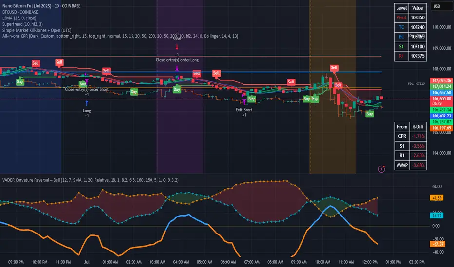
Simple Market Kill-Zones + Open (UTC)What it does
This Pine v6 indicator highlights the “kill-zones” around the big session opens—Asian (23:00–03:00 UTC), London (07:00–09:00 UTC) and New York (13:30–15:30 UTC)—by reading each bar’s actual UTC timestamp. It also draws dashed vertical lines at exactly 23:00, 07:00 and 13:30 UTC, so you never miss the liquidity ramps. Because it uses raw UTC hours/minutes, it stays accurate even when exchanges pause (e.g. Nano-BTC’s daily halt) or your chart’s display timezone changes.
Key Inputs
Show Asia/London/NY Kill Zone – toggle each shaded band on/off
Zone Colors – pick your own semi-transparent hues
Show Session-Open Lines – enable dashed verticals at the exact open times
Line Colors – customize the line opacity and style
How to use
Apply on your favorite timeframe (15 min–1 h is a sweet spot).
Toggle the zones you care about and pick readable colors.
Use the dashed lines as entry triggers or as visual bookmarks.
In your own Pine strategies, wrap order logic with the zone booleans to only trade when liquidity’s alive.
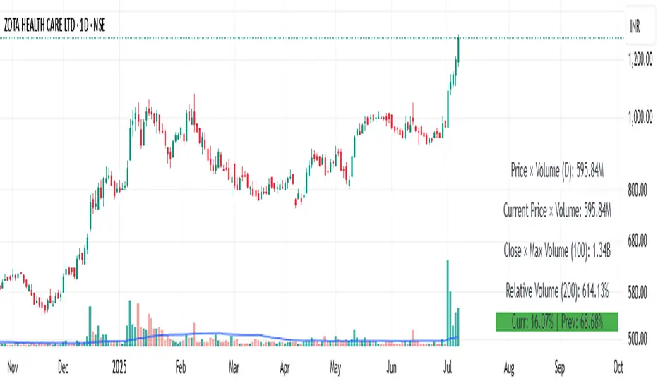
Price × Volume TableIt creates a table showing:
1- Daily Close × Daily Volume
2- Current Close × Current Volume
3- Close × Highest Volume (last 360 candles)
Avg daily rangeThe Average Daily Range (ADR) is a technical indicator that measures the average price movement of a financial instrument over a specific period.

ADX & ATR Display (Table) - Percentage ATROverview:
The "ADX & ATR Display (Table)" is a custom Pine Script indicator designed to provide real-time insights into market trend strength and volatility directly on your chart, presented in a clean, non-intrusive table format. It combines two powerful technical analysis tools: the Average Directional Index (ADX) and the Average True Range (ATR), helping traders quickly grasp current market conditions.
Key Features:
Average Directional Index (ADX):
Purpose: ADX quantifies the strength of a trend, regardless of its direction (up or down). It helps identify if a market is trending strongly or if it's in a ranging (sideways) phase.
Calculation: It is derived from positive (+DI) and negative (-DI) directional indicators, which measure the strength of upward and downward price movements respectively. The indicator then smooths the absolute difference between +DI and -DI.
Interpretation:
ADX values below 25 generally suggest a weak or ranging market.
Values between 25 and 50 indicate the presence of a trending market.
Values above 50 signify a strong trend.
A rising ADX line indicates increasing trend strength, while a falling ADX suggests the trend is weakening.
Display: Your indicator displays the ADX value as a direct numerical score (e.g., 56.5).
Average True Range (ATR):
Purpose: ATR measures the volatility of a market, providing a clearer understanding of the typical price fluctuation over a given period.
Calculation: ATR considers the "true range," which is the largest of three measures: the current high minus the current low, the absolute value of the current high minus the previous close, or the absolute value of the current low minus the previous close. This true range is then averaged over a specified period.
Interpretation:
Higher ATR values indicate higher volatility, meaning prices are experiencing more dramatic movements.
Lower ATR values suggest lower volatility, indicating more stable price action.
Display: Your indicator uniquely displays the ATR value as a percentage (%) of the current closing price, making it easy to compare volatility across different assets or price levels (e.g., 3.97%). This normalized view is particularly useful for position sizing and risk management.
Indicator Display:
This indicator presents both the ADX and ATR values in a compact, customizable table located at the top center of your chart. This allows for a quick, at-a-glance overview of the current market's trend strength and volatility without cluttering the main price action with overlay lines or sub-panes.
Usage:
Traders can utilize this indicator to:
Identify strong trending markets (via ADX) suitable for trend-following strategies.
Recognize ranging or consolidating markets (via ADX) where breakout strategies might be more appropriate.
Gauge market volatility (via ATR) to adjust stop-loss and take-profit levels dynamically.
Compare volatility across different instruments by normalizing ATR to a percentage.
Inputs:
ADX Length: (Default: 14) Adjusts the period for the ADX calculation.
ATR Length: (Default: 14) Adjusts the period for the ATR calculation.

Z-Score + Momentum Strategy (Filtered)✅ What the script does:
Calculates the Z-Score of price with EMA smoothing.
Calculates Momentum as the difference between the current price and the price n bars ago.
Generates signals:
Buy: When the Z-Score is rising and relatively positive, and momentum is increasing.
Sell: When the Z-Score is falling, and momentum is decreasing.
Plots BUY and SELL labels on the candles.
Provides alerts that can be activated from the TradingView settings.
Displays Z-Score and Momentum in the lower pane of the chart.
🎯 How to use the script:
Copy the code into the Pine Editor on TradingView.
Click "Add to Chart".
Enable alerts using the alertcondition settings.
You can modify the following parameters:
Z-Score period: length
Momentum lookback period: momentumLength
Z-Score entry threshold: threshold

Icy-Hot Visual Indicator [SciQua]🧊 Icy-Hot Visual Indicator
This indicator colors your price bars and/or chart background based on a normalized & smoothed transform of any price-based input (default: close). It gives you a quick “temperature map” of market momentum or volatility—cool blues for low readings, hot reds for high readings—without cluttering your chart.
🔍 Key Features
1. Dual Visual Layers
Candle Gradient: Applies a smooth, multi-color gradient to candle bodies and wicks based on normalized, smoothed input data
Background Gradient: Adds a semi-transparent gradient behind the candles to highlight broader trend zones or volatility regimes
2. Advanced Customization
Normalization Types: bounded, unbounded, z-score, MAD, percentile, sigmoid, tanh, rank, robust, and more
Smoothing Methods: EMA, SMA, WMA, RMA, HMA, TEMA, VWMA, Gaussian, LinReg, ExpReg, and others (12+ options)
3. Gradient Control: Choose 2–7 color stops, reverse direction, adjust display length
Flexible Source Inputs
Use any built-in price series (close, hl2, volume, etc.)
Feed outputs from external indicators (RSI, custom oscillators, moving averages) into either layer
❓How It Works
Inputs are normalized (z-score, bounded, etc.) then smoothed (EMA, LinReg, etc.) in the order you choose. The result is clamped to 0–1 and passed through a multi-stop gradient engine for precise color mapping.
✨ What Makes It Original
While many indicators apply colors or smoothing, this script combines multi-stage normalization, adaptive smoothing, and a modular gradient rendering engine in a highly customizable dual-layer system. It’s built using proprietary functions from the SciQua suite that are not available in public libraries and allow for advanced visual encoding without relying on alerts, signals, or extra panes.
This makes it original in both design and execution—offering a visual-first approach with unique depth, clarity, and flexibility.
🔐 Why This Script Is Closed-Source
While the underlying functions are published in the open-source SciQua library, this indicator’s specific implementation, configuration architecture, and visual behavior are proprietary. It combines multiple library utilities into a dual-layer adaptive system that handles advanced gradient rendering, multi-stage normalization, and smoothing pipelines in a unique way.
The source is closed to protect the design logic, interface abstraction, and fine-tuned behaviors that make this indicator commercially valuable. The building blocks are open to the Pine community, but this assembled product is not meant for replication or redistribution.
How to Use It
1. Highlight Trend Strength
Source: RSI percentile
Setup: 200-bar look-back, mild smoothing
Result: Warm tones when momentum is peaking; cool when it’s fading. Use as a quick filter for entries in the direction of the trend.
2. Visualize Volatility Regimes
Source: ATR or True Range
Setup: Bounded normalization with tighter smoothing bar color off, bg color on.
Result: Background bands that shade when volatility spikes. Helps you avoid low-volatility breakouts or throttle position sizing in choppy markets.
3. Combine with Other Indicators
Source: Output of your custom indicator (e.g., a Keltner Band width)
Setup: Match normalization period to your strategy’s timeframe
Result: Bars colored by your own logic—no extra panes, just enhanced candles.
4. Background Only Heatmap
Turn off bar coloring and dial in semi-transparent background shades—keeps candles crisp while still giving you a context heat-map behind price.
Economic Event Timer & Alerts [AlgoXcalibur]Stay ahead of market-moving news with this real-time event tracker and countdown alert system.
This essential algorithm displays critical scheduled events that may influence sudden spikes in market volatility, helping you stay aware and reduce exposure to unpredictable moves before they even happen. Featuring a captivating on-chart display with event titles, adjustable time zone, real-time countdowns, and live alert notifications — you’ll always know what’s ahead — so you can prepare, not react.
🧠 Algorithm Logic
The Economic Event Timer & Alerts system delivers critical market awareness through an array of integrated functions. At its core, a live countdown table provides real-time updates on the day’s scheduled economic events, with dynamic, color-coded countdowns that ensure fast and easy interpretation at a glance. Complementing the table, Countdown Alerts notify you 30 minutes, 10 minutes, and 1 minute prior to each event—giving you clear, timely reminders without the need to constantly monitor your chart. The adjustable time zone input supports ET, CT, MT, PT, or UTC, so the displayed time-of-event aligns with your trading session. Rigorously refined, the algorithm updates the table daily—and clearly displays No Scheduled Events Today to provide certainty and reassurance on days without scheduled events. Packaged in a minimalist, unobtrusive design, the tool remains visually clean and focused for serious traders.
Updated automatically for hassle-free peace of mind.
⚙️ Features
• Time Zone Selector: Easily toggle between time zones to match your trading session.
• Countdown Alerts: Enable real-time notifications to keep you informed and aware of events without having to monitor the chart.
• Update & Expiration Awareness Feature:
This innovative feature includes a simple visual and alert system that prompts you when it’s time to reload the indicator & recreate alerts — ensuring your alerts are always tied to the latest data update.
🔄 Update Available
On the final day of current event data, the indicator will:
• Display Update Available on the indicator’s table
• Send an alert at 4:00 PM ET reminding you to reload & recreate alerts
You can load the updated version anytime that day.
⛔ Expired
If not reloaded, the next day the indicator will:
• Display an EXPIRED banner on the indicator’s table
• Send a Data Expired alert every day at 8:30 AM ET that prompts you to recreate alerts, until you do or disable the alert.
This prevents missing event alerts unknowingly.
Why is this feature necessary?
Even though the indicator is updated when necessary (typically every 2–4 weeks) to provide upcoming event data automatically, TradingView alerts do not auto-update —they stay tied to the version of the script that was active when the alert was created.
This thoughtful refinement is designed to ensure your alerts remain synced to current events and ready for when it matters most.
🚨 Protect Your Capital
At AlgoXcalibur, we understand that the best way to be profitable is to avoid unnecessary risk.
Dedicated to empowering traders with insight that matters, we designed this tool to transform inconvenient economic calendars into effortless, essential information—displayed directly on your chart. Whether you’re managing open positions or timing new trades, knowing when impactful events are about to hit is crucial to being proactive, protecting capital, and trading with confidence. This is not a technical analysis indicator—this is a risk management tool that provides traders with a fundamental edge.
Built for traders who value risk management, market awareness, and algorithm automation.
🔐 To get access or learn more, visit the Author’s Instructions section.

TrendBoxThis indicator is called "TrendBox," designed to help traders analyze daily price ranges using several technical indicators. Below is a breakdown of its functionality, purpose, and key components:
Purpose
The script overlays indicators on a chart to assess whether the price is above or below key levels and moving in a trend.
VIX-based expected range (index fund targeted)
- This helps calculate the expected dealers range based on VIX implications. You can expect to see ranges be bought on and sold on. Moving outside this range creates heightened volatility and most of the time a gamma squeeze follows.
VWAP (Volume Weighted Average Price)
- This allows you to understand the mid point or average pricing of the daily session. If you're paying a premium or getting a discount on the daily session.
Daily Market Open
- Identifying the market open price is a key level on a daily session and allows you to identify some level of intraday trend.
Daily 4-period VWMA
- This is a crucial role of our indicator and showing short term time frame bias. Seeing price move over the top of our daily 4 level establishes a short term trend and can be used as a distribution guide, closing positions when we see longer time frame candles close under it. Vice versa for shorting.
It also displays a status box (optional) summarizing whether the price is above or below these levels, helping traders quickly evaluate market conditions.

long short ratioSummary
Transform your analysis with a clear view of the market's true engine: capital.
The Long/Short Ratio HUD is a visual analysis tool designed to offer an instant perspective on the battle between buyers and sellers. Unlike traditional volume indicators that only measure the quantity of assets traded, this HUD measures the actual monetary value (e.g., USD, USDT) flowing into the market, giving you a much more accurate reading of true sentiment and conviction.
This indicator is presented as a clean, non-intrusive Heads-Up Display (HUD) in a corner of your chart, allowing you to keep your workspace clear while receiving high-value information.
Key Features
Intuitive Sentiment Bar: Instantly visualize the percentage of dominance between buyers (green) and sellers (red) in the current timeframe.
True Monetary Volume: Calculations are not based on simple volume (number of shares or coins) but on quote volume (Volume x Price). Discover how much real capital is backing the bulls and bears.
Data Smoothing: It uses an Exponential Moving Average (EMA) to smooth the volume data, showing the trend in sentiment rather than the noise of a single candle.
Non-Intrusive HUD: Docks to your chosen corner, displaying essential information without cluttering your price action and analysis.
Smart Number Formatting: Large monetary volumes are automatically abbreviated (e.g., 2.1M for millions, 850K for thousands) for a quick and easy read.
Fully Customizable: Easily adjust the HUD's position and the EMA's length (sensitivity) to fit your trading style.
How It Works & How to Interpret It
The indicator analyzes each candle's structure (body and wicks) along with its monetary volume to determine the buying and selling pressure.
Sentiment Calculation:
A green candle with a large body and a high close indicates strong buying pressure.
A red candle with a large body and a low close indicates strong selling pressure.
Long wicks signify a battle; the indicator intelligently distributes the volume to reflect who won that intra-bar fight.
Practical Interpretation:
Clear Dominance (e.g., > 70% Green): Suggests strong control by buyers. Look for confirmation of a trend continuation.
Balance (~50%/50%) with High Monetary Volume: Indicates a major battle or an absorption phase. Although significant capital is being traded, there is no clear winner. This is a key signal to be alert for a potential reversal or consolidation.
Divergences: One of the most powerful signals. If the price is rising but the buying sentiment on the HUD is decreasing, it could indicate that the uptrend is losing capital momentum and is vulnerable to a correction.
Disclaimer
This indicator is provided for educational and analytical purposes only. It does not constitute financial advice or a recommendation to buy or sell any asset. All investment and trading decisions are the sole responsibility of the user. Past performance is not indicative of future results.

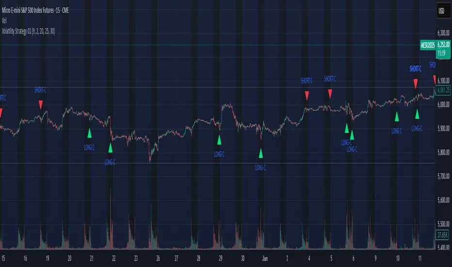
Volatility Strategy 01a quantitative volatility strategy (especially effective in trend direction on the 15min chart on the s&p-index)
the strategy is a rule-based setup, which dynamically adapts to the implied volatility structure (vx1!–vx2!)
context-dependent mean reversion strategy based on multiple timeframes in the vix index
a signal is provided under following conditions:
1. the vvix/vix spread has deviated significantly beyond one standard deviation
2. the vix is positioned above or below 3 moving averages on 3 minor timeframes
3. the trade direction is derived from the projected volatility regime, measured via vx1! and vx2! (cboe)
AlgoChadLin's BITCOIN H1 Breakout Strategy No.545Strategy Overview
AlgoChadLin's BITCOIN H1 Breakout Strategy No.545 is a sophisticated breakout trading system designed for Bitcoin on the H1 timeframe. It integrates multiple volatility and price action indicators to identify high-probability breakout opportunities, aiming to capitalize on significant market movements.
Auther: @algochadlin
Strategy Logic
Breakout Confirmation: Utilizes a combination of Average True Range (ATR) and Bollinger Bands to identify periods of low volatility followed by sharp price movements.
Long: Initiated when the price breaks above the previous hour's upper Bollinger Band, with ATR confirming increased volatility.
Short: Triggered when the price breaks below the previous hour's lower Bollinger Band, with ATR indicating heightened volatility.
Parameters
Price Entry Multiplier: Adjusts the entry price relative to the breakout level.
Exit After Bars: Specifies the number of bars to hold the position before exiting.
Profit Target (%): Defines the percentage gain at which to take profit.
Stop Loss Coefficient: Multiplier for ATR to calculate stop-loss distance.
Trailing Stop Coefficients: Defines the trailing stop parameters.
Biggest Range Period: Determines the lookback period for identifying the largest price range.
Setup
Timeframe: 1-Hour (H1)
Asset: Bitcoin, also suitable for ETH

Options Strategy V1.3📈 Options Strategy V1.3 — EMA Crossover + RSI + ATR + Opening Range
Overview:
This strategy is designed for short-term directional trades on large-cap stocks or ETFs, especially when trading options. It combines classic trend-following signals with momentum confirmation, volatility-based risk management, and session timing filters to help identify high-probability entries with predefined stop-loss and profit targets.
🔍 Strategy Components:
EMA Crossover (Fast/Slow)
Entry signals are triggered by the crossover of a short EMA above or below a long EMA — a traditional trend-following method to detect shifts in momentum.
RSI Filter
RSI confirms the signal by avoiding entries in overbought/oversold zones unless certain momentum conditions are met.
Long entry requires RSI ≥ Long Threshold
Short entry requires RSI ≤ Short Threshold
ATR-Based SL & TP
Stop-loss is set dynamically as a multiple of ATR below (long) or above (short) the entry price.
Take-profit is placed as a ratio (TP/SL) of the stop distance, ensuring consistent reward/risk structure.
Opening Range Filter (Optional)
If enabled, the strategy only triggers trades after price breaks out of the 09:30–09:45 EST range, ensuring participation in directional moves.
Session Filters
No trades from 04:00 to 09:30 and from 16:00 to 20:00 EST, avoiding low-liquidity periods.
All open trades are closed at 15:55 EST, to avoid overnight risk or expiration issues for options.
⚙️ Built-in Presets:
You can choose one of the built-in ticker-specific presets for optimal conditions:
Ticker EMAs RSI (Long/Short) ATR SL×ATR TP/SL
SPY 8/28 56 / 26 14 1.4× 4.0×
TSLA 23/27 56 / 33 13 1.4× 3.6×
AAPL 6/13 61 / 26 23 1.4× 2.1×
MSFT 25/32 54 / 26 14 1.2× 2.2×
META 25/32 53 / 26 17 1.8× 2.3×
AMZN 28/32 55 / 25 16 1.8× 2.3×
You can also choose "Custom" to fully configure all parameters to your own market and strategy preferences.
📌 Best Use Case:
This strategy is especially suited for intraday options trading, where timing and risk control are critical. It works best on liquid tickers with strong trends or clear breakout behavior.
